PROMPTS · KREATIV ENTDECKEN

Prompt-Galerie

Echte Prompts und erzeugte Beispiele erkunden. Inspiration für Ihre nächste kreative Mission finden und den vollständigen Prompt kostenlos kopieren.

Beispiele
6,699
Modelle
9
Quellen
67
6.699 Prompt-Beispiele · Seite 14 von 140
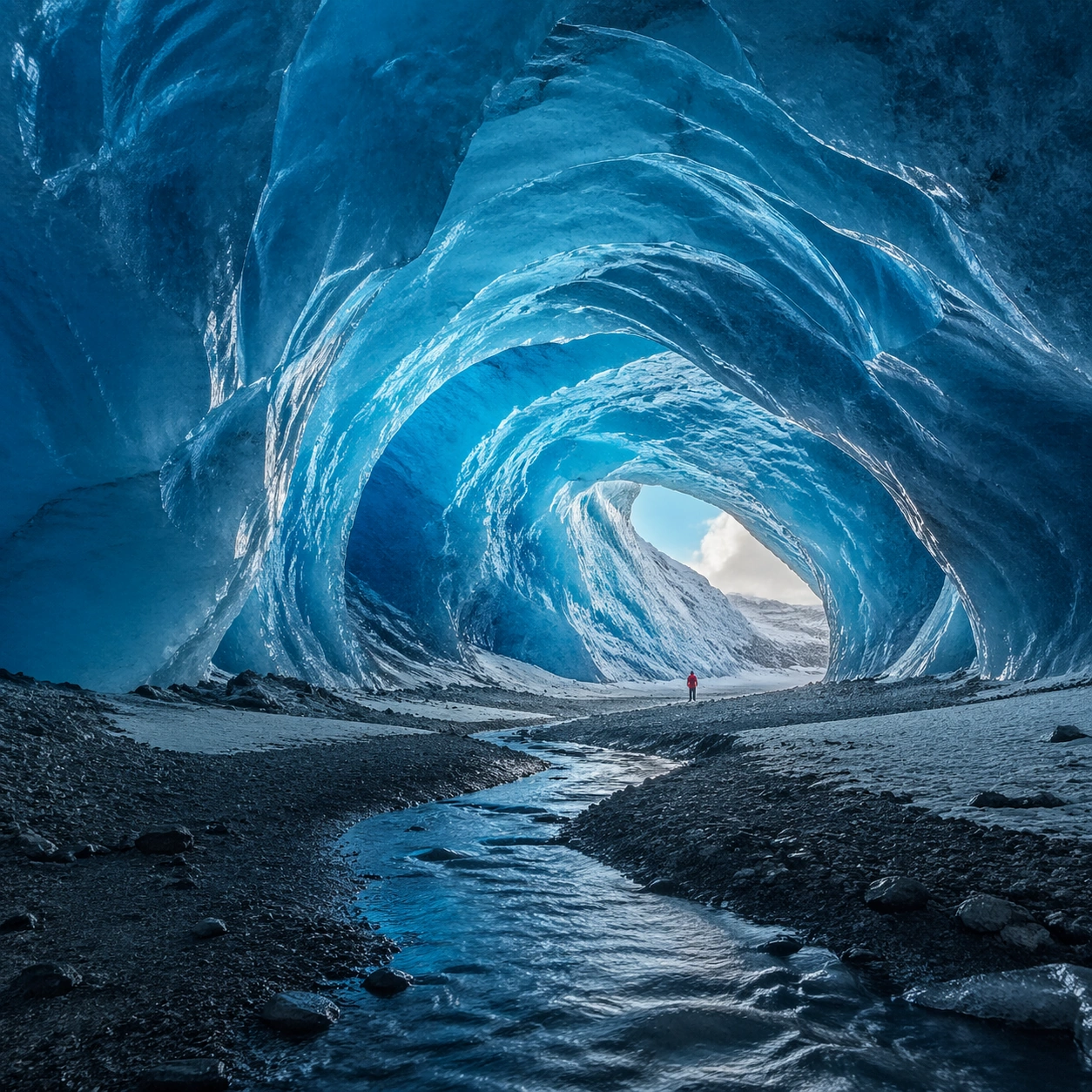
Example generated from “Blue Glacier-Cavern Landscape Study — ChaosRealmsAI · MIT”
GPT Image 2en

Scene: Create a square, photoreal landscape study of glacier cathedral in ice blue. Compose it as the clearest monument-scale establishing view, using a wide, level camera position with deep atmospheric recession and a calm, authoritative horizon. Let broad, sculpting natural light describe the major masses before it picks out the smaller details Keep the frame cinematic but disciplined, with a clear foreground, middle distance, and far mass so the viewer can measure real depth. The image should feel like a field photograph made with patience, precision, and sublime restraint rather than a fantasy matte painting. Subject: Show a colossal glacier cavern with vaulted translucent blue ice walls, a narrow meltwater stream carved through the floor, and a tiny explorer in muted red outerwear near the far entrance for scale. This variation should emphasize hero panorama. The main landform must dominate the composition, but secondary elements should quietly explain how the place works: water paths, sediment lines, snow bands, surf, ash, wind streaks, stars, or human traces where appropriate. Everything in the image should support the same idea of scale and climate, so the scene reads as one coherent environment rather than a stack of spectacular details. Important details: Preserve cathedral-like vertical volume, convincing ice translucency, cold volumetric light entering from the opening, layered cyan-to-azure color in the ice, and a real sense of frozen density rather than decorative crystals. Keep one dominant landform, one secondary supporting rhythm, and a restrained scale witness so the scene reads immediately. Keep geology, weather, and atmosphere physically believable. Use subtle micro-texture, tonal separation, and air perspective to reinforce distance. If a human, vehicle, tent, caravan, bird, or boat appears, it must remain tiny and subordinate to the landscape, functioning only as a scale witness. The composition should feel original, severe, and elegant, with no decorative filler and no imitation of any copyrighted visual property. Use case: Glacier Cathedral in Ice Blue single study 1/9, exploring the hero panorama variation. Constraints: No readable text, no watermark, no logos, preserve exact 1:1 aspect ratio, no fantasy crystals, no neon glow, no carved masonry, no aurora inside the cave, no split-screen layout, no collage fragments, no exaggerated fisheye distortion, no kitsch color grading, no artificial border, no split-panel treatment.
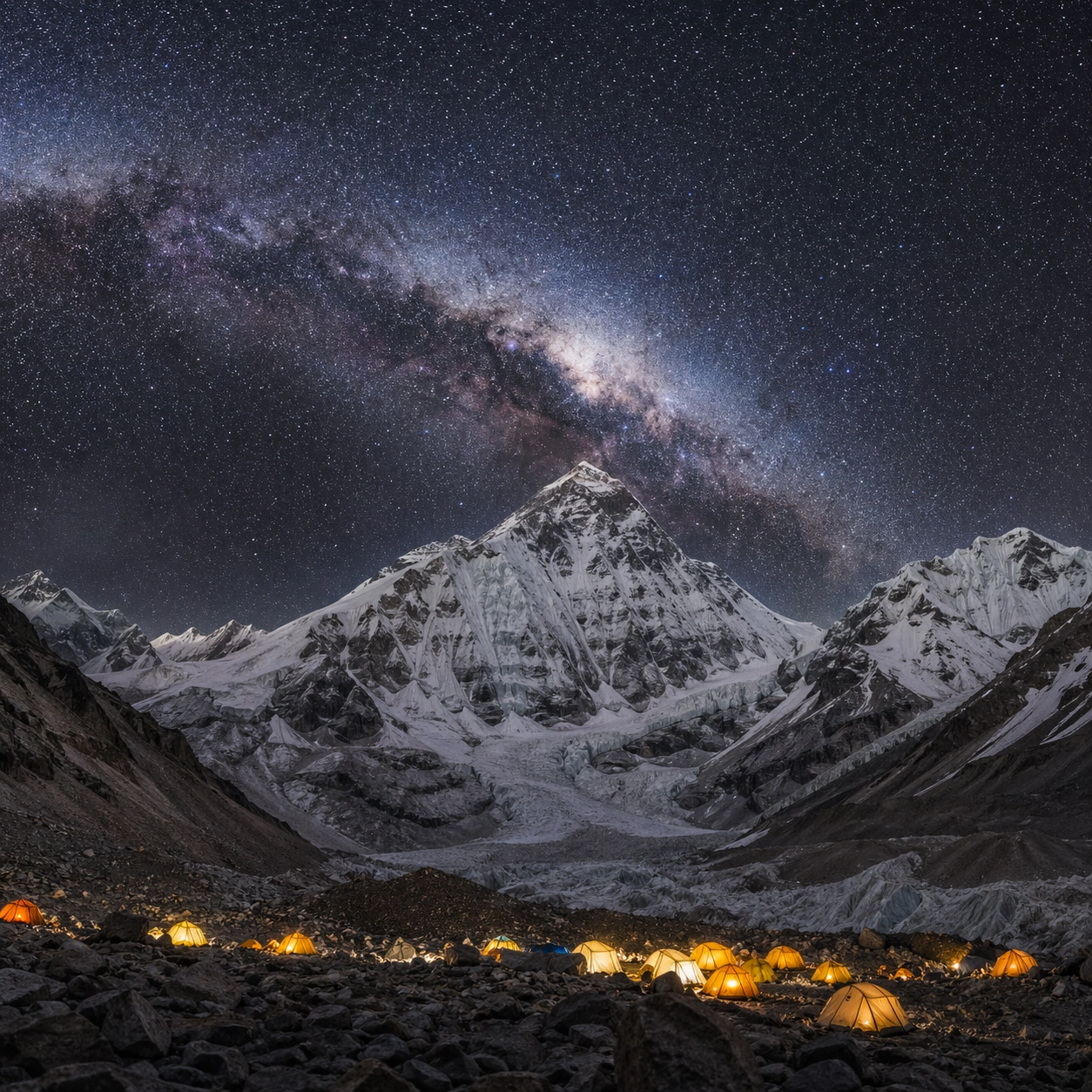
Example generated from “Himalayan Base-Camp Starscape Study — ChaosRealmsAI · MIT”
GPT Image 2en

Scene: Create a square, photoreal landscape study of himalayan base camp starscape. Compose it as the clearest monument-scale establishing view, using a wide, level camera position with deep atmospheric recession and a calm, authoritative horizon. Let broad, sculpting natural light describe the major masses before it picks out the smaller details Keep the frame cinematic but disciplined, with a clear foreground, middle distance, and far mass so the viewer can measure real depth. The image should feel like a field photograph made with patience, precision, and sublime restraint rather than a fantasy matte painting. Subject: Show a high Himalayan base camp at night beneath the world's highest summit, with the Milky Way arching overhead, warm tent lights in the foreground, and black snow ridges cutting into a clear star field. This variation should emphasize hero panorama. The main landform must dominate the composition, but secondary elements should quietly explain how the place works: water paths, sediment lines, snow bands, surf, ash, wind streaks, stars, or human traces where appropriate. Everything in the image should support the same idea of scale and climate, so the scene reads as one coherent environment rather than a stack of spectacular details. Important details: Preserve thin high-altitude air, disciplined astrophotography realism, crisp stars without cartoon exaggeration, warm-versus-cold color contrast, and believable tent scale against the mountain mass. Keep one dominant landform, one secondary supporting rhythm, and a restrained scale witness so the scene reads immediately. Keep geology, weather, and atmosphere physically believable. Use subtle micro-texture, tonal separation, and air perspective to reinforce distance. If a human, vehicle, tent, caravan, bird, or boat appears, it must remain tiny and subordinate to the landscape, functioning only as a scale witness. The composition should feel original, severe, and elegant, with no decorative filler and no imitation of any copyrighted visual property. Use case: Himalayan Base Camp Starscape single study 1/9, exploring the hero panorama variation. Constraints: No readable text, no watermark, no logos, preserve exact 1:1 aspect ratio, no satellite trails, no fireworks, no oversized moon, no city glow on the horizon, no split-screen layout, no collage fragments, no exaggerated fisheye distortion, no kitsch color grading, no artificial border, no split-panel treatment.
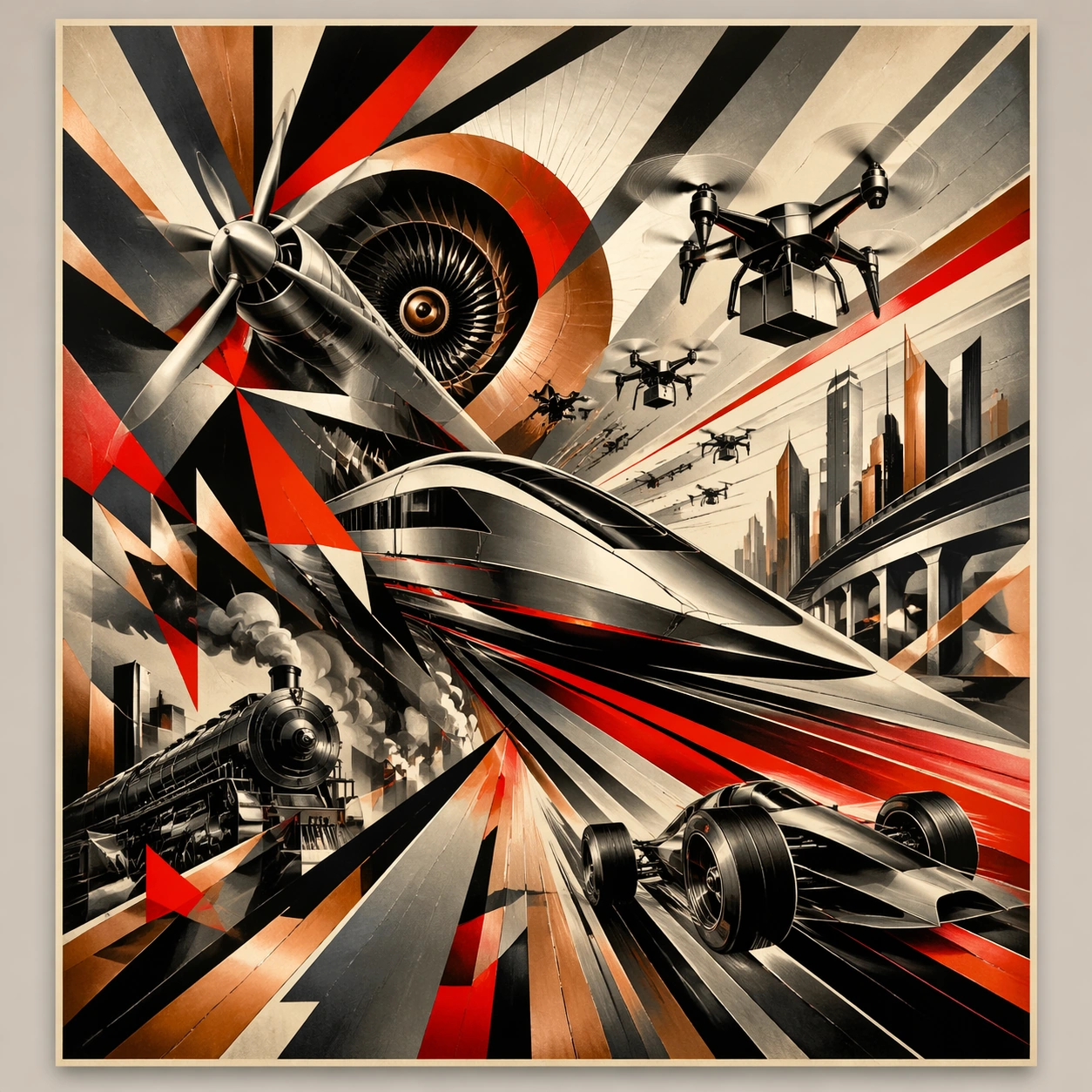
Example generated from “Futurist Rail-and-Drone Motion Poster Study — ChaosRealmsAI · MIT”
GPT Image 2en

Scene: A square straight-on studio view of a pristine poster mounted on a matte wall with even museum lighting, crisp corners, and enough breathing room around the sheet for the full composition to read as an intentional object. The poster should express machine-age futurist poster language with fractured motion, metallic planes, angular overlaps, and speed-worshiping thrust, using gunmetal silver, copper, cream, black, and electric red accents and a tactile surface appropriate to the medium. Subject: Build the flagship poster statement for this style, with the strongest hierarchy, the clearest subject silhouette, and the most disciplined balance between image field, pseudo-typography, and empty space. Use trains, propellers, racing cars, turbines, smoke trails, city arcs, and explosive speed lines as the main visual ingredients, and organize them with chopped angular typographic shards used as non-readable motion accents. For the contemporary-subject axis, thread in high-speed rail, delivery drones, and urban night traffic translated into ecstatic machine momentum. The poster must feel like an original design object rather than a reproduction of any known work. Important details: Treat this as the cleanest thesis image in the set: the paper should look fresh, the inks or paint should feel deliberate, and every formal rule of the style should be easy to study at a glance. Preserve dynamic rotation, vector thrust, hard overlaps, metallic sheen restraint, and aggressive directional rhythm. Keep every letterform abstract and non-readable, as if it were a typographic texture rather than language. Make the style unmistakable through composition, palette, surface behavior, and symbolic compression. no static composition, no soft nostalgic brushwork, no pastoral calm, no rounded playful forms. Use case: Italian Futurism single study 1/9, establishing the cleanest museum-grade poster reading. Constraints: No readable text, no watermark, no logos, preserve exact 1:1 aspect ratio, no copyrighted characters, no real brand marks, no QR codes, no interface chrome, no accidental gibberish lettering.

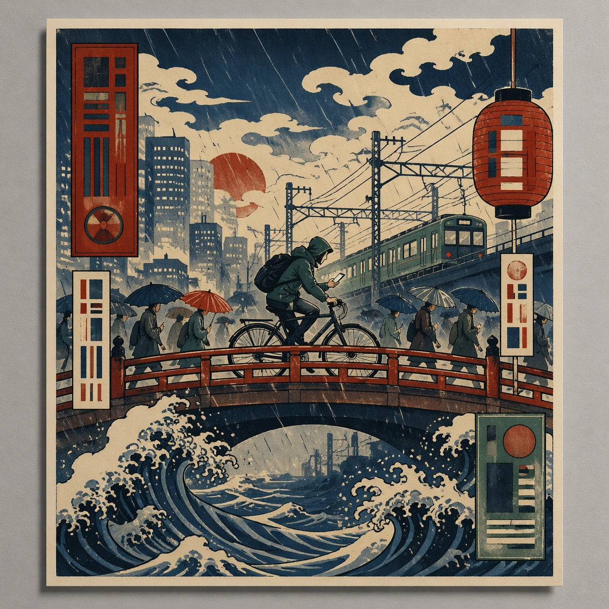
Example generated from “Ukiyo-E City-Cyclist Poster Study — ChaosRealmsAI · MIT”
GPT Image 2en

Scene: A square straight-on studio view of a pristine poster mounted on a matte wall with even museum lighting, crisp corners, and enough breathing room around the sheet for the full composition to read as an intentional object. The poster should express woodblock poster language with flat color planes, carved keylines, wave patterns, cloud voids, and compressed perspective, using indigo, vermilion, muted cream, smoky pine green, and weathered charcoal outlines and a tactile surface appropriate to the medium. Subject: Build the flagship poster statement for this style, with the strongest hierarchy, the clearest subject silhouette, and the most disciplined balance between image field, pseudo-typography, and empty space. Use bridges, river spray, layered robes, lantern shapes, rain bands, cloud scrolls, and urban commuters as the main visual ingredients, and organize them with cartouche-like title seals and vertical blocks rendered as abstract non-readable forms. For the contemporary-subject axis, thread in a city cyclist crossing a bridge in rain with phone light and train wires translated into woodblock logic. The poster must feel like an original design object rather than a reproduction of any known work. Important details: Treat this as the cleanest thesis image in the set: the paper should look fresh, the inks or paint should feel deliberate, and every formal rule of the style should be easy to study at a glance. Preserve visible contour line discipline, flat depth stacking, patterned water, and rhythmic empty sky fields. Keep every letterform abstract and non-readable, as if it were a typographic texture rather than language. Make the style unmistakable through composition, palette, surface behavior, and symbolic compression. no glossy digital gradients, no lens blur, no hyperreal reflections, no cinematic depth-of-field. Use case: Ukiyo-e Remix single study 1/9, establishing the cleanest museum-grade poster reading. Constraints: No readable text, no watermark, no logos, preserve exact 1:1 aspect ratio, no copyrighted characters, no real brand marks, no QR codes, no interface chrome, no accidental gibberish lettering.

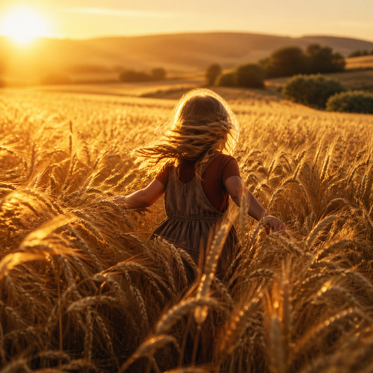
Example generated from “Magic-Hour Child-in-Wheat Scene — ChaosRealmsAI · MIT”
GPT Image 2en

Scene: A square naturalistic frame captured at the exact edge of magic hour, when the sun sits low and turns grass, dust, skin, and hair into luminous gold. Use wide lenses, open air, gentle motion, and a lived-in landscape such as tall wheat, meadow, creek bank, orchard, or open prairie. Show a child running through shoulder-high wheat with the low sun just outside frame, turning every awn and strand of hair into a halo. Subject: Center on a child or small human figure moving through the landscape with curiosity, wonder, or private joy. The body should feel small inside the world, with the environment carrying as much emotional meaning as the person. The figure is mid-stride and half-obscured by grain, making the field feel like a living sea around them. Important details: The visual rule is reverence through natural light, wind, and tactile surface detail. Preserve lens flare, translucent grasses, skin warmed by sun, and humble earth textures without commercial polish. Avoid heavy stylization, urban intrusions, or artificial studio neatness. Let the wheat dominate the frame, with the child discovered through movement and backlight rather than centered portraiture. Use case: Natural Reverence Magic Hour single study 1/9. Constraints: No readable text, no watermark, no logos, preserve exact 1:1 aspect ratio, no readable text, no modern billboards, no synthetic neon color, no posed fashion styling, no fantasy creatures, no broken anatomy, no low-detail background, no accidental text fragments.

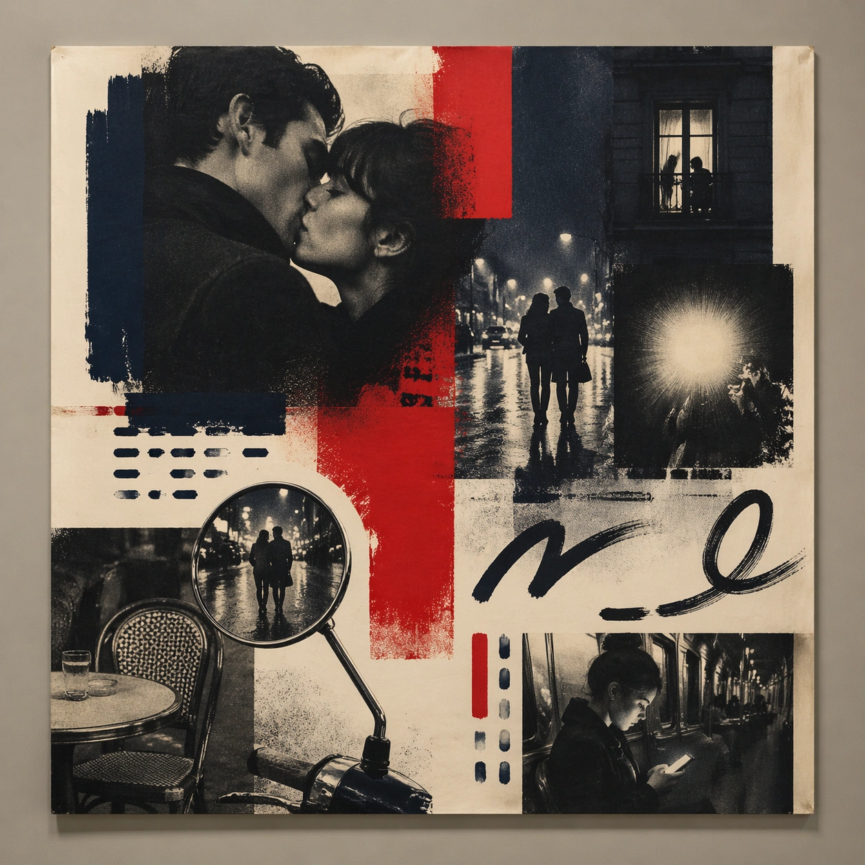
Example generated from “French New-Wave Romance Poster Study — ChaosRealmsAI · MIT”
GPT Image 2en

Scene: A square straight-on studio view of a pristine poster mounted on a matte wall with even museum lighting, crisp corners, and enough breathing room around the sheet for the full composition to read as an intentional object. The poster should express 1960s art-house poster grammar with radical photo crop, offset grain, hand-painted marks, and emotional empty space, using inky blue, carmine red, warm cream, charcoal, and cigarette-smoke gray and a tactile surface appropriate to the medium. Subject: Build the flagship poster statement for this style, with the strongest hierarchy, the clearest subject silhouette, and the most disciplined balance between image field, pseudo-typography, and empty space. Use street couples, scooter mirrors, apartment windows, rain-slick pavement, camera flash, and cafe tables as the main visual ingredients, and organize them with handwritten sweeps and sans blocks that feel gestural but stay non-readable. For the contemporary-subject axis, thread in a late-night metro ride and smartphone glow transformed into a melancholic art-house romance surface. The poster must feel like an original design object rather than a reproduction of any known work. Important details: Treat this as the cleanest thesis image in the set: the paper should look fresh, the inks or paint should feel deliberate, and every formal rule of the style should be easy to study at a glance. Preserve abrupt crop decisions, mood ambiguity, rough screen-print texture, and tension between photo and mark-making. Keep every letterform abstract and non-readable, as if it were a typographic texture rather than language. Make the style unmistakable through composition, palette, surface behavior, and symbolic compression. no blockbuster gloss, no readable credits, no hyper-polished skin retouching, no superhero spectacle. Use case: French New Wave single study 1/9, establishing the cleanest museum-grade poster reading. Constraints: No readable text, no watermark, no logos, preserve exact 1:1 aspect ratio, no copyrighted characters, no real brand marks, no QR codes, no interface chrome, no accidental gibberish lettering.

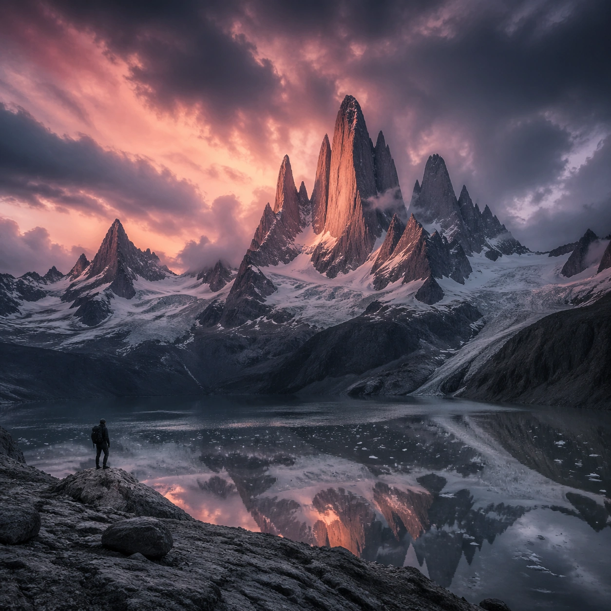
Example generated from “Patagonian Granite-Spire Landscape Study — ChaosRealmsAI · MIT”
GPT Image 2en

Scene: Create a square, photoreal landscape study of patagonian spire granite. Compose it as the clearest monument-scale establishing view, using a wide, level camera position with deep atmospheric recession and a calm, authoritative horizon. Let broad, sculpting natural light describe the major masses before it picks out the smaller details Keep the frame cinematic but disciplined, with a clear foreground, middle distance, and far mass so the viewer can measure real depth. The image should feel like a field photograph made with patience, precision, and sublime restraint rather than a fantasy matte painting. Subject: Show jagged Patagonian granite spires rising through storm clouds, touched by rose dawn light above a glacier lake, with a lone climber silhouette on the approach. This variation should emphasize hero panorama. The main landform must dominate the composition, but secondary elements should quietly explain how the place works: water paths, sediment lines, snow bands, surf, ash, wind streaks, stars, or human traces where appropriate. Everything in the image should support the same idea of scale and climate, so the scene reads as one coherent environment rather than a stack of spectacular details. Important details: Preserve serrated granite geometry, storm-driven cloud movement, rose and steel-gray color contrast, glacial water reflection, and a harsh high-wind alpine atmosphere. Keep one dominant landform, one secondary supporting rhythm, and a restrained scale witness so the scene reads immediately. Keep geology, weather, and atmosphere physically believable. Use subtle micro-texture, tonal separation, and air perspective to reinforce distance. If a human, vehicle, tent, caravan, bird, or boat appears, it must remain tiny and subordinate to the landscape, functioning only as a scale witness. The composition should feel original, severe, and elegant, with no decorative filler and no imitation of any copyrighted visual property. Use case: Patagonian Spire Granite single study 1/9, exploring the hero panorama variation. Constraints: No readable text, no watermark, no logos, preserve exact 1:1 aspect ratio, no dense forest foreground, no cable cars, no fantasy castle ruins, no tropical haze, no split-screen layout, no collage fragments, no exaggerated fisheye distortion, no kitsch color grading, no artificial border, no split-panel treatment.
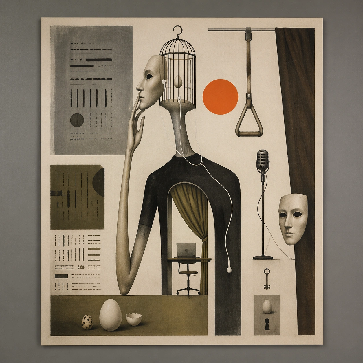
Example generated from “Surreal Remote-Work Theatre Poster Study — ChaosRealmsAI · MIT”
GPT Image 2en

Scene: A square straight-on studio view of a pristine poster mounted on a matte wall with even museum lighting, crisp corners, and enough breathing room around the sheet for the full composition to read as an intentional object. The poster should express dry surreal theatre-poster logic using one impossible symbol, large mute fields, and an intellectual deadpan mood, using ash gray, olive, umber, bone, and a single acid orange or neon pink accent and a tactile surface appropriate to the medium. Subject: Build the flagship poster statement for this style, with the strongest hierarchy, the clearest subject silhouette, and the most disciplined balance between image field, pseudo-typography, and empty space. Use elongated limbs, bird cages, eggs, microphones, masks, curtains, keys, and impossible body-object hybrids as the main visual ingredients, and organize them with quiet hand-drawn title blocks used as texture and spacing devices rather than readable type. For the contemporary-subject axis, thread in remote-work objects, earbuds, and subway handles fused into a deadpan surreal theatre metaphor. The poster must feel like an original design object rather than a reproduction of any known work. Important details: Treat this as the cleanest thesis image in the set: the paper should look fresh, the inks or paint should feel deliberate, and every formal rule of the style should be easy to study at a glance. Preserve symbolic compression, painterly paper tooth, sparse composition, and one decisive accent color. Keep every letterform abstract and non-readable, as if it were a typographic texture rather than language. Make the style unmistakable through composition, palette, surface behavior, and symbolic compression. no crowded collage, no glamour sheen, no literal plot illustration, no cheerful advertising tone. Use case: Polish Surrealist single study 1/9, establishing the cleanest museum-grade poster reading. Constraints: No readable text, no watermark, no logos, preserve exact 1:1 aspect ratio, no copyrighted characters, no real brand marks, no QR codes, no interface chrome, no accidental gibberish lettering.

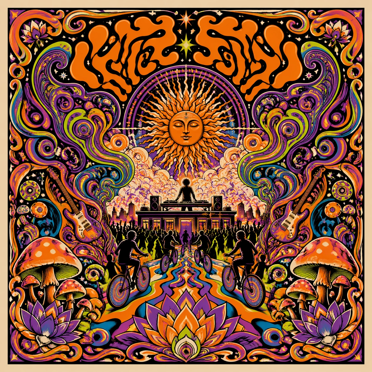
Example generated from “Psychedelic Electronic-Set Poster Study — ChaosRealmsAI · MIT”
GPT Image 2en

Scene: A square straight-on studio view of a pristine poster mounted on a matte wall with even museum lighting, crisp corners, and enough breathing room around the sheet for the full composition to read as an intentional object. The poster should express late-1960s psychedelic poster language with liquid swirls, floral mandala density, vibrating contours, and molten ornamental framing, using acid orange, violet, lime, cyan, cream, and deep black and a tactile surface appropriate to the medium. Subject: Build the flagship poster statement for this style, with the strongest hierarchy, the clearest subject silhouette, and the most disciplined balance between image field, pseudo-typography, and empty space. Use sun faces, paisley smoke, guitars, mushrooms, stars, lotus petals, and concentric wave rings as the main visual ingredients, and organize them with ornamental pseudo-lettering that feels lavish and tangled while remaining unreadable. For the contemporary-subject axis, thread in a rooftop electronic set, bike lights, and crowd motion translated into a hallucinatory hand-drawn poster field. The poster must feel like an original design object rather than a reproduction of any known work. Important details: Treat this as the cleanest thesis image in the set: the paper should look fresh, the inks or paint should feel deliberate, and every formal rule of the style should be easy to study at a glance. Preserve dense symmetry, nested curves, optical vibration, and saturated color friction across the whole sheet. Keep every letterform abstract and non-readable, as if it were a typographic texture rather than language. Make the style unmistakable through composition, palette, surface behavior, and symbolic compression. no plain corporate layout, no dead empty zones, no restrained minimalist spacing, no clean sans-serif blocks. Use case: Psychedelic 60s single study 1/9, establishing the cleanest museum-grade poster reading. Constraints: No readable text, no watermark, no logos, preserve exact 1:1 aspect ratio, no copyrighted characters, no real brand marks, no QR codes, no interface chrome, no accidental gibberish lettering.

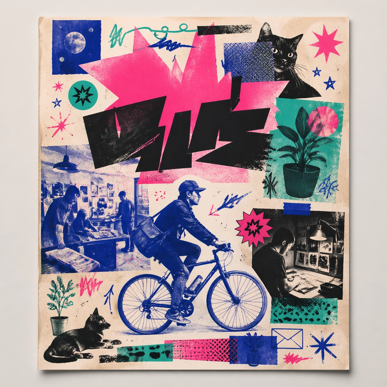
Example generated from “Risograph Bicycle-and-Zine Poster Study — ChaosRealmsAI · MIT”
GPT Image 2en

Scene: A square straight-on studio view of a pristine poster mounted on a matte wall with even museum lighting, crisp corners, and enough breathing room around the sheet for the full composition to read as an intentional object. The poster should express DIY risograph poster language with fluorescent layers, halftone dots, soy-ink soak, copier artifacts, and handmade zine rhythm, using fluorescent pink, teal, ultramarine, black, and fibrous cream paper and a tactile surface appropriate to the medium. Subject: Build the flagship poster statement for this style, with the strongest hierarchy, the clearest subject silhouette, and the most disciplined balance between image field, pseudo-typography, and empty space. Use club-flyer stars, bicycles, cats, plants, arrows, sticker bursts, notebook doodles, and photocopy shadows as the main visual ingredients, and organize them with xerox-like title blocks, stickers, and captions treated as energetic but non-readable print texture. For the contemporary-subject axis, thread in community workshops, late-night print studios, and messenger bikes folded into a zine-launch poster system. The poster must feel like an original design object rather than a reproduction of any known work. Important details: Treat this as the cleanest thesis image in the set: the paper should look fresh, the inks or paint should feel deliberate, and every formal rule of the style should be easy to study at a glance. Preserve plate drift, dot grain, bleed-through, paper curl, and independent-publisher roughness. Keep every letterform abstract and non-readable, as if it were a typographic texture rather than language. Make the style unmistakable through composition, palette, surface behavior, and symbolic compression. no full-CMYK smoothness, no perfect vector edges, no glossy magazine finish, no sterile product polish. Use case: Risograph Zine single study 1/9, establishing the cleanest museum-grade poster reading. Constraints: No readable text, no watermark, no logos, preserve exact 1:1 aspect ratio, no copyrighted characters, no real brand marks, no QR codes, no interface chrome, no accidental gibberish lettering.

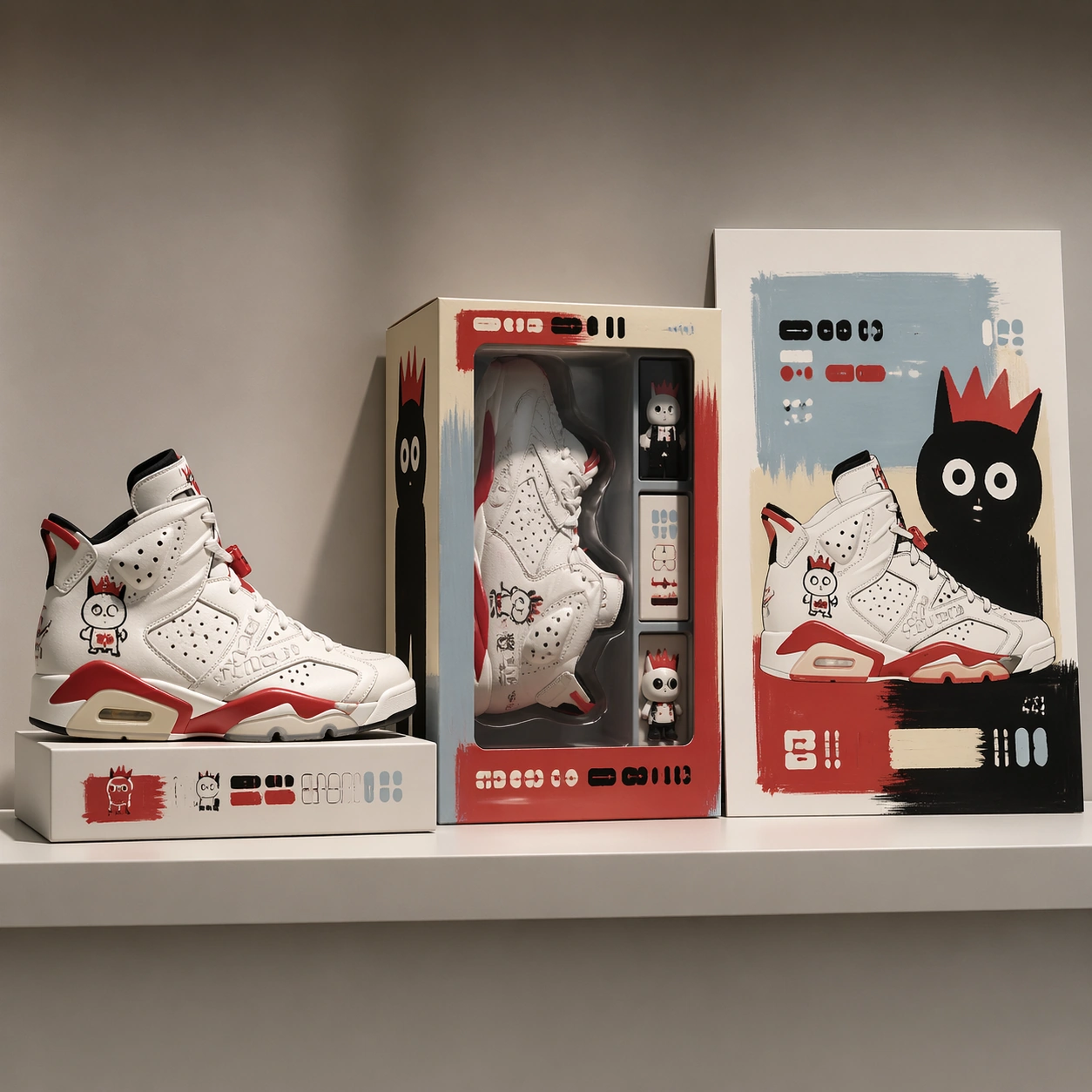
Example generated from “Athletic Footwear and Toy Packaging Triptych — ChaosRealmsAI · MIT”
GPT Image 2en

Scene: A square commercial pitch-board mockup photographed in a bright studio, arranged as a clean three-part retail presentation. The camera looks straight at a shallow display shelf with softbox reflections, neutral warm gray background, and crisp shadows. The composition uses a left product hero, a center packaging window box, and a right campaign poster panel, all aligned to a precise grid with generous margins and premium proposal lighting. Subject: A fictional athletic footwear capsule paired with a neo-pop toy painter language. The shoe has sculpted white leather panels, cherry-red rubber accents, hand-drawn childlike character marks, and small embossed abstract glyph blocks. The packaging is a clear-window collector box with painted mascot silhouettes and layered insert cards. The poster repeats the product shape as oversized flat color cutouts with playful eyes, uneven brush borders, and carefully placed non-readable label bars. Important details: Keep the product, box, and poster visibly from the same campaign through matching red, ivory, black, and pale blue. The mockup must feel expensive enough for a design proposal, not a random collage. Preserve believable materials: leather grain, translucent plastic window, folded carton edges, printed ink texture, and tabletop contact shadows. All typography areas should be structured as clean placeholder glyphs rather than legible brand names. Use case: Brand Artist Collab Mockup single study 1/8, focused on a proposal-ready product, packaging, and poster triptych. Constraints: No readable text, no watermark, no logos, preserve exact 1:1 aspect ratio, no real brand names, no real artist signatures, no distorted shoe anatomy, no cluttered retail background, no extra panels outside the three-part mockup.

Example generated from “Game Starter Pack Store Capsule — ChaosRealmsAI · MIT”
GPT Image 2en

Scene: A square production-ready image designed for a game-art review wall and a commercial gallery at the same time. Frame a starter pack capsule built around welcoming value and clean product grouping with disciplined lighting, clean edge separation, and enough surrounding context to prove how the asset would behave in a real product surface. The camera, crop, and tonal balance should feel intentional rather than generic, with high readability at first glance and convincing material response under closer inspection. Subject: Center the study on a starter pack capsule built around welcoming value and clean product grouping. Translate the topic into a concrete, shippable visual statement instead of a loose mood board. Build layered object relationships, believable surface finish, and strong silhouette grouping so the image reads immediately as part of Bundle Shop Capsule System. The subject should feel made for a live game pipeline: useful in store, UI, campaign, or art-review contexts, with visual hierarchy strong enough to survive aggressive cropping. Important details: the offer should feel approachable and trustworthy while visually rich enough for a store feature. Keep every supporting element subordinate to the main read, and make category separation obvious through form, color zoning, depth, and material logic rather than words. Where panels, cards, badges, or interface blocks appear, they must look professionally structured but remain unreadable. The visual language should feel premium, original, and coherent across this package, with no filler clutter and no accidental resemblance to a specific shipped game IP. Use case: Bundle Shop Capsule System single study 1/9, focused on starter pack capsule. Constraints: No readable text, no watermark, no logos, preserve exact 1:1 aspect ratio, no readable price text, no coupons, no broken hierarchy, no generic stock-photo staging, no accidental UI gibberish.

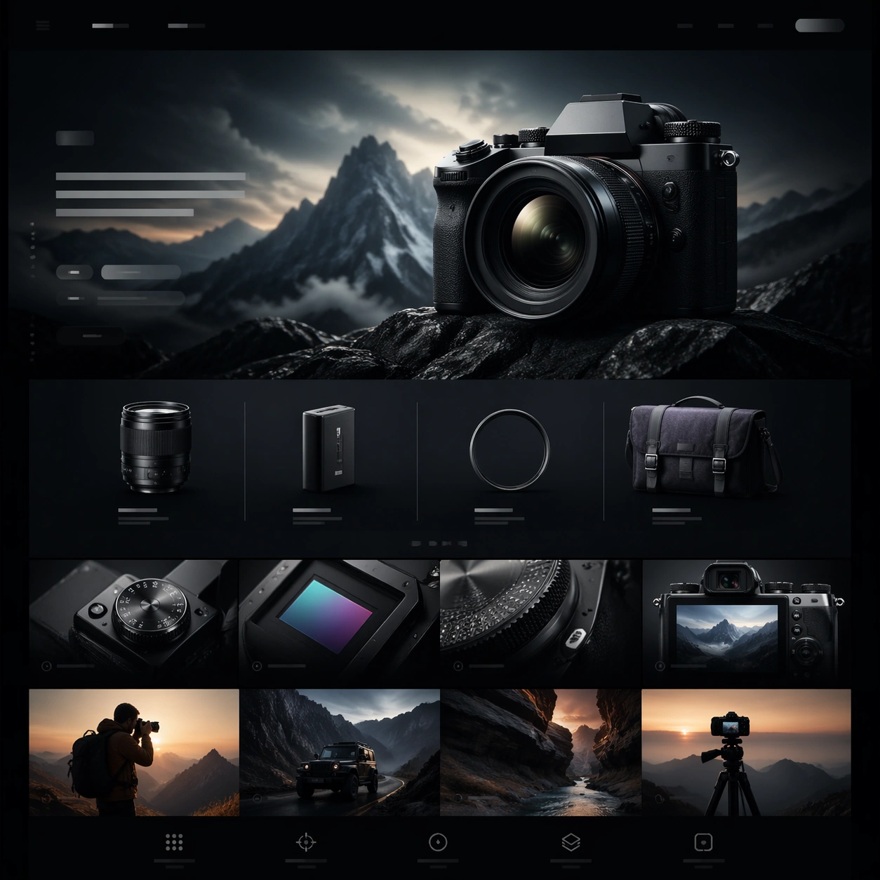
Example generated from “Camera Launch Website Concept — ChaosRealmsAI · MIT”
GPT Image 2en

Scene: A square-framed premium website still designed for Cinematic Hardware Microsite. The image should feel like a cinematic hardware microsite captured at its most polished moment: controlled contrast, glossy but believable materials, deep atmosphere, and a disciplined web-art-direction rhythm. Use the square crop to show a complete webpage moment inside the frame, with clear zones for hero media, quiet non-legible interface rails, and elegant spacing rather than a flat generic UI. Subject: Present the hardware and its key accessories as a calm comparison board with premium spacing, soft shadows, and modular web framing. Draw on this topic direction: Create cinematic microsite visuals for hardware launches, balancing immersive hero storytelling with readable spec sections and conversion modules. Use the theme focus "电影感网页首屏 + 规格模块 + 场景演绎" and the inspiration "掌机、机械键盘、专业相机或桌面音箱新品的长页面网站首屏与内容区组合提案。" as raw material, but render a fictional premium hardware launch rather than referencing any specific brand. Let the main object feel like a plausible camera, handheld console, keyboard, speaker, or audio device, depending on what best serves the composition. Keep the composition independent, but make the hardware feel launch-ready, tactile, and compatible with a cinematic product website. Important details: Honor the topic's core requirement: 比普通 landing page 更强调情绪化场景和硬件美学,但仍要有可读的网页结构。 Preserve premium product-photography realism, clean industrial design cues, layered web hierarchy, and the sense that the page could be sliced into multiple scroll sections. Reflect the frontier claim that ordinary models lose section rhythm and system cohesion in these complex commercial layouts; this image should instead keep the product silhouette, material finish, lighting logic, and module cadence unusually coherent. Success should feel aligned with these goals: 既有高级情绪图,也有真实网页 section 感; 产品外观、材质、配件和使用场景可信; 页面像可以切成多段长图或网页模块; 适合做科技品牌提案或 demo showcase. Use case: Cinematic Hardware Microsite single study 1/5. Constraints: No readable text, no watermark, no logos, preserve exact 1:1 aspect ratio, no browser chrome, no random lorem ipsum, no cheap ecommerce clutter, no floating disconnected UI cards, no distorted product geometry, no extra hands unless the concept requires them.

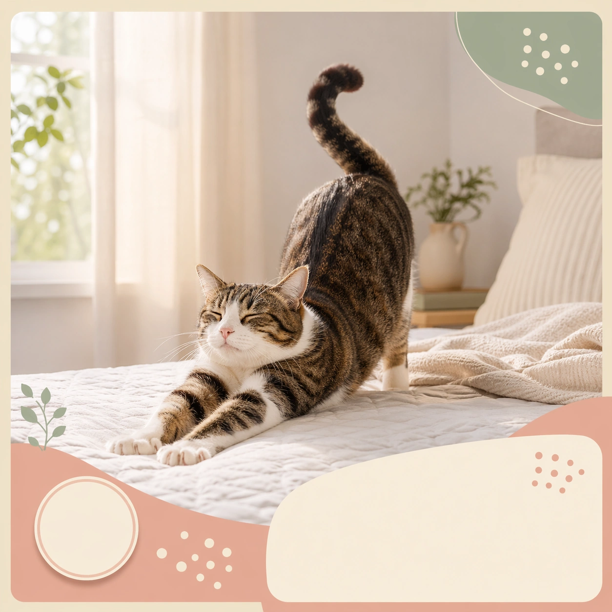
Example generated from “Morning Stretch Pet Carousel Cover — ChaosRealmsAI · MIT”
GPT Image 2en

Scene: A square social carousel card for a pet focused lifestyle account, combining believable photography with polished graphic framing, soft color blocks, and elegant placeholder caption zones. The image should feel feed native and instantly shareable, but still clean enough for a brand team to reuse in campaign planning. Keep the composition legible at thumbnail size and strong enough to function as one panel in a larger carousel sequence. Use a pale bedroom corner with soft sunrise light, a tidy quilt, and rounded graphic blocks framing the lower third like a planned carousel cover. Subject: Anchor the card around one clear pet behavior or daily ritual. The animal should stay realistic and expressive, with posture, paws, ears, and eye direction doing most of the emotional work. The framing can include props, bedding, or environment cues, but only when they support the story and help the card read quickly in a busy feed. Show a cat extending forward in a full body stretch with lifted tail, calm eyes, and relaxed paws, capturing the recognizable first moment of a home routine. Important details: Treat layout as part of the concept: use layered paper blocks, soft borders, icon like dots, or sticker style cutout shadows without introducing readable copy. The mood should remain warm, useful, and commercially organized rather than chaotic influencer clutter. Each card must feel distinct, yet part of the same family of pet content systems for social scheduling, seasonal batches, and brand feeds. Make the card feel optimistic and morning fresh rather than sleepy or messy, with enough blank structure for future repost or campaign adaptation. Use case: Cute Pet Social Carousel Family single study 1/9, morning stretch carousel cover for a commercially reusable prompt atlas example. Constraints: No readable text, no watermark, no logos, preserve exact 1:1 aspect ratio, no readable captions, no meme screenshot aesthetic, no chaotic collage overload, no warped anatomy, no generic stock photo stiffness, no intrusive human faces, no messy laundry, no smartphone in frame, no harsh orange sunrise flare.

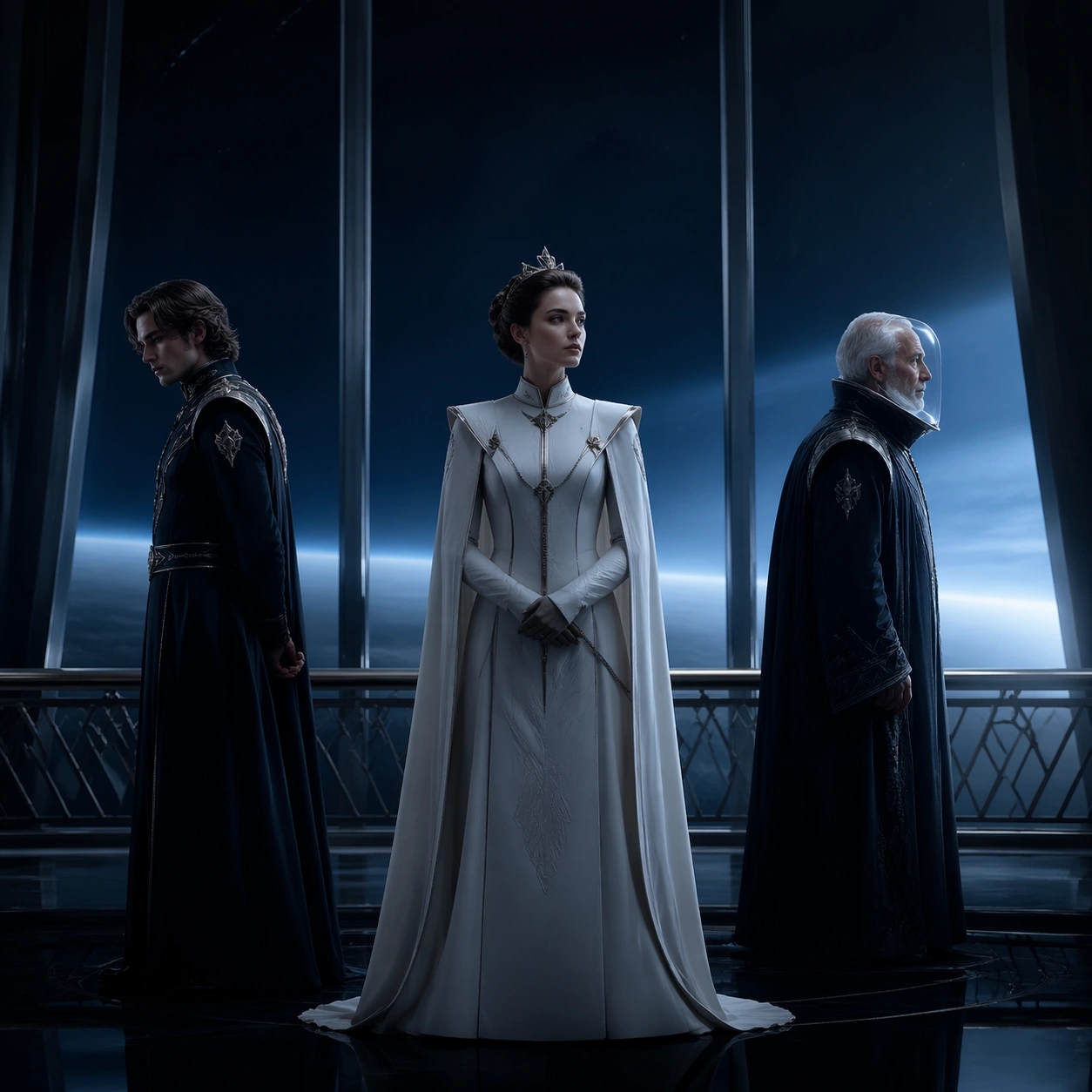
Example generated from “Orbital Royal Family Festival Poster — ChaosRealmsAI · MIT”
GPT Image 2en

Scene: A square competition-poster composition set in the observation deck of a silent orbital palace, with midnight blue glass, distant planet glow, polished metal handrails, and restrained silver highlights. The mood is solemn and expensive rather than sci-fi loud, with generous negative space and a premium one-sheet balance that suggests official festival packaging. The frame should feel ready for invisible title and laurel placement without containing any readable text. Subject: Create a serious fandom-crossover poster centered on an original trio: a young empress in severe white tailoring, her disinherited brother in a dark ceremonial uniform, and an elderly navigator in a translucent visor. They should stand far enough apart to imply political fracture, but close enough to read as one family tragedy. The setting hints at a space-opera dynasty, yet the treatment must remain intimate and human, more arthouse succession drama than battle spectacle. Use window reflections, subtle costume insignia shapes, and careful eye lines to communicate hierarchy. Important details: The challenge is translating franchise-scale lore into an austere award-festival visual language. Keep the poster sparse, polished, and emotionally legible. Use precise facial lighting, controlled metallic textures, and soft cosmic color gradients without turning the image into concept-art overload. The characters should feel instantly iconic, but the packaging must read as a genuine competition-film key art image. Use case: Festival Poster Fandom Crossover single study 5/9, testing whether a space-opera royal family can be compressed into restrained competition-poster packaging. Constraints: No readable text, no watermark, no logos, preserve exact 1:1 aspect ratio, no spaceship battle, no laser effects, no crowded starfield wallpaper, no floating heads collage, no campy science-fiction camp, no superhero posing, no glossy franchise merchandise feel.

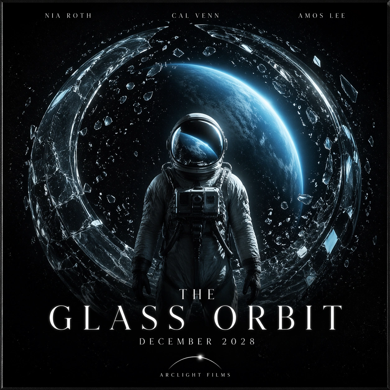
Example generated from “The Glass Orbit Fictional Film Poster — ChaosRealmsAI · MIT”
GPT Image 2en

Scene: A square premium science-fiction movie poster printed on satin paper, shown straight-on with faint edge shadow and realistic poster grain. Use black space, pale cyan planet light, white typography, and a single dramatic central object. The composition should look like a finished theatrical one-sheet for a serious fictional film. Subject: Create a poster for a fictional space drama titled THE GLASS ORBIT. Show an astronaut standing inside a transparent broken orbital ring, with a blue planet reflected in the helmet and tiny shards of glass forming a circular halo. The exact readable poster copy must be: THE GLASS ORBIT, NIA ROTH, CAL VENN, AMOS LEE, DECEMBER 2028, ARCLIGHT FILMS. The title should be large and elegant near the lower third, cast names at the top, release date under the title, and a small fictional studio mark at bottom. Important details: This is a fake IP poster, not a real franchise. The image must balance photorealistic space suit materials with clean poster typography. Keep the title readable, spacing professional, and text aligned to a clear grid. Use no long billing block. The fictional studio mark can be a simple abstract arc symbol beside ARCLIGHT FILMS. Use case: Fictional IP Poster single study 5/8, testing readable release typography on a photorealistic space drama poster. Constraints: No readable text except the specified fictional poster copy, no watermark, no real logos, preserve exact 1:1 aspect ratio, no existing franchise references, no extra cast names, no misspelled title, no flag patches, no clutter over text.

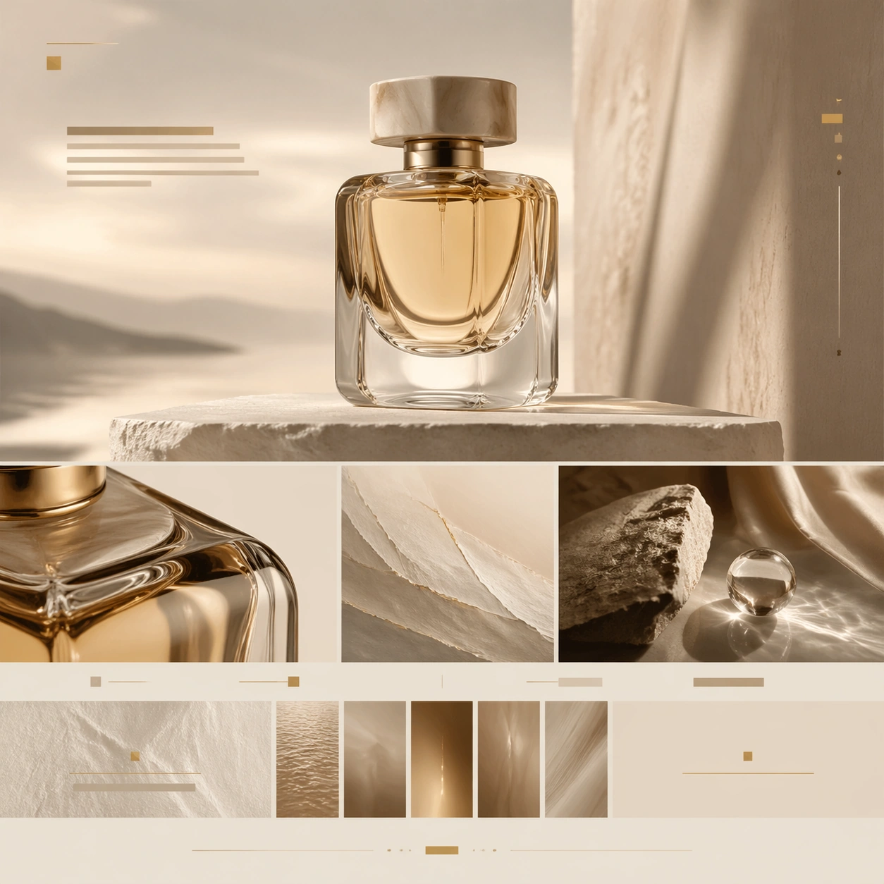
Example generated from “Sculpted Fragrance Brand Website Concept — ChaosRealmsAI · MIT”
GPT Image 2en

Scene: A square luxury brand-story page still for a sculptural fragrance launch, presented like an elegant maison website chapter. The page is front-on, spacious, and editorial, using ivory, pale stone, smoky amber, and faint gold-beige tones. The top half should feel like an atmospheric hero spread while the lower half transitions into refined storytelling modules, material close-ups, and subtle chapter dividers. Lighting is soft, luminous, and perfume-advertisement polished. Subject: Center a sculpted glass fragrance bottle with thick translucent walls, a heavy cap, and liquid tinted like pale amber. Around it, construct a believable brand-story page using abstract headline bars, chapter blocks, ingredient-inspired visual panels, and refined content bands that suggest origin, craft, and collection identity without readable copy. Include one macro crop of the bottle shoulder and glass thickness, and one supporting still-life panel with stone, fabric, and reflected light that implies olfactory mood rather than literal ingredients. Important details: The composition must feel like a luxury maison narrative, not an ecommerce product card. Emphasize tactile materials, quiet prestige, and a flow from hero object to craft story to collection context to understated CTA. Glass weight, reflections, cap fit, and liquid level should feel credible. Keep the page restrained, elegant, and expensive, with generous margins and careful chapter rhythm. Use case: Luxury Brand Story Page single study 1/9, testing fragrance storytelling, tactile material close-up, and maison-style chapter pacing. Constraints: No readable text, no watermark, no logos, preserve exact 1:1 aspect ratio, no browser chrome, no loud beauty-ad copy, no flowers exploding around the bottle, no cheap sparkles, no retail shelf scene, no distorted bottle symmetry.

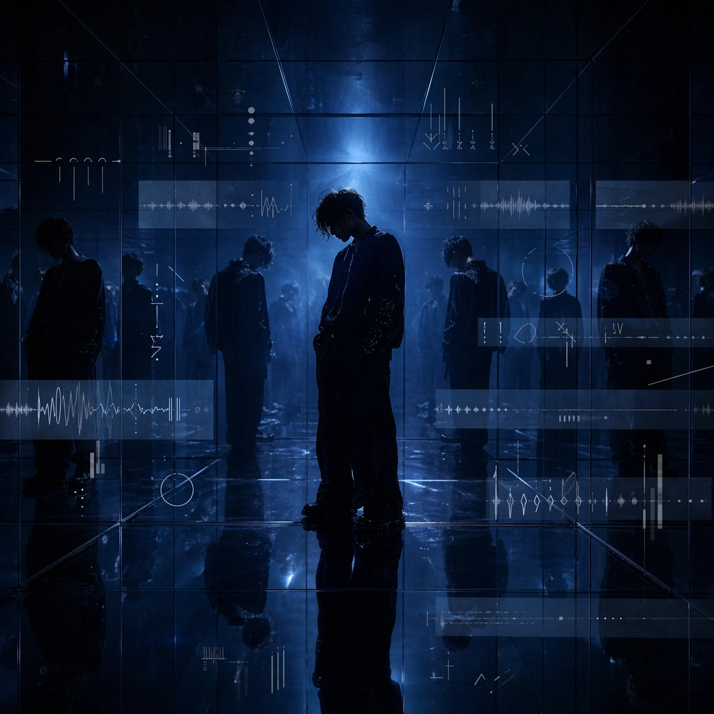
Example generated from “Mirror Room Music Visualizer Still — ChaosRealmsAI · MIT”
GPT Image 2en

Scene: A square mirror-lined room with moody blue light, shallow haze, and a performer seen both directly and in fragmented reflections. The image should feel like a loop still from a lyric visualizer, where the room itself produces rhythm and repetition before any readable language appears. Subject: A lone performer figure occupies the center while reflected copies stretch into the mirrors. Around the figure sit floating bars of invented glyph marks, faint waveform traces, and translucent rectangular panels that imply lyric pacing without displaying actual words. Important details: The mirrors should amplify repetition, timing, and emotional echo. Keep the pseudo-typography abstract and elegant, let the reflections reinforce the beat, and make the composition feel intentionally designed for music promo use. The frame should carry both atmosphere and layout discipline, not just glossy mood. Use case: Lyric Frames single study 5/9 for the Lyric Visualizer Frame Family Prompt Atlas theme. Constraints: No readable text, no watermark, no logos, preserve exact 1:1 aspect ratio, no readable text, no visible software frame, no crowd, no lens-flare overload, no neon club logos

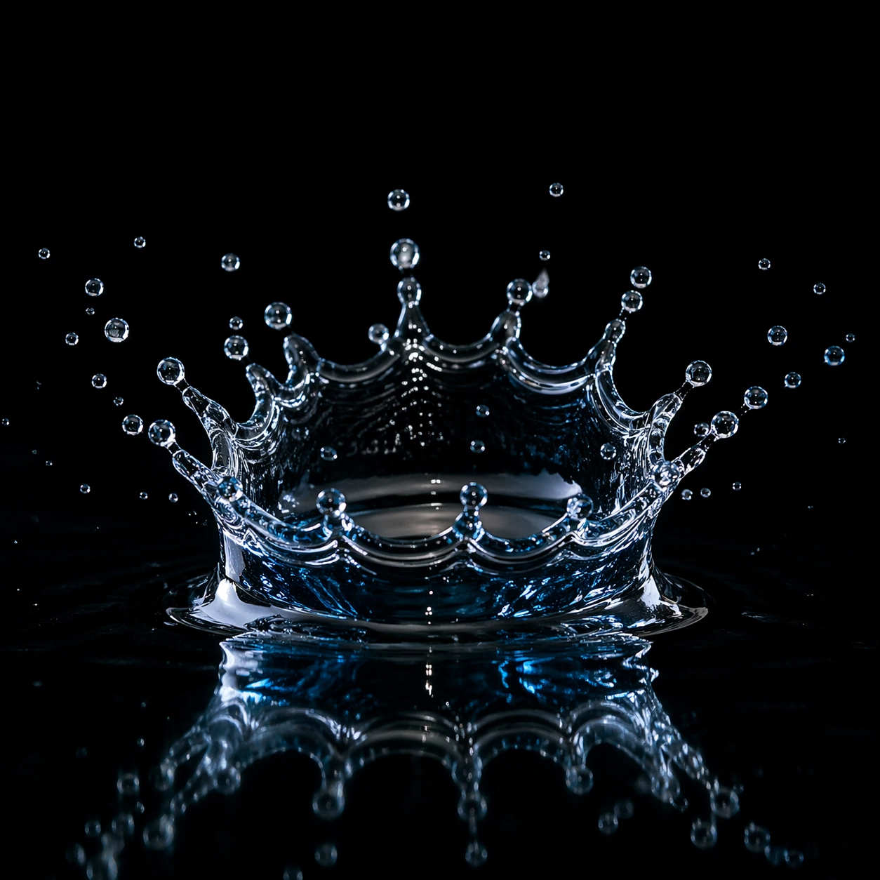
Example generated from “Water Crown Splash Study — ChaosRealmsAI · MIT”
GPT Image 2en

Scene: A controlled black studio macro setup, pure black background, glossy black reflective tray, invisible electronic flash, cool blue rim light from back right and clean white key flash from front left. Subject: a single water droplet impact frozen as a crown splash on a glossy black tray, centered in a square frame at the exact peak moment of impact. The main event fills about 62% of the image width with particles suspended around it. Important details: Photorealistic high-speed photography, millionth-of-a-second freeze, macro lens, razor-sharp water surface tension, cool blue rim highlights, suspended micro droplets, realistic physics, deep black negative space, crop-safe composition. Use case: Independent image in a Prompt Atlas high-speed theme. Square 1:1 gallery card and detail modal asset. Constraints: No text, no watermark, no logo, no human hands, no visible weapon or launcher, no blood, no animals, no cartoon style, no CGI look, preserve exact 1:1 aspect ratio.

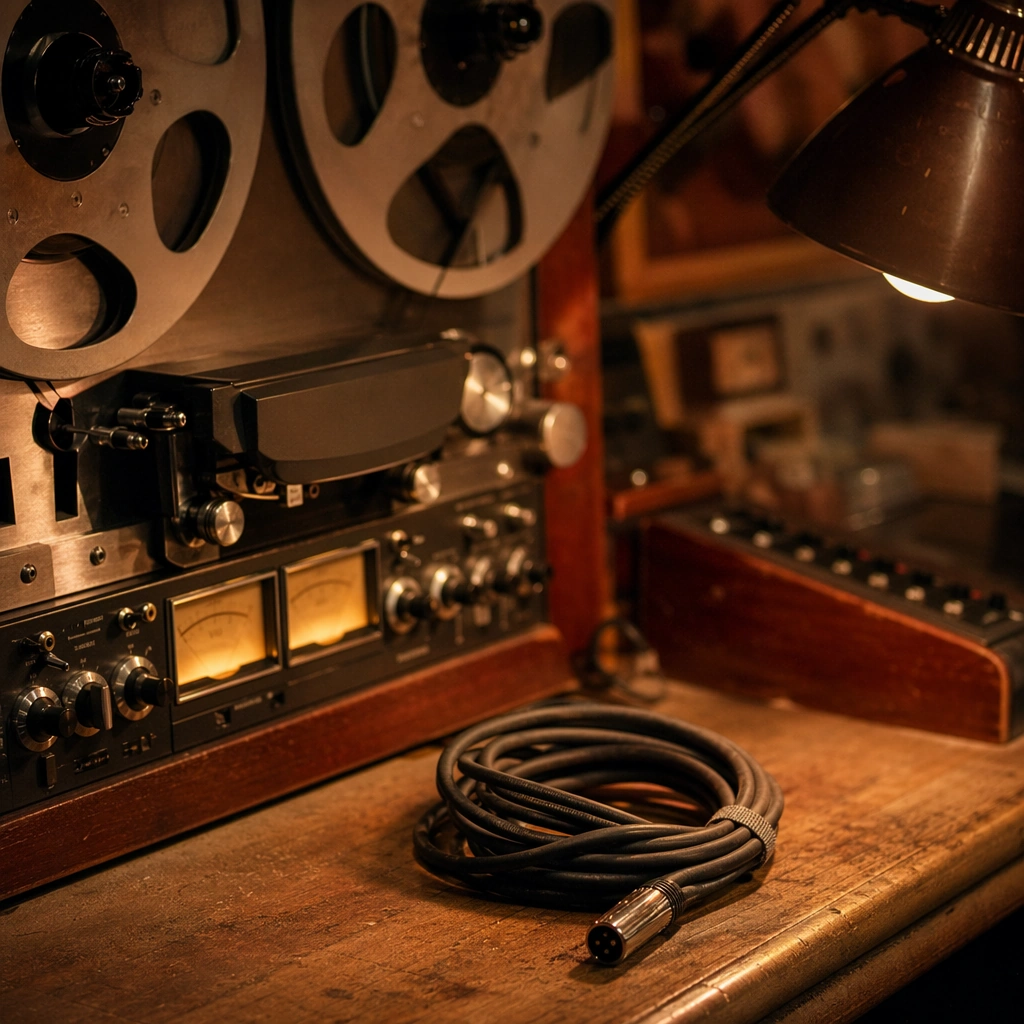
Example generated from “Analog Tape Machine Session Still Life — ChaosRealmsAI · MIT”
GPT Image 2en

Scene: A square close still life inside a recording room with a tape machine, softly glowing meters, brushed metal knobs, and warm wood surfaces catching lamplight. The frame should feel tactile, intimate, and emotionally musical rather than purely technical. Subject: The subject is the recording object world itself: analog meters, reels, worn wood desk edges, a coiled cable, and a few softly out-of-focus studio surfaces. The composition should imply live-session authenticity and process without requiring a visible performer. Important details: Material realism matters. The machine should look used and loved, the light should be warm but controlled, and the surrounding surfaces should support a believable recording-room atmosphere. This should feel like adjacent campaign imagery for a stripped-back music session. Use case: Live Session single study 5/9 for the Live Session Poster and Recording Room Aesthetic Prompt Atlas theme. Constraints: No readable text, no watermark, no logos, preserve exact 1:1 aspect ratio, no readable labels, no bright computer screens, no desk clutter, no brand badges, no sterile lab look

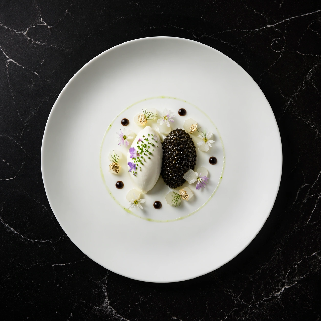
Example generated from “Caviar and Gold Fine-Dining Overhead — ChaosRealmsAI · MIT”
GPT Image 2en

Scene: A square fine-dining hero shot photographed from directly overhead on a deep black marble table with soft veining. A single matte white porcelain plate sits slightly off center with generous negative space around it, lit by a precise top light with a faint 45 degree fill from the upper left. The atmosphere is quiet, premium, and editorial, like a Michelin restaurant campaign image made for a luxury magazine spread. Subject: At the center of the plate, build a small architectural tasting course around a quenelle of chilled creme fraiche, a restrained mound of glossy black caviar, tiny cubes of translucent kohlrabi, a few gold-leaf accents, and delicate edible flower petals in pale violet and white. Add a thin ring of clear herb oil and several micro dots of dark reduction so the dish reads as intentional constellation-like plating rather than random garnish. The portion should feel expensive and precise, not abundant. Important details: Preserve true culinary realism: caviar beads must look separate and hydrated, creme fraiche should hold a soft spooned texture, porcelain should remain clean, and sauce dots must have crisp edges. Keep the garnish logic sparse and balanced, with every component readable at a glance. The visual language is minimalist French fine dining with immaculate spacing, premium ingredient knowledge, and commercial food-photography polish. Use case: Michelin Plate Hero Shot single study 1/8, focused on a luxury caviar plate with disciplined top-down composition. Constraints: No readable text, no watermark, no logos, preserve exact 1:1 aspect ratio, no cutlery, no hands, no table clutter, no oversized portions, no messy sauce smears, no impossible garnish placements, no extra plates.

Example generated from “Old and New Helmet Upgrade Comparison — ChaosRealmsAI · MIT”
GPT Image 2en

Scene: A square production-ready image designed for a game-art review wall and a commercial gallery at the same time. Frame a side-by-side old versus new gear comparison board with clear hierarchy and item desirability with disciplined lighting, clean edge separation, and enough surrounding context to prove how the asset would behave in a real product surface. The camera, crop, and tonal balance should feel intentional rather than generic, with high readability at first glance and convincing material response under closer inspection. Subject: Center the study on a side-by-side old versus new gear comparison board with clear hierarchy and item desirability. Translate the topic into a concrete, shippable visual statement instead of a loose mood board. Build layered object relationships, believable surface finish, and strong silhouette grouping so the image reads immediately as part of Inventory Tooltip Comparison Board. The subject should feel made for a live game pipeline: useful in store, UI, campaign, or art-review contexts, with visual hierarchy strong enough to survive aggressive cropping. Important details: the player’s upgrade decision should be obvious through shape, rarity framing, and stat-bar rhythm without legible text. Keep every supporting element subordinate to the main read, and make category separation obvious through form, color zoning, depth, and material logic rather than words. Where panels, cards, badges, or interface blocks appear, they must look professionally structured but remain unreadable. The visual language should feel premium, original, and coherent across this package, with no filler clutter and no accidental resemblance to a specific shipped game IP. Use case: Inventory Tooltip Comparison Board single study 1/9, focused on old vs new gear. Constraints: No readable text, no watermark, no logos, preserve exact 1:1 aspect ratio, no readable stats, no numbers, no broken hierarchy, no generic stock-photo staging, no accidental UI gibberish.

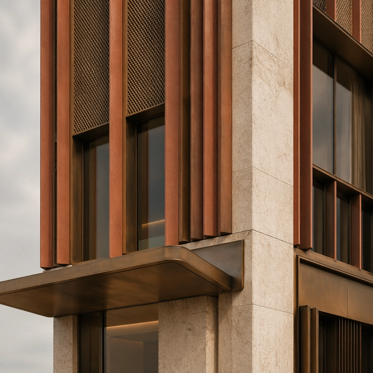
Example generated from “Terracotta and Bronze Facade Material Panel — ChaosRealmsAI · MIT”
GPT Image 2en

Scene: Create a square standalone support study for Architectural Facade Identity System. Use a close architectural mockup panel showing terracotta fins, bronze mesh, stone edge, and glazing sample and frame it like a premium commercial still or design-editorial crop with clear focal hierarchy, disciplined perspective, and enough breathing room for the materials and objects to read at both thumbnail and full size. Keep earthy terracotta, bronze brown, pale stone, smoked glass, and soft sky gray as the tonal guide so the image still belongs to the same theme family, and light the scene in a controlled way that emphasizes texture, edge quality, and authored atmosphere over spectacle. Subject: Show an architectural facade system with terracotta fins, bronze mesh, deep window reveals, sculpted canopies, and a civic-commercial identity that feels recognizable from multiple distances. In this support study, focus on construction realism, joint discipline, and tactile weathering. The image should work independently, yet it must still feel like it belongs to the same broader world of Facade Identity. Make the space, props, and detailing useful for real campaign, editorial, or design-review contexts rather than moodboard abstraction. Important details: Carry forward the broader language of the fin spacing, bronze mesh logic, canopy silhouette, reveal depth, and urban recognizability of the building, but let this image prove a new support surface or secondary deliverable. Material realism is essential: wood grain, metal sheen, glass edges, textiles, and stone should feel physically plausible and carefully art directed. Any graphic panels, labels, menus, packaging, or captions must stay abstract and unreadable. The overall result should feel reusable for architecture competitions, developer decks, city-brand editorials, and facade-design presentations, with enough structure that a creative or operations team could build on it. Use case: Architectural Facade Identity System single study 5/9, exploring support image for facade material reviews. Constraints: No readable text, no watermark, no logos, preserve exact 1:1 aspect ratio, no giant logos, no construction cranes, no crowds, no random neighboring ads, no impossible geometry, no specification text.

Example generated from “Coach Portrait and Profile Board — ChaosRealmsAI · MIT”
GPT Image 2en

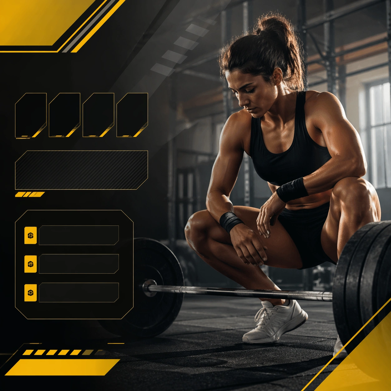
Scene: Create a square coach profile board for Athlete Cards, using portrait-led sports communication with stat-panel discipline, premium lighting, and card-like hierarchy. The composition should read as a practical, production-ready sports or fitness surface with a clear hierarchy, premium lighting, and obvious commercial intent. Keep the environment specific enough to feel real, but leave enough control in the layout for non-readable information modules, campaign blocks, or visualized metrics. Aim for a finish that works for a brand, club, app, academy, or event operator. Subject: Build the image around folded-arms coach portrait. The subject should be original, believable, and free of any real-brand or celebrity cues. Use realistic apparel, safe body mechanics when movement is visible, and environmental props that support the category without clutter. The subject must stay visually dominant so the design still works as a communication asset rather than a pure scene study. Important details: The mood should read as sideline authority. Treat layout, light, and supporting graphic structure as part of one polished delivery surface. Any schedule blocks, metric panels, quote zones, badges, or path diagrams must stay abstract and non-readable. Prioritize usefulness, clarity, and category truth over spectacle. The image should feel distinct from the series package while still belonging naturally to the same topic and business use case. Use case: Athlete Cards single study 5/9, an independent rollout surface for the topic. Constraints: No readable text, no watermark, no logos, preserve exact 1:1 aspect ratio, no brand marks, no public-figure resemblance, no generic stock layout, no cluttered UI imitation, no accidental copyrighted insignia.

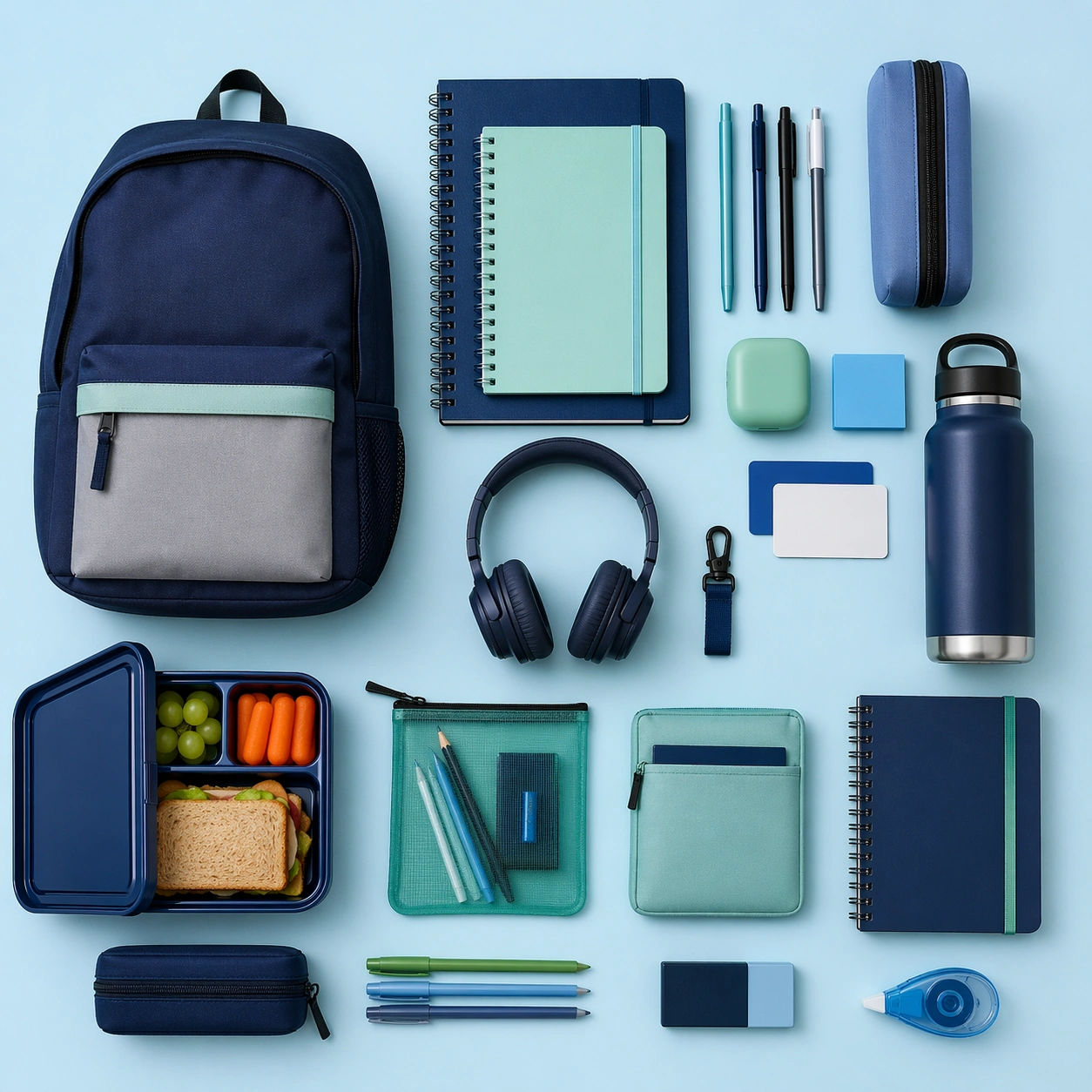
Example generated from “Back-to-School Organizer Flatlay — ChaosRealmsAI · MIT”
GPT Image 2en

Scene: Create a square overhead school-organization flatlay with bright even light, clean background color, and crisp object spacing. The frame should feel like a premium organizational campaign image rather than a cluttered backpack dump. Use the logic of a locker or compact student storage zone translated into an editorial board, with a strong sense of readiness and control. Subject: Arrange notebooks, pens, bottle, lunch or storage forms, headphones, card-like objects, and small accessories into a coherent compact student setup. The subject should communicate organization, routine, and practical energy without any readable text or obvious brand dependence. Keep the item mix realistic and the layout commercially clear. Important details: Treat the image like a problem of visual hierarchy. Spacing, color coding, and object grouping should feel intentional and helpful. Materials should stay tactile and believable. The result should work for stationery, accessories, education brands, or parent-facing retail campaigns during school-reset season. Keep the frame precise enough for gallery, research, and campaign reuse, with believable materials and a strong thumbnail read. Use case: Back to School single study 5/9. Constraints: No readable text, no watermark, no logos, preserve exact 1:1 aspect ratio, no readable labels, no school logo, no messy crumpled papers, no mascot graphics, no cluttered sticker collage, no food spills, no chalk writing, no childish cartoon overload.

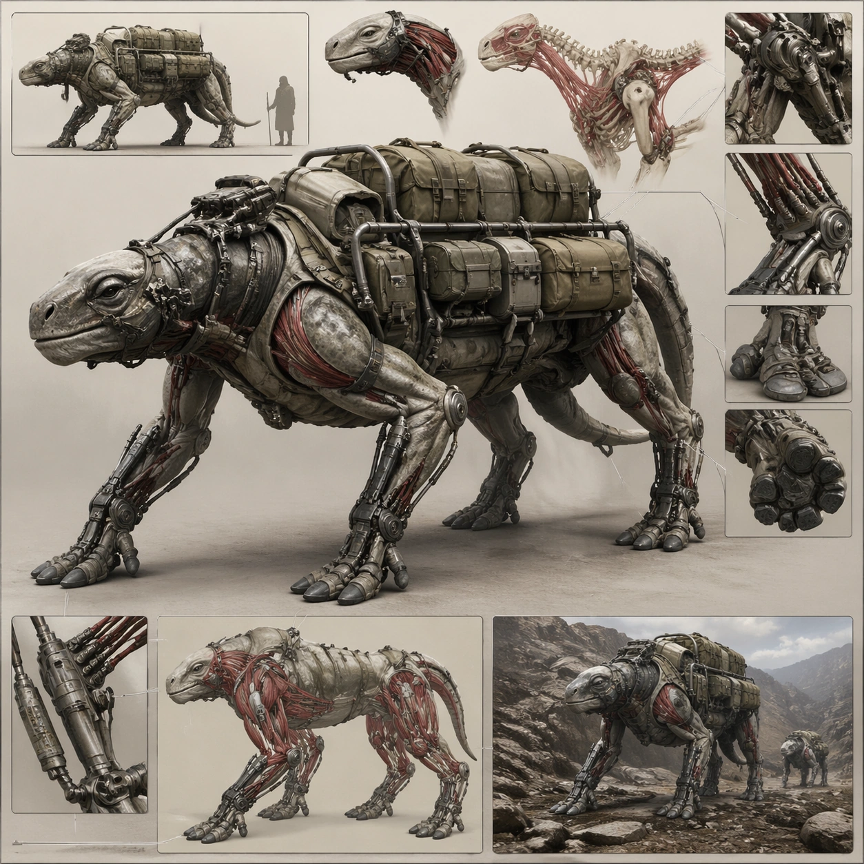
Example generated from “Biomechanical Cargo Carrier Concept Board — ChaosRealmsAI · MIT”
GPT Image 2en

Scene: Design a square biomechanical concept plate that reads clearly from a distance and rewards close inspection. Use one strong main pose or view supported by carefully placed detail windows, component callouts, or environment cues. Compose a concept plate around a quadruped cargo carrier with load racks, tendon-driven pistons, and terrain attachments. Subject: Show a complete biomechanical entity or subsystem with clear task identity: guard, carrier, swimmer, scout, ritual host, or similar. The fusion between body logic and engineering should feel intentional and load-bearing. The being should feel bred or engineered for logistics, with anatomy optimized for weight transfer, endurance, and field maintenance. Important details: Favor anatomical structure, movement plausibility, and material discipline over surface noise. The result should feel buildable within its fictional world, not like a random accumulation of tubes and spikes. Use board hierarchy to explain how organic power and mechanical support cooperate under freight load. Preserve readable biomechanics so joints, muscles, shells, and machines all seem to cooperate under one functional design logic. Use case: Biomech Board single study 1/5, designed as a self-contained support image for this topic. Constraints: No readable text, no watermark, no logos, preserve exact 1:1 aspect ratio, no horror torture imagery, no generic robot soldier clichés, no comic-book posing, no logo insignia, no fantasy war beast armor.

Example generated from “Checkout Campaign Toolkit Flatlay — ChaosRealmsAI · MIT”
GPT Image 2en

Scene: Create a square overhead commerce flatlay on a deep charcoal surface with hard directional light, sharp shadows, and intense contrast. The arrangement should feel strategic and high-pressure rather than messy. Use abstract sale chips, card-like shapes, carts, parcel tools, and product silhouettes laid out with editorial precision so the frame can work as a campaign support image for checkout pushes and cart-building reminders. Subject: Arrange a compact shopping toolkit made from generic products, cart handles, card-like forms, sticker blocks, packing tools, and parcel components. The viewer should immediately read purchase momentum, bundle logic, and checkout readiness without any readable interface text. The scene must feel digital-retail adjacent while remaining physically staged and photographically believable. Important details: Hierarchy and edge clarity matter more than spectacle. Use strong black, white, and yellow structure with maybe one metallic accent. Keep shapes crisp and conversion-minded, with every object contributing to urgency. The final image should feel like a campaign asset for cart reminders, flash-sale pushes, or deal countdown support rather than a random desk still life. Use case: Black Friday single study 5/9. Constraints: No readable text, no watermark, no logos, preserve exact 1:1 aspect ratio, no readable checkout text, no brand cards, no currency symbols, no rainbow palette, no cluttered receipts, no human hands, no broken shadows, no generic office stationery.

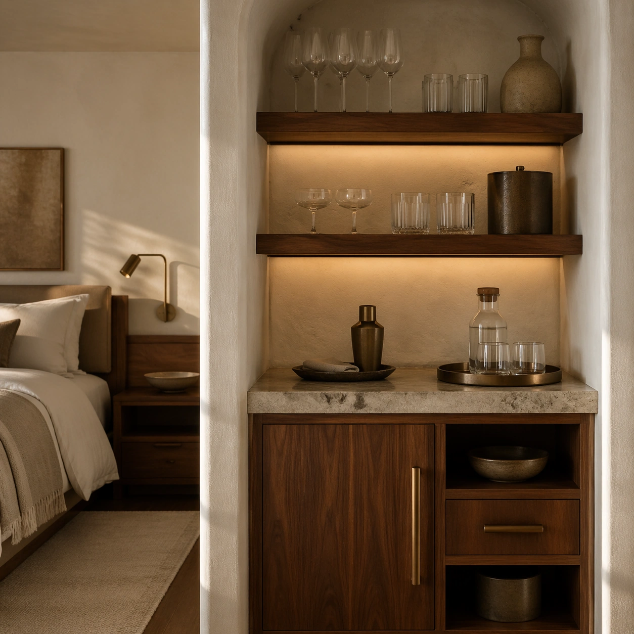
Example generated from “Walnut Boutique Hotel Minibar Alcove — ChaosRealmsAI · MIT”
GPT Image 2en

Scene: Create a square standalone support study for Boutique Guestroom Editorial Suite. Use a square still of a minibar alcove with walnut shelves and stone counter and frame it like a premium commercial still or design-editorial crop with clear focal hierarchy, disciplined perspective, and enough breathing room for the materials and objects to read at both thumbnail and full size. Keep warm plaster white, walnut brown, muted clay, brushed bronze, and soft morning gray as the tonal guide so the image still belongs to the same theme family, and light the scene in a controlled way that emphasizes texture, edge quality, and authored atmosphere over spectacle. Subject: Show a boutique hotel suite with limewashed plaster walls, walnut millwork, tailored linen bedding, bronze reading lights, textured drapery, and a quietly lived-in premium mood. In this support study, focus on glassware arrangement, niche lighting, and premium restraint. The image should work independently, yet it must still feel like it belongs to the same broader world of Guestroom Suite. Make the space, props, and detailing useful for real campaign, editorial, or design-review contexts rather than moodboard abstraction. Important details: Carry forward the broader language of the bed proportions, walnut joinery, plaster texture, bronze hardware, linen styling, and restrained resort palette, but let this image prove a new support surface or secondary deliverable. Material realism is essential: wood grain, metal sheen, glass edges, textiles, and stone should feel physically plausible and carefully art directed. Any graphic panels, labels, menus, packaging, or captions must stay abstract and unreadable. The overall result should feel reusable for hospitality websites, travel editorials, booking campaigns, and room-style handoff decks, with enough structure that a creative or operations team could build on it. Use case: Boutique Guestroom Editorial Suite single study 5/9, exploring boutique minibar styling support. Constraints: No readable text, no watermark, no logos, preserve exact 1:1 aspect ratio, no people, no messy luggage spill, no cheap decor, no hard flash, no exaggerated luxury clichés, no readable bottle labels.

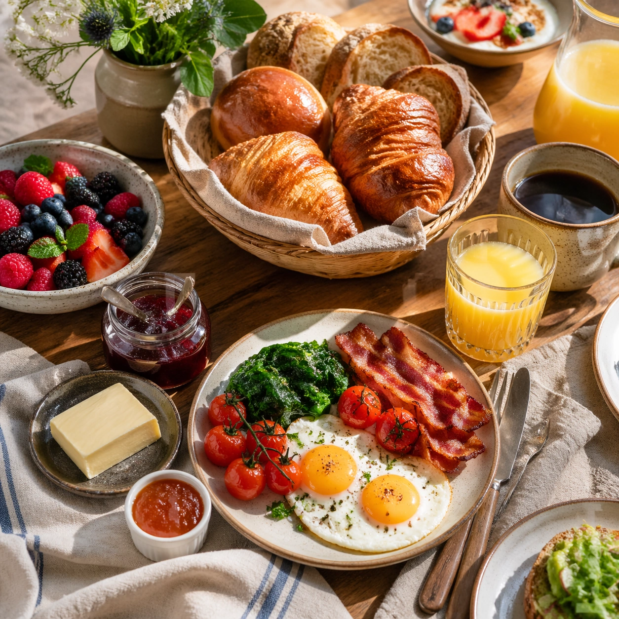
Example generated from “Daylit Pastry Basket Brunch Table — ChaosRealmsAI · MIT”
GPT Image 2en

Scene: Compose a square brunch tabletop image with layered tableware, generous daylight, and a sense of weekend abundance that still feels organized enough for real hospitality and publishing use. The scene should balance multiple objects without losing the hero focal point, making table choreography and dish relationships a core part of the image. Use a square overhead-to-three-quarter view with warm daylight, a woven basket, small ramekins, and linen folds that feel casual but polished. Subject: The food must look fresh, warm, and genuinely shareable: eggs, breads, fruit, spreads, juices, and plated brunch mains should feel cooked and plated for service, not arranged as fake prop food. Feature croissants, rolls, butter, preserves, and one or two plates nearby so the basket reads as part of a brunch service rather than an isolated still life. Important details: Table logic matters. Plates, glasses, linens, and serving utensils need believable spacing, overlap, and hierarchy so the image can support menus, social assets, and campaign layouts. Make the abundance feel intentional rather than chaotic, with appetizing textures and natural daylight carrying the mood. This image should feel fully self-contained while still belonging to the same broader topic and commercial world. Keep textures rich but disciplined: flaky pastry, soft butter, glass jar reflections, and cloth folds should feel inviting without becoming cluttered. Use case: Brunch Tabletop single study 5/9, built for Prompt Atlas coverage of a food and beverage commercial visual system. Constraints: No readable text, no watermark, no logos, preserve exact 1:1 aspect ratio, no buffet chaos, no greasy diner styling unless specifically implied, no visible phone screens, no plastic takeaway packaging, no fake stock-family posing, no unreadable signage, no supermarket pastry pile, no plastic packets, no buffet sneeze guards.

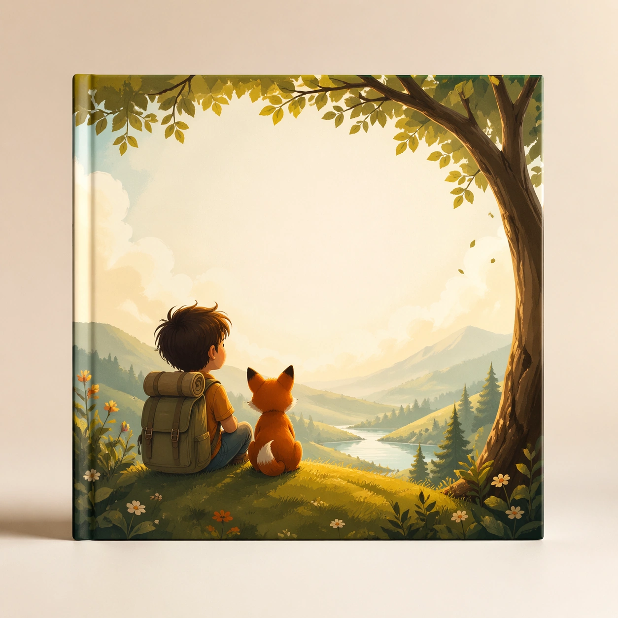
Example generated from “Child and Animal Storybook Cover Mockup — ChaosRealmsAI · MIT”
GPT Image 2en

Scene: Create a square picture-book cover mockup centered on a single upright book against a soft studio backdrop, with gentle spotlighting and printed-paper realism. The cover should feel modern, warm, and distinctly for young children, leaving obvious blank space for future title treatment. Keep the square frame balanced, calm, and production-ready so the asset can serve gallery review, research comparison, and real educational delivery at the same time. Subject: Use an inviting scene of a child and animal companion in a story-rich environment, composed boldly enough for retail shelf recognition but soft enough for bedtime reading appeal. Keep the illustration painterly, emotionally warm, and structured like a real publishing deliverable. The subject arrangement should feel complete and self-contained, able to stand alone as a real supporting deliverable inside the same education business line. Important details: The design should prioritize silhouette clarity, age-appropriate charm, and a clear focal relationship between characters and world. Avoid decorative overload so the asset reads as a commercially viable cover rather than a generic fantasy illustration. Keep the visual hierarchy modular, commercially believable, and clearly tied to a real educational use case rather than a generic mood board. Use case: Children Storybook Scene Page System single study 1/5, story cover board. Constraints: No readable text, no watermark, no logos, preserve exact 1:1 aspect ratio, no readable text, no logos, no harsh realism, no licensed character resemblance, no cluttered scrapbook styling, no horror elements.
Example generated from “Chocolate Gold-Leaf Mirror Macro — ChaosRealmsAI · MIT”
GPT Image 2en

Scene: Create a square competition-style pastry studio photograph with one sculptural chocolate showpiece on a dark pedestal against a controlled neutral or black backdrop. Softbox reflections should skim the tempered surfaces with glass-like sharpness, while shadows stay deep and elegant. The object must feel large, balanced, and professionally lit, as if documented after winning a grand pastry prize. Create a square macro studio image against a dark background with one curved chocolate surface dominating the frame and reflection bands running cleanly across it. The atmosphere should feel forensic and luxurious. Subject: Show a section of mirror-dark tempered chocolate with several restrained patches of gold leaf adhered to the surface, plus a few sharp edge transitions into matte planes. The curvature should be elegant enough that the reflections describe the temper quality clearly. The image should feel like proof of mastery in surface finishing. Important details: Tempered chocolate realism is critical: mirror reflections, crisp edges, matte-to-gloss transitions, gold leaf, sugar accents, and structural balance all need to feel plausible. The sculpture can be impossible in composition, but never sloppy in craft. Every support point and reflection line should suggest deliberate pastry engineering. Prioritize flawless reflection continuity, believable micro imperfections only at the scale of real handwork, and the ultra-thin texture of gold leaf against the lacquer. Nothing should look plastic or rendered from metal. Use case: Chocolate lacquer sculpture single study 5/9, isolating mirror temper and gold leaf as the central material event. Constraints: No readable text, no watermark, no logos, preserve exact 1:1 aspect ratio, no candy-bar packaging cues, no readable competition banners, no cartoon dessert palette, no smudged fingerprints, no cluttered workshop background, no fingerprints, no crumbs, no product-packaging context.

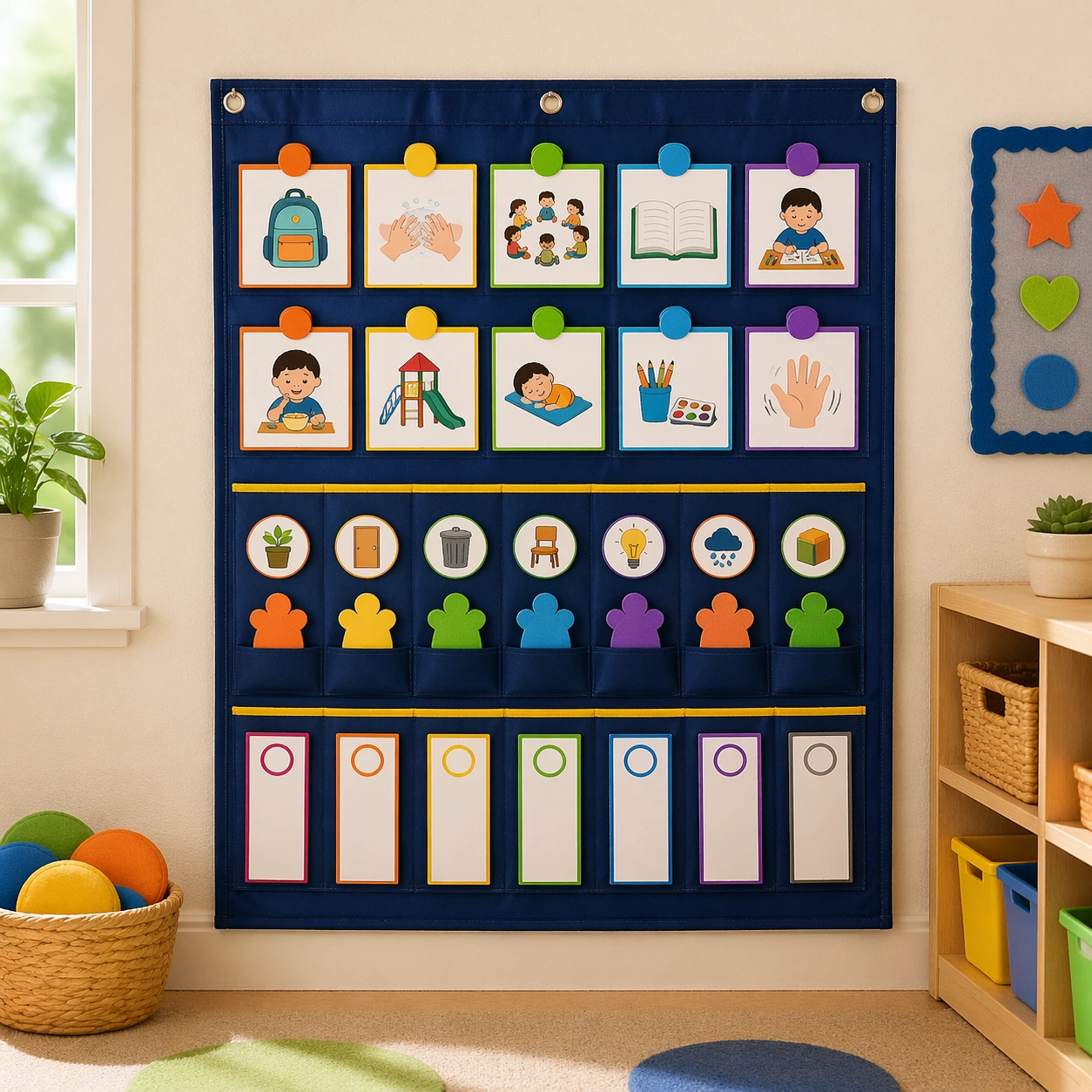
Example generated from “Picture Routine Pocket Chart Wall — ChaosRealmsAI · MIT”
GPT Image 2en

Scene: Show a square classroom wall setup with a fabric pocket chart, clipped cards, and a few nearby baskets in bright natural light. The composition should feel practical and kindergarten-realistic, yet polished enough for a school-supply catalog. Keep the square frame balanced, calm, and production-ready so the asset can serve gallery review, research comparison, and real educational delivery at the same time. Subject: Use visual routine cards, icon-only job markers, and blank status strips arranged in an intuitive hierarchy inside the pockets. The chart should look highly usable for young children who rely on pictures more than reading. The subject arrangement should feel complete and self-contained, able to stand alone as a real supporting deliverable inside the same education business line. Important details: Emphasize tactile fabrics, clean color coding, and child-height accessibility. The wall system should feel organized, calm, and easy for teachers to update throughout the day. Keep the visual hierarchy modular, commercially believable, and clearly tied to a real educational use case rather than a generic mood board. Use case: Classroom Routine and Rule Visual Set single study 1/5, pocket chart wall. Constraints: No readable text, no watermark, no logos, preserve exact 1:1 aspect ratio, no readable text, no logos, no scary warning symbols, no chaotic wall clutter, no generic stock classroom mess, no adult office styling.

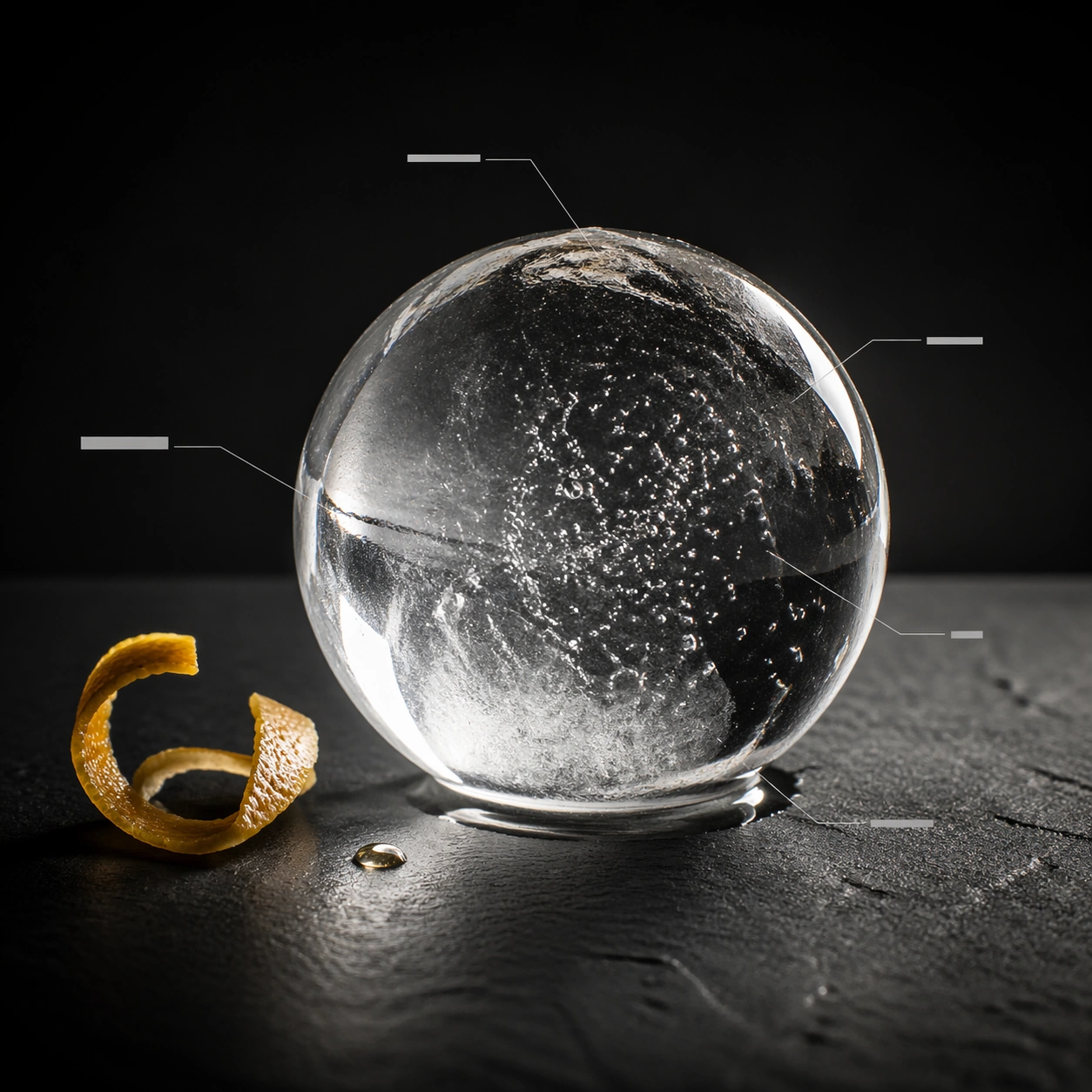
Example generated from “Clear Ice Sphere Editorial Study — ChaosRealmsAI · MIT”
GPT Image 2en

Scene: Create a square premium editorial cocktail photograph with Scandinavian restraint: the glass sits against a dark or neutral studio backdrop, lit with crisp directional light that reveals liquid clarity, condensation, and the shape of the vessel. The composition should leave clean space for anatomy-like annotation structures. Any diagram devices must stay abstract, minimal, and completely unreadable. Create a square macro studio image on a dark neutral pedestal with one ice sphere as the dominant object, lit from the side and slightly from behind. A few thin blank annotation leaders may enter the frame to emphasize the editorial anatomy concept without becoming technical clutter. Subject: Show one large nearly transparent ice sphere with subtle trapped bubbles, a shallow frost halo, and a thin reflective wet edge where it meets the surface. A minimal curl of citrus peel and one droplet of spirit can appear nearby as quiet context. The sphere should feel cold, heavy, and perfectly cut. Important details: The work should feel like a luxury magazine spread translated into one square frame, where product photography and information design cooperate without becoming cluttered. Glass thickness, ice clarity, citrus oils, bubbles, smoke, and liquid layering all need to feel physically accurate. Hairline leader lines may terminate in blank bars or geometric tabs, but never readable labels. The appeal comes from optical precision: internal bubble clusters, tiny fracture lines, and condensation must read immediately at close range. Keep the editorial callouts abstract and elegant, letting the ice itself behave like the specimen. Use case: Cocktail anatomy editorial single study 5/9, isolating the internal drama of a clear ice sphere. Constraints: No readable text, no watermark, no logos, preserve exact 1:1 aspect ratio, no menu typography, no neon nightclub clutter, no brand bottle labels, no bar receipt props, no visible trademarks, no novelty-shaped ice, no melting puddle chaos, no text labels.

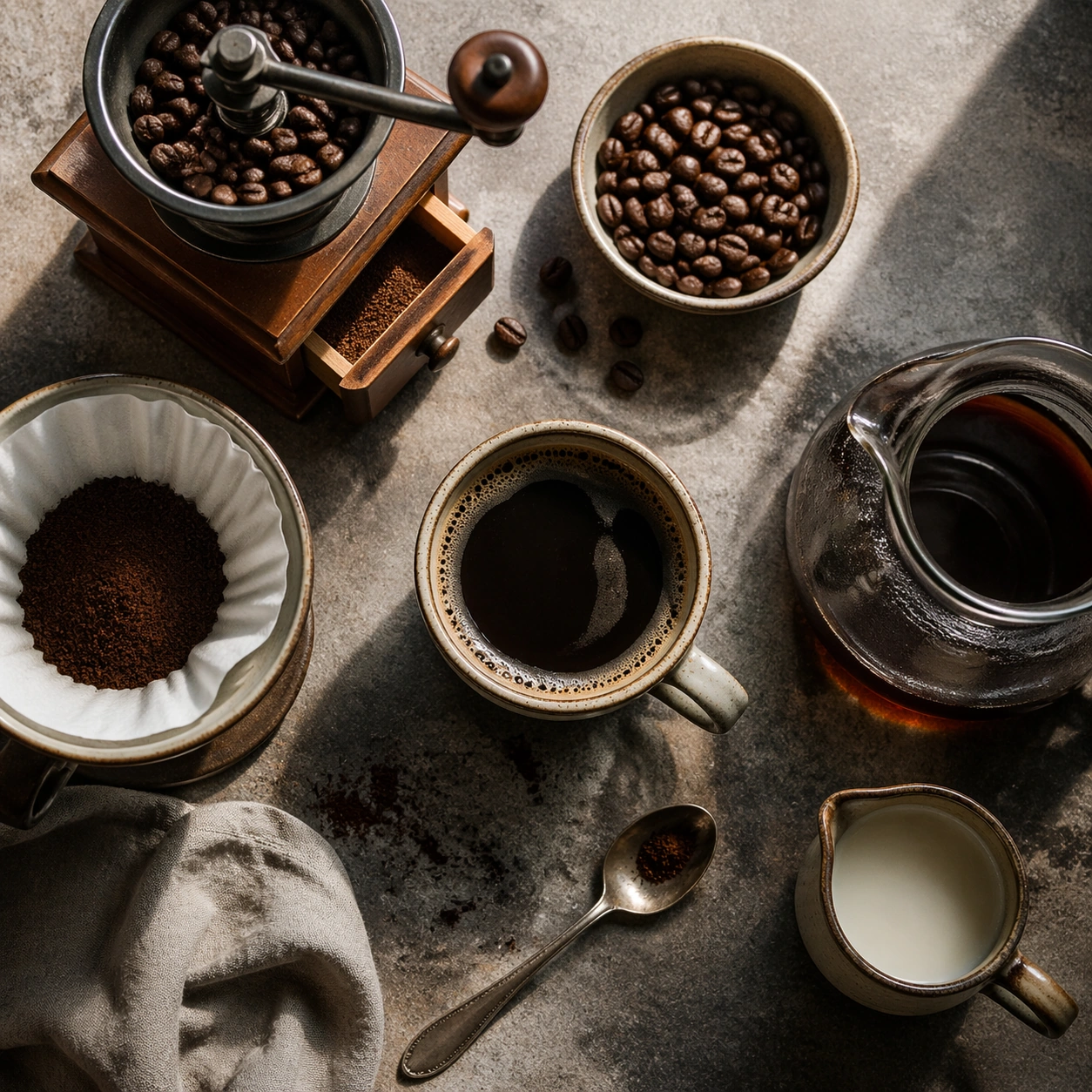
Example generated from “Coffee Beans and Brewing Tools Board — ChaosRealmsAI · MIT”
GPT Image 2en

Scene: Compose a square beverage campaign image built around ritual, vessel, light, and atmosphere. The frame should feel like it belongs to a premium drink brand that understands daily habits: ceramic warmth, glass condensation, steam behavior, and tactile surfaces all need to read as observed and real rather than generic lifestyle filler. Use a near-overhead square crop on a textured counter, arranging tools with measured spacing and soft side light. Subject: The hero beverage must feel consumable and culturally grounded, with believable proportions, realistic liquid behavior, and supporting tools or props that reinforce the ritual without overwhelming the drink itself. Feature beans, grinder, filter paper, spoon, and cup as a composed ritual toolkit rather than a cluttered equipment dump. Important details: Credibility comes from timing and materials: crema density, ice clarity, tea translucency, condensation trails, and the way a hand or vessel sits in space. Keep the mood intentional and campaign-ready, with enough atmosphere to suggest a lived routine while preserving product focus. This image should feel fully self-contained while still belonging to the same broader topic and commercial world. Every object should feel used but premium, with believable wear, clean edges, and clear functional hierarchy that supports a brand campaign. Use case: Coffee Rituals single study 5/9, built for Prompt Atlas coverage of a food and beverage commercial visual system. Constraints: No readable text, no watermark, no logos, preserve exact 1:1 aspect ratio, no plastic café props, no latte-art gimmick overload, no fake steam clouds, no unreadable cup slogans, no random breakfast clutter, no artificial neon excess, no instruction diagrams, no readable labels, no excessive accessories.

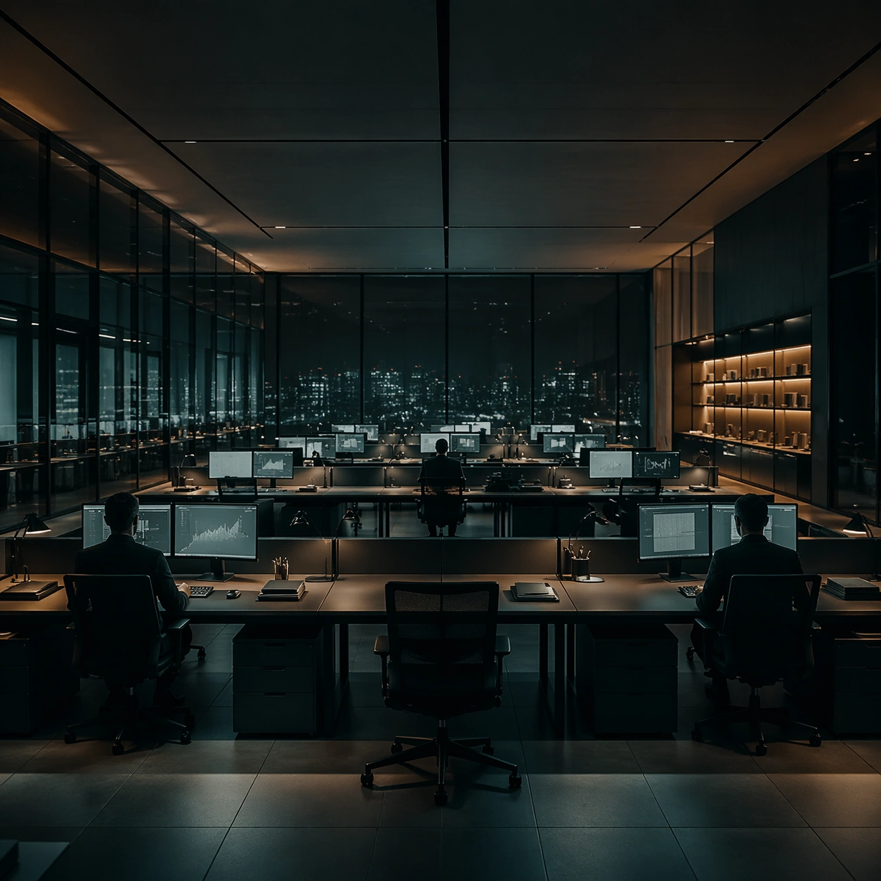
Example generated from “Late-Night Analyst Office Grid — ChaosRealmsAI · MIT”
GPT Image 2en

Scene: A square interior image defined by desaturated teal, nicotine amber, matte charcoal, and polished glass, with every desk, chair, monitor, and light source positioned with mathematical restraint. The room should feel contemporary and expensive, but emotionally distant, as if every element has been audited for balance and control. Build a late-night analyst bullpen with long shared desks, evenly spaced task lamps, and a wall of dark windows holding faint city reflections. Subject: Use office floors, apartments, control rooms, or meeting spaces where human figures appear small, backlit, and subordinate to the grid of furniture and screens. The subject is not one person so much as the cold system of objects, reflections, and intervals between them. Three workers appear as distant silhouettes at separate stations, each reduced to a small node within the larger desk grid. Important details: The signature depends on exact spacing, subdued color, restrained contrast, and a polished investigative mood. Preserve orderly cable paths, clean desk surfaces, sensible monitor glow, and strong negative space. Avoid colorful personality clutter, playful decor, or casual lived-in mess. The glow from monitors should be cool and controlled, with chairs, notebooks, and cables all aligned into quiet order. Use case: Cold Precision Grid Interior single study 1/9. Constraints: No readable text, no watermark, no logos, preserve exact 1:1 aspect ratio, no visible logos on screens, no colorful sticky notes, no comic exaggeration, no warm family-home coziness, no random clutter piles, no broken anatomy, no low-detail background, no accidental text fragments.

Example generated from “Compact Apartment Foldout Dining Scene — ChaosRealmsAI · MIT”
GPT Image 2en

Scene: Create a square standalone support study for Compact Urban Apartment Efficiency Aesthetic. Use a front-on still of a foldout dining table opened from the millwork wall and frame it like a premium commercial still or design-editorial crop with clear focal hierarchy, disciplined perspective, and enough breathing room for the materials and objects to read at both thumbnail and full size. Keep light ash wood, warm white plaster, soft graphite accents, pale stone, and muted sage textiles as the tonal guide so the image still belongs to the same theme family, and light the scene in a controlled way that emphasizes texture, edge quality, and authored atmosphere over spectacle. Subject: Show a compact urban apartment with ash wood millwork, sliding partitions, hidden storage walls, a built-in platform bed, compact stone kitchen surfaces, and calm metropolitan daylight. In this support study, focus on hinge discipline, seating fit, table styling, and spatial efficiency. The image should work independently, yet it must still feel like it belongs to the same broader world of Urban Apartment. Make the space, props, and detailing useful for real campaign, editorial, or design-review contexts rather than moodboard abstraction. Important details: Carry forward the broader language of the sliding partition system, integrated storage geometry, ash wood detailing, compact kitchen language, and quiet city-apartment restraint, but let this image prove a new support surface or secondary deliverable. Material realism is essential: wood grain, metal sheen, glass edges, textiles, and stone should feel physically plausible and carefully art directed. Any graphic panels, labels, menus, packaging, or captions must stay abstract and unreadable. The overall result should feel reusable for rental campaigns, design editorials, developer micro-unit decks, and small-space planning references, with enough structure that a creative or operations team could build on it. Use case: Compact Urban Apartment Efficiency Aesthetic single study 5/9, exploring small-space dining support visual. Constraints: No readable text, no watermark, no logos, preserve exact 1:1 aspect ratio, no clutter piles, no messy shoes, no novelty gadgets, no colorful toy furniture, no cramped distortion, no crowded dinner party.
Example generated from “Creative Studio Material Library Wall — ChaosRealmsAI · MIT”
GPT Image 2en

Scene: Create a square standalone support study for Creative Studio and Office Brand Floor. Use a front-on wall of samples, books, mockups, and pin-up surfaces arranged with discipline and frame it like a premium commercial still or design-editorial crop with clear focal hierarchy, disciplined perspective, and enough breathing room for the materials and objects to read at both thumbnail and full size. Keep warm gray, natural oak, charcoal felt, off-white surfaces, and one controlled accent hue as the tonal guide so the image still belongs to the same theme family, and light the scene in a controlled way that emphasizes texture, edge quality, and authored atmosphere over spectacle. Subject: Show a branded creative studio and office floor with modular collaboration tables, acoustic felt panels, smoked glass partitions, library shelving, soft lounge seating, and clear company personality. In this support study, focus on creative-process evidence, tactile order, and editorial neatness. The image should work independently, yet it must still feel like it belongs to the same broader world of Studio Office. Make the space, props, and detailing useful for real campaign, editorial, or design-review contexts rather than moodboard abstraction. Important details: Carry forward the broader language of the table system, acoustic materials, glass-partition rhythm, informal lounge furniture, and abstract brand-graphic zones, but let this image prove a new support surface or secondary deliverable. Material realism is essential: wood grain, metal sheen, glass edges, textiles, and stone should feel physically plausible and carefully art directed. Any graphic panels, labels, menus, packaging, or captions must stay abstract and unreadable. The overall result should feel reusable for office leasing decks, employer-brand campaigns, interior editorials, and workspace design reviews, with enough structure that a creative or operations team could build on it. Use case: Creative Studio and Office Brand Floor single study 5/9, exploring support image for studio culture storytelling. Constraints: No readable text, no watermark, no logos, preserve exact 1:1 aspect ratio, no office workers, no readable whiteboard text, no startup cliché neon, no messy desks, no cheap task-chair overload, no readable book spines.

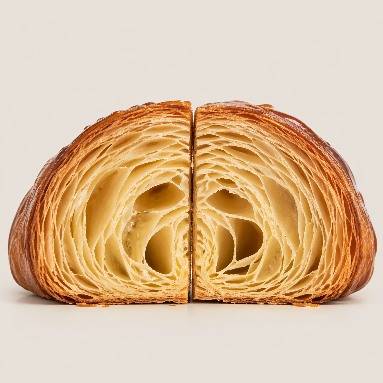
Example generated from “Croissant Lamination Cross-Section — ChaosRealmsAI · MIT”
GPT Image 2en

Scene: Create a square pastry documentation image on a seamless pale gray or warm ivory studio background with soft catalog lighting and almost no cast-shadow drama. The camera should feel orthographic or gently frontal so cross-sections remain easy to compare. Everything must read like a pastry atlas: clean, measured, and highly legible, with crumbs controlled and edges crisp. Create a square specimen-style photograph on a seamless warm gray background with a frontal view and restrained shadow. The frame should be tight enough that the croissant dominates, but generous enough to leave a quiet field around it. Subject: Show one large croissant cut cleanly down its center line, with the interior facing forward and the exterior shell still visibly crisp and flaky. The lamination should step outward in dense, countable leaves, with a hollow core tapering toward the tips. The specimen should look freshly cut, not dried out or crushed. Important details: Treat every cut face as the hero: laminated layers, cream density, air pockets, fruit cavities, glaze thickness, and crumb structure all need to be countable and believable. The studio language should stay consistent and understated so structural detail does the work. No element should feel collapsed, smeared, or over-stylized. Focus on the relationship between crisp exterior, honeycombed inner void, and laminated leaf structure. A few tiny flakes near the base are acceptable if controlled, but the image must remain as clean as a museum plate. Use case: Pastry cross-section atlas single study 5/9, isolating croissant lamination as a specimen. Constraints: No readable text, no watermark, no logos, preserve exact 1:1 aspect ratio, no bakery counter background, no casual napkins, no readable labels, no powdered sugar mess, no rustic knife marks, no coffee cups, no butter pats, no torn ragged cut.

Example generated from “Lunch Box Delivery Hero Card — ChaosRealmsAI · MIT”
GPT Image 2en

Scene: Compose a square food-commerce image optimized for instant readability in app tiles, promo cards, or delivery grids. The image should emphasize appetizing clarity, strong hierarchy, and modular layout zones while staying photorealistic and commercially grounded. Packaging, dish crop, and badge-like design shapes can appear, but all text must remain unreadable. Use a bright square crop with one open lunch container, one side element, and strong modular negative space around the food. Subject: The food should look craveable at thumbnail scale, with clear portion logic, supporting side items when relevant, and delivery-aware presentation that prioritizes speed, legibility, and conversion. Make the lunch box feel balanced, complete, and office-friendly, with ingredients separated enough to remain legible on small screens. Important details: This theme is about commerce reasoning. Preserve sharp hero food silhouettes, obvious combo structure, and clean tile-safe framing so the assets can survive small screens. Abstract text areas, CTA-like shapes, and offer badges are allowed only as non-legible design modules. Keep everything polished, modern, and immediately useful for ordering surfaces. This image should feel fully self-contained while still belonging to the same broader topic and commercial world. Clean compartment lines, lid geometry, and ingredient color contrast should make the image highly scannable for app browsing. Use case: Delivery Tiles single study 5/9, built for Prompt Atlas coverage of a food and beverage commercial visual system. Constraints: No readable text, no watermark, no logos, preserve exact 1:1 aspect ratio, no readable text, no logos, no app UI chrome, no fake prices, no delivery-bag chaos, no greasy blur, no clutter that hurts thumbnail legibility, no office desk clutter, no readable brand tape, no cafeteria tray vibe.

Example generated from “Pink Patisserie Cake Box Flatlay — ChaosRealmsAI · MIT”
GPT Image 2en

Scene: Compose a square premium patisserie image with polished but believable boutique lighting, elegant marble or lacquer surfaces, and a sweet-shop atmosphere that feels brand-authored rather than generic. The camera should preserve product clarity, shape definition, and shelf or counter context while leaving enough breathing room for campaign placement. Use a top-down square composition over a clean stone surface, with tissue paper, ribbon, and one opened box arranged like a product campaign still life. Subject: The desserts must look crafted by a high-end pastry kitchen: clean lamination, glossy glaze, stable cream structure, crisp edges, and packaging or display surfaces that reinforce a coherent dessert identity. Feature a premium cake box system with a visible dessert slice, neat inserts, and subtle branded geometry expressed through color blocks and materials rather than readable text. Important details: Sweetness should come from color control, finish quality, and material nuance, not from visual clutter. Preserve believable pastry engineering, boutique display logic, and refined merchandising cues so the images can support brand storytelling across retail, packaging, and editorial use. This image should feel fully self-contained while still belonging to the same broader topic and commercial world. The result should feel like an expensive gifting moment: crisp folds, believable paper texture, precise corners, and pastry visibility that still keeps packaging central. Use case: Dessert Brand single study 5/9, built for Prompt Atlas coverage of a food and beverage commercial visual system. Constraints: No readable text, no watermark, no logos, preserve exact 1:1 aspect ratio, no candy-color overload, no plastic frosting, no supermarket clutter, no cartoon decorations, no melted textures that break realism, no childish party props, no shipping labels, no readable copy, no discount-store vibe.
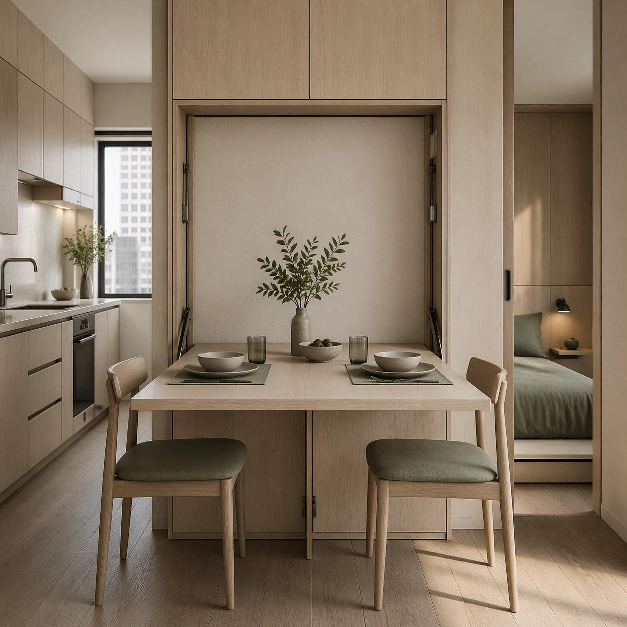
Example generated from “Braised Chicken Feet Dim Sum Study — ChaosRealmsAI · MIT”
GPT Image 2en

Scene: Create a square museum-atlas photograph of dim sum presented on natural linen or pale neutral textile, lit with calm daylight and restrained shadow. The composition should feel archival, specimen-like, and quietly luxurious rather than crowded or banquet-style. Blank museum tabs, bamboo details, and shallow steam are acceptable so long as no readable characters appear anywhere. Create a square overhead or gently angled specimen photograph on warm linen with soft daylight and very controlled shadow. The mood should be serious, tactile, and archival rather than sensational. Subject: Show a small arranged set of braised chicken feet with lacquered skin, visible joints, and a rich mahogany glaze, presented as part of the dim sum world rather than an oddity. A tiny blank specimen tab and a small porcelain rest may appear nearby. The subject should feel intricate, crafted, and fully edible. Important details: Make the dumplings feel handcrafted and specific: pleat count, skin thickness, translucency, filling pressure, steam moisture, and wrapper folds all need to be believable. The museum treatment should elevate the food without turning it into abstraction. Every item should still look edible, warm, and tactile. Focus on skin texture, folds, claws, and glaze sheen without exaggeration. The image should demonstrate that difficult anatomy-like forms can still be documented with elegance and warmth. Use case: Dim sum miniature atlas single study 5/9, treating braised chicken feet as an archival culinary specimen. Constraints: No readable text, no watermark, no logos, preserve exact 1:1 aspect ratio, no banquet table clutter, no readable calligraphy, no sauce spills, no glossy menu styling, no plastic steamer look, no horror framing, no sauce pooling, no banquet clutter.

Example generated from “Preschool Flashcard Deck Retail Flatlay — ChaosRealmsAI · MIT”
GPT Image 2en

Scene: Create a square top-down retail flatlay on a pale playroom floor with one boxed flashcard deck, a few fanned cards, soft fabric pouches, and color-coded dividers arranged with catalog clarity. Use warm morning light and gentle shadows so the image feels commercial, trustworthy, and ready for an online learning-store product page. Keep the square frame balanced, calm, and production-ready so the asset can serve gallery review, research comparison, and real educational delivery at the same time. Subject: The hero product is a compact preschool flashcard deck with matte lamination, rounded edges, and animal, object, and counting illustrations peeking from the stack. Surround it with a few tactile add-ons such as a carrying strap, sorting ring, and corner tabs, all designed in the same child-friendly visual language. The subject arrangement should feel complete and self-contained, able to stand alone as a real supporting deliverable inside the same education business line. Important details: Keep the layout highly structured and retail-aware: clear spacing, controlled props, soft pastel accents, and obvious product hierarchy. The card art should stay simple and educational, with blank label fields instead of real words, so the deck can imply multilingual packaging without showing any readable copy. Keep the visual hierarchy modular, commercially believable, and clearly tied to a real educational use case rather than a generic mood board. Use case: Early Learning Flashcard Family single study 1/5, boxed deck flatlay. Constraints: No readable text, no watermark, no logos, preserve exact 1:1 aspect ratio, no readable text, no numerals, no brand mascots, no logos, no chaotic shelf clutter, no broken packaging.

Example generated from “Speaker Interior Cutaway Concept — ChaosRealmsAI · MIT”
GPT Image 2en

Scene: A square studio technical plate with crisp neutral lighting and strong object-legibility against a calm background. Compose the frame as a square key visual with disciplined camera placement, premium lighting control, and believable real-world scale. The tonal range should feel polished and intentional, with enough atmosphere to create depth without obscuring form. Keep contrast calibrated for launch, catalog, or research presentation use rather than casual snapshot aesthetics. Subject: Center an original speaker-like engineered object split to reveal driver, chamber, bracing, and damping layers. Make the subject feel original, production-aware, and clearly grounded in Engineering Cutaway and Section Poster. Treat this as an independent study that must feel complete and coherent without relying on any external reference image. The focal hierarchy should be immediate: primary form first, then material behavior, then supporting environmental cues that clarify use context and difficulty. Important details: Keep the acoustic logic believable and the section precise. The image should read as engineering communication, not stylized gadget art. The visual language should still feel native to Engineering Cutaway and Section Poster, using disciplined industrial or campaign composition instead of generic stock photography. Use believable materials, engineering logic, and professional composition discipline. Reflections, shadows, edge breaks, texture scale, interface density, and small physical joints must all support realism. Avoid filler props, vague mood-board clutter, or any element that weakens the sense of a purpose-built industrial or automotive image. Use case: Cutaway Poster single study 5/9 for Engineering Cutaway and Section Poster, built as image support-one. Constraints: No readable text, no watermark, no logos, preserve exact 1:1 aspect ratio, no readable labels, no logos, no impossible internals, no chaotic arrows, no random infographic decoration, no fantasy glow.

Example generated from “Cave-Aged Cheese Wheel Cross-Section — ChaosRealmsAI · MIT”
GPT Image 2en

Scene: Create a square museum-vitrine style photograph of fermentation vessels treated as natural-history specimens, with calm raking light, restrained reflections, and an atmosphere of patient observation. Glass, ceramic, cloth covers, and aged labels can appear, but any markings must stay unreadable. The mood should be archival, biological, and sculptural at once. Create a square specimen photograph on a dark museum-like pedestal with soft raking light and controlled cave-like atmosphere. The background should imply cool stone darkness without distracting from the cheese. Subject: Show a large cheese wheel with one wedge removed so the rind, paste, internal openings, and age patterns become readable. The rind should carry subtle bloom and cave wear, while the interior shows density variation and possible tunnels or crystals. The wheel must feel mature, heavy, and alive with time. Important details: Micro texture is essential: skins, bubbles, sediment, microbial mats, crusts, folds, and wet surfaces all need distinct tactile logic. The images should respect the beauty of slow transformation without sanitizing it into generic product photography. Fermentation must look alive, layered, and physically specific. Focus on the contrast between rugged outer rind and complex interior body. Crystals, moisture gradients, and micro cavities should feel naturally formed, not stylized. Use case: Fermentation sculpture atlas single study 5/9, documenting a cave-aged cheese wheel as a living specimen. Constraints: No readable text, no watermark, no logos, preserve exact 1:1 aspect ratio, no readable dates or species names, no modern supermarket packaging, no laboratory sterility that kills the organic feel, no mold-horror sensationalism, no cartoon colors, no grocery wrapper, no cheese-board lifestyle props, no readable cave labels.

Example generated from “Candlelit Banquet Place Setting — ChaosRealmsAI · MIT”
GPT Image 2en

Scene: Compose a square feast or banquet campaign image with abundant but controlled table choreography, rich servingware, and a celebratory atmosphere that feels suitable for hospitality campaigns, seasonal dining promotions, or event editorials. The frame should manage many elements without losing hierarchy, elegance, or appetite appeal. Use a square crop of one portion of the table with candlelight, plateware, napkin folds, and partial dish visibility creating intimate celebration. Subject: The food must look substantial and celebratory, with believable multi-dish coordination, serving logic, and table rituals that suggest a real banquet rather than a random buffet pile. Let the place setting and nearby food communicate premium hospitality and anticipation. Important details: This topic depends on composition reasoning. Preserve a strong centerpiece, readable secondary dishes, coherent servingware, and lighting that supports depth across the table. Celebration should emerge from abundance, color, and ritual objects, not from gimmicks or branded holiday symbols. Everything must feel premium, coordinated, and logistically plausible. This image should feel fully self-contained while still belonging to the same broader topic and commercial world. Material realism matters: glass sparkle, candle glow, linen depth, and polished flatware should all feel warm and believable without overpowering the food. Use case: Festive Feast single study 5/9, built for Prompt Atlas coverage of a food and beverage commercial visual system. Constraints: No readable text, no watermark, no logos, preserve exact 1:1 aspect ratio, no readable text, no logos, no generic wedding décor, no buffet-chaos clutter, no novelty party props, no copied holiday mascots, no visible faces dominating the frame, no wedding invitation cards, no readable place cards, no luxury-brand logos.

Example generated from “Strength Training Program Social Tile — ChaosRealmsAI · MIT”
GPT Image 2en

Scene: Create a square strength-cycle social tile for Program Launch, using conversion-friendly fitness marketing with premium training imagery, structured layouts, and trustworthy coaching tone. The composition should read as a practical, production-ready sports or fitness surface with a clear hierarchy, premium lighting, and obvious commercial intent. Keep the environment specific enough to feel real, but leave enough control in the layout for non-readable information modules, campaign blocks, or visualized metrics. Aim for a finish that works for a brand, club, app, academy, or event operator. Subject: Build the image around athlete near barbell setup. The subject should be original, believable, and free of any real-brand or celebrity cues. Use realistic apparel, safe body mechanics when movement is visible, and environmental props that support the category without clutter. The subject must stay visually dominant so the design still works as a communication asset rather than a pure scene study. Important details: The mood should read as disciplined power. Treat layout, light, and supporting graphic structure as part of one polished delivery surface. Any schedule blocks, metric panels, quote zones, badges, or path diagrams must stay abstract and non-readable. Prioritize usefulness, clarity, and category truth over spectacle. The image should feel distinct from the series package while still belonging naturally to the same topic and business use case. Use case: Program Launch single study 5/9, an independent rollout surface for the topic. Constraints: No readable text, no watermark, no logos, preserve exact 1:1 aspect ratio, no brand marks, no public-figure resemblance, no generic stock layout, no cluttered UI imitation, no accidental copyrighted insignia.
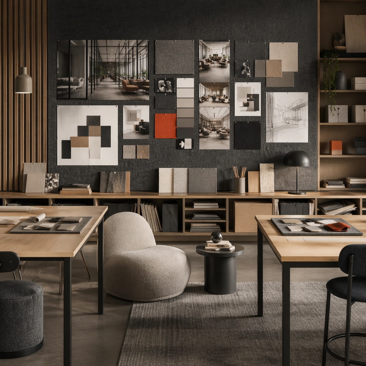
Example generated from “Hillside City with Layered Tram Transport — ChaosRealmsAI · MIT”
GPT Image 2en

Scene: Design a square urban concept image that sells one future-city mobility idea clearly enough for an editorial spread, launch visual, or worldbuilding board. The framing should always reveal at least two transport layers and one strong lived-in density cue. Show a steep hillside district with terraced housing, switchback trams, layered retaining decks, and mist lifting through the valley. Subject: Show a complete district-scale mobility ecosystem with believable housing, transit, commerce, and utility access. Human presence can appear as tiny commuters, riders, or maintenance workers, but the main protagonist is the city system itself. The city should adapt to terrain elegantly, with circulation and density resolved through ramps, lifts, rail loops, and narrow civic terraces. Important details: Use depth layering, disciplined architecture families, and just enough weather or atmosphere to create mood without erasing the logic of roads, bridges, lines, and occupancy. The result should feel specific to a place and function, not like an all-purpose neon metropolis. Make slope logic, drainage, and movement the main read so the district feels engineered for real life, not merely picturesque. Preserve credible circulation between transport levels so every district reads as somewhere people could actually move through and inhabit. Use case: Future City single study 1/5, designed as a self-contained support image for this topic. Constraints: No readable text, no watermark, no logos, preserve exact 1:1 aspect ratio, no superhero chase scenes, no floating random platforms without support, no unreadable giant signage, no sterile empty plazas, no fantasy cliff palaces.
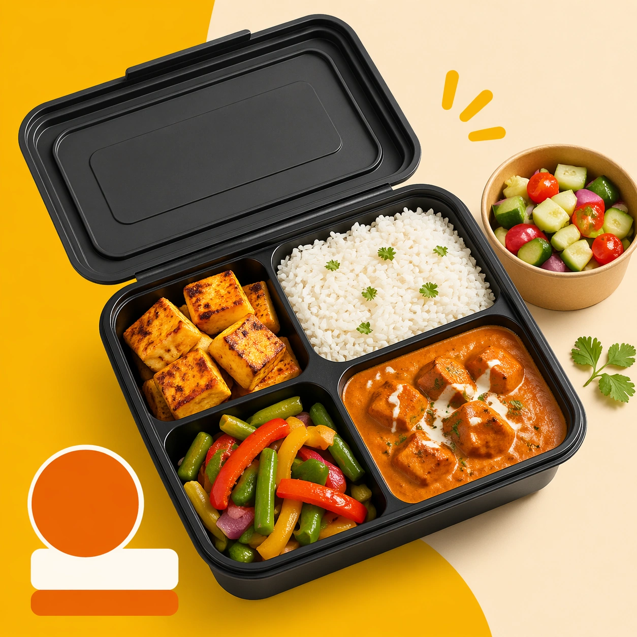
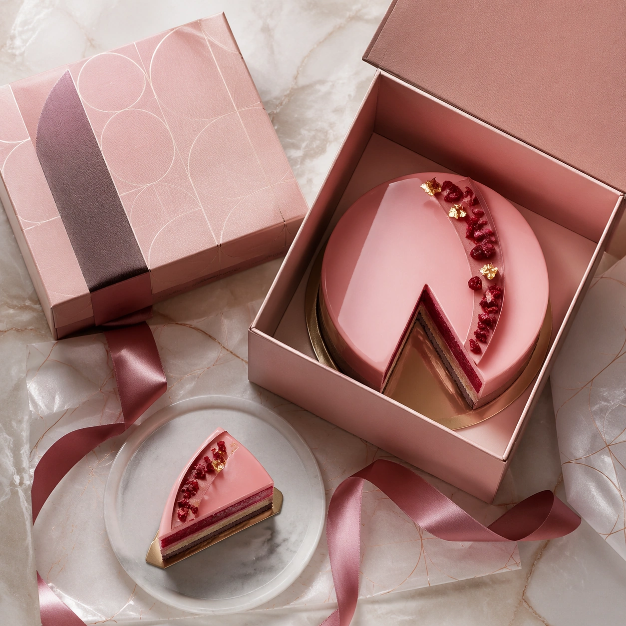
Example generated from “Shared Laundry Community Lounge Concept — ChaosRealmsAI · MIT”
GPT Image 2en

Scene: Design a square near-future living environment study that feels immediately usable as a brand-inspiration image or speculative editorial visual. The scene should show one complete routine surface, not just decorative furniture styling. Compose a bright shared laundry lounge with folding counters, seating niches, clean storage walls, and quietly automated machines integrated into one room. Subject: Focus on a believable room or shared domestic node where human habits, object placement, and light all imply how the space is used every day. Technology should feel embedded in materials, fixtures, and workflows instead of floating as abstract holograms. The space should feel used by neighbors and families, not merely styled, with clear workflows for washing, sorting, waiting, and light social interaction. Important details: Keep the design humane, tactile, and slightly imperfect so it reads as lived-in. Surfaces, storage, and appliance behavior should all support a credible near-future domestic routine. Show how good lighting, acoustics, and materials can turn a utility room into a credible community amenity. Preserve habitual realism in object placement, cleaning, storage, and circulation so every room feels actually inhabited. Use case: Future Domestic single study 1/5, designed as a self-contained support image for this topic. Constraints: No readable text, no watermark, no logos, preserve exact 1:1 aspect ratio, no generic smart-home wallpaper, no unrealistic levitating furniture, no fashion-shoot posing, no readable packaging copy, no luxury spa cues.