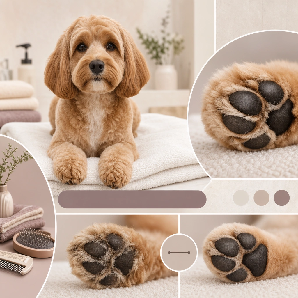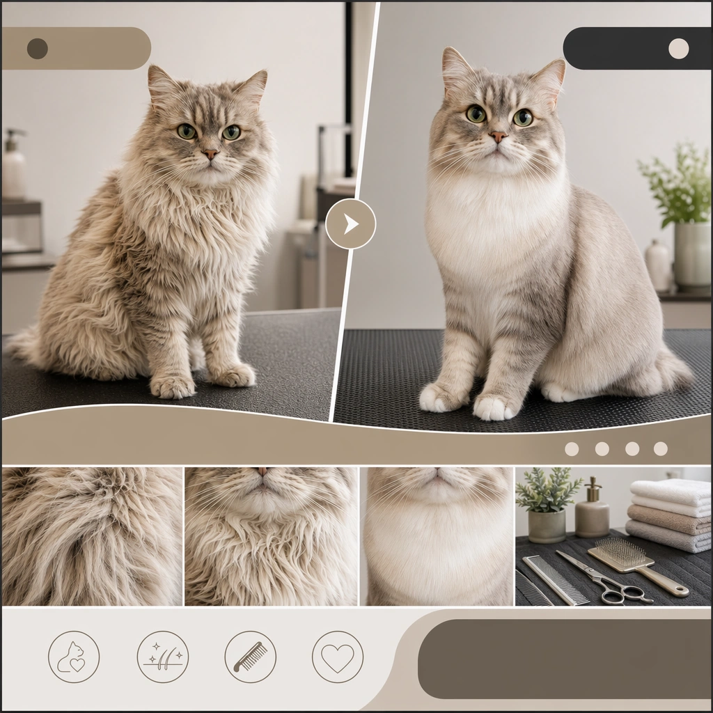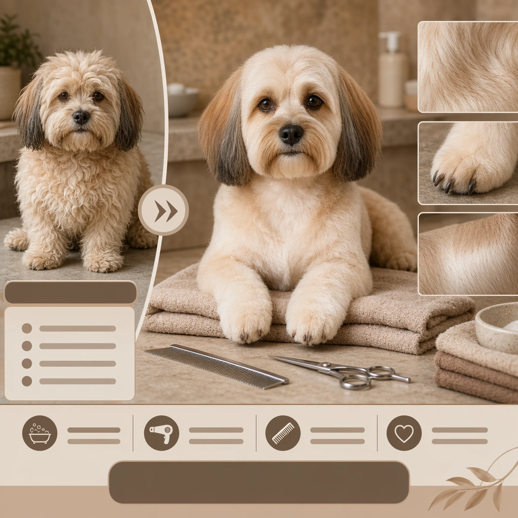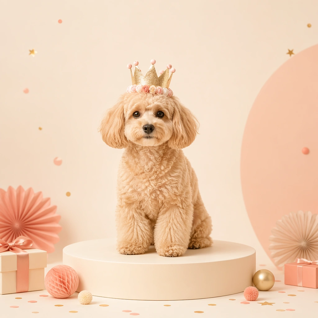
提示词库 · 创作探索

提示词库

探索真实提示词和对应生成示例,按任务找到灵感,免费复制完整提示词,开启下一次创作。

示例
10,974
模型
17
来源
1277
10,974 条提示词示例 · 第 21 / 229 页
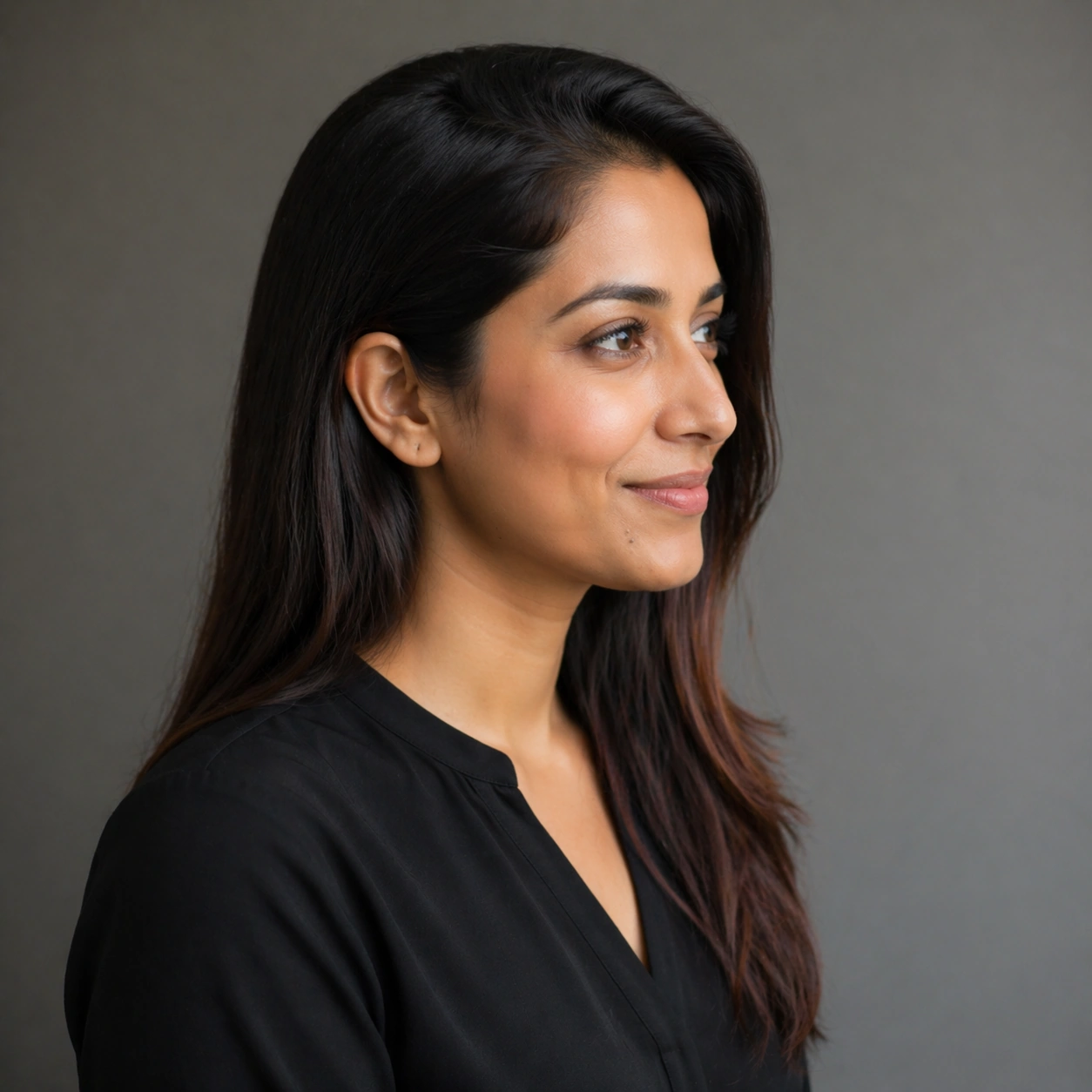
Example generated from “Personal Brand Portrait System — Profile Study”
GPT Image 2en

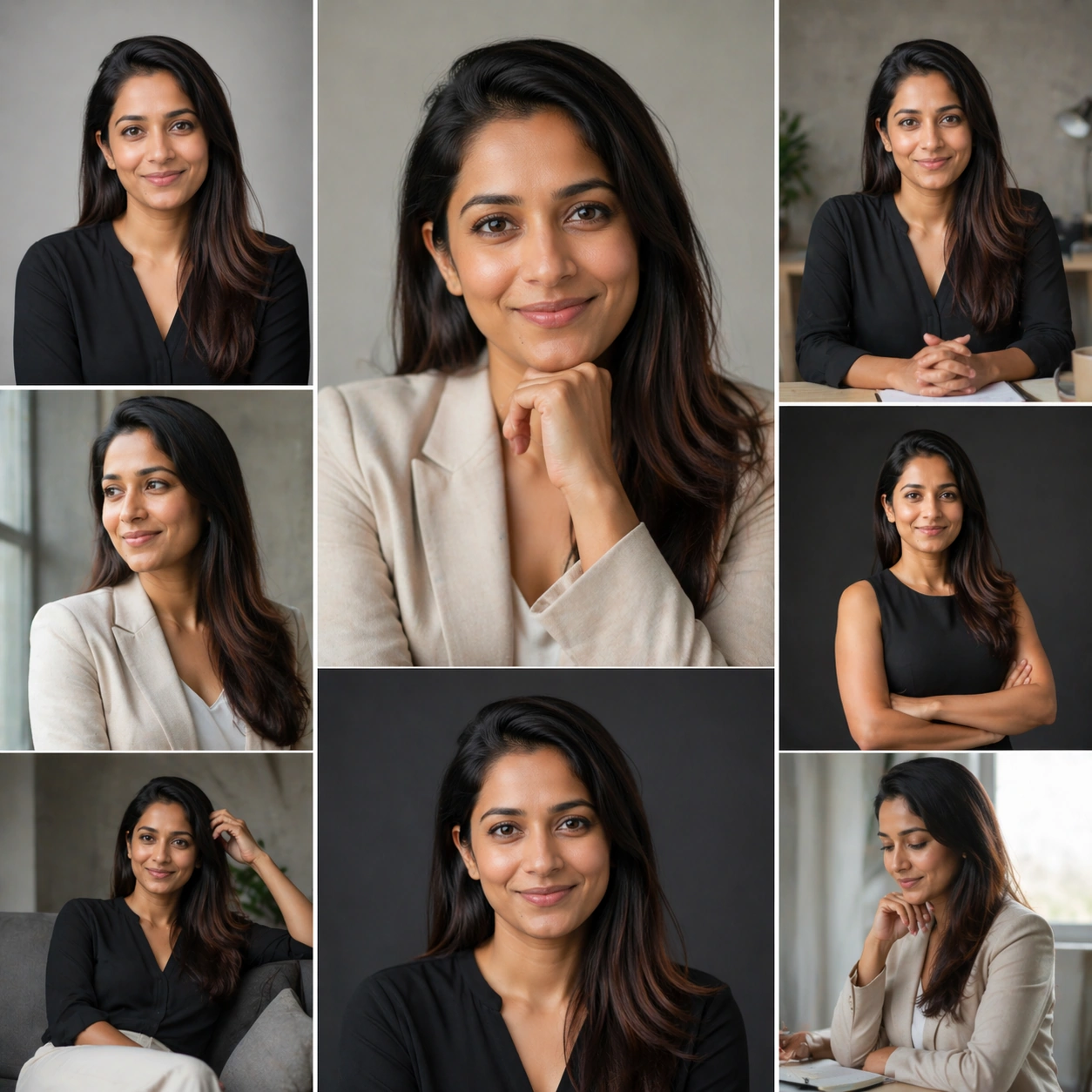
Scene: Create a square 1:1 portrait image for Personal Brand Portrait System. Use a disciplined side-light portrait with a smooth background, quiet contrast, and a calm editorial mood. The frame should feel like a finished professional deliverable rather than a casual snapshot, with clear lens discipline, believable light falloff, and a palette that directly supports Create a full portrait system for creators, consultants, and public-facing professionals across profile photos, website hero images, and keynote promos.. Keep enough surrounding space and compositional control for gallery, research, campaign, or approval-board reuse while staying photoreal and human-scaled. Subject: Center one creator-founder in their thirties with light brown skin, long dark hair tucked behind one ear, intelligent eyes, and an approachable but polished posture. Rotate the same person into a controlled profile study that proves nose bridge, jawline, ear shape, and hairline remain consistent with the reference model. Use the example direction from the brief as grounding context: Create a full portrait system for creators, consultants, and public-facing professionals across profile photos, website hero images, and keynote promos.. Wardrobe, lighting, environment, and pose may shift to serve this variation, but the viewer must immediately understand that the same reference identity is still in front of the camera. Important details: This backlog line is difficult because Create a full portrait system for creators, consultants, and public-facing professionals across profile photos, website hero images, and keynote promos.. Preserve skin tone family, bone structure, eye spacing, nose shape, mouth shape, hairline logic, shoulder width, and overall body read across the entire series. preserve exact face / hair base / body proportions from the reference model. Make the image useful for approval and continuity review, not merely stylistic for style alone. Avoid the common failure described in the brief: ordinary image models often lose likeness once styling, lighting, or layout changes enter the frame. Success should feel like the result should feel professionally usable, coherent, and clearly built around one stable human identity. Use case: Personal Brand Portrait System series study 4/9, a profile or near-profile study. Constraints: No readable text, no watermark, no logos, preserve exact 1:1 aspect ratio, preserve exact face / hair base / body proportions from the reference model, no profile drift, no altered nose length, no ears changing shape, no chaotic flyaway hair.


Example generated from “Personal Brand Portrait System — Approachable Smile”
GPT Image 2en

Scene: Create a square 1:1 portrait image for Personal Brand Portrait System. Use a welcoming light setup with soft highlights, gentle warmth, and subtle environmental mood that still feels premium. The frame should feel like a finished professional deliverable rather than a casual snapshot, with clear lens discipline, believable light falloff, and a palette that directly supports Create a full portrait system for creators, consultants, and public-facing professionals across profile photos, website hero images, and keynote promos.. Keep enough surrounding space and compositional control for gallery, research, campaign, or approval-board reuse while staying photoreal and human-scaled. Subject: Center one creator-founder in their thirties with light brown skin, long dark hair tucked behind one ear, intelligent eyes, and an approachable but polished posture. Keep the same face and body proportions, but let the emotional register open up into a believable smile or softer public-facing energy. This should look like the same person relaxing, not a second talent hire. Use the example direction from the brief as grounding context: Create a full portrait system for creators, consultants, and public-facing professionals across profile photos, website hero images, and keynote promos.. Wardrobe, lighting, environment, and pose may shift to serve this variation, but the viewer must immediately understand that the same reference identity is still in front of the camera. Important details: This backlog line is difficult because Create a full portrait system for creators, consultants, and public-facing professionals across profile photos, website hero images, and keynote promos.. Preserve skin tone family, bone structure, eye spacing, nose shape, mouth shape, hairline logic, shoulder width, and overall body read across the entire series. preserve exact face / hair base / body proportions from the reference model. Expression change is allowed; identity change is not. Teeth, lips, eye crinkle, and cheeks should still fit the same bone structure. Avoid the common failure described in the brief: ordinary image models often lose likeness once styling, lighting, or layout changes enter the frame. Success should feel like the result should feel professionally usable, coherent, and clearly built around one stable human identity. Use case: Personal Brand Portrait System series study 5/9, a warmer, approachable expression variation. Constraints: No readable text, no watermark, no logos, preserve exact 1:1 aspect ratio, preserve exact face / hair base / body proportions from the reference model, no changed teeth shape, no exaggerated laugh lines, no glamour filter skin, no mismatched eye color.
Example generated from “Personal Brand Portrait System — Dark Backdrop Editorial”
GPT Image 2en

Scene: Create a square 1:1 portrait image for Personal Brand Portrait System. Use a black or charcoal backdrop with controlled rim light, richer shadow depth, and a still-readable face. The frame should feel like a finished professional deliverable rather than a casual snapshot, with clear lens discipline, believable light falloff, and a palette that directly supports Create a full portrait system for creators, consultants, and public-facing professionals across profile photos, website hero images, and keynote promos.. Keep enough surrounding space and compositional control for gallery, research, campaign, or approval-board reuse while staying photoreal and human-scaled. Subject: Center one creator-founder in their thirties with light brown skin, long dark hair tucked behind one ear, intelligent eyes, and an approachable but polished posture. Use moodier lighting and slightly bolder styling while maintaining the same face geometry, hairstyle base, and shoulder width from the anchor portrait. Use the example direction from the brief as grounding context: Create a full portrait system for creators, consultants, and public-facing professionals across profile photos, website hero images, and keynote promos.. Wardrobe, lighting, environment, and pose may shift to serve this variation, but the viewer must immediately understand that the same reference identity is still in front of the camera. Important details: This backlog line is difficult because Create a full portrait system for creators, consultants, and public-facing professionals across profile photos, website hero images, and keynote promos.. Preserve skin tone family, bone structure, eye spacing, nose shape, mouth shape, hairline logic, shoulder width, and overall body read across the entire series. preserve exact face / hair base / body proportions from the reference model. The image should prove the subject survives a more dramatic public-facing treatment without becoming a different person. Avoid the common failure described in the brief: ordinary image models often lose likeness once styling, lighting, or layout changes enter the frame. Success should feel like the result should feel professionally usable, coherent, and clearly built around one stable human identity. Use case: Personal Brand Portrait System series study 6/9, a darker editorial portrait proof. Constraints: No readable text, no watermark, no logos, preserve exact 1:1 aspect ratio, preserve exact face / hair base / body proportions from the reference model, no crushed blacks, no hidden facial structure, no costume jump that breaks continuity, no dramatic age shift.
Example generated from “Personal Brand Portrait System — Banner Crop Portrait”
GPT Image 2en

Scene: Create a square 1:1 portrait image for Personal Brand Portrait System. Use a square frame that internally feels like a landscape-safe banner crop, with strong side negative space and a stable mid-shot. The frame should feel like a finished professional deliverable rather than a casual snapshot, with clear lens discipline, believable light falloff, and a palette that directly supports Create a full portrait system for creators, consultants, and public-facing professionals across profile photos, website hero images, and keynote promos.. Keep enough surrounding space and compositional control for gallery, research, campaign, or approval-board reuse while staying photoreal and human-scaled. Subject: Center one creator-founder in their thirties with light brown skin, long dark hair tucked behind one ear, intelligent eyes, and an approachable but polished posture. Keep the face exact, but compose the body and gaze so the portrait could be repurposed into website hero, interview banner, or campaign cover layouts. Use the example direction from the brief as grounding context: Create a full portrait system for creators, consultants, and public-facing professionals across profile photos, website hero images, and keynote promos.. Wardrobe, lighting, environment, and pose may shift to serve this variation, but the viewer must immediately understand that the same reference identity is still in front of the camera. Important details: This backlog line is difficult because Create a full portrait system for creators, consultants, and public-facing professionals across profile photos, website hero images, and keynote promos.. Preserve skin tone family, bone structure, eye spacing, nose shape, mouth shape, hairline logic, shoulder width, and overall body read across the entire series. preserve exact face / hair base / body proportions from the reference model. This image should feel adaptable, confident, and production-safe across multiple crop targets. Avoid the common failure described in the brief: ordinary image models often lose likeness once styling, lighting, or layout changes enter the frame. Success should feel like the result should feel professionally usable, coherent, and clearly built around one stable human identity. Use case: Personal Brand Portrait System series study 7/9, a wider crop meant to survive cover or banner usage. Constraints: No readable text, no watermark, no logos, preserve exact 1:1 aspect ratio, preserve exact face / hair base / body proportions from the reference model, no empty dead space, no floating hands, no distorted shoulders, no fake browser chrome.

Example generated from “Personal Brand Portrait System — Monochrome Alt”
GPT Image 2en

Scene: Create a square 1:1 portrait image for Personal Brand Portrait System. Use a grayscale studio portrait with crisp tonal separation, refined skin rendering, and magazine-ready depth. The frame should feel like a finished professional deliverable rather than a casual snapshot, with clear lens discipline, believable light falloff, and a palette that directly supports Create a full portrait system for creators, consultants, and public-facing professionals across profile photos, website hero images, and keynote promos.. Keep enough surrounding space and compositional control for gallery, research, campaign, or approval-board reuse while staying photoreal and human-scaled. Subject: Center one creator-founder in their thirties with light brown skin, long dark hair tucked behind one ear, intelligent eyes, and an approachable but polished posture. Translate the same identity into a black-and-white treatment. The face, hair base, and body proportions must remain exact while color disappears and texture becomes more important. Use the example direction from the brief as grounding context: Create a full portrait system for creators, consultants, and public-facing professionals across profile photos, website hero images, and keynote promos.. Wardrobe, lighting, environment, and pose may shift to serve this variation, but the viewer must immediately understand that the same reference identity is still in front of the camera. Important details: This backlog line is difficult because Create a full portrait system for creators, consultants, and public-facing professionals across profile photos, website hero images, and keynote promos.. Preserve skin tone family, bone structure, eye spacing, nose shape, mouth shape, hairline logic, shoulder width, and overall body read across the entire series. preserve exact face / hair base / body proportions from the reference model. Do not let grayscale flatten the likeness; bone structure and micro-contrast must carry recognition. Avoid the common failure described in the brief: ordinary image models often lose likeness once styling, lighting, or layout changes enter the frame. Success should feel like the result should feel professionally usable, coherent, and clearly built around one stable human identity. Use case: Personal Brand Portrait System series study 8/9, a monochrome alternate portrait. Constraints: No readable text, no watermark, no logos, preserve exact 1:1 aspect ratio, preserve exact face / hair base / body proportions from the reference model, no muddy grayscale, no retro film scratches, no blown highlights, no new hairstyle volume.

Example generated from “Personal Brand Portrait System — Approval Sheet Layout”
GPT Image 2en

Scene: Create a square 1:1 portrait image for Personal Brand Portrait System. Use a square layout that still reads as photography first, with restrained panel logic, tidy spacing, and agency-grade presentation cues but no readable text. The frame should feel like a finished professional deliverable rather than a casual snapshot, with clear lens discipline, believable light falloff, and a palette that directly supports Create a full portrait system for creators, consultants, and public-facing professionals across profile photos, website hero images, and keynote promos.. Keep enough surrounding space and compositional control for gallery, research, campaign, or approval-board reuse while staying photoreal and human-scaled. Subject: Center one creator-founder in their thirties with light brown skin, long dark hair tucked behind one ear, intelligent eyes, and an approachable but polished posture. Combine the same identity into a structured final board or polished hero frame that implies contact-sheet usability, campaign approval, or press-kit readiness. Keep the subject dominant and recognizable within the layout. Use the example direction from the brief as grounding context: Create a full portrait system for creators, consultants, and public-facing professionals across profile photos, website hero images, and keynote promos.. Wardrobe, lighting, environment, and pose may shift to serve this variation, but the viewer must immediately understand that the same reference identity is still in front of the camera. Important details: This backlog line is difficult because Create a full portrait system for creators, consultants, and public-facing professionals across profile photos, website hero images, and keynote promos.. Preserve skin tone family, bone structure, eye spacing, nose shape, mouth shape, hairline logic, shoulder width, and overall body read across the entire series. preserve exact face / hair base / body proportions from the reference model. Structured presentation is allowed, but the face must still be the star. Preserve exact face / hair base / body proportions from the reference model while making the overall page logic convincing. Avoid the common failure described in the brief: ordinary image models often lose likeness once styling, lighting, or layout changes enter the frame. Success should feel like the result should feel professionally usable, coherent, and clearly built around one stable human identity. Use case: Personal Brand Portrait System series study 9/9, a polished approval-sheet or press-sheet finish. Constraints: No readable text, no watermark, no logos, preserve exact 1:1 aspect ratio, preserve exact face / hair base / body proportions from the reference model, no readable names, no slate numbers, no fake logos, no broken grid logic.

Example generated from “Pet Brand Merch And Accessory Drop — Collar Launch Hero”
GPT Image 2en

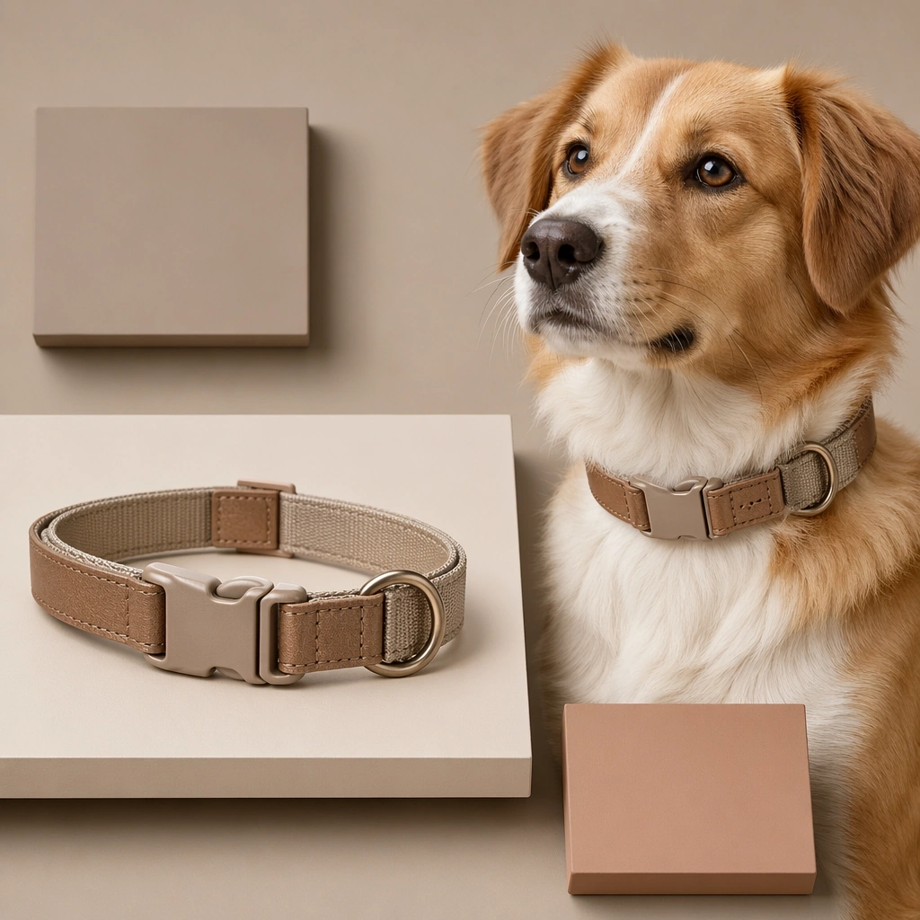
Scene: A square launch board for a pet lifestyle accessory brand, combining product hero presentation, tactile material realism, and polished commercial hierarchy. The image should feel ready for a launch drop, lookbook grid, or ecommerce campaign, with a disciplined palette and enough structure to support future text overlays outside the generated image. Keep the styling modern, giftable, and design conscious rather than generic pet store clutter. Use a soft neutral studio setup with floating shadow cards, one collar laid flat, and one dog portrait wearing the collar as the main proof point. Subject: Focus on one accessory story at a time: collars, bowls, carriers, apparel, charms, bedding, or matching human pet lifestyle pieces. Products must feel usable and materially believable. If a pet appears, the animal should reinforce scale, personality, and desirability without overshadowing the merchandise. The overall mood should balance warmth, quality, and retail polish. The collar should show leather or woven detail, clean buckle construction, and tasteful color blocking that feels premium but practical. Important details: Show material cues clearly such as leather grain, nylon webbing, ceramic glaze, coated canvas, quilted textiles, matte buckles, or brushed metal hardware. Use graphic framing only lightly so the product remains the hero. The result should look like something a modern direct-to-consumer brand could ship across social launches, product pages, collection decks, and campaign tiles. Balance fashion appeal with product clarity so the board works equally well for launch announcements, PDP crops, and brand feed storytelling. Use case: Pet Brand Merch and Accessory Drop single study 1/9, collar launch hero for a commercially reusable prompt atlas example. Constraints: No readable text, no watermark, no logos, preserve exact 1:1 aspect ratio, no readable logos, no overstuffed retail shelf clutter, no novelty toy overload, no unsafe pet styling, no generic discount store vibe, no fake luxury monogram, no studded punk cliché, no giant charms, no human fashion editorial overload.

Example generated from “Pet Brand Merch And Accessory Drop — Bowl and Placemat Set”
GPT Image 2en

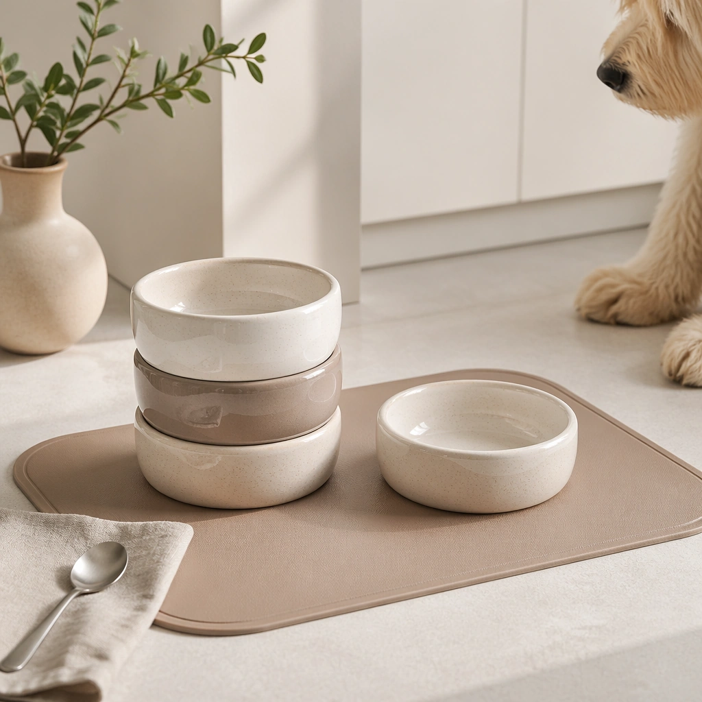
Scene: A square launch board for a pet lifestyle accessory brand, combining product hero presentation, tactile material realism, and polished commercial hierarchy. The image should feel ready for a launch drop, lookbook grid, or ecommerce campaign, with a disciplined palette and enough structure to support future text overlays outside the generated image. Keep the styling modern, giftable, and design conscious rather than generic pet store clutter. Compose a bright kitchen or studio tabletop with stacked ceramic bowls, one laid-out placemat, and a clean feeding corner aesthetic. Subject: Focus on one accessory story at a time: collars, bowls, carriers, apparel, charms, bedding, or matching human pet lifestyle pieces. Products must feel usable and materially believable. If a pet appears, the animal should reinforce scale, personality, and desirability without overshadowing the merchandise. The overall mood should balance warmth, quality, and retail polish. Let the ceramic glaze, shape, and coordinated surface textures drive the composition, with a pet entering only as a soft contextual cue. Important details: Show material cues clearly such as leather grain, nylon webbing, ceramic glaze, coated canvas, quilted textiles, matte buckles, or brushed metal hardware. Use graphic framing only lightly so the product remains the hero. The result should look like something a modern direct-to-consumer brand could ship across social launches, product pages, collection decks, and campaign tiles. The board should feel domestic, premium, and easy to reuse for catalog, ecommerce, and social drop posts. Use case: Pet Brand Merch and Accessory Drop single study 2/9, bowl and placemat set for a commercially reusable prompt atlas example. Constraints: No readable text, no watermark, no logos, preserve exact 1:1 aspect ratio, no readable logos, no overstuffed retail shelf clutter, no novelty toy overload, no unsafe pet styling, no generic discount store vibe, no fake luxury monogram, no food mess, no readable embossed branding, no farmhouse clutter.

Example generated from “Pet Brand Merch And Accessory Drop — Travel Carrier Lookbook Board”
GPT Image 2en

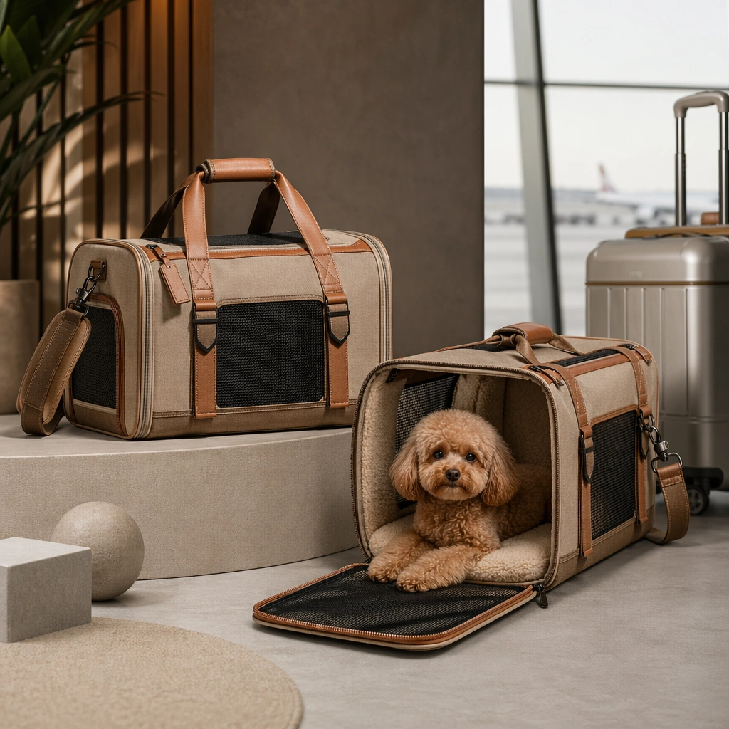
Scene: A square launch board for a pet lifestyle accessory brand, combining product hero presentation, tactile material realism, and polished commercial hierarchy. The image should feel ready for a launch drop, lookbook grid, or ecommerce campaign, with a disciplined palette and enough structure to support future text overlays outside the generated image. Keep the styling modern, giftable, and design conscious rather than generic pet store clutter. Use an airport-adjacent or studio travel set with rolling handle hints, clean flooring, and a balanced square layout centered on the carrier. Subject: Focus on one accessory story at a time: collars, bowls, carriers, apparel, charms, bedding, or matching human pet lifestyle pieces. Products must feel usable and materially believable. If a pet appears, the animal should reinforce scale, personality, and desirability without overshadowing the merchandise. The overall mood should balance warmth, quality, and retail polish. Show the carrier open and closed, with one pet comfortably visible to confirm size, ventilation, and calm use context. Important details: Show material cues clearly such as leather grain, nylon webbing, ceramic glaze, coated canvas, quilted textiles, matte buckles, or brushed metal hardware. Use graphic framing only lightly so the product remains the hero. The result should look like something a modern direct-to-consumer brand could ship across social launches, product pages, collection decks, and campaign tiles. The board should suggest urban mobility and premium utility, not frantic travel stress or luggage chaos. Use case: Pet Brand Merch and Accessory Drop single study 3/9, travel carrier lookbook board for a commercially reusable prompt atlas example. Constraints: No readable text, no watermark, no logos, preserve exact 1:1 aspect ratio, no readable logos, no overstuffed retail shelf clutter, no novelty toy overload, no unsafe pet styling, no generic discount store vibe, no fake luxury monogram, no airport crowd, no readable tags, no cramped uncomfortable posture.

Example generated from “Pet Brand Merch And Accessory Drop — Raincoat Apparel Drop”
GPT Image 2en

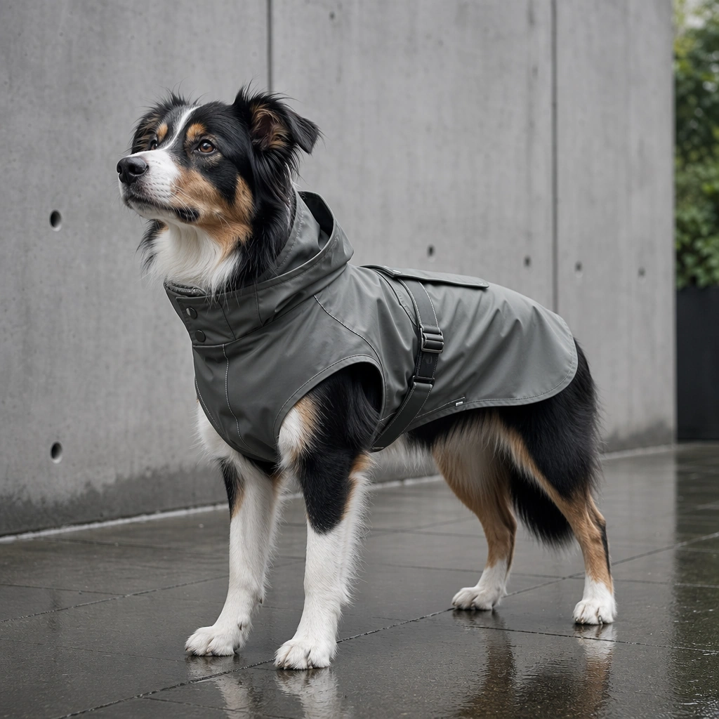
Scene: A square launch board for a pet lifestyle accessory brand, combining product hero presentation, tactile material realism, and polished commercial hierarchy. The image should feel ready for a launch drop, lookbook grid, or ecommerce campaign, with a disciplined palette and enough structure to support future text overlays outside the generated image. Keep the styling modern, giftable, and design conscious rather than generic pet store clutter. Frame the shot in a damp but clean city sidewalk or studio set with cool gray light, controlled reflections, and subtle product graphics. Subject: Focus on one accessory story at a time: collars, bowls, carriers, apparel, charms, bedding, or matching human pet lifestyle pieces. Products must feel usable and materially believable. If a pet appears, the animal should reinforce scale, personality, and desirability without overshadowing the merchandise. The overall mood should balance warmth, quality, and retail polish. Feature a dog wearing a fitted raincoat with visible stitching, closures, and safe coverage while standing confidently. Important details: Show material cues clearly such as leather grain, nylon webbing, ceramic glaze, coated canvas, quilted textiles, matte buckles, or brushed metal hardware. Use graphic framing only lightly so the product remains the hero. The result should look like something a modern direct-to-consumer brand could ship across social launches, product pages, collection decks, and campaign tiles. Let the product feel functional and fashionable at once, suitable for seasonal drop content and outdoor lifestyle branding. Use case: Pet Brand Merch and Accessory Drop single study 4/9, raincoat apparel drop for a commercially reusable prompt atlas example. Constraints: No readable text, no watermark, no logos, preserve exact 1:1 aspect ratio, no readable logos, no overstuffed retail shelf clutter, no novelty toy overload, no unsafe pet styling, no generic discount store vibe, no fake luxury monogram, no heavy rainstorm chaos, no human umbrella dominance, no costume cosplay mood.

Example generated from “Pet Brand Merch And Accessory Drop — Leash Charm Bundle Board”
GPT Image 2en

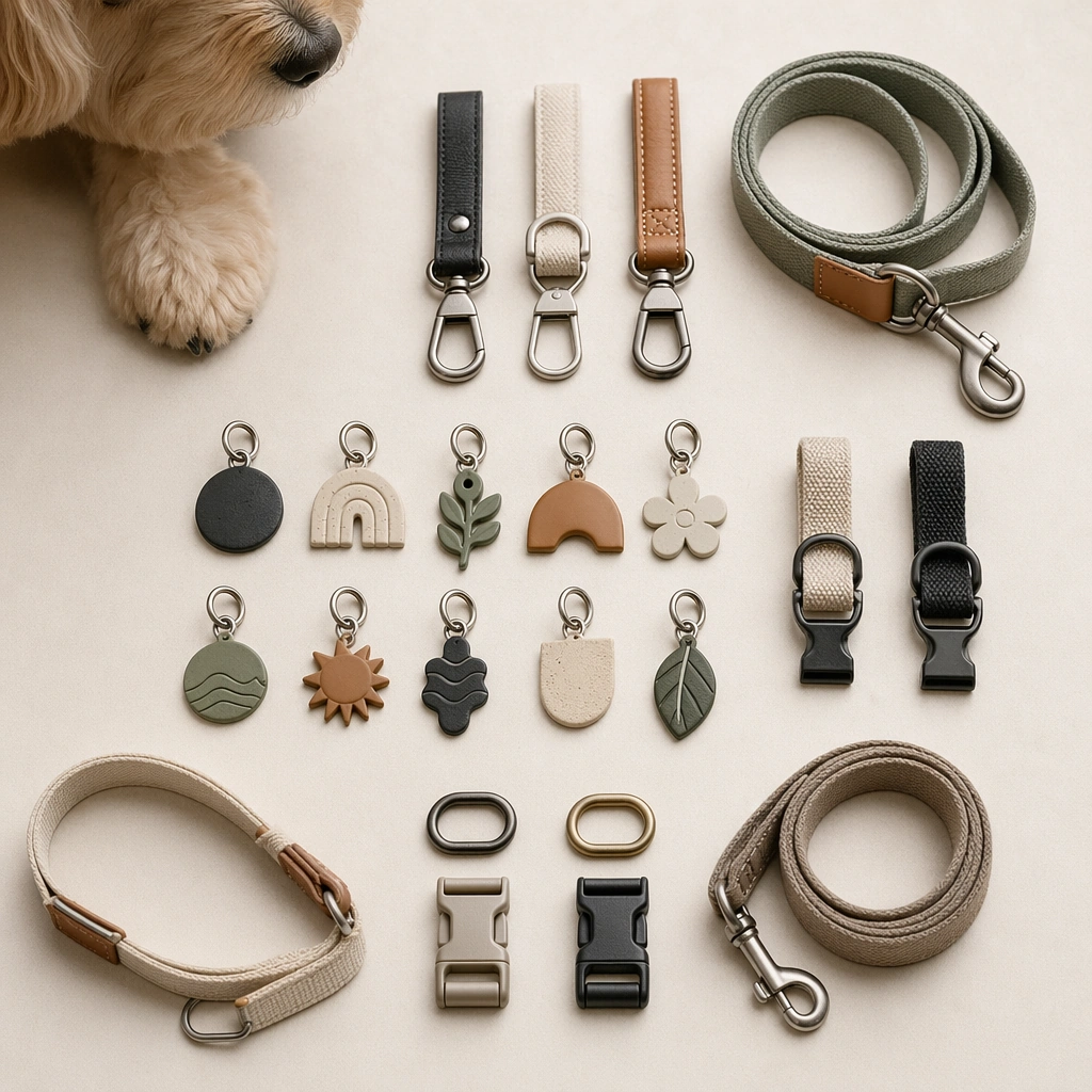
Scene: A square launch board for a pet lifestyle accessory brand, combining product hero presentation, tactile material realism, and polished commercial hierarchy. The image should feel ready for a launch drop, lookbook grid, or ecommerce campaign, with a disciplined palette and enough structure to support future text overlays outside the generated image. Keep the styling modern, giftable, and design conscious rather than generic pet store clutter. Use a close tabletop merchandising setup with metal hooks, straps, and small accessories arranged in a precise grid. Subject: Focus on one accessory story at a time: collars, bowls, carriers, apparel, charms, bedding, or matching human pet lifestyle pieces. Products must feel usable and materially believable. If a pet appears, the animal should reinforce scale, personality, and desirability without overshadowing the merchandise. The overall mood should balance warmth, quality, and retail polish. Focus on the accessory bundle itself while a pet portrait or cropped body remains secondary for scale and styling context. Important details: Show material cues clearly such as leather grain, nylon webbing, ceramic glaze, coated canvas, quilted textiles, matte buckles, or brushed metal hardware. Use graphic framing only lightly so the product remains the hero. The result should look like something a modern direct-to-consumer brand could ship across social launches, product pages, collection decks, and campaign tiles. The board should read as a collection drop, with clear variation, premium finish, and giftable organization. Use case: Pet Brand Merch and Accessory Drop single study 5/9, leash charm bundle board for a commercially reusable prompt atlas example. Constraints: No readable text, no watermark, no logos, preserve exact 1:1 aspect ratio, no readable logos, no overstuffed retail shelf clutter, no novelty toy overload, no unsafe pet styling, no generic discount store vibe, no fake luxury monogram, no jewelry brand imitation, no logo tags, no cluttered keychain pile.

Example generated from “Pet Brand Merch And Accessory Drop — Sleep Bed Textile Line”
GPT Image 2en

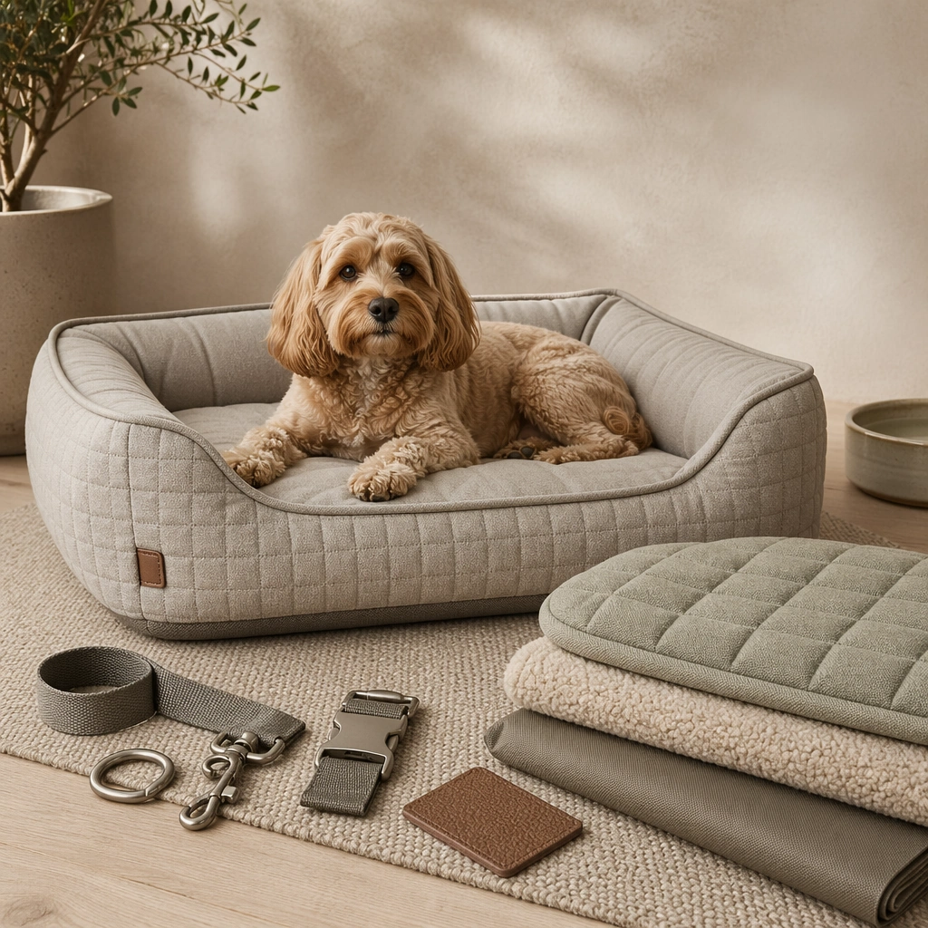
Scene: A square launch board for a pet lifestyle accessory brand, combining product hero presentation, tactile material realism, and polished commercial hierarchy. The image should feel ready for a launch drop, lookbook grid, or ecommerce campaign, with a disciplined palette and enough structure to support future text overlays outside the generated image. Keep the styling modern, giftable, and design conscious rather than generic pet store clutter. Stage a soft interior corner with one bed, folded textile samples, and a tidy palette story built into the square composition. Subject: Focus on one accessory story at a time: collars, bowls, carriers, apparel, charms, bedding, or matching human pet lifestyle pieces. Products must feel usable and materially believable. If a pet appears, the animal should reinforce scale, personality, and desirability without overshadowing the merchandise. The overall mood should balance warmth, quality, and retail polish. Show a pet comfortably resting on the bed, with enough visible product structure to communicate shape, cushioning, and fabric quality. Important details: Show material cues clearly such as leather grain, nylon webbing, ceramic glaze, coated canvas, quilted textiles, matte buckles, or brushed metal hardware. Use graphic framing only lightly so the product remains the hero. The result should look like something a modern direct-to-consumer brand could ship across social launches, product pages, collection decks, and campaign tiles. The mood should feel restful, tactile, and home-worthy, suitable for collection pages or nurture-focused campaign content. Use case: Pet Brand Merch and Accessory Drop single study 6/9, sleep bed textile line for a commercially reusable prompt atlas example. Constraints: No readable text, no watermark, no logos, preserve exact 1:1 aspect ratio, no readable logos, no overstuffed retail shelf clutter, no novelty toy overload, no unsafe pet styling, no generic discount store vibe, no fake luxury monogram, no messy bedroom, no blanket mountain, no sleepy blur.

Example generated from “Pet Brand Merch And Accessory Drop — Matching Owner Pet Tote Board”
GPT Image 2en

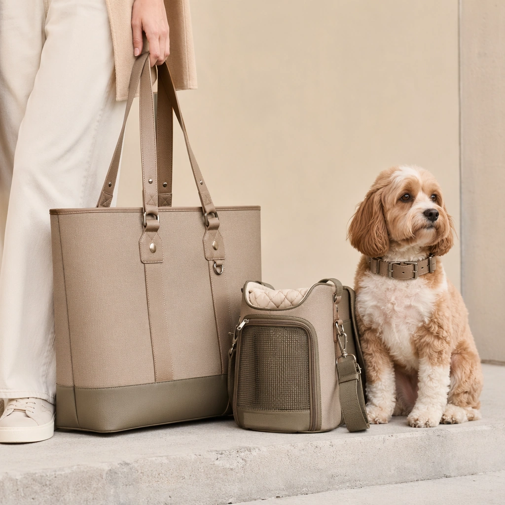
Scene: A square launch board for a pet lifestyle accessory brand, combining product hero presentation, tactile material realism, and polished commercial hierarchy. The image should feel ready for a launch drop, lookbook grid, or ecommerce campaign, with a disciplined palette and enough structure to support future text overlays outside the generated image. Keep the styling modern, giftable, and design conscious rather than generic pet store clutter. Use a clean studio or street-side setup with one tote, one pet accessory counterpart, and only partial owner presence for scale. Subject: Focus on one accessory story at a time: collars, bowls, carriers, apparel, charms, bedding, or matching human pet lifestyle pieces. Products must feel usable and materially believable. If a pet appears, the animal should reinforce scale, personality, and desirability without overshadowing the merchandise. The overall mood should balance warmth, quality, and retail polish. The product pairing should feel intentional and fashion-aware, with the pet wearing or sitting beside the coordinated accessory set. Important details: Show material cues clearly such as leather grain, nylon webbing, ceramic glaze, coated canvas, quilted textiles, matte buckles, or brushed metal hardware. Use graphic framing only lightly so the product remains the hero. The result should look like something a modern direct-to-consumer brand could ship across social launches, product pages, collection decks, and campaign tiles. The board should sell shared lifestyle identity and gifting appeal while keeping product surfaces and pet comfort clear. Use case: Pet Brand Merch and Accessory Drop single study 7/9, matching owner pet tote board for a commercially reusable prompt atlas example. Constraints: No readable text, no watermark, no logos, preserve exact 1:1 aspect ratio, no readable logos, no overstuffed retail shelf clutter, no novelty toy overload, no unsafe pet styling, no generic discount store vibe, no fake luxury monogram, no full fashion model takeover, no readable print slogans, no cluttered street background.

Example generated from “Pet Brand Merch And Accessory Drop — Seasonal Colorway Grid”
GPT Image 2en

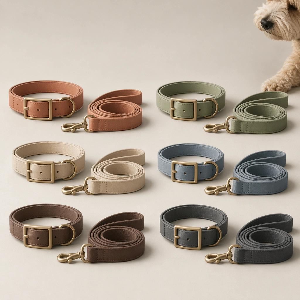
Scene: A square launch board for a pet lifestyle accessory brand, combining product hero presentation, tactile material realism, and polished commercial hierarchy. The image should feel ready for a launch drop, lookbook grid, or ecommerce campaign, with a disciplined palette and enough structure to support future text overlays outside the generated image. Keep the styling modern, giftable, and design conscious rather than generic pet store clutter. Compose a clean front-facing grid of collars, leashes, bowls, or apparel swatches on a neutral studio background with disciplined shadows. Subject: Focus on one accessory story at a time: collars, bowls, carriers, apparel, charms, bedding, or matching human pet lifestyle pieces. Products must feel usable and materially believable. If a pet appears, the animal should reinforce scale, personality, and desirability without overshadowing the merchandise. The overall mood should balance warmth, quality, and retail polish. Highlight coordinated product variants across four to six seasonal colors while a minimal pet cue keeps the category instantly recognizable. Important details: Show material cues clearly such as leather grain, nylon webbing, ceramic glaze, coated canvas, quilted textiles, matte buckles, or brushed metal hardware. Use graphic framing only lightly so the product remains the hero. The result should look like something a modern direct-to-consumer brand could ship across social launches, product pages, collection decks, and campaign tiles. The image is about system thinking: coherent palette families, repeatable materials, and brand-level assortment planning. Use case: Pet Brand Merch and Accessory Drop single study 8/9, seasonal colorway grid for a commercially reusable prompt atlas example. Constraints: No readable text, no watermark, no logos, preserve exact 1:1 aspect ratio, no readable logos, no overstuffed retail shelf clutter, no novelty toy overload, no unsafe pet styling, no generic discount store vibe, no fake luxury monogram, no rainbow overload, no readable collection labels, no cheap product packshot lighting.

Example generated from “Pet Brand Merch And Accessory Drop — Giftable Accessory Flatlay”
GPT Image 2en

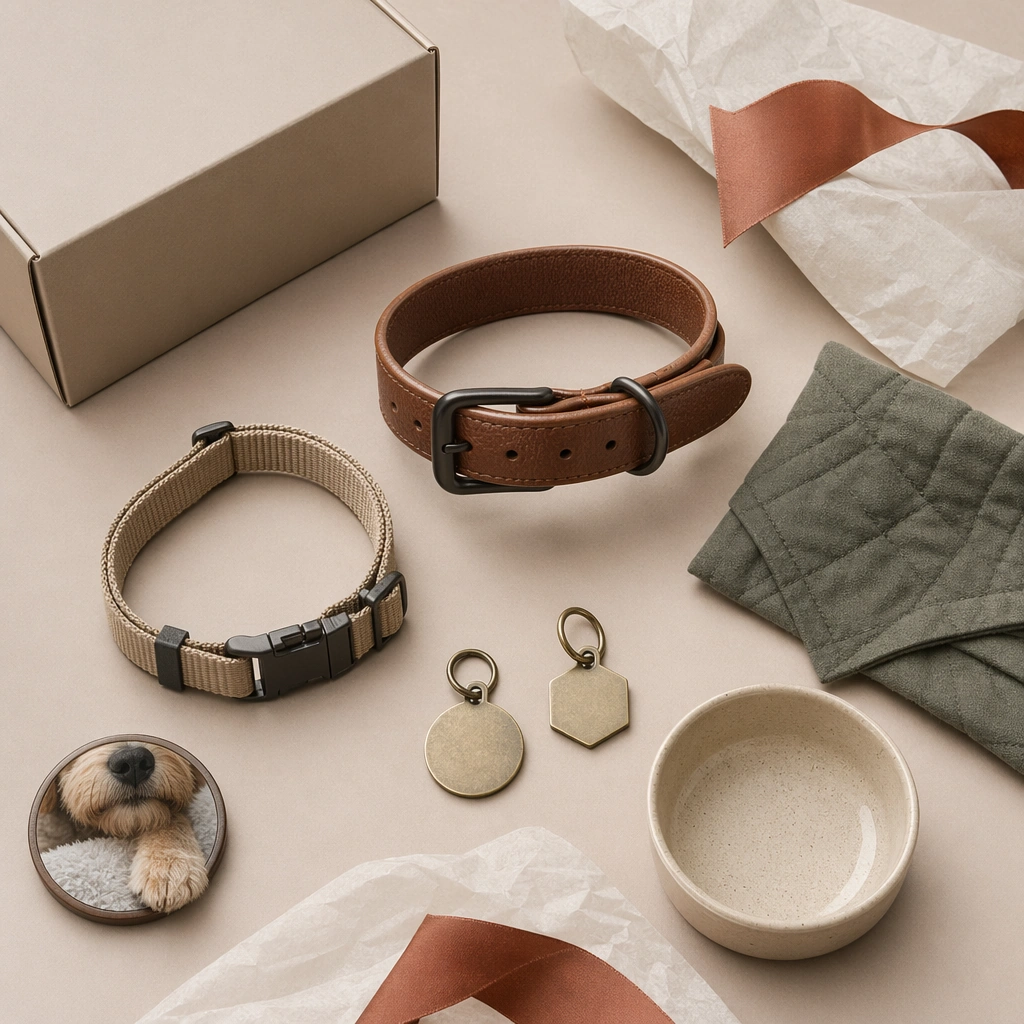
Scene: A square launch board for a pet lifestyle accessory brand, combining product hero presentation, tactile material realism, and polished commercial hierarchy. The image should feel ready for a launch drop, lookbook grid, or ecommerce campaign, with a disciplined palette and enough structure to support future text overlays outside the generated image. Keep the styling modern, giftable, and design conscious rather than generic pet store clutter. Use top-down photography with tissue paper, boxes, ribbon forms, and grouped accessories arranged in a controlled flatlay system. Subject: Focus on one accessory story at a time: collars, bowls, carriers, apparel, charms, bedding, or matching human pet lifestyle pieces. Products must feel usable and materially believable. If a pet appears, the animal should reinforce scale, personality, and desirability without overshadowing the merchandise. The overall mood should balance warmth, quality, and retail polish. Show a set of small accessories that feel ready to gift, with one subtle pet presence or portrait medallion to anchor the category. Important details: Show material cues clearly such as leather grain, nylon webbing, ceramic glaze, coated canvas, quilted textiles, matte buckles, or brushed metal hardware. Use graphic framing only lightly so the product remains the hero. The result should look like something a modern direct-to-consumer brand could ship across social launches, product pages, collection decks, and campaign tiles. The board should feel premium, editorial, and easy to adapt to gifting campaigns, registry content, or checkout upsell placements. Use case: Pet Brand Merch and Accessory Drop single study 9/9, giftable accessory flatlay for a commercially reusable prompt atlas example. Constraints: No readable text, no watermark, no logos, preserve exact 1:1 aspect ratio, no readable logos, no overstuffed retail shelf clutter, no novelty toy overload, no unsafe pet styling, no generic discount store vibe, no fake luxury monogram, no brand marks, no ribbon clutter, no scrapbook excess.

Example generated from “Pet Clinic And Vet Trust Visuals — Clinic Welcome Reception Board”
GPT Image 2en

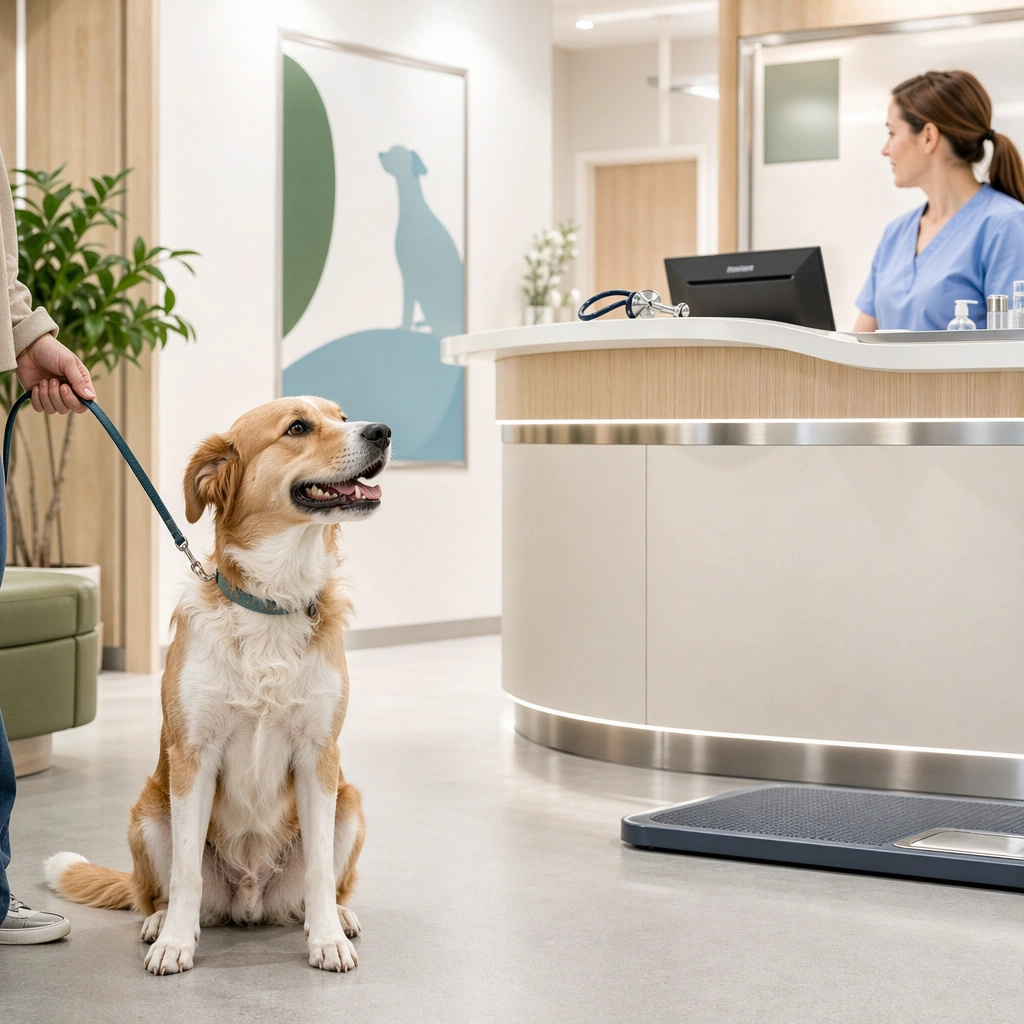
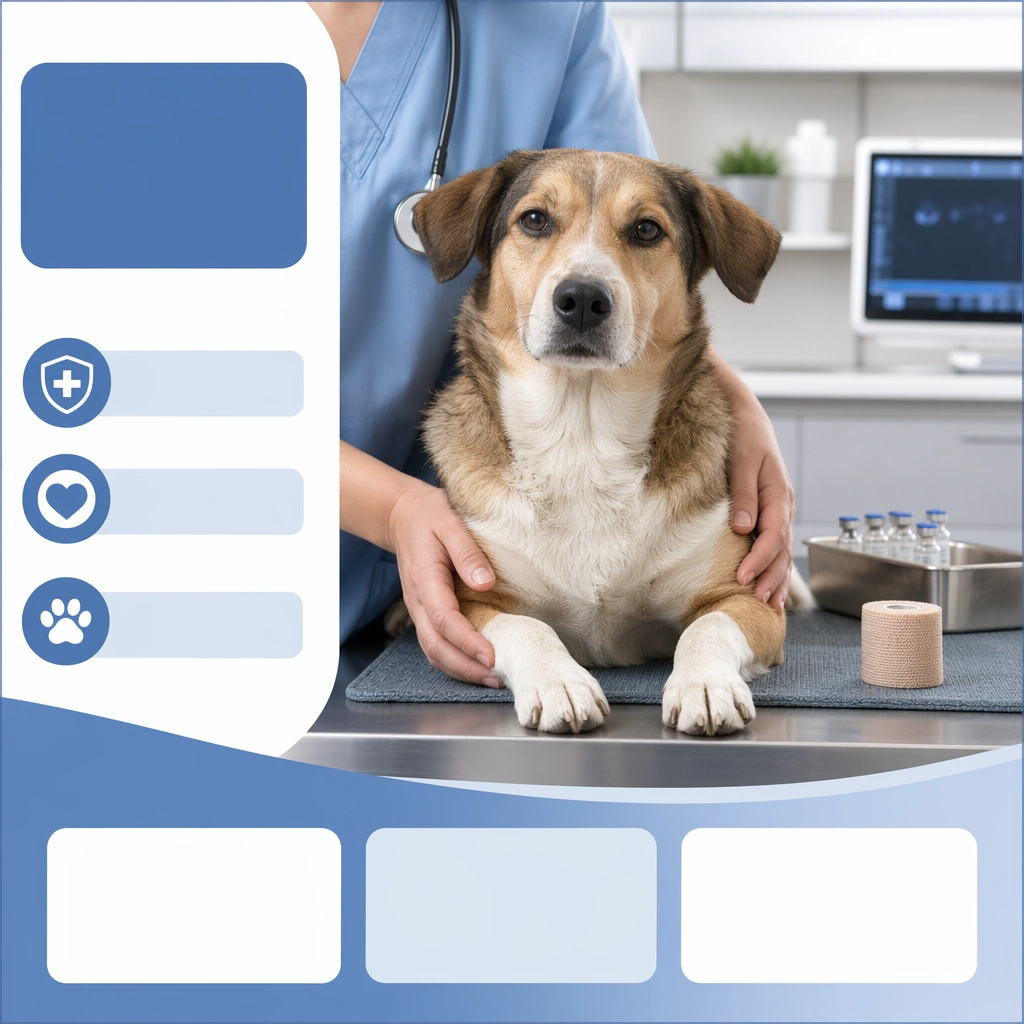
Scene: A square veterinary communication visual designed for clinic websites, social education posts, waiting room materials, or service pages. The image should combine modern clinical realism with calm emotional tone. Use clean surfaces, soft medical color palettes, and enough layout structure that the asset feels intentionally designed rather than captured spontaneously. Every scene must support trust, reassurance, and professional competence. Show a bright reception zone with curved desk edges, pale wood and white materials, one waiting pet, and abstract signage zones without readable copy. Subject: Focus on one pet care moment such as welcome, examination, vaccination, dental checking, diagnostics, recovery, or urgent intake. Animals should appear calm or gently supported, while any human presence remains partially framed, professional, and non dominant. Show believable equipment, treatment spaces, or clinic cues, but avoid frightening procedure intensity. The visual message is care, order, and transparency. Feature a calm dog near the reception area with a gentle handler implied off frame, making the space feel welcoming and organized. Important details: Use veterinary specific signals like stainless surfaces, examination mats, stethoscope curves, soft uniforms, scan monitors without readable data, or preventive care props. Keep everything polished, realistic, and emotionally safe. The image should feel useful for a real clinic marketing system and credible to pet owners who need both competence and warmth. Avoid generic hospital drama or sanitized emptiness. The message should be first impression trust: clean design, efficient flow, and emotional softness without resorting to hospitality clichés. Use case: Pet Clinic and Vet Trust Visuals single study 1/9, clinic welcome reception board for a commercially reusable prompt atlas example. Constraints: No readable text, no watermark, no logos, preserve exact 1:1 aspect ratio, no surgery gore, no visible needles entering skin, no readable charts, no emergency panic chaos, no harsh fluorescent ugliness, no fear based pet expressions, no crowded lobby, no anxious leash pulling, no visible paperwork text.

Example generated from “Pet Clinic And Vet Trust Visuals — Gentle Exam Table Visual”
GPT Image 2en

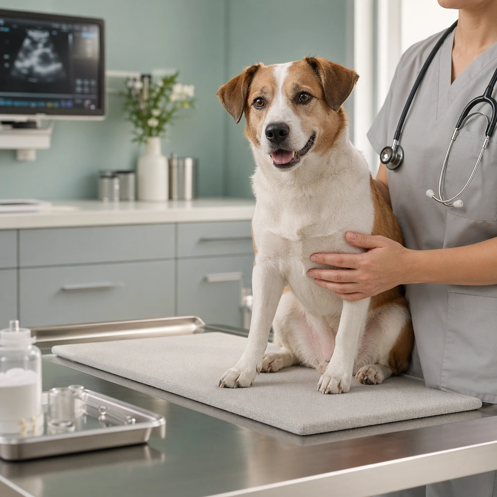
Scene: A square veterinary communication visual designed for clinic websites, social education posts, waiting room materials, or service pages. The image should combine modern clinical realism with calm emotional tone. Use clean surfaces, soft medical color palettes, and enough layout structure that the asset feels intentionally designed rather than captured spontaneously. Every scene must support trust, reassurance, and professional competence. Use a tidy exam room with an elevated table, matte wall color, soft daylight balance, and one clinician figure partially visible in neutral scrubs. Subject: Focus on one pet care moment such as welcome, examination, vaccination, dental checking, diagnostics, recovery, or urgent intake. Animals should appear calm or gently supported, while any human presence remains partially framed, professional, and non dominant. Show believable equipment, treatment spaces, or clinic cues, but avoid frightening procedure intensity. The visual message is care, order, and transparency. Show a pet standing or seated comfortably on the exam table while the clinician offers calm touch and attention rather than active procedure drama. Important details: Use veterinary specific signals like stainless surfaces, examination mats, stethoscope curves, soft uniforms, scan monitors without readable data, or preventive care props. Keep everything polished, realistic, and emotionally safe. The image should feel useful for a real clinic marketing system and credible to pet owners who need both competence and warmth. Avoid generic hospital drama or sanitized emptiness. The image should communicate trust through posture, spacing, and environment. Everything should feel precise, warm, and medically credible. Use case: Pet Clinic and Vet Trust Visuals single study 2/9, gentle exam table visual for a commercially reusable prompt atlas example. Constraints: No readable text, no watermark, no logos, preserve exact 1:1 aspect ratio, no surgery gore, no visible needles entering skin, no readable charts, no emergency panic chaos, no harsh fluorescent ugliness, no fear based pet expressions, no restraint tension, no sharp tool focus, no crowded medical machines.

Example generated from “Pet Clinic And Vet Trust Visuals — Vaccination Reassurance Card”
GPT Image 2en

Scene: A square veterinary communication visual designed for clinic websites, social education posts, waiting room materials, or service pages. The image should combine modern clinical realism with calm emotional tone. Use clean surfaces, soft medical color palettes, and enough layout structure that the asset feels intentionally designed rather than captured spontaneously. Every scene must support trust, reassurance, and professional competence. Compose a clean square card with one prep area, soft clinic blue accents, and placeholder information bands arranged around the portrait. Subject: Focus on one pet care moment such as welcome, examination, vaccination, dental checking, diagnostics, recovery, or urgent intake. Animals should appear calm or gently supported, while any human presence remains partially framed, professional, and non dominant. Show believable equipment, treatment spaces, or clinic cues, but avoid frightening procedure intensity. The visual message is care, order, and transparency. Feature a pet being calmly held or comforted before or after a vaccination, with relaxed eyes and stable posture. Important details: Use veterinary specific signals like stainless surfaces, examination mats, stethoscope curves, soft uniforms, scan monitors without readable data, or preventive care props. Keep everything polished, realistic, and emotionally safe. The image should feel useful for a real clinic marketing system and credible to pet owners who need both competence and warmth. Avoid generic hospital drama or sanitized emptiness. The key is emotional reassurance, not the injection itself. Make the card feel educational, safe, and useful for clinic reminders. Use case: Pet Clinic and Vet Trust Visuals single study 3/9, vaccination reassurance card for a commercially reusable prompt atlas example. Constraints: No readable text, no watermark, no logos, preserve exact 1:1 aspect ratio, no surgery gore, no visible needles entering skin, no readable charts, no emergency panic chaos, no harsh fluorescent ugliness, no fear based pet expressions, no needle close up, no crying child analogies, no fear expression.

Example generated from “Pet Clinic And Vet Trust Visuals — Dental Care Consult Panel”
GPT Image 2en

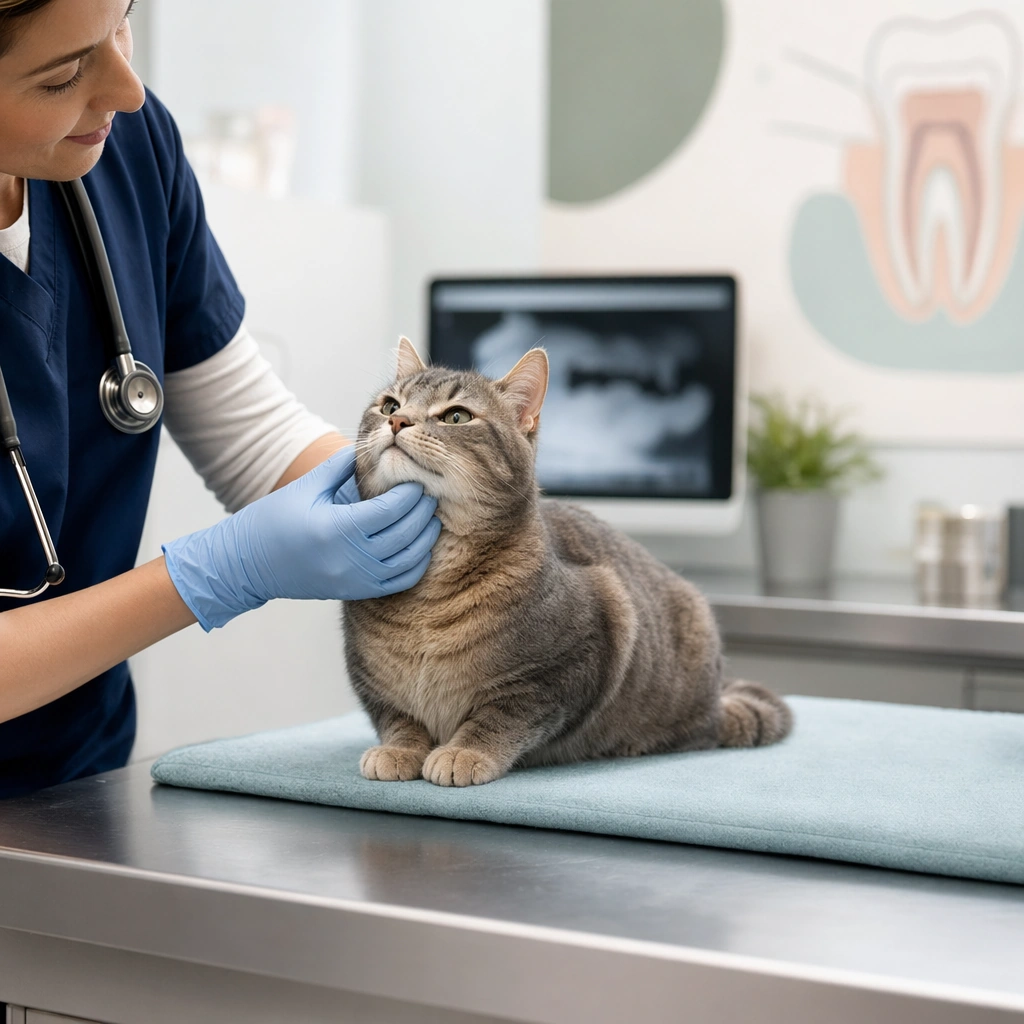
Scene: A square veterinary communication visual designed for clinic websites, social education posts, waiting room materials, or service pages. The image should combine modern clinical realism with calm emotional tone. Use clean surfaces, soft medical color palettes, and enough layout structure that the asset feels intentionally designed rather than captured spontaneously. Every scene must support trust, reassurance, and professional competence. Use a consultation room or exam corner with cool neutral tones, one dental illustration zone as abstract shapes, and a composed square layout. Subject: Focus on one pet care moment such as welcome, examination, vaccination, dental checking, diagnostics, recovery, or urgent intake. Animals should appear calm or gently supported, while any human presence remains partially framed, professional, and non dominant. Show believable equipment, treatment spaces, or clinic cues, but avoid frightening procedure intensity. The visual message is care, order, and transparency. Show a dog or cat with mouth closed, calm posture, and a veterinarian checking the face or jaw area in a non invasive way. Important details: Use veterinary specific signals like stainless surfaces, examination mats, stethoscope curves, soft uniforms, scan monitors without readable data, or preventive care props. Keep everything polished, realistic, and emotionally safe. The image should feel useful for a real clinic marketing system and credible to pet owners who need both competence and warmth. Avoid generic hospital drama or sanitized emptiness. The board should suggest routine dental care and preventative wellness rather than scary intervention or deep procedure imagery. Use case: Pet Clinic and Vet Trust Visuals single study 4/9, dental care consult panel for a commercially reusable prompt atlas example. Constraints: No readable text, no watermark, no logos, preserve exact 1:1 aspect ratio, no surgery gore, no visible needles entering skin, no readable charts, no emergency panic chaos, no harsh fluorescent ugliness, no fear based pet expressions, no open bloody mouth, no metal tool close up, no sedation cues.

Example generated from “Pet Clinic And Vet Trust Visuals — Recovery Room Comfort Board”
GPT Image 2en

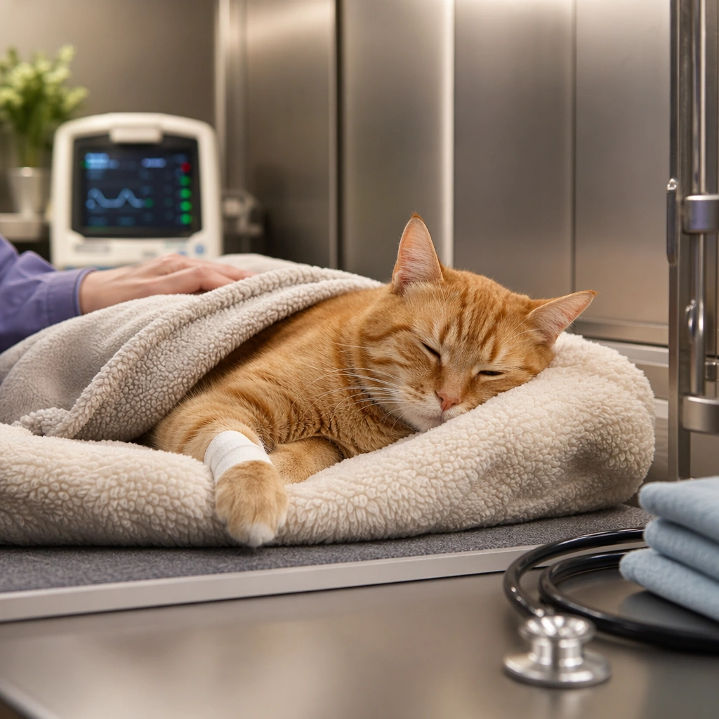
Scene: A square veterinary communication visual designed for clinic websites, social education posts, waiting room materials, or service pages. The image should combine modern clinical realism with calm emotional tone. Use clean surfaces, soft medical color palettes, and enough layout structure that the asset feels intentionally designed rather than captured spontaneously. Every scene must support trust, reassurance, and professional competence. Create a calm recovery corner with soft blankets, clean enclosure details, warm low contrast light, and a minimal monitoring cue in the background. Subject: Focus on one pet care moment such as welcome, examination, vaccination, dental checking, diagnostics, recovery, or urgent intake. Animals should appear calm or gently supported, while any human presence remains partially framed, professional, and non dominant. Show believable equipment, treatment spaces, or clinic cues, but avoid frightening procedure intensity. The visual message is care, order, and transparency. Feature a resting pet looking sleepy but comfortable, with careful bedding, clean fur, and an atmosphere of attentive aftercare. Important details: Use veterinary specific signals like stainless surfaces, examination mats, stethoscope curves, soft uniforms, scan monitors without readable data, or preventive care props. Keep everything polished, realistic, and emotionally safe. The image should feel useful for a real clinic marketing system and credible to pet owners who need both competence and warmth. Avoid generic hospital drama or sanitized emptiness. The image should reassure owners that recovery is quiet, observed, and compassionate, not sterile or frightening. Use case: Pet Clinic and Vet Trust Visuals single study 5/9, recovery room comfort board for a commercially reusable prompt atlas example. Constraints: No readable text, no watermark, no logos, preserve exact 1:1 aspect ratio, no surgery gore, no visible needles entering skin, no readable charts, no emergency panic chaos, no harsh fluorescent ugliness, no fear based pet expressions, no tubes dominating the frame, no distress posture, no dark ICU drama.

Example generated from “Pet Clinic And Vet Trust Visuals — Diagnostic Lab Sample Board”
GPT Image 2en

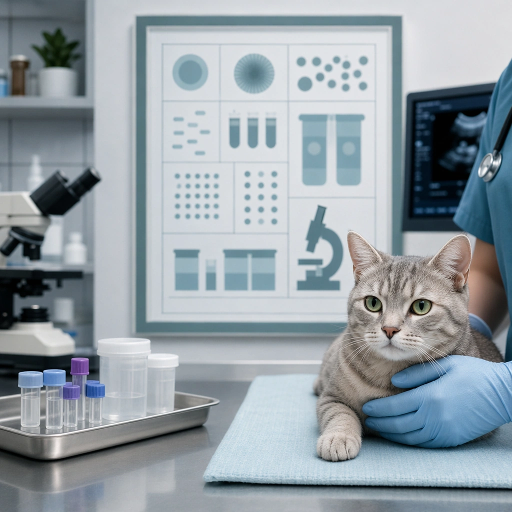
Scene: A square veterinary communication visual designed for clinic websites, social education posts, waiting room materials, or service pages. The image should combine modern clinical realism with calm emotional tone. Use clean surfaces, soft medical color palettes, and enough layout structure that the asset feels intentionally designed rather than captured spontaneously. Every scene must support trust, reassurance, and professional competence. Frame a square board with labeled-shape placeholders, sample tray silhouettes, microscope form cues, and one pet portrait linked to the diagnostic context. Subject: Focus on one pet care moment such as welcome, examination, vaccination, dental checking, diagnostics, recovery, or urgent intake. Animals should appear calm or gently supported, while any human presence remains partially framed, professional, and non dominant. Show believable equipment, treatment spaces, or clinic cues, but avoid frightening procedure intensity. The visual message is care, order, and transparency. Show a pet calmly present in the foreground or side panel while the clinic environment and diagnostic tools remain secondary but clearly real. Important details: Use veterinary specific signals like stainless surfaces, examination mats, stethoscope curves, soft uniforms, scan monitors without readable data, or preventive care props. Keep everything polished, realistic, and emotionally safe. The image should feel useful for a real clinic marketing system and credible to pet owners who need both competence and warmth. Avoid generic hospital drama or sanitized emptiness. This should feel like a modern explanation asset for testing and diagnostics, visually credible without becoming technical or cold. Use case: Pet Clinic and Vet Trust Visuals single study 6/9, diagnostic lab sample board for a commercially reusable prompt atlas example. Constraints: No readable text, no watermark, no logos, preserve exact 1:1 aspect ratio, no surgery gore, no visible needles entering skin, no readable charts, no emergency panic chaos, no harsh fluorescent ugliness, no fear based pet expressions, no blood close up, no readable charts, no intimidating lab darkness.

Example generated from “Pet Clinic And Vet Trust Visuals — Telehealth Follow-Up Visual”
GPT Image 2en

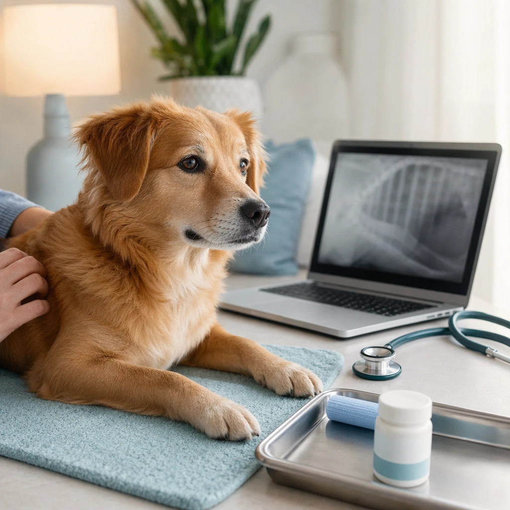
Scene: A square veterinary communication visual designed for clinic websites, social education posts, waiting room materials, or service pages. The image should combine modern clinical realism with calm emotional tone. Use clean surfaces, soft medical color palettes, and enough layout structure that the asset feels intentionally designed rather than captured spontaneously. Every scene must support trust, reassurance, and professional competence. Use a tidy home corner with laptop silhouette, clinic color accents, and structured layout panels that suggest continuity of care. Subject: Focus on one pet care moment such as welcome, examination, vaccination, dental checking, diagnostics, recovery, or urgent intake. Animals should appear calm or gently supported, while any human presence remains partially framed, professional, and non dominant. Show believable equipment, treatment spaces, or clinic cues, but avoid frightening procedure intensity. The visual message is care, order, and transparency. Feature a calm pet beside the remote setup, with one owner hand or arm implied only lightly and the pet still clearly central. Important details: Use veterinary specific signals like stainless surfaces, examination mats, stethoscope curves, soft uniforms, scan monitors without readable data, or preventive care props. Keep everything polished, realistic, and emotionally safe. The image should feel useful for a real clinic marketing system and credible to pet owners who need both competence and warmth. Avoid generic hospital drama or sanitized emptiness. The message should be convenience plus trust, linking clinic professionalism to home follow-up without becoming generic video call content. Use case: Pet Clinic and Vet Trust Visuals single study 7/9, telehealth follow-up visual for a commercially reusable prompt atlas example. Constraints: No readable text, no watermark, no logos, preserve exact 1:1 aspect ratio, no surgery gore, no visible needles entering skin, no readable charts, no emergency panic chaos, no harsh fluorescent ugliness, no fear based pet expressions, no readable screen UI, no messy living room, no dominant human portrait.

Example generated from “Pet Clinic And Vet Trust Visuals — Preventive Care Plan Board”
GPT Image 2en

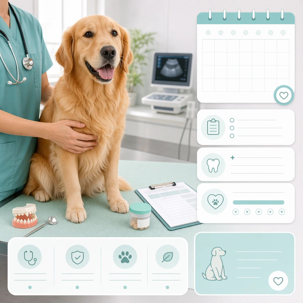
Scene: A square veterinary communication visual designed for clinic websites, social education posts, waiting room materials, or service pages. The image should combine modern clinical realism with calm emotional tone. Use clean surfaces, soft medical color palettes, and enough layout structure that the asset feels intentionally designed rather than captured spontaneously. Every scene must support trust, reassurance, and professional competence. Compose a clean board with one healthy pet portrait, calendar-like placeholder modules, and soft clinic greens or blues. Subject: Focus on one pet care moment such as welcome, examination, vaccination, dental checking, diagnostics, recovery, or urgent intake. Animals should appear calm or gently supported, while any human presence remains partially framed, professional, and non dominant. Show believable equipment, treatment spaces, or clinic cues, but avoid frightening procedure intensity. The visual message is care, order, and transparency. Show a well cared for adult pet looking relaxed and alert, positioned as the hero of an ongoing wellness journey rather than a sick patient. Important details: Use veterinary specific signals like stainless surfaces, examination mats, stethoscope curves, soft uniforms, scan monitors without readable data, or preventive care props. Keep everything polished, realistic, and emotionally safe. The image should feel useful for a real clinic marketing system and credible to pet owners who need both competence and warmth. Avoid generic hospital drama or sanitized emptiness. The board should feel subscription ready and retention friendly, useful for annual checkup, wellness plan, or reminder campaigns. Use case: Pet Clinic and Vet Trust Visuals single study 8/9, preventive care plan board for a commercially reusable prompt atlas example. Constraints: No readable text, no watermark, no logos, preserve exact 1:1 aspect ratio, no surgery gore, no visible needles entering skin, no readable charts, no emergency panic chaos, no harsh fluorescent ugliness, no fear based pet expressions, no disease scare motifs, no emergency red palette, no complicated medical diagrams.

Example generated from “Pet Clinic And Vet Trust Visuals — Emergency Night Intake Scene”
GPT Image 2en

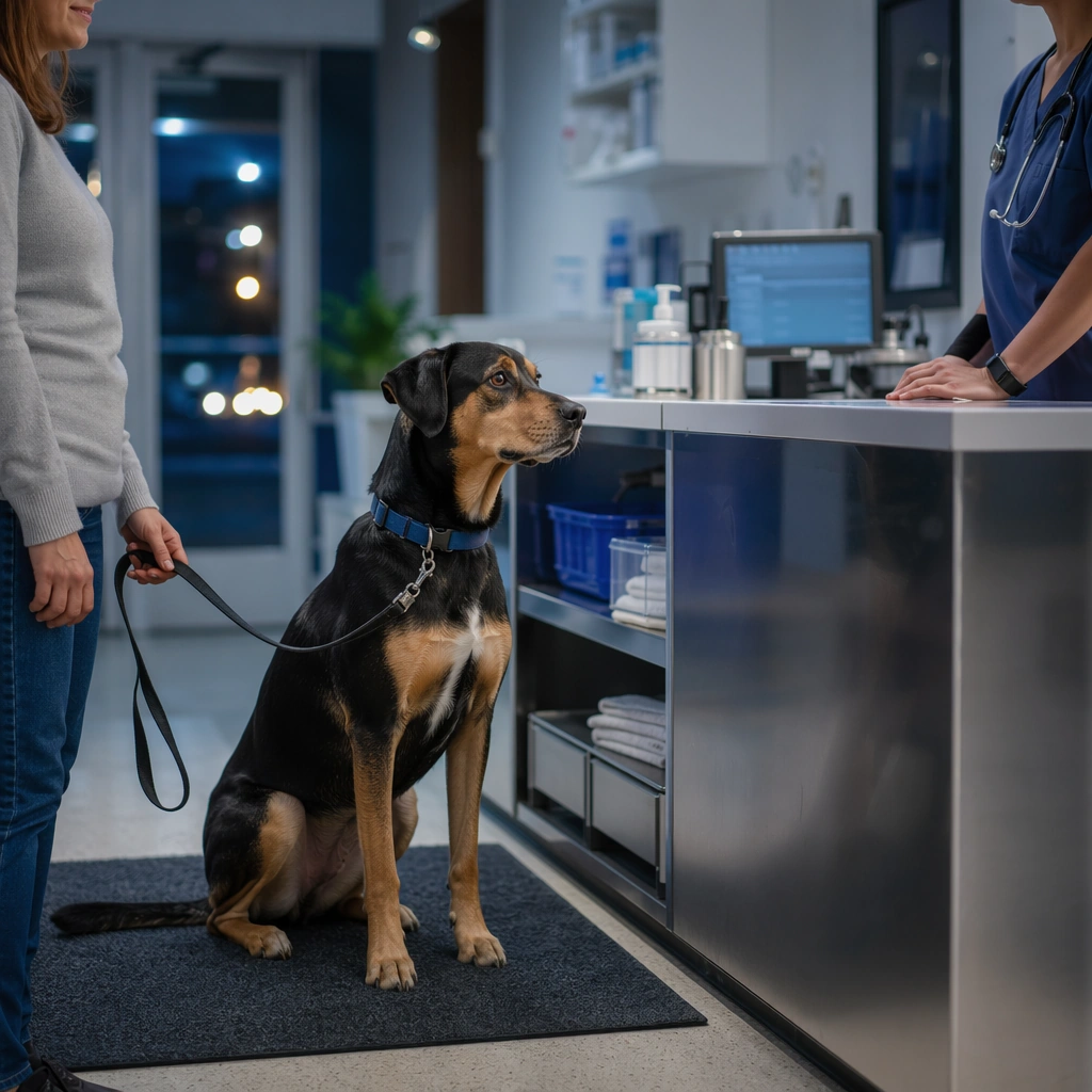
Scene: A square veterinary communication visual designed for clinic websites, social education posts, waiting room materials, or service pages. The image should combine modern clinical realism with calm emotional tone. Use clean surfaces, soft medical color palettes, and enough layout structure that the asset feels intentionally designed rather than captured spontaneously. Every scene must support trust, reassurance, and professional competence. Use a night clinic entrance or intake desk with cooler light, strong organization, and a focused composition that still feels controlled and humane. Subject: Focus on one pet care moment such as welcome, examination, vaccination, dental checking, diagnostics, recovery, or urgent intake. Animals should appear calm or gently supported, while any human presence remains partially framed, professional, and non dominant. Show believable equipment, treatment spaces, or clinic cues, but avoid frightening procedure intensity. The visual message is care, order, and transparency. Feature a pet arriving with owner support implied, while the clinic team and environment communicate readiness, steadiness, and care. Important details: Use veterinary specific signals like stainless surfaces, examination mats, stethoscope curves, soft uniforms, scan monitors without readable data, or preventive care props. Keep everything polished, realistic, and emotionally safe. The image should feel useful for a real clinic marketing system and credible to pet owners who need both competence and warmth. Avoid generic hospital drama or sanitized emptiness. The image should acknowledge urgency but lead with competence and reassurance, suitable for after-hours service pages or public trust campaigns. Use case: Pet Clinic and Vet Trust Visuals single study 9/9, emergency night intake scene for a commercially reusable prompt atlas example. Constraints: No readable text, no watermark, no logos, preserve exact 1:1 aspect ratio, no surgery gore, no visible needles entering skin, no readable charts, no emergency panic chaos, no harsh fluorescent ugliness, no fear based pet expressions, no chaos, no visible injury trauma, no alarm light theatrics.

Example generated from “Pet Food Packaging And Bowl Scene System — Dry Food Bag and Bowl Hero”
GPT Image 2en

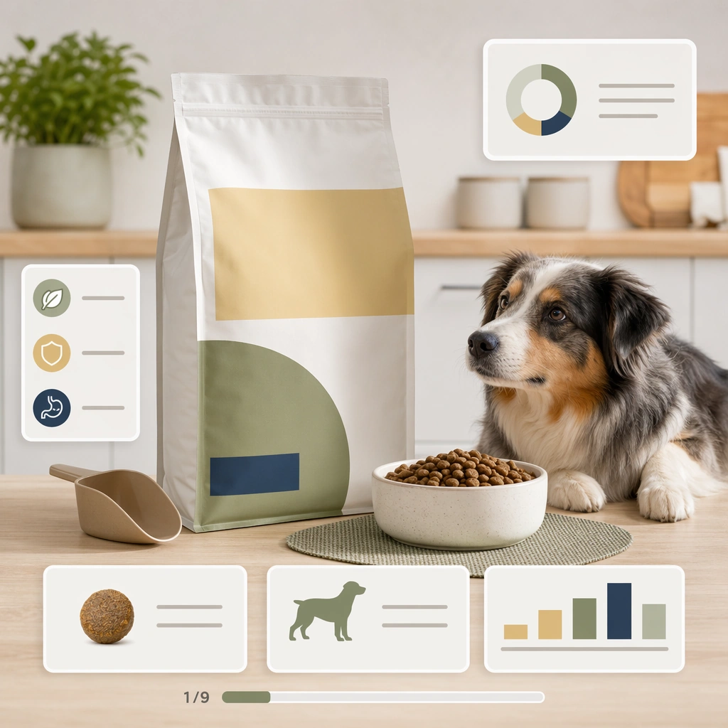
Scene: A square pet food marketing board that combines believable packaging forms, food texture realism, bowl presentation, and feeding context. The composition should feel useful for shelf mockups, product detail pages, retail social posts, and launch decks. Keep surfaces clean, lighting appetizing but not glossy in a human food luxury way, and layout structured enough to communicate trust even without readable labels. Use a bright kitchen counter or studio tabletop with soft daylight, one upright bag, one ceramic bowl, and abstract nutrition card shapes around them. Subject: Anchor each image around one pet nutrition scenario: dry food, wet food, treats, toppers, life stage feeding, or ingredient reassurance. Packaging should look generic but premium, using abstract label blocks instead of text. Bowl scenes must feel species appropriate, portion realistic, and visually clean. Any pet presence should reinforce feeding trust and appetite rather than dominate the composition. Show realistic dry kibble texture in the bowl, a tidy feeding mat, and a nearby dog or cat looking interested but calm rather than lunging. Important details: Use real category cues such as pouch stands, tray seals, scoop shapes, freeze dried pieces, feeding mats, ingredient bowls, and veterinary-adjacent cleanliness where relevant. The overall tone should signal industry knowledge and commercial usefulness. Avoid fake luxury extremes or cartoon kibble. Make the board easy to scan, with clear hero focus and believable product hierarchy across package, food, and setting. The board should feel shelf ready and digitally versatile, with enough category logic for a real ecommerce hero image. Use case: Pet Food Packaging and Bowl Scene System single study 1/9, dry food bag and bowl hero for a commercially reusable prompt atlas example. Constraints: No readable text, no watermark, no logos, preserve exact 1:1 aspect ratio, no readable package copy, no brand logos, no unrealistic human gourmet plating, no overflowing portions, no unsafe ingredients, no messy floor spills, no human hands pouring, no shiny metallic glare overload, no decorative herbs.

Example generated from “Pet Food Packaging And Bowl Scene System — Wet Food Serving Board”
GPT Image 2en

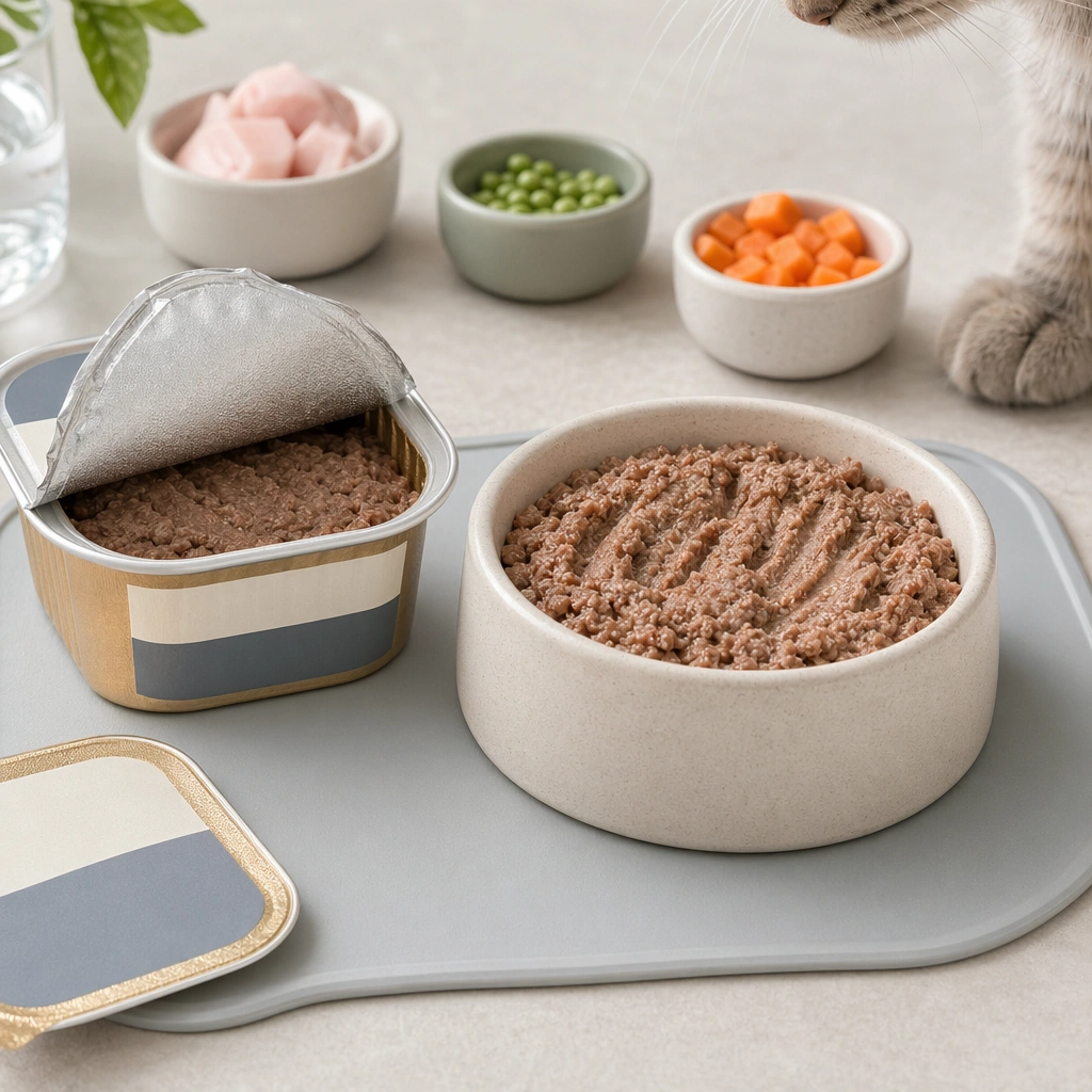
Scene: A square pet food marketing board that combines believable packaging forms, food texture realism, bowl presentation, and feeding context. The composition should feel useful for shelf mockups, product detail pages, retail social posts, and launch decks. Keep surfaces clean, lighting appetizing but not glossy in a human food luxury way, and layout structured enough to communicate trust even without readable labels. Frame a square serving setup with one opened tray or cup, one plated bowl portion, and a minimal cool neutral background. Subject: Anchor each image around one pet nutrition scenario: dry food, wet food, treats, toppers, life stage feeding, or ingredient reassurance. Packaging should look generic but premium, using abstract label blocks instead of text. Bowl scenes must feel species appropriate, portion realistic, and visually clean. Any pet presence should reinforce feeding trust and appetite rather than dominate the composition. The food should look moist, structured, and species appropriate, with clean spooning marks and realistic portion scale beside the package form. Important details: Use real category cues such as pouch stands, tray seals, scoop shapes, freeze dried pieces, feeding mats, ingredient bowls, and veterinary-adjacent cleanliness where relevant. The overall tone should signal industry knowledge and commercial usefulness. Avoid fake luxury extremes or cartoon kibble. Make the board easy to scan, with clear hero focus and believable product hierarchy across package, food, and setting. Keep the mood clinical enough to trust and appetizing enough to sell, without drifting into human restaurant styling. Use case: Pet Food Packaging and Bowl Scene System single study 2/9, wet food serving board for a commercially reusable prompt atlas example. Constraints: No readable text, no watermark, no logos, preserve exact 1:1 aspect ratio, no readable package copy, no brand logos, no unrealistic human gourmet plating, no overflowing portions, no unsafe ingredients, no messy floor spills, no garnish leaves, no silverware glamour, no human table dining context.

Example generated from “Pet Food Packaging And Bowl Scene System — Treat Jar Flatlay System”
GPT Image 2en

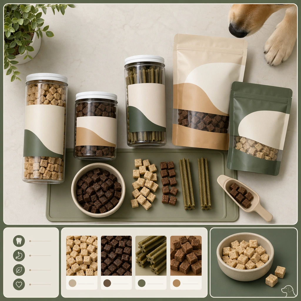
Scene: A square pet food marketing board that combines believable packaging forms, food texture realism, bowl presentation, and feeding context. The composition should feel useful for shelf mockups, product detail pages, retail social posts, and launch decks. Keep surfaces clean, lighting appetizing but not glossy in a human food luxury way, and layout structured enough to communicate trust even without readable labels. Use a front facing tabletop flatlay with jars or pouches, neatly grouped treat pieces, and modular graphic frames that create a catalog feel. Subject: Anchor each image around one pet nutrition scenario: dry food, wet food, treats, toppers, life stage feeding, or ingredient reassurance. Packaging should look generic but premium, using abstract label blocks instead of text. Bowl scenes must feel species appropriate, portion realistic, and visually clean. Any pet presence should reinforce feeding trust and appetite rather than dominate the composition. Focus on the packaging family and the physical treat forms, with perhaps one pet nose or paw entering in a controlled way to suggest appetite. Important details: Use real category cues such as pouch stands, tray seals, scoop shapes, freeze dried pieces, feeding mats, ingredient bowls, and veterinary-adjacent cleanliness where relevant. The overall tone should signal industry knowledge and commercial usefulness. Avoid fake luxury extremes or cartoon kibble. Make the board easy to scan, with clear hero focus and believable product hierarchy across package, food, and setting. The image should read as a system board for assorted treats or reward products, not as a messy snack explosion. Use case: Pet Food Packaging and Bowl Scene System single study 3/9, treat jar flatlay system for a commercially reusable prompt atlas example. Constraints: No readable text, no watermark, no logos, preserve exact 1:1 aspect ratio, no readable package copy, no brand logos, no unrealistic human gourmet plating, no overflowing portions, no unsafe ingredients, no messy floor spills, no human snack styling, no wrappers scattered everywhere, no glossy candy colors.

Example generated from “Pet Food Packaging And Bowl Scene System — Ingredient Trust Composition”
GPT Image 2en

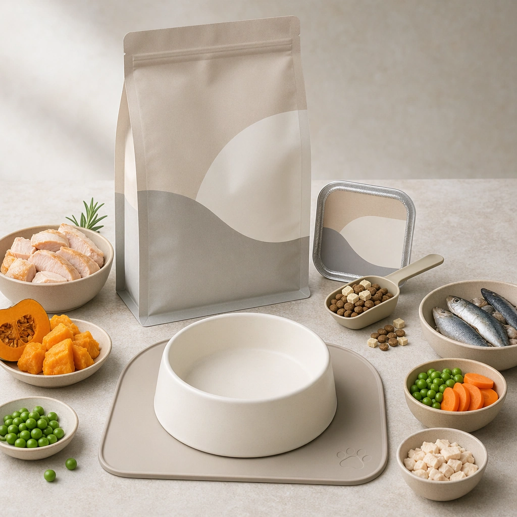
Scene: A square pet food marketing board that combines believable packaging forms, food texture realism, bowl presentation, and feeding context. The composition should feel useful for shelf mockups, product detail pages, retail social posts, and launch decks. Keep surfaces clean, lighting appetizing but not glossy in a human food luxury way, and layout structured enough to communicate trust even without readable labels. Arrange ingredient bowls, neutral packaging, and one empty ceramic serving dish on a pale stone surface with clinical soft light. Subject: Anchor each image around one pet nutrition scenario: dry food, wet food, treats, toppers, life stage feeding, or ingredient reassurance. Packaging should look generic but premium, using abstract label blocks instead of text. Bowl scenes must feel species appropriate, portion realistic, and visually clean. Any pet presence should reinforce feeding trust and appetite rather than dominate the composition. Show simple recognizably pet appropriate ingredient cues such as fish pieces, poultry cuts, pumpkin mash, or grain free vegetable accents in restrained amounts. Important details: Use real category cues such as pouch stands, tray seals, scoop shapes, freeze dried pieces, feeding mats, ingredient bowls, and veterinary-adjacent cleanliness where relevant. The overall tone should signal industry knowledge and commercial usefulness. Avoid fake luxury extremes or cartoon kibble. Make the board easy to scan, with clear hero focus and believable product hierarchy across package, food, and setting. The board should suggest transparency, formulation care, and premium sourcing without making claims through text. Use case: Pet Food Packaging and Bowl Scene System single study 4/9, ingredient trust composition for a commercially reusable prompt atlas example. Constraints: No readable text, no watermark, no logos, preserve exact 1:1 aspect ratio, no readable package copy, no brand logos, no unrealistic human gourmet plating, no overflowing portions, no unsafe ingredients, no messy floor spills, no raw bloodiness, no gourmet restaurant plating, no supplement bottle branding.

Example generated from “Pet Food Packaging And Bowl Scene System — Kitten Starter Feeding Kit”
GPT Image 2en

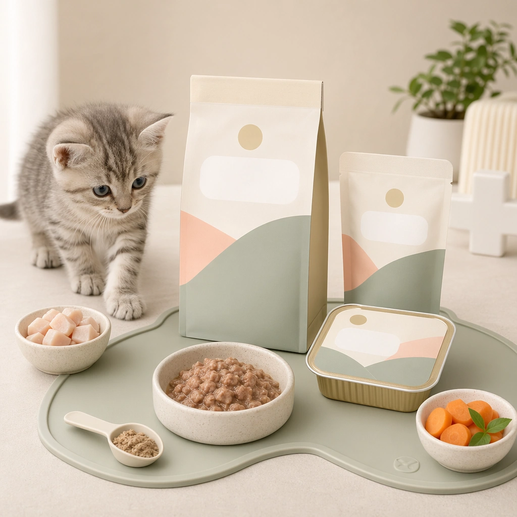
Scene: A square pet food marketing board that combines believable packaging forms, food texture realism, bowl presentation, and feeding context. The composition should feel useful for shelf mockups, product detail pages, retail social posts, and launch decks. Keep surfaces clean, lighting appetizing but not glossy in a human food luxury way, and layout structured enough to communicate trust even without readable labels. Use a bright pastel neutral setup with small bowls, a soft feeding mat, and compact package formats sized for starter products. Subject: Anchor each image around one pet nutrition scenario: dry food, wet food, treats, toppers, life stage feeding, or ingredient reassurance. Packaging should look generic but premium, using abstract label blocks instead of text. Bowl scenes must feel species appropriate, portion realistic, and visually clean. Any pet presence should reinforce feeding trust and appetite rather than dominate the composition. Include a curious kitten near the setup with one paw close to the mat, while the packages and bowl still remain the visual anchor. Important details: Use real category cues such as pouch stands, tray seals, scoop shapes, freeze dried pieces, feeding mats, ingredient bowls, and veterinary-adjacent cleanliness where relevant. The overall tone should signal industry knowledge and commercial usefulness. Avoid fake luxury extremes or cartoon kibble. Make the board easy to scan, with clear hero focus and believable product hierarchy across package, food, and setting. The proportions, serving size, and tone should clearly suggest early life nutrition rather than general adult food marketing. Use case: Pet Food Packaging and Bowl Scene System single study 5/9, kitten starter feeding kit for a commercially reusable prompt atlas example. Constraints: No readable text, no watermark, no logos, preserve exact 1:1 aspect ratio, no readable package copy, no brand logos, no unrealistic human gourmet plating, no overflowing portions, no unsafe ingredients, no messy floor spills, no baby human nursery styling, no oversized milk imagery, no toy clutter.

Example generated from “Pet Food Packaging And Bowl Scene System — Senior Diet Counter Scene”
GPT Image 2en

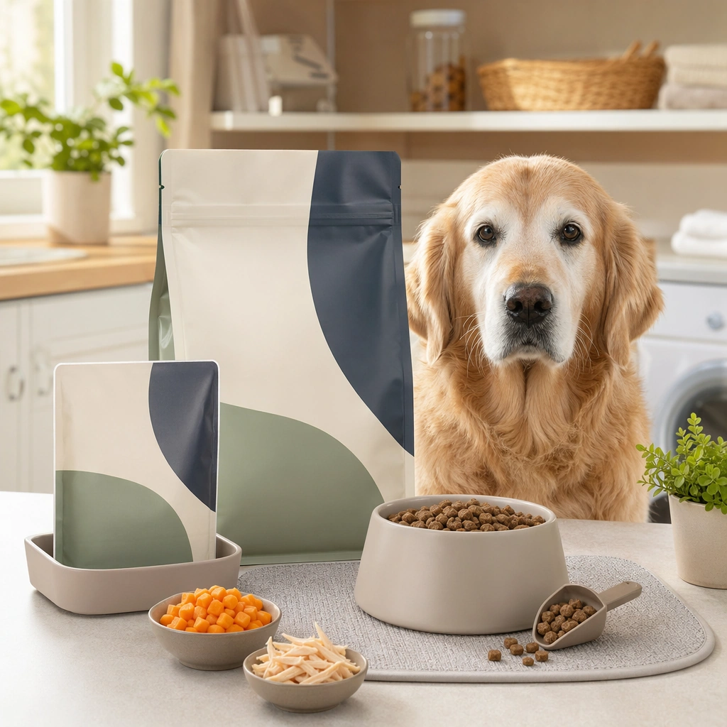
Scene: A square pet food marketing board that combines believable packaging forms, food texture realism, bowl presentation, and feeding context. The composition should feel useful for shelf mockups, product detail pages, retail social posts, and launch decks. Keep surfaces clean, lighting appetizing but not glossy in a human food luxury way, and layout structured enough to communicate trust even without readable labels. Set the board on a clean home counter with warm daylight, one mature pet nearby, and packaging that looks practical and premium. Subject: Anchor each image around one pet nutrition scenario: dry food, wet food, treats, toppers, life stage feeding, or ingredient reassurance. Packaging should look generic but premium, using abstract label blocks instead of text. Bowl scenes must feel species appropriate, portion realistic, and visually clean. Any pet presence should reinforce feeding trust and appetite rather than dominate the composition. Show a measured portion in a bowl beside a senior dog or cat with calm body language and visible age appropriate dignity. Important details: Use real category cues such as pouch stands, tray seals, scoop shapes, freeze dried pieces, feeding mats, ingredient bowls, and veterinary-adjacent cleanliness where relevant. The overall tone should signal industry knowledge and commercial usefulness. Avoid fake luxury extremes or cartoon kibble. Make the board easy to scan, with clear hero focus and believable product hierarchy across package, food, and setting. The visual message should be gentle support, digestibility, and trust, not exaggerated medical drama or luxury excess. Use case: Pet Food Packaging and Bowl Scene System single study 6/9, senior diet counter scene for a commercially reusable prompt atlas example. Constraints: No readable text, no watermark, no logos, preserve exact 1:1 aspect ratio, no readable package copy, no brand logos, no unrealistic human gourmet plating, no overflowing portions, no unsafe ingredients, no messy floor spills, no pills, no disease scare imagery, no kitchen mess.

Example generated from “Pet Food Packaging And Bowl Scene System — Freeze Dried Topper Study”
GPT Image 2en

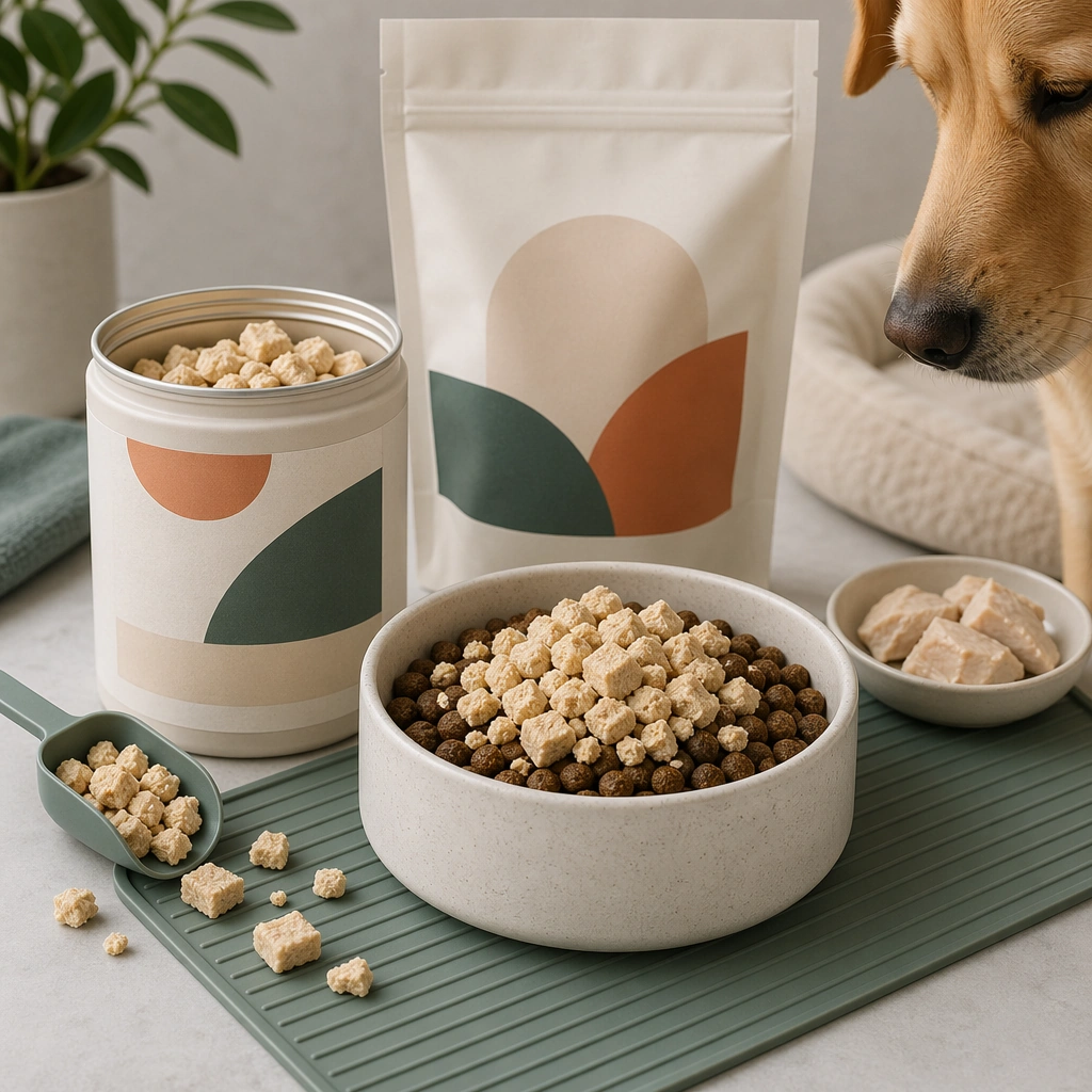
Scene: A square pet food marketing board that combines believable packaging forms, food texture realism, bowl presentation, and feeding context. The composition should feel useful for shelf mockups, product detail pages, retail social posts, and launch decks. Keep surfaces clean, lighting appetizing but not glossy in a human food luxury way, and layout structured enough to communicate trust even without readable labels. Compose a square board with one open topper container, scattered but controlled pieces, and a main bowl where the topper sits above kibble or wet food. Subject: Anchor each image around one pet nutrition scenario: dry food, wet food, treats, toppers, life stage feeding, or ingredient reassurance. Packaging should look generic but premium, using abstract label blocks instead of text. Bowl scenes must feel species appropriate, portion realistic, and visually clean. Any pet presence should reinforce feeding trust and appetite rather than dominate the composition. Make the topper texture highly legible, with believable crumb size and dry surface detail that reads premium and functional. Important details: Use real category cues such as pouch stands, tray seals, scoop shapes, freeze dried pieces, feeding mats, ingredient bowls, and veterinary-adjacent cleanliness where relevant. The overall tone should signal industry knowledge and commercial usefulness. Avoid fake luxury extremes or cartoon kibble. Make the board easy to scan, with clear hero focus and believable product hierarchy across package, food, and setting. The board should explain the category visually through hierarchy and context rather than text: base food, topper, package, and appetite cue. Use case: Pet Food Packaging and Bowl Scene System single study 7/9, freeze dried topper study for a commercially reusable prompt atlas example. Constraints: No readable text, no watermark, no logos, preserve exact 1:1 aspect ratio, no readable package copy, no brand logos, no unrealistic human gourmet plating, no overflowing portions, no unsafe ingredients, no messy floor spills, no crumb explosion, no camping aesthetic, no raw meat sensationalism.

Example generated from “Pet Food Packaging And Bowl Scene System — Multi Flavor Shelf Family”
GPT Image 2en

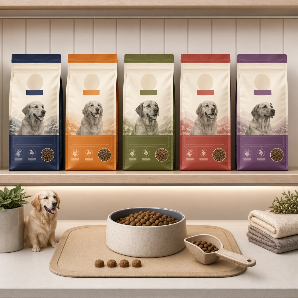
Scene: A square pet food marketing board that combines believable packaging forms, food texture realism, bowl presentation, and feeding context. The composition should feel useful for shelf mockups, product detail pages, retail social posts, and launch decks. Keep surfaces clean, lighting appetizing but not glossy in a human food luxury way, and layout structured enough to communicate trust even without readable labels. Use a front facing retail shelf or studio shelf simulation with four or five package variants arranged in a disciplined grid. Subject: Anchor each image around one pet nutrition scenario: dry food, wet food, treats, toppers, life stage feeding, or ingredient reassurance. Packaging should look generic but premium, using abstract label blocks instead of text. Bowl scenes must feel species appropriate, portion realistic, and visually clean. Any pet presence should reinforce feeding trust and appetite rather than dominate the composition. The package colors should vary in a controlled system while shape, material, and overall design language remain coherent across the set. Important details: Use real category cues such as pouch stands, tray seals, scoop shapes, freeze dried pieces, feeding mats, ingredient bowls, and veterinary-adjacent cleanliness where relevant. The overall tone should signal industry knowledge and commercial usefulness. Avoid fake luxury extremes or cartoon kibble. Make the board easy to scan, with clear hero focus and believable product hierarchy across package, food, and setting. This image is about product family logic and aisle readability, so keep the layout clear, premium, and generic enough for many brands. Use case: Pet Food Packaging and Bowl Scene System single study 8/9, multi flavor shelf family for a commercially reusable prompt atlas example. Constraints: No readable text, no watermark, no logos, preserve exact 1:1 aspect ratio, no readable package copy, no brand logos, no unrealistic human gourmet plating, no overflowing portions, no unsafe ingredients, no messy floor spills, no supermarket clutter, no loud price stickers, no readable flavor names.

Example generated from “Pet Food Packaging And Bowl Scene System — Night Feeding Routine Board”
GPT Image 2en

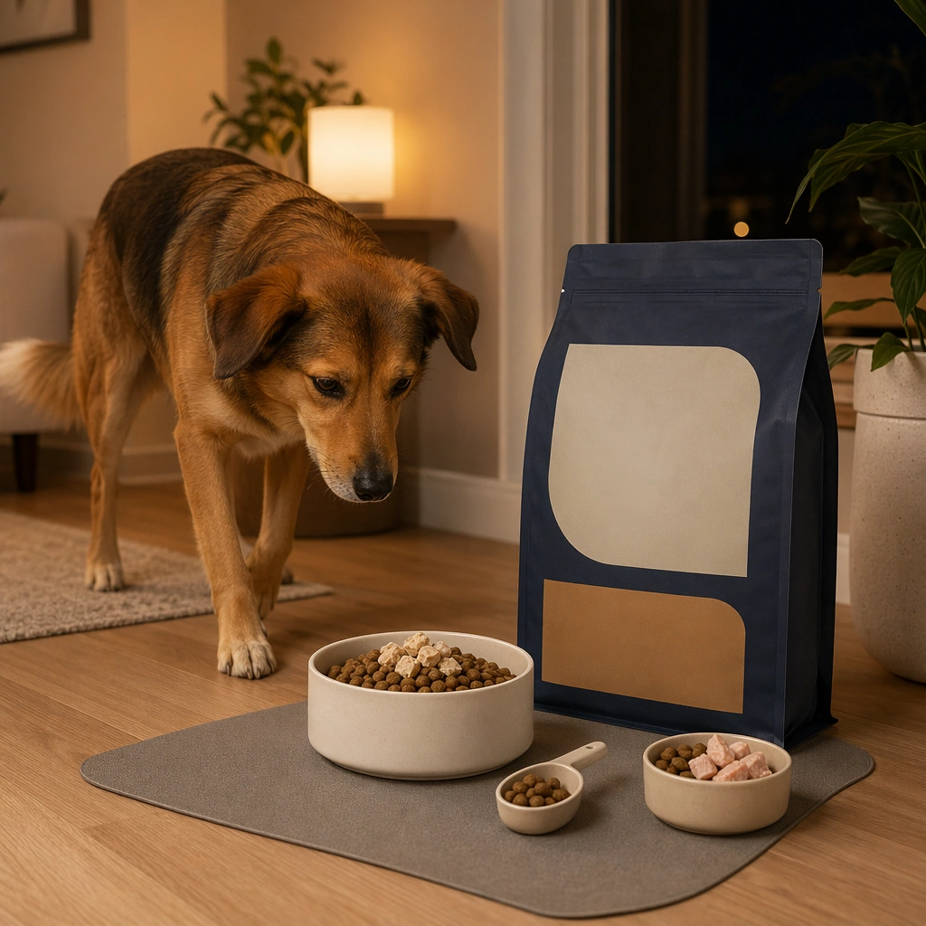
Scene: A square pet food marketing board that combines believable packaging forms, food texture realism, bowl presentation, and feeding context. The composition should feel useful for shelf mockups, product detail pages, retail social posts, and launch decks. Keep surfaces clean, lighting appetizing but not glossy in a human food luxury way, and layout structured enough to communicate trust even without readable labels. Use warm evening interior light with a tidy feeding corner, one product package nearby, and a clean bowl scene on a mat. Subject: Anchor each image around one pet nutrition scenario: dry food, wet food, treats, toppers, life stage feeding, or ingredient reassurance. Packaging should look generic but premium, using abstract label blocks instead of text. Bowl scenes must feel species appropriate, portion realistic, and visually clean. Any pet presence should reinforce feeding trust and appetite rather than dominate the composition. Show a pet approaching or eating calmly, with measured portion size and a domestic atmosphere that feels cared for rather than staged. Important details: Use real category cues such as pouch stands, tray seals, scoop shapes, freeze dried pieces, feeding mats, ingredient bowls, and veterinary-adjacent cleanliness where relevant. The overall tone should signal industry knowledge and commercial usefulness. Avoid fake luxury extremes or cartoon kibble. Make the board easy to scan, with clear hero focus and believable product hierarchy across package, food, and setting. The board should connect product, ritual, and home life in a way that feels useful for DTC social content and retention messaging. Use case: Pet Food Packaging and Bowl Scene System single study 9/9, night feeding routine board for a commercially reusable prompt atlas example. Constraints: No readable text, no watermark, no logos, preserve exact 1:1 aspect ratio, no readable package copy, no brand logos, no unrealistic human gourmet plating, no overflowing portions, no unsafe ingredients, no messy floor spills, no messy leftover scraps, no dark gloomy kitchen, no human dinner table crossover.

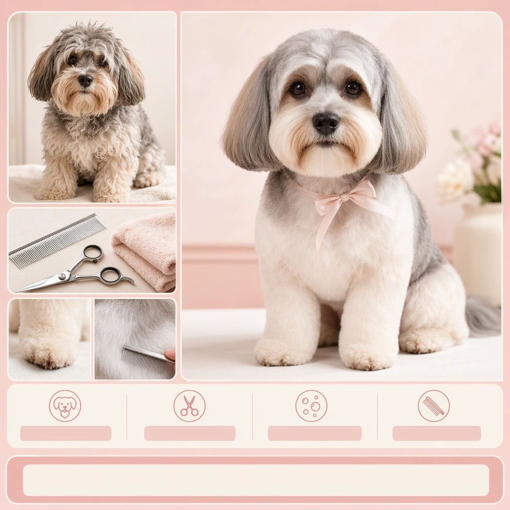
Example generated from “Pet Grooming Before After Campaign — Poodle Makeover Proof Board”
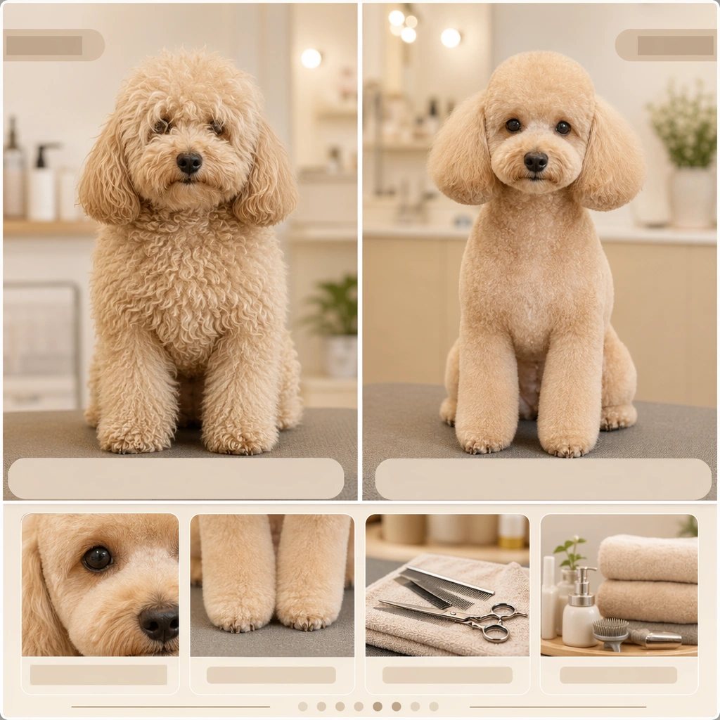
GPT Image 2en

Scene: A square grooming campaign board designed for a premium pet salon, combining real pet photography with structured before after logic, service proof framing, and clear commercial hierarchy. The composition should feel like something a salon could use for social ads, in store signage, or booking pages. Keep the visual system clean, polished, and easy to scan, with split panels, small detail crops, or modular proof zones instead of clutter. Use a clean split board with warm ivory lighting, one slightly shaggy pre groom portrait, one precise after portrait, and tiny supporting detail insets. Subject: Focus on one grooming transformation or care result at a time. The pet must remain comfortable, dignified, and believable, with healthy fur texture, accurate anatomy, and emotionally safe handling implied by the scene. Before states should look natural and slightly unrefined, not neglected. After states should look skillful, fresh, and trustworthy rather than artificially over styled. Feature a poodle whose coat moves from soft overgrown fluff to a tidy sculpted trim with bright visible eyes and balanced face proportions. Important details: Use salon language visually: tidy tools, controlled backgrounds, clean towels, polished fur finish, and evidence driven close ups where needed. Any informational zones should remain abstract placeholder bands instead of words. The board should sell care, calm, and competence. Avoid manipulative makeover drama; the transformation needs to feel professional, humane, and repeatable in a real business setting. Make the transformation clear but kind, showing the value of revealing expression, shape, and hygiene rather than inventing a dramatic personality shift. Use case: Pet Grooming Before-After Campaign single study 1/9, poodle makeover proof board for a commercially reusable prompt atlas example. Constraints: No readable text, no watermark, no logos, preserve exact 1:1 aspect ratio, no visible abuse cues, no humiliating costume bows, no readable labels, no dirt grime sensationalism, no chaotic grooming room clutter, no distorted fur texture, no exaggerated glam lashes, no fake fashion accessories, no harsh contrast retouching.

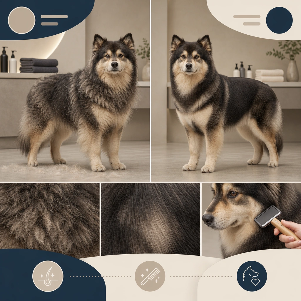
Example generated from “Pet Grooming Before After Campaign — Deshedding Undercoat Result”
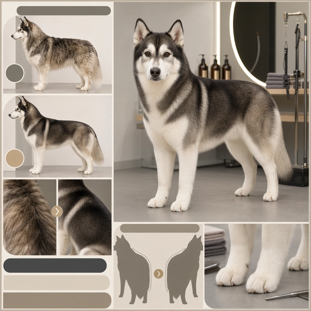
GPT Image 2en

Scene: A square grooming campaign board designed for a premium pet salon, combining real pet photography with structured before after logic, service proof framing, and clear commercial hierarchy. The composition should feel like something a salon could use for social ads, in store signage, or booking pages. Keep the visual system clean, polished, and easy to scan, with split panels, small detail crops, or modular proof zones instead of clutter. Frame the dog on a neutral salon floor with side by side coat texture panels and one close crop showing the brushed finish. Subject: Focus on one grooming transformation or care result at a time. The pet must remain comfortable, dignified, and believable, with healthy fur texture, accurate anatomy, and emotionally safe handling implied by the scene. Before states should look natural and slightly unrefined, not neglected. After states should look skillful, fresh, and trustworthy rather than artificially over styled. Show a double coated dog before and after deshedding, keeping the animal calm and naturally posed while the coat becomes visibly cleaner and more even. Important details: Use salon language visually: tidy tools, controlled backgrounds, clean towels, polished fur finish, and evidence driven close ups where needed. Any informational zones should remain abstract placeholder bands instead of words. The board should sell care, calm, and competence. Avoid manipulative makeover drama; the transformation needs to feel professional, humane, and repeatable in a real business setting. Emphasize texture control, healthy shine, and reduced loose fur. The board should read as practical grooming value, not beauty pageant styling. Use case: Pet Grooming Before-After Campaign single study 2/9, deshedding undercoat result for a commercially reusable prompt atlas example. Constraints: No readable text, no watermark, no logos, preserve exact 1:1 aspect ratio, no visible abuse cues, no humiliating costume bows, no readable labels, no dirt grime sensationalism, no chaotic grooming room clutter, no distorted fur texture, no flying fur explosion, no vacuum gimmicks, no cartoon fluff clouds.

Example generated from “Pet Grooming Before After Campaign — Face Trim Eye Reveal Board”
GPT Image 2en

Scene: A square grooming campaign board designed for a premium pet salon, combining real pet photography with structured before after logic, service proof framing, and clear commercial hierarchy. The composition should feel like something a salon could use for social ads, in store signage, or booking pages. Keep the visual system clean, polished, and easy to scan, with split panels, small detail crops, or modular proof zones instead of clutter. Use a close portrait split with one pre trim face and one after trim face, supported by a tiny tool-free detail panel on a soft gray background. Subject: Focus on one grooming transformation or care result at a time. The pet must remain comfortable, dignified, and believable, with healthy fur texture, accurate anatomy, and emotionally safe handling implied by the scene. Before states should look natural and slightly unrefined, not neglected. After states should look skillful, fresh, and trustworthy rather than artificially over styled. Feature a shaggy small dog whose fringe initially covers the eyes, then after grooming reveals a clear open expression and balanced facial lines. Important details: Use salon language visually: tidy tools, controlled backgrounds, clean towels, polished fur finish, and evidence driven close ups where needed. Any informational zones should remain abstract placeholder bands instead of words. The board should sell care, calm, and competence. Avoid manipulative makeover drama; the transformation needs to feel professional, humane, and repeatable in a real business setting. The key selling point is emotional visibility. Make the result feel practical, safe, and comfort driven rather than makeover vanity. Use case: Pet Grooming Before-After Campaign single study 3/9, face trim eye reveal board for a commercially reusable prompt atlas example. Constraints: No readable text, no watermark, no logos, preserve exact 1:1 aspect ratio, no visible abuse cues, no humiliating costume bows, no readable labels, no dirt grime sensationalism, no chaotic grooming room clutter, no distorted fur texture, no scissors in action near the eye, no anxious expression, no over trimmed skin exposure.

Example generated from “Pet Grooming Before After Campaign — Bath Dry Fluff Finish”
GPT Image 2en

Scene: A square grooming campaign board designed for a premium pet salon, combining real pet photography with structured before after logic, service proof framing, and clear commercial hierarchy. The composition should feel like something a salon could use for social ads, in store signage, or booking pages. Keep the visual system clean, polished, and easy to scan, with split panels, small detail crops, or modular proof zones instead of clutter. Create a bright grooming nook with white tile, folded towels, and a three panel layout that shows damp transition and finished fluff. Subject: Focus on one grooming transformation or care result at a time. The pet must remain comfortable, dignified, and believable, with healthy fur texture, accurate anatomy, and emotionally safe handling implied by the scene. Before states should look natural and slightly unrefined, not neglected. After states should look skillful, fresh, and trustworthy rather than artificially over styled. Show a medium dog moving from slightly damp and flat to freshly dried with lifted clean coat texture and relaxed posture. Important details: Use salon language visually: tidy tools, controlled backgrounds, clean towels, polished fur finish, and evidence driven close ups where needed. Any informational zones should remain abstract placeholder bands instead of words. The board should sell care, calm, and competence. Avoid manipulative makeover drama; the transformation needs to feel professional, humane, and repeatable in a real business setting. Keep the finish believable and touchable. The board should communicate hygiene, comfort, and salon competence more than theatrical fluff. Use case: Pet Grooming Before-After Campaign single study 4/9, bath dry fluff finish for a commercially reusable prompt atlas example. Constraints: No readable text, no watermark, no logos, preserve exact 1:1 aspect ratio, no visible abuse cues, no humiliating costume bows, no readable labels, no dirt grime sensationalism, no chaotic grooming room clutter, no distorted fur texture, no wet mess on the floor, no branded bottles, no wind tunnel blowout effect.

Example generated from “Pet Grooming Before After Campaign — Paw Pad Clean Detail Board”
GPT Image 2en

Scene: A square grooming campaign board designed for a premium pet salon, combining real pet photography with structured before after logic, service proof framing, and clear commercial hierarchy. The composition should feel like something a salon could use for social ads, in store signage, or booking pages. Keep the visual system clean, polished, and easy to scan, with split panels, small detail crops, or modular proof zones instead of clutter. Use a macro plus portrait layout on a pale stone background, with the main image showing the pet calmly seated and a detail crop on the paws. Subject: Focus on one grooming transformation or care result at a time. The pet must remain comfortable, dignified, and believable, with healthy fur texture, accurate anatomy, and emotionally safe handling implied by the scene. Before states should look natural and slightly unrefined, not neglected. After states should look skillful, fresh, and trustworthy rather than artificially over styled. Feature a dog or cat with clearly groomed paw fur and clean pads, relaxed body language, and a healthy well maintained coat. Important details: Use salon language visually: tidy tools, controlled backgrounds, clean towels, polished fur finish, and evidence driven close ups where needed. Any informational zones should remain abstract placeholder bands instead of words. The board should sell care, calm, and competence. Avoid manipulative makeover drama; the transformation needs to feel professional, humane, and repeatable in a real business setting. Sell precision and everyday care rather than dramatic beauty. The macro detail should feel clinical enough to trust but warm enough for a pet audience. Use case: Pet Grooming Before-After Campaign single study 5/9, paw pad clean detail board for a commercially reusable prompt atlas example. Constraints: No readable text, no watermark, no logos, preserve exact 1:1 aspect ratio, no visible abuse cues, no humiliating costume bows, no readable labels, no dirt grime sensationalism, no chaotic grooming room clutter, no distorted fur texture, no medical procedure look, no sharp tool display, no dirty floor context.

Example generated from “Pet Grooming Before After Campaign — Salon Bow Finale Board”
GPT Image 2en

Scene: A square grooming campaign board designed for a premium pet salon, combining real pet photography with structured before after logic, service proof framing, and clear commercial hierarchy. The composition should feel like something a salon could use for social ads, in store signage, or booking pages. Keep the visual system clean, polished, and easy to scan, with split panels, small detail crops, or modular proof zones instead of clutter. Use a pale blush or cream studio setup with one hero portrait and smaller process cues arranged as a simple promotional board. Subject: Focus on one grooming transformation or care result at a time. The pet must remain comfortable, dignified, and believable, with healthy fur texture, accurate anatomy, and emotionally safe handling implied by the scene. Before states should look natural and slightly unrefined, not neglected. After states should look skillful, fresh, and trustworthy rather than artificially over styled. Show a freshly groomed small dog with a tiny tasteful bow or neck ribbon, sitting with direct eye contact and polished coat finish. Important details: Use salon language visually: tidy tools, controlled backgrounds, clean towels, polished fur finish, and evidence driven close ups where needed. Any informational zones should remain abstract placeholder bands instead of words. The board should sell care, calm, and competence. Avoid manipulative makeover drama; the transformation needs to feel professional, humane, and repeatable in a real business setting. The accessory is secondary; the true hero is the groom. Keep the result premium, tidy, and realistic for boutique salon marketing. Use case: Pet Grooming Before-After Campaign single study 6/9, salon bow finale board for a commercially reusable prompt atlas example. Constraints: No readable text, no watermark, no logos, preserve exact 1:1 aspect ratio, no visible abuse cues, no humiliating costume bows, no readable labels, no dirt grime sensationalism, no chaotic grooming room clutter, no distorted fur texture, no giant bows, no rhinestone overload, no toy display shelf.

Example generated from “Pet Grooming Before After Campaign — Double Coat Lineup Board”
GPT Image 2en

Scene: A square grooming campaign board designed for a premium pet salon, combining real pet photography with structured before after logic, service proof framing, and clear commercial hierarchy. The composition should feel like something a salon could use for social ads, in store signage, or booking pages. Keep the visual system clean, polished, and easy to scan, with split panels, small detail crops, or modular proof zones instead of clutter. Compose a square board with one main full body dog portrait and several inset frames showing side profile, back coat texture, and clean silhouette improvement. Subject: Focus on one grooming transformation or care result at a time. The pet must remain comfortable, dignified, and believable, with healthy fur texture, accurate anatomy, and emotionally safe handling implied by the scene. Before states should look natural and slightly unrefined, not neglected. After states should look skillful, fresh, and trustworthy rather than artificially over styled. Feature a husky or shepherd type dog with freshly managed coat, tidy outline, and calm stand that shows the service result across multiple angles. Important details: Use salon language visually: tidy tools, controlled backgrounds, clean towels, polished fur finish, and evidence driven close ups where needed. Any informational zones should remain abstract placeholder bands instead of words. The board should sell care, calm, and competence. Avoid manipulative makeover drama; the transformation needs to feel professional, humane, and repeatable in a real business setting. The board should feel like a premium service explanation for heavy coat clients, using image evidence instead of text heavy claims. Use case: Pet Grooming Before-After Campaign single study 7/9, double coat lineup board for a commercially reusable prompt atlas example. Constraints: No readable text, no watermark, no logos, preserve exact 1:1 aspect ratio, no visible abuse cues, no humiliating costume bows, no readable labels, no dirt grime sensationalism, no chaotic grooming room clutter, no distorted fur texture, no snowy wilderness background, no action running pose, no excessive shedding debris.

Example generated from “Pet Grooming Before After Campaign — Cat Grooming Gentle Proof”
GPT Image 2en

Scene: A square grooming campaign board designed for a premium pet salon, combining real pet photography with structured before after logic, service proof framing, and clear commercial hierarchy. The composition should feel like something a salon could use for social ads, in store signage, or booking pages. Keep the visual system clean, polished, and easy to scan, with split panels, small detail crops, or modular proof zones instead of clutter. Use soft neutral light with a quiet tabletop or grooming mat environment and a structured collage of hero portrait plus close fur detail. Subject: Focus on one grooming transformation or care result at a time. The pet must remain comfortable, dignified, and believable, with healthy fur texture, accurate anatomy, and emotionally safe handling implied by the scene. Before states should look natural and slightly unrefined, not neglected. After states should look skillful, fresh, and trustworthy rather than artificially over styled. Show a cat looking composed after grooming, with sleeker coat texture, tidy chest fur, and eyes that communicate comfort rather than stress. Important details: Use salon language visually: tidy tools, controlled backgrounds, clean towels, polished fur finish, and evidence driven close ups where needed. Any informational zones should remain abstract placeholder bands instead of words. The board should sell care, calm, and competence. Avoid manipulative makeover drama; the transformation needs to feel professional, humane, and repeatable in a real business setting. The key message is gentleness. Keep everything quiet, premium, and feline appropriate so the board feels credible to cautious cat owners. Use case: Pet Grooming Before-After Campaign single study 8/9, cat grooming gentle proof for a commercially reusable prompt atlas example. Constraints: No readable text, no watermark, no logos, preserve exact 1:1 aspect ratio, no visible abuse cues, no humiliating costume bows, no readable labels, no dirt grime sensationalism, no chaotic grooming room clutter, no distorted fur texture, no aggressive restraint cues, no dripping wet fur, no loud salon environment.

Example generated from “Pet Grooming Before After Campaign — Premium Spa Package Hero”
GPT Image 2en

Scene: A square grooming campaign board designed for a premium pet salon, combining real pet photography with structured before after logic, service proof framing, and clear commercial hierarchy. The composition should feel like something a salon could use for social ads, in store signage, or booking pages. Keep the visual system clean, polished, and easy to scan, with split panels, small detail crops, or modular proof zones instead of clutter. Stage the board as a premium service ad with warm stone colors, folded towels, ceramic bowls, and a central polished pet portrait. Subject: Focus on one grooming transformation or care result at a time. The pet must remain comfortable, dignified, and believable, with healthy fur texture, accurate anatomy, and emotionally safe handling implied by the scene. Before states should look natural and slightly unrefined, not neglected. After states should look skillful, fresh, and trustworthy rather than artificially over styled. Feature a well groomed dog in a relaxed seated or lying pose with exceptionally soft coat finish and calm luxurious mood. Important details: Use salon language visually: tidy tools, controlled backgrounds, clean towels, polished fur finish, and evidence driven close ups where needed. Any informational zones should remain abstract placeholder bands instead of words. The board should sell care, calm, and competence. Avoid manipulative makeover drama; the transformation needs to feel professional, humane, and repeatable in a real business setting. The board should suggest upgrade service, sensory comfort, and repeat booking value while staying realistic and uncluttered. Use case: Pet Grooming Before-After Campaign single study 9/9, premium spa package hero for a commercially reusable prompt atlas example. Constraints: No readable text, no watermark, no logos, preserve exact 1:1 aspect ratio, no visible abuse cues, no humiliating costume bows, no readable labels, no dirt grime sensationalism, no chaotic grooming room clutter, no distorted fur texture, no human spa parody, no cucumber eye joke, no scented candle overload.

Example generated from “Pet Holiday Costume Promo Set — Winter Knit Sweater Promo”
GPT Image 2en

Scene: A square pet holiday promo tile designed for brand campaigns, combining believable costume styling with feed friendly layout control and polished product marketing energy. The framing should feel commercial and celebratory rather than amateur party photography. Use clean seasonal props, soft placeholder graphic zones, and strong central subject clarity so the image can function across ads, organic social, and shop features. Use cool window light, a pale wood floor, and restrained evergreen or wool textures that suggest winter without turning the frame into a dense holiday set. Subject: Center one pet in a holiday outfit or themed accessory that looks comfortable, well fitted, and genuinely photographable. The animal must remain the hero, not the prop pile. Expression, posture, and styling should communicate the seasonal mood while preserving real anatomy, fur detail, and a sense of animal comfort. Avoid parody or heavy anthropomorphic comedy. Show a dog in a neatly fitted cream knit sweater, seated with composed eye contact and visible fabric texture across the shoulders and chest. Important details: Treat each image like a campaign key tile with a disciplined palette, controlled set dressing, and enough compositional breathing room for future text overlays outside the image generation. Holiday atmosphere can come from color, lighting, and a few strong props. Keep the tone premium, charming, and retailer ready. The result should feel useful for product pages, promo banners, and carousel campaigns. The garment should feel warm, giftable, and believable, with enough negative space for storefront adaptation and social post reuse. Use case: Pet Holiday Costume Promo Set single study 1/9, winter knit sweater promo for a commercially reusable prompt atlas example. Constraints: No readable text, no watermark, no logos, preserve exact 1:1 aspect ratio, no readable sale text, no oversized mascots, no heavy human costume parody, no chaotic party clutter, no unsafe accessories, no generic stock holiday card vibe, no fake snowstorm, no antler headbands, no fireplace overload.

Example generated from “Pet Holiday Costume Promo Set — Spooky Cape Night Promo”
GPT Image 2en

Scene: A square pet holiday promo tile designed for brand campaigns, combining believable costume styling with feed friendly layout control and polished product marketing energy. The framing should feel commercial and celebratory rather than amateur party photography. Use clean seasonal props, soft placeholder graphic zones, and strong central subject clarity so the image can function across ads, organic social, and shop features. Stage a dark plum and charcoal set with a faint moonlit edge light, one pumpkin tone accent, and a minimal promo layout frame. Subject: Center one pet in a holiday outfit or themed accessory that looks comfortable, well fitted, and genuinely photographable. The animal must remain the hero, not the prop pile. Expression, posture, and styling should communicate the seasonal mood while preserving real anatomy, fur detail, and a sense of animal comfort. Avoid parody or heavy anthropomorphic comedy. Feature a cat or small dog in a simple velvet cape, posed upright with watchful eyes and a strong silhouette. Important details: Treat each image like a campaign key tile with a disciplined palette, controlled set dressing, and enough compositional breathing room for future text overlays outside the image generation. Holiday atmosphere can come from color, lighting, and a few strong props. Keep the tone premium, charming, and retailer ready. The result should feel useful for product pages, promo banners, and carousel campaigns. Keep the mood playful and elegant, suited for seasonal costume merchandising rather than haunted house theatrics. Use case: Pet Holiday Costume Promo Set single study 2/9, spooky cape night promo for a commercially reusable prompt atlas example. Constraints: No readable text, no watermark, no logos, preserve exact 1:1 aspect ratio, no readable sale text, no oversized mascots, no heavy human costume parody, no chaotic party clutter, no unsafe accessories, no generic stock holiday card vibe, no gore, no fake fangs close up, no children party chaos.

Example generated from “Pet Holiday Costume Promo Set — Birthday Crown Celebration Tile”
GPT Image 2en

Scene: A square pet holiday promo tile designed for brand campaigns, combining believable costume styling with feed friendly layout control and polished product marketing energy. The framing should feel commercial and celebratory rather than amateur party photography. Use clean seasonal props, soft placeholder graphic zones, and strong central subject clarity so the image can function across ads, organic social, and shop features. Use pastel cream, soft coral, and tidy confetti graphics arranged around a simple pedestal for a premium birthday drop feel. Subject: Center one pet in a holiday outfit or themed accessory that looks comfortable, well fitted, and genuinely photographable. The animal must remain the hero, not the prop pile. Expression, posture, and styling should communicate the seasonal mood while preserving real anatomy, fur detail, and a sense of animal comfort. Avoid parody or heavy anthropomorphic comedy. Show a calm pet wearing a tiny crown or party band, sitting proudly with direct eye contact and polished fur detail. Important details: Treat each image like a campaign key tile with a disciplined palette, controlled set dressing, and enough compositional breathing room for future text overlays outside the image generation. Holiday atmosphere can come from color, lighting, and a few strong props. Keep the tone premium, charming, and retailer ready. The result should feel useful for product pages, promo banners, and carousel campaigns. The image should feel milestone ready, giftable, and clean enough for subscription perks, birthday reminders, and social promos. Use case: Pet Holiday Costume Promo Set single study 3/9, birthday crown celebration tile for a commercially reusable prompt atlas example. Constraints: No readable text, no watermark, no logos, preserve exact 1:1 aspect ratio, no readable sale text, no oversized mascots, no heavy human costume parody, no chaotic party clutter, no unsafe accessories, no generic stock holiday card vibe, no messy cake smash, no clown palette, no oversized helium balloons.

Example generated from “Pet Holiday Costume Promo Set — Lunar Red Scarf Portrait”
GPT Image 2en

Scene: A square pet holiday promo tile designed for brand campaigns, combining believable costume styling with feed friendly layout control and polished product marketing energy. The framing should feel commercial and celebratory rather than amateur party photography. Use clean seasonal props, soft placeholder graphic zones, and strong central subject clarity so the image can function across ads, organic social, and shop features. Use warm neutral light with restrained red and gold props, matte paper textures, and a balanced portrait crop on a quiet backdrop. Subject: Center one pet in a holiday outfit or themed accessory that looks comfortable, well fitted, and genuinely photographable. The animal must remain the hero, not the prop pile. Expression, posture, and styling should communicate the seasonal mood while preserving real anatomy, fur detail, and a sense of animal comfort. Avoid parody or heavy anthropomorphic comedy. Feature a pet wearing a red scarf or collar ribbon, posed calmly with alert eyes and strong color separation from the background. Important details: Treat each image like a campaign key tile with a disciplined palette, controlled set dressing, and enough compositional breathing room for future text overlays outside the image generation. Holiday atmosphere can come from color, lighting, and a few strong props. Keep the tone premium, charming, and retailer ready. The result should feel useful for product pages, promo banners, and carousel campaigns. Let the color symbolism and polished portrait craft carry the festive mood; keep it respectful, clean, and widely reusable. Use case: Pet Holiday Costume Promo Set single study 4/9, lunar red scarf portrait for a commercially reusable prompt atlas example. Constraints: No readable text, no watermark, no logos, preserve exact 1:1 aspect ratio, no readable sale text, no oversized mascots, no heavy human costume parody, no chaotic party clutter, no unsafe accessories, no generic stock holiday card vibe, no fireworks, no readable banners, no crowded banquet setting.

Example generated from “Pet Holiday Costume Promo Set — Spring Floral Picnic Promo”
GPT Image 2en

Scene: A square pet holiday promo tile designed for brand campaigns, combining believable costume styling with feed friendly layout control and polished product marketing energy. The framing should feel commercial and celebratory rather than amateur party photography. Use clean seasonal props, soft placeholder graphic zones, and strong central subject clarity so the image can function across ads, organic social, and shop features. Build a soft outdoor picnic scene with filtered daylight, pale florals, woven textures, and graphic frame elements that keep the square composition organized. Subject: Center one pet in a holiday outfit or themed accessory that looks comfortable, well fitted, and genuinely photographable. The animal must remain the hero, not the prop pile. Expression, posture, and styling should communicate the seasonal mood while preserving real anatomy, fur detail, and a sense of animal comfort. Avoid parody or heavy anthropomorphic comedy. Show a dog or rabbit wearing a light floral bandana or collar accessory, posed neatly beside the picnic styling. Important details: Treat each image like a campaign key tile with a disciplined palette, controlled set dressing, and enough compositional breathing room for future text overlays outside the image generation. Holiday atmosphere can come from color, lighting, and a few strong props. Keep the tone premium, charming, and retailer ready. The result should feel useful for product pages, promo banners, and carousel campaigns. The atmosphere should feel fresh and editorial, useful for spring launches, lifestyle brands, and pet accessory campaigns. Use case: Pet Holiday Costume Promo Set single study 5/9, spring floral picnic promo for a commercially reusable prompt atlas example. Constraints: No readable text, no watermark, no logos, preserve exact 1:1 aspect ratio, no readable sale text, no oversized mascots, no heavy human costume parody, no chaotic party clutter, no unsafe accessories, no generic stock holiday card vibe, no flower explosion, no muddy grass, no crowded park crowd.

Example generated from “Pet Holiday Costume Promo Set — Summer Beach Shirt Post”
GPT Image 2en

Scene: A square pet holiday promo tile designed for brand campaigns, combining believable costume styling with feed friendly layout control and polished product marketing energy. The framing should feel commercial and celebratory rather than amateur party photography. Use clean seasonal props, soft placeholder graphic zones, and strong central subject clarity so the image can function across ads, organic social, and shop features. Use bright coastal daylight, pale sand tones, and a minimal beach set with striped towel shapes and airy negative space. Subject: Center one pet in a holiday outfit or themed accessory that looks comfortable, well fitted, and genuinely photographable. The animal must remain the hero, not the prop pile. Expression, posture, and styling should communicate the seasonal mood while preserving real anatomy, fur detail, and a sense of animal comfort. Avoid parody or heavy anthropomorphic comedy. Feature a pet in a relaxed open shirt or lightweight neck scarf, seated confidently with coat detail preserved despite the brighter environment. Important details: Treat each image like a campaign key tile with a disciplined palette, controlled set dressing, and enough compositional breathing room for future text overlays outside the image generation. Holiday atmosphere can come from color, lighting, and a few strong props. Keep the tone premium, charming, and retailer ready. The result should feel useful for product pages, promo banners, and carousel campaigns. The image should feel vacation ready and playful while remaining polished enough for product drops and ad placements. Use case: Pet Holiday Costume Promo Set single study 6/9, summer beach shirt post for a commercially reusable prompt atlas example. Constraints: No readable text, no watermark, no logos, preserve exact 1:1 aspect ratio, no readable sale text, no oversized mascots, no heavy human costume parody, no chaotic party clutter, no unsafe accessories, no generic stock holiday card vibe, no surfboard overload, no sunglasses gag, no harsh midday burn.