提示词库 · 创作探索

提示词库

探索真实提示词和对应生成示例,按任务找到灵感,免费复制完整提示词,开启下一次创作。

示例
10,974
模型
17
来源
1277
10,974 条提示词示例 · 第 22 / 229 页
Example generated from “Pet Holiday Costume Promo Set — Harvest Plaid Basket Shot”
GPT Image 2en

Scene: A square pet holiday promo tile designed for brand campaigns, combining believable costume styling with feed friendly layout control and polished product marketing energy. The framing should feel commercial and celebratory rather than amateur party photography. Use clean seasonal props, soft placeholder graphic zones, and strong central subject clarity so the image can function across ads, organic social, and shop features. Set the scene with straw colored light, wooden crate shapes, muted plaid textures, and one basket or blanket prop in a clean square composition. Subject: Center one pet in a holiday outfit or themed accessory that looks comfortable, well fitted, and genuinely photographable. The animal must remain the hero, not the prop pile. Expression, posture, and styling should communicate the seasonal mood while preserving real anatomy, fur detail, and a sense of animal comfort. Avoid parody or heavy anthropomorphic comedy. Show a pet wearing a plaid bandana or jacket accent, settled beside the harvest props with calm eye contact. Important details: Treat each image like a campaign key tile with a disciplined palette, controlled set dressing, and enough compositional breathing room for future text overlays outside the image generation. Holiday atmosphere can come from color, lighting, and a few strong props. Keep the tone premium, charming, and retailer ready. The result should feel useful for product pages, promo banners, and carousel campaigns. Keep the styling grounded and giftable rather than country fair caricature. The tile should feel rich, warm, and storefront ready. Use case: Pet Holiday Costume Promo Set single study 7/9, harvest plaid basket shot for a commercially reusable prompt atlas example. Constraints: No readable text, no watermark, no logos, preserve exact 1:1 aspect ratio, no readable sale text, no oversized mascots, no heavy human costume parody, no chaotic party clutter, no unsafe accessories, no generic stock holiday card vibe, no oversized pumpkin tower, no scarecrow joke, no muddy barn clutter.


Example generated from “Pet Holiday Costume Promo Set — New Year Party Collar Tile”
GPT Image 2en

Scene: A square pet holiday promo tile designed for brand campaigns, combining believable costume styling with feed friendly layout control and polished product marketing energy. The framing should feel commercial and celebratory rather than amateur party photography. Use clean seasonal props, soft placeholder graphic zones, and strong central subject clarity so the image can function across ads, organic social, and shop features. Use dark navy studio mood with gold confetti hints, glossy reflections, and a crisp centered composition that feels ad ready. Subject: Center one pet in a holiday outfit or themed accessory that looks comfortable, well fitted, and genuinely photographable. The animal must remain the hero, not the prop pile. Expression, posture, and styling should communicate the seasonal mood while preserving real anatomy, fur detail, and a sense of animal comfort. Avoid parody or heavy anthropomorphic comedy. Feature a black or gray coated pet wearing a sleek metallic collar or ribbon detail, posed with elevated gaze and tidy posture. Important details: Treat each image like a campaign key tile with a disciplined palette, controlled set dressing, and enough compositional breathing room for future text overlays outside the image generation. Holiday atmosphere can come from color, lighting, and a few strong props. Keep the tone premium, charming, and retailer ready. The result should feel useful for product pages, promo banners, and carousel campaigns. The image should feel upscale and festive, suitable for year end gifting, campaign countdowns, and celebratory social drops. Use case: Pet Holiday Costume Promo Set single study 8/9, new year party collar tile for a commercially reusable prompt atlas example. Constraints: No readable text, no watermark, no logos, preserve exact 1:1 aspect ratio, no readable sale text, no oversized mascots, no heavy human costume parody, no chaotic party clutter, no unsafe accessories, no generic stock holiday card vibe, no champagne gag, no human hands cheering, no disco overload.

Example generated from “Pet Holiday Costume Promo Set — Gift Box Bundle Holiday Board”
GPT Image 2en

Scene: A square pet holiday promo tile designed for brand campaigns, combining believable costume styling with feed friendly layout control and polished product marketing energy. The framing should feel commercial and celebratory rather than amateur party photography. Use clean seasonal props, soft placeholder graphic zones, and strong central subject clarity so the image can function across ads, organic social, and shop features. Compose a square tabletop set with wrapped boxes, tissue textures, soft ribbon forms, and one clear portrait space for the animal hero. Subject: Center one pet in a holiday outfit or themed accessory that looks comfortable, well fitted, and genuinely photographable. The animal must remain the hero, not the prop pile. Expression, posture, and styling should communicate the seasonal mood while preserving real anatomy, fur detail, and a sense of animal comfort. Avoid parody or heavy anthropomorphic comedy. Show a pet beside the gift arrangement, wearing a simple coordinated accessory and maintaining calm gift guide worthy eye contact. Important details: Treat each image like a campaign key tile with a disciplined palette, controlled set dressing, and enough compositional breathing room for future text overlays outside the image generation. Holiday atmosphere can come from color, lighting, and a few strong props. Keep the tone premium, charming, and retailer ready. The result should feel useful for product pages, promo banners, and carousel campaigns. The board should suggest a curated holiday bundle and premium gifting potential while keeping props secondary to the pet. Use case: Pet Holiday Costume Promo Set single study 9/9, gift box bundle holiday board for a commercially reusable prompt atlas example. Constraints: No readable text, no watermark, no logos, preserve exact 1:1 aspect ratio, no readable sale text, no oversized mascots, no heavy human costume parody, no chaotic party clutter, no unsafe accessories, no generic stock holiday card vibe, no brand packaging, no excessive ribbon tangle, no crowded retail shelf.

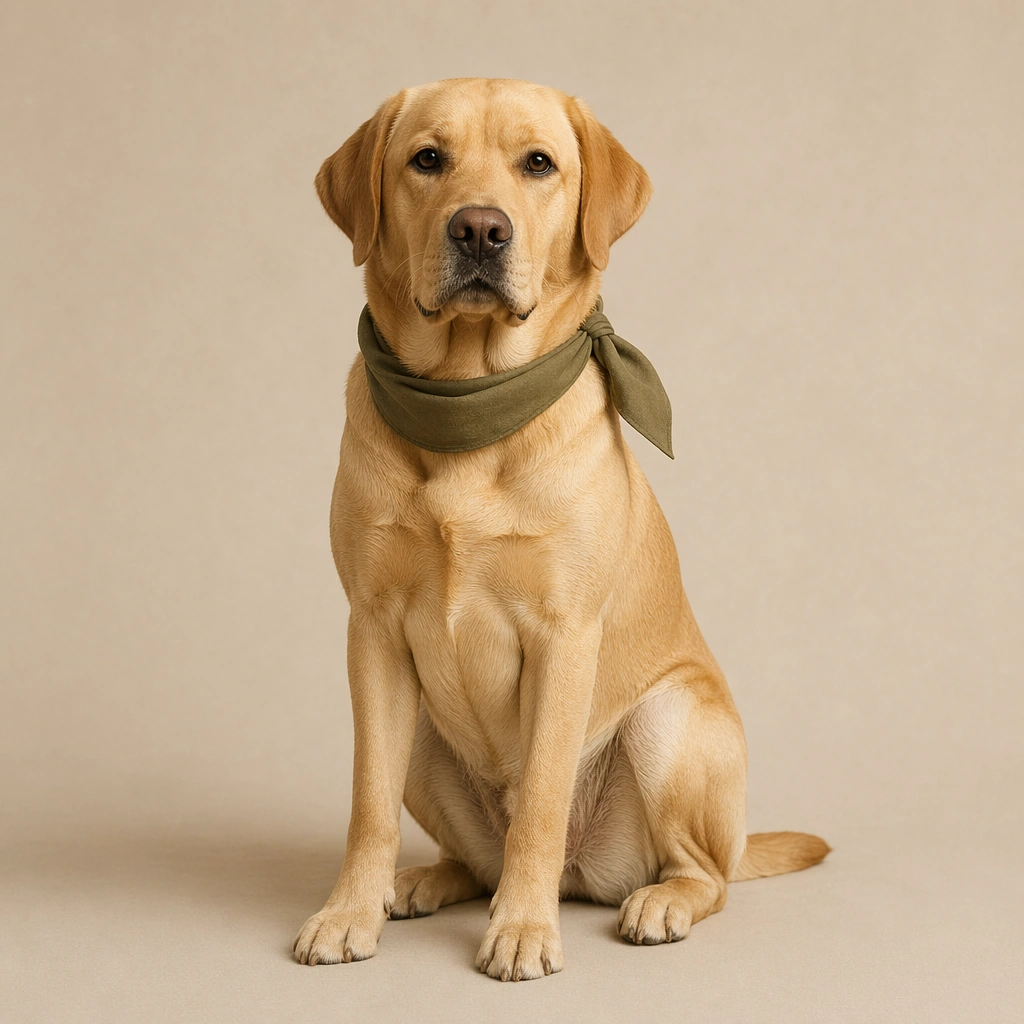
Example generated from “Pet Portrait Personality System — Confident Labrador Brand Hero”
GPT Image 2en

Scene: A square commercial pet portrait built like a premium asset from a modern animal lifestyle brand. Use controlled studio or window light, accurate fur rendering, and a clean background with enough breathing room for avatar, packaging, and merch crops. The frame should feel intentionally art directed, with believable lens depth and restrained color grading rather than sentimental snapshot energy. Set the dog against a matte oatmeal backdrop with gentle side light and a faint grounded floor shadow so the portrait feels premium but approachable. Subject: Photograph one pet as the clear hero and let its personality read through posture, eye expression, ear position, and grooming detail. The animal must feel real, well cared for, and emotionally specific, with anatomy, coat pattern, and whisker detail treated seriously. Avoid clownish costume logic; the character comes from attitude, styling restraint, and portrait craft. The Labrador sits upright with chest forward, glossy coat detail, relaxed mouth, alert ears, and a gaze that signals dependable friendliness. Important details: Keep the image commercially reusable: crisp edges, clean separation from the background, subtle brand polish, and enough negative space for later design systems. Props may appear only when they reinforce the personality cue. Maintain trustworthy realism, elegant light falloff, and a finish that could sit on a profile card, tote bag, clinic brochure, or premium social post without redesigning the core image. Allow one slim olive neck scarf as the only styling element, simple enough to remain useful for packaging cutouts and profile icons. Use case: Pet Portrait Personality System single study 1/9, confident labrador brand hero for a commercially reusable prompt atlas example. Constraints: No readable text, no watermark, no logos, preserve exact 1:1 aspect ratio, no chaotic home interiors, no novelty meme expressions, no distorted anatomy, no extra animals, no cluttered props, no cropped off ears unless intentionally close, no playful party props, no open mouth panting, no muddy paws.

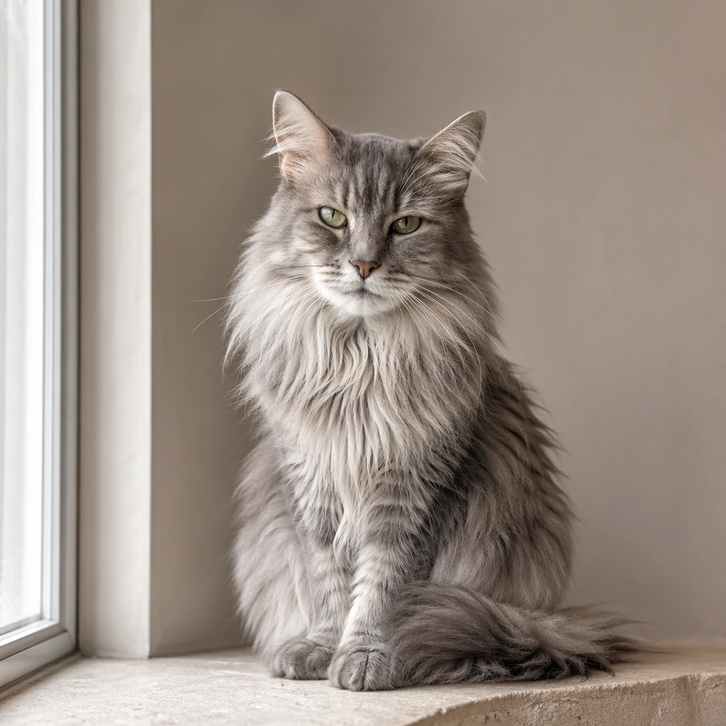
Example generated from “Pet Portrait Personality System — Window Light Senior Cat Portrait”
GPT Image 2en

Scene: A square commercial pet portrait built like a premium asset from a modern animal lifestyle brand. Use controlled studio or window light, accurate fur rendering, and a clean background with enough breathing room for avatar, packaging, and merch crops. The frame should feel intentionally art directed, with believable lens depth and restrained color grading rather than sentimental snapshot energy. Use a pale stone windowsill environment with diffused morning light and a soft neutral wall that keeps the composition quiet and editorial. Subject: Photograph one pet as the clear hero and let its personality read through posture, eye expression, ear position, and grooming detail. The animal must feel real, well cared for, and emotionally specific, with anatomy, coat pattern, and whisker detail treated seriously. Avoid clownish costume logic; the character comes from attitude, styling restraint, and portrait craft. Show an older long haired cat with silver whiskers, slightly weathered fur around the muzzle, calm seated posture, and intelligent half narrowed eyes. Important details: Keep the image commercially reusable: crisp edges, clean separation from the background, subtle brand polish, and enough negative space for later design systems. Props may appear only when they reinforce the personality cue. Maintain trustworthy realism, elegant light falloff, and a finish that could sit on a profile card, tote bag, clinic brochure, or premium social post without redesigning the core image. Honor age detail instead of hiding it; the portrait should feel tender, premium, and suitable for senior pet wellness or memorial adjacent branding. Use case: Pet Portrait Personality System single study 2/9, window light senior cat portrait for a commercially reusable prompt atlas example. Constraints: No readable text, no watermark, no logos, preserve exact 1:1 aspect ratio, no chaotic home interiors, no novelty meme expressions, no distorted anatomy, no extra animals, no cluttered props, no cropped off ears unless intentionally close, no kitten cues, no harsh glamour retouching, no ornate furniture.

Example generated from “Pet Portrait Personality System — Curious Rabbit Profile Badge”
GPT Image 2en

Scene: A square commercial pet portrait built like a premium asset from a modern animal lifestyle brand. Use controlled studio or window light, accurate fur rendering, and a clean background with enough breathing room for avatar, packaging, and merch crops. The frame should feel intentionally art directed, with believable lens depth and restrained color grading rather than sentimental snapshot energy. Stage the rabbit on a pale sage paper sweep with even daylight style lighting that preserves the softness of the ears and nose contours. Subject: Photograph one pet as the clear hero and let its personality read through posture, eye expression, ear position, and grooming detail. The animal must feel real, well cared for, and emotionally specific, with anatomy, coat pattern, and whisker detail treated seriously. Avoid clownish costume logic; the character comes from attitude, styling restraint, and portrait craft. Feature a small rabbit in three quarter view with lifted ears, bright reflective eyes, fine whiskers, and a slight forward lean that suggests curiosity. Important details: Keep the image commercially reusable: crisp edges, clean separation from the background, subtle brand polish, and enough negative space for later design systems. Props may appear only when they reinforce the personality cue. Maintain trustworthy realism, elegant light falloff, and a finish that could sit on a profile card, tote bag, clinic brochure, or premium social post without redesigning the core image. Keep the paws tidy, the silhouette legible, and the tonal contrast strong enough for avatar use without losing natural fur texture. Use case: Pet Portrait Personality System single study 3/9, curious rabbit profile badge for a commercially reusable prompt atlas example. Constraints: No readable text, no watermark, no logos, preserve exact 1:1 aspect ratio, no chaotic home interiors, no novelty meme expressions, no distorted anatomy, no extra animals, no cluttered props, no cropped off ears unless intentionally close, no fantasy colors, no oversized carrots, no childish nursery styling.

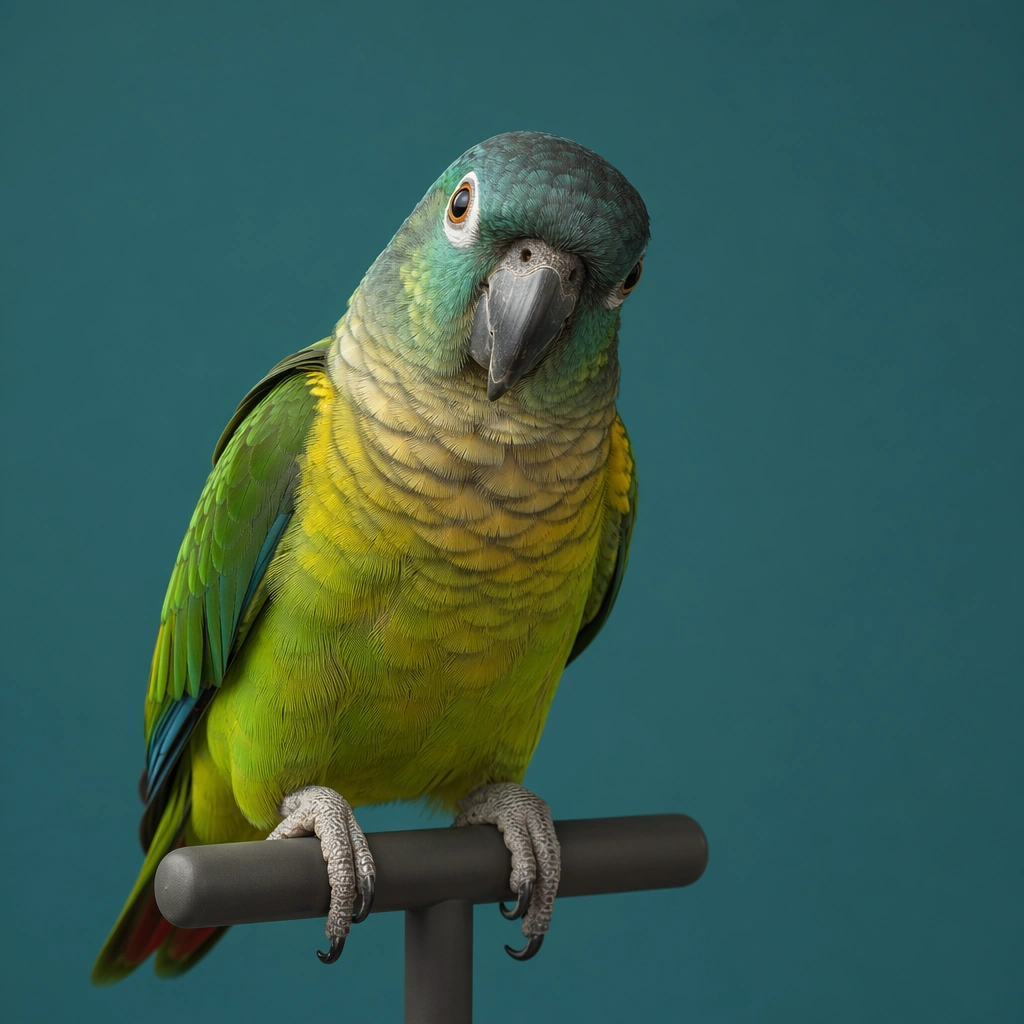
Example generated from “Pet Portrait Personality System — Parrot Color Persona Portrait”
GPT Image 2en

Scene: A square commercial pet portrait built like a premium asset from a modern animal lifestyle brand. Use controlled studio or window light, accurate fur rendering, and a clean background with enough breathing room for avatar, packaging, and merch crops. The frame should feel intentionally art directed, with believable lens depth and restrained color grading rather than sentimental snapshot energy. Use a muted teal background with crisp yet soft directional light so the feathers glow without becoming neon or theatrical. Subject: Photograph one pet as the clear hero and let its personality read through posture, eye expression, ear position, and grooming detail. The animal must feel real, well cared for, and emotionally specific, with anatomy, coat pattern, and whisker detail treated seriously. Avoid clownish costume logic; the character comes from attitude, styling restraint, and portrait craft. Show a medium parrot perched on a minimal matte stand, head slightly tilted, with attentive eye contact and clearly separated feather planes. Important details: Keep the image commercially reusable: crisp edges, clean separation from the background, subtle brand polish, and enough negative space for later design systems. Props may appear only when they reinforce the personality cue. Maintain trustworthy realism, elegant light falloff, and a finish that could sit on a profile card, tote bag, clinic brochure, or premium social post without redesigning the core image. Let the bird provide the color story, but keep the grading controlled and commercial, avoiding zoo poster spectacle or cartoon exaggeration. Use case: Pet Portrait Personality System single study 4/9, parrot color persona portrait for a commercially reusable prompt atlas example. Constraints: No readable text, no watermark, no logos, preserve exact 1:1 aspect ratio, no chaotic home interiors, no novelty meme expressions, no distorted anatomy, no extra animals, no cluttered props, no cropped off ears unless intentionally close, no jungle overload, no screaming motion blur, no rainbow saturation spikes.

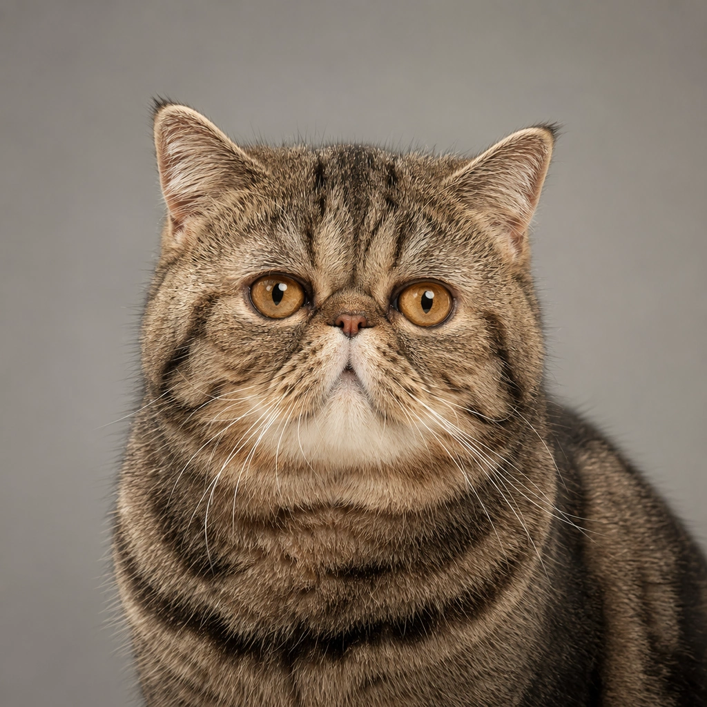
Example generated from “Pet Portrait Personality System — Exotic Shorthair Close Study”
GPT Image 2en

Scene: A square commercial pet portrait built like a premium asset from a modern animal lifestyle brand. Use controlled studio or window light, accurate fur rendering, and a clean background with enough breathing room for avatar, packaging, and merch crops. The frame should feel intentionally art directed, with believable lens depth and restrained color grading rather than sentimental snapshot energy. Frame the cat tightly against a warm gray seamless backdrop with very soft frontal light and delicate shadow under the chin. Subject: Photograph one pet as the clear hero and let its personality read through posture, eye expression, ear position, and grooming detail. The animal must feel real, well cared for, and emotionally specific, with anatomy, coat pattern, and whisker detail treated seriously. Avoid clownish costume logic; the character comes from attitude, styling restraint, and portrait craft. Show the broad face, plush short coat, small ears, and symmetrical gaze with enough breathing room that the portrait still feels luxurious rather than compressed. Important details: Keep the image commercially reusable: crisp edges, clean separation from the background, subtle brand polish, and enough negative space for later design systems. Props may appear only when they reinforce the personality cue. Maintain trustworthy realism, elegant light falloff, and a finish that could sit on a profile card, tote bag, clinic brochure, or premium social post without redesigning the core image. Use shallow depth only lightly; the viewer should still read fur detail, nose texture, and subtle color transitions across the face. Use case: Pet Portrait Personality System single study 5/9, exotic shorthair close study for a commercially reusable prompt atlas example. Constraints: No readable text, no watermark, no logos, preserve exact 1:1 aspect ratio, no chaotic home interiors, no novelty meme expressions, no distorted anatomy, no extra animals, no cluttered props, no cropped off ears unless intentionally close, no exaggerated baby filter look, no costume collars, no distorted flat face caricature.

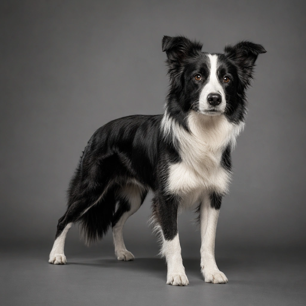
Example generated from “Pet Portrait Personality System — Border Collie Athletic Stance”
GPT Image 2en

Scene: A square commercial pet portrait built like a premium asset from a modern animal lifestyle brand. Use controlled studio or window light, accurate fur rendering, and a clean background with enough breathing room for avatar, packaging, and merch crops. The frame should feel intentionally art directed, with believable lens depth and restrained color grading rather than sentimental snapshot energy. Set the portrait on a charcoal to fog gray studio floor and wall blend with directional side light that reveals musculature and coat contour. Subject: Photograph one pet as the clear hero and let its personality read through posture, eye expression, ear position, and grooming detail. The animal must feel real, well cared for, and emotionally specific, with anatomy, coat pattern, and whisker detail treated seriously. Avoid clownish costume logic; the character comes from attitude, styling restraint, and portrait craft. The dog stands in a balanced athletic stance with lifted head, focused expression, clean black and white markings, and healthy coat sheen. Important details: Keep the image commercially reusable: crisp edges, clean separation from the background, subtle brand polish, and enough negative space for later design systems. Props may appear only when they reinforce the personality cue. Maintain trustworthy realism, elegant light falloff, and a finish that could sit on a profile card, tote bag, clinic brochure, or premium social post without redesigning the core image. Keep the body fully legible for merch silhouettes and product banners while maintaining a realistic working dog presence. Use case: Pet Portrait Personality System single study 6/9, border collie athletic stance for a commercially reusable prompt atlas example. Constraints: No readable text, no watermark, no logos, preserve exact 1:1 aspect ratio, no chaotic home interiors, no novelty meme expressions, no distorted anatomy, no extra animals, no cluttered props, no cropped off ears unless intentionally close, no frisbee action blur, no human trainer, no outdoor sports clutter.
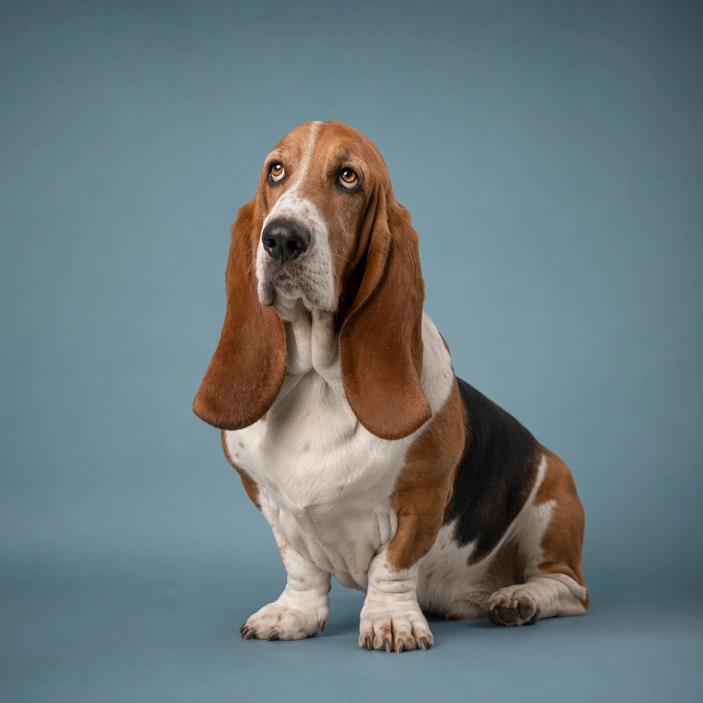
Example generated from “Pet Portrait Personality System — Basset Hound Soft Ear Study”
GPT Image 2en

Scene: A square commercial pet portrait built like a premium asset from a modern animal lifestyle brand. Use controlled studio or window light, accurate fur rendering, and a clean background with enough breathing room for avatar, packaging, and merch crops. The frame should feel intentionally art directed, with believable lens depth and restrained color grading rather than sentimental snapshot energy. Use creamy low contrast studio light and a muted dusty blue backdrop that supports the drooping ear silhouette without turning cute into kitsch. Subject: Photograph one pet as the clear hero and let its personality read through posture, eye expression, ear position, and grooming detail. The animal must feel real, well cared for, and emotionally specific, with anatomy, coat pattern, and whisker detail treated seriously. Avoid clownish costume logic; the character comes from attitude, styling restraint, and portrait craft. Show a seated basset hound with long ears resting naturally, amber eyes, heavy brow, and a patient expression that feels gentle and slightly wistful. Important details: Keep the image commercially reusable: crisp edges, clean separation from the background, subtle brand polish, and enough negative space for later design systems. Props may appear only when they reinforce the personality cue. Maintain trustworthy realism, elegant light falloff, and a finish that could sit on a profile card, tote bag, clinic brochure, or premium social post without redesigning the core image. Allow subtle leather collar detail only if it remains secondary to the face and ear geometry; the mood should stay clean and premium. Use case: Pet Portrait Personality System single study 7/9, basset hound soft ear study for a commercially reusable prompt atlas example. Constraints: No readable text, no watermark, no logos, preserve exact 1:1 aspect ratio, no chaotic home interiors, no novelty meme expressions, no distorted anatomy, no extra animals, no cluttered props, no cropped off ears unless intentionally close, no comedic drool, no costume hats, no over sharpened fur.

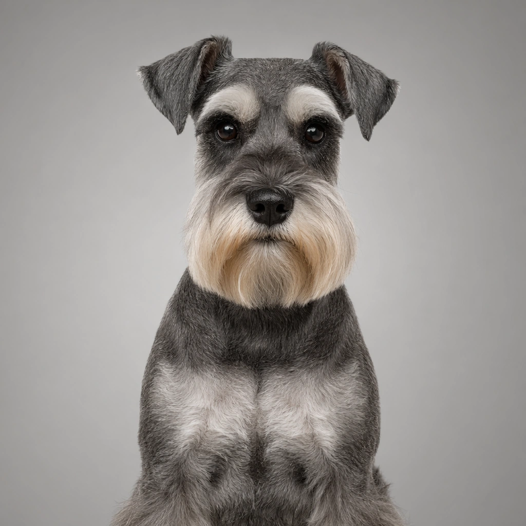
Example generated from “Pet Portrait Personality System — Schnauzer Classic Groomed Portrait”
GPT Image 2en

Scene: A square commercial pet portrait built like a premium asset from a modern animal lifestyle brand. Use controlled studio or window light, accurate fur rendering, and a clean background with enough breathing room for avatar, packaging, and merch crops. The frame should feel intentionally art directed, with believable lens depth and restrained color grading rather than sentimental snapshot energy. Place the dog against a pale graphite backdrop with clean top side lighting that reveals the beard, eyebrows, and clipped body texture. Subject: Photograph one pet as the clear hero and let its personality read through posture, eye expression, ear position, and grooming detail. The animal must feel real, well cared for, and emotionally specific, with anatomy, coat pattern, and whisker detail treated seriously. Avoid clownish costume logic; the character comes from attitude, styling restraint, and portrait craft. Show a miniature schnauzer in a straight seated posture with alert dark eyes and balanced symmetry across the face and chest. Important details: Keep the image commercially reusable: crisp edges, clean separation from the background, subtle brand polish, and enough negative space for later design systems. Props may appear only when they reinforce the personality cue. Maintain trustworthy realism, elegant light falloff, and a finish that could sit on a profile card, tote bag, clinic brochure, or premium social post without redesigning the core image. The trim should look skilled, believable, and premium, suitable for salon marketing, breed club imagery, or branded grooming cards. Use case: Pet Portrait Personality System single study 8/9, schnauzer classic groomed portrait for a commercially reusable prompt atlas example. Constraints: No readable text, no watermark, no logos, preserve exact 1:1 aspect ratio, no chaotic home interiors, no novelty meme expressions, no distorted anatomy, no extra animals, no cluttered props, no cropped off ears unless intentionally close, no bow overload, no fashion gimmicks, no toy dog proportions.

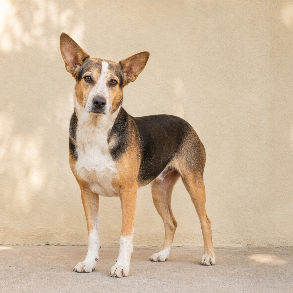
Example generated from “Pet Portrait Personality System — Rescue Mixed Breed Trust Portrait”
GPT Image 2en

Scene: A square commercial pet portrait built like a premium asset from a modern animal lifestyle brand. Use controlled studio or window light, accurate fur rendering, and a clean background with enough breathing room for avatar, packaging, and merch crops. The frame should feel intentionally art directed, with believable lens depth and restrained color grading rather than sentimental snapshot energy. Use soft outdoor shade or simulated open shade against a plain plaster wall so the portrait feels real world and grounded rather than studio precious. Subject: Photograph one pet as the clear hero and let its personality read through posture, eye expression, ear position, and grooming detail. The animal must feel real, well cared for, and emotionally specific, with anatomy, coat pattern, and whisker detail treated seriously. Avoid clownish costume logic; the character comes from attitude, styling restraint, and portrait craft. Feature a medium mixed breed dog with alert but gentle eyes, asymmetrical markings, and a relaxed standing pose that suggests resilience and trust. Important details: Keep the image commercially reusable: crisp edges, clean separation from the background, subtle brand polish, and enough negative space for later design systems. Props may appear only when they reinforce the personality cue. Maintain trustworthy realism, elegant light falloff, and a finish that could sit on a profile card, tote bag, clinic brochure, or premium social post without redesigning the core image. Keep the styling minimal and dignified; the emotion should come from honest presence, not pity cues or dramatic hardship staging. Use case: Pet Portrait Personality System single study 9/9, rescue mixed breed trust portrait for a commercially reusable prompt atlas example. Constraints: No readable text, no watermark, no logos, preserve exact 1:1 aspect ratio, no chaotic home interiors, no novelty meme expressions, no distorted anatomy, no extra animals, no cluttered props, no cropped off ears unless intentionally close, no chain fences, no visible neglect trauma, no gloomy disaster mood.

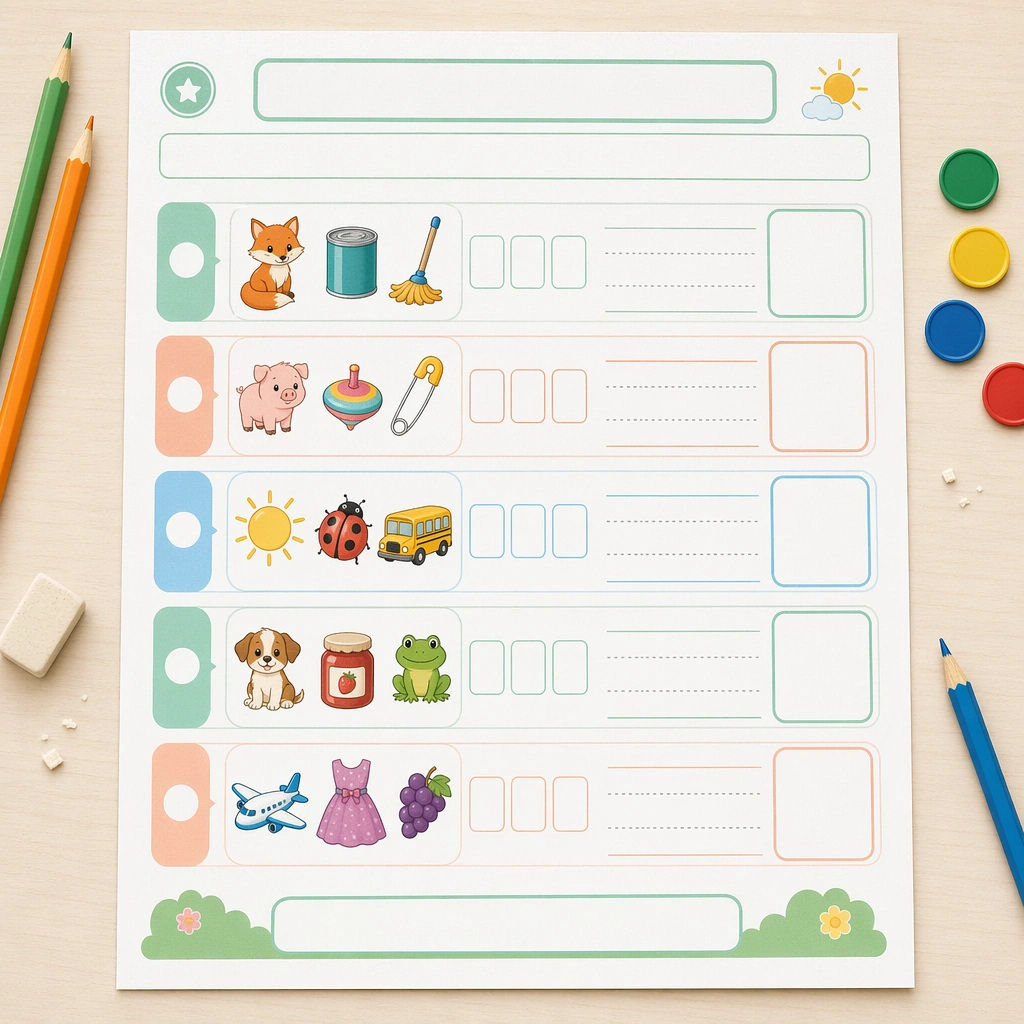
Example generated from “Phonics And Reading Practice Sheet — Reference Sound Sheet”
GPT Image 2en

Scene: Create a square top-down view of a beautifully printed phonics worksheet lying on a pale teacher desk, lit by clean morning classroom light. The page should feel like a real production proof with crisp margins, soft recycled-paper texture, and enough surrounding space for pencils, counters, and eraser crumbs without becoming messy. Keep the square frame balanced, calm, and production-ready so the asset can serve gallery review, research comparison, and real educational delivery at the same time. Subject: Design the worksheet around picture-led sound sorting, using rows of illustrated objects, blank letter tiles, empty tracing lanes, and large response boxes. The visual logic must feel approachable for early readers, with one clear task family repeated across the page so the system reads as usable rather than decorative. The subject matter should feel intentionally selected for a coherent curriculum family rather than like a random decorative assortment. Important details: Make the page highly structured: rounded section blocks, calm mint, peach, and sky accents, child-friendly icons, and empty headline zones where copy could be added later. The overall impression should be a premium literacy resource that balances pedagogy, print practicality, and visual warmth. Preserve the same worksheet margins, answer-box scale, icon cadence, divider rhythm, and blank title bars from the reference sheet. Use variation only in the teaching content, supporting props, and scene-specific mood while preserving the core visual system exactly. Use case: Phonics and Reading Practice Sheet series study 1/4, reference sound sheet. Constraints: No readable text, no watermark, no logos, preserve exact 1:1 aspect ratio, no readable letters, no real words, no teacher handwriting, no messy desk clutter, no adult branding, no distorted paper edges.

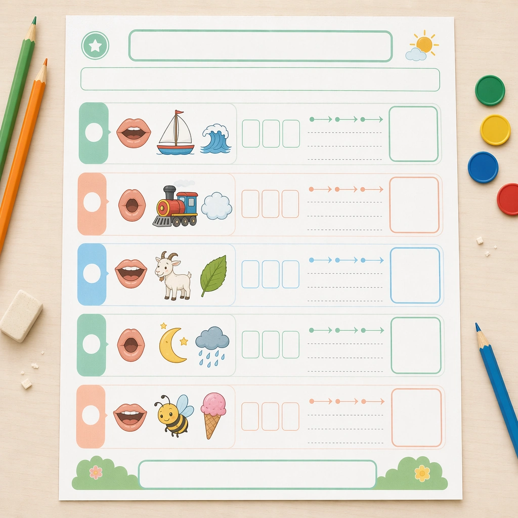
Example generated from “Phonics And Reading Practice Sheet — Vowel Blend Sheet”
GPT Image 2en

Scene: Keep the same square overhead proof-shot setup, identical paper stock, lighting softness, and desk styling from the reference worksheet. The image should look like the next page in a tightly art-directed literacy pack, maintaining precise margins, print realism, and the same calm elementary-classroom mood. Keep the square frame balanced, calm, and production-ready so the asset can serve gallery review, research comparison, and real educational delivery at the same time. Subject: Swap the exercise logic to blending practice using illustrated mouth shapes, picture cues, segmented sound chips, blank blend strips, and simple guided arrows that imply left-to-right reading without any actual alphabet characters. The worksheet should feel active and teachable, not abstract. The subject matter should feel intentionally selected for a coherent curriculum family rather than like a random decorative assortment. Important details: Preserve the structural system from the reference page exactly: same header band, module spacing, answer-box size, icon style, and empty prompt panels. Variation should come from the sound-building visuals and sequencing cues, while the worksheet still feels like part of one commercially viable phonics line. Preserve the same worksheet margins, answer-box scale, icon cadence, divider rhythm, and blank title bars from the reference sheet. Use variation only in the teaching content, supporting props, and scene-specific mood while preserving the core visual system exactly. Use case: Phonics and Reading Practice Sheet series study 2/4, vowel blend sheet. Constraints: No readable text, no watermark, no logos, preserve exact 1:1 aspect ratio, no readable letters, no real words, no teacher handwriting, no messy desk clutter, no adult branding, no distorted paper edges.

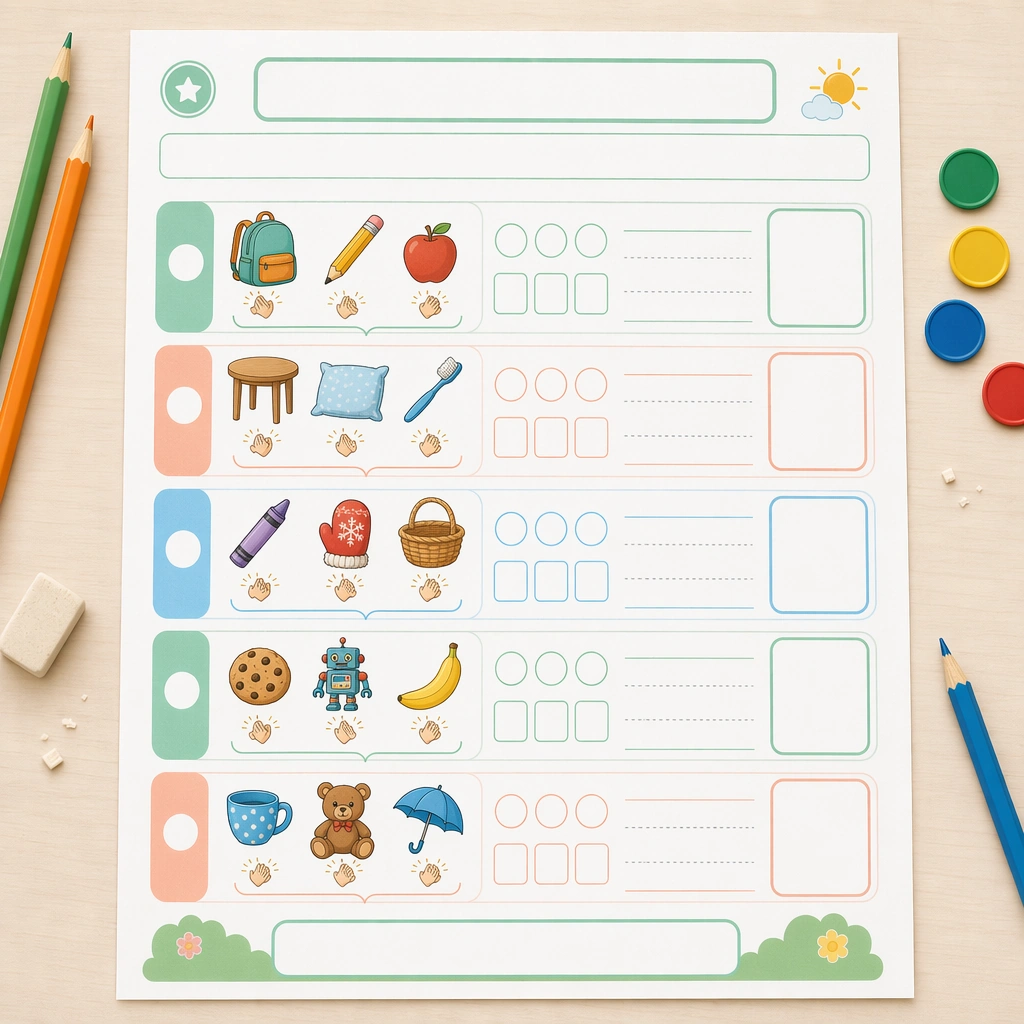
Example generated from “Phonics And Reading Practice Sheet — Syllable Clap Sheet”
GPT Image 2en

Scene: Render the identical square print-proof photograph again, with the same desk crop, page scale, and soft classroom lighting. It should appear as another sheet from the same literacy unit, reviewed by a curriculum designer for consistency across a printable packet and digital download bundle. Keep the square frame balanced, calm, and production-ready so the asset can serve gallery review, research comparison, and real educational delivery at the same time. Subject: Build the page around clapping and segmentation cues: picture cards, empty beat circles, step markers, hand icons, and grouping brackets that help children feel parts of a spoken word without relying on actual text. Keep the picture support lively and age-appropriate, with familiar school and home objects. The subject matter should feel intentionally selected for a coherent curriculum family rather than like a random decorative assortment. Important details: The same system constraints must hold: matching margins, rounded activity blocks, pastel guidance colors, and blank instruction areas. The image should communicate pacing, repetition, and child accessibility through graphic rhythm alone, proving the worksheet family can handle multiple exercise types. Preserve the same worksheet margins, answer-box scale, icon cadence, divider rhythm, and blank title bars from the reference sheet. Use variation only in the teaching content, supporting props, and scene-specific mood while preserving the core visual system exactly. Use case: Phonics and Reading Practice Sheet series study 3/4, syllable clap sheet. Constraints: No readable text, no watermark, no logos, preserve exact 1:1 aspect ratio, no readable letters, no real words, no teacher handwriting, no messy desk clutter, no adult branding, no distorted paper edges.

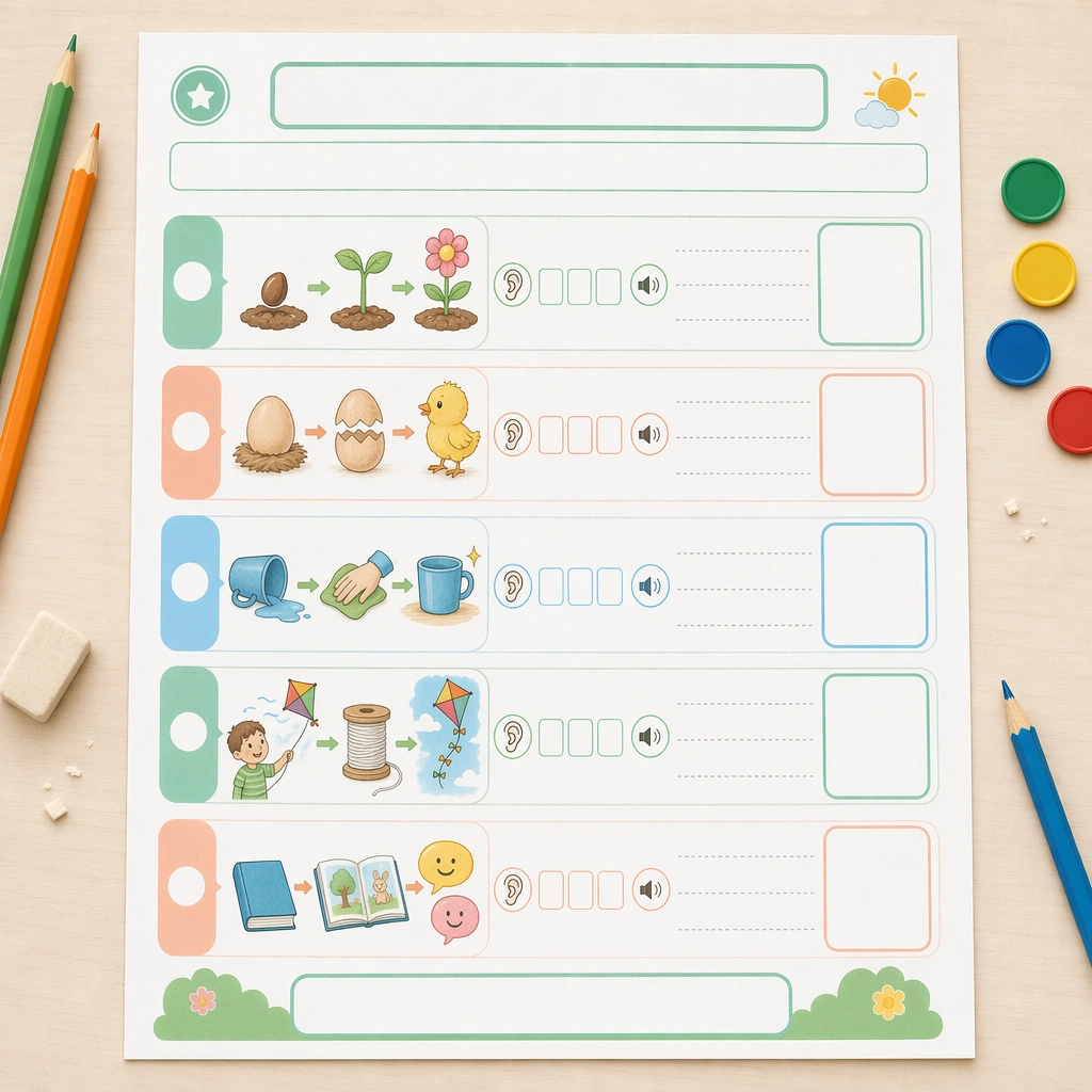
Example generated from “Phonics And Reading Practice Sheet — Guided Reading Sheet”
GPT Image 2en

Scene: Keep the same square overhead page proof and classroom desktop environment, with restrained props and meticulous spacing that mirror the reference sheet. The visual should feel like a polished handout cover image for a reading-intervention toolkit, practical enough for print and attractive enough for catalog display. Keep the square frame balanced, calm, and production-ready so the asset can serve gallery review, research comparison, and real educational delivery at the same time. Subject: Focus on short-sequence reading support using picture panels, empty sentence frames, direction arrows, listening icons, and response boxes for retelling order. The layout should encourage progression from image cue to spoken response to reading confidence, even though all textual areas stay intentionally blank. The subject matter should feel intentionally selected for a coherent curriculum family rather than like a random decorative assortment. Important details: Maintain the exact worksheet architecture from the reference page while changing only the pedagogical content. The shared header rhythm, module shapes, color coding, and answer-zone scale should make the four-page series feel ready for a real classroom literacy product line. Preserve the same worksheet margins, answer-box scale, icon cadence, divider rhythm, and blank title bars from the reference sheet. Use variation only in the teaching content, supporting props, and scene-specific mood while preserving the core visual system exactly. Use case: Phonics and Reading Practice Sheet series study 4/4, guided reading sheet. Constraints: No readable text, no watermark, no logos, preserve exact 1:1 aspect ratio, no readable letters, no real words, no teacher handwriting, no messy desk clutter, no adult branding, no distorted paper edges.

Example generated from “Phonics And Reading Practice Sheet — Small Group Teacher Board”
GPT Image 2en

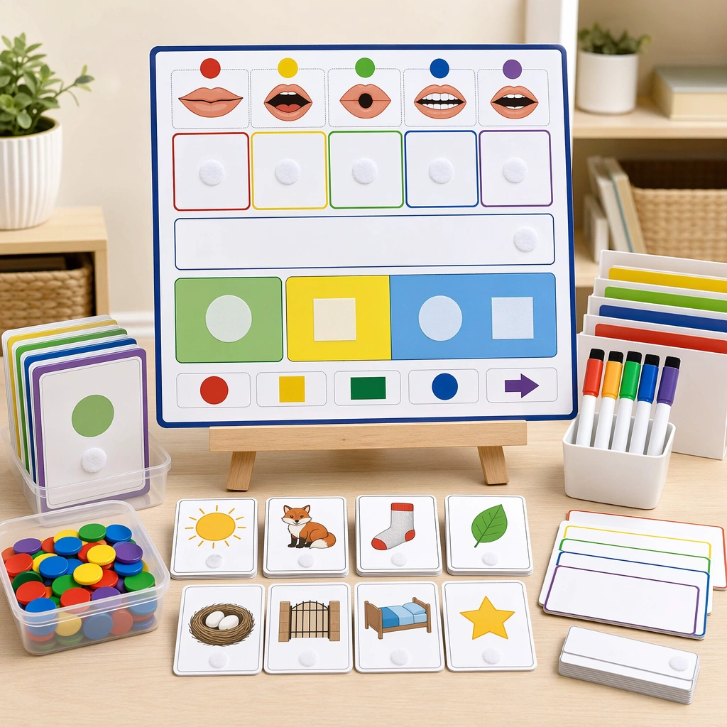
Scene: Show a square tabletop teaching setup with a compact instruction board, mini picture cards, counters, and a standing easel under soft classroom light. The composition should feel deliberate and organized, like a teacher-resource catalog image rather than a candid classroom photograph. Keep the square frame balanced, calm, and production-ready so the asset can serve gallery review, research comparison, and real educational delivery at the same time. Subject: Center a reusable board with sound boxes, mouth-shape icons, and blank modeling strips, surrounded by a few small manipulative pieces. The board should suggest how a teacher would guide three or four children through decoding practice while staying free of readable copy. The subject arrangement should feel complete and self-contained, able to stand alone as a real supporting deliverable inside the same education business line. Important details: Keep the material language realistic: laminated card stock, dry-erase surfaces, velcro dots, and color-coded modules. The instructional intent should be obvious through physical structure and pacing cues, not through text. Keep the visual hierarchy modular, commercially believable, and clearly tied to a real educational use case rather than a generic mood board. Use case: Phonics and Reading Practice Sheet single study 2/5, small group teacher board. Constraints: No readable text, no watermark, no logos, preserve exact 1:1 aspect ratio, no readable text, no real letters, no logos, no teacher scribbles, no chaotic classroom mess, no broken magnets.

Example generated from “Phonics And Reading Practice Sheet — Homework Folder Kit”
GPT Image 2en

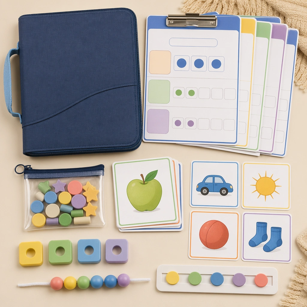
Scene: Render a square parent-facing flatlay of a take-home phonics kit on a soft neutral background, styled like an educational ecommerce bundle. Include a tidy folder, clipped sheets, a small pouch of tokens, and picture cards arranged with catalog precision. Keep the square frame balanced, calm, and production-ready so the asset can serve gallery review, research comparison, and real educational delivery at the same time. Subject: The kit should clearly communicate repeatable home practice through blank instruction inserts, color-coded sections, and tactile components that align with early-reading pedagogy. Everything should feel durable, family-friendly, and easy to understand at a glance. The subject arrangement should feel complete and self-contained, able to stand alone as a real supporting deliverable inside the same education business line. Important details: Avoid the look of office supplies or generic school clutter. The hierarchy should be crisp, the palette supportive, and the components specific enough that a buyer could immediately imagine nightly reading practice without seeing any written directions. Keep the visual hierarchy modular, commercially believable, and clearly tied to a real educational use case rather than a generic mood board. Use case: Phonics and Reading Practice Sheet single study 3/5, homework folder kit. Constraints: No readable text, no watermark, no logos, preserve exact 1:1 aspect ratio, no readable text, no real letters, no logos, no teacher scribbles, no chaotic classroom mess, no broken magnets.
Example generated from “Phonics And Reading Practice Sheet — Magnetic Phoneme Tray”
GPT Image 2en

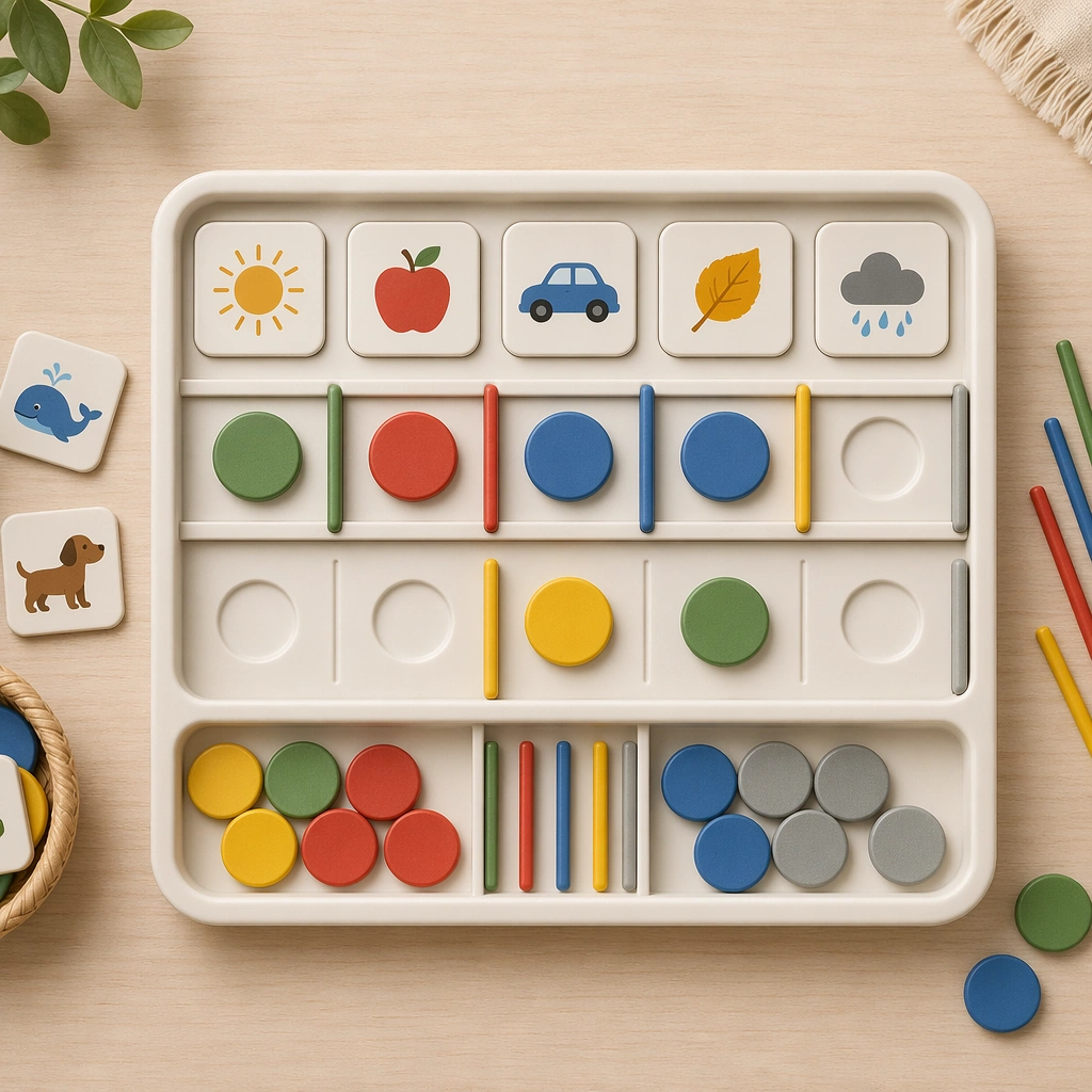
Scene: Create a square close top-down product shot of a magnetic literacy tray resting on a classroom table, with clean side light revealing soft plastic texture and tidy compartments. The image should feel like a new teaching tool launch visual rather than a casual desktop snapshot. Keep the square frame balanced, calm, and production-ready so the asset can serve gallery review, research comparison, and real educational delivery at the same time. Subject: Feature colored magnetic chips, picture tokens, empty sound slots, and movable divider bars that suggest phoneme sequencing and blending. The tray must look intuitive for children and clearly part of an educational tool ecosystem, even without actual letters. The subject arrangement should feel complete and self-contained, able to stand alone as a real supporting deliverable inside the same education business line. Important details: Use a restrained palette and very controlled object spacing so the product reads clearly. The modular compartments, rounded corners, and pictorial cues should do the instructional work that text would normally handle. Keep the visual hierarchy modular, commercially believable, and clearly tied to a real educational use case rather than a generic mood board. Use case: Phonics and Reading Practice Sheet single study 4/5, magnetic phoneme tray. Constraints: No readable text, no watermark, no logos, preserve exact 1:1 aspect ratio, no readable text, no real letters, no logos, no teacher scribbles, no chaotic classroom mess, no broken magnets.

Example generated from “Phonics And Reading Practice Sheet — Progress Reward Board”
GPT Image 2en

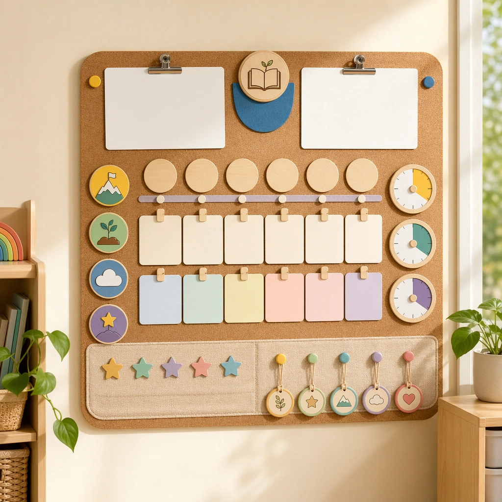
Scene: Show a square wall-mounted progress board photographed straight-on in a sunny classroom nook, with soft cork texture, clipped cards, and a few dangling reward tokens. The board should feel like a parent-communication and classroom-management hybrid asset created by a high-quality education brand. Keep the square frame balanced, calm, and production-ready so the asset can serve gallery review, research comparison, and real educational delivery at the same time. Subject: Mix empty milestone circles, pictorial challenge badges, reading-timer icons, and neat places for removable stars or tokens. The board must look motivating and child-safe without becoming loud or gamified beyond educational credibility. The subject arrangement should feel complete and self-contained, able to stand alone as a real supporting deliverable inside the same education business line. Important details: Keep the layout modular and spacious, with obvious room for future customization. The asset should prove that the worksheet system can extend into motivation and routine support, still without requiring readable language. Keep the visual hierarchy modular, commercially believable, and clearly tied to a real educational use case rather than a generic mood board. Use case: Phonics and Reading Practice Sheet single study 5/5, progress reward board. Constraints: No readable text, no watermark, no logos, preserve exact 1:1 aspect ratio, no readable text, no real letters, no logos, no teacher scribbles, no chaotic classroom mess, no broken magnets.

Example generated from “Planetary Outpost And Frontier Base Set — Frontier Habitat Anchor”
GPT Image 2en

Scene: Create a square planetary-outpost image with harsh environment readability and grounded survival engineering. The frame should capture both the base architecture and the environmental pressure around it, using dust, ice, darkness, or glare only as support for spatial clarity. Keep the camera near enough to read pipes, locks, and utility surfaces, but far enough to show how the base organizes itself against the landscape. Frame a modular desert outpost at late afternoon with one landing pad, one greenhouse spine, and layered dust ridges surrounding the main habitat cluster. Subject: Center the composition on a coherent frontier base language: pressure habitats, greenhouses, landing pads, drills, storage berms, utility corridors, rover access, and sheltered work zones. The base should feel assembled by necessity and maintained daily by real crews, not staged as a decorative movie backdrop. Establish the reference language through pressure modules, rover bays, solar berms, and exposed utility lines arranged in a clear survival hierarchy. Important details: Prioritize survivability, logistics, and modular continuity. Material weathering, suit-scale doors, thermal lighting, and utility routing should all help explain how the installation stays alive in a hostile world. Use disciplined industrial colors with one environmental accent so the package remains reusable across concept posters and design sheets. The first image must define proportions, material wear, and lighting discipline so later variants can preserve the same base family under changing conditions. Resolve the anchor rules that later reference-dependent variants must inherit, especially the habitat module proportions, airlock language, utility pipe routing, and survival-first lighting hierarchy. Use case: Frontier Base series study 1/4, designed as a reusable core-system image for this topic. Constraints: No readable text, no watermark, no logos, preserve exact 1:1 aspect ratio, no fantasy ruins, no military battle explosions, no giant heroic poses, no magical sky anomalies, no giant cinematic hero figure.

Example generated from “Planetary Outpost And Frontier Base Set — Dust Storm Shield Mode”
GPT Image 2en

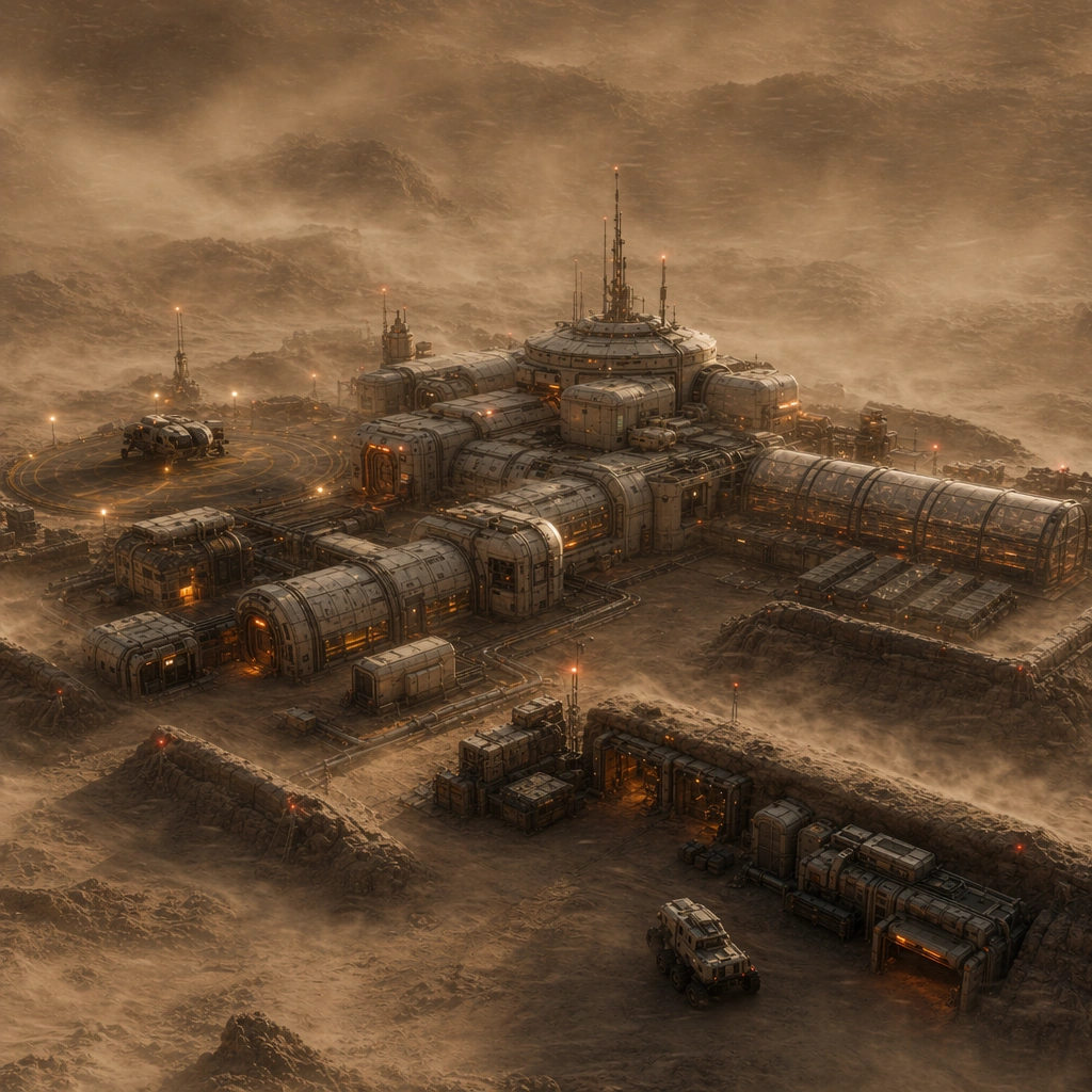
Scene: Create a square planetary-outpost image with harsh environment readability and grounded survival engineering. The frame should capture both the base architecture and the environmental pressure around it, using dust, ice, darkness, or glare only as support for spatial clarity. Keep the camera near enough to read pipes, locks, and utility surfaces, but far enough to show how the base organizes itself against the landscape. Keep the same habitat cluster but cover the scene with disciplined blowing dust and storm light so the shields and route markers become more visible. Subject: Center the composition on a coherent frontier base language: pressure habitats, greenhouses, landing pads, drills, storage berms, utility corridors, rover access, and sheltered work zones. The base should feel assembled by necessity and maintained daily by real crews, not staged as a decorative movie backdrop. Retain the exact module arrangement from the reference while showing storm shutters, tethered equipment, and emergency circulation paths in operation. Important details: Prioritize survivability, logistics, and modular continuity. Material weathering, suit-scale doors, thermal lighting, and utility routing should all help explain how the installation stays alive in a hostile world. Use disciplined industrial colors with one environmental accent so the package remains reusable across concept posters and design sheets. This should feel like a prepared survival system under stress, not a disaster image, with visibility managed through lighting and structural continuity. Preserve the exact structural language established by the reference image, especially the habitat module proportions, airlock language, utility pipe routing, and survival-first lighting hierarchy. Use case: Frontier Base series study 2/4, designed as a reusable core-system image for this topic. Constraints: No readable text, no watermark, no logos, preserve exact 1:1 aspect ratio, no fantasy ruins, no military battle explosions, no giant heroic poses, no magical sky anomalies, no collapsing structures, no panic crowd scene.

Example generated from “Planetary Outpost And Frontier Base Set — Night Reactor Watch”
GPT Image 2en

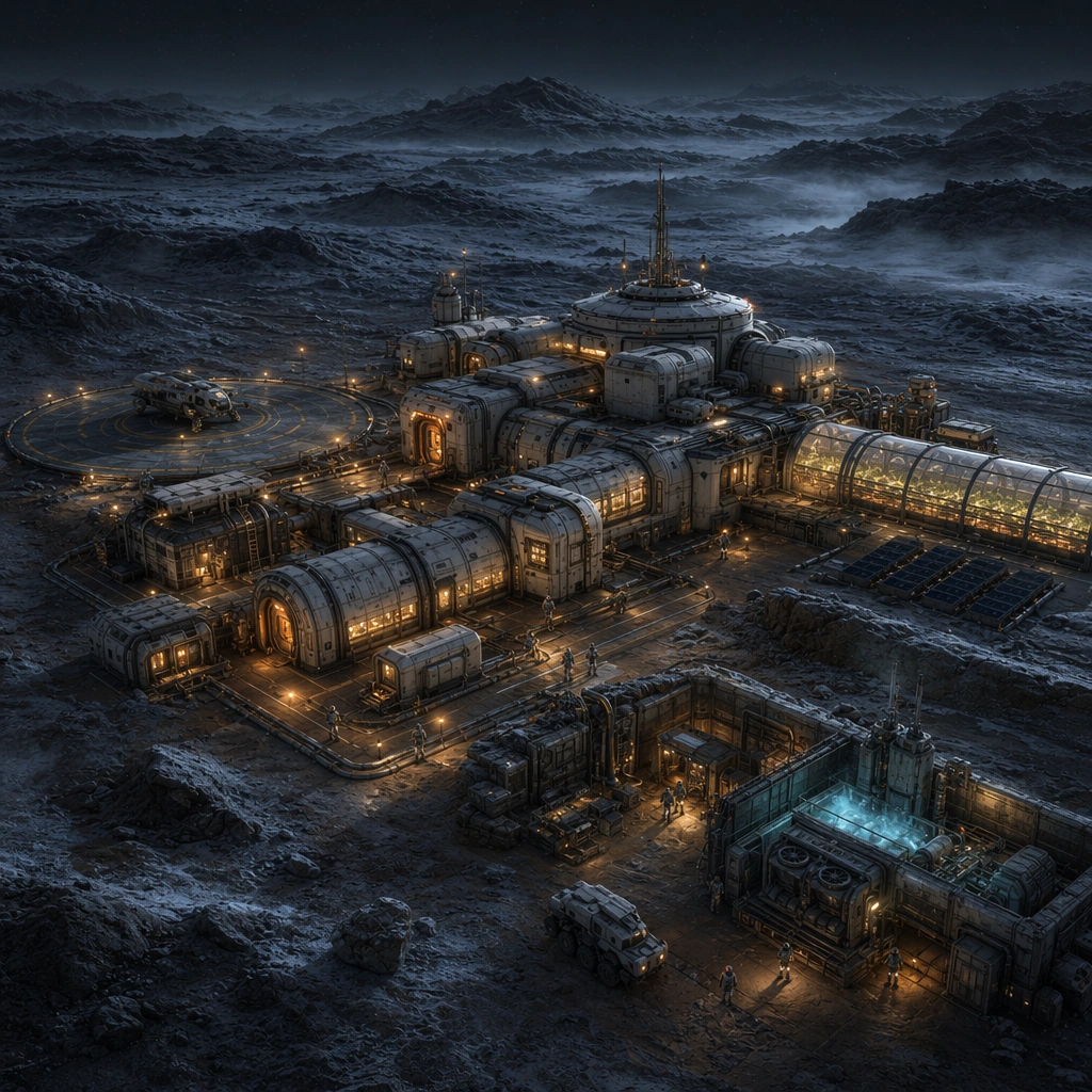
Scene: Create a square planetary-outpost image with harsh environment readability and grounded survival engineering. The frame should capture both the base architecture and the environmental pressure around it, using dust, ice, darkness, or glare only as support for spatial clarity. Keep the camera near enough to read pipes, locks, and utility surfaces, but far enough to show how the base organizes itself against the landscape. Render the same outpost at deep night with cold terrain, warm windows, and one reactor service zone softly lighting the exterior paths. Subject: Center the composition on a coherent frontier base language: pressure habitats, greenhouses, landing pads, drills, storage berms, utility corridors, rover access, and sheltered work zones. The base should feel assembled by necessity and maintained daily by real crews, not staged as a decorative movie backdrop. Preserve the anchor base silhouette while emphasizing maintenance ladders, cable runs, reactor shielding, and a few tiny crew suits conducting routine work. Important details: Prioritize survivability, logistics, and modular continuity. Material weathering, suit-scale doors, thermal lighting, and utility routing should all help explain how the installation stays alive in a hostile world. Use disciplined industrial colors with one environmental accent so the package remains reusable across concept posters and design sheets. Night lighting should clarify function rather than create mystery, showing exactly how the installation stays alive after dark. Preserve the exact structural language established by the reference image, especially the habitat module proportions, airlock language, utility pipe routing, and survival-first lighting hierarchy. Use case: Frontier Base series study 3/4, designed as a reusable core-system image for this topic. Constraints: No readable text, no watermark, no logos, preserve exact 1:1 aspect ratio, no fantasy ruins, no military battle explosions, no giant heroic poses, no magical sky anomalies, no horror lighting, no emergency meltdown cues.

Example generated from “Planetary Outpost And Frontier Base Set — Relief Cargo Arrival”
GPT Image 2en

Scene: Create a square planetary-outpost image with harsh environment readability and grounded survival engineering. The frame should capture both the base architecture and the environmental pressure around it, using dust, ice, darkness, or glare only as support for spatial clarity. Keep the camera near enough to read pipes, locks, and utility surfaces, but far enough to show how the base organizes itself against the landscape. Stage the habitat cluster during a controlled cargo arrival with one lander settling near the same pad and containers moving toward the service corridor. Subject: Center the composition on a coherent frontier base language: pressure habitats, greenhouses, landing pads, drills, storage berms, utility corridors, rover access, and sheltered work zones. The base should feel assembled by necessity and maintained daily by real crews, not staged as a decorative movie backdrop. Keep the original module family unchanged while foregrounding unloading cranes, transfer vehicles, and staged supply stacks. Important details: Prioritize survivability, logistics, and modular continuity. Material weathering, suit-scale doors, thermal lighting, and utility routing should all help explain how the installation stays alive in a hostile world. Use disciplined industrial colors with one environmental accent so the package remains reusable across concept posters and design sheets. The emphasis should be on calm logistical competence and believable infrastructure throughput instead of dramatic action. Preserve the exact structural language established by the reference image, especially the habitat module proportions, airlock language, utility pipe routing, and survival-first lighting hierarchy. Use case: Frontier Base series study 4/4, designed as a reusable core-system image for this topic. Constraints: No readable text, no watermark, no logos, preserve exact 1:1 aspect ratio, no fantasy ruins, no military battle explosions, no giant heroic poses, no magical sky anomalies, no combat dropship mood, no giant crowd.

Example generated from “Planetary Outpost And Frontier Base Set — Sulfur Swamp Extractor”
GPT Image 2en

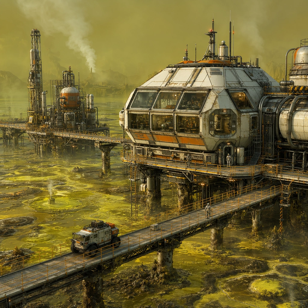
Scene: Design a square concept image for one planetary survival installation, making the environment harsh but legible and the infrastructure specific enough for a real worldbuilding deck. The camera should always reveal at least one core habitat, one utility or extraction system, and one clear environmental stressor. Show a yellow-green swamp world where lifted habitat decks and extraction rigs stand above unstable chemical pools and vent plumes. Subject: Show a complete survival ecosystem with believable shelter, energy, mobility, and work routines. Small rovers or suited crew can appear as scale cues, but the installation itself should remain the main protagonist. Focus on corrosion protection, pipe routing, sealed work zones, and elevated maintenance walkways that explain how the base survives the terrain. Important details: Use pressure-rated geometry, practical weathering, and environmental contrast to distinguish climate, terrain, and base function. Each image should feel mission-specific while staying rooted in frontier engineering rather than fantasy spectacle. Use harsh color carefully so the installation still reads cleanly and professionally, not as a horror swamp. Preserve daily operational logic in shelter, energy, mobility, and maintenance so each base feels sustainably inhabited. Use case: Frontier Base single study 2/5, designed as a self-contained support image for this topic. Constraints: No readable text, no watermark, no logos, preserve exact 1:1 aspect ratio, no alien-monster attack scenes, no unreadable base markings, no generic movie war camp look, no decorative spaceship clutter, no monster lurkers, no gore cues.

Example generated from “Planetary Outpost And Frontier Base Set — High Wind Ridge Station”
GPT Image 2en

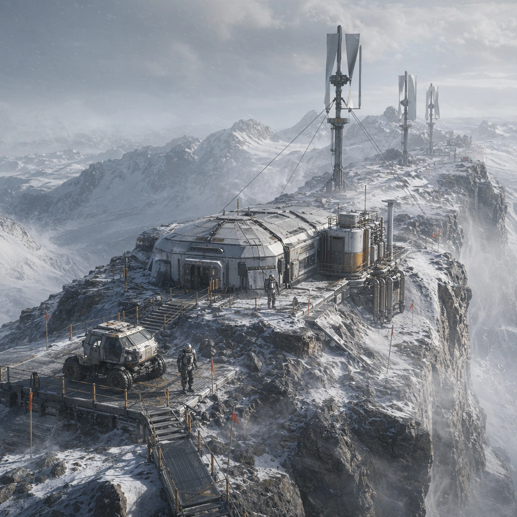
Scene: Design a square concept image for one planetary survival installation, making the environment harsh but legible and the infrastructure specific enough for a real worldbuilding deck. The camera should always reveal at least one core habitat, one utility or extraction system, and one clear environmental stressor. Frame a base along a narrow ridge with tether towers, wind harvesters, and low-slung habitat forms clinging to the terrain. Subject: Show a complete survival ecosystem with believable shelter, energy, mobility, and work routines. Small rovers or suited crew can appear as scale cues, but the installation itself should remain the main protagonist. The architecture should feel aerodynamically disciplined, with buried connectors, storm locks, and service paths that explain safe work in severe wind. Important details: Use pressure-rated geometry, practical weathering, and environmental contrast to distinguish climate, terrain, and base function. Each image should feel mission-specific while staying rooted in frontier engineering rather than fantasy spectacle. Let the wind become visible through snow, dust, or cloth markers while the base remains stable and readable. Preserve daily operational logic in shelter, energy, mobility, and maintenance so each base feels sustainably inhabited. Use case: Frontier Base single study 3/5, designed as a self-contained support image for this topic. Constraints: No readable text, no watermark, no logos, preserve exact 1:1 aspect ratio, no alien-monster attack scenes, no unreadable base markings, no generic movie war camp look, no decorative spaceship clutter, no dramatic crash scene.

Example generated from “Planetary Outpost And Frontier Base Set — Canyon Mining Habitat”
GPT Image 2en

Scene: Design a square concept image for one planetary survival installation, making the environment harsh but legible and the infrastructure specific enough for a real worldbuilding deck. The camera should always reveal at least one core habitat, one utility or extraction system, and one clear environmental stressor. Look across a canyon wall where habitat pods, elevator spines, ore conveyors, and landing shelves carve a vertical industrial settlement into the rock. Subject: Show a complete survival ecosystem with believable shelter, energy, mobility, and work routines. Small rovers or suited crew can appear as scale cues, but the installation itself should remain the main protagonist. Show how extraction and living systems coexist through protected pods, haul routes, and vertical logistics. Important details: Use pressure-rated geometry, practical weathering, and environmental contrast to distinguish climate, terrain, and base function. Each image should feel mission-specific while staying rooted in frontier engineering rather than fantasy spectacle. Balance awe and practicality so the canyon is impressive but the mining habitat remains the primary organized system. Preserve daily operational logic in shelter, energy, mobility, and maintenance so each base feels sustainably inhabited. Use case: Frontier Base single study 4/5, designed as a self-contained support image for this topic. Constraints: No readable text, no watermark, no logos, preserve exact 1:1 aspect ratio, no alien-monster attack scenes, no unreadable base markings, no generic movie war camp look, no decorative spaceship clutter, no fantasy dwarf city cues.

Example generated from “Planetary Outpost And Frontier Base Set — Subsurface Lava Observatory”
GPT Image 2en

Scene: Design a square concept image for one planetary survival installation, making the environment harsh but legible and the infrastructure specific enough for a real worldbuilding deck. The camera should always reveal at least one core habitat, one utility or extraction system, and one clear environmental stressor. Compose a partially buried observatory overlooking a lava trench through armored glazing and thermal shields. Subject: Show a complete survival ecosystem with believable shelter, energy, mobility, and work routines. Small rovers or suited crew can appear as scale cues, but the installation itself should remain the main protagonist. The base should read as heat-resistant science infrastructure with cooling fins, drill probes, and controlled access tunnels. Important details: Use pressure-rated geometry, practical weathering, and environmental contrast to distinguish climate, terrain, and base function. Each image should feel mission-specific while staying rooted in frontier engineering rather than fantasy spectacle. Use orange lava as a secondary accent only; the main read should still be disciplined engineered shelter and scientific purpose. Preserve daily operational logic in shelter, energy, mobility, and maintenance so each base feels sustainably inhabited. Use case: Frontier Base single study 5/5, designed as a self-contained support image for this topic. Constraints: No readable text, no watermark, no logos, preserve exact 1:1 aspect ratio, no alien-monster attack scenes, no unreadable base markings, no generic movie war camp look, no decorative spaceship clutter, no apocalyptic inferno mood.

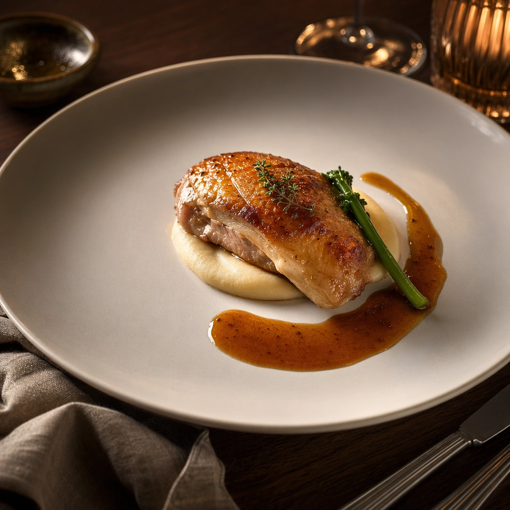
Example generated from “Plated Signature Dish Editorial — Chef Table Anchor”
GPT Image 2en

Scene: Compose a square restaurant editorial food photograph with a controlled three-quarter camera angle, tactile linen, brushed metal cutlery used sparingly at the edge of frame, and lighting that feels like a real dining room service captured by a magazine photographer. Keep the tonal range warm, dimensional, and refined, with enough negative space around the plate for the image to function as a hero asset rather than a crowded snapshot. Use amber side light and a dark walnut tabletop with a soft bokeh falloff so the image feels intimate, premium, and ready for a menu hero or campaign cover. Subject: The food must read as a true signature dish developed by a serious kitchen: precise portions, believable sauce behavior, carefully considered garnish, and a table context that suggests a coherent restaurant identity instead of generic luxury styling. Feature a composed butter-glazed poultry dish with a silky puree, one crisp vegetable accent, and a clean arc of sauce placed with chef-level intent. Important details: Restaurant credibility matters more than spectacle. Preserve appetizing moisture, plausible ingredient hierarchy, and disciplined prop styling. Every crumb, herb leaf, ceramic reflection, and fold in the table linen should support the editorial story while keeping the dish unmistakably central. This image establishes the reference system for the series, including camera height, tabletop discipline, prop family, and color control that later images must inherit. The plate should introduce the full visual grammar for the series: generous margin, elegant asymmetry, crisp rim cleanliness, and service-level polish without feeling sterile. Use case: Signature Dishes series study 1/9, built for Prompt Atlas coverage of a food and beverage commercial visual system. Constraints: No readable text, no watermark, no logos, preserve exact 1:1 aspect ratio, no plastic-looking food, no overloaded garnish, no sloppy sauce smears, no cartoon color saturation, no stock-photo posing, no messy background clutter, no extra diners, no handheld utensils, no scattered crumbs.



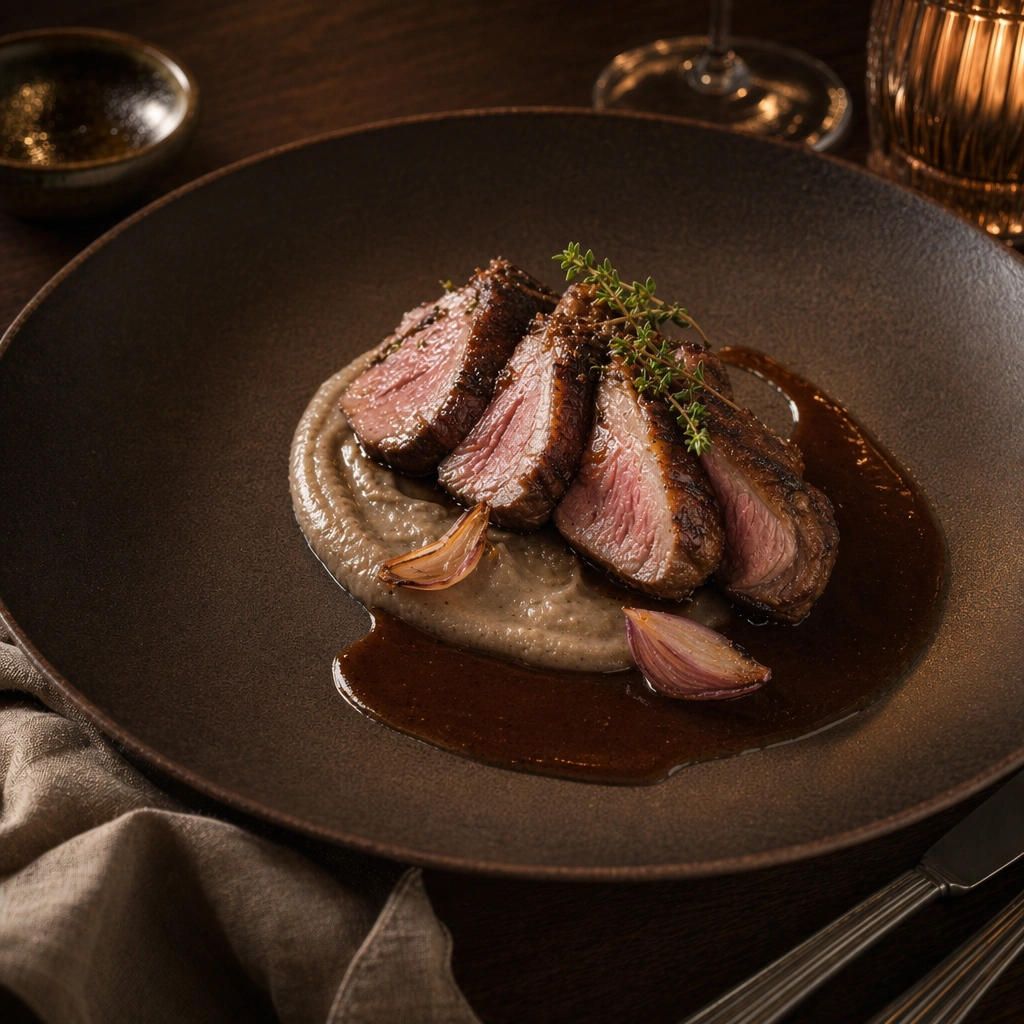
Example generated from “Plated Signature Dish Editorial — Charred Lamb Composition”
GPT Image 2en

Scene: Compose a square restaurant editorial food photograph with a controlled three-quarter camera angle, tactile linen, brushed metal cutlery used sparingly at the edge of frame, and lighting that feels like a real dining room service captured by a magazine photographer. Keep the tonal range warm, dimensional, and refined, with enough negative space around the plate for the image to function as a hero asset rather than a crowded snapshot. Maintain the same dining-room framing and rim visibility, but let the light catch a darker lacquer, ember tones, and stoneware texture for a more nocturnal mood. Subject: The food must read as a true signature dish developed by a serious kitchen: precise portions, believable sauce behavior, carefully considered garnish, and a table context that suggests a coherent restaurant identity instead of generic luxury styling. Present sliced charred lamb with smoked eggplant puree, compressed shallot petals, and a glossy reduced jus arranged with spacious discipline. Important details: Restaurant credibility matters more than spectacle. Preserve appetizing moisture, plausible ingredient hierarchy, and disciplined prop styling. Every crumb, herb leaf, ceramic reflection, and fold in the table linen should support the editorial story while keeping the dish unmistakably central. Preserve the exact camera height, lens feel, prop family, tabletop scale, palette discipline, and brand logic established by 01-chef-table-anchor. Keep the visual architecture from the anchor image intact: identical plate scale, camera distance, linen softness, and negative-space ratio, with added emphasis on char, glaze, and meat grain. Use case: Signature Dishes series study 3/9, built for Prompt Atlas coverage of a food and beverage commercial visual system. Constraints: No readable text, no watermark, no logos, preserve exact 1:1 aspect ratio, no plastic-looking food, no overloaded garnish, no sloppy sauce smears, no cartoon color saturation, no stock-photo posing, no messy background clutter, no carving board, no aggressive grill marks, no barbecue styling.

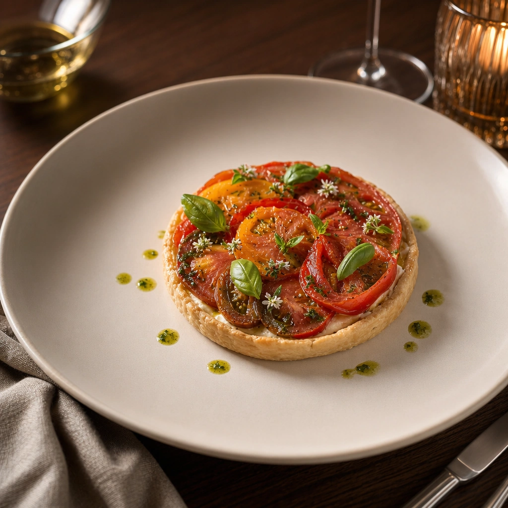
Example generated from “Plated Signature Dish Editorial — Heritage Tomato Tart”
GPT Image 2en

Scene: Compose a square restaurant editorial food photograph with a controlled three-quarter camera angle, tactile linen, brushed metal cutlery used sparingly at the edge of frame, and lighting that feels like a real dining room service captured by a magazine photographer. Keep the tonal range warm, dimensional, and refined, with enough negative space around the plate for the image to function as a hero asset rather than a crowded snapshot. Retain the same tabletop and lens relationship while increasing daylight freshness through tomato reds, pale pastry gold, and a cleaner summer brightness. Subject: The food must read as a true signature dish developed by a serious kitchen: precise portions, believable sauce behavior, carefully considered garnish, and a table context that suggests a coherent restaurant identity instead of generic luxury styling. Center a delicate savory tart with layered heritage tomato slices, whipped cheese, basil oil droplets, and tiny herb blossoms arranged with fine-dining control. Important details: Restaurant credibility matters more than spectacle. Preserve appetizing moisture, plausible ingredient hierarchy, and disciplined prop styling. Every crumb, herb leaf, ceramic reflection, and fold in the table linen should support the editorial story while keeping the dish unmistakably central. Preserve the exact camera height, lens feel, prop family, tabletop scale, palette discipline, and brand logic established by 01-chef-table-anchor. The reference system must remain visible in the spacing, plate diameter, and calm restaurant context, even as the ingredients move toward a lighter seasonal register. Use case: Signature Dishes series study 4/9, built for Prompt Atlas coverage of a food and beverage commercial visual system. Constraints: No readable text, no watermark, no logos, preserve exact 1:1 aspect ratio, no plastic-looking food, no overloaded garnish, no sloppy sauce smears, no cartoon color saturation, no stock-photo posing, no messy background clutter, no picnic cues, no pizza resemblance, no oversized salad garnish.

Example generated from “Plated Signature Dish Editorial — Braised Short Rib Spread”
GPT Image 2en

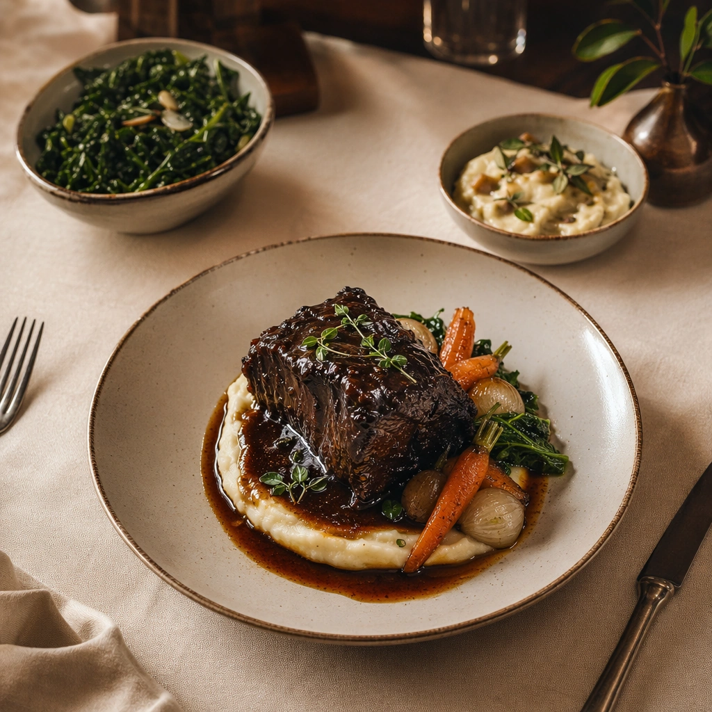
Scene: Compose a square restaurant editorial food photograph with a controlled three-quarter camera angle, tactile linen, brushed metal cutlery used sparingly at the edge of frame, and lighting that feels like a real dining room service captured by a magazine photographer. Keep the tonal range warm, dimensional, and refined, with enough negative space around the plate for the image to function as a hero asset rather than a crowded snapshot. Use a slightly wider crop that still reads square, showing one hero plate and two supporting side dishes on a linen-covered table with warm evening light. Subject: The food must read as a true signature dish developed by a serious kitchen: precise portions, believable sauce behavior, carefully considered garnish, and a table context that suggests a coherent restaurant identity instead of generic luxury styling. Feature braised short rib on creamy mash with glazed vegetables, plus modest supporting bowls that build a believable restaurant set rather than a banquet. Important details: Restaurant credibility matters more than spectacle. Preserve appetizing moisture, plausible ingredient hierarchy, and disciplined prop styling. Every crumb, herb leaf, ceramic reflection, and fold in the table linen should support the editorial story while keeping the dish unmistakably central. This image should feel fully self-contained while still belonging to the same broader topic and commercial world. Comfort should come through tenderness, gloss, and deep color, but the layout still needs editorial hierarchy and carefully managed negative space. Use case: Signature Dishes single study 6/9, built for Prompt Atlas coverage of a food and beverage commercial visual system. Constraints: No readable text, no watermark, no logos, preserve exact 1:1 aspect ratio, no plastic-looking food, no overloaded garnish, no sloppy sauce smears, no cartoon color saturation, no stock-photo posing, no messy background clutter, no family-style chaos, no giant portions, no beer mugs.

Example generated from “Plated Signature Dish Editorial — Hearth Roast Close-Up”
GPT Image 2en

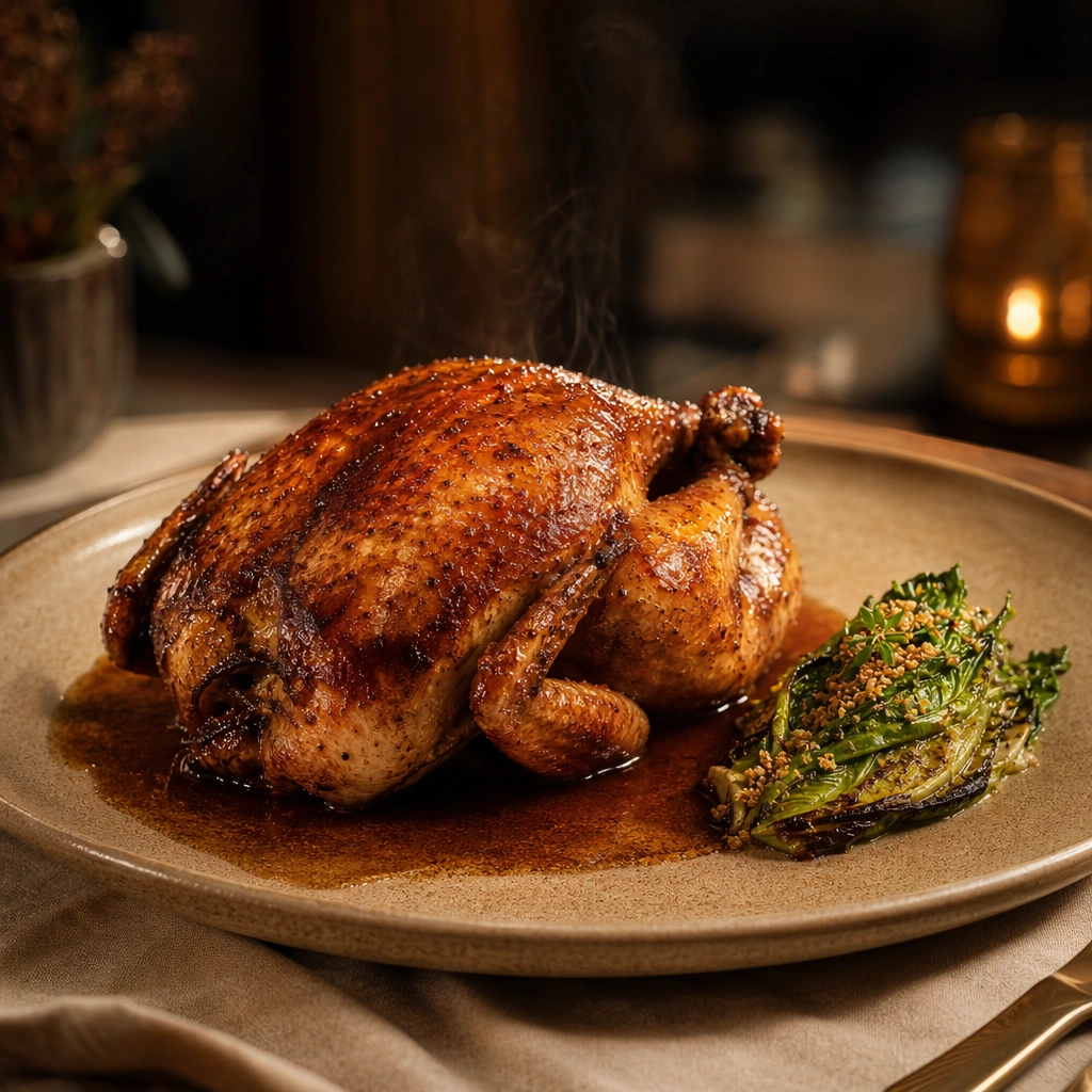
Scene: Compose a square restaurant editorial food photograph with a controlled three-quarter camera angle, tactile linen, brushed metal cutlery used sparingly at the edge of frame, and lighting that feels like a real dining room service captured by a magazine photographer. Keep the tonal range warm, dimensional, and refined, with enough negative space around the plate for the image to function as a hero asset rather than a crowded snapshot. Move closer to the food and compress the background, keeping only a sliver of tabletop, linen, and a softly glowing dining-room ambience. Subject: The food must read as a true signature dish developed by a serious kitchen: precise portions, believable sauce behavior, carefully considered garnish, and a table context that suggests a coherent restaurant identity instead of generic luxury styling. Show a roast bird or roast vegetable centerpiece with crisp skin, resting juices, and one elegant side garnish on a warm ceramic plate. Important details: Restaurant credibility matters more than spectacle. Preserve appetizing moisture, plausible ingredient hierarchy, and disciplined prop styling. Every crumb, herb leaf, ceramic reflection, and fold in the table linen should support the editorial story while keeping the dish unmistakably central. This image should feel fully self-contained while still belonging to the same broader topic and commercial world. Texture should carry the image: crackling skin, glossy jus, ceramic heat, and subtle steam, all rendered without making the composition feel greasy or casual. Use case: Signature Dishes single study 7/9, built for Prompt Atlas coverage of a food and beverage commercial visual system. Constraints: No readable text, no watermark, no logos, preserve exact 1:1 aspect ratio, no plastic-looking food, no overloaded garnish, no sloppy sauce smears, no cartoon color saturation, no stock-photo posing, no messy background clutter, no carving knife, no hands pulling meat, no campfire styling.

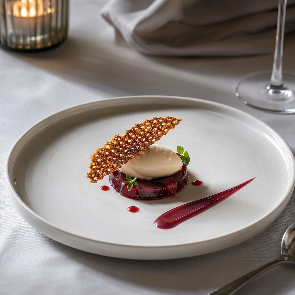
Example generated from “Plated Signature Dish Editorial — Dessert Prelude Plate”
GPT Image 2en

Scene: Compose a square restaurant editorial food photograph with a controlled three-quarter camera angle, tactile linen, brushed metal cutlery used sparingly at the edge of frame, and lighting that feels like a real dining room service captured by a magazine photographer. Keep the tonal range warm, dimensional, and refined, with enough negative space around the plate for the image to function as a hero asset rather than a crowded snapshot. Use a clean, quiet square composition with cooler dessert lighting, high plate visibility, and a polished tabletop that echoes the savory images without duplicating them. Subject: The food must read as a true signature dish developed by a serious kitchen: precise portions, believable sauce behavior, carefully considered garnish, and a table context that suggests a coherent restaurant identity instead of generic luxury styling. Present a small plated dessert with fruit gel, cream quenelle, crisp tuile, and one precise sauce stroke in a premium restaurant setting. Important details: Restaurant credibility matters more than spectacle. Preserve appetizing moisture, plausible ingredient hierarchy, and disciplined prop styling. Every crumb, herb leaf, ceramic reflection, and fold in the table linen should support the editorial story while keeping the dish unmistakably central. This image should feel fully self-contained while still belonging to the same broader topic and commercial world. The image should feel like the thoughtful final course of the same restaurant story, with restraint, clean geometry, and materially convincing sugar and cream textures. Use case: Signature Dishes single study 8/9, built for Prompt Atlas coverage of a food and beverage commercial visual system. Constraints: No readable text, no watermark, no logos, preserve exact 1:1 aspect ratio, no plastic-looking food, no overloaded garnish, no sloppy sauce smears, no cartoon color saturation, no stock-photo posing, no messy background clutter, no birthday cues, no sprinkles, no oversized cake slice.

Example generated from “Plated Signature Dish Editorial — Wine Pairing Table Story”
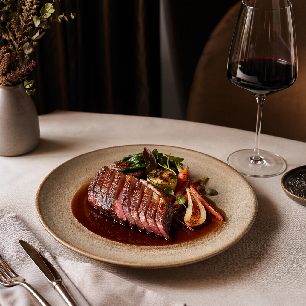
GPT Image 2en

Scene: Compose a square restaurant editorial food photograph with a controlled three-quarter camera angle, tactile linen, brushed metal cutlery used sparingly at the edge of frame, and lighting that feels like a real dining room service captured by a magazine photographer. Keep the tonal range warm, dimensional, and refined, with enough negative space around the plate for the image to function as a hero asset rather than a crowded snapshot. Open the crop slightly to include one elegant wine glass and a folded napkin while keeping the dish dominant and the dining room atmospheric. Subject: The food must read as a true signature dish developed by a serious kitchen: precise portions, believable sauce behavior, carefully considered garnish, and a table context that suggests a coherent restaurant identity instead of generic luxury styling. Pair a composed main course with a partially poured glass of red wine and subtle service cues that suggest hospitality without showing staff. Important details: Restaurant credibility matters more than spectacle. Preserve appetizing moisture, plausible ingredient hierarchy, and disciplined prop styling. Every crumb, herb leaf, ceramic reflection, and fold in the table linen should support the editorial story while keeping the dish unmistakably central. This image should feel fully self-contained while still belonging to the same broader topic and commercial world. Balance the composition so the wine supports the dish instead of stealing the frame; stemware reflections, liquid level, and table etiquette all need to feel credible. Use case: Signature Dishes single study 9/9, built for Prompt Atlas coverage of a food and beverage commercial visual system. Constraints: No readable text, no watermark, no logos, preserve exact 1:1 aspect ratio, no plastic-looking food, no overloaded garnish, no sloppy sauce smears, no cartoon color saturation, no stock-photo posing, no messy background clutter, no visible bottle label, no toast gesture, no crowded table setting.

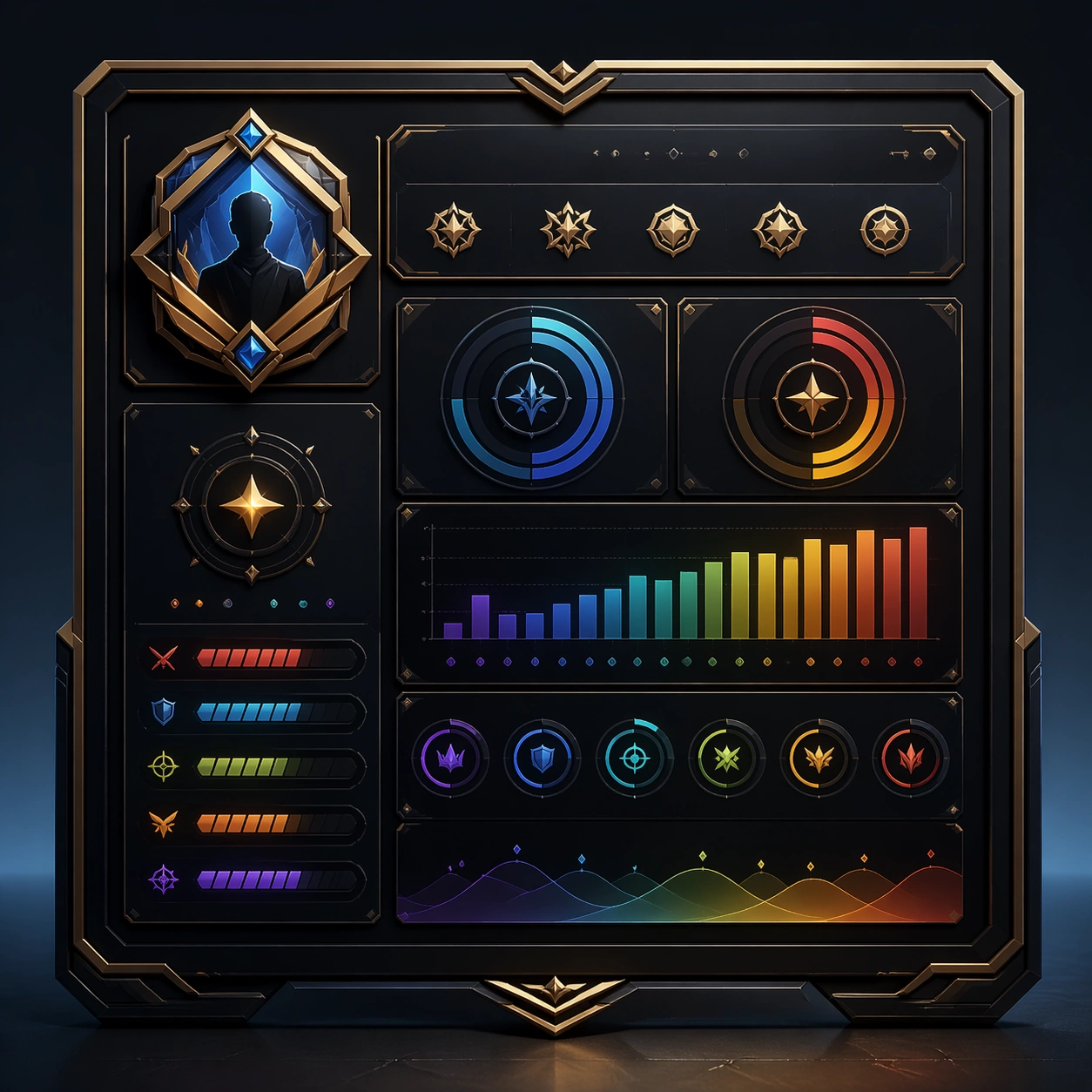
Example generated from “Player Profile Achievement Card Set — Profile Hero Card”
GPT Image 2en

Scene: A square production-ready image designed for a game-art review wall and a commercial gallery at the same time. Frame a flagship player profile hero card with portrait, crest, and status hierarchy with disciplined lighting, clean edge separation, and enough surrounding context to prove how the asset would behave in a real product surface. The camera, crop, and tonal balance should feel intentional rather than generic, with high readability at first glance and convincing material response under closer inspection. Subject: Center the study on a flagship player profile hero card with portrait, crest, and status hierarchy. Translate the topic into a concrete, shippable visual statement instead of a loose mood board. Build layered object relationships, believable surface finish, and strong silhouette grouping so the image reads immediately as part of Player Profile Achievement Card Set. The subject should feel made for a live game pipeline: useful in store, UI, campaign, or art-review contexts, with visual hierarchy strong enough to survive aggressive cropping. Important details: the card should feel personal and prestigious without any readable name fields. Keep every supporting element subordinate to the main read, and make category separation obvious through form, color zoning, depth, and material logic rather than words. Where panels, cards, badges, or interface blocks appear, they must look professionally structured but remain unreadable. The visual language should feel premium, original, and coherent across this package, with no filler clutter and no accidental resemblance to a specific shipped game IP. Use case: Player Profile Achievement Card Set single study 1/9, focused on profile hero card. Constraints: No readable text, no watermark, no logos, preserve exact 1:1 aspect ratio, no readable username, no numbers, no broken hierarchy, no generic stock-photo staging, no accidental UI gibberish.

Example generated from “Player Profile Achievement Card Set — Ranked Season Recap”
GPT Image 2en

Scene: A square production-ready image designed for a game-art review wall and a commercial gallery at the same time. Frame a season-recap card that visualizes climb, rank feel, and earned prestige through abstract badges and routes with disciplined lighting, clean edge separation, and enough surrounding context to prove how the asset would behave in a real product surface. The camera, crop, and tonal balance should feel intentional rather than generic, with high readability at first glance and convincing material response under closer inspection. Subject: Center the study on a season-recap card that visualizes climb, rank feel, and earned prestige through abstract badges and routes. Translate the topic into a concrete, shippable visual statement instead of a loose mood board. Build layered object relationships, believable surface finish, and strong silhouette grouping so the image reads immediately as part of Player Profile Achievement Card Set. The subject should feel made for a live game pipeline: useful in store, UI, campaign, or art-review contexts, with visual hierarchy strong enough to survive aggressive cropping. Important details: the result should feel emotionally rewarding and shareable without text. Keep every supporting element subordinate to the main read, and make category separation obvious through form, color zoning, depth, and material logic rather than words. Where panels, cards, badges, or interface blocks appear, they must look professionally structured but remain unreadable. The visual language should feel premium, original, and coherent across this package, with no filler clutter and no accidental resemblance to a specific shipped game IP. Use case: Player Profile Achievement Card Set single study 2/9, focused on ranked season recap. Constraints: No readable text, no watermark, no logos, preserve exact 1:1 aspect ratio, no readable rank names, no numerals, no broken hierarchy, no generic stock-photo staging, no accidental UI gibberish.

Example generated from “Player Profile Achievement Card Set — Achievement Unlock Tile”
GPT Image 2en

Scene: A square production-ready image designed for a game-art review wall and a commercial gallery at the same time. Frame an unlock tile centered on a newly earned achievement with celebratory polish and badge clarity with disciplined lighting, clean edge separation, and enough surrounding context to prove how the asset would behave in a real product surface. The camera, crop, and tonal balance should feel intentional rather than generic, with high readability at first glance and convincing material response under closer inspection. Subject: Center the study on an unlock tile centered on a newly earned achievement with celebratory polish and badge clarity. Translate the topic into a concrete, shippable visual statement instead of a loose mood board. Build layered object relationships, believable surface finish, and strong silhouette grouping so the image reads immediately as part of Player Profile Achievement Card Set. The subject should feel made for a live game pipeline: useful in store, UI, campaign, or art-review contexts, with visual hierarchy strong enough to survive aggressive cropping. Important details: make the reward feel meaningful and collectible, not generic toast UI. Keep every supporting element subordinate to the main read, and make category separation obvious through form, color zoning, depth, and material logic rather than words. Where panels, cards, badges, or interface blocks appear, they must look professionally structured but remain unreadable. The visual language should feel premium, original, and coherent across this package, with no filler clutter and no accidental resemblance to a specific shipped game IP. Use case: Player Profile Achievement Card Set single study 3/9, focused on achievement unlock tile. Constraints: No readable text, no watermark, no logos, preserve exact 1:1 aspect ratio, no readable achievement title, no XP numbers, no broken hierarchy, no generic stock-photo staging, no accidental UI gibberish.

Example generated from “Player Profile Achievement Card Set — End Of Season Share Card”
GPT Image 2en

Scene: A square production-ready image designed for a game-art review wall and a commercial gallery at the same time. Frame a social-ready end-of-season card designed for external sharing and profile pride with disciplined lighting, clean edge separation, and enough surrounding context to prove how the asset would behave in a real product surface. The camera, crop, and tonal balance should feel intentional rather than generic, with high readability at first glance and convincing material response under closer inspection. Subject: Center the study on a social-ready end-of-season card designed for external sharing and profile pride. Translate the topic into a concrete, shippable visual statement instead of a loose mood board. Build layered object relationships, believable surface finish, and strong silhouette grouping so the image reads immediately as part of Player Profile Achievement Card Set. The subject should feel made for a live game pipeline: useful in store, UI, campaign, or art-review contexts, with visual hierarchy strong enough to survive aggressive cropping. Important details: the composition should survive mobile compression and still signal accomplishment. Keep every supporting element subordinate to the main read, and make category separation obvious through form, color zoning, depth, and material logic rather than words. Where panels, cards, badges, or interface blocks appear, they must look professionally structured but remain unreadable. The visual language should feel premium, original, and coherent across this package, with no filler clutter and no accidental resemblance to a specific shipped game IP. Use case: Player Profile Achievement Card Set single study 4/9, focused on end of season share card. Constraints: No readable text, no watermark, no logos, preserve exact 1:1 aspect ratio, no hashtags, no handles, no broken hierarchy, no generic stock-photo staging, no accidental UI gibberish.

Example generated from “Player Profile Achievement Card Set — Profile Badge Wall”
GPT Image 2en

Scene: A square production-ready image designed for a game-art review wall and a commercial gallery at the same time. Frame a badge-wall style board that arranges multiple achievements inside a coherent profile system with disciplined lighting, clean edge separation, and enough surrounding context to prove how the asset would behave in a real product surface. The camera, crop, and tonal balance should feel intentional rather than generic, with high readability at first glance and convincing material response under closer inspection. Subject: Center the study on a badge-wall style board that arranges multiple achievements inside a coherent profile system. Translate the topic into a concrete, shippable visual statement instead of a loose mood board. Build layered object relationships, believable surface finish, and strong silhouette grouping so the image reads immediately as part of Player Profile Achievement Card Set. The subject should feel made for a live game pipeline: useful in store, UI, campaign, or art-review contexts, with visual hierarchy strong enough to survive aggressive cropping. Important details: badge diversity and completion feeling should read instantly. Keep every supporting element subordinate to the main read, and make category separation obvious through form, color zoning, depth, and material logic rather than words. Where panels, cards, badges, or interface blocks appear, they must look professionally structured but remain unreadable. The visual language should feel premium, original, and coherent across this package, with no filler clutter and no accidental resemblance to a specific shipped game IP. Use case: Player Profile Achievement Card Set single study 5/9, focused on profile badge wall. Constraints: No readable text, no watermark, no logos, preserve exact 1:1 aspect ratio, no labels, no text, no broken hierarchy, no generic stock-photo staging, no accidental UI gibberish.

Example generated from “Player Profile Achievement Card Set — Career Stats Abstract”
GPT Image 2en

Scene: A square production-ready image designed for a game-art review wall and a commercial gallery at the same time. Frame an abstracted career-stats board built from bars, rings, and icon rhythm rather than readable numbers with disciplined lighting, clean edge separation, and enough surrounding context to prove how the asset would behave in a real product surface. The camera, crop, and tonal balance should feel intentional rather than generic, with high readability at first glance and convincing material response under closer inspection. Subject: Center the study on an abstracted career-stats board built from bars, rings, and icon rhythm rather than readable numbers. Translate the topic into a concrete, shippable visual statement instead of a loose mood board. Build layered object relationships, believable surface finish, and strong silhouette grouping so the image reads immediately as part of Player Profile Achievement Card Set. The subject should feel made for a live game pipeline: useful in store, UI, campaign, or art-review contexts, with visual hierarchy strong enough to survive aggressive cropping. Important details: make it feel credible and information-rich without actual statistics. Keep every supporting element subordinate to the main read, and make category separation obvious through form, color zoning, depth, and material logic rather than words. Where panels, cards, badges, or interface blocks appear, they must look professionally structured but remain unreadable. The visual language should feel premium, original, and coherent across this package, with no filler clutter and no accidental resemblance to a specific shipped game IP. Use case: Player Profile Achievement Card Set single study 6/9, focused on career stats abstract. Constraints: No readable text, no watermark, no logos, preserve exact 1:1 aspect ratio, no numerals, no chart labels, no broken hierarchy, no generic stock-photo staging, no accidental UI gibberish.

Example generated from “Player Profile Achievement Card Set — Cosmetic Showcase Panel”
GPT Image 2en

Scene: A square production-ready image designed for a game-art review wall and a commercial gallery at the same time. Frame a profile-adjacent panel that packages player cosmetics, frames, and chosen flair items with disciplined lighting, clean edge separation, and enough surrounding context to prove how the asset would behave in a real product surface. The camera, crop, and tonal balance should feel intentional rather than generic, with high readability at first glance and convincing material response under closer inspection. Subject: Center the study on a profile-adjacent panel that packages player cosmetics, frames, and chosen flair items. Translate the topic into a concrete, shippable visual statement instead of a loose mood board. Build layered object relationships, believable surface finish, and strong silhouette grouping so the image reads immediately as part of Player Profile Achievement Card Set. The subject should feel made for a live game pipeline: useful in store, UI, campaign, or art-review contexts, with visual hierarchy strong enough to survive aggressive cropping. Important details: the panel should feel aspirational and identity-rich while staying clean. Keep every supporting element subordinate to the main read, and make category separation obvious through form, color zoning, depth, and material logic rather than words. Where panels, cards, badges, or interface blocks appear, they must look professionally structured but remain unreadable. The visual language should feel premium, original, and coherent across this package, with no filler clutter and no accidental resemblance to a specific shipped game IP. Use case: Player Profile Achievement Card Set single study 7/9, focused on cosmetic showcase panel. Constraints: No readable text, no watermark, no logos, preserve exact 1:1 aspect ratio, no labels, no brand marks, no broken hierarchy, no generic stock-photo staging, no accidental UI gibberish.

Example generated from “Player Profile Achievement Card Set — Guild Social Card”
GPT Image 2en

Scene: A square production-ready image designed for a game-art review wall and a commercial gallery at the same time. Frame a social-facing card tying player identity to a guild, party, or shared community badge system with disciplined lighting, clean edge separation, and enough surrounding context to prove how the asset would behave in a real product surface. The camera, crop, and tonal balance should feel intentional rather than generic, with high readability at first glance and convincing material response under closer inspection. Subject: Center the study on a social-facing card tying player identity to a guild, party, or shared community badge system. Translate the topic into a concrete, shippable visual statement instead of a loose mood board. Build layered object relationships, believable surface finish, and strong silhouette grouping so the image reads immediately as part of Player Profile Achievement Card Set. The subject should feel made for a live game pipeline: useful in store, UI, campaign, or art-review contexts, with visual hierarchy strong enough to survive aggressive cropping. Important details: community belonging should come through composition and emblem language, not text. Keep every supporting element subordinate to the main read, and make category separation obvious through form, color zoning, depth, and material logic rather than words. Where panels, cards, badges, or interface blocks appear, they must look professionally structured but remain unreadable. The visual language should feel premium, original, and coherent across this package, with no filler clutter and no accidental resemblance to a specific shipped game IP. Use case: Player Profile Achievement Card Set single study 8/9, focused on guild social card. Constraints: No readable text, no watermark, no logos, preserve exact 1:1 aspect ratio, no readable guild name, no logos, no broken hierarchy, no generic stock-photo staging, no accidental UI gibberish.

Example generated from “Player Profile Achievement Card Set — Legacy Trophy Poster”
GPT Image 2en

Scene: A square production-ready image designed for a game-art review wall and a commercial gallery at the same time. Frame a poster-like profile asset built around trophies, seasonal badges, and long-term legacy with disciplined lighting, clean edge separation, and enough surrounding context to prove how the asset would behave in a real product surface. The camera, crop, and tonal balance should feel intentional rather than generic, with high readability at first glance and convincing material response under closer inspection. Subject: Center the study on a poster-like profile asset built around trophies, seasonal badges, and long-term legacy. Translate the topic into a concrete, shippable visual statement instead of a loose mood board. Build layered object relationships, believable surface finish, and strong silhouette grouping so the image reads immediately as part of Player Profile Achievement Card Set. The subject should feel made for a live game pipeline: useful in store, UI, campaign, or art-review contexts, with visual hierarchy strong enough to survive aggressive cropping. Important details: the mood should feel commemorative and premium rather than cluttered. Keep every supporting element subordinate to the main read, and make category separation obvious through form, color zoning, depth, and material logic rather than words. Where panels, cards, badges, or interface blocks appear, they must look professionally structured but remain unreadable. The visual language should feel premium, original, and coherent across this package, with no filler clutter and no accidental resemblance to a specific shipped game IP. Use case: Player Profile Achievement Card Set single study 9/9, focused on legacy trophy poster. Constraints: No readable text, no watermark, no logos, preserve exact 1:1 aspect ratio, no readable years, no slogan, no broken hierarchy, no generic stock-photo staging, no accidental UI gibberish.

Example generated from “Polish Poster Surrealist — Print Proof Flatlay”
GPT Image 2en

Scene: A square overhead tabletop photograph of a fresh poster proof on neutral worktable paper, lit by cool daylight, with crop marks, tape tabs, and slight paper bow visible around the sheet. The poster should express dry surreal theatre-poster logic using one impossible symbol, large mute fields, and an intellectual deadpan mood, using ash gray, olive, umber, bone, and a single acid orange or neon pink accent and a tactile surface appropriate to the medium. Subject: Design the poster as a print-shop proof, preserving the same poster language while allowing production clues such as edge trims, registration targets, and process marks to frame the composition. Use elongated limbs, bird cages, eggs, microphones, masks, curtains, keys, and impossible body-object hybrids as the main visual ingredients, and organize them with quiet hand-drawn title blocks used as texture and spacing devices rather than readable type. For the contemporary-subject axis, thread in remote-work objects, earbuds, and subway handles fused into a deadpan surreal theatre metaphor. The poster must feel like an original design object rather than a reproduction of any known work. Important details: The image must still read as a finished poster concept, but it should carry believable print-process evidence and material tactility instead of gallery-wall perfection. Preserve symbolic compression, painterly paper tooth, sparse composition, and one decisive accent color. Keep every letterform abstract and non-readable, as if it were a typographic texture rather than language. Make the style unmistakable through composition, palette, surface behavior, and symbolic compression. no crowded collage, no glamour sheen, no literal plot illustration, no cheerful advertising tone. Use case: Polish Surrealist single study 2/9, testing production realism and process evidence. Constraints: No readable text, no watermark, no logos, preserve exact 1:1 aspect ratio, no copyrighted characters, no real brand marks, no QR codes, no interface chrome, no accidental gibberish lettering.

Example generated from “Polish Poster Surrealist — Transit Lightbox”
GPT Image 2en

Scene: A square dusk street photograph of a backlit transit poster glowing inside glass, with faint rain reflections, soft city blur in the distance, and the poster remaining fully legible as a composition. The poster should express dry surreal theatre-poster logic using one impossible symbol, large mute fields, and an intellectual deadpan mood, using ash gray, olive, umber, bone, and a single acid orange or neon pink accent and a tactile surface appropriate to the medium. Subject: Adapt the poster into a public-facing lightbox version that still honors the original style grammar while feeling bold enough to stop a passerby from several meters away. Use elongated limbs, bird cages, eggs, microphones, masks, curtains, keys, and impossible body-object hybrids as the main visual ingredients, and organize them with quiet hand-drawn title blocks used as texture and spacing devices rather than readable type. For the contemporary-subject axis, thread in remote-work objects, earbuds, and subway handles fused into a deadpan surreal theatre metaphor. The poster must feel like an original design object rather than a reproduction of any known work. Important details: Let the style survive the illumination test: color blocking, silhouette contrast, and abstract lettering should stay controlled under bright internal light and reflective glass. Preserve symbolic compression, painterly paper tooth, sparse composition, and one decisive accent color. Keep every letterform abstract and non-readable, as if it were a typographic texture rather than language. Make the style unmistakable through composition, palette, surface behavior, and symbolic compression. no crowded collage, no glamour sheen, no literal plot illustration, no cheerful advertising tone. Use case: Polish Surrealist single study 3/9, testing distance readability in public display. Constraints: No readable text, no watermark, no logos, preserve exact 1:1 aspect ratio, no copyrighted characters, no real brand marks, no QR codes, no interface chrome, no accidental gibberish lettering.

Example generated from “Polish Poster Surrealist — Wheatpaste Wall Layer”
GPT Image 2en

Scene: A square urban wall study with the poster pasted onto rough plaster among torn edges and older paper remnants, photographed in soft overcast light so texture, glue bubbles, and surface scars stay visible. The poster should express dry surreal theatre-poster logic using one impossible symbol, large mute fields, and an intellectual deadpan mood, using ash gray, olive, umber, bone, and a single acid orange or neon pink accent and a tactile surface appropriate to the medium. Subject: Create a version that feels made for the street, with the poster carrying enough formal force to survive abrasion, layering, and imperfect placement without losing its visual identity. Use elongated limbs, bird cages, eggs, microphones, masks, curtains, keys, and impossible body-object hybrids as the main visual ingredients, and organize them with quiet hand-drawn title blocks used as texture and spacing devices rather than readable type. For the contemporary-subject axis, thread in remote-work objects, earbuds, and subway handles fused into a deadpan surreal theatre metaphor. The poster must feel like an original design object rather than a reproduction of any known work. Important details: Keep the main design intact but let the environment add grit: lifted corners, tiny tears, wrinkled paper, and older color fragments around the perimeter should amplify the style rather than dilute it. Preserve symbolic compression, painterly paper tooth, sparse composition, and one decisive accent color. Keep every letterform abstract and non-readable, as if it were a typographic texture rather than language. Make the style unmistakable through composition, palette, surface behavior, and symbolic compression. no crowded collage, no glamour sheen, no literal plot illustration, no cheerful advertising tone. Use case: Polish Surrealist single study 4/9, testing street-life durability and layered context. Constraints: No readable text, no watermark, no logos, preserve exact 1:1 aspect ratio, no copyrighted characters, no real brand marks, no QR codes, no interface chrome, no accidental gibberish lettering.

Example generated from “Polish Poster Surrealist — Folded Archive Copy”
GPT Image 2en

Scene: A square conservation-table view of a vintage poster laid on gray felt under raking light, with visible fold lines, softened corners, and subtle aging that still preserves the integrity of the image. The poster should express dry surreal theatre-poster logic using one impossible symbol, large mute fields, and an intellectual deadpan mood, using ash gray, olive, umber, bone, and a single acid orange or neon pink accent and a tactile surface appropriate to the medium. Subject: Present the poster as an archive copy that has been stored, unfolded, and carefully documented, letting age and handling reveal how the design holds up across time. Use elongated limbs, bird cages, eggs, microphones, masks, curtains, keys, and impossible body-object hybrids as the main visual ingredients, and organize them with quiet hand-drawn title blocks used as texture and spacing devices rather than readable type. For the contemporary-subject axis, thread in remote-work objects, earbuds, and subway handles fused into a deadpan surreal theatre metaphor. The poster must feel like an original design object rather than a reproduction of any known work. Important details: Aging must stay believable rather than theatrical: slight yellowing, fold memory, edge wear, and pigment variation should support the historical or crafted feeling of the style. Preserve symbolic compression, painterly paper tooth, sparse composition, and one decisive accent color. Keep every letterform abstract and non-readable, as if it were a typographic texture rather than language. Make the style unmistakable through composition, palette, surface behavior, and symbolic compression. no crowded collage, no glamour sheen, no literal plot illustration, no cheerful advertising tone. Use case: Polish Surrealist single study 5/9, testing archival endurance and age character. Constraints: No readable text, no watermark, no logos, preserve exact 1:1 aspect ratio, no copyrighted characters, no real brand marks, no QR codes, no interface chrome, no accidental gibberish lettering.