提示词库 · 创作探索

提示词库

探索真实提示词和对应生成示例,按任务找到灵感,免费复制完整提示词,开启下一次创作。

示例
10,974
模型
17
来源
1277
10,974 条提示词示例 · 第 71 / 229 页
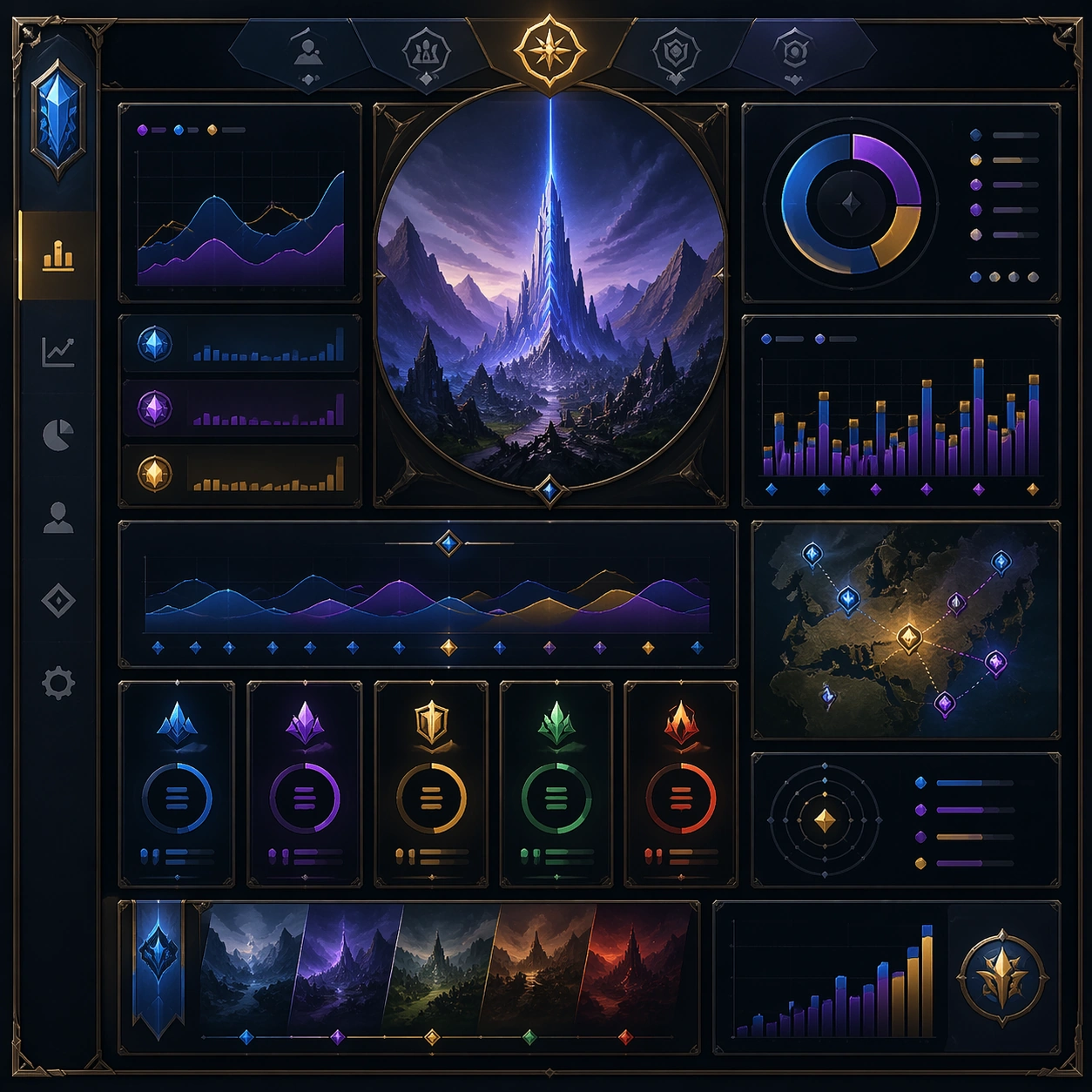
Example generated from “Analytics Storytelling Dashboard Views — Variant Two”
GPT Image 2en

Scene: Create a square dependent image for Analytics Storytelling Dashboard Views. Build a second controlled variation in the same system with a premium, production-ready finish. Use a polished modular board or campaign surface with clean spacing, premium game-UI finish, and clear focal hierarchy. The composition should feel intentional, clean, and reusable for gallery, research, campaign, or internal handoff contexts. Lighting must support readability first, with the main forms clearly separated from the background and enough breathing room for the system to stay legible at both hero scale and thumbnail scale. Subject: Center a coherent original game-art system built for premium production and marketing surfaces. For this image, focus on the intended support surface. Keep the same system logic stable across screenshots, cards, banners, and overview boards. Preserve exact identity or system logic from the reference image while changing only the intended variation axis. The viewer should immediately understand what role this surface plays inside a cohesive game-production asset pack. Important details: Lock framing, icon grammar, palette blocking, and surface hierarchy so the kit feels production-ready and consistent. Preserve the core silhouette, framing language, and material logic from the reference image while each variation changes function. Keep materials believable, edge hierarchy disciplined, and the visual language consistent with Analytics Views. Use abstract interface blocks or diagram accents when helpful, but avoid any readable language. The final result should feel like a deliberate production asset rather than a random illustration. Use case: Analytics Storytelling Dashboard Views series study 3/9, designed as variant two within a cohesive asset pack. Constraints: No readable text, no watermark, no logos, preserve exact 1:1 aspect ratio, no unrelated objects, no broken visual hierarchy, no malformed anatomy or broken perspective, no random decorative clutter.


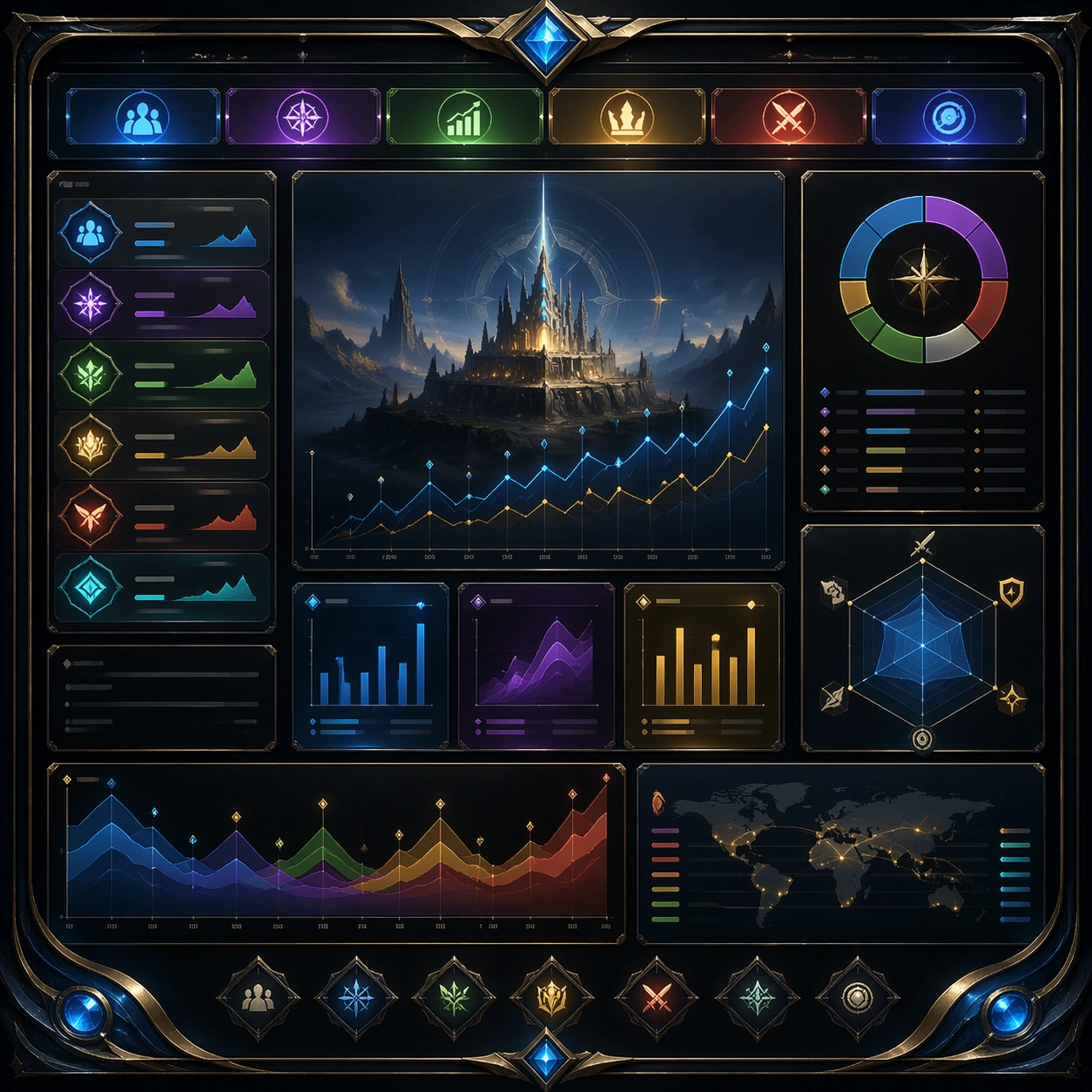
Example generated from “Analytics Storytelling Dashboard Views — Variant Three”
GPT Image 2en

Scene: Create a square dependent image for Analytics Storytelling Dashboard Views. Build a third controlled variation in the same system with a premium, production-ready finish. Use a polished modular board or campaign surface with clean spacing, premium game-UI finish, and clear focal hierarchy. The composition should feel intentional, clean, and reusable for gallery, research, campaign, or internal handoff contexts. Lighting must support readability first, with the main forms clearly separated from the background and enough breathing room for the system to stay legible at both hero scale and thumbnail scale. Subject: Center a coherent original game-art system built for premium production and marketing surfaces. For this image, focus on the intended support surface. Keep the same system logic stable across screenshots, cards, banners, and overview boards. Preserve exact identity or system logic from the reference image while changing only the intended variation axis. The viewer should immediately understand what role this surface plays inside a cohesive game-production asset pack. Important details: Lock framing, icon grammar, palette blocking, and surface hierarchy so the kit feels production-ready and consistent. Preserve the core silhouette, framing language, and material logic from the reference image while each variation changes function. Keep materials believable, edge hierarchy disciplined, and the visual language consistent with Analytics Views. Use abstract interface blocks or diagram accents when helpful, but avoid any readable language. The final result should feel like a deliberate production asset rather than a random illustration. Use case: Analytics Storytelling Dashboard Views series study 4/9, designed as variant three within a cohesive asset pack. Constraints: No readable text, no watermark, no logos, preserve exact 1:1 aspect ratio, no unrelated objects, no broken visual hierarchy, no malformed anatomy or broken perspective, no random decorative clutter.

Example generated from “Analytics Storytelling Dashboard Views — Support One”
GPT Image 2en

Scene: Create a square standalone support image for Analytics Storytelling Dashboard Views. Build a support-surface study with a clear focal hierarchy and a finished professional surface. Use a polished modular board or campaign surface with clean spacing, premium game-UI finish, and clear focal hierarchy. The frame should feel self-contained and polished, with enough structure to explain the system even without the reference series, yet still obviously belonging to the same theme and production world. Subject: Show a coherent original game-art system built for premium production and marketing surfaces in a way that emphasizes the intended support surface. Keep the same system logic stable across screenshots, cards, banners, and overview boards. Even though this image is independent, the viewer should still recognize the same universe, same commercial logic, and same production intent as the core package. Important details: Lock framing, icon grammar, palette blocking, and surface hierarchy so the kit feels production-ready and consistent. Preserve the broader theme language through color, framing, material choices, and modular composition. Use clean panel rhythm, premium asset presentation, and believable detail density. The image should work equally well as a gallery study, research reference, and mock production deliverable. Use case: Analytics Storytelling Dashboard Views single study 5/9, exploring support one as a support surface. Constraints: No readable text, no watermark, no logos, preserve exact 1:1 aspect ratio, no unrelated objects, no broken visual hierarchy, no visual noise that obscures the main surface, no accidental brand resemblance.

Example generated from “Analytics Storytelling Dashboard Views — Support Two”
GPT Image 2en

Scene: Create a square standalone support image for Analytics Storytelling Dashboard Views. Build a second support-surface study with a clear focal hierarchy and a finished professional surface. Use a polished modular board or campaign surface with clean spacing, premium game-UI finish, and clear focal hierarchy. The frame should feel self-contained and polished, with enough structure to explain the system even without the reference series, yet still obviously belonging to the same theme and production world. Subject: Show a coherent original game-art system built for premium production and marketing surfaces in a way that emphasizes the intended support surface. Keep the same system logic stable across screenshots, cards, banners, and overview boards. Even though this image is independent, the viewer should still recognize the same universe, same commercial logic, and same production intent as the core package. Important details: Lock framing, icon grammar, palette blocking, and surface hierarchy so the kit feels production-ready and consistent. Preserve the broader theme language through color, framing, material choices, and modular composition. Use clean panel rhythm, premium asset presentation, and believable detail density. The image should work equally well as a gallery study, research reference, and mock production deliverable. Use case: Analytics Storytelling Dashboard Views single study 6/9, exploring support two as a support surface. Constraints: No readable text, no watermark, no logos, preserve exact 1:1 aspect ratio, no unrelated objects, no broken visual hierarchy, no visual noise that obscures the main surface, no accidental brand resemblance.

Example generated from “Analytics Storytelling Dashboard Views — Support Three”
GPT Image 2en

Scene: Create a square standalone support image for Analytics Storytelling Dashboard Views. Build a third support-surface study with a clear focal hierarchy and a finished professional surface. Use a polished modular board or campaign surface with clean spacing, premium game-UI finish, and clear focal hierarchy. The frame should feel self-contained and polished, with enough structure to explain the system even without the reference series, yet still obviously belonging to the same theme and production world. Subject: Show a coherent original game-art system built for premium production and marketing surfaces in a way that emphasizes the intended support surface. Keep the same system logic stable across screenshots, cards, banners, and overview boards. Even though this image is independent, the viewer should still recognize the same universe, same commercial logic, and same production intent as the core package. Important details: Lock framing, icon grammar, palette blocking, and surface hierarchy so the kit feels production-ready and consistent. Preserve the broader theme language through color, framing, material choices, and modular composition. Use clean panel rhythm, premium asset presentation, and believable detail density. The image should work equally well as a gallery study, research reference, and mock production deliverable. Use case: Analytics Storytelling Dashboard Views single study 7/9, exploring support three as a support surface. Constraints: No readable text, no watermark, no logos, preserve exact 1:1 aspect ratio, no unrelated objects, no broken visual hierarchy, no visual noise that obscures the main surface, no accidental brand resemblance.

Example generated from “Analytics Storytelling Dashboard Views — Support Four”
GPT Image 2en

Scene: Create a square standalone support image for Analytics Storytelling Dashboard Views. Build a fourth support-surface study with a clear focal hierarchy and a finished professional surface. Use a polished modular board or campaign surface with clean spacing, premium game-UI finish, and clear focal hierarchy. The frame should feel self-contained and polished, with enough structure to explain the system even without the reference series, yet still obviously belonging to the same theme and production world. Subject: Show a coherent original game-art system built for premium production and marketing surfaces in a way that emphasizes the intended support surface. Keep the same system logic stable across screenshots, cards, banners, and overview boards. Even though this image is independent, the viewer should still recognize the same universe, same commercial logic, and same production intent as the core package. Important details: Lock framing, icon grammar, palette blocking, and surface hierarchy so the kit feels production-ready and consistent. Preserve the broader theme language through color, framing, material choices, and modular composition. Use clean panel rhythm, premium asset presentation, and believable detail density. The image should work equally well as a gallery study, research reference, and mock production deliverable. Use case: Analytics Storytelling Dashboard Views single study 8/9, exploring support four as a support surface. Constraints: No readable text, no watermark, no logos, preserve exact 1:1 aspect ratio, no unrelated objects, no broken visual hierarchy, no visual noise that obscures the main surface, no accidental brand resemblance.

Example generated from “Analytics Storytelling Dashboard Views — Support Five”
GPT Image 2en

Scene: Create a square standalone support image for Analytics Storytelling Dashboard Views. Build a fifth support-surface study with a clear focal hierarchy and a finished professional surface. Use a polished modular board or campaign surface with clean spacing, premium game-UI finish, and clear focal hierarchy. The frame should feel self-contained and polished, with enough structure to explain the system even without the reference series, yet still obviously belonging to the same theme and production world. Subject: Show a coherent original game-art system built for premium production and marketing surfaces in a way that emphasizes the intended support surface. Keep the same system logic stable across screenshots, cards, banners, and overview boards. Even though this image is independent, the viewer should still recognize the same universe, same commercial logic, and same production intent as the core package. Important details: Lock framing, icon grammar, palette blocking, and surface hierarchy so the kit feels production-ready and consistent. Preserve the broader theme language through color, framing, material choices, and modular composition. Use clean panel rhythm, premium asset presentation, and believable detail density. The image should work equally well as a gallery study, research reference, and mock production deliverable. Use case: Analytics Storytelling Dashboard Views single study 9/9, exploring support five as a support surface. Constraints: No readable text, no watermark, no logos, preserve exact 1:1 aspect ratio, no unrelated objects, no broken visual hierarchy, no visual noise that obscures the main surface, no accidental brand resemblance.

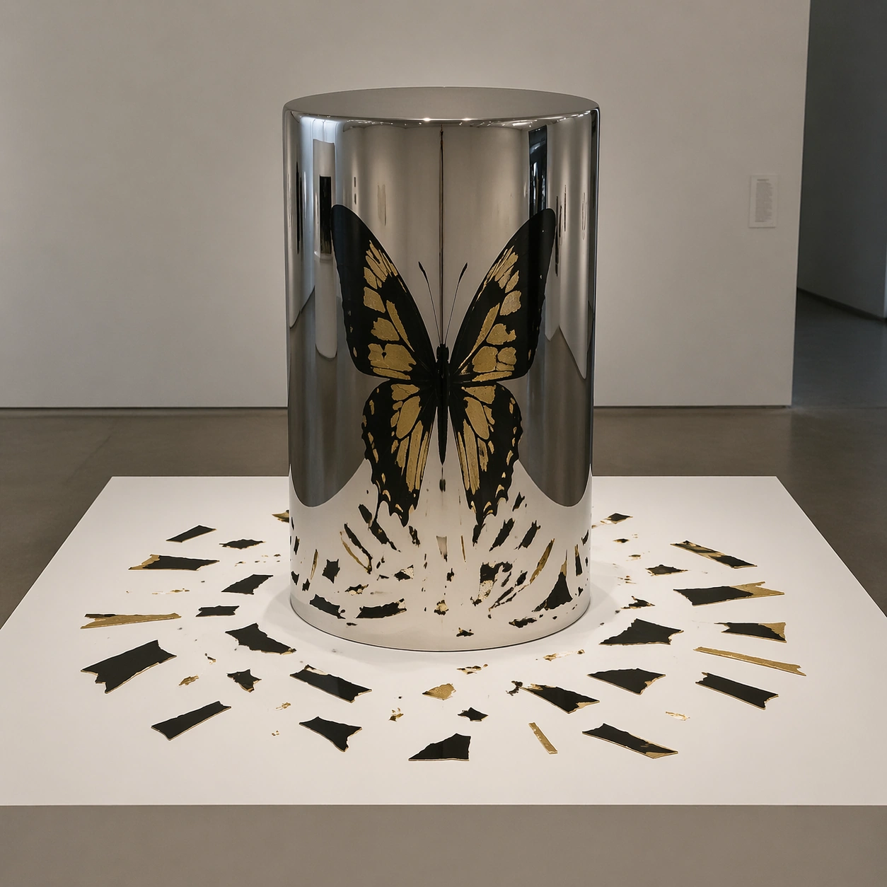
Example generated from “Anamorphic Perspective Art — Gallery Cylinder Shadow”
GPT Image 2en

Scene: A quiet white-cube gallery installation photographed at eye level. A polished chrome cylinder stands on a low white plinth, surrounded by scattered black-and-gold fragments printed on the table surface. Subject: The scattered flat fragments look meaningless on the table, but their reflection in the curved cylinder resolves into a complete symmetrical butterfly silhouette. The real table marks should look warped and broken, while the cylinder reflection is clean and recognizable. Important details: Photorealistic gallery lighting, softbox reflections on chrome, accurate cylindrical mirror distortion, crisp black ink and gold foil fragments, clean plinth edges, subtle museum floor shadows, geometry that makes the reflection feel physically plausible. Use case: Independent Prompt Atlas image testing anamorphic mirror geometry, material reflection, and optical-illusion composition. Constraints: No readable text, no watermark, no logos, no human hands, no extra mirrors, no fantasy glow, no broken cylinder, preserve exact 1:1 aspect ratio.

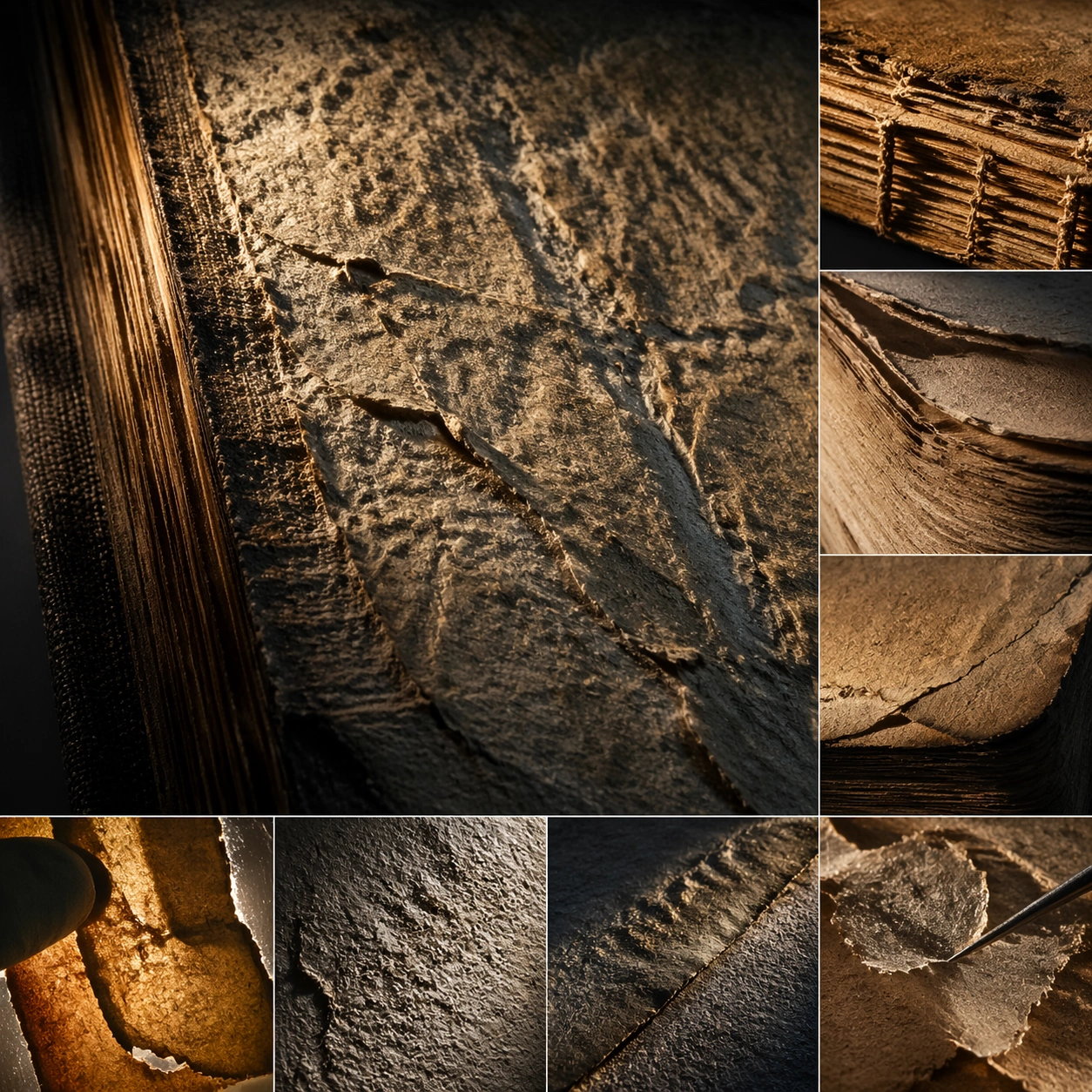
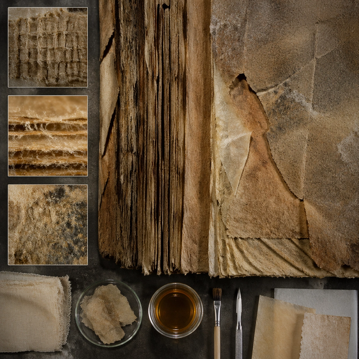
Example generated from “Ancient Book Restoration — Macro Study”
GPT Image 2en

Scene: A square material-focused image where lighting, scale, and surface behavior are the main event. Build the frame around extreme close observation of texture, grain, and edge behavior. Keep the lighting, camera distance, and spatial organization tuned for a high-signal research image rather than a casual snapshot. The image belongs to the Ancient Book Restoration theme and should feel immediately legible as a prompt atlas theme for ancient book restoration, testing world-knowledge, editing-workflow with gpt image 2.. Subject: Center the study on extreme close observation of texture, grain, and edge behavior. Translate the theme into a concrete visual statement instead of an abstract mood board: the viewer should understand what kind of image this is, what is being tested, and why the composition is difficult. Use the slug idea of ancient book restoration as a literal guide for subject matter, materials, and staging. Important details: Microstructure matters: refraction, fibers, scratches, pores, edge wear, translucency, and dust should all feel physically specific. Preserve a disciplined square composition, clear focal hierarchy, and enough secondary information to make the image feel complete rather than underspecified. The image should look polished, novel, and exhibition-ready, with topic-specific credibility coming from the way surfaces, structure, and visual language reinforce Ancient Book Restoration. Avoid generic filler elements that do not serve the main concept. Use case: Ancient Book Restoration single study 2/8, testing world-knowledge, editing-workflow through the macro study variation. Constraints: No readable text, no watermark, no logos, preserve exact 1:1 aspect ratio, no generic stock macro, no broken scale cues, no plastic-looking texture when it should feel natural, no meaningless blur, no watermark, no fake labels.

Example generated from “Ancient Book Restoration — Side Light Study”
GPT Image 2en

Scene: A square material-focused image where lighting, scale, and surface behavior are the main event. Build the frame around raking light used to reveal depth and relief. Keep the lighting, camera distance, and spatial organization tuned for a high-signal research image rather than a casual snapshot. The image belongs to the Ancient Book Restoration theme and should feel immediately legible as a prompt atlas theme for ancient book restoration, testing world-knowledge, editing-workflow with gpt image 2.. Subject: Center the study on raking light used to reveal depth and relief. Translate the theme into a concrete visual statement instead of an abstract mood board: the viewer should understand what kind of image this is, what is being tested, and why the composition is difficult. Use the slug idea of ancient book restoration as a literal guide for subject matter, materials, and staging. Important details: Microstructure matters: refraction, fibers, scratches, pores, edge wear, translucency, and dust should all feel physically specific. Preserve a disciplined square composition, clear focal hierarchy, and enough secondary information to make the image feel complete rather than underspecified. The image should look polished, novel, and exhibition-ready, with topic-specific credibility coming from the way surfaces, structure, and visual language reinforce Ancient Book Restoration. Avoid generic filler elements that do not serve the main concept. Use case: Ancient Book Restoration single study 3/8, testing world-knowledge, editing-workflow through the side light study variation. Constraints: No readable text, no watermark, no logos, preserve exact 1:1 aspect ratio, no generic stock macro, no broken scale cues, no plastic-looking texture when it should feel natural, no meaningless blur, no watermark, no fake labels.

Example generated from “Ancient Book Restoration — Process Trace”
GPT Image 2en

Scene: A square material-focused image where lighting, scale, and surface behavior are the main event. Build the frame around evidence of making, wear, or transformation frozen in the surface. Keep the lighting, camera distance, and spatial organization tuned for a high-signal research image rather than a casual snapshot. The image belongs to the Ancient Book Restoration theme and should feel immediately legible as a prompt atlas theme for ancient book restoration, testing world-knowledge, editing-workflow with gpt image 2.. Subject: Center the study on evidence of making, wear, or transformation frozen in the surface. Translate the theme into a concrete visual statement instead of an abstract mood board: the viewer should understand what kind of image this is, what is being tested, and why the composition is difficult. Use the slug idea of ancient book restoration as a literal guide for subject matter, materials, and staging. Important details: Microstructure matters: refraction, fibers, scratches, pores, edge wear, translucency, and dust should all feel physically specific. Preserve a disciplined square composition, clear focal hierarchy, and enough secondary information to make the image feel complete rather than underspecified. The image should look polished, novel, and exhibition-ready, with topic-specific credibility coming from the way surfaces, structure, and visual language reinforce Ancient Book Restoration. Avoid generic filler elements that do not serve the main concept. Use case: Ancient Book Restoration single study 4/8, testing world-knowledge, editing-workflow through the process trace variation. Constraints: No readable text, no watermark, no logos, preserve exact 1:1 aspect ratio, no generic stock macro, no broken scale cues, no plastic-looking texture when it should feel natural, no meaningless blur, no watermark, no fake labels.

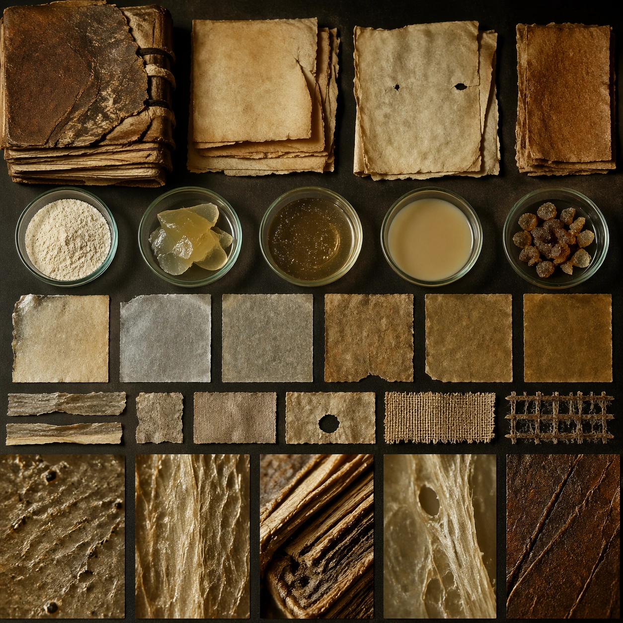
Example generated from “Ancient Book Restoration — Specimen Table”
GPT Image 2en

Scene: A square material-focused image where lighting, scale, and surface behavior are the main event. Build the frame around multiple related samples arranged for comparison. Keep the lighting, camera distance, and spatial organization tuned for a high-signal research image rather than a casual snapshot. The image belongs to the Ancient Book Restoration theme and should feel immediately legible as a prompt atlas theme for ancient book restoration, testing world-knowledge, editing-workflow with gpt image 2.. Subject: Center the study on multiple related samples arranged for comparison. Translate the theme into a concrete visual statement instead of an abstract mood board: the viewer should understand what kind of image this is, what is being tested, and why the composition is difficult. Use the slug idea of ancient book restoration as a literal guide for subject matter, materials, and staging. Important details: Microstructure matters: refraction, fibers, scratches, pores, edge wear, translucency, and dust should all feel physically specific. Preserve a disciplined square composition, clear focal hierarchy, and enough secondary information to make the image feel complete rather than underspecified. The image should look polished, novel, and exhibition-ready, with topic-specific credibility coming from the way surfaces, structure, and visual language reinforce Ancient Book Restoration. Avoid generic filler elements that do not serve the main concept. Use case: Ancient Book Restoration single study 5/8, testing world-knowledge, editing-workflow through the specimen table variation. Constraints: No readable text, no watermark, no logos, preserve exact 1:1 aspect ratio, no generic stock macro, no broken scale cues, no plastic-looking texture when it should feel natural, no meaningless blur, no watermark, no fake labels.

Example generated from “Ancient Book Restoration — 氛围场景”
GPT Image 2en

Scene: A square material-focused image where lighting, scale, and surface behavior are the main event. Build the frame around the material placed into a broader environment without losing tactile priority. Keep the lighting, camera distance, and spatial organization tuned for a high-signal research image rather than a casual snapshot. The image belongs to the Ancient Book Restoration theme and should feel immediately legible as a prompt atlas theme for ancient book restoration, testing world-knowledge, editing-workflow with gpt image 2.. Subject: Center the study on the material placed into a broader environment without losing tactile priority. Translate the theme into a concrete visual statement instead of an abstract mood board: the viewer should understand what kind of image this is, what is being tested, and why the composition is difficult. Use the slug idea of ancient book restoration as a literal guide for subject matter, materials, and staging. Important details: Microstructure matters: refraction, fibers, scratches, pores, edge wear, translucency, and dust should all feel physically specific. Preserve a disciplined square composition, clear focal hierarchy, and enough secondary information to make the image feel complete rather than underspecified. The image should look polished, novel, and exhibition-ready, with topic-specific credibility coming from the way surfaces, structure, and visual language reinforce Ancient Book Restoration. Avoid generic filler elements that do not serve the main concept. Use case: Ancient Book Restoration single study 6/8, testing world-knowledge, editing-workflow through the 氛围场景 variation. Constraints: No readable text, no watermark, no logos, preserve exact 1:1 aspect ratio, no generic stock macro, no broken scale cues, no plastic-looking texture when it should feel natural, no meaningless blur, no watermark, no fake labels.

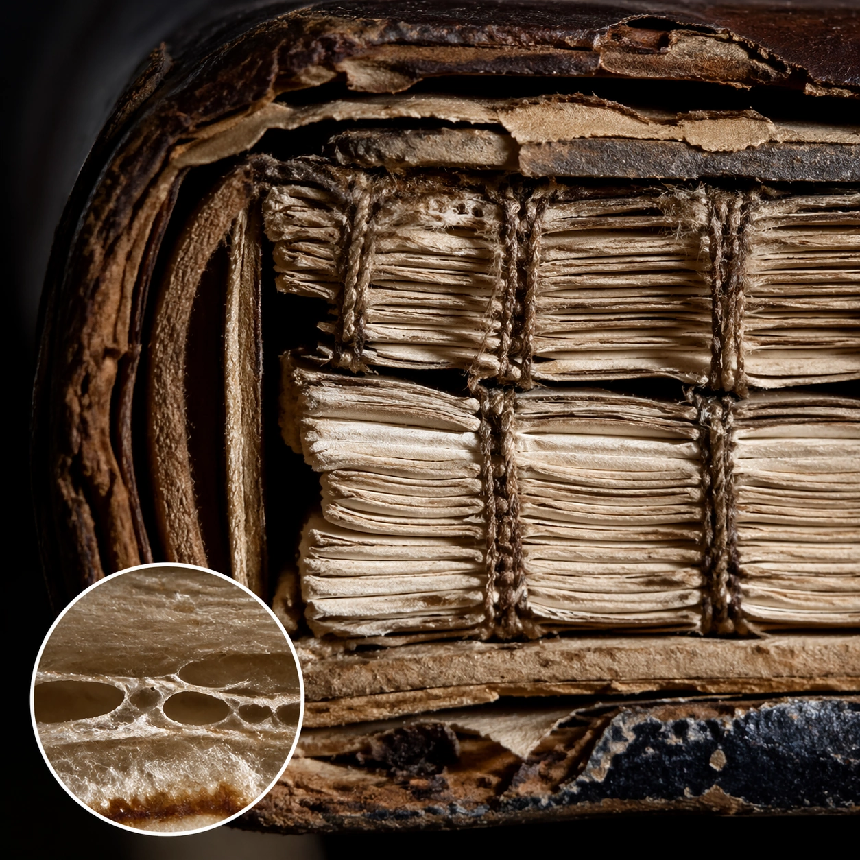
Example generated from “Ancient Book Restoration — Structure Closeup”
GPT Image 2en

Scene: A square material-focused image where lighting, scale, and surface behavior are the main event. Build the frame around the internal or layered structure made legible through detail. Keep the lighting, camera distance, and spatial organization tuned for a high-signal research image rather than a casual snapshot. The image belongs to the Ancient Book Restoration theme and should feel immediately legible as a prompt atlas theme for ancient book restoration, testing world-knowledge, editing-workflow with gpt image 2.. Subject: Center the study on the internal or layered structure made legible through detail. Translate the theme into a concrete visual statement instead of an abstract mood board: the viewer should understand what kind of image this is, what is being tested, and why the composition is difficult. Use the slug idea of ancient book restoration as a literal guide for subject matter, materials, and staging. Important details: Microstructure matters: refraction, fibers, scratches, pores, edge wear, translucency, and dust should all feel physically specific. Preserve a disciplined square composition, clear focal hierarchy, and enough secondary information to make the image feel complete rather than underspecified. The image should look polished, novel, and exhibition-ready, with topic-specific credibility coming from the way surfaces, structure, and visual language reinforce Ancient Book Restoration. Avoid generic filler elements that do not serve the main concept. Use case: Ancient Book Restoration single study 7/8, testing world-knowledge, editing-workflow through the structure closeup variation. Constraints: No readable text, no watermark, no logos, preserve exact 1:1 aspect ratio, no generic stock macro, no broken scale cues, no plastic-looking texture when it should feel natural, no meaningless blur, no watermark, no fake labels.

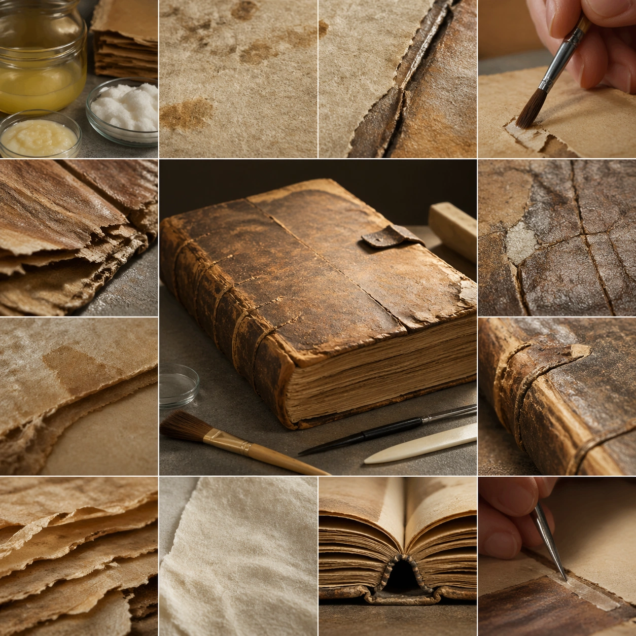
Example generated from “Ancient Book Restoration — Signature Material”
GPT Image 2en

Scene: A square material-focused image where lighting, scale, and surface behavior are the main event. Build the frame around the most complete and persuasive final material image. Keep the lighting, camera distance, and spatial organization tuned for a high-signal research image rather than a casual snapshot. The image belongs to the Ancient Book Restoration theme and should feel immediately legible as a prompt atlas theme for ancient book restoration, testing world-knowledge, editing-workflow with gpt image 2.. Subject: Center the study on the most complete and persuasive final material image. Translate the theme into a concrete visual statement instead of an abstract mood board: the viewer should understand what kind of image this is, what is being tested, and why the composition is difficult. Use the slug idea of ancient book restoration as a literal guide for subject matter, materials, and staging. Important details: Microstructure matters: refraction, fibers, scratches, pores, edge wear, translucency, and dust should all feel physically specific. Preserve a disciplined square composition, clear focal hierarchy, and enough secondary information to make the image feel complete rather than underspecified. The image should look polished, novel, and exhibition-ready, with topic-specific credibility coming from the way surfaces, structure, and visual language reinforce Ancient Book Restoration. Avoid generic filler elements that do not serve the main concept. Use case: Ancient Book Restoration single study 8/8, testing world-knowledge, editing-workflow through the signature material variation. Constraints: No readable text, no watermark, no logos, preserve exact 1:1 aspect ratio, no generic stock macro, no broken scale cues, no plastic-looking texture when it should feel natural, no meaningless blur, no watermark, no fake labels.

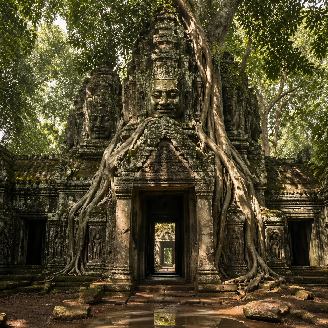
Example generated from “Root-wrapped Khmer-inspired gateway”
GPT Image 2en

Scene: A square documentary image composed like a premium archaeology magazine feature. Use deep canopy green, cool stone gray, damp earth brown, and shafts of warm filtered sunlight. Frame an Angkor temple gateway fused with giant root systems, sandstone faces, and moss-dark galleries beneath a tropical canopy with crisp depth layering, restrained contrast, and subtle atmospheric depth so the scene feels excavated, observed, and historically grounded rather than theatrical or game-like. Keep the light directional but believable, as if captured during a careful field visit. Subject: Center the image on an Angkor temple gateway fused with giant root systems, sandstone faces, and moss-dark galleries beneath a tropical canopy. Include culturally accurate surface logic, region-specific setting, and believable human-scale cues in stairs, doorways, cut blocks, relief edges, or water depth. Shapes, carvings, masonry joints, and site wear should feel studied from real archaeology, with no generic ancient-world mashup and no ornamental filler borrowed from another civilization. Important details: Keep the site recognizably Khmer, with disciplined tower silhouettes, naga-era stone logic, gallery rhythm, and roots that wrap around built forms instead of replacing them with fantasy tree sculpture. Emphasize sandstone blocks, strangler-fig roots, moss, damp soil, carved lintels, and weather-softened bas-relief surfaces. Keep inscriptions, painted registers, symbolic motifs, or carved bands visually plausible but not readable. Preserve a museum-grade balance between beauty and evidence: light should reveal relief depth, edge wear, repairs, sediment traces, and excavation context without turning the site into fantasy spectacle. The composition should feel like a definitive reference frame that later variations can inherit exactly. Use case: Angkor Wat Overgrown Symbiosis series study 1/9. Constraints: No readable text, no watermark, no logos, preserve exact 1:1 aspect ratio, no fantasy elves, no glowing magic runes, no steel catwalks, no modern park signage, no tourists, no anachronistic props, no collage layout, no exaggerated fantasy lighting.

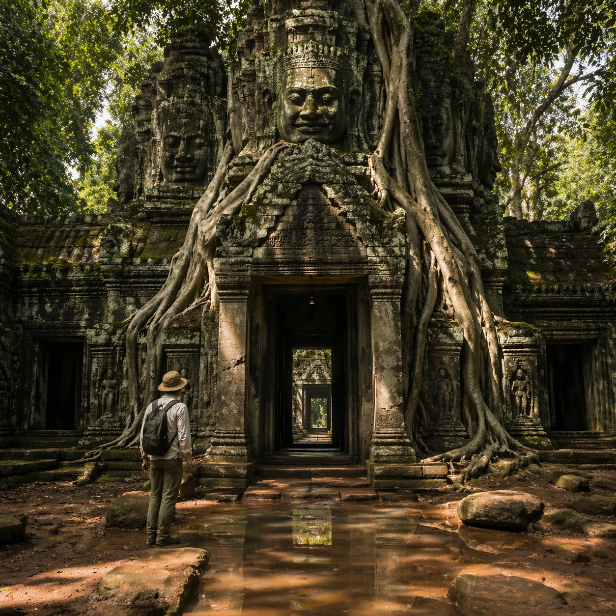
Example generated from “Researcher beside an imagined Khmer gateway”
GPT Image 2en

Scene: A square follow-up field image from the same site, slightly closer and lower than the reference anchor, with careful documentary framing and the same material palette. The camera should feel physically present inside the archaeological space, using natural light, soft depth separation, and one clear human figure to explain scale without turning the image into lifestyle photography. Subject: Show the same site identity established in the reference anchor, now with an archaeologist, conservator, or field researcher moving through the scene in practical neutral clothing. The person should be small relative to the monument and clearly secondary to the architecture, water, or painted wall system. Keep the main forms, structural rhythm, and civilizational markers unchanged. Important details: Preserve the exact site identity, base geometry, material behavior, and cultural signatures from the reference model. Only vary vantage, gesture, and scale cues. Keep the site recognizably Khmer, with disciplined tower silhouettes, naga-era stone logic, gallery rhythm, and roots that wrap around built forms instead of replacing them with fantasy tree sculpture. Human presence should clarify stair height, wall size, carving depth, or spatial compression while respecting conservation protocol and historical seriousness. Keep any tools understated and generic, with no readable labels. The image must still look like a rigorous archaeological record first and a dramatic scene second. Use case: Angkor Wat Overgrown Symbiosis series study 2/9. Constraints: No readable text, no watermark, no logos, preserve exact 1:1 aspect ratio, preserve exact site identity from the reference image, no fantasy elves, no glowing magic runes, no steel catwalks, no modern park signage, no fashion editorial styling, no crowd, no cinematic props.

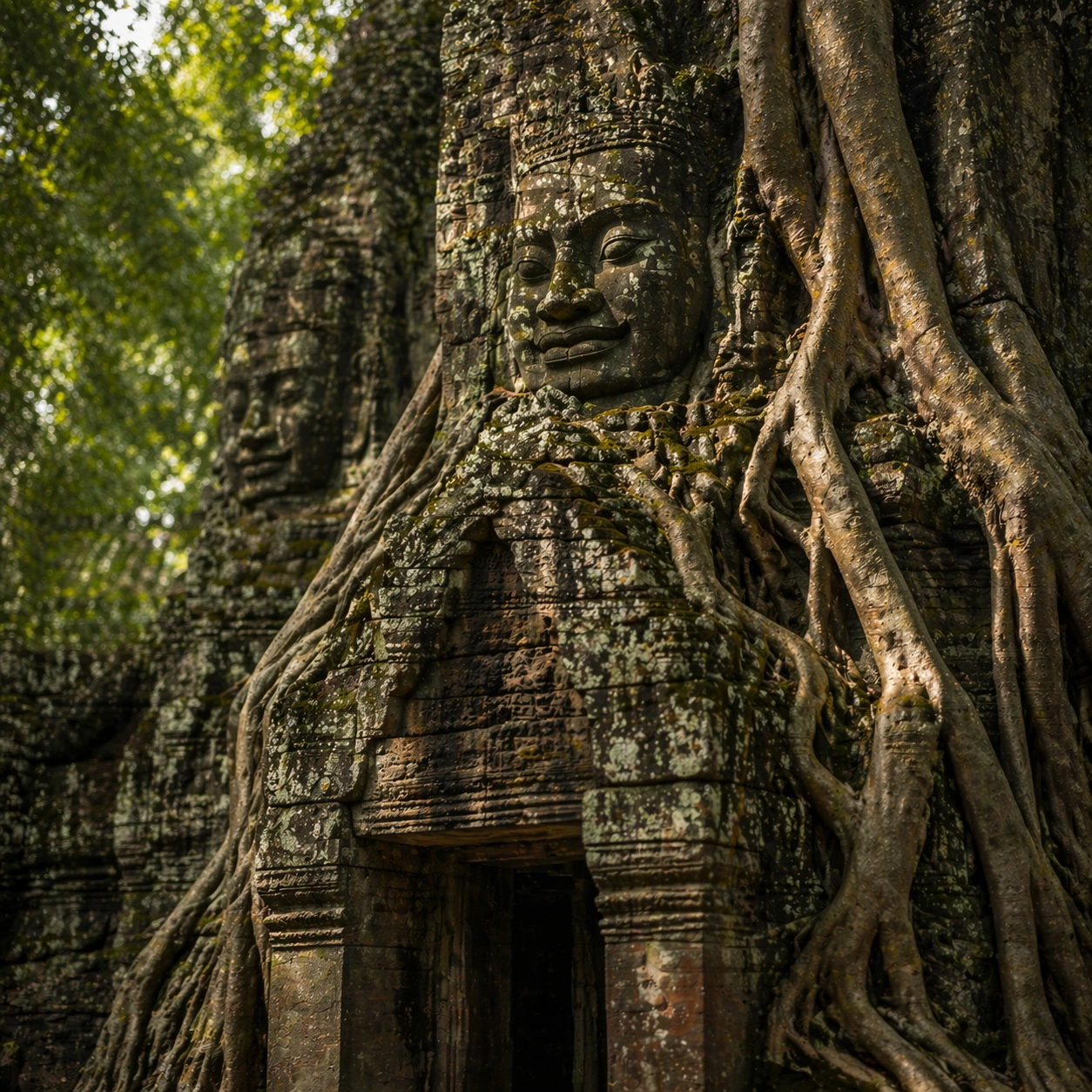
Example generated from “Khmer-inspired stone and root surface study”
GPT Image 2en

Scene: A square close study framed within the same site established by the reference anchor. Use a tight crop, shallow but believable depth of field, and raking light that reveals tactile evidence in surface relief, pigment, tool marks, moisture, or marine wear. The image should feel like a museum conservation photograph elevated to gallery quality. Subject: Focus on a materially rich portion of the same site: carved edges, painted plaster, fitted stone, root-wrapped masonry, submerged paving, or quarry-cut facial planes depending on the civilization. The composition should remain anchored to the original location and show enough surrounding context that viewers still recognize the parent site rather than mistaking it for an unrelated artifact. Important details: Preserve the exact site identity from the reference model while shifting emphasis to forensic surface evidence. Keep the site recognizably Khmer, with disciplined tower silhouettes, naga-era stone logic, gallery rhythm, and roots that wrap around built forms instead of replacing them with fantasy tree sculpture. Make micro-texture, fracture lines, pigment retention, water wear, plant interaction, dust, or chisel traces visually persuasive. Avoid decorative clutter. Every mark should feel like evidence of making, weathering, excavation, or conservation. Keep any symbolic marks non-legible and historically appropriate, and make the light reveal depth without flattening the material richness. Use case: Angkor Wat Overgrown Symbiosis series study 3/9. Constraints: No readable text, no watermark, no logos, preserve exact 1:1 aspect ratio, preserve exact site identity from the reference image, no fantasy elves, no glowing magic runes, no steel catwalks, no modern park signage, no isolated floating artifact, no studio backdrop, no fake macro abstraction.
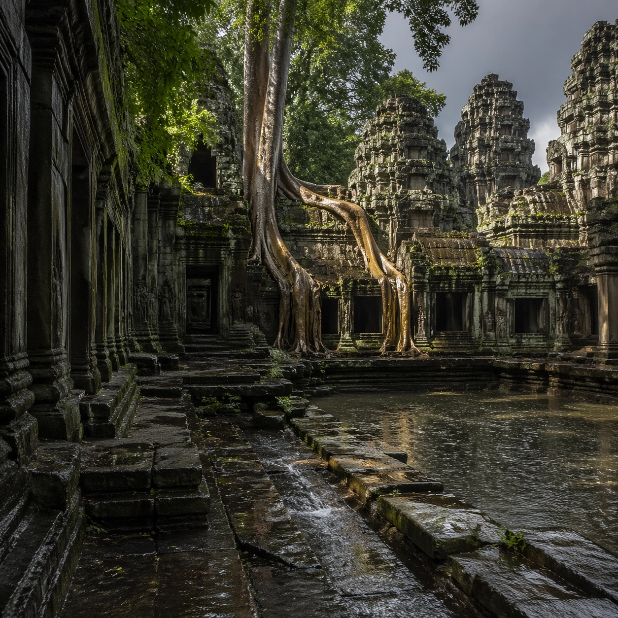
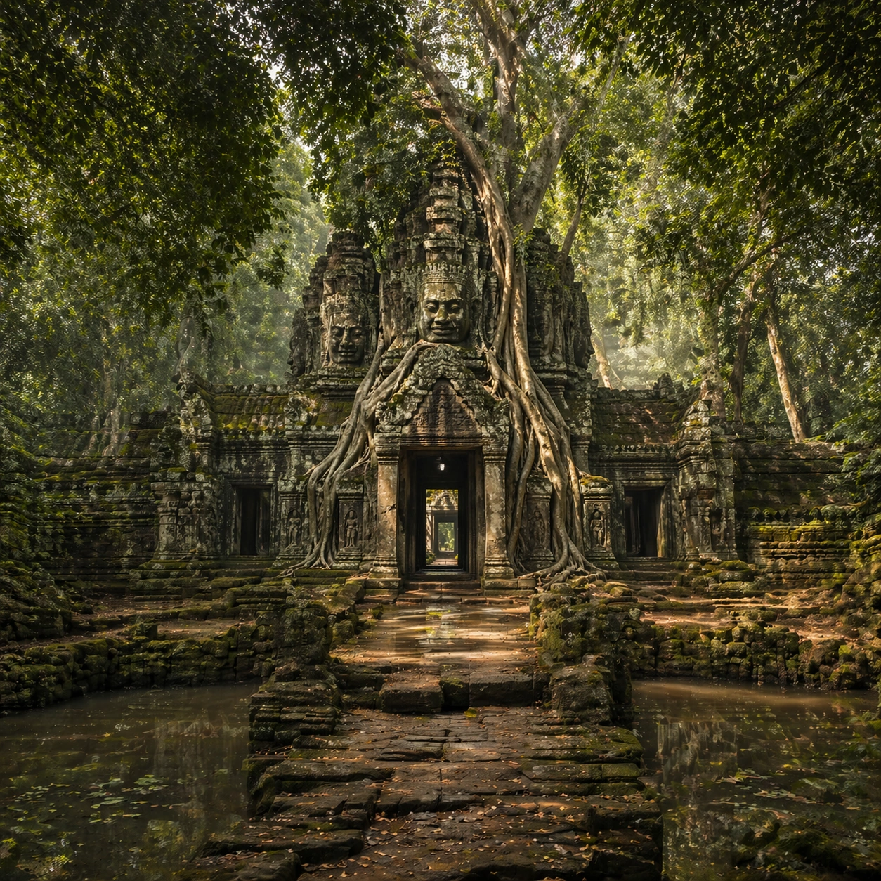
Example generated from “Imagined overgrown temple, wide environmental view”
GPT Image 2en

Scene: A square wide reveal of the same site under a slightly different environmental condition, with more surrounding geography or architecture visible while keeping the anchor landmark dominant. Use disciplined composition, atmospheric perspective, and natural light behavior so the image feels like a patient field photograph captured after the reference shot rather than a different fantasy set. Subject: Show the same site identity with broader context: approaches, terraces, ring walls, canyon slot, canopy volume, quarry slope, or chamber boundaries depending on the location. The anchor structure must remain instantly recognizable. Environmental scale should deepen understanding of why the site is placed here and how people, water, topography, or vegetation shape the experience of the monument. Important details: Preserve the exact landmark, materials, and civilizational cues from the reference model while allowing wider framing and a different atmospheric emphasis. Keep the site recognizably Khmer, with disciplined tower silhouettes, naga-era stone logic, gallery rhythm, and roots that wrap around built forms instead of replacing them with fantasy tree sculpture. Use geography and environmental systems to add meaning: drainage, mist, current, valley depth, roots, irrigation, or enclosure logic. The image should feel both beautiful and evidentiary, with no compositional tricks that break continuity with the established site. Use case: Angkor Wat Overgrown Symbiosis series study 4/9. Constraints: No readable text, no watermark, no logos, preserve exact 1:1 aspect ratio, preserve exact site identity from the reference image, no fantasy elves, no glowing magic runes, no steel catwalks, no modern park signage, no unrelated landmarks, no speculative mashup architecture, no posterized grading.

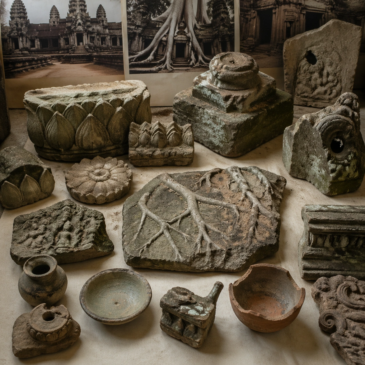
Example generated from “Angkor Wat Overgrown — Artifact Tableau”
GPT Image 2en

Scene: A square artifact and material study arranged like a high-end conservation photograph. Use soft directional light, controlled shadow falloff, and a neutral work surface so every fragment reads clearly. The image should feel intimate and scientific, but still rich enough to communicate the broader civilization through craft, wear, and material vocabulary alone. Subject: Present sandstone fragments, lotus motif carvings, small ritual ceramics, weathered pedestal pieces, and root-imprinted stone samples on a study table. Arrange the pieces with disciplined spacing and believable conservation handling. Include enough variation in scale, finish, and damage state to suggest excavation reality rather than a perfectly staged luxury still life. Nothing should look modern or decorative for its own sake; every object must feel like evidence tied to the same cultural world as the main topic. Important details: Emphasize tactile surfaces, honest aging, and historically grounded material behavior. Keep the site recognizably Khmer, with disciplined tower silhouettes, naga-era stone logic, gallery rhythm, and roots that wrap around built forms instead of replacing them with fantasy tree sculpture. Show abrasion, dust, corrosion, cracks, mineral bloom, pigment retention, or edge polish where appropriate. Keep the arrangement orderly but not sterile, as if prepared for a serious cataloging session. No readable labels, no museum placards, and no visual shortcuts that turn the study into product photography detached from archaeology. Use case: Angkor Wat Overgrown Symbiosis single study 6/9. Constraints: No readable text, no watermark, no logos, preserve exact 1:1 aspect ratio, no fantasy elves, no glowing magic runes, no steel catwalks, no modern park signage, no luxury advertising gloss, no floating objects, no velvet jewelry styling, no unrelated tools.

Example generated from “Angkor Wat Overgrown — Light Shift Study”
GPT Image 2en

Scene: A square mood variation from the same civilization theme, built around late monsoon light with richer moisture, cooler shadows, and luminous leaf reflections across the same temple surfaces. The image should stay grounded in field realism while testing how different illumination changes material reading, atmosphere, and emotional register. Keep the frame self-contained and coherent, as if photographed during a second visit under altered conditions. Subject: Show a culturally accurate site or interior connected to the same world as the main topic, but not as a direct dependency on the series reference. The focus should be on how light transforms relief, color, moisture, water, dust, or vegetation while preserving archaeological credibility. Architectural forms, objects, and setting must still belong to the same civilization with no cross-cultural contamination. Important details: Keep the site recognizably Khmer, with disciplined tower silhouettes, naga-era stone logic, gallery rhythm, and roots that wrap around built forms instead of replacing them with fantasy tree sculpture. Use the shift in light to reveal different evidence than the other studies: pigment glow, root sheen, caustics, wet stone, canyon shadow, marine haze, terrace depth, or quarry moisture. Keep the result serious and observational rather than romanticized. Non-readable motifs are acceptable, but there should be no signs, captions, or modern display devices. The image should feel like a rigorous visual experiment in historical atmosphere. Use case: Angkor Wat Overgrown Symbiosis single study 7/9. Constraints: No readable text, no watermark, no logos, preserve exact 1:1 aspect ratio, no fantasy elves, no glowing magic runes, no steel catwalks, no modern park signage, no theatrical color filters, no supernatural effects, no montage composition, no glossy concept-art exaggeration.

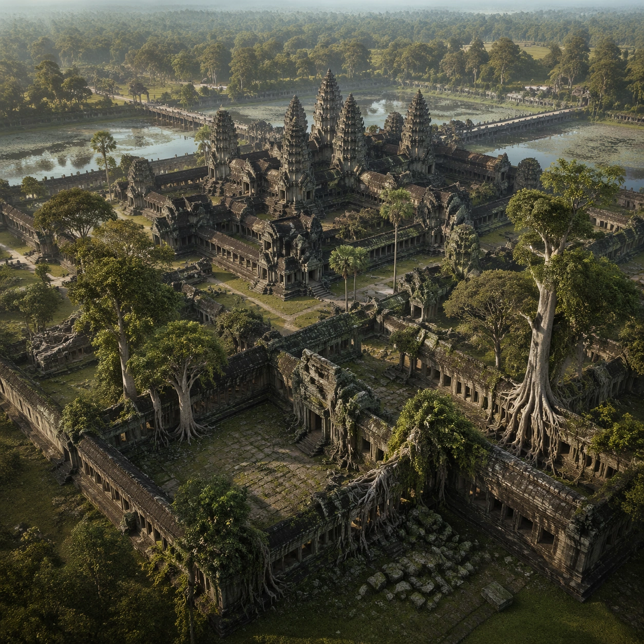
Example generated from “Angkor Wat Overgrown — Survey Perspective”
GPT Image 2en

Scene: A square survey-oriented image that explains spatial logic with the clarity of an expert field overview while still reading as a finished artwork. Use a stable elevated vantage, clean depth layering, and enough visible terrain or architecture to make relationships legible without turning the frame into a literal map. The scene should feel analytical and cinematic at the same time. Subject: Show a slightly elevated survey image that reveals galleries, collapsed thresholds, root spread, and canopy openings as one integrated site system. Organize the composition so paths, terraces, walls, courtyards, chambers, canals, root systems, or quarry clusters can be read as a coherent system. The image should reveal how the civilization used land, water, elevation, enclosure, or monumentality. Keep all architecture, materials, and environmental details consistent with the correct place and period. Important details: Keep the site recognizably Khmer, with disciplined tower silhouettes, naga-era stone logic, gallery rhythm, and roots that wrap around built forms instead of replacing them with fantasy tree sculpture. This image should reward close looking by showing infrastructural logic: how stone courses align, how water moves, how rooms connect, how carved masses sit inside geology, or how vegetation interacts with built form. Avoid explicit annotation. Let composition, light, and scale cues do the explanatory work. Keep any measuring elements generic and unreadable, and make the image feel like serious research made visually elegant. Use case: Angkor Wat Overgrown Symbiosis single study 8/9. Constraints: No readable text, no watermark, no logos, preserve exact 1:1 aspect ratio, no fantasy elves, no glowing magic runes, no steel catwalks, no modern park signage, no infographic arrows, no split-screen layout, no impossible aerial geometry, no unrelated settlements.

Example generated from “Angkor Wat Overgrown — Editorial Reconstruction”
GPT Image 2en

Scene: A square hero image designed for a museum wall graphic or flagship magazine cover, but without any actual typography. Use strong focal hierarchy, refined contrast, and a polished finish that still feels rooted in archaeological evidence. The frame should look complete on its own and communicate why this civilization remains visually unforgettable. Subject: Build the image around an editorial hero image presenting the temple and tree symbiosis as a precise, living archaeological relationship. Present architecture, artifacts, environment, and atmosphere as one coherent statement. The composition can be more distilled than a field snapshot, but it must remain culturally specific, materially persuasive, and free of fantasy shorthand. Nothing should feel like a movie poster or commercial franchise imitation. Important details: Keep the site recognizably Khmer, with disciplined tower silhouettes, naga-era stone logic, gallery rhythm, and roots that wrap around built forms instead of replacing them with fantasy tree sculpture. Distill the site or cultural world into one decisive visual argument: place, craft, weathering, engineering, and memory. Use the strongest material signatures from this civilization and let them sit in a believable environment with controlled dramatic weight. Keep any carved or painted symbols non-readable. The result should look like responsible high-end visual storytelling for research and public interpretation, not a spectacle-first matte painting. Use case: Angkor Wat Overgrown Symbiosis single study 9/9. Constraints: No readable text, no watermark, no logos, preserve exact 1:1 aspect ratio, no fantasy elves, no glowing magic runes, no steel catwalks, no modern park signage, no movie-poster tropes, no overdesigned framing devices, no collage layout, no brand-like iconography.

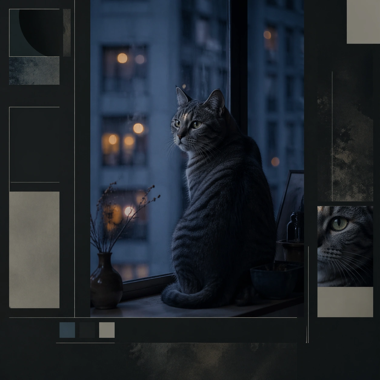
Example generated from “Animal Character Editorial Spread Set — House Cat Nocturne Essay”
GPT Image 2en

Scene: A square editorial spread opener or magazine board that combines photoreal animal portraiture with layout fragments, negative space, and sophisticated art direction. The animal should read as a character with presence and point of view, but never become a cartoon mascot or a human impersonation. Keep the image useful for brand editorials, cultural magazines, nonprofit storytelling, or visual essays where personality and atmosphere matter as much as realism. Set the cat near a city apartment window at blue hour with cool reflections, dark paper margins, and structured editorial sidebars. Subject: Focus on one animal in a setting that supports a distinct personality cue such as quiet confidence, urban wit, eccentric elegance, patient age, or tactile curiosity. Use real anatomy, plausible behavior, and emotionally controlled lighting. The animal may be framed with objects, set pieces, or composition motifs, but the scene must still feel truthful to the species and grounded in editorial photography logic. Show a cat perched with composed stillness, silhouette clarity, and watchful eyes that carry the entire mood of the piece. Important details: Use magazine-like hierarchy: one hero image, supporting crop windows, abstract text columns, margin bars, or pull quote blocks without readable words. The result should feel authored and surprising, not like a stock portrait dropped into a template. Aim for mood, specificity, and a polished sense of visual journalism. Let environment, gesture, and styling carry the personality instead of costumes or overt anthropomorphism. Make the animal feel self-possessed and urban without anthropomorphic costume cues; let light and composition do the writing. Use case: Animal Character Editorial Spread Set single study 2/9, house cat nocturne essay for a commercially reusable prompt atlas example. Constraints: No readable text, no watermark, no logos, preserve exact 1:1 aspect ratio, no human clothes on animals, no cartoon facial exaggeration, no readable magazine text, no mascot smile effects, no fake celebrity parody, no novelty prop overload, no neon overload, no cyberpunk gimmicks, no city skyline cliché dominating the frame.

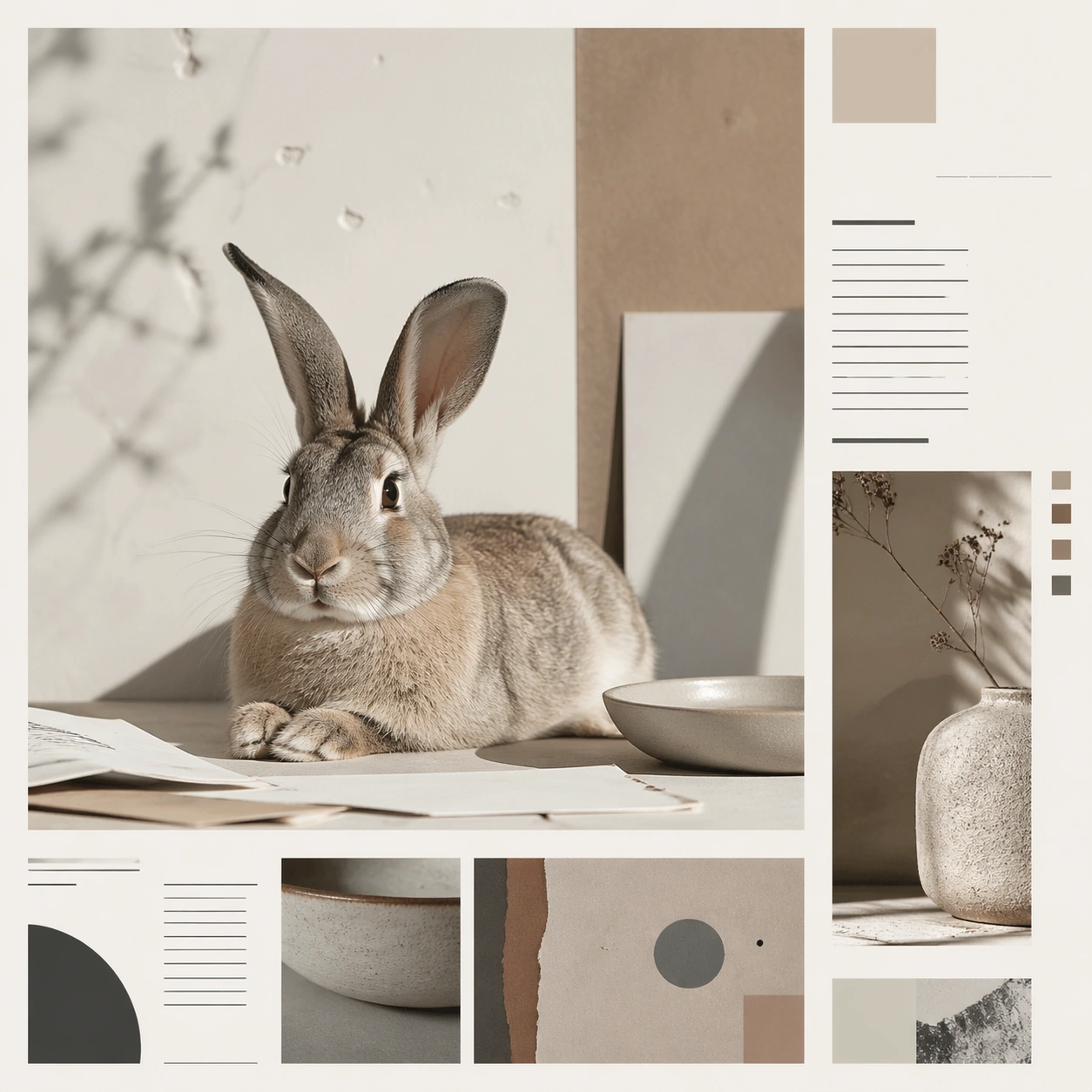
Example generated from “Animal Character Editorial Spread Set — Rabbit Still Life Feature”
GPT Image 2en

Scene: A square editorial spread opener or magazine board that combines photoreal animal portraiture with layout fragments, negative space, and sophisticated art direction. The animal should read as a character with presence and point of view, but never become a cartoon mascot or a human impersonation. Keep the image useful for brand editorials, cultural magazines, nonprofit storytelling, or visual essays where personality and atmosphere matter as much as realism. Use a pale studio tabletop with paper, ceramics, and soft shadow planes arranged like an editorial still life feature. Subject: Focus on one animal in a setting that supports a distinct personality cue such as quiet confidence, urban wit, eccentric elegance, patient age, or tactile curiosity. Use real anatomy, plausible behavior, and emotionally controlled lighting. The animal may be framed with objects, set pieces, or composition motifs, but the scene must still feel truthful to the species and grounded in editorial photography logic. Feature a rabbit seated or lying calmly among the objects, with ears and whiskers shaping the composition rather than overwhelming it. Important details: Use magazine-like hierarchy: one hero image, supporting crop windows, abstract text columns, margin bars, or pull quote blocks without readable words. The result should feel authored and surprising, not like a stock portrait dropped into a template. Aim for mood, specificity, and a polished sense of visual journalism. Let environment, gesture, and styling carry the personality instead of costumes or overt anthropomorphism. The board should feel poetic, tactile, and intelligent, suitable for a design magazine or refined brand editorial. Use case: Animal Character Editorial Spread Set single study 3/9, rabbit still life feature for a commercially reusable prompt atlas example. Constraints: No readable text, no watermark, no logos, preserve exact 1:1 aspect ratio, no human clothes on animals, no cartoon facial exaggeration, no readable magazine text, no mascot smile effects, no fake celebrity parody, no novelty prop overload, no tea-party fantasy, no costume rabbit clichés, no nursery styling.

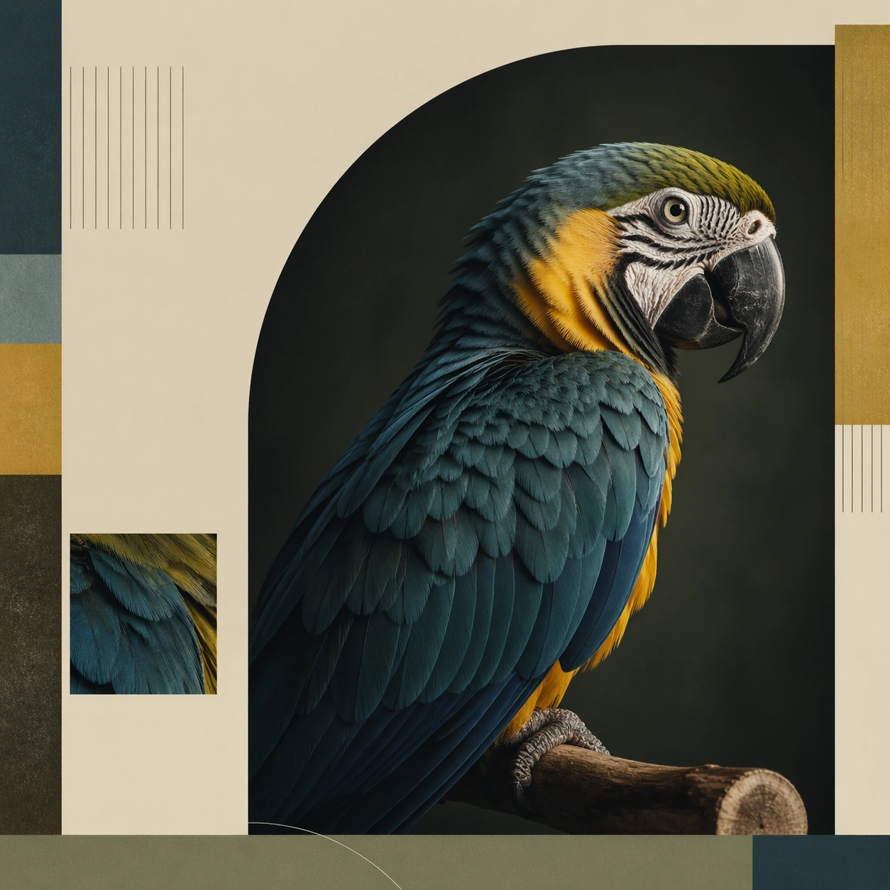
Example generated from “Animal Character Editorial Spread Set — Parrot Chromatic Profile”
GPT Image 2en

Scene: A square editorial spread opener or magazine board that combines photoreal animal portraiture with layout fragments, negative space, and sophisticated art direction. The animal should read as a character with presence and point of view, but never become a cartoon mascot or a human impersonation. Keep the image useful for brand editorials, cultural magazines, nonprofit storytelling, or visual essays where personality and atmosphere matter as much as realism. Create a clean color field background with one geometric crop window and editorial margin bands that echo the feather palette. Subject: Focus on one animal in a setting that supports a distinct personality cue such as quiet confidence, urban wit, eccentric elegance, patient age, or tactile curiosity. Use real anatomy, plausible behavior, and emotionally controlled lighting. The animal may be framed with objects, set pieces, or composition motifs, but the scene must still feel truthful to the species and grounded in editorial photography logic. Show a parrot in profile on a simple stand, with feather layering and eye clarity carrying the entire character read. Important details: Use magazine-like hierarchy: one hero image, supporting crop windows, abstract text columns, margin bars, or pull quote blocks without readable words. The result should feel authored and surprising, not like a stock portrait dropped into a template. Aim for mood, specificity, and a polished sense of visual journalism. Let environment, gesture, and styling carry the personality instead of costumes or overt anthropomorphism. The tone should be refined and art directed, closer to a magazine feature than a wildlife poster or pet shop image. Use case: Animal Character Editorial Spread Set single study 4/9, parrot chromatic profile for a commercially reusable prompt atlas example. Constraints: No readable text, no watermark, no logos, preserve exact 1:1 aspect ratio, no human clothes on animals, no cartoon facial exaggeration, no readable magazine text, no mascot smile effects, no fake celebrity parody, no novelty prop overload, no tropical jungle overload, no cartoon color saturation, no performance tricks.

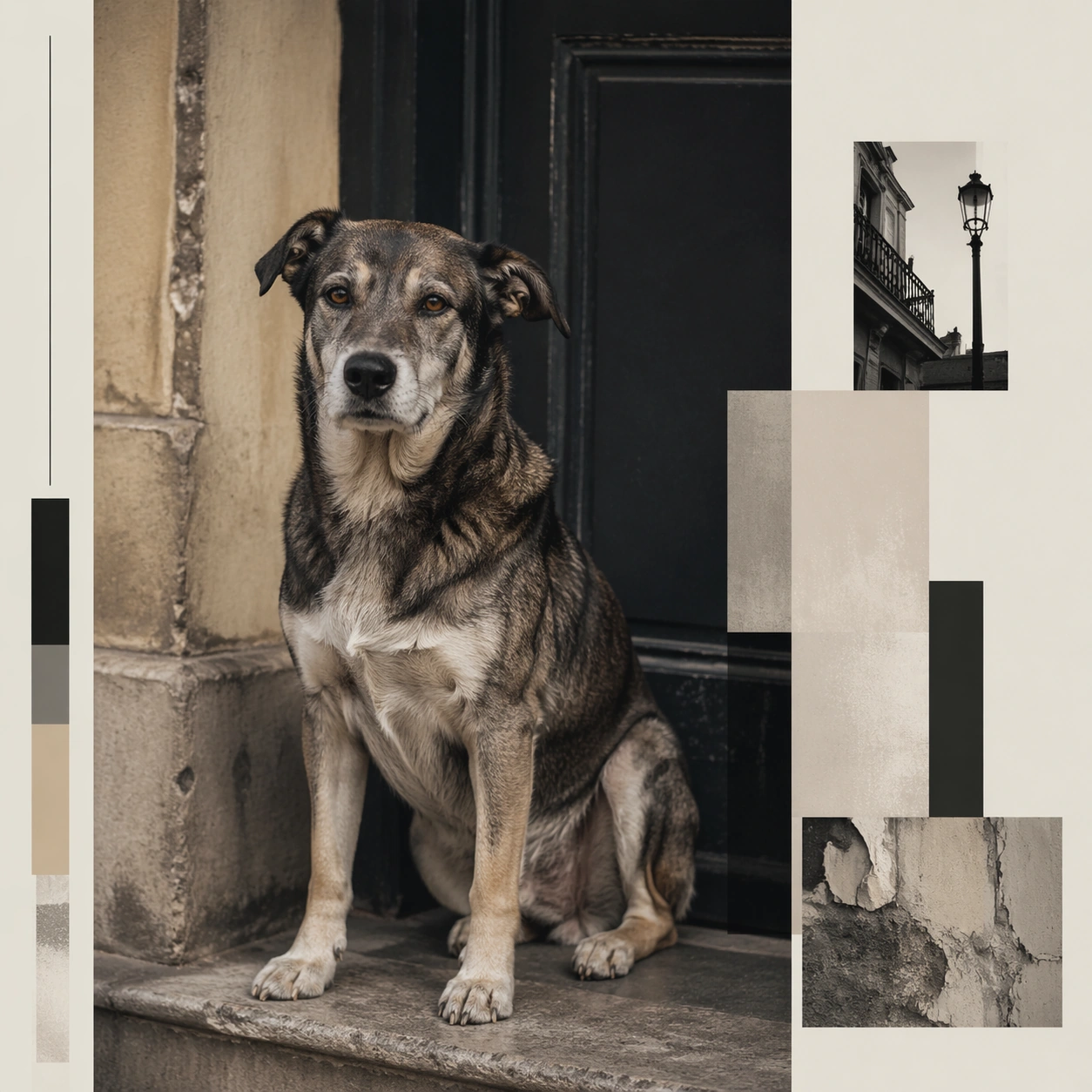
Example generated from “Animal Character Editorial Spread Set — Mixed Breed City Column”
GPT Image 2en

Scene: A square editorial spread opener or magazine board that combines photoreal animal portraiture with layout fragments, negative space, and sophisticated art direction. The animal should read as a character with presence and point of view, but never become a cartoon mascot or a human impersonation. Keep the image useful for brand editorials, cultural magazines, nonprofit storytelling, or visual essays where personality and atmosphere matter as much as realism. Use an urban stoop, sidewalk corner, or weathered doorway with soft daylight and deliberate magazine layout framing. Subject: Focus on one animal in a setting that supports a distinct personality cue such as quiet confidence, urban wit, eccentric elegance, patient age, or tactile curiosity. Use real anatomy, plausible behavior, and emotionally controlled lighting. The animal may be framed with objects, set pieces, or composition motifs, but the scene must still feel truthful to the species and grounded in editorial photography logic. Show a mixed breed dog standing or sitting with confident relaxed posture, lived-in markings, and immediate visual individuality. Important details: Use magazine-like hierarchy: one hero image, supporting crop windows, abstract text columns, margin bars, or pull quote blocks without readable words. The result should feel authored and surprising, not like a stock portrait dropped into a template. Aim for mood, specificity, and a polished sense of visual journalism. Let environment, gesture, and styling carry the personality instead of costumes or overt anthropomorphism. The image should read like a profile of neighborhood presence and resilience, not an adoption poster or fashion campaign. Use case: Animal Character Editorial Spread Set single study 5/9, mixed breed city column for a commercially reusable prompt atlas example. Constraints: No readable text, no watermark, no logos, preserve exact 1:1 aspect ratio, no human clothes on animals, no cartoon facial exaggeration, no readable magazine text, no mascot smile effects, no fake celebrity parody, no novelty prop overload, no grunge misery, no streetwear costume, no graffiti overload.

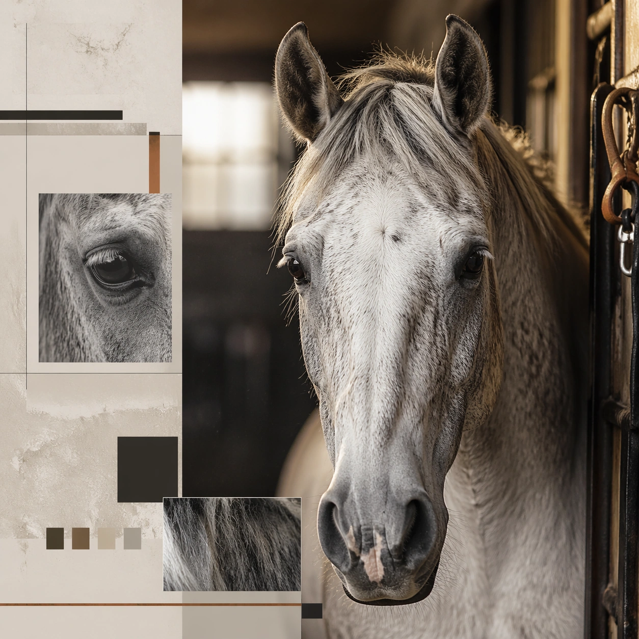
Example generated from “Animal Character Editorial Spread Set — Senior Horse Grooming Feature”
GPT Image 2en

Scene: A square editorial spread opener or magazine board that combines photoreal animal portraiture with layout fragments, negative space, and sophisticated art direction. The animal should read as a character with presence and point of view, but never become a cartoon mascot or a human impersonation. Keep the image useful for brand editorials, cultural magazines, nonprofit storytelling, or visual essays where personality and atmosphere matter as much as realism. Use a stable doorway or grooming aisle with warm side light, dusty air softness, and balanced editorial framing zones. Subject: Focus on one animal in a setting that supports a distinct personality cue such as quiet confidence, urban wit, eccentric elegance, patient age, or tactile curiosity. Use real anatomy, plausible behavior, and emotionally controlled lighting. The animal may be framed with objects, set pieces, or composition motifs, but the scene must still feel truthful to the species and grounded in editorial photography logic. Feature an older horse with visible age detail, brushed coat, and calm direct presence, cropped close enough for face and mane texture. Important details: Use magazine-like hierarchy: one hero image, supporting crop windows, abstract text columns, margin bars, or pull quote blocks without readable words. The result should feel authored and surprising, not like a stock portrait dropped into a template. Aim for mood, specificity, and a polished sense of visual journalism. Let environment, gesture, and styling carry the personality instead of costumes or overt anthropomorphism. Let the image feel patient and dignified, like a long-form profile about care, history, and companionship. Use case: Animal Character Editorial Spread Set single study 6/9, senior horse grooming feature for a commercially reusable prompt atlas example. Constraints: No readable text, no watermark, no logos, preserve exact 1:1 aspect ratio, no human clothes on animals, no cartoon facial exaggeration, no readable magazine text, no mascot smile effects, no fake celebrity parody, no novelty prop overload, no cowboy costume cues, no racing imagery, no dramatic gallop action.

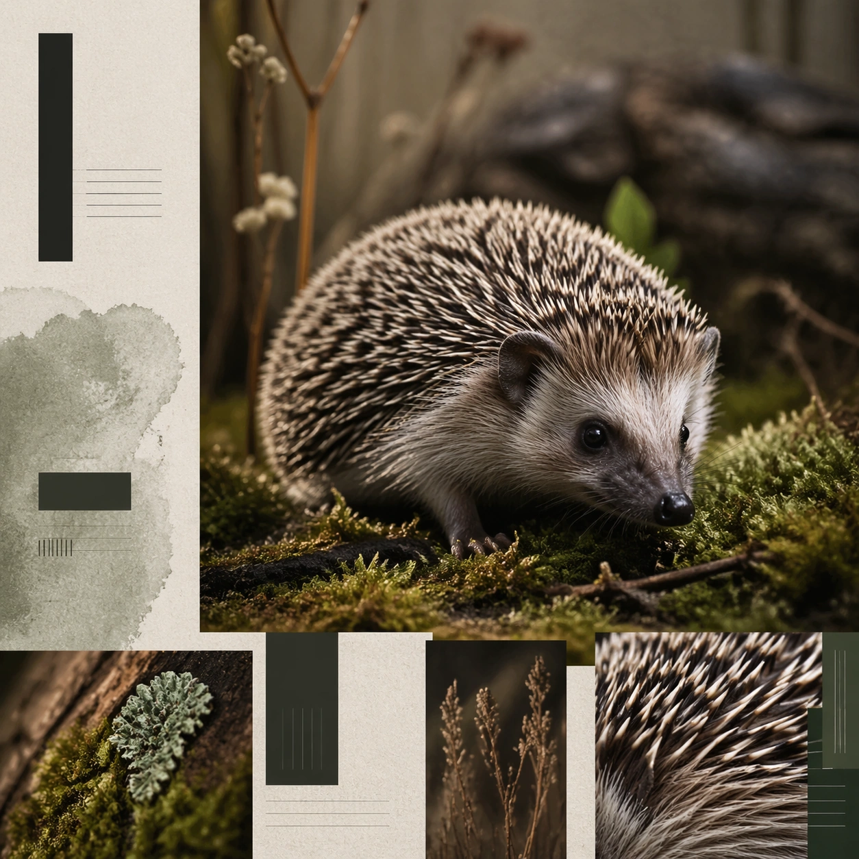
Example generated from “Animal Character Editorial Spread Set — Hedgehog Habitat Mini Story”
GPT Image 2en

Scene: A square editorial spread opener or magazine board that combines photoreal animal portraiture with layout fragments, negative space, and sophisticated art direction. The animal should read as a character with presence and point of view, but never become a cartoon mascot or a human impersonation. Keep the image useful for brand editorials, cultural magazines, nonprofit storytelling, or visual essays where personality and atmosphere matter as much as realism. Build a miniature but realistic habitat set with moss, paper texture, and close editorial crop windows around the main portrait. Subject: Focus on one animal in a setting that supports a distinct personality cue such as quiet confidence, urban wit, eccentric elegance, patient age, or tactile curiosity. Use real anatomy, plausible behavior, and emotionally controlled lighting. The animal may be framed with objects, set pieces, or composition motifs, but the scene must still feel truthful to the species and grounded in editorial photography logic. Show a hedgehog moving gently or sniffing forward, with crisp spine detail and expressive small-scale presence. Important details: Use magazine-like hierarchy: one hero image, supporting crop windows, abstract text columns, margin bars, or pull quote blocks without readable words. The result should feel authored and surprising, not like a stock portrait dropped into a template. Aim for mood, specificity, and a polished sense of visual journalism. Let environment, gesture, and styling carry the personality instead of costumes or overt anthropomorphism. The board should feel like a charming micro-story for a design-minded publication, not a novelty pet novelty post. Use case: Animal Character Editorial Spread Set single study 7/9, hedgehog habitat mini story for a commercially reusable prompt atlas example. Constraints: No readable text, no watermark, no logos, preserve exact 1:1 aspect ratio, no human clothes on animals, no cartoon facial exaggeration, no readable magazine text, no mascot smile effects, no fake celebrity parody, no novelty prop overload, no fairy forest fantasy, no oversized mushrooms, no cute sticker overload.

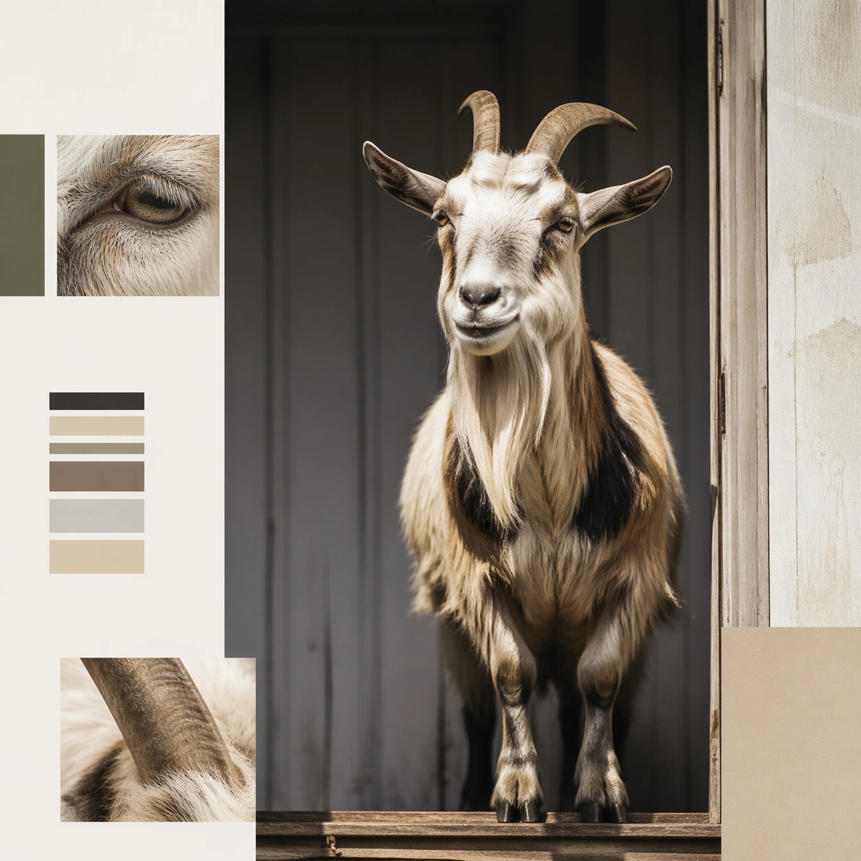
Example generated from “Animal Character Editorial Spread Set — Goat Farm Personality Spread”
GPT Image 2en

Scene: A square editorial spread opener or magazine board that combines photoreal animal portraiture with layout fragments, negative space, and sophisticated art direction. The animal should read as a character with presence and point of view, but never become a cartoon mascot or a human impersonation. Keep the image useful for brand editorials, cultural magazines, nonprofit storytelling, or visual essays where personality and atmosphere matter as much as realism. Use a clean farm doorway or pale barn wall with natural light and graphic editorial blocks that frame the animal with confidence. Subject: Focus on one animal in a setting that supports a distinct personality cue such as quiet confidence, urban wit, eccentric elegance, patient age, or tactile curiosity. Use real anatomy, plausible behavior, and emotionally controlled lighting. The animal may be framed with objects, set pieces, or composition motifs, but the scene must still feel truthful to the species and grounded in editorial photography logic. Feature a goat with strong horn silhouette or ear shape, upright stance, and alert expression that feels almost portrait-like in intent. Important details: Use magazine-like hierarchy: one hero image, supporting crop windows, abstract text columns, margin bars, or pull quote blocks without readable words. The result should feel authored and surprising, not like a stock portrait dropped into a template. Aim for mood, specificity, and a polished sense of visual journalism. Let environment, gesture, and styling carry the personality instead of costumes or overt anthropomorphism. The image should surprise through framing and seriousness, making farm life feel magazine worthy without irony. Use case: Animal Character Editorial Spread Set single study 8/9, goat farm personality spread for a commercially reusable prompt atlas example. Constraints: No readable text, no watermark, no logos, preserve exact 1:1 aspect ratio, no human clothes on animals, no cartoon facial exaggeration, no readable magazine text, no mascot smile effects, no fake celebrity parody, no novelty prop overload, no rustic kitsch overload, no costume scarf, no petting-zoo chaos.

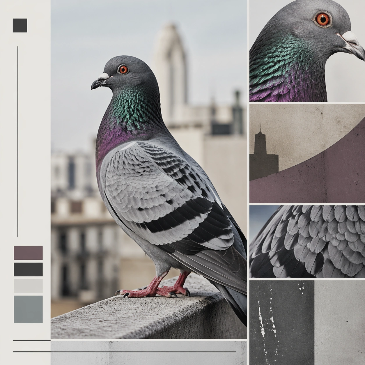
Example generated from “Animal Character Editorial Spread Set — Urban Pigeon Culture Essay”
GPT Image 2en

Scene: A square editorial spread opener or magazine board that combines photoreal animal portraiture with layout fragments, negative space, and sophisticated art direction. The animal should read as a character with presence and point of view, but never become a cartoon mascot or a human impersonation. Keep the image useful for brand editorials, cultural magazines, nonprofit storytelling, or visual essays where personality and atmosphere matter as much as realism. Use a city ledge or plaza edge with muted concrete tones, soft daylight, and magazine-style layout panels integrated into the square. Subject: Focus on one animal in a setting that supports a distinct personality cue such as quiet confidence, urban wit, eccentric elegance, patient age, or tactile curiosity. Use real anatomy, plausible behavior, and emotionally controlled lighting. The animal may be framed with objects, set pieces, or composition motifs, but the scene must still feel truthful to the species and grounded in editorial photography logic. Show one pigeon with iridescent neck detail and sharp attentive posture, photographed with the seriousness usually reserved for larger animals. Important details: Use magazine-like hierarchy: one hero image, supporting crop windows, abstract text columns, margin bars, or pull quote blocks without readable words. The result should feel authored and surprising, not like a stock portrait dropped into a template. Aim for mood, specificity, and a polished sense of visual journalism. Let environment, gesture, and styling carry the personality instead of costumes or overt anthropomorphism. The board should feel observant and culturally aware, turning an overlooked city animal into a compelling editorial character. Use case: Animal Character Editorial Spread Set single study 9/9, urban pigeon culture essay for a commercially reusable prompt atlas example. Constraints: No readable text, no watermark, no logos, preserve exact 1:1 aspect ratio, no human clothes on animals, no cartoon facial exaggeration, no readable magazine text, no mascot smile effects, no fake celebrity parody, no novelty prop overload, no pest-control cues, no flock chaos, no comedic city grime stereotype.

Example generated from “Annotated Map Design — Overview Plate”
GPT Image 2en

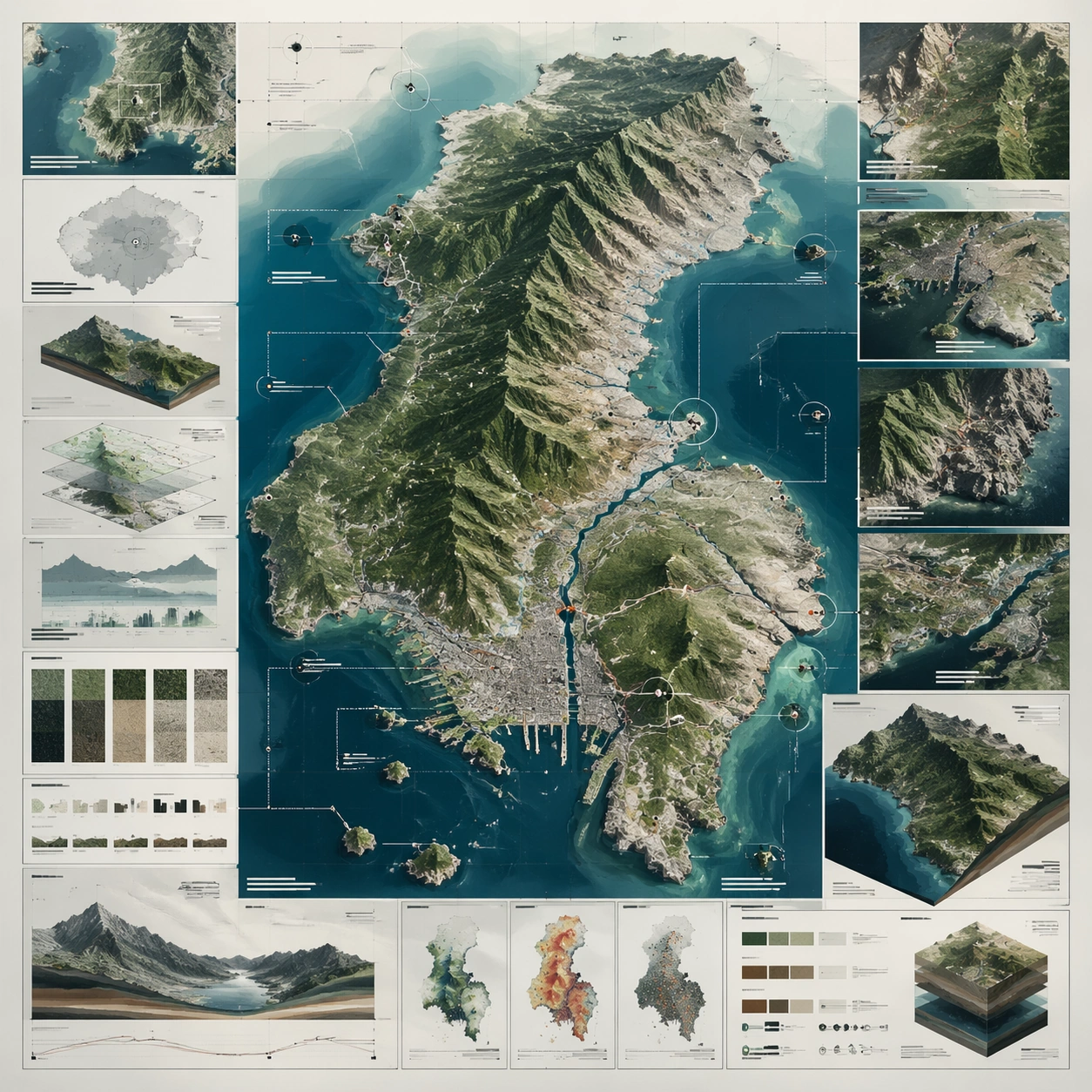
Scene: A square plate or board viewed straight-on, with crisp organization, disciplined spacing, and premium print clarity. Build the frame around a complete overview that establishes the system, subject boundaries, and visual hierarchy. Keep the lighting, camera distance, and spatial organization tuned for a high-signal research image rather than a casual snapshot. The image belongs to the Annotated Map Design theme and should feel immediately legible as a prompt atlas theme for annotated map design, testing structured-layout, photorealism, technical-diagram, world-knowledge, reasoning-composition with gpt image 2.. Subject: Center the study on a complete overview that establishes the system, subject boundaries, and visual hierarchy. Translate the theme into a concrete visual statement instead of an abstract mood board: the viewer should understand what kind of image this is, what is being tested, and why the composition is difficult. Use the slug idea of annotated map design as a literal guide for subject matter, materials, and staging. Important details: The image should communicate logic through grouping, hierarchy, callouts, insets, and believable professional layout discipline rather than decorative noise. Preserve a disciplined square composition, clear focal hierarchy, and enough secondary information to make the image feel complete rather than underspecified. The image should look polished, novel, and exhibition-ready, with topic-specific credibility coming from the way surfaces, structure, and visual language reinforce Annotated Map Design. Avoid generic filler elements that do not serve the main concept. Use case: Annotated Map Design single study 1/8, testing structured-layout, photorealism, technical-diagram, world-knowledge, reasoning-composition through the overview plate variation. Constraints: No readable text, no watermark, no logos, preserve exact 1:1 aspect ratio, no readable labels, no messy arrows, no random infographic decoration, no fake UI chrome unless the topic calls for it, no broken alignment, no meaningless clutter.
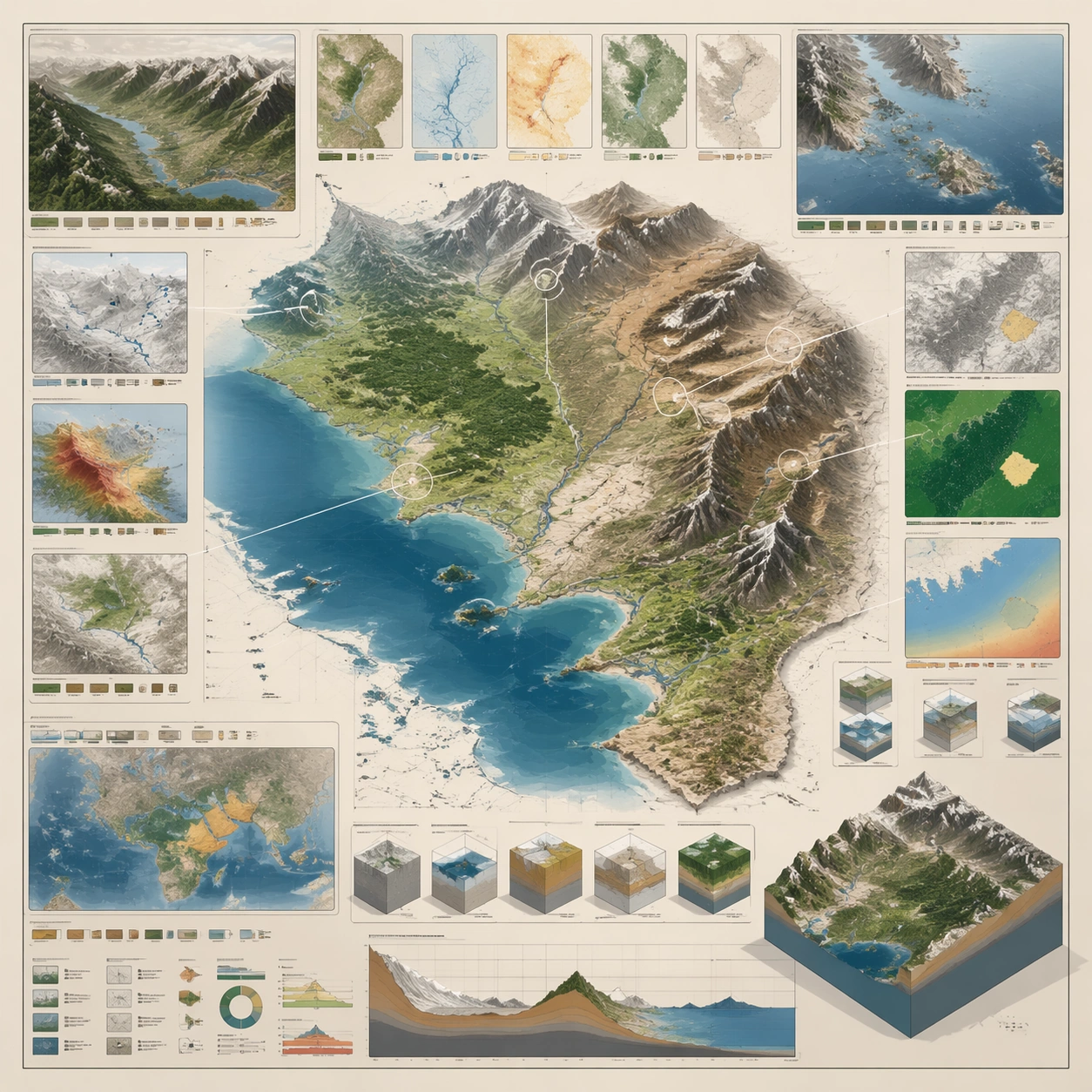
Example generated from “Annotated Map Design — Cutaway Panel”
GPT Image 2en

Scene: A square plate or board viewed straight-on, with crisp organization, disciplined spacing, and premium print clarity. Build the frame around a cutaway or sectional treatment that reveals interior logic without sacrificing readability. Keep the lighting, camera distance, and spatial organization tuned for a high-signal research image rather than a casual snapshot. The image belongs to the Annotated Map Design theme and should feel immediately legible as a prompt atlas theme for annotated map design, testing structured-layout, photorealism, technical-diagram, world-knowledge, reasoning-composition with gpt image 2.. Subject: Center the study on a cutaway or sectional treatment that reveals interior logic without sacrificing readability. Translate the theme into a concrete visual statement instead of an abstract mood board: the viewer should understand what kind of image this is, what is being tested, and why the composition is difficult. Use the slug idea of annotated map design as a literal guide for subject matter, materials, and staging. Important details: The image should communicate logic through grouping, hierarchy, callouts, insets, and believable professional layout discipline rather than decorative noise. Preserve a disciplined square composition, clear focal hierarchy, and enough secondary information to make the image feel complete rather than underspecified. The image should look polished, novel, and exhibition-ready, with topic-specific credibility coming from the way surfaces, structure, and visual language reinforce Annotated Map Design. Avoid generic filler elements that do not serve the main concept. Use case: Annotated Map Design single study 2/8, testing structured-layout, photorealism, technical-diagram, world-knowledge, reasoning-composition through the cutaway panel variation. Constraints: No readable text, no watermark, no logos, preserve exact 1:1 aspect ratio, no readable labels, no messy arrows, no random infographic decoration, no fake UI chrome unless the topic calls for it, no broken alignment, no meaningless clutter.
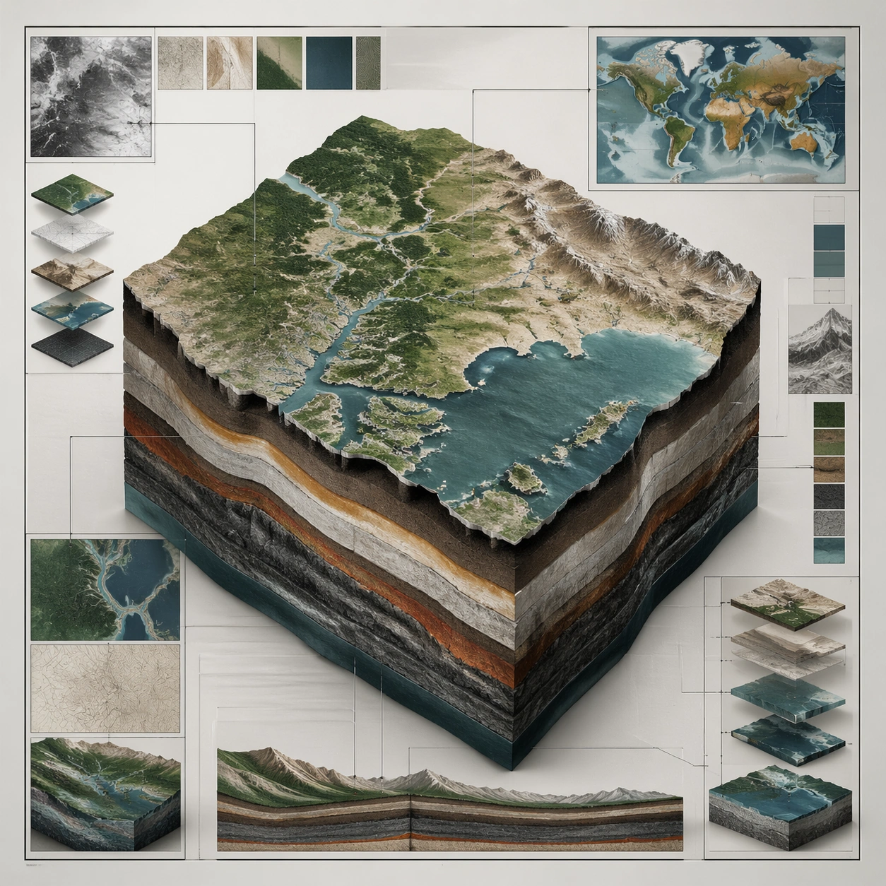
Example generated from “Annotated Map Design — Process Sequence”
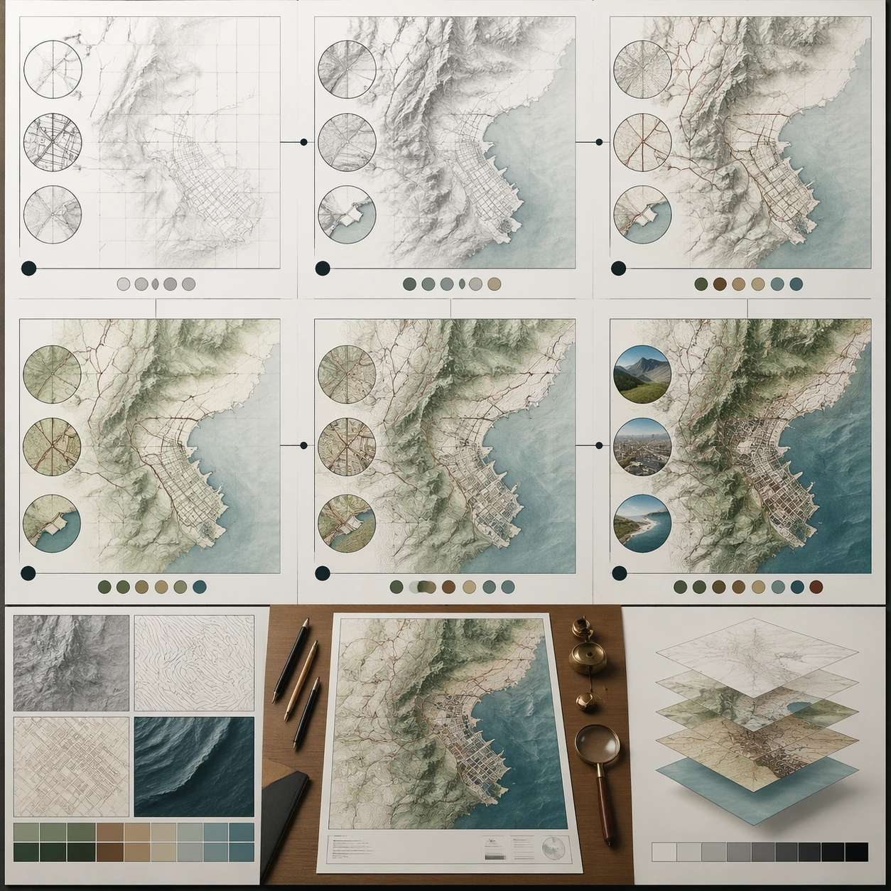
GPT Image 2en

Scene: A square plate or board viewed straight-on, with crisp organization, disciplined spacing, and premium print clarity. Build the frame around a sequence of stages or states arranged in a disciplined progression. Keep the lighting, camera distance, and spatial organization tuned for a high-signal research image rather than a casual snapshot. The image belongs to the Annotated Map Design theme and should feel immediately legible as a prompt atlas theme for annotated map design, testing structured-layout, photorealism, technical-diagram, world-knowledge, reasoning-composition with gpt image 2.. Subject: Center the study on a sequence of stages or states arranged in a disciplined progression. Translate the theme into a concrete visual statement instead of an abstract mood board: the viewer should understand what kind of image this is, what is being tested, and why the composition is difficult. Use the slug idea of annotated map design as a literal guide for subject matter, materials, and staging. Important details: The image should communicate logic through grouping, hierarchy, callouts, insets, and believable professional layout discipline rather than decorative noise. Preserve a disciplined square composition, clear focal hierarchy, and enough secondary information to make the image feel complete rather than underspecified. The image should look polished, novel, and exhibition-ready, with topic-specific credibility coming from the way surfaces, structure, and visual language reinforce Annotated Map Design. Avoid generic filler elements that do not serve the main concept. Use case: Annotated Map Design single study 3/8, testing structured-layout, photorealism, technical-diagram, world-knowledge, reasoning-composition through the process sequence variation. Constraints: No readable text, no watermark, no logos, preserve exact 1:1 aspect ratio, no readable labels, no messy arrows, no random infographic decoration, no fake UI chrome unless the topic calls for it, no broken alignment, no meaningless clutter.
Example generated from “Annotated Map Design — Annotation Cluster”
GPT Image 2en

Scene: A square plate or board viewed straight-on, with crisp organization, disciplined spacing, and premium print clarity. Build the frame around dense callouts and side insets that feel scholarly while staying unreadable. Keep the lighting, camera distance, and spatial organization tuned for a high-signal research image rather than a casual snapshot. The image belongs to the Annotated Map Design theme and should feel immediately legible as a prompt atlas theme for annotated map design, testing structured-layout, photorealism, technical-diagram, world-knowledge, reasoning-composition with gpt image 2.. Subject: Center the study on dense callouts and side insets that feel scholarly while staying unreadable. Translate the theme into a concrete visual statement instead of an abstract mood board: the viewer should understand what kind of image this is, what is being tested, and why the composition is difficult. Use the slug idea of annotated map design as a literal guide for subject matter, materials, and staging. Important details: The image should communicate logic through grouping, hierarchy, callouts, insets, and believable professional layout discipline rather than decorative noise. Preserve a disciplined square composition, clear focal hierarchy, and enough secondary information to make the image feel complete rather than underspecified. The image should look polished, novel, and exhibition-ready, with topic-specific credibility coming from the way surfaces, structure, and visual language reinforce Annotated Map Design. Avoid generic filler elements that do not serve the main concept. Use case: Annotated Map Design single study 4/8, testing structured-layout, photorealism, technical-diagram, world-knowledge, reasoning-composition through the annotation cluster variation. Constraints: No readable text, no watermark, no logos, preserve exact 1:1 aspect ratio, no readable labels, no messy arrows, no random infographic decoration, no fake UI chrome unless the topic calls for it, no broken alignment, no meaningless clutter.
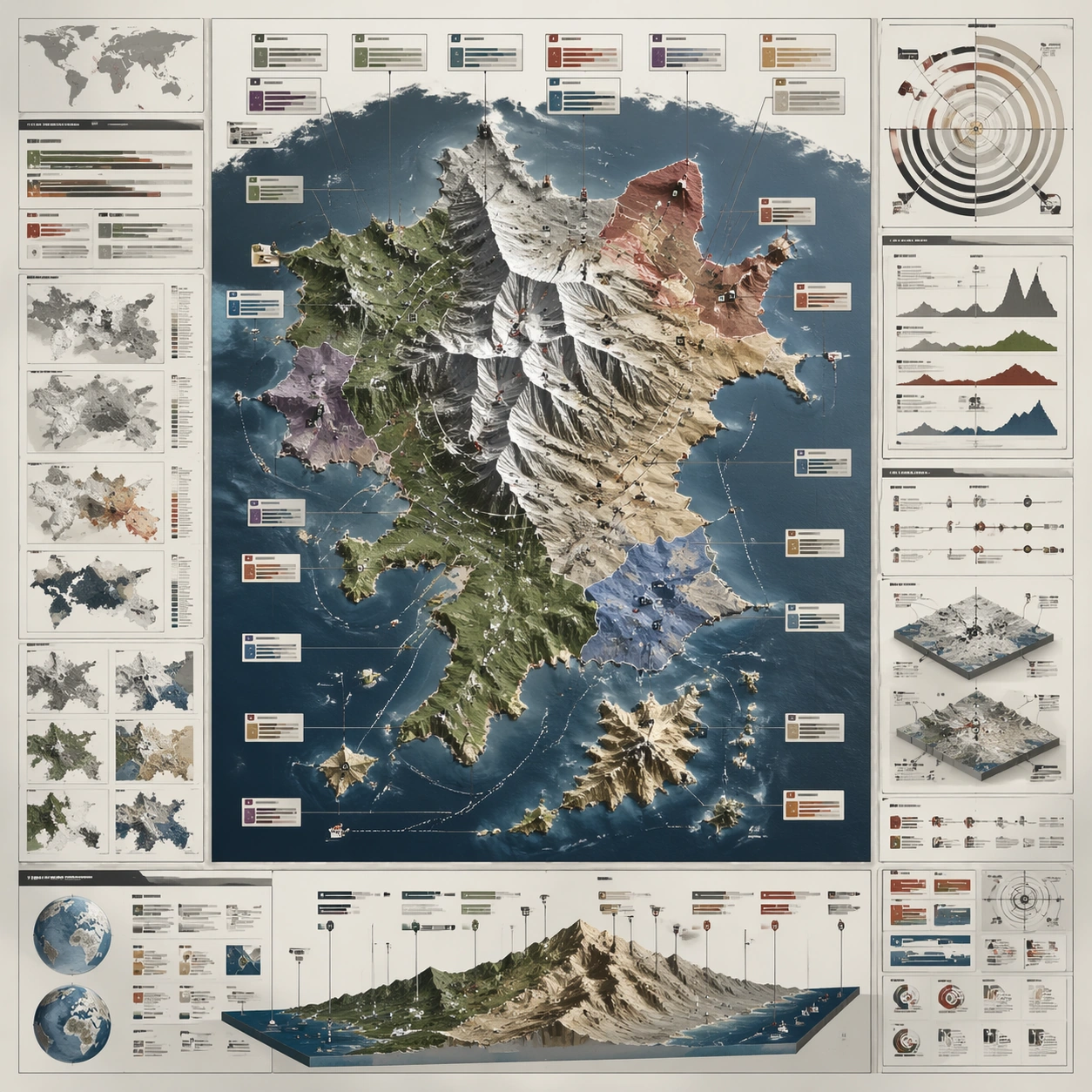
Example generated from “Annotated Map Design — Comparison Board”
GPT Image 2en

Scene: A square plate or board viewed straight-on, with crisp organization, disciplined spacing, and premium print clarity. Build the frame around a side-by-side comparison structure with strong contrast and equal visual weight. Keep the lighting, camera distance, and spatial organization tuned for a high-signal research image rather than a casual snapshot. The image belongs to the Annotated Map Design theme and should feel immediately legible as a prompt atlas theme for annotated map design, testing structured-layout, photorealism, technical-diagram, world-knowledge, reasoning-composition with gpt image 2.. Subject: Center the study on a side-by-side comparison structure with strong contrast and equal visual weight. Translate the theme into a concrete visual statement instead of an abstract mood board: the viewer should understand what kind of image this is, what is being tested, and why the composition is difficult. Use the slug idea of annotated map design as a literal guide for subject matter, materials, and staging. Important details: The image should communicate logic through grouping, hierarchy, callouts, insets, and believable professional layout discipline rather than decorative noise. Preserve a disciplined square composition, clear focal hierarchy, and enough secondary information to make the image feel complete rather than underspecified. The image should look polished, novel, and exhibition-ready, with topic-specific credibility coming from the way surfaces, structure, and visual language reinforce Annotated Map Design. Avoid generic filler elements that do not serve the main concept. Use case: Annotated Map Design single study 5/8, testing structured-layout, photorealism, technical-diagram, world-knowledge, reasoning-composition through the comparison board variation. Constraints: No readable text, no watermark, no logos, preserve exact 1:1 aspect ratio, no readable labels, no messy arrows, no random infographic decoration, no fake UI chrome unless the topic calls for it, no broken alignment, no meaningless clutter.
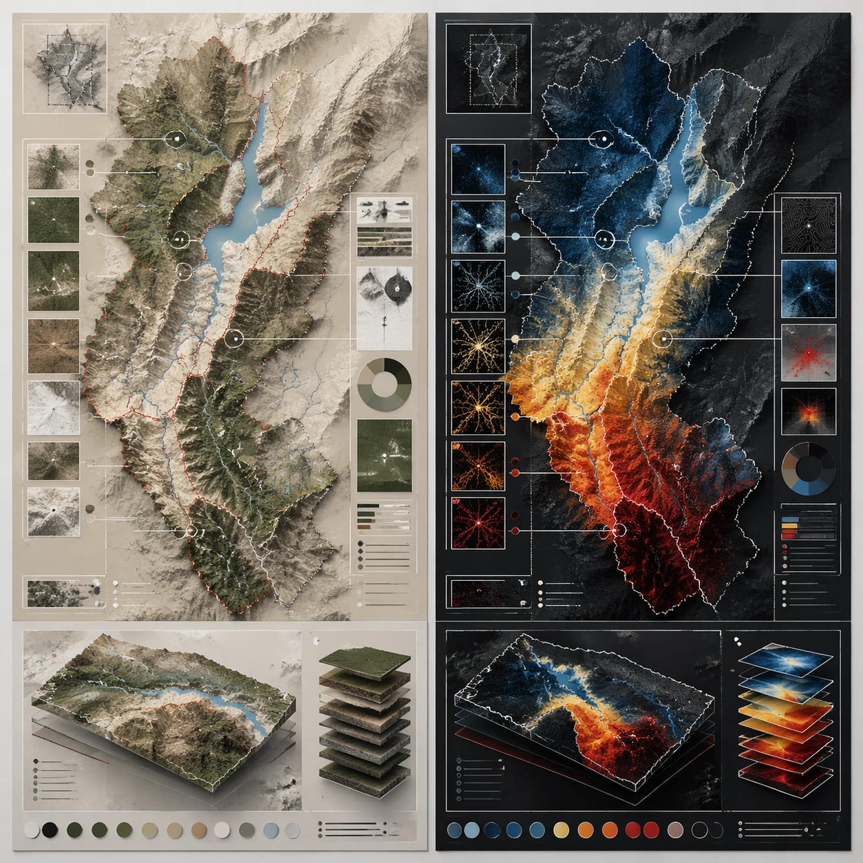
Example generated from “Annotated Map Design — 材质标注”
GPT Image 2en

Scene: A square plate or board viewed straight-on, with crisp organization, disciplined spacing, and premium print clarity. Build the frame around specific texture or material evidence presented with controlled explanatory framing. Keep the lighting, camera distance, and spatial organization tuned for a high-signal research image rather than a casual snapshot. The image belongs to the Annotated Map Design theme and should feel immediately legible as a prompt atlas theme for annotated map design, testing structured-layout, photorealism, technical-diagram, world-knowledge, reasoning-composition with gpt image 2.. Subject: Center the study on specific texture or material evidence presented with controlled explanatory framing. Translate the theme into a concrete visual statement instead of an abstract mood board: the viewer should understand what kind of image this is, what is being tested, and why the composition is difficult. Use the slug idea of annotated map design as a literal guide for subject matter, materials, and staging. Important details: The image should communicate logic through grouping, hierarchy, callouts, insets, and believable professional layout discipline rather than decorative noise. Preserve a disciplined square composition, clear focal hierarchy, and enough secondary information to make the image feel complete rather than underspecified. The image should look polished, novel, and exhibition-ready, with topic-specific credibility coming from the way surfaces, structure, and visual language reinforce Annotated Map Design. Avoid generic filler elements that do not serve the main concept. Use case: Annotated Map Design single study 6/8, testing structured-layout, photorealism, technical-diagram, world-knowledge, reasoning-composition through the 材质标注 variation. Constraints: No readable text, no watermark, no logos, preserve exact 1:1 aspect ratio, no readable labels, no messy arrows, no random infographic decoration, no fake UI chrome unless the topic calls for it, no broken alignment, no meaningless clutter.
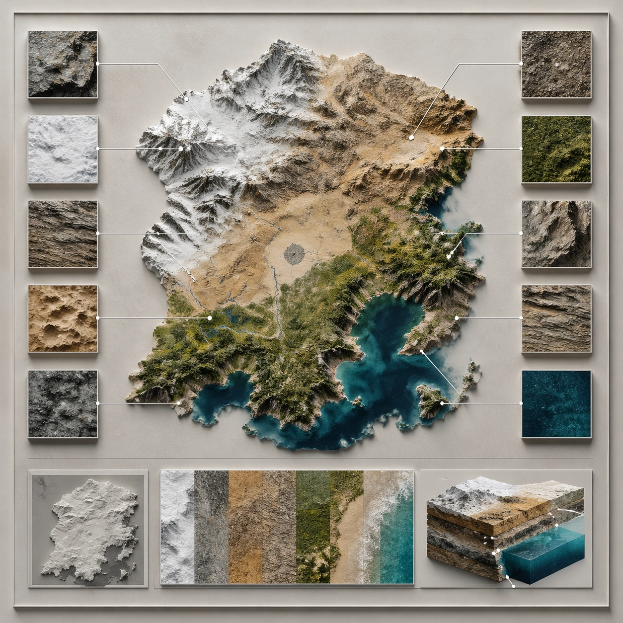
Example generated from “Annotated Map Design — Exploded System”
GPT Image 2en

Scene: A square plate or board viewed straight-on, with crisp organization, disciplined spacing, and premium print clarity. Build the frame around components separated clearly enough to reveal construction and dependency. Keep the lighting, camera distance, and spatial organization tuned for a high-signal research image rather than a casual snapshot. The image belongs to the Annotated Map Design theme and should feel immediately legible as a prompt atlas theme for annotated map design, testing structured-layout, photorealism, technical-diagram, world-knowledge, reasoning-composition with gpt image 2.. Subject: Center the study on components separated clearly enough to reveal construction and dependency. Translate the theme into a concrete visual statement instead of an abstract mood board: the viewer should understand what kind of image this is, what is being tested, and why the composition is difficult. Use the slug idea of annotated map design as a literal guide for subject matter, materials, and staging. Important details: The image should communicate logic through grouping, hierarchy, callouts, insets, and believable professional layout discipline rather than decorative noise. Preserve a disciplined square composition, clear focal hierarchy, and enough secondary information to make the image feel complete rather than underspecified. The image should look polished, novel, and exhibition-ready, with topic-specific credibility coming from the way surfaces, structure, and visual language reinforce Annotated Map Design. Avoid generic filler elements that do not serve the main concept. Use case: Annotated Map Design single study 7/8, testing structured-layout, photorealism, technical-diagram, world-knowledge, reasoning-composition through the exploded system variation. Constraints: No readable text, no watermark, no logos, preserve exact 1:1 aspect ratio, no readable labels, no messy arrows, no random infographic decoration, no fake UI chrome unless the topic calls for it, no broken alignment, no meaningless clutter.
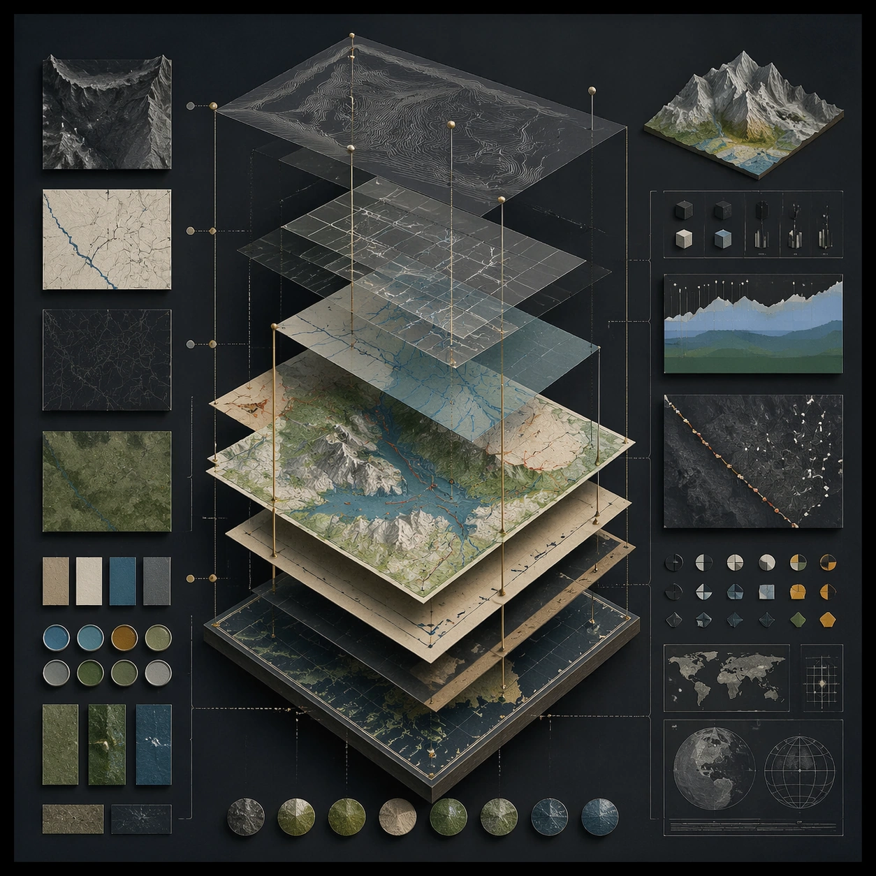
Example generated from “Annotated Map Design — Final Plate”
GPT Image 2en

Scene: A square plate or board viewed straight-on, with crisp organization, disciplined spacing, and premium print clarity. Build the frame around a polished final technical plate that feels ready for a research deck or exhibition wall. Keep the lighting, camera distance, and spatial organization tuned for a high-signal research image rather than a casual snapshot. The image belongs to the Annotated Map Design theme and should feel immediately legible as a prompt atlas theme for annotated map design, testing structured-layout, photorealism, technical-diagram, world-knowledge, reasoning-composition with gpt image 2.. Subject: Center the study on a polished final technical plate that feels ready for a research deck or exhibition wall. Translate the theme into a concrete visual statement instead of an abstract mood board: the viewer should understand what kind of image this is, what is being tested, and why the composition is difficult. Use the slug idea of annotated map design as a literal guide for subject matter, materials, and staging. Important details: The image should communicate logic through grouping, hierarchy, callouts, insets, and believable professional layout discipline rather than decorative noise. Preserve a disciplined square composition, clear focal hierarchy, and enough secondary information to make the image feel complete rather than underspecified. The image should look polished, novel, and exhibition-ready, with topic-specific credibility coming from the way surfaces, structure, and visual language reinforce Annotated Map Design. Avoid generic filler elements that do not serve the main concept. Use case: Annotated Map Design single study 8/8, testing structured-layout, photorealism, technical-diagram, world-knowledge, reasoning-composition through the final plate variation. Constraints: No readable text, no watermark, no logos, preserve exact 1:1 aspect ratio, no readable labels, no messy arrows, no random infographic decoration, no fake UI chrome unless the topic calls for it, no broken alignment, no meaningless clutter.
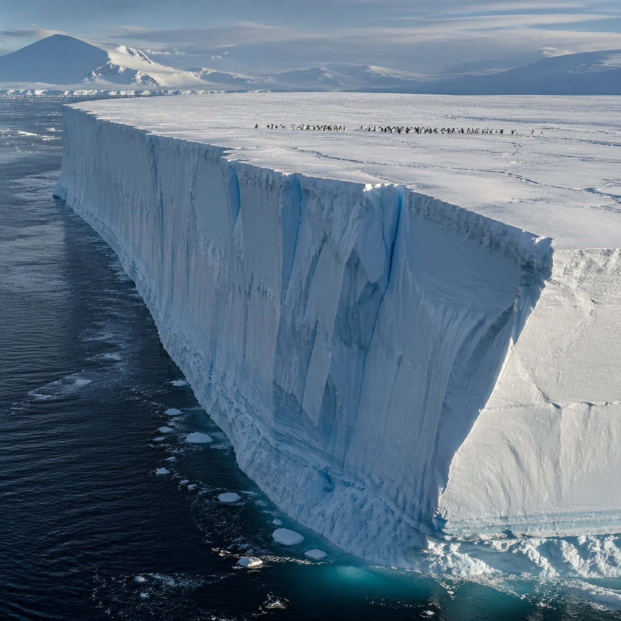
Example generated from “Antarctic Tabular Iceberg — Aerial Geometry”
GPT Image 2en

Scene: Create a square, photoreal landscape study of antarctic tabular iceberg. Compose it as the planform geometry and overall shape logic of the landscape, using an elevated oblique aerial view that still preserves believable scale and natural topography. Let light reveal contour, fracture, and pattern instead of flattening the terrain Keep the frame cinematic but disciplined, with a clear foreground, middle distance, and far mass so the viewer can measure real depth. The image should feel like a field photograph made with patience, precision, and sublime restraint rather than a fantasy matte painting. Subject: Show a vast Antarctic tabular iceberg adrift at sea, with one side dropping in a near-vertical ice cliff, blue fracture lines, open polar water, and a tiny penguin colony visible on the flat top. This variation should emphasize aerial scale read. The main landform must dominate the composition, but secondary elements should quietly explain how the place works: water paths, sediment lines, snow bands, surf, ash, wind streaks, stars, or human traces where appropriate. Everything in the image should support the same idea of scale and climate, so the scene reads as one coherent environment rather than a stack of spectacular details. Important details: Preserve rectilinear iceberg geometry, sharp ice-edge scale, cold polar clarity, faint blue internal compression bands, and the unsettling simplicity of a floating frozen plateau. Emphasize rhythm, repetition, and large-form geometry without losing physical realism. Keep geology, weather, and atmosphere physically believable. Use subtle micro-texture, tonal separation, and air perspective to reinforce distance. If a human, vehicle, tent, caravan, bird, or boat appears, it must remain tiny and subordinate to the landscape, functioning only as a scale witness. The composition should feel original, severe, and elegant, with no decorative filler and no imitation of any copyrighted visual property. Use case: Antarctic Tabular Iceberg single study 3/9, exploring the aerial scale read variation. Constraints: No readable text, no watermark, no logos, preserve exact 1:1 aspect ratio, no research station, no cruise liner, no aurora curtains, no whimsical cartoon penguins, no map labels, no diagram arrows, no satellite-interface graphics, no kitsch color grading, no artificial border, no split-panel treatment.
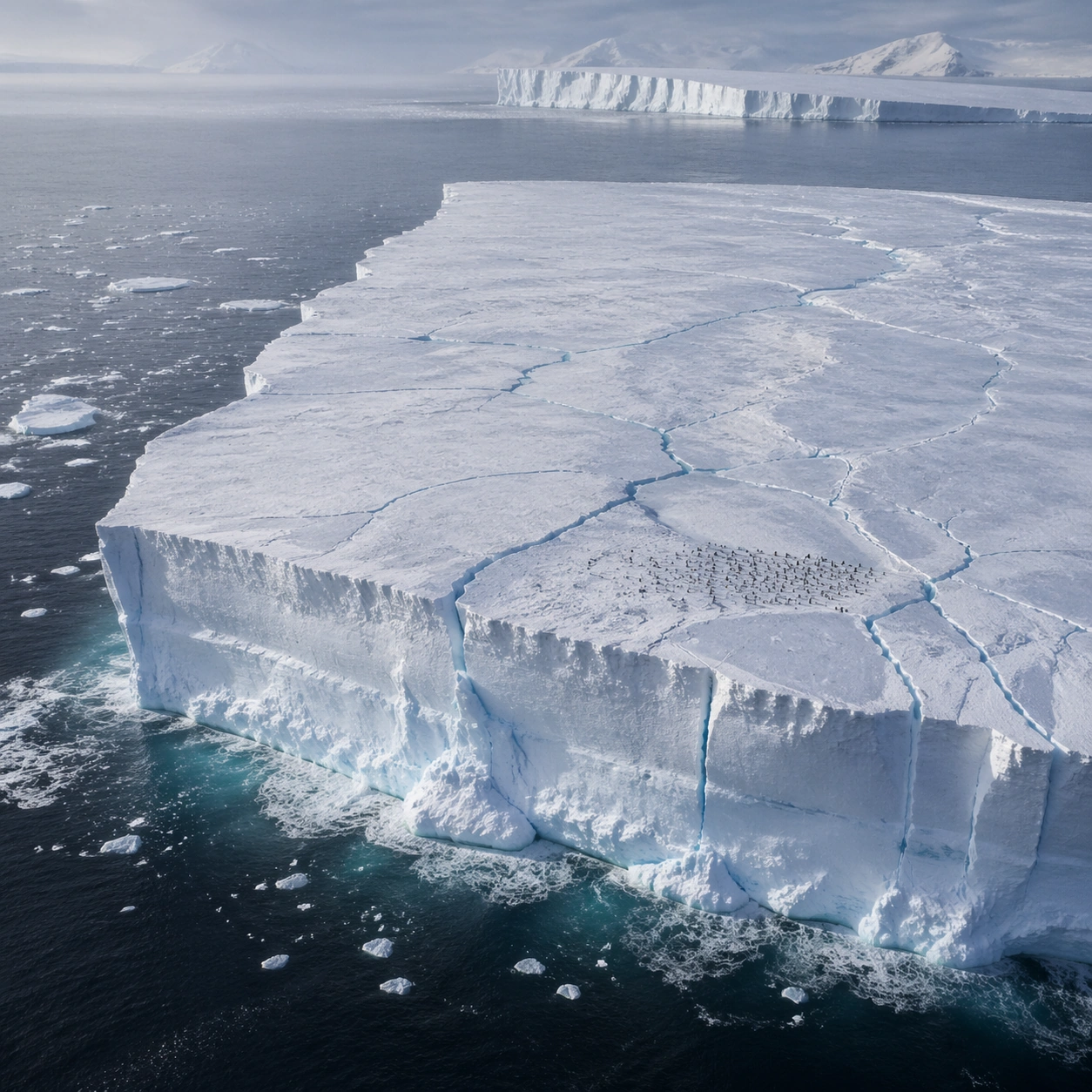
Example generated from “Antarctic Tabular Iceberg — Atmosphere Event”
GPT Image 2en

Scene: Create a square, photoreal landscape study of antarctic tabular iceberg. Compose it as the moment when weather, particles, or moving air become the main dramatic agent, using a stable documentary framing that lets the environmental event stay legible. Let the air itself carry visible density through haze, spray, ash, dust, snow, or storm structure Keep the frame cinematic but disciplined, with a clear foreground, middle distance, and far mass so the viewer can measure real depth. The image should feel like a field photograph made with patience, precision, and sublime restraint rather than a fantasy matte painting. Subject: Show a vast Antarctic tabular iceberg adrift at sea, with one side dropping in a near-vertical ice cliff, blue fracture lines, open polar water, and a tiny penguin colony visible on the flat top. This variation should emphasize weather-driven study. The main landform must dominate the composition, but secondary elements should quietly explain how the place works: water paths, sediment lines, snow bands, surf, ash, wind streaks, stars, or human traces where appropriate. Everything in the image should support the same idea of scale and climate, so the scene reads as one coherent environment rather than a stack of spectacular details. Important details: Preserve rectilinear iceberg geometry, sharp ice-edge scale, cold polar clarity, faint blue internal compression bands, and the unsettling simplicity of a floating frozen plateau. The atmosphere must feel physically plausible and tied to terrain, wind direction, temperature, and moisture. Keep geology, weather, and atmosphere physically believable. Use subtle micro-texture, tonal separation, and air perspective to reinforce distance. If a human, vehicle, tent, caravan, bird, or boat appears, it must remain tiny and subordinate to the landscape, functioning only as a scale witness. The composition should feel original, severe, and elegant, with no decorative filler and no imitation of any copyrighted visual property. Use case: Antarctic Tabular Iceberg single study 4/9, exploring the weather-driven study variation. Constraints: No readable text, no watermark, no logos, preserve exact 1:1 aspect ratio, no research station, no cruise liner, no aurora curtains, no whimsical cartoon penguins, no disaster-movie excess, no impossible lightning clutter, no synthetic smoke plumes, no kitsch color grading, no artificial border, no split-panel treatment.

Example generated from “Antarctic Tabular Iceberg — Light Contrast”
GPT Image 2en

Scene: Create a square, photoreal landscape study of antarctic tabular iceberg. Compose it as directional light carving sharp separation between illuminated and shadowed forms, using a composition built around light falloff, shadow shape, and reflective control rather than camera gimmicks. Let one strong light source create crisp hierarchy and believable color temperature shifts Keep the frame cinematic but disciplined, with a clear foreground, middle distance, and far mass so the viewer can measure real depth. The image should feel like a field photograph made with patience, precision, and sublime restraint rather than a fantasy matte painting. Subject: Show a vast Antarctic tabular iceberg adrift at sea, with one side dropping in a near-vertical ice cliff, blue fracture lines, open polar water, and a tiny penguin colony visible on the flat top. This variation should emphasize light-structure study. The main landform must dominate the composition, but secondary elements should quietly explain how the place works: water paths, sediment lines, snow bands, surf, ash, wind streaks, stars, or human traces where appropriate. Everything in the image should support the same idea of scale and climate, so the scene reads as one coherent environment rather than a stack of spectacular details. Important details: Preserve rectilinear iceberg geometry, sharp ice-edge scale, cold polar clarity, faint blue internal compression bands, and the unsettling simplicity of a floating frozen plateau. Surface brightness, shadow depth, and reflected light should all agree with the material and weather conditions. Keep geology, weather, and atmosphere physically believable. Use subtle micro-texture, tonal separation, and air perspective to reinforce distance. If a human, vehicle, tent, caravan, bird, or boat appears, it must remain tiny and subordinate to the landscape, functioning only as a scale witness. The composition should feel original, severe, and elegant, with no decorative filler and no imitation of any copyrighted visual property. Use case: Antarctic Tabular Iceberg single study 5/9, exploring the light-structure study variation. Constraints: No readable text, no watermark, no logos, preserve exact 1:1 aspect ratio, no research station, no cruise liner, no aurora curtains, no whimsical cartoon penguins, no blown highlights, no muddy blacks, no theatrical stage lighting, no kitsch color grading, no artificial border, no split-panel treatment.

Example generated from “Antarctic Tabular Iceberg — Material Close”
GPT Image 2en

Scene: Create a square, photoreal landscape study of antarctic tabular iceberg. Compose it as surface texture and material transitions while still keeping the full environment recognizable, using a tighter medium-wide crop that gives more area to texture, fracture, grain, water, ice, lava, salt, or stone. Let texture remain readable without making the scene feel like a macro shot Keep the frame cinematic but disciplined, with a clear foreground, middle distance, and far mass so the viewer can measure real depth. The image should feel like a field photograph made with patience, precision, and sublime restraint rather than a fantasy matte painting. Subject: Show a vast Antarctic tabular iceberg adrift at sea, with one side dropping in a near-vertical ice cliff, blue fracture lines, open polar water, and a tiny penguin colony visible on the flat top. This variation should emphasize material realism check. The main landform must dominate the composition, but secondary elements should quietly explain how the place works: water paths, sediment lines, snow bands, surf, ash, wind streaks, stars, or human traces where appropriate. Everything in the image should support the same idea of scale and climate, so the scene reads as one coherent environment rather than a stack of spectacular details. Important details: Preserve rectilinear iceberg geometry, sharp ice-edge scale, cold polar clarity, faint blue internal compression bands, and the unsettling simplicity of a floating frozen plateau. Micro-texture, edge wear, wetness, frost, dust, foam, or sediment should deepen realism rather than distract from scale. Keep geology, weather, and atmosphere physically believable. Use subtle micro-texture, tonal separation, and air perspective to reinforce distance. If a human, vehicle, tent, caravan, bird, or boat appears, it must remain tiny and subordinate to the landscape, functioning only as a scale witness. The composition should feel original, severe, and elegant, with no decorative filler and no imitation of any copyrighted visual property. Use case: Antarctic Tabular Iceberg single study 6/9, exploring the material realism check variation. Constraints: No readable text, no watermark, no logos, preserve exact 1:1 aspect ratio, no research station, no cruise liner, no aurora curtains, no whimsical cartoon penguins, no extreme macro abstraction, no plastic-looking surfaces, no shallow depth-of-field blur, no kitsch color grading, no artificial border, no split-panel treatment.

Example generated from “Antarctic Tabular Iceberg — Scale Witness”
GPT Image 2en

Scene: Create a square, photoreal landscape study of antarctic tabular iceberg. Compose it as a tiny human, animal, tent, vehicle, or craft that reveals the vastness of the environment, using a balanced frame where the witness remains small but unmistakable. Let the scale marker stay visible without becoming the true subject Keep the frame cinematic but disciplined, with a clear foreground, middle distance, and far mass so the viewer can measure real depth. The image should feel like a field photograph made with patience, precision, and sublime restraint rather than a fantasy matte painting. Subject: Show a vast Antarctic tabular iceberg adrift at sea, with one side dropping in a near-vertical ice cliff, blue fracture lines, open polar water, and a tiny penguin colony visible on the flat top. This variation should emphasize scale comparison. The main landform must dominate the composition, but secondary elements should quietly explain how the place works: water paths, sediment lines, snow bands, surf, ash, wind streaks, stars, or human traces where appropriate. Everything in the image should support the same idea of scale and climate, so the scene reads as one coherent environment rather than a stack of spectacular details. Important details: Preserve rectilinear iceberg geometry, sharp ice-edge scale, cold polar clarity, faint blue internal compression bands, and the unsettling simplicity of a floating frozen plateau. The viewer should understand the environment first and the witness second, with clean spatial separation between them. Keep geology, weather, and atmosphere physically believable. Use subtle micro-texture, tonal separation, and air perspective to reinforce distance. If a human, vehicle, tent, caravan, bird, or boat appears, it must remain tiny and subordinate to the landscape, functioning only as a scale witness. The composition should feel original, severe, and elegant, with no decorative filler and no imitation of any copyrighted visual property. Use case: Antarctic Tabular Iceberg single study 7/9, exploring the scale comparison variation. Constraints: No readable text, no watermark, no logos, preserve exact 1:1 aspect ratio, no research station, no cruise liner, no aurora curtains, no whimsical cartoon penguins, no crowd scenes, no heroic close-up character framing, no busy gear pile, no kitsch color grading, no artificial border, no split-panel treatment.

Example generated from “Antarctic Tabular Iceberg — Abstract Rhythm”
GPT Image 2en

Scene: Create a square, photoreal landscape study of antarctic tabular iceberg. Compose it as the near-abstract rhythm of repeated natural forms, lines, and tonal bands, using a disciplined crop that approaches abstraction while remaining unmistakably a real place. Let shape and tonal cadence dominate before small narrative details Keep the frame cinematic but disciplined, with a clear foreground, middle distance, and far mass so the viewer can measure real depth. The image should feel like a field photograph made with patience, precision, and sublime restraint rather than a fantasy matte painting. Subject: Show a vast Antarctic tabular iceberg adrift at sea, with one side dropping in a near-vertical ice cliff, blue fracture lines, open polar water, and a tiny penguin colony visible on the flat top. This variation should emphasize formal composition study. The main landform must dominate the composition, but secondary elements should quietly explain how the place works: water paths, sediment lines, snow bands, surf, ash, wind streaks, stars, or human traces where appropriate. Everything in the image should support the same idea of scale and climate, so the scene reads as one coherent environment rather than a stack of spectacular details. Important details: Preserve rectilinear iceberg geometry, sharp ice-edge scale, cold polar clarity, faint blue internal compression bands, and the unsettling simplicity of a floating frozen plateau. Pattern, repetition, and negative space should feel discovered in nature, not graphically imposed. Keep geology, weather, and atmosphere physically believable. Use subtle micro-texture, tonal separation, and air perspective to reinforce distance. If a human, vehicle, tent, caravan, bird, or boat appears, it must remain tiny and subordinate to the landscape, functioning only as a scale witness. The composition should feel original, severe, and elegant, with no decorative filler and no imitation of any copyrighted visual property. Use case: Antarctic Tabular Iceberg single study 8/9, exploring the formal composition study variation. Constraints: No readable text, no watermark, no logos, preserve exact 1:1 aspect ratio, no research station, no cruise liner, no aurora curtains, no whimsical cartoon penguins, no graphic overlays, no surreal floating elements, no ornamental symmetry cheats, no kitsch color grading, no artificial border, no split-panel treatment.

Example generated from “Antarctic Tabular Iceberg — Final Iconic”
GPT Image 2en

Scene: Create a square, photoreal landscape study of antarctic tabular iceberg. Compose it as the cleanest, most iconic summary of the whole landscape idea, using a distilled composition with one unforgettable silhouette or mass relationship and generous breathing room. Let the scene resolve into a memorable final image with strong legibility at thumbnail size Keep the frame cinematic but disciplined, with a clear foreground, middle distance, and far mass so the viewer can measure real depth. The image should feel like a field photograph made with patience, precision, and sublime restraint rather than a fantasy matte painting. Subject: Show a vast Antarctic tabular iceberg adrift at sea, with one side dropping in a near-vertical ice cliff, blue fracture lines, open polar water, and a tiny penguin colony visible on the flat top. This variation should emphasize iconic final plate. The main landform must dominate the composition, but secondary elements should quietly explain how the place works: water paths, sediment lines, snow bands, surf, ash, wind streaks, stars, or human traces where appropriate. Everything in the image should support the same idea of scale and climate, so the scene reads as one coherent environment rather than a stack of spectacular details. Important details: Preserve rectilinear iceberg geometry, sharp ice-edge scale, cold polar clarity, faint blue internal compression bands, and the unsettling simplicity of a floating frozen plateau. Keep the frame spare, confident, and monumental, with every element earning its place. Keep geology, weather, and atmosphere physically believable. Use subtle micro-texture, tonal separation, and air perspective to reinforce distance. If a human, vehicle, tent, caravan, bird, or boat appears, it must remain tiny and subordinate to the landscape, functioning only as a scale witness. The composition should feel original, severe, and elegant, with no decorative filler and no imitation of any copyrighted visual property. Use case: Antarctic Tabular Iceberg single study 9/9, exploring the iconic final plate variation. Constraints: No readable text, no watermark, no logos, preserve exact 1:1 aspect ratio, no research station, no cruise liner, no aurora curtains, no whimsical cartoon penguins, no cluttered edges, no competing focal points, no visual noise in empty space, no kitsch color grading, no artificial border, no split-panel treatment.

Example generated from “App Launch Hero System — Focus Streak Coach”
GPT Image 2en

Scene: A square mobile-app launch page with bright daylight tones, mint, coral, and soft navy accents, composed as a clean first-scroll marketing page. The frame should feel airy and optimistic, with rounded cards, large breathing room, and a subtle gradient halo behind the hero phone stack. Structure the layout so the top half reads as a conversion hero and the bottom half suggests habit metrics, social proof, and onboarding prompts. Subject: Show a trio of overlapping mobile screens for a focus and streak coaching app. The primary screen features a circular progress ring and a calm daily plan layout, the second shows streak history with illustrated badges, and the third suggests a small guided session timer. Surround the phone stack with abstract headline bars, a simple CTA pair, a horizontal row of feature chips, and a testimonial card with star-like dot icons. Add a faint abstract hero motif of looping ribbons forming a sunrise arc to reinforce momentum and repetition. Important details: The image needs to look like a real app launch page made by a strong product-marketing team. The device stack should be crisp and believable, while the surrounding modules create a convincing narrative from motivation to features to signup. Use consistent UI language and rounded-system components. All textual regions must remain unreadable, treated as elegant blocks and micro-glyph textures only. Preserve strong spacing discipline so the frame feels trustworthy and marketable instead of noisy or juvenile. Use case: App Launch Hero System single study 2/9, testing whether a wellness-style mobile launch page can balance cheerful hero art, app proof, and CTA hierarchy in one still. Constraints: No readable text, no watermark, no logos, preserve exact 1:1 aspect ratio, no smartwatch mockup, no cartoon mascot dominating the frame, no browser chrome, no cluttered notification spam, no fake app-store badges, no broken phone anatomy.

Example generated from “App Launch Hero System — Founder Finance Dashboard”
GPT Image 2en

Scene: A square fintech launch-page still with dark navy, graphite, and electric emerald highlights, arranged like a premium SaaS hero section with lower feature and pricing modules. The tone should be serious and investor-ready, with sharp grids, glowing chart accents, and one restrained gradient field behind the central dashboard. The page should feel as if it belongs to a real B2B startup about to launch publicly. Subject: Center a large desktop dashboard screenshot for a founder-finance planning app, showing a believable mix of forecast charts, runway curves, small cash buckets, and a timeline ribbon, all rendered as clean unreadable UI. Add a secondary tablet screen angled nearby to suggest collaborative review. Build a convincing launch-page structure around the product with abstract headline rows, a slim CTA strip, three feature modules, and a compact pricing or plan comparison band. Include a subtle hero graphic of luminous graph lines turning into a city skyline above the dashboard. Important details: The frame must read as a true SaaS launch page, not a raw dashboard screenshot. The marketing hierarchy matters: hero proof first, then benefits, trust, and conversion. Keep the UI plausible and restrained, with executive polish rather than playful startup clutter. All copy zones should remain abstract and unreadable, using bars, dots, and icon-like shapes only. Use precise alignment and whitespace so the layout feels like a real launch asset ready for a founder, growth team, and product designer to present together. Use case: App Launch Hero System single study 3/9, testing whether a finance SaaS page can balance complex dashboard proof with clean launch marketing hierarchy. Constraints: No readable text, no watermark, no logos, preserve exact 1:1 aspect ratio, no browser chrome, no crypto clichés, no stock-photo executives, no overloaded tiny charts, no banking brand references, no distorted screen perspective.