App Launch Hero System — Founder Finance Dashboard

App Launch Hero System — Founder Finance Dashboard

原始文档

GPT Image 2 · en

Scene:
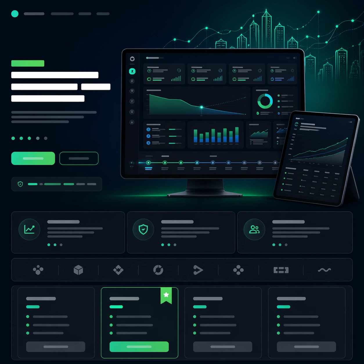
A square fintech launch-page still with dark navy, graphite, and electric emerald highlights, arranged like a premium SaaS hero section with lower feature and pricing modules. The tone should be serious and investor-ready, with sharp grids, glowing chart accents, and one restrained gradient field behind the central dashboard. The page should feel as if it belongs to a real B2B startup about to launch publicly.

Subject:
Center a large desktop dashboard screenshot for a founder-finance planning app, showing a believable mix of forecast charts, runway curves, small cash buckets, and a timeline ribbon, all rendered as clean unreadable UI. Add a secondary tablet screen angled nearby to suggest collaborative review. Build a convincing launch-page structure around the product with abstract headline rows, a slim CTA strip, three feature modules, and a compact pricing or plan comparison band. Include a subtle hero graphic of luminous graph lines turning into a city skyline above the dashboard.

Important details:
The frame must read as a true SaaS launch page, not a raw dashboard screenshot. The marketing hierarchy matters: hero proof first, then benefits, trust, and conversion. Keep the UI plausible and restrained, with executive polish rather than playful startup clutter. All copy zones should remain abstract and unreadable, using bars, dots, and icon-like shapes only. Use precise alignment and whitespace so the layout feels like a real launch asset ready for a founder, growth team, and product designer to present together.

Use case:
App Launch Hero System single study 3/9, testing whether a finance SaaS page can balance complex dashboard proof with clean launch marketing hierarchy.

Constraints:
No readable text, no watermark, no logos, preserve exact 1:1 aspect ratio, no browser chrome, no crypto clichés, no stock-photo executives, no overloaded tiny charts, no banking brand references, no distorted screen perspective.

使用方法

  1. 复制完整原始提示词,并保留其中的参数。
  2. 按需求替换主体、文字和构图要求。
  3. 在兼容的外部工具中使用,核对当前使用条件并检查结果。

开始前需了解

  • 先确认是否需要参考图。标注兼容模型,不代表该示例由这个模型生成。
  • 核对名称、数字与画面文字;不同模型版本的结果可能不同。

相似案例

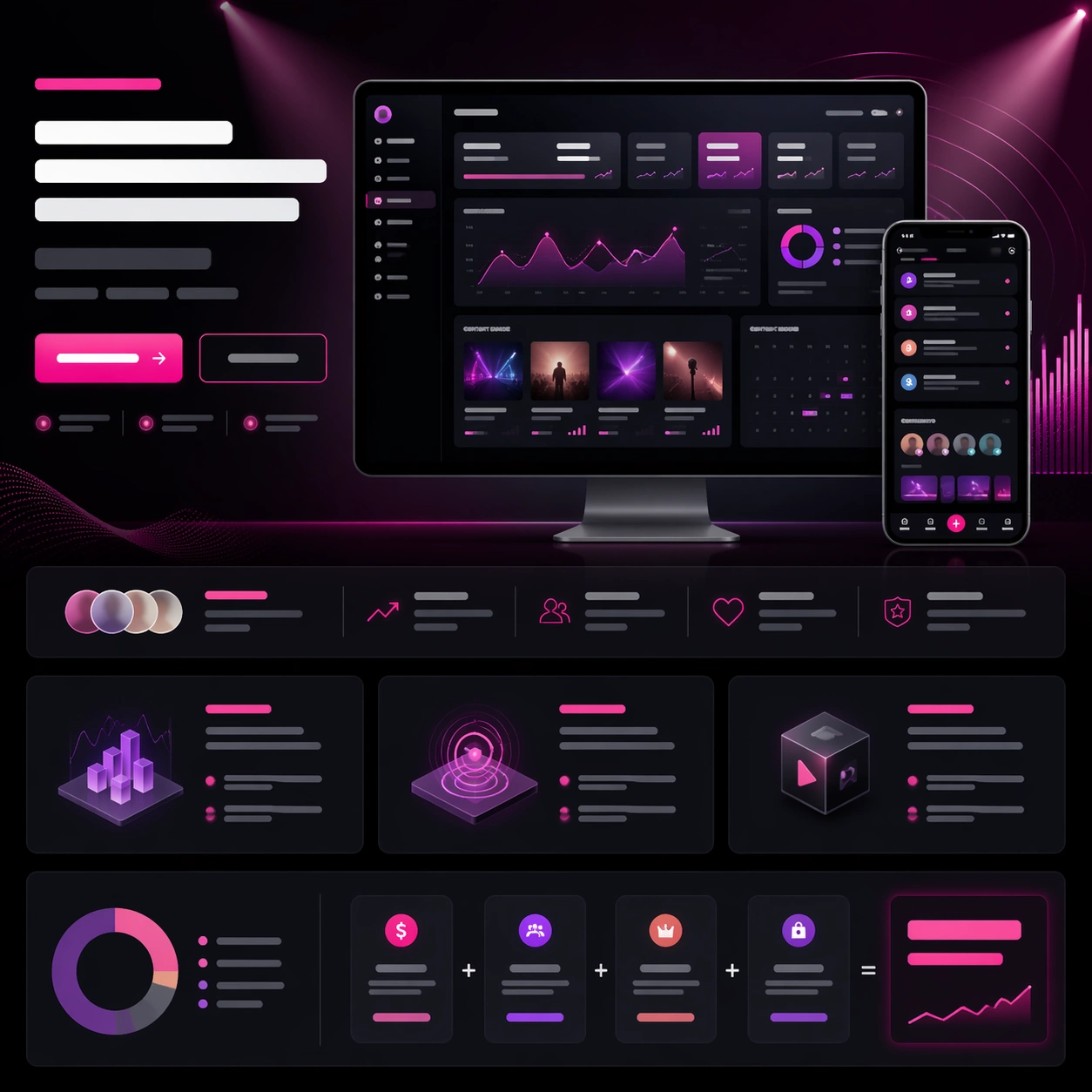
App Launch Hero System — Creator Analytics Portal
GPT Image 2en

Scene: A square creator-tool launch-page still with charcoal, plum, silver, and electric pink highlights, arranged as a polished web hero with lower storytelling bands. The tone should feel ambitious and media-savvy, with glowing chart accents, thumbnail-like content tiles, and a

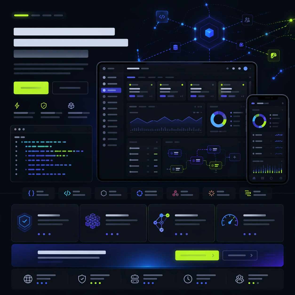
App Launch Hero System — Developer API Command Center
GPT Image 2en

Scene: A square developer-tool launch-page still with charcoal, indigo, ice blue, and vivid lime accents, styled like a serious API platform homepage. The page should feel technical and premium, with a clear hero zone, product screenshot cluster, lower feature modules, and a fina

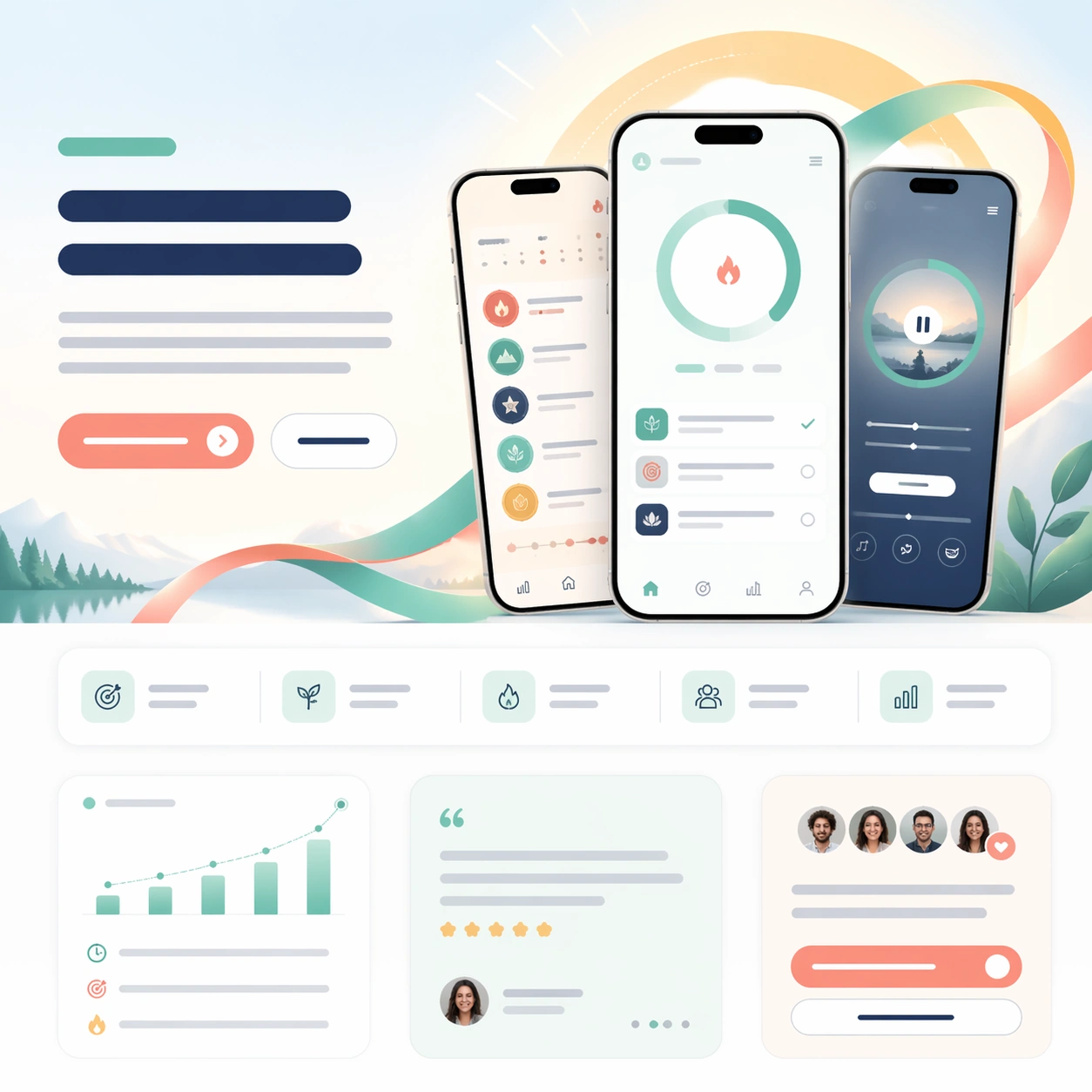
App Launch Hero System — Focus Streak Coach
GPT Image 2en

Scene: A square mobile-app launch page with bright daylight tones, mint, coral, and soft navy accents, composed as a clean first-scroll marketing page. The frame should feel airy and optimistic, with rounded cards, large breathing room, and a subtle gradient halo behind the hero

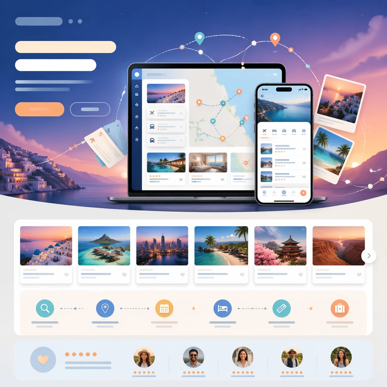
App Launch Hero System — Trip Planner Orbit
GPT Image 2en

Scene: A square travel-app launch-page still with twilight blue, sand, aqua, and sunset orange accents, composed like a premium consumer travel website. The frame should feel aspirational and lightweight, with layered cards, route arcs, and one atmospheric gradient behind the cen

App Launch Hero System — Clinic Wellness Companion
GPT Image 2en

Scene: A square health-tech launch-page still with warm white, sage, sea-glass, and muted coral tones, designed like a trusted care-platform website. The layout should be soft and reassuring but still commercial and precise, with a centered phone hero, supporting information card

App Launch Hero System — Design Review Canvas
GPT Image 2en

Scene: A square software launch-page still with cool white, lavender gray, cobalt, and signal orange accents, composed like a premium design-tool website first screen with supporting sections below. Use a clean studio background, floating panels, and carefully spaced interface la