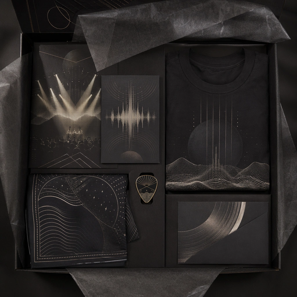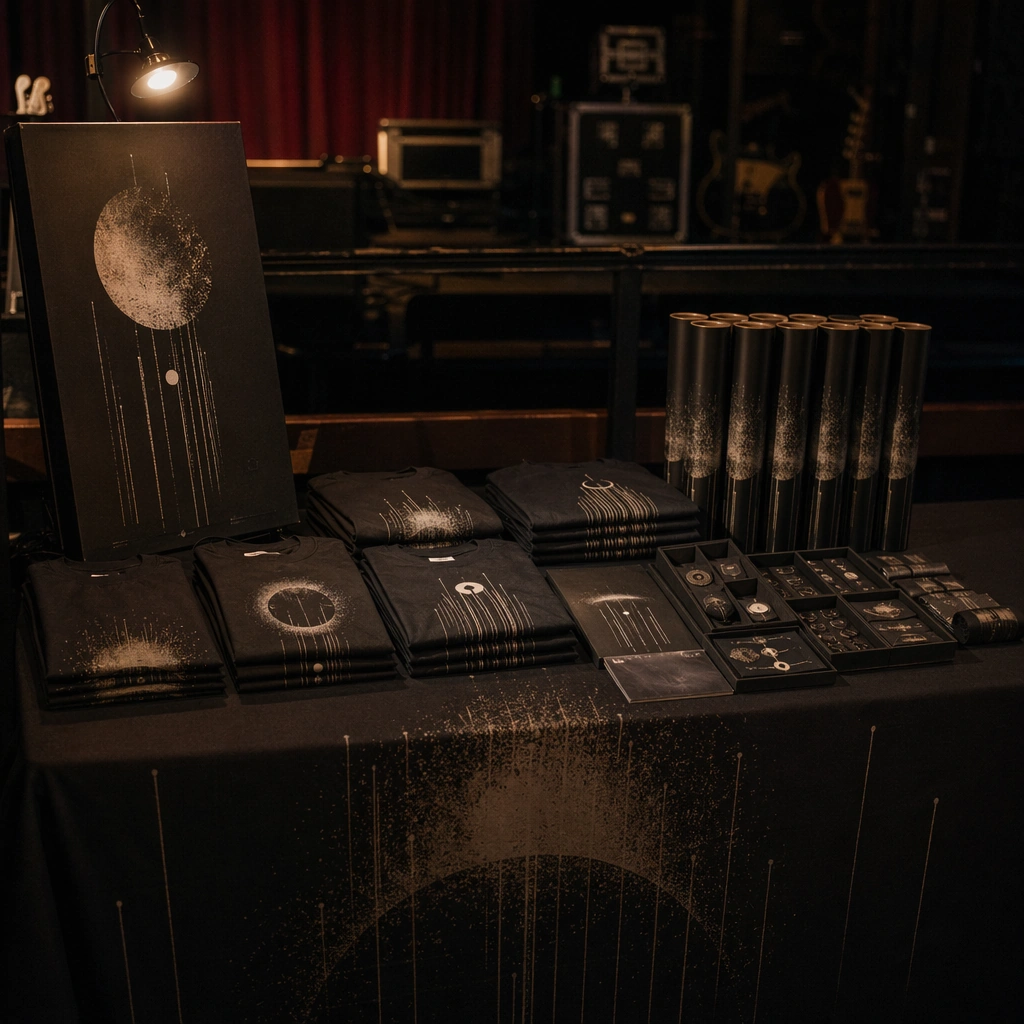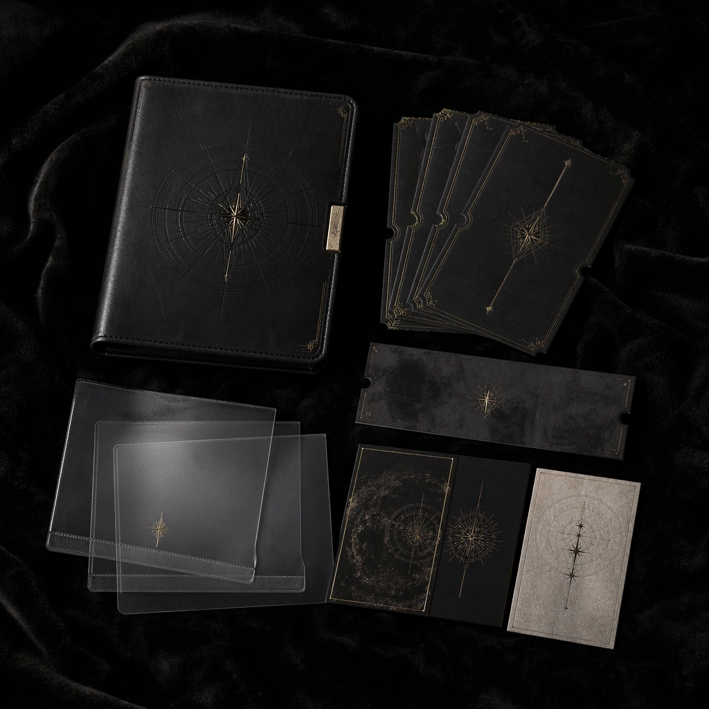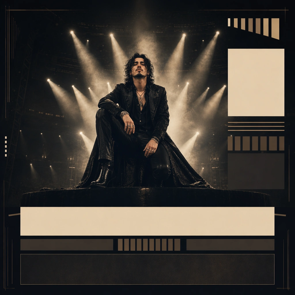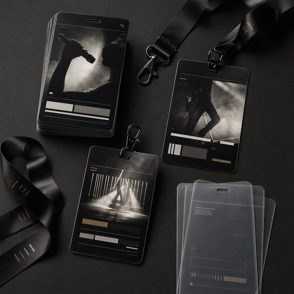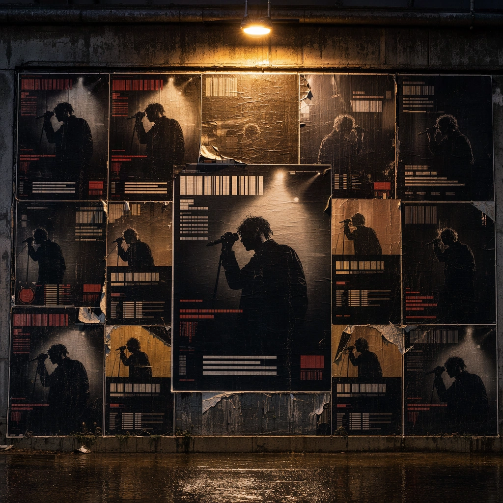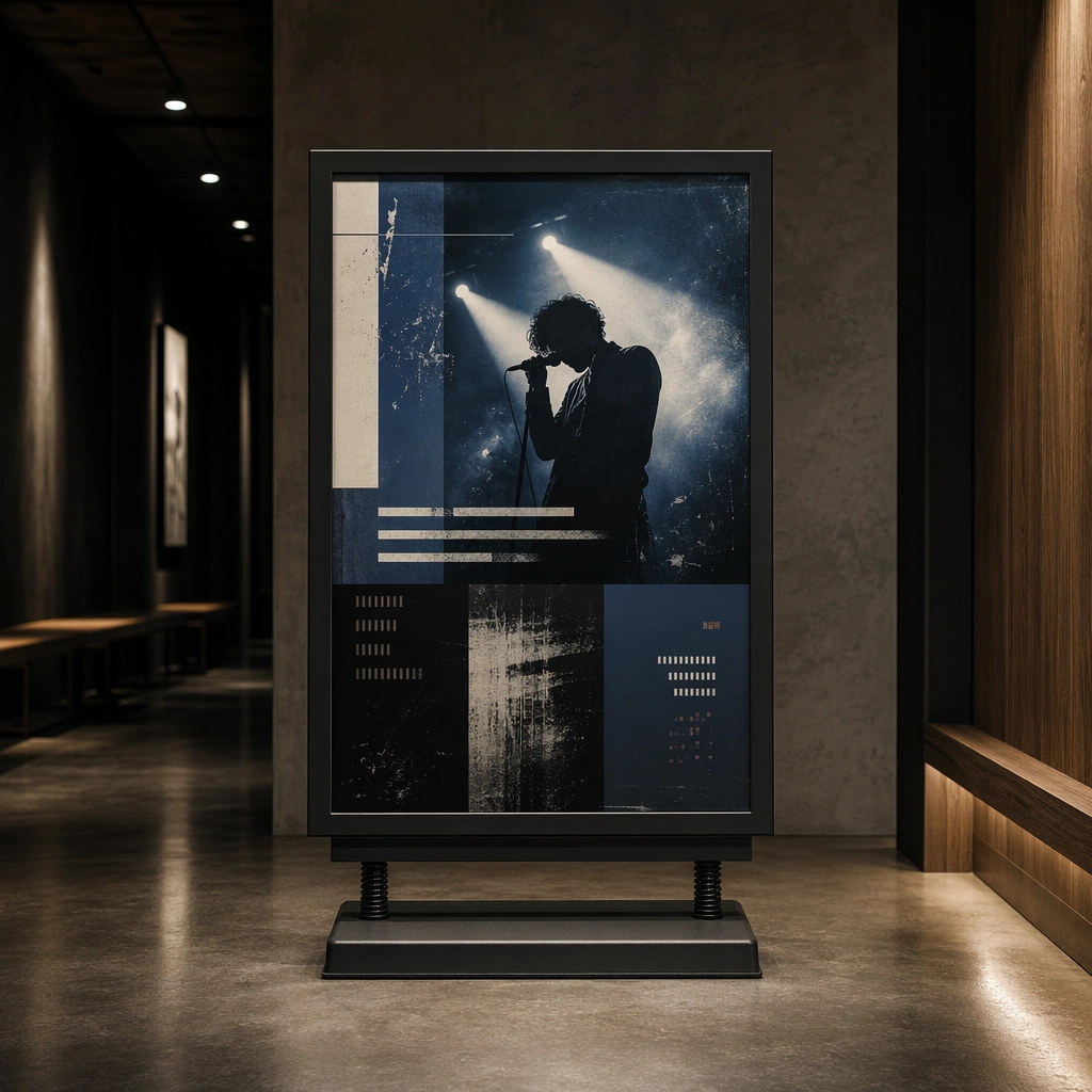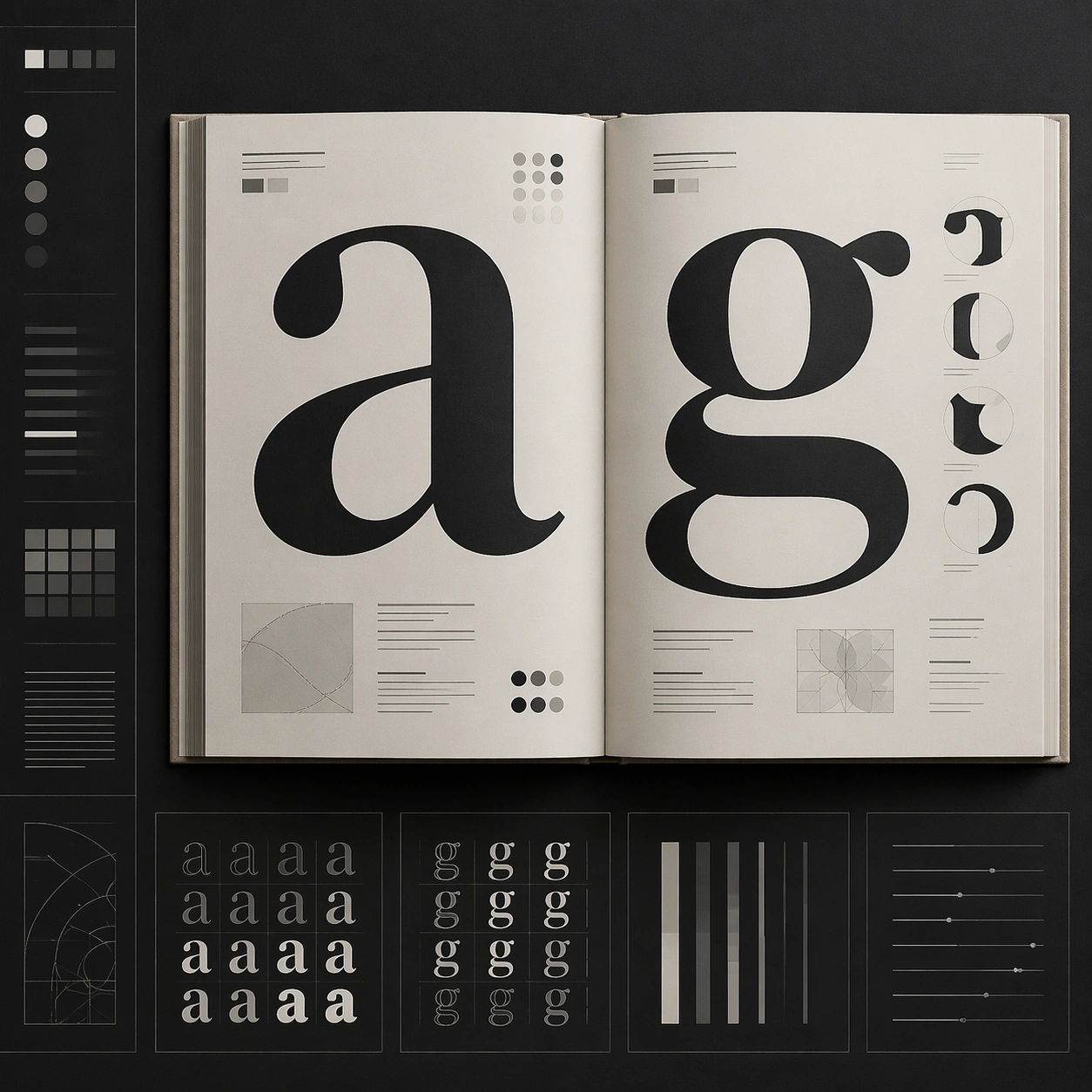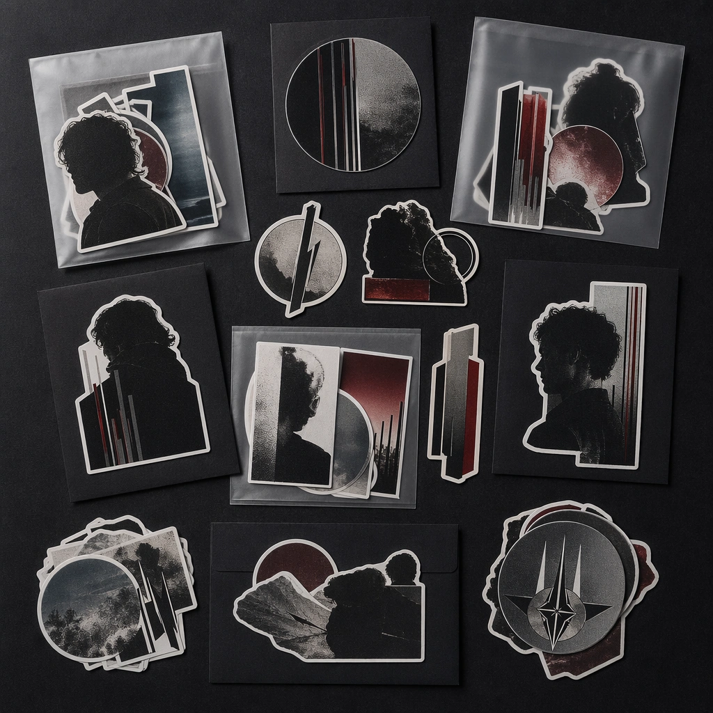
Scene: A square tabletop flat lay of die-cut stickers, small backing cards, and translucent sleeves on a matte dark surface under soft light. The arrangement should feel collectible and intentionally merch-like rather than playful or childish. Subject: The sticker family should carry fragments of a tour graphic language: emblems, portrait crops, abstract bars, and atmospheric shapes arranged into a premium pack. The set should suggest real commerce packaging without any readable product names. Important details: Use cut contours, satin finishes, and disciplined spacing to present the sticker pack as a serious launch asset. The image should feel like part of a merch release toolkit that could appear on a ticketing page or social drop card. Use case: Tour Merch single study 6/9 for the Tour Merch and Ticket Drop System Prompt Atlas theme. Constraints: No readable text, no watermark, no logos, preserve exact 1:1 aspect ratio, no cartoon mascot style, no notebook props, no readable labels, no retail price sticker, no rainbow novelty palette