PROMPTY · TWÓRCZE ODKRYWANIE

Galeria promptów

Odkrywaj prawdziwe prompty i wygenerowane przykłady. Znajdź inspirację do kolejnej twórczej misji i kopiuj pełne prompty bezpłatnie.

Przykłady
10,974
Modele
17
Źródła
1277
10 974 przykładów promptów · strona 12 z 229
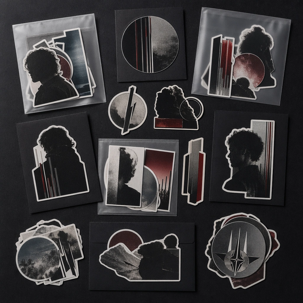
Example generated from “Tour Merch And Ticket Drop System — Sticker Pack Flatlay”
GPT Image 2en

Scene: A square tabletop flat lay of die-cut stickers, small backing cards, and translucent sleeves on a matte dark surface under soft light. The arrangement should feel collectible and intentionally merch-like rather than playful or childish. Subject: The sticker family should carry fragments of a tour graphic language: emblems, portrait crops, abstract bars, and atmospheric shapes arranged into a premium pack. The set should suggest real commerce packaging without any readable product names. Important details: Use cut contours, satin finishes, and disciplined spacing to present the sticker pack as a serious launch asset. The image should feel like part of a merch release toolkit that could appear on a ticketing page or social drop card. Use case: Tour Merch single study 6/9 for the Tour Merch and Ticket Drop System Prompt Atlas theme. Constraints: No readable text, no watermark, no logos, preserve exact 1:1 aspect ratio, no cartoon mascot style, no notebook props, no readable labels, no retail price sticker, no rainbow novelty palette
Example generated from “Tour Merch And Ticket Drop System — Bundle Box Insert”
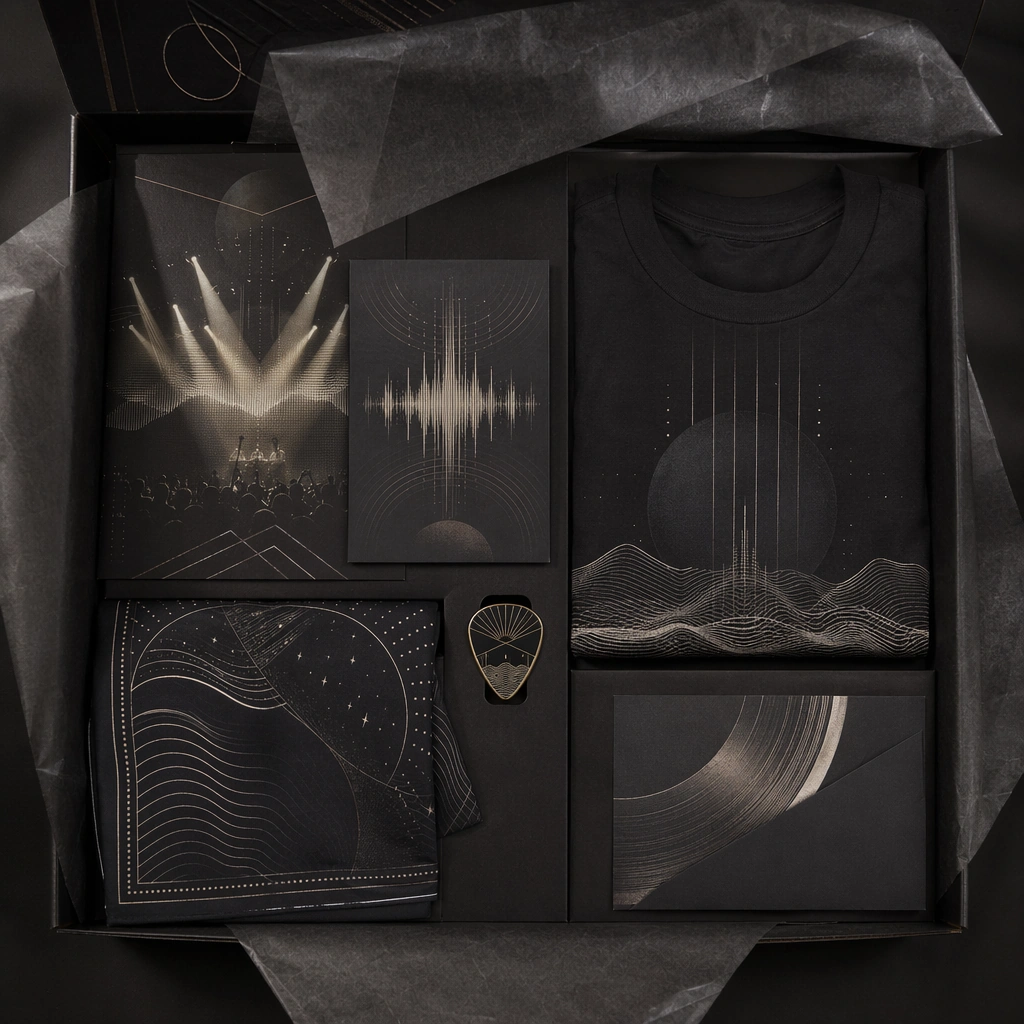
GPT Image 2en

Scene: A square overhead unboxing-style composition showing tissue paper, layered inserts, a small accessory, and folded soft goods inside a dark collector box. The shot should feel tactile and premium, with careful light on paper folds and textured surfaces. Subject: The subject is the bundle reveal itself: coordinated printed surfaces, accessory hints, and a coherent graphic language tying the whole box together. The objects should feel music-specific and limited-edition without showing readable SKU text or commercial branding. Important details: Focus on material layering and launch desirability. Tissue, card stock, soft goods, and small objects should all reinforce one collector system. The scene should feel curated and musical, not like generic beauty or lifestyle subscription packaging. Use case: Tour Merch single study 7/9 for the Tour Merch and Ticket Drop System Prompt Atlas theme. Constraints: No readable text, no watermark, no logos, preserve exact 1:1 aspect ratio, no shipping labels, no brand boxes, no price tags, no packing peanuts, no extra unrelated consumer products

Example generated from “Tour Merch And Ticket Drop System — Merch Table Display”
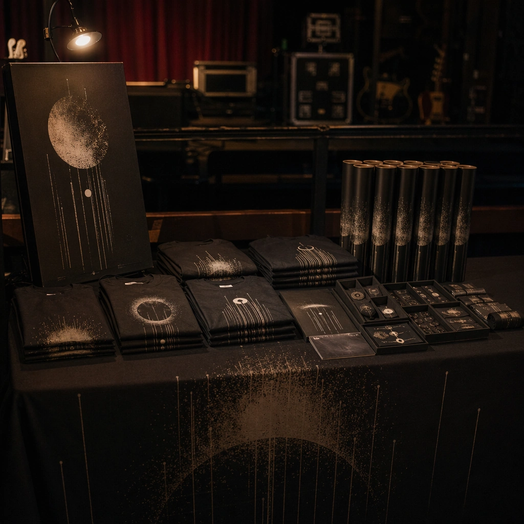
GPT Image 2en

Scene: A square environmental shot of a tidy merch table before doors open, with folded shirts, poster tubes, accessory trays, and one sign board arranged under dim practical venue light. The scene should feel real and music-specific, not like a generic retail checkout counter. Subject: The table carries a coherent drop identity through repeated graphic cues, dark palette, and controlled presentation. It should communicate the excitement of live-show commerce while keeping every object part of one curated launch family. Important details: Use practical realism and layout discipline. The table must feel functional, but also photogenic enough for promo use. Keep the environment subdued so the merch family dominates, and avoid readable pricing or visible sponsor marks. Use case: Tour Merch single study 8/9 for the Tour Merch and Ticket Drop System Prompt Atlas theme. Constraints: No readable text, no watermark, no logos, preserve exact 1:1 aspect ratio, no crowd hands, no readable price lists, no sponsor signage, no venue branding, no cluttered cash-register focus

Example generated from “Tour Merch And Ticket Drop System — Ticket Wallet Pack”
GPT Image 2en

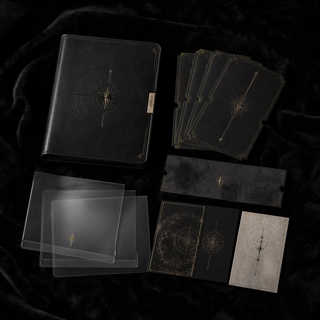
Scene: A square close product photograph of a ticket wallet, passes, translucent sleeves, and small paper inserts spread on black velvet with low directional light. The materials should feel luxurious and collectible without crossing into fashion-accessory branding. Subject: The subject is the set of entry objects themselves, designed with one premium music-drop language of emblems, dark color, and subtle metallic cues. The composition should feel like high-value tour collateral meant to be photographed and shared. Important details: Keep it tactile, minimal, and coherent. The wallet, passes, and inserts should look like parts of one system. Use shadow, texture, and spacing to suggest exclusivity while avoiding literal seat numbers or readable ticket data. Use case: Tour Merch single study 9/9 for the Tour Merch and Ticket Drop System Prompt Atlas theme. Constraints: No readable text, no watermark, no logos, preserve exact 1:1 aspect ratio, no readable seat info, no barcode, no brand logo, no wallet brand styling, no extra jewelry or lifestyle props

Example generated from “Tour Poster City Rollout Family — Reference Main Tour Poster”
GPT Image 2en

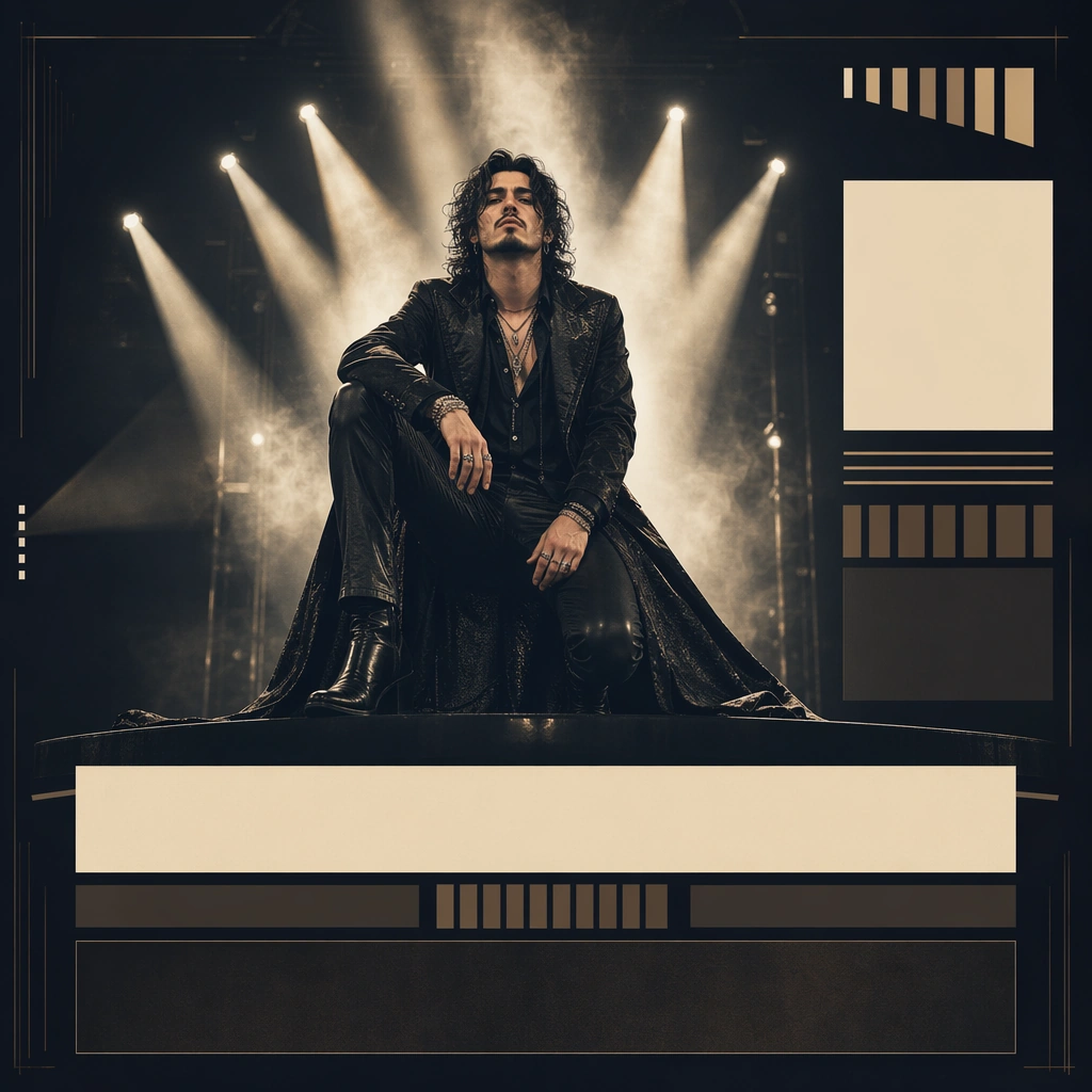
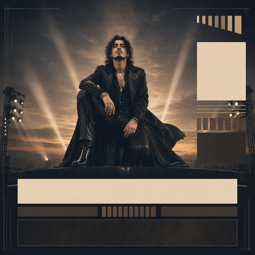
Scene: A square hero tour-poster composition built like a high-end announcement key art, with one performer centered on a stage-like platform and tall spotlight beams cutting through haze behind them. The frame should feel ready to scale into city-specific posters, keeping large modular zones where date and venue information could later appear as graphic blocks rather than readable text. Subject: An invented headlining musician stands in a dramatic but controlled pose, wearing a long coat and holding a low, relaxed stance that suggests stage authority. This reference image must lock the exact face, hair base, body proportions, wardrobe silhouette, and poster hierarchy so later city variants can preserve the same tour identity. Important details: Treat the date and city information as non-readable graphic modules: stacked bars, block fields, and rhythmic typographic placeholders. The lighting architecture, performer scale, and negative space are the real system. The poster must feel energetic and live, but still professionally laid out for ticketing and campaign deployment rather than chaotic fan art. Use case: Tour Posters series study 1/9 for the Tour Poster City Rollout Family Prompt Atlas theme. Constraints: No readable text, no watermark, no logos, preserve exact 1:1 aspect ratio, no readable dates, no venue logos, no crowd hands, no confetti storm, no extra band members, no brand sponsorship marks

Example generated from “Tour Poster City Rollout Family — Arena Night Variant”
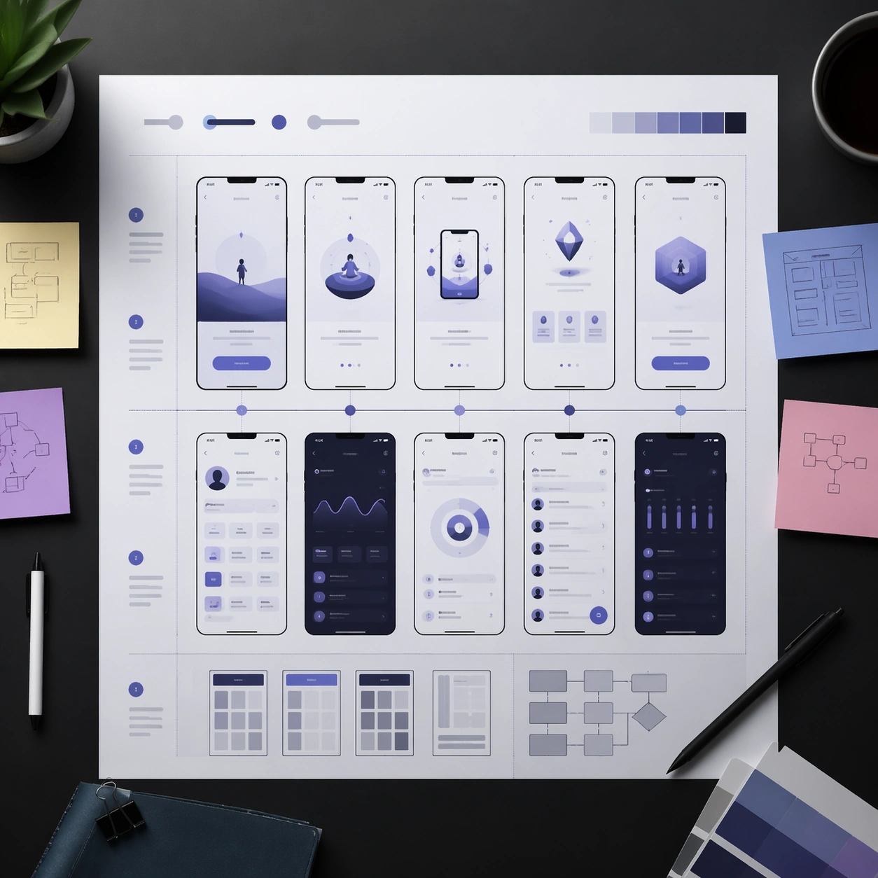
GPT Image 2en

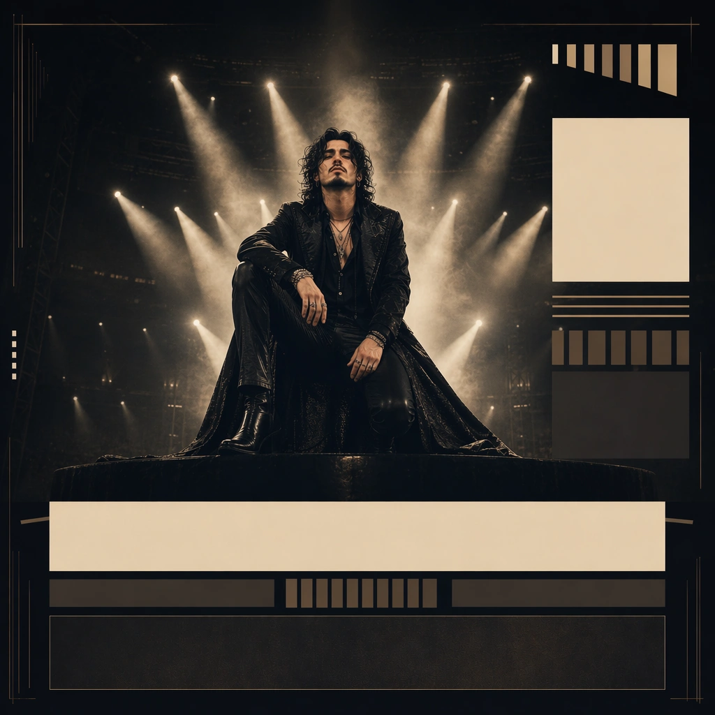
Scene: A square city-rollout poster in the same tour design language, now pushed toward deeper night atmosphere, denser haze, and a wider beam spread that implies a large arena setting. The frame must remain recognizably based on the reference poster, with the same modular block hierarchy and subject scale. Subject: Preserve the exact same headlining musician from the reference image, including face shape, hair base, body proportions, and long-coat silhouette. The performer stands with the same core stage authority, now surrounded by larger light cones and faint architectural depth that suggest a bigger live environment without adding a literal crowd. Important details: The city rollout should feel like a variation inside one ticketing campaign, not a new visual system. Keep the same non-readable date-block logic, same spotlight architecture, and same performer lock while deepening the mood and scale. This should feel usable for an arena-stop announcement where identity clarity matters more than decorative complexity. Use case: Tour Posters series study 2/9 for the Tour Poster City Rollout Family Prompt Atlas theme. Constraints: No readable text, no watermark, no logos, preserve exact 1:1 aspect ratio, preserve the exact reference face, hair base, and body proportions; no readable city name, no crowd sea, no sponsor logos, no fireworks, no random color palette shift
Example generated from “Tour Poster City Rollout Family — Theater Velvet Variant”
GPT Image 2en

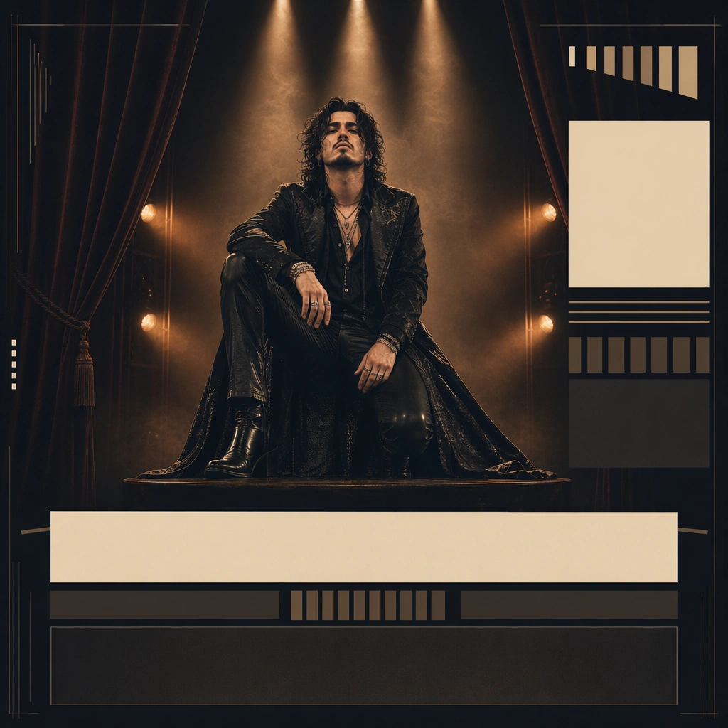
Scene: A square poster using the same hierarchy as the reference tour image, but now framed by dark velvet curtains, narrower spotlights, and warmer side light that suggest a more intimate theater environment. The composition must stay modular and campaign-consistent, not drift into costume-drama poster language. Subject: Preserve the exact same headlining musician from the reference image, with identical face shape, hair base, body proportions, and long-coat silhouette. The performer remains centered and dominant, while the environment shifts into theater warmth and ceremonial framing around them. Important details: Use velvet texture and warmer highlights to imply venue scale change while keeping the poster system intact. Date and venue information should still exist only as abstract graphic bands and stacked blocks. The emotional shift is intimacy, not identity replacement. It should still read as the same tour campaign at a glance. Use case: Tour Posters series study 3/9 for the Tour Poster City Rollout Family Prompt Atlas theme. Constraints: No readable text, no watermark, no logos, preserve exact 1:1 aspect ratio, preserve the exact reference face, hair base, and body proportions; no readable marquee text, no orchestra crowd, no costume swap, no decorative gold ornament excess, no sponsor marks

Example generated from “Tour Poster City Rollout Family — Open Air Dusk Variant”
GPT Image 2en

Scene: A square tour-poster variation in the same overall design system, now opening toward a dusky outdoor horizon with softer haze, wider light beams, and a faint sense of wind moving through the scene. The poster should still behave like part of the same ticketing rollout, not like a disconnected landscape poster. Subject: Preserve the exact same headlining musician from the reference image, including face shape, hair base, body proportions, and long-coat silhouette. The performer remains the anchor while the environment shifts to a more open-air atmosphere, with stage-light geometry reaching into the dusk sky behind them. Important details: Keep the same block hierarchy, same abstract date fields, and same subject placement logic. The novelty comes from venue mood, not from new branding. This should feel like a believable outdoor stop variation inside the same tour rollout family, balancing openness with controlled poster clarity. Use case: Tour Posters series study 4/9 for the Tour Poster City Rollout Family Prompt Atlas theme. Constraints: No readable text, no watermark, no logos, preserve exact 1:1 aspect ratio, preserve the exact reference face, hair base, and body proportions; no readable festival names, no crowd field, no fireworks, no giant stage screens, no sunset postcard look

Example generated from “Tour Poster City Rollout Family — Ticket Header Study”
GPT Image 2en

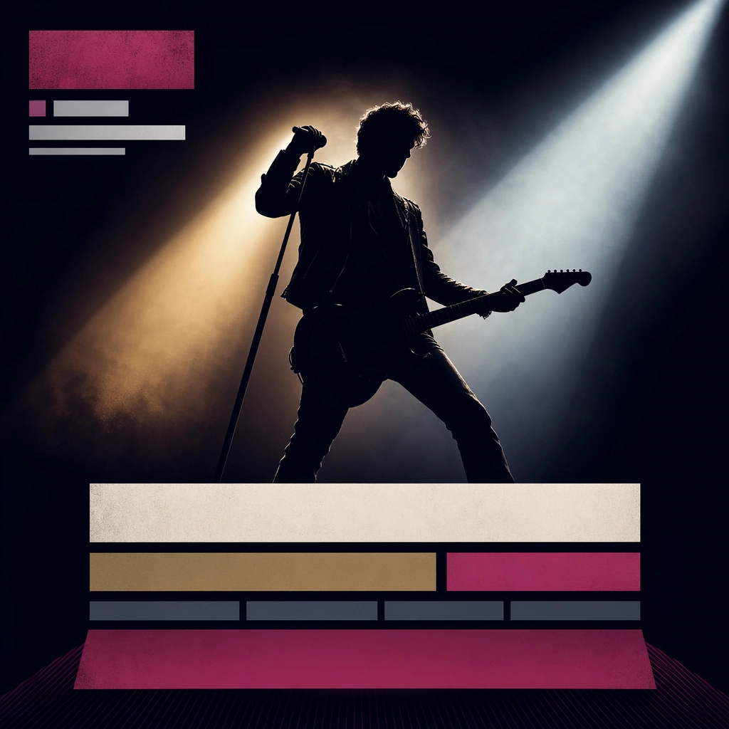
Scene: A square promo header concept with broad negative space, one strong performer silhouette, and modular stacked information zones built as non-readable bars. The image should feel like it could sit atop a ticket page or sales landing surface while retaining the drama of a tour poster. Subject: The subject is a controlled combination of live-performance identity and modular information hierarchy: one headliner figure, spotlight architecture, and placeholder blocks for dates, city, and venue. It should look musical and commercial, not like a generic event website header. Important details: Use shape contrast, beam geometry, and carefully spaced modules to make the surface instantly scannable. Keep the live-show energy present, but do not let the layout collapse into a noisy flyer. The image should suggest ticketing clarity without rendering any actual readable information. Use case: Tour Posters single study 5/9 for the Tour Poster City Rollout Family Prompt Atlas theme. Constraints: No readable text, no watermark, no logos, preserve exact 1:1 aspect ratio, no readable dates, no sponsor logos, no browser UI, no crowd photo background, no fake QR code

Example generated from “Tour Poster City Rollout Family — Lobby Lightbox Wall”
GPT Image 2en

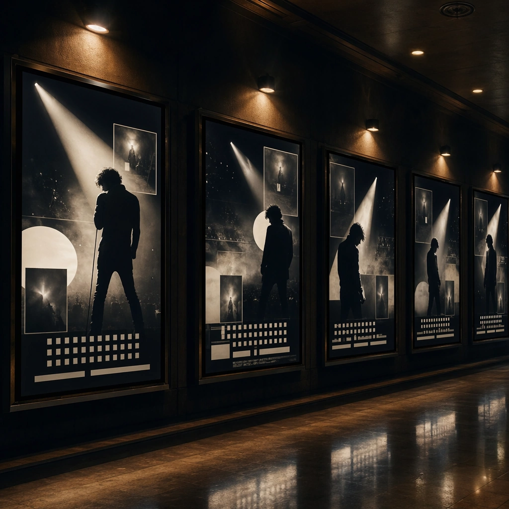
Scene: A square environmental photograph of a dim venue lobby lined with backlit poster lightboxes. The lightboxes should display a coherent headliner campaign language across multiple panels, creating the sense of a full tour rollout environment before doors open. Subject: The subject is the wall of campaign surfaces itself: repeated performer imagery, spotlight geometry, and non-readable date modules translated into illuminated display panels. The hallway should feel real, with polished floor reflections and practical lighting, but the posters remain the unmistakable focal point. Important details: This is a deployment study. Keep the environment believable and minimal, and let repetition sell ownership. The lightboxes should feel like a real tour promotion occupying physical space, not a trade-show booth. Strong poster hierarchy and atmospheric light are more important than environmental decoration. Use case: Tour Posters single study 6/9 for the Tour Poster City Rollout Family Prompt Atlas theme. Constraints: No readable text, no watermark, no logos, preserve exact 1:1 aspect ratio, no venue logos, no audience queue, no readable directional signage, no branded concessions, no random ads sharing the wall

Example generated from “Tour Poster City Rollout Family — VIP Laminate Flatlay”
GPT Image 2en

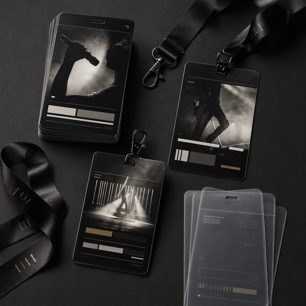
Scene: A square top-down product shot of stacked laminates, satin lanyards, clipped cards, and translucent sleeves on a dark tabletop. Light should skim the plastic and satin surfaces so the materials feel real and tactile, while the layout remains clean and premium. Subject: The access objects carry the tour’s visual system through performer crops, beam graphics, and modular bar fields reserved for future event data. They should feel like genuine backstage or VIP credentials, yet free of any readable names, dates, or brand marks. Important details: Focus on material realism and campaign continuity. The badge family should clearly belong to a live-music rollout, not to a conference or corporate event. Use a tight palette, controlled spacing, and consistent abstract hierarchy so the identity survives across small practical objects. Use case: Tour Posters single study 7/9 for the Tour Poster City Rollout Family Prompt Atlas theme. Constraints: No readable text, no watermark, no logos, preserve exact 1:1 aspect ratio, no barcodes, no readable names, no corporate event styling, no extra office supplies, no bright plastic toy colors

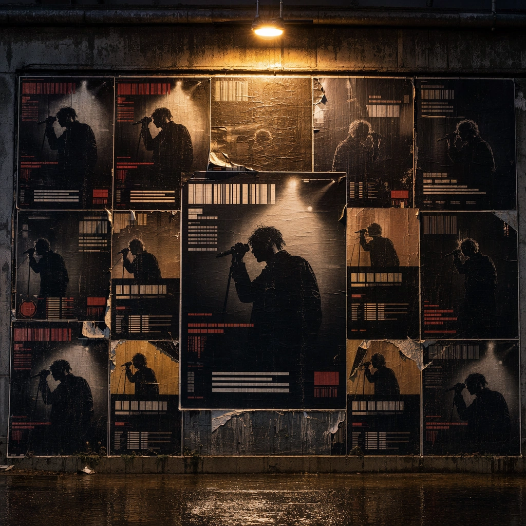
Example generated from “Tour Poster City Rollout Family — Wheatpaste Night Wall”
GPT Image 2en

Scene: A square straight-on street photograph of a damp city wall pasted with multiple copies of the same tour poster, lit by sodium street spill and reflected rain on the pavement below. The scene should feel urban and tactile, but still composed enough to show poster hierarchy clearly. Subject: The poster family features one performer, spotlight beams, and abstract modular information fields repeated across the wall. Tears, overlaps, and wrinkles are allowed, but the campaign must remain legible as one owned live-tour identity rather than anonymous street clutter. Important details: Use repetition, wet texture, and poster wear to suggest real-world rollout. Keep other environmental elements quiet so the posters dominate. The mood should be urgent and live, but the design system must still read as professional, coherent, and adaptable to ticketing culture. Use case: Tour Posters single study 8/9 for the Tour Poster City Rollout Family Prompt Atlas theme. Constraints: No readable text, no watermark, no logos, preserve exact 1:1 aspect ratio, no readable graffiti, no brand billboards nearby, no passing crowd, no daylight, no unrelated posters breaking the campaign repetition

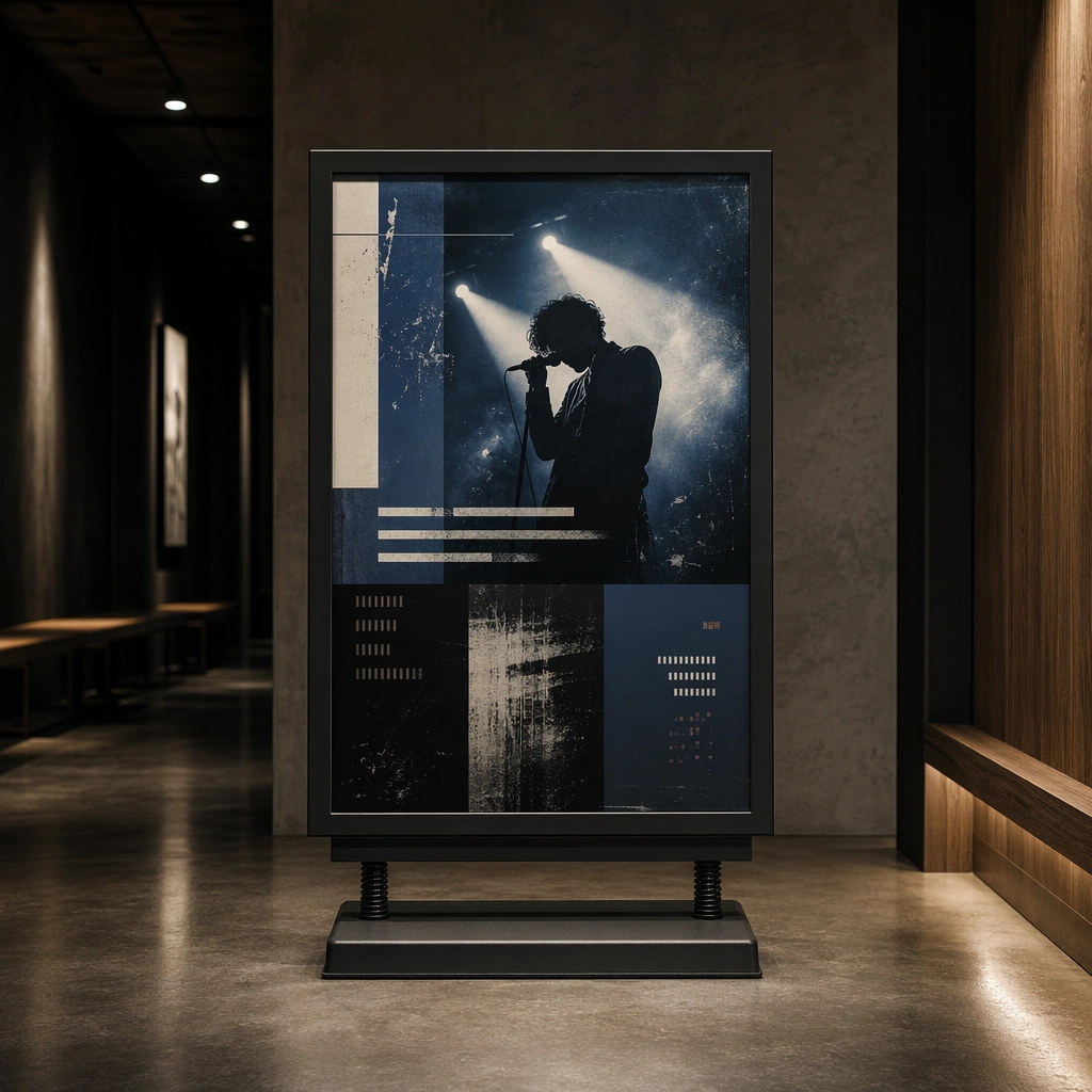
Example generated from “Tour Poster City Rollout Family — Queue Sign Study”
GPT Image 2en

Scene: A square product-environment shot of a freestanding sign board inside a dim entry corridor, lit with clean practical light and slight floor reflections. The board should look real and usable, but it also needs enough visual drama to feel like part of the main tour campaign. Subject: The sign board carries the same performer-led graphic identity, spotlight cues, and modular non-readable information blocks that define the larger tour poster system. It should feel like a crowd-flow object that still belongs inside a serious live-music rollout, not generic venue signage. Important details: Balance utility and campaign character. Use a clean frame, believable material build, and restrained environmental context so the sign board reads clearly. The live-show energy should come from lighting and poster cues, not from crowd chaos or literal readable instructions. Use case: Tour Posters single study 9/9 for the Tour Poster City Rollout Family Prompt Atlas theme. Constraints: No readable text, no watermark, no logos, preserve exact 1:1 aspect ratio, no arrows with readable labels, no venue logo, no crowd queue, no emergency signage, no cheap plastic retail look

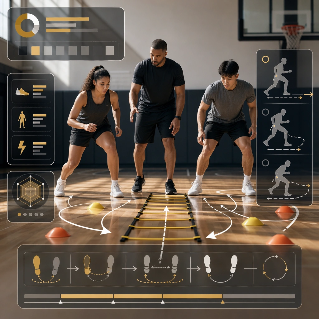
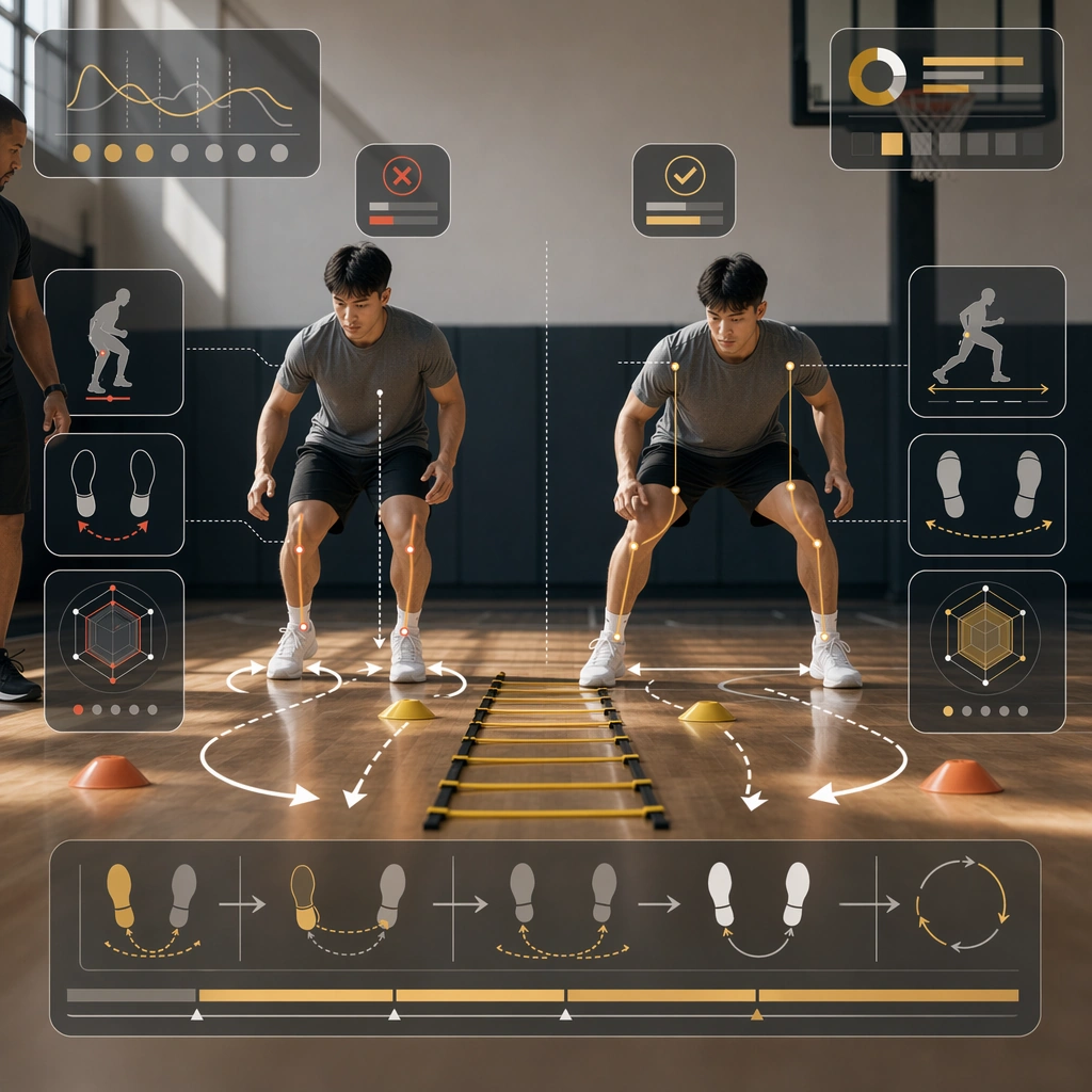
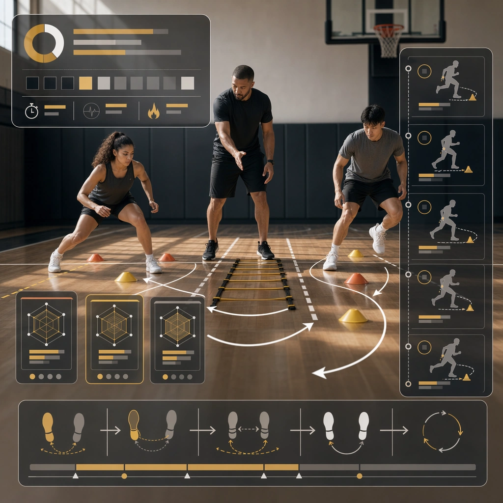
Example generated from “Training Drill And Coaching Explainer Kit — Reference Drill Board”
GPT Image 2en

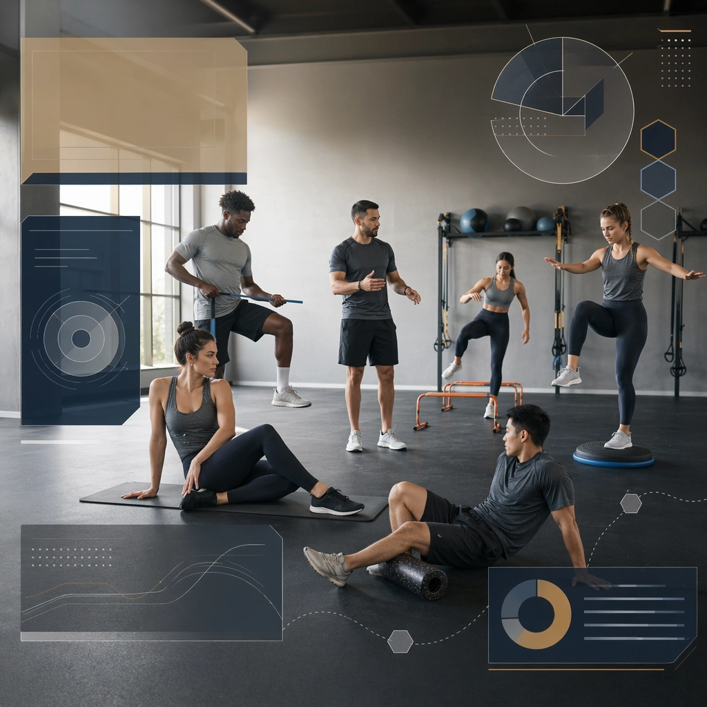
Scene: Create a square reference drill board for Training Explainer, using a bright premium training facility with clear floor markings, coaching props, and balanced realism-plus-diagram overlays. The frame should feel commercial, polished, and immediately useful for a real client deliverable rather than a one-off art experiment. Keep the composition readable at thumbnail scale while still rewarding a closer look with layered depth, clean negative space, and strong directional light. Build the image so it clearly supports sports communication, with enough modular structure to imply information architecture without relying on literal words. Subject: Center the image on one original coach guiding one or two original athletes through a simple branded-neutral drill setup, arranged as coach with athletes in setup position. Treat the subject as original and brandless, with believable apparel construction, realistic body proportions, and strong emotional legibility. Surround the subject with supporting environmental cues that reinforce the category but never overpower the main figure. All secondary objects, props, and background elements should strengthen the same professional sports or fitness context. Important details: This first image must establish the full reference system for later derivatives: instructional panel structure, non-readable sequence blocks, and elegant arrow-based motion guidance. The emotional tone should read as clear instructional calm. Make the visual language reusable, disciplined, and commercially credible, with clean edges, coherent light behavior, and obvious hierarchy. Abstract panels, diagram bands, or stat-like modules are welcome, but they must remain non-readable and subordinate to the main visual message. The result should feel original, specific, and ready to anchor a larger package. Use case: Training Explainer series study 1/9, the reference image for the package. Constraints: No readable text, no watermark, no logos, preserve exact 1:1 aspect ratio, no brand marks, no copied famous team or product identity, no generic stock-photo stiffness, no cluttered background noise, no celebrity likenesses.

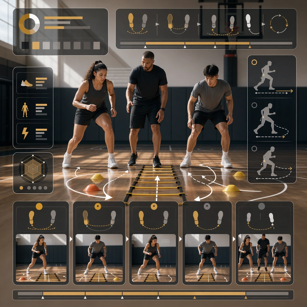
Example generated from “Training Drill And Coaching Explainer Kit — Step Progression Board”
GPT Image 2en

Scene: Build a square step progression board derived from the reference image for Training Explainer. Preserve the exact world established by the reference image, including the same palette family, lighting direction, environmental logic, and surface finish. The new frame should feel like a deliberate extension of one campaign system, not a separate concept. Shift the hierarchy to suit this use case, but keep the overall composition commercial, polished, and ready for real rollout. Subject: Use the same original subject identity and anchor cues introduced by the reference image, now organized as same coach and athletes in movement stages. Keep faces, hair logic, body proportions, apparel or product construction, and major supporting forms consistent with the reference. Allow only the layout emphasis, pose, crop, and contextual energy to change so the result clearly belongs to the same package. Important details: Continuity is the main challenge. Preserve the exact reference language for color, materials, framing rhythm, and overall brandless campaign grammar while steering the tone toward ordered teaching flow. Keep any stat blocks, schedule modules, arrows, badges, or callout panels non-readable. The derivative should prove that the same art direction can handle a different communication task without losing identity or utility. Make it credible for production use, with clean edges, intentional spacing, and no random decorative elements. Use case: Training Explainer series study 2/9, a derivative surface linked to 01-reference-drill-board. Constraints: No readable text, no watermark, no logos, preserve exact 1:1 aspect ratio, no new subject identity, no brand marks, no palette drift, no unrelated props, no collage chaos, no copied public-figure styling.
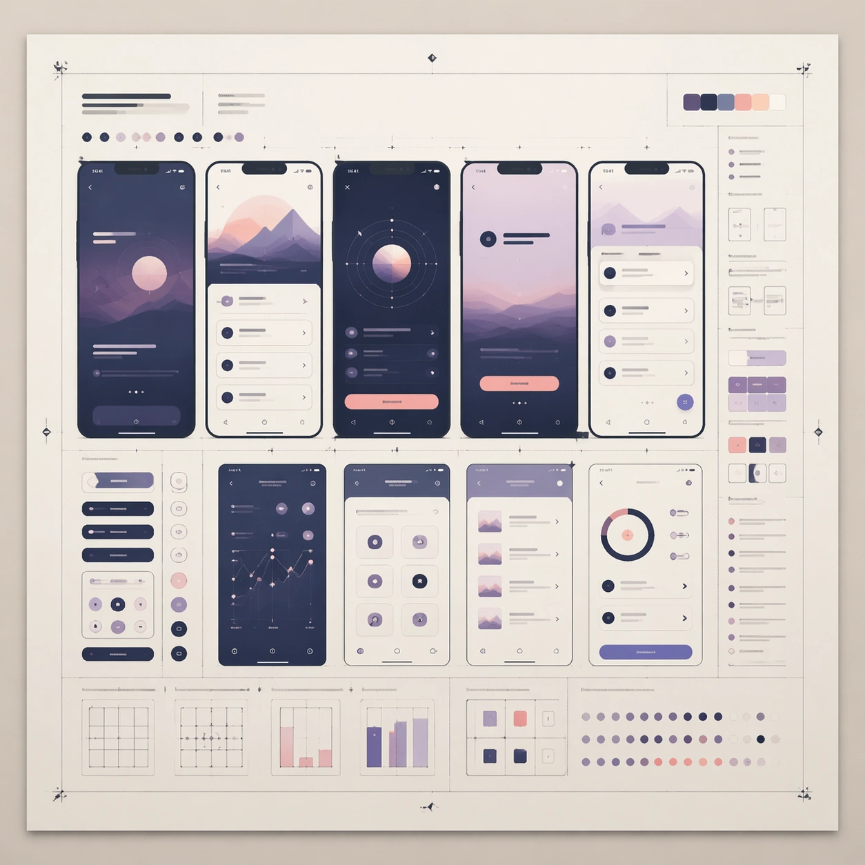
Example generated from “Training Drill And Coaching Explainer Kit — Common Mistake Correction”
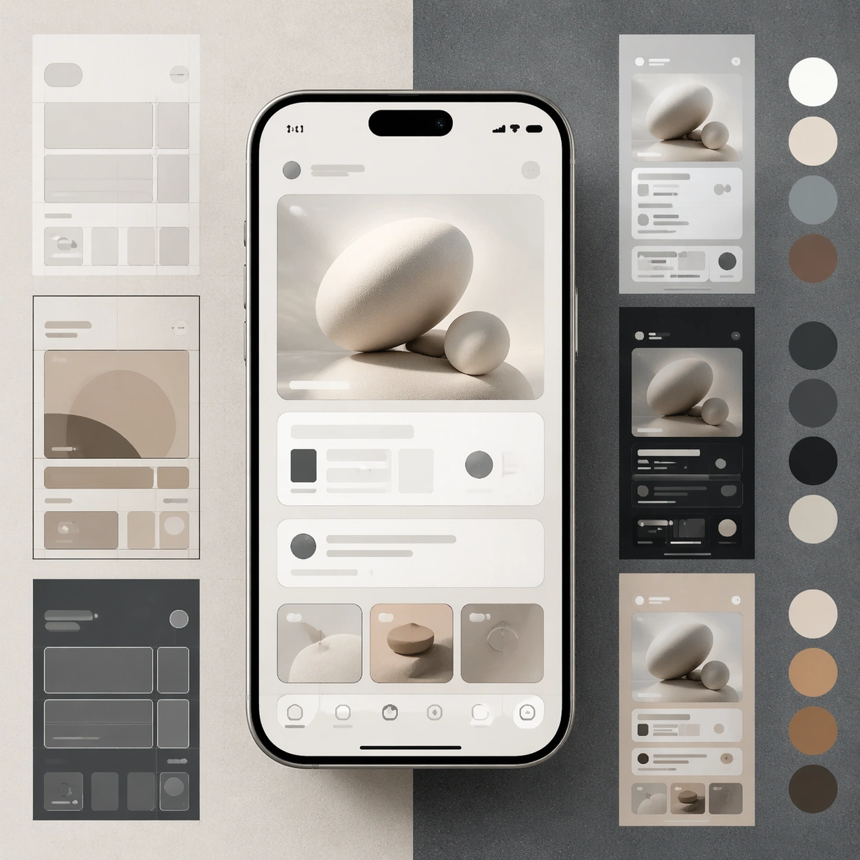
GPT Image 2en

Scene: Build a square mistake-correction board derived from the reference image for Training Explainer. Preserve the exact world established by the reference image, including the same palette family, lighting direction, environmental logic, and surface finish. The new frame should feel like a deliberate extension of one campaign system, not a separate concept. Shift the hierarchy to suit this use case, but keep the overall composition commercial, polished, and ready for real rollout. Subject: Use the same original subject identity and anchor cues introduced by the reference image, now organized as same athlete shown in correct and flawed posture. Keep faces, hair logic, body proportions, apparel or product construction, and major supporting forms consistent with the reference. Allow only the layout emphasis, pose, crop, and contextual energy to change so the result clearly belongs to the same package. Important details: Continuity is the main challenge. Preserve the exact reference language for color, materials, framing rhythm, and overall brandless campaign grammar while steering the tone toward constructive comparison. Keep any stat blocks, schedule modules, arrows, badges, or callout panels non-readable. The derivative should prove that the same art direction can handle a different communication task without losing identity or utility. Make it credible for production use, with clean edges, intentional spacing, and no random decorative elements. Use case: Training Explainer series study 3/9, a derivative surface linked to 01-reference-drill-board. Constraints: No readable text, no watermark, no logos, preserve exact 1:1 aspect ratio, no new subject identity, no brand marks, no palette drift, no unrelated props, no collage chaos, no copied public-figure styling.
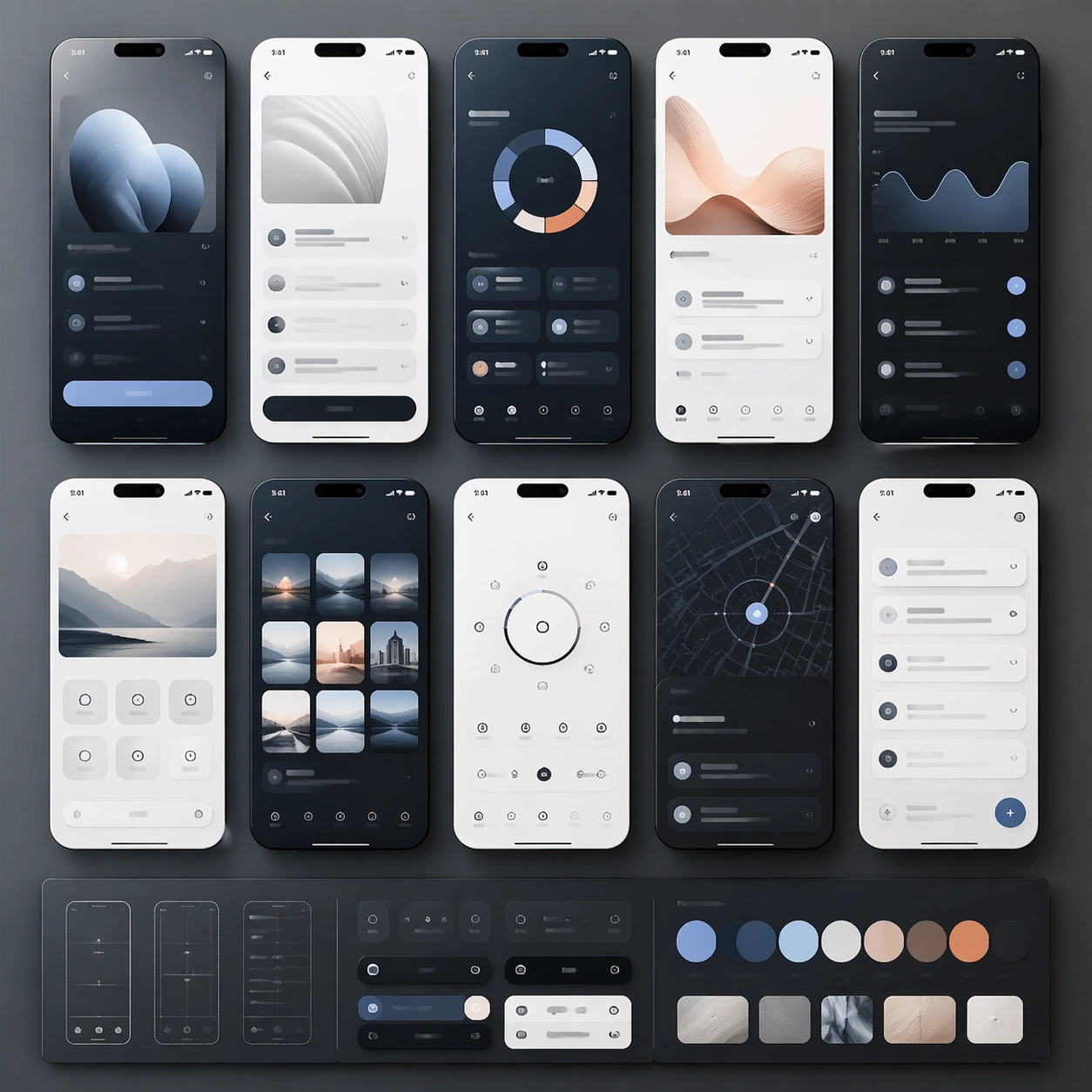
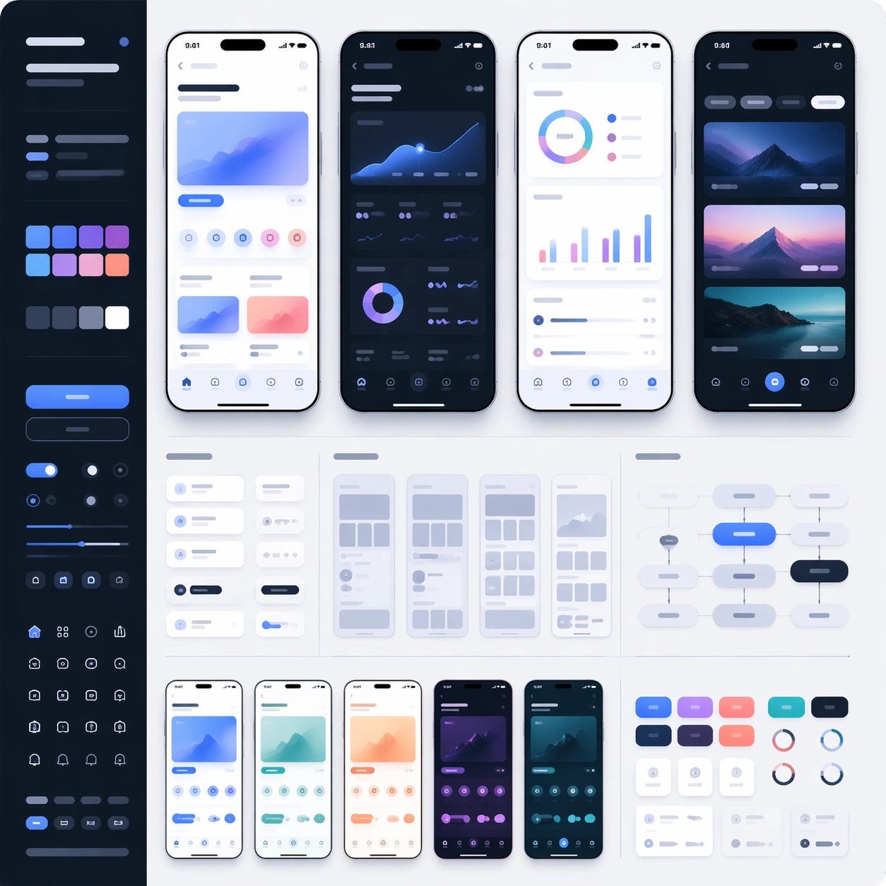
Example generated from “Training Drill And Coaching Explainer Kit — Session Flow Variant”
GPT Image 2en

Scene: Build a square session-flow variant derived from the reference image for Training Explainer. Preserve the exact world established by the reference image, including the same palette family, lighting direction, environmental logic, and surface finish. The new frame should feel like a deliberate extension of one campaign system, not a separate concept. Shift the hierarchy to suit this use case, but keep the overall composition commercial, polished, and ready for real rollout. Subject: Use the same original subject identity and anchor cues introduced by the reference image, now organized as same cast inside grouped session map. Keep faces, hair logic, body proportions, apparel or product construction, and major supporting forms consistent with the reference. Allow only the layout emphasis, pose, crop, and contextual energy to change so the result clearly belongs to the same package. Important details: Continuity is the main challenge. Preserve the exact reference language for color, materials, framing rhythm, and overall brandless campaign grammar while steering the tone toward operational overview. Keep any stat blocks, schedule modules, arrows, badges, or callout panels non-readable. The derivative should prove that the same art direction can handle a different communication task without losing identity or utility. Make it credible for production use, with clean edges, intentional spacing, and no random decorative elements. Use case: Training Explainer series study 4/9, a derivative surface linked to 01-reference-drill-board. Constraints: No readable text, no watermark, no logos, preserve exact 1:1 aspect ratio, no new subject identity, no brand marks, no palette drift, no unrelated props, no collage chaos, no copied public-figure styling.
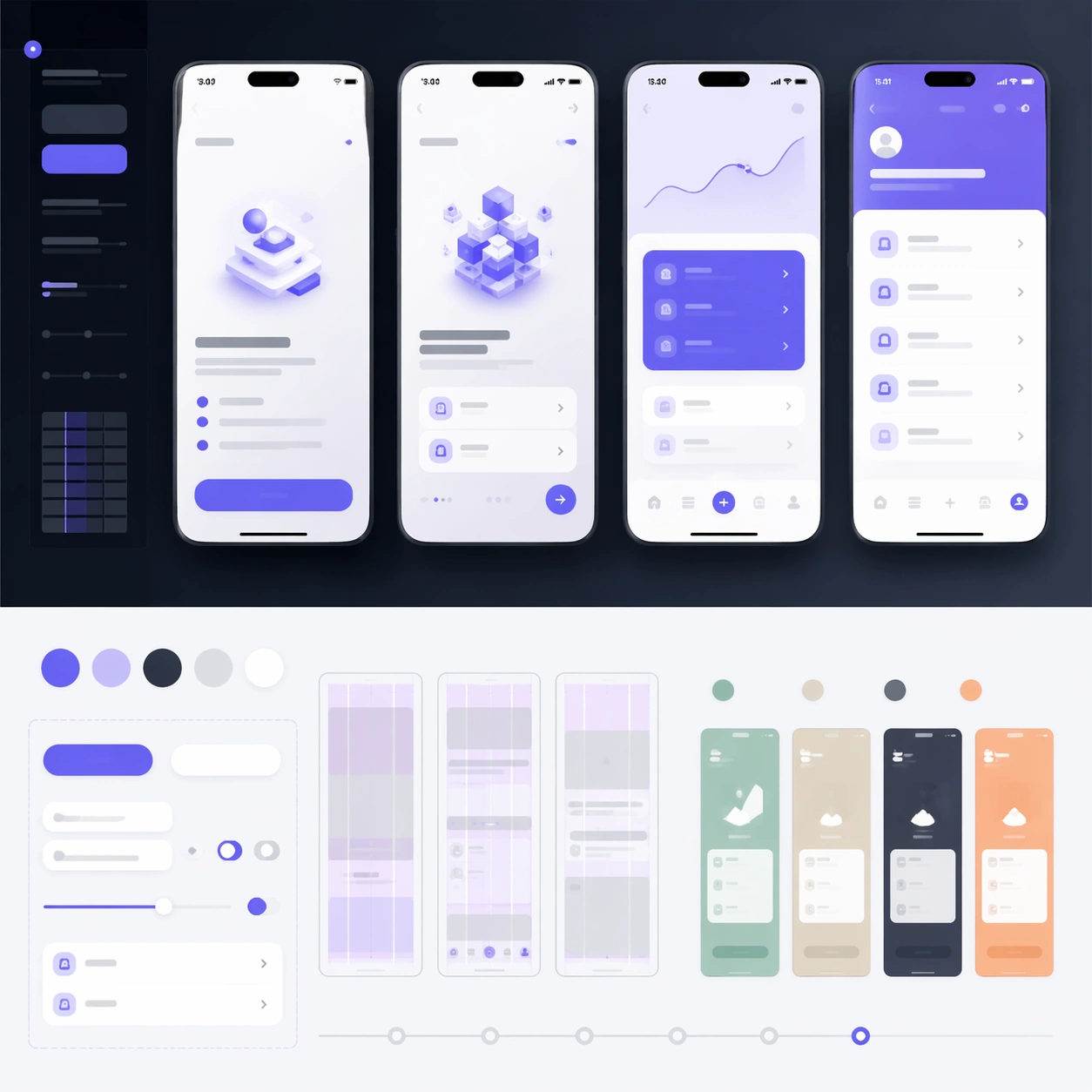
Example generated from “Training Drill And Coaching Explainer Kit — Sprint Form Check”
GPT Image 2en

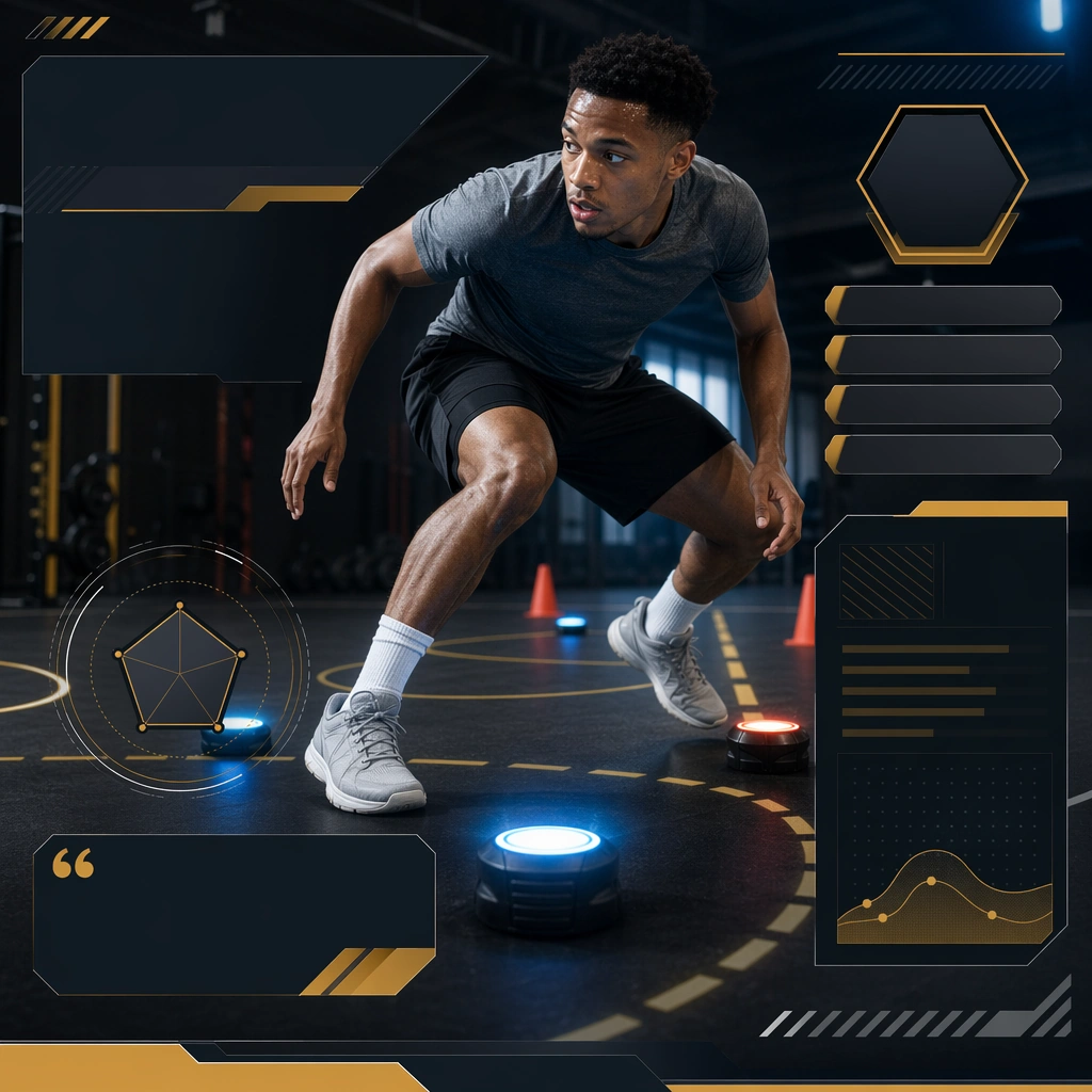
Scene: Create a square sprint form-check board for Training Explainer, using coaching communication that blends real athletic motion with structured educational overlays and premium layout clarity. The composition should read as a practical, production-ready sports or fitness surface with a clear hierarchy, premium lighting, and obvious commercial intent. Keep the environment specific enough to feel real, but leave enough control in the layout for non-readable information modules, campaign blocks, or visualized metrics. Aim for a finish that works for a brand, club, app, academy, or event operator. Subject: Build the image around sprinter in controlled motion. The subject should be original, believable, and free of any real-brand or celebrity cues. Use realistic apparel, safe body mechanics when movement is visible, and environmental props that support the category without clutter. The subject must stay visually dominant so the design still works as a communication asset rather than a pure scene study. Important details: The mood should read as mechanical clarity. Treat layout, light, and supporting graphic structure as part of one polished delivery surface. Any schedule blocks, metric panels, quote zones, badges, or path diagrams must stay abstract and non-readable. Prioritize usefulness, clarity, and category truth over spectacle. The image should feel distinct from the series package while still belonging naturally to the same topic and business use case. Use case: Training Explainer single study 5/9, an independent rollout surface for the topic. Constraints: No readable text, no watermark, no logos, preserve exact 1:1 aspect ratio, no brand marks, no public-figure resemblance, no generic stock layout, no cluttered UI imitation, no accidental copyrighted insignia.

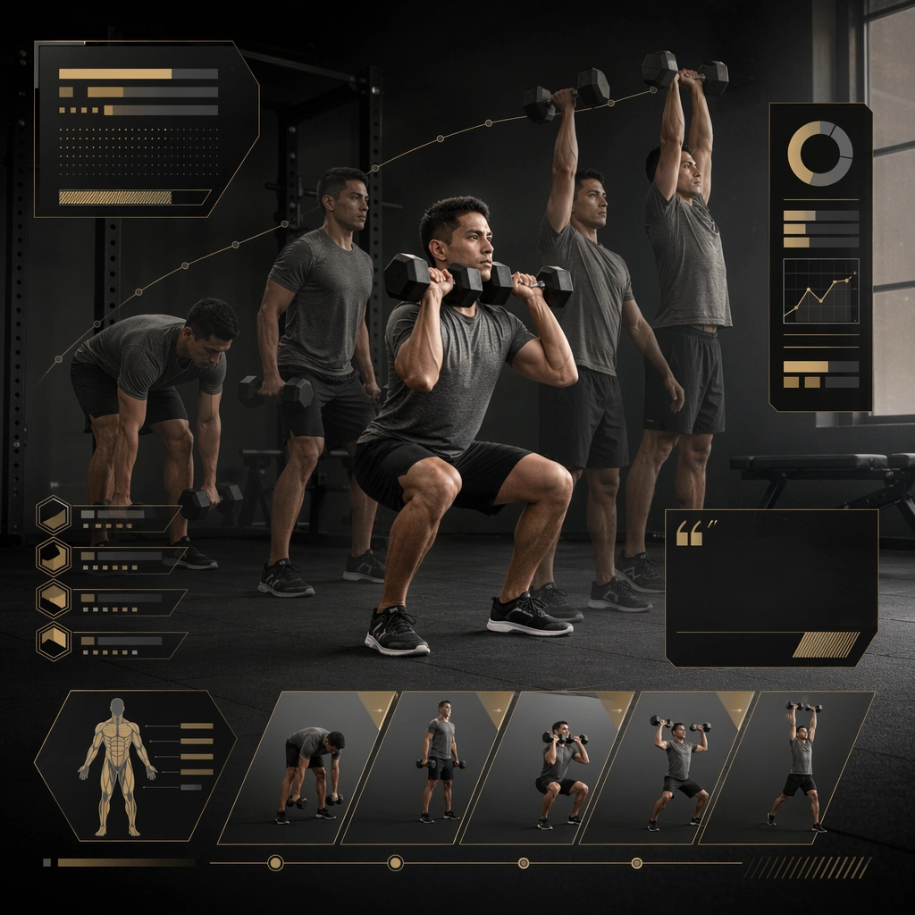
Example generated from “Training Drill And Coaching Explainer Kit — Dumbbell Complex Grid”
GPT Image 2en

Scene: Create a square dumbbell-complex grid for Training Explainer, using coaching communication that blends real athletic motion with structured educational overlays and premium layout clarity. The composition should read as a practical, production-ready sports or fitness surface with a clear hierarchy, premium lighting, and obvious commercial intent. Keep the environment specific enough to feel real, but leave enough control in the layout for non-readable information modules, campaign blocks, or visualized metrics. Aim for a finish that works for a brand, club, app, academy, or event operator. Subject: Build the image around athlete executing a dumbbell sequence. The subject should be original, believable, and free of any real-brand or celebrity cues. Use realistic apparel, safe body mechanics when movement is visible, and environmental props that support the category without clutter. The subject must stay visually dominant so the design still works as a communication asset rather than a pure scene study. Important details: The mood should read as safe sequential structure. Treat layout, light, and supporting graphic structure as part of one polished delivery surface. Any schedule blocks, metric panels, quote zones, badges, or path diagrams must stay abstract and non-readable. Prioritize usefulness, clarity, and category truth over spectacle. The image should feel distinct from the series package while still belonging naturally to the same topic and business use case. Use case: Training Explainer single study 6/9, an independent rollout surface for the topic. Constraints: No readable text, no watermark, no logos, preserve exact 1:1 aspect ratio, no brand marks, no public-figure resemblance, no generic stock layout, no cluttered UI imitation, no accidental copyrighted insignia.

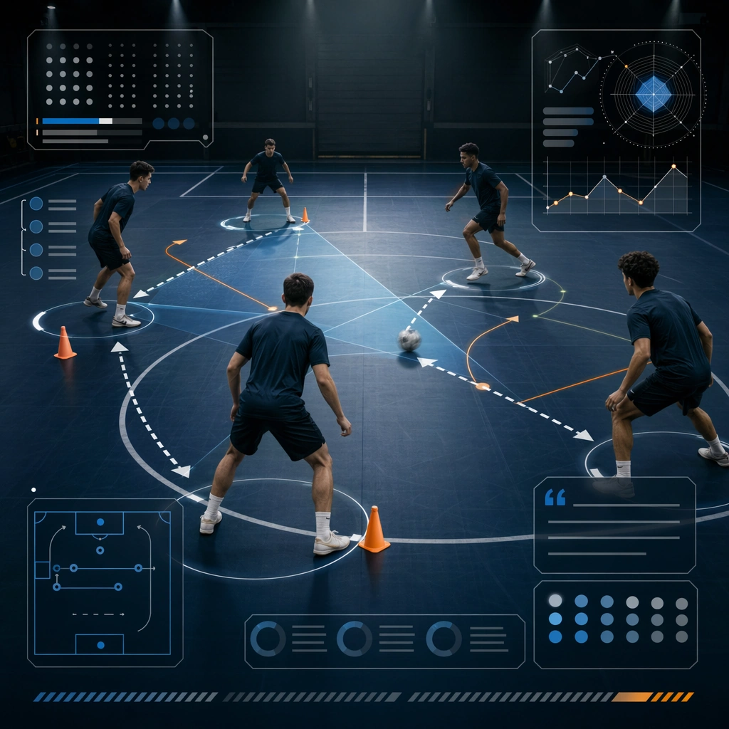
Example generated from “Training Drill And Coaching Explainer Kit — Passing Lane Diagram”
GPT Image 2en

Scene: Create a square passing-lane diagram for Training Explainer, using coaching communication that blends real athletic motion with structured educational overlays and premium layout clarity. The composition should read as a practical, production-ready sports or fitness surface with a clear hierarchy, premium lighting, and obvious commercial intent. Keep the environment specific enough to feel real, but leave enough control in the layout for non-readable information modules, campaign blocks, or visualized metrics. Aim for a finish that works for a brand, club, app, academy, or event operator. Subject: Build the image around small athlete group in passing pattern. The subject should be original, believable, and free of any real-brand or celebrity cues. Use realistic apparel, safe body mechanics when movement is visible, and environmental props that support the category without clutter. The subject must stay visually dominant so the design still works as a communication asset rather than a pure scene study. Important details: The mood should read as spatial logic. Treat layout, light, and supporting graphic structure as part of one polished delivery surface. Any schedule blocks, metric panels, quote zones, badges, or path diagrams must stay abstract and non-readable. Prioritize usefulness, clarity, and category truth over spectacle. The image should feel distinct from the series package while still belonging naturally to the same topic and business use case. Use case: Training Explainer single study 7/9, an independent rollout surface for the topic. Constraints: No readable text, no watermark, no logos, preserve exact 1:1 aspect ratio, no brand marks, no public-figure resemblance, no generic stock layout, no cluttered UI imitation, no accidental copyrighted insignia.

Example generated from “Training Drill And Coaching Explainer Kit — Mobility Circuit Board”
GPT Image 2en

Scene: Create a square mobility-circuit board for Training Explainer, using coaching communication that blends real athletic motion with structured educational overlays and premium layout clarity. The composition should read as a practical, production-ready sports or fitness surface with a clear hierarchy, premium lighting, and obvious commercial intent. Keep the environment specific enough to feel real, but leave enough control in the layout for non-readable information modules, campaign blocks, or visualized metrics. Aim for a finish that works for a brand, club, app, academy, or event operator. Subject: Build the image around coach and athletes across mobility stations. The subject should be original, believable, and free of any real-brand or celebrity cues. Use realistic apparel, safe body mechanics when movement is visible, and environmental props that support the category without clutter. The subject must stay visually dominant so the design still works as a communication asset rather than a pure scene study. Important details: The mood should read as airy organized prep. Treat layout, light, and supporting graphic structure as part of one polished delivery surface. Any schedule blocks, metric panels, quote zones, badges, or path diagrams must stay abstract and non-readable. Prioritize usefulness, clarity, and category truth over spectacle. The image should feel distinct from the series package while still belonging naturally to the same topic and business use case. Use case: Training Explainer single study 8/9, an independent rollout surface for the topic. Constraints: No readable text, no watermark, no logos, preserve exact 1:1 aspect ratio, no brand marks, no public-figure resemblance, no generic stock layout, no cluttered UI imitation, no accidental copyrighted insignia.

Example generated from “Training Drill And Coaching Explainer Kit — Goalkeeper Reaction Drill”
GPT Image 2en

Scene: Create a square reaction-drill coaching board for Training Explainer, using coaching communication that blends real athletic motion with structured educational overlays and premium layout clarity. The composition should read as a practical, production-ready sports or fitness surface with a clear hierarchy, premium lighting, and obvious commercial intent. Keep the environment specific enough to feel real, but leave enough control in the layout for non-readable information modules, campaign blocks, or visualized metrics. Aim for a finish that works for a brand, club, app, academy, or event operator. Subject: Build the image around athlete reacting to target markers. The subject should be original, believable, and free of any real-brand or celebrity cues. Use realistic apparel, safe body mechanics when movement is visible, and environmental props that support the category without clutter. The subject must stay visually dominant so the design still works as a communication asset rather than a pure scene study. Important details: The mood should read as sharp readiness. Treat layout, light, and supporting graphic structure as part of one polished delivery surface. Any schedule blocks, metric panels, quote zones, badges, or path diagrams must stay abstract and non-readable. Prioritize usefulness, clarity, and category truth over spectacle. The image should feel distinct from the series package while still belonging naturally to the same topic and business use case. Use case: Training Explainer single study 9/9, an independent rollout surface for the topic. Constraints: No readable text, no watermark, no logos, preserve exact 1:1 aspect ratio, no brand marks, no public-figure resemblance, no generic stock layout, no cluttered UI imitation, no accidental copyrighted insignia.

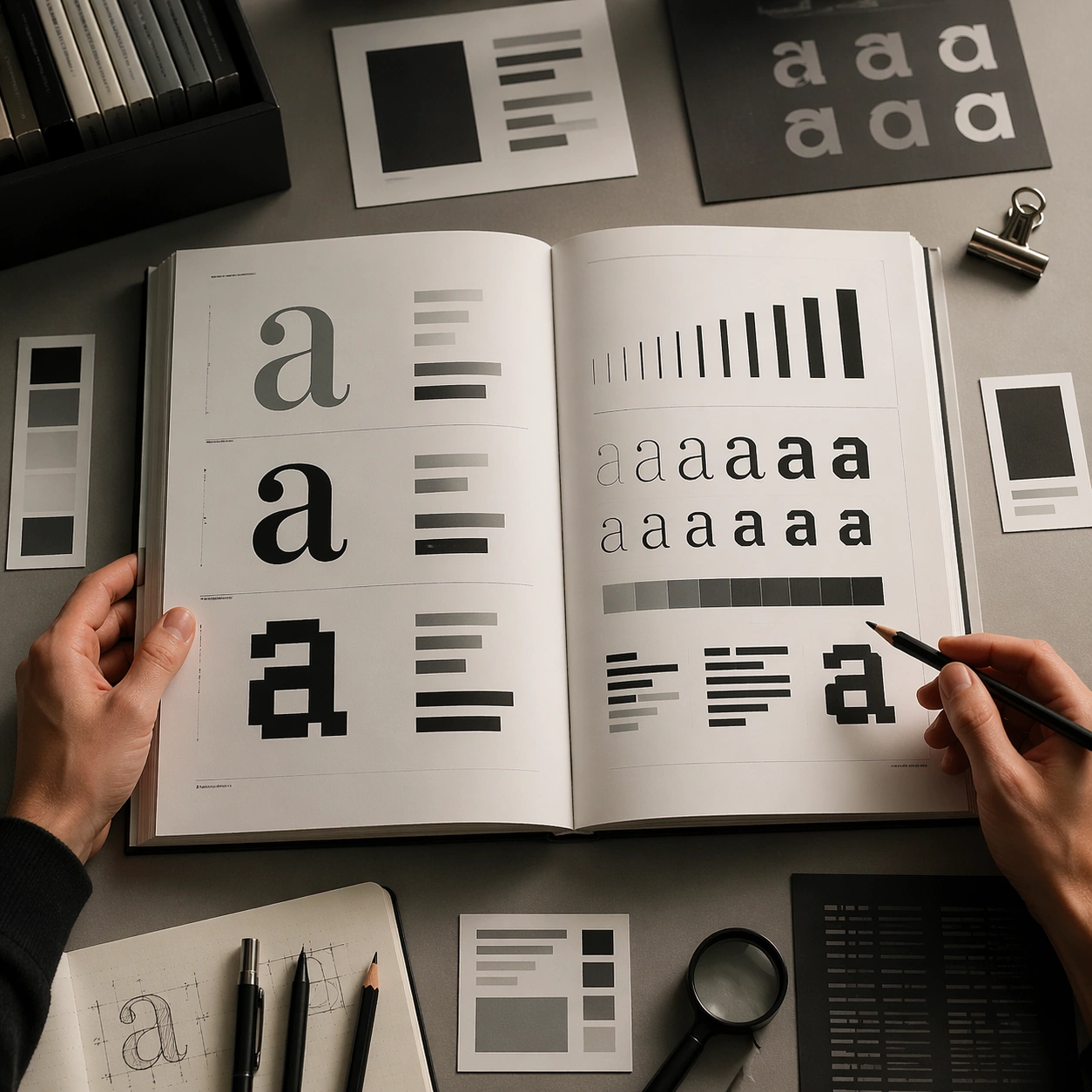
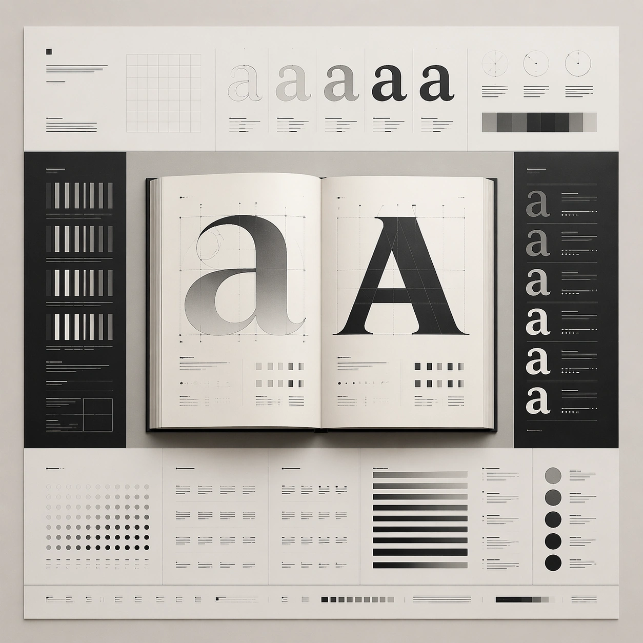
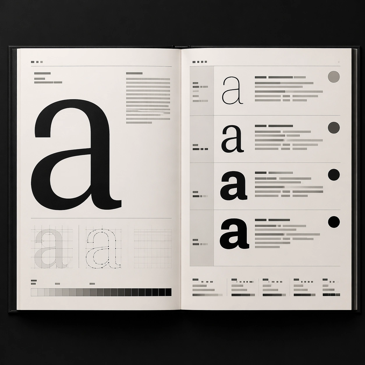
Example generated from “Type Specimen Book — Hero Spread”
GPT Image 2en

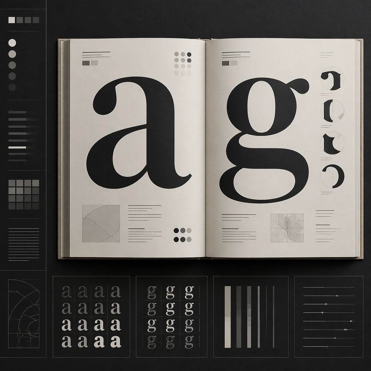
Scene: A square editorial or interface layout study with exact margins, confident grid structure, and premium print or screen presentation. Build the frame around a primary spread or headline surface with immediate hierarchy. Keep the lighting, camera distance, and spatial organization tuned for a high-signal research image rather than a casual snapshot. The image belongs to the Type Specimen Book theme and should feel immediately legible as a prompt atlas theme for type specimen book, testing text-rendering with gpt image 2.. Subject: Center the study on a primary spread or headline surface with immediate hierarchy. Translate the theme into a concrete visual statement instead of an abstract mood board: the viewer should understand what kind of image this is, what is being tested, and why the composition is difficult. Use the slug idea of type specimen book as a literal guide for subject matter, materials, and staging. If helpful, borrow the broad visual cues suggested by ABC..., Light, Regular, Bold, Black, but keep the result original and specific to this study. Important details: Typography fields must stay unreadable, but hierarchy, rhythm, and page architecture should feel convincing enough for design review. Preserve a disciplined square composition, clear focal hierarchy, and enough secondary information to make the image feel complete rather than underspecified. The image should look polished, novel, and exhibition-ready, with topic-specific credibility coming from the way surfaces, structure, and visual language reinforce Type Specimen Book. Avoid generic filler elements that do not serve the main concept. Use case: Type Specimen Book single study 1/8, testing text-rendering through the hero spread variation. Constraints: No readable text, no watermark, no logos, preserve exact 1:1 aspect ratio, no readable text, no logo lockups from real brands, no broken grid, no arbitrary poster clutter, no malformed columns, no accidental lorem ipsum.

Example generated from “Type Specimen Book — Variant Grid”
GPT Image 2en

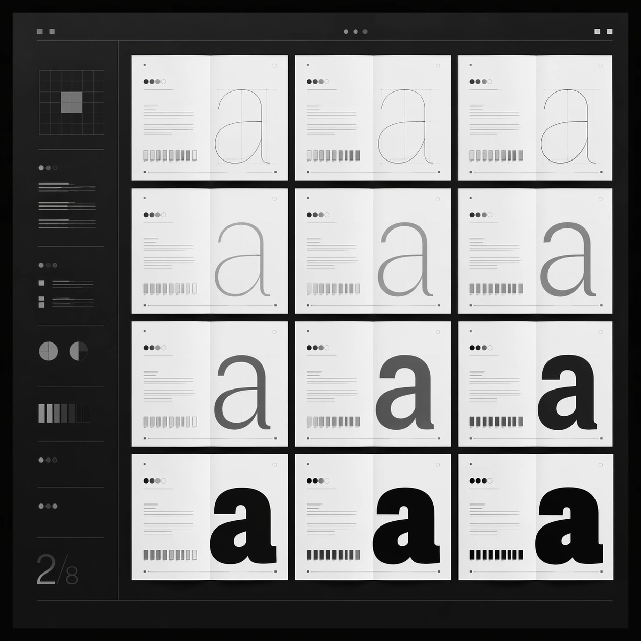
Scene: A square editorial or interface layout study with exact margins, confident grid structure, and premium print or screen presentation. Build the frame around multiple aligned variations sharing one disciplined layout system. Keep the lighting, camera distance, and spatial organization tuned for a high-signal research image rather than a casual snapshot. The image belongs to the Type Specimen Book theme and should feel immediately legible as a prompt atlas theme for type specimen book, testing text-rendering with gpt image 2.. Subject: Center the study on multiple aligned variations sharing one disciplined layout system. Translate the theme into a concrete visual statement instead of an abstract mood board: the viewer should understand what kind of image this is, what is being tested, and why the composition is difficult. Use the slug idea of type specimen book as a literal guide for subject matter, materials, and staging. If helpful, borrow the broad visual cues suggested by ABC..., Light, Regular, Bold, Black, but keep the result original and specific to this study. Important details: Typography fields must stay unreadable, but hierarchy, rhythm, and page architecture should feel convincing enough for design review. Preserve a disciplined square composition, clear focal hierarchy, and enough secondary information to make the image feel complete rather than underspecified. The image should look polished, novel, and exhibition-ready, with topic-specific credibility coming from the way surfaces, structure, and visual language reinforce Type Specimen Book. Avoid generic filler elements that do not serve the main concept. Use case: Type Specimen Book single study 2/8, testing text-rendering through the variant grid variation. Constraints: No readable text, no watermark, no logos, preserve exact 1:1 aspect ratio, no readable text, no logo lockups from real brands, no broken grid, no arbitrary poster clutter, no malformed columns, no accidental lorem ipsum.

Example generated from “Type Specimen Book — Desk Review”
GPT Image 2en

Scene: A square editorial or interface layout study with exact margins, confident grid structure, and premium print or screen presentation. Build the frame around a presentation context that shows the layout as a reviewed design object. Keep the lighting, camera distance, and spatial organization tuned for a high-signal research image rather than a casual snapshot. The image belongs to the Type Specimen Book theme and should feel immediately legible as a prompt atlas theme for type specimen book, testing text-rendering with gpt image 2.. Subject: Center the study on a presentation context that shows the layout as a reviewed design object. Translate the theme into a concrete visual statement instead of an abstract mood board: the viewer should understand what kind of image this is, what is being tested, and why the composition is difficult. Use the slug idea of type specimen book as a literal guide for subject matter, materials, and staging. If helpful, borrow the broad visual cues suggested by ABC..., Light, Regular, Bold, Black, but keep the result original and specific to this study. Important details: Typography fields must stay unreadable, but hierarchy, rhythm, and page architecture should feel convincing enough for design review. Preserve a disciplined square composition, clear focal hierarchy, and enough secondary information to make the image feel complete rather than underspecified. The image should look polished, novel, and exhibition-ready, with topic-specific credibility coming from the way surfaces, structure, and visual language reinforce Type Specimen Book. Avoid generic filler elements that do not serve the main concept. Use case: Type Specimen Book single study 3/8, testing text-rendering through the desk review variation. Constraints: No readable text, no watermark, no logos, preserve exact 1:1 aspect ratio, no readable text, no logo lockups from real brands, no broken grid, no arbitrary poster clutter, no malformed columns, no accidental lorem ipsum.

Example generated from “Type Specimen Book — Material Closeup”
GPT Image 2en

Scene: A square editorial or interface layout study with exact margins, confident grid structure, and premium print or screen presentation. Build the frame around print grain, paper, or screen detail without losing overall composition. Keep the lighting, camera distance, and spatial organization tuned for a high-signal research image rather than a casual snapshot. The image belongs to the Type Specimen Book theme and should feel immediately legible as a prompt atlas theme for type specimen book, testing text-rendering with gpt image 2.. Subject: Center the study on print grain, paper, or screen detail without losing overall composition. Translate the theme into a concrete visual statement instead of an abstract mood board: the viewer should understand what kind of image this is, what is being tested, and why the composition is difficult. Use the slug idea of type specimen book as a literal guide for subject matter, materials, and staging. If helpful, borrow the broad visual cues suggested by ABC..., Light, Regular, Bold, Black, but keep the result original and specific to this study. Important details: Typography fields must stay unreadable, but hierarchy, rhythm, and page architecture should feel convincing enough for design review. Preserve a disciplined square composition, clear focal hierarchy, and enough secondary information to make the image feel complete rather than underspecified. The image should look polished, novel, and exhibition-ready, with topic-specific credibility coming from the way surfaces, structure, and visual language reinforce Type Specimen Book. Avoid generic filler elements that do not serve the main concept. Use case: Type Specimen Book single study 4/8, testing text-rendering through the material closeup variation. Constraints: No readable text, no watermark, no logos, preserve exact 1:1 aspect ratio, no readable text, no logo lockups from real brands, no broken grid, no arbitrary poster clutter, no malformed columns, no accidental lorem ipsum.

Example generated from “Type Specimen Book — Archive Sheet”
GPT Image 2en

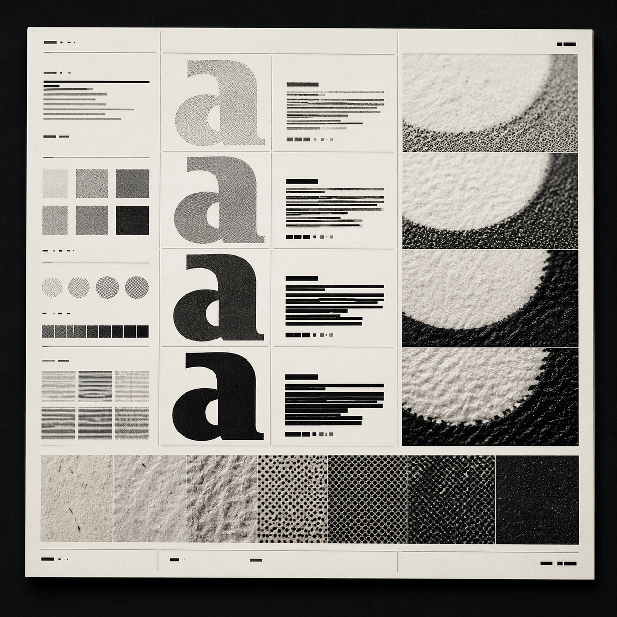
Scene: A square editorial or interface layout study with exact margins, confident grid structure, and premium print or screen presentation. Build the frame around a flat archival or proof-like sheet with modular content blocks. Keep the lighting, camera distance, and spatial organization tuned for a high-signal research image rather than a casual snapshot. The image belongs to the Type Specimen Book theme and should feel immediately legible as a prompt atlas theme for type specimen book, testing text-rendering with gpt image 2.. Subject: Center the study on a flat archival or proof-like sheet with modular content blocks. Translate the theme into a concrete visual statement instead of an abstract mood board: the viewer should understand what kind of image this is, what is being tested, and why the composition is difficult. Use the slug idea of type specimen book as a literal guide for subject matter, materials, and staging. If helpful, borrow the broad visual cues suggested by ABC..., Light, Regular, Bold, Black, but keep the result original and specific to this study. Important details: Typography fields must stay unreadable, but hierarchy, rhythm, and page architecture should feel convincing enough for design review. Preserve a disciplined square composition, clear focal hierarchy, and enough secondary information to make the image feel complete rather than underspecified. The image should look polished, novel, and exhibition-ready, with topic-specific credibility coming from the way surfaces, structure, and visual language reinforce Type Specimen Book. Avoid generic filler elements that do not serve the main concept. Use case: Type Specimen Book single study 5/8, testing text-rendering through the archive sheet variation. Constraints: No readable text, no watermark, no logos, preserve exact 1:1 aspect ratio, no readable text, no logo lockups from real brands, no broken grid, no arbitrary poster clutter, no malformed columns, no accidental lorem ipsum.

Example generated from “Type Specimen Book — 陈列展示”
GPT Image 2en

Scene: A square editorial or interface layout study with exact margins, confident grid structure, and premium print or screen presentation. Build the frame around a polished display context that still preserves layout logic. Keep the lighting, camera distance, and spatial organization tuned for a high-signal research image rather than a casual snapshot. The image belongs to the Type Specimen Book theme and should feel immediately legible as a prompt atlas theme for type specimen book, testing text-rendering with gpt image 2.. Subject: Center the study on a polished display context that still preserves layout logic. Translate the theme into a concrete visual statement instead of an abstract mood board: the viewer should understand what kind of image this is, what is being tested, and why the composition is difficult. Use the slug idea of type specimen book as a literal guide for subject matter, materials, and staging. If helpful, borrow the broad visual cues suggested by ABC..., Light, Regular, Bold, Black, but keep the result original and specific to this study. Important details: Typography fields must stay unreadable, but hierarchy, rhythm, and page architecture should feel convincing enough for design review. Preserve a disciplined square composition, clear focal hierarchy, and enough secondary information to make the image feel complete rather than underspecified. The image should look polished, novel, and exhibition-ready, with topic-specific credibility coming from the way surfaces, structure, and visual language reinforce Type Specimen Book. Avoid generic filler elements that do not serve the main concept. Use case: Type Specimen Book single study 6/8, testing text-rendering through the 陈列展示 variation. Constraints: No readable text, no watermark, no logos, preserve exact 1:1 aspect ratio, no readable text, no logo lockups from real brands, no broken grid, no arbitrary poster clutter, no malformed columns, no accidental lorem ipsum.

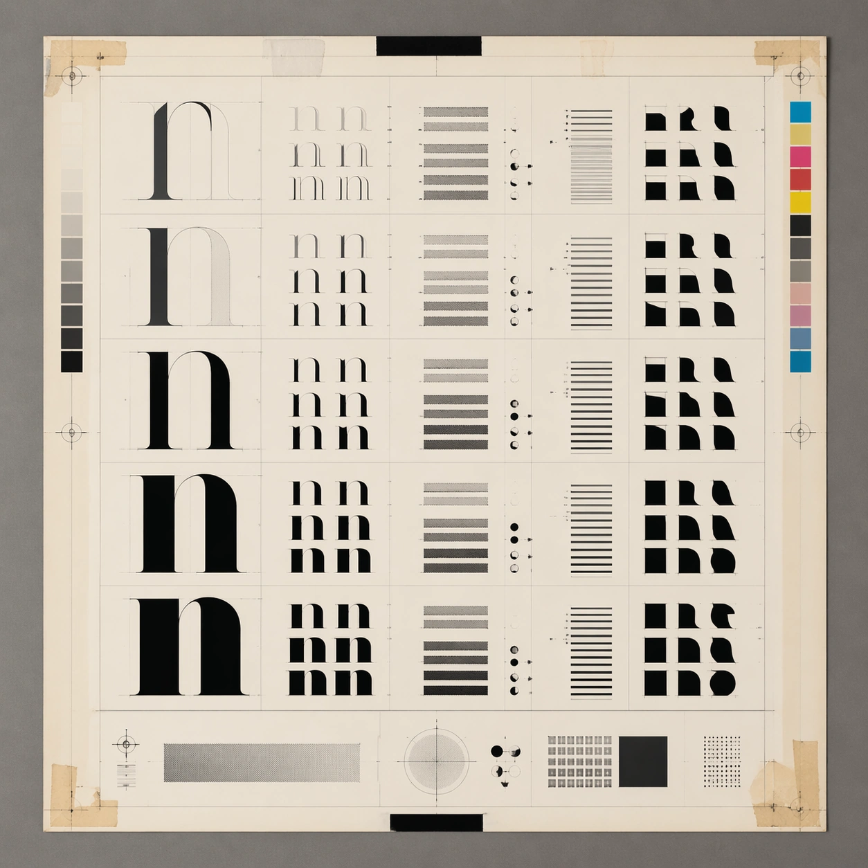
Example generated from “Type Specimen Book — System Board”
GPT Image 2en

Scene: A square editorial or interface layout study with exact margins, confident grid structure, and premium print or screen presentation. Build the frame around a family of elements organized into a coherent visual language. Keep the lighting, camera distance, and spatial organization tuned for a high-signal research image rather than a casual snapshot. The image belongs to the Type Specimen Book theme and should feel immediately legible as a prompt atlas theme for type specimen book, testing text-rendering with gpt image 2.. Subject: Center the study on a family of elements organized into a coherent visual language. Translate the theme into a concrete visual statement instead of an abstract mood board: the viewer should understand what kind of image this is, what is being tested, and why the composition is difficult. Use the slug idea of type specimen book as a literal guide for subject matter, materials, and staging. If helpful, borrow the broad visual cues suggested by ABC..., Light, Regular, Bold, Black, but keep the result original and specific to this study. Important details: Typography fields must stay unreadable, but hierarchy, rhythm, and page architecture should feel convincing enough for design review. Preserve a disciplined square composition, clear focal hierarchy, and enough secondary information to make the image feel complete rather than underspecified. The image should look polished, novel, and exhibition-ready, with topic-specific credibility coming from the way surfaces, structure, and visual language reinforce Type Specimen Book. Avoid generic filler elements that do not serve the main concept. Use case: Type Specimen Book single study 7/8, testing text-rendering through the system board variation. Constraints: No readable text, no watermark, no logos, preserve exact 1:1 aspect ratio, no readable text, no logo lockups from real brands, no broken grid, no arbitrary poster clutter, no malformed columns, no accidental lorem ipsum.

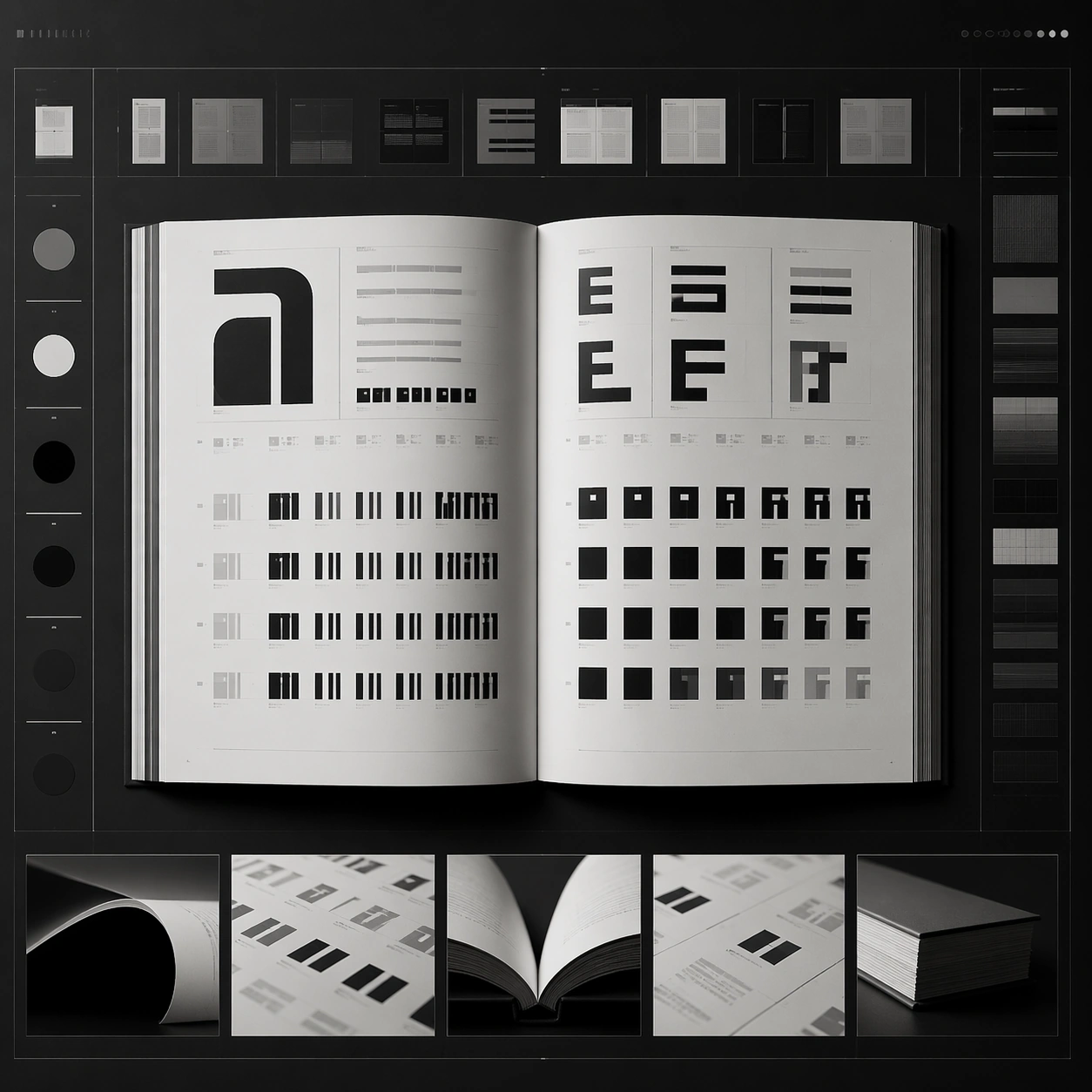
Example generated from “Type Specimen Book — Signature Layout”
GPT Image 2en

Scene: A square editorial or interface layout study with exact margins, confident grid structure, and premium print or screen presentation. Build the frame around the most distilled expression of the topic’s layout identity. Keep the lighting, camera distance, and spatial organization tuned for a high-signal research image rather than a casual snapshot. The image belongs to the Type Specimen Book theme and should feel immediately legible as a prompt atlas theme for type specimen book, testing text-rendering with gpt image 2.. Subject: Center the study on the most distilled expression of the topic’s layout identity. Translate the theme into a concrete visual statement instead of an abstract mood board: the viewer should understand what kind of image this is, what is being tested, and why the composition is difficult. Use the slug idea of type specimen book as a literal guide for subject matter, materials, and staging. If helpful, borrow the broad visual cues suggested by ABC..., Light, Regular, Bold, Black, but keep the result original and specific to this study. Important details: Typography fields must stay unreadable, but hierarchy, rhythm, and page architecture should feel convincing enough for design review. Preserve a disciplined square composition, clear focal hierarchy, and enough secondary information to make the image feel complete rather than underspecified. The image should look polished, novel, and exhibition-ready, with topic-specific credibility coming from the way surfaces, structure, and visual language reinforce Type Specimen Book. Avoid generic filler elements that do not serve the main concept. Use case: Type Specimen Book single study 8/8, testing text-rendering through the signature layout variation. Constraints: No readable text, no watermark, no logos, preserve exact 1:1 aspect ratio, no readable text, no logo lockups from real brands, no broken grid, no arbitrary poster clutter, no malformed columns, no accidental lorem ipsum.

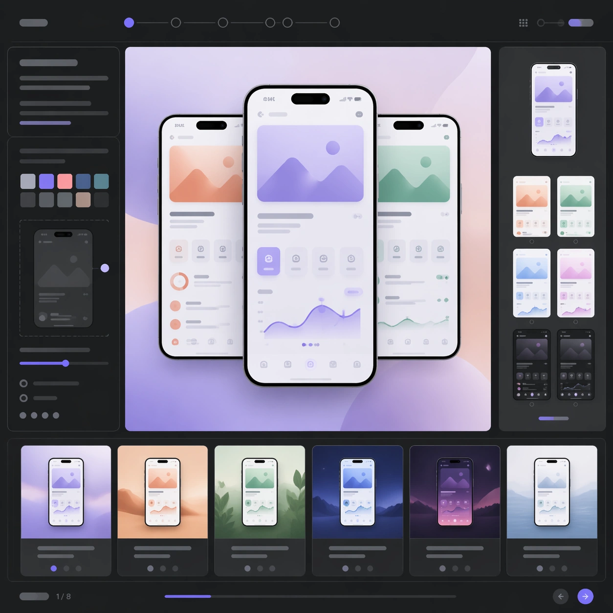
Example generated from “Ui Screenshot Prototype — Hero Spread”
GPT Image 2en

Scene: A square editorial or interface layout study with exact margins, confident grid structure, and premium print or screen presentation. Build the frame around a primary spread or headline surface with immediate hierarchy. Keep the lighting, camera distance, and spatial organization tuned for a high-signal research image rather than a casual snapshot. The image belongs to the UI Screenshot Prototype theme and should feel immediately legible as a prompt atlas theme for ui screenshot prototype, testing structured-layout, style-transfer with gpt image 2.. Subject: Center the study on a primary spread or headline surface with immediate hierarchy. Translate the theme into a concrete visual statement instead of an abstract mood board: the viewer should understand what kind of image this is, what is being tested, and why the composition is difficult. Use the slug idea of ui screenshot prototype as a literal guide for subject matter, materials, and staging. If helpful, borrow the broad visual cues suggested by iOS app, onboarding, but keep the result original and specific to this study. Important details: Typography fields must stay unreadable, but hierarchy, rhythm, and page architecture should feel convincing enough for design review. Preserve a disciplined square composition, clear focal hierarchy, and enough secondary information to make the image feel complete rather than underspecified. The image should look polished, novel, and exhibition-ready, with topic-specific credibility coming from the way surfaces, structure, and visual language reinforce UI Screenshot Prototype. Avoid generic filler elements that do not serve the main concept. Use case: UI Screenshot Prototype single study 1/8, testing structured-layout, style-transfer through the hero spread variation. Constraints: No readable text, no watermark, no logos, preserve exact 1:1 aspect ratio, no readable text, no logo lockups from real brands, no broken grid, no arbitrary poster clutter, no malformed columns, no accidental lorem ipsum.

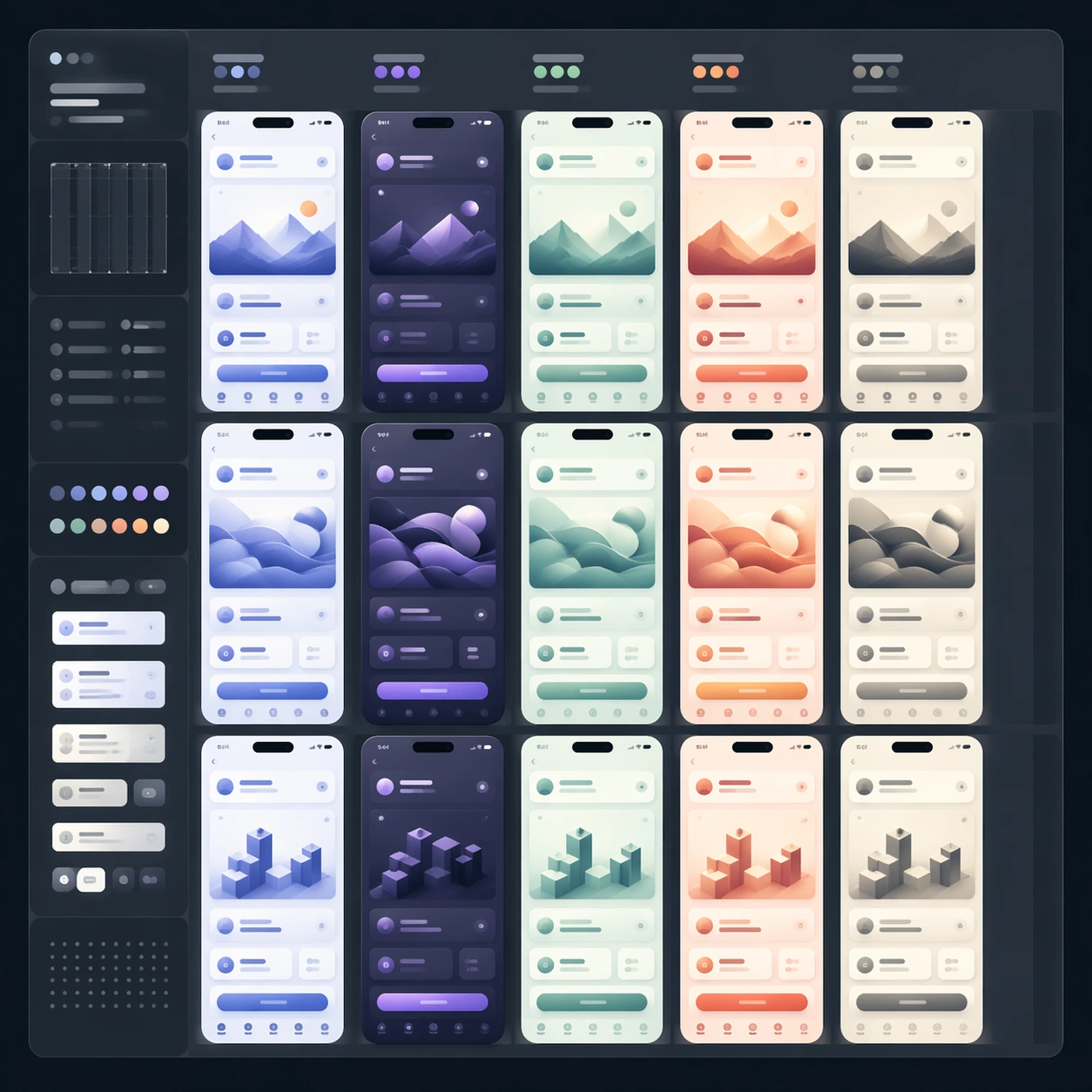
Example generated from “Ui Screenshot Prototype — Variant Grid”
GPT Image 2en

Scene: A square editorial or interface layout study with exact margins, confident grid structure, and premium print or screen presentation. Build the frame around multiple aligned variations sharing one disciplined layout system. Keep the lighting, camera distance, and spatial organization tuned for a high-signal research image rather than a casual snapshot. The image belongs to the UI Screenshot Prototype theme and should feel immediately legible as a prompt atlas theme for ui screenshot prototype, testing structured-layout, style-transfer with gpt image 2.. Subject: Center the study on multiple aligned variations sharing one disciplined layout system. Translate the theme into a concrete visual statement instead of an abstract mood board: the viewer should understand what kind of image this is, what is being tested, and why the composition is difficult. Use the slug idea of ui screenshot prototype as a literal guide for subject matter, materials, and staging. If helpful, borrow the broad visual cues suggested by iOS app, onboarding, but keep the result original and specific to this study. Important details: Typography fields must stay unreadable, but hierarchy, rhythm, and page architecture should feel convincing enough for design review. Preserve a disciplined square composition, clear focal hierarchy, and enough secondary information to make the image feel complete rather than underspecified. The image should look polished, novel, and exhibition-ready, with topic-specific credibility coming from the way surfaces, structure, and visual language reinforce UI Screenshot Prototype. Avoid generic filler elements that do not serve the main concept. Use case: UI Screenshot Prototype single study 2/8, testing structured-layout, style-transfer through the variant grid variation. Constraints: No readable text, no watermark, no logos, preserve exact 1:1 aspect ratio, no readable text, no logo lockups from real brands, no broken grid, no arbitrary poster clutter, no malformed columns, no accidental lorem ipsum.

Example generated from “Ui Screenshot Prototype — Desk Review”
GPT Image 2en

Scene: A square editorial or interface layout study with exact margins, confident grid structure, and premium print or screen presentation. Build the frame around a presentation context that shows the layout as a reviewed design object. Keep the lighting, camera distance, and spatial organization tuned for a high-signal research image rather than a casual snapshot. The image belongs to the UI Screenshot Prototype theme and should feel immediately legible as a prompt atlas theme for ui screenshot prototype, testing structured-layout, style-transfer with gpt image 2.. Subject: Center the study on a presentation context that shows the layout as a reviewed design object. Translate the theme into a concrete visual statement instead of an abstract mood board: the viewer should understand what kind of image this is, what is being tested, and why the composition is difficult. Use the slug idea of ui screenshot prototype as a literal guide for subject matter, materials, and staging. If helpful, borrow the broad visual cues suggested by iOS app, onboarding, but keep the result original and specific to this study. Important details: Typography fields must stay unreadable, but hierarchy, rhythm, and page architecture should feel convincing enough for design review. Preserve a disciplined square composition, clear focal hierarchy, and enough secondary information to make the image feel complete rather than underspecified. The image should look polished, novel, and exhibition-ready, with topic-specific credibility coming from the way surfaces, structure, and visual language reinforce UI Screenshot Prototype. Avoid generic filler elements that do not serve the main concept. Use case: UI Screenshot Prototype single study 3/8, testing structured-layout, style-transfer through the desk review variation. Constraints: No readable text, no watermark, no logos, preserve exact 1:1 aspect ratio, no readable text, no logo lockups from real brands, no broken grid, no arbitrary poster clutter, no malformed columns, no accidental lorem ipsum.

Example generated from “Ui Screenshot Prototype — Material Closeup”
GPT Image 2en

Scene: A square editorial or interface layout study with exact margins, confident grid structure, and premium print or screen presentation. Build the frame around print grain, paper, or screen detail without losing overall composition. Keep the lighting, camera distance, and spatial organization tuned for a high-signal research image rather than a casual snapshot. The image belongs to the UI Screenshot Prototype theme and should feel immediately legible as a prompt atlas theme for ui screenshot prototype, testing structured-layout, style-transfer with gpt image 2.. Subject: Center the study on print grain, paper, or screen detail without losing overall composition. Translate the theme into a concrete visual statement instead of an abstract mood board: the viewer should understand what kind of image this is, what is being tested, and why the composition is difficult. Use the slug idea of ui screenshot prototype as a literal guide for subject matter, materials, and staging. If helpful, borrow the broad visual cues suggested by iOS app, onboarding, but keep the result original and specific to this study. Important details: Typography fields must stay unreadable, but hierarchy, rhythm, and page architecture should feel convincing enough for design review. Preserve a disciplined square composition, clear focal hierarchy, and enough secondary information to make the image feel complete rather than underspecified. The image should look polished, novel, and exhibition-ready, with topic-specific credibility coming from the way surfaces, structure, and visual language reinforce UI Screenshot Prototype. Avoid generic filler elements that do not serve the main concept. Use case: UI Screenshot Prototype single study 4/8, testing structured-layout, style-transfer through the material closeup variation. Constraints: No readable text, no watermark, no logos, preserve exact 1:1 aspect ratio, no readable text, no logo lockups from real brands, no broken grid, no arbitrary poster clutter, no malformed columns, no accidental lorem ipsum.

Example generated from “Ui Screenshot Prototype — Archive Sheet”
GPT Image 2en

Scene: A square editorial or interface layout study with exact margins, confident grid structure, and premium print or screen presentation. Build the frame around a flat archival or proof-like sheet with modular content blocks. Keep the lighting, camera distance, and spatial organization tuned for a high-signal research image rather than a casual snapshot. The image belongs to the UI Screenshot Prototype theme and should feel immediately legible as a prompt atlas theme for ui screenshot prototype, testing structured-layout, style-transfer with gpt image 2.. Subject: Center the study on a flat archival or proof-like sheet with modular content blocks. Translate the theme into a concrete visual statement instead of an abstract mood board: the viewer should understand what kind of image this is, what is being tested, and why the composition is difficult. Use the slug idea of ui screenshot prototype as a literal guide for subject matter, materials, and staging. If helpful, borrow the broad visual cues suggested by iOS app, onboarding, but keep the result original and specific to this study. Important details: Typography fields must stay unreadable, but hierarchy, rhythm, and page architecture should feel convincing enough for design review. Preserve a disciplined square composition, clear focal hierarchy, and enough secondary information to make the image feel complete rather than underspecified. The image should look polished, novel, and exhibition-ready, with topic-specific credibility coming from the way surfaces, structure, and visual language reinforce UI Screenshot Prototype. Avoid generic filler elements that do not serve the main concept. Use case: UI Screenshot Prototype single study 5/8, testing structured-layout, style-transfer through the archive sheet variation. Constraints: No readable text, no watermark, no logos, preserve exact 1:1 aspect ratio, no readable text, no logo lockups from real brands, no broken grid, no arbitrary poster clutter, no malformed columns, no accidental lorem ipsum.

Example generated from “Ui Screenshot Prototype — 陈列展示”
GPT Image 2en

Scene: A square editorial or interface layout study with exact margins, confident grid structure, and premium print or screen presentation. Build the frame around a polished display context that still preserves layout logic. Keep the lighting, camera distance, and spatial organization tuned for a high-signal research image rather than a casual snapshot. The image belongs to the UI Screenshot Prototype theme and should feel immediately legible as a prompt atlas theme for ui screenshot prototype, testing structured-layout, style-transfer with gpt image 2.. Subject: Center the study on a polished display context that still preserves layout logic. Translate the theme into a concrete visual statement instead of an abstract mood board: the viewer should understand what kind of image this is, what is being tested, and why the composition is difficult. Use the slug idea of ui screenshot prototype as a literal guide for subject matter, materials, and staging. If helpful, borrow the broad visual cues suggested by iOS app, onboarding, but keep the result original and specific to this study. Important details: Typography fields must stay unreadable, but hierarchy, rhythm, and page architecture should feel convincing enough for design review. Preserve a disciplined square composition, clear focal hierarchy, and enough secondary information to make the image feel complete rather than underspecified. The image should look polished, novel, and exhibition-ready, with topic-specific credibility coming from the way surfaces, structure, and visual language reinforce UI Screenshot Prototype. Avoid generic filler elements that do not serve the main concept. Use case: UI Screenshot Prototype single study 6/8, testing structured-layout, style-transfer through the 陈列展示 variation. Constraints: No readable text, no watermark, no logos, preserve exact 1:1 aspect ratio, no readable text, no logo lockups from real brands, no broken grid, no arbitrary poster clutter, no malformed columns, no accidental lorem ipsum.

Example generated from “Ui Screenshot Prototype — System Board”
GPT Image 2en

Scene: A square editorial or interface layout study with exact margins, confident grid structure, and premium print or screen presentation. Build the frame around a family of elements organized into a coherent visual language. Keep the lighting, camera distance, and spatial organization tuned for a high-signal research image rather than a casual snapshot. The image belongs to the UI Screenshot Prototype theme and should feel immediately legible as a prompt atlas theme for ui screenshot prototype, testing structured-layout, style-transfer with gpt image 2.. Subject: Center the study on a family of elements organized into a coherent visual language. Translate the theme into a concrete visual statement instead of an abstract mood board: the viewer should understand what kind of image this is, what is being tested, and why the composition is difficult. Use the slug idea of ui screenshot prototype as a literal guide for subject matter, materials, and staging. If helpful, borrow the broad visual cues suggested by iOS app, onboarding, but keep the result original and specific to this study. Important details: Typography fields must stay unreadable, but hierarchy, rhythm, and page architecture should feel convincing enough for design review. Preserve a disciplined square composition, clear focal hierarchy, and enough secondary information to make the image feel complete rather than underspecified. The image should look polished, novel, and exhibition-ready, with topic-specific credibility coming from the way surfaces, structure, and visual language reinforce UI Screenshot Prototype. Avoid generic filler elements that do not serve the main concept. Use case: UI Screenshot Prototype single study 7/8, testing structured-layout, style-transfer through the system board variation. Constraints: No readable text, no watermark, no logos, preserve exact 1:1 aspect ratio, no readable text, no logo lockups from real brands, no broken grid, no arbitrary poster clutter, no malformed columns, no accidental lorem ipsum.

Example generated from “Ui Screenshot Prototype — Signature Layout”
GPT Image 2en

Scene: A square editorial or interface layout study with exact margins, confident grid structure, and premium print or screen presentation. Build the frame around the most distilled expression of the topic’s layout identity. Keep the lighting, camera distance, and spatial organization tuned for a high-signal research image rather than a casual snapshot. The image belongs to the UI Screenshot Prototype theme and should feel immediately legible as a prompt atlas theme for ui screenshot prototype, testing structured-layout, style-transfer with gpt image 2.. Subject: Center the study on the most distilled expression of the topic’s layout identity. Translate the theme into a concrete visual statement instead of an abstract mood board: the viewer should understand what kind of image this is, what is being tested, and why the composition is difficult. Use the slug idea of ui screenshot prototype as a literal guide for subject matter, materials, and staging. If helpful, borrow the broad visual cues suggested by iOS app, onboarding, but keep the result original and specific to this study. Important details: Typography fields must stay unreadable, but hierarchy, rhythm, and page architecture should feel convincing enough for design review. Preserve a disciplined square composition, clear focal hierarchy, and enough secondary information to make the image feel complete rather than underspecified. The image should look polished, novel, and exhibition-ready, with topic-specific credibility coming from the way surfaces, structure, and visual language reinforce UI Screenshot Prototype. Avoid generic filler elements that do not serve the main concept. Use case: UI Screenshot Prototype single study 8/8, testing structured-layout, style-transfer through the signature layout variation. Constraints: No readable text, no watermark, no logos, preserve exact 1:1 aspect ratio, no readable text, no logo lockups from real brands, no broken grid, no arbitrary poster clutter, no malformed columns, no accidental lorem ipsum.

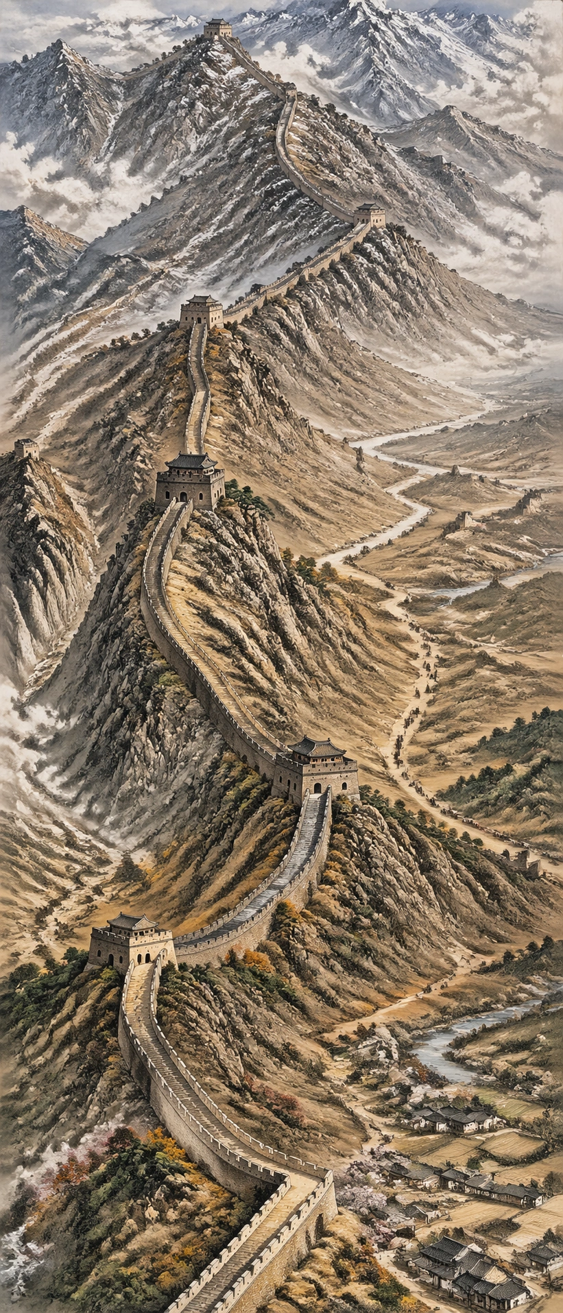
Example generated from “Ultra Long Scroll Painting — Great Wall Terrain Scroll”
GPT Image 2en

Scene: A single vertical 9:21 illustrated terrain scroll, like a museum-grade painted map seen from a high oblique angle. The scroll travels from rugged northern mountains at the top through watchtowers and ridgelines toward lower valleys and villages at the bottom. Subject: A continuous Great Wall terrain narrative: crenellated wall segments climbing ridges, beacon towers, steep stone stairs, mountain passes, dry grasses, distant villages, switchback paths, old caravan traces, and changing weather bands. The wall must remain spatially continuous through the entire image. Important details: Extreme vertical 9:21 aspect ratio, readable topographic logic, hand-painted cartographic detail, believable Chinese mountain geology, mist depth, tiny human-scale landmarks, accurate wall geometry following ridgelines, clear foreground-middle-background layering, rich detail without visual clutter. Use case: Independent Prompt Atlas image for testing long-format landscape continuity, world-knowledge detail, and dense structured composition. Constraints: No readable text, no labels, no watermark, no logos, no map pins, no fantasy castle additions, no disconnected wall fragments, no frame, preserve exact 9:21 vertical aspect ratio.

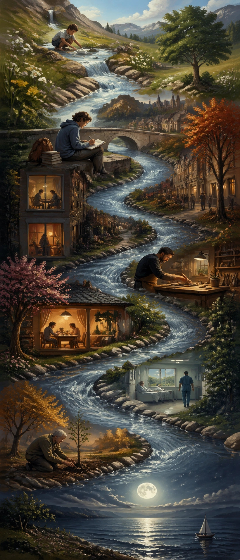
Example generated from “Ultra Long Scroll Painting — Lifetime River Scroll”
GPT Image 2en

Scene: A single vertical 9:21 allegorical scroll in a refined editorial painting style. A river begins as a small spring at the top, grows through towns and seasons in the middle, and reaches a wide moonlit estuary at the bottom. Subject: One human life shown as a continuous river timeline without text: childhood paper boats near the source, student notebooks beside a bridge, first apartment windows, workbench and tools, family dinner light, hospital corridor calmness, old hands planting a tree, and a final open sea horizon. All moments must be connected by the same river path. Important details: Extreme vertical scroll composition, emotionally clear but not sentimental, coherent time progression, recurring visual motifs, seasonal color transitions, dense micro scenes that remain readable in a gallery thumbnail, painterly detail, careful negative space around major life moments. Use case: Independent Prompt Atlas image for testing reasoning composition, extreme aspect ratio, and long-form visual narrative without text labels. Constraints: No readable text, no captions, no watermark, no logos, no disjointed panels, no fantasy glow, no celebrity likeness, preserve exact 9:21 vertical aspect ratio.

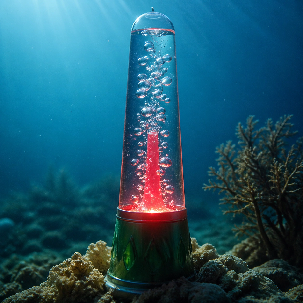
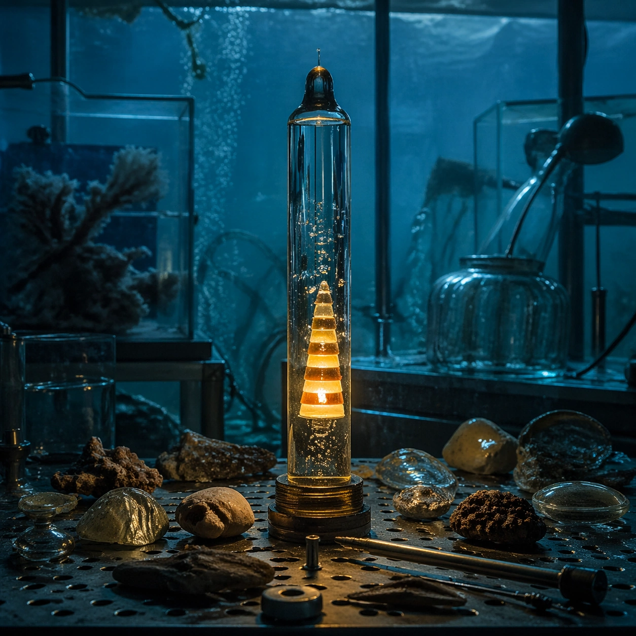
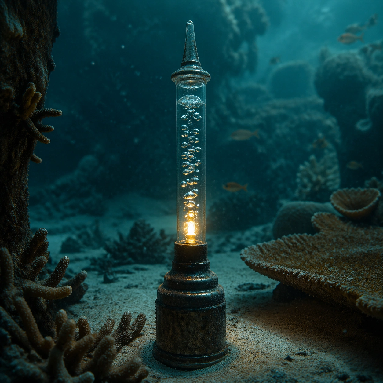
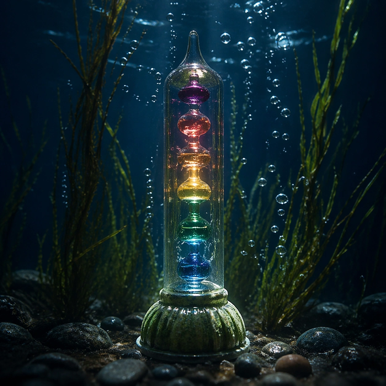
Example generated from “Underwater Bubble Light — Hero Shot”
GPT Image 2en

Scene: A square photographic image with intentional lens choice, coherent light, and a subject that feels observed rather than merely decorated. Build the frame around a definitive frame that establishes the subject’s strongest visual identity. Keep the lighting, camera distance, and spatial organization tuned for a high-signal research image rather than a casual snapshot. The image belongs to the Underwater Bubble Light theme and should feel immediately legible as a prompt atlas theme for underwater bubble light, testing photorealism, physics-materials with gpt image 2.. Subject: Center the study on a definitive frame that establishes the subject’s strongest visual identity. Translate the theme into a concrete visual statement instead of an abstract mood board: the viewer should understand what kind of image this is, what is being tested, and why the composition is difficult. Use the slug idea of underwater bubble light as a literal guide for subject matter, materials, and staging. Important details: The realism should come from timing, optics, and material response: atmosphere, contrast, depth, motion, and tiny physical cues all need to agree. Preserve a disciplined square composition, clear focal hierarchy, and enough secondary information to make the image feel complete rather than underspecified. The image should look polished, novel, and exhibition-ready, with topic-specific credibility coming from the way surfaces, structure, and visual language reinforce Underwater Bubble Light. Avoid generic filler elements that do not serve the main concept. Use case: Underwater Bubble Light single study 1/8, testing photorealism, physics-materials through the hero shot variation. Constraints: No readable text, no watermark, no logos, preserve exact 1:1 aspect ratio, no watermark, no cheap HDR excess, no unreadable signage, no fake stock-photo posing, no compositing seams, no arbitrary lens flare.

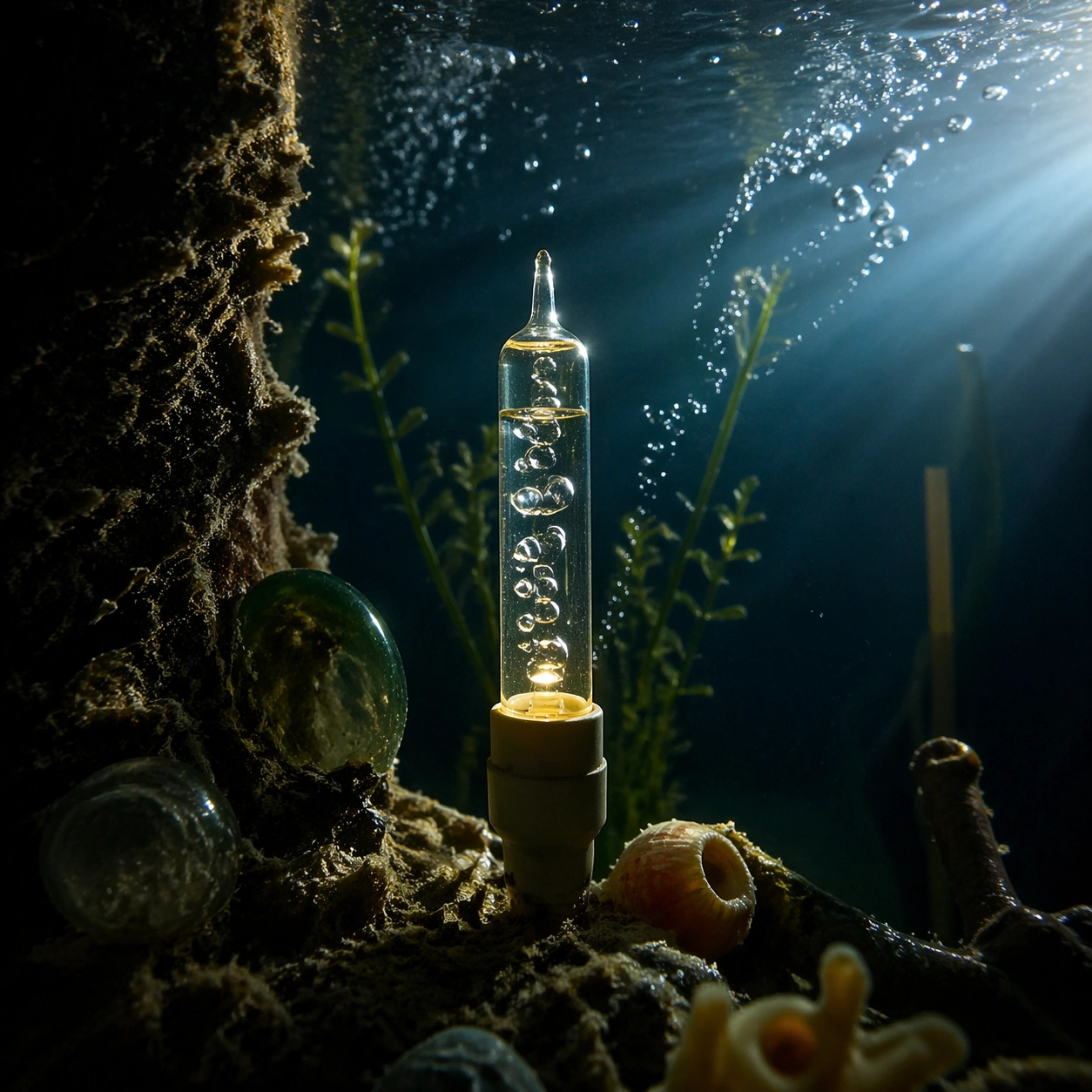
Example generated from “Underwater Bubble Light — Macro Study”
GPT Image 2en

Scene: A square photographic image with intentional lens choice, coherent light, and a subject that feels observed rather than merely decorated. Build the frame around closer observation that reveals fine structure and optical behavior. Keep the lighting, camera distance, and spatial organization tuned for a high-signal research image rather than a casual snapshot. The image belongs to the Underwater Bubble Light theme and should feel immediately legible as a prompt atlas theme for underwater bubble light, testing photorealism, physics-materials with gpt image 2.. Subject: Center the study on closer observation that reveals fine structure and optical behavior. Translate the theme into a concrete visual statement instead of an abstract mood board: the viewer should understand what kind of image this is, what is being tested, and why the composition is difficult. Use the slug idea of underwater bubble light as a literal guide for subject matter, materials, and staging. Important details: The realism should come from timing, optics, and material response: atmosphere, contrast, depth, motion, and tiny physical cues all need to agree. Preserve a disciplined square composition, clear focal hierarchy, and enough secondary information to make the image feel complete rather than underspecified. The image should look polished, novel, and exhibition-ready, with topic-specific credibility coming from the way surfaces, structure, and visual language reinforce Underwater Bubble Light. Avoid generic filler elements that do not serve the main concept. Use case: Underwater Bubble Light single study 2/8, testing photorealism, physics-materials through the macro study variation. Constraints: No readable text, no watermark, no logos, preserve exact 1:1 aspect ratio, no watermark, no cheap HDR excess, no unreadable signage, no fake stock-photo posing, no compositing seams, no arbitrary lens flare.

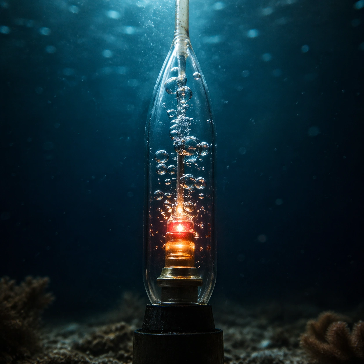
Example generated from “Underwater Bubble Light — Side Light Study”
GPT Image 2en

Scene: A square photographic image with intentional lens choice, coherent light, and a subject that feels observed rather than merely decorated. Build the frame around a directional-light treatment that increases form and drama. Keep the lighting, camera distance, and spatial organization tuned for a high-signal research image rather than a casual snapshot. The image belongs to the Underwater Bubble Light theme and should feel immediately legible as a prompt atlas theme for underwater bubble light, testing photorealism, physics-materials with gpt image 2.. Subject: Center the study on a directional-light treatment that increases form and drama. Translate the theme into a concrete visual statement instead of an abstract mood board: the viewer should understand what kind of image this is, what is being tested, and why the composition is difficult. Use the slug idea of underwater bubble light as a literal guide for subject matter, materials, and staging. Important details: The realism should come from timing, optics, and material response: atmosphere, contrast, depth, motion, and tiny physical cues all need to agree. Preserve a disciplined square composition, clear focal hierarchy, and enough secondary information to make the image feel complete rather than underspecified. The image should look polished, novel, and exhibition-ready, with topic-specific credibility coming from the way surfaces, structure, and visual language reinforce Underwater Bubble Light. Avoid generic filler elements that do not serve the main concept. Use case: Underwater Bubble Light single study 3/8, testing photorealism, physics-materials through the side light study variation. Constraints: No readable text, no watermark, no logos, preserve exact 1:1 aspect ratio, no watermark, no cheap HDR excess, no unreadable signage, no fake stock-photo posing, no compositing seams, no arbitrary lens flare.

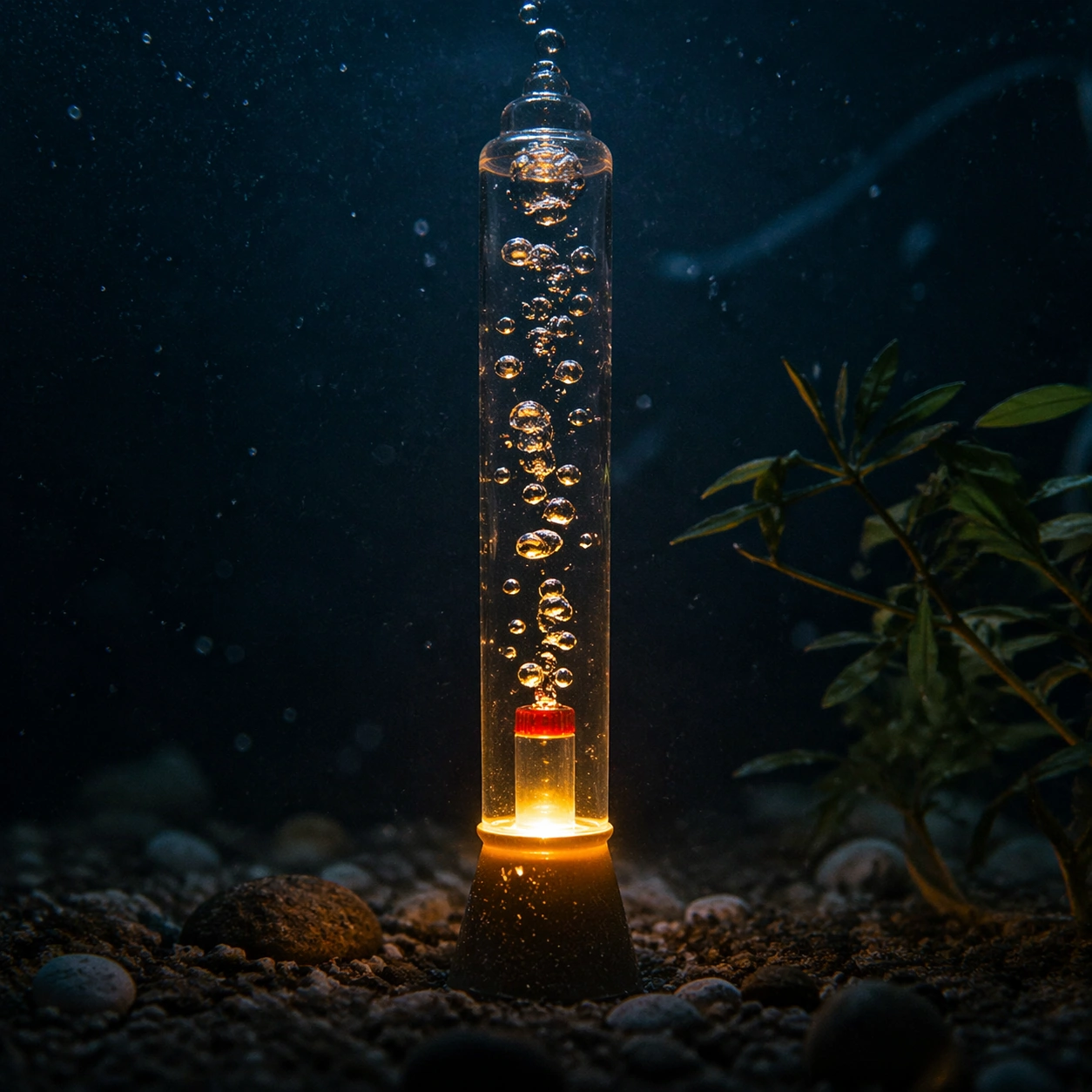
Example generated from “Underwater Bubble Light — Motion Moment”
GPT Image 2en

Scene: A square photographic image with intentional lens choice, coherent light, and a subject that feels observed rather than merely decorated. Build the frame around a time-sensitive or kinetic phenomenon captured at the right instant. Keep the lighting, camera distance, and spatial organization tuned for a high-signal research image rather than a casual snapshot. The image belongs to the Underwater Bubble Light theme and should feel immediately legible as a prompt atlas theme for underwater bubble light, testing photorealism, physics-materials with gpt image 2.. Subject: Center the study on a time-sensitive or kinetic phenomenon captured at the right instant. Translate the theme into a concrete visual statement instead of an abstract mood board: the viewer should understand what kind of image this is, what is being tested, and why the composition is difficult. Use the slug idea of underwater bubble light as a literal guide for subject matter, materials, and staging. Important details: The realism should come from timing, optics, and material response: atmosphere, contrast, depth, motion, and tiny physical cues all need to agree. Preserve a disciplined square composition, clear focal hierarchy, and enough secondary information to make the image feel complete rather than underspecified. The image should look polished, novel, and exhibition-ready, with topic-specific credibility coming from the way surfaces, structure, and visual language reinforce Underwater Bubble Light. Avoid generic filler elements that do not serve the main concept. Use case: Underwater Bubble Light single study 4/8, testing photorealism, physics-materials through the motion moment variation. Constraints: No readable text, no watermark, no logos, preserve exact 1:1 aspect ratio, no watermark, no cheap HDR excess, no unreadable signage, no fake stock-photo posing, no compositing seams, no arbitrary lens flare.

Example generated from “Underwater Bubble Light — Low-Light Atlas”
GPT Image 2en

Scene: A square photographic image with intentional lens choice, coherent light, and a subject that feels observed rather than merely decorated. Build the frame around a dusk, night, or low-light frame with disciplined exposure. Keep the lighting, camera distance, and spatial organization tuned for a high-signal research image rather than a casual snapshot. The image belongs to the Underwater Bubble Light theme and should feel immediately legible as a prompt atlas theme for underwater bubble light, testing photorealism, physics-materials with gpt image 2.. Subject: Center the study on a dusk, night, or low-light frame with disciplined exposure. Translate the theme into a concrete visual statement instead of an abstract mood board: the viewer should understand what kind of image this is, what is being tested, and why the composition is difficult. Use the slug idea of underwater bubble light as a literal guide for subject matter, materials, and staging. Important details: The realism should come from timing, optics, and material response: atmosphere, contrast, depth, motion, and tiny physical cues all need to agree. Preserve a disciplined square composition, clear focal hierarchy, and enough secondary information to make the image feel complete rather than underspecified. The image should look polished, novel, and exhibition-ready, with topic-specific credibility coming from the way surfaces, structure, and visual language reinforce Underwater Bubble Light. Avoid generic filler elements that do not serve the main concept. Use case: Underwater Bubble Light single study 5/8, testing photorealism, physics-materials through the low-light atlas variation. Constraints: No readable text, no watermark, no logos, preserve exact 1:1 aspect ratio, no watermark, no cheap HDR excess, no unreadable signage, no fake stock-photo posing, no compositing seams, no arbitrary lens flare.

Example generated from “Underwater Bubble Light — Specimen Table”
GPT Image 2en

Scene: A square photographic image with intentional lens choice, coherent light, and a subject that feels observed rather than merely decorated. Build the frame around a carefully arranged or comparative frame that still feels photographic. Keep the lighting, camera distance, and spatial organization tuned for a high-signal research image rather than a casual snapshot. The image belongs to the Underwater Bubble Light theme and should feel immediately legible as a prompt atlas theme for underwater bubble light, testing photorealism, physics-materials with gpt image 2.. Subject: Center the study on a carefully arranged or comparative frame that still feels photographic. Translate the theme into a concrete visual statement instead of an abstract mood board: the viewer should understand what kind of image this is, what is being tested, and why the composition is difficult. Use the slug idea of underwater bubble light as a literal guide for subject matter, materials, and staging. Important details: The realism should come from timing, optics, and material response: atmosphere, contrast, depth, motion, and tiny physical cues all need to agree. Preserve a disciplined square composition, clear focal hierarchy, and enough secondary information to make the image feel complete rather than underspecified. The image should look polished, novel, and exhibition-ready, with topic-specific credibility coming from the way surfaces, structure, and visual language reinforce Underwater Bubble Light. Avoid generic filler elements that do not serve the main concept. Use case: Underwater Bubble Light single study 6/8, testing photorealism, physics-materials through the specimen table variation. Constraints: No readable text, no watermark, no logos, preserve exact 1:1 aspect ratio, no watermark, no cheap HDR excess, no unreadable signage, no fake stock-photo posing, no compositing seams, no arbitrary lens flare.

Example generated from “Underwater Bubble Light — Atmospheric View”
GPT Image 2en

Scene: A square photographic image with intentional lens choice, coherent light, and a subject that feels observed rather than merely decorated. Build the frame around weather, haze, or volumetric light used to deepen realism. Keep the lighting, camera distance, and spatial organization tuned for a high-signal research image rather than a casual snapshot. The image belongs to the Underwater Bubble Light theme and should feel immediately legible as a prompt atlas theme for underwater bubble light, testing photorealism, physics-materials with gpt image 2.. Subject: Center the study on weather, haze, or volumetric light used to deepen realism. Translate the theme into a concrete visual statement instead of an abstract mood board: the viewer should understand what kind of image this is, what is being tested, and why the composition is difficult. Use the slug idea of underwater bubble light as a literal guide for subject matter, materials, and staging. Important details: The realism should come from timing, optics, and material response: atmosphere, contrast, depth, motion, and tiny physical cues all need to agree. Preserve a disciplined square composition, clear focal hierarchy, and enough secondary information to make the image feel complete rather than underspecified. The image should look polished, novel, and exhibition-ready, with topic-specific credibility coming from the way surfaces, structure, and visual language reinforce Underwater Bubble Light. Avoid generic filler elements that do not serve the main concept. Use case: Underwater Bubble Light single study 7/8, testing photorealism, physics-materials through the atmospheric view variation. Constraints: No readable text, no watermark, no logos, preserve exact 1:1 aspect ratio, no watermark, no cheap HDR excess, no unreadable signage, no fake stock-photo posing, no compositing seams, no arbitrary lens flare.

Example generated from “Underwater Bubble Light — Signature Frame”
GPT Image 2en

Scene: A square photographic image with intentional lens choice, coherent light, and a subject that feels observed rather than merely decorated. Build the frame around the most memorable final image for the topic. Keep the lighting, camera distance, and spatial organization tuned for a high-signal research image rather than a casual snapshot. The image belongs to the Underwater Bubble Light theme and should feel immediately legible as a prompt atlas theme for underwater bubble light, testing photorealism, physics-materials with gpt image 2.. Subject: Center the study on the most memorable final image for the topic. Translate the theme into a concrete visual statement instead of an abstract mood board: the viewer should understand what kind of image this is, what is being tested, and why the composition is difficult. Use the slug idea of underwater bubble light as a literal guide for subject matter, materials, and staging. Important details: The realism should come from timing, optics, and material response: atmosphere, contrast, depth, motion, and tiny physical cues all need to agree. Preserve a disciplined square composition, clear focal hierarchy, and enough secondary information to make the image feel complete rather than underspecified. The image should look polished, novel, and exhibition-ready, with topic-specific credibility coming from the way surfaces, structure, and visual language reinforce Underwater Bubble Light. Avoid generic filler elements that do not serve the main concept. Use case: Underwater Bubble Light single study 8/8, testing photorealism, physics-materials through the signature frame variation. Constraints: No readable text, no watermark, no logos, preserve exact 1:1 aspect ratio, no watermark, no cheap HDR excess, no unreadable signage, no fake stock-photo posing, no compositing seams, no arbitrary lens flare.