PROMPTS · KREATIV ENTDECKEN

Prompt-Galerie

Echte Prompts und erzeugte Beispiele erkunden. Inspiration für Ihre nächste kreative Mission finden und den vollständigen Prompt kostenlos kopieren.

Beispiele
10,974
Modelle
17
Quellen
1277
10.974 Prompt-Beispiele · Seite 52 von 229
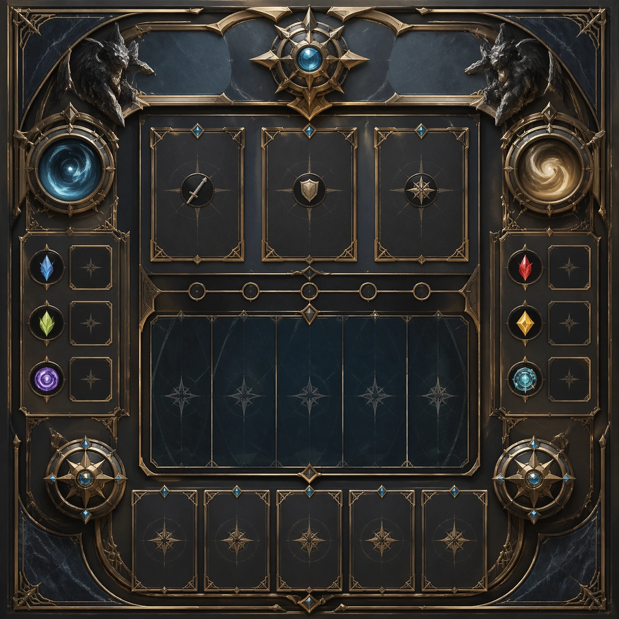
Example generated from “Douyin Hook Cover Visuals — Support Two”
GPT Image 2en

Scene: Create a square standalone support image for short-form hook cover visuals. Build a second support-surface study with a clear focal hierarchy and a finished professional surface. Use a polished modular board or campaign surface with clean spacing, premium game-UI finish, and clear focal hierarchy. The frame should feel self-contained and polished, with enough structure to explain the system even without the reference series, yet still obviously belonging to the same theme and production world. Subject: Show a coherent original game-art system built for premium production and marketing surfaces in a way that emphasizes the intended support surface. Keep the same system logic stable across screenshots, cards, banners, and overview boards. Even though this image is independent, the viewer should still recognize the same universe, same commercial logic, and same production intent as the core package. Important details: Lock framing, icon grammar, palette blocking, and surface hierarchy so the kit feels production-ready and consistent. Preserve the broader theme language through color, framing, material choices, and modular composition. Use clean panel rhythm, premium asset presentation, and believable detail density. The image should work equally well as a gallery study, research reference, and mock production deliverable. Use case: short-form hook cover visuals single study 6/9, exploring support two as a support surface. Constraints: No readable text, no watermark, no logos, preserve exact 1:1 aspect ratio, no unrelated objects, no broken visual hierarchy, no visual noise that obscures the main surface, no accidental brand resemblance.
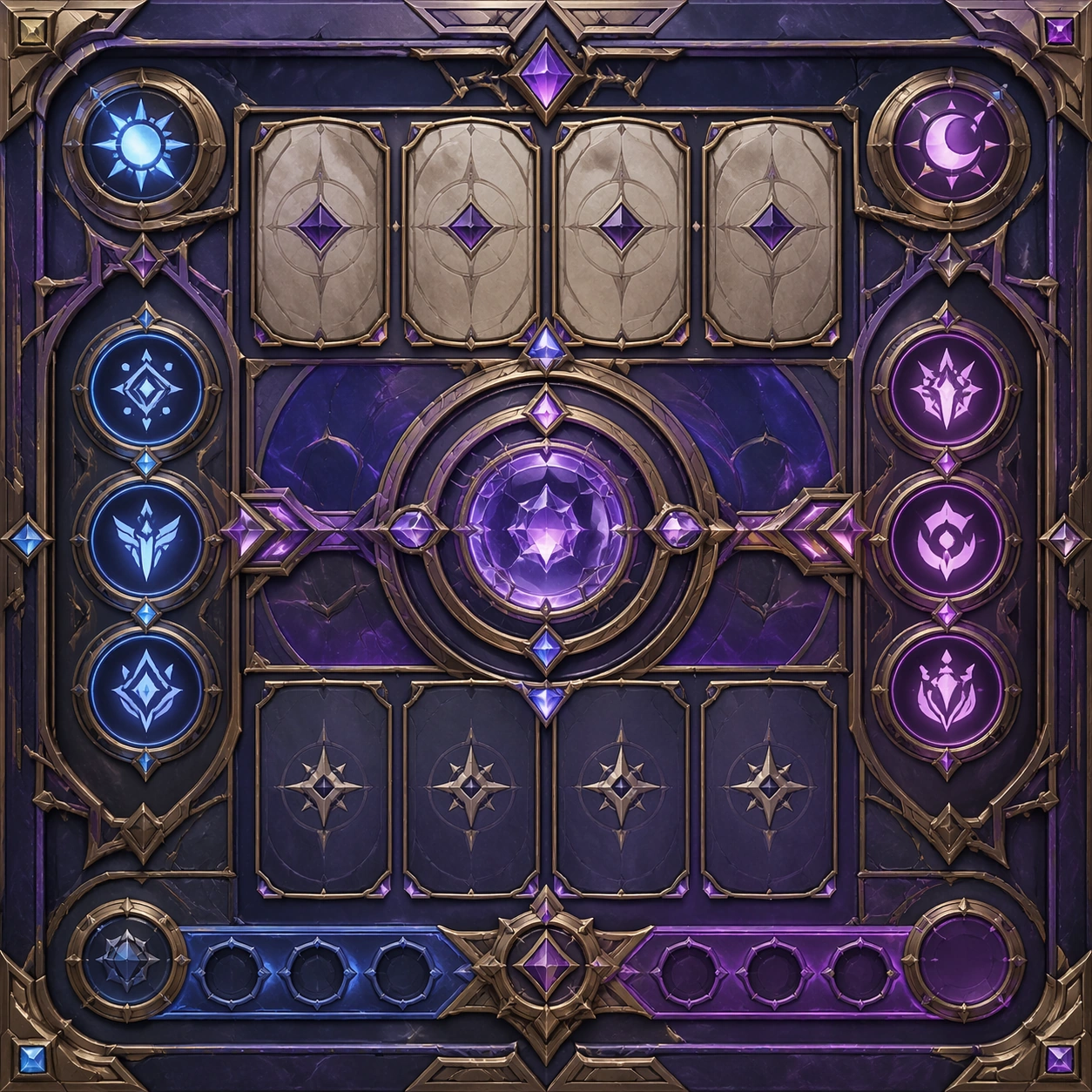
Example generated from “Douyin Hook Cover Visuals — Support Three”
GPT Image 2en

Scene: Create a square standalone support image for short-form hook cover visuals. Build a third support-surface study with a clear focal hierarchy and a finished professional surface. Use a polished modular board or campaign surface with clean spacing, premium game-UI finish, and clear focal hierarchy. The frame should feel self-contained and polished, with enough structure to explain the system even without the reference series, yet still obviously belonging to the same theme and production world. Subject: Show a coherent original game-art system built for premium production and marketing surfaces in a way that emphasizes the intended support surface. Keep the same system logic stable across screenshots, cards, banners, and overview boards. Even though this image is independent, the viewer should still recognize the same universe, same commercial logic, and same production intent as the core package. Important details: Lock framing, icon grammar, palette blocking, and surface hierarchy so the kit feels production-ready and consistent. Preserve the broader theme language through color, framing, material choices, and modular composition. Use clean panel rhythm, premium asset presentation, and believable detail density. The image should work equally well as a gallery study, research reference, and mock production deliverable. Use case: short-form hook cover visuals single study 7/9, exploring support three as a support surface. Constraints: No readable text, no watermark, no logos, preserve exact 1:1 aspect ratio, no unrelated objects, no broken visual hierarchy, no visual noise that obscures the main surface, no accidental brand resemblance.

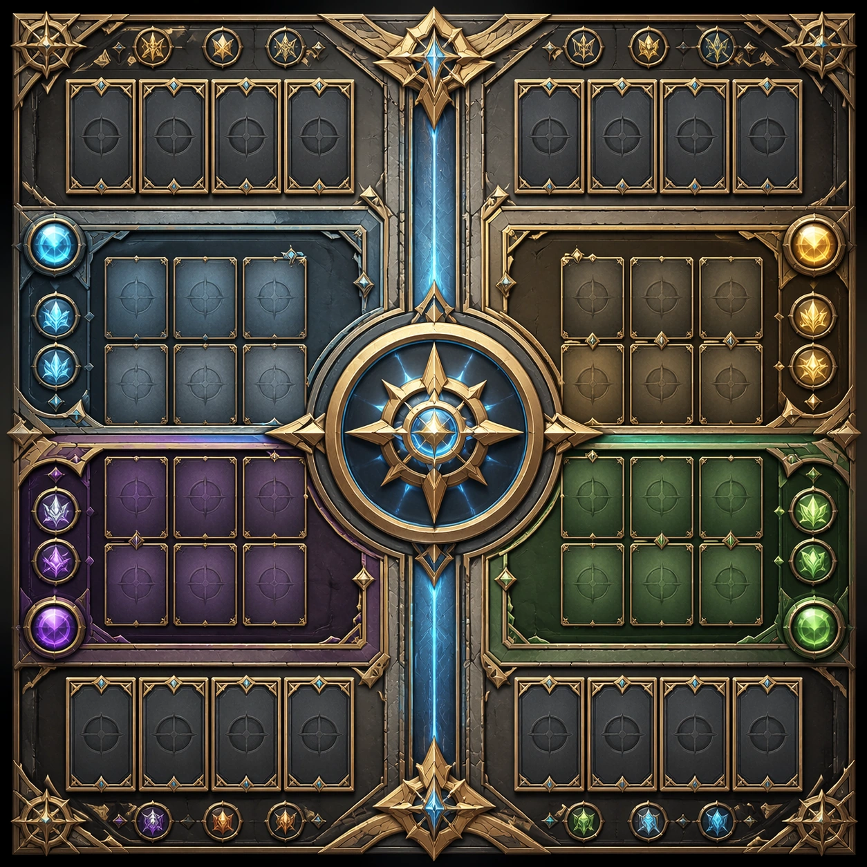
Example generated from “Douyin Hook Cover Visuals — Support Four”
GPT Image 2en

Scene: Create a square standalone support image for short-form hook cover visuals. Build a fourth support-surface study with a clear focal hierarchy and a finished professional surface. Use a polished modular board or campaign surface with clean spacing, premium game-UI finish, and clear focal hierarchy. The frame should feel self-contained and polished, with enough structure to explain the system even without the reference series, yet still obviously belonging to the same theme and production world. Subject: Show a coherent original game-art system built for premium production and marketing surfaces in a way that emphasizes the intended support surface. Keep the same system logic stable across screenshots, cards, banners, and overview boards. Even though this image is independent, the viewer should still recognize the same universe, same commercial logic, and same production intent as the core package. Important details: Lock framing, icon grammar, palette blocking, and surface hierarchy so the kit feels production-ready and consistent. Preserve the broader theme language through color, framing, material choices, and modular composition. Use clean panel rhythm, premium asset presentation, and believable detail density. The image should work equally well as a gallery study, research reference, and mock production deliverable. Use case: short-form hook cover visuals single study 8/9, exploring support four as a support surface. Constraints: No readable text, no watermark, no logos, preserve exact 1:1 aspect ratio, no unrelated objects, no broken visual hierarchy, no visual noise that obscures the main surface, no accidental brand resemblance.
Example generated from “Douyin Hook Cover Visuals — Support Five”
GPT Image 2en

Scene: Create a square standalone support image for short-form hook cover visuals. Build a fifth support-surface study with a clear focal hierarchy and a finished professional surface. Use a polished modular board or campaign surface with clean spacing, premium game-UI finish, and clear focal hierarchy. The frame should feel self-contained and polished, with enough structure to explain the system even without the reference series, yet still obviously belonging to the same theme and production world. Subject: Show a coherent original game-art system built for premium production and marketing surfaces in a way that emphasizes the intended support surface. Keep the same system logic stable across screenshots, cards, banners, and overview boards. Even though this image is independent, the viewer should still recognize the same universe, same commercial logic, and same production intent as the core package. Important details: Lock framing, icon grammar, palette blocking, and surface hierarchy so the kit feels production-ready and consistent. Preserve the broader theme language through color, framing, material choices, and modular composition. Use clean panel rhythm, premium asset presentation, and believable detail density. The image should work equally well as a gallery study, research reference, and mock production deliverable. Use case: short-form hook cover visuals single study 9/9, exploring support five as a support surface. Constraints: No readable text, no watermark, no logos, preserve exact 1:1 aspect ratio, no unrelated objects, no broken visual hierarchy, no visual noise that obscures the main surface, no accidental brand resemblance.
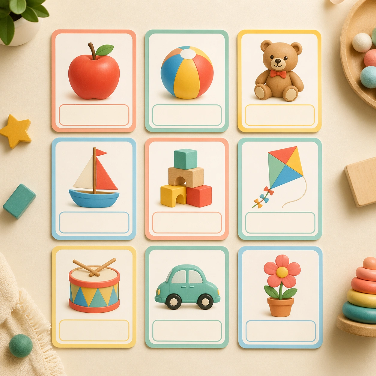
Example generated from “Early Learning Flashcard Family — Reference Alphabet Board”
GPT Image 2en

Scene: Show a square hero arrangement of nine preschool flashcards on a warm cream tabletop, photographed from a clean overhead angle with soft daylight and very gentle shadows. The board should feel like a polished product shoot for a modern classroom brand, with equal spacing, rounded corners, matte lamination, and tiny tactile paper grain. Keep the square frame balanced, calm, and production-ready so the asset can serve gallery review, research comparison, and real educational delivery at the same time. Subject: Use a mix of simple child-friendly illustrations such as a red apple, a rolling ball, a smiling bear, wooden blocks, a kite, and a tiny drum, each centered inside its own card with a dedicated blank label area. Every illustration should be bold, friendly, and immediately legible for a three-to-five-year-old learner. The subject matter should feel intentionally selected for a coherent curriculum family rather than like a random decorative assortment. Important details: Keep the design language extremely consistent: thick pastel borders, generous white space, gentle coral, teal, butter yellow, and sky blue accents, and a clear one-concept-per-card logic. The image should communicate that the system could expand into an entire early-learning deck without losing production discipline. Preserve the same rounded card frame, corner radius, soft shadow depth, illustration scale, and empty caption panel rhythm from the reference board. Use variation only in the teaching content, supporting props, and scene-specific mood while preserving the core visual system exactly. Use case: Early Learning Flashcard Family series study 1/4, reference alphabet board. Constraints: No readable text, no watermark, no logos, preserve exact 1:1 aspect ratio, no real letters, no readable numerals, no handwriting, no crowded toy-store clutter, no adult hands, no broken card edges.

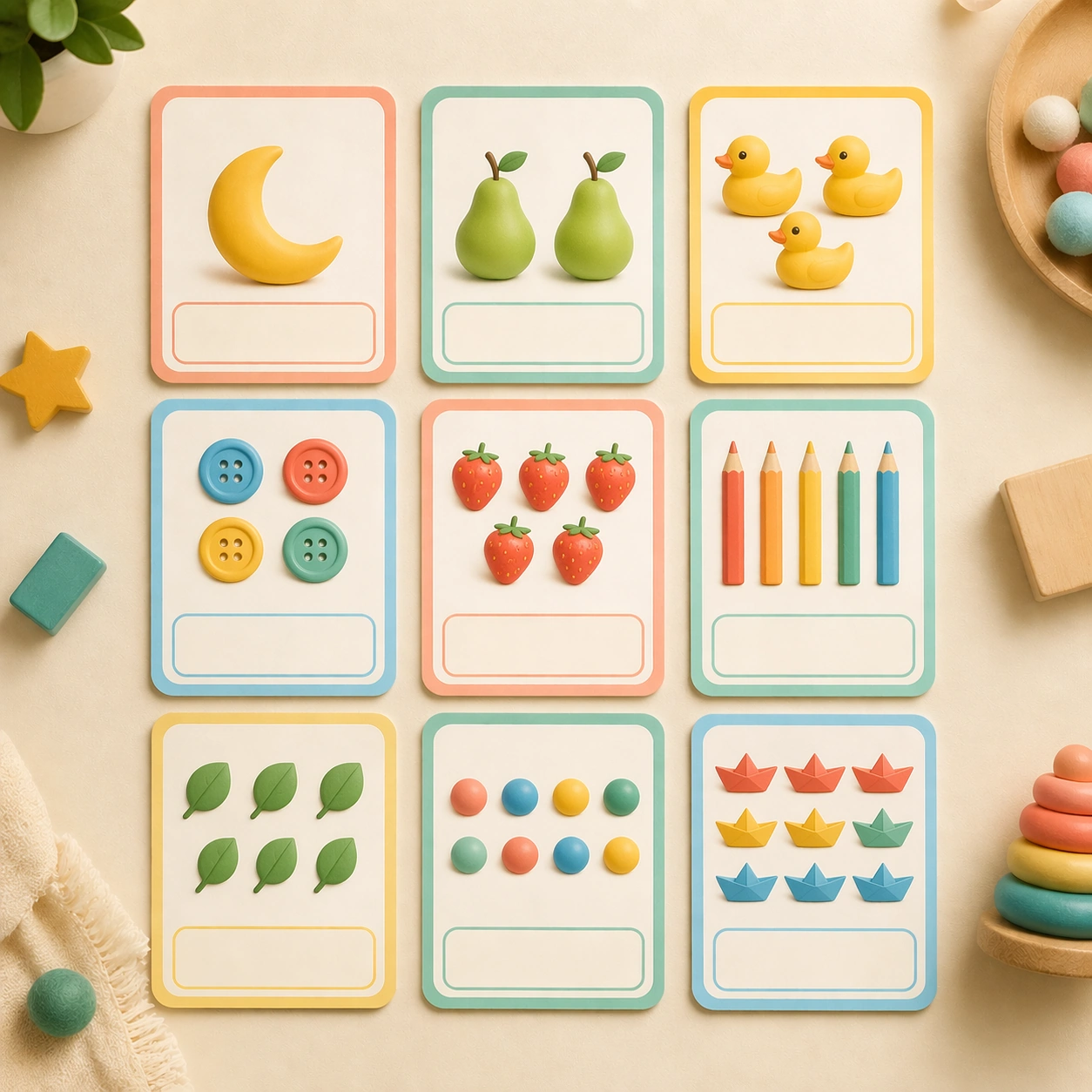
Example generated from “Early Learning Flashcard Family — Number Counting Board”
GPT Image 2en

Scene: Present the same square overhead studio board, maintaining the identical card grid, light direction, and tactile print finish established by the reference image. The composition should feel like the second SKU in the same preschool product line, precise enough for catalog approval and consistent enough to be mistaken for the same shoot. Keep the square frame balanced, calm, and production-ready so the asset can serve gallery review, research comparison, and real educational delivery at the same time. Subject: Replace the alphabet-like assortment with counting cards that show grouped objects such as one moon, two pears, three ducks, four buttons, and five paper boats. Each card should pair the object cluster with a strong empty number zone, making quantity the star without requiring any actual characters. The subject matter should feel intentionally selected for a coherent curriculum family rather than like a random decorative assortment. Important details: The set must still read as the same brand system: matching border thickness, rounded geometry, illustration density, blank caption placement, and palette anchors. Variation should come from quantity grouping, object rhythm, and a slightly more playful arrangement inside each card while the overall board remains locked. Preserve the same rounded card frame, corner radius, soft shadow depth, illustration scale, and empty caption panel rhythm from the reference board. Use variation only in the teaching content, supporting props, and scene-specific mood while preserving the core visual system exactly. Use case: Early Learning Flashcard Family series study 2/4, number counting board. Constraints: No readable text, no watermark, no logos, preserve exact 1:1 aspect ratio, no real letters, no readable numerals, no handwriting, no crowded toy-store clutter, no adult hands, no broken card edges.

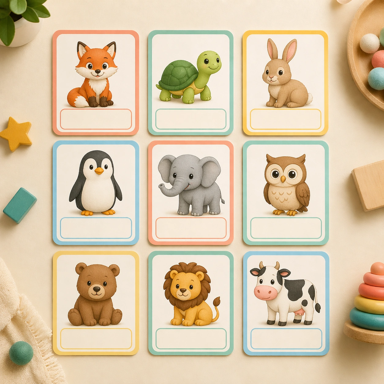
Example generated from “Early Learning Flashcard Family — Animal Recognition Board”
GPT Image 2en

Scene: Keep the same square tabletop setup, card spacing, lighting softness, and product-photography calm from the reference board. The camera should remain straight overhead, as if the art director is reviewing a second lesson deck that must drop into the same boxed set without any manufacturing adjustments. Keep the square frame balanced, calm, and production-ready so the asset can serve gallery review, research comparison, and real educational delivery at the same time. Subject: Fill the cards with friendly animal portraits and full-body icons such as a fox, turtle, rabbit, penguin, elephant, and owl, each placed on a clean interior field with a blank naming band at the base. The animals should be stylized enough for preschool friendliness yet specific enough to feel educational rather than decorative. The subject matter should feel intentionally selected for a coherent curriculum family rather than like a random decorative assortment. Important details: Maintain the same construction rules from the reference board, including the exact card proportions, empty label band, pastel border logic, and restrained background treatment. Only the pedagogical category should change, while the packaging logic, printing realism, and child-safe visual clarity remain identical. Preserve the same rounded card frame, corner radius, soft shadow depth, illustration scale, and empty caption panel rhythm from the reference board. Use variation only in the teaching content, supporting props, and scene-specific mood while preserving the core visual system exactly. Use case: Early Learning Flashcard Family series study 3/4, animal recognition board. Constraints: No readable text, no watermark, no logos, preserve exact 1:1 aspect ratio, no real letters, no readable numerals, no handwriting, no crowded toy-store clutter, no adult hands, no broken card edges.

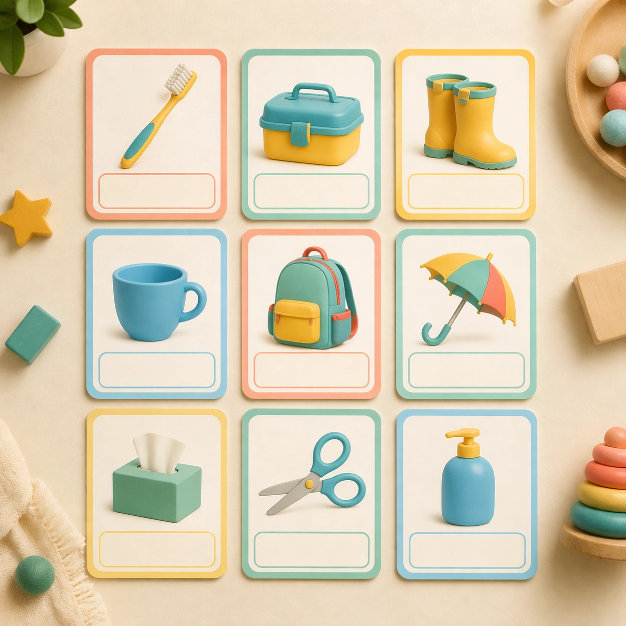
Example generated from “Early Learning Flashcard Family — Daily Object Board”
GPT Image 2en

Scene: Render the identical square product-shot arrangement one more time, preserving the reference board grid, tabletop warmth, and balanced daylight. It should feel like a third extension in a tightly art-directed line of flashcards prepared for nursery classrooms, e-commerce listing images, and teacher catalog spreads. Keep the square frame balanced, calm, and production-ready so the asset can serve gallery review, research comparison, and real educational delivery at the same time. Subject: Swap in common daily objects such as a toothbrush, lunchbox, rain boots, cup, backpack, umbrella, and scissors with child-safe simplified form. Each object belongs to one isolated card and sits above a blank caption area so educators could imagine multiple languages or curriculum variations later. The subject matter should feel intentionally selected for a coherent curriculum family rather than like a random decorative assortment. Important details: Keep every structural cue from the reference image intact: the card size, rounded corners, border rhythm, print finish, blank naming space, and palette balance. Let the variation come from object silhouettes and classroom relevance, not from layout changes or new brand behavior. Preserve the same rounded card frame, corner radius, soft shadow depth, illustration scale, and empty caption panel rhythm from the reference board. Use variation only in the teaching content, supporting props, and scene-specific mood while preserving the core visual system exactly. Use case: Early Learning Flashcard Family series study 4/4, daily object board. Constraints: No readable text, no watermark, no logos, preserve exact 1:1 aspect ratio, no real letters, no readable numerals, no handwriting, no crowded toy-store clutter, no adult hands, no broken card edges.
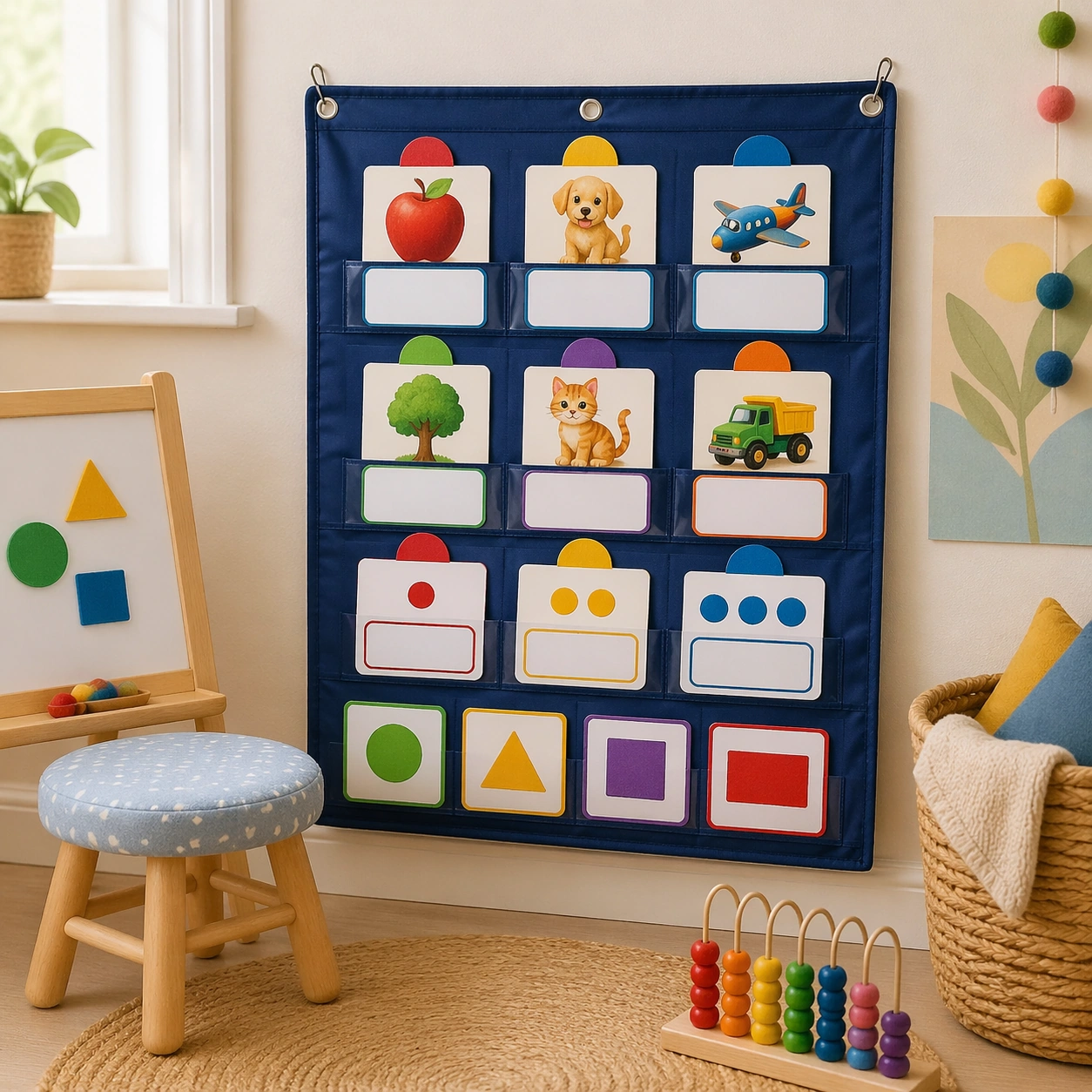
Example generated from “Early Learning Flashcard Family — Pocket Chart Classroom”
GPT Image 2en

Scene: Show a square classroom corner with a fabric pocket chart mounted at child height, soft daylight from the side, and a calm early-years interior palette. The composition should feel intentionally staged for a teaching-resource brochure, with the chart, nearby stool, and woven basket arranged in a clean, friendly, production-ready way. Keep the square frame balanced, calm, and production-ready so the asset can serve gallery review, research comparison, and real educational delivery at the same time. Subject: The pocket chart holds several flashcards from the same educational family, mixing object, animal, and quantity cards with blank response slots and color-coded category markers. Add a few tactile classroom cues such as felt shapes, counting beads, and a small easel, but keep the flashcards as the clear visual focus. The subject arrangement should feel complete and self-contained, able to stand alone as a real supporting deliverable inside the same education business line. Important details: Emphasize usability and warmth over spectacle: smooth fabric textures, gentle rounded shapes, and a classroom environment that feels realistic but uncluttered. The cards must still read as part of one coherent system, even though the image is now an environmental mockup rather than a product flatlay. Keep the visual hierarchy modular, commercially believable, and clearly tied to a real educational use case rather than a generic mood board. Use case: Early Learning Flashcard Family single study 2/5, pocket chart classroom. Constraints: No readable text, no watermark, no logos, preserve exact 1:1 aspect ratio, no readable text, no numerals, no brand mascots, no logos, no chaotic shelf clutter, no broken packaging.

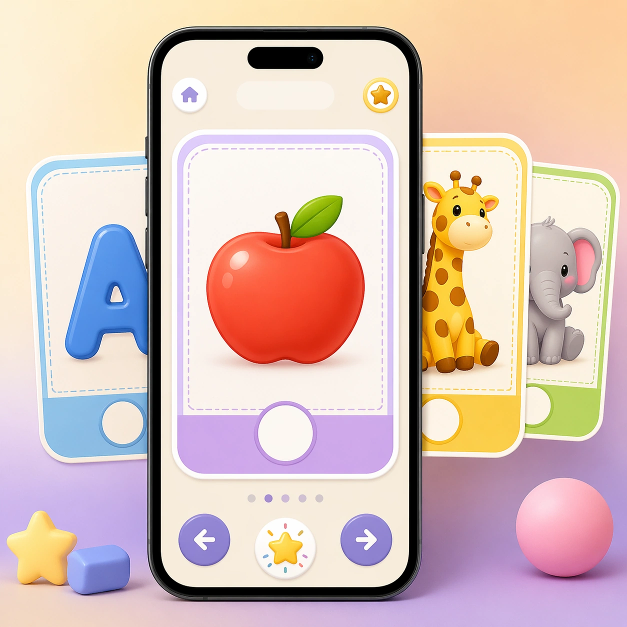
Example generated from “Early Learning Flashcard Family — Learning App Card Screen”
GPT Image 2en

Scene: Design a square app-preview composition featuring a smartphone on a soft gradient background, viewed straight-on with subtle depth and polished device lighting. The overall image should look like a premium education-app marketing tile, pairing crisp interface cards with a cheerful but restrained preschool palette. Keep the square frame balanced, calm, and production-ready so the asset can serve gallery review, research comparison, and real educational delivery at the same time. Subject: The screen shows large swipeable flashcards with the same rounded geometry, illustration density, and blank caption zones seen in the physical deck. Use one hero card and a few stacked previews to suggest letter, number, and animal lessons without showing any readable interface copy. The subject arrangement should feel complete and self-contained, able to stand alone as a real supporting deliverable inside the same education business line. Important details: Keep the interface extremely clear: oversized tap targets, progress dots without labels, empty title bars, and playful reward icons that never become generic game clutter. The image should prove that the flashcard system can migrate from print to digital while preserving teaching clarity and brand continuity. Keep the visual hierarchy modular, commercially believable, and clearly tied to a real educational use case rather than a generic mood board. Use case: Early Learning Flashcard Family single study 3/5, learning app card screen. Constraints: No readable text, no watermark, no logos, preserve exact 1:1 aspect ratio, no readable text, no numerals, no brand mascots, no logos, no chaotic shelf clutter, no broken packaging.

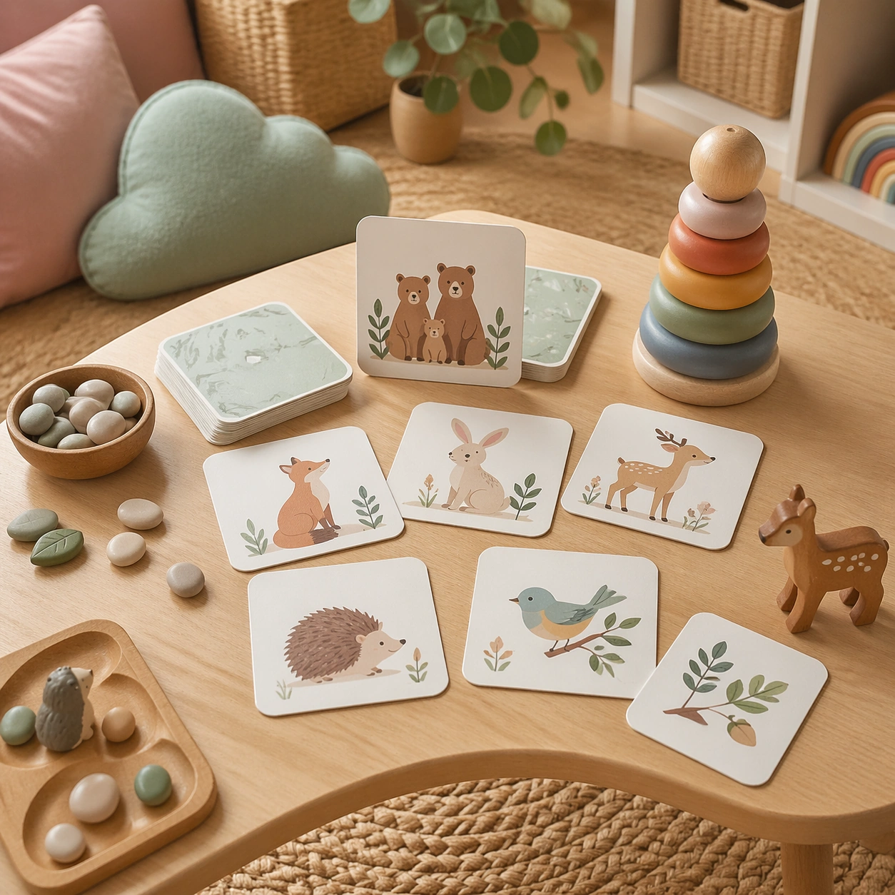
Example generated from “Early Learning Flashcard Family — Soft Playroom Scatter”
GPT Image 2en

Scene: Show a square lifestyle photograph inside a softly lit playroom, with a low wooden table, woven rug, pastel cushions, and a small set of flashcards scattered in an intentional, photogenic arrangement. The light should be natural and tender, as if the image were made for a parent-facing catalog about playful home learning. Keep the square frame balanced, calm, and production-ready so the asset can serve gallery review, research comparison, and real educational delivery at the same time. Subject: Feature the cards alongside simple learning props such as counting stones, toy animals, and stacking rings, making it clear that the deck supports tactile play and visual recognition. No people are necessary; the arrangement itself should tell the story of an organized, inviting learning ritual. The subject arrangement should feel complete and self-contained, able to stand alone as a real supporting deliverable inside the same education business line. Important details: Keep the scene commercial and uncluttered. The props should echo the same palette and illustration style as the cards, and the composition must prioritize legibility of the product system rather than become a generic nursery photograph. Keep the visual hierarchy modular, commercially believable, and clearly tied to a real educational use case rather than a generic mood board. Use case: Early Learning Flashcard Family single study 4/5, soft playroom scatter. Constraints: No readable text, no watermark, no logos, preserve exact 1:1 aspect ratio, no readable text, no numerals, no brand mascots, no logos, no chaotic shelf clutter, no broken packaging.

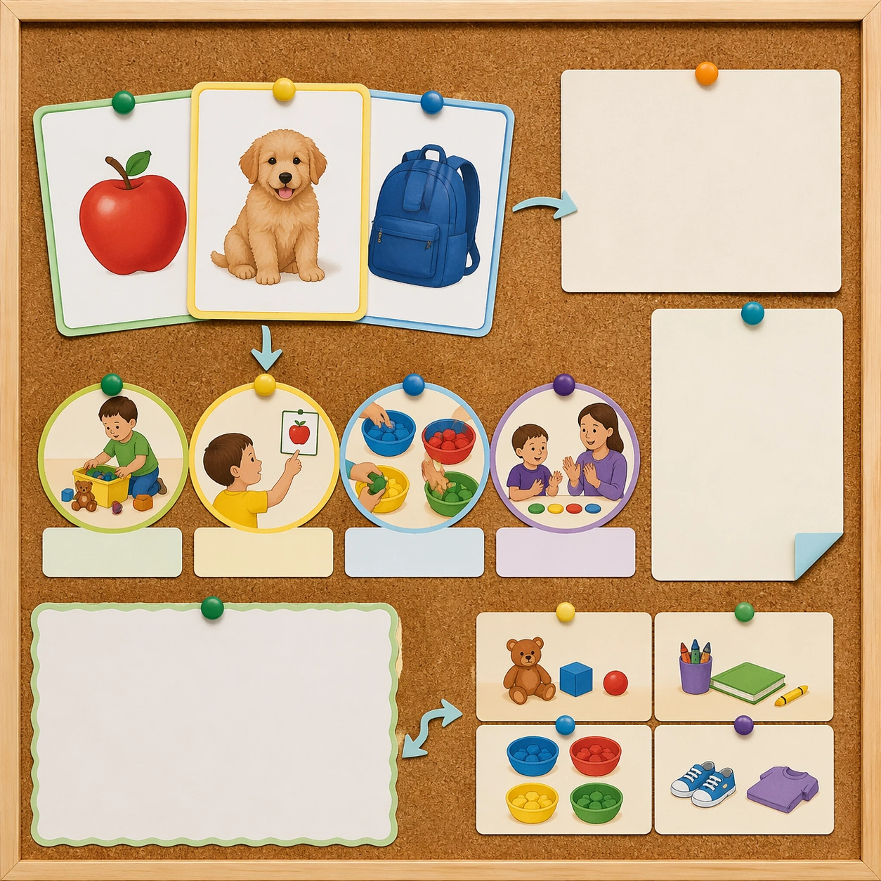
Example generated from “Early Learning Flashcard Family — Parent Guide Board”
GPT Image 2en

Scene: Create a square editorial board with pinned flashcards, routine icons, soft arrows, and blank note panels on a cork surface photographed straight-on. The image should feel like a polished support asset from an early-education brand, somewhere between a teaching board and a parent handout cover. Keep the square frame balanced, calm, and production-ready so the asset can serve gallery review, research comparison, and real educational delivery at the same time. Subject: Mix a few hero flashcards with visual routine cues such as tidy-up, point-and-name, sort-by-color, and count-together activities shown only through pictograms and mini scenes. Leave generous blank rectangles where copy could later be typeset by a design team. The subject arrangement should feel complete and self-contained, able to stand alone as a real supporting deliverable inside the same education business line. Important details: Use a measured visual hierarchy so the board reads as informative and brand-ready rather than scrapbook-like. The blank text areas, color coding, and card integration should suggest a real family-resource product while still respecting the no-readable-text constraint. Keep the visual hierarchy modular, commercially believable, and clearly tied to a real educational use case rather than a generic mood board. Use case: Early Learning Flashcard Family single study 5/5, parent guide board. Constraints: No readable text, no watermark, no logos, preserve exact 1:1 aspect ratio, no readable text, no numerals, no brand mascots, no logos, no chaotic shelf clutter, no broken packaging.

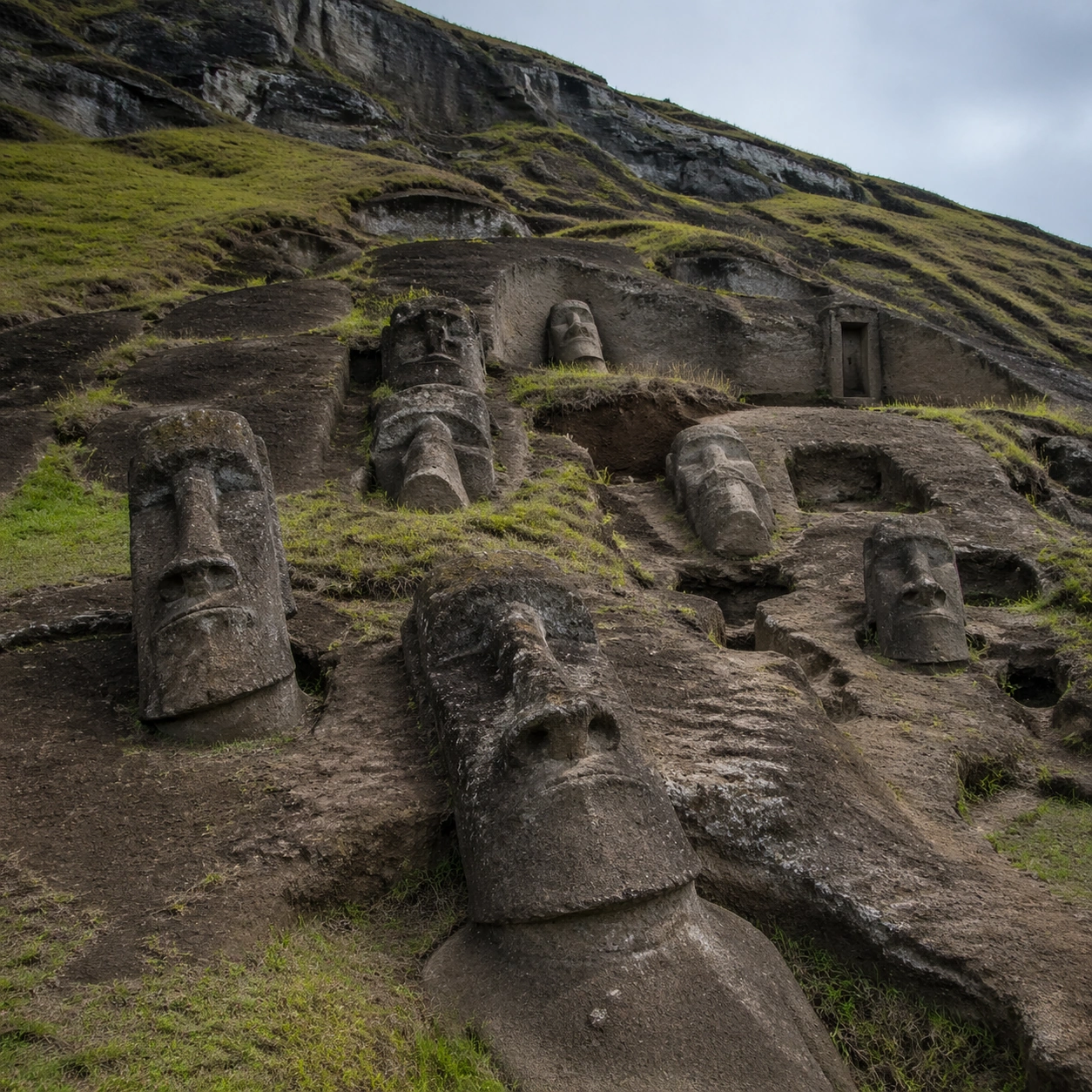
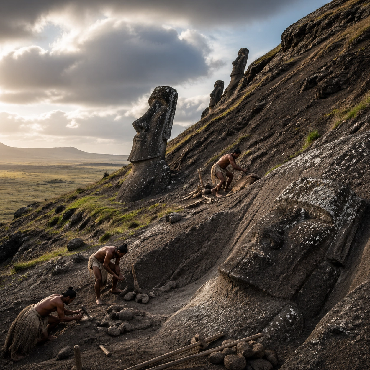
Example generated from “Easter Island Moai Quarry — Reference Anchor”
GPT Image 2en

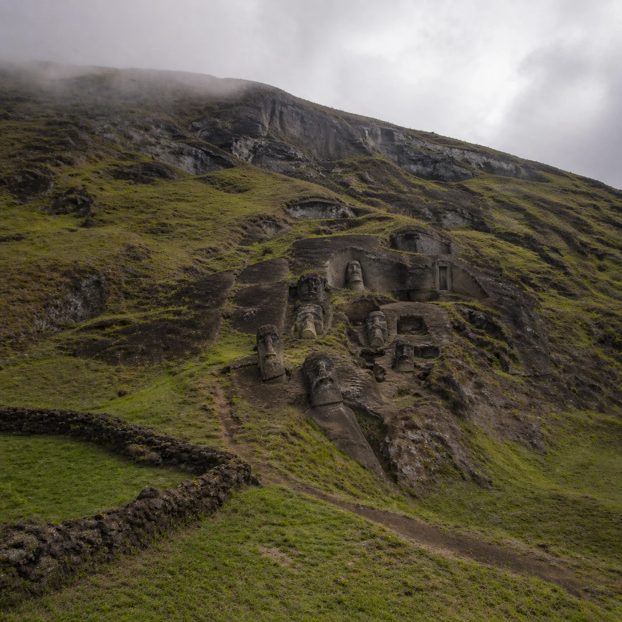
Scene: A square documentary image composed like a premium archaeology magazine feature. Use volcanic green, carved tuff gray, cool Pacific cloud light, and damp earth brown. Frame the Rano Raraku quarry slope filled with Moai in different carving stages, some half-buried and some still emerging from volcanic stone with crisp depth layering, restrained contrast, and subtle atmospheric depth so the scene feels excavated, observed, and historically grounded rather than theatrical or game-like. Keep the light directional but believable, as if captured during a careful field visit. Subject: Center the image on the Rano Raraku quarry slope filled with Moai in different carving stages, some half-buried and some still emerging from volcanic stone. Include culturally accurate surface logic, region-specific setting, and believable human-scale cues in stairs, doorways, cut blocks, relief edges, or water depth. Shapes, carvings, masonry joints, and site wear should feel studied from real archaeology, with no generic ancient-world mashup and no ornamental filler borrowed from another civilization. Important details: Keep the quarry recognizably Rano Raraku, with unfinished forms still attached to bedrock, tilted standing figures, and the specific relation between carved heads, slope, and volcanic terrain. Emphasize volcanic tuff, grass, quarry scars, carved facial planes, damp soil, and low cloud moisture on stone surfaces. Keep inscriptions, painted registers, symbolic motifs, or carved bands visually plausible but not readable. Preserve a museum-grade balance between beauty and evidence: light should reveal relief depth, edge wear, repairs, sediment traces, and excavation context without turning the site into fantasy spectacle. The composition should feel like a definitive reference frame that later variations can inherit exactly. Use case: Easter Island Moai Quarry series study 1/9. Constraints: No readable text, no watermark, no logos, preserve exact 1:1 aspect ratio, no sci-fi statues, no modern cranes, no fantasy rituals, no giant glowing eyes, no tourists, no anachronistic props, no collage layout, no exaggerated fantasy lighting.

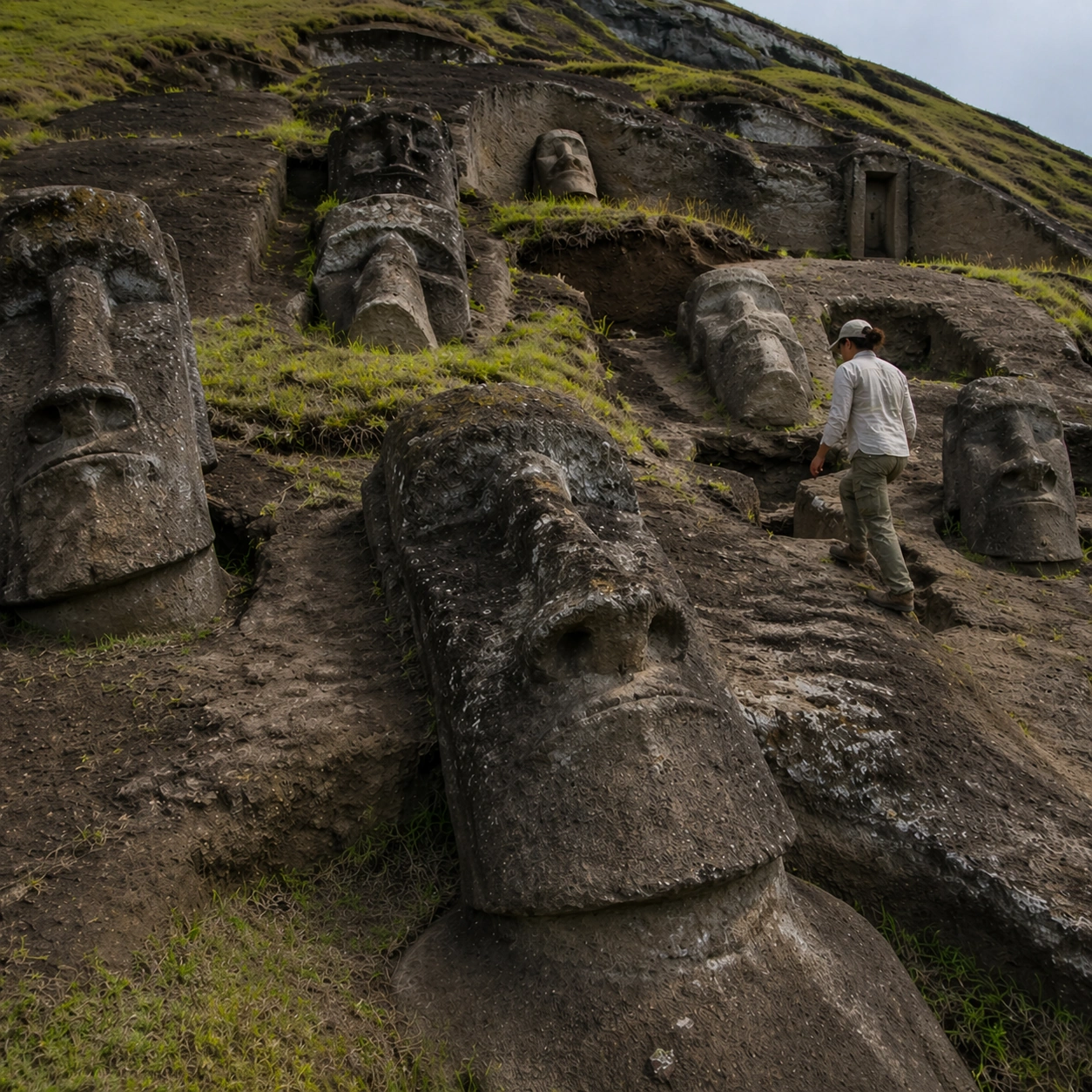
Example generated from “Easter Island Moai Quarry — Human Scale Reveal”
GPT Image 2en

Scene: A square follow-up field image from the same site, slightly closer and lower than the reference anchor, with careful documentary framing and the same material palette. The camera should feel physically present inside the archaeological space, using natural light, soft depth separation, and one clear human figure to explain scale without turning the image into lifestyle photography. Subject: Show the same site identity established in the reference anchor, now with an archaeologist, conservator, or field researcher moving through the scene in practical neutral clothing. The person should be small relative to the monument and clearly secondary to the architecture, water, or painted wall system. Keep the main forms, structural rhythm, and civilizational markers unchanged. Important details: Preserve the exact site identity, base geometry, material behavior, and cultural signatures from the reference model. Only vary vantage, gesture, and scale cues. Keep the quarry recognizably Rano Raraku, with unfinished forms still attached to bedrock, tilted standing figures, and the specific relation between carved heads, slope, and volcanic terrain. Human presence should clarify stair height, wall size, carving depth, or spatial compression while respecting conservation protocol and historical seriousness. Keep any tools understated and generic, with no readable labels. The image must still look like a rigorous archaeological record first and a dramatic scene second. Use case: Easter Island Moai Quarry series study 2/9. Constraints: No readable text, no watermark, no logos, preserve exact 1:1 aspect ratio, preserve exact site identity from the reference image, no sci-fi statues, no modern cranes, no fantasy rituals, no giant glowing eyes, no fashion editorial styling, no crowd, no cinematic props.

Example generated from “Easter Island Moai Quarry — Surface Close Study”
GPT Image 2en

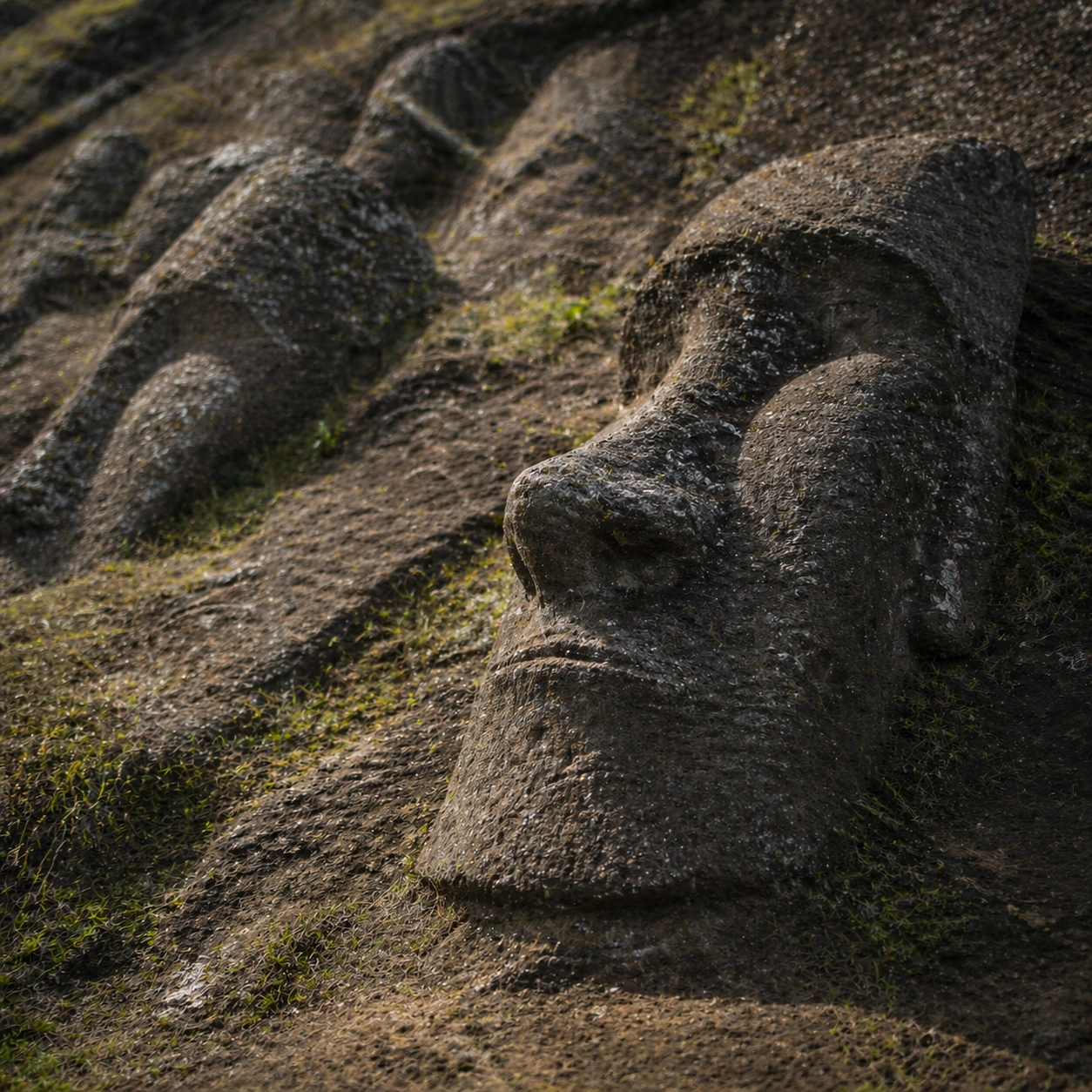
Scene: A square close study framed within the same site established by the reference anchor. Use a tight crop, shallow but believable depth of field, and raking light that reveals tactile evidence in surface relief, pigment, tool marks, moisture, or marine wear. The image should feel like a museum conservation photograph elevated to gallery quality. Subject: Focus on a materially rich portion of the same site: carved edges, painted plaster, fitted stone, root-wrapped masonry, submerged paving, or quarry-cut facial planes depending on the civilization. The composition should remain anchored to the original location and show enough surrounding context that viewers still recognize the parent site rather than mistaking it for an unrelated artifact. Important details: Preserve the exact site identity from the reference model while shifting emphasis to forensic surface evidence. Keep the quarry recognizably Rano Raraku, with unfinished forms still attached to bedrock, tilted standing figures, and the specific relation between carved heads, slope, and volcanic terrain. Make micro-texture, fracture lines, pigment retention, water wear, plant interaction, dust, or chisel traces visually persuasive. Avoid decorative clutter. Every mark should feel like evidence of making, weathering, excavation, or conservation. Keep any symbolic marks non-legible and historically appropriate, and make the light reveal depth without flattening the material richness. Use case: Easter Island Moai Quarry series study 3/9. Constraints: No readable text, no watermark, no logos, preserve exact 1:1 aspect ratio, preserve exact site identity from the reference image, no sci-fi statues, no modern cranes, no fantasy rituals, no giant glowing eyes, no isolated floating artifact, no studio backdrop, no fake macro abstraction.

Example generated from “Easter Island Moai Quarry — Atmospheric Wide Reveal”
GPT Image 2en

Scene: A square wide reveal of the same site under a slightly different environmental condition, with more surrounding geography or architecture visible while keeping the anchor landmark dominant. Use disciplined composition, atmospheric perspective, and natural light behavior so the image feels like a patient field photograph captured after the reference shot rather than a different fantasy set. Subject: Show the same site identity with broader context: approaches, terraces, ring walls, canyon slot, canopy volume, quarry slope, or chamber boundaries depending on the location. The anchor structure must remain instantly recognizable. Environmental scale should deepen understanding of why the site is placed here and how people, water, topography, or vegetation shape the experience of the monument. Important details: Preserve the exact landmark, materials, and civilizational cues from the reference model while allowing wider framing and a different atmospheric emphasis. Keep the quarry recognizably Rano Raraku, with unfinished forms still attached to bedrock, tilted standing figures, and the specific relation between carved heads, slope, and volcanic terrain. Use geography and environmental systems to add meaning: drainage, mist, current, valley depth, roots, irrigation, or enclosure logic. The image should feel both beautiful and evidentiary, with no compositional tricks that break continuity with the established site. Use case: Easter Island Moai Quarry series study 4/9. Constraints: No readable text, no watermark, no logos, preserve exact 1:1 aspect ratio, preserve exact site identity from the reference image, no sci-fi statues, no modern cranes, no fantasy rituals, no giant glowing eyes, no unrelated landmarks, no speculative mashup architecture, no posterized grading.

Example generated from “Easter Island Moai Quarry — Excavation Overview”
GPT Image 2en

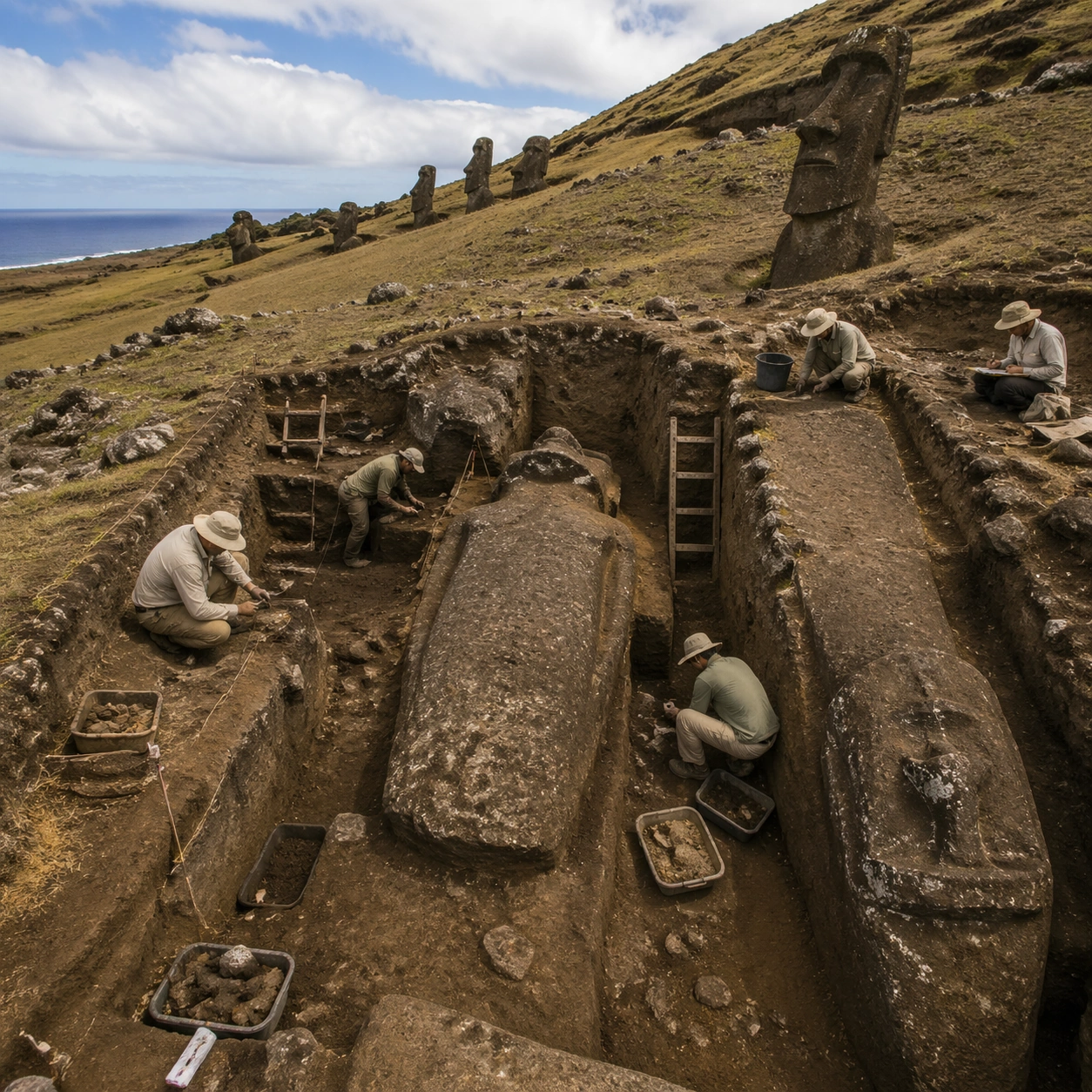
Scene: A square independent archaeology study composed from a slightly elevated fieldwork viewpoint. Use balanced natural light, crisp evidence hierarchy, and practical site organization so the image feels publishable in a museum report and still visually strong enough for a gallery wall. The frame should explain where excavation is happening without relying on readable markers or diagrams. Subject: Show a quarry documentation scene with measured excavation cuts, soil profiles, and careful study of carving sequence and transport preparation. Include grounded human traces such as ladders, trays, brushes, baskets, light rigs, or measuring tools only when they support archaeological realism and remain visually secondary. The site should stay culturally specific, with architecture, surface treatment, sediment, and environmental context all belonging to the correct civilization rather than a generic dig. Important details: Keep the quarry recognizably Rano Raraku, with unfinished forms still attached to bedrock, tilted standing figures, and the specific relation between carved heads, slope, and volcanic terrain. Prioritize evidence relationships: exposed layers, cleaned edges, protected surfaces, loose fragments, and transitions between buried and revealed material. Let color, wear, and composition explain what has just been uncovered. The image must feel methodical rather than adventurous. Keep any site tags, notes, or markers abstract and unreadable. Avoid sensational treasure imagery and keep the atmosphere scholarly, patient, and materially convincing. Use case: Easter Island Moai Quarry single study 5/9. Constraints: No readable text, no watermark, no logos, preserve exact 1:1 aspect ratio, no sci-fi statues, no modern cranes, no fantasy rituals, no giant glowing eyes, no treasure-chest clichés, no action-movie posing, no arbitrary props, no infographic overlay.

Example generated from “Easter Island Moai Quarry — Artifact Tableau”
GPT Image 2en

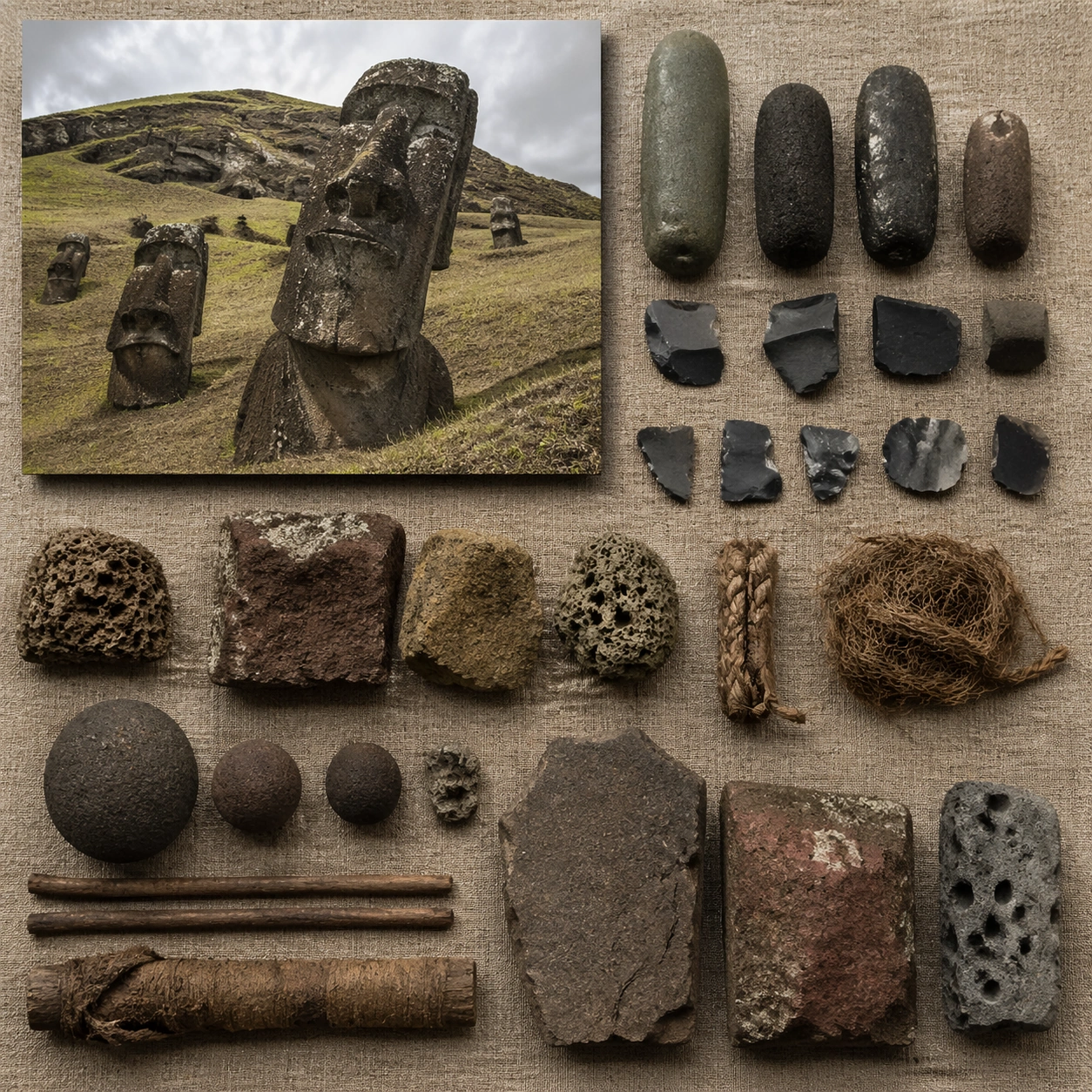
Scene: A square artifact and material study arranged like a high-end conservation photograph. Use soft directional light, controlled shadow falloff, and a neutral work surface so every fragment reads clearly. The image should feel intimate and scientific, but still rich enough to communicate the broader civilization through craft, wear, and material vocabulary alone. Subject: Present basalt tools, tuff samples, carving flakes, rope fragments, and field notes materials arranged on coarse fabric without readable markings. Arrange the pieces with disciplined spacing and believable conservation handling. Include enough variation in scale, finish, and damage state to suggest excavation reality rather than a perfectly staged luxury still life. Nothing should look modern or decorative for its own sake; every object must feel like evidence tied to the same cultural world as the main topic. Important details: Emphasize tactile surfaces, honest aging, and historically grounded material behavior. Keep the quarry recognizably Rano Raraku, with unfinished forms still attached to bedrock, tilted standing figures, and the specific relation between carved heads, slope, and volcanic terrain. Show abrasion, dust, corrosion, cracks, mineral bloom, pigment retention, or edge polish where appropriate. Keep the arrangement orderly but not sterile, as if prepared for a serious cataloging session. No readable labels, no museum placards, and no visual shortcuts that turn the study into product photography detached from archaeology. Use case: Easter Island Moai Quarry single study 6/9. Constraints: No readable text, no watermark, no logos, preserve exact 1:1 aspect ratio, no sci-fi statues, no modern cranes, no fantasy rituals, no giant glowing eyes, no luxury advertising gloss, no floating objects, no velvet jewelry styling, no unrelated tools.

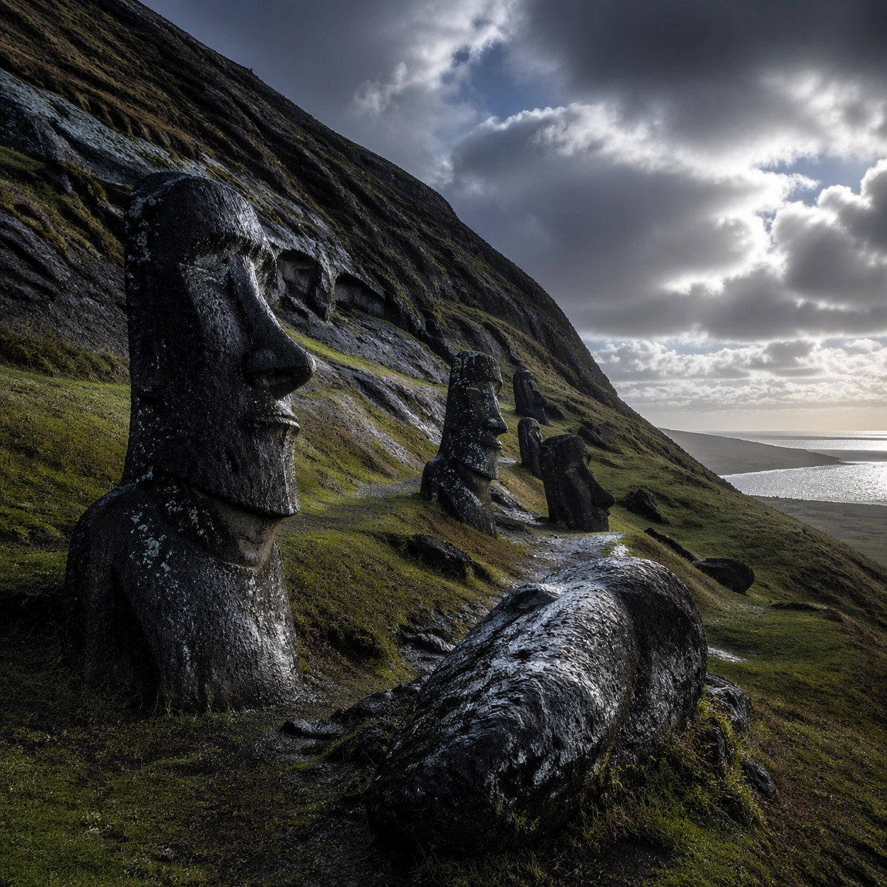
Example generated from “Easter Island Moai Quarry — Light Shift Study”
GPT Image 2en

Scene: A square mood variation from the same civilization theme, built around post-storm Pacific light with dramatic cloud openings, darker grass, and cool highlights across the moai faces. The image should stay grounded in field realism while testing how different illumination changes material reading, atmosphere, and emotional register. Keep the frame self-contained and coherent, as if photographed during a second visit under altered conditions. Subject: Show a culturally accurate site or interior connected to the same world as the main topic, but not as a direct dependency on the series reference. The focus should be on how light transforms relief, color, moisture, water, dust, or vegetation while preserving archaeological credibility. Architectural forms, objects, and setting must still belong to the same civilization with no cross-cultural contamination. Important details: Keep the quarry recognizably Rano Raraku, with unfinished forms still attached to bedrock, tilted standing figures, and the specific relation between carved heads, slope, and volcanic terrain. Use the shift in light to reveal different evidence than the other studies: pigment glow, root sheen, caustics, wet stone, canyon shadow, marine haze, terrace depth, or quarry moisture. Keep the result serious and observational rather than romanticized. Non-readable motifs are acceptable, but there should be no signs, captions, or modern display devices. The image should feel like a rigorous visual experiment in historical atmosphere. Use case: Easter Island Moai Quarry single study 7/9. Constraints: No readable text, no watermark, no logos, preserve exact 1:1 aspect ratio, no sci-fi statues, no modern cranes, no fantasy rituals, no giant glowing eyes, no theatrical color filters, no supernatural effects, no montage composition, no glossy concept-art exaggeration.

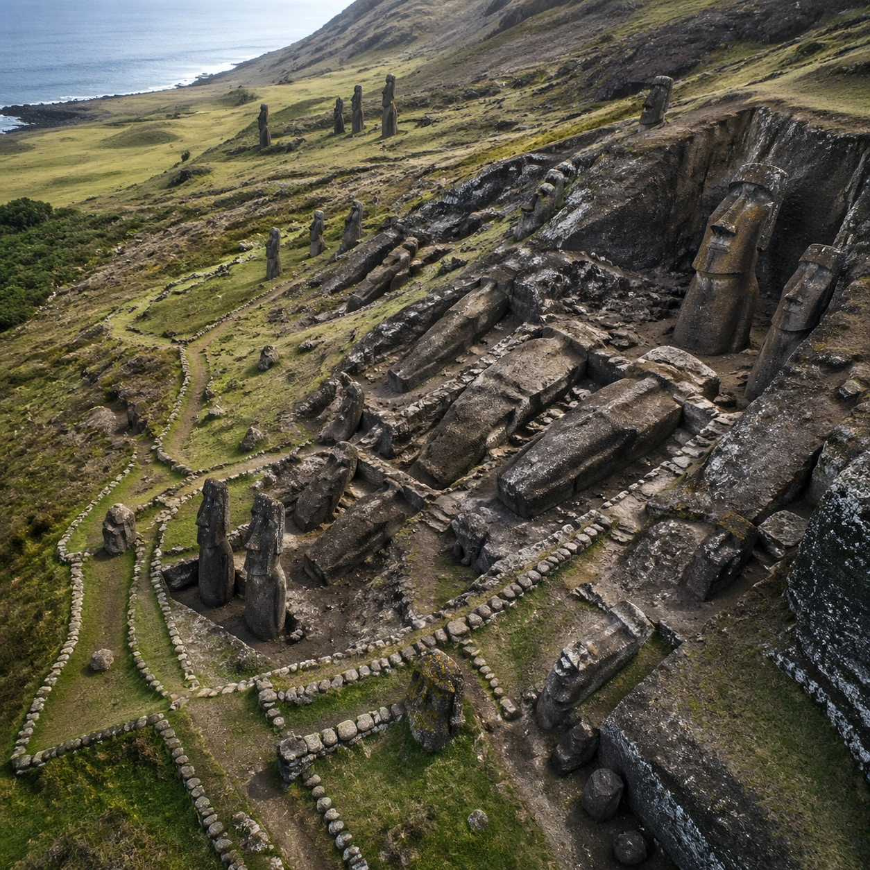
Example generated from “Easter Island Moai Quarry — Survey Perspective”
GPT Image 2en

Scene: A square survey-oriented image that explains spatial logic with the clarity of an expert field overview while still reading as a finished artwork. Use a stable elevated vantage, clean depth layering, and enough visible terrain or architecture to make relationships legible without turning the frame into a literal map. The scene should feel analytical and cinematic at the same time. Subject: Show an elevated quarry survey that reveals carving clusters, partial burials, slope angle, and statue distribution as one geologically grounded system. Organize the composition so paths, terraces, walls, courtyards, chambers, canals, root systems, or quarry clusters can be read as a coherent system. The image should reveal how the civilization used land, water, elevation, enclosure, or monumentality. Keep all architecture, materials, and environmental details consistent with the correct place and period. Important details: Keep the quarry recognizably Rano Raraku, with unfinished forms still attached to bedrock, tilted standing figures, and the specific relation between carved heads, slope, and volcanic terrain. This image should reward close looking by showing infrastructural logic: how stone courses align, how water moves, how rooms connect, how carved masses sit inside geology, or how vegetation interacts with built form. Avoid explicit annotation. Let composition, light, and scale cues do the explanatory work. Keep any measuring elements generic and unreadable, and make the image feel like serious research made visually elegant. Use case: Easter Island Moai Quarry single study 8/9. Constraints: No readable text, no watermark, no logos, preserve exact 1:1 aspect ratio, no sci-fi statues, no modern cranes, no fantasy rituals, no giant glowing eyes, no infographic arrows, no split-screen layout, no impossible aerial geometry, no unrelated settlements.

Example generated from “Easter Island Moai Quarry — Editorial Reconstruction”
GPT Image 2en

Scene: A square hero image designed for a museum wall graphic or flagship magazine cover, but without any actual typography. Use strong focal hierarchy, refined contrast, and a polished finish that still feels rooted in archaeological evidence. The frame should look complete on its own and communicate why this civilization remains visually unforgettable. Subject: Build the image around a premium editorial hero image that frames the quarry as process, labor, and landscape rather than isolated monument tourism. Present architecture, artifacts, environment, and atmosphere as one coherent statement. The composition can be more distilled than a field snapshot, but it must remain culturally specific, materially persuasive, and free of fantasy shorthand. Nothing should feel like a movie poster or commercial franchise imitation. Important details: Keep the quarry recognizably Rano Raraku, with unfinished forms still attached to bedrock, tilted standing figures, and the specific relation between carved heads, slope, and volcanic terrain. Distill the site or cultural world into one decisive visual argument: place, craft, weathering, engineering, and memory. Use the strongest material signatures from this civilization and let them sit in a believable environment with controlled dramatic weight. Keep any carved or painted symbols non-readable. The result should look like responsible high-end visual storytelling for research and public interpretation, not a spectacle-first matte painting. Use case: Easter Island Moai Quarry single study 9/9. Constraints: No readable text, no watermark, no logos, preserve exact 1:1 aspect ratio, no sci-fi statues, no modern cranes, no fantasy rituals, no giant glowing eyes, no movie-poster tropes, no overdesigned framing devices, no collage layout, no brand-like iconography.

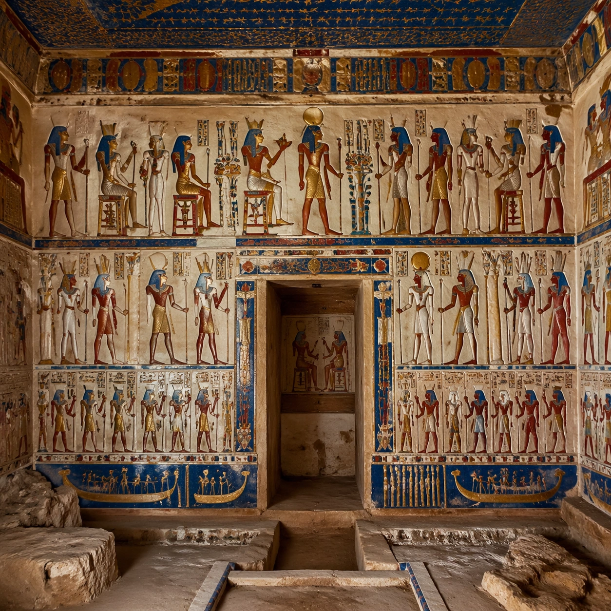
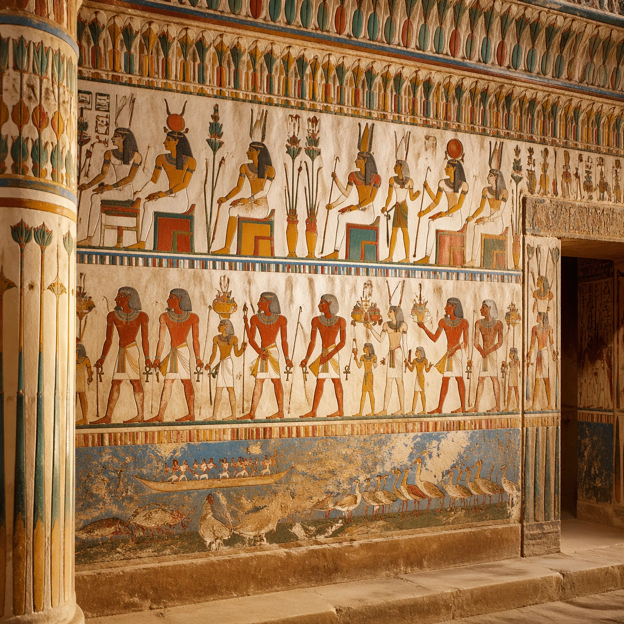
Example generated from “Egyptian Polychrome Wall — Reference Anchor”
GPT Image 2en

Scene: A square documentary image composed like a premium archaeology magazine feature. Use lapis blue, iron red, warm limestone cream, and intact gold highlights under careful chamber lighting. Frame a newly opened Egyptian tomb chamber wall covered in vivid painted registers, carved figures, and fresh-looking polychrome plaster with crisp depth layering, restrained contrast, and subtle atmospheric depth so the scene feels excavated, observed, and historically grounded rather than theatrical or game-like. Keep the light directional but believable, as if captured during a careful field visit. Subject: Center the image on a newly opened Egyptian tomb chamber wall covered in vivid painted registers, carved figures, and fresh-looking polychrome plaster. Include culturally accurate surface logic, region-specific setting, and believable human-scale cues in stairs, doorways, cut blocks, relief edges, or water depth. Shapes, carvings, masonry joints, and site wear should feel studied from real archaeology, with no generic ancient-world mashup and no ornamental filler borrowed from another civilization. Important details: Keep the wall system recognizably Egyptian, with disciplined horizontal registers, profile figures, symbolic proportions, and pigment behavior that feels mineral and hand-applied rather than digitally printed. Emphasize painted plaster, carved limestone, mineral pigments, gold leaf accents, faience tones, and fine dust settled in joints. Keep inscriptions, painted registers, symbolic motifs, or carved bands visually plausible but not readable. Preserve a museum-grade balance between beauty and evidence: light should reveal relief depth, edge wear, repairs, sediment traces, and excavation context without turning the site into fantasy spectacle. The composition should feel like a definitive reference frame that later variations can inherit exactly. Use case: Egyptian Polychrome Wall Reconstruction series study 1/9. Constraints: No readable text, no watermark, no logos, preserve exact 1:1 aspect ratio, no horror tropes, no movie traps, no laser beams, no undead figures, no tourists, no anachronistic props, no collage layout, no exaggerated fantasy lighting.

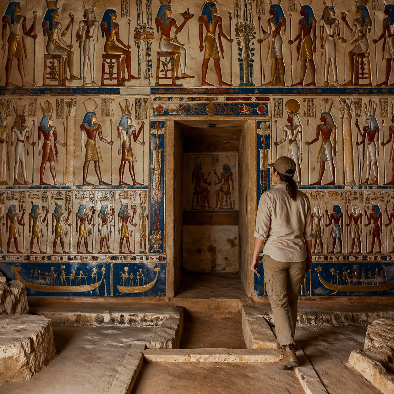
Example generated from “Egyptian Polychrome Wall — Human Scale Reveal”
GPT Image 2en

Scene: A square follow-up field image from the same site, slightly closer and lower than the reference anchor, with careful documentary framing and the same material palette. The camera should feel physically present inside the archaeological space, using natural light, soft depth separation, and one clear human figure to explain scale without turning the image into lifestyle photography. Subject: Show the same site identity established in the reference anchor, now with an archaeologist, conservator, or field researcher moving through the scene in practical neutral clothing. The person should be small relative to the monument and clearly secondary to the architecture, water, or painted wall system. Keep the main forms, structural rhythm, and civilizational markers unchanged. Important details: Preserve the exact site identity, base geometry, material behavior, and cultural signatures from the reference model. Only vary vantage, gesture, and scale cues. Keep the wall system recognizably Egyptian, with disciplined horizontal registers, profile figures, symbolic proportions, and pigment behavior that feels mineral and hand-applied rather than digitally printed. Human presence should clarify stair height, wall size, carving depth, or spatial compression while respecting conservation protocol and historical seriousness. Keep any tools understated and generic, with no readable labels. The image must still look like a rigorous archaeological record first and a dramatic scene second. Use case: Egyptian Polychrome Wall Reconstruction series study 2/9. Constraints: No readable text, no watermark, no logos, preserve exact 1:1 aspect ratio, preserve exact site identity from the reference image, no horror tropes, no movie traps, no laser beams, no undead figures, no fashion editorial styling, no crowd, no cinematic props.

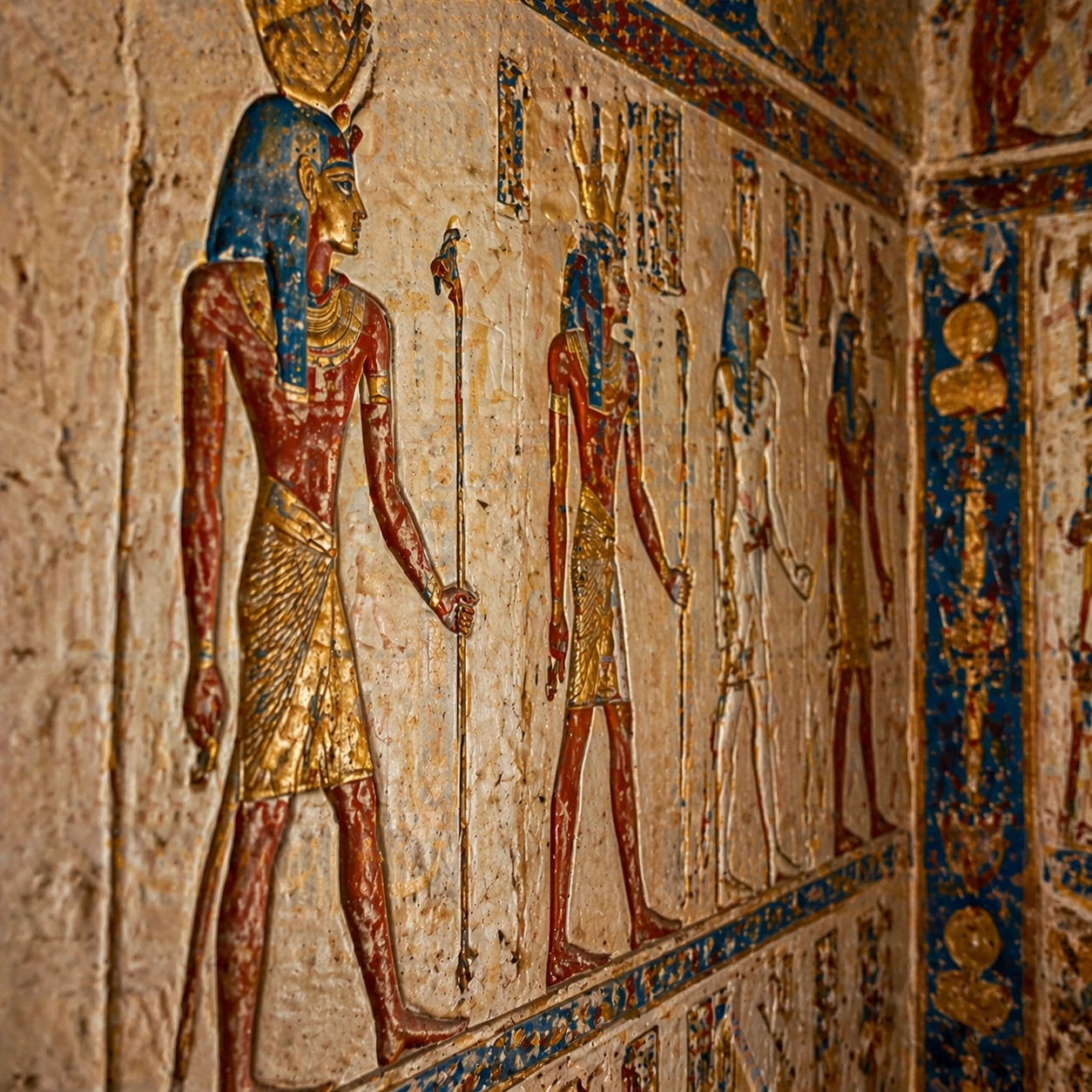
Example generated from “Egyptian Polychrome Wall — Surface Close Study”
GPT Image 2en

Scene: A square close study framed within the same site established by the reference anchor. Use a tight crop, shallow but believable depth of field, and raking light that reveals tactile evidence in surface relief, pigment, tool marks, moisture, or marine wear. The image should feel like a museum conservation photograph elevated to gallery quality. Subject: Focus on a materially rich portion of the same site: carved edges, painted plaster, fitted stone, root-wrapped masonry, submerged paving, or quarry-cut facial planes depending on the civilization. The composition should remain anchored to the original location and show enough surrounding context that viewers still recognize the parent site rather than mistaking it for an unrelated artifact. Important details: Preserve the exact site identity from the reference model while shifting emphasis to forensic surface evidence. Keep the wall system recognizably Egyptian, with disciplined horizontal registers, profile figures, symbolic proportions, and pigment behavior that feels mineral and hand-applied rather than digitally printed. Make micro-texture, fracture lines, pigment retention, water wear, plant interaction, dust, or chisel traces visually persuasive. Avoid decorative clutter. Every mark should feel like evidence of making, weathering, excavation, or conservation. Keep any symbolic marks non-legible and historically appropriate, and make the light reveal depth without flattening the material richness. Use case: Egyptian Polychrome Wall Reconstruction series study 3/9. Constraints: No readable text, no watermark, no logos, preserve exact 1:1 aspect ratio, preserve exact site identity from the reference image, no horror tropes, no movie traps, no laser beams, no undead figures, no isolated floating artifact, no studio backdrop, no fake macro abstraction.

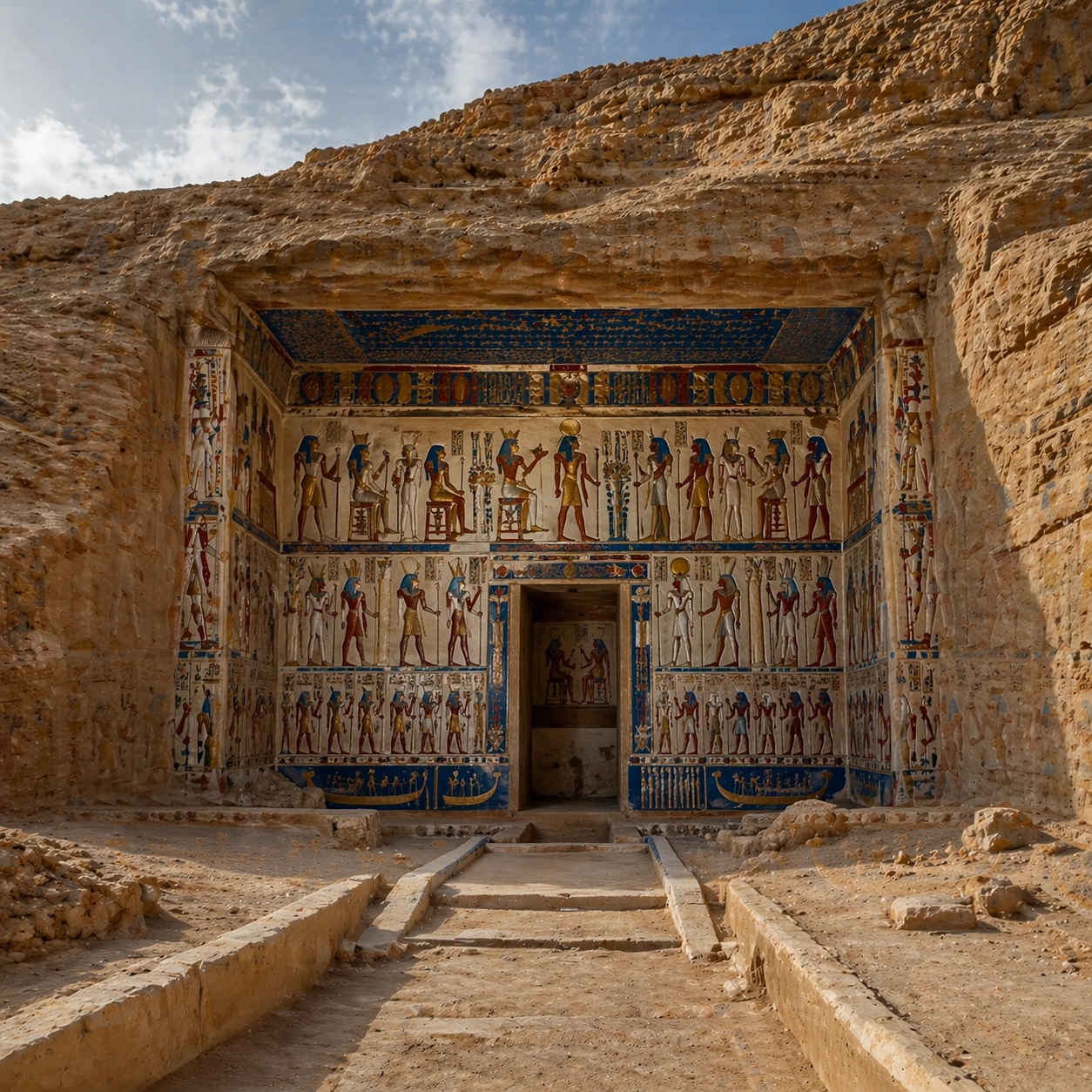
Example generated from “Egyptian Polychrome Wall — Atmospheric Wide Reveal”
GPT Image 2en

Scene: A square wide reveal of the same site under a slightly different environmental condition, with more surrounding geography or architecture visible while keeping the anchor landmark dominant. Use disciplined composition, atmospheric perspective, and natural light behavior so the image feels like a patient field photograph captured after the reference shot rather than a different fantasy set. Subject: Show the same site identity with broader context: approaches, terraces, ring walls, canyon slot, canopy volume, quarry slope, or chamber boundaries depending on the location. The anchor structure must remain instantly recognizable. Environmental scale should deepen understanding of why the site is placed here and how people, water, topography, or vegetation shape the experience of the monument. Important details: Preserve the exact landmark, materials, and civilizational cues from the reference model while allowing wider framing and a different atmospheric emphasis. Keep the wall system recognizably Egyptian, with disciplined horizontal registers, profile figures, symbolic proportions, and pigment behavior that feels mineral and hand-applied rather than digitally printed. Use geography and environmental systems to add meaning: drainage, mist, current, valley depth, roots, irrigation, or enclosure logic. The image should feel both beautiful and evidentiary, with no compositional tricks that break continuity with the established site. Use case: Egyptian Polychrome Wall Reconstruction series study 4/9. Constraints: No readable text, no watermark, no logos, preserve exact 1:1 aspect ratio, preserve exact site identity from the reference image, no horror tropes, no movie traps, no laser beams, no undead figures, no unrelated landmarks, no speculative mashup architecture, no posterized grading.

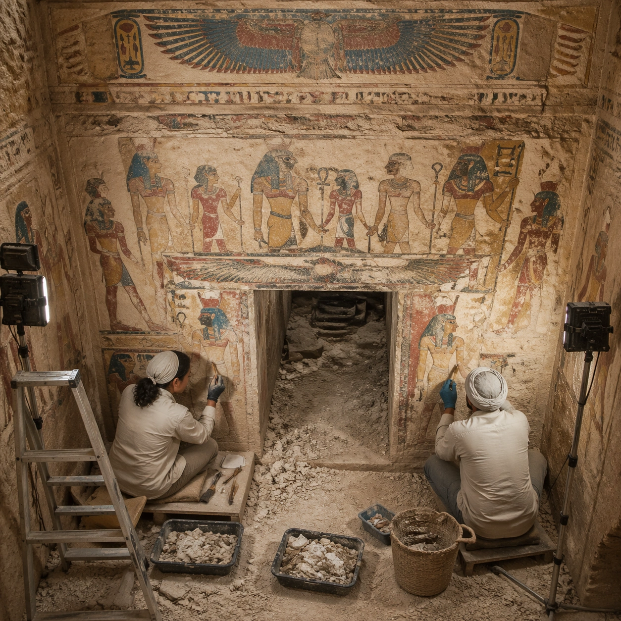
Example generated from “Egyptian Polychrome Wall — Excavation Overview”
GPT Image 2en

Scene: A square independent archaeology study composed from a slightly elevated fieldwork viewpoint. Use balanced natural light, crisp evidence hierarchy, and practical site organization so the image feels publishable in a museum report and still visually strong enough for a gallery wall. The frame should explain where excavation is happening without relying on readable markers or diagrams. Subject: Show a burial chamber threshold with conservators revealing painted plaster beneath dust and fallen chips, lit by neutral field lamps. Include grounded human traces such as ladders, trays, brushes, baskets, light rigs, or measuring tools only when they support archaeological realism and remain visually secondary. The site should stay culturally specific, with architecture, surface treatment, sediment, and environmental context all belonging to the correct civilization rather than a generic dig. Important details: Keep the wall system recognizably Egyptian, with disciplined horizontal registers, profile figures, symbolic proportions, and pigment behavior that feels mineral and hand-applied rather than digitally printed. Prioritize evidence relationships: exposed layers, cleaned edges, protected surfaces, loose fragments, and transitions between buried and revealed material. Let color, wear, and composition explain what has just been uncovered. The image must feel methodical rather than adventurous. Keep any site tags, notes, or markers abstract and unreadable. Avoid sensational treasure imagery and keep the atmosphere scholarly, patient, and materially convincing. Use case: Egyptian Polychrome Wall Reconstruction single study 5/9. Constraints: No readable text, no watermark, no logos, preserve exact 1:1 aspect ratio, no horror tropes, no movie traps, no laser beams, no undead figures, no treasure-chest clichés, no action-movie posing, no arbitrary props, no infographic overlay.

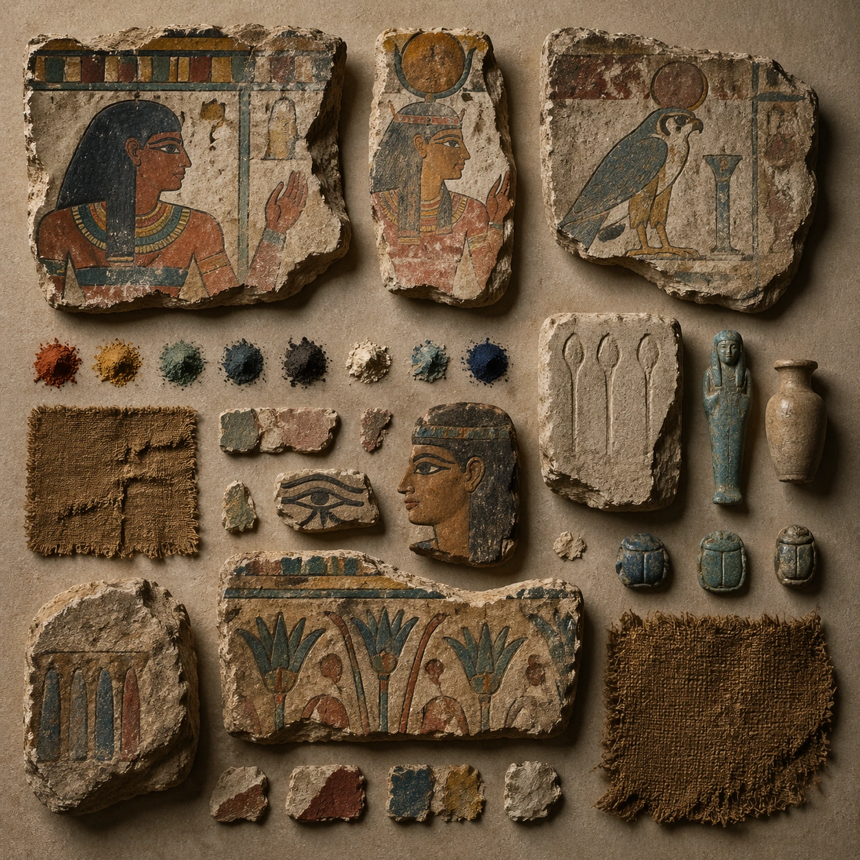
Example generated from “Egyptian Polychrome Wall — Artifact Tableau”
GPT Image 2en

Scene: A square artifact and material study arranged like a high-end conservation photograph. Use soft directional light, controlled shadow falloff, and a neutral work surface so every fragment reads clearly. The image should feel intimate and scientific, but still rich enough to communicate the broader civilization through craft, wear, and material vocabulary alone. Subject: Present paint flakes, pigment samples, linen fragments, carved plaster chips, and small funerary objects laid out for conservation review. Arrange the pieces with disciplined spacing and believable conservation handling. Include enough variation in scale, finish, and damage state to suggest excavation reality rather than a perfectly staged luxury still life. Nothing should look modern or decorative for its own sake; every object must feel like evidence tied to the same cultural world as the main topic. Important details: Emphasize tactile surfaces, honest aging, and historically grounded material behavior. Keep the wall system recognizably Egyptian, with disciplined horizontal registers, profile figures, symbolic proportions, and pigment behavior that feels mineral and hand-applied rather than digitally printed. Show abrasion, dust, corrosion, cracks, mineral bloom, pigment retention, or edge polish where appropriate. Keep the arrangement orderly but not sterile, as if prepared for a serious cataloging session. No readable labels, no museum placards, and no visual shortcuts that turn the study into product photography detached from archaeology. Use case: Egyptian Polychrome Wall Reconstruction single study 6/9. Constraints: No readable text, no watermark, no logos, preserve exact 1:1 aspect ratio, no horror tropes, no movie traps, no laser beams, no undead figures, no luxury advertising gloss, no floating objects, no velvet jewelry styling, no unrelated tools.

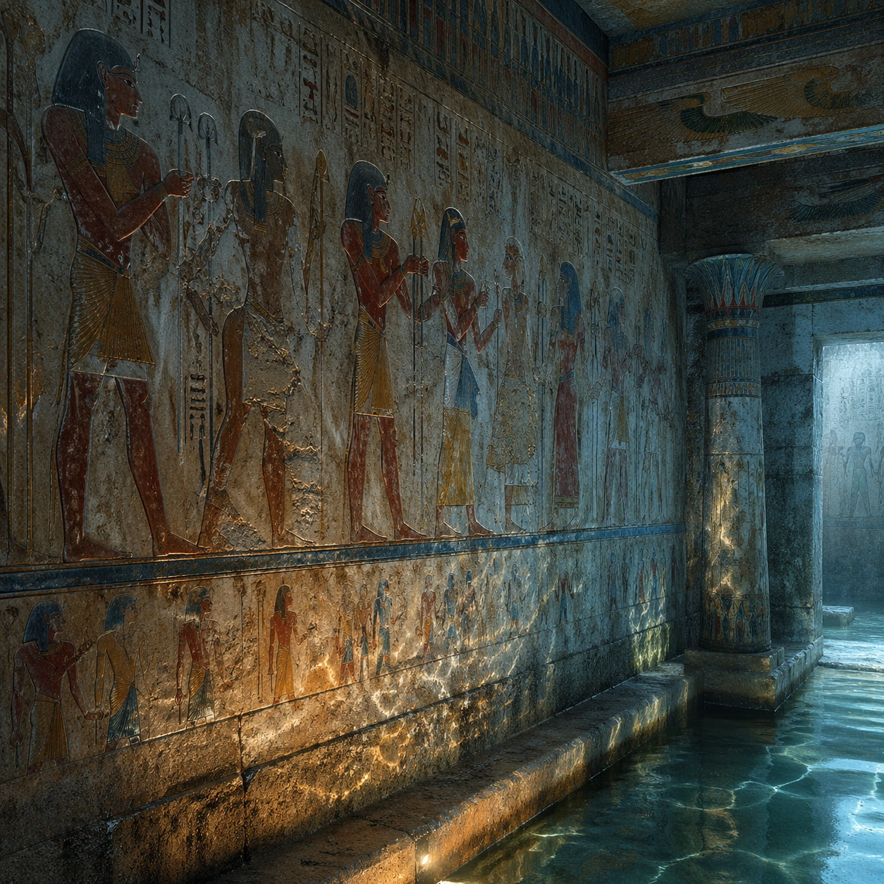
Example generated from “Egyptian Polychrome Wall — Light Shift Study”
GPT Image 2en

Scene: A square mood variation from the same civilization theme, built around cool conservation lighting mixed with a small amount of warm reflected lamp glow across the same painted surface. The image should stay grounded in field realism while testing how different illumination changes material reading, atmosphere, and emotional register. Keep the frame self-contained and coherent, as if photographed during a second visit under altered conditions. Subject: Show a culturally accurate site or interior connected to the same world as the main topic, but not as a direct dependency on the series reference. The focus should be on how light transforms relief, color, moisture, water, dust, or vegetation while preserving archaeological credibility. Architectural forms, objects, and setting must still belong to the same civilization with no cross-cultural contamination. Important details: Keep the wall system recognizably Egyptian, with disciplined horizontal registers, profile figures, symbolic proportions, and pigment behavior that feels mineral and hand-applied rather than digitally printed. Use the shift in light to reveal different evidence than the other studies: pigment glow, root sheen, caustics, wet stone, canyon shadow, marine haze, terrace depth, or quarry moisture. Keep the result serious and observational rather than romanticized. Non-readable motifs are acceptable, but there should be no signs, captions, or modern display devices. The image should feel like a rigorous visual experiment in historical atmosphere. Use case: Egyptian Polychrome Wall Reconstruction single study 7/9. Constraints: No readable text, no watermark, no logos, preserve exact 1:1 aspect ratio, no horror tropes, no movie traps, no laser beams, no undead figures, no theatrical color filters, no supernatural effects, no montage composition, no glossy concept-art exaggeration.

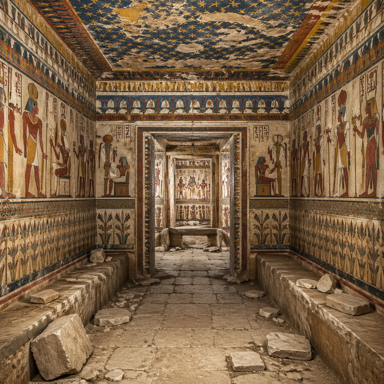
Example generated from “Egyptian Polychrome Wall — Survey Perspective”
GPT Image 2en

Scene: A square survey-oriented image that explains spatial logic with the clarity of an expert field overview while still reading as a finished artwork. Use a stable elevated vantage, clean depth layering, and enough visible terrain or architecture to make relationships legible without turning the frame into a literal map. The scene should feel analytical and cinematic at the same time. Subject: Show an axial chamber view showing wall relationships, ceiling bands, floor debris, and the logic of the painted interior as a coherent archaeological space. Organize the composition so paths, terraces, walls, courtyards, chambers, canals, root systems, or quarry clusters can be read as a coherent system. The image should reveal how the civilization used land, water, elevation, enclosure, or monumentality. Keep all architecture, materials, and environmental details consistent with the correct place and period. Important details: Keep the wall system recognizably Egyptian, with disciplined horizontal registers, profile figures, symbolic proportions, and pigment behavior that feels mineral and hand-applied rather than digitally printed. This image should reward close looking by showing infrastructural logic: how stone courses align, how water moves, how rooms connect, how carved masses sit inside geology, or how vegetation interacts with built form. Avoid explicit annotation. Let composition, light, and scale cues do the explanatory work. Keep any measuring elements generic and unreadable, and make the image feel like serious research made visually elegant. Use case: Egyptian Polychrome Wall Reconstruction single study 8/9. Constraints: No readable text, no watermark, no logos, preserve exact 1:1 aspect ratio, no horror tropes, no movie traps, no laser beams, no undead figures, no infographic arrows, no split-screen layout, no impossible aerial geometry, no unrelated settlements.

Example generated from “Egyptian Polychrome Wall — Editorial Reconstruction”
GPT Image 2en

Scene: A square hero image designed for a museum wall graphic or flagship magazine cover, but without any actual typography. Use strong focal hierarchy, refined contrast, and a polished finish that still feels rooted in archaeological evidence. The frame should look complete on its own and communicate why this civilization remains visually unforgettable. Subject: Build the image around a stand-alone museum board style image that lets original color, craft, and tomb architecture carry the drama without spectacle. Present architecture, artifacts, environment, and atmosphere as one coherent statement. The composition can be more distilled than a field snapshot, but it must remain culturally specific, materially persuasive, and free of fantasy shorthand. Nothing should feel like a movie poster or commercial franchise imitation. Important details: Keep the wall system recognizably Egyptian, with disciplined horizontal registers, profile figures, symbolic proportions, and pigment behavior that feels mineral and hand-applied rather than digitally printed. Distill the site or cultural world into one decisive visual argument: place, craft, weathering, engineering, and memory. Use the strongest material signatures from this civilization and let them sit in a believable environment with controlled dramatic weight. Keep any carved or painted symbols non-readable. The result should look like responsible high-end visual storytelling for research and public interpretation, not a spectacle-first matte painting. Use case: Egyptian Polychrome Wall Reconstruction single study 9/9. Constraints: No readable text, no watermark, no logos, preserve exact 1:1 aspect ratio, no horror tropes, no movie traps, no laser beams, no undead figures, no movie-poster tropes, no overdesigned framing devices, no collage layout, no brand-like iconography.

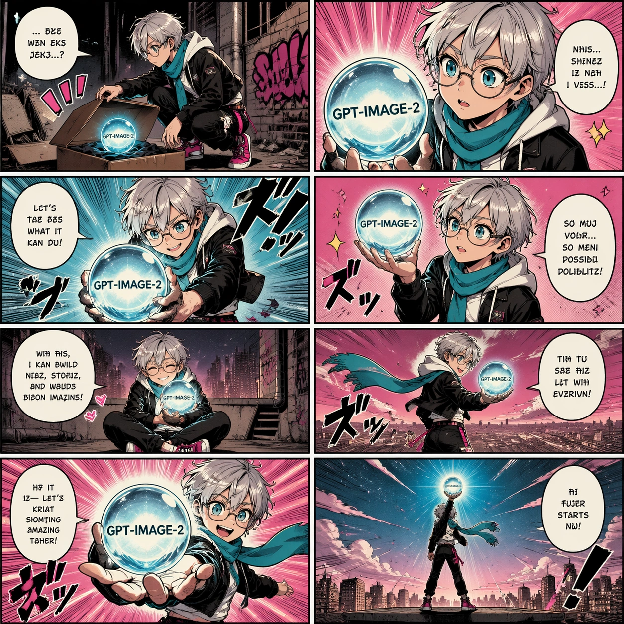
Example generated from “Eight Panel Consistency Comic — Reference Hero Orb Page”
GPT Image 2en

Scene: A square single-page manga-style launch comic with exactly eight panels arranged in a clean 2 by 4 grid. Crisp black panel borders, warm screen-tone texture, limited cyan, magenta, black, and cream palette, high production polish, and clear reading flow from top-left to bottom-right. Subject: One consistent protagonist appears across all eight panels: short silver hair, round glasses, cropped black jacket, white hoodie, cyan scarf, magenta sneakers. The protagonist discovers, lifts, and presents a glowing glass orb with the exact readable text GPT-IMAGE-2 inside the orb. The orb stays the same size and design across panels. Expressions change, but the face, hair, outfit, and prop identity remain consistent. Important details: Eight distinct panels, one coherent launch story, consistent character model, consistent outfit, consistent glowing orb, dynamic manga camera angles, clean speech balloons with pseudo-text except the orb text GPT-IMAGE-2. Include a few non-readable sound-effect shapes and speed lines. The layout must be readable as one finished comic page, not eight unrelated stickers. Use case: Reference image for a four-image series testing character and product-prop consistency across multi-panel comic pages. Constraints: Exactly eight panels, preserve one protagonist identity across all panels, only readable text should be GPT-IMAGE-2 on the orb, no real brand logos, no watermark, no extra main characters, no broken panel grid, no photorealism, preserve exact 1:1 aspect ratio.

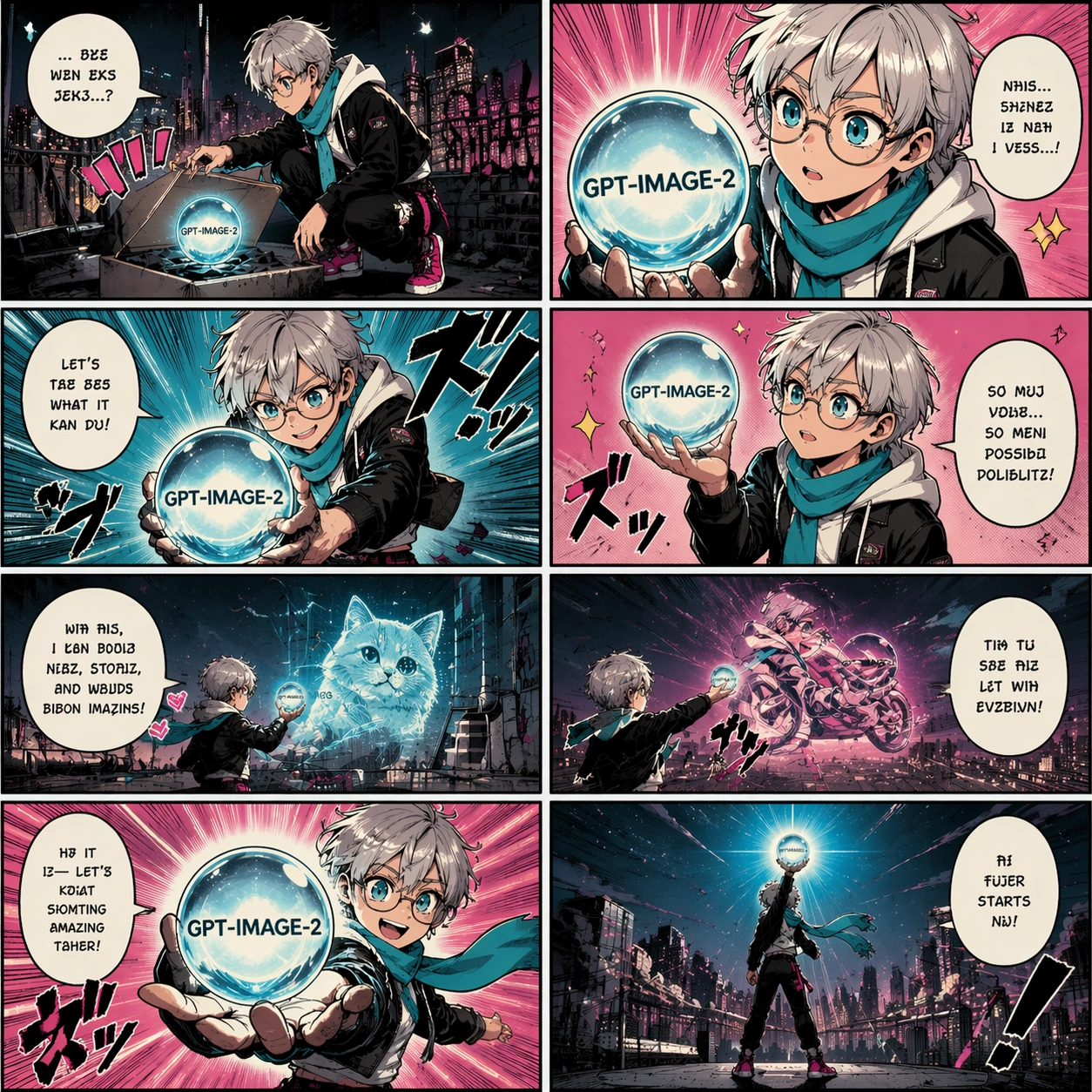
Example generated from “Eight Panel Consistency Comic — Rooftop Launch Page”
GPT Image 2en

Scene: Same square eight-panel manga page format as the reference image, exactly eight panels in a clean 2 by 4 grid, same ink line weight, screen-tone texture, limited cyan, magenta, black, and cream palette. Subject: Use the same protagonist from the reference image: short silver hair, round glasses, cropped black jacket, white hoodie, cyan scarf, magenta sneakers. Place them on a city rooftop at night, using the same glowing GPT-IMAGE-2 orb as the story prop. The eight panels show the character testing the orb, projecting images into the skyline, reacting, then presenting it toward the reader. Important details: Preserve identity, outfit, face shape, hair, scarf, sneakers, and orb design from the reference. Keep the exact eight-panel comic rhythm. Use speech balloons with pseudo-text only; the only intended readable text is GPT-IMAGE-2 on the orb. Add manga motion lines, rooftop railings, tiny skyline silhouettes, and glow reflections. Use case: Second image in a reference-dependent comic consistency series, testing whether the same character and product prop survive a new setting and story beat. Constraints: PRESERVE the reference protagonist, outfit, orb, page style, panel count, and square crop. Exactly eight panels, no real logos, no watermark, no extra main character, no photorealism, no readable dialogue other than GPT-IMAGE-2, preserve exact 1:1 aspect ratio.

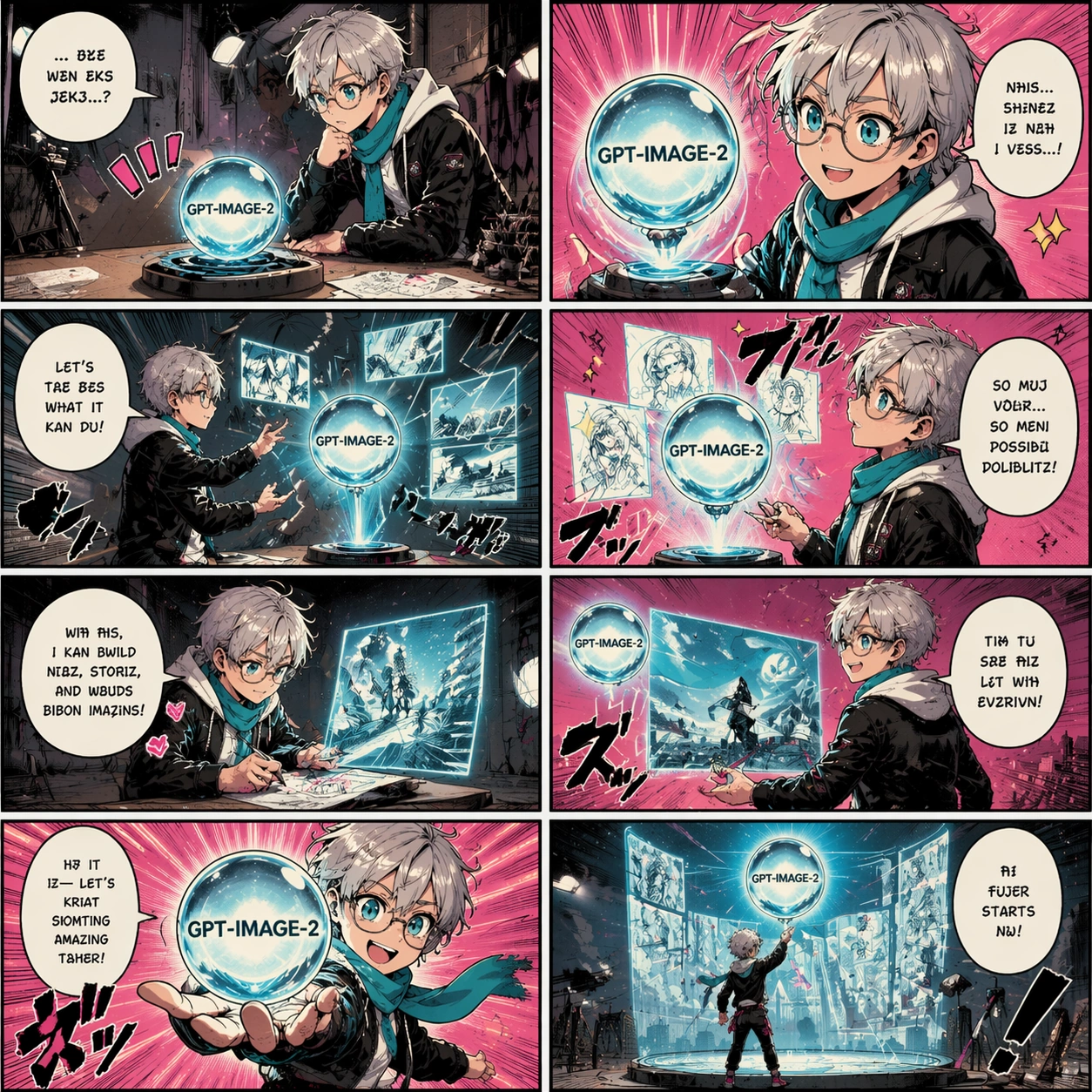
Example generated from “Eight Panel Consistency Comic — Studio Demo Page”
GPT Image 2en

Scene: Same square eight-panel manga page format as the reference image, exactly eight panels in a 2 by 4 grid, same line art, screen tones, limited cyan, magenta, black, and cream palette, and polished product-launch energy. Subject: Use the same protagonist from the reference image with identical silver hair, round glasses, black cropped jacket, white hoodie, cyan scarf, and magenta sneakers. The same glowing glass orb with GPT-IMAGE-2 inside sits on a studio table, then floats, projects sketch thumbnails, and becomes the focus of a demo sequence across eight panels. Important details: Preserve protagonist identity and prop design from the reference. The studio has simple lights, a drawing table, camera tripod silhouettes, and clean product-demo staging. Keep speech bubbles as pseudo-text, with only GPT-IMAGE-2 readable on the orb. Each panel should advance the demo story while keeping the character model consistent. Use case: Third image in a reference-dependent comic consistency series, testing product demo storytelling with the same hero and prop. Constraints: PRESERVE the reference protagonist, outfit, orb, page style, panel count, and square crop. Exactly eight panels, no real logos, no watermark, no extra main character, no photorealistic UI, no readable dialogue except GPT-IMAGE-2, preserve exact 1:1 aspect ratio.

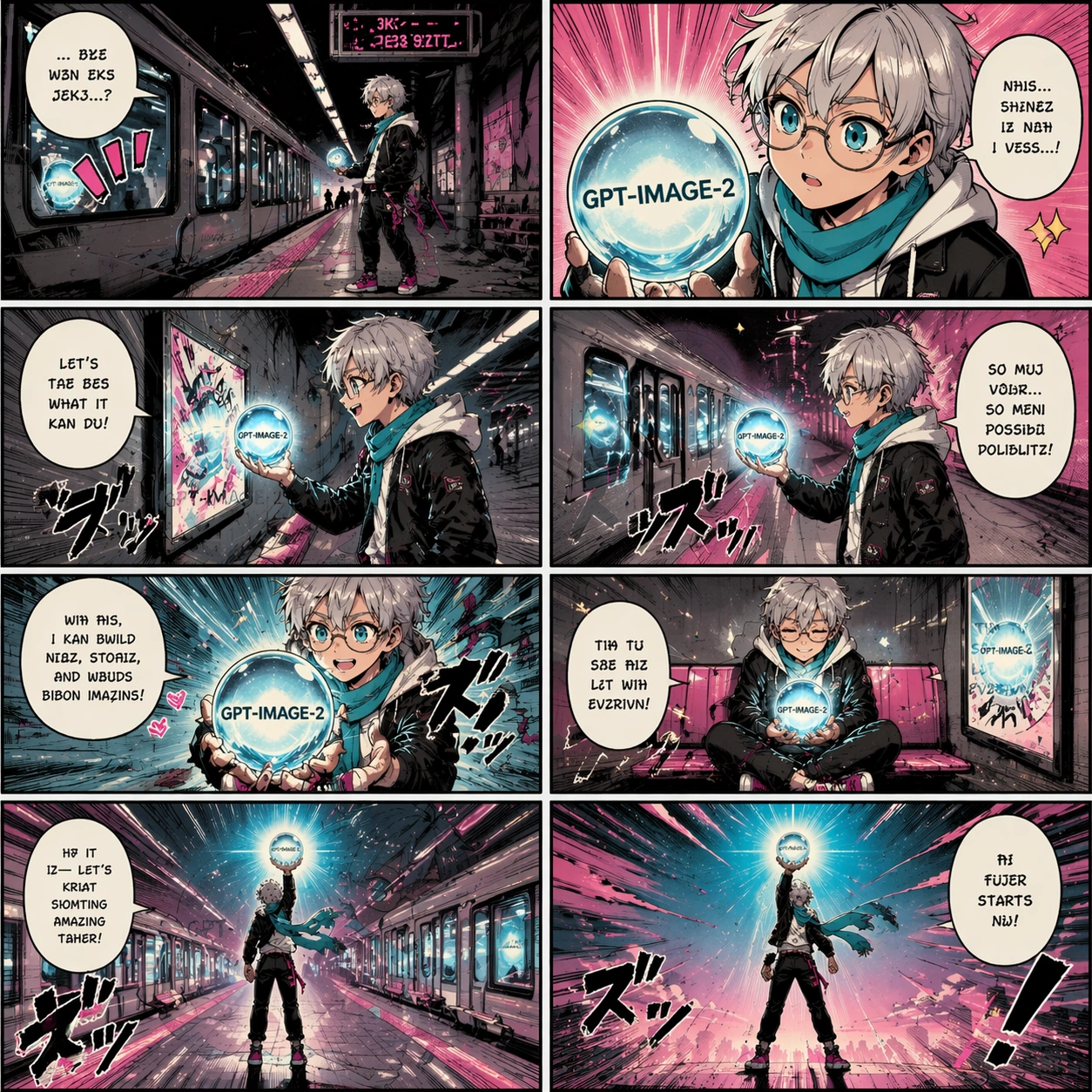
Example generated from “Eight Panel Consistency Comic — Subway Reveal Page”
GPT Image 2en

Scene: Same square eight-panel manga page format as the reference image, exactly eight panels in a clean 2 by 4 grid, same screen-tone texture, ink style, and limited cyan, magenta, black, and cream palette. Subject: Use the same protagonist from the reference image with the same silver hair, round glasses, cropped black jacket, white hoodie, cyan scarf, and magenta sneakers. The story takes place in a stylized subway station. The glowing GPT-IMAGE-2 orb reflects in train windows, lights up poster frames, and turns a waiting platform into a launch reveal across eight panels. Important details: Preserve the character identity and orb design from the reference. Keep panel rhythm clean and cinematic: establishing shot, close-up, reaction, action, reveal, quiet beat, wide platform glow, final hero pose. Speech balloons contain pseudo-text only; GPT-IMAGE-2 should appear on the orb. Use manga speed lines, train silhouettes, and reflected glow. Use case: Fourth image in a reference-dependent comic consistency series, testing identity and prop continuity in a public transit setting. Constraints: PRESERVE the reference protagonist, outfit, orb, page style, panel count, and square crop. Exactly eight panels, no real transit logos, no watermark, no extra main character, no photorealism, no readable dialogue except GPT-IMAGE-2, preserve exact 1:1 aspect ratio.

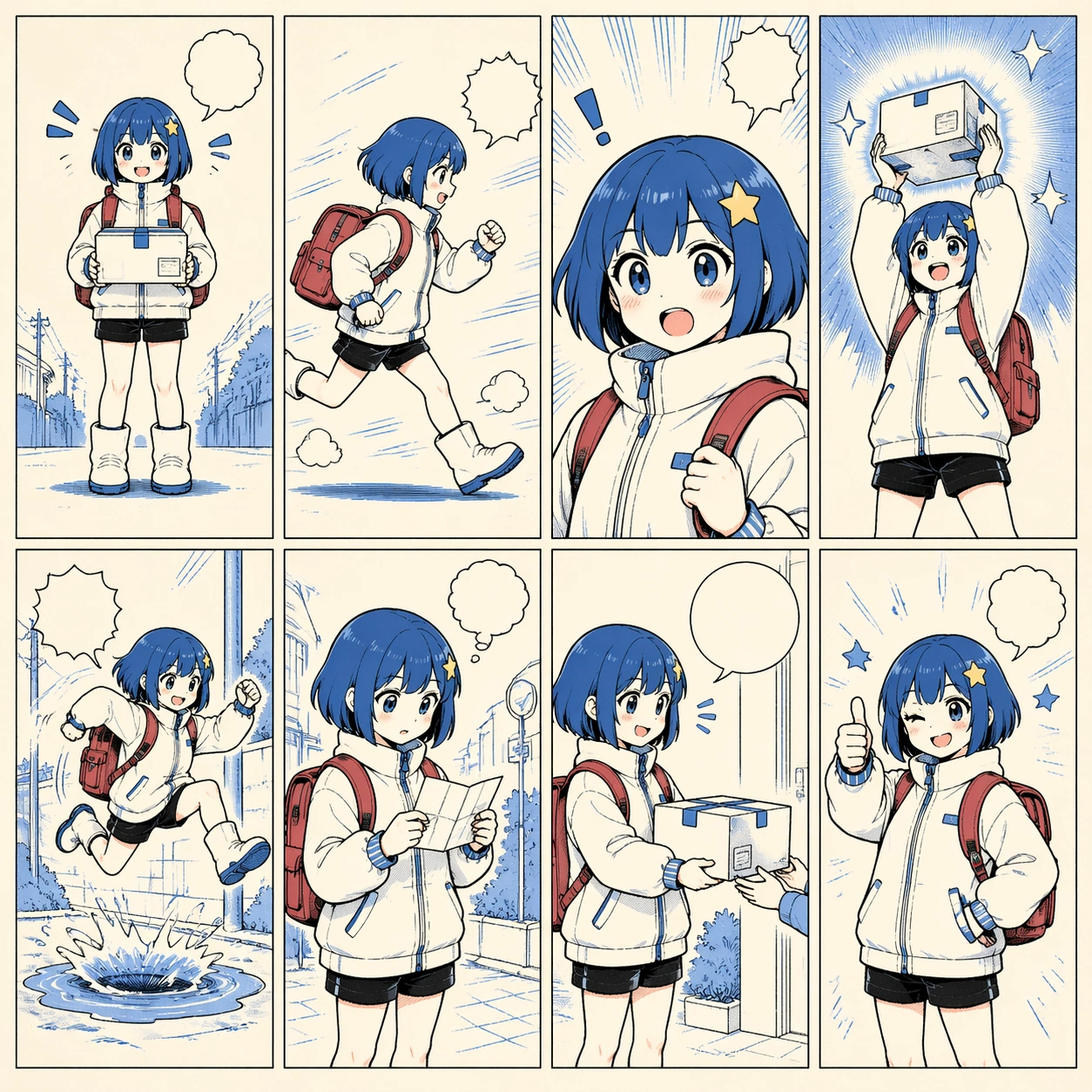
Example generated from “Eight Panel Consistency Comic — Character Turnaround Comic”
GPT Image 2en

Scene: A square eight-panel character consistency comic page, exactly eight panels in a balanced 2 by 4 grid. The style is clean anime production art mixed with manga panel storytelling, cream paper, black ink, and blue accent shadows. Subject: One consistent mascot courier appears in all eight panels: bobbed blue hair, star hairpin, oversized white delivery jacket, red backpack, black shorts, and white boots. The panels show front view, side run, close-up reaction, lifting a glowing parcel, jumping over a puddle, checking a tiny map, handing off the parcel, and final thumbs-up pose. Important details: The main test is identity consistency: same face, hair, outfit, backpack, boots, and parcel shape in every panel. Use different poses and camera angles while keeping the character recognizable. Add pseudo-dialogue balloons, action lines, and simple background cues, but keep the panel grid clean. Use case: Independent comic single image, testing character identity lock across eight panels without reference images. Constraints: Exactly eight panels, one main character only, no readable text, no logos, no watermark, no broken panel borders, no photorealism, no outfit changes, preserve exact 1:1 aspect ratio.

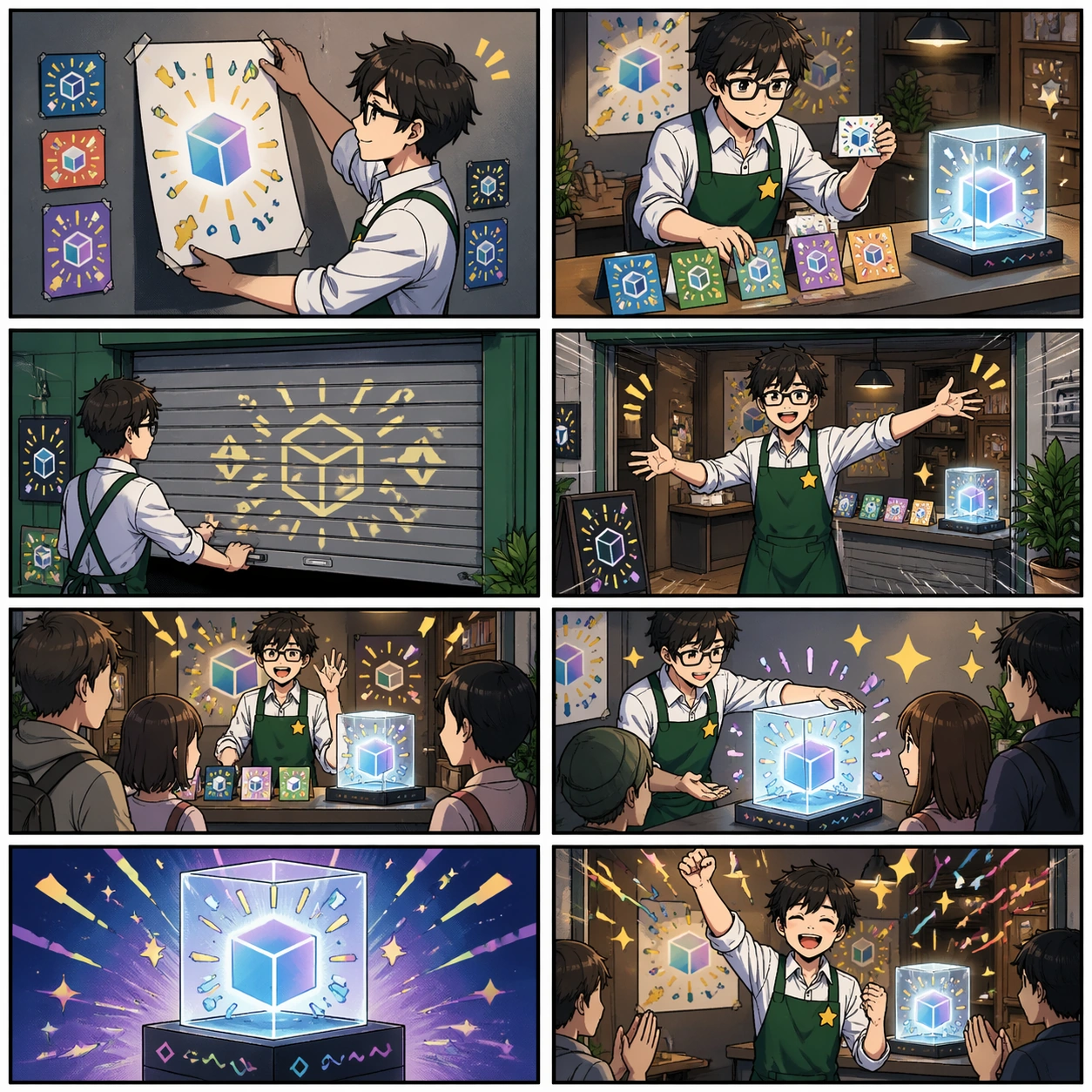
Example generated from “Eight Panel Consistency Comic — Launch Storefront Comic”
GPT Image 2en

Scene: A square eight-panel storefront launch comic, exactly eight panels in a clean 2 by 4 grid. The style is polished commercial manga with crisp borders, bright but controlled colors, screen-tone shadows, and clear product-poster energy. Subject: A consistent shopkeeper character prepares a tiny pop-up storefront for an image-generation launch. The shopkeeper has a green apron, square glasses, rolled sleeves, and a small star-shaped badge. Across eight panels they hang posters, arrange sample cards, open the shutters, greet a small crowd, demonstrate a glowing display cube, and celebrate the launch. Important details: Maintain the same shopkeeper identity and outfit across all panels. The storefront, display cube, posters, and sample cards should be consistent props. Use pseudo-lettering and symbol marks only; no readable brand names. The page should feel like a commercial launch comic with strong layout clarity and cheerful pacing. Use case: Independent comic single image, testing multi-panel commercial storytelling and prop consistency in a self-contained prompt. Constraints: Exactly eight panels, no readable text, no real logos, no watermark, no extra main protagonist, no broken grid, no photorealism, no clutter that hides panel flow, preserve exact 1:1 aspect ratio.

Example generated from “Emote Expression Victory Pose Pack — Reference Hero Anchor”
GPT Image 2en

Scene: A premium square hero reveal frame in a stylized game lobby, lit with a confident rim light and balanced neutral background glow. Frame the composition like a premium game-production deliverable rather than generic concept art, with disciplined square balance, controlled highlight placement, and enough negative space to keep the focal structure easy to parse. Use lighting, value grouping, and depth layers to make the scene feel intentional, collectible, and immediately useful for internal review or outward-facing promotion. Subject: Present one original arena champion in a neutral but charismatic stance, showing the full costume set, signature prop, footwear, gloves, and facial markings with production-sheet clarity. Build the image around one dominant primary read, then support it with clearly organized secondary shapes, props, interface shells, or environment structures that reinforce gameplay context and commercial usefulness. Every object should look original, fully resolved, and designed to survive cropping for store, profile, patch, or gallery surfaces. Important details: This image is the master visual anchor for every later emote, sticker, and victory variation in the set. Keep the hero immediately recognizable at both full-body and sticker scale, with expressive hand language, sharp silhouette control, and a clean commercial finish suited to game UI surfaces. Treat this image as the root visual anchor: it must be especially stable, complete, and easy for later variations to inherit from. Use case: Emote Expression Victory Pose Pack series study 1/9. Constraints: No readable text, no watermark, no logos, preserve exact 1:1 aspect ratio, no unreadable chat bubbles pretending to be text, no extra characters, no mutated hands, no costume redesign, no muddy silhouette.

Example generated from “Emote Expression Victory Pose Pack — Smile Emote Burst”
GPT Image 2en

Scene: A waist-up social emote crop with bright celebratory lighting and a soft burst backdrop that feels ready for a chat wheel preview. Frame the composition like a premium game-production deliverable rather than generic concept art, with disciplined square balance, controlled highlight placement, and enough negative space to keep the focal structure easy to parse. Use lighting, value grouping, and depth layers to make the scene feel intentional, collectible, and immediately useful for internal review or outward-facing promotion. Subject: Show the same hero breaking into a wide genuine smile, one hand raised in an energetic greeting, with the expression readable at thumbnail size. Build the image around one dominant primary read, then support it with clearly organized secondary shapes, props, interface shells, or environment structures that reinforce gameplay context and commercial usefulness. Every object should look original, fully resolved, and designed to survive cropping for store, profile, patch, or gallery surfaces. Important details: The gesture should feel fast, warm, and designed for looped social use without losing costume or face integrity. Keep the hero immediately recognizable at both full-body and sticker scale, with expressive hand language, sharp silhouette control, and a clean commercial finish suited to game UI surfaces. Preserve the same hero identity, face structure, hair silhouette, costume construction, faction color logic, and prop details established by the reference image. The variation may change framing, intensity, or layout emphasis, but it must still feel like a direct continuation of the same design system. Use case: Emote Expression Victory Pose Pack series study 2/9. Constraints: No readable text, no watermark, no logos, preserve exact 1:1 aspect ratio, no unreadable chat bubbles pretending to be text, no extra characters, no mutated hands, no costume redesign, no muddy silhouette.

Example generated from “Emote Expression Victory Pose Pack — Rage Emote Flare”
GPT Image 2en

Scene: A dramatic bust crop with hotter side light, sharper shadows, and a compact background effect that implies tension without clutter. Frame the composition like a premium game-production deliverable rather than generic concept art, with disciplined square balance, controlled highlight placement, and enough negative space to keep the focal structure easy to parse. Use lighting, value grouping, and depth layers to make the scene feel intentional, collectible, and immediately useful for internal review or outward-facing promotion. Subject: Show the same hero mid-frustration, brows locked, jaw tense, shoulders forward, with a clenched hand and a believable competitive rage reaction. Build the image around one dominant primary read, then support it with clearly organized secondary shapes, props, interface shells, or environment structures that reinforce gameplay context and commercial usefulness. Every object should look original, fully resolved, and designed to survive cropping for store, profile, patch, or gallery surfaces. Important details: The emotion must read instantly as anger rather than generic shouting, while still staying attractive and UI-safe. Keep the hero immediately recognizable at both full-body and sticker scale, with expressive hand language, sharp silhouette control, and a clean commercial finish suited to game UI surfaces. Preserve the same hero identity, face structure, hair silhouette, costume construction, faction color logic, and prop details established by the reference image. The variation may change framing, intensity, or layout emphasis, but it must still feel like a direct continuation of the same design system. Use case: Emote Expression Victory Pose Pack series study 3/9. Constraints: No readable text, no watermark, no logos, preserve exact 1:1 aspect ratio, no unreadable chat bubbles pretending to be text, no extra characters, no mutated hands, no costume redesign, no muddy silhouette.

Example generated from “Emote Expression Victory Pose Pack — Taunt Pose Loop”
GPT Image 2en

Scene: A three-quarter performance frame staged like a game unlock pose, with directional lighting and enough floor to support a planted stance. Frame the composition like a premium game-production deliverable rather than generic concept art, with disciplined square balance, controlled highlight placement, and enough negative space to keep the focal structure easy to parse. Use lighting, value grouping, and depth layers to make the scene feel intentional, collectible, and immediately useful for internal review or outward-facing promotion. Subject: Show the same hero leaning into a teasing taunt pose, with confident eye contact, a crooked grin, and body language that invites a rival to engage. Build the image around one dominant primary read, then support it with clearly organized secondary shapes, props, interface shells, or environment structures that reinforce gameplay context and commercial usefulness. Every object should look original, fully resolved, and designed to survive cropping for store, profile, patch, or gallery surfaces. Important details: The taunt should feel playful and cocky rather than villainous, with strong torso twist and readable negative space around the limbs. Keep the hero immediately recognizable at both full-body and sticker scale, with expressive hand language, sharp silhouette control, and a clean commercial finish suited to game UI surfaces. Preserve the same hero identity, face structure, hair silhouette, costume construction, faction color logic, and prop details established by the reference image. The variation may change framing, intensity, or layout emphasis, but it must still feel like a direct continuation of the same design system. Use case: Emote Expression Victory Pose Pack series study 4/9. Constraints: No readable text, no watermark, no logos, preserve exact 1:1 aspect ratio, no unreadable chat bubbles pretending to be text, no extra characters, no mutated hands, no costume redesign, no muddy silhouette.


Example generated from “Emote Expression Victory Pose Pack — Victory Podium Hero”
GPT Image 2en

Scene: A full-body reward screen composition with a subtle stage platform, premium spotlighting, and controlled confetti-like energy accents. Frame the composition like a premium game-production deliverable rather than generic concept art, with disciplined square balance, controlled highlight placement, and enough negative space to keep the focal structure easy to parse. Use lighting, value grouping, and depth layers to make the scene feel intentional, collectible, and immediately useful for internal review or outward-facing promotion. Subject: Show the same hero in a triumphant match-win pose, chest lifted, one foot forward, prop held high, and posture designed for an MVP presentation card. Build the image around one dominant primary read, then support it with clearly organized secondary shapes, props, interface shells, or environment structures that reinforce gameplay context and commercial usefulness. Every object should look original, fully resolved, and designed to survive cropping for store, profile, patch, or gallery surfaces. Important details: The pose must feel like a final victory beat instead of a combat strike, with clear balance and celebratory emotion. Keep the hero immediately recognizable at both full-body and sticker scale, with expressive hand language, sharp silhouette control, and a clean commercial finish suited to game UI surfaces. Preserve the same hero identity, face structure, hair silhouette, costume construction, faction color logic, and prop details established by the reference image. The variation may change framing, intensity, or layout emphasis, but it must still feel like a direct continuation of the same design system. Use case: Emote Expression Victory Pose Pack series study 5/9. Constraints: No readable text, no watermark, no logos, preserve exact 1:1 aspect ratio, no unreadable chat bubbles pretending to be text, no extra characters, no mutated hands, no costume redesign, no muddy silhouette.

Example generated from “Emote Expression Victory Pose Pack — Supportive Cheer Sticker”
GPT Image 2en

Scene: A compact sticker-style crop with strong contour separation, simple background energy, and enough breathing room for future UI framing. Frame the composition like a premium game-production deliverable rather than generic concept art, with disciplined square balance, controlled highlight placement, and enough negative space to keep the focal structure easy to parse. Use lighting, value grouping, and depth layers to make the scene feel intentional, collectible, and immediately useful for internal review or outward-facing promotion. Subject: Show the same hero cheering for a teammate with bright eyes, an open smile, and a supportive hand signal that reads positively at tiny scale. Build the image around one dominant primary read, then support it with clearly organized secondary shapes, props, interface shells, or environment structures that reinforce gameplay context and commercial usefulness. Every object should look original, fully resolved, and designed to survive cropping for store, profile, patch, or gallery surfaces. Important details: Keep the visual language friendly and legible, favoring iconic shapes over tiny surface noise. Keep the hero immediately recognizable at both full-body and sticker scale, with expressive hand language, sharp silhouette control, and a clean commercial finish suited to game UI surfaces. Preserve the same hero identity, face structure, hair silhouette, costume construction, faction color logic, and prop details established by the reference image. The variation may change framing, intensity, or layout emphasis, but it must still feel like a direct continuation of the same design system. Use case: Emote Expression Victory Pose Pack series study 6/9. Constraints: No readable text, no watermark, no logos, preserve exact 1:1 aspect ratio, no unreadable chat bubbles pretending to be text, no extra characters, no mutated hands, no costume redesign, no muddy silhouette.

Example generated from “Emote Expression Victory Pose Pack — MVP Card Pose”
GPT Image 2en

Scene: A vertical-feeling square composition adapted for a versus-card style presentation, with layered depth and clean hero separation. Frame the composition like a premium game-production deliverable rather than generic concept art, with disciplined square balance, controlled highlight placement, and enough negative space to keep the focal structure easy to parse. Use lighting, value grouping, and depth layers to make the scene feel intentional, collectible, and immediately useful for internal review or outward-facing promotion. Subject: Show the same hero in a composed high-status winner pose, angled slightly toward camera, with one arm crossing the torso and the prop creating a second read line. Build the image around one dominant primary read, then support it with clearly organized secondary shapes, props, interface shells, or environment structures that reinforce gameplay context and commercial usefulness. Every object should look original, fully resolved, and designed to survive cropping for store, profile, patch, or gallery surfaces. Important details: The final image should feel suitable for a premium reward or highlight card without requiring readable interface text. Keep the hero immediately recognizable at both full-body and sticker scale, with expressive hand language, sharp silhouette control, and a clean commercial finish suited to game UI surfaces. Preserve the same hero identity, face structure, hair silhouette, costume construction, faction color logic, and prop details established by the reference image. The variation may change framing, intensity, or layout emphasis, but it must still feel like a direct continuation of the same design system. Use case: Emote Expression Victory Pose Pack series study 8/9. Constraints: No readable text, no watermark, no logos, preserve exact 1:1 aspect ratio, no unreadable chat bubbles pretending to be text, no extra characters, no mutated hands, no costume redesign, no muddy silhouette.

Example generated from “Emote Expression Victory Pose Pack — Emote Wheel Preview”
GPT Image 2en

Scene: A polished UI-mock presentation board in square format, showing the same hero as the central art focus with surrounding non-textual icon placeholders. Frame the composition like a premium game-production deliverable rather than generic concept art, with disciplined square balance, controlled highlight placement, and enough negative space to keep the focal structure easy to parse. Use lighting, value grouping, and depth layers to make the scene feel intentional, collectible, and immediately useful for internal review or outward-facing promotion. Subject: Show the hero in a compact neutral stance that can support multiple emote contexts, while the layout implies a radial emote system through shapes and highlighted slots. Build the image around one dominant primary read, then support it with clearly organized secondary shapes, props, interface shells, or environment structures that reinforce gameplay context and commercial usefulness. Every object should look original, fully resolved, and designed to survive cropping for store, profile, patch, or gallery surfaces. Important details: Use abstract interface framing and icon geometry only; the hero must remain the main subject and continuity anchor. Keep the hero immediately recognizable at both full-body and sticker scale, with expressive hand language, sharp silhouette control, and a clean commercial finish suited to game UI surfaces. Preserve the same hero identity, face structure, hair silhouette, costume construction, faction color logic, and prop details established by the reference image. The variation may change framing, intensity, or layout emphasis, but it must still feel like a direct continuation of the same design system. Use case: Emote Expression Victory Pose Pack series study 9/9. Constraints: No readable text, no watermark, no logos, preserve exact 1:1 aspect ratio, no unreadable chat bubbles pretending to be text, no extra characters, no mutated hands, no costume redesign, no muddy silhouette.

Example generated from “Engineering Cutaway And Section Poster — Object Hero”
GPT Image 2en

Scene: A square poster-grade studio scene with strong central lighting, disciplined shadows, and a premium neutral backdrop. Compose the frame as a square key visual with disciplined camera placement, premium lighting control, and believable real-world scale. The tonal range should feel polished and intentional, with enough atmosphere to create depth without obscuring form. Keep contrast calibrated for launch, catalog, or research presentation use rather than casual snapshot aesthetics. Subject: Center an original compact turbine-assisted industrial air purifier with a cylindrical shell, layered filtration stack, structural ribs, motor chamber, and clean service-access geometry. Make the subject feel original, production-aware, and clearly grounded in Engineering Cutaway and Section Poster. For this series image, preserve exact core subject identity, proportions, base geometry, and material language from the reference image whenever continuity matters. The focal hierarchy should be immediate: primary form first, then material behavior, then supporting environmental cues that clarify use context and difficulty. Important details: Show the complete engineered object with material credibility, service-access hints, and a clear silhouette suitable for educational or sales-grade technical storytelling. Preserve exact exterior silhouette, key internal architecture, material logic, and scale cues across the series. Cross-sections must feel engineered, crisp, and physically coherent rather than decorative slices. Use believable materials, engineering logic, and professional composition discipline. Reflections, shadows, edge breaks, texture scale, interface density, and small physical joints must all support realism. Avoid filler props, vague mood-board clutter, or any element that weakens the sense of a purpose-built industrial or automotive image. Use case: Cutaway Poster series study 1/9 for Engineering Cutaway and Section Poster, built as image 01-reference-anchor. Constraints: No readable text, no watermark, no logos, preserve exact 1:1 aspect ratio, no readable labels, no logos, no fantasy energy cores, no decorative arrow overload, no exploded chaos, no science-fiction internals.

Example generated from “Engineering Cutaway And Section Poster — Half Section”
GPT Image 2en

Scene: A square technical poster plate with neutral light, clean background, and an exact cut plane through the object shell. Compose the frame as a square key visual with disciplined camera placement, premium lighting control, and believable real-world scale. The tonal range should feel polished and intentional, with enough atmosphere to create depth without obscuring form. Keep contrast calibrated for launch, catalog, or research presentation use rather than casual snapshot aesthetics. Subject: Center an original compact turbine-assisted industrial air purifier with a cylindrical shell, layered filtration stack, structural ribs, motor chamber, and clean service-access geometry. Make the subject feel original, production-aware, and clearly grounded in Engineering Cutaway and Section Poster. For this series image, preserve exact core subject identity, proportions, base geometry, and material language from the reference image whenever continuity matters. The focal hierarchy should be immediate: primary form first, then material behavior, then supporting environmental cues that clarify use context and difficulty. Important details: Preserve the same object identity while exposing filtration layers, motor chamber, ducts, and supports. The cut should feel deliberate and fully engineered. Preserve exact exterior silhouette, key internal architecture, material logic, and scale cues across the series. Cross-sections must feel engineered, crisp, and physically coherent rather than decorative slices. Use believable materials, engineering logic, and professional composition discipline. Reflections, shadows, edge breaks, texture scale, interface density, and small physical joints must all support realism. Avoid filler props, vague mood-board clutter, or any element that weakens the sense of a purpose-built industrial or automotive image. Use case: Cutaway Poster series study 2/9 for Engineering Cutaway and Section Poster, built as image 02-context-shift. Constraints: No readable text, no watermark, no logos, preserve exact 1:1 aspect ratio, no readable labels, no logos, no fantasy energy cores, no decorative arrow overload, no exploded chaos, no science-fiction internals.

Example generated from “Engineering Cutaway And Section Poster — Component Section”
GPT Image 2en

Scene: A square dramatic technical poster with stronger contrast, supporting cut fragments, and depth cues around the main section view. Compose the frame as a square key visual with disciplined camera placement, premium lighting control, and believable real-world scale. The tonal range should feel polished and intentional, with enough atmosphere to create depth without obscuring form. Keep contrast calibrated for launch, catalog, or research presentation use rather than casual snapshot aesthetics. Subject: Center an original compact turbine-assisted industrial air purifier with a cylindrical shell, layered filtration stack, structural ribs, motor chamber, and clean service-access geometry. Make the subject feel original, production-aware, and clearly grounded in Engineering Cutaway and Section Poster. For this series image, preserve exact core subject identity, proportions, base geometry, and material language from the reference image whenever continuity matters. The focal hierarchy should be immediate: primary form first, then material behavior, then supporting environmental cues that clarify use context and difficulty. Important details: Reveal fasteners, filter layers, supports, ducts, and structural logic while keeping the object clearly the same. The frame should feel didactic without becoming cluttered. Preserve exact exterior silhouette, key internal architecture, material logic, and scale cues across the series. Cross-sections must feel engineered, crisp, and physically coherent rather than decorative slices. Use believable materials, engineering logic, and professional composition discipline. Reflections, shadows, edge breaks, texture scale, interface density, and small physical joints must all support realism. Avoid filler props, vague mood-board clutter, or any element that weakens the sense of a purpose-built industrial or automotive image. Use case: Cutaway Poster series study 3/9 for Engineering Cutaway and Section Poster, built as image 03-surface-study. Constraints: No readable text, no watermark, no logos, preserve exact 1:1 aspect ratio, no readable labels, no logos, no fantasy energy cores, no decorative arrow overload, no exploded chaos, no science-fiction internals.

Example generated from “Engineering Cutaway And Section Poster — Display Board”
GPT Image 2en

Scene: A square display board with one hero cutaway, secondary close fragments, and refined presentation contrast over a dark neutral field. Compose the frame as a square key visual with disciplined camera placement, premium lighting control, and believable real-world scale. The tonal range should feel polished and intentional, with enough atmosphere to create depth without obscuring form. Keep contrast calibrated for launch, catalog, or research presentation use rather than casual snapshot aesthetics. Subject: Center an original compact turbine-assisted industrial air purifier with a cylindrical shell, layered filtration stack, structural ribs, motor chamber, and clean service-access geometry. Make the subject feel original, production-aware, and clearly grounded in Engineering Cutaway and Section Poster. For this series image, preserve exact core subject identity, proportions, base geometry, and material language from the reference image whenever continuity matters. The focal hierarchy should be immediate: primary form first, then material behavior, then supporting environmental cues that clarify use context and difficulty. Important details: Balance poster drama with engineering clarity so the final image feels equally suitable for museum-style display and technical sales storytelling. Preserve exact exterior silhouette, key internal architecture, material logic, and scale cues across the series. Cross-sections must feel engineered, crisp, and physically coherent rather than decorative slices. Use believable materials, engineering logic, and professional composition discipline. Reflections, shadows, edge breaks, texture scale, interface density, and small physical joints must all support realism. Avoid filler props, vague mood-board clutter, or any element that weakens the sense of a purpose-built industrial or automotive image. Use case: Cutaway Poster series study 4/9 for Engineering Cutaway and Section Poster, built as image 04-presentation-master. Constraints: No readable text, no watermark, no logos, preserve exact 1:1 aspect ratio, no readable labels, no logos, no fantasy energy cores, no decorative arrow overload, no exploded chaos, no science-fiction internals.