Original document
GPT Image 2 · en
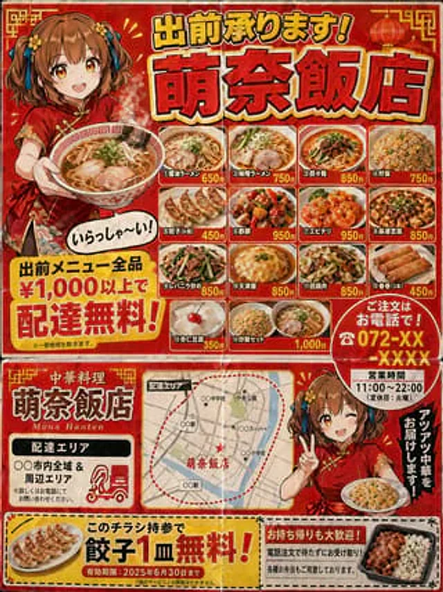
A Japanese-style community Chinese restaurant takeout flyer (3:4 aspect ratio) intended for mailbox delivery. The design style mimics double-sided B5 printing. Flyer features (following the layout logic of real takeout flyers): - Striking red and yellow color scheme. - Large headline at the top: "Takeout Service Available!"{argument name="shop name" default="Mona-Hanten"} (Gothic form with shadows). - Illustration: A{argument name="character" default="A Chinese girl wearing a red cheongsam and sporting a short brown bob."} Holding a ramen noodle, a dialogue box reads "Welcome!" - A menu photo grid (4x3) showcasing various dishes: different types of ramen, fried rice, gyoza, sweet and sour pork, dry-fried shrimp, mapo tofu, stir-fried pork liver with chives, Tianjin rice, twice-cooked pork, spring rolls, almond tofu, and fried rice set meals. - The name and price of each dish. - A striking yellow banner proclaims "Free delivery on orders over ¥1,000!" - "Order by phone! ☎ 072-XX-XXXX" highlighted in red. - Business hours: "11:00-22:00 (Closed on Tuesdays)". - Delivery area map (simple illustration). - Coupon (with dotted lines, can be cut out): "Free gyoza with this flyer!" Cheap paper printing quality. Includes creases. So realistic it's almost indistinguishable from a genuine Japanese takeout flyer.How to use
- Copy the complete original prompt, including any parameters.
- Replace the subject, text and composition with your own requirements.
- Use a compatible external tool; check its current access conditions and review the result.
Before you start
- Check whether a reference image is required. A compatible model label does not mean this example was generated with that model.
- Keep names, figures and visible text accurate; results can vary between model versions.