
Original document
GPT Image 2 · en
Scene:
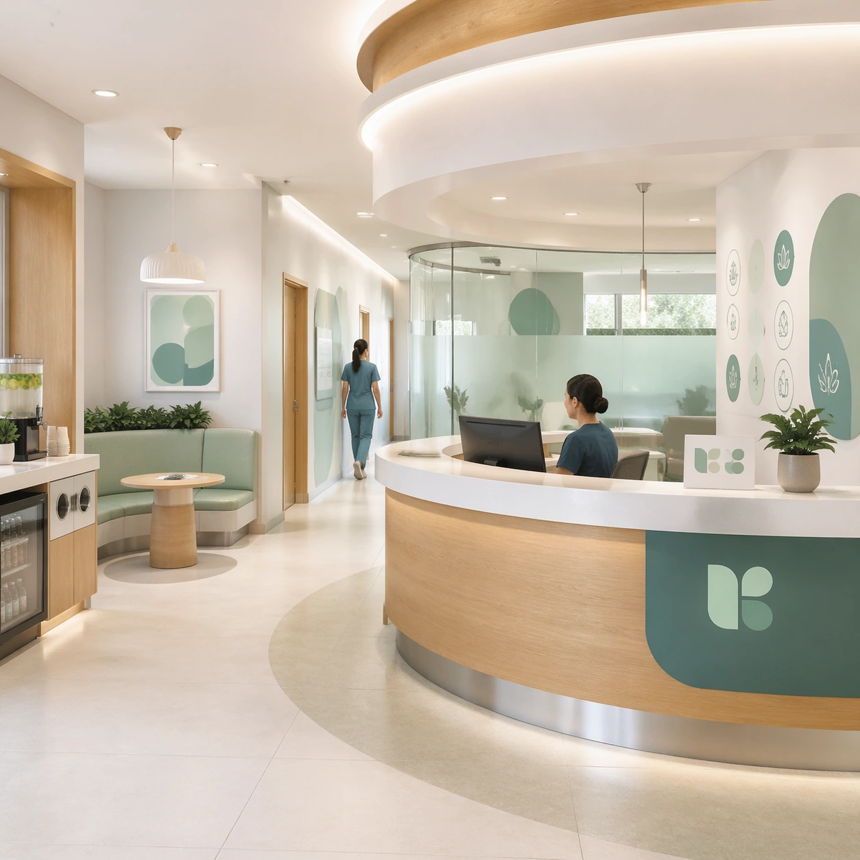
A square reception-lobby brand hero for Clinic Brand and Interior Visual System. Compose it at eye level with a welcoming front desk, seating niche, and visible circulation paths. Use a palette of mineral white, muted teal, pale sage, warm oak, and brushed aluminum, soft daylight with clean indirect reflections, and a mood of institutional calm, premium trust, and approachable warmth. The frame should feel like a real healthcare communication asset art-directed for professional delivery, not a stock photo, speculative concept render, or generic corporate template. Keep the camera distance, negative space, and depth cues disciplined so the image reads immediately even at thumbnail size.

Subject:
Center on a modern specialty clinic lobby with a curved desk, frosted glass partitions, modular seating, a beverage counter, and discreet branded wall graphics. Show enough surrounding context that the viewer understands the intended service surface, user situation, and institutional setting. Every object, person, diagram, device crop, or spatial cue should support clarity, trust, and practical use. If people appear, keep them anonymous, natural, privacy-safe, and grounded in believable body language rather than promotional posing.

Important details:
Maintain a clinic identity system expressed through rounded geometry, hygienic materials, discreet wayfinding zones, and premium but practical detailing. Make the brand language visible across wall panels, staff uniforms, and packaging accents without relying on any readable typography. Use abstract icon shapes, color blocks, chart bars, interface modules, or non-legible placeholder microcopy whenever information structure is needed, but never readable text. Materials, spacing, lighting, and hierarchy should feel production-ready and healthcare-specific. Avoid generic lifestyle filler, decorative noise, or design gestures that do not reinforce the communication goal.

Use case:
Clinic Brand single study 1/9 for a clinic website hero and brand overview.

Constraints:
No readable text, no watermark, no logos, preserve exact 1:1 aspect ratio, no spa cliches, no chaotic emergency scenes, no futuristic medical hardware, no dirty or damaged surfaces, no crowded queue, no empty shell space.
How to use
- Copy the complete original prompt, including any parameters.
- Replace the subject, text and composition with your own requirements.
- Use a compatible external tool; check its current access conditions and review the result.
Before you start
- Check whether a reference image is required. A compatible model label does not mean this example was generated with that model.
- Keep names, figures and visible text accurate; results can vary between model versions.