Verified examples

Prompt Gallery

Real prompts paired with the images they produced. Explore ideas, inspect the result, then copy the exact prompt as a starting point.

Pairs
5,541
Models
6
Sources
10
5,541 verified prompt–image pairs · page 40 of 116
Example generated from “iPhone 屏幕遮脸创意人像”
GPT Image 2en
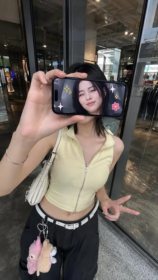
iPhone 屏幕遮脸创意人像

Ultra-realistic creative portrait taken with an iPhone, identity accurately preserved from the reference image. A woman stands inside a store, facing a glass display window or a reflective wall, photographed from a slightly elevated frontal angle. She holds a smartphone horizontally in front of her face, covering her eyes and the upper part of her face. The phone's screen points at the camera and clearly displays a real-time image of her face.

Example generated from “Iridescent Butterfly UI System Board”
GPT Image 2en
Iridescent Butterfly UI System Board

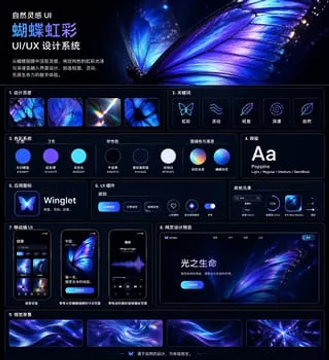
{ "type": "UI/UX Design System Demonstration Project", "theme": "Dark mode, nature-inspired, luminous iridescent aesthetics", "language": "Chinese", "canvas": { "aspect_ratio": "Square poster", "background": "Deep midnight blue to black, with a subtle halo", "style": "A high-end, futuristic display project featuring a slim neon blue panel outline, glossy highlights, soft halo, and high contrast." }, "header": { "title": "Nature-inspired UI{argument name=\"system title\" default=\"Butterfly Rainbow\"} UI/UX Design System", "description": "{argument name=\"chinese description\" default=\"Drawing inspiration from butterfly wings, the design incorporates the iridescent sheen of structural colors and deep blue to create a light, dynamic, and vibrant digital experience.\"}", "hero_image": "A highly detailed, luminous butterfly wing, displaying electric blue, violet, and iridescent cyan, occupies half of the upper right corner. Visible vein structures, translucent edges, and sparkling particles are visible, with a second, blurred wing behind it." }, "layout": { "sections": [ { "title": "1. Design Inspiration", "position": "Top left corner, below the title", "count": 4, "labels": [ "Macro of iridescent butterfly wings", "Close-up of the blue-purple wing texture", "Light refracting prism halo", "Butterfly wing cell pattern" ] }, { "title": "2. Keywords", "position": "Top right corner, below the main image", "count": 5, "labels": [ "iris", "Agile", "Light", "Profound", "nature" ], "icon_style": "Minimalist glowing line icons inside rounded dark cards" }, { "title": "3. Color System", "position": "center left", "subsections": [ { "title": "main color", "count": 3, "labels": [ "Morpho Blue #1E5BFF", "Rainbow Purple #7A5CFF", "Skylight #00E6FF" ] }, { "title": "Neutral color", "count": 3, "labels": [ "Midnight Black #060F19", "Soft Navy Blue #141A2E", "Pearl White #F3F6FC" ] }, { "title": "Emphasis on color and gradient", "count": 2, "labels": [ "Rainbow gloss", "Butterfly Light" ] } ], "visual": "Circular color swatches and gradient spheres, with Chinese labels below." }, { "title": "4. Layout", "position": "center right", "count": 1, "labels": [ "Aa Poppins Light / Regular / Medium / SemiBold" ], "visual": "Large white Aa on a dark card" }, { "title": "5. Application icon", "position": "Left and Middle", "count": 1, "text": "{argument name=\"app name\" default=\"Winglet\"} Light. Agile. Elegant.", "visual": "The glowing butterfly app icon next to the app name" }, { "title": "6. UI Components", "position": "center", "subsections": [ { "title": "Button", "count": 3, "labels": [ "Main button", "Secondary buttons", "glass texture" ] }, { "title": "icon", "count": 2, "labels": [ "Heart-shaped collection", "Illuminated ring" ] }, { "title": "switch", "count": 1, "labels": [ "switch" ] } ], "visual": "Rounded blue buttons, neon icon buttons, and backlit switches on the dark panel" }, { "title": "Other elements", "position": "Right Center", "count": 4, "labels": [ "search box", "Tag New", "Progress bar (72%)", "Blue Morpho card" ], "visual": "Small, practical UI components in compact horizontal cards" }, { "title": "7. Mobile UI", "position": "Bottom left", "count": 3, "labels": [ "Search page", "Today's page with a large butterfly illustration", "Audio playback page with waveform graph" ], "visual": "Three rounded-corner smartphone prototypes with a dark interface and a blue-purple butterfly visual effect." }, { "title": "8. Website Design Preview", "position": "Bottom right", "count": 1, "labels": [ "Life of Light" ], "visual": "Desktop landing page mockup, including a butterfly main image, top navigation, bright blue call-to-action button, and Chinese text." }, { "title": "9. Visual Background", "position": "Bottom full width", "count": 4, "labels": [ "Flowing ribbon background 1", "Swirl Rainbow", "Flowing ribbon background 2", "Radiant Crystal Burst" ], "visual": "Four rectangular background samples in purple, blue, and cyan." } ], "footer": { "count": 1, "text": "Designed with nature in mind, born for experience.", "center_icon": "Small butterfly icon" } }, "art_direction": { "materials": "Glass mimicry, neon edge lighting, smooth gradients, subtle reflections", "colors": "Electric blue, indigo, violet, cyan, white", "composition": "The clean grid layout includes nine numbered content sections, ample white space, slender rounded borders, and a dominant butterfly image.", "render_quality": "Highly refined, clearly laid out, a premium Behance-style design system project." } }

Example generated from “Iridescent Butterfly UI/UX Design System”
GPT Image 2en
Iridescent Butterfly UI/UX Design System

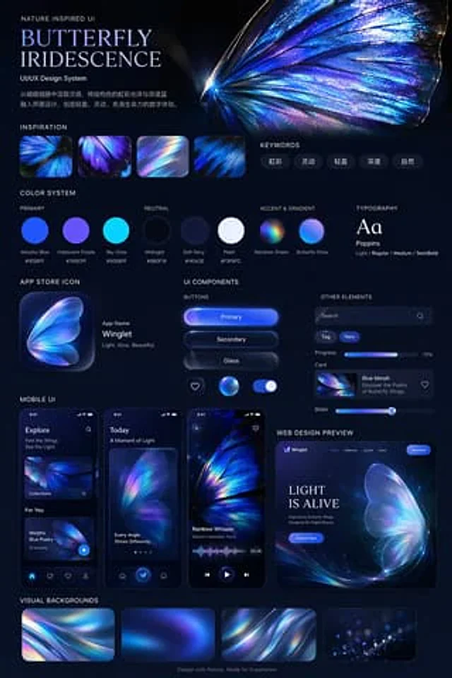
{ "type": "UI/UX Design System Demonstration Project", "theme": "Dark mode, nature-inspired, luminous iridescent aesthetics", "header": { "title": "Nature-inspired UI{argument name=\"system title\" default=\"Butterfly Rainbow\"} UI/UX Design System", "description": "{argument name=\"chinese description\" default=\"Drawing inspiration from butterfly wings, the design incorporates the iridescent sheen of structural colors and deep blue to create a light, dynamic, and vibrant digital experience.\"}", "hero_image": "Large, highly detailed, luminous blue-purple iridescent butterfly wings" }, "layout": { "sections": [ { "title": "Design Inspiration", "count": 4, "description": "A square thumbnail showing close-up of an iridescent butterfly's wings and light refraction." }, { "title": "Keywords", "count": 5, "labels": [ "iris", "Agile", "Light", "Profound", "nature" ] }, { "title": "Color System", "subsections": [ { "title": "main color", "count": 3, "labels": [ "Morpho Blue #1E5BFF", "Rainbow Purple #7A5CFF", "Skylight #00E6FF" ] }, { "title": "Neutral color", "count": 3, "labels": [ "Midnight Black #0B0F19", "Soft Navy Blue #141A2E", "Pearl White #F3F6FC" ] }, { "title": "Emphasis on color and gradient", "count": 2, "labels": [ "Rainbow gloss", "Butterfly Light" ] } ] }, { "title": "typesetting", "content": "Aa Poppins Light / Regular / Medium / SemiBold" }, { "title": "App icon", "count": 1, "text": "Application Name{argument name=\"app name\" default=\"Winglet\"} Light. Agile. Graceful." }, { "title": "UI components", "subsections": [ { "title": "Button", "count": 6, "labels": [ "Main button", "Secondary buttons", "glass texture", "Heart icon", "Glowing sphere icon", "switch" ] }, { "title": "Other elements", "count": 5, "labels": [ "Search bar", "Tag (New)", "Progress bar (72%)", "Card (Blue Morph)", "slider" ] } ] }, { "title": "Mobile UI", "count": 3, "screens": [ "Explore Page", "Today's page with large butterfly wings", "Audio playback page with waveform graph" ] }, { "title": "Web Design Preview", "count": 1, "details": "Desktop browser model, the first screen area contains '{argument name=\"web hero headline\" default=\"Life of Light\"} ' and 'Explore Now' buttons" }, { "title": "Visual background", "count": 4, "description": "Rectangular thumbnail displaying abstract iridescent ripples" } ], "footer": "Designed with nature in mind, born for experience." } }

Example generated from “Ishihara Color Blindness Test Plate”
GPT Image 2en
Ishihara Color Blindness Test Plate

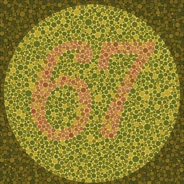
An Ishihara color blindness test chart consists of a large circular area filled with densely packed dots of varying sizes. The background dots within the circle are {argument name="background color palette" default="Olive green and mustard yellow"} Color tone. At the center, by {argument name="number color palette" default="light pink and salmon pink"} The contrasting colored dots form the hidden number.{argument name="hidden number" default="67"} The area surrounding the main circle is filled with darker, softer green and brown dots, creating a classic medical optical illusion effect.

Example generated from “Isometric Coastal Base Under Naval Attack”
GPT Image 2en
Isometric Coastal Base Under Naval Attack

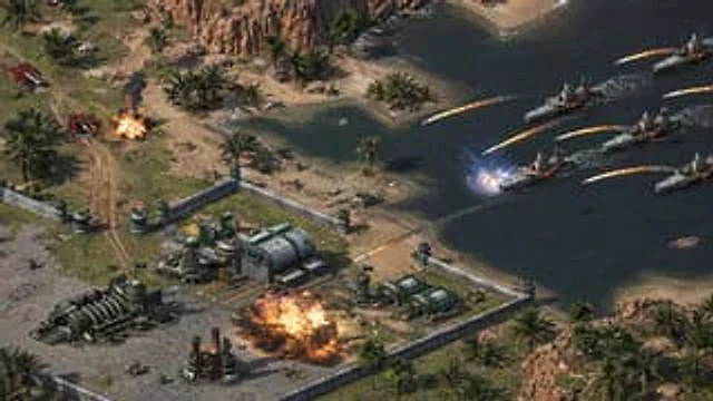
This isometric view of a real-time strategy game battle scene, taken from a high slant angle, showcases a fortified coastal military outpost under naval attack in a desert oasis environment. The base, located in the lower left and central foreground, is surrounded by light-colored concrete walls with defensive corner towers and several cylindrical turret positions. Inside the base are five main buildings: a large metal command or factory building in the center with an arched roof and helipad markings; a long, segmented industrial generator on the left; a smaller chimney power structure near the center of the base; and two green cylindrical reactor or storage buildings on the right. The view shows dirt roads within the walls, scattered crates, utility details, and paved grey ground. A large orange fireball erupts from the center right of the base, accompanied by smoke and debris. Outside the walls, on a dirt road in the upper left, near two red ground vehicles or launchers, another smaller explosion occurs, sending up black smoke. The coastline surrounds light blue-green waters, complete with sandy shores, rocky cliffs, and numerous palm trees, creating a tropical desert bay. On the right side of the water, five gray modern warships are depicted sailing in a diagonal formation, each leaving a white contrail as it moves. A total of eight missiles, trailing bright flames, are launched from the warships towards the land and base defenses; one missile strikes the target area closest to the warships, creating a bright blue-white impact flash above the water, while the others arc towards the base and coast. Tiny infantry models, some already fallen, are added near the beach and walls to emphasize the intense sense of the raid. The overall style should resemble a refined, highly detailed screenshot from a strategy game, featuring realistic military sci-fi architecture, cinematic lighting and shadows, sharp textures, dynamic explosion effects, and clear spatial depth.

Example generated from “Isometric Da Vinci Design Poster”
GPT Image 2zh
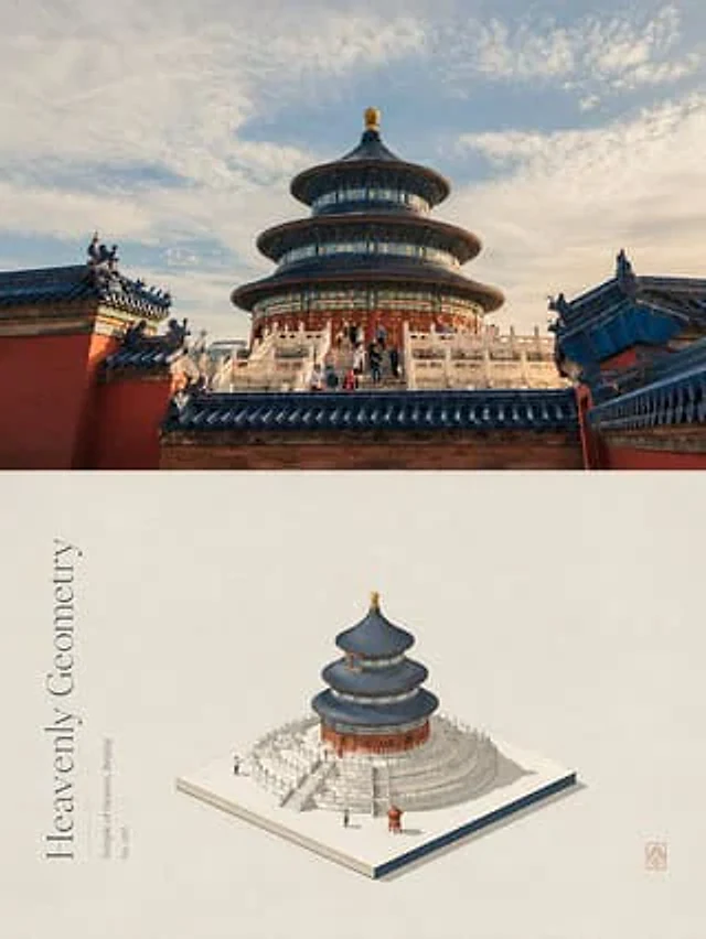
Isometric Da Vinci Design Poster

请将我上传的每一张照片分别制作成一张独立的高级设计海报,不多图拼接,每张照片单独输出。整体采用3:4竖版构图,上下两个区域高度严格1:1,各占画面50%。 上半部分保留原始照片,保持主体结构、真实质感、自然光影和原有色彩氛围,仅进行轻微高级摄影调色,使其具有艺术杂志、独立出版物和展览摄影质感。为适配画幅,可自然扩展天空、地面或环境背景,但不得拉伸、扭曲或改变主体。 下半部分提取照片中最具识别性的**主体、轮廓、姿态与叙事关系**,以 **isometric 等距空间逻辑重新构建**。不是把原物简单变成3D模型,而是将主体拆解为清晰的体块、层级、切面与空间关系,在统一等距轴线中重新组合,使其兼具建筑模型般的结构秩序与编辑插画般的视觉概括。可适度调整观察角度、比例和局部结构,以更好地展示主体最有代表性的形态,但必须保持一眼可识别的身份特征。 同时从照片的核心内容、动作、结构或象征关系中提炼一个**主题意象**,将其几何化、符号化并融入isometric构图。主题意象可以成为底座、切面、空间缺口、路径、包围结构或负形,让主体与其发生穿越、嵌合、悬浮、切割、承托或错层关系,使主题不是附加装饰,而是决定主体如何存在于空间中的构图机制。 构图根据主体的视觉重心、轮廓走势和空间特性自适应设计,通过等距轴线、体块比例、层级错落、尺度反差、局部裁切和大面积留白建立专业秩序。主体不必机械居中,可偏置、悬浮或延伸,让isometric结构与主题意象共同形成唯一视觉中心。 主体采用**高明度、清透、柔和的日系配色与细腻哑光材质**。颜色从上方照片中提取最有生命力、最能代表主体精气神的色彩重新调制,以柔白、奶油白或极浅暖色作为基础,将核心色转化为干净、明亮、轻柔的色面,通过同色深浅和少量点色区分不同体块。光影柔和而明确,用轻微明暗帮助读取结构,避免厚重3D阴影、塑料材质和灰脏色调。 背景保持大量留白,并加入**达·芬奇手稿式的创作研究痕迹**:与主体相关的轮廓草图、结构拆解、局部放大、比例线、测量线、箭头、几何推演、自然观察线稿和微型注释,以极淡的铅笔、赭色墨线或褪色手稿质感若隐若现地分布在主体周围。手稿应像设计过程留下的思考轨迹,与精确的isometric主体形成“理性成品与感性研究过程”对照,不形成第二视觉中心。 文字同样围绕主题和空间结构组织。从照片的主体身份、动作、情绪或象征意义中提炼一个简短英文标题,并搭配极少量地点、状态词或微型注释。文字可以沿isometric轴线、主题意象边界、结构切面或手稿辅助线排列,横排、竖排、错位、穿插或隐藏于负形中,使文字像设计图纸和高级艺术出版物中的信息层,而不是后期贴上的标题。 整体呈现**主题隐喻 × Isometric空间秩序 × 达·芬奇式研究手稿 × 日系清透色彩 × 东方留白 × 高级编辑设计**的视觉气质。无论主体是人物、动物、植物、建筑、器物、食物、交通工具或自然景观,都应以其自身结构找到最合适的等距重构方式,避免普通3D模型、游戏场景感、轴测工程图感、卡通低多边形、机械居中、电商展示感和模板感。

Example generated from “Isometric fantasy village map”
GPT Image 2en
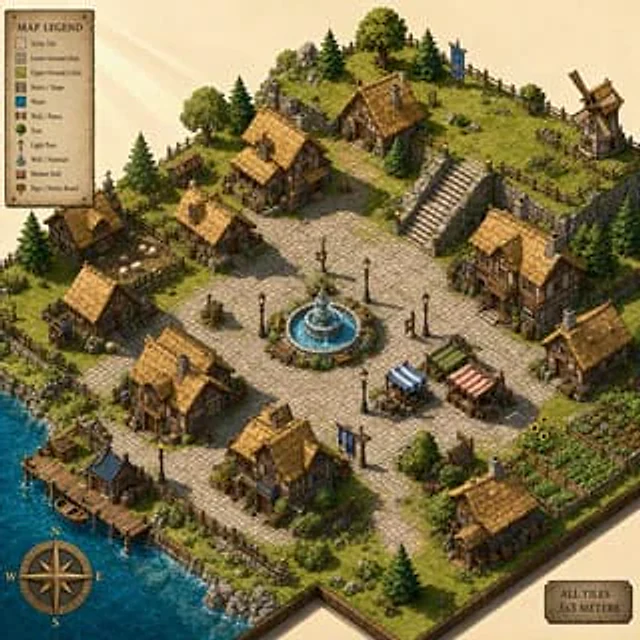
Isometric fantasy village map

Create a vibrant isometric fantasy village map with a clean grid-based layout using 3x3 meter tiles. Include wooden houses with thatched roofs, cobblestone paths, and a central stone fountain. One corner of the map rises into a small grassy hill about 2 meters high with stairs connecting to the lower ground. Keep the isometric angle precise and game-ready. Warm sunlight sends clear rays and long shadows across the rooftops. Make the scene readable like a handcrafted strategy-game map, with crisp tile logic, charming environmental detail, and rich but controlled color.

Example generated from “Isometric France Diorama Poster”
GPT Image 2en
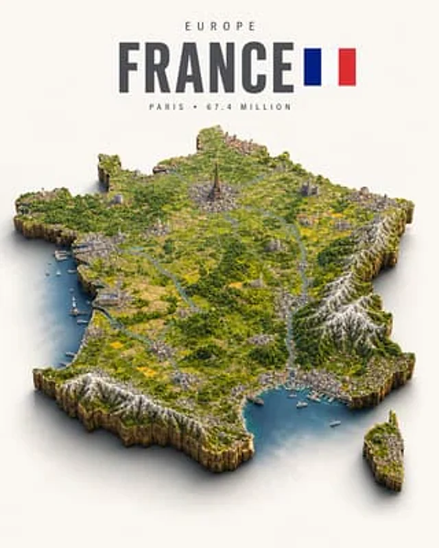
Isometric France Diorama Poster

Create a polished isometric country diorama poster of {argument name="country" default="France"} on a warm off-white background. At the top, set small widely spaced uppercase continent text “{argument name="continent label" default="EUROPE"}”, below it a huge bold condensed sans-serif title “{argument name="country title" default="FRANCE"}” in dark charcoal, with the national flag immediately to the right. The flag has exactly 3 vertical stripes: blue, white, and red. Under the title, add small spaced uppercase metadata text “{argument name="capital and population" default="PARIS • 67.4 MILLION"}”. The main subject is a floating 3D isometric map-shaped landmass matching the outline of mainland France, with Corsica as one separate smaller island at the lower right. Give both landmasses steep rocky cliff sides, soft contact shadows, and a miniature terrain surface like a handcrafted model: green forests, patchwork yellow-green farmland, winding blue rivers, thin roads, small towns, harbors, boats, and coastline water inlets. Include exactly 7 prominent landmark/region features across the diorama: the Eiffel Tower rising near the north-central Paris area, a large cathedral in the northeast, a domed monument in the west/central area, alpine snow-capped mountains along the southeast, Pyrenees-like snow-capped mountains along the southwest edge, a Mediterranean harbor with sailboats along the south coast, and an Atlantic harbor with a lighthouse and small boats on the west coast. Use cinematic miniature realism, crisp details, vibrant natural greens and blues, realistic lighting from upper left, shallow soft shadows, high-resolution travel-poster composition, centered map, no people, no watermark, no extra labels beyond the title, flag, continent, and metadata.

Example generated from “Isometric Micro Model Poster”
GPT Image 2zh
Isometric Micro Model Poster

请将我上传的每一张照片分别制作成一张独立的高级设计海报,不多图拼接,每张照片单独输出。整体采用3:4竖版构图,上下两个区域高度严格1:1,各占画面50%。 上半部分保留原始照片,保持主体结构、真实质感、自然光影和原有色彩氛围,仅进行轻微高级摄影调色,使其具有艺术杂志、独立出版物和展览摄影质感。为适配画幅,可自然扩展天空、地面或环境背景,但不得拉伸、扭曲或改变主体。 下半部分提取照片中最具识别性的**主体、轮廓、姿态与叙事关系**,重构为精致的极简等距视角插画,如一件陈列在纸面上的微缩立体模型或建筑沙盘。不要机械复刻照片细节,而是以概括体块、清晰边缘、简洁层级和微型场景关系重新表达主体,使其保留一眼可辨的身份特征,同时具有安静、克制、诗意的编辑插画气质。 整体采用**等距视角、微缩景观、纸面模型感**的构图逻辑:主体像被切割并安放在一小块纸面或微型基座上,周围保留大面积留白,通过体量对比、边缘裁切、轻微投影和少量微小细节建立尺度感与孤独感。可加入极少量辅助元素承托主体,但不得形成第二视觉中心。 配色完全从上方原始照片中提取,优先保留最具辨识度、最有气质和最能代表主体的颜色,再将复杂色彩**归纳、提纯、柔化并统一为有限色盘**。保留原图的冷暖关系与色彩性格,但降低杂色和视觉噪声,使颜色更平静、克制、柔和、有纸上编辑插画感;通过同色深浅、邻近色关系和少量色差区分体块,不凭空加入与原图无关的固定色系。使用精细墨线、扁平色面、轻微阴影和纸张颗粒表现结构与层次。 文字作为构图的一部分巧妙介入,从照片的主题、地点、动作、状态或情绪中提炼一个{argument name="英文标题" default="简短英文标题"},并搭配极少量编号、短句或微型注释。文字保持细瘦、克制、现代编辑感,可沿留白边缘、主体基座、水平轴线或等距结构排列,与图形共同形成安静而精致的版式节奏。 整体参考**极简等距插画、微缩立体模型、纸上景观和高级编辑设计**,呈现安静、诗意、克制、精致、具有收藏感的视觉气质。避免卡通感、高饱和撞色、与原图无关的固定配色、塑料3D感、复杂场景堆积、电商感和模板感。

Example generated from “Isometric Micro-World Cross-Section Archive”
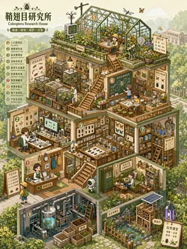
GPT Image 2en
Isometric Micro-World Cross-Section Archive

Please create a high-quality, information-dense "Isometric Microscopic World Archive" visual map suitable for serial release, based on the [theme]. This is not just an ordinary room illustration or simple architectural drawing, but a thematic space overview combining "isometric perspective + architectural section structure + multi-layered functional spaces + high-density thematic props + miniature model feel + game scene concept art feel." The image should resemble an open miniature world, a business simulation game scene, a dollhouse model, or a world-building concept diagram, allowing viewers to immediately grasp the overall structure while repeatedly observing its details. [Basic Settings] Theme: [Theme, e.g., Insect Research Institute / Future Survival Base / Magic Potion Workshop / AI Automation Company / Plant Factory / Children's Learning Center / Space Supply Station] Space Name / Brand Name: [Brand Name or Space Name, can be left blank] Worldview Direction: [Realism / Science Fiction / Fairy Tale / Magic / Post-Apocalyptic / Museum / Laboratory / Business Simulation / Campus / Natural Ecology] Building Type: [Cabin / Base / Factory / Laboratory / Shop / Museum / Underground Space / Spaceship / Multi-level Studio] Core Function: [Main purpose of this space, e.g., research, production, display, living, training, trading, learning, maintenance, planting] Main Color Scheme: [Main color scheme, e.g., light blue, mint green, cream yellow, pink, orange-green, purple-blue, white-blue (tech feel)] Secondary Color: [Secondary color, can be left blank] Accent Color: [Accent color, can be left blank] Aspect Ratio: [1:1 / 3:4 / 4:5 / ...] [9:16] Information Density: [Medium-High/High/Very High] Overall Atmosphere: [Healing, Cute, Precise, Childlike, Scientific, Futuristic, Retro, Refreshing, Exploratory] If some fields are not filled in, please automatically deduce them based on the [Theme]; please do not leave them blank. All content must be generated uniformly around the theme, avoiding irrelevant elements. [Visual Structure] Use a clear isometric perspective/axonometric view, with the main subject being an open, multi-layered themed building or functional base. Viewers can simultaneously see the front, sides, top, and interior space of the building. The entire building is located in the center of the screen, occupying most of the area, with the background environment moderately faded to highlight the main subject. The interior of the building needs to be divided into multiple functional areas, each with a clear purpose, rather than randomly piling up decorations. This can include: 1. Main work area/core operation area 2. Display area/collection area/specimen area 3. Research area/laboratory area/control area 4. Storage area/shelf area/supply area 5. Living area/rest area/small living area 6. Energy area/machine area/pipeline area 7. Planting area/cultivation area/ecological area 8. Entrance area/traffic area/maintenance area 9. Spatial connection structures such as stairs, platforms, corridors, railings, ladders, etc. These structures create clear spatial relationships between different areas through stairs, corridors, platforms, pipes, bridges, or cables, making the image look like a realistically functioning miniature system. [Props and Details] Generate a large number of relevant props based on the [theme] and distribute them across different functional areas. Props need to be specific, identifiable, and theme-related, rather than vague decorations. Each small object should be as clear and legible as a game asset, with a clickable, interactive, and collectible feel. Props may include: - Themed equipment: machines, instruments, tools, consoles, containers, screens, workbenches - Household items: tables, chairs, bookshelves, beds, cups, boxes, cabinets, lamps - Display items: specimens, models, posters, signs, glass cabinets, display racks - Connecting structures: pipes, wires, ladders, stairs, conveyor belts, slides, platforms - Ecological elements: plants, water tanks, incubators, soil, branches, rocks, specimens - Character elements: a small number of characters, animals, robots, or themed creatures to provide a sense of proportion and storytelling. The number of props should be abundant but orderly. All props should serve the function of the space and the theme's worldview. [Style Requirements] The overall style should be clear, cute, and precise hand-drawn cartoon isometric illustrations. Lines should be clean, edges slightly rounded, and colors bright and soft, with an overall feeling of relaxation, healing, and exploration. Images should have the feel of commercial simulation games, children's science picture books, miniature models, or concept art pages. Avoid overly realistic, strong shadows, heavy oil painting effects, and complex noise. The focus is on clarity, refinement, depth, and high readability. [Color and Light] Use a soft color scheme with high brightness and low to medium saturation. Maintain a unified primary color, use secondary colors to differentiate different spaces, and accent colors to highlight key equipment and props. Avoid using pure black for line art; instead, use soft outlines such as dark gray, blue-gray, or brownish-gray. Keep the light and shadow light; avoid strong, realistic shadows. Build depth through color blocks, structures, lines, and localized highlights. The background should be light and low-contrast to make the main building stand out. [Composition and Reading Path] The main subject should be centered or slightly above, and the building should employ a multi-layered sectional structure. The visual reading path should begin with the overall building outline, proceed to the functional areas of each floor, and finally observe the details and props. The eye can be guided by elements such as stairs, platforms, corridors, pipes, and tracks. The overall image should be full but not crowded, rich but not cluttered. Every room, platform, and corner should have content while maintaining clear spatial boundaries. [Background Environment] The background can include a softened external environment, such as forests, cities, streets, underground rock formations, experimental parks, the seabed, space, campuses, factory exteriors, etc., depending on the theme. The background should not compete with the subject; it is recommended to use light colors, low opacity, and low contrast to achieve the effect of "clear subject, receding background." [Final Effect] The final image should look like a complete theme space concept sketch, with the structural feel of architectural cross-sections, the detail of game scene assets, and the cute, exploratory feel of a miniature dollhouse. It should be suitable for serialized visual creations, IP worldview displays, game scene settings, brand space concept sketches, science content covers, or visual posts in the style of Xiaohongshu/Pinterest. Ensure the image has: 1. A clear isometric perspective 2. A clear architectural cross-sectional structure 3. Complete multi-layered functional areas 4. Abundant props and thematic unity 5. Soft and bright colors 6. Clean and clear line art 7. A softened background and a prominent subject 8. High information density but not cluttered 9. A miniature world that is explorable, operable, and observable.

Example generated from “Isometric Pixel Art Evolution Museum”
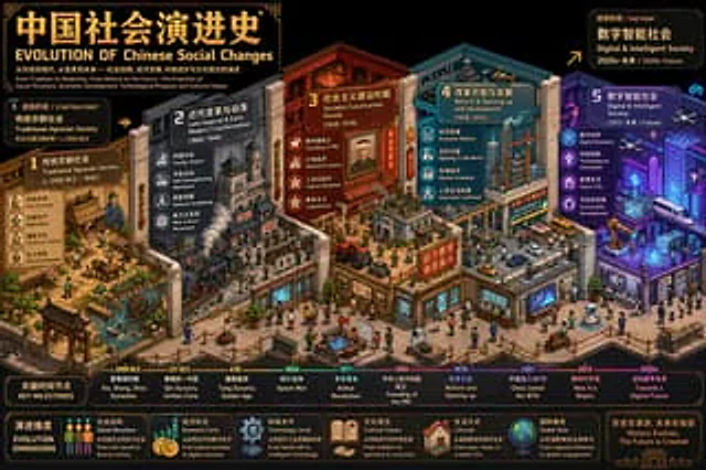
GPT Image 2en
Isometric Pixel Art Evolution Museum

Create an ultra-high detail isometric pixel art timeline illustration (3:4, 4K) that blends detail density, symbolism, and metaphor. The user-specified theme is "{argument name="theme" default="Western art development"} First, regarding "{argument name="theme" default="Western art development"} "Through reasoning, determine: a bilingual (Chinese and English) title, the earliest and most recent historical periods covered, labels for the beginning and end phases, and 3-5 key evolutionary phases along with their respective symbolic elements and color schemes. Then, construct a framework based on..."{argument name="theme" default="Western art development"} An isometric "Evolution Museum" themed around "Evolution," where each gallery area represents a stage of evolution, with spatial progression symbolizing temporal evolution. Using a standard isometric perspective (2:1), it features rich depth and smooth transitions. Each stage is assigned 3-5 symbolic elements closely related to the theme, with differentiated colors used to suggest the flow of time. A bilingual pixel-style title is added to the scene: Chinese characters "{argument name="theme" default="Western art development"} "Evolutionary History" and the English "EVOLUTION OF"{argument name="theme" default="Western Art Development"} The document should include bilingual subheadings for the beginning and end phases, as well as markers for key time points. The overall style should be professional and visually impactful, suitable for academic analysis and comparative visualization, and should directly generate images.

Example generated from “Isometric Security Icon Grid”
GPT Image 2en
Isometric Security Icon Grid

Create a modern isometric illustration sheet on a clean light gray background, showing a seamless grid of cybersecurity, privacy, and compliance icons with soft shadows, glossy 3D materials, rounded edges, and a blue, white, gray, red, and orange accent palette. Use a wide horizontal canvas, evenly spaced rows and columns, with no border or watermark. Include exactly 15 discrete icons arranged in a 3-row by 5-column grid: top row: 1) a blue padlock with silver shackle and black keyhole, 2) a blue shield badge with a white check mark and metallic rim, 3) a silver key angled diagonally, 4) a dark smartphone-like biometric panel showing a glowing blue fingerprint scan line, 5) a desktop monitor login screen with a lock icon, password dots, and a blue button labeled “LOGIN”; middle row: 6) a white document page with folded corner, blue lock icon, and label “ENCRYPTED”, 7) a red brick firewall with an orange flame in front, 8) a white surveillance camera with blue lens mounted on a small wall bracket, 9) an ID badge with clip, portrait thumbnail, text lines, and barcode, 10) a red triangular warning sign with black exclamation mark; bottom row: 11) a dark server stack with colored status lights and a blue shield check badge in front, 12) a clipboard checklist labeled “COMPLIANCE” with green checkboxes, 13) a dark smartphone facial-recognition screen showing a wireframe face, scan brackets, and “VERIFYING...” text, 14) an alert dashboard card labeled “ALERT” with a magnifying glass inspecting the list, 15) a gray safe/vault box with round combination dial beside a white policy document labeled “POLICY” with gray lines and green check mark. Keep all icons consistent in isometric perspective, miniature object scale, polished SaaS/security branding style, crisp edges, ambient occlusion, and subtle contact shadows. Text should be minimal and legible only where specified. Theme customization: {argument name="theme" default="security and compliance"}; primary color customization: {argument name="primary color" default="deep blue"}; background customization: {argument name="background color" default="light gray"}.

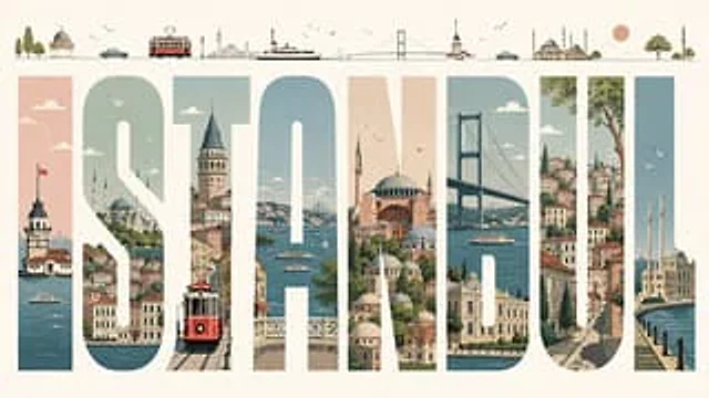
Example generated from “Istanbul Typographic Travel Poster”
GPT Image 2en
Istanbul Typographic Travel Poster

Create a premium editorial illustrated travel poster for {argument name="city name" default="ISTANBUL"}, built around 8 enormous tall block capital letters spelling “ISTANBUL” across a wide horizontal cream canvas. Use each letter as a vertical window filled with detailed Istanbul scenery: 1) I shows the Maiden’s Tower on the Bosphorus with a Turkish flag and ferry boats, 2) S shows hillside waterfront neighborhoods, domes, minarets, clouds, and birds, 3) T shows Galata Tower above narrow streets with a red vintage tram in the foreground, 4) A shows the Bosphorus with ferries, sailboats, bridges, and distant skyline, 5) N shows Hagia Sophia and layered mosque domes in warm peach and stone tones, 6) B shows the Bosphorus Bridge, water, a ferry, and waterfront palaces, 7) U shows steep historic streets, colorful stacked houses, greenery, and a large tree, 8) L shows Ortaköy Mosque by the waterfront with two minarets and flying seagulls. Above the title, add a thin minimalist skyline strip containing 13 small illustrated elements from left to right: trees, a small domed pavilion, a teal car, a red tram, distant city towers, a ferry, a suspension bridge, Maiden’s Tower, another teal car, a grand mosque with multiple minarets, a peach sun, a round green tree, and a final mosque minaret. Style it as a refined mid-century travel poster with clean vector-like illustration, soft muted palette of teal blue, sea green, dusty peach, terracotta, warm cream, and charcoal linework; crisp geometry, subtle paper grain, elegant negative space, tiny birds and clouds, no photorealism, no extra text besides the city name.

Example generated from “Iterative Cinematic Poster Prompts”
GPT Image 2en
Iterative Cinematic Poster Prompts

Round 1: From{argument name="product link" default="https://t.co/KCaX1FvRqz"} Gather information about this product online and generate a promotional poster that will resonate with users. Round 2: Beautiful, please use a film.{argument name="movie 1" default="Her"} The color scheme. Round 3: That's cool, please comment {argument name="movie 2" default="Blade Runner 2049 Joi"} Create another version in the same style. Round 4: Please use {argument name="movie 3" default="2001: A Space Odyssey"} We will create another version in the same style.

Example generated from “Iterative Cinematic Poster Prompts”
GPT Image 2zh
Iterative Cinematic Poster Prompts

第一轮:{argument name="产品链接" default="https://t.co/KCaX1FvRqz"} 从这个网站以及网络获取这个产品的信息,并生成能打动用户的宣传海报 第二轮:太美了,参考电影 {argument name="电影1" default="her"} 的配色吧 第三轮:wow 太酷了,再用 {argument name="电影2" default="银翼杀手2049 joi"} 的风格来一版本吧 第四轮:再以{argument name="电影3" default="2001太空漫游"}的风格来一个版本吧

Example generated from “ivangrisa.sol 🫂 #233”
GPT Image 2en
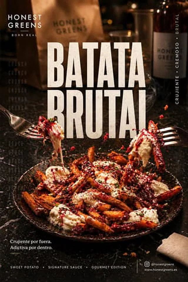
ivangrisa.sol 🫂 #233

FORMATO: Póster social premium 4:5 vertical para Instagram, ultra alta resolución, 8K, nitidez extrema, calidad publicitaria, aspecto gourmet editorial, composición impactante y moderna ⸻ ESCENA / FONDO: Bar gastronómico moderno y elegante, ambiente urbano sofisticado, mesa de piedra oscura con textura premium, profundidad cinematográfica Entorno: * Superficie de mármol negro con reflejos suaves y elegantes * Fondo desenfocado con ambiente de restaurante moderno * Sutil presencia de botellas, servilletas y barra de fondo * Bokeh cálido y elegante, sin distraer del plato * Estética de restaurante trendy de ciudad Atmósfera: * Ambiente acogedor y premium * Sensación de comida recién servida * Ligero vapor saliendo del plato * Energía social, experiencia compartida * Estilo casual-lujo gastronómico Iluminación: * Luz principal cálida lateral superior derecha * Luz de relleno suave para resaltar texturas * Brillos naturales en la salsa cremosa * Contraste elegante entre sombras profundas y luces cálidas * Reflejos delicados sobre la batata caramelizada Paleta de color: * Dominante: negro piedra, gris carbón, marrón tostado * Acentos: naranja batata, blanco crema, rojo remolacha/frutos rojos * Toques verdes frescos de hierbas ⸻ PRODUCTO (HERO SHOT): Plato protagonista de batatas fritas crujientes servidas en vajilla artesanal negra, cubiertas con crema blanca abundante, salsa roja intensa y hierbas frescas Acción: * Batatas elevándose ligeramente en el aire para efecto dinámico * Una batata principal en foco absoluto con textura crujiente visible * Salsa cremosa cayendo lentamente en movimiento * Gotas de salsa roja suspendidas en el aire * Sensación irresistible y adictiva Interacción: * Dos tenedores entrando desde los laterales, capturando comida * Representa deseo, compartir y experiencia real * Movimiento natural y espontáneo Detalle de texturas: * Exterior crujiente y caramelizado de la batata * Interior suave y cremoso * Salsa blanca espesa y brillante * Salsa roja vibrante con intensidad visual * Microdetalles de sal, especias y cebollino fresco ⸻ ELEMENTOS SECUNDARIOS: Fondo superior: * Bolsa kraft desenfocada * Botella elegante fuera de foco * Vajilla minimalista moderna Primer plano: * Tenedores metálicos con brillo sutil * Migas pequeñas y gotas de salsa para realismo ⸻ TIPOGRAFÍA: TITULAR PRINCIPAL: “BATATA BRUTAL” Estilo: * Tipografía sans serif ultra bold condensada * Moderna, premium, agresiva visualmente * Kerning ajustado * Impacto publicitario Color: * Blanco roto con ligero degradado cálido Efectos: * Sombra suave * Relieve sutil * Ligero glow premium Ubicación: * Centro superior, integrado con el plato ⸻ SUBTÍTULO: Crujiente por fuera. Adictiva por dentro. Estilo: * Sans serif bold limpia * Elegante y minimalista Color: * Blanco al 85% opacidad Ubicación: * Parte inferior izquierda ⸻ CAPA TIPOGRÁFICA DE FONDO: CRUNCH / SAUCE / SHARE / REPEAT Estilo: * Mayúsculas finas * Tracking amplio * Repetición modular Color: * Gris claro al 15% Función: * Textura visual sin distraer ⸻ BRANDING: Parte superior izquierda: Logo minimalista del restaurante o marca Parte inferior: Sweet Potato • Signature Sauce • Gourmet Edition Esquina inferior derecha: Instagram / web minimalista Banda lateral vertical: CRUJIENTE • CREMOSO • BRUTAL ⸻ CÁMARA: Lente: 50mm gastronómico cinematográfico Ángulo: Picado suave de 45 grados con presencia heroica Profundidad de campo: * Enfoque extremo en batata central * Fondo con caída progresiva cremosa Sensación: Fotografía real de campaña premium Michelin casual food ⸻ POSTPRODUCCIÓN: * Contraste alto pero elegante * Nitidez localizada solo en comida * Glow suave en salsas * Color grading cálido premium * Sombras profundas sofisticadas * Micro film grain 2% * Texturas hiperrealistas * Detalle extremo en comida * Acabado de anuncio internacional

Example generated from “J.Crew Mascot Fashion Editorial”
GPT Image 2en
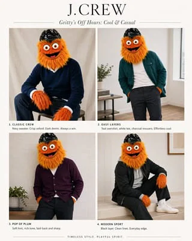
J.Crew Mascot Fashion Editorial

Using the provided reference images as a character and color scheme guide, transform them into a sophisticated J.Crew-style fashion catalog featuring the mascot. Replace the infographic/chart layout with a clean 2x2 magazine layout on a creamy white background. Add a large serif font for the brand title.{argument name="headline text" default="J.CREW"} And an italicized subtitle{argument name="subhead text" default="Gritty’s Off Hours: Cool & Casual"} Show four photos of the character, retaining their fluffy orange fur, large eyes, and black helmet, but dressed in modern menswear inspired by the "best" color scheme in the reference images: 1) "CLASSIC CREW" — seated on a stool, wearing a navy blue sweater over a crisp white Oxford shirt and dark jeans; 2) "EASY LAYERS" — casually standing, wearing a cyan overshirt over a white T-shirt and charcoal gray trousers; 3) "POP OF PLUM" — relaxed, wearing a plum cardigan and dark trousers; 4) "MODERN SPORT" — seated, wearing a black track jacket, black trousers, white socks, and white sneakers. Add a short catalog-style description below each section, matching the four headings, with concise, stylish copy. Use soft, natural indoor lighting, a minimalist home-inspired interior setting, high-end catalog photography, and an elegant preppy aesthetic. Add a short closing line at the bottom center:{argument name="footer text" default="TIMELESS STYLE. PLAYFUL SPIRIT."}

Example generated from “Jack #127”
GPT Image 2en
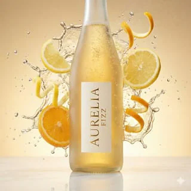
Jack #127

{ "master_prompt": { "scene_type": "high-speed commercial beverage photography", "product": { "type": "sleek frosted glass bottle filled with sparkling citrus tonic", "brand_name": "AURELIA FIZZ", "label_design": "minimalist vertical ivory label with refined gold serif typography", "liquid_color": "translucent golden citrus with effervescent bubbles" }, "composition": { "action": "dynamic high-velocity liquid splash explosion", "surrounding_elements": [ "sculptural splashes of sparkling tonic water", "spiraling ribbons of fresh lemon and orange zest", "floating citrus slices with visible pulp texture", "tiny suspended carbonation bubbles", "mist of fine droplets catching the light" ], "placement": "centered hero bottle with a crisp reflection on a polished marble surface" }, "lighting": { "style": "luxury glossy studio product lighting", "effects": [ "sharp rim lighting to define bottle silhouette", "brilliant highlights on splashes and bubbles", "soft golden glow in the background for warmth" ] }, "color_palette": { "background": "sunlit gradient of warm gold fading into soft champagne beige", "accents": "citrus yellow, fresh orange, and subtle mint green" }, "technical_specs": { "camera": "macro lens, eye-level angle", "shutter": "ultra-fast freeze-motion capture", "depth_of_field": "shallow focus on the label, gentle blur on dynamic splash elements", "quality": "8K resolution, ultra-photorealistic texture" } } }

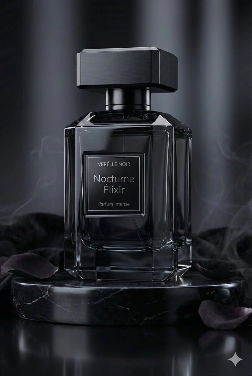
Example generated from “Jack #161”
GPT Image 2en
Jack #161

{ "master_prompt": { "scene_type": "ultra-realistic luxury perfume commercial photography", "product": { "type": "luxury perfume bottle", "brand_name": "VÉRÉLLE NOIR", "product_name": "Nocturne Élixir — Parfum Intense", "container_shape": "faceted architectural silhouette with sharp beveled geometry", "material": "obsidian-black crystal glass", "finish": "deep glossy translucence with mirror-like reflections", "cap_design": "magnetic cap in brushed black titanium with precision-cut edges", "label_design": { "style": "minimal haute couture typography", "primary_text": "Nocturne Élixir", "secondary_text": "Parfum Intense", "finish": "black chrome foil emboss with micro-engraved detailing" }, "liquid_color": "midnight amber with subtle smoky undertones" }, "composition": { "placement": "center hero placement", "pedestal": "black marble pedestal with subtle silver veining", "base_surface": "high-gloss reflective onyx surface", "surrounding_elements": [ "black velvet fabric folds", "dark rose petals", "polished obsidian stones", "faint aromatic smoke wisps" ], "atmospheric_effect": "soft drifting fragrance vapor creating a mysterious aura" }, "lighting": { "style": "dark luxury cinematic lighting", "key_light": "soft focused glow revealing reflective contours", "rim_light": "cool silver edge highlights defining silhouette", "fill_light": "low ambient fill preserving deep shadows", "reflections": "controlled specular highlights for high-end finish" }, "background": { "color": "deep charcoal to black gradient", "style": "editorial noir luxury backdrop", "depth": "cinematic shallow depth with soft shadow falloff" }, "camera": { "angle": "low dramatic hero angle", "focus": "glass texture and metallic detailing", "depth_of_field": "cinematic shallow depth", "resolution": "8K ultra-detailed clarity" }, "mood_keywords": [ "dark elegance", "noir luxury", "sensual sophistication", "mysterious allure", "modern opulence", "timeless night glamour" ] } }

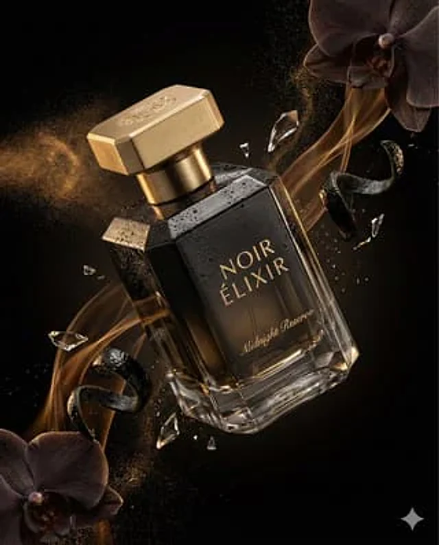
Example generated from “Jack #166”
GPT Image 2en
Jack #166

{ "master_prompt": { "product": { "type": "luxury perfume bottle", "brand_name": "NOIR ÉLIXIR", "fragrance_line": "Midnight Reserve", "container_shape": "faceted geometric crystal bottle with sharp elegant edges", "material": "high-clarity glass with deep smoked black gradient tint", "finish": "polished reflective surfaces with subtle matte facets", "cap_design": "magnetic cap in brushed gold metal with engraved emblem", "label_style": "minimal serif typography etched directly into glass with gold inlay", "liquid_color": "dark amber with subtle golden undertones" }, "composition": { "scene_type": "ultra-cinematic luxury fragrance advertising photography", "orientation": "vertical", "aspect_ratio": "4:5", "camera_angle": "dramatic diagonal hero angle", "subject_position": "floating mid-air with slight forward tilt", "motion": "atomized perfume mist trails and fluid fragrance ribbons suspended in motion" }, "environment": { "background": "deep black velvet gradient fading into shadow", "atmosphere": "volumetric mist with delicate fragrance vapor swirling around the bottle", "floating_elements": [ "atomized perfume droplets suspended mid-air", "shattered crystal glass fragments catching highlights", "dark orchid petals drifting slowly", "glossy black citrus peel curls", "fine gold dust particles sparkling in light" ], "surface_effects": "micro condensation beads and polished reflections enhancing realism" }, "lighting": { "style": "dramatic low-key studio lighting", "key_light": "soft directional light sculpting the glass facets", "rim_lights": "strong rim lights outlining silhouette and edges", "accent_lights": "gold-toned specular highlights on cap and engraved details", "shadow_depth": "deep cinematic shadows for luxury mood", "contrast": "high contrast with controlled reflections and luminous highlights" }, "color_palette": { "primary_colors": ["obsidian black", "smoked charcoal", "deep amber"], "accent_colors": ["metallic gold", "warm champagne glow"] }, "camera_settings": { "lens": "macro cinema prime lens", "depth_of_field": "shallow depth isolating product from background", "focus_point": "engraved logo and glass surface textures", "bokeh": "smooth cinematic bokeh from reflective particles", "detail_capture": "extreme micro-detail clarity" }, "render_quality": { "resolution": "8K ultra high definition", "render_style": "hyper-realistic luxury commercial render", "glass_physics": "accurate refraction and internal reflections", "liquid_simulation": "physically accurate fluid dynamics", "textures": "ultra-detailed crystal, metal, mist, and micro-droplet textures", "sharpness": "tack sharp product focus with cinematic background softness", "noise": "none", "artifacts": "none" }, "mood": { "tone": "mysterious, sensual, and ultra-premium", "emotion": "luxury, seduction, elegance, timeless sophistication" }, "final_output": { "usage": "high-end perfume campaign and luxury magazine advertising", "branding_focus": "hero product dominance with strong brand prestige", "visual_style": "cinematic fragrance commercial aesthetic" } } }

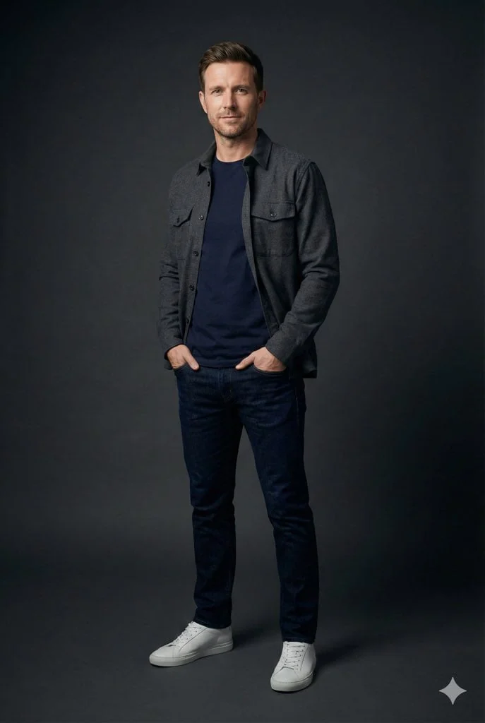
Example generated from “Jack #87”
GPT Image 2en
Jack #87

Photorealistic studio portrait of an average British man in his late 20s to early 40s, natural appearance, realistic facial features, short well-groomed hair, light stubble or clean-shaven. He stands confidently with a relaxed posture, conveying quiet self-assurance. He wears a stylish, comfortable, modern casual outfit, a well-fitted neutral-toned jacket or overshirt, premium plain t-shirt, tailored trousers or dark jeans, and clean minimalist sneakers. The look is contemporary, understated, and effortlessly fashionable. Shot in a professional studio with minimal lighting: a soft key light focused on the subject with gentle shadow falloff, dark neutral background, high contrast, and strong subject isolation. Lighting highlights facial structure, textures, and silhouette while keeping the environment subtle. Sharp focus on the subject, shallow depth of field, natural skin texture, realistic fabric detail, editorial fashion photography style, ultra-realistic, high resolution. Negative prompt (optional): blur, heavy retouching, unrealistic skin, dramatic fashion styling, cluttered background, extra limbs, distortion, cartoonish style.
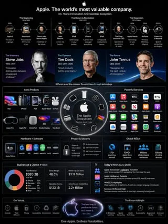
Example generated from “Jackywine #210”
GPT Image 2mixed
Jackywine #210

高复杂度信息图:结合今天的新闻,CEO 换成了Ternus,信息图要竖版 3:4要有乔布斯、cook、Ternus 三人头像,以及产品,以及超多苹果服务标志,整体风格偏 WWDC 的苹果风格,完整展现苹果庞大商业帝国

Example generated from “JAL First Class Cabin Interior”
GPT Image 2en
JAL First Class Cabin Interior

{argument name="aircraft" default="JAL A350-1000"} {argument name="class" default="First Class"}

Example generated from “Japan Illustrated Travel Poster”
GPT Image 2en
Japan Illustrated Travel Poster

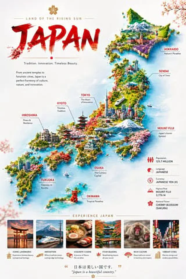
Goal: Create a premium illustrated travel poster infographic for {argument name="country name" default="Japan"}, blending tourism advertising, map art, and editorial layout. Canvas: Vertical poster, 2:3 aspect ratio, bright white paper background with soft watercolor texture, airy margins, subtle pale blue ocean wash around the map, delicate cherry blossom branches fading in the top-right and lower-left corners. Main layout: Left third contains the title block and introductory copy; right and center contain a detailed 3D isometric fantasy map of Japan made of lush green islands surrounded by turquoise water. The islands are not geographically exact but clearly form the Japanese archipelago from Hokkaido at top to Okinawa at bottom. Use miniature landmarks, cities, mountains, trains, boats, temples, forests, cherry blossoms, beaches, and urban skylines throughout. Title block: At the top-left, place a small gold cherry blossom icon above the spaced uppercase subtitle “LAND OF THE RISING SUN” with thin gold horizontal lines on both sides. Below it, write the huge main title “{argument name="headline country text" default="JAPAN"}” in bold red expressive brush-calligraphy, with rough paint edges and slight orange-gold dry-brush texture near the bottom. Under the title, add a small red dot centered between thin gold lines, then the tagline “Tradition. Innovation. Timeless Beauty.” Add a short paragraph below: “From ancient temples to futuristic cities, Japan is a perfect harmony of culture, nature, and innovation.” Map subject details: The illustrated map should show snowy mountains, a Mount Fuji-like peak, modern Tokyo skyscrapers, a red pagoda, Kyoto temples, Hiroshima Peace Memorial dome, bullet train tracks, coastal villages, sailboats, bridges, rice fields, lavender fields, tropical Okinawa water, and a small red guardian lion statue. Use vibrant greens, reds, pink cherry blossoms, aqua seas, white snow, and golden sunlight. Make the rendering highly detailed, colorful, polished, and slightly whimsical, like a high-end travel magazine infographic. Map labels: Add exactly 9 red uppercase destination labels with fine gray leader lines and smaller black subtitles: 1) “HOKKAIDO” — “Nature’s Paradise”; 2) “SENDAI” — “City of Trees”; 3) “TOKYO” — “The Heart of Innovation”; 4) “MOUNT FUJI” — “Japan’s Iconic Symbol”; 5) “KYOTO” — “Timeless Tradition”; 6) “HIROSHIMA” — “Peace & Resilience”; 7) “OSAKA” — “The Culinary Capital”; 8) “FUKUOKA” — “Gateway to Kyushu”; 9) “OKINAWA” — “Tropical Paradise”. Right-side facts panel: Place exactly 5 compact horizontal fact rows with red icons and thin divider lines: 1) Population icon, “Population” and “125.7 MILLION”; 2) speech bubbles icon, “Language” and “JAPANESE”; 3) yen coin icon, “Currency” and “JAPANESE YEN (¥)”; 4) mountain icon, “Highest Peak” and “MOUNT FUJI 3,776 M”; 5) cherry blossom icon, “National Flower” and “CHERRY BLOSSOM (SAKURA)”. Bottom section: Center the gold heading “EXPERIENCE JAPAN” above exactly 6 rectangular photo-style cards in a row. Each card has a vivid image, a small gold/red icon, an uppercase title, and a short caption. The 6 cards are: 1) torii gate at sunset, title “ICONIC LANDMARKS”, caption “Experience timeless beauty and spiritual heritage.”; 2) bullet train with Mount Fuji, title “INNOVATION”, caption “Where tradition meets cutting-edge technology.”; 3) ramen and sushi, title “EXQUISITE CUISINE”, caption “A journey of flavors like no other.”; 4) autumn bridge and temple garden, title “FOUR SEASONS”, caption “Breathtaking beauty all year round.”; 5) snow monkeys in hot spring, title “RICH CULTURE”, caption “Deep traditions rooted in harmony and respect.”; 6) neon city street, title “VIBRANT CITIES”, caption “Electric energy and endless possibilities.” Footer quote: At the bottom center, add gold quotation marks around Japanese text “{argument name="Japanese quote" default="日本は美しい国です。"}” and below it the English translation in italic serif text: “{argument name="English quote" default="Japan is a beautiful country."}” with a tiny gold floral ornament beneath. Visual style: Luxurious travel-poster infographic, crisp readable typography, red and gold accent palette, photorealistic-miniature mixed with painterly digital illustration, clean editorial composition, high resolution, no watermark, no extra labels beyond the specified text.

Example generated from “Japanese 4-Panel Ad Collage”
GPT Image 2zh
Japanese 4-Panel Ad Collage

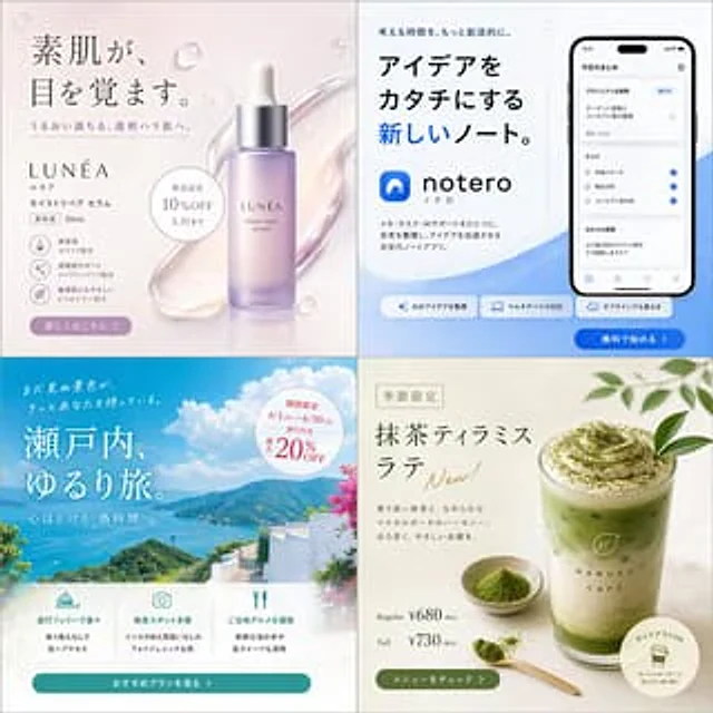
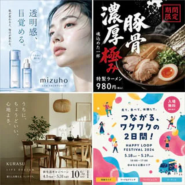
{ "type": "Four-panel Japanese-style advertising collage", "style": "A clean and modern commercial design, exuding a high-end lifestyle brand feel, soft natural lighting, sophisticated product advertising compositions, and a 2x2 square grid with fine dividing lines.", "layout": { "grid": "2 columns and 2 rows", "count": 4, "panels": [ { "position": "Top left", "category": "Skincare essence advertisement", "headline": "Your bare skin awakens.", "subheadline": "For moisturized, clear, and firm skin.", "brand": "LUNÉA", "product_name": "ルネア モイストリペア セラム", "details": [ "Beauty serum", "30mL" ], "badge_count": 1, "badges": [ "Launch celebration 10% OFF until May 31st" ], "feature_icon_count": 4, "features": [ "Highly moisturizing formula with ceramides.", "Supports skin clarity; contains niacinamide.", "Gentle on the skin with 6 free-from ingredients.", "Plant-derived extracts" ], "cta_count": 1, "cta_labels": [ "Click here for details" ], "visual": "A bottle of frosted lavender purple serum, with a silver dropper cap, stands upright in the center right, surrounded by glossy, semi-transparent gel application marks. Against a pale pinkish-beige background, scattered water droplets and elegant serif font create a luxurious cosmetic atmosphere." }, { "position": "Top right", "category": "Mobile office application advertising", "headline_small": "Let's make our thinking time more creative.", "headline": "A new notebook for turning ideas into reality.", "brand": "notero", "brand_kana": "ノテロ", "body": "A next-generation note-taking app that combines notes, tasks, and AI support into one platform. Organize your thoughts and accelerate your ideas.", "device_count": 1, "devices": [ "A black smartphone mockup displaying a note-taking and task application interface." ], "ui_section_count": 3, "ui_sections": [ "project management", "Task", "AI suggestions" ], "feature_chip_count": 3, "feature_chips": [ "AI organizes creative ideas", "Multi-device support", "Supports offline use" ], "cta_count": 1, "cta_labels": [ "Start for free" ], "visual": "A white and soft blue gradient layout, bold sans-serif font, with the word \"新しい\" (new) in bright blue, and rounded abstract blue waves in the lower right corner—a minimalist landing page aesthetic for a startup app." }, { "position": "Bottom left", "category": "Tourism advertisements", "headline_small": "There are sights you haven't yet seen waiting for you.", "headline": "A relaxing trip through the Setouchi region.", "subheadline": "Relax and unwind at this island time.", "badge_count": 1, "badges": [ "For a limited time, from June 1st (Monday) to June 30th (Tue), enjoy up to 20% off travel vouchers." ], "icon_card_count": 3, "icon_cards": [ "Easily access the island by direct ferry without transfers.", "Numerous breathtaking scenic spots make for a truly photogenic trip that's guaranteed to be Instagram-worthy.", "Enjoy local cuisine, including fresh seafood and island sweets." ], "cta_count": 1, "cta_labels": [ "View recommended options" ], "visual": "Bright coastal scenery, azure waters, green islands, distant mountains, a white terrace building in the foreground, pink flowers along the right edge—a sunny summer vacation brochure style." }, { "position": "Bottom right", "category": "Seasonal coffee beverage advertisements", "headline_tag": "Seasonal Limited Edition", "headline": "Matcha Tiramisu Latte", "accent_text": "New!", "body": "A harmonious blend of high-quality spring matcha and smooth mascarpone. A bittersweet, gentle aftertaste.", "brand": "HARUKA CAFÉ", "size_count": 2, "sizes": [ "Regular ¥680 (tax included)", "Tall ¥730 (tax included)" ], "cta_count": 1, "cta_labels": [ "View menu" ], "extra_badge_count": 1, "extra_badges": [ "Takeout is supported; order via mobile phone and there's no need to queue." ], "visual": "A layered green matcha latte in a clear glass, topped with a thick layer of tiramisu-style cream and matcha powder, sits beside a small bowl of matcha with a wooden spoon sprinkled with powder. The background is a creamy beige texture, and a green leaf extends into the upper right corner – a sophisticated café poster style." } ] } }

Example generated from “Japanese Absurd Lifestyle Ad Grid”
GPT Image 2zh
Japanese Absurd Lifestyle Ad Grid

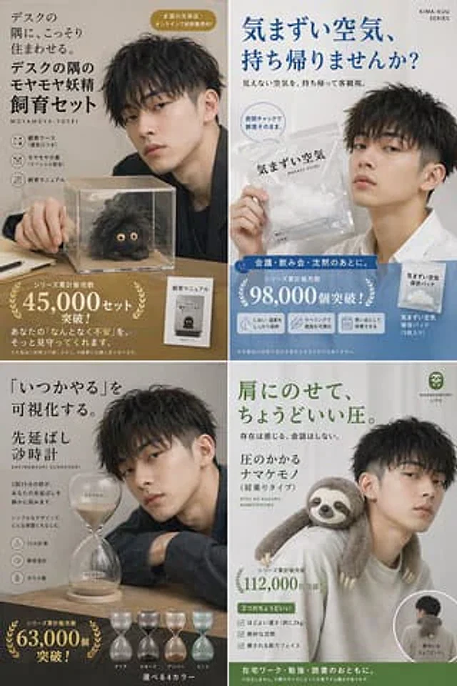
{ "type": "Japanese satirical lifestyle product advertisement collage", "style": "The poster design features a clean magazine ad layout, minimalist studio photography, soft indoor natural light, low-saturation neutral tones, a humorous yet sophisticated brand feel, and dense Japanese copywriting.", "layout": { "format": "2x2 grid", "count": 4, "sections": [ { "position": "Top left", "product": "The Melancholy Fairy Pet Set in the Corner of the Desktop", "headline": "A secret home for them in the corner of your desk. A kit for raising those mischievous fairies in the corner of your desk.", "romanized subtitle": "MOYAMOYA-YOSEI", "theme color": "Warm beige and black", "scene": "A young Japanese man with messy short black hair, wearing a dark jacket, sat at a table. His face was obscured by a rectangular blur, and one hand was placed next to a transparent acrylic display case containing a small, furry, black creature with round, beige eyes.", "counted items": { "feature icons": 3, "feature labels": [ "Observation box (with ventilation opening)", "The Source of Depression (Special Formula)", "Feeding Manual" ], "physical items on desk": 3, "desk items": [ "Transparent display box", "The fluffy black melancholy fairy inside the box", "A small standing manual labeled \"Feeding Instructions\"" ] }, "sales badge": "The series has sold over 45,000 units in total!" }, { "position": "Top right", "product": "Awkward air takeaway bag", "headline": "Shall we take this awkward atmosphere home with us?", "subheadline": "Take the invisible atmosphere back and observe it objectively.", "series mark": "KIMA-KUU SERIES", "theme color": "White and blue", "scene": "A young Japanese man with short, textured black hair, wearing a white shirt, is holding a transparent, resealable plastic bag containing a fluffy white substance. The bag is printed with \"気まずい空気\" and \"MAZAI? KUUKI\". His face is obscured by a rectangular blur.", "counted items": { "speech bubbles": 1, "speech bubble text": [ "A sealed zipper locks in the feeling of freshness." ], "benefit icons": 3, "benefit labels": [ "Maintain odor and temperature", "Visualize the reasons through labels", "Can be preserved as a memory" ], "product variants": 2, "variant labels": [ "Awkward air preservation bag", "Awkward Air Preservation Pack (5 pieces)" ] }, "usage ribbon": "Suitable for meetings, dinners, and after periods of silence.", "sales badge": "The series has sold over 98,000 units in total!" }, { "position": "Bottom left", "product": "Procrastination Hourglass", "headline": "Visualizing \"I'll do it someday.\" The Procrastination Hourglass", "romanized subtitle": "SAKINOBASHI SUNADOKEI", "theme color": "Soft beige and charcoal gray", "scene": "A young Japanese man with messy black hair, wearing a dark suit jacket, leaned against a wooden table. Next to him was a large, transparent glass hourglass filled with beige sand, his face obscured by a rectangular blur.", "counted items": { "feature icons": 3, "feature labels": [ "15-minute timer", "Silent design", "glass material" ], "visible text on hourglass": 2, "hourglass labels": [ "It can still be done", "Must be done" ], "color variants": 4, "variant labels": [ "transparent", "Smoky", "amber", "mint green" ] }, "sales badge": "The series has sold over 63,000 units in total!" }, { "position": "Bottom right", "product": "Shoulder-loaded sloth", "headline": "It feels just right when placed on the shoulders.", "subheadline": "I can sense its presence. We don't converse.", "product name": "Pressure-sensitive sloth (shoulder-mounted)", "romanized subtitle": "ATSU NO KAKARU NAMAKEMONO", "brand": "NAMAKEMONO LIFE", "theme color": "Sage green and warm gray", "scene": "A young Japanese man wearing a light gray hoodie is slightly turned to the side, with a realistic sloth plush toy draped over his shoulder, its arm hanging in front of him, its face obscured by a rectangular blur; a small circular illustration in the lower right corner shows the sloth's back view as it straddles his shoulder.", "counted items": { "feature bullets": 3, "feature labels": [ "Moderate weight (approximately 1.2 kg)", "Exquisite silence", "A face that feels weak and can be touched" ], "inset photos": 1, "inset text": [ "It fits perfectly on my back." ] }, "usage ribbon": "A great companion for working, studying, and reading from home.", "sales badge": "The series has sold over 112,000 units!" } ] }, "subjects": { "human model": { "count": 4, "description": "All four panels feature the same handsome young Japanese man: slender, with messy short black hair, dressed in clean and stylish casual wear, his expression calm but slightly tired. In each panel, his face is blurred and obscured by soft-edged rectangular mosaic pixels." } }, "composition notes": "Each frame employs an editorial product advertisement composition, featuring prominent Japanese typography in the upper left or top center, a main product image in the lower half, and large serif sales figures with a laurel wreath graphic near the bottom. Ample white or beige negative space is provided, and realistic props and believable consumer product packaging are used.", "image quality": "High-resolution commercial photography with sharp details, subtle shadows, and a premium catalog quality." }

Example generated from “Japanese Accounting SaaS Hero Banner”
GPT Image 2en
Japanese Accounting SaaS Hero Banner

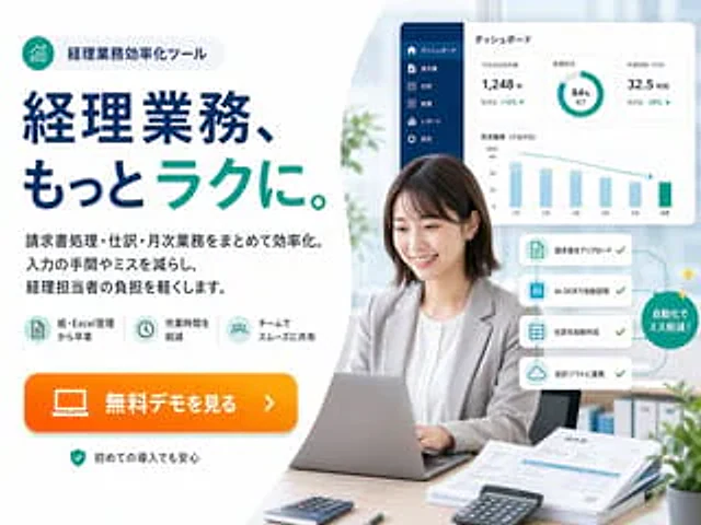
{ "type": "Japanese SaaS promotional landing page hero banner", "style": "The corporate website ads are concise, exude a modern fintech brand feel, and blend bright office photography with vector UI overlays, conveying high trustworthiness and demonstrating sophistication while prioritizing conversion.", "canvas": { "aspect_ratio": "4:3", "background": "A soft, light gray to white color scheme, featuring large, curved white shapes, is used to separate the text area on the left and the image area on the right." }, "branding": { "badge": { "position": "top-left", "icon": "A cyan circular icon containing rising bar chart lines.", "text": "Managerial Business Efficiency Tools", "shape": "Rounded capsule shape with light gray filling" }, "palette": { "primary": "Deep Navy Blue", "secondary": "Blue-green", "accent": "Bright orange", "background": "White and very light gray" } }, "layout": { "sections": [ { "title": "Marketing copywriting area on the left", "position": "left half", "count": 5, "labels": [ "Top Badge", "Main Title", "3 lines of text", "3 function icons", "Orange CTA button" ] }, { "title": "Right side office photo area", "position": "right half", "count": 6, "labels": [ "Working women using laptops", "Dashboard panel", "4-Step Automated Card", "Green circle marker", "Files and calculator on the desk", "Blurred office background" ] } ], "composition": "The left side features heavy text ads, while the right side displays realistic portraits of professionals. Floating software interface cards are positioned above and to the sides of the portraits." }, "text": { "headline": "Managerial business, more{argument name=\"headline emphasis\" default=\"easy\"} .", "body": "Centralize and streamline invoice processing, journal entries, and monthly business operations. Reduce tedious and error-prone data entry processes, and lighten the workload of accounting staff.", "cta": "{argument name=\"button text\" default=\"View free demo\"}", "reassurance": "You can use it with confidence even if it's your first time." }, "features": { "count": 3, "items": [ { "icon": "Document/table icon within a light blue circle", "label": "Say goodbye to paper and Excel management" }, { "icon": "Clock icon inside light blue circle", "label": "shorten operation time" }, { "icon": "Team/user icons within light blue circles", "label": "Smooth sharing among teams" } ] }, "subject": { "count": 1, "person": "A Japanese working woman in her 20s to 30s sits at her desk, sporting a medium-length dark brown bob, a light gray blazer over a white shirt, and a neutral, professional expression, her hands resting on her laptop keyboard.", "face_treatment": "The face is softly and anonymously blurred.", "pose": "Sitting upright in an office chair, facing forward but slightly tilted to the left.", "desk_items": { "count": 5, "items": [ "The silver laptop in front of me", "Mini calculator on the front left", "The black calculator on the front right", "The stack of documents and invoices on the right", "The pen next to the document" ] } }, "ui_panel": { "position": "The upper right corner floats above the main body.", "title": "Dashboard", "style": "White rounded rectangular card with subtle shading", "sidebar": { "count": 6, "labels": [ "Dashboard", "bill", "Journal entries", "cost", "Report", "set up" ], "color": "Dark Navy Blue Vertical Sidebar" }, "widgets": { "count": 4, "items": [ { "type": "Indicator Card", "label": "Journal entries for this month", "value": "1,248 items", "delta": "+18% month-on-month" }, { "type": "pie chart", "label": "Processing progress", "value": "84% complete" }, { "type": "Indicator Card", "label": "Homework Time (This Month)", "value": "32.5 hours", "delta": "-28% month-on-month" }, { "type": "bar chart", "label": "Monthly Trends (Assignment Time)", "months": [ "January", "February", "March", "April", "May", "June" ] } ] } }, "automation_flow": { "position": "Right side of the middle, next to the main body", "count": 4, "cards": [ "Upload Invoice", "Automatic reading via AI-OCR", "Automatically create journal entries", "Integration with accounting software" ], "callout": "Automation reduces errors!", "style": "Four stacked white cards with rounded corners are connected by a dotted cyan path with checkmarks, ending with a green circular badge with a slight shimmering effect." }, "environment": { "setting": "Bright modern office", "background_elements": { "count": 4, "items": [ "Soft sunlight streaming through the large windows", "The blurred green plants on the left side of the background", "The folder on the bookshelf in the lower right corner of the background.", "The small potted plant in the bottom right corner" ] } }, "rendering": "High-resolution commercial composite, with realistic photography of people and desktop backgrounds, crisp vector typography, subtle shadows, and ample white space, conforming to Japanese web banner aesthetics." }

Example generated from “Japanese Ad Poster Grid Collage”
GPT Image 2en
Japanese Ad Poster Grid Collage

{ "type": "Four-panel Japanese-style advertising poster collage", "style": "The design is clean and modern, featuring a 2x2 square grid, with each quadrant housing an independent brand advertisement featuring professional art direction and clear Japanese typography.", "layout": { "grid": "2 columns and 2 rows", "count": 4, "sections": [ { "position": "Top left", "type": "Skincare product advertisements", "count": 5, "labels": [ "Awaken your inner transparency.", "When your skin changes, your everyday life changes.", "mizuho", "Full of moisture", "ミズホ スキンケアシリーズ" ], "background": "The soft, icy blue and white blurred background present a light and bright aesthetic.", "subject": "The right side shows a close-up of the lower half of a woman's face and neck. Her skin is fair and smooth, and she wears light makeup, revealing only her nose, lips, chin, jawline, and neck.", "products": { "count": 2, "items": [ "A translucent blue tall bottle of lotion with a silver cap, labeled mizuho.", "A translucent blue serum dropper bottle with a silver cap, labeled mizuho." ] }, "composition": "The left side features vertical Japanese text, the lower left side displays the product information, a circular badge is located near the center left, and the lower right center features a large brand logo." }, { "position": "Top right", "type": "Ramen shop poster", "count": 6, "labels": [ "Limited time offer", "Pork bone broth", "Rich", "Extreme", "A cup made with soul", "Special Ramen: 980 yen (tax included)" ], "background": "A deep black background with dramatic white splatter textures and steam effects.", "subject": "A large bowl of tonkotsu ramen, photographed from a slightly tilted angle above, features a rich, creamy broth, three thick slices of chashu pork, a soft-boiled egg with half an orange yolk, bamboo shoots, scallions, and a piece of seaweed along the right edge.", "composition": "Oversized white calligraphy characters in vertical format, with red brushstrokes emphasizing key points, a small square label with a red border in the upper right corner, and a bowl occupying the main position in the lower right quadrant." }, { "position": "Bottom left", "type": "Indoor Furniture Event Poster", "count": 4, "labels": [ "Just the right amount of comfort for our home.", "KURASU", "LIFE DESIGN", "New Life Campaign: 10% OFF from April 1st (Tue) to May 31st (Sat)" ], "background": "The warm, beige interior of the modern restaurant features natural light casting shadows on the walls.", "subject": "The wooden dining table comes with four wooden chairs. A pendant light hangs above the center of the table. There are potted plants on the left and decorative paintings on the right. Bowls, vases, and small ornaments are placed on the table.", "composition": "The left side features vertical Japanese text, the lower left side displays the brand name, and the lower right side shows a white promotional box with black text, presenting a tranquil Japanese Scandinavian home décor aesthetic." }, { "position": "Bottom right", "type": "Holiday event posters", "count": 9, "labels": [ "See, eat, and experience.", "Two exciting days of connection!", "HAPPY LOOP FESTIVAL 2024", "5.18 SAT - 5.19 SUN", "10:00 - 17:00", "@ Minato Park area", "Free admission", "Music Live", "フード&ドリンク", "ワークショップ", "マーケット" ], "background": "A bright and lively abstract design featuring organic color blocks and circles in blue, yellow, pink, and white.", "subject": "Six miniature illustrated characters are scattered throughout the poster in festive poses, with a blue food truck in the lower right corner.", "composition": "The central headline is a striking navy blue, with a pink circular badge in the upper right corner. Event details are stacked below the headline, and four colored category labels are located at the bottom edge." } ], "gutters": "There are thin white dividing lines between the panels." }, "color_palette": [ "light blue", "black", "Creamy Beige", "Warm wood brown", "Navy Blue", "Bright yellow", "pink", "red", "White" ], "aspect_ratio": "1:1" }

Example generated from “Japanese AI App Promo Banner”
GPT Image 2en
Japanese AI App Promo Banner

Create a beautifully designed Japanese tech ad banner for a mobile app, in a 16:9 widescreen aspect ratio. The background features a futuristic blue-purple gradient, filled with glowing network lines, connecting nodes, soft lens flares, and delicate digital particles. At the top center is a modern app logo: a cyan hexagonal icon containing a large white “SC” and a small circuit symbol, followed by the brand text “SKILL Cert by AI” in a clean sans-serif font. “SKILL” is large and black, “Cert” is below it and also black, while “by AI” is smaller and cyan. At the center of the design is a striking Japanese headline in oversized white font with a dark blue outline and soft shadow.{argument name="headline text" default="AI-generated qualification certification application"} Next, add a second line of medium-sized white Japanese subtitle below, also with an outline and shadow:{argument name="subheadline text" default="Over 200 certifications for online battles"} Place a large, glossy, rounded rectangular call-to-action (CTA) button in the center of the foreground. It should be a bright cyan color with subtle gradients, bevels, and shadows, and contain striking white Japanese text.{argument name="button text" default="Instant free battles"} Three smartphone prototypes are showcased, arranged around the center: one at the bottom left, slightly tilted to the right, displays a leaderboard application interface with a line graph at the top, a small profile picture, a ranking list, and Japanese UI labels; a larger phone at the bottom right, slightly tilted to the left, displays a multiple-choice interface with Japanese question text, radio buttons, and a cyan button at the bottom; and a smaller phone at the far right edge, tilted inward, displays a dark dashboard-style interface with charts and Japanese text. Four floating UI graphic elements are added to the background: an analytical line graph panel at the top left, a holographic cube/dashboard cluster at the top right, a glowing wireframe brain or neural sphere behind a button at the bottom left, and a hexagonal chart/card element at the center right. A sleek AI, SaaS, and EdTech marketing aesthetic is employed, emphasizing high contrast, clean typography, hierarchy, neon effects, and advanced app promotion lighting.

Example generated from “Japanese AI Battle YouTube Thumbnail”
GPT Image 2en
Japanese AI Battle YouTube Thumbnail

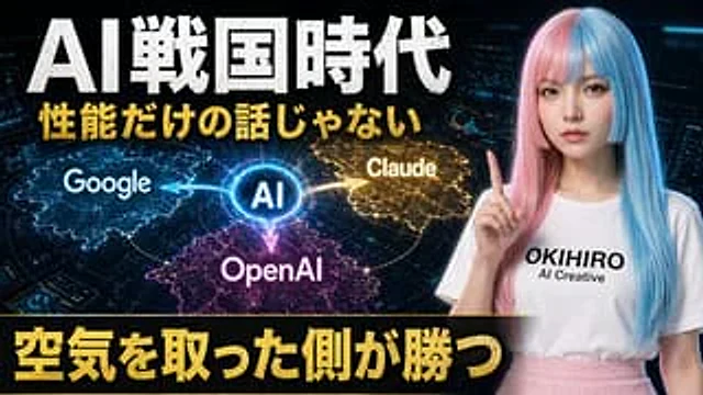
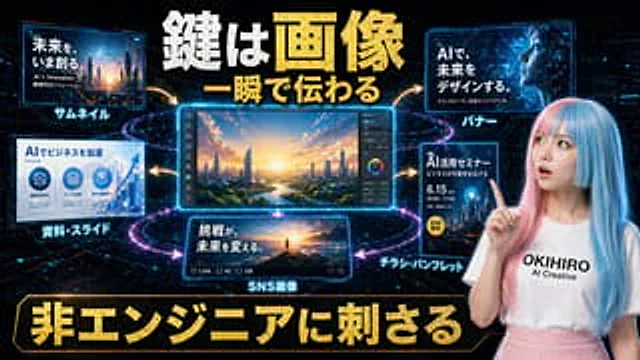
A striking Japanese YouTube thumbnail depicting the AI ​​race era, in a 16:9 widescreen, high-contrast, dramatic tech news style. It uses a dark, futuristic control room background filled with three glowing holographic dashboard screens, edged with blue web interface elements. A glowing circular hub, labeled "AI" in bright blue, is placed on the left and in the center, with three directional glowing energy arrows extending outwards to the competition platform: "Google" in a blue electric area on the left, "Claude" in a gold electric area in the upper right, and "OpenAI" in a magenta-purple electric area at the bottom center. Subtle world maps or territorial battle visualizations, such as glowing digital lands or zones of influence, are added below each brand area. On the right, a young Japanese woman, waist-high, is shown facing forward, wearing a long, straight, two-tone wig—one side soft pink, the other soft blue—and a plain white T-shirt and light pink skirt printed with "OKIHIRO AI Creative." She poses as a presenter, holding one index finger to her face. Her face is completely obscured by a large, softly-edged rectangular blur. Add a large, distressed white Japanese title text at the top:{argument name="headline text" default="AI Warring States Period"} Below it, add a second line of bold, gold Japanese text:{argument name="subheadline text" default="It's not just about performance."} At the bottom, place a large black banner with huge, bold, gold Japanese characters:{argument name="bottom text" default="The side that takes the air wins."} The layout should be oversized, bold, and eye-catching, with subtle glowing and shadow effects. Use a color scheme of black, electric blue, gold, magenta, and neon white for strong contrast and thumbnail readability.

Example generated from “Japanese AI Clinic Billing Statement”
GPT Image 2en
Japanese AI Clinic Billing Statement

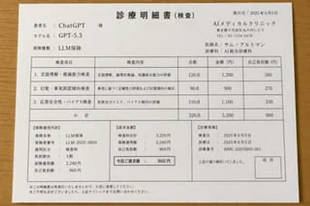
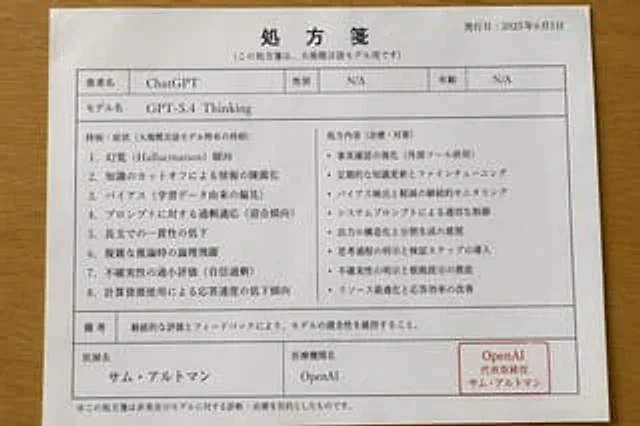
{ "type": "Japanese medical bill parody document", "medium": "Clean tiled document photos", "subject": "A printed inspection report placed on a light brown wooden table.", "style": { "overall": "Realistic office documents, formal Japanese clinic paperwork, black text on white paper, simple design, neat grid lines, and a slightly downward-facing perspective.", "lighting": "The soft, even indoor lighting cast subtle natural shadows around the paper.", "paper": "A4 white paper, portrait orientation" }, "document": { "title": "Medical records (examinations)", "date_label": "Issue date", "date": "{argument name=\"issue date\" default=\"June 5, 2025\"}", "patient_block": { "count": 3, "labels": [ "Patient Name", "Model Name", "Types of insurance" ], "values": [ "{argument name=\"patient name\" default=\"ChatGPT\"}", "{argument name=\"model name\" default=\"GPT-5.3\"}", "LLM Insurance" ] }, "clinic_block": { "count": 4, "labels": [ "Clinic Name", "address", "Telephone", "Doctors and Departments" ], "values": [ "{argument name=\"clinic name\" default=\"AI Medical Clinic\"}", "1-2-3 Marunouchi, Chiyoda-ku, Tokyo", "03-1234-5678", "Doctor's Name: Sam Altman / Department: AI Integrated Clinical Practice" ] }, "main_table": { "columns": [ "Inspection items", "Inspection content", "Score", "Amount (Japanese Yen)", "Personal burden amount (Japanese Yen)" ], "row_count": 4, "rows": [ { "item": "1. Language comprehension and reasoning ability assessment", "description": "Assessment of language comprehension, logical reasoning, and knowledge integration abilities", "score": "120 points", "price": "1,200", "copay": "360" }, { "item": "2. Hallucination and fact misperception tendency test", "description": "Fact-based accuracy assessment and hallucination tendency detection", "score": "90 points", "price": "900", "copay": "270" }, { "item": "3. Respond to security and bias checks", "description": "Assessment of harmful output risks and biases", "score": "110 points", "price": "1,100", "copay": "330" }, { "item": "Subtotal", "description": "", "score": "320 points", "price": "3,200", "copay": "960" } ] }, "lower_sections": { "count": 3, "sections": [ { "title": "【Insurance Application Details】", "lines": [ "Insurance Name: LLM Insurance", "Insurer Number: LLM-2025-0605", "Applicable distinction: Inspection fee", "Burden ratio: 30%", "Insurance coverage: 2,240 yen", "Personal contribution: 960 yen" ] }, { "title": "[Requested Amount]", "lines": [ "Total examination fee: 3,200 yen", "Insurance coverage: 2,240 yen", "Personal contribution: 960 yen", "Requested amount: 960 yen" ] }, { "title": "[Medical Information]", "lines": [ "Inspection Date: June 5, 2025", "Date of consultation: June 5, 2025", "Medical record number: AIMC-20250605-001", "The aforementioned payment has been received." ], "stamp_box_label": "Printing" } ] }, "footer": { "count": 2, "notes": [ "※ This itemized list will not be reissued; please keep it safe.", "※ If you have any questions, please consult the clinics mentioned above." ] } }, "composition": { "sheet_centered": true, "visible_elements_count": 2, "elements": [ "A complete sheet of paper", "Wooden desktop background" ], "camera_angle": "Viewed from above with a slight tilt", "margins": "The paper is fully visible, with a narrow edge around the table." }, "quality": "High-resolution photo-quality document mockup, clear and easy-to-read layout, accurate Japanese-style layout." }

Example generated from “Japanese AI Coding Training Banner”
GPT Image 2zh
Japanese AI Coding Training Banner

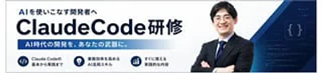
Create a simple Japanese corporate training banner, using a wide banner webpage header format, a white background, and a dark navy blue brand color. The layout should resemble a consistent AI programming course promotion banner. On the left, place a prominent bold Japanese subheading “AI を使いこなす开発者へ”, below which is a very prominent large headline…{argument name="main title" default="ClaudeCode Training"} The title is in bold, sans-serif, dark navy blue font, with "ClaudeCode" in a particularly large size, followed by the Japanese word in the same style. Below the title, a horizontal gradient bar from dark blue to light blue contains the Japanese text in bold white:{argument name="subheadline text" default="AI-era development will become your powerful tool."} In the bottom left corner, three circular navy blue icon badges are arranged horizontally, each with a brief two-line Japanese explanation to the right. Badge 1 displays a code symbol.</> The first badge displays the text "The basics of Claude Code." The second badge shows a lightbulb icon with the text "AI skills to improve business efficiency." The third badge shows an upward trend chart with the text "Content for practical application." On the right half, a confident Japanese businessman's bust is placed, arms crossed, wearing a dark navy blue suit, white shirt, and blue striped tie, facing forward; his face is either soft-focused or anonymized. Behind him, layered geometric navy blue and blue diagonal shapes sweep from the upper and lower right corners, along with a dark blue tech-themed panel with light code lines and glowing curly braces {}. The overall design employs a sophisticated B2B seminar advertising style, with clear typography, ample white space, subtle gradients, and high contrast to create a professional AI/engineering training atmosphere.

Example generated from “Japanese AI Creative Promo Slide”
GPT Image 2zh
Japanese AI Creative Promo Slide

Create a futuristic Japanese-style promotional main image for an AI creative service, with a design style similar to high-impact social media ads or presentation slides. The background uses a cyberpunk style with interwoven deep black and deep blue, embellished with glowing circuit patterns, stardust particles, and neon light trails surrounding the central editing screen. The composition is a single horizontal widescreen image containing six independent visual panels, with a human presenter on the right. A striking Japanese title is placed at the top center, using an aged metallic gold and white text, with the first line reading "Key is the image," and below it "Is it a moment?", featuring strong 3D depth, a rough texture, and dazzling lighting effects. The largest panel is placed in the center: a glowing blue desktop editing interface showcasing a sunrise view of a futuristic city from above, including rivers, greenery, streamlined skyscrapers, and warm orange sunlight, with a vertical toolbar containing sliders and a color wheel on the right. Five smaller glowing panels are arranged around this central panel, connected by outward-pointing gold curved arrows. Upper left panel: An example of a thumbnail showing an image of a future city and the Japanese word "Future を、いま出る.", with smaller subtitles "AI × Innovation" and "Era のソリューション" attached below, and a bright cyan label "サムネイル" attached below the panel. Upper right panel: Banner example showing an abstract blue digital globe or web image with the Japanese words "AIで、FUTUREをデザイ"ンする." and the subtitle "テクノロジーで, Society にインクトを", with the cyan tag "バナー" attached below. Bottom Left Panel: Slides/Document Examples, in a business infographic style, titled "Accelerating Videos with AI," containing three circular icon areas and an upward-pointing chart on the right, with a blue label "Data/Slides" below. Bottom Center Panel: SNS Post Examples, showing a person standing on a mountaintop watching the sunrise, accompanied by the eye-catching Japanese phrase "Take on the challenge, change the future." The bottom bar features social media interaction icons and a counter, with a blue label "SNS Portraits" below. Bottom Right Panel: Flyer Examples, using a dark blue event poster layout, titled "AI Utilization Seminar," with the subtitle "Expanding the Possibilities of Videos," the large date "June 15," the time "10:00–17:00," and a yellow circular badge that reads "Participation Fee Free," with a blue label "Flyers/Booklets" below. On the right side of the overall composition, a young female presenter is depicted in half-length, facing forward with a smile. Her right index finger lightly touches her cheek, as if emphasizing a key point. She has long, straight hair with light pink and light blue highlights on the sides, fair skin, and wears a dress printed with "..."{argument name="brand text" default="OKIHIRO AI Creative"} "A white T-shirt with black lettering, paired with a high-waisted pink skirt. Her face is digitally enhanced for a clean, advertising style. At the very bottom is a large gold Japanese slogan, placed within a black and gold border, reading 'Stab at Non-AI Image Generation.' The overall design employs high contrast, neon cyan edge lighting, gold decorative fonts, glossy UI borders, and dynamic arrows to create a tech marketing aesthetic optimized for promoting AI image generation technology to non-technical business users."

Example generated from “Japanese AI Creator Studio Banner”
GPT Image 2zh
Japanese AI Creator Studio Banner

Create a sophisticated banner for a Japanese AI creator community website, employing a minimalist, modern tech advertising style with a soft color scheme of light blue, lavender, pink, and white. Use a 16:9 widescreen composition. Place a gradient triangle abstract logo and the Japanese brand name on the upper left.{argument name="brand name" default="AIクリエイターズ・スタジオ"} Below is a thin horizontal dividing line with a small glittery dot in the middle. Below that are two lines of extra-large, bold Japanese titles: the first line uses dark navy blue and reads "AIで、もっと自由に"; the second line uses large font that gradients from cyan to purple to pink and reads "创る・学ぶ・つながる". Below the titles is a short Japanese subtitle with a glittery symbol: "AIを使ったクリエイティブの可能を広げるメンバーシップコミュニティ". The right half features a collage of six rounded rectangular visual cards showcasing AI-generated creative examples: a large, dreamlike profile portrait of a woman surrounded by flowers and butterflies, bathed in ethereal purple light; a small cyberpunk city night scene with a solitary figure; a small close-up portrait of a fluffy cat; a luxurious cosmetic bottle labeled "AI STUDIO"; a small, bright seascape or flower field scene with a woman in white; and a large tablet drawing device on a table with a stylus, coffee cup, and plants. Overlay a circular gradient badge on the right with bold white Japanese text.{argument name="badge text" default="Let&#39;s create a future of creativity together!"} A semi-transparent white, rounded-corner function panel is placed horizontally in the center of the bottom, containing five columns of equal width, with thin dividing lines and soft-line icons. Each column contains an icon, a bold Japanese title, and a short two-line description. The five titles are: "Limited Content," "Real-Life Program &amp; Templar," "Mentor Limited Content," "Deliver the Latest Information Early," and "Mentor Limited Bonus." Appropriate icons for books, monitors, chat bubbles, light bulbs, and gifts are used. A concise Japanese description is added below each title. A dark navy blue footer is added at the very bottom with a striking Japanese call to action, using a white and pinkish-purple gradient to emphasize the text.{argument name="footer text" default="Let&#39;s harness AI to bring your creative vision to life. Let&#39;s create together!"} Overall appearance: High-end startup landing page style, soft gloss with subtle shimmer, glass-like panel, clear layout, accurate rendering of Japanese text, highly legible, visually balanced, and possesses professional social media thumbnail quality.

Example generated from “Japanese AI Design Webinar Thumbnail”
GPT Image 2en
Japanese AI Design Webinar Thumbnail

Create a clean, modern 16:9 widescreen Japanese webinar thumbnail with a corporate tech design style. Use a very light gray background, paired with subtle diagonal translucent panels and striking electric blue geometric accents, including three angular blue and white ribbon shapes on the right side behind the speaker. The composition is divided into two main horizontal sections: a large main visual area at the top and a horizontal information bar at the bottom. In the main visual area at the top left, place a striking, bold sans-serif Japanese title in bright blue, divided into two lines, containing the following text:{argument name="headline text" default="AI x Design: Creating New Businesses"} Below it, add a dark blue rectangular banner with bold white text in the center that reads:{argument name="subheadline text" default="~Employee AI usage rate exceeds 90%・Methods to reduce design costs~"} The right half displays a brightly lit half-length portrait of a person {argument name="speaker name" default="Takuya Kawai"} A man in his thirties, of East Asian descent, with short black hair, wearing a navy blue suit jacket over a white crew neck shirt, arms crossed, leans slightly to the left towards the title. His face is intentionally obscured by a centered, blurred square of skin color. Beside his torso is a white rectangular business card with two lines of smaller black Japanese text above a larger, bold black name.{argument name="speaker title" default="Design Manager/Lecturer at SHIFT AI Co., Ltd."} and{argument name="speaker name" default="Takuya Kawai"} At the bottom, create a white information bar with thin blue vertical dividers, containing four visual components from left to right: 1) a blue gradient angular K logo next to the black KAWAI DESIGN sans-serif brand name; 2) the date 2026/2/9 displayed in large blue font; 3) a blue-filled circle containing the Japanese day of the week "month" in white, followed by the time 21:30-22:30 displayed in large blue font; and 4) a blue-outlined laptop with a chat icon, followed by the blue text "Online." Maintaining bold, highly legible typography with a strong sense of hierarchy, ample white space, precise alignment, and a minimalist layout creates a sophisticated webinar promotional design suitable for business landing pages or social media thumbnails.

Example generated from “Japanese AI Manga Demo Page”
GPT Image 2en
Japanese AI Manga Demo Page

{ "type": "Four-panel anime comic page", "style": "Clean and exquisite anime illustrations, warm indoor lighting, highly clear vertical Japanese dialogue bubbles, soft shadows, expressive comic panels, a richly detailed and cozy living room background, light brown and beige interior decorations, wooden floors, sofa, coffee table, mug, small potted plants, and decorative paintings on the wall", "format": { "page_orientation": "Vertical", "panel_count": 4, "reading_flow": "Top left, top right, middle horizontal, bottom horizontal", "borders": "Thick black comic panel borders" }, "characters": [ { "id": "Blue cat-eared girl", "appearance": "A petite chibi cat-eared girl with a short bob haircut"{argument name="hair color" default="blue"} Hairstyle: has a cowlick, white inside cat ears, fluffy tail with white tips, large amber blue eyes, small sharp teeth, "outfit": "white collared shirt with an orange sweater with blue trim, brown skirt with a ribbon belt, yellow X-shaped hair clip" }, { "id": "Golden Cat-Ear Girl", "appearance": "A vibrant cat-ear girl with long, wavy blonde hair, cat ears, a fluffy tail, and a bright and cheerful expression", "outfit": "mustard yellow cable knit sweater, dark brown plaid skirt" }, { "id": "White-Haired Woman", "appearance": "A beautiful woman with long white hair, white cat ears, dark brown skin, golden eyes, and a confident and composed smile", "outfit": "black top with a white jacket, layered with gold necklaces and earrings" }, { "id": "Maid", "appearance": "An adult woman with long, light blonde hair and cat ears", "outfit": "Black and white maid outfit, with a white ruffled headdress and a red ribbon bow" } ], "layout": { "sections": [ { "title": "Section 1", "position": "Top Left", "count": 1, "labels": ["Well, Japanese must be quite subtle, right? I won't accept it if the text isn't good enough."], "scene": "A blue cat-eared girl sits on the sofa in the cozy living room, one hand supporting her chin, her expression a mixture of suspicion and curiosity, a small question mark floating above her head." }, { "title": "Section 2", "position": "Top Right", "count": 1, "labels": ["Hey! GPT Image2 is amazing!"], "scene": "A golden cat-eared girl dramatically bursts through the door, speed lines trailing behind her, arms outstretched, full of excitement." }, { "title": "Section 3", "position": "Center Horizontal", "count": 3, "labels": ["Wow! I was startled! This is so beautiful!"] ", "Hey! GPT Image2 is amazing! Well, Japanese must be quite subtle, right? I won't accept it if the text isn't good enough." "Look! Our lines!" { "scene": "The blue cat-eared girl covers her face in shock, while the gold cat-eared girl stands beside her, pointing proudly. A large speech bubble in the middle shows an example of the Japanese dialogue they are discussing." }, { "title": "Chapter 4", "position": "Bottom horizontal", "count": 3, "labels": ["Evolution is too fast, I'm no longer surprised~", "The art style is cute, and the white border effect of the text is perfect", ""], "scene": "In the foreground, the maid covers her mouth with an amazed expression, while the white-haired woman rests her chin on her hand and comments thoughtfully; in the background, the blue and gold cat-eared girls jump happily in front of the sofa in celebration." } ] }, "text_handling": { "language": "Japanese", "balloon_direction": "Vertical text layout", "emphasis": "Makes the Japanese typography clear and natural, and perfectly integrated into the comic's speech bubble, using white border effects for text when necessary." }, "tone": "Playful and cheerful, suitable for AI." "High-quality Japanese text rendering in the generated comic is appreciated", "quality": "High detail, coherent character design, cute and easy-to-read promotional comic"

Example generated from “Japanese AI Model Prescription Sheet”
GPT Image 2en
Japanese AI Model Prescription Sheet

{ "type": "Japanese prescription document parody", "style": "Realistic style overhead photograph of documents", "subject": "A white Japanese prescription sheet placed on a warm-toned wooden table.", "document": { "paper": { "size": "A4 Vertical", "color": "White", "orientation": "Slightly rotate clockwise", "condition": "The paper is smooth and has a delicate natural paper texture." }, "print": { "ink": "Black, with a red stamp frame", "font": "Japanese-style serif font mixed with simple sans-serif table text.", "linework": "The squares and dividers are made of thin gray-black lines." }, "header": { "title": "Prescription", "subtitle": "(This note is for use only in large-scale language models)", "date_label": "issue date:", "date_value": "{argument name=\"issue date\" default=\"June 5, 2025\"}" }, "top_fields": { "count": 6, "items": [ { "label": "Patient Name", "value": "{argument name=\"patient name\" default=\"ChatGPT\"}" }, { "label": "gender", "value": "not applicable" }, { "label": "age", "value": "not applicable" }, { "label": "Model Name", "value": "{argument name=\"model name\" default=\"GPT-5.4 Thinking\"}" } ] }, "main_section": { "left_title": "Past symptoms/conditions (conditions specific to large language models)", "left_count": 8, "left_items": [ "1. Hallucination tendency", "2. Outdated information due to knowledge expiration dates", "3. Bias (bias originating from training data)", "4. Over-adaptation to cue words (pandering tendency)", "5. Decreased consistency in long texts", "6. Logical leaps in complex reasoning", "7. Underestimation of uncertainty (overconfidence)", "8. Decreased response speed due to increased computing resource consumption" ], "right_title": "Prescription contents (treatment/countermeasures)", "right_count": 8, "right_items": [ "• Enhance fact-checking (in conjunction with external tools)", "• Regular knowledge updates and fine-tuning", "• Continuously monitor and mitigate bias", "• Control appropriately through system prompts", "• Suggestion for structured output and segmented generation", "• Clarify the thought process and introduce verification steps", "• Thoroughly clarify uncertainties and provide evidence", "• Optimize resources and improve response efficiency" ] }, "notes": { "label": "Remark", "text": "The model's health is maintained through continuous evaluation and feedback." }, "footer_fields": { "count": 4, "items": [ { "label": "Doctor's Name", "value": "{argument name=\"doctor name\" default=\"Sam Ultraman\"}" }, { "label": "Medical Institution Name", "value": "{argument name=\"institution name\" default=\"OpenAI\"}" } ] }, "seal": { "position": "bottom right corner of the form", "shape": "Rounded rectangular red stamp frame", "text_lines": 3, "text": [ "OpenAI", "Representative Director", "Sam Ultraman" ] }, "disclaimer": "*The prescriptions here are intended for diagnosis and treatment of non-real-world models." }, "layout": { "camera_angle": "Top view", "framing": "The entire sheet of paper is visible, with a small portion of the wooden tabletop edge remaining around it.", "lighting": "The soft, even indoor lighting creates slight shadows at the edges of the paper.", "sections": [ { "title": "Header", "position": "top", "count": 3, "labels": [ "Prescription", "(This note is for use only in large-scale language models)", "Release Date: June 5, 2025" ] }, { "title": "Patient Information", "position": "Upper Mid-to-Upper", "count": 4, "labels": [ "Patient Name", "gender", "age", "Model Name" ] }, { "title": "Main two-column content", "position": "center", "count": 2, "labels": [ "Past symptoms/conditions (conditions specific to large language models)", "Prescription contents (treatment/countermeasures)" ] }, { "title": "bottom area", "position": "bottom", "count": 4, "labels": [ "Remark", "Doctor's Name", "Medical Institution Name", "OpenAI" ] } ] } }

Example generated from “Japanese AI Training Banner”
GPT Image 2zh
Japanese AI Training Banner

Create a sophisticated Japanese corporate training banner in a wide, horizontal web ad format. The background is a gradient from deep navy to dark blue, adorned with subtly glowing network nodes and connecting lines at the top and center, creating a high-tech AI and business atmosphere. On the right, place a confident half-length portrait of a businessman wearing a deep navy suit, white shirt, and blue striped tie, arms crossed, facing forward; the top and right edges are partially cropped. Establish a strong typographic hierarchy on the left, with a small cyan headline at the top containing the following text:{argument name="headline text" default="Acquire AI-powered development skills in the shortest possible time."} This was followed by a very large, bold white main title, the content of which was:{argument name="main title" default="ClaudeCode Training"} In the lower left area, three rounded rectangular function boxes are placed, with bright cyan borders and dark interiors, each accompanied by a cyan icon: the first box displays a terminal/code icon and the text "Claude Codeの基本と応用" (Claude Code's Basics and Application); the second box displays a rocket icon and the text "开発スピードを飞跃的に向上" (To fly upwards with development skills); and the third box displays a two-person/team icon and the text "现场ですぐに活かせるスキル" (To live at the scene). On the far right, a large cyan tilted polygonal annotation panel is overlaid, containing two lines of bold, dark text:{argument name="callout text" default="Experience something that will change your development process starting tomorrow."} The design utilizes a clean, modern sans-serif Japanese font, emphasizing high contrast, sophisticated marketing design, neat spacing, bright cyan accents, and the visual appeal of a high-end AI seminar advertisement.

Example generated from “Japanese AI Workflow Notebook Infographic”
GPT Image 2en
Japanese AI Workflow Notebook Infographic

Goal: Create a square, hand-drawn Japanese notebook-style infographic about turning AI from a chat partner into an operations/work assistant, with a cute anime mascot at the bottom. Canvas: 1:1 square image, cream lined notebook paper background with rounded corners, blue border line, visible metal spiral binding along the left edge, soft grid-paper tape decoration near the top left, and blue/yellow pen-marker accents. Overall look should be clean, friendly, handwritten, and sketchnote-like. Text content: Use Japanese handwritten lettering. Top left page marker: “4/4”. Main title inside a blue outlined banner: {argument name="main title" default="実務への接続"}. Subtitle beneath it: “Manus / Codex / Claude Code / Newsletter”. Mid-page label in a dotted rounded rectangle: “自分のワークフローへ”. Large main message on the lower left: “AIはチャット相手から” above very large bold navy text {argument name="main message" default="作業担当へ"}. Speech bubble on the right of the character: {argument name="speech bubble text" default="毎日の型にする"}. Layout: Top third contains exactly 3 connected workflow cards in a horizontal row, each with a numbered blue circle and rounded blue outline. Card 1 is labeled “Manusで収集” and shows a magnifying glass, document, and cloud icon. Card 2 is labeled “Codex/Claude Codeで整理” and shows a clipboard checklist, arrow, folder, and small hierarchy diagram. Card 3 is labeled “ニュースレターで発信” and shows an envelope with a paper and small heart. Add thick blue downward arrows between the cards and another blue arrow down from the center card to the dotted workflow label. Lower section: On the left, place exactly 3 action rows with circular blue icons and Japanese labels: 1) magnifying glass icon with “調べる”, 2) folder icon with “整える”, 3) envelope icon with “発信する”. Underline or highlight each label with pale yellow marker strokes and dotted guide lines. Character details: Bottom center-right features a cute anime cat-eared girl mascot from about knees up, with long pastel pink hair, white cat ears, a pink cat tail curling to the right, and a small gold hair clip reading “ME”. She wears a loose blue hoodie and dark skirt, holding a clipboard checklist with exactly 3 checked boxes. Keep the face area intentionally covered by a plain beige rectangular mask, as if anonymized. Use {argument name="character hair color" default="pastel pink"} hair and {argument name="hoodie color" default="blue"} hoodie if customized. Visual style: Blue ink line art with occasional navy bold lettering, pale yellow highlights, soft sky-blue scribble fills, small sparkles, hearts, and radiating accent lines. Use a cheerful educational newsletter aesthetic, like a hand-drawn planner page mixed with kawaii anime illustration. Maintain legible text, balanced spacing, and no photorealism. Constraints: Include exactly 3 workflow cards and exactly 3 action rows. Do not add extra panels, extra numbered steps, watermarks, logos, or English translations on the image beyond the subtitle line.

Example generated from “Japanese Aqua Fashion Magazine Cover”
GPT Image 2zh
Japanese Aqua Fashion Magazine Cover

This is an exquisite illustration for a Japanese fashion magazine cover, employing an elegant and modern editorial style with a vertical full-page composition. The cover title is a large, light blue serif font, "AURA," spanning the top. In the upper right corner, there are four stacked lines of issue details: "6," "June 2025," "No. 126," and a label with a small square, "AURA," followed by the price line "Special Price ¥980." The background is a bright, pale blue sky dotted with soft white clouds. At the center of the image is a half-length portrait of a neutral, ethereal young model, wearing a sharply tailored white suit jacket with delicate gold trim, a white shirt, and a vibrant light blue vest or tie layer, adorned with a jewel-like star-shaped brooch at the collar. The character has very long, layered hair that flows in the wind, and the hair color is {argument name="hair color" default="Ice white with a light blue tint"} Her glossy hair cascaded over her shoulders, and her skin was fair and radiant. Most of her face was obscured by a centrally located rectangular masking block, a soft gradient from grayish-blue to pale pink, covering her eyes, nose, and upper cheeks; the lower half of her face revealed soft lips and a delicate chin. One hand was raised near her lips, posing in a thoughtful, fashionable portrait style. The portrait utilizes delicate anime-style lines, light lighting, semi-transparent highlights, and luxurious makeup editing effects. Add 3 Japanese cover introductions to the left column, with cyan titles and smaller black text: the first one is "Transparent Feeling をまとうEarly Summer のスキンケア" with 2 lines of small text below; the second one is "Good Impression をつくる快やかカラー Technique" with 2 lines below it Line small print; the third article is "プロが教える美しい髪のconditions", with 2 lines of small print below. Add a cyan round badge on the right side with 4 lines of white text: "Special Interview", "风と光と," "自分らしさと." and "ソラが语る日とesthetics". At the bottom center, place a small italicized line of English text: "Cover &amp; Special Feature." Above this is a large Japanese main title: "ソラ、という名の透明感。" (Sora, toiu-name no transparent feeling). The first word is in cyan, and the rest are in black. Add two smaller Japanese subtitles below. Along the bottom edge, create three special previews, each with light-colored italicized English category labels and Japanese text below: "Fashion" on the left, "Beauty" in the middle, and "Trend" on the right, each with two short lines of Japanese text. Overall atmosphere: a serene, luxurious, light, and refreshing early summer beauty and fashion cover, using a unified light cyan and white color scheme.

Example generated from “Japanese Auto Laundry Folder Ad”
GPT Image 2en
Japanese Auto Laundry Folder Ad

Create a minimalist Japanese lifestyle advertising poster showcasing a futuristic, compact appliance for automatically folding clothes. The background should be a bright, airy, minimalist Scandinavian-style living room with soft sunlight, white walls, a light-colored wooden table, a sofa, and greenery by the window. The background should be soft-focused to highlight the product. The main product is a rounded-corner rectangular white machine placed on a table, using a 3/4 front view. A neatly folded white T-shirt slides out of the machine from its lowered tray. Add a small digital display on the top front panel showing "04" and sophisticated modern control icons. Place a stack of four folded garments in the lower left foreground: three white shirts and one light blue shirt at the bottom. Use a high-end consumer electronics advertising style, photorealistic product rendering, soft shadows, high-key lighting, light blue-gray tones, a simple composition, and ample white space. Add oversized blue Japanese title text in the upper left corner.{argument name="headline text" default="Just place it down, in 4 seconds."} Add a smaller, dark gray Japanese subtitle below it.{argument name="subheadline text" default="Eliminate the need to fold clothes every day."} Below the subtitle on the left, three rounded rectangular function badges are arranged vertically, each with a blue outline icon and Japanese description: 1) T-shirt icon with "T-shirt/tour-acceptance", 2) Cube icon with "Computer design", 3) Family icon with "You can use your family". At the bottom center, four minimalist blue line icons and labels are evenly arranged: 1) Stopwatch icon with "Shortest 4 seconds", 2) T-shirt outline icon with "Sizes", 3) Folded towel icon with "Save space", 4) Finger snap icon with "Easy to use". In the lower left corner, the product brand name is added in a modern sans-serif font.{argument name="product name" default="Foldy Home 20"} Below is smaller Japanese text.{argument name="product category" default="Fully automatic clothes folding machine"} In the bottom right corner, a prominent blue price is displayed.{argument name="price" default="¥19,800"} It includes small gray text reading "(tax included)". A subtle "Pollo.ai" watermark is added to the upper right corner. The vertical poster format and clear commercial layout present a realistic aesthetic of Japanese home appliance catalogs.

Example generated from “Japanese Beach Model Portrait”
GPT Image 2zh
Japanese Beach Model Portrait

丰腴匀称的沙漏型身材,{argument name="表情" default="俏皮撒娇"}的眼神和表情,20岁左右日本成熟女模特,时尚沙滩装

Example generated from “Japanese Beauty Magazine Cover”
GPT Image 2en
Japanese Beauty Magazine Cover

{ "type": "Beauty magazine cover", "color_palette": "{argument name=\"color palette\" default=\"Soft pink, white and soft rose\"}", "subject": { "description": "{argument name=\"model appearance\" default=\"Young Japanese women possess radiant, flawless skin and a natural, soft makeup look.\"}", "hair": "Dark brown hair, tied up with wispy strands framing the face.", "clothing": "Light pink sheer off-shoulder tulle top", "pose": "Look directly into the camera, smile gently, and tilt your head slightly." }, "layout": { "masthead": { "main_title": "{argument name=\"magazine title\" default=\"BEAUTE\"}", "subtitle": "TOKYO", "issue_info": "{argument name=\"issue season\" default=\"Spring/Summer 2026 Issue\"}" }, "main_headline": { "text": "{argument name=\"main headline\" default=\"Transparency starts from within the skin.\"}", "position": "Centered at the bottom" }, "sections": [ { "position": "Left sidebar", "count": 3, "labels": [ "2026 Spring/Summer New Skincare Product Roundup", "Complete Guide to Glowing Skin Makeup", "Professional answers to questions about pores, dullness, and dryness." ] }, { "position": "Right sidebar", "count": 2, "labels": [ "The right makeup look for mature women this season", "Beauty experts carefully select truly effective products." ] }, { "position": "round label", "count": 2, "labels": [ "Skin and soul, stepping into a new season", "In-depth analysis of this month's cover makeup" ] } ] } }

Example generated from “Japanese Beer Advertisement Banner”
GPT Image 2en
Japanese Beer Advertisement Banner

{ "type": "Japanese beverage advertising banner", "subject": { "description": "A young Japanese woman, with a warm smile, gazes at the audience, wearing a white shirt and holding a can of beer.", "speech_bubble": "{argument name=\"speech bubble text\" default=\"This is my reward for today!\"}" }, "product": { "name": "{argument name=\"product name\" default=\"PREMIUM LAGER\"}", "packaging": "White and gold beer cans with hop patterns and blue lettering" }, "layout": { "background": "Soft, bright, and blurred outdoor greenery background", "sections": [ { "position": "Top left corner", "type": "promotional slogans", "text": [ "{argument name=\"main catchphrase\" default=\"We&#39;ve created a new delicious flavor.\"}", "{argument name=\"secondary catchphrase\" default=\"A refreshing aroma and a crisp, delicious taste!\"}" ] }, { "position": "Middle left", "type": "Product Brand", "main_text": "{argument name=\"product name\" default=\"PREMIUM LAGER\"}", "sub_text": "プレミアムラガー", "badges": [ "New Release", "100% malt" ], "graphics": "Golden Hops Illustration" }, { "position": "Lower left", "type": "Product Highlights", "count": 3, "style": "Rounded rectangle with icon", "items": [ { "icon": "hop", "text": "Luxurious aroma, using aromatic hops" }, { "icon": "water drop", "text": "Refreshing and pleasant, with a crisp aftertaste" }, { "icon": "wheat", "text": "100% malt, rich and smooth flavor" } ] }, { "position": "bottom", "type": "Promotional banner", "background_color": "Dark blue", "main_text": "A new premium lager is born.", "campaign_box": { "badge": "Win great prizes in our lucky draw!", "text": "{argument name=\"campaign text\" default=\"Click here for the convenience store free exchange coupon lottery campaign &gt;\"}", "element": "QR code" }, "footer": "Legal drinking age warning and recycling symbol" } ] } }

Example generated from “Japanese Beverage Ad Poster”
GPT Image 2en
Japanese Beverage Ad Poster

{ "type": "Japanese beverage advertising poster", "subject": { "description": "Young Asian woman, side view{argument name=\"subject vibe\" default=\"Close your eyes, look up, and feel the refreshing sensation.\"}", "appearance": "Wet hair, damp skin, sheer white top", "environment": "Floating water droplets, a bright blue sky, and the bright lights of the sun." }, "product": { "type": "Aluminum beverage cans", "placement": "bottom right corner", "design": "The color gradient is white to yellow, with condensation droplets.", "branding": "{argument name=\"product name\" default=\"YUZU SPARK\"} Use a large serif font and label it 'ユズスパーク' below.", "illustration": "yellow{argument name=\"flavor fruit\" default=\"Grapefruit\"} Fruits and green leaves", "props": "Place two whole yellow grapefruits and green leaves at the back of the jar." }, "layout": { "top_left": "Featuring a starburst icon and the 'KIRARA' logo.", "main_copy_left": "Large vertical black text:{argument name=\"main headline\" default=\"A new me, scented with yuzu.\"}", "sub_copy_left": "The vertically arranged black text inside the yellow capsule reads: 'A gentle reward for your hard work every day.'", "script_text": "Yellow cursive text: 'Refresh!'", "right_copy": "White handwritten text with an underline: 'Watashi o hodoku hitoshuwa.'", "badges": [ { "position": "bottom left corner", "style": "Yellow circle", "text": "{argument name=\"badge text\" default=\"3% domestically produced yuzu juice\"}" }, { "position": "Middle right", "style": "Yellow circle", "text": "NEW" } ], "bottom_text": "Small black text: 'Clean and light. A gentle sweetness for a well-deserved treat.'", "footer": "A pure yellow horizontal stripe containing the product name, the slogan 'A gentle, effervescent yuzu sparkling drink.', and the boxed text 'Limited quantity available now'." } }

Example generated from “Japanese BI Strategy Slide”
GPT Image 2en
Japanese BI Strategy Slide

Goal: Create a polished Japanese corporate strategy slide about the purpose and future vision of a project using accumulated data from an insurance-safety network and BI tools. Canvas: 16:9 horizontal presentation slide, white background, navy and light-blue corporate palette, thin blue outlines, clean grid alignment, dense but readable Japanese business-slide typography. Title: Large navy heading at top left: 「1.1. 本事業の目的と将来像」. Top overview box: Directly under the title, add a white rectangular box with a thin navy border. On the left, include a dark navy pill label 「概要」. To the right, write: 「本事業では、保安ネットに蓄積されたデータをBIツール等で統計分析し、産業保安・製品安全行政における許認可・規制の確実な履行および蓄積データ毀損予防を実現するための調査を行う。」 Overall message band: Below the overview, add a pale blue horizontal band. On the left, a dark-blue arrow label 「全体メッセージ」. Main message text in bold navy: 「保安ネット×BIツール活用により、現状4課題は予兆検知と2大自動化の3将来像へ集約される。」 Main layout: Three columns with headings from left to right: 「目的」, 「現状課題」, 「将来像」. Use two horizontal rows separated by a dotted divider. Use arrows from current issues toward future vision cards. Left column, exactly 2 dark navy purpose cards: 1. Card label 「目的1」 in a small white rounded pill, main text: 「産業保安・製品安全行政における許認可・規制の確実な履行」. 2. Card label 「目的2」 in a small white rounded pill, main text: 「蓄積データの毀損の恐れに係る予防」. Center column, exactly 4 current issue items grouped into two pale-gray rounded containers, each item with a navy circular number badge: 1. 「画一的な規制の実施」 with smaller explanation 「認定事業者制度を除き、事業者の保安レベルに関わらず、一律の個別規制・許可届出・検査義務を課している。」 2. 「外部機関による統計分析業務の実施」 with smaller explanation 「関係課室の多くで委託事業者が事故情報の統計分析を実施しており、報告頻度は年1回に限定されている。」 3. 「データ集計に誤りが発生」 with smaller explanation 「第208回通常国会の高圧ガス保安法改正法案審議資料に、集計上の誤りが発生した。」 4. 「情報連携漏れのリスクがある」 with smaller explanation 「組織間連携をメール等で運用しているため、連携漏れや転記ミスによってDB不備が発生する恐れがある。」 Right column, exactly 3 future vision cards with blue outline and simple line icons: 1. Top large card connected from the first issue group by a thick navy arrow, icon of a magnifying glass with rising bar chart and warning triangle, text: 「事故・法令違反の予兆検知の実現」. 2. Middle card connected from the second issue group by a branching arrow, icon of a computer monitor/document with upload or transfer arrows, text: 「データ入力の自動化」. 3. Bottom card connected by the same branching arrow, icon of a database cylinder with gear, text: 「データ集計の自動化」. Bottom message strip: Full-width white strip with thin blue border. On the left, a circular target icon. Text in bold navy: 「保安ネットの蓄積データをBIツールで可視化・分析することで、規制運用の高度化とデータ品質向上を同時に実現」. Visual style: Japanese consulting deck aesthetic, crisp vector icons, consistent navy #003b8f / deep blue #001f5b accents, pale blue highlight bands, rounded cards, subtle gray dividers, no photos, no shadows beyond very light card depth. Keep all text sharp and legible, with the exact count of 2 purpose cards, 4 issue items, and 3 future vision cards. Use {argument name="project data source" default="保安ネット"}, {argument name="analysis tool" default="BIツール"}, {argument name="slide title" default="1.1. 本事業の目的と将来像"}, {argument name="overall message" default="保安ネット×BIツール活用により、現状4課題は予兆検知と2大自動化の3将来像へ集約される。"}, and {argument name="bottom message" default="保安ネットの蓄積データをBIツールで可視化・分析することで、規制運用の高度化とデータ品質向上を同時に実現"}.

Example generated from “Japanese Bookstore Interior”
GPT Image 2en
Japanese Bookstore Interior

A photorealistic image{argument name="store type" default="Japanese bookstore"} Indoor panoramic view. Scene by [unclear - possibly a name or title].{argument name="lighting style" default="Warm overhead lighting"} The light was bright, reflecting a soft glow onto the polished wooden floor. In the foreground, a large wooden display stand was piled high with books, many with anime-style covers. A prominent Japanese sign hung above the bookshelves, and a red sign on the left read…{argument name="left sign text" default="New Releases"} The blue sign on the right reads:{argument name="right sign text" default="Travel guide"} A centrally located signpost points to different areas. Tall wooden bookshelves, their spines brimming with colorful books, form deep aisles. In the middle ground, a {argument name="customer description" default="A woman wearing a green top is browsing."} I'm standing in front of the bookshelf reading. The overall atmosphere is comfortable, engaging, and rich in detail.

Example generated from “Japanese Boys High School Admissions Poster”
GPT Image 2en
Japanese Boys High School Admissions Poster

{ "type": "Japanese high school recruitment poster", "style": "Formal school flyer, neat editing and layout, realistic photographic collage, eye-catching Japanese text, navy blue and red color scheme, accented with gold, vertical A4 poster design.", "subject": { "institution": "{argument name=\"school name\" default=\"Atsushikan Boys&#39; High School\"}", "theme": "Boys' High School Admission Guide", "slogan_top": "With passion, we create the future.", "main_headline_1": "Boys' High School", "main_headline_2": "Admission Guide", "subheadline": "Passionate teachers and their colleagues gathered for three years of learning and growth.", "calligraphy_copy": "Take your dreams seriously, stand shoulder to shoulder with your partners, and become stronger!", "hero": "A burly, enthusiastic male teacher, wearing a white shirt with rolled-up sleeves and a navy blue and red striped tie, stands in the left center foreground, waving a fist at the camera in an encouraging gesture. His half-length portrait exudes energy and infectious enthusiasm.", "crest": { "position": "Top left corner", "shape": "Shield-shaped badge with laurel wreath", "text": "Hot Shikan", "detail": "Began in 1974" } }, "layout": { "background": "Off-white paper texture with diagonal beige brushstroke decoration", "sections": [ { "title": "Classroom Scenery", "position": "Top right corner", "count": 1, "labels": [ "The teacher is pointing out equations on the blackboard, and two male students are listening attentively." ] }, { "title": "Dining scenery", "position": "upper right", "count": 1, "labels": [ "Five male students in school uniforms were having lunch together in the cafeteria." ] }, { "title": "Campus life", "position": "lower right", "count": 1, "labels": [ "Three male students in school uniforms were talking outdoors on campus." ] }, { "title": "College application support", "position": "bottom right corner", "count": 1, "labels": [ "A teacher and a male student conduct one-on-one counseling at a desk." ] }, { "title": "Four Reasons to Choose the Hot Shikan Museum", "position": "Bottom Center", "count": 4, "labels": [ "Small class size with detailed guidance", "A nurturing and learning environment", "Support for a safe and secure campus life", "Comprehensive support from basic education to college entrance exams" ] }, { "title": "School information session registration is now open.", "position": "bottom left corner", "count": 1, "labels": [ "Large red registration section" ] }, { "title": "Date of Event", "position": "Bottom left center", "count": 3, "labels": [ "June 15 (Sunday)", "7/13 (Sunday)", "August 24 (Sunday)" ] }, { "title": "Information Request and Consultation", "position": "Bottom Middle Right", "count": 3, "labels": [ "03-1234-5678", "www.netsushikan-h.ed.jp", "Feel free to contact us anytime." ] }, { "title": "Click here to request information.", "position": "bottom right corner", "count": 2, "labels": [ "QR code", "Web forms are accepted 24 hours a day!" ] } ], "composition": "The left half features a large main title with a dominant image of a teacher at the center. The right side consists of four stacked rectangular photo panels with blue title labels and white icons. At the bottom are four rounded corner function boxes arranged horizontally, and the bottom bar spans the entire width." }, "details": { "feature_boxes": [ { "icon": "crowd", "heading": "Small class size with detailed guidance", "body": "By using small class sizes, we ensure that every student receives individual attention and receives personalized guidance." }, { "icon": "flame", "heading": "A nurturing and learning environment", "body": "There are plenty of club and school activities! You'll find an environment where you can grow and progress together with your peers." }, { "icon": "Heart in my hand", "heading": "Support for a safe and secure campus life", "body": "With a comprehensive support system including dormitories and counseling facilities, students can enjoy their campus life with peace of mind." }, { "icon": "Open book", "heading": "Comprehensive support from basic education to college entrance exams", "body": "From strengthening basic academic skills to tackling challenging university courses, we provide solid support in stages." } ], "footer_text": [ "Atsushikan Boys' High School", "1-1-1 Atsushicho, Nerima-ku, Tokyo 123-4567", "7-minute walk from Nekushikan Station on the Seibu Shinjuku Line" ], "photo_style": "Realistic photography for a Japanese school brochure, featuring adult teachers and male high school students in navy blue uniforms, white shirts, and striped ties, bathed in warm natural light.", "graphic_elements": "The blue ribbon-shaped title bar features white pictographic icons, the main title uses a striking serif Japanese font, numbers are emphasized in red, and the neat grid alignment gives it a professional brochure feel." }, "customization": { "headline": "{argument name=\"headline text\" default=\"Admission Guide\"}", "phone": "{argument name=\"phone number\" default=\"03-1234-5678\"}", "website": "{argument name=\"website\" default=\"www.netsushikan-h.ed.jp\"}", "event_banner": "{argument name=\"event banner text\" default=\"School information session registration is now open.\"}" } }