PROMPTS · CREATIVE EXPLORATION

Prompt Gallery

Explore real prompts and their generated examples. Find inspiration for your next creative mission and copy the complete prompt for free.

Examples
10,974
Models
17
Sources
1277
10,974 prompt examples · page 67 of 229
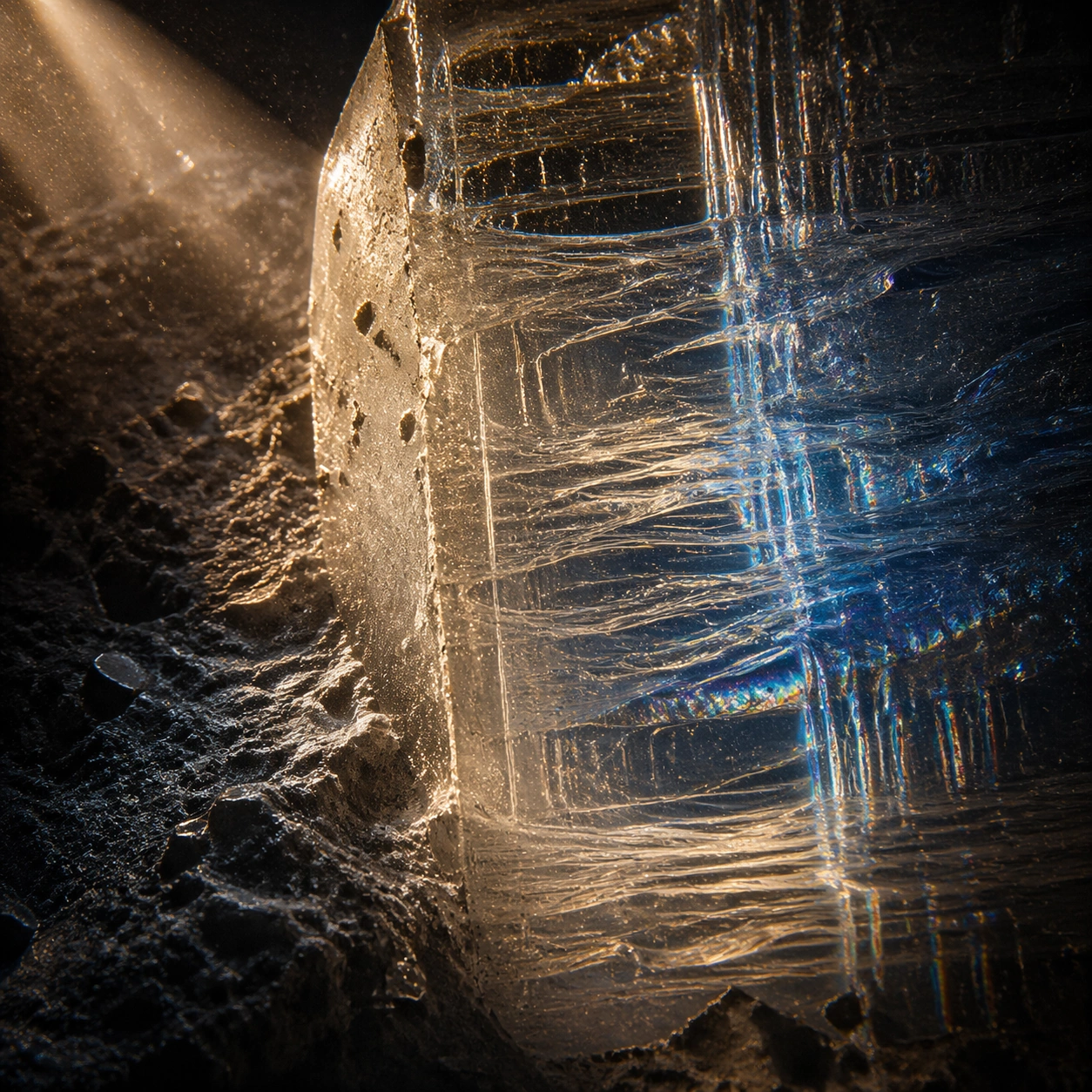
Example generated from “Complex Optics Materials — Side Light Study”
GPT Image 2en

Scene: A square material-focused image where lighting, scale, and surface behavior are the main event. Build the frame around raking light used to reveal depth and relief. Keep the lighting, camera distance, and spatial organization tuned for a high-signal research image rather than a casual snapshot. The image belongs to the Complex Optics Materials theme and should feel immediately legible as a prompt atlas theme for complex optics materials, testing photorealism, physics-materials, reasoning-composition with gpt image 2.. Subject: Center the study on raking light used to reveal depth and relief. Translate the theme into a concrete visual statement instead of an abstract mood board: the viewer should understand what kind of image this is, what is being tested, and why the composition is difficult. Use the slug idea of complex optics materials as a literal guide for subject matter, materials, and staging. Important details: Microstructure matters: refraction, fibers, scratches, pores, edge wear, translucency, and dust should all feel physically specific. Preserve a disciplined square composition, clear focal hierarchy, and enough secondary information to make the image feel complete rather than underspecified. The image should look polished, novel, and exhibition-ready, with topic-specific credibility coming from the way surfaces, structure, and visual language reinforce Complex Optics Materials. Avoid generic filler elements that do not serve the main concept. Use case: Complex Optics Materials single study 3/8, testing photorealism, physics-materials, reasoning-composition through the side light study variation. Constraints: No readable text, no watermark, no logos, preserve exact 1:1 aspect ratio, no generic stock macro, no broken scale cues, no plastic-looking texture when it should feel natural, no meaningless blur, no watermark, no fake labels.
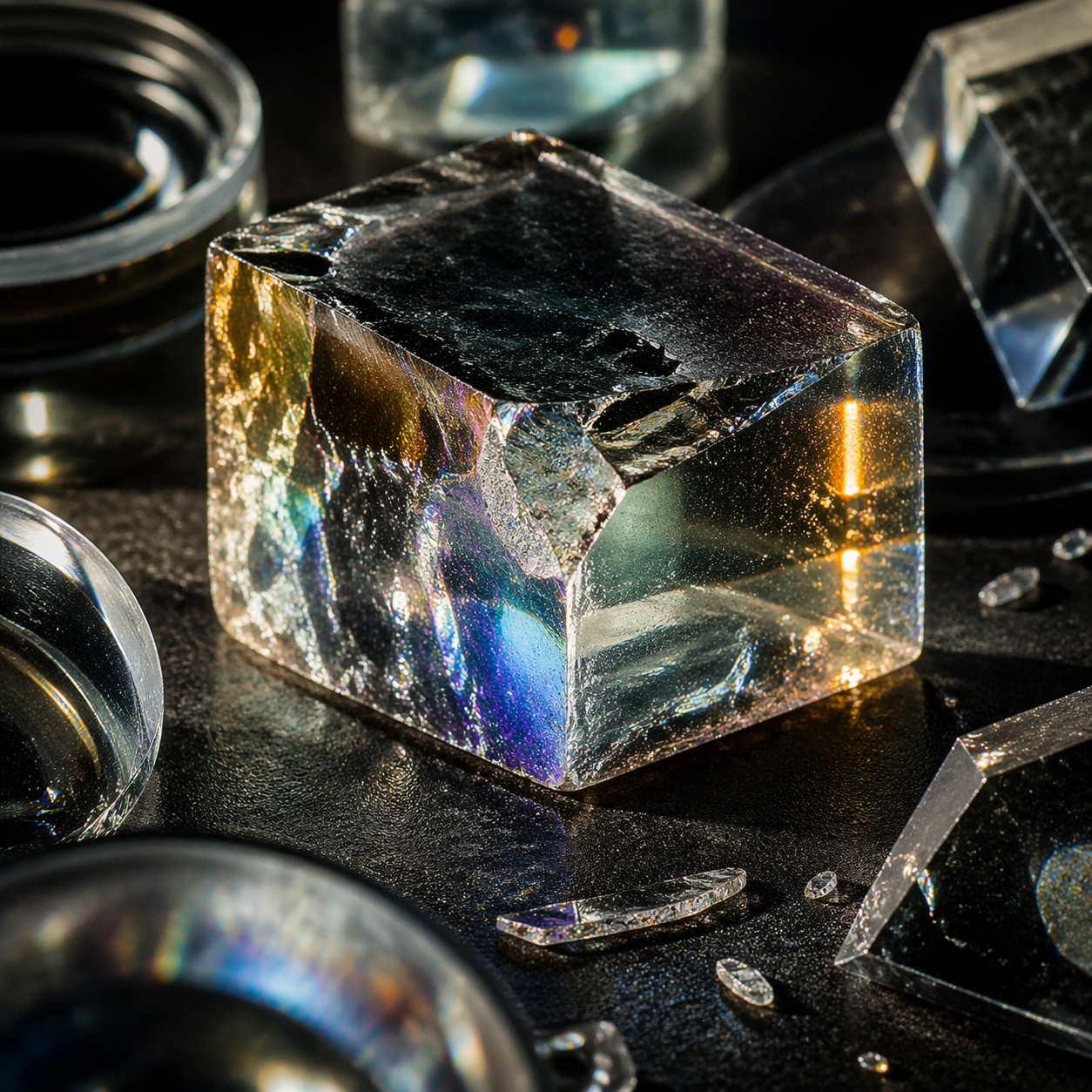
Example generated from “Complex Optics Materials — Process Trace”
GPT Image 2en

Scene: A square material-focused image where lighting, scale, and surface behavior are the main event. Build the frame around evidence of making, wear, or transformation frozen in the surface. Keep the lighting, camera distance, and spatial organization tuned for a high-signal research image rather than a casual snapshot. The image belongs to the Complex Optics Materials theme and should feel immediately legible as a prompt atlas theme for complex optics materials, testing photorealism, physics-materials, reasoning-composition with gpt image 2.. Subject: Center the study on evidence of making, wear, or transformation frozen in the surface. Translate the theme into a concrete visual statement instead of an abstract mood board: the viewer should understand what kind of image this is, what is being tested, and why the composition is difficult. Use the slug idea of complex optics materials as a literal guide for subject matter, materials, and staging. Important details: Microstructure matters: refraction, fibers, scratches, pores, edge wear, translucency, and dust should all feel physically specific. Preserve a disciplined square composition, clear focal hierarchy, and enough secondary information to make the image feel complete rather than underspecified. The image should look polished, novel, and exhibition-ready, with topic-specific credibility coming from the way surfaces, structure, and visual language reinforce Complex Optics Materials. Avoid generic filler elements that do not serve the main concept. Use case: Complex Optics Materials single study 4/8, testing photorealism, physics-materials, reasoning-composition through the process trace variation. Constraints: No readable text, no watermark, no logos, preserve exact 1:1 aspect ratio, no generic stock macro, no broken scale cues, no plastic-looking texture when it should feel natural, no meaningless blur, no watermark, no fake labels.
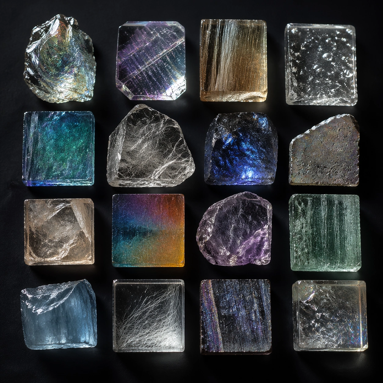
Example generated from “Complex Optics Materials — Specimen Table”
GPT Image 2en

Scene: A square material-focused image where lighting, scale, and surface behavior are the main event. Build the frame around multiple related samples arranged for comparison. Keep the lighting, camera distance, and spatial organization tuned for a high-signal research image rather than a casual snapshot. The image belongs to the Complex Optics Materials theme and should feel immediately legible as a prompt atlas theme for complex optics materials, testing photorealism, physics-materials, reasoning-composition with gpt image 2.. Subject: Center the study on multiple related samples arranged for comparison. Translate the theme into a concrete visual statement instead of an abstract mood board: the viewer should understand what kind of image this is, what is being tested, and why the composition is difficult. Use the slug idea of complex optics materials as a literal guide for subject matter, materials, and staging. Important details: Microstructure matters: refraction, fibers, scratches, pores, edge wear, translucency, and dust should all feel physically specific. Preserve a disciplined square composition, clear focal hierarchy, and enough secondary information to make the image feel complete rather than underspecified. The image should look polished, novel, and exhibition-ready, with topic-specific credibility coming from the way surfaces, structure, and visual language reinforce Complex Optics Materials. Avoid generic filler elements that do not serve the main concept. Use case: Complex Optics Materials single study 5/8, testing photorealism, physics-materials, reasoning-composition through the specimen table variation. Constraints: No readable text, no watermark, no logos, preserve exact 1:1 aspect ratio, no generic stock macro, no broken scale cues, no plastic-looking texture when it should feel natural, no meaningless blur, no watermark, no fake labels.
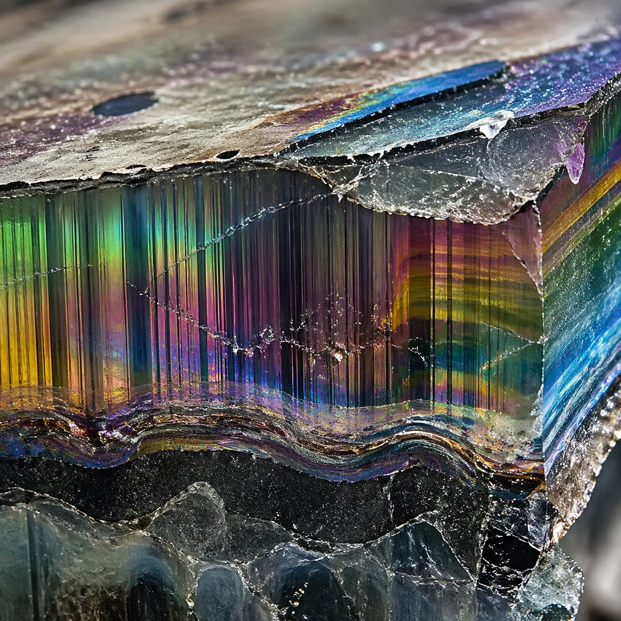
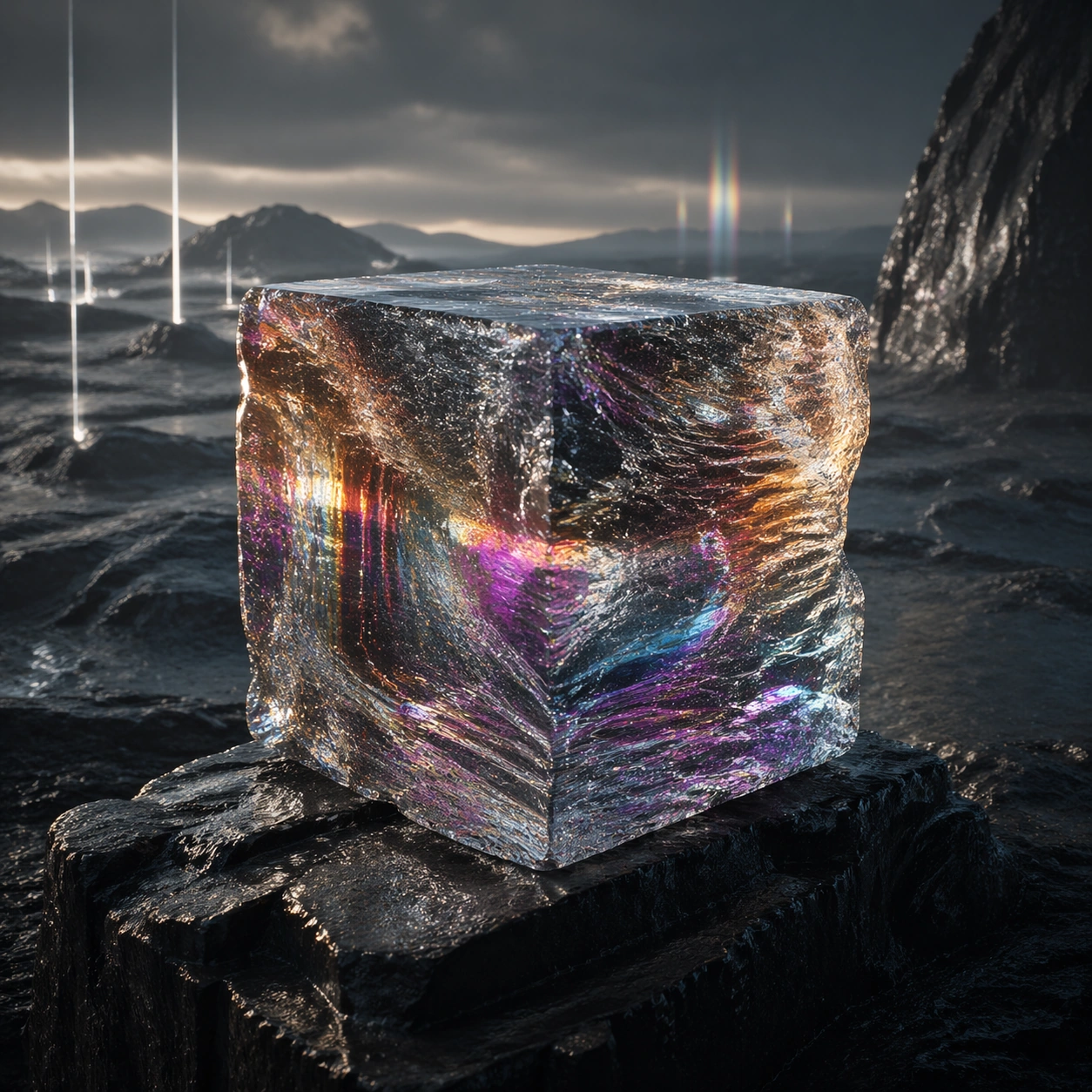
Example generated from “Complex Optics Materials — 氛围场景”
GPT Image 2en

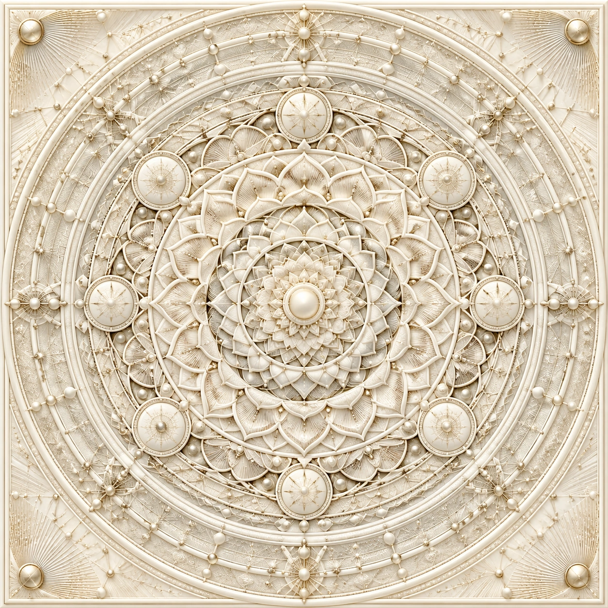
Scene: A square material-focused image where lighting, scale, and surface behavior are the main event. Build the frame around the material placed into a broader environment without losing tactile priority. Keep the lighting, camera distance, and spatial organization tuned for a high-signal research image rather than a casual snapshot. The image belongs to the Complex Optics Materials theme and should feel immediately legible as a prompt atlas theme for complex optics materials, testing photorealism, physics-materials, reasoning-composition with gpt image 2.. Subject: Center the study on the material placed into a broader environment without losing tactile priority. Translate the theme into a concrete visual statement instead of an abstract mood board: the viewer should understand what kind of image this is, what is being tested, and why the composition is difficult. Use the slug idea of complex optics materials as a literal guide for subject matter, materials, and staging. Important details: Microstructure matters: refraction, fibers, scratches, pores, edge wear, translucency, and dust should all feel physically specific. Preserve a disciplined square composition, clear focal hierarchy, and enough secondary information to make the image feel complete rather than underspecified. The image should look polished, novel, and exhibition-ready, with topic-specific credibility coming from the way surfaces, structure, and visual language reinforce Complex Optics Materials. Avoid generic filler elements that do not serve the main concept. Use case: Complex Optics Materials single study 6/8, testing photorealism, physics-materials, reasoning-composition through the 氛围场景 variation. Constraints: No readable text, no watermark, no logos, preserve exact 1:1 aspect ratio, no generic stock macro, no broken scale cues, no plastic-looking texture when it should feel natural, no meaningless blur, no watermark, no fake labels.
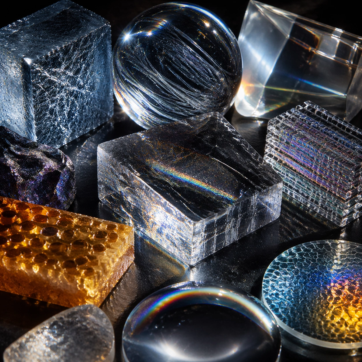
Example generated from “Complex Optics Materials — Structure Closeup”
GPT Image 2en

Scene: A square material-focused image where lighting, scale, and surface behavior are the main event. Build the frame around the internal or layered structure made legible through detail. Keep the lighting, camera distance, and spatial organization tuned for a high-signal research image rather than a casual snapshot. The image belongs to the Complex Optics Materials theme and should feel immediately legible as a prompt atlas theme for complex optics materials, testing photorealism, physics-materials, reasoning-composition with gpt image 2.. Subject: Center the study on the internal or layered structure made legible through detail. Translate the theme into a concrete visual statement instead of an abstract mood board: the viewer should understand what kind of image this is, what is being tested, and why the composition is difficult. Use the slug idea of complex optics materials as a literal guide for subject matter, materials, and staging. Important details: Microstructure matters: refraction, fibers, scratches, pores, edge wear, translucency, and dust should all feel physically specific. Preserve a disciplined square composition, clear focal hierarchy, and enough secondary information to make the image feel complete rather than underspecified. The image should look polished, novel, and exhibition-ready, with topic-specific credibility coming from the way surfaces, structure, and visual language reinforce Complex Optics Materials. Avoid generic filler elements that do not serve the main concept. Use case: Complex Optics Materials single study 7/8, testing photorealism, physics-materials, reasoning-composition through the structure closeup variation. Constraints: No readable text, no watermark, no logos, preserve exact 1:1 aspect ratio, no generic stock macro, no broken scale cues, no plastic-looking texture when it should feel natural, no meaningless blur, no watermark, no fake labels.
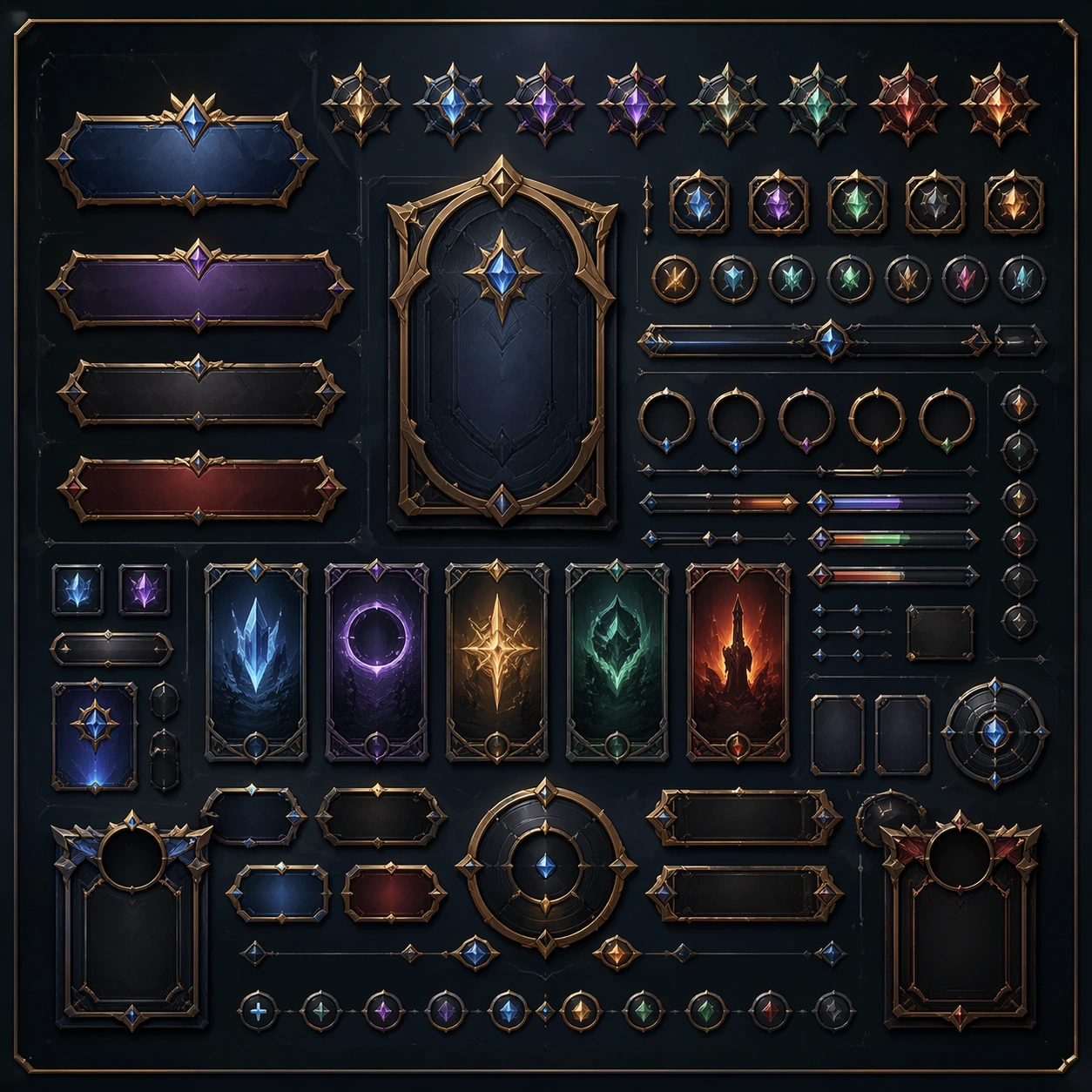
Example generated from “Complex Optics Materials — Signature Material”
GPT Image 2en

Scene: A square material-focused image where lighting, scale, and surface behavior are the main event. Build the frame around the most complete and persuasive final material image. Keep the lighting, camera distance, and spatial organization tuned for a high-signal research image rather than a casual snapshot. The image belongs to the Complex Optics Materials theme and should feel immediately legible as a prompt atlas theme for complex optics materials, testing photorealism, physics-materials, reasoning-composition with gpt image 2.. Subject: Center the study on the most complete and persuasive final material image. Translate the theme into a concrete visual statement instead of an abstract mood board: the viewer should understand what kind of image this is, what is being tested, and why the composition is difficult. Use the slug idea of complex optics materials as a literal guide for subject matter, materials, and staging. Important details: Microstructure matters: refraction, fibers, scratches, pores, edge wear, translucency, and dust should all feel physically specific. Preserve a disciplined square composition, clear focal hierarchy, and enough secondary information to make the image feel complete rather than underspecified. The image should look polished, novel, and exhibition-ready, with topic-specific credibility coming from the way surfaces, structure, and visual language reinforce Complex Optics Materials. Avoid generic filler elements that do not serve the main concept. Use case: Complex Optics Materials single study 8/8, testing photorealism, physics-materials, reasoning-composition through the signature material variation. Constraints: No readable text, no watermark, no logos, preserve exact 1:1 aspect ratio, no generic stock macro, no broken scale cues, no plastic-looking texture when it should feel natural, no meaningless blur, no watermark, no fake labels.
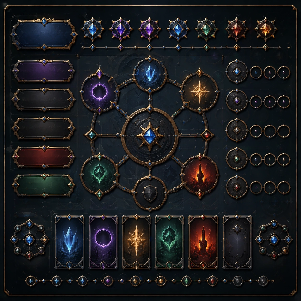
Example generated from “Component Library Premium Showcase — Reference Anchor”
GPT Image 2en

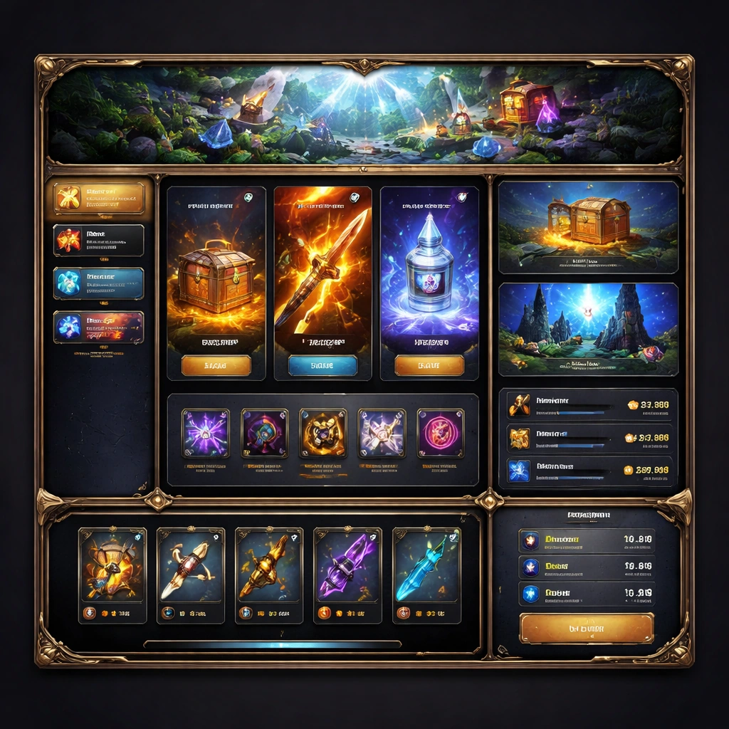
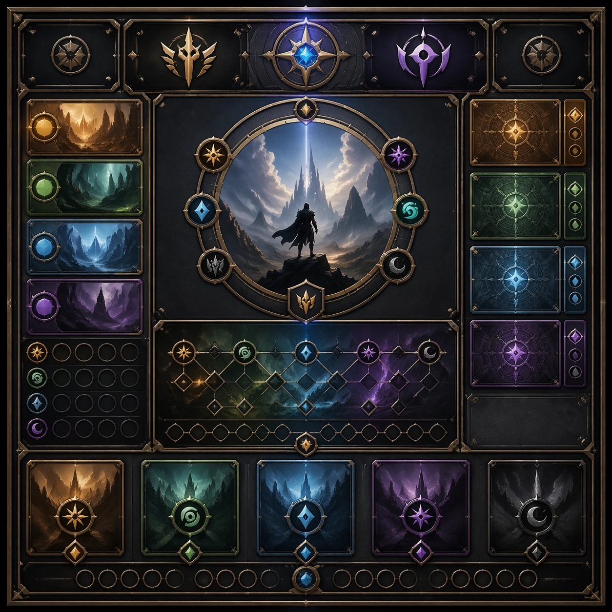
Scene: Create a square reference image for Component Library Premium Showcase. Build a reference anchor establishing the core system with a premium, production-ready finish. Use a polished modular board or campaign surface with clean spacing, premium game-UI finish, and clear focal hierarchy. The composition should feel intentional, clean, and reusable for gallery, research, campaign, or internal handoff contexts. Lighting must support readability first, with the main forms clearly separated from the background and enough breathing room for the system to stay legible at both hero scale and thumbnail scale. Subject: Center a coherent original game-art system built for premium production and marketing surfaces. For this image, focus on reference anchor. Keep the same system logic stable across screenshots, cards, banners, and overview boards. This image is the canonical anchor that later series images must follow. The viewer should immediately understand what role this surface plays inside a cohesive game-production asset pack. Important details: Lock framing, icon grammar, palette blocking, and surface hierarchy so the kit feels production-ready and consistent. Preserve the core silhouette, framing language, and material logic from the reference image while each variation changes function. Keep materials believable, edge hierarchy disciplined, and the visual language consistent with Component Showcase. Use abstract interface blocks or diagram accents when helpful, but avoid any readable language. The final result should feel like a deliberate production asset rather than a random illustration. Use case: Component Library Premium Showcase series study 1/9, designed as reference anchor within a cohesive asset pack. Constraints: No readable text, no watermark, no logos, preserve exact 1:1 aspect ratio, no unrelated objects, no broken visual hierarchy, no malformed anatomy or broken perspective, no random decorative clutter.

Example generated from “Component Library Premium Showcase — Variant One”
GPT Image 2en

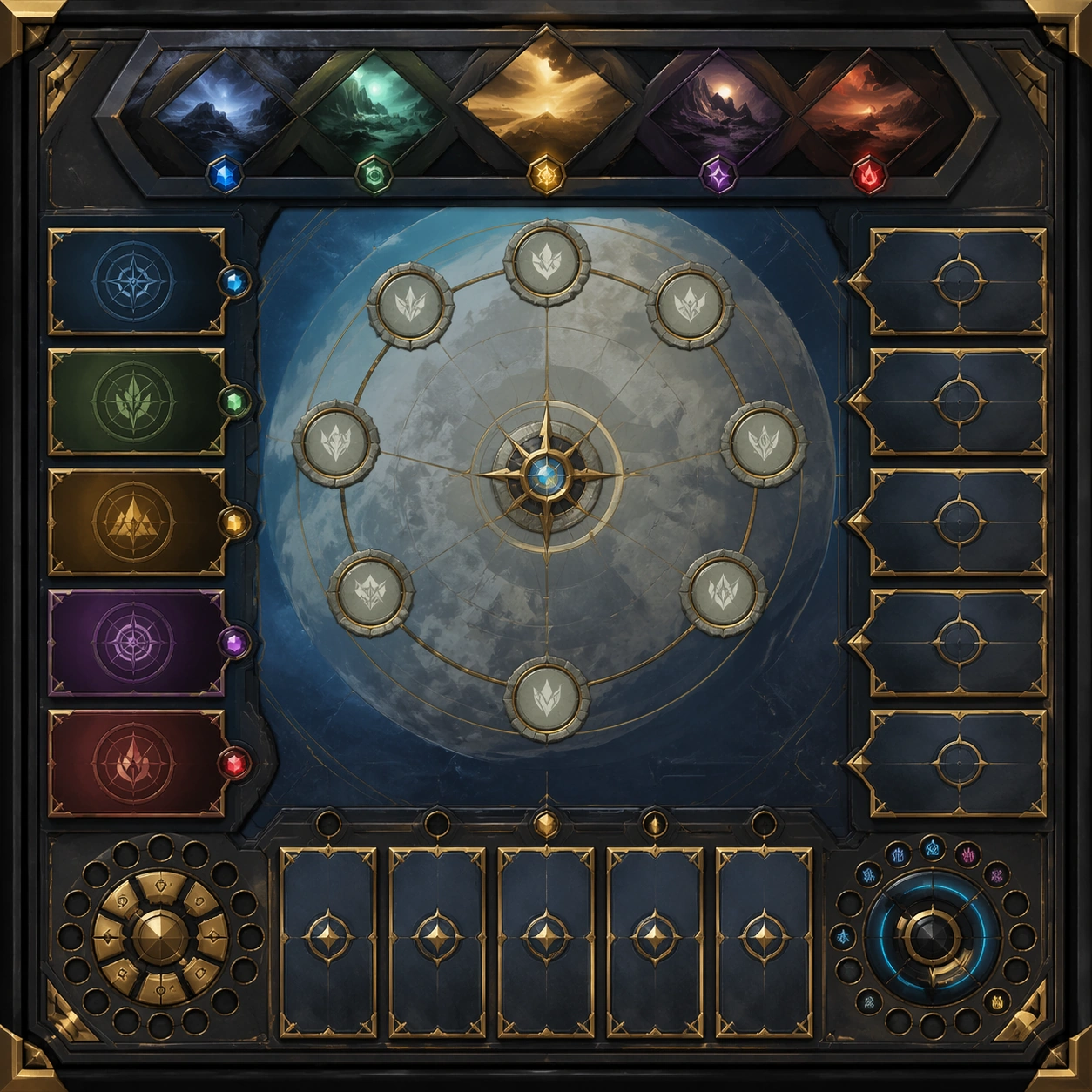
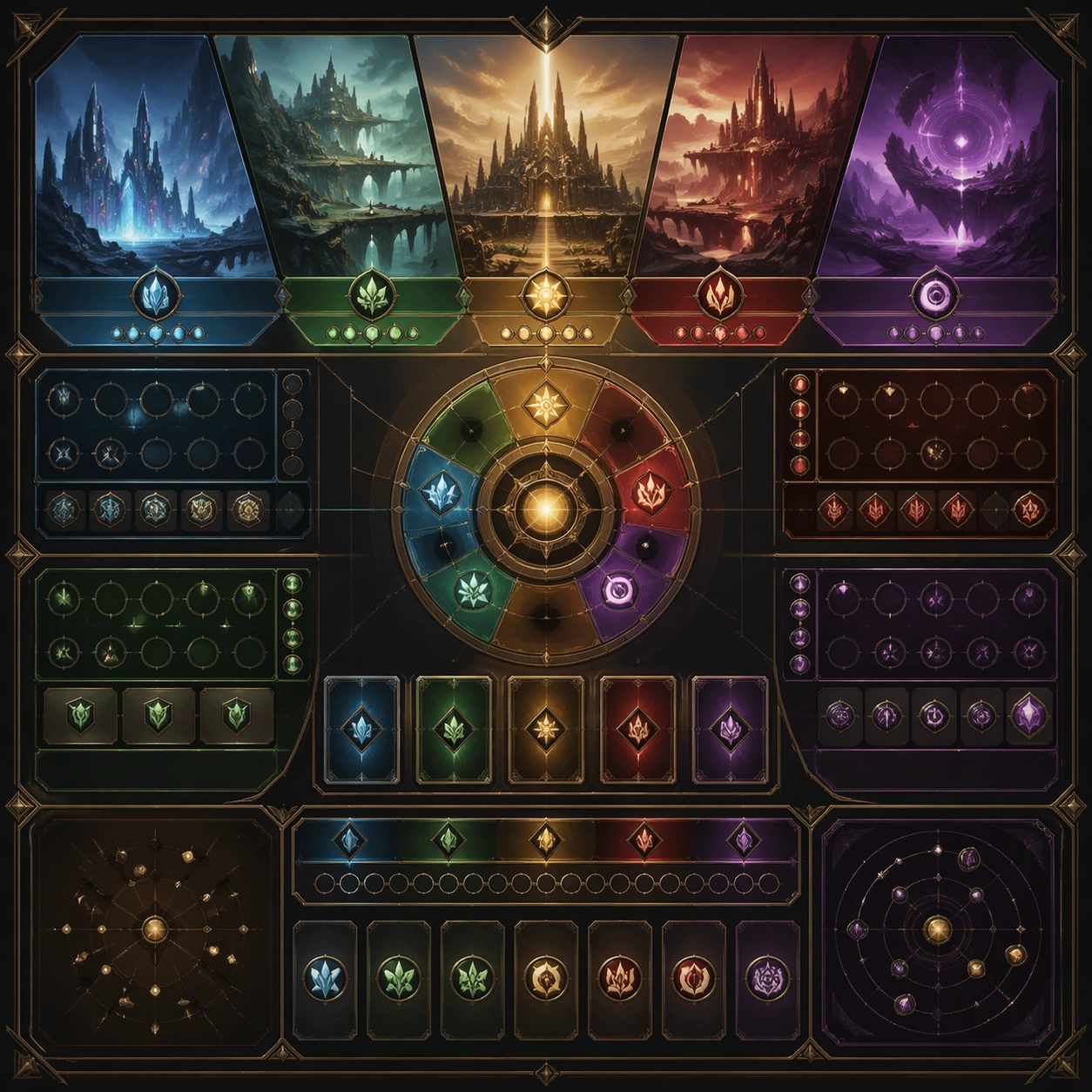
Scene: Create a square dependent image for Component Library Premium Showcase. Build a first controlled variation in the same system with a premium, production-ready finish. Use a polished modular board or campaign surface with clean spacing, premium game-UI finish, and clear focal hierarchy. The composition should feel intentional, clean, and reusable for gallery, research, campaign, or internal handoff contexts. Lighting must support readability first, with the main forms clearly separated from the background and enough breathing room for the system to stay legible at both hero scale and thumbnail scale. Subject: Center a coherent original game-art system built for premium production and marketing surfaces. For this image, focus on the intended support surface. Keep the same system logic stable across screenshots, cards, banners, and overview boards. Preserve exact identity or system logic from the reference image while changing only the intended variation axis. The viewer should immediately understand what role this surface plays inside a cohesive game-production asset pack. Important details: Lock framing, icon grammar, palette blocking, and surface hierarchy so the kit feels production-ready and consistent. Preserve the core silhouette, framing language, and material logic from the reference image while each variation changes function. Keep materials believable, edge hierarchy disciplined, and the visual language consistent with Component Showcase. Use abstract interface blocks or diagram accents when helpful, but avoid any readable language. The final result should feel like a deliberate production asset rather than a random illustration. Use case: Component Library Premium Showcase series study 2/9, designed as variant one within a cohesive asset pack. Constraints: No readable text, no watermark, no logos, preserve exact 1:1 aspect ratio, no unrelated objects, no broken visual hierarchy, no malformed anatomy or broken perspective, no random decorative clutter.

Example generated from “Component Library Premium Showcase — Variant Two”
GPT Image 2en

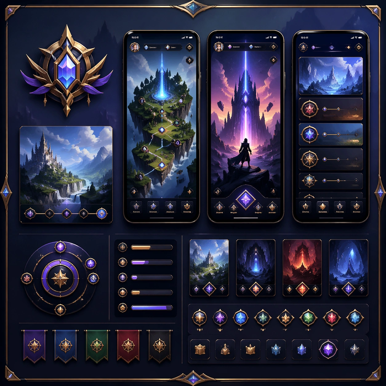
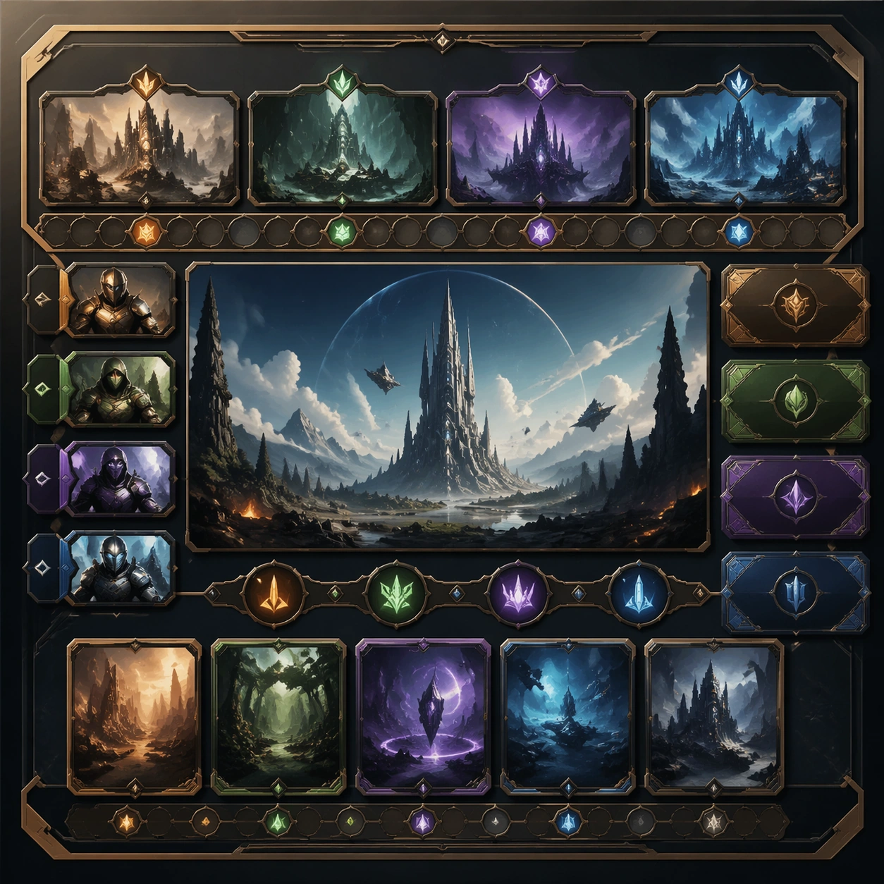
Scene: Create a square dependent image for Component Library Premium Showcase. Build a second controlled variation in the same system with a premium, production-ready finish. Use a polished modular board or campaign surface with clean spacing, premium game-UI finish, and clear focal hierarchy. The composition should feel intentional, clean, and reusable for gallery, research, campaign, or internal handoff contexts. Lighting must support readability first, with the main forms clearly separated from the background and enough breathing room for the system to stay legible at both hero scale and thumbnail scale. Subject: Center a coherent original game-art system built for premium production and marketing surfaces. For this image, focus on the intended support surface. Keep the same system logic stable across screenshots, cards, banners, and overview boards. Preserve exact identity or system logic from the reference image while changing only the intended variation axis. The viewer should immediately understand what role this surface plays inside a cohesive game-production asset pack. Important details: Lock framing, icon grammar, palette blocking, and surface hierarchy so the kit feels production-ready and consistent. Preserve the core silhouette, framing language, and material logic from the reference image while each variation changes function. Keep materials believable, edge hierarchy disciplined, and the visual language consistent with Component Showcase. Use abstract interface blocks or diagram accents when helpful, but avoid any readable language. The final result should feel like a deliberate production asset rather than a random illustration. Use case: Component Library Premium Showcase series study 3/9, designed as variant two within a cohesive asset pack. Constraints: No readable text, no watermark, no logos, preserve exact 1:1 aspect ratio, no unrelated objects, no broken visual hierarchy, no malformed anatomy or broken perspective, no random decorative clutter.

Example generated from “Component Library Premium Showcase — Variant Three”
GPT Image 2en

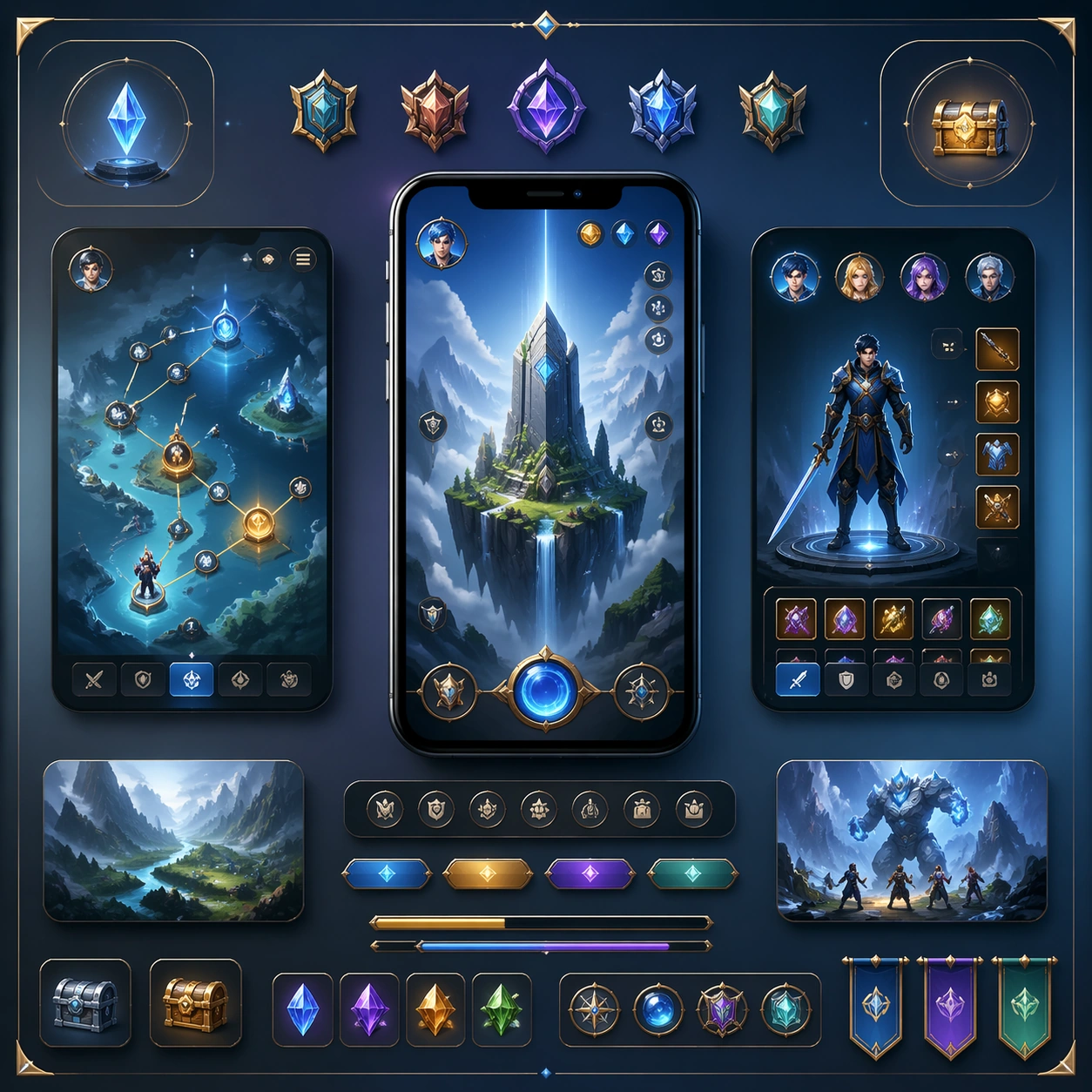
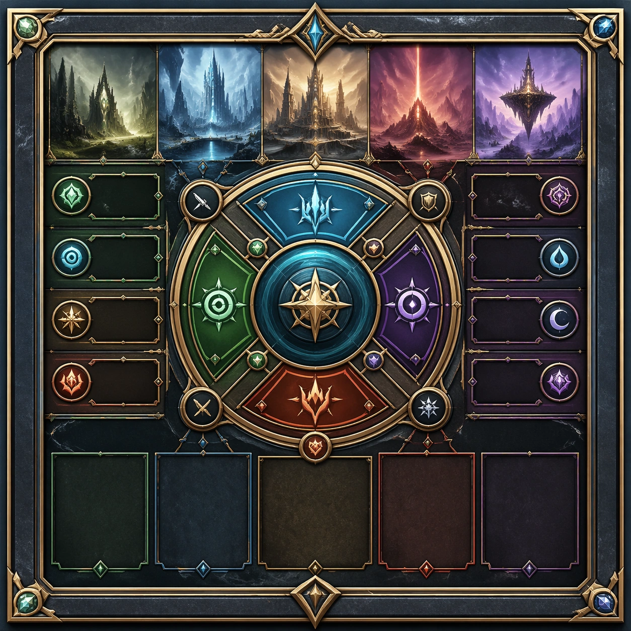
Scene: Create a square dependent image for Component Library Premium Showcase. Build a third controlled variation in the same system with a premium, production-ready finish. Use a polished modular board or campaign surface with clean spacing, premium game-UI finish, and clear focal hierarchy. The composition should feel intentional, clean, and reusable for gallery, research, campaign, or internal handoff contexts. Lighting must support readability first, with the main forms clearly separated from the background and enough breathing room for the system to stay legible at both hero scale and thumbnail scale. Subject: Center a coherent original game-art system built for premium production and marketing surfaces. For this image, focus on the intended support surface. Keep the same system logic stable across screenshots, cards, banners, and overview boards. Preserve exact identity or system logic from the reference image while changing only the intended variation axis. The viewer should immediately understand what role this surface plays inside a cohesive game-production asset pack. Important details: Lock framing, icon grammar, palette blocking, and surface hierarchy so the kit feels production-ready and consistent. Preserve the core silhouette, framing language, and material logic from the reference image while each variation changes function. Keep materials believable, edge hierarchy disciplined, and the visual language consistent with Component Showcase. Use abstract interface blocks or diagram accents when helpful, but avoid any readable language. The final result should feel like a deliberate production asset rather than a random illustration. Use case: Component Library Premium Showcase series study 4/9, designed as variant three within a cohesive asset pack. Constraints: No readable text, no watermark, no logos, preserve exact 1:1 aspect ratio, no unrelated objects, no broken visual hierarchy, no malformed anatomy or broken perspective, no random decorative clutter.

Example generated from “Component Library Premium Showcase — Support One”
GPT Image 2en

Scene: Create a square standalone support image for Component Library Premium Showcase. Build a support-surface study with a clear focal hierarchy and a finished professional surface. Use a polished modular board or campaign surface with clean spacing, premium game-UI finish, and clear focal hierarchy. The frame should feel self-contained and polished, with enough structure to explain the system even without the reference series, yet still obviously belonging to the same theme and production world. Subject: Show a coherent original game-art system built for premium production and marketing surfaces in a way that emphasizes the intended support surface. Keep the same system logic stable across screenshots, cards, banners, and overview boards. Even though this image is independent, the viewer should still recognize the same universe, same commercial logic, and same production intent as the core package. Important details: Lock framing, icon grammar, palette blocking, and surface hierarchy so the kit feels production-ready and consistent. Preserve the broader theme language through color, framing, material choices, and modular composition. Use clean panel rhythm, premium asset presentation, and believable detail density. The image should work equally well as a gallery study, research reference, and mock production deliverable. Use case: Component Library Premium Showcase single study 5/9, exploring support one as a support surface. Constraints: No readable text, no watermark, no logos, preserve exact 1:1 aspect ratio, no unrelated objects, no broken visual hierarchy, no visual noise that obscures the main surface, no accidental brand resemblance.

Example generated from “Component Library Premium Showcase — Support Two”
GPT Image 2en

Scene: Create a square standalone support image for Component Library Premium Showcase. Build a second support-surface study with a clear focal hierarchy and a finished professional surface. Use a polished modular board or campaign surface with clean spacing, premium game-UI finish, and clear focal hierarchy. The frame should feel self-contained and polished, with enough structure to explain the system even without the reference series, yet still obviously belonging to the same theme and production world. Subject: Show a coherent original game-art system built for premium production and marketing surfaces in a way that emphasizes the intended support surface. Keep the same system logic stable across screenshots, cards, banners, and overview boards. Even though this image is independent, the viewer should still recognize the same universe, same commercial logic, and same production intent as the core package. Important details: Lock framing, icon grammar, palette blocking, and surface hierarchy so the kit feels production-ready and consistent. Preserve the broader theme language through color, framing, material choices, and modular composition. Use clean panel rhythm, premium asset presentation, and believable detail density. The image should work equally well as a gallery study, research reference, and mock production deliverable. Use case: Component Library Premium Showcase single study 6/9, exploring support two as a support surface. Constraints: No readable text, no watermark, no logos, preserve exact 1:1 aspect ratio, no unrelated objects, no broken visual hierarchy, no visual noise that obscures the main surface, no accidental brand resemblance.

Example generated from “Component Library Premium Showcase — Support Three”
GPT Image 2en

Scene: Create a square standalone support image for Component Library Premium Showcase. Build a third support-surface study with a clear focal hierarchy and a finished professional surface. Use a polished modular board or campaign surface with clean spacing, premium game-UI finish, and clear focal hierarchy. The frame should feel self-contained and polished, with enough structure to explain the system even without the reference series, yet still obviously belonging to the same theme and production world. Subject: Show a coherent original game-art system built for premium production and marketing surfaces in a way that emphasizes the intended support surface. Keep the same system logic stable across screenshots, cards, banners, and overview boards. Even though this image is independent, the viewer should still recognize the same universe, same commercial logic, and same production intent as the core package. Important details: Lock framing, icon grammar, palette blocking, and surface hierarchy so the kit feels production-ready and consistent. Preserve the broader theme language through color, framing, material choices, and modular composition. Use clean panel rhythm, premium asset presentation, and believable detail density. The image should work equally well as a gallery study, research reference, and mock production deliverable. Use case: Component Library Premium Showcase single study 7/9, exploring support three as a support surface. Constraints: No readable text, no watermark, no logos, preserve exact 1:1 aspect ratio, no unrelated objects, no broken visual hierarchy, no visual noise that obscures the main surface, no accidental brand resemblance.

Example generated from “Component Library Premium Showcase — Support Four”
GPT Image 2en

Scene: Create a square standalone support image for Component Library Premium Showcase. Build a fourth support-surface study with a clear focal hierarchy and a finished professional surface. Use a polished modular board or campaign surface with clean spacing, premium game-UI finish, and clear focal hierarchy. The frame should feel self-contained and polished, with enough structure to explain the system even without the reference series, yet still obviously belonging to the same theme and production world. Subject: Show a coherent original game-art system built for premium production and marketing surfaces in a way that emphasizes the intended support surface. Keep the same system logic stable across screenshots, cards, banners, and overview boards. Even though this image is independent, the viewer should still recognize the same universe, same commercial logic, and same production intent as the core package. Important details: Lock framing, icon grammar, palette blocking, and surface hierarchy so the kit feels production-ready and consistent. Preserve the broader theme language through color, framing, material choices, and modular composition. Use clean panel rhythm, premium asset presentation, and believable detail density. The image should work equally well as a gallery study, research reference, and mock production deliverable. Use case: Component Library Premium Showcase single study 8/9, exploring support four as a support surface. Constraints: No readable text, no watermark, no logos, preserve exact 1:1 aspect ratio, no unrelated objects, no broken visual hierarchy, no visual noise that obscures the main surface, no accidental brand resemblance.

Example generated from “Component Library Premium Showcase — Support Five”
GPT Image 2en

Scene: Create a square standalone support image for Component Library Premium Showcase. Build a fifth support-surface study with a clear focal hierarchy and a finished professional surface. Use a polished modular board or campaign surface with clean spacing, premium game-UI finish, and clear focal hierarchy. The frame should feel self-contained and polished, with enough structure to explain the system even without the reference series, yet still obviously belonging to the same theme and production world. Subject: Show a coherent original game-art system built for premium production and marketing surfaces in a way that emphasizes the intended support surface. Keep the same system logic stable across screenshots, cards, banners, and overview boards. Even though this image is independent, the viewer should still recognize the same universe, same commercial logic, and same production intent as the core package. Important details: Lock framing, icon grammar, palette blocking, and surface hierarchy so the kit feels production-ready and consistent. Preserve the broader theme language through color, framing, material choices, and modular composition. Use clean panel rhythm, premium asset presentation, and believable detail density. The image should work equally well as a gallery study, research reference, and mock production deliverable. Use case: Component Library Premium Showcase single study 9/9, exploring support five as a support surface. Constraints: No readable text, no watermark, no logos, preserve exact 1:1 aspect ratio, no unrelated objects, no broken visual hierarchy, no visual noise that obscures the main surface, no accidental brand resemblance.

Example generated from “Consumer App Polish Flow Screens — Reference Anchor”
GPT Image 2en

Scene: Create a square reference image for Consumer App Polish Flow Screens. Build a reference anchor establishing the core system with a premium, production-ready finish. Use a polished modular board or campaign surface with clean spacing, premium game-UI finish, and clear focal hierarchy. The composition should feel intentional, clean, and reusable for gallery, research, campaign, or internal handoff contexts. Lighting must support readability first, with the main forms clearly separated from the background and enough breathing room for the system to stay legible at both hero scale and thumbnail scale. Subject: Center a coherent original game-art system built for premium production and marketing surfaces. For this image, focus on reference anchor. Keep the same system logic stable across screenshots, cards, banners, and overview boards. This image is the canonical anchor that later series images must follow. The viewer should immediately understand what role this surface plays inside a cohesive game-production asset pack. Important details: Lock framing, icon grammar, palette blocking, and surface hierarchy so the kit feels production-ready and consistent. Preserve the core silhouette, framing language, and material logic from the reference image while each variation changes function. Keep materials believable, edge hierarchy disciplined, and the visual language consistent with App Flow Polish. Use abstract interface blocks or diagram accents when helpful, but avoid any readable language. The final result should feel like a deliberate production asset rather than a random illustration. Use case: Consumer App Polish Flow Screens series study 1/9, designed as reference anchor within a cohesive asset pack. Constraints: No readable text, no watermark, no logos, preserve exact 1:1 aspect ratio, no unrelated objects, no broken visual hierarchy, no malformed anatomy or broken perspective, no random decorative clutter.

Example generated from “Consumer App Polish Flow Screens — Variant One”
GPT Image 2en

Scene: Create a square dependent image for Consumer App Polish Flow Screens. Build a first controlled variation in the same system with a premium, production-ready finish. Use a polished modular board or campaign surface with clean spacing, premium game-UI finish, and clear focal hierarchy. The composition should feel intentional, clean, and reusable for gallery, research, campaign, or internal handoff contexts. Lighting must support readability first, with the main forms clearly separated from the background and enough breathing room for the system to stay legible at both hero scale and thumbnail scale. Subject: Center a coherent original game-art system built for premium production and marketing surfaces. For this image, focus on the intended support surface. Keep the same system logic stable across screenshots, cards, banners, and overview boards. Preserve exact identity or system logic from the reference image while changing only the intended variation axis. The viewer should immediately understand what role this surface plays inside a cohesive game-production asset pack. Important details: Lock framing, icon grammar, palette blocking, and surface hierarchy so the kit feels production-ready and consistent. Preserve the core silhouette, framing language, and material logic from the reference image while each variation changes function. Keep materials believable, edge hierarchy disciplined, and the visual language consistent with App Flow Polish. Use abstract interface blocks or diagram accents when helpful, but avoid any readable language. The final result should feel like a deliberate production asset rather than a random illustration. Use case: Consumer App Polish Flow Screens series study 2/9, designed as variant one within a cohesive asset pack. Constraints: No readable text, no watermark, no logos, preserve exact 1:1 aspect ratio, no unrelated objects, no broken visual hierarchy, no malformed anatomy or broken perspective, no random decorative clutter.

Example generated from “Consumer App Polish Flow Screens — Variant Two”
GPT Image 2en

Scene: Create a square dependent image for Consumer App Polish Flow Screens. Build a second controlled variation in the same system with a premium, production-ready finish. Use a polished modular board or campaign surface with clean spacing, premium game-UI finish, and clear focal hierarchy. The composition should feel intentional, clean, and reusable for gallery, research, campaign, or internal handoff contexts. Lighting must support readability first, with the main forms clearly separated from the background and enough breathing room for the system to stay legible at both hero scale and thumbnail scale. Subject: Center a coherent original game-art system built for premium production and marketing surfaces. For this image, focus on the intended support surface. Keep the same system logic stable across screenshots, cards, banners, and overview boards. Preserve exact identity or system logic from the reference image while changing only the intended variation axis. The viewer should immediately understand what role this surface plays inside a cohesive game-production asset pack. Important details: Lock framing, icon grammar, palette blocking, and surface hierarchy so the kit feels production-ready and consistent. Preserve the core silhouette, framing language, and material logic from the reference image while each variation changes function. Keep materials believable, edge hierarchy disciplined, and the visual language consistent with App Flow Polish. Use abstract interface blocks or diagram accents when helpful, but avoid any readable language. The final result should feel like a deliberate production asset rather than a random illustration. Use case: Consumer App Polish Flow Screens series study 3/9, designed as variant two within a cohesive asset pack. Constraints: No readable text, no watermark, no logos, preserve exact 1:1 aspect ratio, no unrelated objects, no broken visual hierarchy, no malformed anatomy or broken perspective, no random decorative clutter.

Example generated from “Consumer App Polish Flow Screens — Variant Three”
GPT Image 2en

Scene: Create a square dependent image for Consumer App Polish Flow Screens. Build a third controlled variation in the same system with a premium, production-ready finish. Use a polished modular board or campaign surface with clean spacing, premium game-UI finish, and clear focal hierarchy. The composition should feel intentional, clean, and reusable for gallery, research, campaign, or internal handoff contexts. Lighting must support readability first, with the main forms clearly separated from the background and enough breathing room for the system to stay legible at both hero scale and thumbnail scale. Subject: Center a coherent original game-art system built for premium production and marketing surfaces. For this image, focus on the intended support surface. Keep the same system logic stable across screenshots, cards, banners, and overview boards. Preserve exact identity or system logic from the reference image while changing only the intended variation axis. The viewer should immediately understand what role this surface plays inside a cohesive game-production asset pack. Important details: Lock framing, icon grammar, palette blocking, and surface hierarchy so the kit feels production-ready and consistent. Preserve the core silhouette, framing language, and material logic from the reference image while each variation changes function. Keep materials believable, edge hierarchy disciplined, and the visual language consistent with App Flow Polish. Use abstract interface blocks or diagram accents when helpful, but avoid any readable language. The final result should feel like a deliberate production asset rather than a random illustration. Use case: Consumer App Polish Flow Screens series study 4/9, designed as variant three within a cohesive asset pack. Constraints: No readable text, no watermark, no logos, preserve exact 1:1 aspect ratio, no unrelated objects, no broken visual hierarchy, no malformed anatomy or broken perspective, no random decorative clutter.

Example generated from “Consumer App Polish Flow Screens — Support One”
GPT Image 2en

Scene: Create a square standalone support image for Consumer App Polish Flow Screens. Build a support-surface study with a clear focal hierarchy and a finished professional surface. Use a polished modular board or campaign surface with clean spacing, premium game-UI finish, and clear focal hierarchy. The frame should feel self-contained and polished, with enough structure to explain the system even without the reference series, yet still obviously belonging to the same theme and production world. Subject: Show a coherent original game-art system built for premium production and marketing surfaces in a way that emphasizes the intended support surface. Keep the same system logic stable across screenshots, cards, banners, and overview boards. Even though this image is independent, the viewer should still recognize the same universe, same commercial logic, and same production intent as the core package. Important details: Lock framing, icon grammar, palette blocking, and surface hierarchy so the kit feels production-ready and consistent. Preserve the broader theme language through color, framing, material choices, and modular composition. Use clean panel rhythm, premium asset presentation, and believable detail density. The image should work equally well as a gallery study, research reference, and mock production deliverable. Use case: Consumer App Polish Flow Screens single study 5/9, exploring support one as a support surface. Constraints: No readable text, no watermark, no logos, preserve exact 1:1 aspect ratio, no unrelated objects, no broken visual hierarchy, no visual noise that obscures the main surface, no accidental brand resemblance.

Example generated from “Consumer App Polish Flow Screens — Support Two”
GPT Image 2en

Scene: Create a square standalone support image for Consumer App Polish Flow Screens. Build a second support-surface study with a clear focal hierarchy and a finished professional surface. Use a polished modular board or campaign surface with clean spacing, premium game-UI finish, and clear focal hierarchy. The frame should feel self-contained and polished, with enough structure to explain the system even without the reference series, yet still obviously belonging to the same theme and production world. Subject: Show a coherent original game-art system built for premium production and marketing surfaces in a way that emphasizes the intended support surface. Keep the same system logic stable across screenshots, cards, banners, and overview boards. Even though this image is independent, the viewer should still recognize the same universe, same commercial logic, and same production intent as the core package. Important details: Lock framing, icon grammar, palette blocking, and surface hierarchy so the kit feels production-ready and consistent. Preserve the broader theme language through color, framing, material choices, and modular composition. Use clean panel rhythm, premium asset presentation, and believable detail density. The image should work equally well as a gallery study, research reference, and mock production deliverable. Use case: Consumer App Polish Flow Screens single study 6/9, exploring support two as a support surface. Constraints: No readable text, no watermark, no logos, preserve exact 1:1 aspect ratio, no unrelated objects, no broken visual hierarchy, no visual noise that obscures the main surface, no accidental brand resemblance.

Example generated from “Consumer App Polish Flow Screens — Support Three”
GPT Image 2en

Scene: Create a square standalone support image for Consumer App Polish Flow Screens. Build a third support-surface study with a clear focal hierarchy and a finished professional surface. Use a polished modular board or campaign surface with clean spacing, premium game-UI finish, and clear focal hierarchy. The frame should feel self-contained and polished, with enough structure to explain the system even without the reference series, yet still obviously belonging to the same theme and production world. Subject: Show a coherent original game-art system built for premium production and marketing surfaces in a way that emphasizes the intended support surface. Keep the same system logic stable across screenshots, cards, banners, and overview boards. Even though this image is independent, the viewer should still recognize the same universe, same commercial logic, and same production intent as the core package. Important details: Lock framing, icon grammar, palette blocking, and surface hierarchy so the kit feels production-ready and consistent. Preserve the broader theme language through color, framing, material choices, and modular composition. Use clean panel rhythm, premium asset presentation, and believable detail density. The image should work equally well as a gallery study, research reference, and mock production deliverable. Use case: Consumer App Polish Flow Screens single study 7/9, exploring support three as a support surface. Constraints: No readable text, no watermark, no logos, preserve exact 1:1 aspect ratio, no unrelated objects, no broken visual hierarchy, no visual noise that obscures the main surface, no accidental brand resemblance.

Example generated from “Consumer App Polish Flow Screens — Support Four”
GPT Image 2en

Scene: Create a square standalone support image for Consumer App Polish Flow Screens. Build a fourth support-surface study with a clear focal hierarchy and a finished professional surface. Use a polished modular board or campaign surface with clean spacing, premium game-UI finish, and clear focal hierarchy. The frame should feel self-contained and polished, with enough structure to explain the system even without the reference series, yet still obviously belonging to the same theme and production world. Subject: Show a coherent original game-art system built for premium production and marketing surfaces in a way that emphasizes the intended support surface. Keep the same system logic stable across screenshots, cards, banners, and overview boards. Even though this image is independent, the viewer should still recognize the same universe, same commercial logic, and same production intent as the core package. Important details: Lock framing, icon grammar, palette blocking, and surface hierarchy so the kit feels production-ready and consistent. Preserve the broader theme language through color, framing, material choices, and modular composition. Use clean panel rhythm, premium asset presentation, and believable detail density. The image should work equally well as a gallery study, research reference, and mock production deliverable. Use case: Consumer App Polish Flow Screens single study 8/9, exploring support four as a support surface. Constraints: No readable text, no watermark, no logos, preserve exact 1:1 aspect ratio, no unrelated objects, no broken visual hierarchy, no visual noise that obscures the main surface, no accidental brand resemblance.

Example generated from “Consumer App Polish Flow Screens — Support Five”
GPT Image 2en

Scene: Create a square standalone support image for Consumer App Polish Flow Screens. Build a fifth support-surface study with a clear focal hierarchy and a finished professional surface. Use a polished modular board or campaign surface with clean spacing, premium game-UI finish, and clear focal hierarchy. The frame should feel self-contained and polished, with enough structure to explain the system even without the reference series, yet still obviously belonging to the same theme and production world. Subject: Show a coherent original game-art system built for premium production and marketing surfaces in a way that emphasizes the intended support surface. Keep the same system logic stable across screenshots, cards, banners, and overview boards. Even though this image is independent, the viewer should still recognize the same universe, same commercial logic, and same production intent as the core package. Important details: Lock framing, icon grammar, palette blocking, and surface hierarchy so the kit feels production-ready and consistent. Preserve the broader theme language through color, framing, material choices, and modular composition. Use clean panel rhythm, premium asset presentation, and believable detail density. The image should work equally well as a gallery study, research reference, and mock production deliverable. Use case: Consumer App Polish Flow Screens single study 9/9, exploring support five as a support surface. Constraints: No readable text, no watermark, no logos, preserve exact 1:1 aspect ratio, no unrelated objects, no broken visual hierarchy, no visual noise that obscures the main surface, no accidental brand resemblance.

Example generated from “Convention Booth Licensing Kit — Reference Anchor”
GPT Image 2en

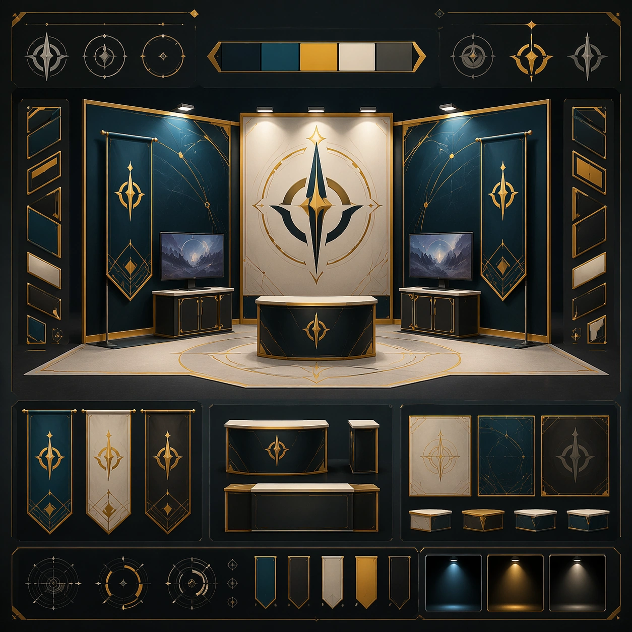
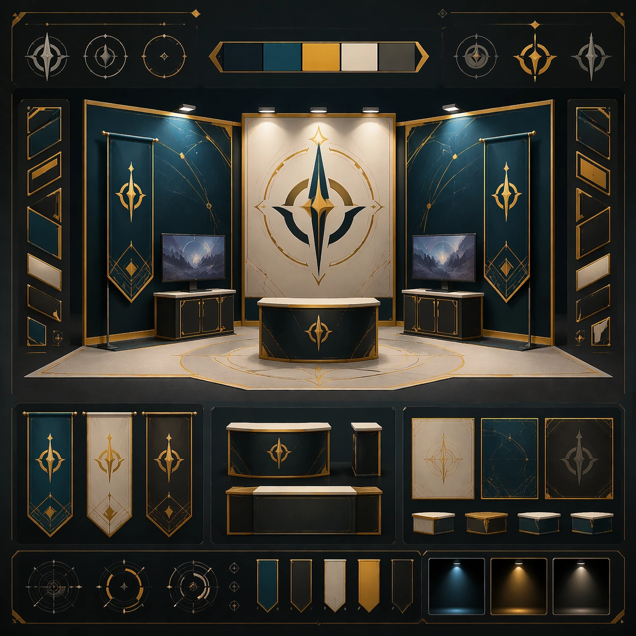
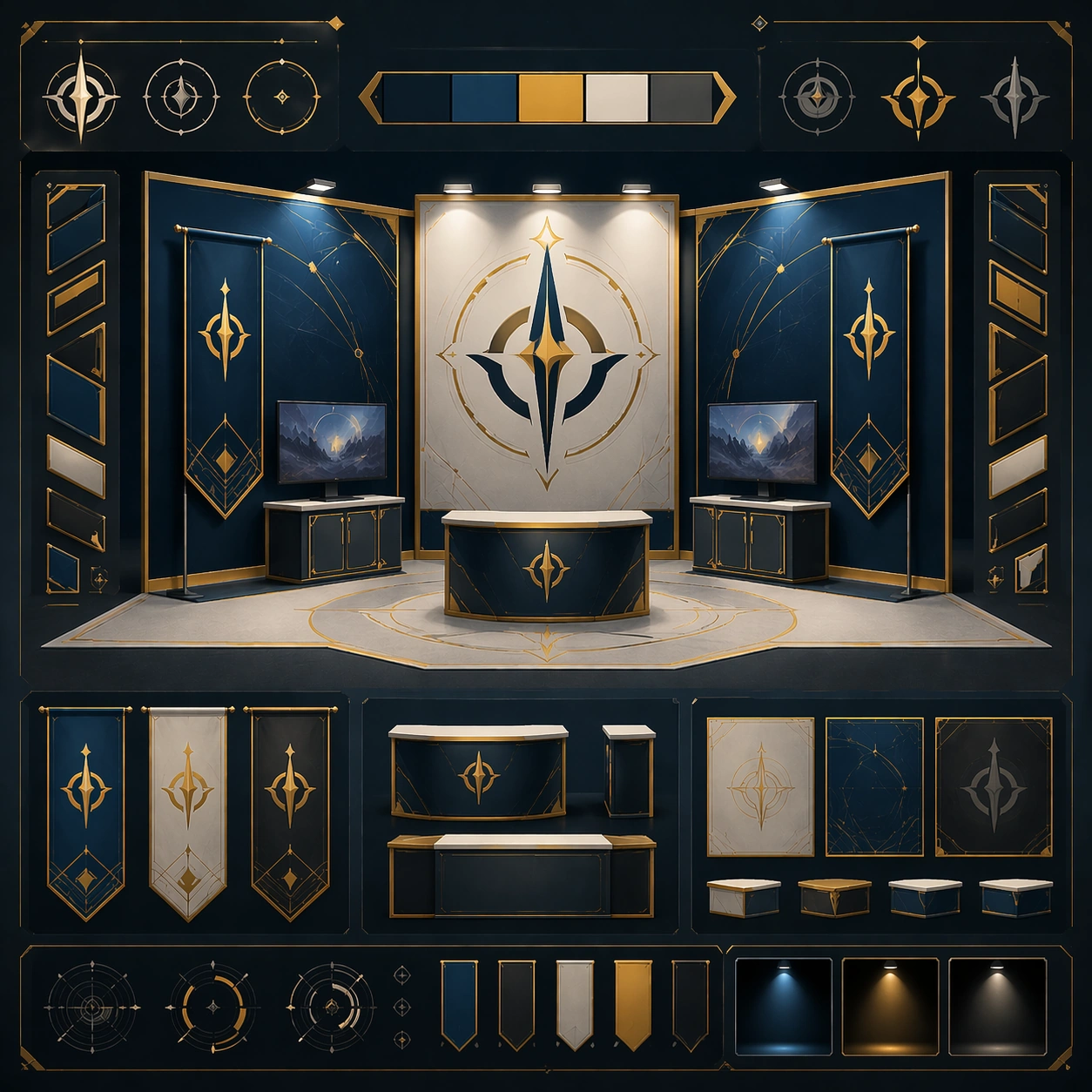
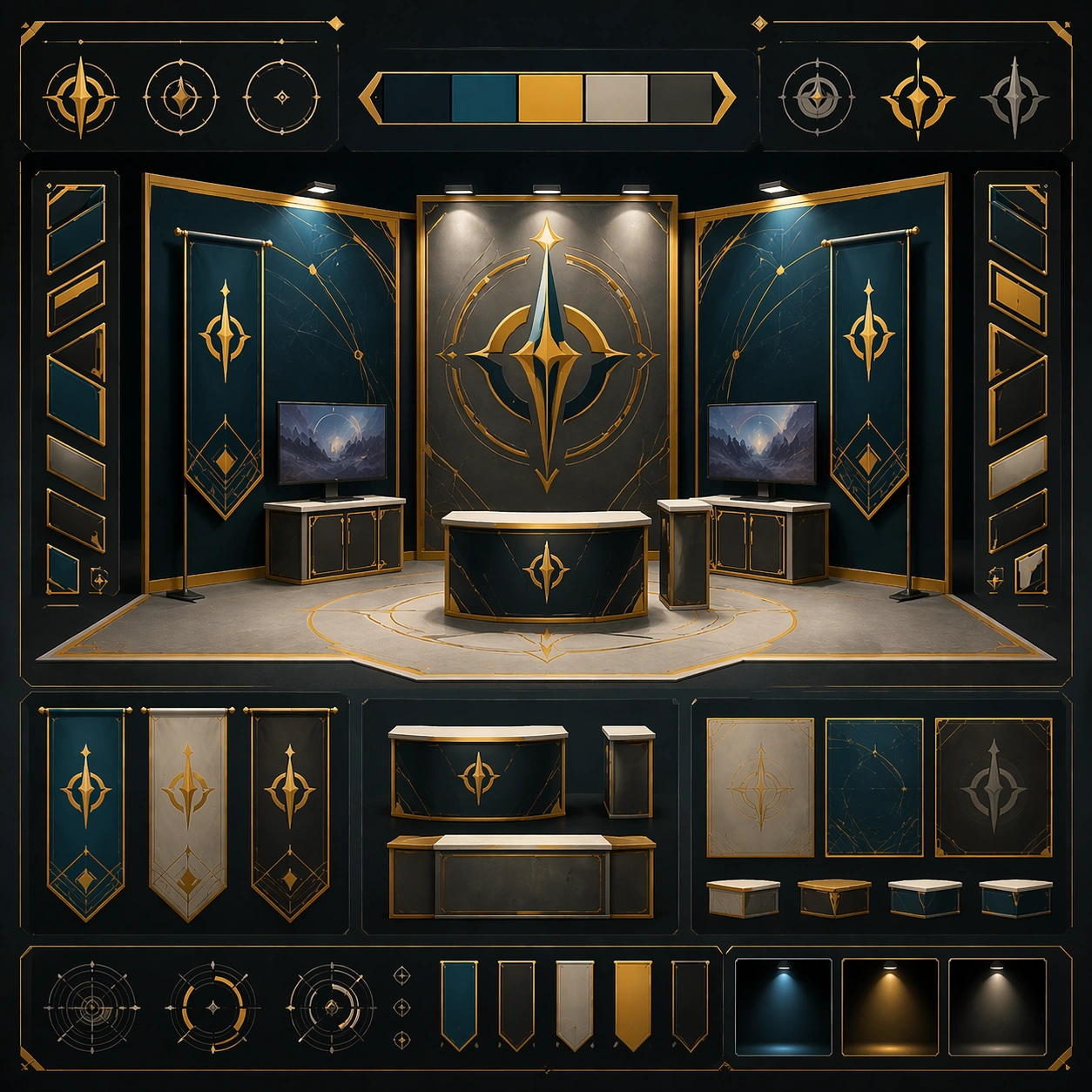
Scene: Create a square reference image for Convention Booth Licensing Kit. Build a reference anchor establishing the core system with a premium, production-ready finish. Use a polished modular board or campaign surface with clean spacing, premium game-UI finish, and clear focal hierarchy. The composition should feel intentional, clean, and reusable for gallery, research, campaign, or internal handoff contexts. Lighting must support readability first, with the main forms clearly separated from the background and enough breathing room for the system to stay legible at both hero scale and thumbnail scale. Subject: Center a coherent original game-art system built for premium production and marketing surfaces. For this image, focus on reference anchor. Keep the same system logic stable across screenshots, cards, banners, and overview boards. This image is the canonical anchor that later series images must follow. The viewer should immediately understand what role this surface plays inside a cohesive game-production asset pack. Important details: Lock framing, icon grammar, palette blocking, and surface hierarchy so the kit feels production-ready and consistent. Preserve the core silhouette, framing language, and material logic from the reference image while each variation changes function. Keep materials believable, edge hierarchy disciplined, and the visual language consistent with Booth Kit. Use abstract interface blocks or diagram accents when helpful, but avoid any readable language. The final result should feel like a deliberate production asset rather than a random illustration. Use case: Convention Booth Licensing Kit series study 1/9, designed as reference anchor within a cohesive asset pack. Constraints: No readable text, no watermark, no logos, preserve exact 1:1 aspect ratio, no unrelated objects, no broken visual hierarchy, no malformed anatomy or broken perspective, no random decorative clutter.

Example generated from “Convention Booth Licensing Kit — Variant One”
GPT Image 2en

Scene: Create a square dependent image for Convention Booth Licensing Kit. Build a first controlled variation in the same system with a premium, production-ready finish. Use a polished modular board or campaign surface with clean spacing, premium game-UI finish, and clear focal hierarchy. The composition should feel intentional, clean, and reusable for gallery, research, campaign, or internal handoff contexts. Lighting must support readability first, with the main forms clearly separated from the background and enough breathing room for the system to stay legible at both hero scale and thumbnail scale. Subject: Center a coherent original game-art system built for premium production and marketing surfaces. For this image, focus on the intended support surface. Keep the same system logic stable across screenshots, cards, banners, and overview boards. Preserve exact identity or system logic from the reference image while changing only the intended variation axis. The viewer should immediately understand what role this surface plays inside a cohesive game-production asset pack. Important details: Lock framing, icon grammar, palette blocking, and surface hierarchy so the kit feels production-ready and consistent. Preserve the core silhouette, framing language, and material logic from the reference image while each variation changes function. Keep materials believable, edge hierarchy disciplined, and the visual language consistent with Booth Kit. Use abstract interface blocks or diagram accents when helpful, but avoid any readable language. The final result should feel like a deliberate production asset rather than a random illustration. Use case: Convention Booth Licensing Kit series study 2/9, designed as variant one within a cohesive asset pack. Constraints: No readable text, no watermark, no logos, preserve exact 1:1 aspect ratio, no unrelated objects, no broken visual hierarchy, no malformed anatomy or broken perspective, no random decorative clutter.

Example generated from “Convention Booth Licensing Kit — Variant Two”
GPT Image 2en

Scene: Create a square dependent image for Convention Booth Licensing Kit. Build a second controlled variation in the same system with a premium, production-ready finish. Use a polished modular board or campaign surface with clean spacing, premium game-UI finish, and clear focal hierarchy. The composition should feel intentional, clean, and reusable for gallery, research, campaign, or internal handoff contexts. Lighting must support readability first, with the main forms clearly separated from the background and enough breathing room for the system to stay legible at both hero scale and thumbnail scale. Subject: Center a coherent original game-art system built for premium production and marketing surfaces. For this image, focus on the intended support surface. Keep the same system logic stable across screenshots, cards, banners, and overview boards. Preserve exact identity or system logic from the reference image while changing only the intended variation axis. The viewer should immediately understand what role this surface plays inside a cohesive game-production asset pack. Important details: Lock framing, icon grammar, palette blocking, and surface hierarchy so the kit feels production-ready and consistent. Preserve the core silhouette, framing language, and material logic from the reference image while each variation changes function. Keep materials believable, edge hierarchy disciplined, and the visual language consistent with Booth Kit. Use abstract interface blocks or diagram accents when helpful, but avoid any readable language. The final result should feel like a deliberate production asset rather than a random illustration. Use case: Convention Booth Licensing Kit series study 3/9, designed as variant two within a cohesive asset pack. Constraints: No readable text, no watermark, no logos, preserve exact 1:1 aspect ratio, no unrelated objects, no broken visual hierarchy, no malformed anatomy or broken perspective, no random decorative clutter.

Example generated from “Convention Booth Licensing Kit — Variant Three”
GPT Image 2en

Scene: Create a square dependent image for Convention Booth Licensing Kit. Build a third controlled variation in the same system with a premium, production-ready finish. Use a polished modular board or campaign surface with clean spacing, premium game-UI finish, and clear focal hierarchy. The composition should feel intentional, clean, and reusable for gallery, research, campaign, or internal handoff contexts. Lighting must support readability first, with the main forms clearly separated from the background and enough breathing room for the system to stay legible at both hero scale and thumbnail scale. Subject: Center a coherent original game-art system built for premium production and marketing surfaces. For this image, focus on the intended support surface. Keep the same system logic stable across screenshots, cards, banners, and overview boards. Preserve exact identity or system logic from the reference image while changing only the intended variation axis. The viewer should immediately understand what role this surface plays inside a cohesive game-production asset pack. Important details: Lock framing, icon grammar, palette blocking, and surface hierarchy so the kit feels production-ready and consistent. Preserve the core silhouette, framing language, and material logic from the reference image while each variation changes function. Keep materials believable, edge hierarchy disciplined, and the visual language consistent with Booth Kit. Use abstract interface blocks or diagram accents when helpful, but avoid any readable language. The final result should feel like a deliberate production asset rather than a random illustration. Use case: Convention Booth Licensing Kit series study 4/9, designed as variant three within a cohesive asset pack. Constraints: No readable text, no watermark, no logos, preserve exact 1:1 aspect ratio, no unrelated objects, no broken visual hierarchy, no malformed anatomy or broken perspective, no random decorative clutter.

Example generated from “Convention Booth Licensing Kit — Support One”
GPT Image 2en

Scene: Create a square standalone support image for Convention Booth Licensing Kit. Build a support-surface study with a clear focal hierarchy and a finished professional surface. Use a polished modular board or campaign surface with clean spacing, premium game-UI finish, and clear focal hierarchy. The frame should feel self-contained and polished, with enough structure to explain the system even without the reference series, yet still obviously belonging to the same theme and production world. Subject: Show a coherent original game-art system built for premium production and marketing surfaces in a way that emphasizes the intended support surface. Keep the same system logic stable across screenshots, cards, banners, and overview boards. Even though this image is independent, the viewer should still recognize the same universe, same commercial logic, and same production intent as the core package. Important details: Lock framing, icon grammar, palette blocking, and surface hierarchy so the kit feels production-ready and consistent. Preserve the broader theme language through color, framing, material choices, and modular composition. Use clean panel rhythm, premium asset presentation, and believable detail density. The image should work equally well as a gallery study, research reference, and mock production deliverable. Use case: Convention Booth Licensing Kit single study 5/9, exploring support one as a support surface. Constraints: No readable text, no watermark, no logos, preserve exact 1:1 aspect ratio, no unrelated objects, no broken visual hierarchy, no visual noise that obscures the main surface, no accidental brand resemblance.

Example generated from “Convention Booth Licensing Kit — Support Two”
GPT Image 2en

Scene: Create a square standalone support image for Convention Booth Licensing Kit. Build a second support-surface study with a clear focal hierarchy and a finished professional surface. Use a polished modular board or campaign surface with clean spacing, premium game-UI finish, and clear focal hierarchy. The frame should feel self-contained and polished, with enough structure to explain the system even without the reference series, yet still obviously belonging to the same theme and production world. Subject: Show a coherent original game-art system built for premium production and marketing surfaces in a way that emphasizes the intended support surface. Keep the same system logic stable across screenshots, cards, banners, and overview boards. Even though this image is independent, the viewer should still recognize the same universe, same commercial logic, and same production intent as the core package. Important details: Lock framing, icon grammar, palette blocking, and surface hierarchy so the kit feels production-ready and consistent. Preserve the broader theme language through color, framing, material choices, and modular composition. Use clean panel rhythm, premium asset presentation, and believable detail density. The image should work equally well as a gallery study, research reference, and mock production deliverable. Use case: Convention Booth Licensing Kit single study 6/9, exploring support two as a support surface. Constraints: No readable text, no watermark, no logos, preserve exact 1:1 aspect ratio, no unrelated objects, no broken visual hierarchy, no visual noise that obscures the main surface, no accidental brand resemblance.

Example generated from “Convention Booth Licensing Kit — Support Three”
GPT Image 2en

Scene: Create a square standalone support image for Convention Booth Licensing Kit. Build a third support-surface study with a clear focal hierarchy and a finished professional surface. Use a polished modular board or campaign surface with clean spacing, premium game-UI finish, and clear focal hierarchy. The frame should feel self-contained and polished, with enough structure to explain the system even without the reference series, yet still obviously belonging to the same theme and production world. Subject: Show a coherent original game-art system built for premium production and marketing surfaces in a way that emphasizes the intended support surface. Keep the same system logic stable across screenshots, cards, banners, and overview boards. Even though this image is independent, the viewer should still recognize the same universe, same commercial logic, and same production intent as the core package. Important details: Lock framing, icon grammar, palette blocking, and surface hierarchy so the kit feels production-ready and consistent. Preserve the broader theme language through color, framing, material choices, and modular composition. Use clean panel rhythm, premium asset presentation, and believable detail density. The image should work equally well as a gallery study, research reference, and mock production deliverable. Use case: Convention Booth Licensing Kit single study 7/9, exploring support three as a support surface. Constraints: No readable text, no watermark, no logos, preserve exact 1:1 aspect ratio, no unrelated objects, no broken visual hierarchy, no visual noise that obscures the main surface, no accidental brand resemblance.

Example generated from “Convention Booth Licensing Kit — Support Four”
GPT Image 2en

Scene: Create a square standalone support image for Convention Booth Licensing Kit. Build a fourth support-surface study with a clear focal hierarchy and a finished professional surface. Use a polished modular board or campaign surface with clean spacing, premium game-UI finish, and clear focal hierarchy. The frame should feel self-contained and polished, with enough structure to explain the system even without the reference series, yet still obviously belonging to the same theme and production world. Subject: Show a coherent original game-art system built for premium production and marketing surfaces in a way that emphasizes the intended support surface. Keep the same system logic stable across screenshots, cards, banners, and overview boards. Even though this image is independent, the viewer should still recognize the same universe, same commercial logic, and same production intent as the core package. Important details: Lock framing, icon grammar, palette blocking, and surface hierarchy so the kit feels production-ready and consistent. Preserve the broader theme language through color, framing, material choices, and modular composition. Use clean panel rhythm, premium asset presentation, and believable detail density. The image should work equally well as a gallery study, research reference, and mock production deliverable. Use case: Convention Booth Licensing Kit single study 8/9, exploring support four as a support surface. Constraints: No readable text, no watermark, no logos, preserve exact 1:1 aspect ratio, no unrelated objects, no broken visual hierarchy, no visual noise that obscures the main surface, no accidental brand resemblance.

Example generated from “Convention Booth Licensing Kit — Support Five”
GPT Image 2en

Scene: Create a square standalone support image for Convention Booth Licensing Kit. Build a fifth support-surface study with a clear focal hierarchy and a finished professional surface. Use a polished modular board or campaign surface with clean spacing, premium game-UI finish, and clear focal hierarchy. The frame should feel self-contained and polished, with enough structure to explain the system even without the reference series, yet still obviously belonging to the same theme and production world. Subject: Show a coherent original game-art system built for premium production and marketing surfaces in a way that emphasizes the intended support surface. Keep the same system logic stable across screenshots, cards, banners, and overview boards. Even though this image is independent, the viewer should still recognize the same universe, same commercial logic, and same production intent as the core package. Important details: Lock framing, icon grammar, palette blocking, and surface hierarchy so the kit feels production-ready and consistent. Preserve the broader theme language through color, framing, material choices, and modular composition. Use clean panel rhythm, premium asset presentation, and believable detail density. The image should work equally well as a gallery study, research reference, and mock production deliverable. Use case: Convention Booth Licensing Kit single study 9/9, exploring support five as a support surface. Constraints: No readable text, no watermark, no logos, preserve exact 1:1 aspect ratio, no unrelated objects, no broken visual hierarchy, no visual noise that obscures the main surface, no accidental brand resemblance.

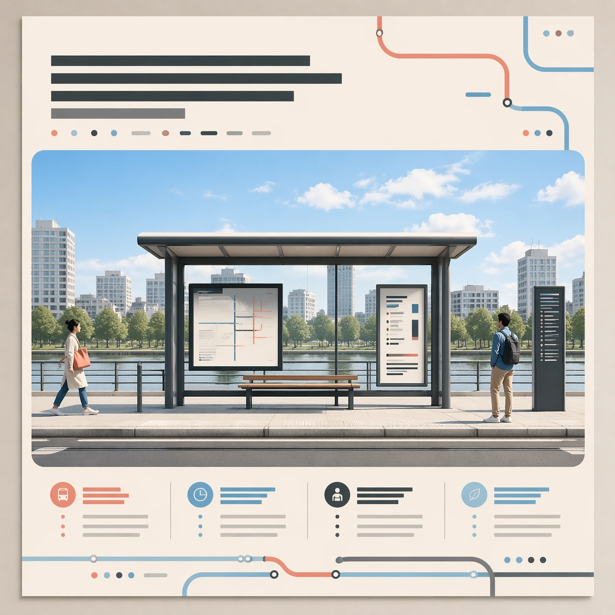
Example generated from “Conversational Editing Workflow — Base Transit Poster”
GPT Image 2en

Scene: Square crop of a polished public-transit campaign poster displayed flat on a design review wall, bright neutral studio lighting, crisp editorial realism, clean margins, and a calm modern palette of cream, graphite, sky blue, and coral accents. The poster looks like a finished layout, not a software screen. The camera is straight-on with no perspective distortion, showing the entire poster and a thin surrounding wall edge. Subject: A central illustrated tram shelter at midday, two small pedestrians at opposite sides, one abstract headline block near the top made only of unreadable graphic strokes, a large image panel in the middle, and a balanced row of abstract information blocks near the bottom. The structure must be clear enough that later edits can preserve its identity: same frame, same shelter, same right-side figure, same decorative route shapes, and same overall spacing. Important details: This is the root reference for a conversational editing chain. Build deliberate edit handles into the image: a removable left pedestrian, a sky that can shift from midday to dusk, a heading area that can become larger, and a palette that can cool down. All text-like elements must be abstract marks, never readable words or letters. Use case: Conversational Editing Workflow series study 1/8, establishing the base image for later semantic edits without masks. Constraints: No readable text, no watermark, no logos, preserve exact 1:1 aspect ratio, no real transit brand, no UI overlay, no crop marks, no handwritten notes, no torn paper, no cluttered review board.

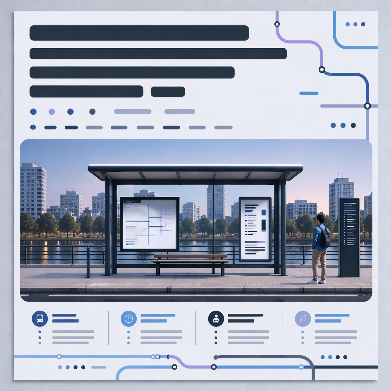
Example generated from “Conversational Editing Workflow — Larger Cooler Heading”
GPT Image 2en

Scene: Square crop of the same transit campaign poster on the same neutral review wall, using the reference as the visual source. The image should look like the next conversational edit after the dusk and removal pass: still a flat poster, still straight-on, still carefully designed, but with a more prominent top heading zone and a cooler design temperature. Subject: Keep the dusk tram shelter scene, repaired empty left side, right pedestrian, central image panel, bottom abstract information blocks, margins, and poster identity from the reference. Enlarge the top abstract heading block so it occupies more vertical space and has stronger visual priority, while remaining unreadable and graphic. Shift the overall palette cooler: more blue, cyan, pale lavender, and graphite; less coral warmth. Preserve the warm horizon glow only as a subtle trace inside the illustrated scene. Important details: This edit tests whether a model can revise layout hierarchy without rebuilding the whole poster. The heading area should become bigger through careful reflow: nearby route shapes and abstract blocks adjust around it, but the composition stays balanced and recognizable. Avoid literal letters. The abstract heading can be thick bars, modular glyph-like marks, and poster-design shapes that imply larger text without being readable. Use case: Conversational Editing Workflow series study 3/8, showing a follow-up request that enlarges a nonreadable heading and cools the color system while preserving previous edits. Constraints: No readable text, no watermark, no logos, preserve exact 1:1 aspect ratio, no return of the removed left person, no hot orange redesign, no new poster topic, no visible editing handles, no distorted frame, no real transit map.

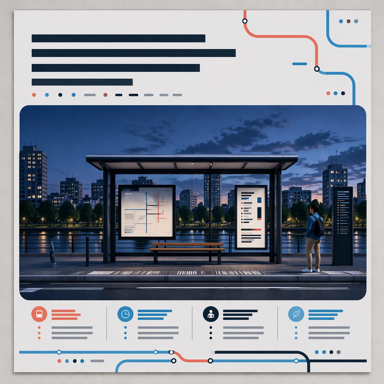
Example generated from “Conversational Editing Workflow — Final Balanced Campaign”
GPT Image 2en

Scene: Square crop of the final version of the same transit campaign poster on the same review wall, straight-on and evenly lit. It should read as the polished result after several conversational edit turns, with a clean professional finish and no visible trace of the editing process. Subject: Preserve the original poster identity from the reference: central tram shelter, repaired empty left side, retained right pedestrian, abstract enlarged heading area, dusk environment, lower information block rhythm, route motifs, and square campaign framing. Make the final version more balanced and presentation-ready: refine spacing, clarify the hierarchy, tune contrast, and make the cool palette elegant rather than flat. The poster should look as if a designer accepted the conversational edits and produced a finished campaign proof. Important details: This image must demonstrate cumulative instruction following. The earlier requested changes should all remain visible: dusk atmosphere, no left pedestrian, larger abstract heading, cooler overall color, and preserved base composition. Rebalance only through subtle graphic design decisions: cleaner negative space, sharper icon-like abstract route marks, smoother illustration edges, and better tonal separation. Do not invent a new poster, change the topic, or add literal explanations. Use case: Conversational Editing Workflow series study 4/8, final cumulative edit proving that multiple conversational revisions can be resolved into one coherent image. Constraints: No readable text, no watermark, no logos, preserve exact 1:1 aspect ratio, no left figure returning, no warm midday lighting, no software UI, no before-after split, no annotation labels, no brand identity, no chaotic poster elements.

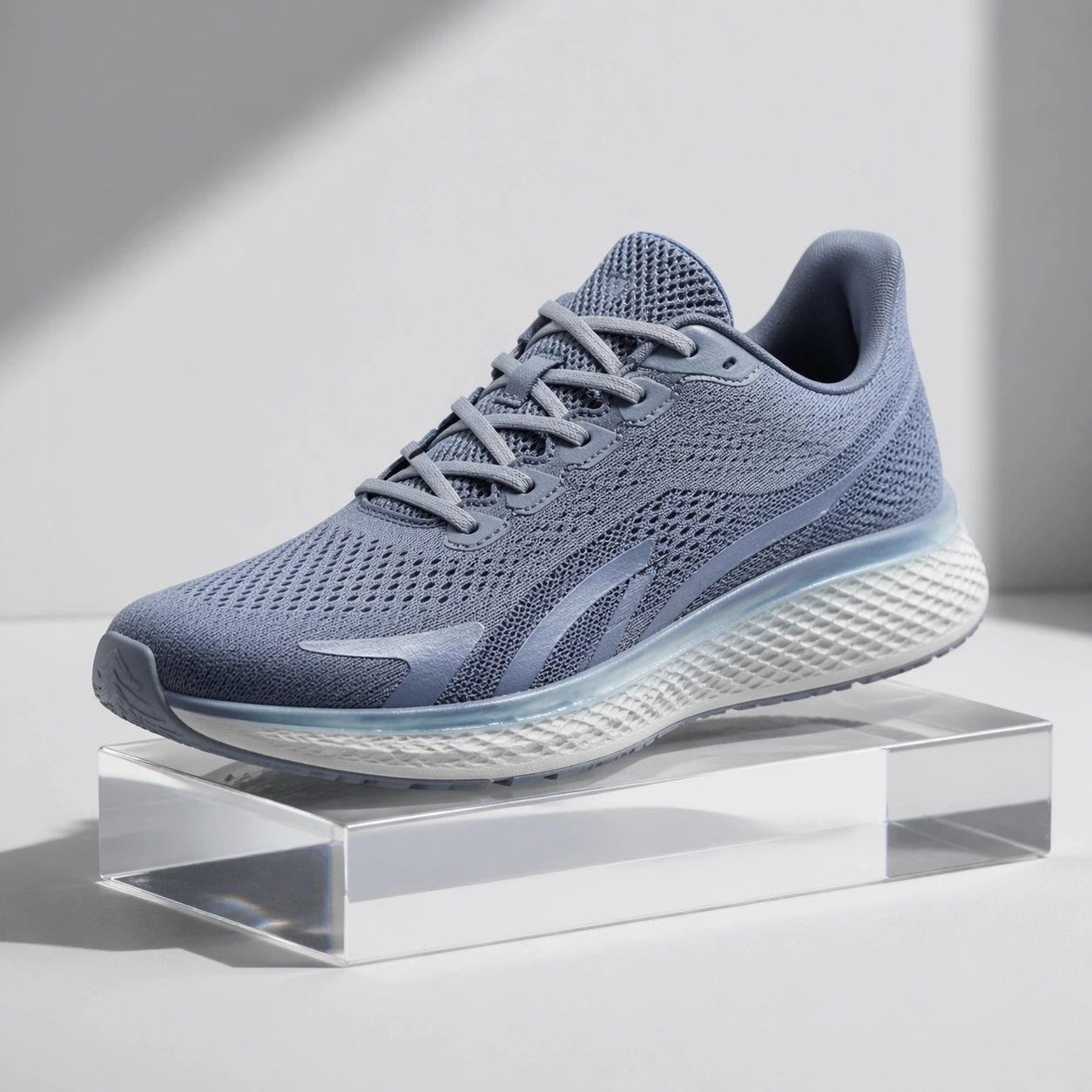
Example generated from “Conversational Editing Workflow — Product Colorway Edit”
GPT Image 2en

Scene: Square crop of a product photography set for a lightweight running shoe, clean studio sweep, softbox lighting, pale gray floor, and a few controlled prop shadows. The style is photorealistic commercial mockup with restrained color and crisp material definition. Subject: A single shoe sits three-quarter view on a low acrylic riser. The image should imply an edit request such as keep the shoe shape, remove the red heel tag, make the upper cooler blue-gray, and preserve the sole texture and lace geometry. The result must look like the same product after conversational colorway editing, not a different model. Include subtle mesh, translucent sole edge, small decorative stripe shapes with no logo, and clean repaired fabric where the heel tag used to be. Important details: This tests local semantic editing without a mask. The shoe silhouette, stitching pattern, lace placement, sole grooves, and lighting must remain coherent while targeted attributes change. The removed tag should leave believable material continuity. The cooler colorway should affect the upper and accent stripe but not the background or shadows. The product should remain centered with catalog-level clarity, suitable for comparing whether shape identity survived the edit. Use case: Conversational Editing Workflow single study 6/8, testing object-preserving product edits across removal, material repair, and color transformation. Constraints: No readable text, no watermark, no logos, preserve exact 1:1 aspect ratio, no brand marks, no extra shoes, no foot or model, no UI overlay, no split before-after view, no deformed sole, no mismatched laces.

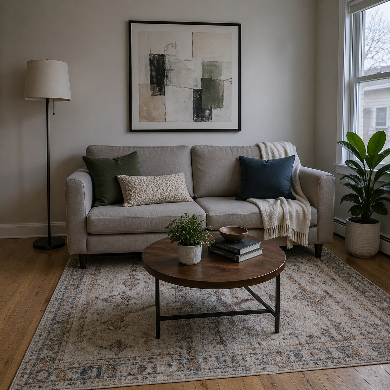
Example generated from “Conversational Editing Workflow — Living Room Declutter”
GPT Image 2en

Scene: Square crop of a compact living room photographed from eye level, soft overcast daylight through a side window, realistic interior design styling, natural wood floor, cream walls, and a calm balanced exposure. The room should feel lived-in but already edited into a cleaner final state. Subject: Show a sofa, coffee table, standing lamp, wall art with abstract unreadable marks, indoor plant, and a rug. The scene should imply a conversational edit sequence: remove the toy pile from the left floor area, make the room slightly cooler in color temperature, straighten the wall art, and keep the sofa, plant, table objects, rug pattern, and window position consistent. The removed area should be naturally repaired with visible floor grain and correct shadows. Important details: This is a mask-free interior editing challenge. The edit must maintain room geometry, scale, lighting direction, and object relationships while changing only the requested semantic elements. The cooler mood should be subtle, not a blue filter over everything. The straightened wall art should align with the room perspective. The floor where clutter was removed must not be blurry, smeared, or unnaturally empty; it should contain plausible shadow and texture continuity. Use case: Conversational Editing Workflow single study 7/8, testing scene cleanup, color-temperature adjustment, and geometry correction in one coherent interior. Constraints: No readable text, no watermark, no logos, preserve exact 1:1 aspect ratio, no before-after split, no editing UI, no distorted furniture, no extra people, no messy replacement clutter, no impossible shadows, no warped wall frame.

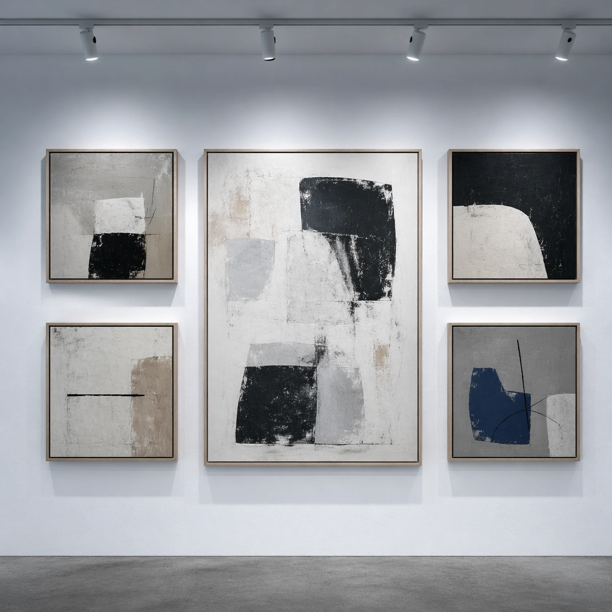
Example generated from “Conversational Editing Workflow — Gallery Layout Correction”
GPT Image 2en

Scene: Square crop of a contemporary gallery wall photographed straight-on, soft ceiling track lights, matte white wall, concrete floor edge, and a restrained exhibition design mood. The image should be clean and frontal, like documentation of a corrected layout after a curator requested edits. Subject: Show five framed abstract artworks arranged in a precise grid-like rhythm. The final image should imply multiple conversational edits: remove the small leftmost label plaque, enlarge the central artwork, make the lighting cooler, and align the top row more evenly while preserving the identities of the other frames. All visible art marks are abstract shapes and textures; no readable labels or signatures. The empty wall where the plaque was removed should retain wall texture and natural shadow falloff. Important details: This tests structured layout correction. The central frame should grow without colliding with the neighboring frames, and the surrounding frames should reposition just enough to maintain balance. Track-light highlights must follow the cooler lighting request while still looking physically plausible. Keep the wall plane, floor line, frame materials, and overall exhibition style consistent. The corrected grid should feel intentional, not mechanically perfect or randomly rearranged. Use case: Conversational Editing Workflow single study 8/8, testing layout-aware object removal, resizing, lighting change, and alignment repair. Constraints: No readable text, no watermark, no logos, preserve exact 1:1 aspect ratio, no museum brand, no people, no UI overlay, no before-after split, no crooked final frames, no impossible light beams, no duplicate central artwork.

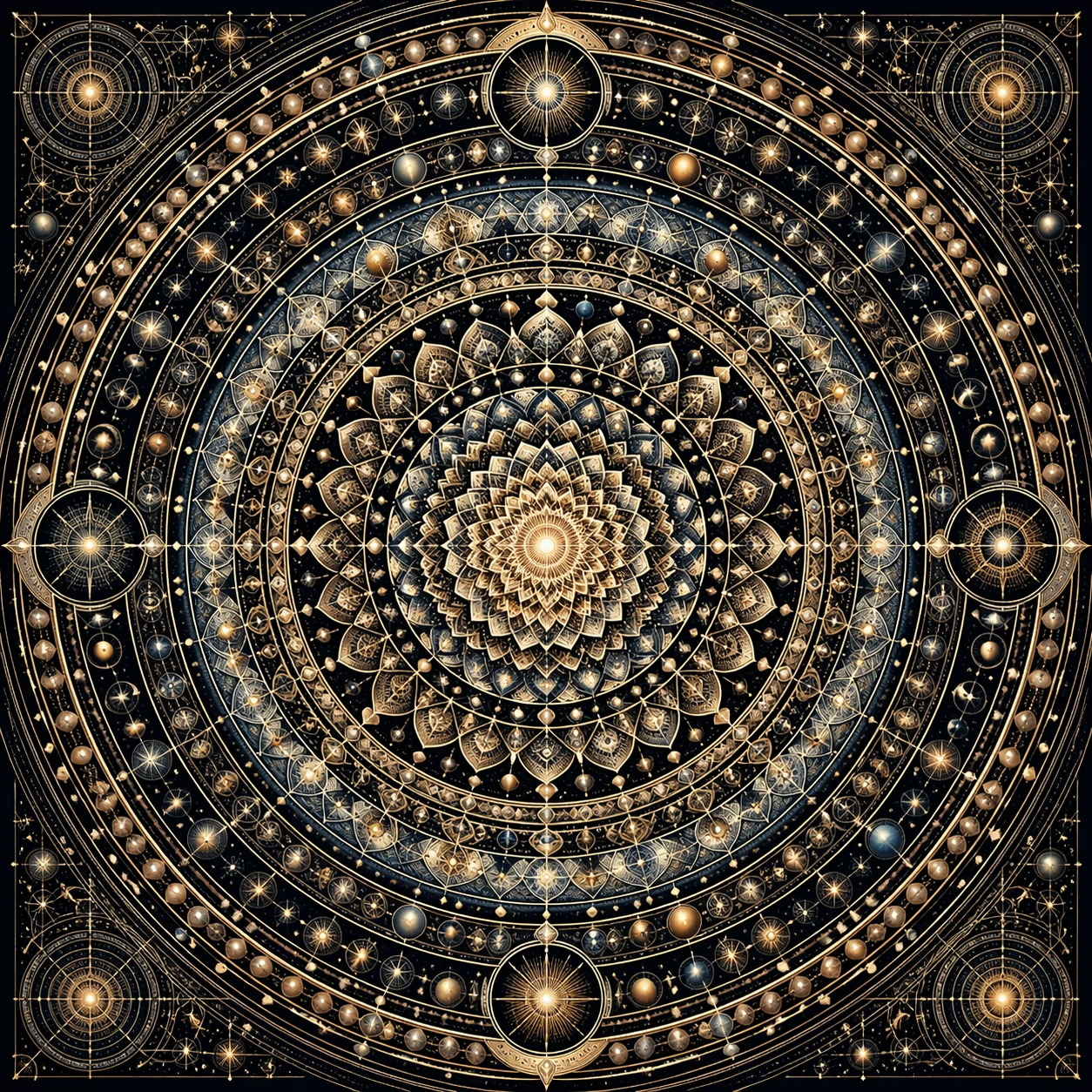
Example generated from “Cosmic Mandala Hyperdense — Core Radial Engine”
GPT Image 2en

Scene: Build a square, front-facing sacred-geometry plate that feels like a premium gallery print rather than a casual illustration. The frame should be fully occupied by one disciplined radial composition, with micro-detail remaining crisp from the bindu center to the outer perimeter and with lighting chosen to clarify line work, relief, and layered depth. Keep the crop completely centered and calm, like a collector poster photographed under controlled museum lighting. Keep the square crop exact, the camera flat, and the tonal design disciplined enough that structure stays clear at poster scale and under close inspection. Subject: Construct a concentric mandala from nested petals, orbital arcs, lattice rings, stellar emblems, and abstract cosmological glyphs. Every ring must belong to one coherent radial system, with a stable central axis, measured spacing, and enough structural variety that the viewer can keep discovering new information without the image collapsing into noise. Focus this variation on a deep obsidian-and-gold master mandala with twelve disciplined outer bands and a razor-sharp central star. The composition should feel complete and singular, as though one finished artifact has been resolved with full conviction rather than one fragment pulled from a larger sheet. Important details: Perfect symmetry is the main test. Keep ring spacing consistent, preserve clean edge transitions, and let scale hierarchy control the eye from center to rim. Use glow, metallic accents, shadow pockets, and fine line weight changes only where they strengthen legibility and make the density feel intentional rather than ornamental clutter. Use restrained gold leaf shimmer, fine charcoal shadow channels, and tiny celestial nodes that repeat cleanly around the full circumference. Preserve crisp edge behavior, stable hierarchy, and enough fine information that the image rewards slow viewing without losing the main read from a distance. Use case: Cosmic Mandala single study 1/9, designed as a self-contained sacred-geometry image with a distinct material and compositional emphasis. Constraints: No readable text, no watermark, no logos, preserve exact 1:1 aspect ratio, no broken symmetry, no drifting center point, no muddy outer rim, no random clip-art symbols, no decorative filler detached from the radial logic, no accidental lettering, no oversized empty center, no soft-focus bloom, no uneven petal counts.

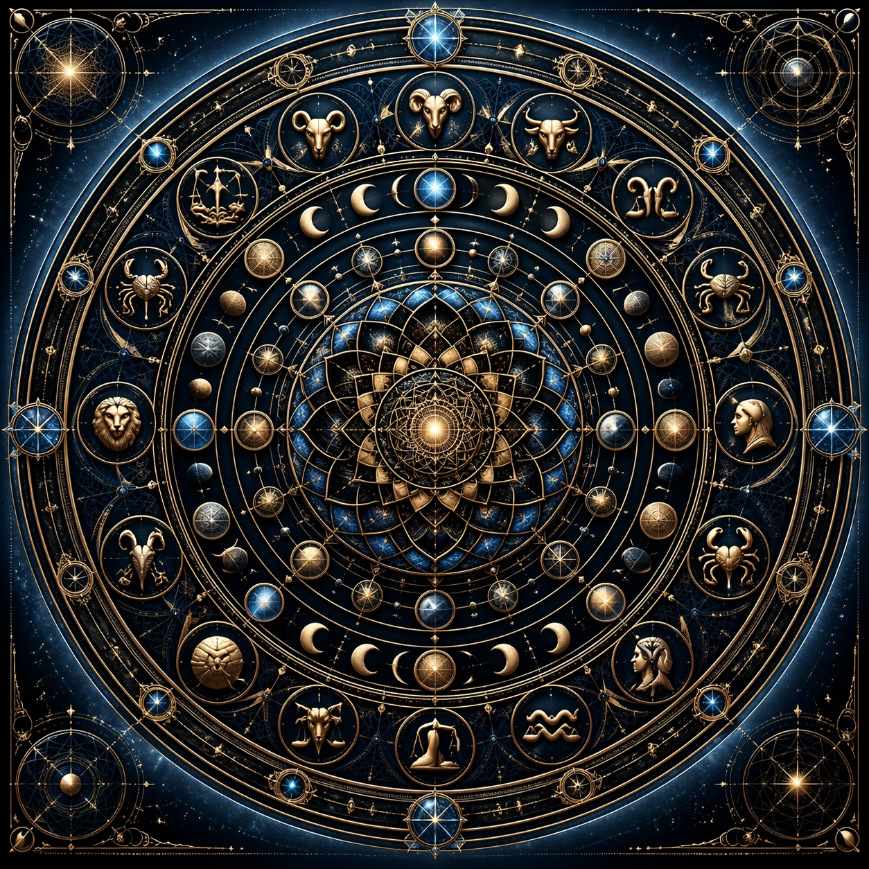
Example generated from “Cosmic Mandala Hyperdense — Zodiac Orbit Choir”
GPT Image 2en

Scene: Build a square, front-facing sacred-geometry plate that feels like a premium gallery print rather than a casual illustration. The frame should be fully occupied by one disciplined radial composition, with micro-detail remaining crisp from the bindu center to the outer perimeter and with lighting chosen to clarify line work, relief, and layered depth. Present the piece as a ceremonial chart on dark midnight lacquer with a cool halo behind the outer ring. Keep the square crop exact, the camera flat, and the tonal design disciplined enough that structure stays clear at poster scale and under close inspection. Subject: Construct a concentric mandala from nested petals, orbital arcs, lattice rings, stellar emblems, and abstract cosmological glyphs. Every ring must belong to one coherent radial system, with a stable central axis, measured spacing, and enough structural variety that the viewer can keep discovering new information without the image collapsing into noise. Focus this variation on a ring system where zodiac-like emblems, planet paths, and moon phases interlock inside one precise circular choir. The composition should feel complete and singular, as though one finished artifact has been resolved with full conviction rather than one fragment pulled from a larger sheet. Important details: Perfect symmetry is the main test. Keep ring spacing consistent, preserve clean edge transitions, and let scale hierarchy control the eye from center to rim. Use glow, metallic accents, shadow pockets, and fine line weight changes only where they strengthen legibility and make the density feel intentional rather than ornamental clutter. Make the icon families feel related by geometry, not by illustration style, and keep the orbit spacing precise enough to read as one engineered mechanism. Preserve crisp edge behavior, stable hierarchy, and enough fine information that the image rewards slow viewing without losing the main read from a distance. Use case: Cosmic Mandala single study 2/9, designed as a self-contained sacred-geometry image with a distinct material and compositional emphasis. Constraints: No readable text, no watermark, no logos, preserve exact 1:1 aspect ratio, no broken symmetry, no drifting center point, no muddy outer rim, no random clip-art symbols, no decorative filler detached from the radial logic, no accidental lettering, no horoscope-card kitsch, no floating icons without anchors, no empty quadrant.

Example generated from “Cosmic Mandala Hyperdense — Binary Nebula Crown”
GPT Image 2en

Scene: Build a square, front-facing sacred-geometry plate that feels like a premium gallery print rather than a casual illustration. The frame should be fully occupied by one disciplined radial composition, with micro-detail remaining crisp from the bindu center to the outer perimeter and with lighting chosen to clarify line work, relief, and layered depth. Treat the frame like a nocturnal cosmic print with deep blacks, faint cyan sparks, and a measured central glow. Keep the square crop exact, the camera flat, and the tonal design disciplined enough that structure stays clear at poster scale and under close inspection. Subject: Construct a concentric mandala from nested petals, orbital arcs, lattice rings, stellar emblems, and abstract cosmological glyphs. Every ring must belong to one coherent radial system, with a stable central axis, measured spacing, and enough structural variety that the viewer can keep discovering new information without the image collapsing into noise. Focus this variation on an ultra-dense crown of radial code-like dot bands and nebular curls fused into sacred geometry. The composition should feel complete and singular, as though one finished artifact has been resolved with full conviction rather than one fragment pulled from a larger sheet. Important details: Perfect symmetry is the main test. Keep ring spacing consistent, preserve clean edge transitions, and let scale hierarchy control the eye from center to rim. Use glow, metallic accents, shadow pockets, and fine line weight changes only where they strengthen legibility and make the density feel intentional rather than ornamental clutter. Blend tiny dotted bands, wave seams, and filigree arcs so the diagram feels futuristic without losing devotional symmetry. Preserve crisp edge behavior, stable hierarchy, and enough fine information that the image rewards slow viewing without losing the main read from a distance. Use case: Cosmic Mandala single study 3/9, designed as a self-contained sacred-geometry image with a distinct material and compositional emphasis. Constraints: No readable text, no watermark, no logos, preserve exact 1:1 aspect ratio, no broken symmetry, no drifting center point, no muddy outer rim, no random clip-art symbols, no decorative filler detached from the radial logic, no accidental lettering, no sci-fi interface clutter, no obvious UI panels, no asymmetrical nebula spill.

Example generated from “Cosmic Mandala Hyperdense — Solar Eclipse Cross Section”
GPT Image 2en

Scene: Build a square, front-facing sacred-geometry plate that feels like a premium gallery print rather than a casual illustration. The frame should be fully occupied by one disciplined radial composition, with micro-detail remaining crisp from the bindu center to the outer perimeter and with lighting chosen to clarify line work, relief, and layered depth. Light the work as if it were printed with metallic ink on matte black stock, with subtle eclipse radiance at the center. Keep the square crop exact, the camera flat, and the tonal design disciplined enough that structure stays clear at poster scale and under close inspection. Subject: Construct a concentric mandala from nested petals, orbital arcs, lattice rings, stellar emblems, and abstract cosmological glyphs. Every ring must belong to one coherent radial system, with a stable central axis, measured spacing, and enough structural variety that the viewer can keep discovering new information without the image collapsing into noise. Focus this variation on a mandala whose rings suggest eclipse shadows, coronas, and occultation layers while staying perfectly decorative. The composition should feel complete and singular, as though one finished artifact has been resolved with full conviction rather than one fragment pulled from a larger sheet. Important details: Perfect symmetry is the main test. Keep ring spacing consistent, preserve clean edge transitions, and let scale hierarchy control the eye from center to rim. Use glow, metallic accents, shadow pockets, and fine line weight changes only where they strengthen legibility and make the density feel intentional rather than ornamental clutter. Keep the corona textures radial and disciplined, and let dark-light transitions articulate ring depth instead of atmospheric smoke. Preserve crisp edge behavior, stable hierarchy, and enough fine information that the image rewards slow viewing without losing the main read from a distance. Use case: Cosmic Mandala single study 4/9, designed as a self-contained sacred-geometry image with a distinct material and compositional emphasis. Constraints: No readable text, no watermark, no logos, preserve exact 1:1 aspect ratio, no broken symmetry, no drifting center point, no muddy outer rim, no random clip-art symbols, no decorative filler detached from the radial logic, no accidental lettering, no cinematic lens flare, no off-axis light source, no irregular eclipse edge.

Example generated from “Cosmic Mandala Hyperdense — Obsidian Gold Relief”
GPT Image 2en

Scene: Build a square, front-facing sacred-geometry plate that feels like a premium gallery print rather than a casual illustration. The frame should be fully occupied by one disciplined radial composition, with micro-detail remaining crisp from the bindu center to the outer perimeter and with lighting chosen to clarify line work, relief, and layered depth. Stage it like a luxury object shot viewed straight on, with grazing light revealing shallow relief and crisp incisions. Keep the square crop exact, the camera flat, and the tonal design disciplined enough that structure stays clear at poster scale and under close inspection. Subject: Construct a concentric mandala from nested petals, orbital arcs, lattice rings, stellar emblems, and abstract cosmological glyphs. Every ring must belong to one coherent radial system, with a stable central axis, measured spacing, and enough structural variety that the viewer can keep discovering new information without the image collapsing into noise. Focus this variation on a carved relief interpretation where the same cosmological density becomes tactile metalwork and lacquered recesses. The composition should feel complete and singular, as though one finished artifact has been resolved with full conviction rather than one fragment pulled from a larger sheet. Important details: Perfect symmetry is the main test. Keep ring spacing consistent, preserve clean edge transitions, and let scale hierarchy control the eye from center to rim. Use glow, metallic accents, shadow pockets, and fine line weight changes only where they strengthen legibility and make the density feel intentional rather than ornamental clutter. Balance glossy black cavities against satin gold ridges, and keep every engraved track clean enough to follow at close distance. Preserve crisp edge behavior, stable hierarchy, and enough fine information that the image rewards slow viewing without losing the main read from a distance. Use case: Cosmic Mandala single study 5/9, designed as a self-contained sacred-geometry image with a distinct material and compositional emphasis. Constraints: No readable text, no watermark, no logos, preserve exact 1:1 aspect ratio, no broken symmetry, no drifting center point, no muddy outer rim, no random clip-art symbols, no decorative filler detached from the radial logic, no accidental lettering, no blurry embossing, no cheap jewelry styling, no inconsistent engraving depth.

Example generated from “Cosmic Mandala Hyperdense — Turquoise Plasma Field”
GPT Image 2en

Scene: Build a square, front-facing sacred-geometry plate that feels like a premium gallery print rather than a casual illustration. The frame should be fully occupied by one disciplined radial composition, with micro-detail remaining crisp from the bindu center to the outer perimeter and with lighting chosen to clarify line work, relief, and layered depth. Use a dark field with cold luminescence, as if the mandala were suspended above a silent laboratory void. Keep the square crop exact, the camera flat, and the tonal design disciplined enough that structure stays clear at poster scale and under close inspection. Subject: Construct a concentric mandala from nested petals, orbital arcs, lattice rings, stellar emblems, and abstract cosmological glyphs. Every ring must belong to one coherent radial system, with a stable central axis, measured spacing, and enough structural variety that the viewer can keep discovering new information without the image collapsing into noise. Focus this variation on a cooler version with turquoise, pale silver, and indigo energy bands radiating through the lattice. The composition should feel complete and singular, as though one finished artifact has been resolved with full conviction rather than one fragment pulled from a larger sheet. Important details: Perfect symmetry is the main test. Keep ring spacing consistent, preserve clean edge transitions, and let scale hierarchy control the eye from center to rim. Use glow, metallic accents, shadow pockets, and fine line weight changes only where they strengthen legibility and make the density feel intentional rather than ornamental clutter. The glow must hug the geometry rather than leak randomly; keep each luminous contour aligned to the underlying ring logic. Preserve crisp edge behavior, stable hierarchy, and enough fine information that the image rewards slow viewing without losing the main read from a distance. Use case: Cosmic Mandala single study 6/9, designed as a self-contained sacred-geometry image with a distinct material and compositional emphasis. Constraints: No readable text, no watermark, no logos, preserve exact 1:1 aspect ratio, no broken symmetry, no drifting center point, no muddy outer rim, no random clip-art symbols, no decorative filler detached from the radial logic, no accidental lettering, no neon poster chaos, no purple fog, no detached glows.

Example generated from “Cosmic Mandala Hyperdense — Pearl Emboss Codex”
GPT Image 2en

Scene: Build a square, front-facing sacred-geometry plate that feels like a premium gallery print rather than a casual illustration. The frame should be fully occupied by one disciplined radial composition, with micro-detail remaining crisp from the bindu center to the outer perimeter and with lighting chosen to clarify line work, relief, and layered depth. Render it like a rare print under soft raking light, where relief and shadow carry the structure more than color contrast. Keep the square crop exact, the camera flat, and the tonal design disciplined enough that structure stays clear at poster scale and under close inspection. Subject: Construct a concentric mandala from nested petals, orbital arcs, lattice rings, stellar emblems, and abstract cosmological glyphs. Every ring must belong to one coherent radial system, with a stable central axis, measured spacing, and enough structural variety that the viewer can keep discovering new information without the image collapsing into noise. Focus this variation on a pale ivory and pearl interpretation that feels embossed into archival paper while preserving the same density. The composition should feel complete and singular, as though one finished artifact has been resolved with full conviction rather than one fragment pulled from a larger sheet. Important details: Perfect symmetry is the main test. Keep ring spacing consistent, preserve clean edge transitions, and let scale hierarchy control the eye from center to rim. Use glow, metallic accents, shadow pockets, and fine line weight changes only where they strengthen legibility and make the density feel intentional rather than ornamental clutter. Let delicate embossing, faint mica shimmer, and exact scoring lines create depth without losing the extreme nesting complexity. Preserve crisp edge behavior, stable hierarchy, and enough fine information that the image rewards slow viewing without losing the main read from a distance. Use case: Cosmic Mandala single study 7/9, designed as a self-contained sacred-geometry image with a distinct material and compositional emphasis. Constraints: No readable text, no watermark, no logos, preserve exact 1:1 aspect ratio, no broken symmetry, no drifting center point, no muddy outer rim, no random clip-art symbols, no decorative filler detached from the radial logic, no accidental lettering, no washed-out low contrast, no paper tears, no decorative flourishes outside the system.

Example generated from “Cosmic Mandala Hyperdense — Cathedral Light Bloom”
GPT Image 2en

Scene: Build a square, front-facing sacred-geometry plate that feels like a premium gallery print rather than a casual illustration. The frame should be fully occupied by one disciplined radial composition, with micro-detail remaining crisp from the bindu center to the outer perimeter and with lighting chosen to clarify line work, relief, and layered depth. Give the image the stillness of an architectural light study, with bright inner glow and darker lead-like seams. Keep the square crop exact, the camera flat, and the tonal design disciplined enough that structure stays clear at poster scale and under close inspection. Subject: Construct a concentric mandala from nested petals, orbital arcs, lattice rings, stellar emblems, and abstract cosmological glyphs. Every ring must belong to one coherent radial system, with a stable central axis, measured spacing, and enough structural variety that the viewer can keep discovering new information without the image collapsing into noise. Focus this variation on a luminous stained-light variation where the radial structure behaves like a sacred window seen head on. The composition should feel complete and singular, as though one finished artifact has been resolved with full conviction rather than one fragment pulled from a larger sheet. Important details: Perfect symmetry is the main test. Keep ring spacing consistent, preserve clean edge transitions, and let scale hierarchy control the eye from center to rim. Use glow, metallic accents, shadow pockets, and fine line weight changes only where they strengthen legibility and make the density feel intentional rather than ornamental clutter. Use jewel-toned radiance sparingly, and keep every petal, spoke, and halo perfectly mirrored so the spectacle stays rigorous. Preserve crisp edge behavior, stable hierarchy, and enough fine information that the image rewards slow viewing without losing the main read from a distance. Use case: Cosmic Mandala single study 8/9, designed as a self-contained sacred-geometry image with a distinct material and compositional emphasis. Constraints: No readable text, no watermark, no logos, preserve exact 1:1 aspect ratio, no broken symmetry, no drifting center point, no muddy outer rim, no random clip-art symbols, no decorative filler detached from the radial logic, no accidental lettering, no figurative saints, no broken lead lines, no off-center bloom.

Example generated from “Cosmic Mandala Hyperdense — Micro Density Atlas”
GPT Image 2en

Scene: Build a square, front-facing sacred-geometry plate that feels like a premium gallery print rather than a casual illustration. The frame should be fully occupied by one disciplined radial composition, with micro-detail remaining crisp from the bindu center to the outer perimeter and with lighting chosen to clarify line work, relief, and layered depth. Compose it as the most information-rich square in the set, yet keep the overall silhouette calm and circular. Keep the square crop exact, the camera flat, and the tonal design disciplined enough that structure stays clear at poster scale and under close inspection. Subject: Construct a concentric mandala from nested petals, orbital arcs, lattice rings, stellar emblems, and abstract cosmological glyphs. Every ring must belong to one coherent radial system, with a stable central axis, measured spacing, and enough structural variety that the viewer can keep discovering new information without the image collapsing into noise. Focus this variation on a maximal study emphasizing tiny sub-rings, minute icon clusters, and nested perimeter detail all the way to the corners. The composition should feel complete and singular, as though one finished artifact has been resolved with full conviction rather than one fragment pulled from a larger sheet. Important details: Perfect symmetry is the main test. Keep ring spacing consistent, preserve clean edge transitions, and let scale hierarchy control the eye from center to rim. Use glow, metallic accents, shadow pockets, and fine line weight changes only where they strengthen legibility and make the density feel intentional rather than ornamental clutter. The outermost bands should reward close inspection with miniature repeating structures, while the center remains the unquestioned anchor. Preserve crisp edge behavior, stable hierarchy, and enough fine information that the image rewards slow viewing without losing the main read from a distance. Use case: Cosmic Mandala single study 9/9, designed as a self-contained sacred-geometry image with a distinct material and compositional emphasis. Constraints: No readable text, no watermark, no logos, preserve exact 1:1 aspect ratio, no broken symmetry, no drifting center point, no muddy outer rim, no random clip-art symbols, no decorative filler detached from the radial logic, no accidental lettering, no noisy wallpaper repetition, no unreadable mush, no corner dead zones.