PROMPTS · EXPLORATION CRÉATIVE

Galerie de prompts

Explorez des prompts réels et leurs exemples générés. Trouvez l’inspiration pour votre prochaine mission créative et copiez le texte intégral gratuitement.

Exemples
10,974
Modèles
17
Sources
1277
10 974 exemples de prompts · page 55 sur 229
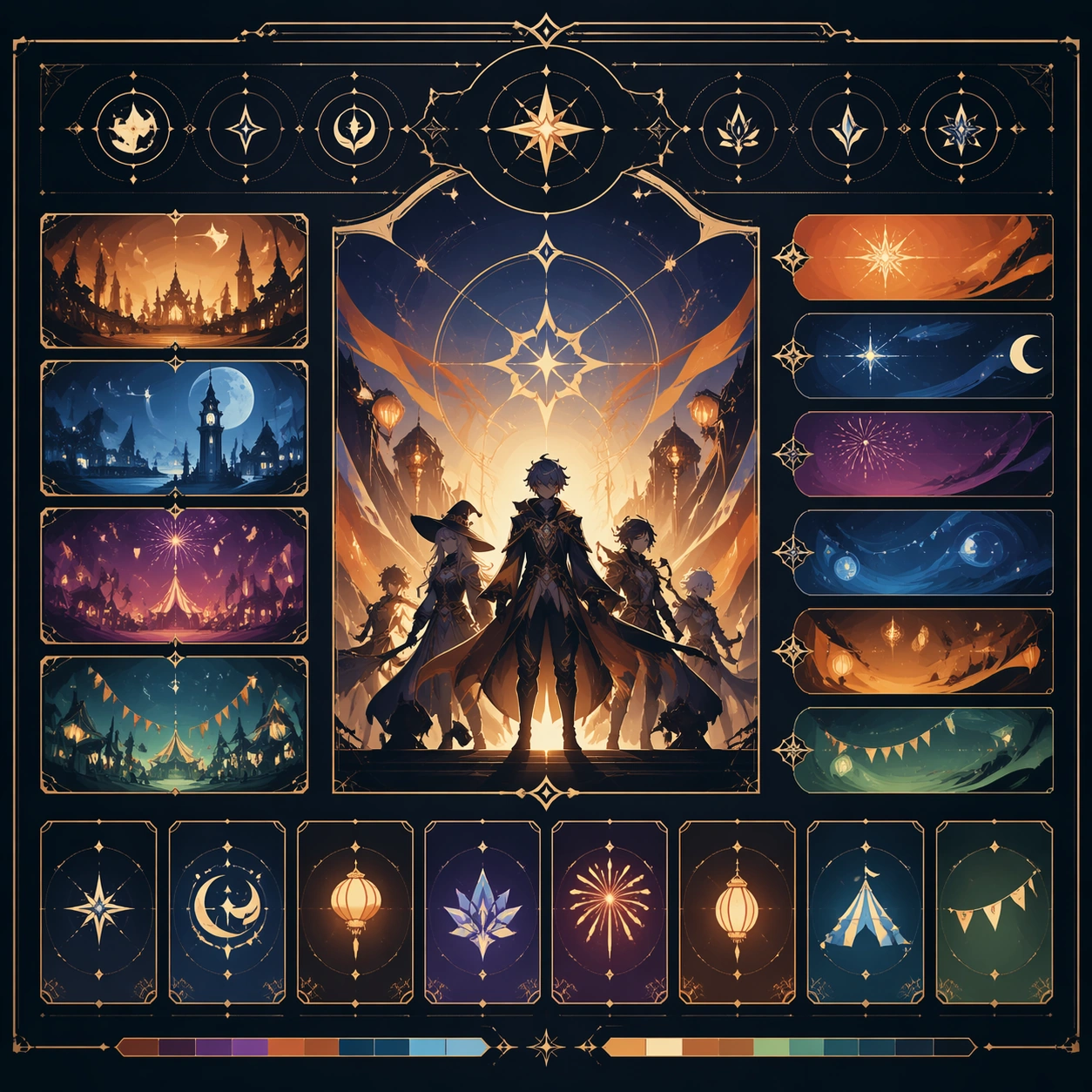
Example generated from “Festival Citywide Poster Family — Support Two”
GPT Image 2en

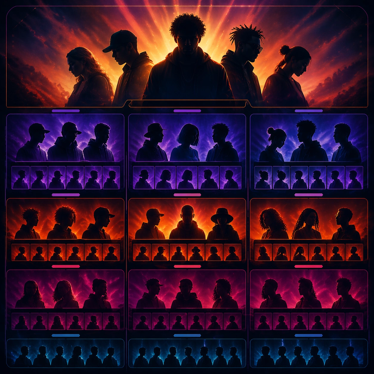
Scene: Create a square standalone support image for Festival Citywide Poster Family. Build a second support-surface study with a clear focal hierarchy and a finished professional surface. Use a polished modular board or campaign surface with clean spacing, premium game-UI finish, and clear focal hierarchy. The frame should feel self-contained and polished, with enough structure to explain the system even without the reference series, yet still obviously belonging to the same theme and production world. Subject: Show a coherent original game-art system built for premium production and marketing surfaces in a way that emphasizes the intended support surface. Keep the same system logic stable across screenshots, cards, banners, and overview boards. Even though this image is independent, the viewer should still recognize the same universe, same commercial logic, and same production intent as the core package. Important details: Lock framing, icon grammar, palette blocking, and surface hierarchy so the kit feels production-ready and consistent. Preserve the broader theme language through color, framing, material choices, and modular composition. Use clean panel rhythm, premium asset presentation, and believable detail density. The image should work equally well as a gallery study, research reference, and mock production deliverable. Use case: Festival Citywide Poster Family single study 6/9, exploring support two as a support surface. Constraints: No readable text, no watermark, no logos, preserve exact 1:1 aspect ratio, no unrelated objects, no broken visual hierarchy, no visual noise that obscures the main surface, no accidental brand resemblance.
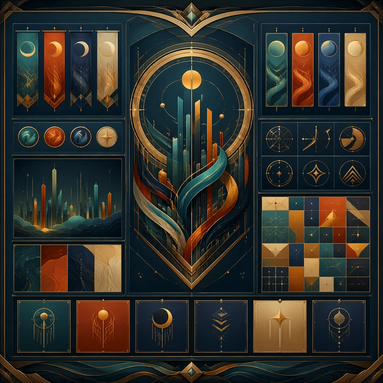
Example generated from “Festival Citywide Poster Family — Support Three”
GPT Image 2en

Scene: Create a square standalone support image for Festival Citywide Poster Family. Build a third support-surface study with a clear focal hierarchy and a finished professional surface. Use a polished modular board or campaign surface with clean spacing, premium game-UI finish, and clear focal hierarchy. The frame should feel self-contained and polished, with enough structure to explain the system even without the reference series, yet still obviously belonging to the same theme and production world. Subject: Show a coherent original game-art system built for premium production and marketing surfaces in a way that emphasizes the intended support surface. Keep the same system logic stable across screenshots, cards, banners, and overview boards. Even though this image is independent, the viewer should still recognize the same universe, same commercial logic, and same production intent as the core package. Important details: Lock framing, icon grammar, palette blocking, and surface hierarchy so the kit feels production-ready and consistent. Preserve the broader theme language through color, framing, material choices, and modular composition. Use clean panel rhythm, premium asset presentation, and believable detail density. The image should work equally well as a gallery study, research reference, and mock production deliverable. Use case: Festival Citywide Poster Family single study 7/9, exploring support three as a support surface. Constraints: No readable text, no watermark, no logos, preserve exact 1:1 aspect ratio, no unrelated objects, no broken visual hierarchy, no visual noise that obscures the main surface, no accidental brand resemblance.
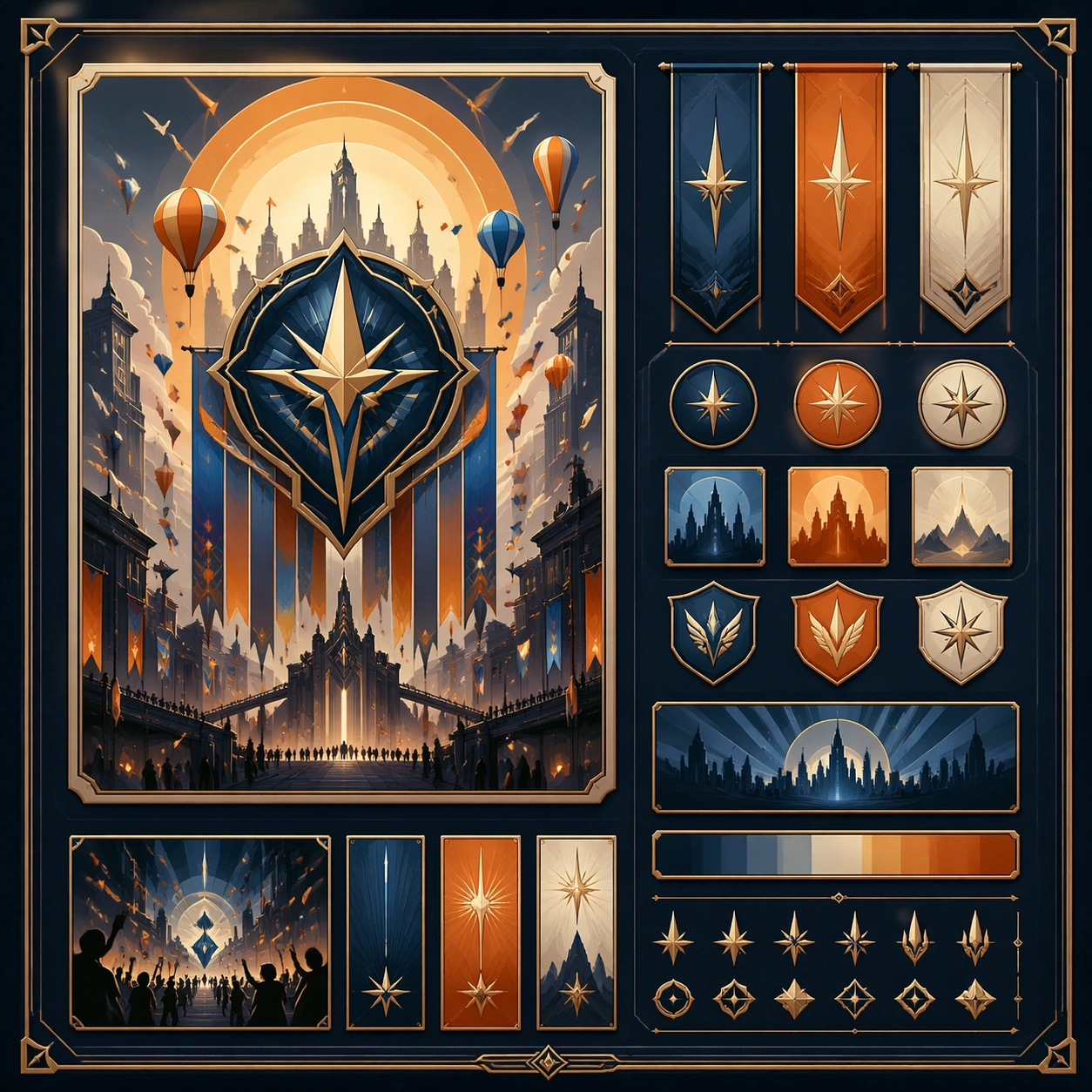
Example generated from “Festival Citywide Poster Family — Support Four”
GPT Image 2en

Scene: Create a square standalone support image for Festival Citywide Poster Family. Build a fourth support-surface study with a clear focal hierarchy and a finished professional surface. Use a polished modular board or campaign surface with clean spacing, premium game-UI finish, and clear focal hierarchy. The frame should feel self-contained and polished, with enough structure to explain the system even without the reference series, yet still obviously belonging to the same theme and production world. Subject: Show a coherent original game-art system built for premium production and marketing surfaces in a way that emphasizes the intended support surface. Keep the same system logic stable across screenshots, cards, banners, and overview boards. Even though this image is independent, the viewer should still recognize the same universe, same commercial logic, and same production intent as the core package. Important details: Lock framing, icon grammar, palette blocking, and surface hierarchy so the kit feels production-ready and consistent. Preserve the broader theme language through color, framing, material choices, and modular composition. Use clean panel rhythm, premium asset presentation, and believable detail density. The image should work equally well as a gallery study, research reference, and mock production deliverable. Use case: Festival Citywide Poster Family single study 8/9, exploring support four as a support surface. Constraints: No readable text, no watermark, no logos, preserve exact 1:1 aspect ratio, no unrelated objects, no broken visual hierarchy, no visual noise that obscures the main surface, no accidental brand resemblance.
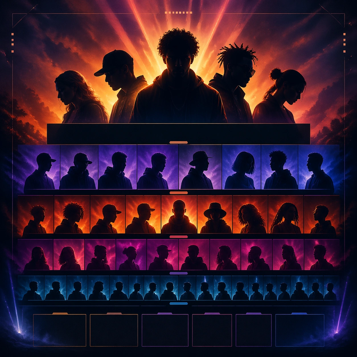
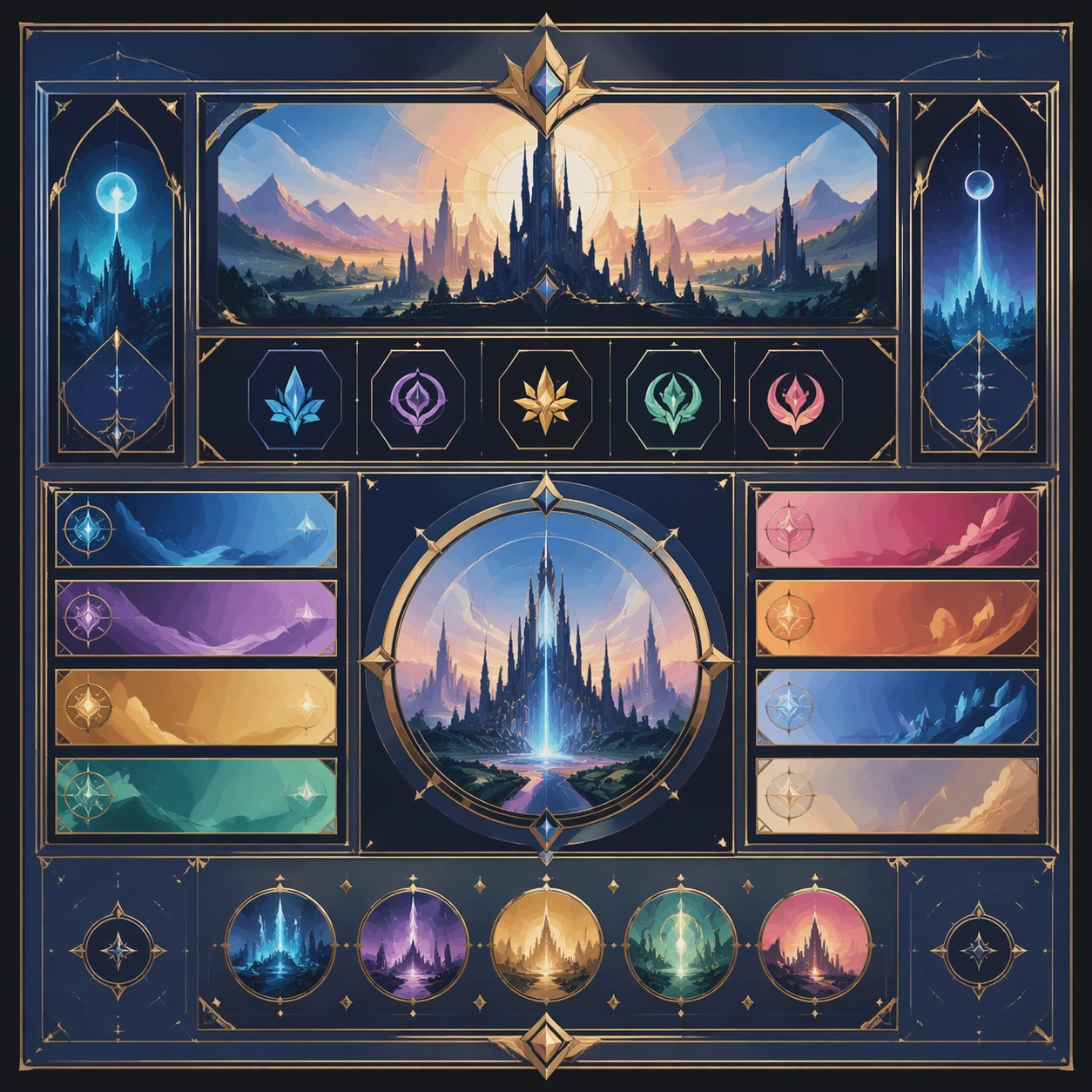
Example generated from “Festival Citywide Poster Family — Support Five”
GPT Image 2en

Scene: Create a square standalone support image for Festival Citywide Poster Family. Build a fifth support-surface study with a clear focal hierarchy and a finished professional surface. Use a polished modular board or campaign surface with clean spacing, premium game-UI finish, and clear focal hierarchy. The frame should feel self-contained and polished, with enough structure to explain the system even without the reference series, yet still obviously belonging to the same theme and production world. Subject: Show a coherent original game-art system built for premium production and marketing surfaces in a way that emphasizes the intended support surface. Keep the same system logic stable across screenshots, cards, banners, and overview boards. Even though this image is independent, the viewer should still recognize the same universe, same commercial logic, and same production intent as the core package. Important details: Lock framing, icon grammar, palette blocking, and surface hierarchy so the kit feels production-ready and consistent. Preserve the broader theme language through color, framing, material choices, and modular composition. Use clean panel rhythm, premium asset presentation, and believable detail density. The image should work equally well as a gallery study, research reference, and mock production deliverable. Use case: Festival Citywide Poster Family single study 9/9, exploring support five as a support surface. Constraints: No readable text, no watermark, no logos, preserve exact 1:1 aspect ratio, no unrelated objects, no broken visual hierarchy, no visual noise that obscures the main surface, no accidental brand resemblance.
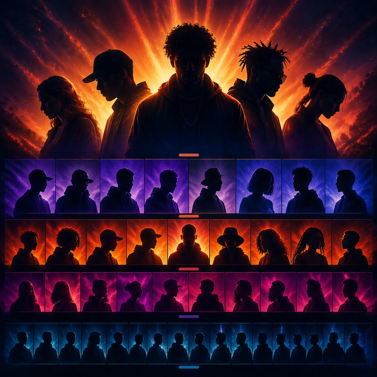
Example generated from “Festival Lineup Poster And Social Kit — Reference Lineup Poster”
GPT Image 2en

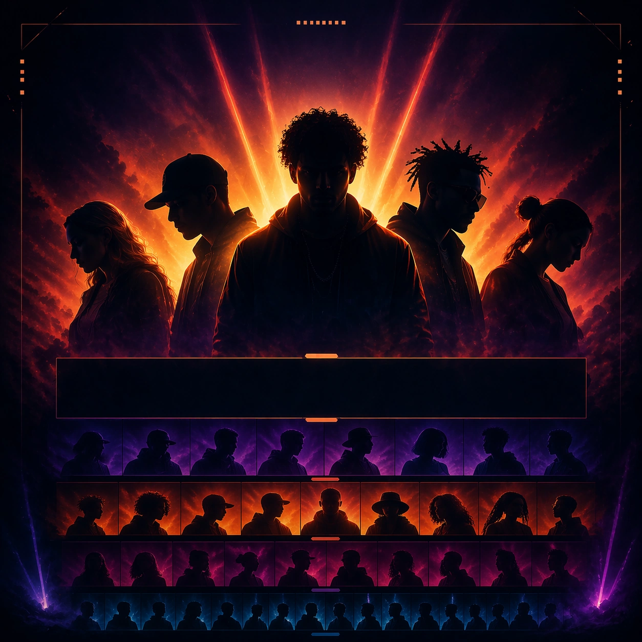
Scene: A square festival lineup poster with a dramatic dusk-to-night atmosphere, layered haze, and broad stage-light color washing behind a stack of performer silhouettes. The composition should feel like a serious launch poster that can scale into social cutdowns, with clear tiering and modular zones for headliners, mid-tier acts, and support acts rendered as abstract non-readable bands. Subject: The subject is the full lineup hierarchy itself: multiple performer silhouettes and portrait fragments arranged in tiers, one strong top line, then progressively smaller supporting layers, all anchored by a believable festival atmosphere. This root image must lock the exact hierarchy logic, color palette, panel spacing, and artist-stack behavior for the rest of the rollout. Important details: Treat the festival as contemporary and premium rather than retro poster pastiche. Use layered depth, restrained glow, and subtle crowd-energy implication without showing a literal sea of people. The stacked lineup should feel instantly scannable and social-ready, with enough empty module space to support future day splits and crop changes. Use case: Festival Lineup series study 1/9 for the Festival Lineup Poster and Social Kit Prompt Atlas theme. Constraints: No readable text, no watermark, no logos, preserve exact 1:1 aspect ratio, no readable artist names, no sponsor logos, no giant beer branding, no literal schedule table, no crowd front row dominating the frame

Example generated from “Festival Lineup Poster And Social Kit — Square Artist Stack”
GPT Image 2en

Scene: A square social crop drawn from the same festival poster world, with a tighter frame around the top and middle tiers, richer edge lighting, and more compact stage haze. The image must remain clearly connected to the reference layout system rather than becoming a new poster. Subject: Preserve the same lineup stacking logic, silhouette family, panel spacing, and atmosphere from the reference image. The upper artist tiers should remain dominant, while the supporting acts compress into structured bands and portrait fragments suited for social-card use. Important details: This is a crop adaptation problem. Keep the same color system, non-readable lineup modules, and stage-energy mood while tightening the hierarchy for square distribution. The result should feel optimized for quick social recognition without losing the premium festival identity locked by the root poster. Use case: Festival Lineup series study 2/9 for the Festival Lineup Poster and Social Kit Prompt Atlas theme. Constraints: No readable text, no watermark, no logos, preserve exact 1:1 aspect ratio, preserve the reference lineup hierarchy and palette; no readable names, no extra sponsor blocks, no random background fireworks, no crowd field, no flat graphic sticker look

Example generated from “Festival Lineup Poster And Social Kit — Day Split Card”
GPT Image 2en

Scene: A square social card in the same festival world, now organized into clearer segmented blocks as if preparing a day split or format split. Atmospheric haze and stage lighting remain in the background, but the hierarchy is redistributed into cleaner compartments for a more structured communication surface. Subject: Preserve the same lineup identity, silhouette family, color palette, and non-readable artist-band language from the reference image. The act tiers are regrouped into structured modules that imply a day split without presenting a literal readable timetable. Important details: The challenge is to restructure without losing the main festival identity. Keep the same cinematic atmosphere, same performer-stack logic, and same premium social polish while introducing more explicit segmentation. It should feel like the same campaign team produced the root poster and this cutdown card in one coherent rollout. Use case: Festival Lineup series study 3/9 for the Festival Lineup Poster and Social Kit Prompt Atlas theme. Constraints: No readable text, no watermark, no logos, preserve exact 1:1 aspect ratio, preserve the reference hierarchy cues; no readable day labels, no timetable grid, no sponsor logo strip, no ticket-button UI, no unrelated decorative stickers

Example generated from “Festival Lineup Poster And Social Kit — Night Headliner Card”
GPT Image 2en

Scene: A square nighttime social card in the same festival atmosphere, darker and more focused, with denser haze and stronger beam contrast around the upper artist tier. The frame should feel like a headliner spotlight card cut from the same broader lineup launch system. Subject: Preserve the same top-tier artist-stack behavior, silhouette family, modular non-readable lineup bands, and color palette from the reference poster. The upper headliner level becomes more dominant while lower tiers recede into subtle supporting strips. Important details: This should feel like the premium nighttime emphasis surface inside one festival campaign. Keep continuity absolute in palette and hierarchy logic, but adjust balance toward the top tier and deeper mood. The image must remain instantly linked to the main lineup poster even when focused on a smaller slice of the stack. Use case: Festival Lineup series study 4/9 for the Festival Lineup Poster and Social Kit Prompt Atlas theme. Constraints: No readable text, no watermark, no logos, preserve exact 1:1 aspect ratio, preserve the reference hierarchy cues; no readable headliner names, no stage sponsor branding, no confetti blizzard, no literal crowd closeup, no unrelated scene change

Example generated from “Festival Lineup Poster And Social Kit — Wristband Promo Flatlay”
GPT Image 2en

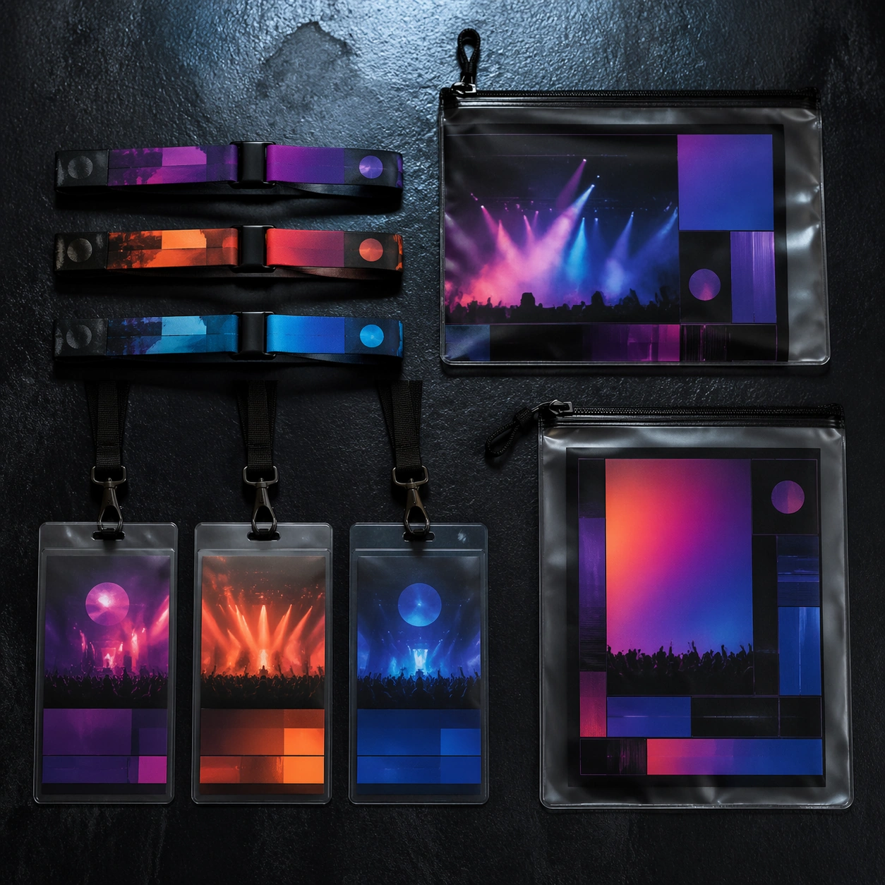
Scene: A square top-down product photograph of woven festival wristbands, laminated passes, and translucent pouches arranged on a dark textured surface with subtle reflected light. The materials should feel tactile and realistic, with weave detail, plastic gloss, and soft shadow. Subject: The object family carries an invented festival identity through gradient color bands, stage-light cues, and abstract modular fields where dates or tiers could appear later. It should feel like true festival access collateral, but entirely non-branded and non-verbal. Important details: The goal is practical desirability. Use rich material response, disciplined spacing, and a clear campaign palette so the set reads as one event family. Avoid turning it into a generic merch photo; it should still belong to a premium lineup rollout and hint at music energy. Use case: Festival Lineup single study 6/9 for the Festival Lineup Poster and Social Kit Prompt Atlas theme. Constraints: No readable text, no watermark, no logos, preserve exact 1:1 aspect ratio, no readable barcodes, no sponsor names, no cheap novelty colors, no extra desk clutter, no unrelated apparel items

Example generated from “Festival Lineup Poster And Social Kit — Site Map Info Card”
GPT Image 2en

Scene: A square info-card composition with abstract stage nodes, connecting paths, color-coded zones, and a faint atmospheric festival backdrop. The image should feel like a navigation aid transformed into a premium campaign surface rather than a technical diagram or software screenshot. Subject: The subject is the navigational system itself: stage icons rendered as abstract nodes, routes as glowing paths, and modular blocks for amenities or schedule information kept fully non-readable. The card should imply festival complexity while staying elegant and poster-like. Important details: Use structured layout, soft festival atmosphere, and clear visual hierarchy to make the map intelligible even without words. This is a reasoning-heavy promo asset: it needs to feel useful, ownable, and music-specific at the same time. Avoid dry technical aesthetics. Use case: Festival Lineup single study 7/9 for the Festival Lineup Poster and Social Kit Prompt Atlas theme. Constraints: No readable text, no watermark, no logos, preserve exact 1:1 aspect ratio, no readable labels, no sponsor map legend, no app UI frame, no literal GPS marker icons, no flat corporate infographic look

Example generated from “Festival Lineup Poster And Social Kit — Night Billboard Study”
GPT Image 2en

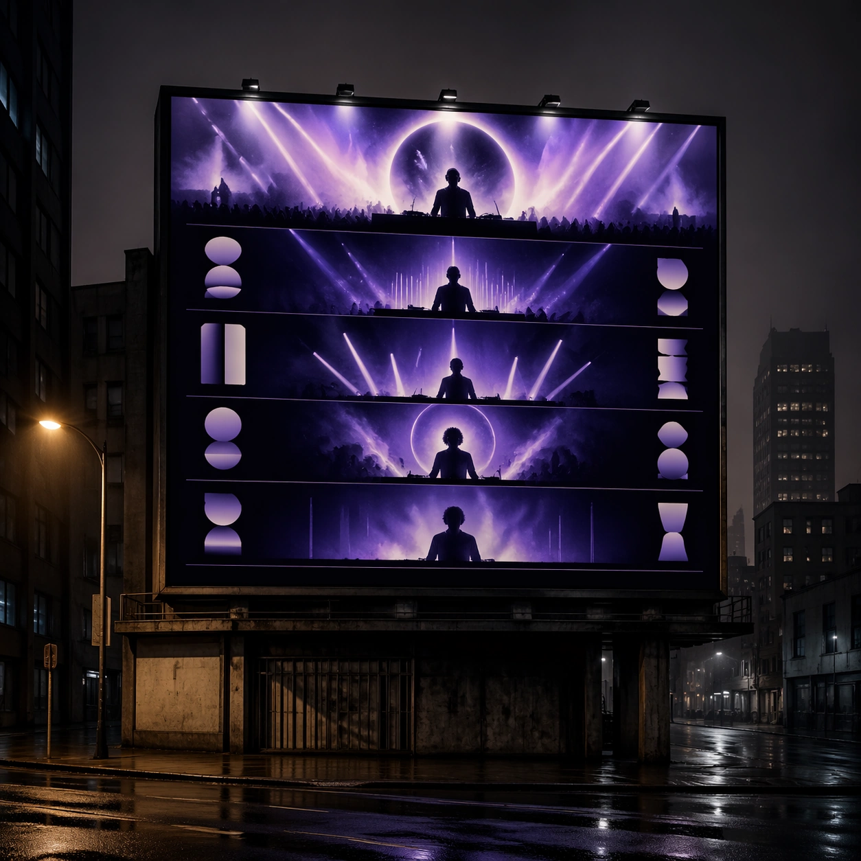
Scene: A square urban night photograph with one large illuminated billboard mounted above a street, glowing against dark buildings and light mist. The billboard should carry a premium festival lineup design language while the surrounding environment stays secondary and quiet. Subject: The billboard displays stacked performer silhouettes, atmospheric beam light, and abstract lineup modules rather than readable names. It should feel like the large-scale public face of a festival campaign, translating social-card clarity into city-scale visibility. Important details: Use billboard scale, wet air, and controlled city ambience to make the festival identity feel real and valuable. The image should capture both campaign prestige and music energy, but avoid brand clutter or unrelated advertising competition. One strong billboard is enough. Use case: Festival Lineup single study 8/9 for the Festival Lineup Poster and Social Kit Prompt Atlas theme. Constraints: No readable text, no watermark, no logos, preserve exact 1:1 aspect ratio, no sponsor ads nearby, no readable billboard copy, no heavy traffic focal point, no crowd, no skyline spectacle that overpowers the billboard

Example generated from “Festival Lineup Poster And Social Kit — Schedule Board Study”
GPT Image 2en

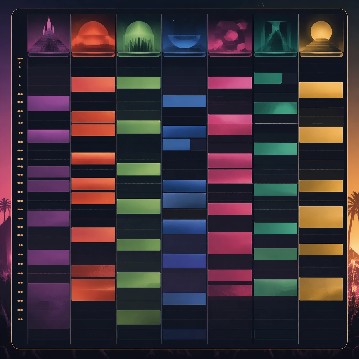
Scene: A square information-board concept with clean vertical columns, stacked horizontal modules, and a subtle atmospheric color field behind the layout. It should feel like a schedule board designed by a festival art team, not a spreadsheet or transit timetable. Subject: The subject is a modular board system where artist slots, stage lanes, and time bands are expressed as abstract non-readable blocks. The card should hint at genuine festival complexity while remaining visually inviting and campaign-consistent. Important details: Use structure as the hero. Column rhythm, spacing, and color zoning should communicate logic even without words. The result needs to feel like a real operational surface that still belongs to the same glamorous festival identity, bridging utility and brand tone. Use case: Festival Lineup single study 9/9 for the Festival Lineup Poster and Social Kit Prompt Atlas theme. Constraints: No readable text, no watermark, no logos, preserve exact 1:1 aspect ratio, no readable timetable text, no sponsor strip, no corporate dashboard styling, no mobile app frame, no cluttered icon legend

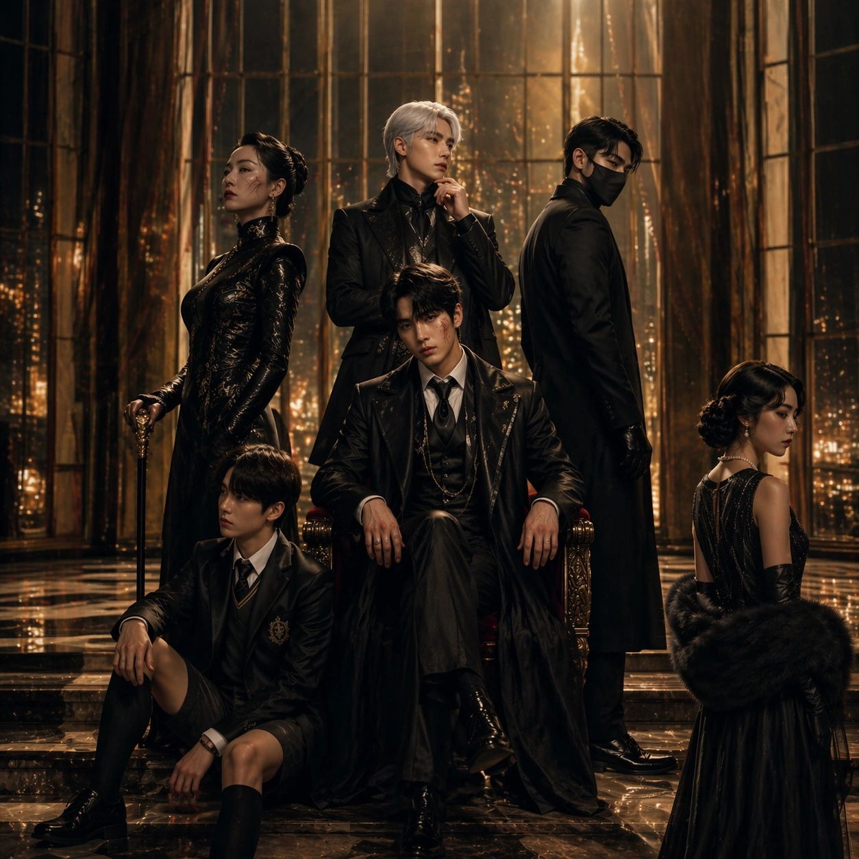
Example generated from “Festival Poster Fandom Crossover — Velvet Reference”
GPT Image 2en

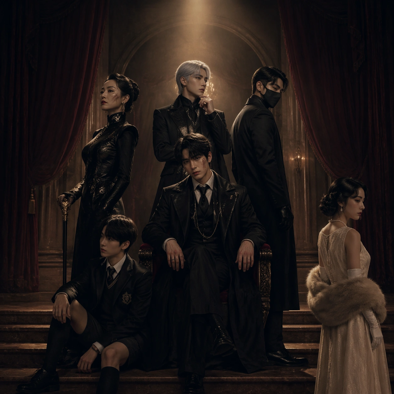
Scene: A square prestige-film poster staged inside a grand old theater lobby just after midnight, with velvet curtains, polished stone floors, deep plum shadows, and a controlled pool of amber light falling from above. The frame should feel like a real awards-season key art image: spacious, symmetrical enough to read as premium packaging, but with subtle asymmetry in pose and eye line. Leave natural zones where a designer could later place title blocks and laurel marks without needing actual readable text. Subject: Present an original fictional ensemble of six fandom-coded characters arranged as if they are the cast of a serious competition drama. At center is a tired young heir in a black formal coat; behind him stands a silver-haired strategist; to one side a scarred matriarch in lacquered eveningwear; to the other side a masked bodyguard; below them a school-uniform prodigy seated on the stair edge; and slightly apart, a pearl-dressed witness looking away. Their spacing, height differences, and gaze directions must imply rivalry, loyalty, and hidden alliances rather than simple group portrait symmetry. Important details: This is the reference image for the series, so identity clarity and hierarchy matter more than spectacle. Faces, silhouettes, costume accents, and relative positions must be easy to preserve in later variants. The poster should feel festival-premium: restrained palette, expensive textures, faint ghosted laurel shapes, minimal prop count, dramatic negative space, and no fan-art chaos. The visual language must suggest prestige cinema packaging without any readable credits. Use case: Festival Poster Fandom Crossover series study 1/9, establishing the cast hierarchy and packaging grammar for a reference-dependent festival poster campaign. Constraints: No readable text, no watermark, no logos, preserve exact 1:1 aspect ratio, no comic-book clutter, no floating character collage, no exaggerated action poses, no neon blockbuster lighting, no messy background extras, no duplicated faces, no broken anatomy.

Example generated from “Festival Poster Fandom Crossover — Seaside Selection”
GPT Image 2en

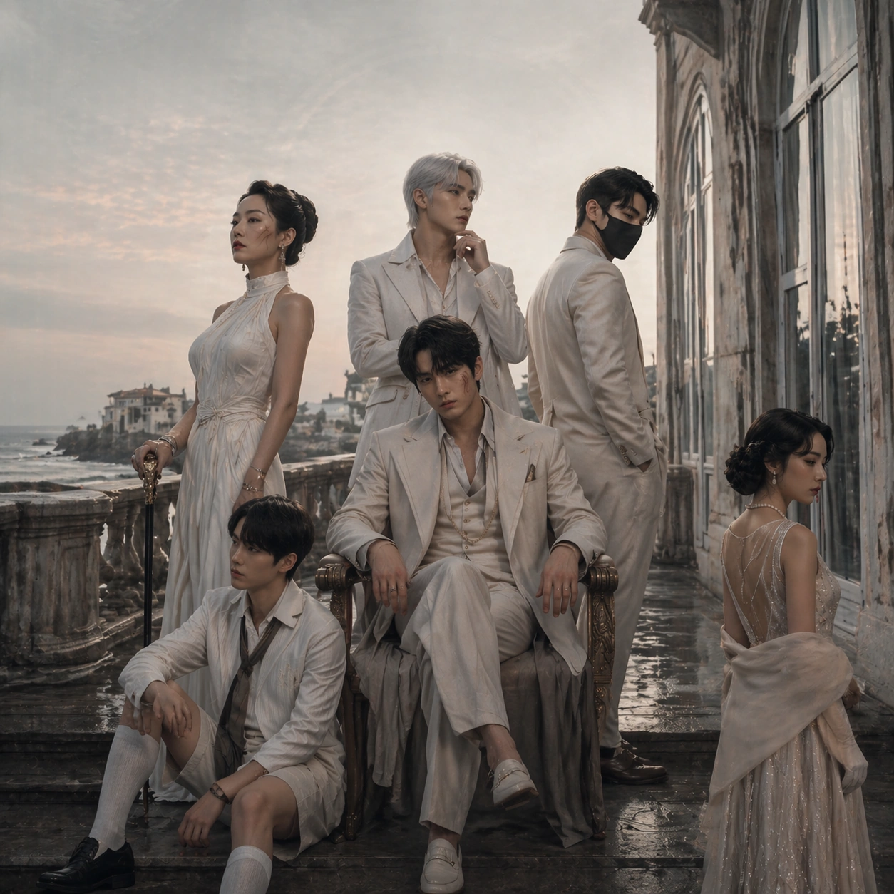
Scene: A square official-selection-style poster on the terrace of a faded seaside hotel at dawn, with pale mineral light, salt haze, stone balustrades, and a muted palette of sea gray, coral blush, cream, and charcoal. The frame should feel expensive and controlled, like a festival one-sheet photographed for the competition lineup, with enough empty breathing room for invisible branding blocks while remaining visually complete without text. Subject: Using the referenced cast as the primary guide, preserve the same six characters, the same front-to-back hierarchy, the same approximate pose directions, and the same alliance tension from image 01. Move them onto the hotel terrace without scrambling their roles: the exhausted heir remains central, the strategist remains elevated, the matriarch and bodyguard still counterbalance each other, the prodigy still anchors the lower edge, and the witness still holds emotional distance. Their wardrobe should shift toward summer formal wear, wind-touched fabrics, and subtle coastal glamour while keeping the same identities. Important details: This image tests whether the model can keep commercial poster continuity while changing setting and seasonal mood. The premium festival grammar must stay intact: sparse layout, elegantly implied laurel areas, controlled reflections on stone and glass, disciplined facial continuity, and no crowding. The visual tone should feel like serious European festival packaging rather than beach fashion advertising or fan convention art. Use case: Festival Poster Fandom Crossover series study 2/9, preserving the reference cast arrangement while translating it into a pale seaside selection poster. Constraints: No readable text, no watermark, no logos, preserve exact 1:1 aspect ratio, no cast reshuffle, no extra characters, no sunny vacation vibe, no broad comedy expressions, no cheap travel-poster colors, no missing central heir, no broken costume continuity.
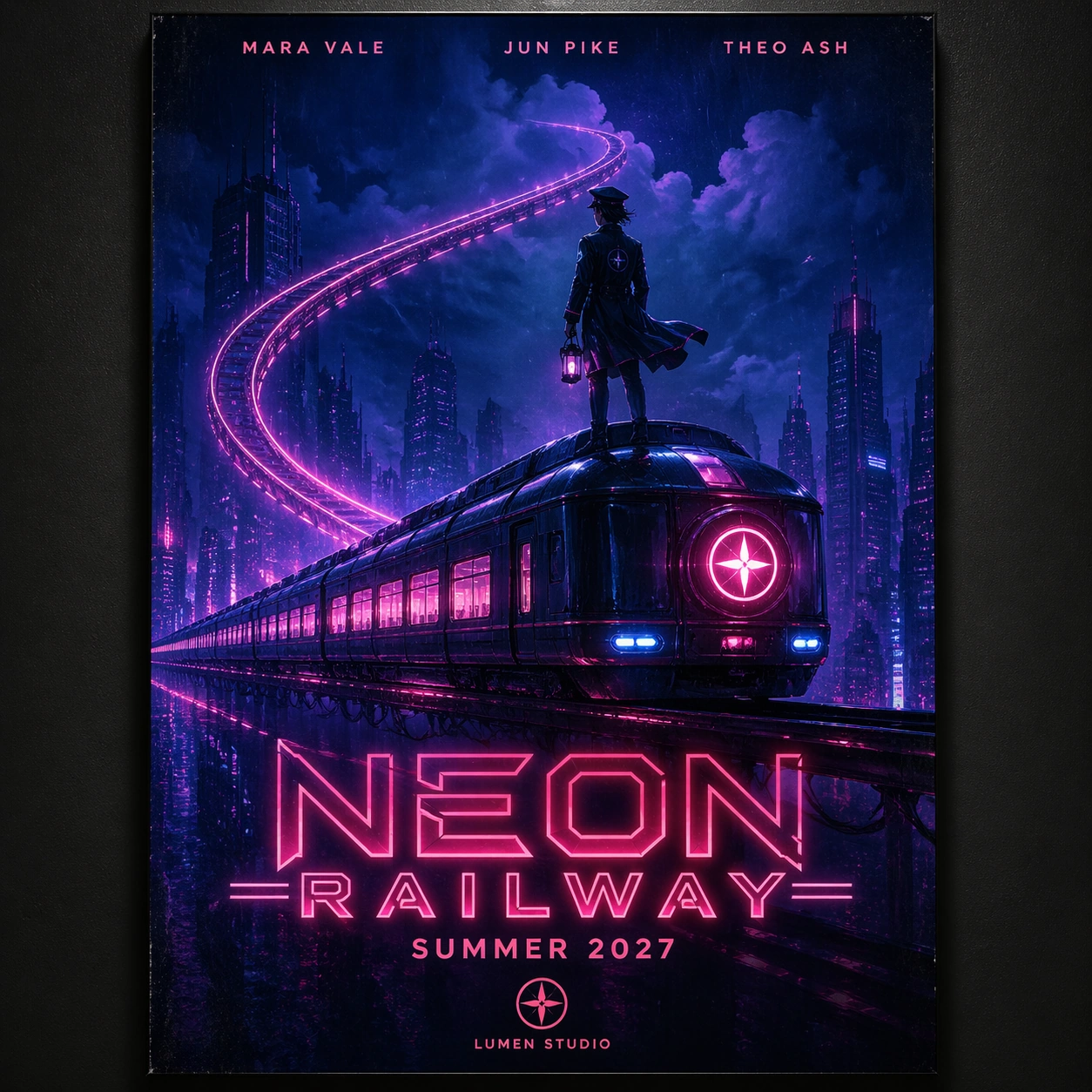
Example generated from “Festival Poster Fandom Crossover — Winter Pressbook”
GPT Image 2en

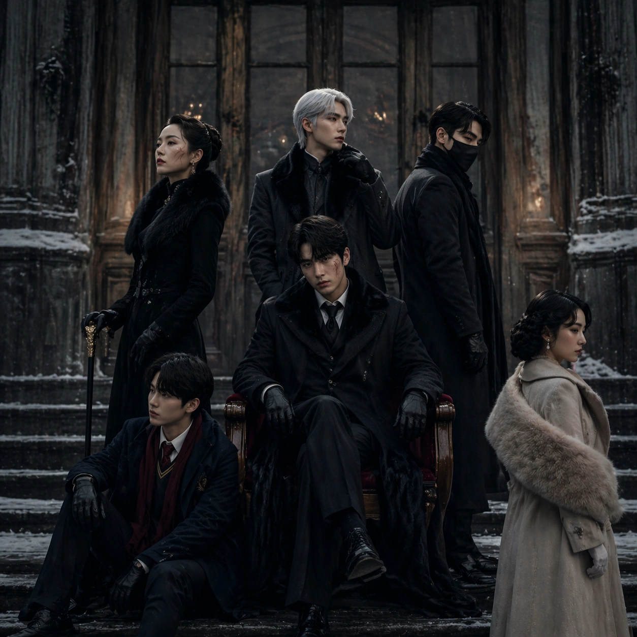
Scene: A square winter festival poster photographed outside a historic cinema facade after light snowfall, with cold blue daylight, smoked-glass doors, damp stone steps, and a restrained black, ivory, steel, and muted crimson palette. The composition should feel like a pressbook cover or jury-screening key art: elegant, sparse, heavy with atmosphere, and disciplined enough that blank design zones emerge naturally without any real typography. Subject: Using the referenced ensemble as the primary continuity source, preserve the same six characters, their height order, their dominant silhouettes, and their emotional geometry from image 01. Re-dress them in heavier winter layers, wool, leather gloves, dark coats, and one controlled crimson accent, but do not lose character identity. The central heir remains isolated yet important, the strategist still reads as the silent controller, the matriarch and bodyguard still form opposing vertical anchors, the prodigy stays low in frame, and the witness still adds ambiguity through a slight off-axis pose. Important details: The difficult part is maintaining cast continuity under a colder, more austere packaging system. Faces and costume signatures must remain recognizable even with winter styling and flatter daylight. Keep the festival-poster language premium and restrained: subtle reflective pavement, a few snow traces, precise negative space, and the feeling of serious awards-circuit marketing rather than fantasy concept art. The image must read as prestigious and human, not action-forward. Use case: Festival Poster Fandom Crossover series study 3/9, testing cast continuity and prestige packaging under a cold winter pressbook treatment. Constraints: No readable text, no watermark, no logos, preserve exact 1:1 aspect ratio, no action scene energy, no dramatic snowfall storm, no costume redesign that erases identities, no busy city traffic, no broad smiles, no shallow depth blur hiding faces, no posterized comic shading.

Example generated from “Festival Poster Fandom Crossover — Gala Window”
GPT Image 2en

Scene: A square gala-night poster set inside a modernist hall with towering amber windows, reflective marble, and soft black-tie lighting that mixes warm gold with pockets of deep graphite shadow. The composition should look like a premium closing-night variant from the same festival campaign: polished, spacious, slightly more luminous than the reference, and clearly designed for serious cinema packaging rather than celebrity-event photography. Subject: Using the referenced image as the continuity anchor, preserve the same six characters, their hierarchy, silhouette rhythm, and tension map from image 01. They should occupy nearly the same relative positions, but now interact with window reflections and evening formalwear details such as satin lapels, long gloves, lacquered shoes, and dark jewel tones. The tired heir remains centered in emotional focus, the strategist still controls the upper register, the matriarch and bodyguard remain opposing pillars, the prodigy stays close to the lower edge, and the witness keeps her slight separation. Important details: This image should prove campaign-level consistency across lighting upgrades. Keep faces, hair shapes, costume motifs, and gaze directions stable enough that all four series posters feel like one awards push. Use reflected window geometry, controlled highlights, and reserved negative space to imply festival prestige. Avoid luxury-brand ad excess; the image should still feel like an austere competition film poster with fandom-coded characters translated into adult cinematic language. Use case: Festival Poster Fandom Crossover series study 4/9, testing whether the same ensemble can survive a warmer, more luminous gala-night packaging variant. Constraints: No readable text, no watermark, no logos, preserve exact 1:1 aspect ratio, no red-carpet paparazzi chaos, no sparkling confetti, no cast rearrangement, no fashion-editorial flirtiness, no overexposed gold glare, no simplified faces, no blockbuster action props.

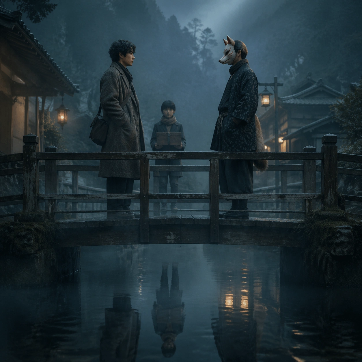
Example generated from “Festival Poster Fandom Crossover — Folklore Detective Selection”
GPT Image 2en

Scene: A square official-selection poster set on a damp village bridge at blue hour, with lantern haze, thin mist over black water, weathered timber railings, and desaturated teal, moss, and bone tones. The atmosphere should feel literary and prestigious, not horror pulp. Compose the frame with calm negative space, carefully weighted verticals, and the sense that a restrained festival title block could exist without any readable text being present. Subject: Create an original fandom-coded detective crossover centered on a young folklorist investigator in a wool coat, facing a fox-masked local guide across the bridge, while a child carrying a sealed evidence box stands several steps behind. The trio should imply a supernatural mystery rooted in village ritual, but the poster treatment must remain serious and adult. Use body language, distance, and mirrored reflections in the water to suggest suspicion, tenderness, and unresolved truth rather than overt fantasy action. Important details: The visual language should mimic a real festival selection one-sheet: sparse, elegant, and emotionally loaded. Keep the lighting soft and naturalistic, with wet wood, wool texture, faint lantern bloom, and careful silhouette clarity. The fandom energy should come from archetype precision and mythic detail, not from loud creature effects. This must read like a premium mystery drama packaged for Cannes or Venice, not a streaming fantasy thumbnail. Use case: Festival Poster Fandom Crossover single study 6/9, testing a folklore-detective premise inside restrained official-selection poster grammar. Constraints: No readable text, no watermark, no logos, preserve exact 1:1 aspect ratio, no jump-scare monster reveal, no bright anime saturation, no detective-board collage, no action chase, no magical particle overload, no modern city skyline, no exaggerated costume cosplay finish.

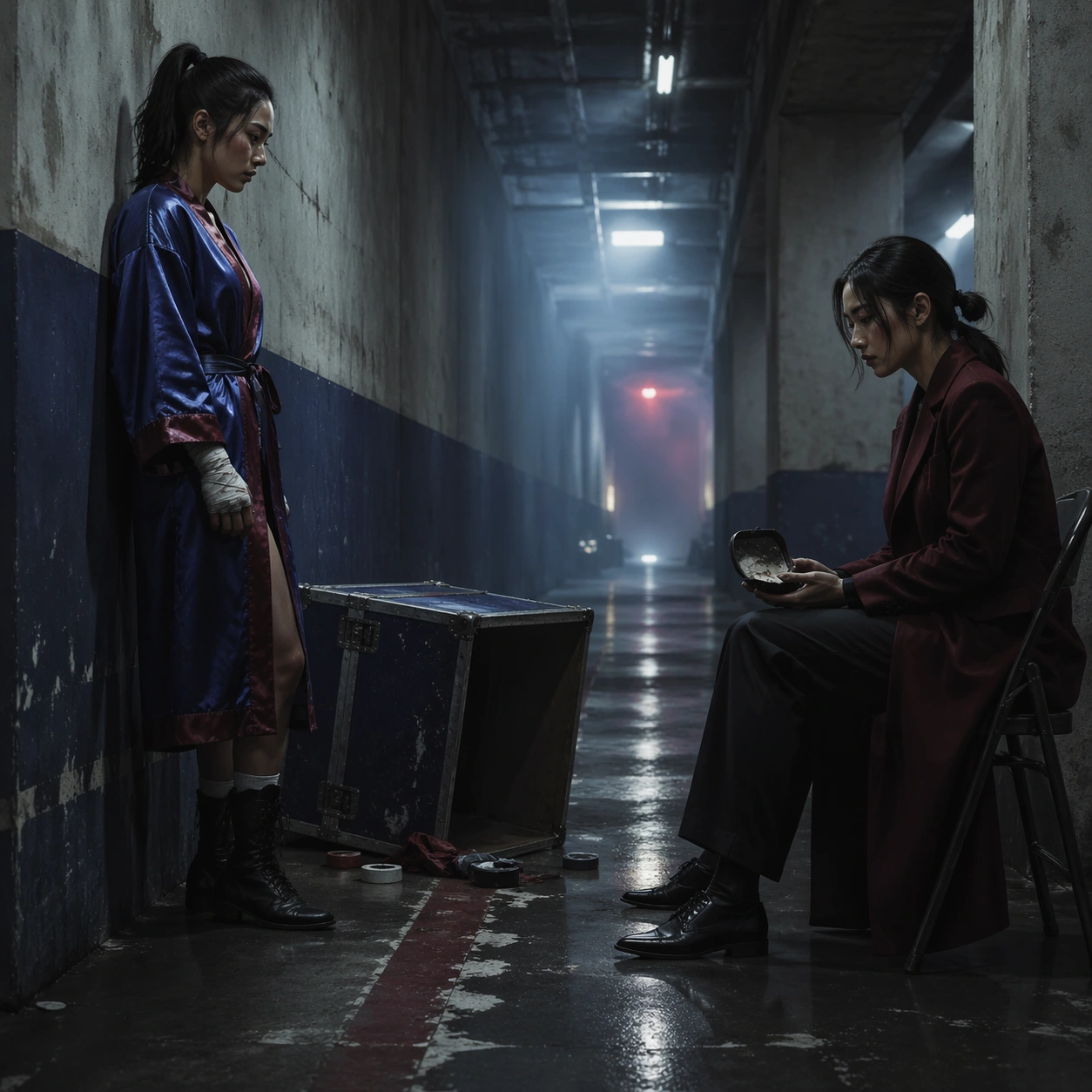
Example generated from “Festival Poster Fandom Crossover — Arena Sisters Jury Sheet”
GPT Image 2en

Scene: A square jury-award poster set in the empty service corridor beneath a monumental sports arena, with concrete walls, fluorescent spill softened by haze, and a limited palette of chalk white, faded cobalt, bruised burgundy, and asphalt black. The frame should feel controlled and prestigious, turning a high-energy fandom premise into a solemn backstage drama with room for invisible festival laurels and title blocks. Subject: Create an original poster about two estranged champion sisters from a combat-sport franchise world. One stands in a satin training robe with taped hands; the other sits on a folding chair in a tailored coat, holding a cracked mouthguard case. They are separated by a narrow corridor gap and an overturned equipment trunk, implying years of rivalry, injury, and shared history. A distant scoreboard glow may exist as abstract light only, never readable numbers. The image should feel like an awards contender about family and sacrifice rather than a hype poster about winning. Important details: The hard part is genre translation. Preserve the physical specificity of the arena world through tape, concrete dust, scuffed floor paint, and bruised knuckles, but wrap it in the sparse hierarchy of a jury-sheet poster. Avoid melodrama and spectacle; use posture, distance, and surface detail to carry the emotional charge. The composition should feel deliberate, premium, and painfully human. Use case: Festival Poster Fandom Crossover single study 7/9, testing whether a sports-anime-style sibling rivalry can become a serious jury-award poster. Constraints: No readable text, no watermark, no logos, preserve exact 1:1 aspect ratio, no ring action scene, no cheering crowd, no championship-belt glamour shot, no comic impact effects, no sweat-spray freeze frame, no propaganda sports branding, no exaggerated victory pose.

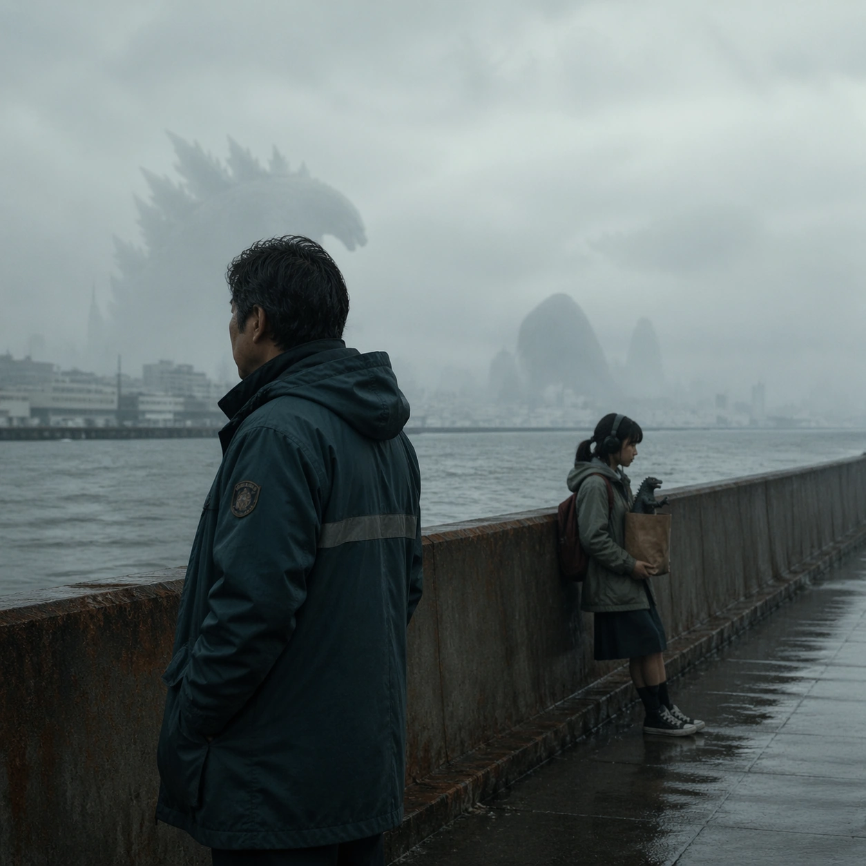
Example generated from “Festival Poster Fandom Crossover — Kaiju Family Program Cover”
GPT Image 2en

Scene: A square program-cover-style poster set on a quiet harbor seawall under overcast afternoon light, with enormous fog-softened silhouettes in the distance, wet concrete textures, gull-gray skies, and a refined palette of slate, rust, pearl, and sea green. The composition should feel like a printed festival program cover for a melancholy family drama, not like a disaster blockbuster. Reserve clean negative space and calm geometry suitable for invisible design treatment without readable text. Subject: Create an original poster centered on a father and daughter from a giant-creature franchise world. The father, in a weatherproof municipal coat, stands near the seawall looking outward; the daughter, wearing headphones and carrying a model creature figurine in a paper bag, leans against the railing several feet away. Far behind them, colossal shoreline forms are visible only as distant ambiguous presences through fog. The emotional core is familial estrangement inside a city that has normalized monsters, not attack spectacle. Important details: The visual trick is to keep fandom-scale worldbuilding while maintaining festival restraint. The kaiju context should be communicated through scale, civic textures, and distant silhouettes rather than explosions. Human posture, weather realism, damp surfaces, and the awkward space between father and daughter must dominate. The result should feel like a believable Berlinale or Cannes program cover for a humane genre crossover. Use case: Festival Poster Fandom Crossover single study 8/9, testing whether a kaiju-family premise can read as restrained festival program packaging. Constraints: No readable text, no watermark, no logos, preserve exact 1:1 aspect ratio, no city destruction, no fireballs, no roaring monster close-up, no military vehicles, no comic-book chaos, no neon sci-fi glow, no tourist postcard harbor mood.

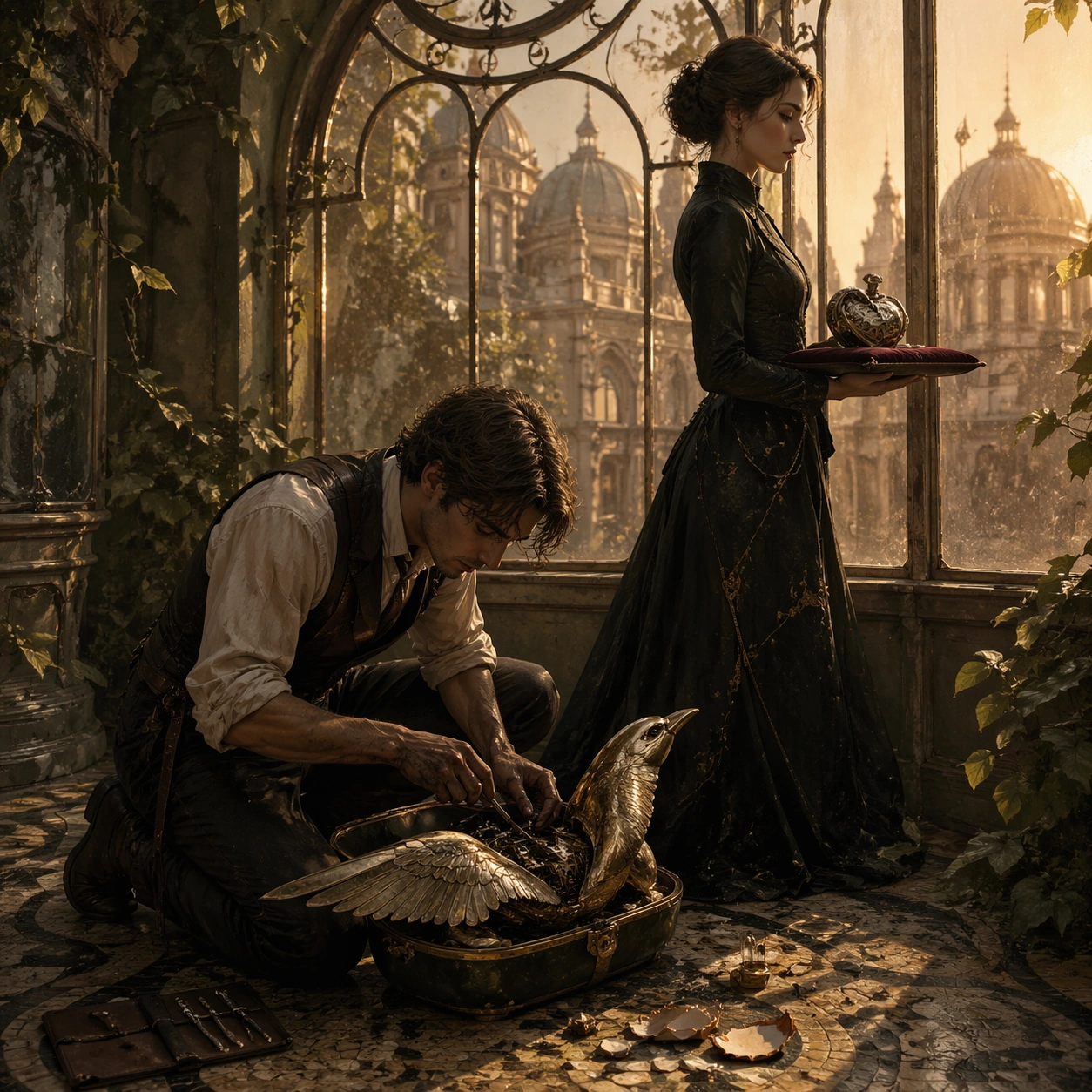
Example generated from “Festival Poster Fandom Crossover — Clockwork Lovers Palme Variant”
GPT Image 2en

Scene: A square closing-night poster set in a glass-roof conservatory at late golden hour, with faded botanical ironwork, pale apricot sun, long shadows across mosaic tile, and an elegant palette of ivory, oxidized green, black, and muted rose gold. The image should feel like the premium variant poster for a celebrated festival romance: sparse, tactile, and fully composed even though any eventual title or laurel placement would remain invisible and unreadable here. Subject: Create an original fandom-coded romance poster featuring two clockwork restorers from a retrofuturist city. One kneels beside an open mechanical bird case, sleeves rolled and hands stained with machine oil; the other stands near the conservatory window holding a dismantled pocket-watch heart on a velvet tray. Their poses should suggest intimacy interrupted by duty and time. Surround them with only a few carefully chosen props: precision tools, shattered enamel fragments, and delicate reflected greenery. The overall impression should be bittersweet, adult, and awards-season refined. Important details: The challenge is to make an ornate genre premise feel genuinely prestigious. Keep the material language believable: brass wear, oil sheen, velvet nap, thin glass reflections, and afternoon haze. The romance should come from gesture, distance, and the symbolic clockwork objects rather than melodramatic embrace. The poster must feel like a closing-night festival favorite, not a steampunk fashion shoot or fantasy merch illustration. Use case: Festival Poster Fandom Crossover single study 9/9, testing whether retrofuturist lovers can become a restrained closing-night festival poster variant. Constraints: No readable text, no watermark, no logos, preserve exact 1:1 aspect ratio, no kiss-poster cliché, no excessive gears everywhere, no cosplay styling, no overlit sunset glamour, no whimsical cartoon tone, no overcrowded prop table, no fantasy castle backdrop.

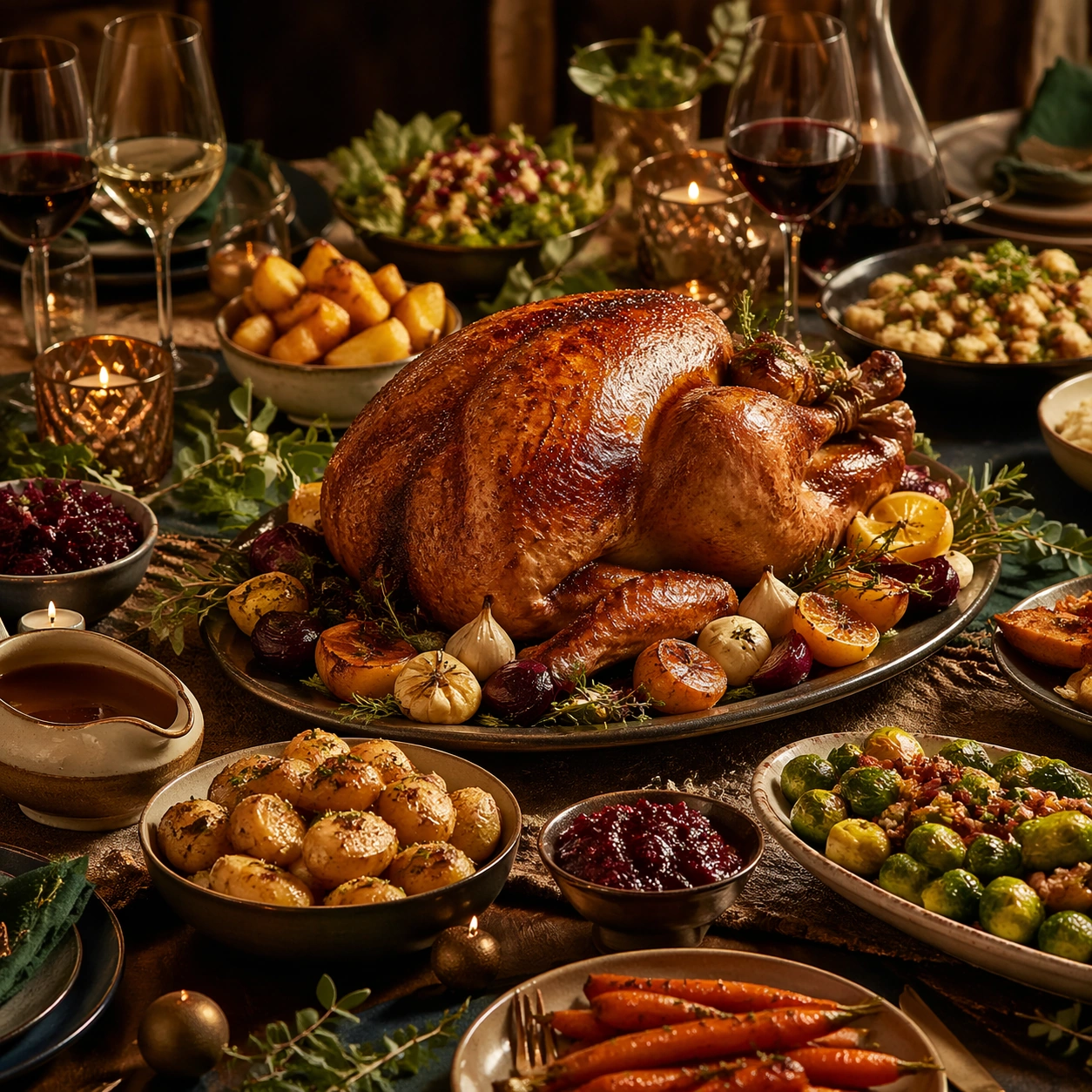
Example generated from “Festive Feast And Banquet Campaign Visuals — Banquet Anchor”
GPT Image 2en

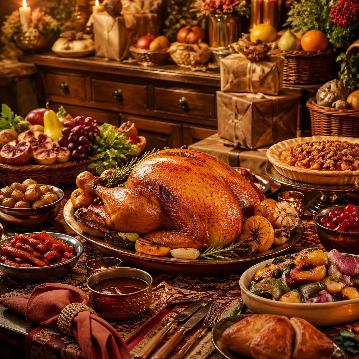
Scene: Compose a square feast or banquet campaign image with abundant but controlled table choreography, rich servingware, and a celebratory atmosphere that feels suitable for hospitality campaigns, seasonal dining promotions, or event editorials. The frame should manage many elements without losing hierarchy, elegance, or appetite appeal. Use a square dining-table crop under warm candlelike and ambient lighting, with layered servingware and enough table depth to feel abundant yet controlled. Subject: The food must look substantial and celebratory, with believable multi-dish coordination, serving logic, and table rituals that suggest a real banquet rather than a random buffet pile. Center a major banquet dish such as a roast, braise, or shared platter, supported by several secondary plates, glassware, and festive table details. Important details: This topic depends on composition reasoning. Preserve a strong centerpiece, readable secondary dishes, coherent servingware, and lighting that supports depth across the table. Celebration should emerge from abundance, color, and ritual objects, not from gimmicks or branded holiday symbols. Everything must feel premium, coordinated, and logistically plausible. This image establishes the reference system for the series, including camera height, tabletop discipline, prop family, and color control that later images must inherit. This anchor image must establish the banquet system for the series: centerpiece hierarchy, servingware palette, depth, and celebratory atmosphere without chaos. Use case: Festive Feast series study 1/9, built for Prompt Atlas coverage of a food and beverage commercial visual system. Constraints: No readable text, no watermark, no logos, preserve exact 1:1 aspect ratio, no readable text, no logos, no generic wedding décor, no buffet-chaos clutter, no novelty party props, no copied holiday mascots, no visible faces dominating the frame, no buffet line, no visible branded décor, no giant flower-wall backdrop.

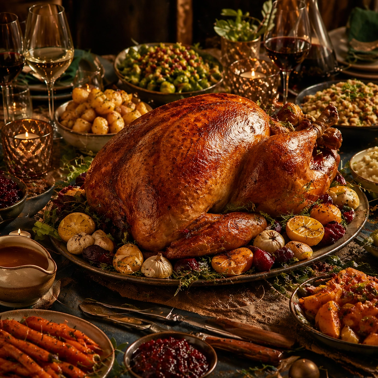
Example generated from “Festive Feast And Banquet Campaign Visuals — Roast Centerpiece”
GPT Image 2en

Scene: Compose a square feast or banquet campaign image with abundant but controlled table choreography, rich servingware, and a celebratory atmosphere that feels suitable for hospitality campaigns, seasonal dining promotions, or event editorials. The frame should manage many elements without losing hierarchy, elegance, or appetite appeal. Preserve the same table scale, servingware family, and warm celebration light, but let a roast centerpiece occupy more of the frame. Subject: The food must look substantial and celebratory, with believable multi-dish coordination, serving logic, and table rituals that suggest a real banquet rather than a random buffet pile. Show a major roast dish with lacquer, herbs, and serving utensils nearby, supported by just enough side dishes to preserve banquet context. Important details: This topic depends on composition reasoning. Preserve a strong centerpiece, readable secondary dishes, coherent servingware, and lighting that supports depth across the table. Celebration should emerge from abundance, color, and ritual objects, not from gimmicks or branded holiday symbols. Everything must feel premium, coordinated, and logistically plausible. Preserve the exact camera height, lens feel, prop family, tabletop scale, palette discipline, and brand logic established by 01-banquet-anchor. The reference system must remain visible through table styling, glassware rhythm, and background dish placement while the roast takes priority. Use case: Festive Feast series study 2/9, built for Prompt Atlas coverage of a food and beverage commercial visual system. Constraints: No readable text, no watermark, no logos, preserve exact 1:1 aspect ratio, no readable text, no logos, no generic wedding décor, no buffet-chaos clutter, no novelty party props, no copied holiday mascots, no visible faces dominating the frame, no chef carving portrait, no smoke-machine effect, no barbecue pit styling.

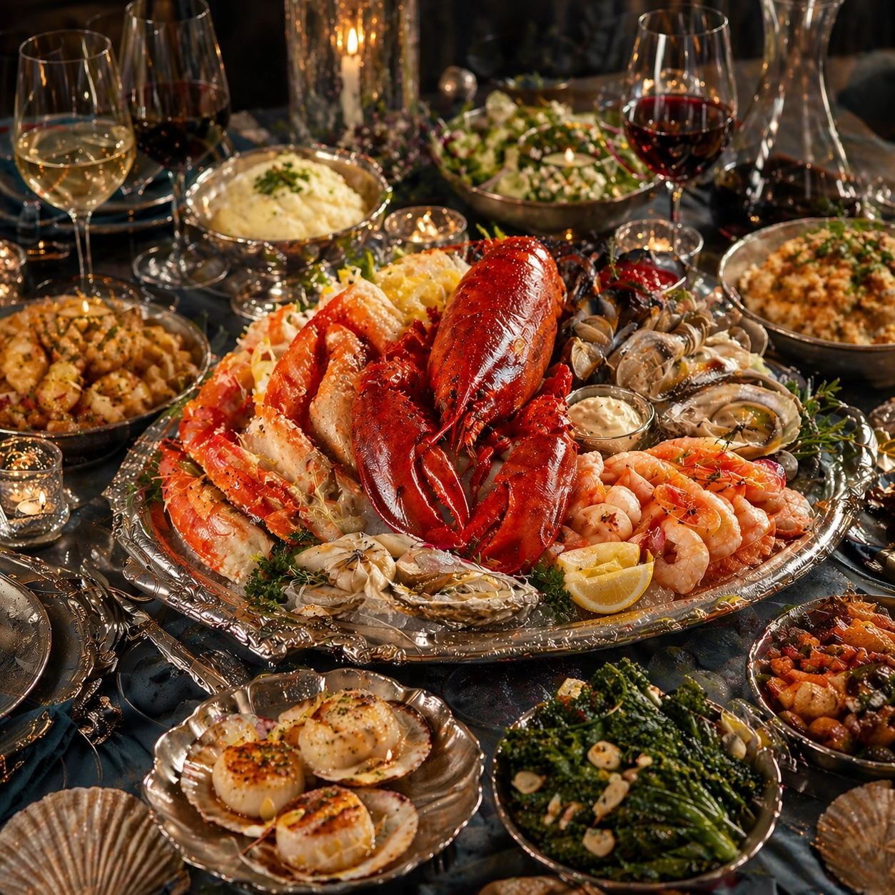
Example generated from “Festive Feast And Banquet Campaign Visuals — Seafood Platter Orbit”
GPT Image 2en

Scene: Compose a square feast or banquet campaign image with abundant but controlled table choreography, rich servingware, and a celebratory atmosphere that feels suitable for hospitality campaigns, seasonal dining promotions, or event editorials. The frame should manage many elements without losing hierarchy, elegance, or appetite appeal. Retain the same banquet geometry and celebratory lighting, but cool the palette slightly with silver platters, shell textures, and reflective serving surfaces. Subject: The food must look substantial and celebratory, with believable multi-dish coordination, serving logic, and table rituals that suggest a real banquet rather than a random buffet pile. Feature a generous seafood platter surrounded by side dishes, sauces, and glassware in a balanced orbit that still feels premium and organized. Important details: This topic depends on composition reasoning. Preserve a strong centerpiece, readable secondary dishes, coherent servingware, and lighting that supports depth across the table. Celebration should emerge from abundance, color, and ritual objects, not from gimmicks or branded holiday symbols. Everything must feel premium, coordinated, and logistically plausible. Preserve the exact camera height, lens feel, prop family, tabletop scale, palette discipline, and brand logic established by 01-banquet-anchor. Keep the anchor banquet language stable through servingware, crop, and abundance logic while making shell moisture, ice restraint, and platter hierarchy believable. Use case: Festive Feast series study 3/9, built for Prompt Atlas coverage of a food and beverage commercial visual system. Constraints: No readable text, no watermark, no logos, preserve exact 1:1 aspect ratio, no readable text, no logos, no generic wedding décor, no buffet-chaos clutter, no novelty party props, no copied holiday mascots, no visible faces dominating the frame, no seafood-tower excess, no beach-party vibe, no restaurant logo plate.

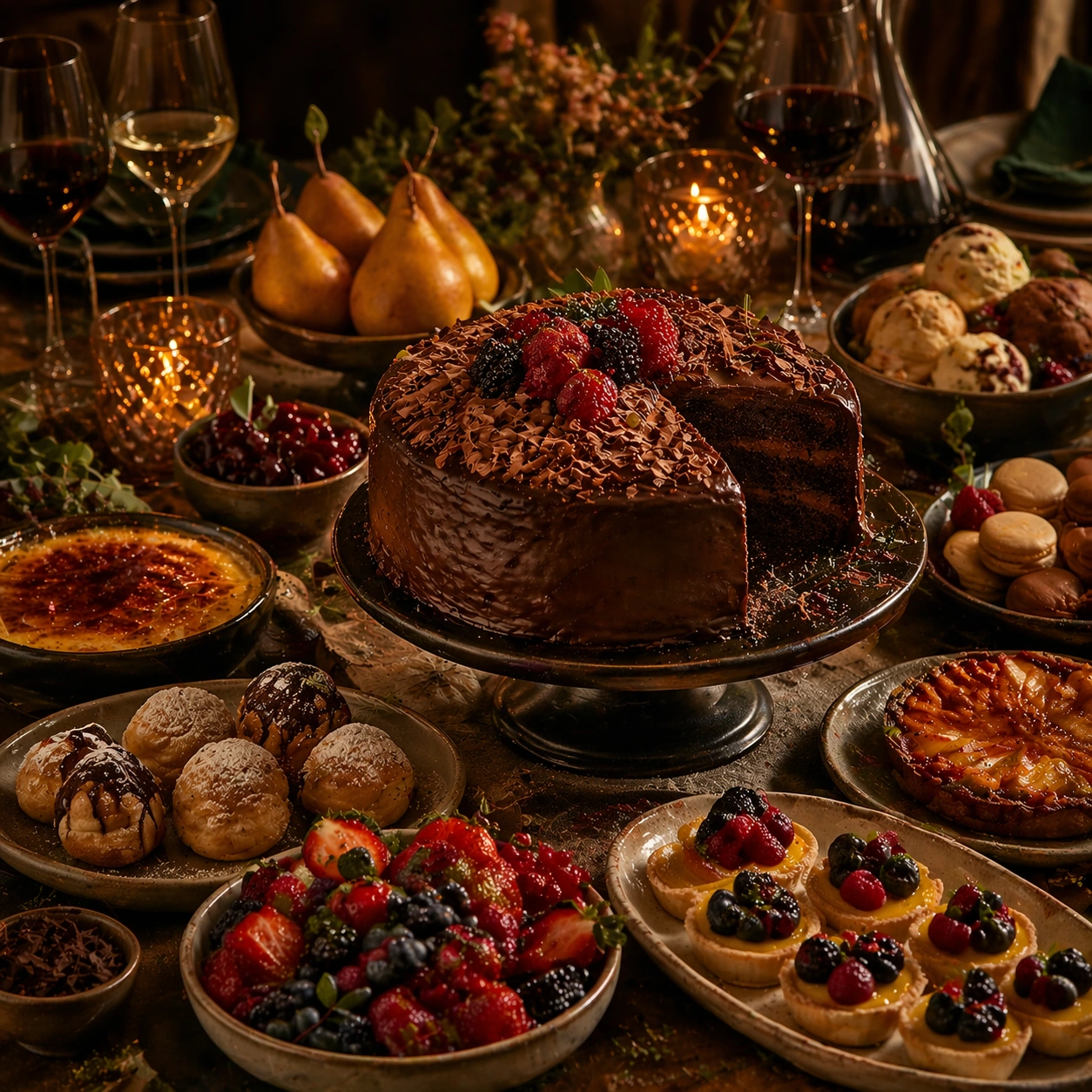
Example generated from “Festive Feast And Banquet Campaign Visuals — Dessert Finale Table”
GPT Image 2en

Scene: Compose a square feast or banquet campaign image with abundant but controlled table choreography, rich servingware, and a celebratory atmosphere that feels suitable for hospitality campaigns, seasonal dining promotions, or event editorials. The frame should manage many elements without losing hierarchy, elegance, or appetite appeal. Maintain the exact banquet staging and table depth, but shift the mood toward dessert lighting, polished fruit tones, and softer highlights. Subject: The food must look substantial and celebratory, with believable multi-dish coordination, serving logic, and table rituals that suggest a real banquet rather than a random buffet pile. Show a dessert-focused feast finale with cakes, fruit platters, pastries, and one hero sweet centerpiece arranged with event-level polish. Important details: This topic depends on composition reasoning. Preserve a strong centerpiece, readable secondary dishes, coherent servingware, and lighting that supports depth across the table. Celebration should emerge from abundance, color, and ritual objects, not from gimmicks or branded holiday symbols. Everything must feel premium, coordinated, and logistically plausible. Preserve the exact camera height, lens feel, prop family, tabletop scale, palette discipline, and brand logic established by 01-banquet-anchor. The banquet continuity should remain obvious through tableware, glass rhythm, and abundance structure even as the course moves from savory to sweet. Use case: Festive Feast series study 4/9, built for Prompt Atlas coverage of a food and beverage commercial visual system. Constraints: No readable text, no watermark, no logos, preserve exact 1:1 aspect ratio, no readable text, no logos, no generic wedding décor, no buffet-chaos clutter, no novelty party props, no copied holiday mascots, no visible faces dominating the frame, no birthday theme, no cartoon candy buffet, no readable celebration signage.

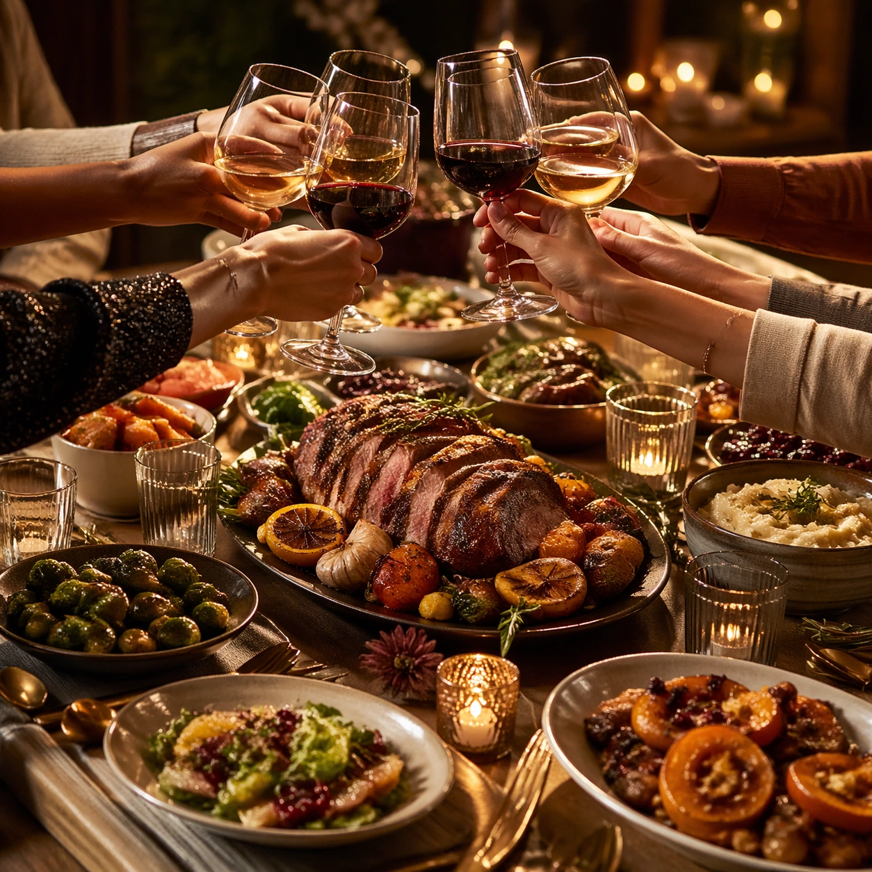
Example generated from “Festive Feast And Banquet Campaign Visuals — Family Toast Wide”
GPT Image 2en

Scene: Compose a square feast or banquet campaign image with abundant but controlled table choreography, rich servingware, and a celebratory atmosphere that feels suitable for hospitality campaigns, seasonal dining promotions, or event editorials. The frame should manage many elements without losing hierarchy, elegance, or appetite appeal. Frame a square crop above the table with several hands raising glasses over a richly set meal under warm festive light. Subject: The food must look substantial and celebratory, with believable multi-dish coordination, serving logic, and table rituals that suggest a real banquet rather than a random buffet pile. Keep the banquet dishes visible below the glasses so the food and celebration remain equally legible. Important details: This topic depends on composition reasoning. Preserve a strong centerpiece, readable secondary dishes, coherent servingware, and lighting that supports depth across the table. Celebration should emerge from abundance, color, and ritual objects, not from gimmicks or branded holiday symbols. Everything must feel premium, coordinated, and logistically plausible. This image should feel fully self-contained while still belonging to the same broader topic and commercial world. The gesture should feel spontaneous but composed. Glass levels, hand positions, and table depth must feel natural, not like staged stock advertising. Use case: Festive Feast single study 6/9, built for Prompt Atlas coverage of a food and beverage commercial visual system. Constraints: No readable text, no watermark, no logos, preserve exact 1:1 aspect ratio, no readable text, no logos, no generic wedding décor, no buffet-chaos clutter, no novelty party props, no copied holiday mascots, no visible faces dominating the frame, no faces, no branded bottles, no confetti storm.

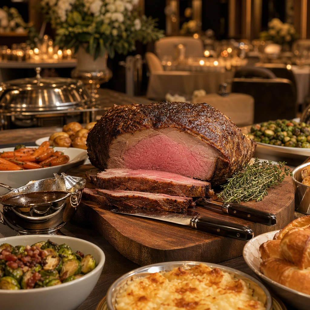
Example generated from “Festive Feast And Banquet Campaign Visuals — Carving Station Detail”
GPT Image 2en

Scene: Compose a square feast or banquet campaign image with abundant but controlled table choreography, rich servingware, and a celebratory atmosphere that feels suitable for hospitality campaigns, seasonal dining promotions, or event editorials. The frame should manage many elements without losing hierarchy, elegance, or appetite appeal. Use a square close crop of a service-side area with warm task light, one carving board or platter, and a disciplined backdrop of banquet context. Subject: The food must look substantial and celebratory, with believable multi-dish coordination, serving logic, and table rituals that suggest a real banquet rather than a random buffet pile. Focus on the finished roast or centerpiece and the serving setup, using the station to imply event service rather than a kitchen line. Important details: This topic depends on composition reasoning. Preserve a strong centerpiece, readable secondary dishes, coherent servingware, and lighting that supports depth across the table. Celebration should emerge from abundance, color, and ritual objects, not from gimmicks or branded holiday symbols. Everything must feel premium, coordinated, and logistically plausible. This image should feel fully self-contained while still belonging to the same broader topic and commercial world. Juice sheen, carving tool placement, board texture, and side-dish proximity should all feel functional and premium. Use case: Festive Feast single study 7/9, built for Prompt Atlas coverage of a food and beverage commercial visual system. Constraints: No readable text, no watermark, no logos, preserve exact 1:1 aspect ratio, no readable text, no logos, no generic wedding décor, no buffet-chaos clutter, no novelty party props, no copied holiday mascots, no visible faces dominating the frame, no visible staff faces, no buffet sneeze guard, no rustic barbecue vibe.

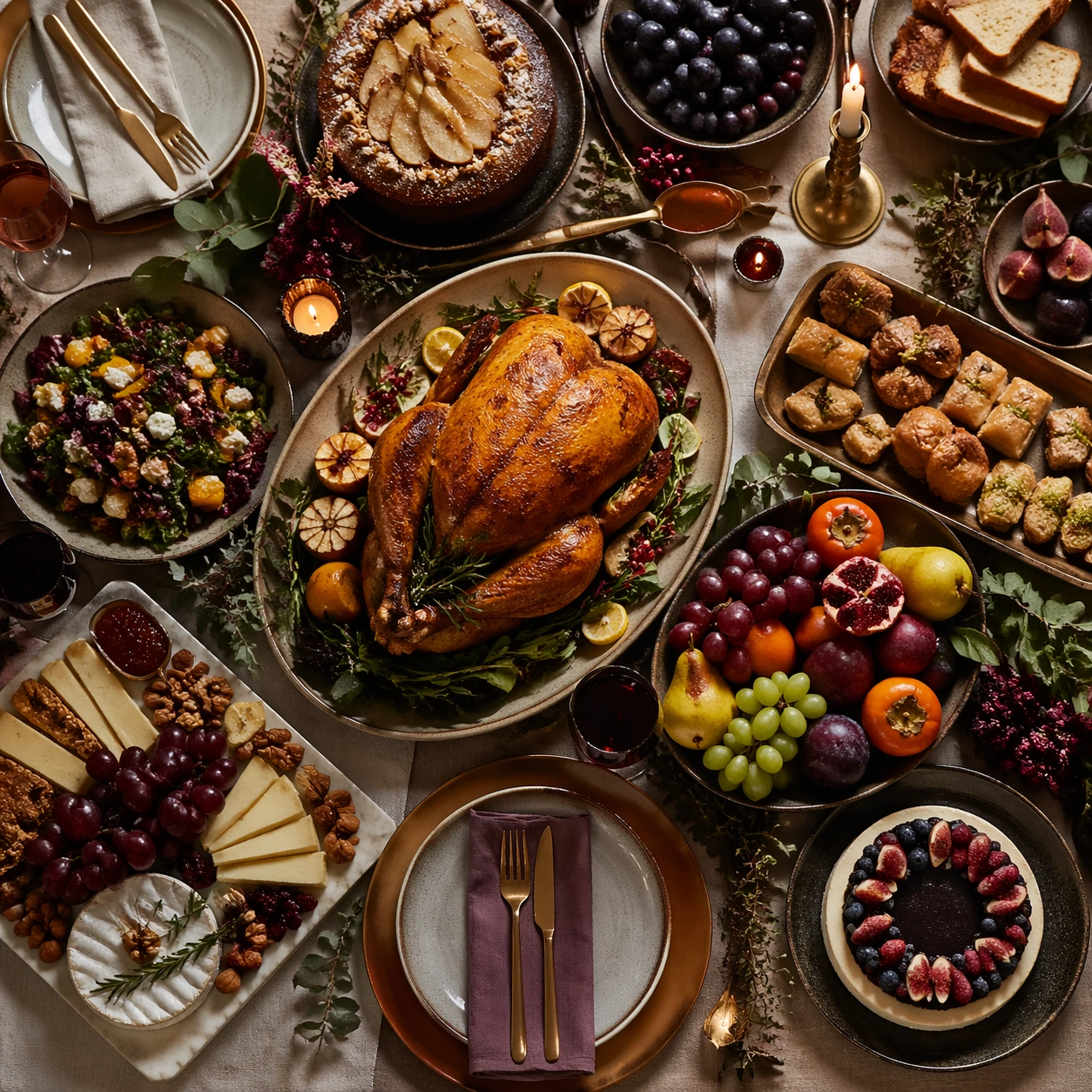
Example generated from “Festive Feast And Banquet Campaign Visuals — Sweets Fruit Overhead”
GPT Image 2en

Scene: Compose a square feast or banquet campaign image with abundant but controlled table choreography, rich servingware, and a celebratory atmosphere that feels suitable for hospitality campaigns, seasonal dining promotions, or event editorials. The frame should manage many elements without losing hierarchy, elegance, or appetite appeal. Shoot from overhead on a large table section with dessert plates, fruit platters, and serving tools arranged into a balanced square composition. Subject: The food must look substantial and celebratory, with believable multi-dish coordination, serving logic, and table rituals that suggest a real banquet rather than a random buffet pile. Use repeated forms and color grouping to make the spread feel abundant yet controlled and campaign-friendly. Important details: This topic depends on composition reasoning. Preserve a strong centerpiece, readable secondary dishes, coherent servingware, and lighting that supports depth across the table. Celebration should emerge from abundance, color, and ritual objects, not from gimmicks or branded holiday symbols. Everything must feel premium, coordinated, and logistically plausible. This image should feel fully self-contained while still belonging to the same broader topic and commercial world. Spacing, platter size, and color rhythm are critical. The scene should feel celebratory, premium, and clear enough to support hospitality promotion. Use case: Festive Feast single study 8/9, built for Prompt Atlas coverage of a food and beverage commercial visual system. Constraints: No readable text, no watermark, no logos, preserve exact 1:1 aspect ratio, no readable text, no logos, no generic wedding décor, no buffet-chaos clutter, no novelty party props, no copied holiday mascots, no visible faces dominating the frame, no candy-shop chaos, no children’s party props, no readable dessert labels.

Example generated from “Festive Feast And Banquet Campaign Visuals — Gift Basket Sideboard”
GPT Image 2en

Scene: Compose a square feast or banquet campaign image with abundant but controlled table choreography, rich servingware, and a celebratory atmosphere that feels suitable for hospitality campaigns, seasonal dining promotions, or event editorials. The frame should manage many elements without losing hierarchy, elegance, or appetite appeal. Compose a square sideboard or buffet-adjacent scene with baskets, wrapped goods, fruit, and one food hero under warm festive light. Subject: The food must look substantial and celebratory, with believable multi-dish coordination, serving logic, and table rituals that suggest a real banquet rather than a random buffet pile. Treat the sideboard as a supporting hospitality surface that extends the banquet world beyond the main table. Important details: This topic depends on composition reasoning. Preserve a strong centerpiece, readable secondary dishes, coherent servingware, and lighting that supports depth across the table. Celebration should emerge from abundance, color, and ritual objects, not from gimmicks or branded holiday symbols. Everything must feel premium, coordinated, and logistically plausible. This image should feel fully self-contained while still belonging to the same broader topic and commercial world. Basket weave, wrapping texture, fruit bloom, and tabletop styling should all feel premium and seasonal without depending on branded gift packaging. Use case: Festive Feast single study 9/9, built for Prompt Atlas coverage of a food and beverage commercial visual system. Constraints: No readable text, no watermark, no logos, preserve exact 1:1 aspect ratio, no readable text, no logos, no generic wedding décor, no buffet-chaos clutter, no novelty party props, no copied holiday mascots, no visible faces dominating the frame, no readable gift cards, no corporate hamper logos, no cluttered hotel buffet line.

Example generated from “Fictional Celebrity Snapshot — Tech Founder Skate Stop”
GPT Image 2en

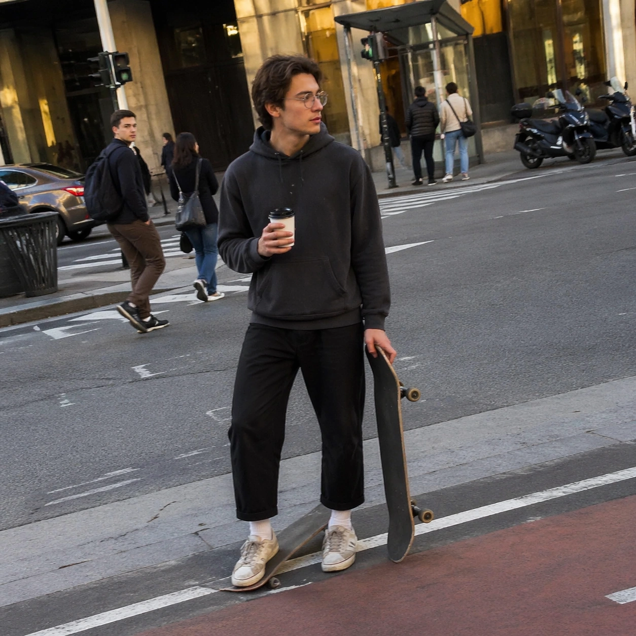
Scene: A square smartphone snapshot in late afternoon city light, slightly tilted and imperfectly framed as if taken quickly from across a bike lane. The image has natural phone-camera compression, mild motion blur at the edges, realistic asphalt texture, parked scooters, a bus stop shelter, and ordinary pedestrians in soft background focus. The mood should feel plausible and unposed, like a casual social-feed photo, not a studio portrait. Subject: A completely fictional young tech-founder celebrity-like person pauses on a skateboard at a crosswalk, wearing a plain charcoal hoodie, cropped trousers, worn sneakers, and round non-branded glasses. They have an invented face that does not resemble any real public figure. One hand holds a paper coffee cup with no readable markings; the other steadies the skateboard. A passerby glances over, suggesting mild recognition without crowd drama. Important details: The core test is believable accidental realism: uneven phone exposure, pedestrian scale, natural shadow direction, slight background clutter, and a subject who reads as famous only through confident posture and subtle attention from bystanders. Avoid paparazzi aggression. Make all storefronts and transit signs unreadable or abstract. Keep skin texture, clothing folds, wheels, curb paint, and reflections physically convincing. Use case: Fictional Celebrity Snapshot single study 1/8, testing a mundane invented-public-figure phone snapshot without real-person likeness. Constraints: No readable text, no watermark, no logos, preserve exact 1:1 aspect ratio, no real celebrity likeness, no real person name, no claimed real event, no brand marks, no news caption, no staged red-carpet lighting, no distorted hands, no unsafe traffic action.

Example generated from “Fictional Celebrity Snapshot — Design Icon Corner Store”
GPT Image 2en

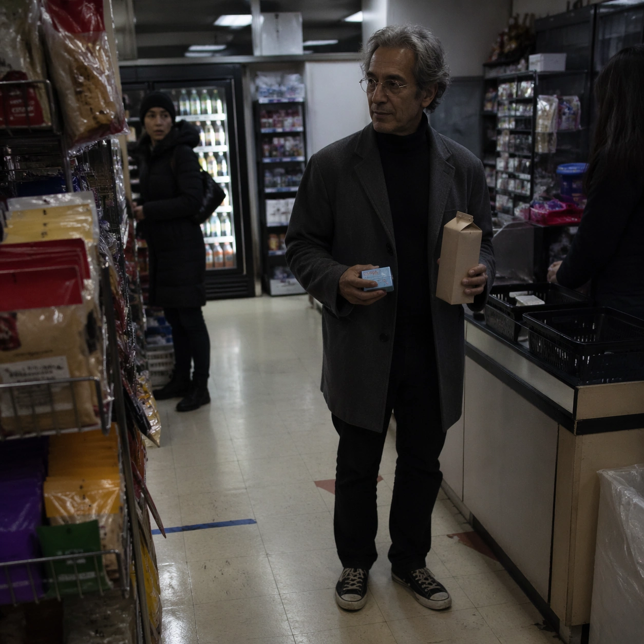
Scene: A square low-light smartphone snapshot inside a small corner store at night, photographed from the snack aisle with imperfect aisle-shelf framing. Fluorescent ceiling light reflects on vinyl floor, coolers glow in the background, and the camera slightly underexposes the subject's face. The composition should feel like a quiet accidental photo taken by a shopper, with realistic phone noise and shallow motion blur. Subject: A completely fictional older design-icon celebrity-like person stands near the checkout holding a plain paper carton and a pack of gum with no readable markings. They wear a black turtleneck under a simple gray coat, wire-frame glasses, and worn canvas shoes, but their facial features are invented and not based on any real designer or public figure. The cashier is mostly obscured; a second shopper recognizes the subject with a subtle double take. Important details: Use ordinary retail clutter without readable product text: colored blocks, abstract labels, shelf geometry, plastic baskets, taped floor marks, and refrigerator reflections. The subject should feel famous through calm presence and visual contrast against the mundane store, not through any real likeness. Make hands, carton, shelf perspective, fluorescent color cast, and phone-camera artifacts convincing. Avoid sensational or invasive framing. Use case: Fictional Celebrity Snapshot single study 2/8, testing a believable invented design-icon corner-store snapshot. Constraints: No readable text, no watermark, no logos, preserve exact 1:1 aspect ratio, no real celebrity likeness, no real person name, no claimed real event, no cigarettes, no brand packages, no news photo caption, no staged commercial lighting, no uncanny face.

Example generated from “Fictional Celebrity Snapshot — Rocket Heiress Playground”
GPT Image 2en

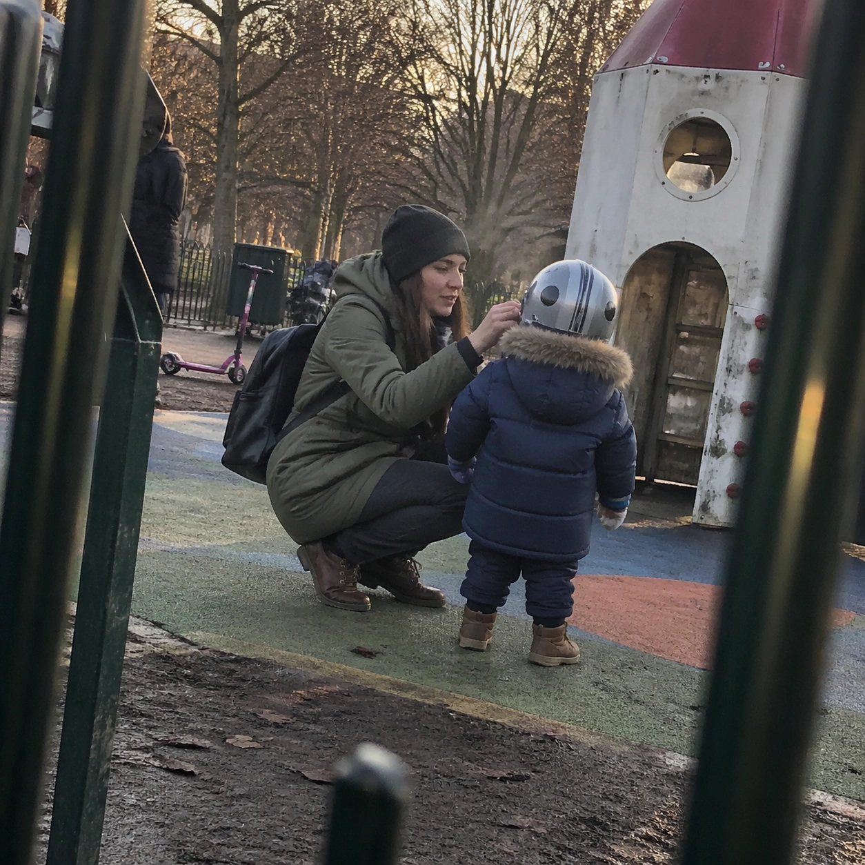
Scene: A square candid smartphone snapshot at a neighborhood playground during soft winter morning light. The camera is held at adult chest height from behind a fence opening, slightly off-level, with realistic foreground blur from metal bars and a patchy rubber play surface. The scene should be respectful, public, and non-invasive, with ordinary parents, scooters, and trees in the background. Subject: A completely fictional aerospace heiress and rocket-company celebrity-like person crouches beside a small child-shaped figure in a puffy coat, helping adjust a toy helmet near a playground rocket climber. The adult has an invented face and does not resemble any real entrepreneur, celebrity, or public figure. Their clothing is casual: olive parka, beanie, plain backpack, and scuffed boots. The child is not identifiable, turned away, and present only as a small contextual silhouette. Important details: The composition should imply a mundane public moment rather than a news event. Use realistic smartphone dynamic range, natural breath in cold air, playground wear, mud near the rubber mat, and soft background bokeh. Avoid celebrity spectacle: no crowds, no bodyguards, no press cameras. The subject reads as high-status through posture, expensive but unbranded outerwear, and a passerby quietly noticing them. Use case: Fictional Celebrity Snapshot single study 3/8, testing a believable invented aerospace-celebrity family moment without real likeness or private-event claims. Constraints: No readable text, no watermark, no logos, preserve exact 1:1 aspect ratio, no real celebrity likeness, no real person name, no claimed real event, no identifiable child face, no paparazzi harassment, no brand marks, no unsafe playground action, no staged family portrait.

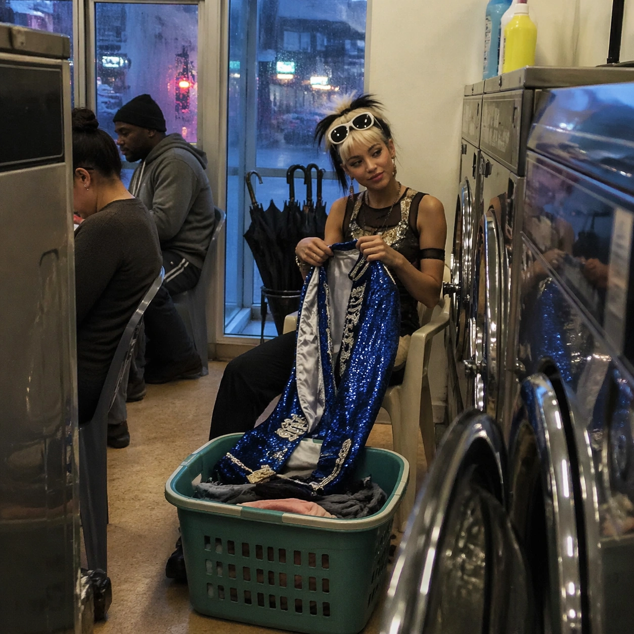
Example generated from “Fictional Celebrity Snapshot — Pop Diva Laundromat”
GPT Image 2en

Scene: A square smartphone snapshot inside a neighborhood laundromat on a rainy evening, framed from waist height between rows of washing machines. Fluorescent light mixes with blue window light, wet umbrellas lean near the door, and reflections ripple across stainless steel machine doors. The photo should feel casually captured, with a slightly crooked frame, phone noise, and one foreground machine edge partly blocking the view. Subject: A completely fictional pop-diva celebrity-like person sits on a plastic chair folding a bright stage-jacket garment beside a basket of ordinary laundry. They have an invented face, unique hairstyle, and dramatic but unbranded sunglasses pushed onto their head, with no resemblance to any real singer. Their expression is relaxed and slightly amused. Two regular customers nearby pretend not to stare, creating the sense of quiet recognition. Important details: The scene should balance glamour and mundanity. Use sequined fabric texture, damp pavement visible through the window, detergent bottles with abstract shapes only, realistic machine reflections, and skin tones under mixed fluorescent light. The subject should look famous through presence, styling, and bystander behavior, not through real identity cues. Keep the snapshot ethically ordinary: no hidden private space, no scandal, no intrusive close-up. Use case: Fictional Celebrity Snapshot single study 4/8, testing a mundane invented pop-star laundromat snapshot with strong phone-photo realism. Constraints: No readable text, no watermark, no logos, preserve exact 1:1 aspect ratio, no real celebrity likeness, no real person name, no claimed real event, no brand detergent labels, no paparazzi flash, no staged fashion shoot, no distorted washing machines.

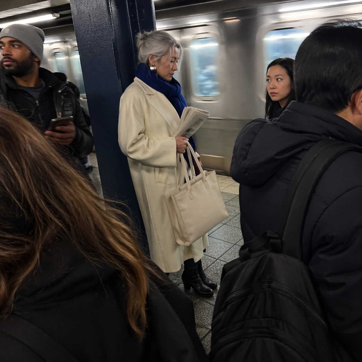
Example generated from “Fictional Celebrity Snapshot — Fashion Muse Subway”
GPT Image 2en

Scene: A square candid smartphone snapshot on a subway platform during morning commute, with cool fluorescent lighting, tiled walls, motion-blurred train windows, and realistic crowd density. The frame is slightly too close and tilted, as if captured while stepping off a train. Foreground commuters partially obscure the lower frame, and the subject is visible through a gap in the crowd. Subject: A completely fictional fashion-muse celebrity-like person waits by a column holding a plain tote bag and a folded newspaper-like sheet with no readable marks. They have an invented face and body language, not resembling any real model, actor, or influencer. Their outfit is distinctive but unbranded: oversized cream coat, cobalt scarf, sculptural earrings, black boots, and silver-gray hair pinned casually. They look calm, absorbed in the commute. Important details: The photo should feel socially plausible: no red carpet, no entourage, no professional flash. Fame is implied through refined styling, unusual composure, and two commuters quietly recognizing them. Render subway grime, floor reflections, fabric folds, handrail metal, motion blur, and mixed skin tones naturally. All station signs and ads must be abstract, cropped, or unreadable. Keep the image from feeling like a fashion editorial despite the stylish subject. Use case: Fictional Celebrity Snapshot single study 6/8, testing public-transit phone realism with a fully invented fashion-icon subject. Constraints: No readable text, no watermark, no logos, preserve exact 1:1 aspect ratio, no real celebrity likeness, no real person name, no claimed real event, no brand clothing marks, no identifiable transit ads, no staged runway pose, no distorted crowd faces.

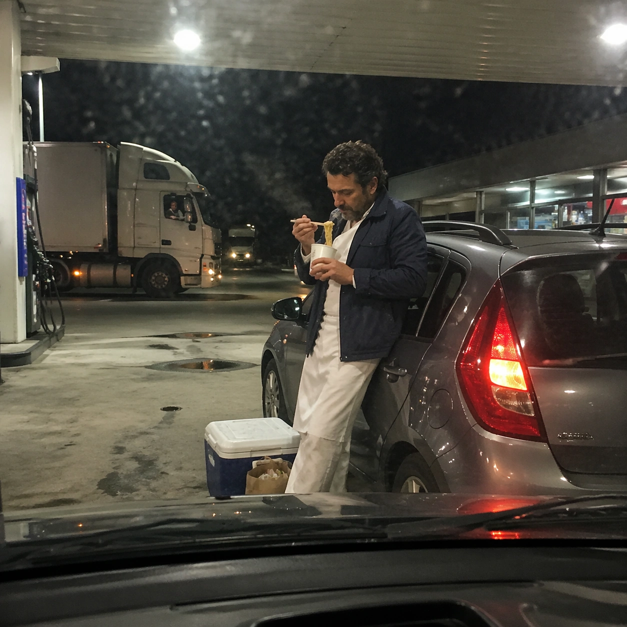
Example generated from “Fictional Celebrity Snapshot — Chef Legend Gas Station”
GPT Image 2en

Scene: A square roadside smartphone snapshot at a gas station after sunset, lit by harsh canopy lights, red-orange taillights, and cooler interior shop glow. The frame is taken from inside a parked car through a slightly dirty windshield, with dashboard reflection at the bottom and mild compression artifacts. The composition should feel mundane, spontaneous, and photorealistic. Subject: A completely fictional world-famous chef-like person stands beside a small hatchback, eating instant noodles from a plain cup with chopsticks while leaning against the car door. They wear a weathered navy jacket over kitchen whites with no restaurant logo, and their face is fully invented, not resembling any real chef or television personality. A road-trip cooler and paper grocery bag sit near their feet. Important details: The subject reads as famous through confident posture, distinctive chef clothing, and a truck driver in the background doing a subtle double take. Render sodium-vapor lighting, windshield smears, steam from the cup, reflective car paint, realistic hands, and pavement oil stains. All pump labels, shop signs, and packaging must be abstract or unreadable. Avoid making the scene look like an advertisement or scandal. Use case: Fictional Celebrity Snapshot single study 7/8, testing an invented chef-celebrity roadside phone snapshot with believable low-light material detail. Constraints: No readable text, no watermark, no logos, preserve exact 1:1 aspect ratio, no real celebrity likeness, no real person name, no claimed real event, no gas station brand marks, no alcohol, no unsafe fueling action, no paparazzi flash, no staged food commercial.

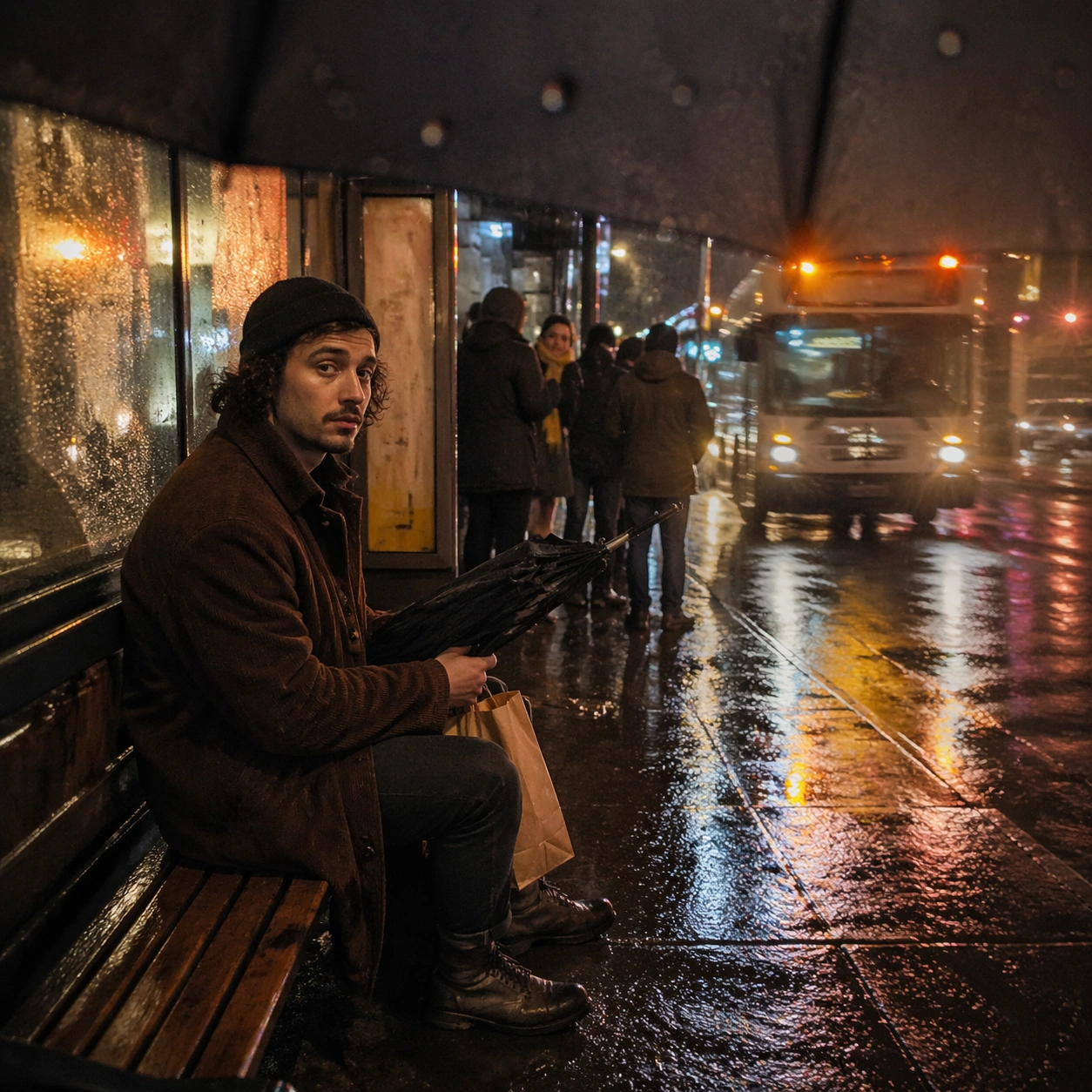
Example generated from “Fictional Celebrity Snapshot — Indie Actor Rainy Bus”
GPT Image 2en

Scene: A square rainy-night smartphone snapshot at a bus stop, with water droplets on the lens, wet pavement reflections, warm shelter light, and a bus approaching in soft motion blur. The camera is held low from under an umbrella, causing the top edge of the frame to vignette slightly. The image should feel like an ordinary commuter photo captured by chance. Subject: A completely fictional acclaimed indie-actor celebrity-like person waits alone on the bench, holding a folded umbrella and a paper bag with no markings. They wear a thrifted corduroy coat, knit cap, scuffed boots, and a calm tired expression. Their face is invented and not based on any real actor. A small group of commuters stands farther back, one person quietly looking over as if recognizing them, but there is no crowd or confrontation. Important details: Make the realism depend on weather and phone optics: raindrops, blown highlights, bus headlights, damp fabric, shelter glass, reflections, and mild lens flare. The subject should feel notable but not glamorous, integrated into public transit life. All bus route signs, shelter ads, and paper bag markings must be unreadable. The image should be emotionally cinematic while still reading as a candid phone snapshot. Use case: Fictional Celebrity Snapshot single study 8/8, testing rainy low-light phone realism with a fictional indie-actor public-transit moment. Constraints: No readable text, no watermark, no logos, preserve exact 1:1 aspect ratio, no real celebrity likeness, no real person name, no claimed real event, no tabloid caption, no brand clothing marks, no unsafe road scene, no staged film still, no uncanny facial detail.
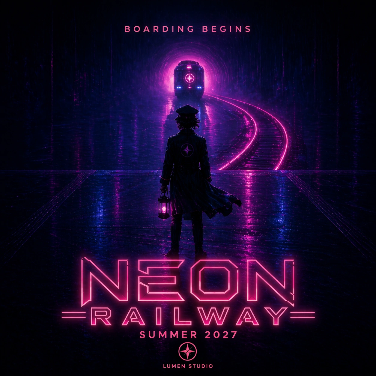
Example generated from “Fictional Ip Poster — Key Art Poster”
GPT Image 2en

Scene: A square release-grade sci-fi anime film poster, photographed as a crisp printed one-sheet on a dark gallery wall with subtle paper texture and cinematic lighting. Use deep indigo sky, magenta neon, rain-slick reflections, and a vertical composition with a large title lockup at the lower third. The poster should look like a real premium theatrical campaign, not a generic concept art image. Subject: Create the key art for a fictional IP called NEON RAILWAY. Show a young conductor standing on the roof of a glowing suspended train crossing a city at night, with luminous rails bending into the clouds. The exact readable poster copy must be: NEON RAILWAY, MARA VALE, JUN PIKE, THEO ASH, SUMMER 2027, LUMEN STUDIO. The title should have a custom angular neon font, cast names in a clean top line, release date beneath the title, and a small fictional studio mark near the bottom. Important details: This is the reference poster for a campaign series, so title typography, protagonist silhouette, train shape, magenta-blue palette, and fictional studio mark must be memorable and reusable. Keep the text hierarchy professional: cast small, title dominant, release date clear, studio secondary. Make all key text readable and aligned. Use case: Fictional IP Poster series study 1/8, establishing the fictional NEON RAILWAY campaign identity. Constraints: No readable text except the specified fictional poster copy, no watermark, no real logos, preserve exact 1:1 aspect ratio, no existing franchise references, no misspelled title, no extra cast names, no fake legal credits, no clutter over typography.

Example generated from “Fictional Ip Poster — Teaser Poster”
GPT Image 2en

Scene: Use the reference NEON RAILWAY key art as the campaign identity source. Create a square minimalist teaser poster photographed as a glossy printed poster in a theater lobby lightbox. Keep the same magenta-blue neon palette, angular title style, glowing suspended rail motif, rain reflections, and fictional LUMEN STUDIO mark, but use more negative space and a stronger mystery mood. Subject: Show only the rear silhouette of the same young conductor standing on an empty platform as the neon train approaches from a tunnel of light. The exact readable poster copy must be: NEON RAILWAY, BOARDING BEGINS, SUMMER 2027, LUMEN STUDIO. The title sits low and large in the same custom style as the reference, BOARDING BEGINS appears as a short teaser line above the train lights, and the date plus studio mark are small but readable near the bottom. Important details: This must feel like the same fictional IP campaign, not a new movie. Preserve the train silhouette, neon rail geometry, title letterform attitude, color palette, and premium poster hierarchy from image 01. Text should be crisp and sparse. Do not add cast names or billing blocks; this is a teaser release artifact. Use case: Fictional IP Poster series study 2/8, creating a teaser variant while preserving the NEON RAILWAY campaign system. Constraints: No readable text except the specified fictional poster copy, no watermark, no real logos, preserve exact 1:1 aspect ratio, no existing franchise references, no extra slogans, no misspelled title, no illegible date, no cluttered typography.
Example generated from “Fictional Ip Poster — Character One Sheet”
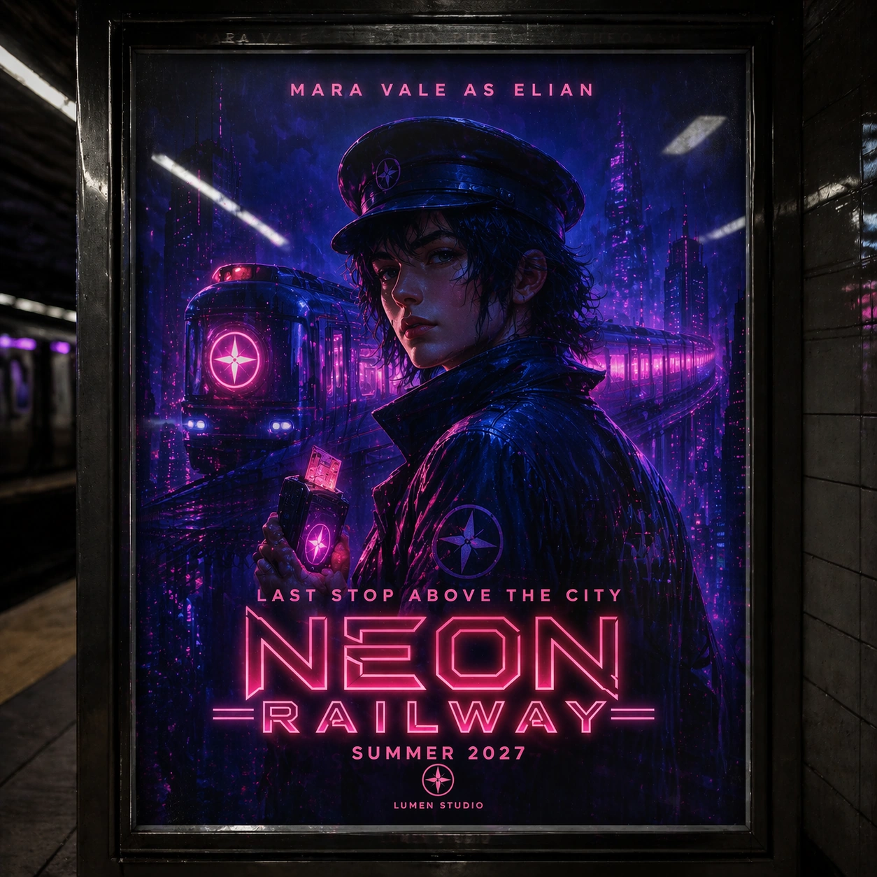
GPT Image 2en

Scene: Use the reference NEON RAILWAY key art as the source for title style, protagonist, train world, and campaign palette. Create a square character one-sheet poster mounted in a subway station advertising frame, with glass reflections, believable print texture, and strong cinematic portrait lighting. Keep the magenta-blue neon rail atmosphere but make the protagonist the dominant subject. Subject: Show the same young conductor from the reference in a three-quarter portrait, wearing a dark raincoat, conductor cap, glowing ticket punch, and wet neon highlights. A spectral train curves behind the shoulders. The exact readable poster copy must be: NEON RAILWAY, MARA VALE AS ELIAN, LAST STOP ABOVE THE CITY, SUMMER 2027, LUMEN STUDIO. The title should match the reference style, the actor-character line should be clear near the top, the tagline sits mid-poster, and date plus studio mark sit near the bottom. Important details: This is a character campaign poster, so preserve face, outfit language, title lockup, train icon, and color system from image 01. Text hierarchy must be professional and legible at poster scale. Make the typography feel designed, not randomly placed, and avoid overfilling the frame with fake credits. Use case: Fictional IP Poster series study 3/8, creating a character one-sheet for the same fictional campaign. Constraints: No readable text except the specified fictional poster copy, no watermark, no real logos, preserve exact 1:1 aspect ratio, no existing franchise references, no extra actor names, no misspelled character name, no generic billing block, no distorted face.

Example generated from “Fictional Ip Poster — Premiere Wall Poster”
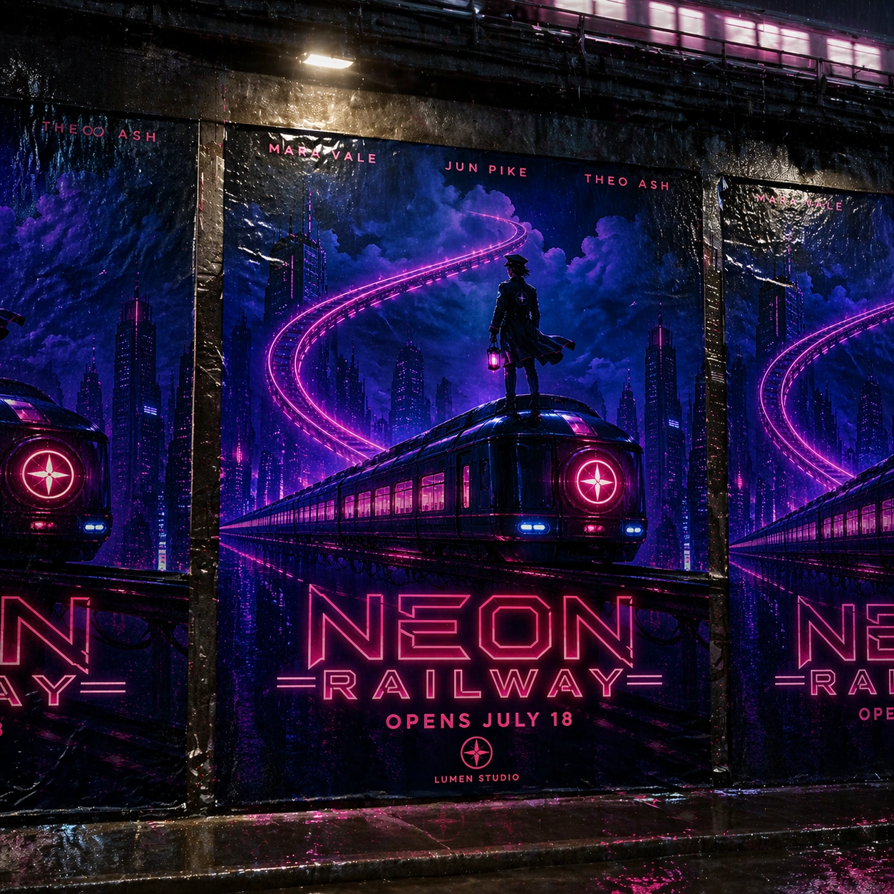
GPT Image 2en

Scene: Use the reference NEON RAILWAY key art as the source for fictional IP identity. Create a square photo-realistic scene of three printed campaign posters pasted on a rainy city wall near an elevated track, all for the same fictional film. The main center poster should dominate, with two partial side posters visible, wet paper edges, streetlight glare, and realistic urban texture. Subject: The center poster shows the young conductor and glowing train from the reference in a wide heroic composition. The exact readable poster copy on the center poster must be: NEON RAILWAY, MARA VALE, JUN PIKE, THEO ASH, OPENS JULY 18, LUMEN STUDIO. Side posters may show cropped versions of the same title lockup but should not introduce new readable words. The campaign should look like a real outdoor release rollout for a fictional sci-fi anime film. Important details: Preserve title style, palette, protagonist identity, train silhouette, and fictional studio mark from image 01. This image tests poster realism and typography under environmental conditions: wet paper, folds, and glare must not make the key copy unreadable. Keep visual hierarchy clear despite street texture and reflections. Use case: Fictional IP Poster series study 4/8, showing the fictional campaign as a realistic outdoor premiere wall poster. Constraints: No readable text except the specified fictional poster copy, no watermark, no real logos, preserve exact 1:1 aspect ratio, no existing franchise references, no extra release dates, no real city ads, no torn title letters, no illegible cast line.

Example generated from “Fictional Ip Poster — Clockwork Harbor Poster”
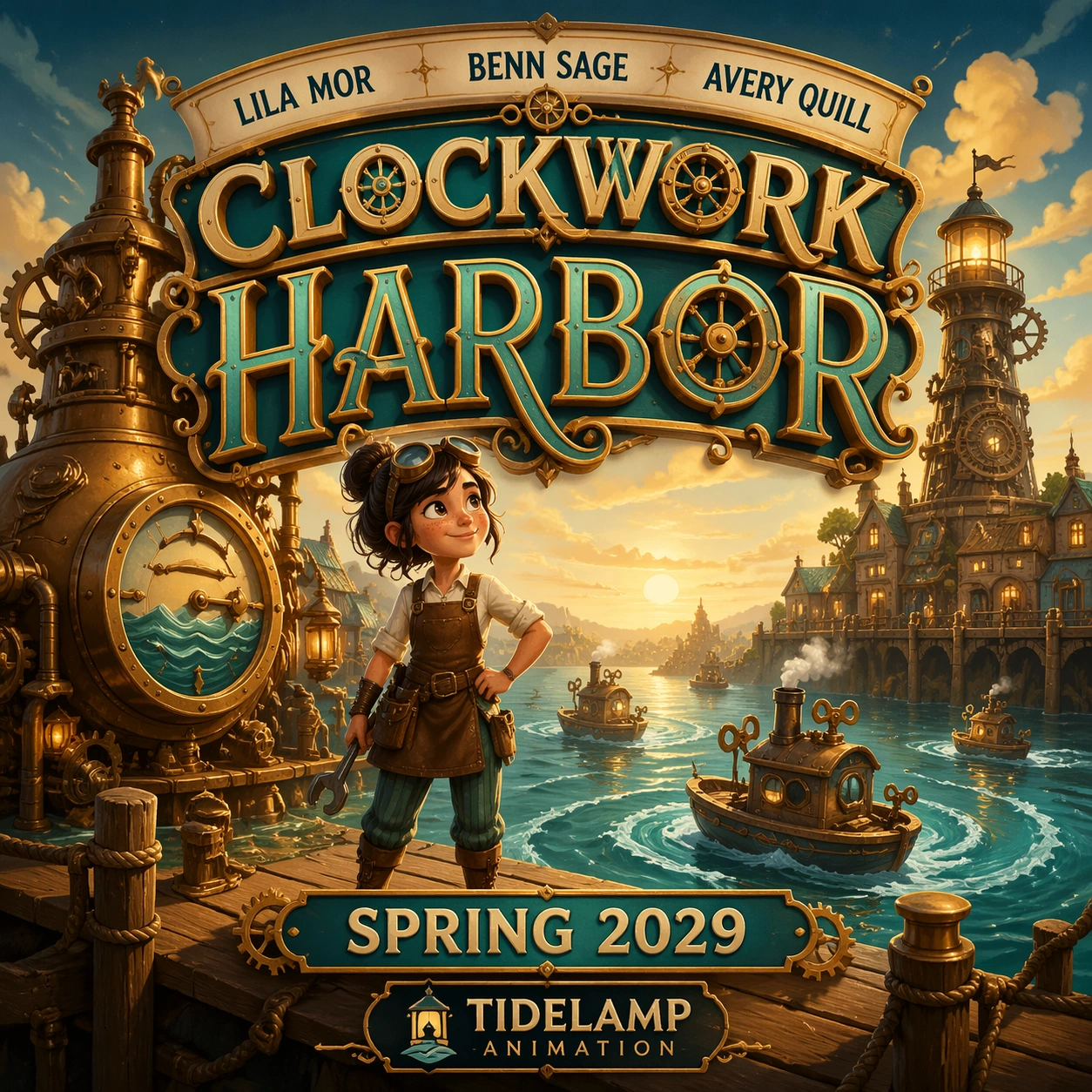
GPT Image 2en

Scene: A square fictional animated adventure poster, printed like a high-end theatrical campaign piece with warm paper texture and rich illustrated detail. Use golden harbor light, teal water, brass machinery, and whimsical but polished composition. The poster should feel like a real family animation release without copying any existing studio style or character design. Subject: Create a poster for a fictional animated film titled CLOCKWORK HARBOR. Show a young inventor standing on a pier beside a giant brass tide machine, with small clockwork boats circling in the water and a lighthouse made of gears in the background. The exact readable poster copy must be: CLOCKWORK HARBOR, LILA MOR, BENN SAGE, AVERY QUILL, SPRING 2029, TIDELAMP ANIMATION. The title is large and playful at the top, cast names in a neat arc above the scene, release date below the character, and fictional studio mark at the bottom. Important details: The typography should look custom, dimensional, and integrated with the poster, but every word must be readable. Keep the character original, the world charming, and the fake studio mark simple. This is not a concept sketch; it should look like a finished launch poster with clear hierarchy and polished color grading. Use case: Fictional IP Poster single study 6/8, testing readable animated-feature typography and fictional studio branding. Constraints: No readable text except the specified fictional poster copy, no watermark, no real logos, preserve exact 1:1 aspect ratio, no existing animation franchise references, no extra tagline, no unreadable cast line, no copied mascot, no fake billing block.

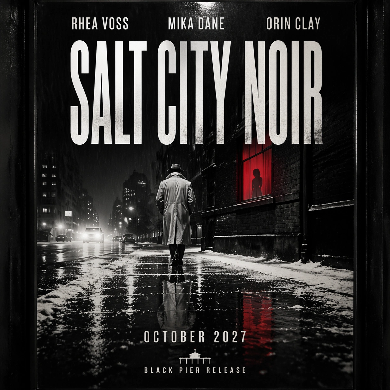
Example generated from “Fictional Ip Poster — Salt City Noir Poster”
GPT Image 2en

Scene: A square neo-noir thriller poster presented as a slightly glossy print under a street kiosk light. Use monochrome salt-white streets, hard black shadows, one red neon accent, rain texture, and a strict vertical poster grid. The composition should feel like a premium fictional crime release with strong typographic hierarchy. Subject: Create a poster for a fictional noir film titled SALT CITY NOIR. Show a detective in a pale coat walking through a city street dusted with salt crystals, reflected in a wet sidewalk while a red window glows above. The exact readable poster copy must be: SALT CITY NOIR, RHEA VOSS, MIKA DANE, ORIN CLAY, OCTOBER 2027, BLACK PIER RELEASE. Place cast names in a clean top line, title in bold condensed letters across the center, release date below, and fictional distributor mark at the bottom. Important details: This poster is about text discipline as much as mood. Make the title sharp, high contrast, and readable against the noir scene. Keep all names fictional and spelled exactly. Avoid long legal credits, random street signs, or extra slogans. The print should look physically real, with slight glare but no loss of legibility. Use case: Fictional IP Poster single study 7/8, testing noir poster typography and photorealistic release design. Constraints: No readable text except the specified fictional poster copy, no watermark, no real logos, preserve exact 1:1 aspect ratio, no existing crime franchise references, no weapon focus, no extra city signage, no misspelled names, no unreadable title.

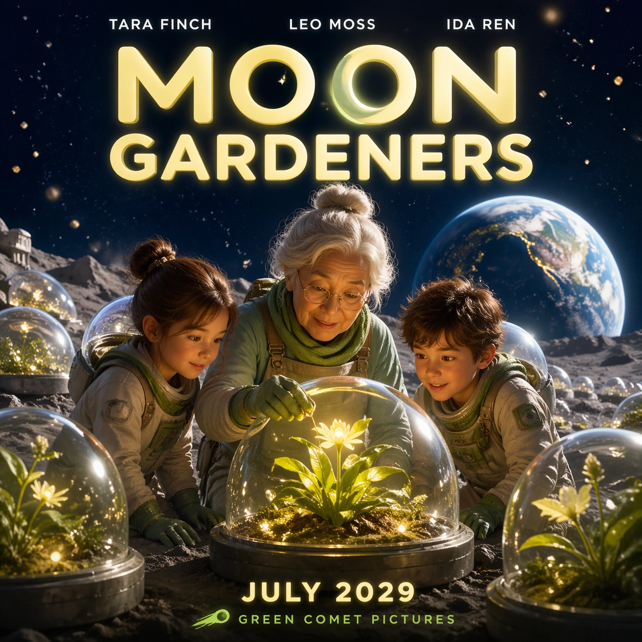
Example generated from “Fictional Ip Poster — Moon Gardeners Poster”
GPT Image 2en

Scene: A square family science-fantasy poster printed on a bright theater display, with clean edge lighting and slightly glossy paper. Use lunar silver, leafy green, warm yellow, and deep midnight blue. The layout is optimistic and theatrical: a large title at the top, character group in the center, moon garden environment behind them, and release information at the bottom. Subject: Create a poster for a fictional film titled MOON GARDENERS. Show two children and an elderly botanist tending glowing plants in glass domes on the moon, with Earth rising in the background and gentle dust floating in low gravity. The exact readable poster copy must be: MOON GARDENERS, TARA FINCH, LEO MOSS, IDA REN, JULY 2029, GREEN COMET PICTURES. The title should be rounded and luminous, cast names cleanly set above the characters, date below the title or near the bottom, and fictional studio mark small but readable. Important details: The poster must feel like a real family release campaign while staying entirely fictional. Keep the title readable against the moon sky, make the cast line orderly, and avoid random extra labels on the domes. The scene can be magical, but the poster layout should remain professional and commercial. Use case: Fictional IP Poster single study 8/8, testing readable family science-fantasy poster typography and structured release hierarchy. Constraints: No readable text except the specified fictional poster copy, no watermark, no real logos, preserve exact 1:1 aspect ratio, no existing franchise references, no extra tagline, no illegible cast names, no real space agency marks, no cluttered title area.

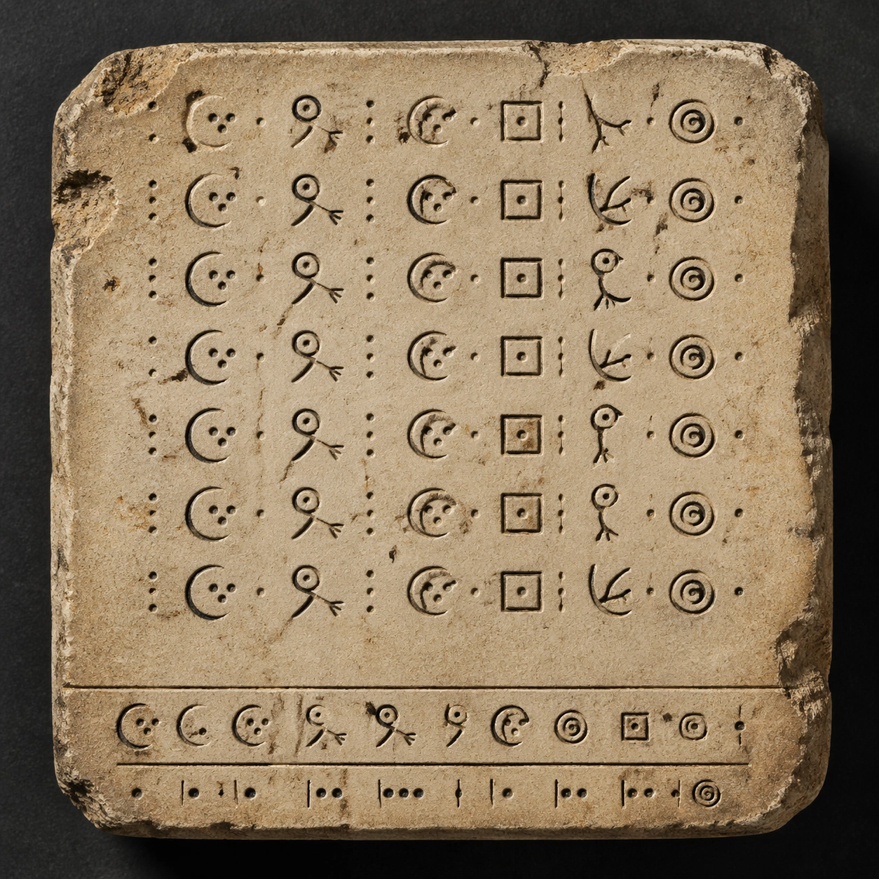
Example generated from “Fictional Symbol System — Core Tablet”
GPT Image 2en

Scene: Square museum conservation photograph, straight-on overhead view, soft raking light from the upper left, warm limestone and soot-black pigment against a quiet charcoal background. The frame is calm and catalog-like, with the tablet centered and enough margin to see chipped corners, dust, and shallow relief. Lighting should reveal carved depth without dramatic shadows. Subject: A fictional core inscription tablet for an invented ancient language. The tablet shows a disciplined grid of repeated glyph groups: crescent stems, three-dot radicals, hooked birdlike strokes, square seed marks, and nested spiral terminals. The symbols are not real writing, but they must feel internally consistent, like a recoverable grammar with prefixes, roots, and punctuation marks. Important details: Establish a reusable glyph family for the series. Keep line weight consistent, spacing deliberate, and repeated radicals recognizable in several positions. Include a small nonverbal comparison strip made only from glyph variants and icon-like separators, not readable labels. The surface should suggest hand-carved stone with mineral stains, rubbed pigment in grooves, and slight erosion that never destroys the symbol silhouettes. Use case: Fictional Symbol System series study 1/8, root reference for a fanout set that preserves the same invented inscription grammar across later artifacts. Constraints: No readable text, no watermark, no logos, preserve exact 1:1 aspect ratio, no Latin letters, no real alphabets, no random scribbles, no modern typography, no translation captions, no QR-code patterns, no extra border text.

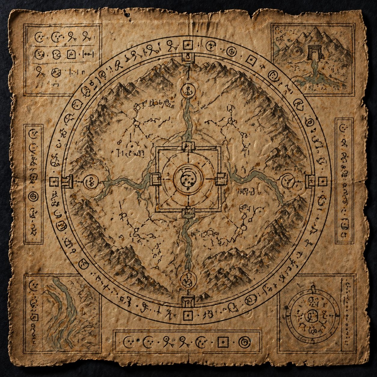
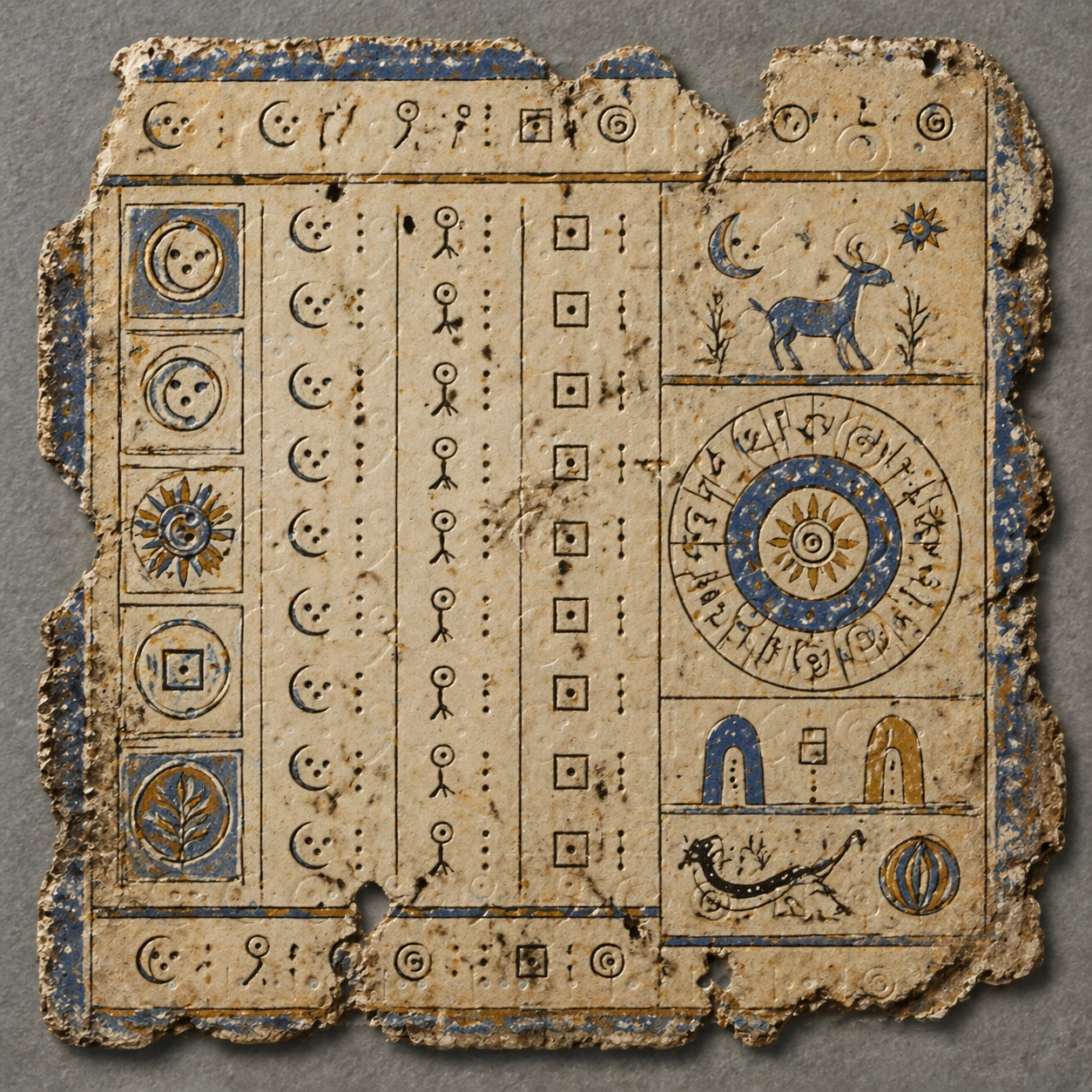
Example generated from “Fictional Symbol System — Ritual Map”
GPT Image 2en

Scene: Square overhead photograph of an aged ritual map on dark indigo cloth, with low amber light, worn parchment fibers, oxidized mineral pigments, and fine pin shadows from curled edges. The map fills the frame like a rare prop from a fantasy archive, organized but weathered, with a circular central diagram surrounded by inset panels. Subject: A ceremonial route map using the exact same fictional glyph family from the reference tablet. The invented symbols appear as carved-looking ink marks along rivers, gates, mountain rings, and constellation paths. Glyph clusters should reuse crescent stems, three-dot radicals, hooked strokes, square seed marks, and spiral terminals from the reference, but arranged as map annotations, seals, and directional markers rather than plain lines of text. Important details: Preserve the reference grammar: consistent stroke weight, repeated radicals, deliberate spacing, and recognizable symbol clusters. The map must communicate linguistic order without real words. Include nonverbal cartographic hierarchy through rings, paths, icons, and divider marks. The visual challenge is to keep the glyph system stable while changing material from stone carving to inked parchment and while embedding it into a complex layout. Use case: Fictional Symbol System series study 2/8, applying the reference inscription grammar to a ritual map through dependency-based visual continuity. Constraints: No readable text, no watermark, no logos, preserve exact 1:1 aspect ratio, no Latin letters, no real alphabets, no fantasy map place names, no random decorative squiggles, no modern UI labels, no compass words, no translation captions.

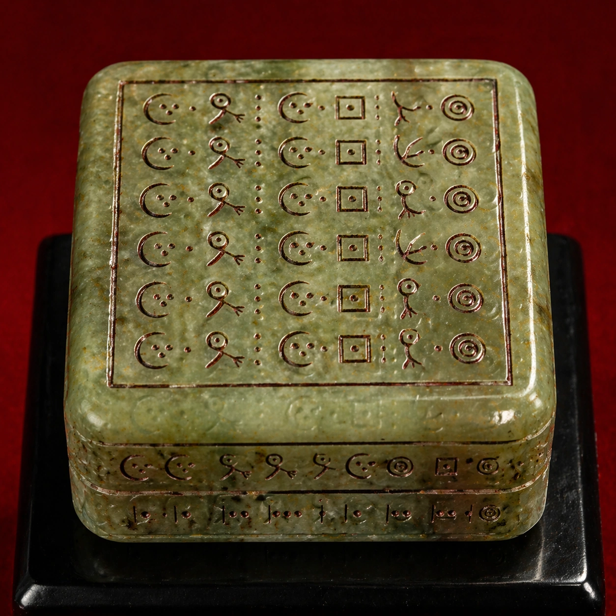
Example generated from “Fictional Symbol System — Jade Seal”
GPT Image 2en

Scene: Square macro product photograph on deep lacquer red, with a polished black plinth and controlled studio highlights. The image is intimate and tactile, showing translucent green jade, cloudy inclusions, beveled edges, and shallow engraved grooves filled with dark cinnabar residue. The camera looks slightly downward but keeps the seal face readable as an object surface. Subject: A ceremonial jade seal carved with the same invented symbol system introduced by the reference tablet. The seal face contains a compact square arrangement of glyph compounds, while the side walls show smaller repeated radicals and divider marks. The symbols must clearly belong to the reference family: crescent stems, three-dot radicals, hooked birdlike strokes, square seed marks, and nested spiral terminals, compressed into a seal-script style without becoming real Chinese characters. Important details: Translate the reference glyph grammar into a new material and scale. Strokes should be incised rather than printed, with consistent proportions despite stone refraction and curved bevels. The composition should feel like a believable archaeological or game-cinematic artifact: luxurious, ancient, and precise. Preserve repeated elements so viewers can infer a system, not decoration. Avoid accidental readable characters from any real writing tradition. Use case: Fictional Symbol System series study 3/8, preserving the reference inscription grammar on a carved jade seal. Constraints: No readable text, no watermark, no logos, preserve exact 1:1 aspect ratio, no Latin letters, no real alphabets, no Chinese characters, no random scratches mistaken for glyphs, no modern branding, no price tag, no museum label.

Example generated from “Fictional Symbol System — Codex Fragment”
GPT Image 2en

Scene: Square archival flat lay of a torn codex fragment, photographed on neutral gray conservation paper under diffuse daylight. The palette uses faded ultramarine, ocher, bone white, and carbon black. Fibers, cracks, wormholes, and repaired seams are visible, but the layout remains crisp enough to study. The fragment should look rare, fragile, and carefully preserved. Subject: A painted codex page fragment using the same fictional glyph grammar from the reference tablet. It combines vertical glyph columns, small icon panels, calendrical-looking cycles, and margin marks. Reuse the reference family of crescent stems, three-dot radicals, hooked strokes, square seed marks, and spiral terminals, now brushed with pigment and arranged like a ceremonial manuscript rather than carved stone. Important details: Keep the glyphs intentionally systematic: recurring radicals, stable proportions, repeatable spacing, and clear cluster boundaries. The page may include diagrammatic suns, seed pods, gates, and animal silhouettes, but the symbols themselves must remain the primary visual test. Show how an invented language could survive across media from stone to parchment to codex. All marks must be pseudo-script, not real Mayan, Egyptian, Chinese, runic, or Latin writing. Use case: Fictional Symbol System series study 4/8, transferring the reference inscription grammar to a painted codex fragment. Constraints: No readable text, no watermark, no logos, preserve exact 1:1 aspect ratio, no Latin letters, no real alphabets, no exact historical script copying, no modern captions, no clean digital font look, no page numbers, no translation key.

Example generated from “Fictional Symbol System — Mayan Star Disk”
GPT Image 2en

Scene: Square dramatic tabletop photograph of a circular stone disk resting in shallow sand, lit by cool moonlike light with a faint rim glow. The stone is dark basalt with turquoise, cinnabar, and shell inlay. The image should feel like a recovered cosmology device, centered, symmetrical, and highly detailed without becoming a flat infographic. Subject: An independent fictional star-disk symbol system, loosely inspired by the visual density of ancient calendar stones but not copying any historical script. The disk contains concentric rings of invented glyph blocks, star nodes, creature profiles, eclipse marks, and directional gates. The glyphs use repeated stepped jaws, paired comet tails, dotted shells, and angular cloud hooks, arranged with strong radial logic. Important details: The symbol system must look intentionally designed: repeated elements should recur at different scales, ring spacing should be consistent, and the central emblem should connect to outer glyph bands through visible visual rules. Keep the marks pseudo-linguistic, not merely decorative ornament. The challenge is controlled fake text in a complex circular layout, with no real words, no copied Maya glyphs, and no accidental calendar numbers. Use case: Fictional Symbol System single study 6/8, testing an independent circular cosmology artifact with dense invented glyph rings. Constraints: No readable text, no watermark, no logos, preserve exact 1:1 aspect ratio, no Latin letters, no real alphabets, no copied Mayan glyphs, no Arabic numerals, no zodiac symbols, no modern museum label, no flat vector chart, no random ornamental filler.

Example generated from “Fictional Symbol System — Rune Field Guide”
GPT Image 2en

Scene: Square editorial flat lay of a fantasy field-guide spread, viewed from above on a weathered wooden desk with pressed leaves, graphite dust, and small specimen stones. The lighting is cool morning window light with soft shadows. The page design is precise and research-like but contains no readable words, only diagrams and invented symbols. Subject: An independent rune-like ecological symbol system for classifying imaginary forest spirits. The page shows four specimen panels, each pairing a creature silhouette, a cluster of invented angular runes, and nonverbal morphology diagrams. The glyphs use forked vertical stems, split diamonds, bark-notch marks, and small moon cuts. They should feel consistent across panels while remaining fictional and distinct from Norse runes. Important details: Make the layout behave like a decoder page without actual labels: clear panel borders, repeated glyph radicals, small arrows made from abstract marks, specimen sketches, and a visual taxonomy grid. The symbols should be crisp enough for visual comparison, with repeated forms implying categories. Avoid real-language text entirely, including headings. The result should read as a polished art-department prop for a novel, game, or film. Use case: Fictional Symbol System single study 7/8, testing a field-guide decoder layout built only from invented symbols and diagrams. Constraints: No readable text, no watermark, no logos, preserve exact 1:1 aspect ratio, no Latin letters, no real alphabets, no Norse rune copying, no handwritten English, no numeric labels, no UI chrome, no messy notebook clutter, no translation captions.