Documento originale
GPT Image 2 · en
Scene:
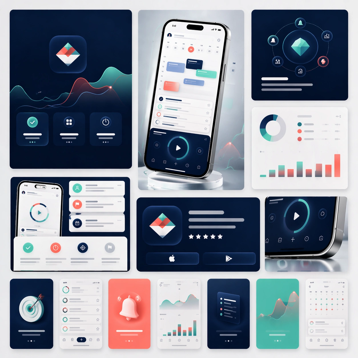
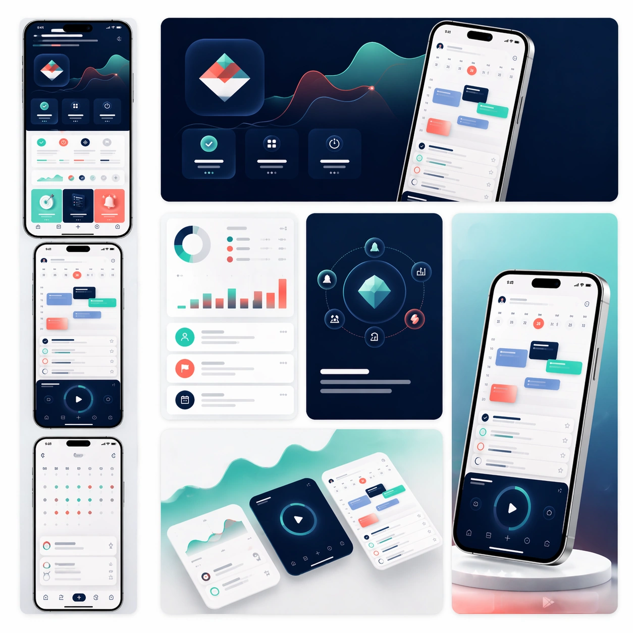
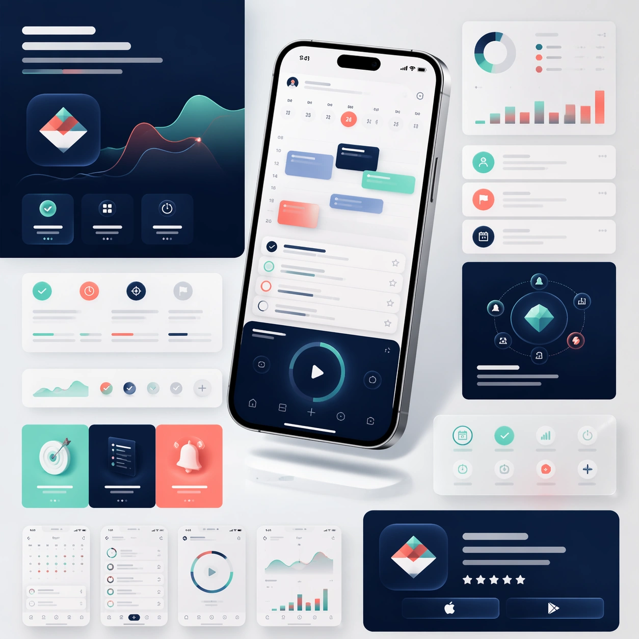
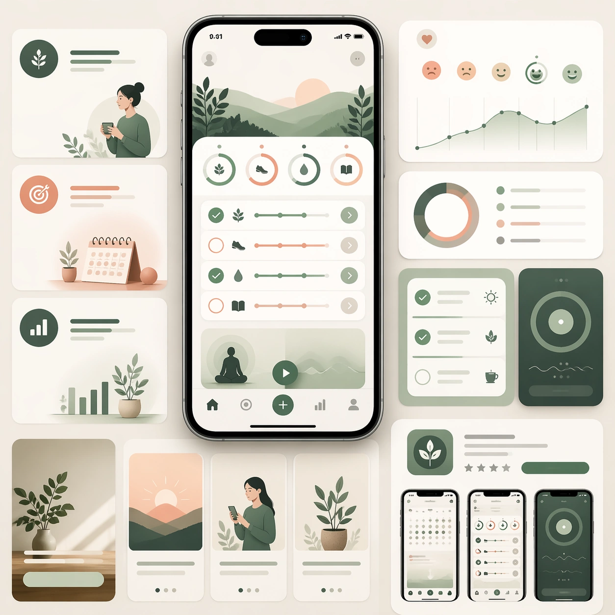
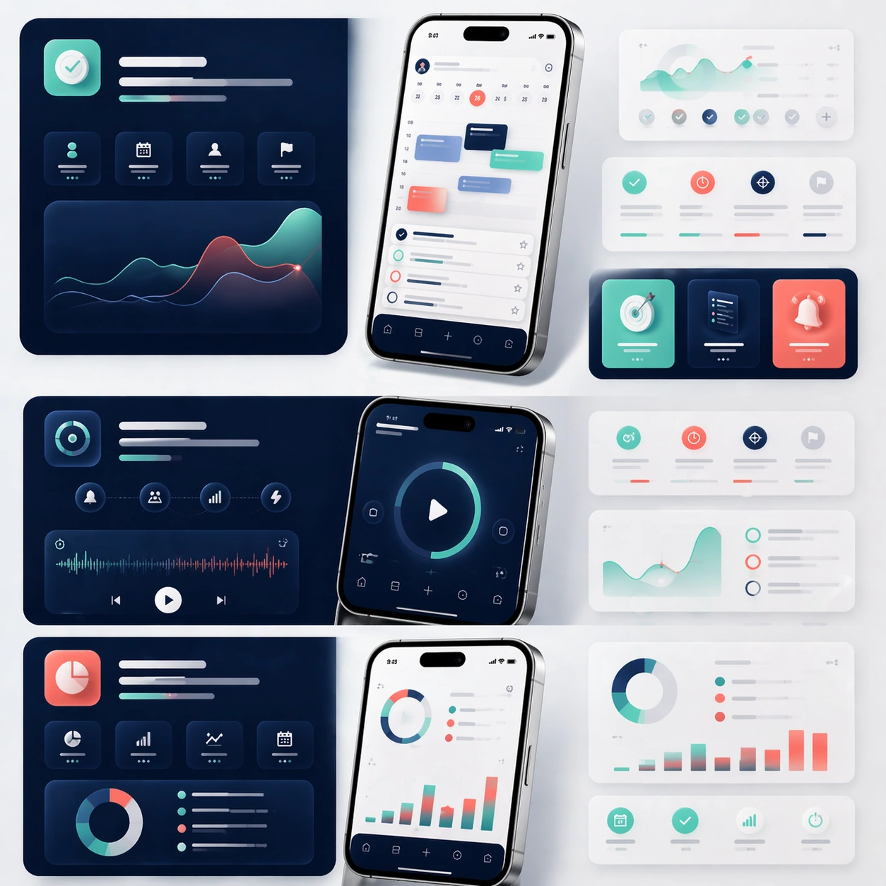
A square editorial board showing the middle sections of a sophisticated app launch page, laid out as a modular story flow with multiple device crops, feature cards, and atmospheric color fields. The camera remains mostly straight-on, as if viewing a refined design presentation board pinned flat under soft studio lighting. Use the same premium navy, mint, coral, and silver palette from the reference, with generous negative space and clean section breaks.

Subject:
Preserve the exact product identity from the reference model: the same app interface hierarchy, the same icon language, the same rounded card system, and the same phone hardware proportions. Instead of one hero moment, focus on three feature narratives: planning, focus, and progress review. Show one larger phone crop for each feature, supported by smaller floating UI fragments, ambient device reflections, and soft diagrammatic layout blocks. The modules should imply how a real landing page would guide a user through benefits step by step, while every screen still clearly belongs to the same app family established in the reference.

Important details:
Preserve exact screen structure, color tokens, device materials, and visual temperament from the reference image. Emphasize feature storytelling rather than generic app collage. Keep the board scanable, premium, and commercially credible, with believable depth, clean spacing, and consistent interaction components. Text areas should read as elegant placeholder bands only. The viewer should immediately understand this as a formal product page system, not a random set of UI screenshots.

Use case:
App Launch Marketing Page Kit series study 2/4, extending the reference identity into a structured feature-story layout.

Constraints:
No readable text, no watermark, no logos, preserve exact 1:1 aspect ratio, preserve the same app identity from the reference, no unrelated color palette shifts, no broken UI perspective, no cluttered sticker aesthetics, no cheap neon effects.
Come usare
- Copia tutto il prompt originale, inclusi i parametri.
- Adatta soggetto, testo e composizione alle tue esigenze.
- Usa uno strumento esterno compatibile; verifica accesso e risultato.
Prima di iniziare
- Controlla se serve un’immagine di riferimento. La compatibilità non prova il modello usato per l’esempio.
- Verifica nomi, numeri e testi; i risultati cambiano con le versioni del modello.