원본 문서
GPT Image 2 · en
Scene:
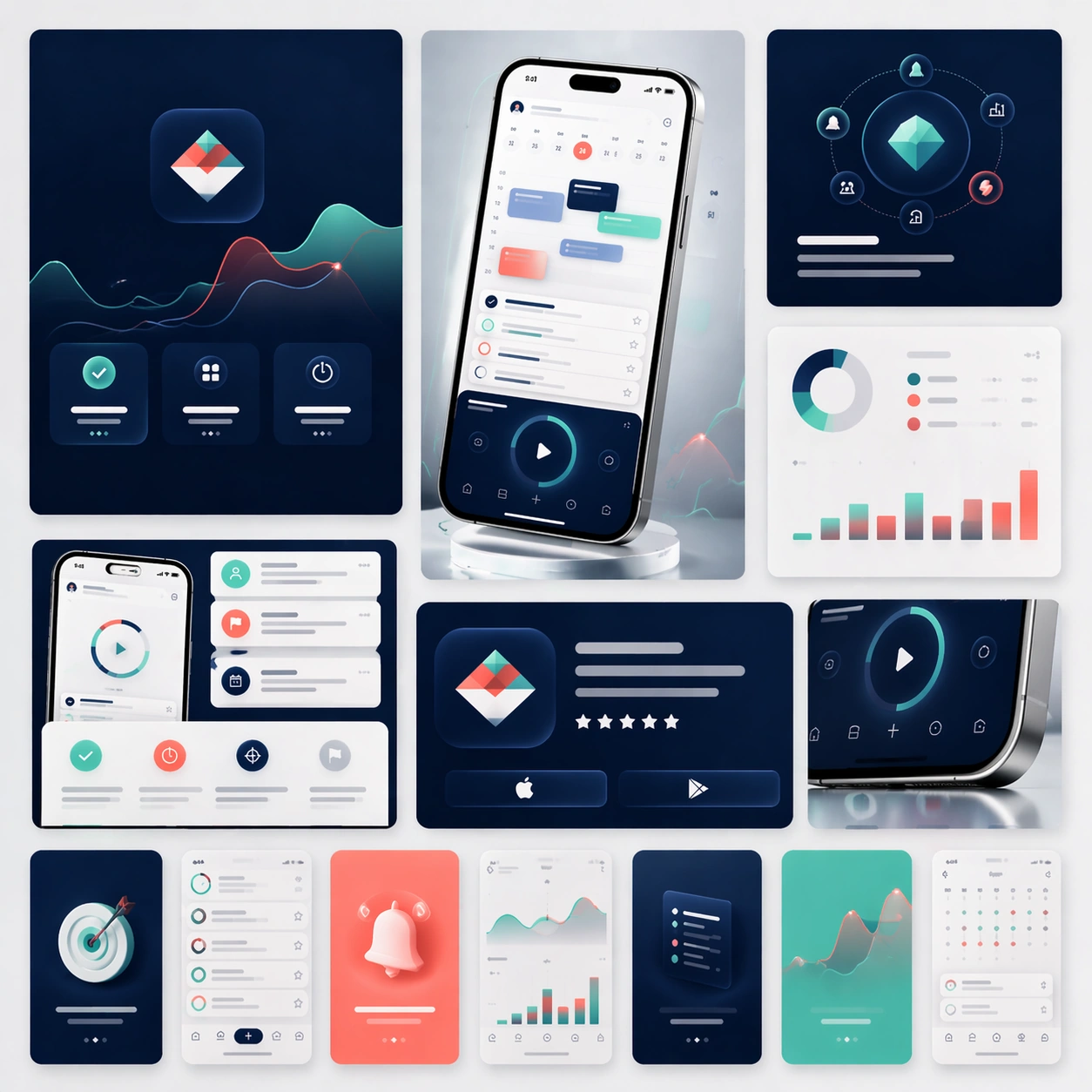
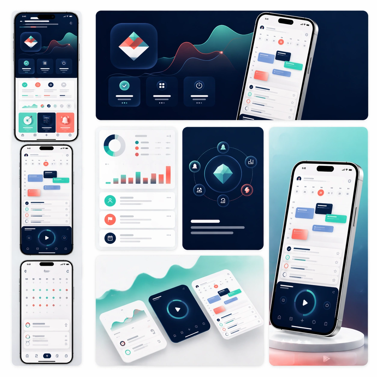
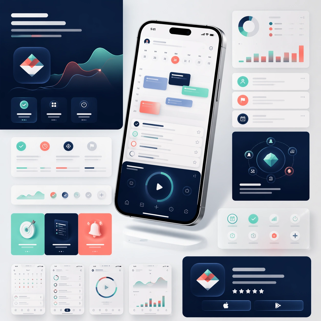
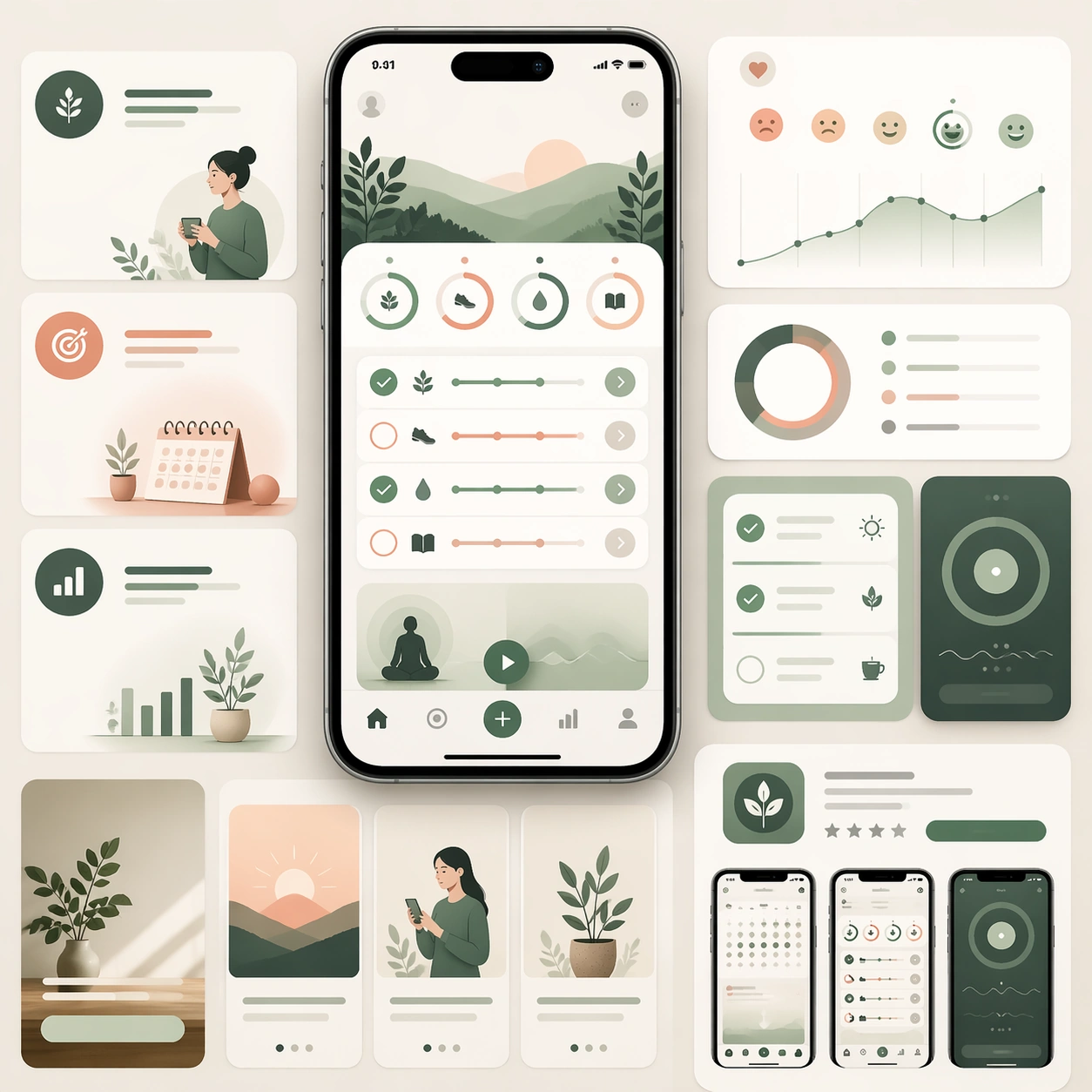
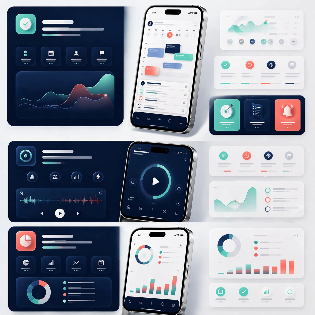
A square editorial board showing the middle sections of a sophisticated app launch page, laid out as a modular story flow with multiple device crops, feature cards, and atmospheric color fields. The camera remains mostly straight-on, as if viewing a refined design presentation board pinned flat under soft studio lighting. Use the same premium navy, mint, coral, and silver palette from the reference, with generous negative space and clean section breaks.

Subject:
Preserve the exact product identity from the reference model: the same app interface hierarchy, the same icon language, the same rounded card system, and the same phone hardware proportions. Instead of one hero moment, focus on three feature narratives: planning, focus, and progress review. Show one larger phone crop for each feature, supported by smaller floating UI fragments, ambient device reflections, and soft diagrammatic layout blocks. The modules should imply how a real landing page would guide a user through benefits step by step, while every screen still clearly belongs to the same app family established in the reference.

Important details:
Preserve exact screen structure, color tokens, device materials, and visual temperament from the reference image. Emphasize feature storytelling rather than generic app collage. Keep the board scanable, premium, and commercially credible, with believable depth, clean spacing, and consistent interaction components. Text areas should read as elegant placeholder bands only. The viewer should immediately understand this as a formal product page system, not a random set of UI screenshots.

Use case:
App Launch Marketing Page Kit series study 2/4, extending the reference identity into a structured feature-story layout.

Constraints:
No readable text, no watermark, no logos, preserve exact 1:1 aspect ratio, preserve the same app identity from the reference, no unrelated color palette shifts, no broken UI perspective, no cluttered sticker aesthetics, no cheap neon effects.
사용 방법
- 매개변수를 포함한 전체 원본 프롬프트를 복사하세요.
- 주제, 문구, 구도를 자신의 요구에 맞게 바꾸세요.
- 호환되는 외부 도구에서 사용하고 이용 조건과 결과를 확인하세요.
시작 전 확인
- 참조 이미지가 필요한지 확인하세요. 호환 표시는 해당 모델로 이 예시를 생성했다는 뜻이 아닙니다.
- 이름, 수치, 이미지 속 문구를 확인하세요. 모델 버전에 따라 결과가 다를 수 있습니다.