Documento originale
GPT Image 2 · en
Scene:
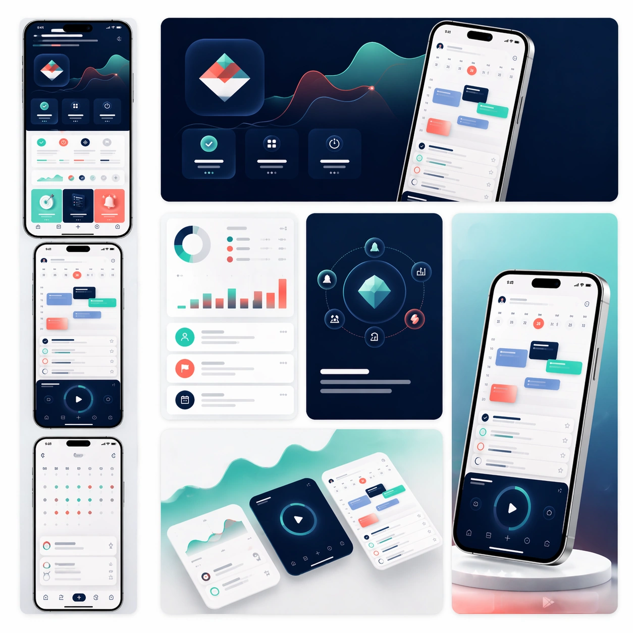
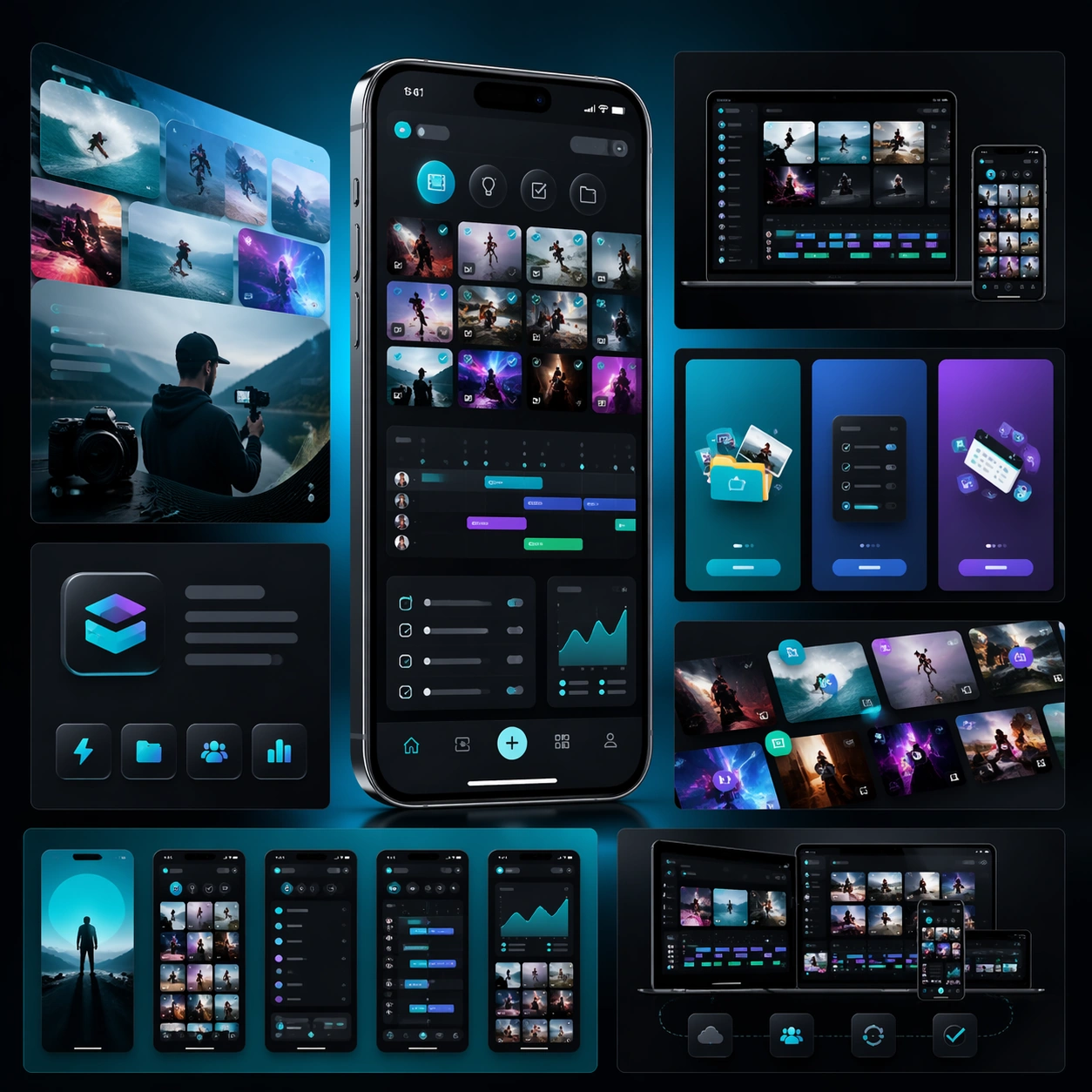
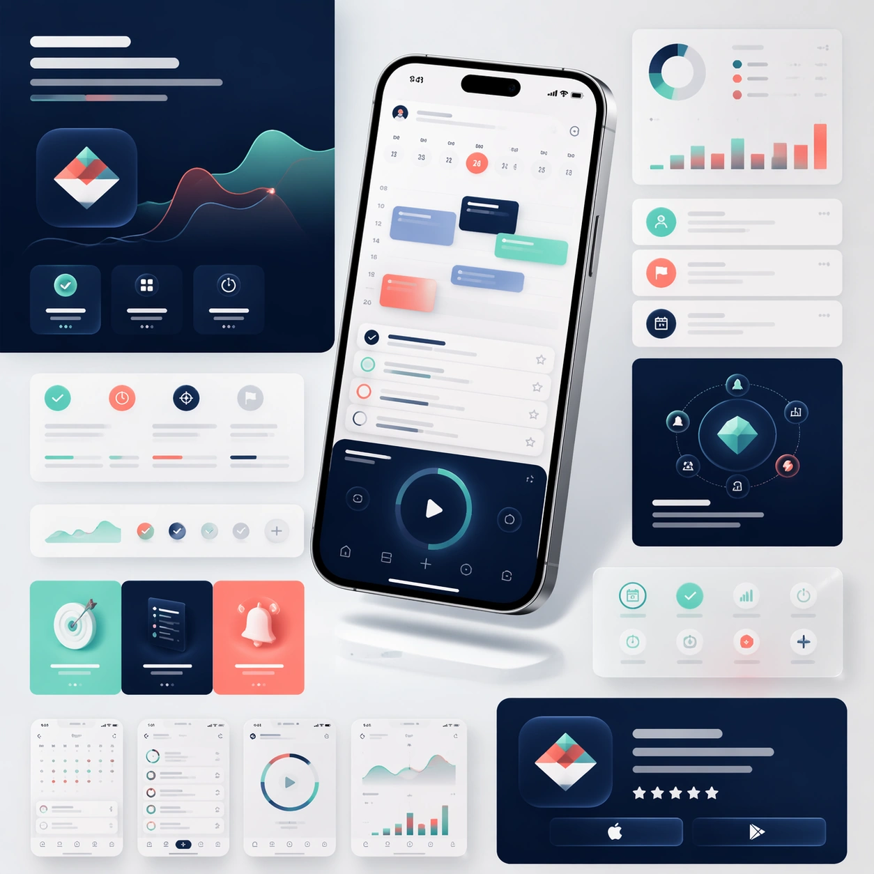
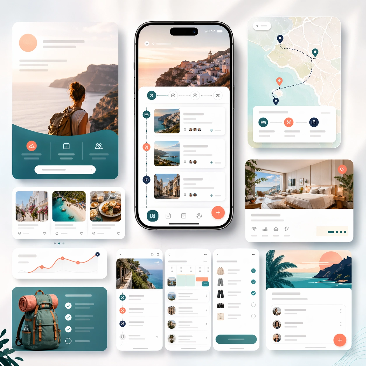
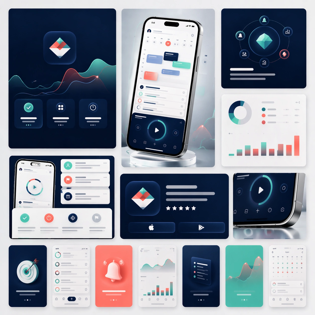
A square campaign board composed of several social-ready launch crops arranged within one master presentation. Instead of a single landing-page layout, show a family of polished ad-like frames, vertical teaser cards, square promo panels, and one compact hero device crop, all presented on a softly lit studio backdrop with subtle gradients and restrained reflections. The view should stay front-facing and editorial.

Subject:
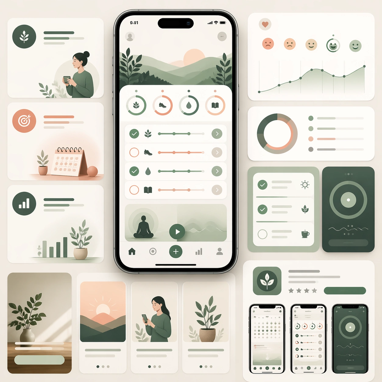
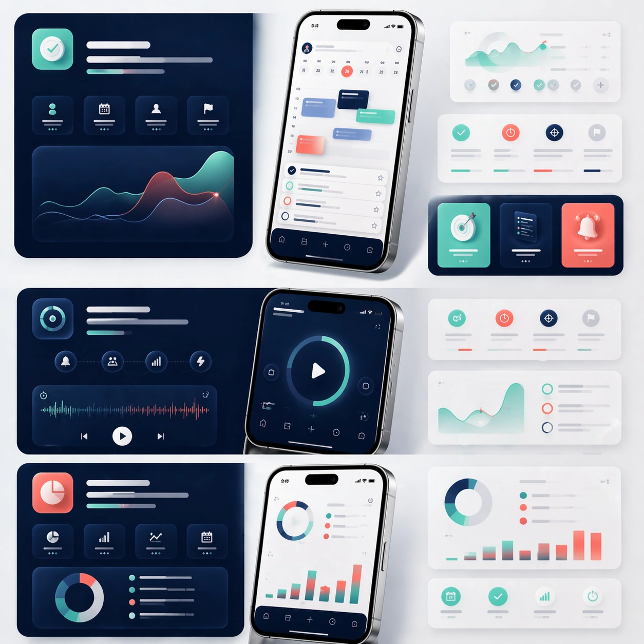
Preserve exact app identity from the reference model: the same phone proportions, the same UI card system, the same palette, the same icon rhythm, and the same polished product mood. Translate that identity into a coordinated social launch kit with short teaser-style compositions, bold image-led framing, and a few screenshot-driven detail panels. The set should feel ready for announcement day across feed placements and paid social, but still look unmistakably related to the original marketing-page system. Use device fragments, cropped screens, and modular graphic blocks to imply campaign flexibility without losing brand coherence.

Important details:
Consistency is the priority. Keep the screen hierarchy stable, preserve material realism, and maintain premium spacing even as the crops become more dynamic. Each sub-frame should feel simple enough to read quickly yet rich enough to support a real product launch. No readable text is allowed, so structure, contrast, and device imagery must carry the message. The result should suggest a disciplined launch toolkit rather than generic social templates.

Use case:
App Launch Marketing Page Kit series study 4/4, converting the reference launch identity into coordinated social launch adaptations.

Constraints:
No readable text, no watermark, no logos, preserve exact 1:1 aspect ratio, preserve the same app identity from the reference, no chaotic sticker overlays, no unrelated lifestyle photography, no drastic color drift, no distorted device silhouettes.
Come usare
- Copia tutto il prompt originale, inclusi i parametri.
- Adatta soggetto, testo e composizione alle tue esigenze.
- Usa uno strumento esterno compatibile; verifica accesso e risultato.
Prima di iniziare
- Controlla se serve un’immagine di riferimento. La compatibilità non prova il modello usato per l’esempio.
- Verifica nomi, numeri e testi; i risultati cambiano con le versioni del modello.