原文
GPT Image 2 · en
Scene:
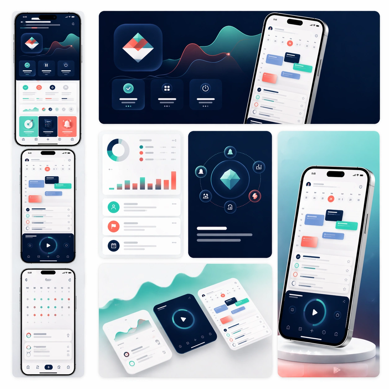
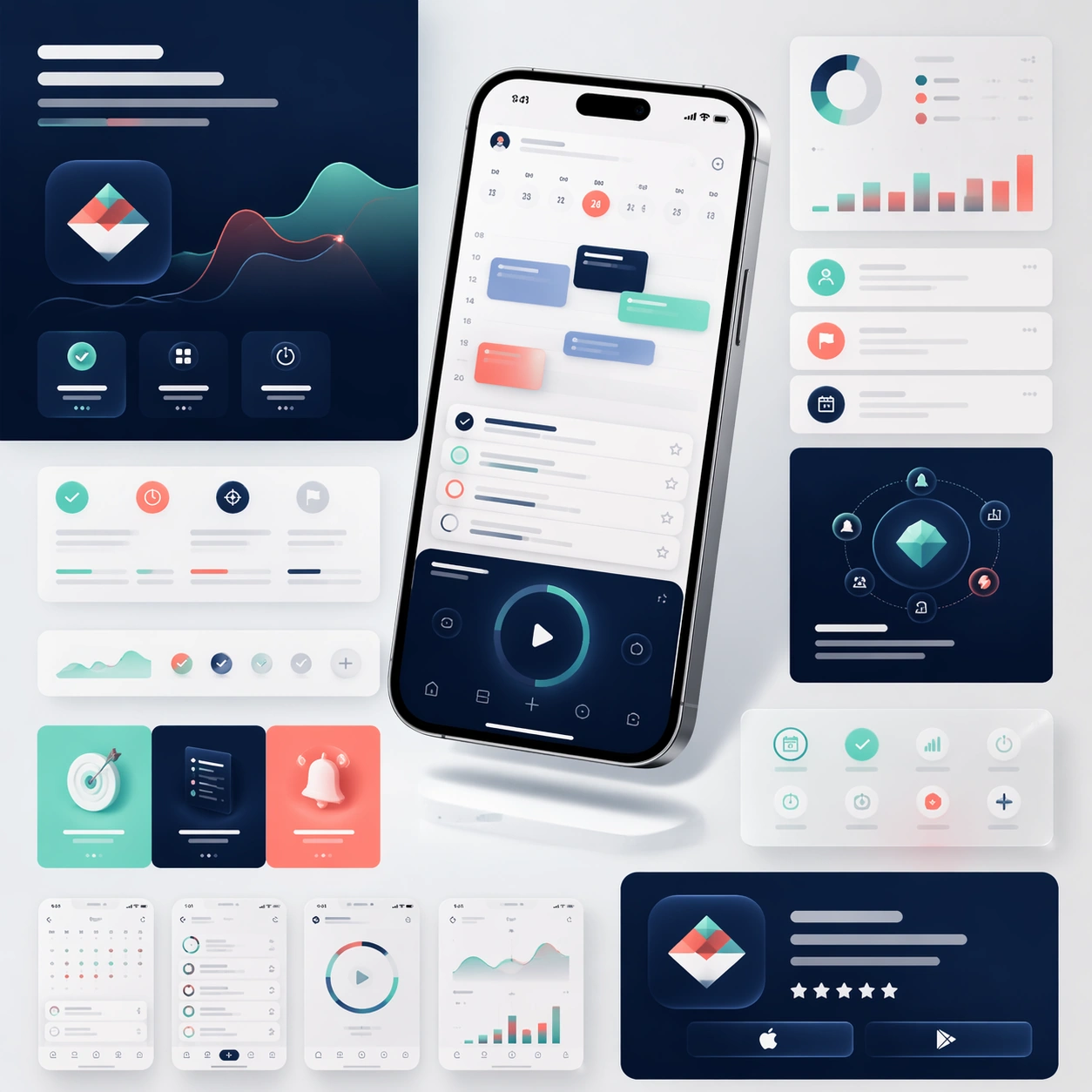
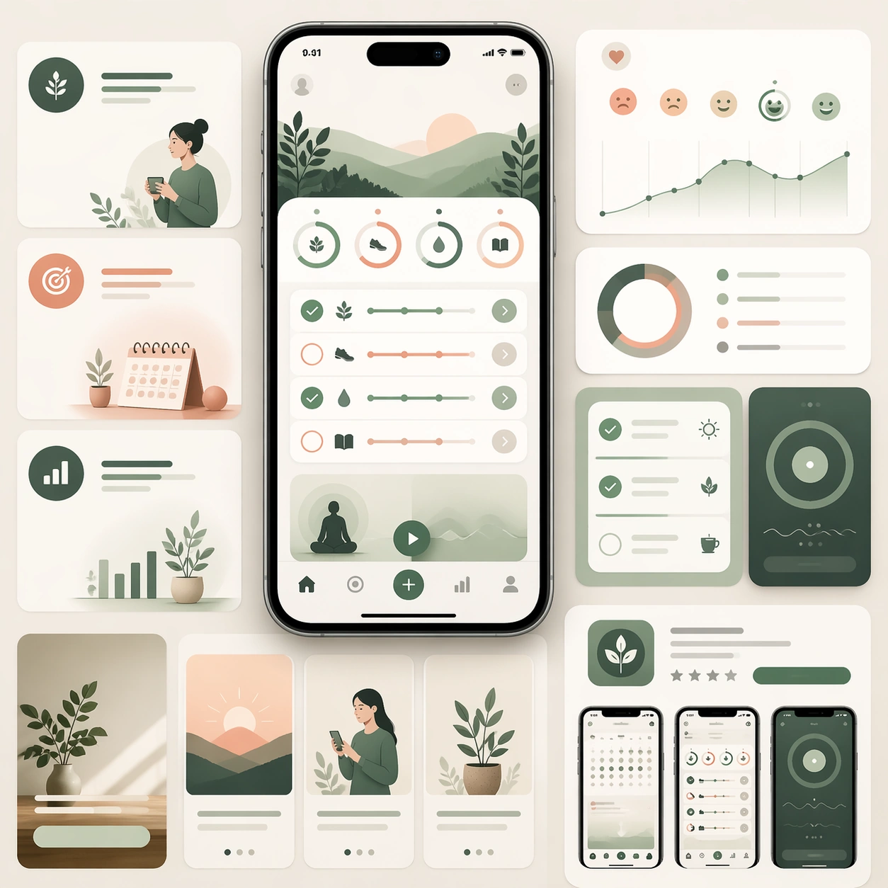
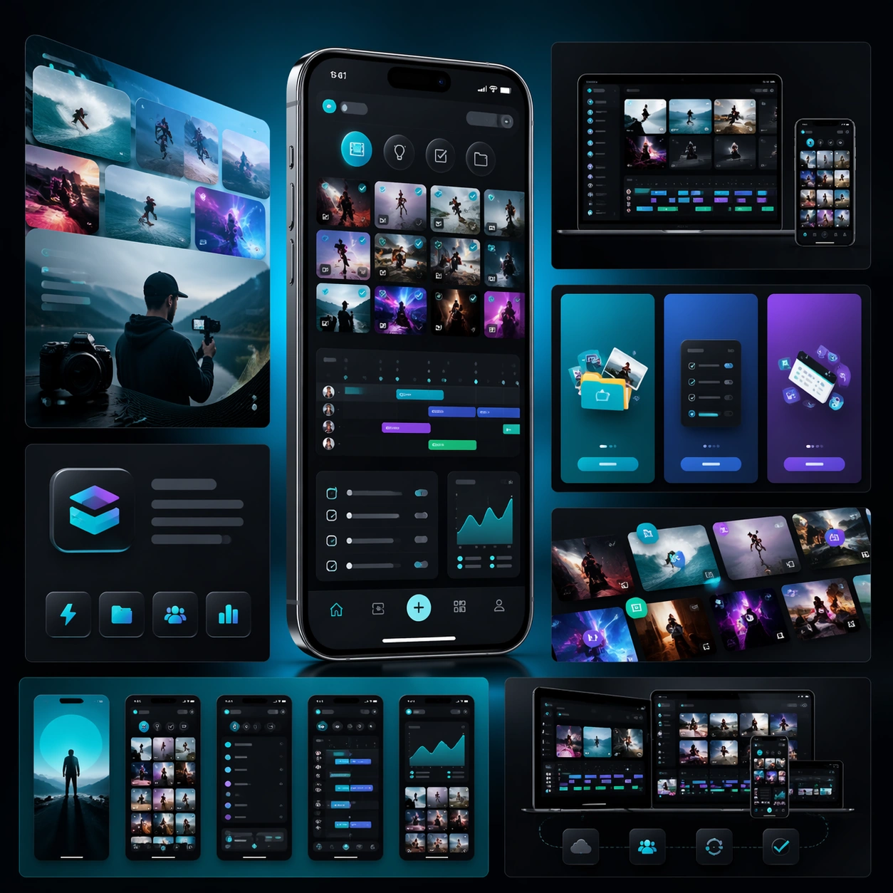
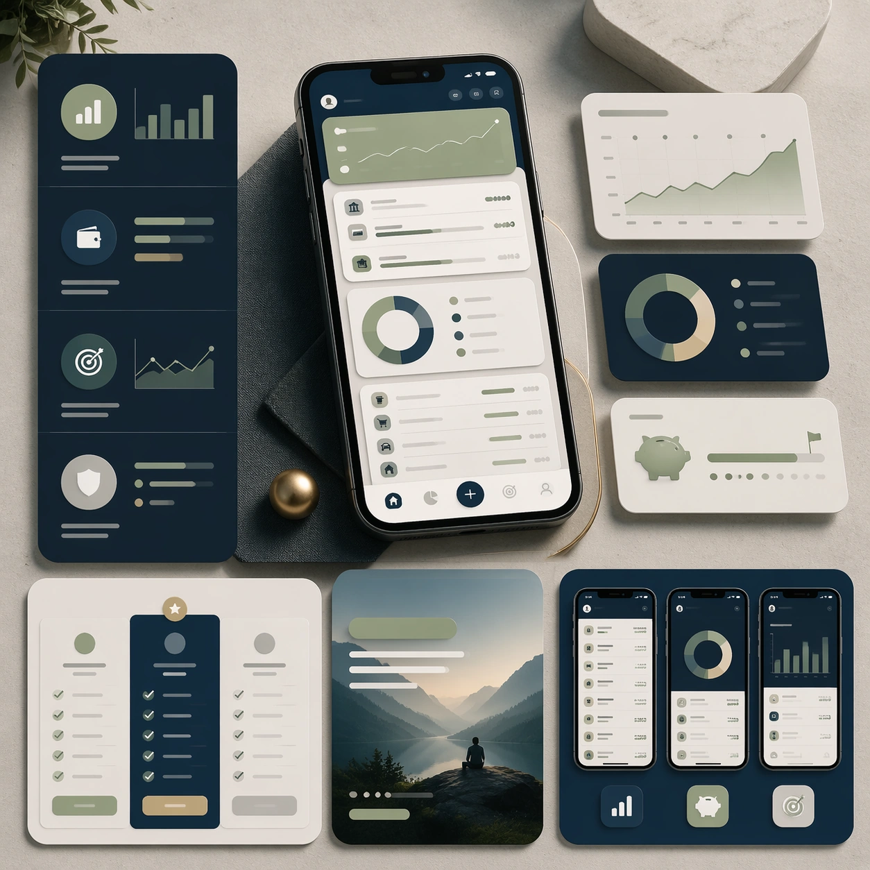
A square marketing presentation for a personal budgeting and planning app, set on a clean stone-like surface with restrained studio lighting. Use a palette of midnight blue, pale sage, warm gray, and subtle brass highlights. Compose one central device render, a few floating analytics panels, and several structured marketing-page modules arranged with editorial precision and generous negative space.

Subject:
Create a trustworthy app launch board for a finance-planning tool aimed at everyday users. The interface should show account summary cards, budget bars, category rings, savings goals, and a calm transaction overview, all rendered as believable mobile UI rather than speculative sci-fi graphics. Around the device, build supporting sections that imply feature explanation, plan comparison, and store-ready promotional crops. The entire board should look prepared for a serious launch campaign that needs both warmth and credibility. All communication should happen through shape, hierarchy, and image language because text must remain unreadable.

Important details:
Emphasize clarity, discipline, and realistic product polish. Keep charts simple and elegant, maintain coherent spacing, and avoid anything that feels like a banking dashboard parody. The composition should project trust, premium utility, and conversion readiness while still feeling modern enough for consumer app marketing. Make it clear that the work extends beyond a single mockup into a full page-and-store asset system.

Use case:
App Launch Marketing Page Kit single study 3/5, testing a finance-planning launch direction.

Constraints:
No readable text, no watermark, no logos, preserve exact 1:1 aspect ratio, no cryptocurrency clichés, no exaggerated holograms, no crowded spreadsheet chaos, no impossible reflections, no mismatched chart styles.
使い方
- パラメータを含む元のプロンプト全体をコピーします。
- 被写体、文字、構図を自分の要件に置き換えます。
- 対応する外部ツールで使用し、利用条件と結果を確認します。
開始前の確認
- 参考画像の要否を確認してください。互換モデルの表示は、そのモデルでの生成実績を意味しません。
- 名前、数値、画像内の文字を確認します。モデルの版で結果は変わります。