原文
GPT Image 2 · en
Scene:
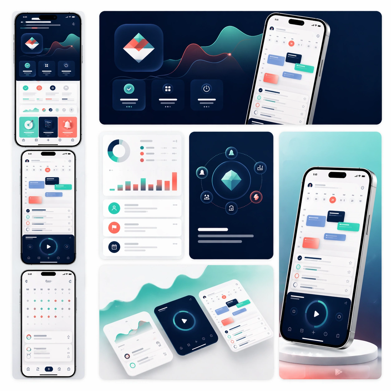
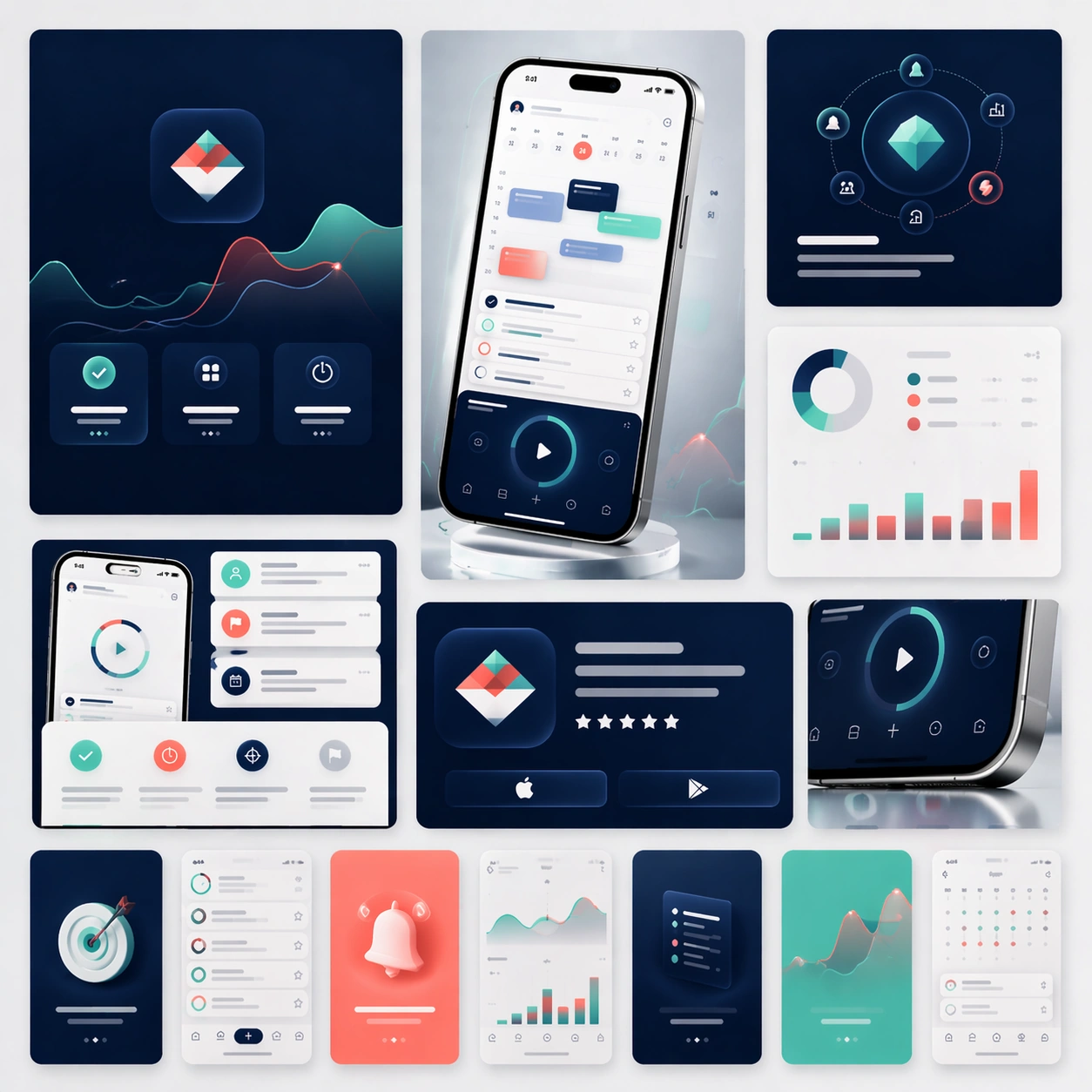
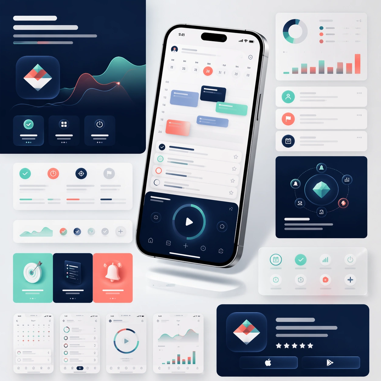
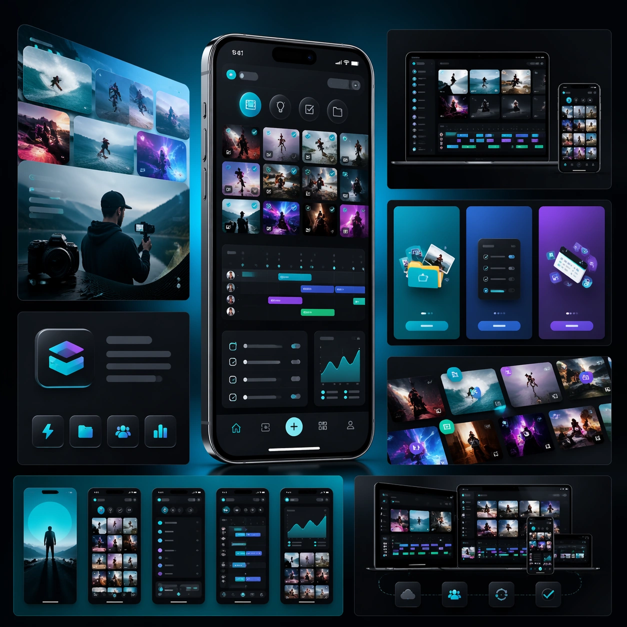
A square campaign board for a mobile creator workflow app, with a more energetic but still disciplined launch aesthetic. Present one hero phone, several cropped interface panels, and layered media-like shapes on a dark charcoal-to-electric-teal gradient field. The lighting should feel glossy and commercial, with crisp reflections on glass and metal but no excessive glow.

Subject:
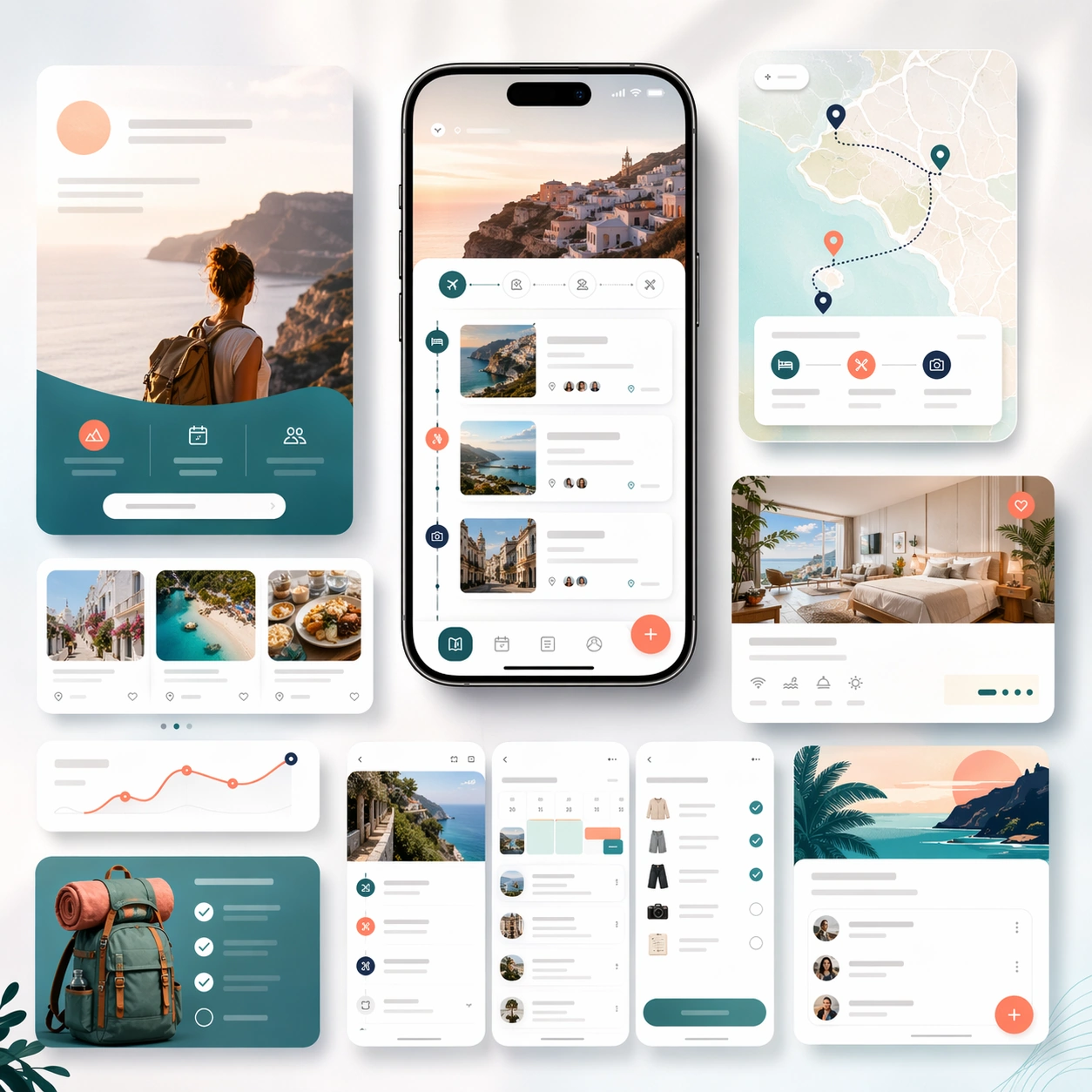
Build a launch-page kit for an app that helps creators organize clips, ideas, publishing steps, and asset libraries. The hero phone should display a visually rich interface with thumbnail grids, scheduling lanes, checklist modules, and compact analytics cards. Surround it with landing-page fragments that suggest onboarding, cross-device workflow, and store-promo assets. The structure should feel like a complete app marketing system prepared for launch week, not just a single hero shot. Use strong composition, believable device rendering, and abstract copy zones that imply promotional messaging without any readable typography.

Important details:
Keep the interface coherent and attractive, but prioritize scanability over noise. Show visual energy through image framing, rhythm, and contrast rather than through random effects. The board should feel like a real product campaign for creators: polished, modern, ambitious, and clear enough to extend into store screenshots, social crops, and a landing page. Maintain structured modules, consistent spacing, and premium material rendering throughout.

Use case:
App Launch Marketing Page Kit single study 2/5, testing an energetic creator-tool launch direction.

Constraints:
No readable text, no watermark, no logos, preserve exact 1:1 aspect ratio, no chaotic collage clutter, no fake brand marks, no distorted screen perspective, no excessive lens flares, no messy color overload.
使い方
- パラメータを含む元のプロンプト全体をコピーします。
- 被写体、文字、構図を自分の要件に置き換えます。
- 対応する外部ツールで使用し、利用条件と結果を確認します。
開始前の確認
- 参考画像の要否を確認してください。互換モデルの表示は、そのモデルでの生成実績を意味しません。
- 名前、数値、画像内の文字を確認します。モデルの版で結果は変わります。