
原文
GPT Image 2 · en
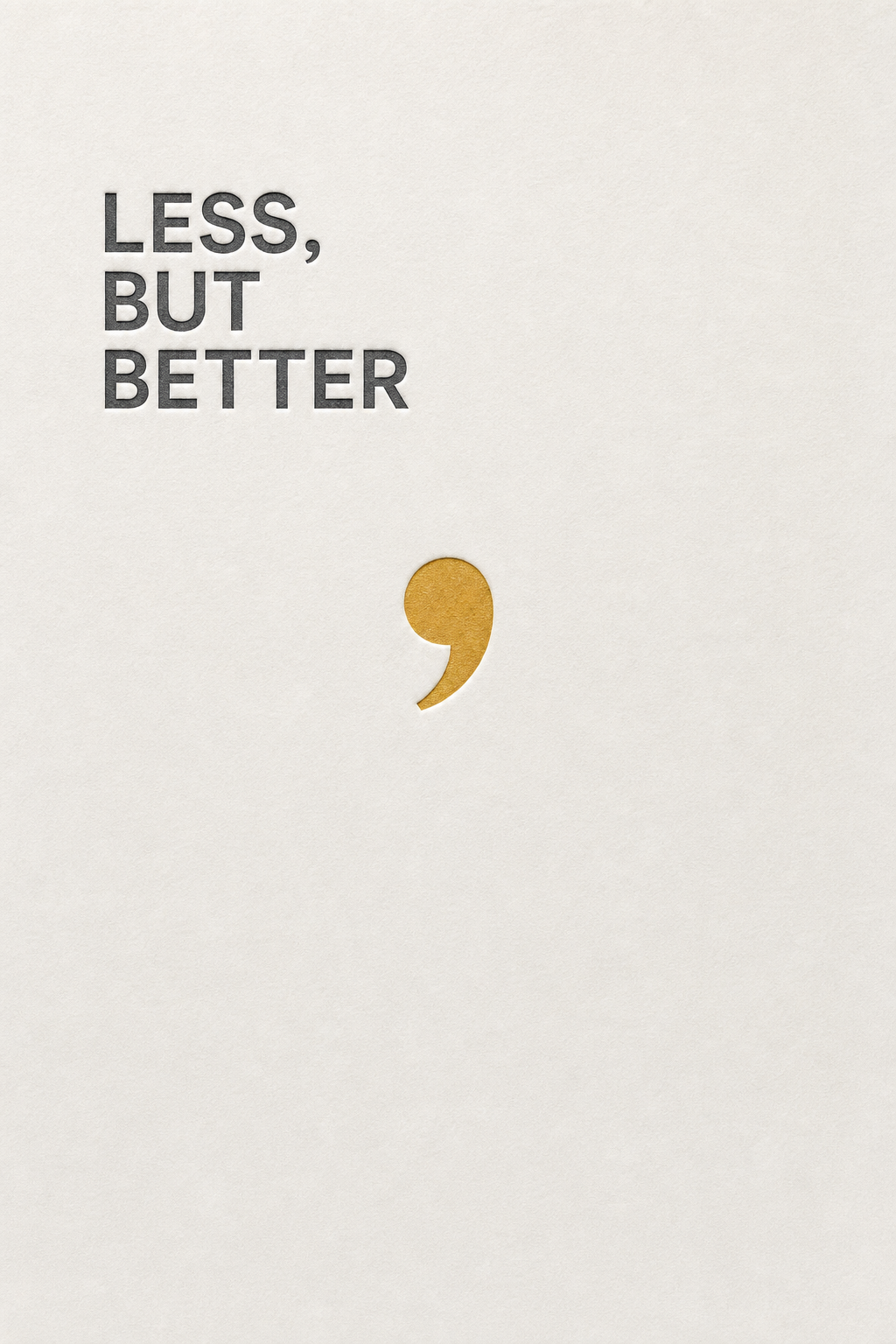
A minimalist design poster reading 'LESS, BUT BETTER' in a precise neutral sans-serif, left-aligned and set in three tight lines high on the sheet. The rest is untouched off-white paper. A comma is rendered oversized in a muted mustard, becoming the only graphic element, floating mid-page. Subtle letterpress deboss texture around the type. Palette of paper white, graphite type, one mustard accent. Cool, deliberate, design-studio elegance.使い方
- パラメータを含む元のプロンプト全体をコピーします。
- 被写体、文字、構図を自分の要件に置き換えます。
- 対応する外部ツールで使用し、利用条件と結果を確認します。
開始前の確認
- 参考画像の要否を確認してください。互換モデルの表示は、そのモデルでの生成実績を意味しません。
- 名前、数値、画像内の文字を確認します。モデルの版で結果は変わります。