
Original document
GPT Image 2 · en
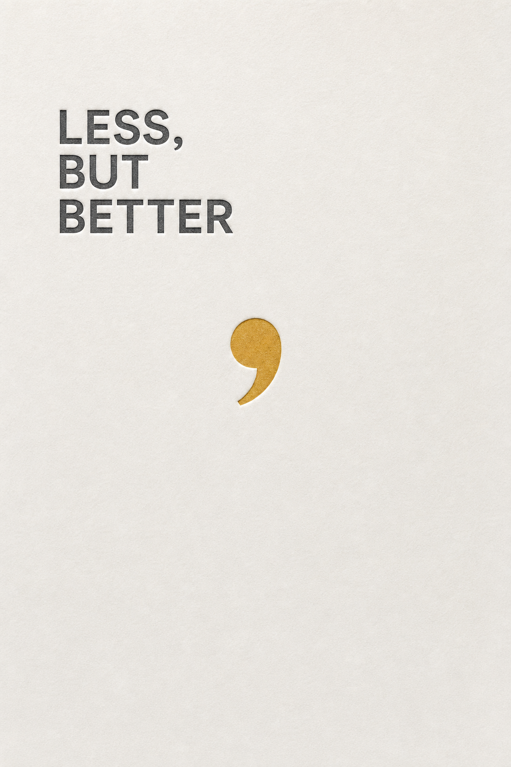
A minimalist design poster reading 'LESS, BUT BETTER' in a precise neutral sans-serif, left-aligned and set in three tight lines high on the sheet. The rest is untouched off-white paper. A comma is rendered oversized in a muted mustard, becoming the only graphic element, floating mid-page. Subtle letterpress deboss texture around the type. Palette of paper white, graphite type, one mustard accent. Cool, deliberate, design-studio elegance.How to use
- Copy the complete original prompt, including any parameters.
- Replace the subject, text and composition with your own requirements.
- Use a compatible external tool; check its current access conditions and review the result.
Before you start
- Check whether a reference image is required. A compatible model label does not mean this example was generated with that model.
- Keep names, figures and visible text accurate; results can vary between model versions.