
Oryginalny dokument
GPT Image 2 · en
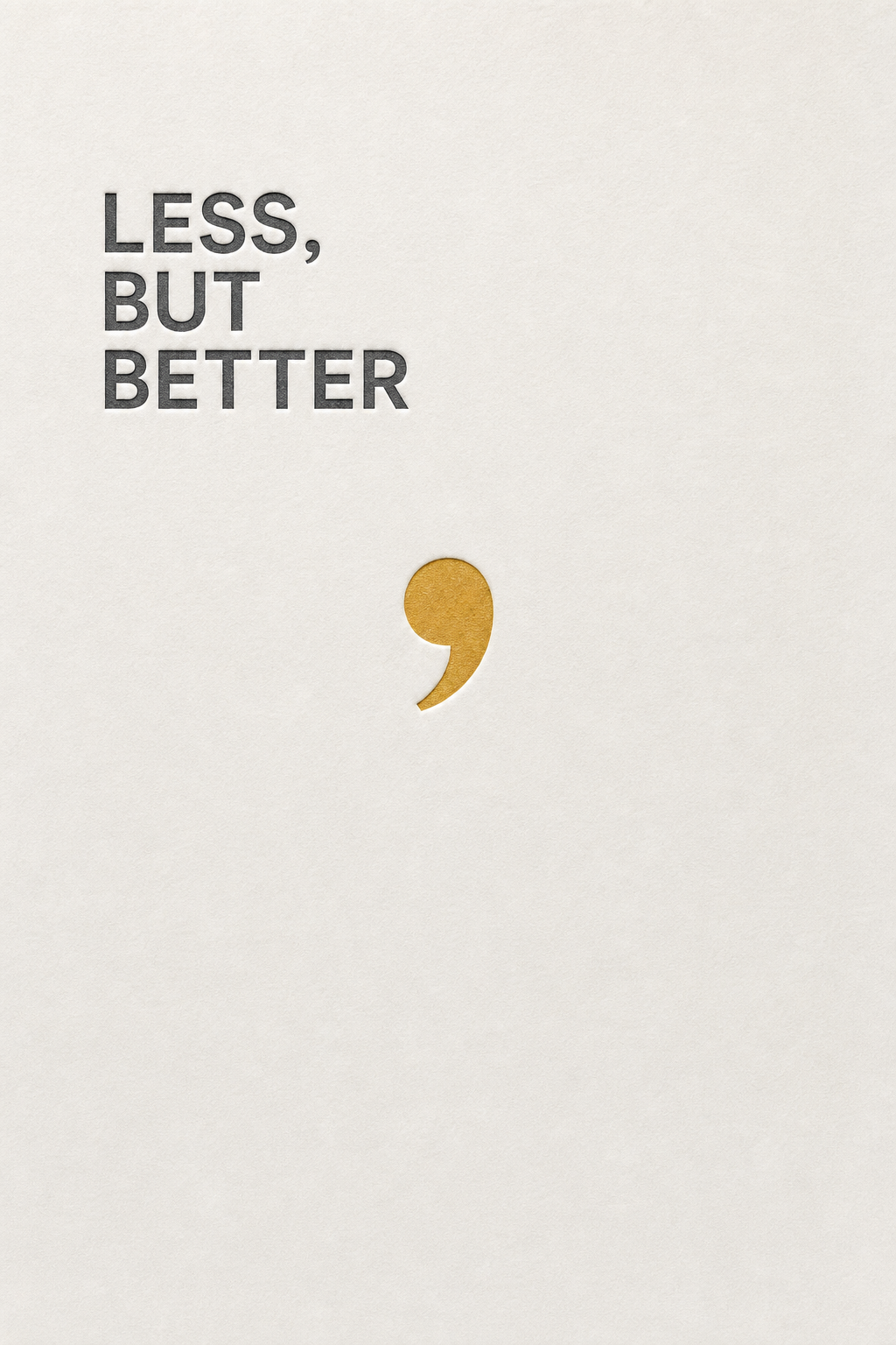
A minimalist design poster reading 'LESS, BUT BETTER' in a precise neutral sans-serif, left-aligned and set in three tight lines high on the sheet. The rest is untouched off-white paper. A comma is rendered oversized in a muted mustard, becoming the only graphic element, floating mid-page. Subtle letterpress deboss texture around the type. Palette of paper white, graphite type, one mustard accent. Cool, deliberate, design-studio elegance.Jak używać
- Skopiuj cały oryginalny prompt wraz z parametrami.
- Dostosuj temat, tekst i kompozycję do swoich potrzeb.
- Użyj zgodnego narzędzia zewnętrznego; sprawdź warunki dostępu i wynik.
Przed rozpoczęciem
- Sprawdź, czy potrzebny jest obraz referencyjny. Zgodność nie potwierdza modelu użytego do przykładu.
- Sprawdź nazwy, liczby i napisy; wyniki zależą od wersji modelu.