原文
GPT Image 2 · en
Scene:
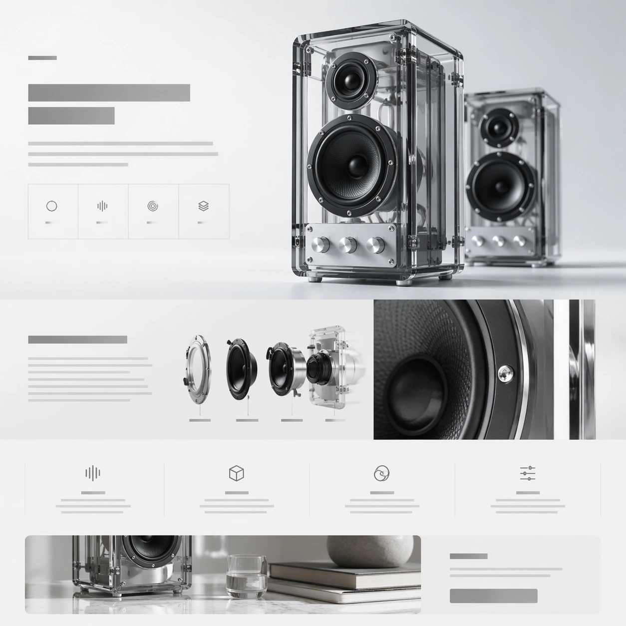
A square web-launch still for a transparent desktop speaker system, presented as a polished premium landing page. The layout feels airy and editorial, with an off-white background that grades into faint ice gray, minimal grid lines, and a calm daylight tone. The composition should suggest stacked website sections inside one frame: a hero band at the top, a storytelling middle section, and compact feature tiles below. Everything is aligned, spacious, and highly intentional.

Subject:
Feature a pair of transparent acrylic speakers with visible internal drivers, aluminum knobs, and smoked glass edges. One speaker stands upright as the main hero object; the second sits slightly behind it for depth. Construct the surrounding landing-page layout from abstract headline blocks, specification ribbons, icon-like markers, and modular content cards that imply acoustic tuning, transparent construction, and room presence. Include one close-up crop of the circular driver housing and one narrow band that suggests a lifestyle scene without showing a full room.

Important details:
This should feel like a launch page for a design-forward audio brand. Transparency, edge highlights, screws, driver cones, and acrylic thickness must be rendered credibly. The page hierarchy should have a strong beat: hero, material story, internal detail, feature row, CTA. Keep the system elegant and premium rather than playful. Use negative space, thin dividers, and quiet contrast to make the composition readable at a glance.

Use case:
Premium Product Landing Page single study 2/9, testing transparent hardware presentation and story-module rhythm in one premium web frame.

Constraints:
No readable text, no watermark, no logos, preserve exact 1:1 aspect ratio, no browser chrome, no crowded furniture scene, no random equalizer graphics, no exaggerated RGB lighting, no warped acrylic geometry, no cheap retail packaging.
使い方
- パラメータを含む元のプロンプト全体をコピーします。
- 被写体、文字、構図を自分の要件に置き換えます。
- 対応する外部ツールで使用し、利用条件と結果を確認します。
開始前の確認
- 参考画像の要否を確認してください。互換モデルの表示は、そのモデルでの生成実績を意味しません。
- 名前、数値、画像内の文字を確認します。モデルの版で結果は変わります。