Premium Product Landing Page — Desktop Synth Arrangement

Premium Product Landing Page — Desktop Synth Arrangement

原文

GPT Image 2 · en

Scene:
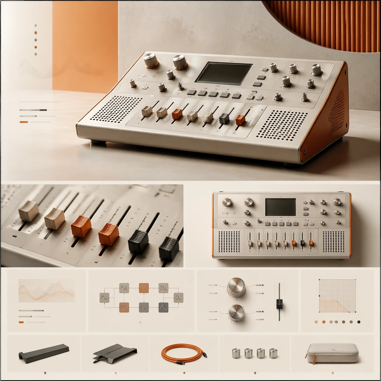
A square premium landing-page still for a boutique desktop synthesizer, composed like a sophisticated music-technology website. The visual tone is warm industrial: bone white, muted orange, brushed aluminum, and soft black accents, with diffuse studio lighting and a neat modular grid. The page should feel like an art-directed launch page with a hero zone up top and a sequence of feature sections below, all contained in a balanced square frame.

Subject:
Present a compact desktop synthesizer with clean knobs, sliders, a small non-readable display area, speaker perforations, and a carefully machined chassis. The main hero render sits slightly off-center to create motion, while surrounding layout elements suggest feature stories, signal-path modules, tactile control explanations, and a slim accessory strip. Add one cropped macro panel showing the fader caps and one secondary angle of the synth from above, but keep the dominant focus on the central hardware object and the premium page hierarchy built around it.

Important details:
This must look like a creative-tech launch page for a serious design-led brand. The hardware needs authentic industrial design cues: measured proportions, believable materials, crisp edges, and tactile knobs that feel manufacturable. The landing-page composition should rely on elegant spacing, modular alignment, and a clear flow from hero to feature storytelling to condensed specification grid. Aim for premium calm, not retro clutter or maximalist music-poster energy.

Use case:
Premium Product Landing Page single study 5/9, testing a boutique synthesizer launch page with tactile product detail and refined module rhythm.

Constraints:
No readable text, no watermark, no logos, preserve exact 1:1 aspect ratio, no browser chrome, no crowded studio desk, no musician portrait, no excessive cables, no vintage grime, no chaotic patch-bay spaghetti, no malformed knobs or keys.

使い方

  1. パラメータを含む元のプロンプト全体をコピーします。
  2. 被写体、文字、構図を自分の要件に置き換えます。
  3. 対応する外部ツールで使用し、利用条件と結果を確認します。

開始前の確認

  • 参考画像の要否を確認してください。互換モデルの表示は、そのモデルでの生成実績を意味しません。
  • 名前、数値、画像内の文字を確認します。モデルの版で結果は変わります。
似た事例

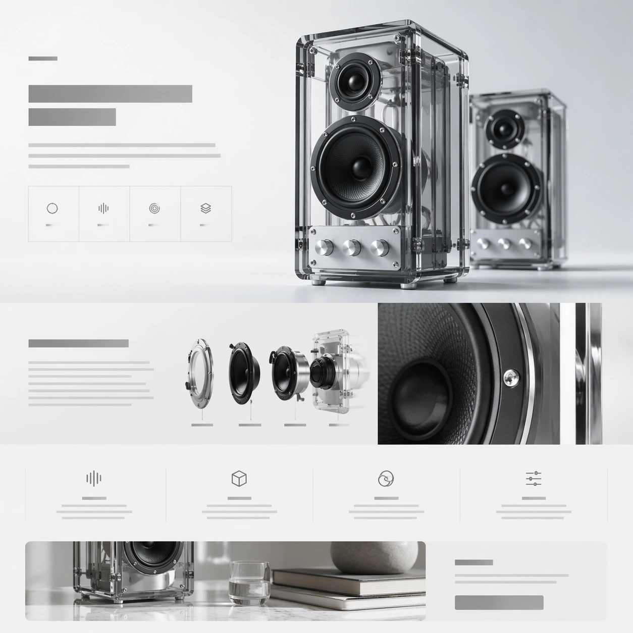
Premium Product Landing Page — Transparent Speaker Story
GPT Image 2en

Scene: A square web-launch still for a transparent desktop speaker system, presented as a polished premium landing page. The layout feels airy and editorial, with an off-white background that grades into faint ice gray, minimal grid lines, and a calm daylight tone. The compositio

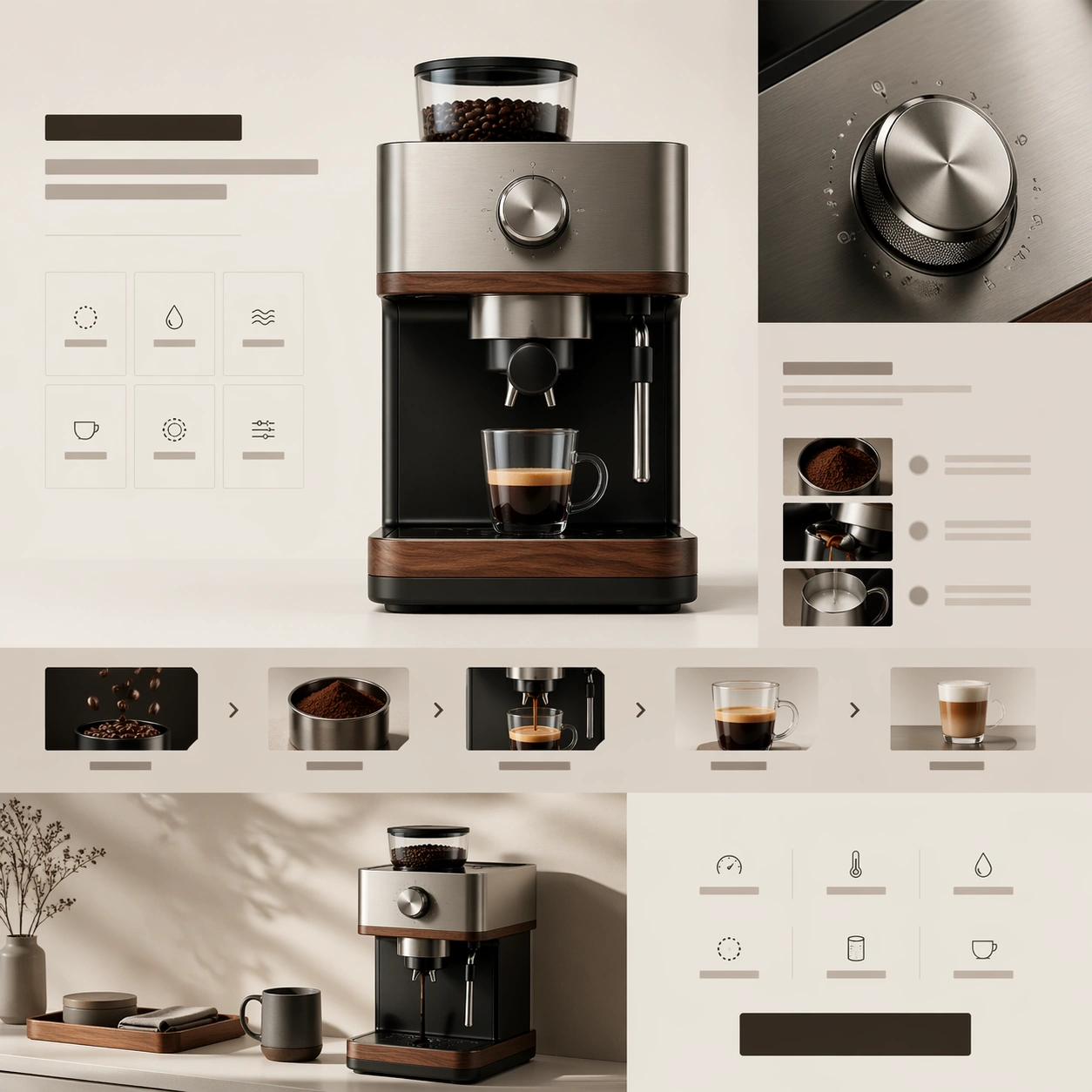
Premium Product Landing Page — Precision Coffee Launch
GPT Image 2en

Scene: A square premium web-launch still for a precision coffee device, staged like the hero and feature stack of a design-led appliance landing page. The palette combines soft cream, matte black, brushed stainless steel, and warm walnut. Lighting feels like bright editorial prod

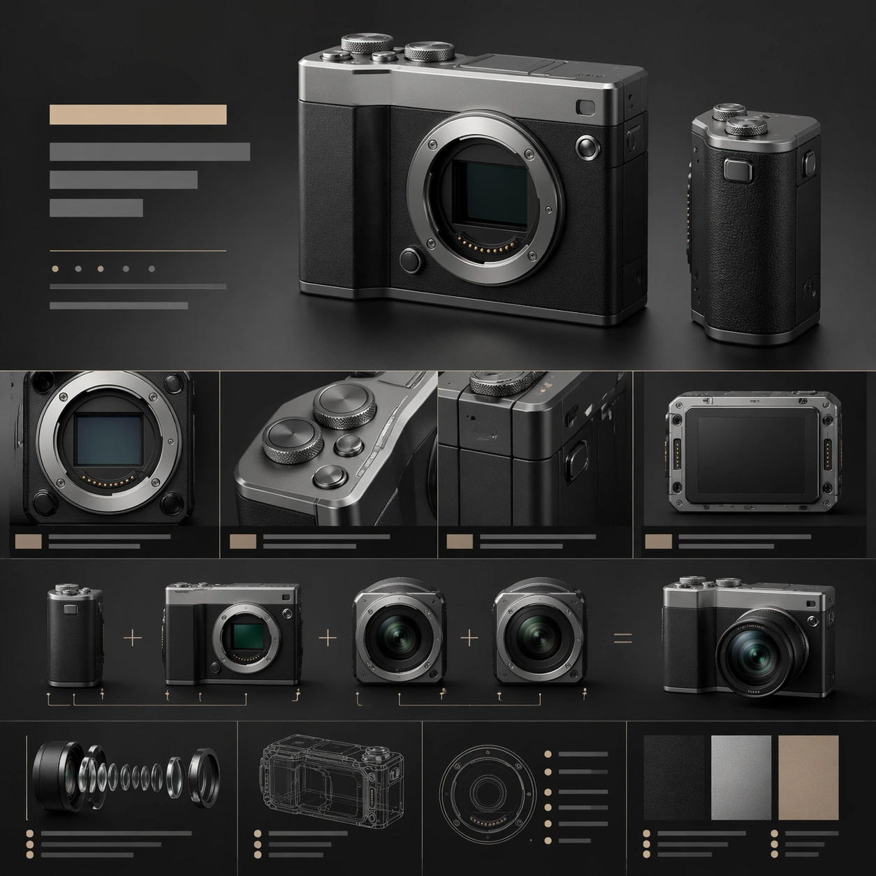
Premium Product Landing Page — Modular Camera Showcase
GPT Image 2en

Scene: A square premium web still for a modular compact camera system, laid out like a high-end product landing page with crisp art direction. The palette combines matte charcoal, silver aluminum, and muted sandstone highlights, with lighting that feels like a blend of studio cat

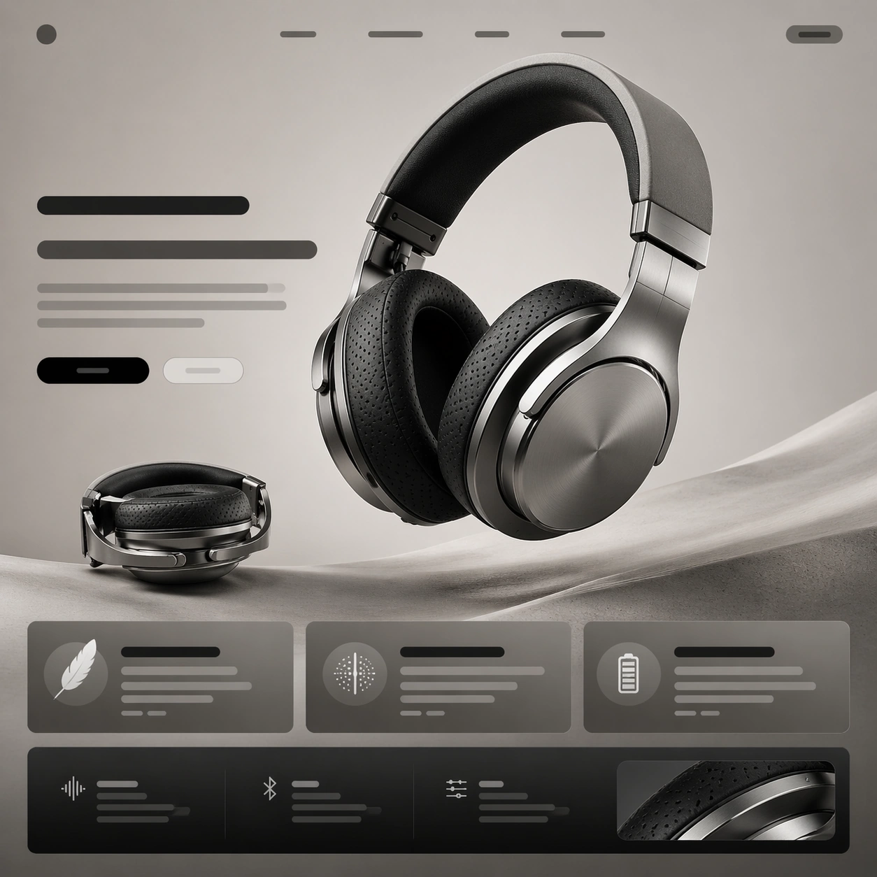
Premium Product Landing Page — Titanium Headphone Hero
GPT Image 2en

Scene: A square premium landing-page still for a flagship over-ear headphone, composed like the first viewport of a hardware launch website. The page is shown front-on with crisp vertical rhythm, a pale graphite background fading into warm stone gray, and a controlled studio-ligh

Premium Product Landing Page — Handheld Console Launch
GPT Image 2en

Scene: A square launch-page still for a premium handheld gaming console, framed like a polished web campaign rather than a store listing. The page uses a deep charcoal-to-graphite background with controlled pools of light, clean module spacing, and a dramatic but disciplined cont

Premium Product Landing Page — Mesh Router Spec Grid
GPT Image 2en

Scene: A square premium landing-page still for a mesh-router system, arranged like a high-end networking product website. The page uses a restrained palette of matte white, soft gray, pale blue, and graphite, with a bright minimal background and precise grid discipline. The compo