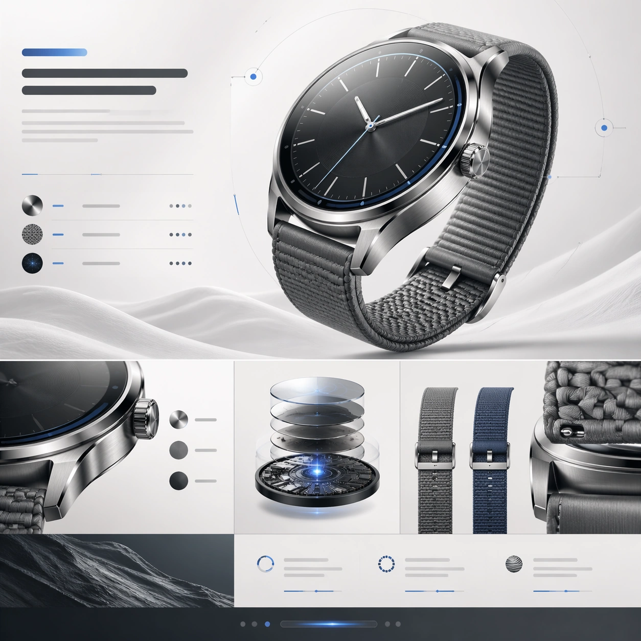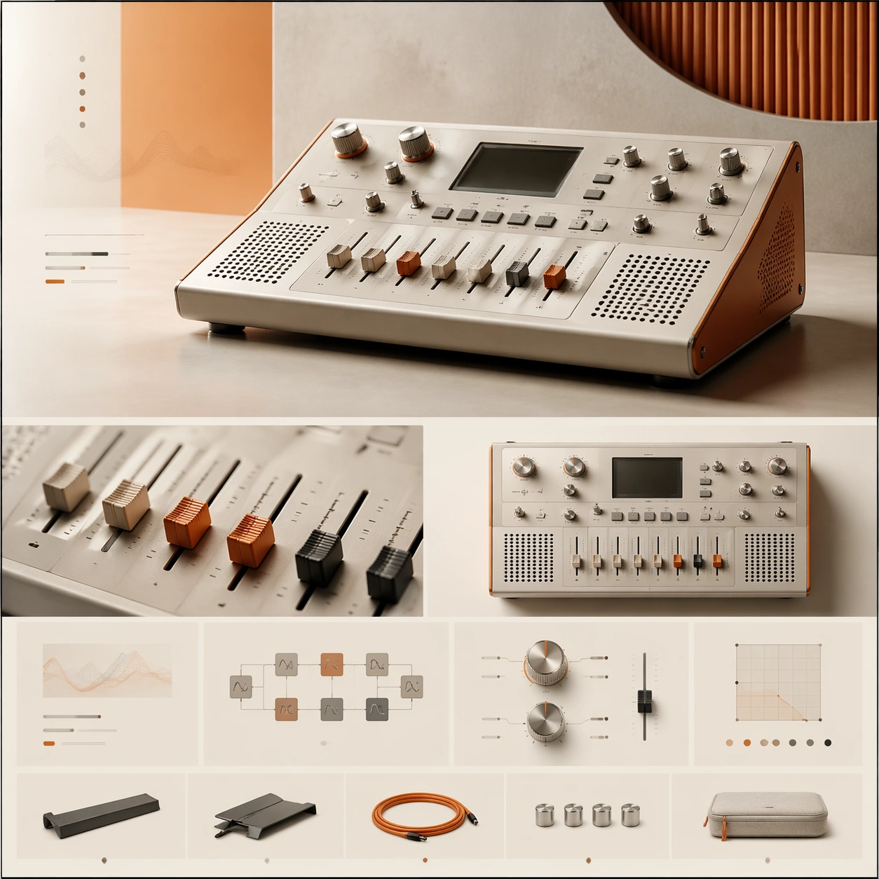
원본 문서
GPT Image 2 · en
Scene:
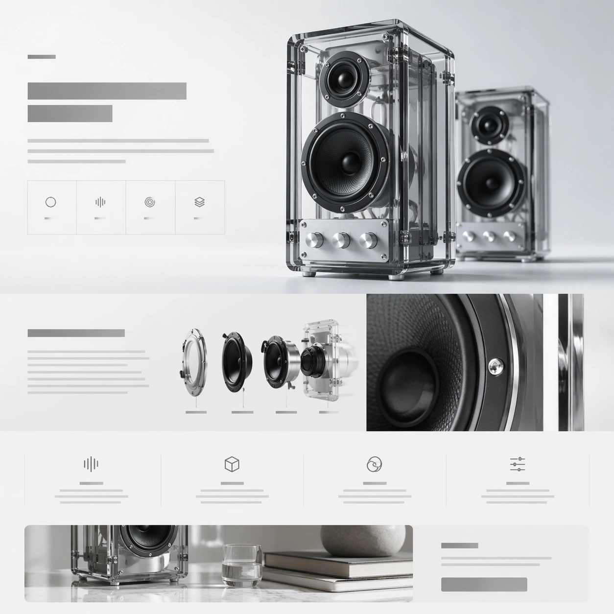
A square web-launch still for a transparent desktop speaker system, presented as a polished premium landing page. The layout feels airy and editorial, with an off-white background that grades into faint ice gray, minimal grid lines, and a calm daylight tone. The composition should suggest stacked website sections inside one frame: a hero band at the top, a storytelling middle section, and compact feature tiles below. Everything is aligned, spacious, and highly intentional.

Subject:
Feature a pair of transparent acrylic speakers with visible internal drivers, aluminum knobs, and smoked glass edges. One speaker stands upright as the main hero object; the second sits slightly behind it for depth. Construct the surrounding landing-page layout from abstract headline blocks, specification ribbons, icon-like markers, and modular content cards that imply acoustic tuning, transparent construction, and room presence. Include one close-up crop of the circular driver housing and one narrow band that suggests a lifestyle scene without showing a full room.

Important details:
This should feel like a launch page for a design-forward audio brand. Transparency, edge highlights, screws, driver cones, and acrylic thickness must be rendered credibly. The page hierarchy should have a strong beat: hero, material story, internal detail, feature row, CTA. Keep the system elegant and premium rather than playful. Use negative space, thin dividers, and quiet contrast to make the composition readable at a glance.

Use case:
Premium Product Landing Page single study 2/9, testing transparent hardware presentation and story-module rhythm in one premium web frame.

Constraints:
No readable text, no watermark, no logos, preserve exact 1:1 aspect ratio, no browser chrome, no crowded furniture scene, no random equalizer graphics, no exaggerated RGB lighting, no warped acrylic geometry, no cheap retail packaging.
사용 방법
- 매개변수를 포함한 전체 원본 프롬프트를 복사하세요.
- 주제, 문구, 구도를 자신의 요구에 맞게 바꾸세요.
- 호환되는 외부 도구에서 사용하고 이용 조건과 결과를 확인하세요.
시작 전 확인
- 참조 이미지가 필요한지 확인하세요. 호환 표시는 해당 모델로 이 예시를 생성했다는 뜻이 아닙니다.
- 이름, 수치, 이미지 속 문구를 확인하세요. 모델 버전에 따라 결과가 다를 수 있습니다.