원본 문서
GPT Image 2 · en
Scene:
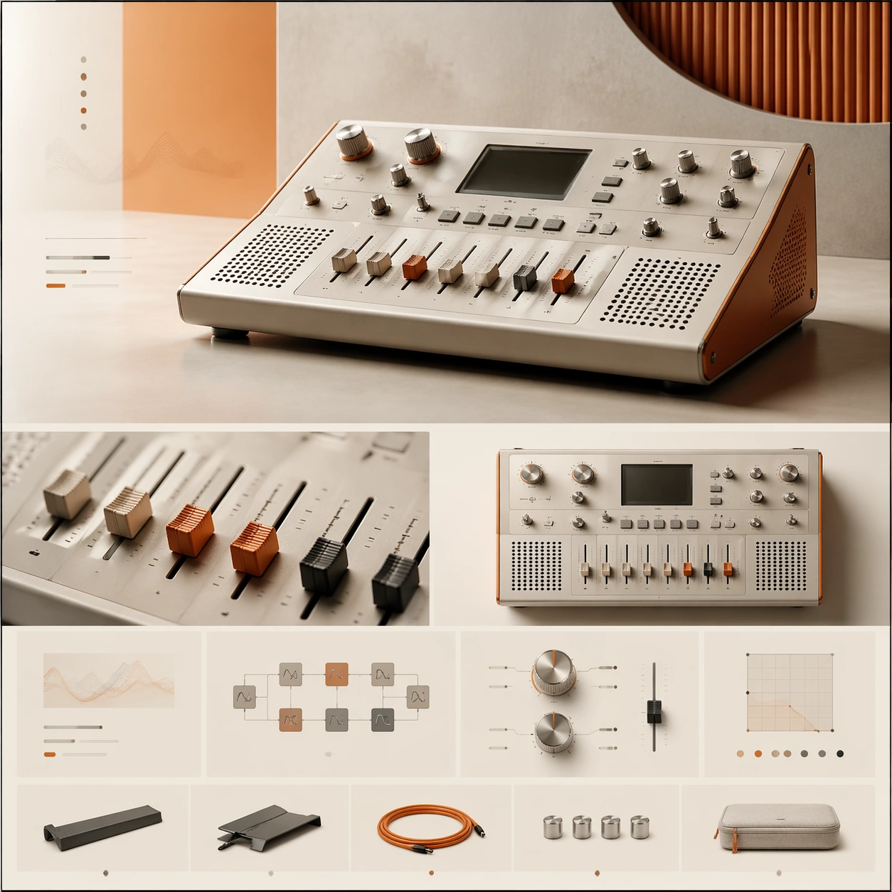
A square premium landing-page still for a boutique desktop synthesizer, composed like a sophisticated music-technology website. The visual tone is warm industrial: bone white, muted orange, brushed aluminum, and soft black accents, with diffuse studio lighting and a neat modular grid. The page should feel like an art-directed launch page with a hero zone up top and a sequence of feature sections below, all contained in a balanced square frame.

Subject:
Present a compact desktop synthesizer with clean knobs, sliders, a small non-readable display area, speaker perforations, and a carefully machined chassis. The main hero render sits slightly off-center to create motion, while surrounding layout elements suggest feature stories, signal-path modules, tactile control explanations, and a slim accessory strip. Add one cropped macro panel showing the fader caps and one secondary angle of the synth from above, but keep the dominant focus on the central hardware object and the premium page hierarchy built around it.

Important details:
This must look like a creative-tech launch page for a serious design-led brand. The hardware needs authentic industrial design cues: measured proportions, believable materials, crisp edges, and tactile knobs that feel manufacturable. The landing-page composition should rely on elegant spacing, modular alignment, and a clear flow from hero to feature storytelling to condensed specification grid. Aim for premium calm, not retro clutter or maximalist music-poster energy.

Use case:
Premium Product Landing Page single study 5/9, testing a boutique synthesizer launch page with tactile product detail and refined module rhythm.

Constraints:
No readable text, no watermark, no logos, preserve exact 1:1 aspect ratio, no browser chrome, no crowded studio desk, no musician portrait, no excessive cables, no vintage grime, no chaotic patch-bay spaghetti, no malformed knobs or keys.
사용 방법
- 매개변수를 포함한 전체 원본 프롬프트를 복사하세요.
- 주제, 문구, 구도를 자신의 요구에 맞게 바꾸세요.
- 호환되는 외부 도구에서 사용하고 이용 조건과 결과를 확인하세요.
시작 전 확인
- 참조 이미지가 필요한지 확인하세요. 호환 표시는 해당 모델로 이 예시를 생성했다는 뜻이 아닙니다.
- 이름, 수치, 이미지 속 문구를 확인하세요. 모델 버전에 따라 결과가 다를 수 있습니다.