App Launch Hero System — Clinic Wellness Companion

App Launch Hero System — Clinic Wellness Companion

원본 문서

GPT Image 2 · en

Scene:
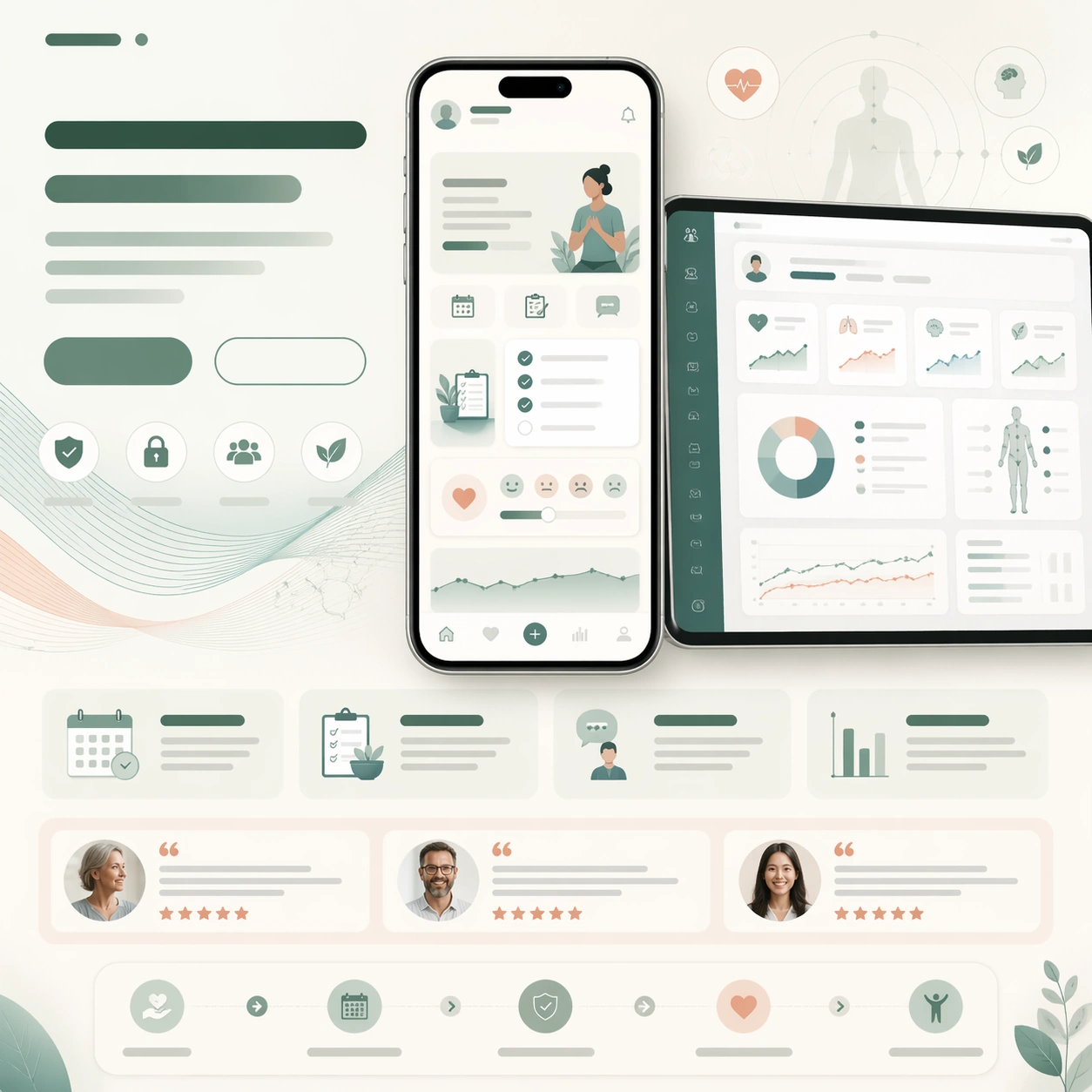
A square health-tech launch-page still with warm white, sage, sea-glass, and muted coral tones, designed like a trusted care-platform website. The layout should be soft and reassuring but still commercial and precise, with a centered phone hero, supporting information cards, and a clear CTA area. Use subtle gradients and rounded modules so the page feels humane rather than sterile.

Subject:
Show a phone-centered launch page for a clinic wellness companion app, with a main screen implying appointment prep, recovery checklist cards, and calm symptom journaling. Add a secondary tablet or desktop crop with clinician-side summaries and progress charts. Compose the page around these screenshots using abstract headline blocks, a CTA pair, feature cards, a patient-story testimonial row, and a gentle care pathway strip. Behind the devices, add a translucent wave motif resembling breathing curves and soft medical diagrams without any readable notation.

Important details:
The image should look like a real health-product launch page built to earn trust. Product screenshots must be believable and calm, while the surrounding layout clearly expresses reassurance, capability, and next-step action. Keep the UI simple, medically credible, and uncluttered. All copy zones stay unreadable, appearing as bars, card stubs, and icon patterns only. The finished still should feel adaptable for a homepage hero, app-store feature graphic, and waiting-room presentation without losing coherence.

Use case:
App Launch Hero System single study 7/9, testing whether a health-tech launch page can combine empathy, clinical clarity, and strong signup structure in one frame.

Constraints:
No readable text, no watermark, no logos, preserve exact 1:1 aspect ratio, no hospital photo backgrounds, no red emergency drama, no browser chrome, no fake prescription text, no unrealistic anatomy diagrams, no distorted device bezels.

사용 방법

  1. 매개변수를 포함한 전체 원본 프롬프트를 복사하세요.
  2. 주제, 문구, 구도를 자신의 요구에 맞게 바꾸세요.
  3. 호환되는 외부 도구에서 사용하고 이용 조건과 결과를 확인하세요.

시작 전 확인

  • 참조 이미지가 필요한지 확인하세요. 호환 표시는 해당 모델로 이 예시를 생성했다는 뜻이 아닙니다.
  • 이름, 수치, 이미지 속 문구를 확인하세요. 모델 버전에 따라 결과가 다를 수 있습니다.
비슷한 예시

App Launch Hero System — Focus Streak Coach
GPT Image 2en

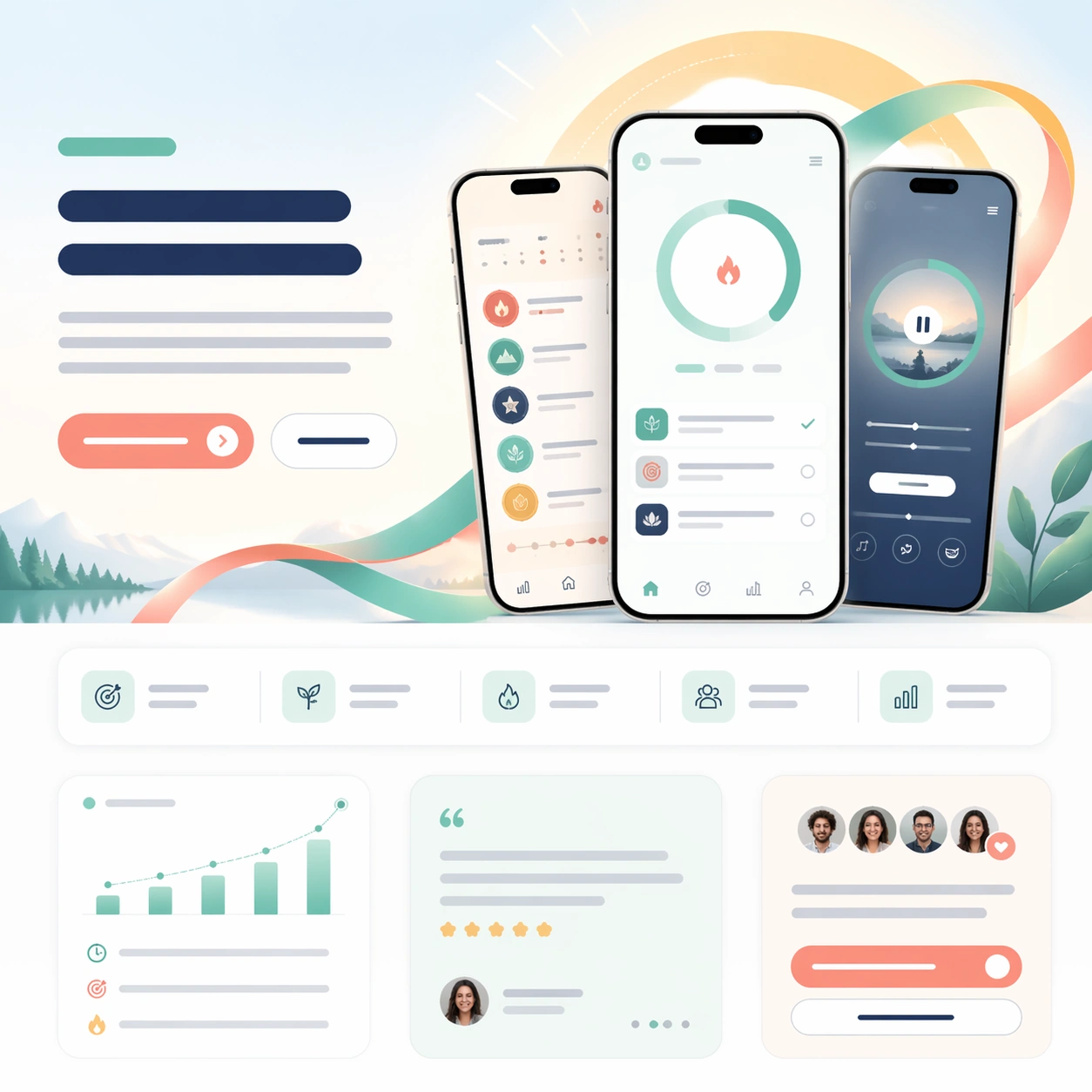
Scene: A square mobile-app launch page with bright daylight tones, mint, coral, and soft navy accents, composed as a clean first-scroll marketing page. The frame should feel airy and optimistic, with rounded cards, large breathing room, and a subtle gradient halo behind the hero

App Launch Hero System — Language Sprint Mobile
GPT Image 2en

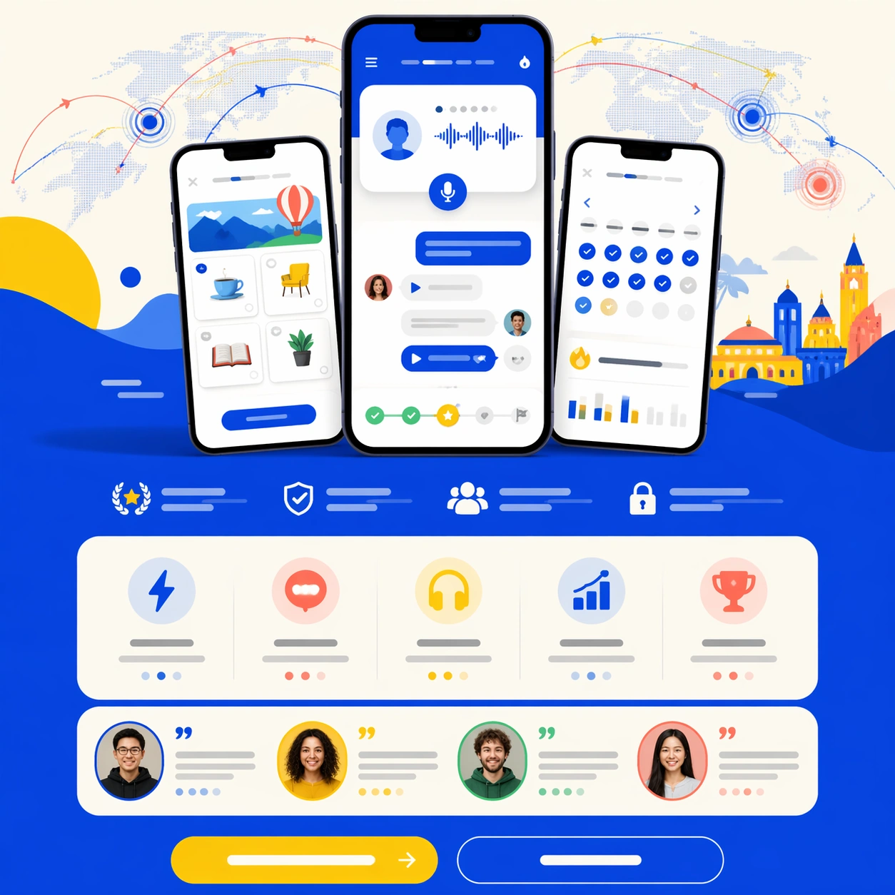
Scene: A square mobile-first app launch-page still with bright cobalt, cream, lemon, and coral accents, styled like a confident consumer-product website with strong onboarding energy. The composition should feel lively but controlled, with a centered phone hero, playful modular c

App Launch Hero System — Founder Finance Dashboard
GPT Image 2en

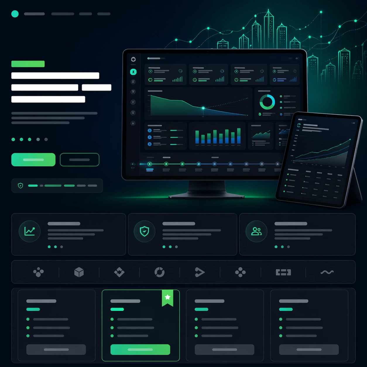
Scene: A square fintech launch-page still with dark navy, graphite, and electric emerald highlights, arranged like a premium SaaS hero section with lower feature and pricing modules. The tone should be serious and investor-ready, with sharp grids, glowing chart accents, and one r

App Launch Hero System — Trip Planner Orbit
GPT Image 2en

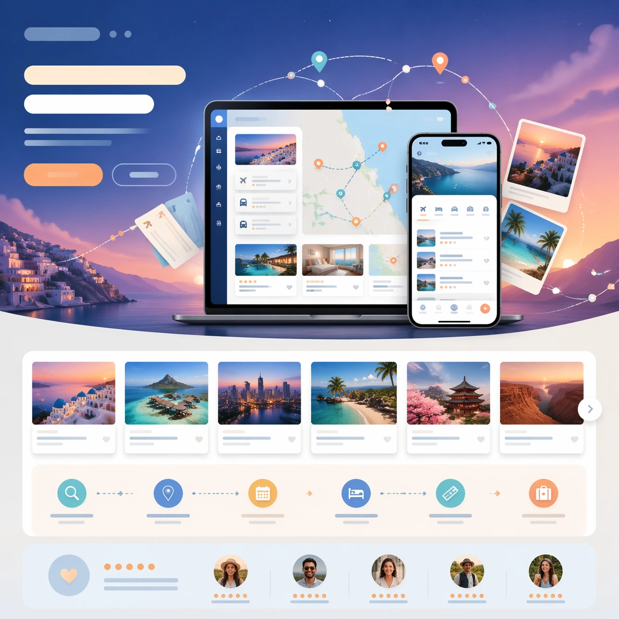
Scene: A square travel-app launch-page still with twilight blue, sand, aqua, and sunset orange accents, composed like a premium consumer travel website. The frame should feel aspirational and lightweight, with layered cards, route arcs, and one atmospheric gradient behind the cen

App Launch Hero System — Creator Analytics Portal
GPT Image 2en

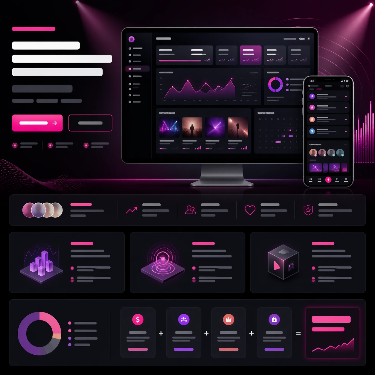
Scene: A square creator-tool launch-page still with charcoal, plum, silver, and electric pink highlights, arranged as a polished web hero with lower storytelling bands. The tone should feel ambitious and media-savvy, with glowing chart accents, thumbnail-like content tiles, and a

App Launch Hero System — Design Review Canvas
GPT Image 2en

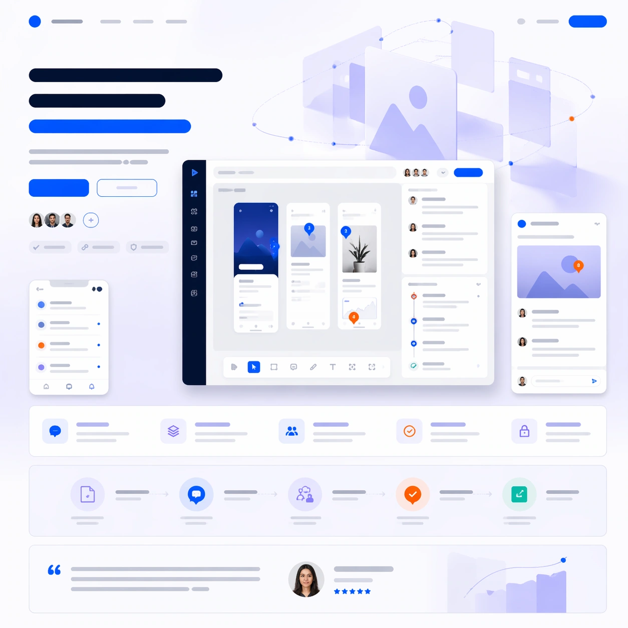
Scene: A square software launch-page still with cool white, lavender gray, cobalt, and signal orange accents, composed like a premium design-tool website first screen with supporting sections below. Use a clean studio background, floating panels, and carefully spaced interface la