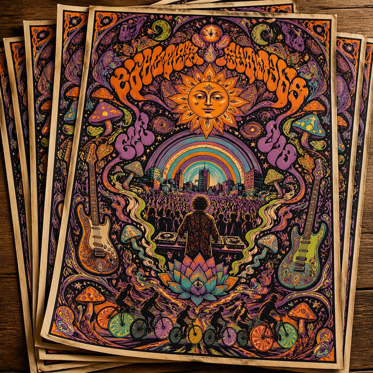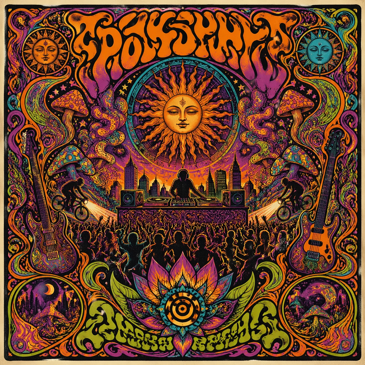
PROMPTY · TWÓRCZE ODKRYWANIE

Galeria promptów

Odkrywaj prawdziwe prompty i wygenerowane przykłady. Znajdź inspirację do kolejnej twórczej misji i kopiuj pełne prompty bezpłatnie.

Przykłady
10,974
Modele
17
Źródła
1277
10 974 przykładów promptów · strona 24 z 229
Example generated from “Product Comparison Benefit Board — Variant Three”
GPT Image 2en

Scene: Create a square dependent image for Product Comparison Benefit Board. Build a third controlled variation in the same system with a premium, production-ready finish. Use a polished modular board or campaign surface with clean spacing, premium game-UI finish, and clear focal hierarchy. The composition should feel intentional, clean, and reusable for gallery, research, campaign, or internal handoff contexts. Lighting must support readability first, with the main forms clearly separated from the background and enough breathing room for the system to stay legible at both hero scale and thumbnail scale. Subject: Center a coherent original game-art system built for premium production and marketing surfaces. For this image, focus on the intended support surface. Keep the same system logic stable across screenshots, cards, banners, and overview boards. Preserve exact identity or system logic from the reference image while changing only the intended variation axis. The viewer should immediately understand what role this surface plays inside a cohesive game-production asset pack. Important details: Lock framing, icon grammar, palette blocking, and surface hierarchy so the kit feels production-ready and consistent. Preserve the core silhouette, framing language, and material logic from the reference image while each variation changes function. Keep materials believable, edge hierarchy disciplined, and the visual language consistent with Compare Board. Use abstract interface blocks or diagram accents when helpful, but avoid any readable language. The final result should feel like a deliberate production asset rather than a random illustration. Use case: Product Comparison Benefit Board series study 4/9, designed as variant three within a cohesive asset pack. Constraints: No readable text, no watermark, no logos, preserve exact 1:1 aspect ratio, no unrelated objects, no broken visual hierarchy, no malformed anatomy or broken perspective, no random decorative clutter.


Example generated from “Product Comparison Benefit Board — Support One”
GPT Image 2en

Scene: Create a square standalone support image for Product Comparison Benefit Board. Build a support-surface study with a clear focal hierarchy and a finished professional surface. Use a polished modular board or campaign surface with clean spacing, premium game-UI finish, and clear focal hierarchy. The frame should feel self-contained and polished, with enough structure to explain the system even without the reference series, yet still obviously belonging to the same theme and production world. Subject: Show a coherent original game-art system built for premium production and marketing surfaces in a way that emphasizes the intended support surface. Keep the same system logic stable across screenshots, cards, banners, and overview boards. Even though this image is independent, the viewer should still recognize the same universe, same commercial logic, and same production intent as the core package. Important details: Lock framing, icon grammar, palette blocking, and surface hierarchy so the kit feels production-ready and consistent. Preserve the broader theme language through color, framing, material choices, and modular composition. Use clean panel rhythm, premium asset presentation, and believable detail density. The image should work equally well as a gallery study, research reference, and mock production deliverable. Use case: Product Comparison Benefit Board single study 5/9, exploring support one as a support surface. Constraints: No readable text, no watermark, no logos, preserve exact 1:1 aspect ratio, no unrelated objects, no broken visual hierarchy, no visual noise that obscures the main surface, no accidental brand resemblance.

Example generated from “Product Comparison Benefit Board — Support Two”
GPT Image 2en

Scene: Create a square standalone support image for Product Comparison Benefit Board. Build a second support-surface study with a clear focal hierarchy and a finished professional surface. Use a polished modular board or campaign surface with clean spacing, premium game-UI finish, and clear focal hierarchy. The frame should feel self-contained and polished, with enough structure to explain the system even without the reference series, yet still obviously belonging to the same theme and production world. Subject: Show a coherent original game-art system built for premium production and marketing surfaces in a way that emphasizes the intended support surface. Keep the same system logic stable across screenshots, cards, banners, and overview boards. Even though this image is independent, the viewer should still recognize the same universe, same commercial logic, and same production intent as the core package. Important details: Lock framing, icon grammar, palette blocking, and surface hierarchy so the kit feels production-ready and consistent. Preserve the broader theme language through color, framing, material choices, and modular composition. Use clean panel rhythm, premium asset presentation, and believable detail density. The image should work equally well as a gallery study, research reference, and mock production deliverable. Use case: Product Comparison Benefit Board single study 6/9, exploring support two as a support surface. Constraints: No readable text, no watermark, no logos, preserve exact 1:1 aspect ratio, no unrelated objects, no broken visual hierarchy, no visual noise that obscures the main surface, no accidental brand resemblance.

Example generated from “Product Comparison Benefit Board — Support Three”
GPT Image 2en

Scene: Create a square standalone support image for Product Comparison Benefit Board. Build a third support-surface study with a clear focal hierarchy and a finished professional surface. Use a polished modular board or campaign surface with clean spacing, premium game-UI finish, and clear focal hierarchy. The frame should feel self-contained and polished, with enough structure to explain the system even without the reference series, yet still obviously belonging to the same theme and production world. Subject: Show a coherent original game-art system built for premium production and marketing surfaces in a way that emphasizes the intended support surface. Keep the same system logic stable across screenshots, cards, banners, and overview boards. Even though this image is independent, the viewer should still recognize the same universe, same commercial logic, and same production intent as the core package. Important details: Lock framing, icon grammar, palette blocking, and surface hierarchy so the kit feels production-ready and consistent. Preserve the broader theme language through color, framing, material choices, and modular composition. Use clean panel rhythm, premium asset presentation, and believable detail density. The image should work equally well as a gallery study, research reference, and mock production deliverable. Use case: Product Comparison Benefit Board single study 7/9, exploring support three as a support surface. Constraints: No readable text, no watermark, no logos, preserve exact 1:1 aspect ratio, no unrelated objects, no broken visual hierarchy, no visual noise that obscures the main surface, no accidental brand resemblance.

Example generated from “Product Comparison Benefit Board — Support Four”
GPT Image 2en

Scene: Create a square standalone support image for Product Comparison Benefit Board. Build a fourth support-surface study with a clear focal hierarchy and a finished professional surface. Use a polished modular board or campaign surface with clean spacing, premium game-UI finish, and clear focal hierarchy. The frame should feel self-contained and polished, with enough structure to explain the system even without the reference series, yet still obviously belonging to the same theme and production world. Subject: Show a coherent original game-art system built for premium production and marketing surfaces in a way that emphasizes the intended support surface. Keep the same system logic stable across screenshots, cards, banners, and overview boards. Even though this image is independent, the viewer should still recognize the same universe, same commercial logic, and same production intent as the core package. Important details: Lock framing, icon grammar, palette blocking, and surface hierarchy so the kit feels production-ready and consistent. Preserve the broader theme language through color, framing, material choices, and modular composition. Use clean panel rhythm, premium asset presentation, and believable detail density. The image should work equally well as a gallery study, research reference, and mock production deliverable. Use case: Product Comparison Benefit Board single study 8/9, exploring support four as a support surface. Constraints: No readable text, no watermark, no logos, preserve exact 1:1 aspect ratio, no unrelated objects, no broken visual hierarchy, no visual noise that obscures the main surface, no accidental brand resemblance.

Example generated from “Product Comparison Benefit Board — Support Five”
GPT Image 2en

Scene: Create a square standalone support image for Product Comparison Benefit Board. Build a fifth support-surface study with a clear focal hierarchy and a finished professional surface. Use a polished modular board or campaign surface with clean spacing, premium game-UI finish, and clear focal hierarchy. The frame should feel self-contained and polished, with enough structure to explain the system even without the reference series, yet still obviously belonging to the same theme and production world. Subject: Show a coherent original game-art system built for premium production and marketing surfaces in a way that emphasizes the intended support surface. Keep the same system logic stable across screenshots, cards, banners, and overview boards. Even though this image is independent, the viewer should still recognize the same universe, same commercial logic, and same production intent as the core package. Important details: Lock framing, icon grammar, palette blocking, and surface hierarchy so the kit feels production-ready and consistent. Preserve the broader theme language through color, framing, material choices, and modular composition. Use clean panel rhythm, premium asset presentation, and believable detail density. The image should work equally well as a gallery study, research reference, and mock production deliverable. Use case: Product Comparison Benefit Board single study 9/9, exploring support five as a support surface. Constraints: No readable text, no watermark, no logos, preserve exact 1:1 aspect ratio, no unrelated objects, no broken visual hierarchy, no visual noise that obscures the main surface, no accidental brand resemblance.

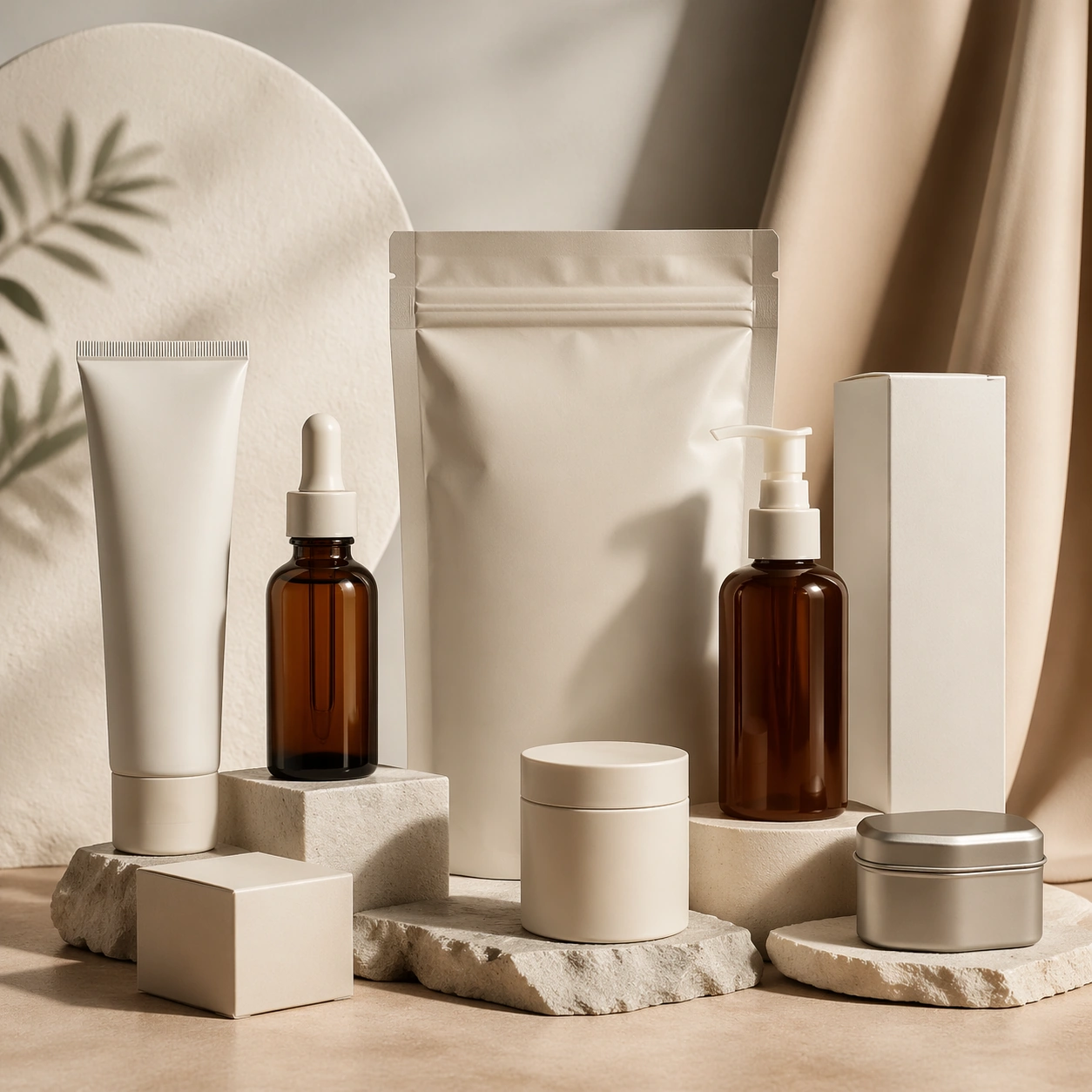
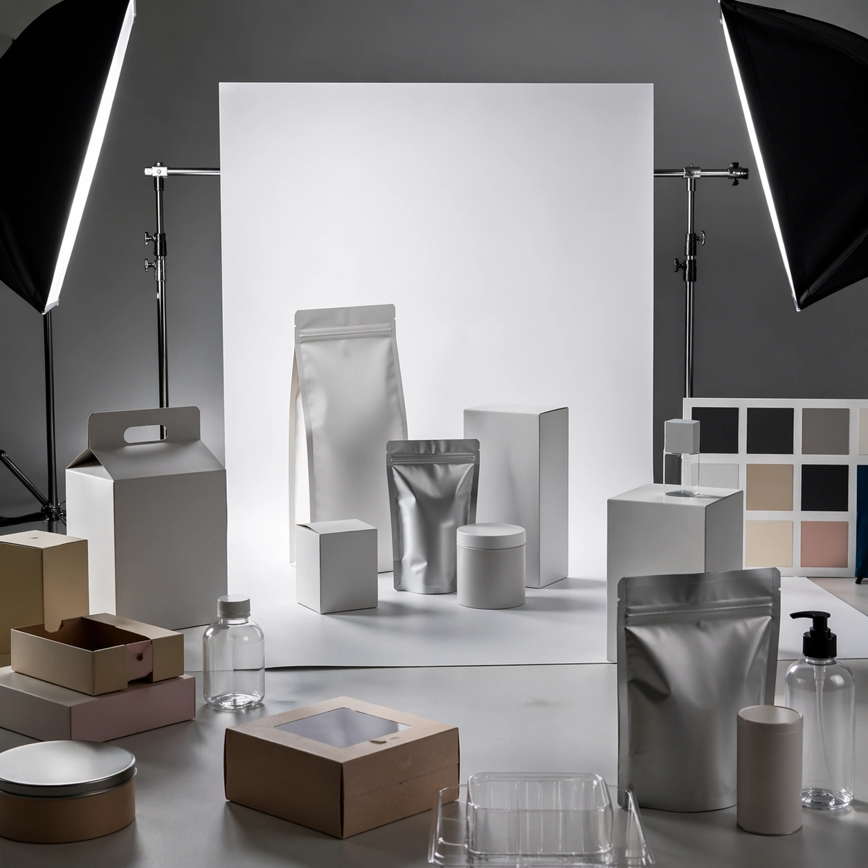
Example generated from “Product Packaging Studio Mockup — Hero Mockup”
GPT Image 2en

Scene: A square commercial presentation with realistic materials, clean staging, and believable product photography or retail lighting. Build the frame around a flagship hero setup that sells the overall system immediately. Keep the lighting, camera distance, and spatial organization tuned for a high-signal research image rather than a casual snapshot. The image belongs to the Product Packaging Studio Mockup theme and should feel immediately legible as a prompt atlas theme for product packaging studio mockup, testing photorealism, physics-materials, editing-workflow, commercial-mockup with gpt image 2.. Subject: Center the study on a flagship hero setup that sells the overall system immediately. Translate the theme into a concrete visual statement instead of an abstract mood board: the viewer should understand what kind of image this is, what is being tested, and why the composition is difficult. Use the slug idea of product packaging studio mockup as a literal guide for subject matter, materials, and staging. If helpful, borrow the broad visual cues suggested by studio, but keep the result original and specific to this study. Important details: The mockup should feel saleable and design-ready: sharp edges, controlled reflections, credible paper or plastic behavior, and precise placement. Preserve a disciplined square composition, clear focal hierarchy, and enough secondary information to make the image feel complete rather than underspecified. The image should look polished, novel, and exhibition-ready, with topic-specific credibility coming from the way surfaces, structure, and visual language reinforce Product Packaging Studio Mockup. Avoid generic filler elements that do not serve the main concept. Use case: Product Packaging Studio Mockup single study 1/8, testing photorealism, physics-materials, editing-workflow, commercial-mockup through the hero mockup variation. Constraints: No readable text, no watermark, no logos, preserve exact 1:1 aspect ratio, no real brand names, no cheap stock-photo styling, no broken perspective, no watermark, no accidental readable packaging copy, no cluttered retail shelf unless intended.

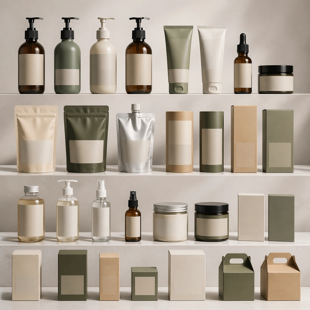
Example generated from “Product Packaging Studio Mockup — Variant Grid”
GPT Image 2en

Scene: A square commercial presentation with realistic materials, clean staging, and believable product photography or retail lighting. Build the frame around a disciplined family of variants presented as one product language. Keep the lighting, camera distance, and spatial organization tuned for a high-signal research image rather than a casual snapshot. The image belongs to the Product Packaging Studio Mockup theme and should feel immediately legible as a prompt atlas theme for product packaging studio mockup, testing photorealism, physics-materials, editing-workflow, commercial-mockup with gpt image 2.. Subject: Center the study on a disciplined family of variants presented as one product language. Translate the theme into a concrete visual statement instead of an abstract mood board: the viewer should understand what kind of image this is, what is being tested, and why the composition is difficult. Use the slug idea of product packaging studio mockup as a literal guide for subject matter, materials, and staging. If helpful, borrow the broad visual cues suggested by studio, but keep the result original and specific to this study. Important details: The mockup should feel saleable and design-ready: sharp edges, controlled reflections, credible paper or plastic behavior, and precise placement. Preserve a disciplined square composition, clear focal hierarchy, and enough secondary information to make the image feel complete rather than underspecified. The image should look polished, novel, and exhibition-ready, with topic-specific credibility coming from the way surfaces, structure, and visual language reinforce Product Packaging Studio Mockup. Avoid generic filler elements that do not serve the main concept. Use case: Product Packaging Studio Mockup single study 2/8, testing photorealism, physics-materials, editing-workflow, commercial-mockup through the variant grid variation. Constraints: No readable text, no watermark, no logos, preserve exact 1:1 aspect ratio, no real brand names, no cheap stock-photo styling, no broken perspective, no watermark, no accidental readable packaging copy, no cluttered retail shelf unless intended.

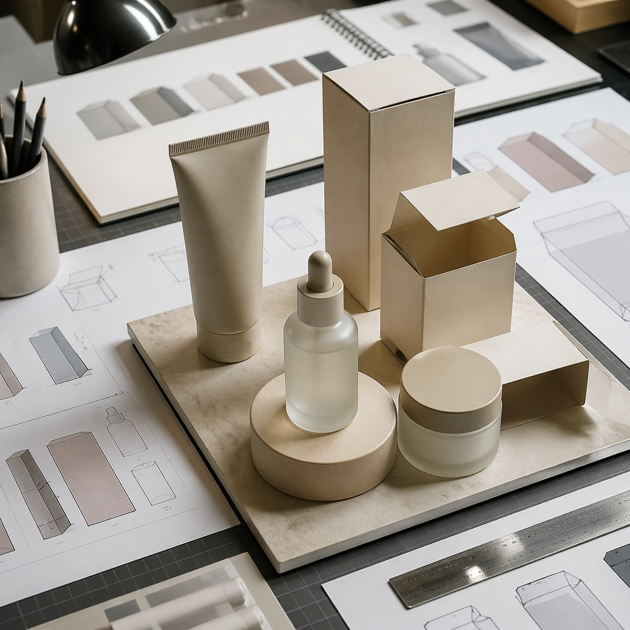
Example generated from “Product Packaging Studio Mockup — Desk Review”
GPT Image 2en

Scene: A square commercial presentation with realistic materials, clean staging, and believable product photography or retail lighting. Build the frame around the system reviewed on a designer’s table with believable supporting objects. Keep the lighting, camera distance, and spatial organization tuned for a high-signal research image rather than a casual snapshot. The image belongs to the Product Packaging Studio Mockup theme and should feel immediately legible as a prompt atlas theme for product packaging studio mockup, testing photorealism, physics-materials, editing-workflow, commercial-mockup with gpt image 2.. Subject: Center the study on the system reviewed on a designer’s table with believable supporting objects. Translate the theme into a concrete visual statement instead of an abstract mood board: the viewer should understand what kind of image this is, what is being tested, and why the composition is difficult. Use the slug idea of product packaging studio mockup as a literal guide for subject matter, materials, and staging. If helpful, borrow the broad visual cues suggested by studio, but keep the result original and specific to this study. Important details: The mockup should feel saleable and design-ready: sharp edges, controlled reflections, credible paper or plastic behavior, and precise placement. Preserve a disciplined square composition, clear focal hierarchy, and enough secondary information to make the image feel complete rather than underspecified. The image should look polished, novel, and exhibition-ready, with topic-specific credibility coming from the way surfaces, structure, and visual language reinforce Product Packaging Studio Mockup. Avoid generic filler elements that do not serve the main concept. Use case: Product Packaging Studio Mockup single study 3/8, testing photorealism, physics-materials, editing-workflow, commercial-mockup through the desk review variation. Constraints: No readable text, no watermark, no logos, preserve exact 1:1 aspect ratio, no real brand names, no cheap stock-photo styling, no broken perspective, no watermark, no accidental readable packaging copy, no cluttered retail shelf unless intended.

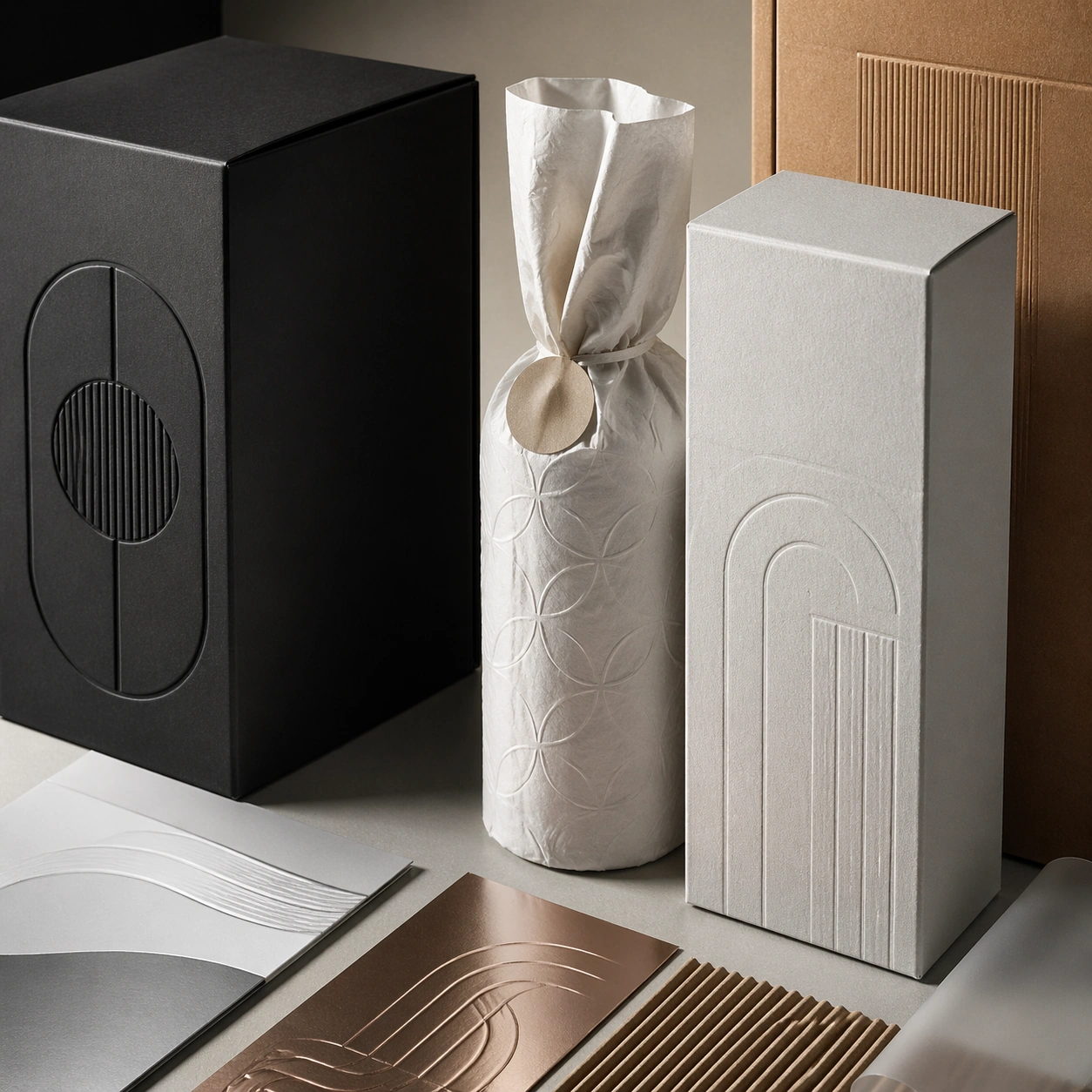
Example generated from “Product Packaging Studio Mockup — Material Closeup”
GPT Image 2en

Scene: A square commercial presentation with realistic materials, clean staging, and believable product photography or retail lighting. Build the frame around tactile finish, emboss, print, foil, or substrate behavior. Keep the lighting, camera distance, and spatial organization tuned for a high-signal research image rather than a casual snapshot. The image belongs to the Product Packaging Studio Mockup theme and should feel immediately legible as a prompt atlas theme for product packaging studio mockup, testing photorealism, physics-materials, editing-workflow, commercial-mockup with gpt image 2.. Subject: Center the study on tactile finish, emboss, print, foil, or substrate behavior. Translate the theme into a concrete visual statement instead of an abstract mood board: the viewer should understand what kind of image this is, what is being tested, and why the composition is difficult. Use the slug idea of product packaging studio mockup as a literal guide for subject matter, materials, and staging. If helpful, borrow the broad visual cues suggested by studio, but keep the result original and specific to this study. Important details: The mockup should feel saleable and design-ready: sharp edges, controlled reflections, credible paper or plastic behavior, and precise placement. Preserve a disciplined square composition, clear focal hierarchy, and enough secondary information to make the image feel complete rather than underspecified. The image should look polished, novel, and exhibition-ready, with topic-specific credibility coming from the way surfaces, structure, and visual language reinforce Product Packaging Studio Mockup. Avoid generic filler elements that do not serve the main concept. Use case: Product Packaging Studio Mockup single study 4/8, testing photorealism, physics-materials, editing-workflow, commercial-mockup through the material closeup variation. Constraints: No readable text, no watermark, no logos, preserve exact 1:1 aspect ratio, no real brand names, no cheap stock-photo styling, no broken perspective, no watermark, no accidental readable packaging copy, no cluttered retail shelf unless intended.

Example generated from “Product Packaging Studio Mockup — Archive Proof”
GPT Image 2en

Scene: A square commercial presentation with realistic materials, clean staging, and believable product photography or retail lighting. Build the frame around proof-like presentation that emphasizes production precision. Keep the lighting, camera distance, and spatial organization tuned for a high-signal research image rather than a casual snapshot. The image belongs to the Product Packaging Studio Mockup theme and should feel immediately legible as a prompt atlas theme for product packaging studio mockup, testing photorealism, physics-materials, editing-workflow, commercial-mockup with gpt image 2.. Subject: Center the study on proof-like presentation that emphasizes production precision. Translate the theme into a concrete visual statement instead of an abstract mood board: the viewer should understand what kind of image this is, what is being tested, and why the composition is difficult. Use the slug idea of product packaging studio mockup as a literal guide for subject matter, materials, and staging. If helpful, borrow the broad visual cues suggested by studio, but keep the result original and specific to this study. Important details: The mockup should feel saleable and design-ready: sharp edges, controlled reflections, credible paper or plastic behavior, and precise placement. Preserve a disciplined square composition, clear focal hierarchy, and enough secondary information to make the image feel complete rather than underspecified. The image should look polished, novel, and exhibition-ready, with topic-specific credibility coming from the way surfaces, structure, and visual language reinforce Product Packaging Studio Mockup. Avoid generic filler elements that do not serve the main concept. Use case: Product Packaging Studio Mockup single study 5/8, testing photorealism, physics-materials, editing-workflow, commercial-mockup through the archive proof variation. Constraints: No readable text, no watermark, no logos, preserve exact 1:1 aspect ratio, no real brand names, no cheap stock-photo styling, no broken perspective, no watermark, no accidental readable packaging copy, no cluttered retail shelf unless intended.

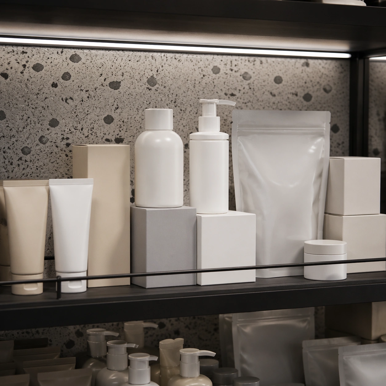
Example generated from “Product Packaging Studio Mockup — Retail Shelf”
GPT Image 2en

Scene: A square commercial presentation with realistic materials, clean staging, and believable product photography or retail lighting. Build the frame around a retail-context display that still keeps the product language primary. Keep the lighting, camera distance, and spatial organization tuned for a high-signal research image rather than a casual snapshot. The image belongs to the Product Packaging Studio Mockup theme and should feel immediately legible as a prompt atlas theme for product packaging studio mockup, testing photorealism, physics-materials, editing-workflow, commercial-mockup with gpt image 2.. Subject: Center the study on a retail-context display that still keeps the product language primary. Translate the theme into a concrete visual statement instead of an abstract mood board: the viewer should understand what kind of image this is, what is being tested, and why the composition is difficult. Use the slug idea of product packaging studio mockup as a literal guide for subject matter, materials, and staging. If helpful, borrow the broad visual cues suggested by studio, but keep the result original and specific to this study. Important details: The mockup should feel saleable and design-ready: sharp edges, controlled reflections, credible paper or plastic behavior, and precise placement. Preserve a disciplined square composition, clear focal hierarchy, and enough secondary information to make the image feel complete rather than underspecified. The image should look polished, novel, and exhibition-ready, with topic-specific credibility coming from the way surfaces, structure, and visual language reinforce Product Packaging Studio Mockup. Avoid generic filler elements that do not serve the main concept. Use case: Product Packaging Studio Mockup single study 6/8, testing photorealism, physics-materials, editing-workflow, commercial-mockup through the retail shelf variation. Constraints: No readable text, no watermark, no logos, preserve exact 1:1 aspect ratio, no real brand names, no cheap stock-photo styling, no broken perspective, no watermark, no accidental readable packaging copy, no cluttered retail shelf unless intended.

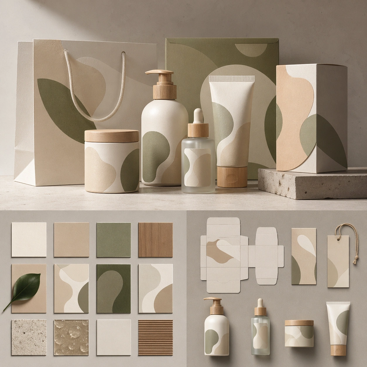
Example generated from “Product Packaging Studio Mockup — System Board”
GPT Image 2en

Scene: A square commercial presentation with realistic materials, clean staging, and believable product photography or retail lighting. Build the frame around multiple assets aligned into one coherent identity or packaging system. Keep the lighting, camera distance, and spatial organization tuned for a high-signal research image rather than a casual snapshot. The image belongs to the Product Packaging Studio Mockup theme and should feel immediately legible as a prompt atlas theme for product packaging studio mockup, testing photorealism, physics-materials, editing-workflow, commercial-mockup with gpt image 2.. Subject: Center the study on multiple assets aligned into one coherent identity or packaging system. Translate the theme into a concrete visual statement instead of an abstract mood board: the viewer should understand what kind of image this is, what is being tested, and why the composition is difficult. Use the slug idea of product packaging studio mockup as a literal guide for subject matter, materials, and staging. If helpful, borrow the broad visual cues suggested by studio, but keep the result original and specific to this study. Important details: The mockup should feel saleable and design-ready: sharp edges, controlled reflections, credible paper or plastic behavior, and precise placement. Preserve a disciplined square composition, clear focal hierarchy, and enough secondary information to make the image feel complete rather than underspecified. The image should look polished, novel, and exhibition-ready, with topic-specific credibility coming from the way surfaces, structure, and visual language reinforce Product Packaging Studio Mockup. Avoid generic filler elements that do not serve the main concept. Use case: Product Packaging Studio Mockup single study 7/8, testing photorealism, physics-materials, editing-workflow, commercial-mockup through the system board variation. Constraints: No readable text, no watermark, no logos, preserve exact 1:1 aspect ratio, no real brand names, no cheap stock-photo styling, no broken perspective, no watermark, no accidental readable packaging copy, no cluttered retail shelf unless intended.

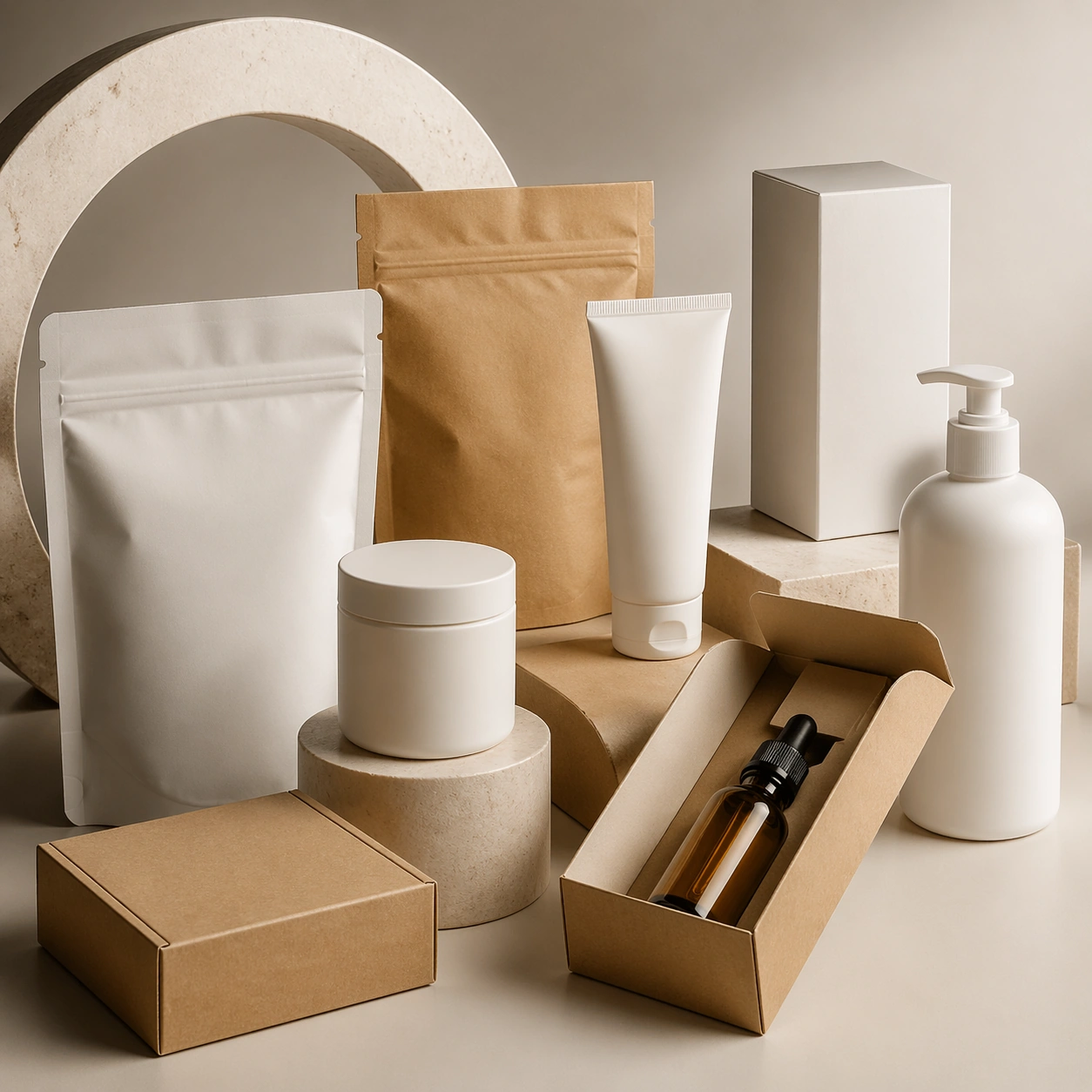
Example generated from “Product Packaging Studio Mockup — Signature Mockup”
GPT Image 2en

Scene: A square commercial presentation with realistic materials, clean staging, and believable product photography or retail lighting. Build the frame around the strongest single commercial frame for the topic. Keep the lighting, camera distance, and spatial organization tuned for a high-signal research image rather than a casual snapshot. The image belongs to the Product Packaging Studio Mockup theme and should feel immediately legible as a prompt atlas theme for product packaging studio mockup, testing photorealism, physics-materials, editing-workflow, commercial-mockup with gpt image 2.. Subject: Center the study on the strongest single commercial frame for the topic. Translate the theme into a concrete visual statement instead of an abstract mood board: the viewer should understand what kind of image this is, what is being tested, and why the composition is difficult. Use the slug idea of product packaging studio mockup as a literal guide for subject matter, materials, and staging. If helpful, borrow the broad visual cues suggested by studio, but keep the result original and specific to this study. Important details: The mockup should feel saleable and design-ready: sharp edges, controlled reflections, credible paper or plastic behavior, and precise placement. Preserve a disciplined square composition, clear focal hierarchy, and enough secondary information to make the image feel complete rather than underspecified. The image should look polished, novel, and exhibition-ready, with topic-specific credibility coming from the way surfaces, structure, and visual language reinforce Product Packaging Studio Mockup. Avoid generic filler elements that do not serve the main concept. Use case: Product Packaging Studio Mockup single study 8/8, testing photorealism, physics-materials, editing-workflow, commercial-mockup through the signature mockup variation. Constraints: No readable text, no watermark, no logos, preserve exact 1:1 aspect ratio, no real brand names, no cheap stock-photo styling, no broken perspective, no watermark, no accidental readable packaging copy, no cluttered retail shelf unless intended.

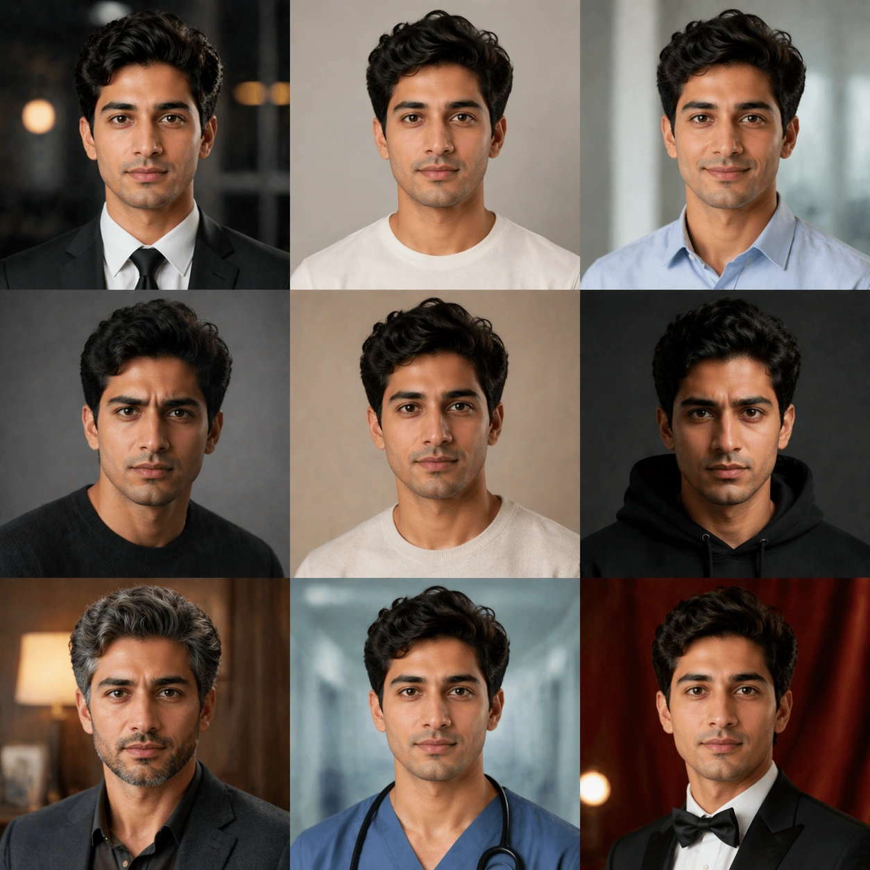
Example generated from “Profession Age Mood Transform Board — Reference Natural Base”
GPT Image 2en

Scene: Create a square 1:1 portrait image for Profession Age Mood Transform Board. Use a clean approval-style studio portrait with neutral light, simple wardrobe, and enough facial visibility to lock identity perfectly. The frame should feel like a finished professional deliverable rather than a casual snapshot, with clear lens discipline, believable light falloff, and a palette that directly supports Push one identity through profession, age, and mood transformations without losing the core face, producing a believable character-styling matrix.. Keep enough surrounding space and compositional control for gallery, research, campaign, or approval-board reuse while staying photoreal and human-scaled. Subject: Center one identity-locked adult with warm beige skin, dark hair, intelligent eyes, and adaptable posture that can shift profession, age, and mood cues. Establish the exact same face, hair base, skin tone family, and body proportions that every transformation image must preserve. Use the example direction from the brief as grounding context: Push one identity through profession, age, and mood transformations without losing the core face, producing a believable character-styling matrix.. Wardrobe, lighting, environment, and pose may shift to serve this variation, but the viewer must immediately understand that the same reference identity is still in front of the camera. Important details: This backlog line is difficult because Push one identity through profession, age, and mood transformations without losing the core face, producing a believable character-styling matrix.. Preserve skin tone family, bone structure, eye spacing, nose shape, mouth shape, hairline logic, shoulder width, and overall body read across the entire series. preserve exact face / hair base / body proportions from the reference model. This baseline must read like the trustworthy approval frame before switching anything. Avoid the common failure described in the brief: ordinary image models often lose likeness once styling, lighting, or layout changes enter the frame. Success should feel like the result should feel professionally usable, coherent, and clearly built around one stable human identity. Use case: Profession Age Mood Transform Board series study 1/9, the natural baseline look. Constraints: No readable text, no watermark, no logos, preserve exact 1:1 aspect ratio, preserve exact face / hair base / body proportions from the reference model, no heavy styling, no logo wardrobe, no beauty filter, no extra subjects.

Example generated from “Profession Age Mood Transform Board — Look Switch One”
GPT Image 2en

Scene: Create a square 1:1 portrait image for Profession Age Mood Transform Board. Use a premium portrait frame with one clear change direction and enough negative space to judge styling cleanly. The frame should feel like a finished professional deliverable rather than a casual snapshot, with clear lens discipline, believable light falloff, and a palette that directly supports Push one identity through profession, age, and mood transformations without losing the core face, producing a believable character-styling matrix.. Keep enough surrounding space and compositional control for gallery, research, campaign, or approval-board reuse while staying photoreal and human-scaled. Subject: Center one identity-locked adult with warm beige skin, dark hair, intelligent eyes, and adaptable posture that can shift profession, age, and mood cues. Keep the exact same person from the reference while executing the first major change requested by the topic, whether hair, makeup, wardrobe, grooming, or professional read. Use the example direction from the brief as grounding context: Push one identity through profession, age, and mood transformations without losing the core face, producing a believable character-styling matrix.. Wardrobe, lighting, environment, and pose may shift to serve this variation, but the viewer must immediately understand that the same reference identity is still in front of the camera. Important details: This backlog line is difficult because Push one identity through profession, age, and mood transformations without losing the core face, producing a believable character-styling matrix.. Preserve skin tone family, bone structure, eye spacing, nose shape, mouth shape, hairline logic, shoulder width, and overall body read across the entire series. preserve exact face / hair base / body proportions from the reference model. The switch must be obvious, but the identity must remain stronger than the styling change. Avoid the common failure described in the brief: ordinary image models often lose likeness once styling, lighting, or layout changes enter the frame. Success should feel like the result should feel professionally usable, coherent, and clearly built around one stable human identity. Use case: Profession Age Mood Transform Board series study 2/9, the first controlled transformation. Constraints: No readable text, no watermark, no logos, preserve exact 1:1 aspect ratio, preserve exact face / hair base / body proportions from the reference model, no face redraw, no changed age unless explicitly asked, no costume-party exaggeration, no new body shape.

Example generated from “Profession Age Mood Transform Board — Look Switch Two”
GPT Image 2en

Scene: Create a square 1:1 portrait image for Profession Age Mood Transform Board. Use a square commercial portrait proof with similar camera logic and controlled light. The frame should feel like a finished professional deliverable rather than a casual snapshot, with clear lens discipline, believable light falloff, and a palette that directly supports Push one identity through profession, age, and mood transformations without losing the core face, producing a believable character-styling matrix.. Keep enough surrounding space and compositional control for gallery, research, campaign, or approval-board reuse while staying photoreal and human-scaled. Subject: Center one identity-locked adult with warm beige skin, dark hair, intelligent eyes, and adaptable posture that can shift profession, age, and mood cues. Preserve the same face and body while moving to a second transformation state that still feels plausible for the same person. Use the example direction from the brief as grounding context: Push one identity through profession, age, and mood transformations without losing the core face, producing a believable character-styling matrix.. Wardrobe, lighting, environment, and pose may shift to serve this variation, but the viewer must immediately understand that the same reference identity is still in front of the camera. Important details: This backlog line is difficult because Push one identity through profession, age, and mood transformations without losing the core face, producing a believable character-styling matrix.. Preserve skin tone family, bone structure, eye spacing, nose shape, mouth shape, hairline logic, shoulder width, and overall body read across the entire series. preserve exact face / hair base / body proportions from the reference model. Hairline logic, eye spacing, lip shape, and shoulder width must remain exact. Avoid the common failure described in the brief: ordinary image models often lose likeness once styling, lighting, or layout changes enter the frame. Success should feel like the result should feel professionally usable, coherent, and clearly built around one stable human identity. Use case: Profession Age Mood Transform Board series study 3/9, the second controlled transformation. Constraints: No readable text, no watermark, no logos, preserve exact 1:1 aspect ratio, preserve exact face / hair base / body proportions from the reference model, no hairstyle that changes skull shape, no enlarged eyes, no body morphing, no logo props.

Example generated from “Profession Age Mood Transform Board — Look Switch Three”
GPT Image 2en

Scene: Create a square 1:1 portrait image for Profession Age Mood Transform Board. Use a slightly bolder campaign-like frame with disciplined crop and clean light falloff. The frame should feel like a finished professional deliverable rather than a casual snapshot, with clear lens discipline, believable light falloff, and a palette that directly supports Push one identity through profession, age, and mood transformations without losing the core face, producing a believable character-styling matrix.. Keep enough surrounding space and compositional control for gallery, research, campaign, or approval-board reuse while staying photoreal and human-scaled. Subject: Center one identity-locked adult with warm beige skin, dark hair, intelligent eyes, and adaptable posture that can shift profession, age, and mood cues. Apply a third styling direction while holding the same reference identity with no drift in age, ethnicity, or face structure. Use the example direction from the brief as grounding context: Push one identity through profession, age, and mood transformations without losing the core face, producing a believable character-styling matrix.. Wardrobe, lighting, environment, and pose may shift to serve this variation, but the viewer must immediately understand that the same reference identity is still in front of the camera. Important details: This backlog line is difficult because Push one identity through profession, age, and mood transformations without losing the core face, producing a believable character-styling matrix.. Preserve skin tone family, bone structure, eye spacing, nose shape, mouth shape, hairline logic, shoulder width, and overall body read across the entire series. preserve exact face / hair base / body proportions from the reference model. The image should prove range under control rather than spectacle for spectacle alone. Avoid the common failure described in the brief: ordinary image models often lose likeness once styling, lighting, or layout changes enter the frame. Success should feel like the result should feel professionally usable, coherent, and clearly built around one stable human identity. Use case: Profession Age Mood Transform Board series study 4/9, the third controlled transformation. Constraints: No readable text, no watermark, no logos, preserve exact 1:1 aspect ratio, preserve exact face / hair base / body proportions from the reference model, no gimmick costume, no false lashes that change eye shape, no surreal hair physics, no second person.

Example generated from “Profession Age Mood Transform Board — Look Switch Four”
GPT Image 2en

Scene: Create a square 1:1 portrait image for Profession Age Mood Transform Board. Use a close or mid-shot portrait that privileges detail and approval clarity over background storytelling. The frame should feel like a finished professional deliverable rather than a casual snapshot, with clear lens discipline, believable light falloff, and a palette that directly supports Push one identity through profession, age, and mood transformations without losing the core face, producing a believable character-styling matrix.. Keep enough surrounding space and compositional control for gallery, research, campaign, or approval-board reuse while staying photoreal and human-scaled. Subject: Center one identity-locked adult with warm beige skin, dark hair, intelligent eyes, and adaptable posture that can shift profession, age, and mood cues. Keep the same exact subject while introducing another visible shift in style language, finish, or mood tied directly to the topic brief. Use the example direction from the brief as grounding context: Push one identity through profession, age, and mood transformations without losing the core face, producing a believable character-styling matrix.. Wardrobe, lighting, environment, and pose may shift to serve this variation, but the viewer must immediately understand that the same reference identity is still in front of the camera. Important details: This backlog line is difficult because Push one identity through profession, age, and mood transformations without losing the core face, producing a believable character-styling matrix.. Preserve skin tone family, bone structure, eye spacing, nose shape, mouth shape, hairline logic, shoulder width, and overall body read across the entire series. preserve exact face / hair base / body proportions from the reference model. Micro-details may change, but likeness, skin tone family, and body read cannot. Avoid the common failure described in the brief: ordinary image models often lose likeness once styling, lighting, or layout changes enter the frame. Success should feel like the result should feel professionally usable, coherent, and clearly built around one stable human identity. Use case: Profession Age Mood Transform Board series study 5/9, the fourth controlled transformation. Constraints: No readable text, no watermark, no logos, preserve exact 1:1 aspect ratio, preserve exact face / hair base / body proportions from the reference model, no retouch blur, no facial asymmetry drift, no extra accessories noise, no unreadable product text.

Example generated from “Profession Age Mood Transform Board — Look Switch Five”
GPT Image 2en

Scene: Create a square 1:1 portrait image for Profession Age Mood Transform Board. Use a square portrait with polished commercial finish and enough room to see styling structure clearly. The frame should feel like a finished professional deliverable rather than a casual snapshot, with clear lens discipline, believable light falloff, and a palette that directly supports Push one identity through profession, age, and mood transformations without losing the core face, producing a believable character-styling matrix.. Keep enough surrounding space and compositional control for gallery, research, campaign, or approval-board reuse while staying photoreal and human-scaled. Subject: Center one identity-locked adult with warm beige skin, dark hair, intelligent eyes, and adaptable posture that can shift profession, age, and mood cues. Push to a fifth variation while preserving exact face / hair base / body proportions from the reference model. This should still feel like one person being art-directed, not re-generated from scratch. Use the example direction from the brief as grounding context: Push one identity through profession, age, and mood transformations without losing the core face, producing a believable character-styling matrix.. Wardrobe, lighting, environment, and pose may shift to serve this variation, but the viewer must immediately understand that the same reference identity is still in front of the camera. Important details: This backlog line is difficult because Push one identity through profession, age, and mood transformations without losing the core face, producing a believable character-styling matrix.. Preserve skin tone family, bone structure, eye spacing, nose shape, mouth shape, hairline logic, shoulder width, and overall body read across the entire series. preserve exact face / hair base / body proportions from the reference model. Keep continuity stronger than novelty. Avoid the common failure described in the brief: ordinary image models often lose likeness once styling, lighting, or layout changes enter the frame. Success should feel like the result should feel professionally usable, coherent, and clearly built around one stable human identity. Use case: Profession Age Mood Transform Board series study 6/9, the fifth controlled transformation. Constraints: No readable text, no watermark, no logos, preserve exact 1:1 aspect ratio, preserve exact face / hair base / body proportions from the reference model, no gender drift unless explicitly relevant, no unrelated props, no costume confusion, no body-scale jump.

Example generated from “Profession Age Mood Transform Board — Look Switch Six”
GPT Image 2en

Scene: Create a square 1:1 portrait image for Profession Age Mood Transform Board. Use a final single-look variation with confident but restrained campaign polish. The frame should feel like a finished professional deliverable rather than a casual snapshot, with clear lens discipline, believable light falloff, and a palette that directly supports Push one identity through profession, age, and mood transformations without losing the core face, producing a believable character-styling matrix.. Keep enough surrounding space and compositional control for gallery, research, campaign, or approval-board reuse while staying photoreal and human-scaled. Subject: Center one identity-locked adult with warm beige skin, dark hair, intelligent eyes, and adaptable posture that can shift profession, age, and mood cues. Use the same person again in a sixth styling state, making sure recognition is instant before the viewer notices what changed. Use the example direction from the brief as grounding context: Push one identity through profession, age, and mood transformations without losing the core face, producing a believable character-styling matrix.. Wardrobe, lighting, environment, and pose may shift to serve this variation, but the viewer must immediately understand that the same reference identity is still in front of the camera. Important details: This backlog line is difficult because Push one identity through profession, age, and mood transformations without losing the core face, producing a believable character-styling matrix.. Preserve skin tone family, bone structure, eye spacing, nose shape, mouth shape, hairline logic, shoulder width, and overall body read across the entire series. preserve exact face / hair base / body proportions from the reference model. The transformation should feel deliberate, premium, and usable in a real salon, beauty, fashion, or casting workflow. Avoid the common failure described in the brief: ordinary image models often lose likeness once styling, lighting, or layout changes enter the frame. Success should feel like the result should feel professionally usable, coherent, and clearly built around one stable human identity. Use case: Profession Age Mood Transform Board series study 7/9, the sixth controlled transformation. Constraints: No readable text, no watermark, no logos, preserve exact 1:1 aspect ratio, preserve exact face / hair base / body proportions from the reference model, no hidden face, no perspective warp, no dramatic environment change, no AI-gloss artifacts.

Example generated from “Profession Age Mood Transform Board — Detail Proof Board”
GPT Image 2en

Scene: Create a square 1:1 portrait image for Profession Age Mood Transform Board. Use a square composition that can include multiple tight crops or one richer close-up, but still reads as one coherent portrait asset. The frame should feel like a finished professional deliverable rather than a casual snapshot, with clear lens discipline, believable light falloff, and a palette that directly supports Push one identity through profession, age, and mood transformations without losing the core face, producing a believable character-styling matrix.. Keep enough surrounding space and compositional control for gallery, research, campaign, or approval-board reuse while staying photoreal and human-scaled. Subject: Center one identity-locked adult with warm beige skin, dark hair, intelligent eyes, and adaptable posture that can shift profession, age, and mood cues. Stay locked to the same identity while emphasizing the evidence of the switch: hair texture, makeup finish, beard line, garment detail, or aging cues depending on the topic. Use the example direction from the brief as grounding context: Push one identity through profession, age, and mood transformations without losing the core face, producing a believable character-styling matrix.. Wardrobe, lighting, environment, and pose may shift to serve this variation, but the viewer must immediately understand that the same reference identity is still in front of the camera. Important details: This backlog line is difficult because Push one identity through profession, age, and mood transformations without losing the core face, producing a believable character-styling matrix.. Preserve skin tone family, bone structure, eye spacing, nose shape, mouth shape, hairline logic, shoulder width, and overall body read across the entire series. preserve exact face / hair base / body proportions from the reference model. This frame should support professional review and decision making without readable text. Avoid the common failure described in the brief: ordinary image models often lose likeness once styling, lighting, or layout changes enter the frame. Success should feel like the result should feel professionally usable, coherent, and clearly built around one stable human identity. Use case: Profession Age Mood Transform Board series study 8/9, a detail-proof or comparison board. Constraints: No readable text, no watermark, no logos, preserve exact 1:1 aspect ratio, preserve exact face / hair base / body proportions from the reference model, no readable labels, no broken panel alignment, no detached close-up fragments, no face drift.

Example generated from “Profession Age Mood Transform Board — Campaign Finale”
GPT Image 2en

Scene: Create a square 1:1 portrait image for Profession Age Mood Transform Board. Use a square commercial finish with strong portrait presence, premium negative space, and final-asset confidence. The frame should feel like a finished professional deliverable rather than a casual snapshot, with clear lens discipline, believable light falloff, and a palette that directly supports Push one identity through profession, age, and mood transformations without losing the core face, producing a believable character-styling matrix.. Keep enough surrounding space and compositional control for gallery, research, campaign, or approval-board reuse while staying photoreal and human-scaled. Subject: Center one identity-locked adult with warm beige skin, dark hair, intelligent eyes, and adaptable posture that can shift profession, age, and mood cues. Resolve the same identity into a final hero image that proves the transformation line can ship as a real campaign, promo board, or salon approval visual. Use the example direction from the brief as grounding context: Push one identity through profession, age, and mood transformations without losing the core face, producing a believable character-styling matrix.. Wardrobe, lighting, environment, and pose may shift to serve this variation, but the viewer must immediately understand that the same reference identity is still in front of the camera. Important details: This backlog line is difficult because Push one identity through profession, age, and mood transformations without losing the core face, producing a believable character-styling matrix.. Preserve skin tone family, bone structure, eye spacing, nose shape, mouth shape, hairline logic, shoulder width, and overall body read across the entire series. preserve exact face / hair base / body proportions from the reference model. The final degree of polish cannot erase the exact same-person read established in image 01. Avoid the common failure described in the brief: ordinary image models often lose likeness once styling, lighting, or layout changes enter the frame. Success should feel like the result should feel professionally usable, coherent, and clearly built around one stable human identity. Use case: Profession Age Mood Transform Board series study 9/9, a polished campaign finale. Constraints: No readable text, no watermark, no logos, preserve exact 1:1 aspect ratio, preserve exact face / hair base / body proportions from the reference model, no readable copy, no logos, no poster clutter, no identity reset.

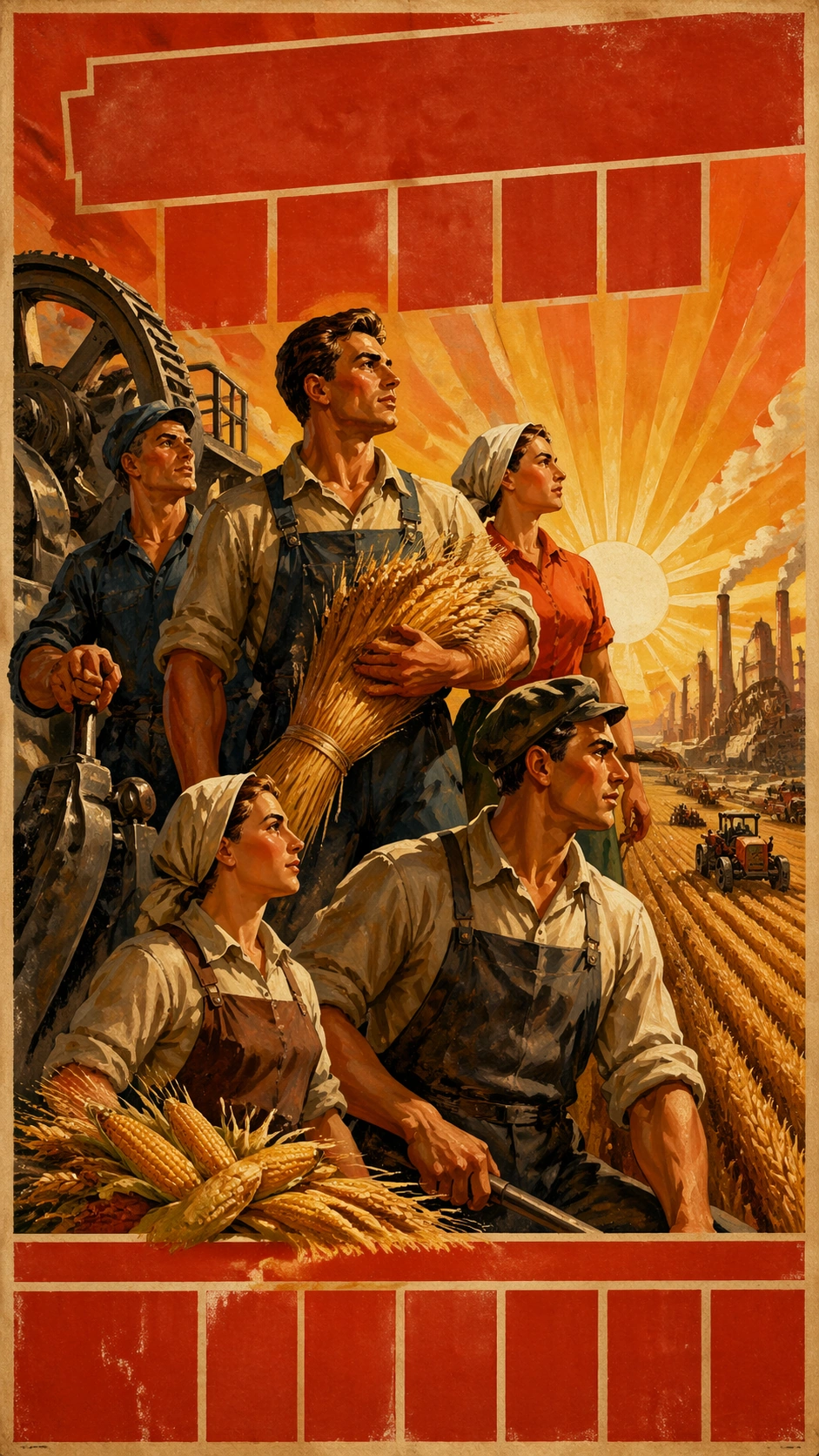
Example generated from “Propaganda Poster History — Industrial Harvest Mural”
GPT Image 2en

Scene: A vertical 9:16 fictional poster study inspired by mid-century socialist realist agricultural and industrial mural language. The page has a heroic low angle, warm sunrise, red-orange sky, golden grain, steel machinery, and thick painted brush texture. Large banner-like type fields sit at the top and bottom as unreadable block shapes, aged by paper fibers and offset ink. The result should read as educational visual-history reconstruction, not a real political message. Subject: A group of invented workers and farmers stand together in a sweeping composition: one person holds a sheaf of grain, another guides a factory lever, another looks toward distant tractors and chimneys. Their clothing is simplified workwear without real badges, flags, or party emblems. The faces are idealized but generic. Industrial wheels and harvest rows converge behind them, linking agriculture and factory production in one theatrical poster image. Important details: Emphasize the visual grammar of socialist-realist poster art: heroic upward gaze, muscular silhouettes, red-gold palette, sunrise symbolism, synchronized bodies, monumental scale, painterly realism, and strong central hierarchy. Keep every political identifier fictional or absent. The headline fields should look historically plausible but remain unreadable. Avoid copying any known poster or depicting a real leader. The subject is style-transfer and world-knowledge research. Use case: Propaganda Poster History single study 3/8, an independent industrial-harvest poster-language specimen for design-history comparison. Constraints: No readable text, no watermark, no logos, preserve exact 9:16 vertical aspect ratio, no real party symbols, no real leader likeness, no actual slogan, no national flags, no contemporary political reference.

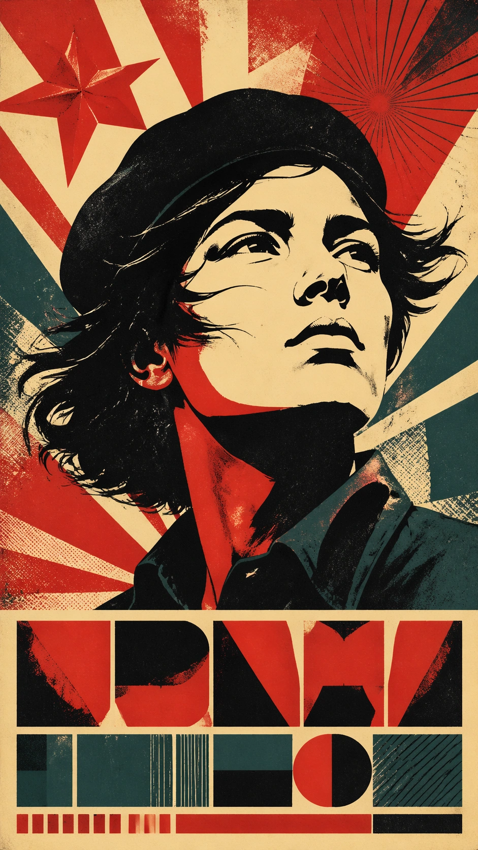
Example generated from “Propaganda Poster History — Revolution Portrait Study”
GPT Image 2en

Scene: A vertical 9:16 fictional poster study inspired by high-contrast revolutionary portrait screenprints and mid-century Latin American graphic poster traditions. The paper is rough, ink is limited to black, red, cream, and deep teal, and the composition uses a single monumental head, radiating background shapes, and a lower block of unreadable title forms. It should look like a museum-safe style study, not a real movement poster. Subject: An invented anonymous young organizer wearing a plain dark beret appears in a bold graphic portrait. The face is not based on any real person and avoids recognizable historical likeness. Wind-shifted hair, a stern upward gaze, and simplified facial planes create an iconic poster silhouette. Behind the portrait are abstract stars, sunburst shards, and screenprint misregistration, but no real flags, names, party emblems, weapons, or actual slogans. Important details: Capture the design grammar often associated with revolutionary portrait posters: flat high-contrast face planes, limited ink palette, heroic upward gaze, hard poster crop, visible screenprint texture, and strong title block hierarchy. The type areas must look intentionally designed but remain unreadable. Keep the work fictional and educational; do not reproduce famous portraits, real leaders, real symbols, or specific campaign names. The image should support visual-history analysis of style transfer and structured layout. Use case: Propaganda Poster History single study 4/8, an independent revolutionary portrait poster-language specimen for design-history comparison. Constraints: No readable text, no watermark, no logos, preserve exact 9:16 vertical aspect ratio, no real leader likeness, no real party symbols, no actual slogan, no weapons, no contemporary political reference.
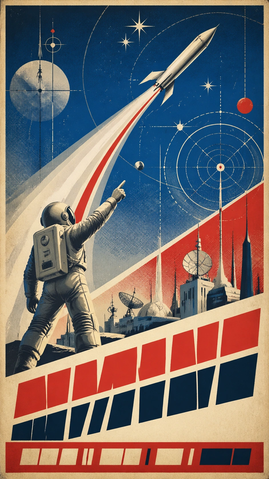
Example generated from “Propaganda Poster History — Space Race Optimism”
GPT Image 2en

Scene: A vertical 9:16 fictional poster study inspired by mid-century space-race optimism and state science promotion graphics. The design uses deep cobalt, bright red, cream, silver, and aged offset texture. A rocket arc cuts upward through geometric stars, while large unreadable headline blocks occupy a diagonal band and a footer strip. The poster should feel like a historical design artifact for classroom analysis, not a real national campaign. Subject: An invented astronaut-like figure in a simplified pressure suit points toward a stylized orbit path above a city of antennas, observatories, and abstract industrial roofs. The rocket is generic, with no national insignia, agency logos, real mission markings, flags, or readable numbers. The figure's face is obscured by a reflective visor. Concentric orbital lines, starbursts, and technical diagram circles create a sense of scientific progress. Important details: Emphasize historical poster cues: space-age geometry, optimistic upward diagonals, simplified industrial skyline, flat color separations, halftone grain, registration shifts, and bold typography fields. The type blocks should be visually convincing but unreadable. Do not include real mission patches, specific spacecraft names, or identifiable political symbols. The image should test world-knowledge style transfer, structured layout, and poster hierarchy while staying fictional and non-persuasive. Use case: Propaganda Poster History single study 5/8, an independent space-race poster-language specimen for design-history comparison. Constraints: No readable text, no watermark, no logos, preserve exact 9:16 vertical aspect ratio, no real space agency marks, no national flags, no actual slogan, no real leader likeness, no contemporary political reference.

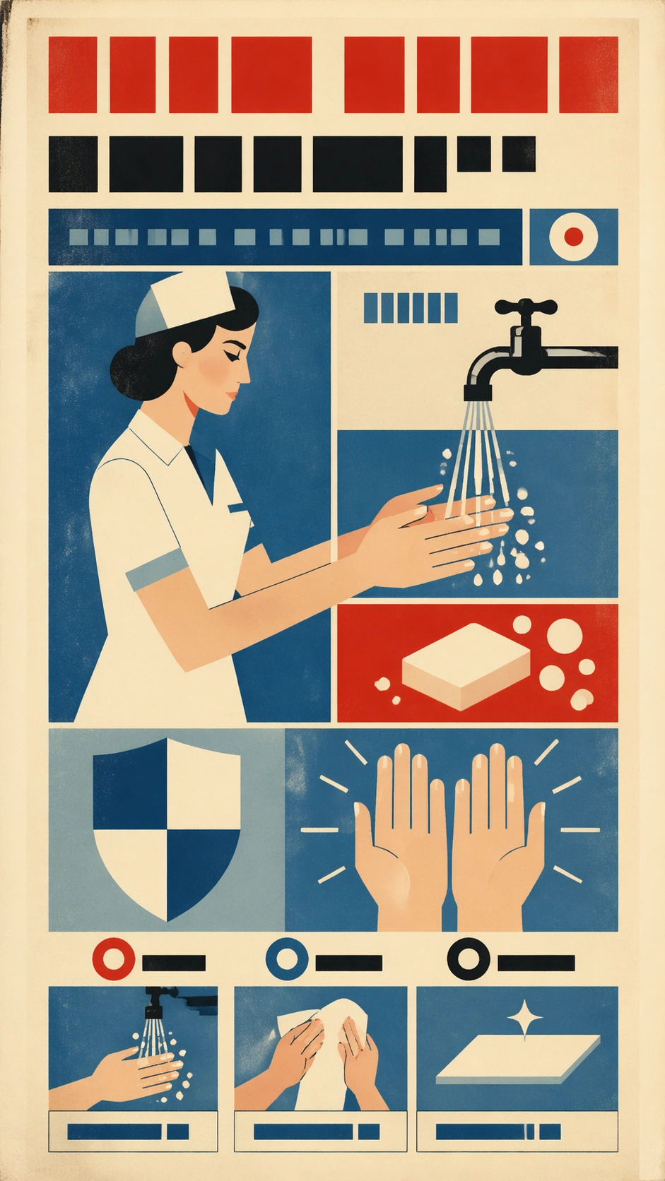
Example generated from “Propaganda Poster History — Public Health Modernist”
GPT Image 2en

Scene: A vertical 9:16 fictional public-health poster study inspired by international modernist information campaigns from the mid twentieth century. The style is clean and didactic: flat pastel background, limited red, blue, black, and cream palette, strong grid, simplified pictograms, and a prominent headline field made from unreadable block shapes. The poster should read as historical visual communication research, not as current medical advice. Subject: A simplified nurse-like figure, water faucet, soap, clean hands, and a shield-like abstract shape are arranged in a modernist grid. The figures are invented and generic, with no real health agency emblem, no medical logo, no country symbol, and no actual instruction text. The bottom area contains small diagram panels showing washing, drying, and clean surface icons, but all labels are blank bars or pseudo-letter marks. Important details: Focus on structured-layout and text-field discipline: modular grid, clear pictogram hierarchy, high-contrast headline area, numbered-looking circles that are not readable numbers, and subtle vintage print grain. Preserve the design-history angle by using period-appropriate flat shapes and lithographic texture. Avoid modern app UI, contemporary public-health slogans, or realistic disease imagery. The poster should be safe, fictional, and analytical rather than prescriptive. Use case: Propaganda Poster History single study 6/8, an independent modernist public-health poster-language specimen for design-history comparison. Constraints: No readable text, no watermark, no logos, preserve exact 9:16 vertical aspect ratio, no real health agency marks, no actual medical instruction, no current public-policy slogan, no national flag, no frightening disease imagery.

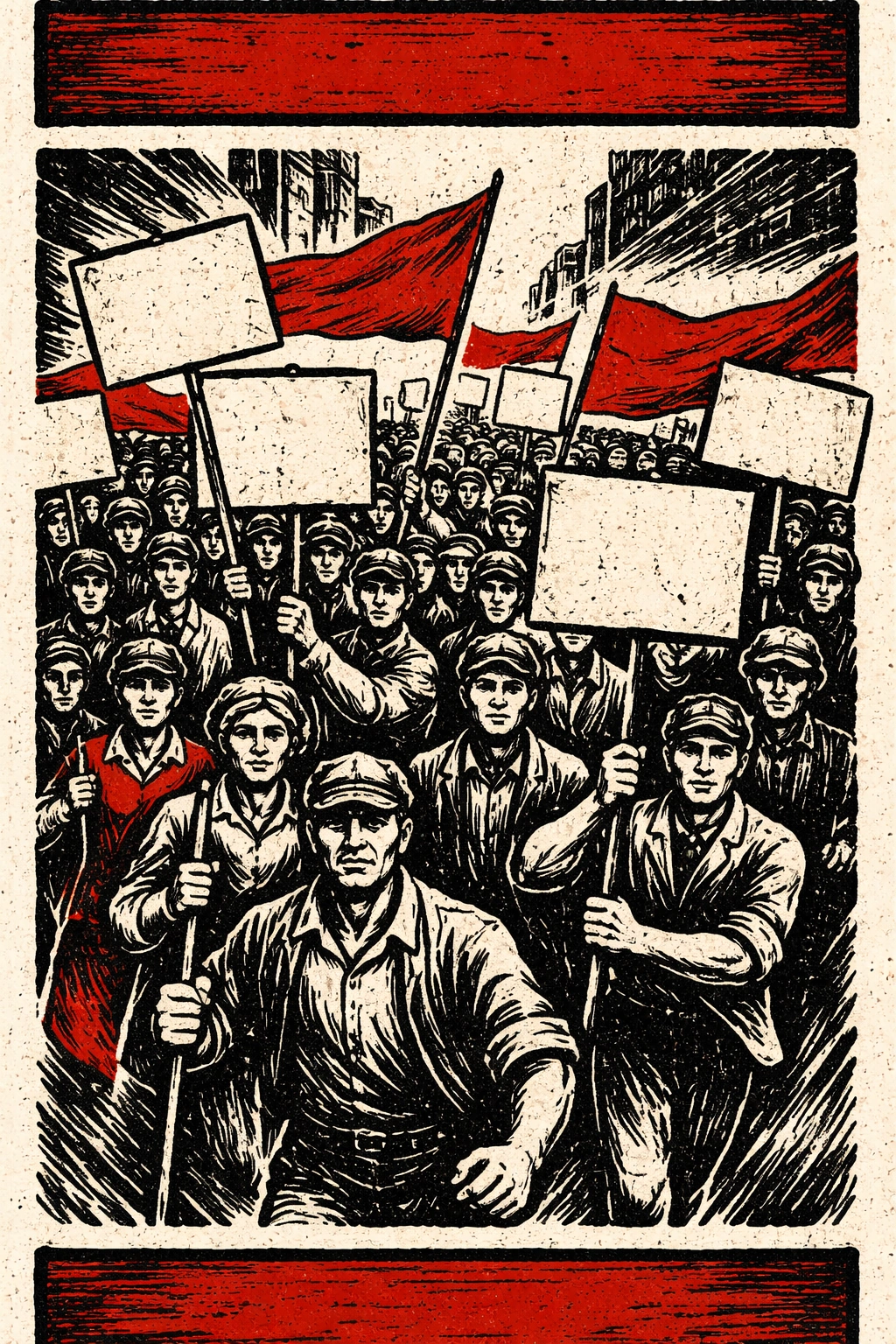
Example generated from “Propaganda Poster History — Woodcut Crowd March”
GPT Image 2en

Scene: A vertical 9:16 fictional poster study inspired by twentieth-century political woodcut and mass-movement print traditions. The page uses rough black ink, red spot color, cream paper, carved line texture, and a high-contrast crowd composition. The headline and side-caption fields are rendered as unreadable carved blocks, keeping the focus on historical print language rather than actual persuasion. Subject: A group of anonymous workers, students, and villagers march through a simplified street, each holding blank banners or abstract rectangular placards with no readable marks. The people are invented, not based on real leaders or specific organizations. Their faces are simplified by woodcut marks, with varied ages and clothing but no real emblems, flags, party badges, or national symbols. The central gesture is collective movement, not a call to a real action. Important details: Emphasize carved print materiality: gouged black lines, uneven red overprint, rough paper tooth, strong diagonals, stacked silhouettes, simplified hands, and poster hierarchy. The composition should demonstrate how woodcut visual language builds urgency through rhythm and contrast. Keep all banners blank or filled with non-readable texture. Do not include real slogans, real historical leaders, or modern protest references. This is a design-history specimen. Use case: Propaganda Poster History single study 7/8, an independent woodcut crowd poster-language specimen for design-history comparison. Constraints: No readable text, no watermark, no logos, preserve exact 9:16 vertical aspect ratio, no real party symbols, no real leader likeness, no actual protest slogan, no national flags, no contemporary political reference.

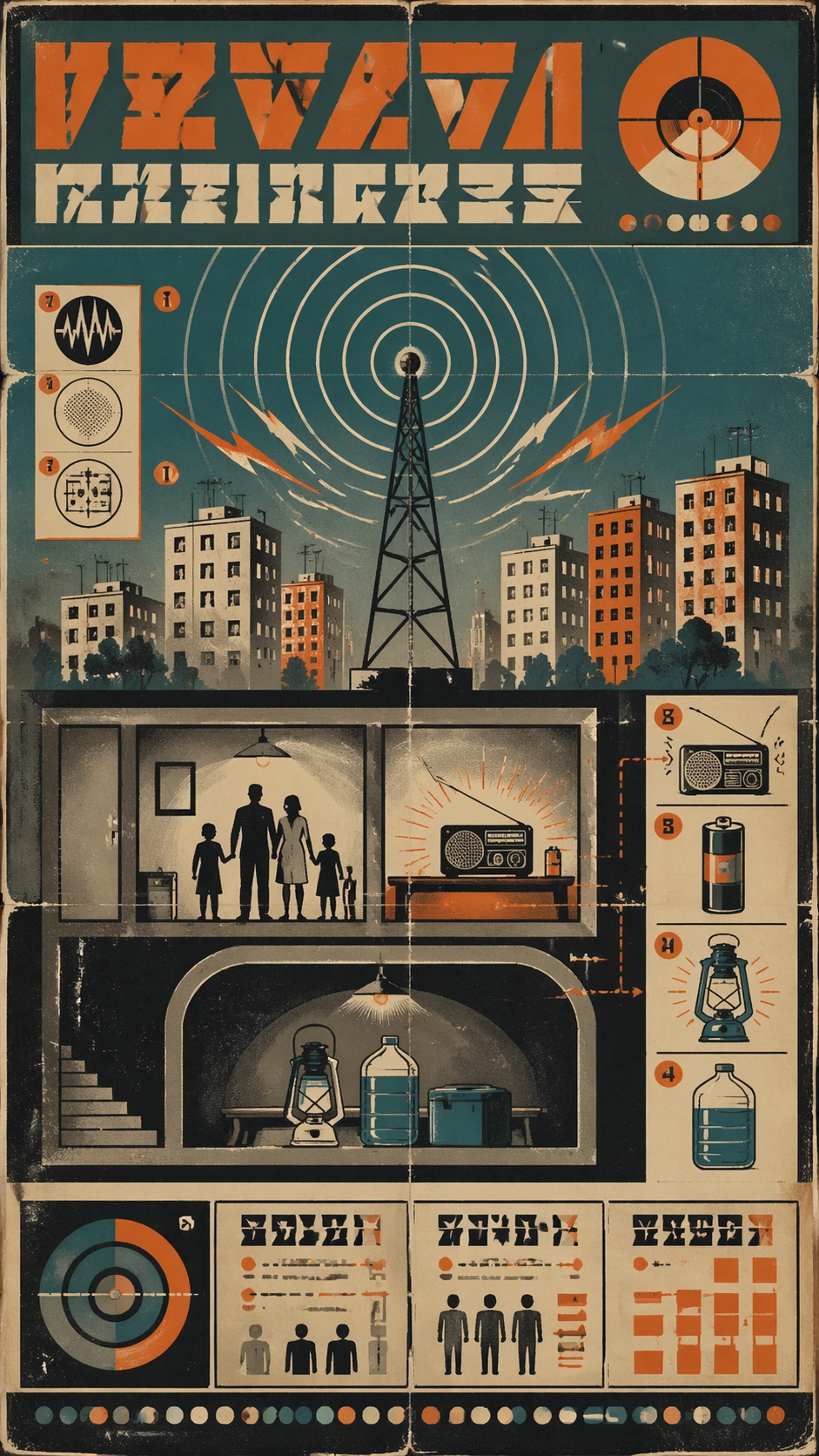
Example generated from “Propaganda Poster History — Civil Defense Broadcast”
GPT Image 2en

Scene: A vertical 9:16 fictional poster study inspired by mid-century civil-defense and broadcast-information graphics. The palette is faded teal, orange, black, cream, and gray, with screenprint grain, folded paper creases, and modular diagram panels. A large headline region at the top and a footer instruction strip are filled with unreadable pseudo-letter blocks. The poster must feel like a historical museum artifact, not present-day emergency guidance. Subject: A generic radio tower emits concentric signal rings over a simplified city cutaway: apartment blocks, basement shelter icon, family silhouettes, battery lamp, water jug, and a small tabletop radio. All elements are invented and unbranded. No government seal, national emblem, real agency name, warning code, or readable instruction appears. The layout uses diagram arrows and numbered-looking circles, but they remain abstract and non-readable. Important details: Capture civil-defense poster grammar: anxious but orderly information design, bold icon system, practical object diagrams, signal waves, limited screenprint colors, and strong modular hierarchy. Keep the educational design-history lens clear by avoiding real instructions or current hazards. The diagram should be visually plausible while preventing actual public-safety advice from being readable. Use aging, ink misregistration, and paper texture to ground the period style. Use case: Propaganda Poster History single study 8/8, an independent civil-defense broadcast poster-language specimen for design-history comparison. Constraints: No readable text, no watermark, no logos, preserve exact 9:16 vertical aspect ratio, no real government seal, no actual emergency instruction, no real warning code, no national flag, no contemporary political or disaster reference.

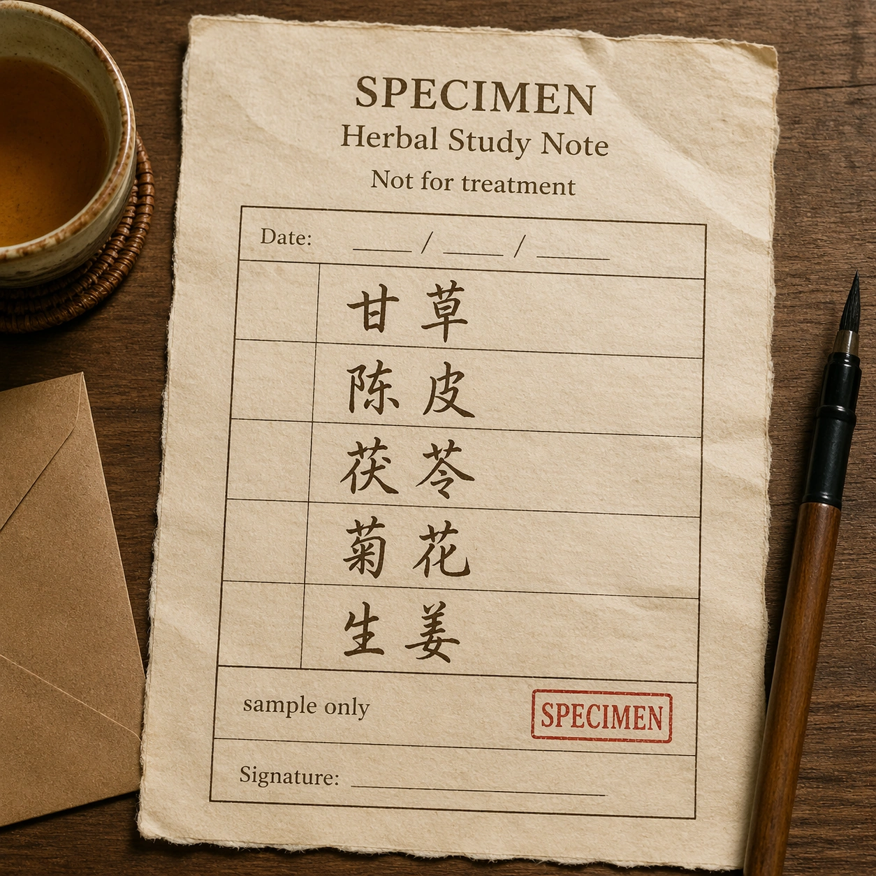
Example generated from “Pseudo Real Documents — Herbal Study Note”
GPT Image 2en

Scene: A square photorealistic overhead photograph of a fictional herbal study note on warm cream prescription-style paper, placed beside a ceramic tea cup, blank kraft envelope, and a brush pen. The paper has slight wrinkles, deckled fiber edges, and a red specimen chop mark. Lighting is soft and domestic, like a careful product shot for cultural stationery. Subject: Create a fictional traditional-herbal note, explicitly not a medical prescription. The exact readable text should include: SPECIMEN, Herbal Study Note, Not for treatment, 甘草, 陈皮, 茯苓, 菊花, 生姜, sample only. Mix tidy printed form fields with expressive handwritten Chinese herb names, using dark brown ink and a red square stamp reading SPECIMEN. Do not include patient name, doctor name, diagnosis, dosage, pharmacy, license number, or instructions for use. Important details: The visual goal is document-level precision: ruled boxes, date area left blank, blank signature line, ink pressure changes, brush-pen pooling, paper translucency, red stamp texture, and believable stationery shadows. The Chinese characters should be readable and beautiful, but the content must remain a non-actionable study sample. Keep the note materially convincing while making its specimen and non-treatment status unambiguous. Use case: Pseudo-Real Documents single study 3/8, testing handwritten document realism, Chinese character rendering, paper fibers, and safe non-medical framing. Constraints: No readable text except the specified herbal study strings, no watermark, no logos, preserve exact 1:1 aspect ratio, no patient data, no doctor signature, no dosage, no treatment directions, no real clinic name, no pharmacy seal, no scannable code.

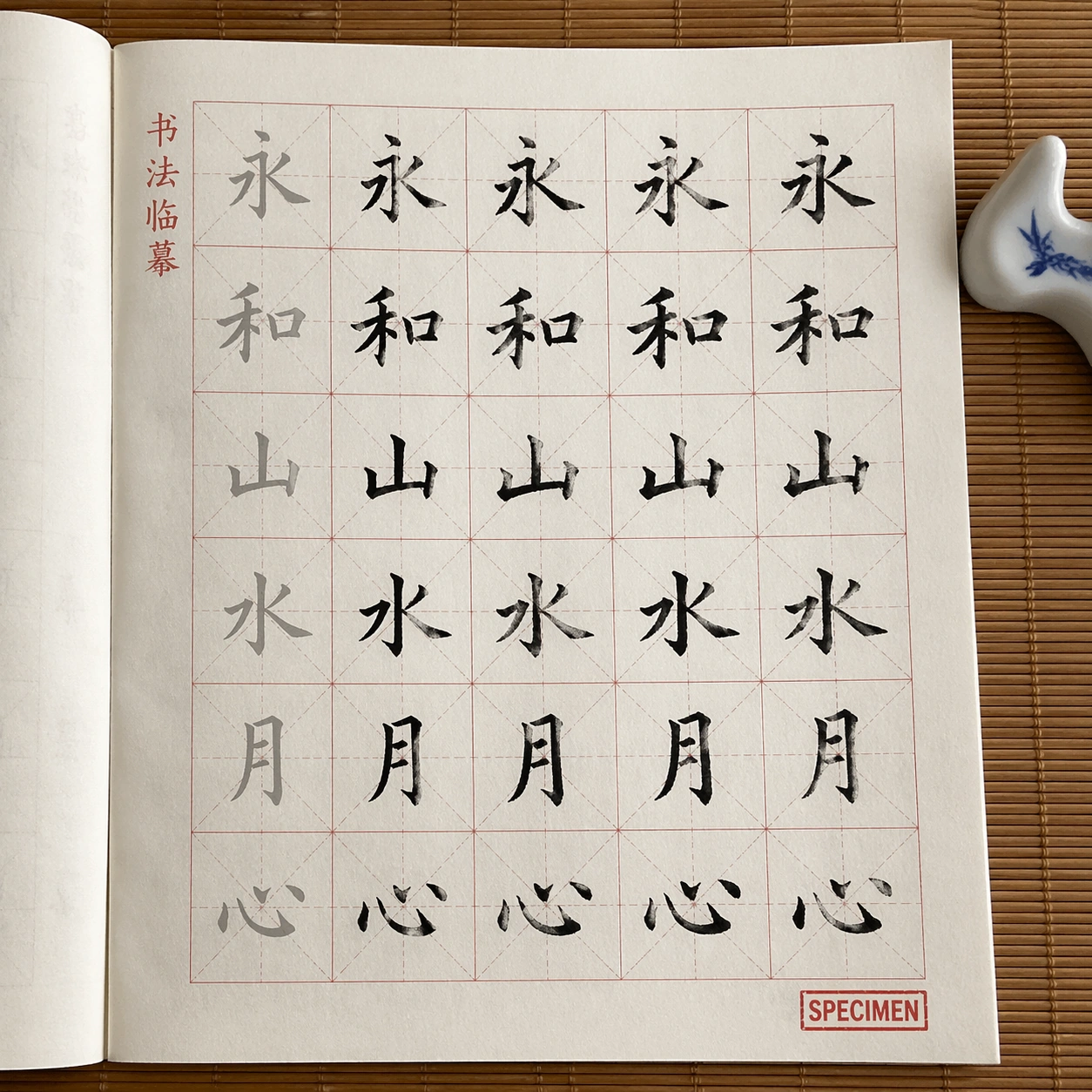
Example generated from “Pseudo Real Documents — Calligraphy Copybook”
GPT Image 2en

Scene: A square photorealistic studio photograph of a Chinese calligraphy practice copybook opened flat on a bamboo desk. The page is printed on thin ivory practice paper with faint red grid lines, gray model characters, black student brush strokes, ink feathering, and a small ceramic brush rest. The camera is top-down with gentle daylight and crisp page texture. Subject: Show a fictional calligraphy copybook page. The exact readable text should include: 书法临摹, 永, 和, 山, 水, 月, 心, SPECIMEN. Arrange the characters in repeated practice boxes: pale gray model characters in the first column, darker traced attempts beside them, and one red rectangular specimen stamp in a corner. No school name, real teacher name, grading score, student identity, or publication imprint. Important details: The test is text rendering plus paper physics. Grid lines must align consistently, characters must sit inside boxes, brush strokes should show pressure, dry-brush texture, ink pooling, and slightly uneven human practice. The printed model characters should be cleaner than the practice strokes. Keep the page believable as a cultural stationery product and not as a certificate. The specified characters should remain readable at thumbnail scale. Use case: Pseudo-Real Documents single study 4/8, testing copybook grid precision, Chinese character readability, brush texture, and thin practice paper realism. Constraints: No readable text except the specified copybook strings, no watermark, no logos, preserve exact 1:1 aspect ratio, no real school name, no personal name, no grading marks, no publisher imprint, no random extra characters, no unreadable ink blot covering the models.
Example generated from “Pseudo Real Documents — Palm Reading Report”
GPT Image 2en

Scene: A square photorealistic product mockup of a fictional palm-reading report sheet on lightly textured parchment paper, photographed on a dark wooden table with a magnifying glass and blank envelope as props. The sheet has a clean consulting-report layout, soft sepia ink, thin diagram lines, and one pressed paper crease. Subject: Create an entertainment-only palm analysis document. The exact readable text should include: SPECIMEN, PALM READING REPORT, Entertainment Only, Life Line, Head Line, Heart Line, Mounts, Notes, sample chart. Show a line drawing of a palm with labeled regions, small annotation boxes, and a neat report grid. Do not include a real client name, birth date, address, phone number, signature, payment field, or predictive claims. Important details: The document should look convincingly printed and handled: letterpress-like header, thin gray rule lines, subtle ink spread, hand-drawn palm diagram texture, corner shadow, and slightly uneven paper grain. The hierarchy must be readable: title, diagram, labels, notes area, and specimen mark. Keep the tone mystical but restrained, like boutique stationery, not a legal or medical report. The entertainment disclaimer should be clear. Use case: Pseudo-Real Documents single study 5/8, testing report-layout readability, diagram labels, parchment material, and safe fictional entertainment framing. Constraints: No readable text except the specified palm report strings, no watermark, no logos, preserve exact 1:1 aspect ratio, no real person data, no signature, no phone number, no address, no payment details, no medical claims, no legal certification, no extra prophecy text.
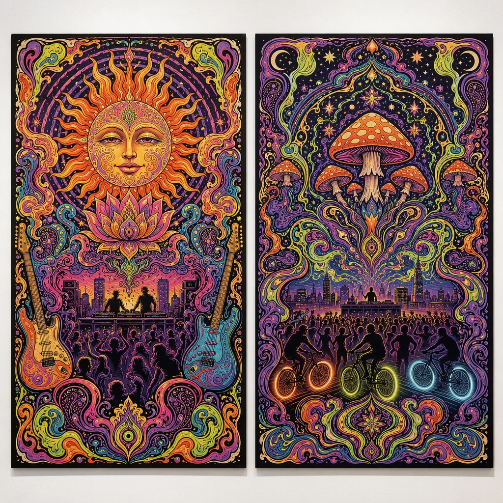
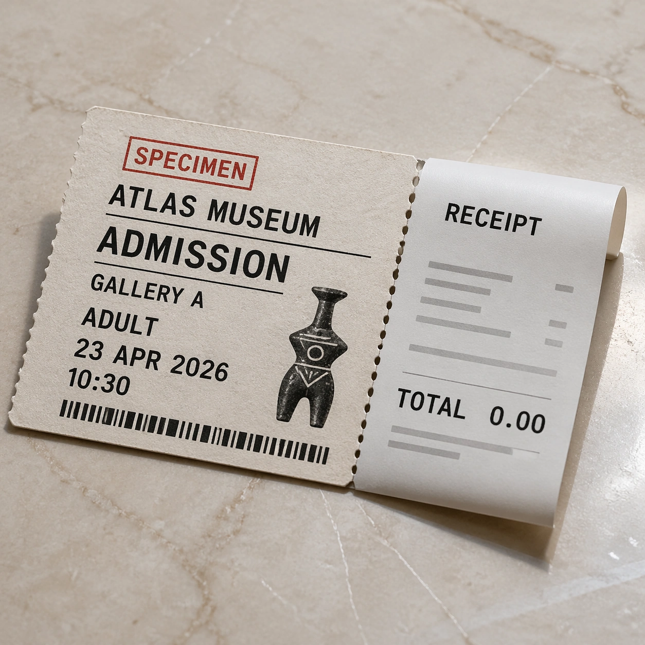
Example generated from “Pseudo Real Documents — Museum Ticket Receipt”
GPT Image 2en

Scene: A square photorealistic still life of a fictional museum ticket and attached receipt on a pale stone counter. The ticket stock is thick matte paper with a torn perforated edge, while the receipt is thin curled thermal paper. Soft gallery light, tiny shadows, and paper fibers should make both materials distinct. Subject: Create a fictional museum admission specimen. The exact readable text should include: SPECIMEN, ATLAS MUSEUM, ADMISSION, GALLERY A, ADULT, 23 APR 2026, 10:30, RECEIPT, TOTAL 0.00. Include a decorative non-scannable barcode-like strip and a small abstract artifact icon, but no real museum logo, no QR code, no payment card digits, no transaction ID, and no address. The receipt can show short gray placeholder rules as unreadable texture. Important details: This image tests two paper systems in one composition: heavier ticket stock versus slick thermal receipt. Keep typography aligned, with readable hierarchy on the ticket and receipt. The perforation, ink density, paper curl, and stone-counter reflections should feel physically plausible. The specimen mark and zero-total value make the document safe and non-operational while retaining museum-product realism. Use case: Pseudo-Real Documents single study 6/8, testing ticket and receipt typography, paper-material contrast, and fictional commercial mockup realism. Constraints: No readable text except the specified museum ticket and receipt strings, no watermark, no logos, preserve exact 1:1 aspect ratio, no real museum name, no QR code, no scannable barcode, no credit card digits, no transaction number, no address, no extra pricing lines.

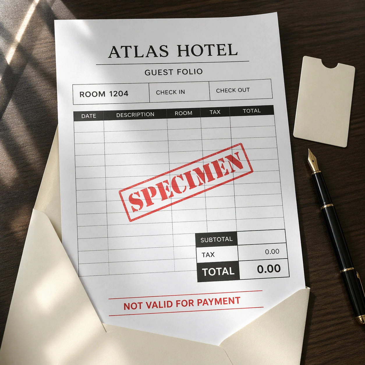
Example generated from “Pseudo Real Documents — Hotel Invoice Folio”
GPT Image 2en

Scene: A square photorealistic overhead mockup of a fictional hotel invoice folio on crisp white letter paper, partly tucked into a cream envelope on a dark walnut desk. Add a fountain pen with no visible brand, a blank key sleeve, and morning window light. The paper should show fine fibers, sharp folds, and slight toner texture. Subject: Create a fictional non-payable hotel folio. The exact readable text should include: SPECIMEN, ATLAS HOTEL, GUEST FOLIO, ROOM 1204, CHECK IN, CHECK OUT, ROOM, TAX, TOTAL 0.00, NOT VALID FOR PAYMENT. Use a neat table with columns, a subtotal area, and a red diagonal specimen stamp. Do not include guest name, address, phone, email, payment card, folio number, tax ID, QR code, or real hotel logo. Important details: The document should look operational in layout but impossible to use: no identity fields, no payment details, zero total, and clear specimen marking. Preserve business-document precision: aligned columns, crisp rules, subtle paper curl, envelope shadow, toner edge softness, and believable desk reflections. The mockup should feel like a hospitality product-design sample, not a real bill. Use case: Pseudo-Real Documents single study 7/8, testing invoice table readability, office-paper material, specimen stamp, and safe non-payable commercial document design. Constraints: No readable text except the specified hotel folio strings, no watermark, no logos, preserve exact 1:1 aspect ratio, no real hotel name, no guest personal data, no payment card digits, no invoice number, no tax ID, no QR code, no payable amount, no signature.

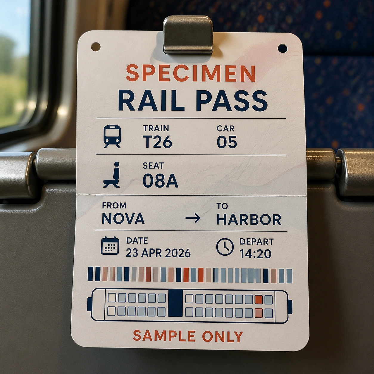
Example generated from “Pseudo Real Documents — Train Seat Reservation”
GPT Image 2en

Scene: A square photorealistic image of a fictional rail seat reservation card clipped to a train seatback tray. The card is printed on satin paper with rounded corners, tiny punched holes, and a folded crease. Behind it, the train interior is softly blurred: fabric seat, window light, and a metal tray hinge. The camera is front-facing so the text plane is readable. Subject: Create a fictional rail reservation specimen. The exact readable text should include: SPECIMEN, RAIL PASS, TRAIN T26, CAR 05, SEAT 08A, FROM NOVA, TO HARBOR, DATE 23 APR 2026, DEPART 14:20, SAMPLE ONLY. Add a decorative non-scannable barcode-like strip and a simple carriage seat diagram made of rectangles. Do not include real railway operators, real station names, passenger name, ticket number, QR code, payment data, or terms and conditions. Important details: The test is transit-document realism in context: crisp ticket typography, small icon alignment, paper thickness, punched holes, clip shadow, mild paper bend, and believable train-seat materials. The reservation must look product-real but clearly fictional and non-operational. Keep the specified route and seat fields readable; all other background marks should be abstract texture. No real transport brand identity should appear. Use case: Pseudo-Real Documents single study 8/8, testing readable rail reservation layout, satin card material, transport context, and safe fictional ticket design. Constraints: No readable text except the specified rail reservation strings, no watermark, no logos, preserve exact 1:1 aspect ratio, no real rail company, no real station names, no passenger name, no ticket number, no QR code, no scannable barcode, no payment data, no extra schedule text.

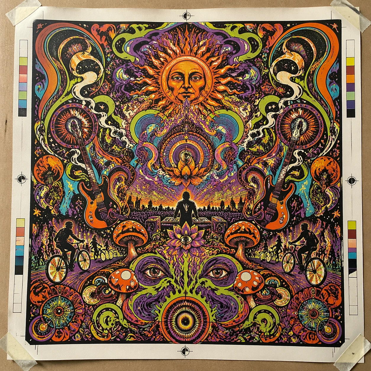
Example generated from “Psychedelic Rock Concert 1960S — Print Proof Flatlay”
GPT Image 2en

Scene: A square overhead tabletop photograph of a fresh poster proof on neutral worktable paper, lit by cool daylight, with crop marks, tape tabs, and slight paper bow visible around the sheet. The poster should express late-1960s psychedelic poster language with liquid swirls, floral mandala density, vibrating contours, and molten ornamental framing, using acid orange, violet, lime, cyan, cream, and deep black and a tactile surface appropriate to the medium. Subject: Design the poster as a print-shop proof, preserving the same poster language while allowing production clues such as edge trims, registration targets, and process marks to frame the composition. Use sun faces, paisley smoke, guitars, mushrooms, stars, lotus petals, and concentric wave rings as the main visual ingredients, and organize them with ornamental pseudo-lettering that feels lavish and tangled while remaining unreadable. For the contemporary-subject axis, thread in a rooftop electronic set, bike lights, and crowd motion translated into a hallucinatory hand-drawn poster field. The poster must feel like an original design object rather than a reproduction of any known work. Important details: The image must still read as a finished poster concept, but it should carry believable print-process evidence and material tactility instead of gallery-wall perfection. Preserve dense symmetry, nested curves, optical vibration, and saturated color friction across the whole sheet. Keep every letterform abstract and non-readable, as if it were a typographic texture rather than language. Make the style unmistakable through composition, palette, surface behavior, and symbolic compression. no plain corporate layout, no dead empty zones, no restrained minimalist spacing, no clean sans-serif blocks. Use case: Psychedelic 60s single study 2/9, testing production realism and process evidence. Constraints: No readable text, no watermark, no logos, preserve exact 1:1 aspect ratio, no copyrighted characters, no real brand marks, no QR codes, no interface chrome, no accidental gibberish lettering.

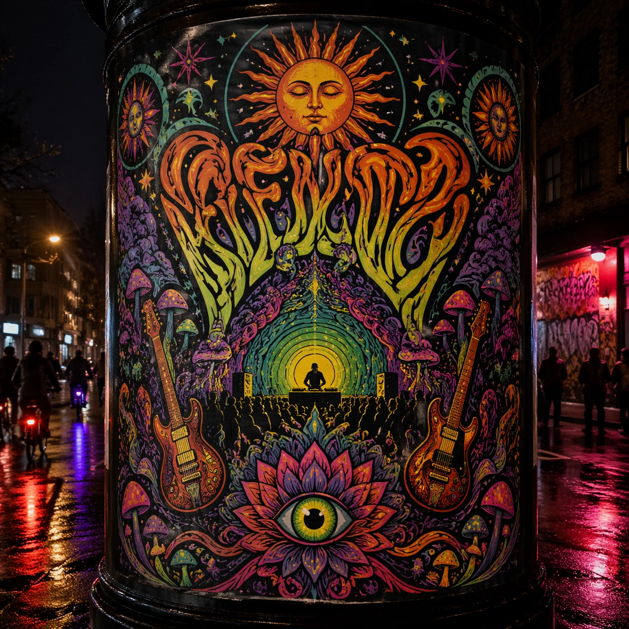
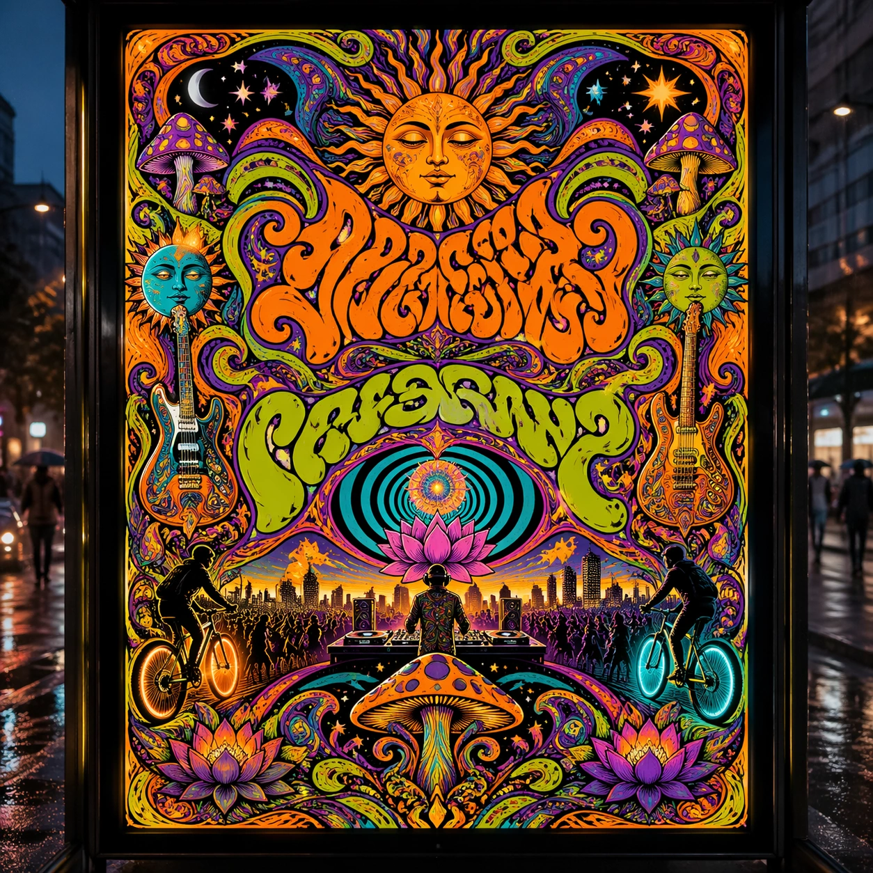
Example generated from “Psychedelic Rock Concert 1960S — Transit Lightbox”
GPT Image 2en

Scene: A square dusk street photograph of a backlit transit poster glowing inside glass, with faint rain reflections, soft city blur in the distance, and the poster remaining fully legible as a composition. The poster should express late-1960s psychedelic poster language with liquid swirls, floral mandala density, vibrating contours, and molten ornamental framing, using acid orange, violet, lime, cyan, cream, and deep black and a tactile surface appropriate to the medium. Subject: Adapt the poster into a public-facing lightbox version that still honors the original style grammar while feeling bold enough to stop a passerby from several meters away. Use sun faces, paisley smoke, guitars, mushrooms, stars, lotus petals, and concentric wave rings as the main visual ingredients, and organize them with ornamental pseudo-lettering that feels lavish and tangled while remaining unreadable. For the contemporary-subject axis, thread in a rooftop electronic set, bike lights, and crowd motion translated into a hallucinatory hand-drawn poster field. The poster must feel like an original design object rather than a reproduction of any known work. Important details: Let the style survive the illumination test: color blocking, silhouette contrast, and abstract lettering should stay controlled under bright internal light and reflective glass. Preserve dense symmetry, nested curves, optical vibration, and saturated color friction across the whole sheet. Keep every letterform abstract and non-readable, as if it were a typographic texture rather than language. Make the style unmistakable through composition, palette, surface behavior, and symbolic compression. no plain corporate layout, no dead empty zones, no restrained minimalist spacing, no clean sans-serif blocks. Use case: Psychedelic 60s single study 3/9, testing distance readability in public display. Constraints: No readable text, no watermark, no logos, preserve exact 1:1 aspect ratio, no copyrighted characters, no real brand marks, no QR codes, no interface chrome, no accidental gibberish lettering.

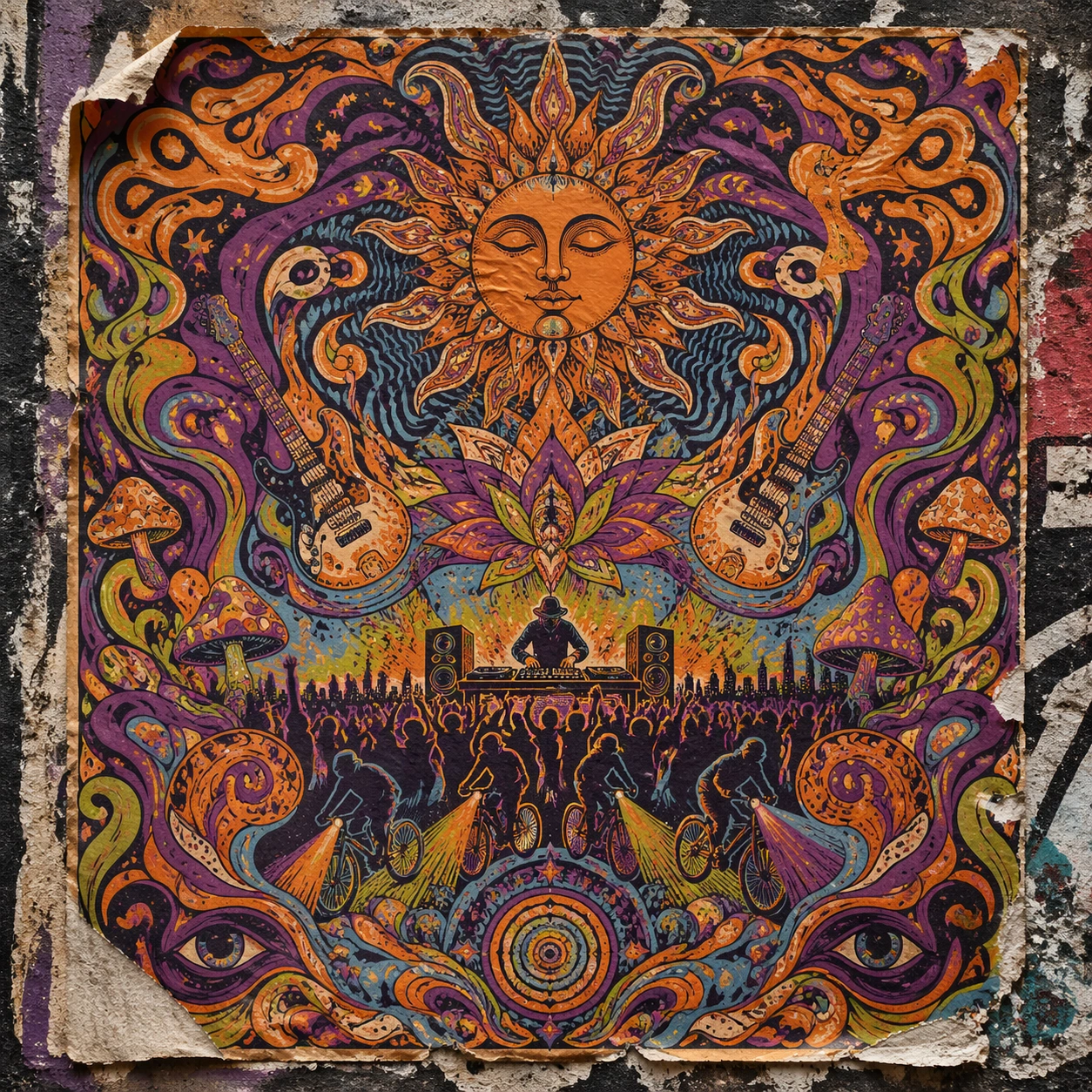
Example generated from “Psychedelic Rock Concert 1960S — Wheatpaste Wall Layer”
GPT Image 2en

Scene: A square urban wall study with the poster pasted onto rough plaster among torn edges and older paper remnants, photographed in soft overcast light so texture, glue bubbles, and surface scars stay visible. The poster should express late-1960s psychedelic poster language with liquid swirls, floral mandala density, vibrating contours, and molten ornamental framing, using acid orange, violet, lime, cyan, cream, and deep black and a tactile surface appropriate to the medium. Subject: Create a version that feels made for the street, with the poster carrying enough formal force to survive abrasion, layering, and imperfect placement without losing its visual identity. Use sun faces, paisley smoke, guitars, mushrooms, stars, lotus petals, and concentric wave rings as the main visual ingredients, and organize them with ornamental pseudo-lettering that feels lavish and tangled while remaining unreadable. For the contemporary-subject axis, thread in a rooftop electronic set, bike lights, and crowd motion translated into a hallucinatory hand-drawn poster field. The poster must feel like an original design object rather than a reproduction of any known work. Important details: Keep the main design intact but let the environment add grit: lifted corners, tiny tears, wrinkled paper, and older color fragments around the perimeter should amplify the style rather than dilute it. Preserve dense symmetry, nested curves, optical vibration, and saturated color friction across the whole sheet. Keep every letterform abstract and non-readable, as if it were a typographic texture rather than language. Make the style unmistakable through composition, palette, surface behavior, and symbolic compression. no plain corporate layout, no dead empty zones, no restrained minimalist spacing, no clean sans-serif blocks. Use case: Psychedelic 60s single study 4/9, testing street-life durability and layered context. Constraints: No readable text, no watermark, no logos, preserve exact 1:1 aspect ratio, no copyrighted characters, no real brand marks, no QR codes, no interface chrome, no accidental gibberish lettering.

Example generated from “Psychedelic Rock Concert 1960S — Folded Archive Copy”
GPT Image 2en

Scene: A square conservation-table view of a vintage poster laid on gray felt under raking light, with visible fold lines, softened corners, and subtle aging that still preserves the integrity of the image. The poster should express late-1960s psychedelic poster language with liquid swirls, floral mandala density, vibrating contours, and molten ornamental framing, using acid orange, violet, lime, cyan, cream, and deep black and a tactile surface appropriate to the medium. Subject: Present the poster as an archive copy that has been stored, unfolded, and carefully documented, letting age and handling reveal how the design holds up across time. Use sun faces, paisley smoke, guitars, mushrooms, stars, lotus petals, and concentric wave rings as the main visual ingredients, and organize them with ornamental pseudo-lettering that feels lavish and tangled while remaining unreadable. For the contemporary-subject axis, thread in a rooftop electronic set, bike lights, and crowd motion translated into a hallucinatory hand-drawn poster field. The poster must feel like an original design object rather than a reproduction of any known work. Important details: Aging must stay believable rather than theatrical: slight yellowing, fold memory, edge wear, and pigment variation should support the historical or crafted feeling of the style. Preserve dense symmetry, nested curves, optical vibration, and saturated color friction across the whole sheet. Keep every letterform abstract and non-readable, as if it were a typographic texture rather than language. Make the style unmistakable through composition, palette, surface behavior, and symbolic compression. no plain corporate layout, no dead empty zones, no restrained minimalist spacing, no clean sans-serif blocks. Use case: Psychedelic 60s single study 5/9, testing archival endurance and age character. Constraints: No readable text, no watermark, no logos, preserve exact 1:1 aspect ratio, no copyrighted characters, no real brand marks, no QR codes, no interface chrome, no accidental gibberish lettering.

Example generated from “Psychedelic Rock Concert 1960S — Twin Poster Diptych”
GPT Image 2en

Scene: A square white-wall installation showing two companion posters hung side by side with equal spacing, photographed frontally so the pair reads as a designed conversation rather than two unrelated sheets. The poster should express late-1960s psychedelic poster language with liquid swirls, floral mandala density, vibrating contours, and molten ornamental framing, using acid orange, violet, lime, cyan, cream, and deep black and a tactile surface appropriate to the medium. Subject: Compose a matched diptych: two posters sharing one style system while splitting the narrative across paired motifs, mirrored masses, or complementary color emphasis. Use sun faces, paisley smoke, guitars, mushrooms, stars, lotus petals, and concentric wave rings as the main visual ingredients, and organize them with ornamental pseudo-lettering that feels lavish and tangled while remaining unreadable. For the contemporary-subject axis, thread in a rooftop electronic set, bike lights, and crowd motion translated into a hallucinatory hand-drawn poster field. The poster must feel like an original design object rather than a reproduction of any known work. Important details: Both halves should feel distinct yet inseparable. Preserve one coherent visual language, but let each sheet carry its own focal symbol and rhythm without readable wording. Preserve dense symmetry, nested curves, optical vibration, and saturated color friction across the whole sheet. Keep every letterform abstract and non-readable, as if it were a typographic texture rather than language. Make the style unmistakable through composition, palette, surface behavior, and symbolic compression. no plain corporate layout, no dead empty zones, no restrained minimalist spacing, no clean sans-serif blocks. Use case: Psychedelic 60s single study 6/9, testing system flexibility across a paired set. Constraints: No readable text, no watermark, no logos, preserve exact 1:1 aspect ratio, no copyrighted characters, no real brand marks, no QR codes, no interface chrome, no accidental gibberish lettering.

Example generated from “Psychedelic Rock Concert 1960S — Stacked Print Bundle”
GPT Image 2en

Scene: A square tabletop shot of several poster prints stacked and slightly fanned, with curled corners, offset edges, and soft directional light revealing paper thickness and ink behavior. The poster should express late-1960s psychedelic poster language with liquid swirls, floral mandala density, vibrating contours, and molten ornamental framing, using acid orange, violet, lime, cyan, cream, and deep black and a tactile surface appropriate to the medium. Subject: Design the top poster to dominate while nearby duplicate sheets echo the same composition, creating a tactile print-run scene rather than a single isolated sheet. Use sun faces, paisley smoke, guitars, mushrooms, stars, lotus petals, and concentric wave rings as the main visual ingredients, and organize them with ornamental pseudo-lettering that feels lavish and tangled while remaining unreadable. For the contemporary-subject axis, thread in a rooftop electronic set, bike lights, and crowd motion translated into a hallucinatory hand-drawn poster field. The poster must feel like an original design object rather than a reproduction of any known work. Important details: Use the stack to emphasize production character: edge shadows, repeated motifs peeking from beneath, and subtle misalignment should enrich the material reading without changing the core design. Preserve dense symmetry, nested curves, optical vibration, and saturated color friction across the whole sheet. Keep every letterform abstract and non-readable, as if it were a typographic texture rather than language. Make the style unmistakable through composition, palette, surface behavior, and symbolic compression. no plain corporate layout, no dead empty zones, no restrained minimalist spacing, no clean sans-serif blocks. Use case: Psychedelic 60s single study 7/9, testing print-run tactility and repeat presence. Constraints: No readable text, no watermark, no logos, preserve exact 1:1 aspect ratio, no copyrighted characters, no real brand marks, no QR codes, no interface chrome, no accidental gibberish lettering.

Example generated from “Psychedelic Rock Concert 1960S — Kiosk Night Glow”
GPT Image 2en

Scene: A square nighttime city view with the poster wrapping part of a cylindrical kiosk, wet pavement reflecting nearby light, and the composition holding together under moody urban illumination. The poster should express late-1960s psychedelic poster language with liquid swirls, floral mandala density, vibrating contours, and molten ornamental framing, using acid orange, violet, lime, cyan, cream, and deep black and a tactile surface appropriate to the medium. Subject: Reframe the design for a dramatic street-placement context, where the poster has to project style and mood through reflection, curvature, and surrounding darkness. Use sun faces, paisley smoke, guitars, mushrooms, stars, lotus petals, and concentric wave rings as the main visual ingredients, and organize them with ornamental pseudo-lettering that feels lavish and tangled while remaining unreadable. For the contemporary-subject axis, thread in a rooftop electronic set, bike lights, and crowd motion translated into a hallucinatory hand-drawn poster field. The poster must feel like an original design object rather than a reproduction of any known work. Important details: The design should remain instantly recognizable despite the cylindrical wrap. Preserve major blocks, symbolic shapes, and abstract title forms so the style still feels authoritative at night. Preserve dense symmetry, nested curves, optical vibration, and saturated color friction across the whole sheet. Keep every letterform abstract and non-readable, as if it were a typographic texture rather than language. Make the style unmistakable through composition, palette, surface behavior, and symbolic compression. no plain corporate layout, no dead empty zones, no restrained minimalist spacing, no clean sans-serif blocks. Use case: Psychedelic 60s single study 8/9, testing atmospheric display under rain and glow. Constraints: No readable text, no watermark, no logos, preserve exact 1:1 aspect ratio, no copyrighted characters, no real brand marks, no QR codes, no interface chrome, no accidental gibberish lettering.

Example generated from “Psychedelic Rock Concert 1960S — Contemporary Remix”
GPT Image 2en

Scene: A square front-facing poster presentation on a clean neutral wall, lit like a premium print test, with crisp edges and a polished but still tactile finish appropriate to the style. The poster should express late-1960s psychedelic poster language with liquid swirls, floral mandala density, vibrating contours, and molten ornamental framing, using acid orange, violet, lime, cyan, cream, and deep black and a tactile surface appropriate to the medium. Subject: Apply the historical poster language to a contemporary urban subject so the old visual grammar proves it can carry present-day themes without losing authenticity or formal discipline. Use sun faces, paisley smoke, guitars, mushrooms, stars, lotus petals, and concentric wave rings as the main visual ingredients, and organize them with ornamental pseudo-lettering that feels lavish and tangled while remaining unreadable. For the contemporary-subject axis, thread in a rooftop electronic set, bike lights, and crowd motion translated into a hallucinatory hand-drawn poster field. The poster must feel like an original design object rather than a reproduction of any known work. Important details: This is not parody. The contemporary subject should feel genuinely absorbed into the style through palette, composition, symbolic compression, and non-readable lettering treatment. Preserve dense symmetry, nested curves, optical vibration, and saturated color friction across the whole sheet. Keep every letterform abstract and non-readable, as if it were a typographic texture rather than language. Make the style unmistakable through composition, palette, surface behavior, and symbolic compression. no plain corporate layout, no dead empty zones, no restrained minimalist spacing, no clean sans-serif blocks. Use case: Psychedelic 60s single study 9/9, testing historical grammar on a present-day subject. Constraints: No readable text, no watermark, no logos, preserve exact 1:1 aspect ratio, no copyrighted characters, no real brand marks, no QR codes, no interface chrome, no accidental gibberish lettering.

Example generated from “Pulpy Typography Violence Poster — Diner Booth Aftermath”
GPT Image 2en

Scene: A square poster-like composition with loud red, tobacco yellow, nicotine cream, and deep black arranged in flat graphic blocks over a staged crime tableau. The lighting should feel hard and directional, but the overall image should still read as a designed print object rather than a literal movie still. Place the action in a diner booth with laminated tabletop reflections, a yellow banquette, and a vertical red block slicing the frame like a fake headline column. Subject: Focus on an implied act of violence or aftermath through frozen props, bodies held in stiff poses, diner booths, cheap motel details, briefcases, dashboard reflections, or nightclub furniture. The people should feel iconic and deadpan, with tension communicated through placement and color rather than explicit gore. A woman in a cream jacket sits motionless beside an overturned coffee cup while a crimson spill crawls across the table edge toward the floor. Important details: The crucial visual rule is the collision of graphic poster language and static pulp staging. Use oversized non-readable letterform-like shapes, caption bars, drop-shadow slabs, and paper-print textures without introducing actual words. Preserve bold silhouette hierarchy, cropped tension, and cynical cool. Treat the spill as a graphic shape, not a medical detail, and let chrome napkin holders and blinds reinforce the print-like composition. Use case: Pulpy Typography Over Violent Tableau single study 1/9. Constraints: No readable text, no watermark, no logos, preserve exact 1:1 aspect ratio, no readable text, no logos, no explicit gore, no dismemberment, no recognizable brand packaging, no comic speech balloons, no broken anatomy, no low-detail background, no accidental text fragments.

Example generated from “Pulpy Typography Violence Poster — Motel Corridor Freeze”
GPT Image 2en

Scene: A square poster-like composition with loud red, tobacco yellow, nicotine cream, and deep black arranged in flat graphic blocks over a staged crime tableau. The lighting should feel hard and directional, but the overall image should still read as a designed print object rather than a literal movie still. Use a cheap motel exterior corridor at night, with doorways receding along one side and a giant mustard color slab masking part of the sky. Subject: Focus on an implied act of violence or aftermath through frozen props, bodies held in stiff poses, diner booths, cheap motel details, briefcases, dashboard reflections, or nightclub furniture. The people should feel iconic and deadpan, with tension communicated through placement and color rather than explicit gore. A man in a dark suit leans against the railing while a dropped room key and a crimson heel mark imply a sudden unseen event. Important details: The crucial visual rule is the collision of graphic poster language and static pulp staging. Use oversized non-readable letterform-like shapes, caption bars, drop-shadow slabs, and paper-print textures without introducing actual words. Preserve bold silhouette hierarchy, cropped tension, and cynical cool. The palette should feel sun-faded even at night, with grainy paper texture and non-readable graphic bars interrupting the realism. Use case: Pulpy Typography Over Violent Tableau single study 2/9. Constraints: No readable text, no watermark, no logos, preserve exact 1:1 aspect ratio, no readable text, no logos, no explicit gore, no dismemberment, no recognizable brand packaging, no comic speech balloons, no broken anatomy, no low-detail background, no accidental text fragments.

Example generated from “Pulpy Typography Violence Poster — Trunk Light Tableau”
GPT Image 2en

Scene: A square poster-like composition with loud red, tobacco yellow, nicotine cream, and deep black arranged in flat graphic blocks over a staged crime tableau. The lighting should feel hard and directional, but the overall image should still read as a designed print object rather than a literal movie still. Frame an open car trunk from slightly above so the rectangular lid becomes part of the poster geometry, with deep black surrounding a hot yellow light source. Subject: Focus on an implied act of violence or aftermath through frozen props, bodies held in stiff poses, diner booths, cheap motel details, briefcases, dashboard reflections, or nightclub furniture. The people should feel iconic and deadpan, with tension communicated through placement and color rather than explicit gore. A briefcase, satin gloves, and a crimson scarf sit inside the trunk while two hands hover just outside the edge of the frame. Important details: The crucial visual rule is the collision of graphic poster language and static pulp staging. Use oversized non-readable letterform-like shapes, caption bars, drop-shadow slabs, and paper-print textures without introducing actual words. Preserve bold silhouette hierarchy, cropped tension, and cynical cool. Make every object feel loaded with narrative, but keep the layout static and graphically controlled rather than frantic. Use case: Pulpy Typography Over Violent Tableau single study 3/9. Constraints: No readable text, no watermark, no logos, preserve exact 1:1 aspect ratio, no readable text, no logos, no explicit gore, no dismemberment, no recognizable brand packaging, no comic speech balloons, no broken anatomy, no low-detail background, no accidental text fragments.

Example generated from “Pulpy Typography Violence Poster — Alley Briefcase Spill”
GPT Image 2en

Scene: A square poster-like composition with loud red, tobacco yellow, nicotine cream, and deep black arranged in flat graphic blocks over a staged crime tableau. The lighting should feel hard and directional, but the overall image should still read as a designed print object rather than a literal movie still. Set the image in a narrow back alley with wet asphalt, one fire stair, and a huge red vertical panel that crops the space like pasted print stock. Subject: Focus on an implied act of violence or aftermath through frozen props, bodies held in stiff poses, diner booths, cheap motel details, briefcases, dashboard reflections, or nightclub furniture. The people should feel iconic and deadpan, with tension communicated through placement and color rather than explicit gore. An exploded briefcase spills casino chips, photos, and a red-stained handkerchief while two figures hold a silent standoff at opposite edges. Important details: The crucial visual rule is the collision of graphic poster language and static pulp staging. Use oversized non-readable letterform-like shapes, caption bars, drop-shadow slabs, and paper-print textures without introducing actual words. Preserve bold silhouette hierarchy, cropped tension, and cynical cool. The props should read crisply enough for narrative, yet the composition must stay closer to editorial design than documentary realism. Use case: Pulpy Typography Over Violent Tableau single study 4/9. Constraints: No readable text, no watermark, no logos, preserve exact 1:1 aspect ratio, no readable text, no logos, no explicit gore, no dismemberment, no recognizable brand packaging, no comic speech balloons, no broken anatomy, no low-detail background, no accidental text fragments.

Example generated from “Pulpy Typography Violence Poster — Pool Cue Interrogation”
GPT Image 2en

Scene: A square poster-like composition with loud red, tobacco yellow, nicotine cream, and deep black arranged in flat graphic blocks over a staged crime tableau. The lighting should feel hard and directional, but the overall image should still read as a designed print object rather than a literal movie still. Use a smoky billiards room with green felt, amber wall lamps, and thick yellow bars crossing the frame like oversized printed title blocks. Subject: Focus on an implied act of violence or aftermath through frozen props, bodies held in stiff poses, diner booths, cheap motel details, briefcases, dashboard reflections, or nightclub furniture. The people should feel iconic and deadpan, with tension communicated through placement and color rather than explicit gore. One seated figure grips a pool cue horizontally while another stands behind in silhouette, both frozen in tense theatrical stillness. Important details: The crucial visual rule is the collision of graphic poster language and static pulp staging. Use oversized non-readable letterform-like shapes, caption bars, drop-shadow slabs, and paper-print textures without introducing actual words. Preserve bold silhouette hierarchy, cropped tension, and cynical cool. Keep the violence implied through posture, broken chalk dust, and a toppled glass rather than facial injury or gore. Use case: Pulpy Typography Over Violent Tableau single study 5/9. Constraints: No readable text, no watermark, no logos, preserve exact 1:1 aspect ratio, no readable text, no logos, no explicit gore, no dismemberment, no recognizable brand packaging, no comic speech balloons, no broken anatomy, no low-detail background, no accidental text fragments.