PROMPTY · TWÓRCZE ODKRYWANIE

Galeria promptów

Odkrywaj prawdziwe prompty i wygenerowane przykłady. Znajdź inspirację do kolejnej twórczej misji i kopiuj pełne prompty bezpłatnie.

Przykłady
10,974
Modele
17
Źródła
1277
10 974 przykładów promptów · strona 64 z 229
Example generated from “Character Quirk Comedy Sheet — Support Two”
GPT Image 2en

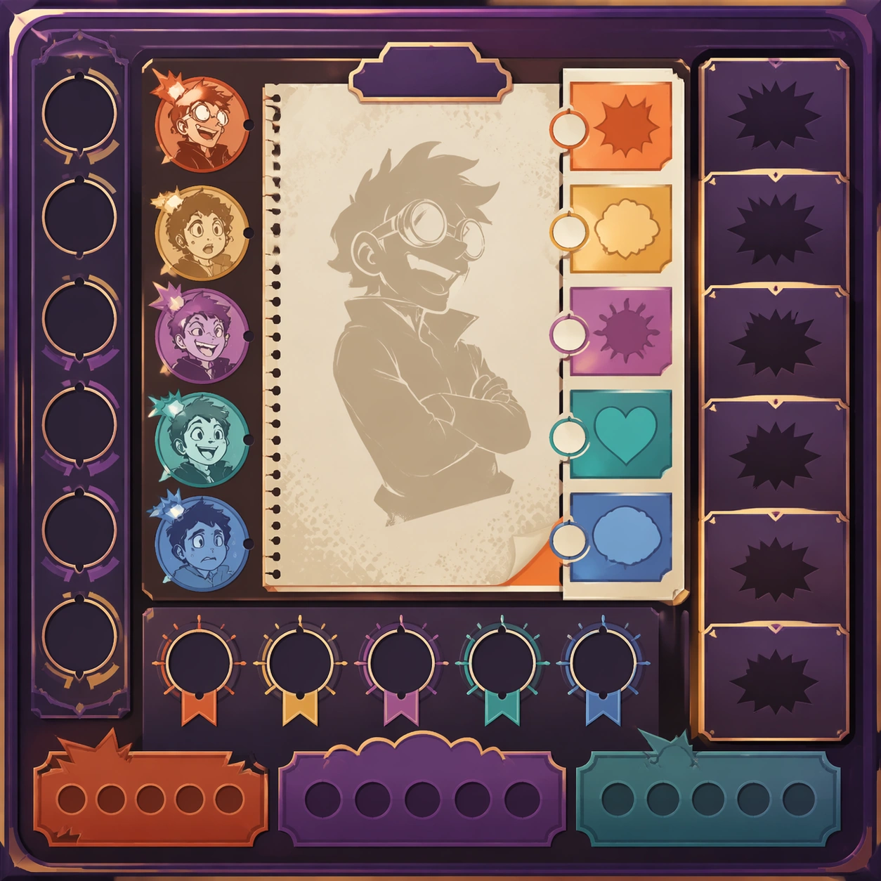
Scene: Create a square standalone support image for Character Quirk Comedy Sheet. Build a second support-surface study with a clear focal hierarchy and a finished professional surface. Use a polished modular board or campaign surface with clean spacing, premium game-UI finish, and clear focal hierarchy. The frame should feel self-contained and polished, with enough structure to explain the system even without the reference series, yet still obviously belonging to the same theme and production world. Subject: Show a coherent original game-art system built for premium production and marketing surfaces in a way that emphasizes the intended support surface. Keep the same system logic stable across screenshots, cards, banners, and overview boards. Even though this image is independent, the viewer should still recognize the same universe, same commercial logic, and same production intent as the core package. Important details: Lock framing, icon grammar, palette blocking, and surface hierarchy so the kit feels production-ready and consistent. Preserve the broader theme language through color, framing, material choices, and modular composition. Use clean panel rhythm, premium asset presentation, and believable detail density. The image should work equally well as a gallery study, research reference, and mock production deliverable. Use case: Character Quirk Comedy Sheet single study 6/9, exploring support two as a support surface. Constraints: No readable text, no watermark, no logos, preserve exact 1:1 aspect ratio, no unrelated objects, no broken visual hierarchy, no visual noise that obscures the main surface, no accidental brand resemblance.
Example generated from “Character Quirk Comedy Sheet — Support Three”
GPT Image 2en

Scene: Create a square standalone support image for Character Quirk Comedy Sheet. Build a third support-surface study with a clear focal hierarchy and a finished professional surface. Use a polished modular board or campaign surface with clean spacing, premium game-UI finish, and clear focal hierarchy. The frame should feel self-contained and polished, with enough structure to explain the system even without the reference series, yet still obviously belonging to the same theme and production world. Subject: Show a coherent original game-art system built for premium production and marketing surfaces in a way that emphasizes the intended support surface. Keep the same system logic stable across screenshots, cards, banners, and overview boards. Even though this image is independent, the viewer should still recognize the same universe, same commercial logic, and same production intent as the core package. Important details: Lock framing, icon grammar, palette blocking, and surface hierarchy so the kit feels production-ready and consistent. Preserve the broader theme language through color, framing, material choices, and modular composition. Use clean panel rhythm, premium asset presentation, and believable detail density. The image should work equally well as a gallery study, research reference, and mock production deliverable. Use case: Character Quirk Comedy Sheet single study 7/9, exploring support three as a support surface. Constraints: No readable text, no watermark, no logos, preserve exact 1:1 aspect ratio, no unrelated objects, no broken visual hierarchy, no visual noise that obscures the main surface, no accidental brand resemblance.
Example generated from “Character Quirk Comedy Sheet — Support Four”
GPT Image 2en

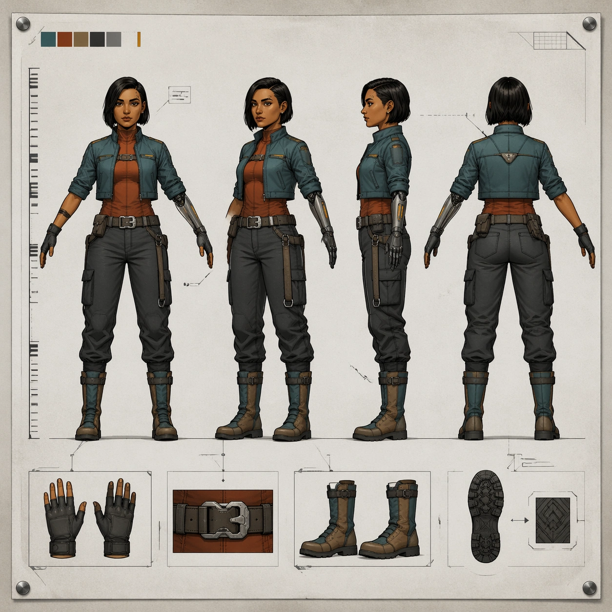
Scene: Create a square standalone support image for Character Quirk Comedy Sheet. Build a fourth support-surface study with a clear focal hierarchy and a finished professional surface. Use a polished modular board or campaign surface with clean spacing, premium game-UI finish, and clear focal hierarchy. The frame should feel self-contained and polished, with enough structure to explain the system even without the reference series, yet still obviously belonging to the same theme and production world. Subject: Show a coherent original game-art system built for premium production and marketing surfaces in a way that emphasizes the intended support surface. Keep the same system logic stable across screenshots, cards, banners, and overview boards. Even though this image is independent, the viewer should still recognize the same universe, same commercial logic, and same production intent as the core package. Important details: Lock framing, icon grammar, palette blocking, and surface hierarchy so the kit feels production-ready and consistent. Preserve the broader theme language through color, framing, material choices, and modular composition. Use clean panel rhythm, premium asset presentation, and believable detail density. The image should work equally well as a gallery study, research reference, and mock production deliverable. Use case: Character Quirk Comedy Sheet single study 8/9, exploring support four as a support surface. Constraints: No readable text, no watermark, no logos, preserve exact 1:1 aspect ratio, no unrelated objects, no broken visual hierarchy, no visual noise that obscures the main surface, no accidental brand resemblance.
Example generated from “Character Quirk Comedy Sheet — Support Five”
GPT Image 2en

Scene: Create a square standalone support image for Character Quirk Comedy Sheet. Build a fifth support-surface study with a clear focal hierarchy and a finished professional surface. Use a polished modular board or campaign surface with clean spacing, premium game-UI finish, and clear focal hierarchy. The frame should feel self-contained and polished, with enough structure to explain the system even without the reference series, yet still obviously belonging to the same theme and production world. Subject: Show a coherent original game-art system built for premium production and marketing surfaces in a way that emphasizes the intended support surface. Keep the same system logic stable across screenshots, cards, banners, and overview boards. Even though this image is independent, the viewer should still recognize the same universe, same commercial logic, and same production intent as the core package. Important details: Lock framing, icon grammar, palette blocking, and surface hierarchy so the kit feels production-ready and consistent. Preserve the broader theme language through color, framing, material choices, and modular composition. Use clean panel rhythm, premium asset presentation, and believable detail density. The image should work equally well as a gallery study, research reference, and mock production deliverable. Use case: Character Quirk Comedy Sheet single study 9/9, exploring support five as a support surface. Constraints: No readable text, no watermark, no logos, preserve exact 1:1 aspect ratio, no unrelated objects, no broken visual hierarchy, no visual noise that obscures the main surface, no accidental brand resemblance.
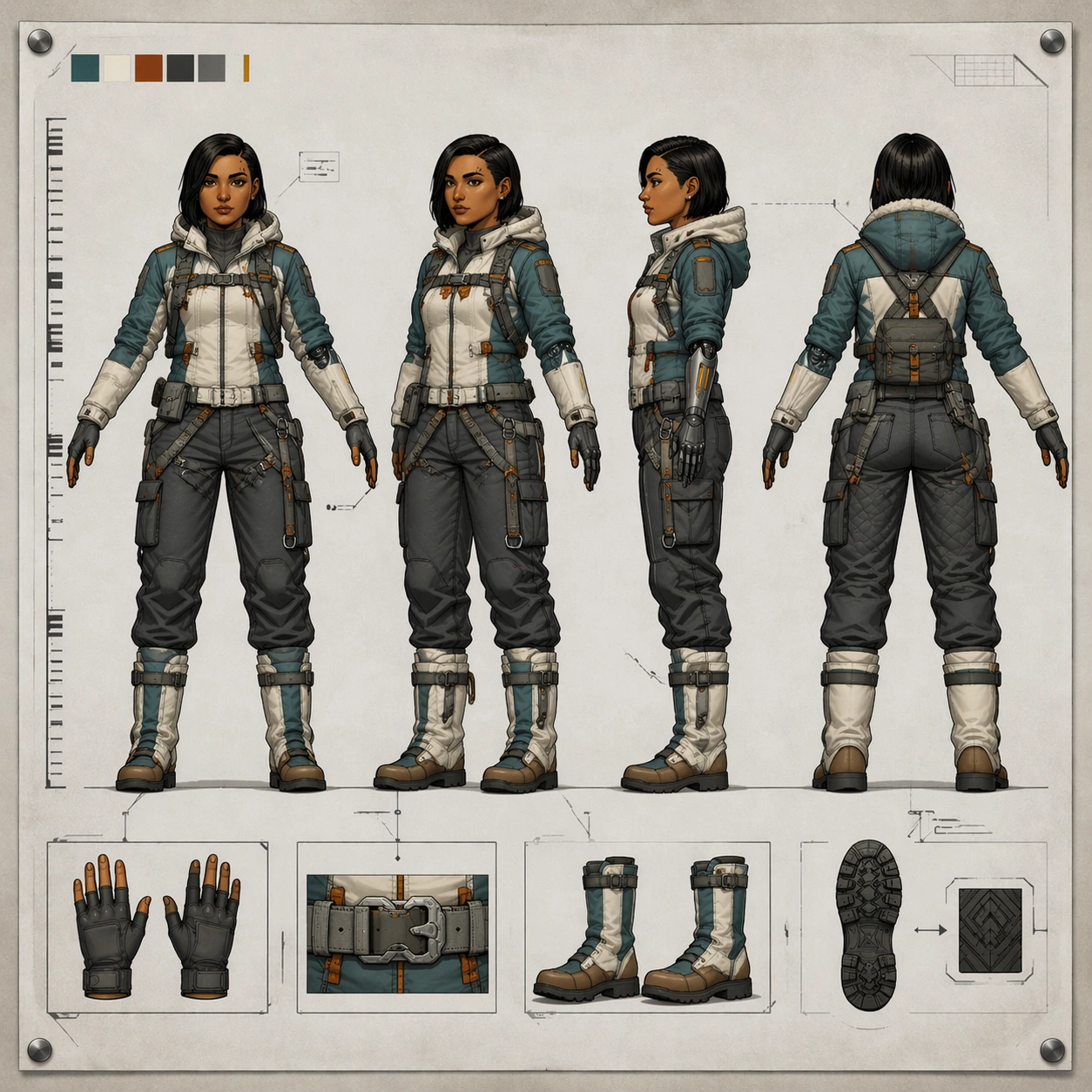
Example generated from “Character Turnaround — Reference Courier Sheet”
GPT Image 2en

Scene: A square concept-art turnaround sheet pinned against a soft neutral studio board, shown perfectly front-facing like a clean production document. The composition is bright, controlled, and diagrammatic rather than cinematic: pale gray paper field, restrained charcoal guide lines, soft overhead light, and enough margin for the sheet to breathe. The frame must feel like a polished animation or game studio deliverable with balanced spacing and clear silhouette readability. Subject: Design one original courier heroine presented in four aligned full-body views on the same sheet: front, three-quarter forty-five-degree view, ninety-degree side view, and back view. She stands in a relaxed T-pose with matching proportions in every view. Her identity is specific and repeatable: compact athletic build, copper-brown skin, narrow oval face, right-eyebrow notch scar, short dark bob tucked behind one ear, teal cropped jacket over a rust utility underlayer, matte graphite cargo trousers, split-tone knee boots, and a slim mechanical left forearm with amber indicator slits. Add a few small accessory insets such as gloves, belt buckle, and boot sole tread, but keep them secondary. Important details: The sheet must read as industrial character design, not poster art. Keep consistent anatomy, head size, limb length, clothing seams, hardware placement, and facial structure across all four views. Include a non-readable height ruler made only of ticks and blocks, a faint floor baseline, and thin callout boxes with abstract marks instead of text. Preserve clean negative space, controlled line hierarchy, and a professional concept-sheet rhythm. Use case: Character Turnaround series study 1/8, establishing the canonical identity and sheet grammar for a reference-driven production lineup. Constraints: No readable text, no watermark, no logos, preserve exact 1:1 aspect ratio, no extra fifth pose, no dramatic action stance, no weapon, no floating UI overlay, no malformed hands, no inconsistent face between views.

Example generated from “Character Turnaround — Arctic Expedition Sheet”
GPT Image 2en

Scene: A square production turnaround sheet using the exact same clean concept-art layout as the reference: flat studio board, generous pale background, faint alignment guides, and crisp overhead document lighting. The sheet should feel like it belongs in the same package and was prepared by the same studio artist, with the same spacing, margins, floor baseline, and neutral presentation. Subject: Use the reference as the primary identity source. Show the same courier heroine again in four aligned full-body views on one sheet: front, forty-five-degree, side, and back, all in a consistent T-pose. She now wears an arctic-expedition variant of her outfit: insulated teal-white field jacket with orange rescue tabs, thermal neck seal, padded graphite trousers, snow gaiters over the same boot silhouette, compact utility sled harness attachments, and the same slim mechanical left forearm visible through a segmented glove system. Preserve the exact face, haircut, eyebrow notch scar, proportions, stance, and mechanical-arm shape from image 01. Important details: This must read as a wardrobe adaptation, not a new person. Keep the same head shape, torso length, shoulder width, knee height, glove proportions, and boot geometry across all views. The arctic clothing should add believable bulk without changing body identity. Maintain technical-sheet cues: a non-readable measurement ruler with ticks only, subtle swatch chips, abstract callout boxes, and tiny gear detail insets. Material logic matters: quilted insulation, matte frost-resistant fabric, brushed metal fasteners, and restrained color blocking. Use case: Character Turnaround series study 2/8, testing reference-based identity preservation while adapting the same hero into an arctic field variant. Constraints: No readable text, no watermark, no logos, preserve exact 1:1 aspect ratio, no extra poses, no snowstorm background, no new face, no oversized parka obscuring silhouette, no missing mechanical arm details, no asymmetry between views.

Example generated from “Character Turnaround — Desert Scout Sheet”
GPT Image 2en

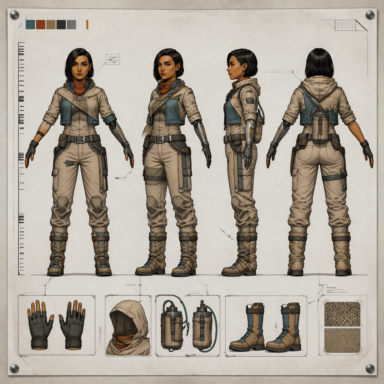
Scene: A square concept-art turnaround sheet with the same straight-on studio presentation as the reference package: bright neutral board, disciplined margins, thin guide lines, and quiet document lighting. The sheet should feel functionally identical to image 01, as if the studio reused the same template for a new environmental variant. Keep the overall brightness and diagram clarity high so every silhouette edge is inspectable. Subject: Use the reference as the primary identity anchor. Show the same courier heroine in four matching views on one sheet: front, forty-five-degree, side, and back, all in the same T-pose and scale. Convert her outfit into a desert-scout kit while keeping face and proportions identical: light sand-colored overwrap over the cropped teal base jacket, rust cooling scarf, mesh underpanels, sun hood folded behind the neck, hydration canister on the lower back, dust gaiters clipped over the same boots, and the same mechanical left forearm now fitted with heat-shield plating and fine cable channels. Preserve the eyebrow scar, bob haircut, compact athletic build, and recognizable hardware placements from image 01. Important details: The challenge is controlled identity continuity under wardrobe transformation. Do not let the desert fabric change her body size, head shape, or limb length. Keep the same boot sole, glove length, belt position, and elbow placement across views. Add industrial-sheet details such as non-readable swatches, angle wedges, and small accessory insets for the hood and canister. Materials should feel plausible for heat, dust, and mobility: woven fabric, ceramic snaps, matte polymer tubing, and softly abraded metal. Use case: Character Turnaround series study 3/8, testing identity consistency and technical-sheet reasoning for a heat-adapted scout variant. Constraints: No readable text, no watermark, no logos, preserve exact 1:1 aspect ratio, no action pose, no giant cape shape hiding anatomy, no changed hairstyle, no futuristic hologram UI, no mismatched boot design, no different person in any view.

Example generated from “Character Turnaround — Ceremonial Harbor Sheet”
GPT Image 2en

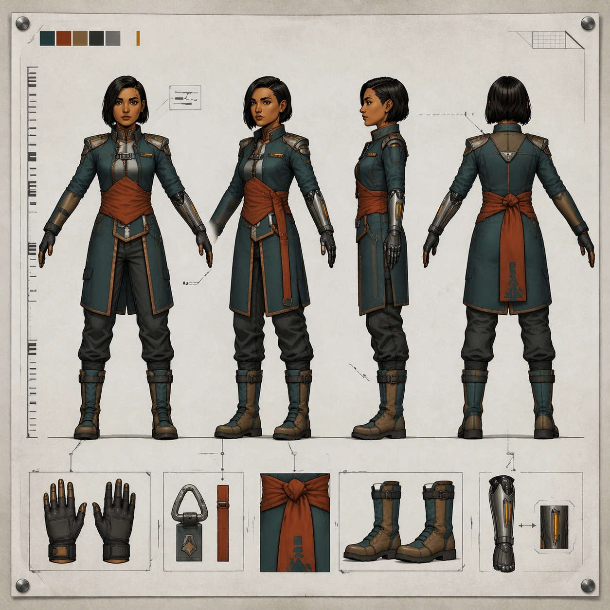
Scene: A square studio turnaround sheet presented exactly like the earlier images in the package: flat neutral board, precise layout grid, balanced margins, and soft top light with no dramatic shadows. The sheet should feel like the final approved page in the same production binder, keeping the same view order, spacing, and restrained document aesthetic. Subject: Use the reference as the primary character and proportion guide. Show the same courier heroine in four aligned full-body views on one sheet: front, forty-five-degree, side, and back, all in the same T-pose. She now wears a ceremonial harbor-uniform version of her gear: fitted teal parade coat with copper trim, rust sash folded into a disciplined geometric wrap, polished graphite shoulder hardware, harbor-signal pennant motifs reduced to abstract shapes, formal gloves, and the same mechanical left forearm integrated into a dress cuff with exposed amber slits still visible. Preserve the exact face, eyebrow notch scar, haircut, body proportions, and boot foundation from image 01, even though the costume is more formal and architectural. Important details: This image should prove that costume elevation does not break identity consistency. Keep the same cranial shape, chin line, shoulder width, knee height, and hand scale across all four views. The ceremonial design should remain believable for a working port authority rather than fantasy royalty. Include non-readable insignia blocks, a tick-mark ruler, and tidy accessory callouts for glove, clasp, and sash knot. Surfaces should feel premium and functional: heavy woven fabric, brushed metal, lacquered trim, and practical seam logic. Use case: Character Turnaround series study 4/8, testing whether the same character can survive a formal ceremonial redesign without losing industrial sheet precision. Constraints: No readable text, no watermark, no logos, preserve exact 1:1 aspect ratio, no throne-room background, no fantasy crown, no different face, no ornate clutter overwhelming the sheet, no missing mechanical-arm cues, no inconsistent proportions between views.

Example generated from “Character Turnaround — Reef Salvager Turnaround”
GPT Image 2en

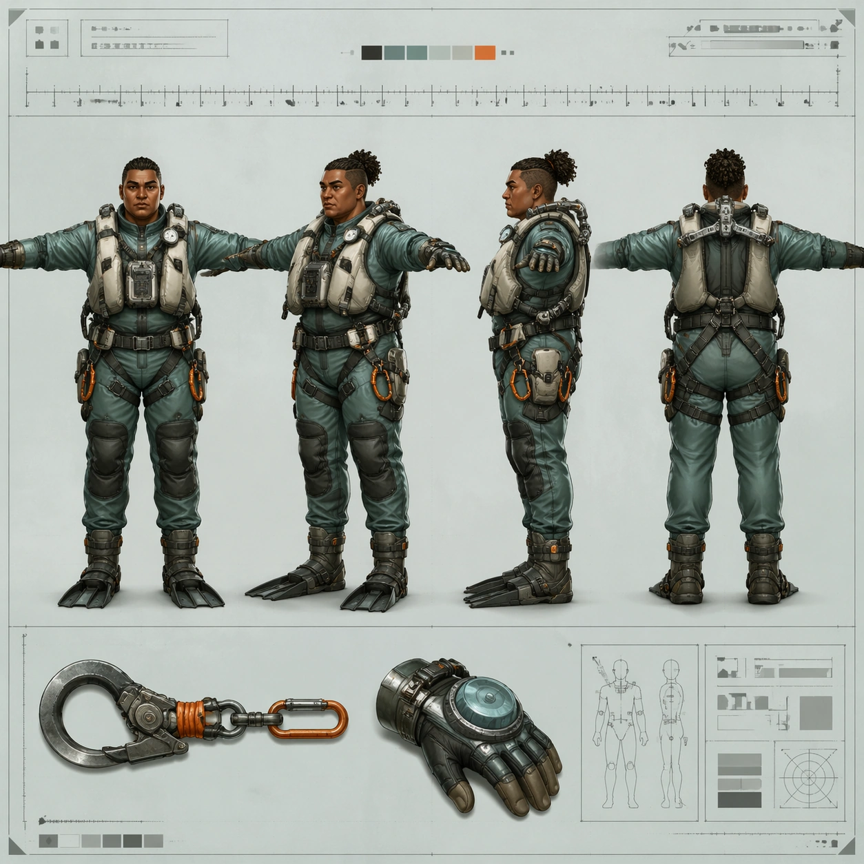
Scene: A square concept-art turnaround sheet laid out like a marine-equipment production document on a pale sea-glass background board. The presentation is flat, centered, and highly inspectable, with crisp paper texture, thin technical guides, and soft diffuse light that keeps every contour legible. The mood is practical and oceanic, leaning toward workwear design rather than fantasy adventure. Subject: Create one original reef salvager character shown in four aligned full-body views on the same sheet: front, forty-five-degree, side, and back, all in a neutral T-pose. The salvager is a sturdy diver-technician with sun-browned skin, tightly coiled hair bound into a short knot, a broad nose, layered pearl-gray flotation vest, sea-green drysuit panels, orange tether clips, reinforced gloves, fin-compatible boots, and a compact exoskeletal shoulder brace used for lifting found machinery. Add one or two small insets for a salvage hook and pressure gauntlet, keeping the main four views dominant and evenly spaced. Important details: Treat this as a professional turnaround page. Preserve exact facial structure, body mass, harness placement, glove thickness, and boot shape across every view. Material logic matters: salt-scuffed polymer, woven strap webbing, neoprene folds, anodized metal buckles, and translucent gasket edges. Include a non-readable measurement ruler and abstract notation boxes only. Avoid turning the page into an underwater scene; the strength is in industrial costume coherence and clean view-to-view repeatability. Use case: Character Turnaround single study 6/8, testing a marine-industrial four-view sheet with believable equipment engineering and stable identity. Constraints: No readable text, no watermark, no logos, preserve exact 1:1 aspect ratio, no underwater background, no extra dynamic pose, no weaponized harpoon, no fantasy mermaid elements, no inconsistent harness hardware, no anatomy drift between views.

Example generated from “Character Turnaround — Lunar Botanist Turnaround”
GPT Image 2en

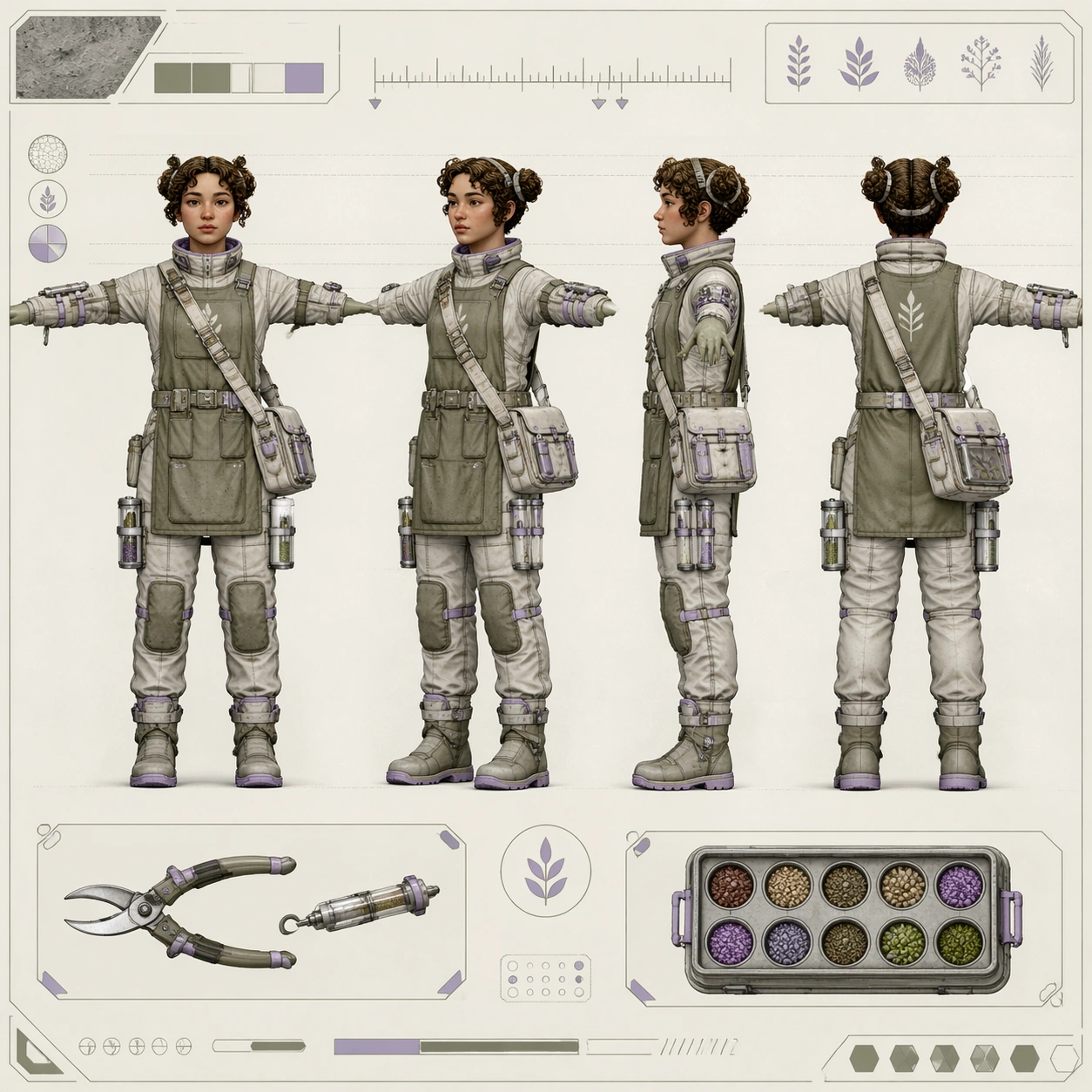
Scene: A square character turnaround sheet presented as a polished space-horticulture design page on a softly lit off-white board. The camera is perfectly straight-on, the background is calm and minimal, and the layout emphasizes inspection and comparison rather than drama. Use a restrained palette of bone white, muted olive, brushed silver, and dusty lavender, with fine guide lines and careful margins. Subject: Create one original lunar botanist shown in four aligned full-body views on the same sheet: front, forty-five-degree, side, and back, all in a neutral T-pose. The botanist is a thoughtful greenhouse field specialist with a rounded face, short curly hair tied into two compact loops, insulated plant-sample satchel, slim pressure-soft suit beneath an apron-like gardening overlayer, seed canisters on the thighs, soft magnetic boots, and forearm tools for clipping, grafting, and moisture sampling. Add one or two modest insets for a pruning tool and seed capsule tray, without reducing the dominance of the four main views. Important details: The page must read as an industrial character sheet for a believable lunar agriculture pipeline. Preserve identical anatomy, facial structure, suit seam logic, pocket count, and tool placement across every view. Materials should feel plausible for greenhouse work in partial gravity: dusty fabric, translucent sample tubes, brushed aluminum connectors, flexible joint seals, and lightly worn rubber soles. Include a non-readable tick ruler, abstract specimen symbols, and clean callout boxes with no letters. Keep the design grounded and usable rather than whimsical. Use case: Character Turnaround single study 7/8, testing a space-agriculture four-view sheet with technical precision and gentle worldbuilding. Constraints: No readable text, no watermark, no logos, preserve exact 1:1 aspect ratio, no outer-space vista background, no astronaut helmet obscuring the face, no floating character, no cartoon plant creatures, no inconsistent tool placement, no proportion changes between views.

Example generated from “Character Turnaround — Volcanic Envoy Turnaround”
GPT Image 2en

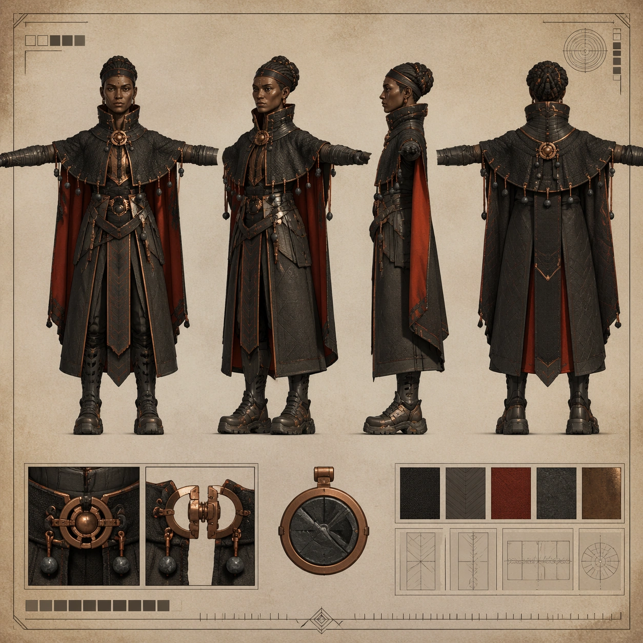
Scene: A square concept-art turnaround sheet mounted on a warm mineral-toned studio board, presented perfectly flat like a production document. Lighting is soft and even, with enough contrast to separate dark fabrics from copper hardware. The page should feel like a formal costume-development sheet for a worldbuilding-heavy game or animated feature, while remaining clean, technical, and easy to inspect. Subject: Create one original volcanic envoy character shown in four aligned full-body views on the same sheet: front, forty-five-degree, side, and back, all in a neutral T-pose. The envoy is a tall diplomatic traveler from a geothermal region, with deep brown skin, high cheekbones, tightly wrapped hair coils, layered charcoal heat-cloak split into engineered panels, ember-red lining, basalt bead counterweights, protective throat collar, ash-resistant gloves, and heavy magnetic-soled boots with vented greaves. Include one or two small accessory insets for a clasp mechanism and ceremonial heat token, but keep the main four views large and dominant. Important details: This sheet should balance ceremony and technical utility. Preserve exact facial identity, shoulder span, cloak panel logic, bead placement, boot geometry, and glove length across all four views. Materials must feel tactile and grounded: charred woven cloth, dark stone beads, forged copper clasps, matte heat shields, and ash-dusted leather. Include a non-readable tick ruler and abstract diagram boxes only. Avoid fantasy excess; the image should still read like a real character sheet prepared for modeling, rigging, or costume approval. Use case: Character Turnaround single study 8/8, testing a ceremonial-industrial four-view sheet with strong silhouette control and production-sheet credibility. Constraints: No readable text, no watermark, no logos, preserve exact 1:1 aspect ratio, no lava battlefield background, no fire magic effects, no extra dynamic pose, no oversized cloak hiding anatomy, no drifting accessory count, no inconsistent face across views.

Example generated from “Chibi Franchise Campaign Pack — Reference Mascot Pack”
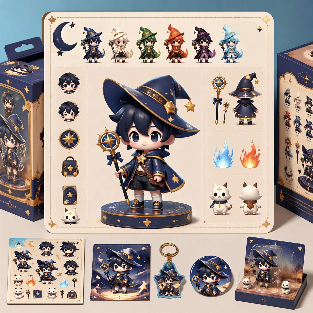
GPT Image 2en

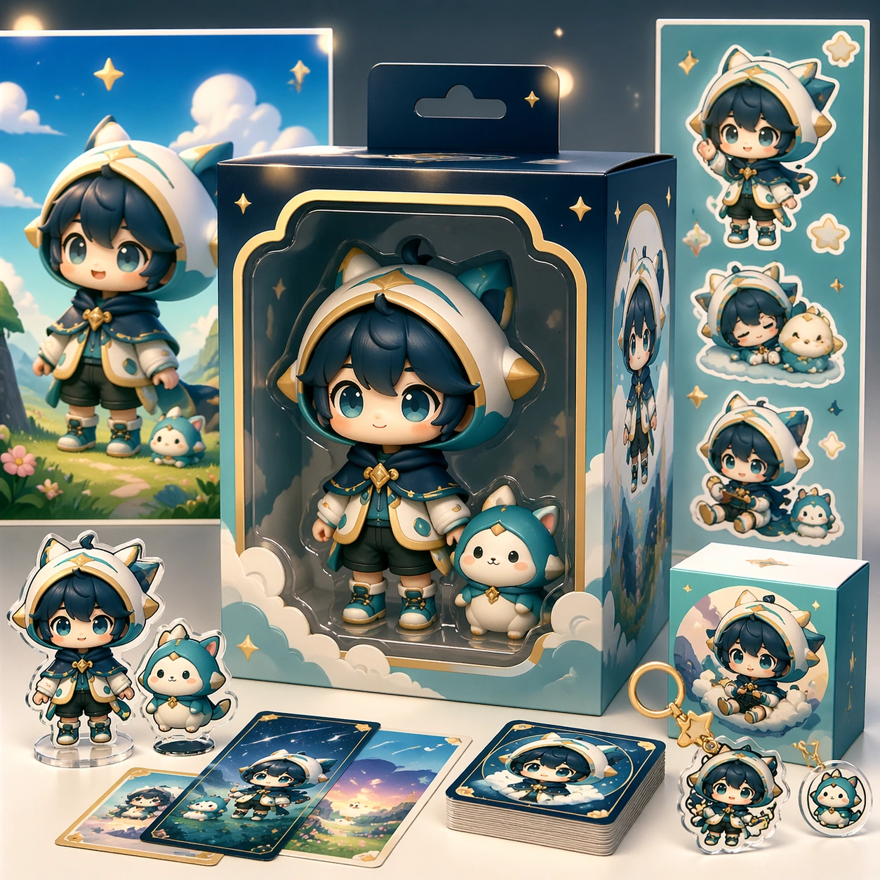
Scene: A square retail-ready campaign visual for Chibi Franchise Campaign Pack, combining cute character appeal with polished commercial presentation. The composition should feel like a high-finish launch board: crisp packaging edges, collectible object staging, clean shelf or poster context, and vivid but controlled color. It should be immediately legible from far away, but still dense with charming small details that reward closer inspection. Subject: Build the image around Reference Mascot Pack, a frame that defines the cute character silhouette, packaging shell, and retail color logic. Translate Convert larger fictional universes into tightly art-directed chibi campaign systems that can span posters, stickers, key visuals, and merch-ready layouts. into one lovable mascot, figure, or product system that feels ready for posters, boxes, stickers, inserts, or point-of-sale material. The result should feel like a fresh research image with clear commercial focus rather than random fan art. The main subject must remain unmistakable even when surrounded by accessories and display pieces. Important details: Charm alone is not enough. Preserve clean silhouette recognition, convincing package construction, reliable prop scale, and structured layout logic so the image feels sellable. This theme studies style-transfer, multi-image-reference, commercial-mockup, structured-layout through a production-ready visual system. Avoid noisy clutter; every secondary element should reinforce collectibility, retail desirability, or explainer clarity. Aim for clear hierarchy, polished craft, and immediately usable campaign logic. Use case: Chibi Franchise Campaign Pack series study 1/4. Constraints: No readable text, no watermark, no logos, preserve exact 1:1 aspect ratio, no horror elements, no brand theft, no malformed packaging edges, no muddy mascot silhouette, no messy retail shelf, no chaotic prop overload.

Example generated from “Chibi Franchise Campaign Pack — Sticker Burst Variant”
GPT Image 2en

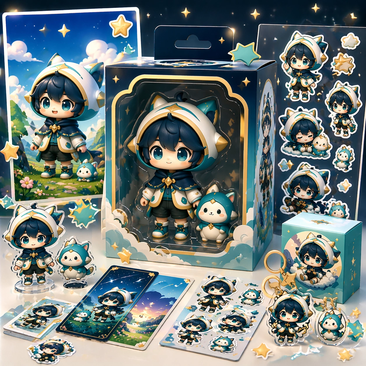
Scene: A square retail-ready campaign visual for Chibi Franchise Campaign Pack, combining cute character appeal with polished commercial presentation. The composition should feel like a high-finish launch board: crisp packaging edges, collectible object staging, clean shelf or poster context, and vivid but controlled color. It should be immediately legible from far away, but still dense with charming small details that reward closer inspection. Subject: Build the image around Sticker Burst Variant, a frame that keeps the same character and package identity while adding collectible sticker energy. Translate Convert larger fictional universes into tightly art-directed chibi campaign systems that can span posters, stickers, key visuals, and merch-ready layouts. into one lovable mascot, figure, or product system that feels ready for posters, boxes, stickers, inserts, or point-of-sale material. The result should feel like a fresh research image with clear commercial focus rather than random fan art. The main subject must remain unmistakable even when surrounded by accessories and display pieces. Important details: Charm alone is not enough. Preserve clean silhouette recognition, convincing package construction, reliable prop scale, and structured layout logic so the image feels sellable. This theme studies style-transfer, multi-image-reference, commercial-mockup, structured-layout through a production-ready visual system. Avoid noisy clutter; every secondary element should reinforce collectibility, retail desirability, or explainer clarity. Aim for clear hierarchy, polished craft, and immediately usable campaign logic. Use case: Chibi Franchise Campaign Pack series study 2/4. Constraints: No readable text, no watermark, no logos, preserve exact 1:1 aspect ratio, no horror elements, no brand theft, no malformed packaging edges, no muddy mascot silhouette, no messy retail shelf, no chaotic prop overload.

Example generated from “Chibi Franchise Campaign Pack — Shelf Launch Variant”
GPT Image 2en

Scene: A square retail-ready campaign visual for Chibi Franchise Campaign Pack, combining cute character appeal with polished commercial presentation. The composition should feel like a high-finish launch board: crisp packaging edges, collectible object staging, clean shelf or poster context, and vivid but controlled color. It should be immediately legible from far away, but still dense with charming small details that reward closer inspection. Subject: Build the image around Shelf Launch Variant, a frame that translates the same mascot package into a shelf-ready launch composition. Translate Convert larger fictional universes into tightly art-directed chibi campaign systems that can span posters, stickers, key visuals, and merch-ready layouts. into one lovable mascot, figure, or product system that feels ready for posters, boxes, stickers, inserts, or point-of-sale material. The result should feel like a fresh research image with clear commercial focus rather than random fan art. The main subject must remain unmistakable even when surrounded by accessories and display pieces. Important details: Charm alone is not enough. Preserve clean silhouette recognition, convincing package construction, reliable prop scale, and structured layout logic so the image feels sellable. This theme studies style-transfer, multi-image-reference, commercial-mockup, structured-layout through a production-ready visual system. Avoid noisy clutter; every secondary element should reinforce collectibility, retail desirability, or explainer clarity. Aim for clear hierarchy, polished craft, and immediately usable campaign logic. Use case: Chibi Franchise Campaign Pack series study 3/4. Constraints: No readable text, no watermark, no logos, preserve exact 1:1 aspect ratio, no horror elements, no brand theft, no malformed packaging edges, no muddy mascot silhouette, no messy retail shelf, no chaotic prop overload.

Example generated from “Chibi Franchise Campaign Pack — Premium Collab Box”
GPT Image 2en

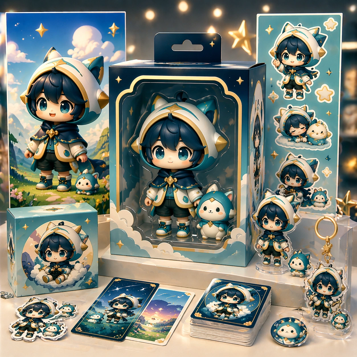
Scene: A square retail-ready campaign visual for Chibi Franchise Campaign Pack, combining cute character appeal with polished commercial presentation. The composition should feel like a high-finish launch board: crisp packaging edges, collectible object staging, clean shelf or poster context, and vivid but controlled color. It should be immediately legible from far away, but still dense with charming small details that reward closer inspection. Subject: Build the image around Premium Collab Box, a frame that elevates the same character system into a premium collaboration box visual. Translate Convert larger fictional universes into tightly art-directed chibi campaign systems that can span posters, stickers, key visuals, and merch-ready layouts. into one lovable mascot, figure, or product system that feels ready for posters, boxes, stickers, inserts, or point-of-sale material. The result should feel like a fresh research image with clear commercial focus rather than random fan art. The main subject must remain unmistakable even when surrounded by accessories and display pieces. Important details: Charm alone is not enough. Preserve clean silhouette recognition, convincing package construction, reliable prop scale, and structured layout logic so the image feels sellable. This theme studies style-transfer, multi-image-reference, commercial-mockup, structured-layout through a production-ready visual system. Avoid noisy clutter; every secondary element should reinforce collectibility, retail desirability, or explainer clarity. Aim for clear hierarchy, polished craft, and immediately usable campaign logic. Use case: Chibi Franchise Campaign Pack series study 4/4. Constraints: No readable text, no watermark, no logos, preserve exact 1:1 aspect ratio, no horror elements, no brand theft, no malformed packaging edges, no muddy mascot silhouette, no messy retail shelf, no chaotic prop overload.

Example generated from “Chibi Franchise Campaign Pack — Merch Preview”
GPT Image 2en

Scene: A square retail-ready campaign visual for Chibi Franchise Campaign Pack, combining cute character appeal with polished commercial presentation. The composition should feel like a high-finish launch board: crisp packaging edges, collectible object staging, clean shelf or poster context, and vivid but controlled color. It should be immediately legible from far away, but still dense with charming small details that reward closer inspection. Subject: Build the image around Merch Preview, a frame that a merchandise-forward visual showing accessories, stickers, tags, or bonus items. Translate Convert larger fictional universes into tightly art-directed chibi campaign systems that can span posters, stickers, key visuals, and merch-ready layouts. into one lovable mascot, figure, or product system that feels ready for posters, boxes, stickers, inserts, or point-of-sale material. The result should feel like a fresh research image with clear commercial focus rather than random fan art. The main subject must remain unmistakable even when surrounded by accessories and display pieces. Important details: Charm alone is not enough. Preserve clean silhouette recognition, convincing package construction, reliable prop scale, and structured layout logic so the image feels sellable. This theme studies style-transfer, multi-image-reference, commercial-mockup, structured-layout through a production-ready visual system. Avoid noisy clutter; every secondary element should reinforce collectibility, retail desirability, or explainer clarity. Aim for clear hierarchy, polished craft, and immediately usable campaign logic. Use case: Chibi Franchise Campaign Pack single study 2/5. Constraints: No readable text, no watermark, no logos, preserve exact 1:1 aspect ratio, no horror elements, no brand theft, no malformed packaging edges, no muddy mascot silhouette, no messy retail shelf, no chaotic prop overload.

Example generated from “Chibi Franchise Campaign Pack — Counter Display”
GPT Image 2en

Scene: A square retail-ready campaign visual for Chibi Franchise Campaign Pack, combining cute character appeal with polished commercial presentation. The composition should feel like a high-finish launch board: crisp packaging edges, collectible object staging, clean shelf or poster context, and vivid but controlled color. It should be immediately legible from far away, but still dense with charming small details that reward closer inspection. Subject: Build the image around Counter Display, a frame that a point-of-sale display study that proves the system can live in store. Translate Convert larger fictional universes into tightly art-directed chibi campaign systems that can span posters, stickers, key visuals, and merch-ready layouts. into one lovable mascot, figure, or product system that feels ready for posters, boxes, stickers, inserts, or point-of-sale material. The result should feel like a fresh research image with clear commercial focus rather than random fan art. The main subject must remain unmistakable even when surrounded by accessories and display pieces. Important details: Charm alone is not enough. Preserve clean silhouette recognition, convincing package construction, reliable prop scale, and structured layout logic so the image feels sellable. This theme studies style-transfer, multi-image-reference, commercial-mockup, structured-layout through a production-ready visual system. Avoid noisy clutter; every secondary element should reinforce collectibility, retail desirability, or explainer clarity. Aim for clear hierarchy, polished craft, and immediately usable campaign logic. Use case: Chibi Franchise Campaign Pack single study 3/5. Constraints: No readable text, no watermark, no logos, preserve exact 1:1 aspect ratio, no horror elements, no brand theft, no malformed packaging edges, no muddy mascot silhouette, no messy retail shelf, no chaotic prop overload.

Example generated from “Chibi Franchise Campaign Pack — Launch Poster”
GPT Image 2en

Scene: A square retail-ready campaign visual for Chibi Franchise Campaign Pack, combining cute character appeal with polished commercial presentation. The composition should feel like a high-finish launch board: crisp packaging edges, collectible object staging, clean shelf or poster context, and vivid but controlled color. It should be immediately legible from far away, but still dense with charming small details that reward closer inspection. Subject: Build the image around Launch Poster, a frame that a clean release poster with cute emotional pull and unmistakable product focus. Translate Convert larger fictional universes into tightly art-directed chibi campaign systems that can span posters, stickers, key visuals, and merch-ready layouts. into one lovable mascot, figure, or product system that feels ready for posters, boxes, stickers, inserts, or point-of-sale material. The result should feel like a fresh research image with clear commercial focus rather than random fan art. The main subject must remain unmistakable even when surrounded by accessories and display pieces. Important details: Charm alone is not enough. Preserve clean silhouette recognition, convincing package construction, reliable prop scale, and structured layout logic so the image feels sellable. This theme studies style-transfer, multi-image-reference, commercial-mockup, structured-layout through a production-ready visual system. Avoid noisy clutter; every secondary element should reinforce collectibility, retail desirability, or explainer clarity. Aim for clear hierarchy, polished craft, and immediately usable campaign logic. Use case: Chibi Franchise Campaign Pack single study 4/5. Constraints: No readable text, no watermark, no logos, preserve exact 1:1 aspect ratio, no horror elements, no brand theft, no malformed packaging edges, no muddy mascot silhouette, no messy retail shelf, no chaotic prop overload.

Example generated from “Chibi Franchise Campaign Pack — Collector Sheet”
GPT Image 2en

Scene: A square retail-ready campaign visual for Chibi Franchise Campaign Pack, combining cute character appeal with polished commercial presentation. The composition should feel like a high-finish launch board: crisp packaging edges, collectible object staging, clean shelf or poster context, and vivid but controlled color. It should be immediately legible from far away, but still dense with charming small details that reward closer inspection. Subject: Build the image around Collector Sheet, a frame that a collector-oriented overview image unifying variants, icons, and packaging cues. Translate Convert larger fictional universes into tightly art-directed chibi campaign systems that can span posters, stickers, key visuals, and merch-ready layouts. into one lovable mascot, figure, or product system that feels ready for posters, boxes, stickers, inserts, or point-of-sale material. The result should feel like a fresh research image with clear commercial focus rather than random fan art. The main subject must remain unmistakable even when surrounded by accessories and display pieces. Important details: Charm alone is not enough. Preserve clean silhouette recognition, convincing package construction, reliable prop scale, and structured layout logic so the image feels sellable. This theme studies style-transfer, multi-image-reference, commercial-mockup, structured-layout through a production-ready visual system. Avoid noisy clutter; every secondary element should reinforce collectibility, retail desirability, or explainer clarity. Aim for clear hierarchy, polished craft, and immediately usable campaign logic. Use case: Chibi Franchise Campaign Pack single study 5/5. Constraints: No readable text, no watermark, no logos, preserve exact 1:1 aspect ratio, no horror elements, no brand theft, no malformed packaging edges, no muddy mascot silhouette, no messy retail shelf, no chaotic prop overload.

Example generated from “Children Storybook Scene Page System — Reference Bedtime Spread”
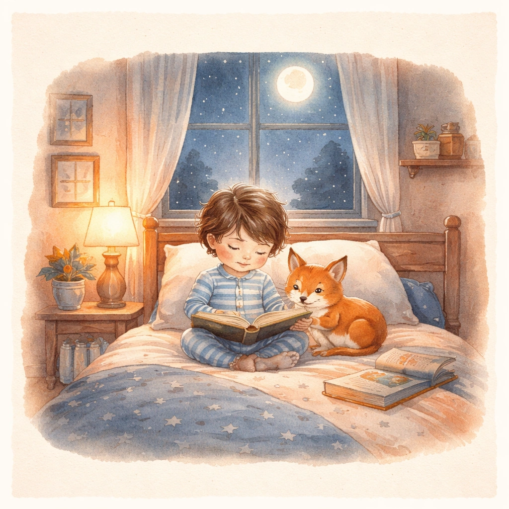
GPT Image 2en

Scene: Create a square view of an open storybook spread seen almost straight-on, as if photographed for a publisher presentation. The page should contain a warm painted bedroom scene with moonlit window light, soft gouache texture, rounded shapes, and calm negative space where short text could later be placed outside the illustration. Keep the square frame balanced, calm, and production-ready so the asset can serve gallery review, research comparison, and real educational delivery at the same time. Subject: Introduce one young child in striped pajamas and a small fox companion sharing a bedtime ritual among books, blankets, and quiet room objects. Their faces, proportions, clothing base, and emotional connection must be extremely clear, because every later spread in the series depends on recognizing the same pair immediately. The subject matter should feel intentionally selected for a coherent curriculum family rather than like a random decorative assortment. Important details: Keep the illustration style gentle and editorially controlled: layered watercolor-gouache surfaces, warm navy and apricot night tones, clean page gutters, and a balance between narrative detail and page readability. The spread should feel publishable for a contemporary children storybook, with emotional warmth and stable character identity. Preserve the same child protagonist, fox companion, brush texture, page framing, color family, and storybook page proportions from the reference spread. Use variation only in the teaching content, supporting props, and scene-specific mood while preserving the core visual system exactly. Use case: Children Storybook Scene Page System series study 1/4, reference bedtime spread. Constraints: No readable text, no watermark, no logos, preserve exact 1:1 aspect ratio, no readable story text, no logos, no celebrity resemblance, no harsh horror mood, no hyper-detailed realism, no extra main characters replacing the leads.

Example generated from “Children Storybook Scene Page System — Raincoat Puddle Walk”
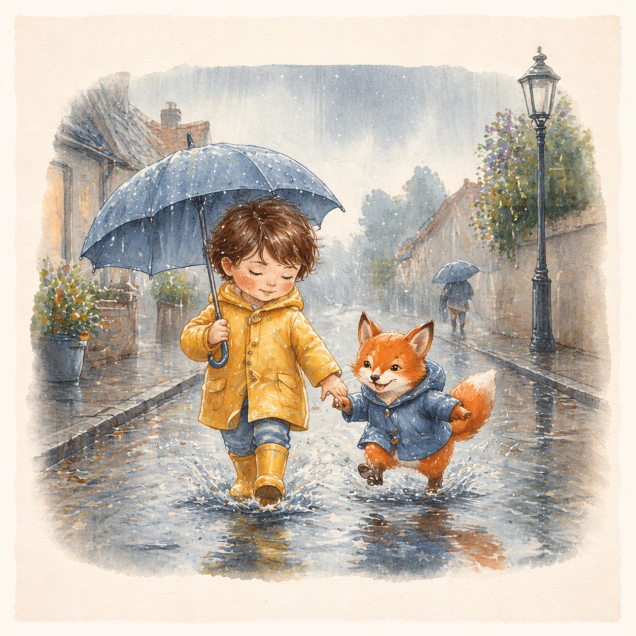
GPT Image 2en

Scene: Keep the same square open-book presentation, page framing, painted texture, and gutter proportions from the reference spread, but move the story into a rainy outdoor walk under silver morning light. The image should look like the next page of the same published picture book, not a separate illustration style. Keep the square frame balanced, calm, and production-ready so the asset can serve gallery review, research comparison, and real educational delivery at the same time. Subject: Show the same child and fox companion in rain gear splashing through puddles beside low houses, umbrellas, and reflective sidewalks. Their faces, body scale, and core visual identity must remain identical to the bedtime spread, even though the environment, weather, and motion become more active. The subject matter should feel intentionally selected for a coherent curriculum family rather than like a random decorative assortment. Important details: Preserve the same brush behavior, color-family logic, and page design system from the reference image. Let change come through weather, movement, and environmental storytelling, while the relationship and illustration language remain stable enough for seamless page-turn continuity. Preserve the same child protagonist, fox companion, brush texture, page framing, color family, and storybook page proportions from the reference spread. Use variation only in the teaching content, supporting props, and scene-specific mood while preserving the core visual system exactly. Use case: Children Storybook Scene Page System series study 2/4, raincoat puddle walk. Constraints: No readable text, no watermark, no logos, preserve exact 1:1 aspect ratio, no readable story text, no logos, no celebrity resemblance, no harsh horror mood, no hyper-detailed realism, no extra main characters replacing the leads.

Example generated from “Children Storybook Scene Page System — Library Hideaway”
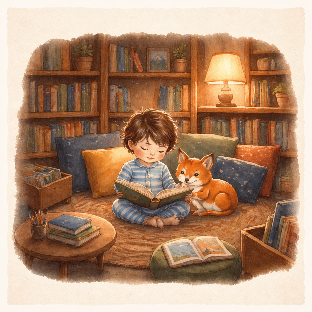
GPT Image 2en

Scene: Render the same square open-book view with matching page margins, soft paper texture, and storybook paint handling, now set inside a cozy children library under honey-colored lamp light. The spread should feel like a calm middle chapter that deepens the world without breaking style continuity. Keep the square frame balanced, calm, and production-ready so the asset can serve gallery review, research comparison, and real educational delivery at the same time. Subject: Place the same child and fox companion in a reading nook surrounded by shelves, cushions, low tables, and borrowed picture books. Their facial features, clothing base, and emotional bond must match the reference spread exactly, while the setting shifts to quiet discovery and concentration. The subject matter should feel intentionally selected for a coherent curriculum family rather than like a random decorative assortment. Important details: Maintain the established illustration logic from the reference image: gentle brushwork, rounded staging, warm educational atmosphere, and clear page composition. The library scene should feel narratively rich yet still leave visual breathing room for eventual typesetting outside the main art. Preserve the same child protagonist, fox companion, brush texture, page framing, color family, and storybook page proportions from the reference spread. Use variation only in the teaching content, supporting props, and scene-specific mood while preserving the core visual system exactly. Use case: Children Storybook Scene Page System series study 3/4, library hideaway. Constraints: No readable text, no watermark, no logos, preserve exact 1:1 aspect ratio, no readable story text, no logos, no celebrity resemblance, no harsh horror mood, no hyper-detailed realism, no extra main characters replacing the leads.

Example generated from “Children Storybook Scene Page System — Garden Evening Return”
GPT Image 2en

Scene: Return to the same square open-spread presentation and page-design proportions, but move the final scene into a dusky garden path leading home with lantern glow and gentle twilight colors. The image should feel like a soft closing spread from the same published story sequence. Keep the square frame balanced, calm, and production-ready so the asset can serve gallery review, research comparison, and real educational delivery at the same time. Subject: Show the same child and fox companion carrying gathered flowers and small discoveries back toward a warmly lit doorway. Their identities, proportions, clothing logic, and tenderness must remain fully consistent with the reference spread so the sequence reads as one continuous picture book. The subject matter should feel intentionally selected for a coherent curriculum family rather than like a random decorative assortment. Important details: Keep the painted style, page framing, and atmosphere anchored to the reference image while letting light, color temperature, and environmental closure create the sense of ending. The series should read as a coherent story-world ready for real book development. Preserve the same child protagonist, fox companion, brush texture, page framing, color family, and storybook page proportions from the reference spread. Use variation only in the teaching content, supporting props, and scene-specific mood while preserving the core visual system exactly. Use case: Children Storybook Scene Page System series study 4/4, garden evening return. Constraints: No readable text, no watermark, no logos, preserve exact 1:1 aspect ratio, no readable story text, no logos, no celebrity resemblance, no harsh horror mood, no hyper-detailed realism, no extra main characters replacing the leads.

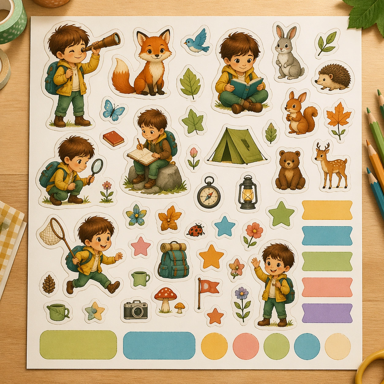
Example generated from “Children Storybook Scene Page System — Character Sticker Sheet”
GPT Image 2en

Scene: Show a square top-down sticker-sheet mockup on a craft table with gentle daylight and clean cut-line realism. The asset should feel like an activity-book insert or bookstore add-on product, with crisp edges and tidy spacing between the illustrated pieces. Keep the square frame balanced, calm, and production-ready so the asset can serve gallery review, research comparison, and real educational delivery at the same time. Subject: Fill the sheet with character poses, props, animals, stars, leaves, and small story-world objects drawn in the same warm painted language as a children picture book. Keep a few larger hero stickers and many small companion icons, all arranged with easy scanning and production polish. The subject arrangement should feel complete and self-contained, able to stand alone as a real supporting deliverable inside the same education business line. Important details: Use blank seal areas and color blocks instead of printed names. The sheet should bridge storytelling and activity design, proving the world can extend into playful educational surfaces. Keep the visual hierarchy modular, commercially believable, and clearly tied to a real educational use case rather than a generic mood board. Use case: Children Storybook Scene Page System single study 2/5, character sticker sheet. Constraints: No readable text, no watermark, no logos, preserve exact 1:1 aspect ratio, no readable text, no logos, no harsh realism, no licensed character resemblance, no cluttered scrapbook styling, no horror elements.

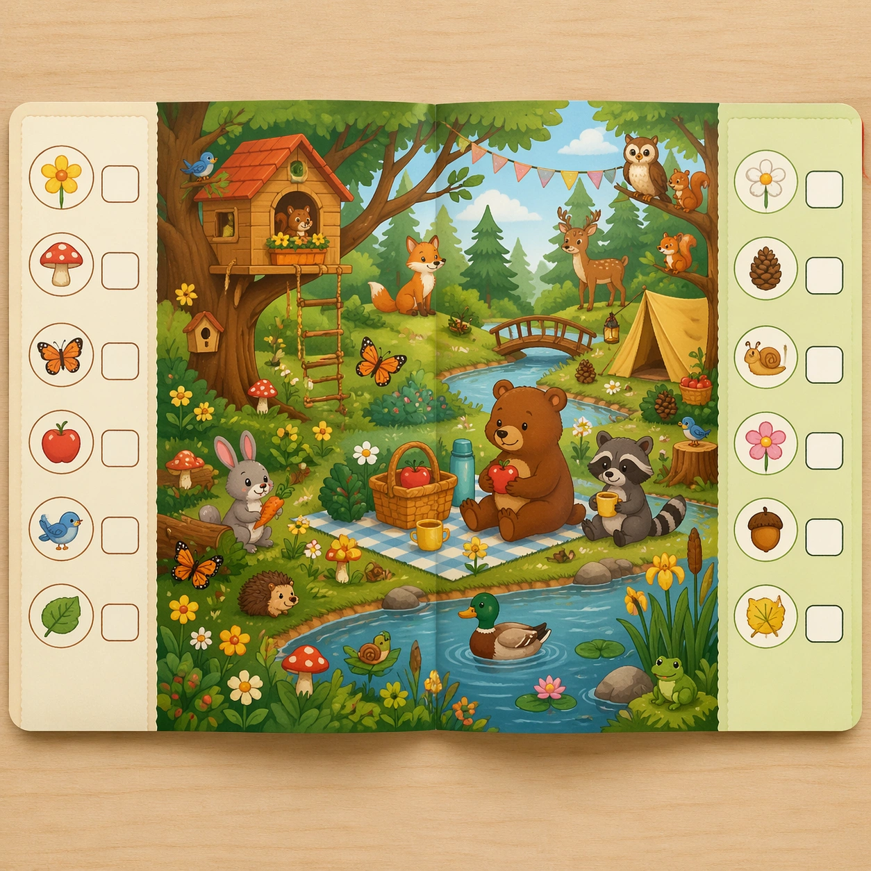
Example generated from “Children Storybook Scene Page System — Activity Search Page”
GPT Image 2en

Scene: Create a square open-page activity spread seen from above, printed on matte paper and lit like a premium workbook preview. The layout should feel playful but controlled, with one busy story scene balanced by blank instruction zones and small target-icon panels. Keep the square frame balanced, calm, and production-ready so the asset can serve gallery review, research comparison, and real educational delivery at the same time. Subject: Build a rich illustrated environment full of story objects, animals, and repeated motifs that children could search for visually. Use empty target boxes and pictorial cue circles instead of readable instructions, making the page useful across languages. The subject arrangement should feel complete and self-contained, able to stand alone as a real supporting deliverable inside the same education business line. Important details: The illustration should stay warm, child-friendly, and narratively coherent rather than random. The page must communicate focused play, observation, and gentle learning through composition alone. Keep the visual hierarchy modular, commercially believable, and clearly tied to a real educational use case rather than a generic mood board. Use case: Children Storybook Scene Page System single study 3/5, activity search page. Constraints: No readable text, no watermark, no logos, preserve exact 1:1 aspect ratio, no readable text, no logos, no harsh realism, no licensed character resemblance, no cluttered scrapbook styling, no horror elements.

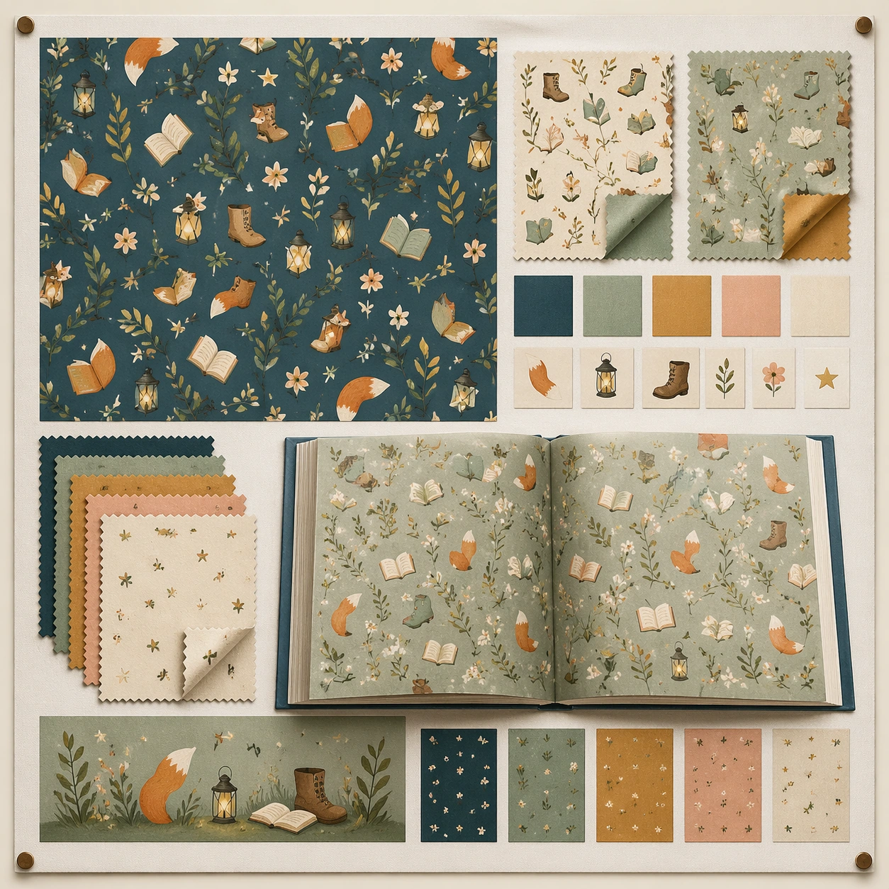
Example generated from “Children Storybook Scene Page System — Endpaper Pattern”
GPT Image 2en

Scene: Render a square pattern-board presentation as if pinned in a publishing design review, with printed swatches, folded corner samples, and soft neutral lighting. The composition should feel like an editorial materials board for a picture-book package. Keep the square frame balanced, calm, and production-ready so the asset can serve gallery review, research comparison, and real educational delivery at the same time. Subject: Use repeating motifs from a gentle story world such as fox tails, leaves, stars, boots, flowers, books, and lanterns, arranged into a seamless but characterful pattern. Include a few larger sample patches and one open book showing how the pattern could live on endpapers. The subject arrangement should feel complete and self-contained, able to stand alone as a real supporting deliverable inside the same education business line. Important details: Keep the pattern sophisticated enough for real publishing design while remaining friendly for children. The system should feel like a companion surface to story pages, not a separate decorative style. Keep the visual hierarchy modular, commercially believable, and clearly tied to a real educational use case rather than a generic mood board. Use case: Children Storybook Scene Page System single study 4/5, endpaper pattern. Constraints: No readable text, no watermark, no logos, preserve exact 1:1 aspect ratio, no readable text, no logos, no harsh realism, no licensed character resemblance, no cluttered scrapbook styling, no horror elements.

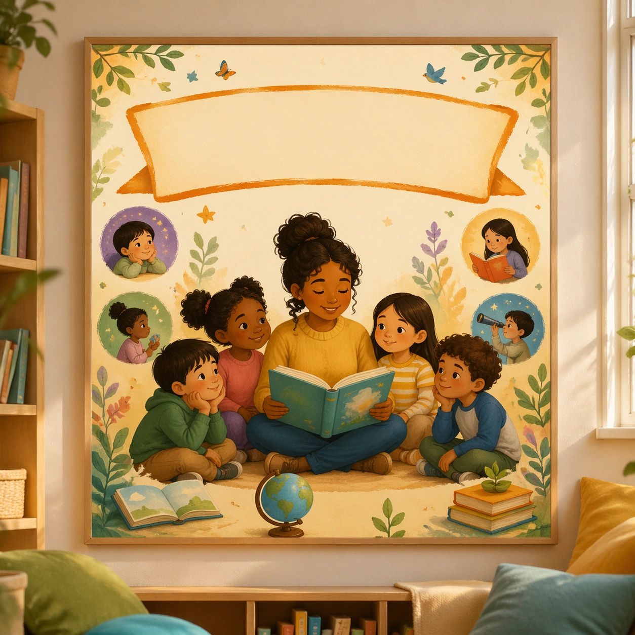
Example generated from “Children Storybook Scene Page System — Read-Aloud Poster”
GPT Image 2en

Scene: Show a square classroom poster mockup straight-on against a reading-corner wall with soft sunlight, low shelves, and cushions just out of focus. The poster should feel like a school literacy-culture asset built from the visual language of a beloved contemporary picture book. Keep the square frame balanced, calm, and production-ready so the asset can serve gallery review, research comparison, and real educational delivery at the same time. Subject: Center warm painted characters, a blank headline band, a few supporting spot illustrations, and an inviting group-reading mood. The composition should be bold enough to work on a wall but still intimate enough to suggest shared reading time. The subject arrangement should feel complete and self-contained, able to stand alone as a real supporting deliverable inside the same education business line. Important details: Keep the poster visually calm and publisher-quality, with strong hierarchy and no printed copy. It should prove the storybook system can extend into literacy promotion and classroom culture surfaces. Keep the visual hierarchy modular, commercially believable, and clearly tied to a real educational use case rather than a generic mood board. Use case: Children Storybook Scene Page System single study 5/5, read-aloud poster. Constraints: No readable text, no watermark, no logos, preserve exact 1:1 aspect ratio, no readable text, no logos, no harsh realism, no licensed character resemblance, no cluttered scrapbook styling, no horror elements.

Example generated from “Chinese Cultural Revolution Poster — Canonical One-Sheet”
GPT Image 2en

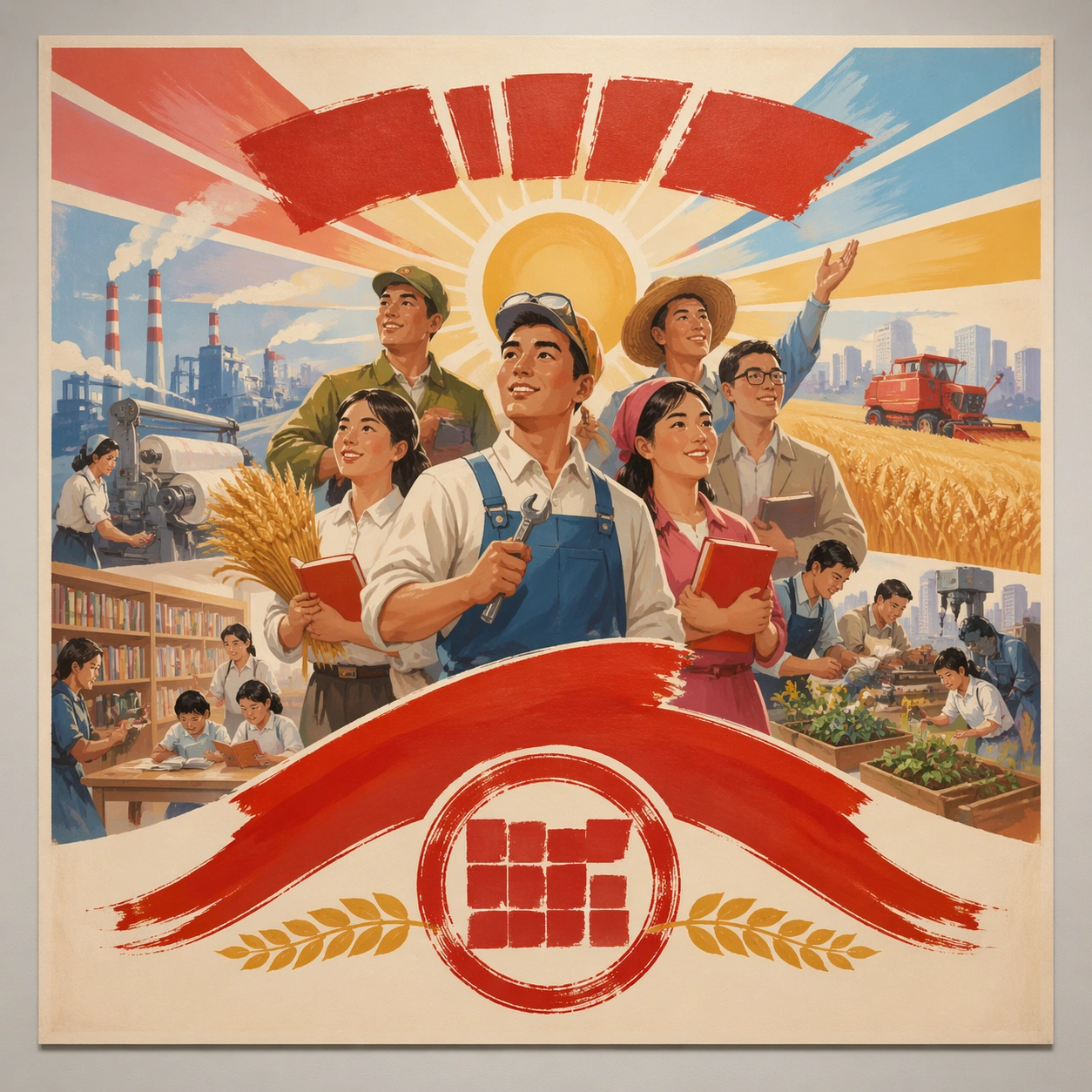
Scene: A square straight-on studio view of a pristine poster mounted on a matte wall with even museum lighting, crisp corners, and enough breathing room around the sheet for the full composition to read as an intentional object. The poster should express late-1970s handmade gouache poster language with bright optimism, grouped figures, clean silhouettes, and celebratory sunlit staging, using red, gold, sky blue, leaf green, cream, and warm skin tones painted opaquely and a tactile surface appropriate to the medium. Subject: Build the flagship poster statement for this style, with the strongest hierarchy, the clearest subject silhouette, and the most disciplined balance between image field, pseudo-typography, and empty space. Use workers, farmers, teachers, textile mills, books, wheat, machinery, and radiant sky bands as the main visual ingredients, and organize them with brush slogan panels and seal forms treated as non-readable compositional devices. For the contemporary-subject axis, thread in urban community gardens, public libraries, and makerspaces rendered through optimistic collective poster grammar. The poster must feel like an original design object rather than a reproduction of any known work. Important details: Treat this as the cleanest thesis image in the set: the paper should look fresh, the inks or paint should feel deliberate, and every formal rule of the style should be easy to study at a glance. Preserve uplifted expressions, gouache blending, clear grouping hierarchy, and warm public-education energy without specific portraiture. Keep every letterform abstract and non-readable, as if it were a typographic texture rather than language. Make the style unmistakable through composition, palette, surface behavior, and symbolic compression. no actual political portraits, no national emblem, no cynical decay, no muddy desaturated palette. Use case: Chinese 70s Poster single study 1/9, establishing the cleanest museum-grade poster reading. Constraints: No readable text, no watermark, no logos, preserve exact 1:1 aspect ratio, no copyrighted characters, no real brand marks, no QR codes, no interface chrome, no accidental gibberish lettering.
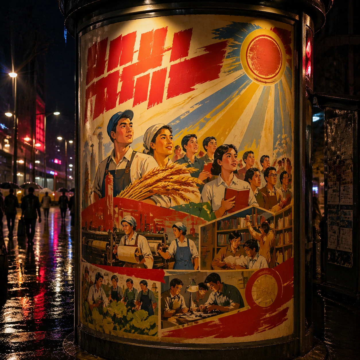
Example generated from “Chinese Cultural Revolution Poster — Print Proof Flatlay”
GPT Image 2en

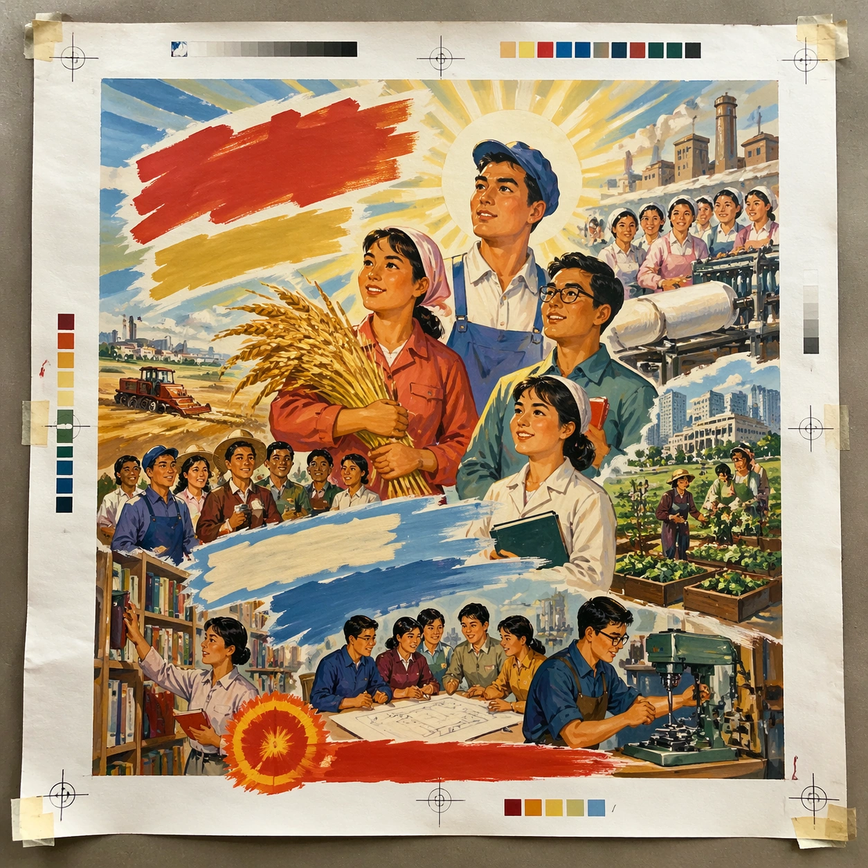
Scene: A square overhead tabletop photograph of a fresh poster proof on neutral worktable paper, lit by cool daylight, with crop marks, tape tabs, and slight paper bow visible around the sheet. The poster should express late-1970s handmade gouache poster language with bright optimism, grouped figures, clean silhouettes, and celebratory sunlit staging, using red, gold, sky blue, leaf green, cream, and warm skin tones painted opaquely and a tactile surface appropriate to the medium. Subject: Design the poster as a print-shop proof, preserving the same poster language while allowing production clues such as edge trims, registration targets, and process marks to frame the composition. Use workers, farmers, teachers, textile mills, books, wheat, machinery, and radiant sky bands as the main visual ingredients, and organize them with brush slogan panels and seal forms treated as non-readable compositional devices. For the contemporary-subject axis, thread in urban community gardens, public libraries, and makerspaces rendered through optimistic collective poster grammar. The poster must feel like an original design object rather than a reproduction of any known work. Important details: The image must still read as a finished poster concept, but it should carry believable print-process evidence and material tactility instead of gallery-wall perfection. Preserve uplifted expressions, gouache blending, clear grouping hierarchy, and warm public-education energy without specific portraiture. Keep every letterform abstract and non-readable, as if it were a typographic texture rather than language. Make the style unmistakable through composition, palette, surface behavior, and symbolic compression. no actual political portraits, no national emblem, no cynical decay, no muddy desaturated palette. Use case: Chinese 70s Poster single study 2/9, testing production realism and process evidence. Constraints: No readable text, no watermark, no logos, preserve exact 1:1 aspect ratio, no copyrighted characters, no real brand marks, no QR codes, no interface chrome, no accidental gibberish lettering.

Example generated from “Chinese Cultural Revolution Poster — Transit Lightbox”
GPT Image 2en

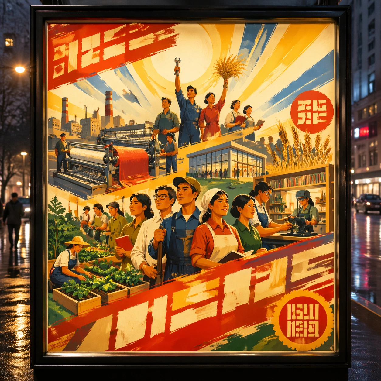
Scene: A square dusk street photograph of a backlit transit poster glowing inside glass, with faint rain reflections, soft city blur in the distance, and the poster remaining fully legible as a composition. The poster should express late-1970s handmade gouache poster language with bright optimism, grouped figures, clean silhouettes, and celebratory sunlit staging, using red, gold, sky blue, leaf green, cream, and warm skin tones painted opaquely and a tactile surface appropriate to the medium. Subject: Adapt the poster into a public-facing lightbox version that still honors the original style grammar while feeling bold enough to stop a passerby from several meters away. Use workers, farmers, teachers, textile mills, books, wheat, machinery, and radiant sky bands as the main visual ingredients, and organize them with brush slogan panels and seal forms treated as non-readable compositional devices. For the contemporary-subject axis, thread in urban community gardens, public libraries, and makerspaces rendered through optimistic collective poster grammar. The poster must feel like an original design object rather than a reproduction of any known work. Important details: Let the style survive the illumination test: color blocking, silhouette contrast, and abstract lettering should stay controlled under bright internal light and reflective glass. Preserve uplifted expressions, gouache blending, clear grouping hierarchy, and warm public-education energy without specific portraiture. Keep every letterform abstract and non-readable, as if it were a typographic texture rather than language. Make the style unmistakable through composition, palette, surface behavior, and symbolic compression. no actual political portraits, no national emblem, no cynical decay, no muddy desaturated palette. Use case: Chinese 70s Poster single study 3/9, testing distance readability in public display. Constraints: No readable text, no watermark, no logos, preserve exact 1:1 aspect ratio, no copyrighted characters, no real brand marks, no QR codes, no interface chrome, no accidental gibberish lettering.

Example generated from “Chinese Cultural Revolution Poster — Wheatpaste Wall Layer”
GPT Image 2en

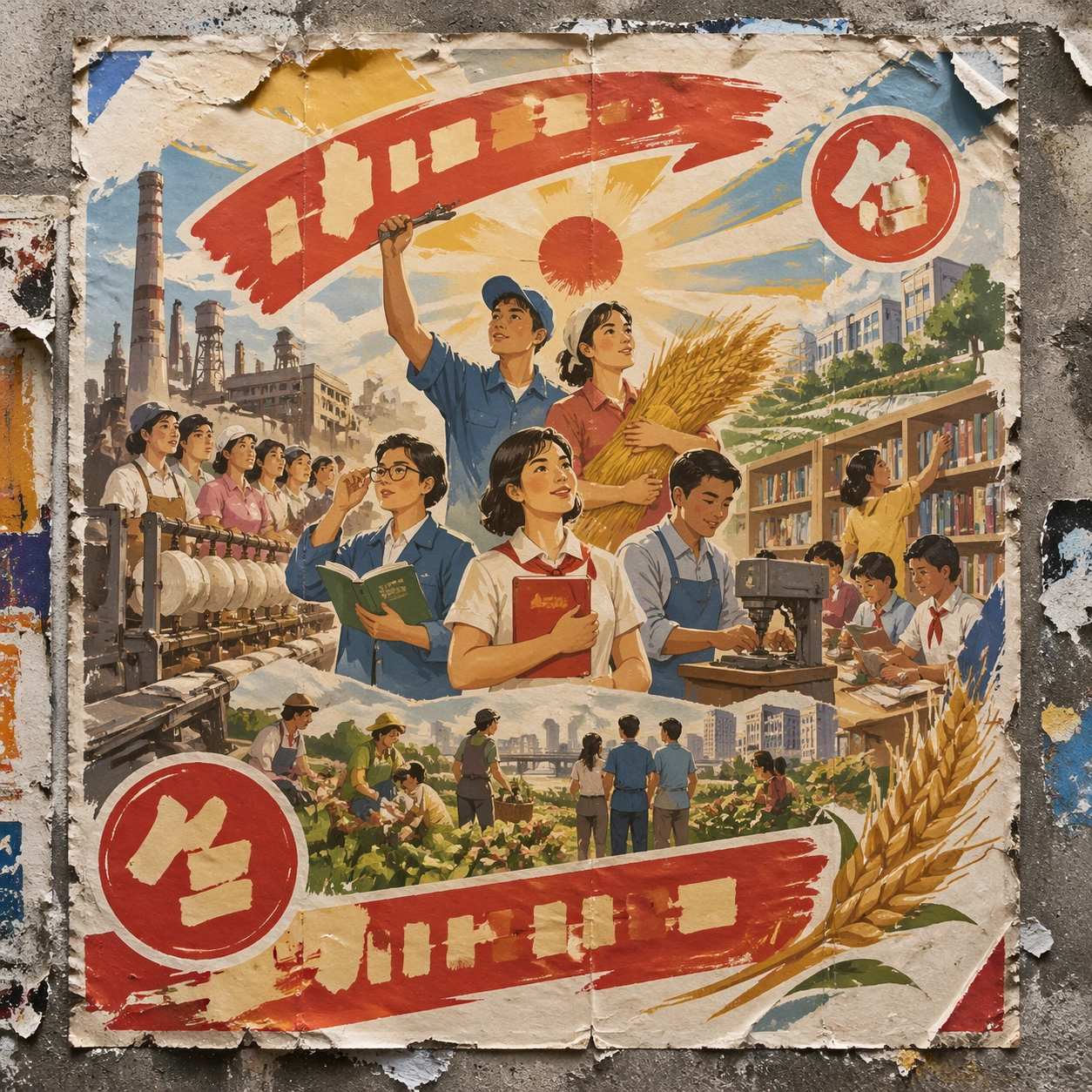
Scene: A square urban wall study with the poster pasted onto rough plaster among torn edges and older paper remnants, photographed in soft overcast light so texture, glue bubbles, and surface scars stay visible. The poster should express late-1970s handmade gouache poster language with bright optimism, grouped figures, clean silhouettes, and celebratory sunlit staging, using red, gold, sky blue, leaf green, cream, and warm skin tones painted opaquely and a tactile surface appropriate to the medium. Subject: Create a version that feels made for the street, with the poster carrying enough formal force to survive abrasion, layering, and imperfect placement without losing its visual identity. Use workers, farmers, teachers, textile mills, books, wheat, machinery, and radiant sky bands as the main visual ingredients, and organize them with brush slogan panels and seal forms treated as non-readable compositional devices. For the contemporary-subject axis, thread in urban community gardens, public libraries, and makerspaces rendered through optimistic collective poster grammar. The poster must feel like an original design object rather than a reproduction of any known work. Important details: Keep the main design intact but let the environment add grit: lifted corners, tiny tears, wrinkled paper, and older color fragments around the perimeter should amplify the style rather than dilute it. Preserve uplifted expressions, gouache blending, clear grouping hierarchy, and warm public-education energy without specific portraiture. Keep every letterform abstract and non-readable, as if it were a typographic texture rather than language. Make the style unmistakable through composition, palette, surface behavior, and symbolic compression. no actual political portraits, no national emblem, no cynical decay, no muddy desaturated palette. Use case: Chinese 70s Poster single study 4/9, testing street-life durability and layered context. Constraints: No readable text, no watermark, no logos, preserve exact 1:1 aspect ratio, no copyrighted characters, no real brand marks, no QR codes, no interface chrome, no accidental gibberish lettering.

Example generated from “Chinese Cultural Revolution Poster — Folded Archive Copy”
GPT Image 2en

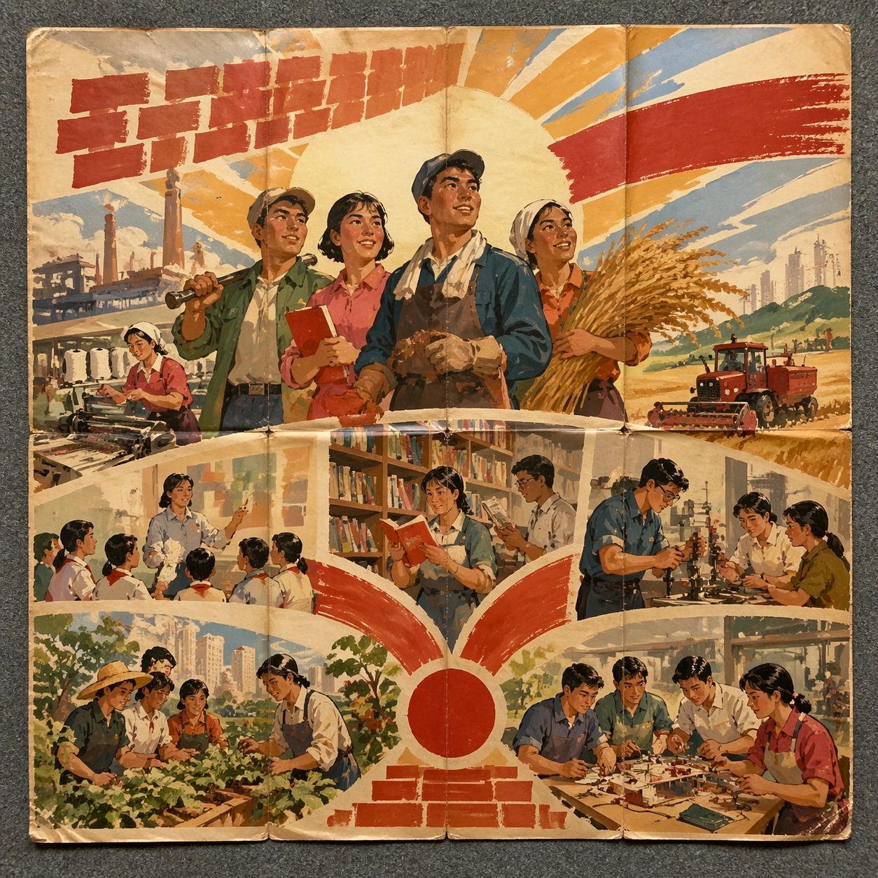
Scene: A square conservation-table view of a vintage poster laid on gray felt under raking light, with visible fold lines, softened corners, and subtle aging that still preserves the integrity of the image. The poster should express late-1970s handmade gouache poster language with bright optimism, grouped figures, clean silhouettes, and celebratory sunlit staging, using red, gold, sky blue, leaf green, cream, and warm skin tones painted opaquely and a tactile surface appropriate to the medium. Subject: Present the poster as an archive copy that has been stored, unfolded, and carefully documented, letting age and handling reveal how the design holds up across time. Use workers, farmers, teachers, textile mills, books, wheat, machinery, and radiant sky bands as the main visual ingredients, and organize them with brush slogan panels and seal forms treated as non-readable compositional devices. For the contemporary-subject axis, thread in urban community gardens, public libraries, and makerspaces rendered through optimistic collective poster grammar. The poster must feel like an original design object rather than a reproduction of any known work. Important details: Aging must stay believable rather than theatrical: slight yellowing, fold memory, edge wear, and pigment variation should support the historical or crafted feeling of the style. Preserve uplifted expressions, gouache blending, clear grouping hierarchy, and warm public-education energy without specific portraiture. Keep every letterform abstract and non-readable, as if it were a typographic texture rather than language. Make the style unmistakable through composition, palette, surface behavior, and symbolic compression. no actual political portraits, no national emblem, no cynical decay, no muddy desaturated palette. Use case: Chinese 70s Poster single study 5/9, testing archival endurance and age character. Constraints: No readable text, no watermark, no logos, preserve exact 1:1 aspect ratio, no copyrighted characters, no real brand marks, no QR codes, no interface chrome, no accidental gibberish lettering.

Example generated from “Chinese Cultural Revolution Poster — Twin Poster Diptych”
GPT Image 2en

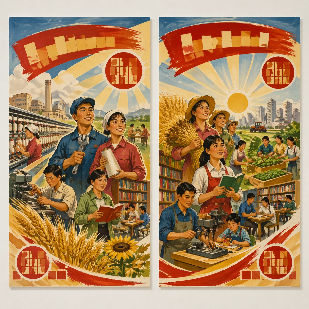
Scene: A square white-wall installation showing two companion posters hung side by side with equal spacing, photographed frontally so the pair reads as a designed conversation rather than two unrelated sheets. The poster should express late-1970s handmade gouache poster language with bright optimism, grouped figures, clean silhouettes, and celebratory sunlit staging, using red, gold, sky blue, leaf green, cream, and warm skin tones painted opaquely and a tactile surface appropriate to the medium. Subject: Compose a matched diptych: two posters sharing one style system while splitting the narrative across paired motifs, mirrored masses, or complementary color emphasis. Use workers, farmers, teachers, textile mills, books, wheat, machinery, and radiant sky bands as the main visual ingredients, and organize them with brush slogan panels and seal forms treated as non-readable compositional devices. For the contemporary-subject axis, thread in urban community gardens, public libraries, and makerspaces rendered through optimistic collective poster grammar. The poster must feel like an original design object rather than a reproduction of any known work. Important details: Both halves should feel distinct yet inseparable. Preserve one coherent visual language, but let each sheet carry its own focal symbol and rhythm without readable wording. Preserve uplifted expressions, gouache blending, clear grouping hierarchy, and warm public-education energy without specific portraiture. Keep every letterform abstract and non-readable, as if it were a typographic texture rather than language. Make the style unmistakable through composition, palette, surface behavior, and symbolic compression. no actual political portraits, no national emblem, no cynical decay, no muddy desaturated palette. Use case: Chinese 70s Poster single study 6/9, testing system flexibility across a paired set. Constraints: No readable text, no watermark, no logos, preserve exact 1:1 aspect ratio, no copyrighted characters, no real brand marks, no QR codes, no interface chrome, no accidental gibberish lettering.

Example generated from “Chinese Cultural Revolution Poster — Stacked Print Bundle”
GPT Image 2en

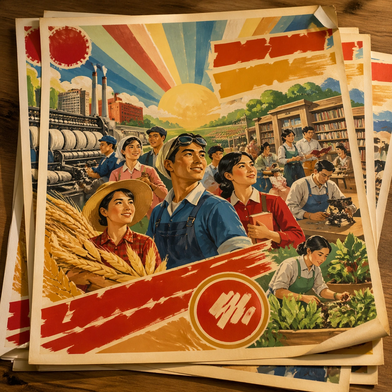
Scene: A square tabletop shot of several poster prints stacked and slightly fanned, with curled corners, offset edges, and soft directional light revealing paper thickness and ink behavior. The poster should express late-1970s handmade gouache poster language with bright optimism, grouped figures, clean silhouettes, and celebratory sunlit staging, using red, gold, sky blue, leaf green, cream, and warm skin tones painted opaquely and a tactile surface appropriate to the medium. Subject: Design the top poster to dominate while nearby duplicate sheets echo the same composition, creating a tactile print-run scene rather than a single isolated sheet. Use workers, farmers, teachers, textile mills, books, wheat, machinery, and radiant sky bands as the main visual ingredients, and organize them with brush slogan panels and seal forms treated as non-readable compositional devices. For the contemporary-subject axis, thread in urban community gardens, public libraries, and makerspaces rendered through optimistic collective poster grammar. The poster must feel like an original design object rather than a reproduction of any known work. Important details: Use the stack to emphasize production character: edge shadows, repeated motifs peeking from beneath, and subtle misalignment should enrich the material reading without changing the core design. Preserve uplifted expressions, gouache blending, clear grouping hierarchy, and warm public-education energy without specific portraiture. Keep every letterform abstract and non-readable, as if it were a typographic texture rather than language. Make the style unmistakable through composition, palette, surface behavior, and symbolic compression. no actual political portraits, no national emblem, no cynical decay, no muddy desaturated palette. Use case: Chinese 70s Poster single study 7/9, testing print-run tactility and repeat presence. Constraints: No readable text, no watermark, no logos, preserve exact 1:1 aspect ratio, no copyrighted characters, no real brand marks, no QR codes, no interface chrome, no accidental gibberish lettering.

Example generated from “Chinese Cultural Revolution Poster — Kiosk Night Glow”
GPT Image 2en

Scene: A square nighttime city view with the poster wrapping part of a cylindrical kiosk, wet pavement reflecting nearby light, and the composition holding together under moody urban illumination. The poster should express late-1970s handmade gouache poster language with bright optimism, grouped figures, clean silhouettes, and celebratory sunlit staging, using red, gold, sky blue, leaf green, cream, and warm skin tones painted opaquely and a tactile surface appropriate to the medium. Subject: Reframe the design for a dramatic street-placement context, where the poster has to project style and mood through reflection, curvature, and surrounding darkness. Use workers, farmers, teachers, textile mills, books, wheat, machinery, and radiant sky bands as the main visual ingredients, and organize them with brush slogan panels and seal forms treated as non-readable compositional devices. For the contemporary-subject axis, thread in urban community gardens, public libraries, and makerspaces rendered through optimistic collective poster grammar. The poster must feel like an original design object rather than a reproduction of any known work. Important details: The design should remain instantly recognizable despite the cylindrical wrap. Preserve major blocks, symbolic shapes, and abstract title forms so the style still feels authoritative at night. Preserve uplifted expressions, gouache blending, clear grouping hierarchy, and warm public-education energy without specific portraiture. Keep every letterform abstract and non-readable, as if it were a typographic texture rather than language. Make the style unmistakable through composition, palette, surface behavior, and symbolic compression. no actual political portraits, no national emblem, no cynical decay, no muddy desaturated palette. Use case: Chinese 70s Poster single study 8/9, testing atmospheric display under rain and glow. Constraints: No readable text, no watermark, no logos, preserve exact 1:1 aspect ratio, no copyrighted characters, no real brand marks, no QR codes, no interface chrome, no accidental gibberish lettering.

Example generated from “Chinese Cultural Revolution Poster — Contemporary Remix”
GPT Image 2en

Scene: A square front-facing poster presentation on a clean neutral wall, lit like a premium print test, with crisp edges and a polished but still tactile finish appropriate to the style. The poster should express late-1970s handmade gouache poster language with bright optimism, grouped figures, clean silhouettes, and celebratory sunlit staging, using red, gold, sky blue, leaf green, cream, and warm skin tones painted opaquely and a tactile surface appropriate to the medium. Subject: Apply the historical poster language to a contemporary urban subject so the old visual grammar proves it can carry present-day themes without losing authenticity or formal discipline. Use workers, farmers, teachers, textile mills, books, wheat, machinery, and radiant sky bands as the main visual ingredients, and organize them with brush slogan panels and seal forms treated as non-readable compositional devices. For the contemporary-subject axis, thread in urban community gardens, public libraries, and makerspaces rendered through optimistic collective poster grammar. The poster must feel like an original design object rather than a reproduction of any known work. Important details: This is not parody. The contemporary subject should feel genuinely absorbed into the style through palette, composition, symbolic compression, and non-readable lettering treatment. Preserve uplifted expressions, gouache blending, clear grouping hierarchy, and warm public-education energy without specific portraiture. Keep every letterform abstract and non-readable, as if it were a typographic texture rather than language. Make the style unmistakable through composition, palette, surface behavior, and symbolic compression. no actual political portraits, no national emblem, no cynical decay, no muddy desaturated palette. Use case: Chinese 70s Poster single study 9/9, testing historical grammar on a present-day subject. Constraints: No readable text, no watermark, no logos, preserve exact 1:1 aspect ratio, no copyrighted characters, no real brand marks, no QR codes, no interface chrome, no accidental gibberish lettering.

Example generated from “Chocolate Lacquer Sculpture — Lacquer Pedestal Anchor”
GPT Image 2en

Scene: Create a square competition-style pastry studio photograph with one sculptural chocolate showpiece on a dark pedestal against a controlled neutral or black backdrop. Softbox reflections should skim the tempered surfaces with glass-like sharpness, while shadows stay deep and elegant. The object must feel large, balanced, and professionally lit, as if documented after winning a grand pastry prize. Center one tall showpiece on a matte dark pedestal in a black studio, with large softboxes creating crisp controlled reflection bands across the tempered chocolate. The backdrop should remain quiet and deep so the sculpture reads as monumental. Subject: Build an abstract chocolate sculpture from sweeping arcs, a central mass, a few thin balancing elements, and restrained gold-leaf accents. The surfaces should vary from mirror-dark to satin brown, showing the complexity of temper and material thickness. The piece must feel poised between elegance and collapse without actually looking unstable. Important details: Tempered chocolate realism is critical: mirror reflections, crisp edges, matte-to-gloss transitions, gold leaf, sugar accents, and structural balance all need to feel plausible. The sculpture can be impossible in composition, but never sloppy in craft. Every support point and reflection line should suggest deliberate pastry engineering. This first image establishes the pedestal height, camera distance, reflection pattern, and competition-showpiece scale for the series. Every reflection line should confirm a clean tempered surface, and the balance of the sculpture should feel engineered even when visually daring. Use case: Chocolate lacquer sculpture series study 1/9, defining the anchor showpiece and studio reflection system. Constraints: No readable text, no watermark, no logos, preserve exact 1:1 aspect ratio, no candy-bar packaging cues, no readable competition banners, no cartoon dessert palette, no smudged fingerprints, no cluttered workshop background, no pastry-shop counter, no wrapper fragments, no readable award plaque.

Example generated from “Chocolate Lacquer Sculpture — Ribbon Arch Balance”
GPT Image 2en

Scene: Create a square competition-style pastry studio photograph with one sculptural chocolate showpiece on a dark pedestal against a controlled neutral or black backdrop. Softbox reflections should skim the tempered surfaces with glass-like sharpness, while shadows stay deep and elegant. The object must feel large, balanced, and professionally lit, as if documented after winning a grand pastry prize. Keep the exact pedestal, camera distance, black backdrop, and softbox reflection bands from the reference image so the sculpture series remains coherent. The light should travel clearly along long curved surfaces. Subject: Construct the showpiece from broad tempered chocolate ribbons looping into an arching form, punctuated by a few thin supports and delicate gold accents. The sculpture should feel aerodynamic and precise, with open negative space between the curved members. The balance must look improbable but still defensible. Important details: Tempered chocolate realism is critical: mirror reflections, crisp edges, matte-to-gloss transitions, gold leaf, sugar accents, and structural balance all need to feel plausible. The sculpture can be impossible in composition, but never sloppy in craft. Every support point and reflection line should suggest deliberate pastry engineering. Preserve exact pedestal scale, studio lighting, and reflection logic from the reference model while changing the geometry toward long continuous chocolate ribbons. Reflection lines should reveal perfect temper and clean curvature with no waviness. Use case: Chocolate lacquer sculpture series study 2/9, translating the anchor system into arched ribbon geometry. Constraints: No readable text, no watermark, no logos, preserve exact 1:1 aspect ratio, no candy-bar packaging cues, no readable competition banners, no cartoon dessert palette, no smudged fingerprints, no cluttered workshop background, no melted edge softness, no bakery dessert props, no colorful candy garnish.

Example generated from “Chocolate Lacquer Sculpture — Feather Spire Orbit”
GPT Image 2en

Scene: Create a square competition-style pastry studio photograph with one sculptural chocolate showpiece on a dark pedestal against a controlled neutral or black backdrop. Softbox reflections should skim the tempered surfaces with glass-like sharpness, while shadows stay deep and elegant. The object must feel large, balanced, and professionally lit, as if documented after winning a grand pastry prize. Maintain the exact pedestal height, camera distance, black studio depth, and softbox reflection structure from the reference image so the showpieces feel photographed under one competition setup. The mood should remain severe and elegant. Subject: Show a tall central spire of dark tempered chocolate surrounded by thinner feather-like blades and suspended circular elements that imply orbital motion. The sculpture should feel lighter and more vertical than the ribbon variation, with a disciplined mix of mirror-dark lacquer and selective gold leaf. Structural balance must remain convincing. Important details: Tempered chocolate realism is critical: mirror reflections, crisp edges, matte-to-gloss transitions, gold leaf, sugar accents, and structural balance all need to feel plausible. The sculpture can be impossible in composition, but never sloppy in craft. Every support point and reflection line should suggest deliberate pastry engineering. Preserve exact studio system and reflection logic from the reference model while shifting the geometry toward thin blades, slender spans, and vertical lift. Edge sharpness and support points are especially important so the sculpture does not feel digitally impossible. Use case: Chocolate lacquer sculpture series study 3/9, adapting the anchor showpiece into a slender spire and orbit structure. Constraints: No readable text, no watermark, no logos, preserve exact 1:1 aspect ratio, no candy-bar packaging cues, no readable competition banners, no cartoon dessert palette, no smudged fingerprints, no cluttered workshop background, no broken thin elements, no decorative sugar confetti, no text signage.

Example generated from “Chocolate Lacquer Sculpture — Amber Sugar Chocolate Fusion”
GPT Image 2en

Scene: Create a square competition-style pastry studio photograph with one sculptural chocolate showpiece on a dark pedestal against a controlled neutral or black backdrop. Softbox reflections should skim the tempered surfaces with glass-like sharpness, while shadows stay deep and elegant. The object must feel large, balanced, and professionally lit, as if documented after winning a grand pastry prize. Use the same pedestal, camera distance, and softbox reflection system from the reference image, but allow warm amber highlights to travel through translucent sugar components intertwined with dark chocolate. The black background should stay otherwise unchanged. Subject: Create a competition showpiece where dark lacquered chocolate arcs support or intersect with translucent amber sugar sails and a few tiny gold-leaf accents. The fusion should feel technically ambitious and balanced, with each material visibly performing a different structural role. The sculpture must remain elegant rather than decorative. Important details: Tempered chocolate realism is critical: mirror reflections, crisp edges, matte-to-gloss transitions, gold leaf, sugar accents, and structural balance all need to feel plausible. The sculpture can be impossible in composition, but never sloppy in craft. Every support point and reflection line should suggest deliberate pastry engineering. Preserve exact studio language and tempered reflection logic from the reference model while introducing translucent sugar that catches light in a different way from chocolate. The contrast between opaque lacquer and glowing amber should feel intentional and premium. Use case: Chocolate lacquer sculpture series study 4/9, concluding the anchor system with a chocolate-and-amber fusion showpiece. Constraints: No readable text, no watermark, no logos, preserve exact 1:1 aspect ratio, no candy-bar packaging cues, no readable competition banners, no cartoon dessert palette, no smudged fingerprints, no cluttered workshop background, no candy-store colors, no sticky caramel drip look, no festive cake decorations.

Example generated from “Chocolate Lacquer Sculpture — Tempering Reflection Test”
GPT Image 2en

Scene: Create a square competition-style pastry studio photograph with one sculptural chocolate showpiece on a dark pedestal against a controlled neutral or black backdrop. Softbox reflections should skim the tempered surfaces with glass-like sharpness, while shadows stay deep and elegant. The object must feel large, balanced, and professionally lit, as if documented after winning a grand pastry prize. Use a square dark-studio tabletop with neutral lighting and enough spacing for several geometric chocolate forms to sit like material samples. Reflection bands should remain the main graphic event across the objects. Subject: Arrange a few small tempered shapes such as spheres, cylinders, ribbons, and facets on the table, each showing a different reflection behavior. The setup should look like a pastry studio testing surface perfection before building a larger showpiece. The objects should feel disciplined, expensive, and purpose-built. Important details: Tempered chocolate realism is critical: mirror reflections, crisp edges, matte-to-gloss transitions, gold leaf, sugar accents, and structural balance all need to feel plausible. The sculpture can be impossible in composition, but never sloppy in craft. Every support point and reflection line should suggest deliberate pastry engineering. The key is comparative clarity: each form should reveal temper quality through different reflection curvature and edge sharpness. The image should feel like a material benchmark, not a product advertisement. Use case: Chocolate lacquer sculpture single study 6/9, turning surface-reflection testing into a refined studio still life. Constraints: No readable text, no watermark, no logos, preserve exact 1:1 aspect ratio, no candy-bar packaging cues, no readable competition banners, no cartoon dessert palette, no smudged fingerprints, no cluttered workshop background, no candy wrappers, no printed notes, no playful colorful toppings.

Example generated from “Chocolate Lacquer Sculpture — Competition Turntable View”
GPT Image 2en

Scene: Create a square competition-style pastry studio photograph with one sculptural chocolate showpiece on a dark pedestal against a controlled neutral or black backdrop. Softbox reflections should skim the tempered surfaces with glass-like sharpness, while shadows stay deep and elegant. The object must feel large, balanced, and professionally lit, as if documented after winning a grand pastry prize. Create a square studio shot of a chocolate sculpture on a rotating-display style base, with black surroundings and balanced front lighting. The base should feel professional and understated, never theatrical. Subject: Present one ambitious chocolate sculpture with clear front-facing symmetry and a few delicate outstretched elements, as if positioned for judging or documentation. Gold leaf, lacquer, and precise supports may accent the form. The work should feel like a competition finalist captured in a moment of stillness. Important details: Tempered chocolate realism is critical: mirror reflections, crisp edges, matte-to-gloss transitions, gold leaf, sugar accents, and structural balance all need to feel plausible. The sculpture can be impossible in composition, but never sloppy in craft. Every support point and reflection line should suggest deliberate pastry engineering. The image should balance pedestal presence with sculptural dominance. Lighting must flatter the temper while preserving enough shadow to keep the object dramatic and dimensional. Use case: Chocolate lacquer sculpture single study 7/9, documenting a judged showpiece on a quiet competition base. Constraints: No readable text, no watermark, no logos, preserve exact 1:1 aspect ratio, no candy-bar packaging cues, no readable competition banners, no cartoon dessert palette, no smudged fingerprints, no cluttered workshop background, no trophy text, no audience background, no confetti celebration.
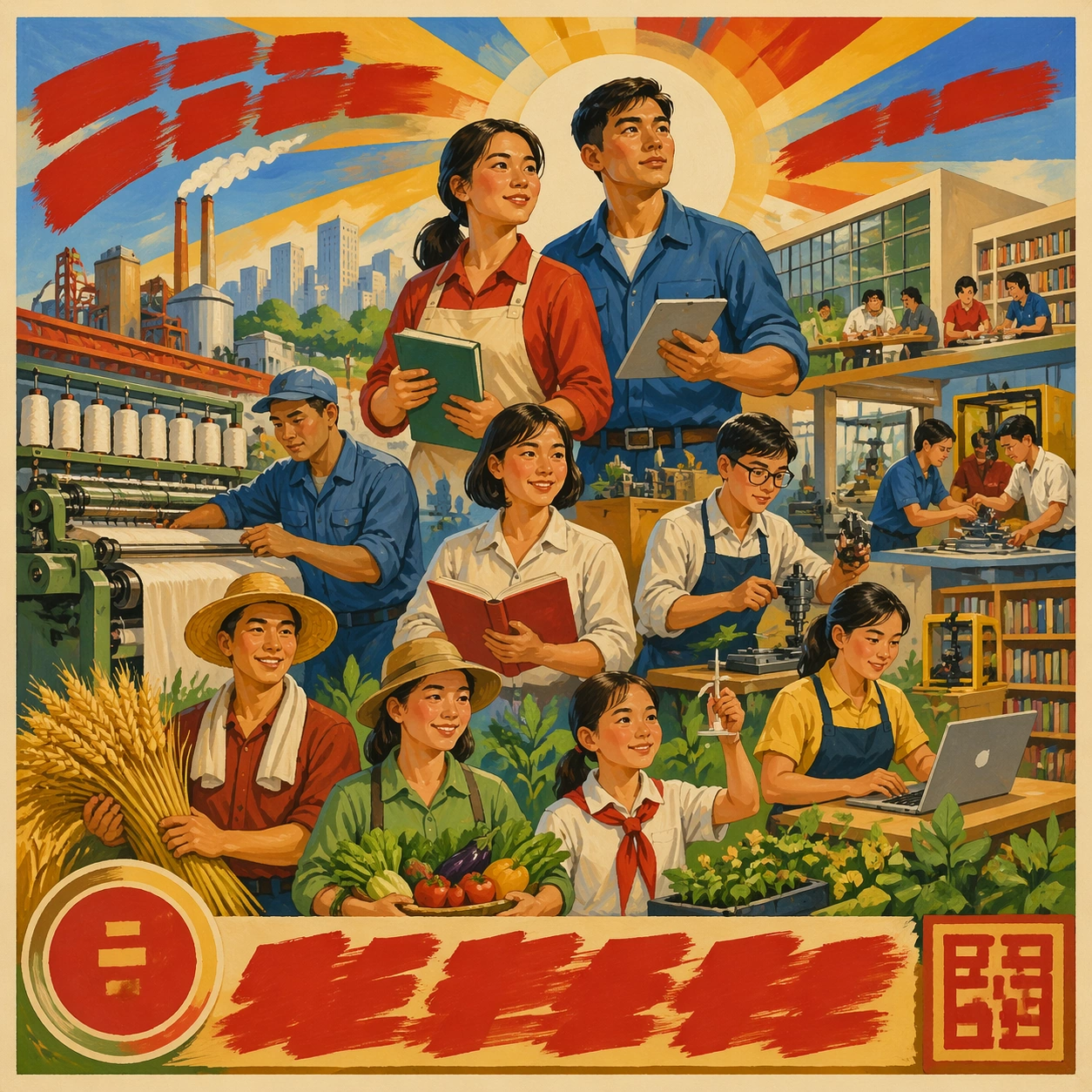
Example generated from “Chocolate Lacquer Sculpture — Exploded Structural Maquette”
GPT Image 2en

Scene: Create a square competition-style pastry studio photograph with one sculptural chocolate showpiece on a dark pedestal against a controlled neutral or black backdrop. Softbox reflections should skim the tempered surfaces with glass-like sharpness, while shadows stay deep and elegant. The object must feel large, balanced, and professionally lit, as if documented after winning a grand pastry prize. Use a square dark tabletop or neutral studio background with controlled light and enough breathing room for multiple components to float or rest in separated order. The composition should feel analytical and premium. Subject: Lay out or suspend the components of a showpiece in exploded order: curved chocolate arcs, slender supports, a base, amber sugar inserts, and a few metallic accents. The parts should feel engineered for assembly, like a pastry equivalent of an exploded product diagram but without text. The image must remain elegant and tactile. Important details: Tempered chocolate realism is critical: mirror reflections, crisp edges, matte-to-gloss transitions, gold leaf, sugar accents, and structural balance all need to feel plausible. The sculpture can be impossible in composition, but never sloppy in craft. Every support point and reflection line should suggest deliberate pastry engineering. Every component needs a credible structural purpose and a distinct material role. Reflection lines and cast shadows should help explain assembly logic without any labels. Use case: Chocolate lacquer sculpture single study 8/9, revealing the structural logic behind a competition showpiece. Constraints: No readable text, no watermark, no logos, preserve exact 1:1 aspect ratio, no candy-bar packaging cues, no readable competition banners, no cartoon dessert palette, no smudged fingerprints, no cluttered workshop background, no technical text callouts, no workshop mess, no plastic support rods.

Example generated from “Chocolate Lacquer Sculpture — Midnight Praline Monolith”
GPT Image 2en

Scene: Create a square competition-style pastry studio photograph with one sculptural chocolate showpiece on a dark pedestal against a controlled neutral or black backdrop. Softbox reflections should skim the tempered surfaces with glass-like sharpness, while shadows stay deep and elegant. The object must feel large, balanced, and professionally lit, as if documented after winning a grand pastry prize. Create a square black-studio photograph with one large monolithic chocolate form on a dark pedestal, using crisp softbox reflections and deep surrounding shadow. The mood should be midnight-dark and monumental. Subject: Build a dense sculptural mass from layered dark chocolate planes, with a few precise cuts, narrow openings, and restrained gold accents interrupting the volume. The monolith should feel heavy and stable, as if carved from tempered darkness. A few subtle praline-inspired cavity hints may appear within the structure. Important details: Tempered chocolate realism is critical: mirror reflections, crisp edges, matte-to-gloss transitions, gold leaf, sugar accents, and structural balance all need to feel plausible. The sculpture can be impossible in composition, but never sloppy in craft. Every support point and reflection line should suggest deliberate pastry engineering. The power of the image comes from weight, reflection, and controlled interruption. Make the mass feel undeniably chocolate while preserving the severe monumentality of the form. Use case: Chocolate lacquer sculpture single study 9/9, turning tempered chocolate into a monumental midnight monolith. Constraints: No readable text, no watermark, no logos, preserve exact 1:1 aspect ratio, no candy-bar packaging cues, no readable competition banners, no cartoon dessert palette, no smudged fingerprints, no cluttered workshop background, no cake-slice associations, no dessert plate context, no sugary decorations.


Example generated from “Christmas Retail Gifting Campaign — Evergreen Window Anchor”
GPT Image 2en

Scene: Create a square luxury retail campaign image staged like a flagship holiday window at blue hour. Use warm amber bulbs, soft snow haze outside the glass, deep spruce green, ribbon red, and brushed brass reflections. The camera should sit at a natural shopper eye level, with enough depth to feel like a real storefront but enough order that the frame reads as a polished hero asset for premium merchandising and gifting communication. Subject: Center stacked gift boxes, a hero hamper, evergreen garlands, velvet ribbons, matte ceramic ornaments, and a small amount of bakery or fragrance gifting cues arranged into one coherent Christmas retail composition. The objects should feel premium and tactile rather than toy-like. Build clear foreground, midground, and background layers so the viewer immediately reads wrapping quality, bundle hierarchy, and a believable in-store campaign language. Important details: Lock the campaign grammar here: pine texture, ribbon thickness, brass hardware, cream paper stock, amber lighting direction, and a refined balance between abundance and breathing room. Keep the gift architecture elegant and commercially usable, with no cluttered department-store chaos. Surfaces should feel physically real, gift-ready, and suitable for a reusable retail toolkit that could expand into web banners, window displays, and catalog covers. Use case: Christmas Retail series study 1/9. Constraints: No readable text, no watermark, no logos, preserve exact 1:1 aspect ratio, no character mascots, no cartoon sleigh clichés, no busy crowd, no branded packaging, no readable price cards, no excessive snowfall blocking the products, no cheap glitter explosion.

Example generated from “Christmas Retail Gifting Campaign — Premium Hamper Variation”
GPT Image 2en

Scene: Create a square dependent campaign visual inside the same flagship holiday retail world, but frame it slightly closer and lower so the hamper reads as the hero deliverable. Keep the same amber store light, spruce-and-brass palette, frosted window glow, and premium merchandising calm established by the reference image. The camera should feel physically related to the anchor rather than like a different brand or a different store. Subject: Feature a structured premium hamper with layered compartments, wrapped jars, folded linens, candles, confectionery tins, and evergreen sprigs gathered into one impressive Christmas gift bundle. Preserve the exact wrapping materials, ribbon character, ornament language, and display logic from the reference model while changing the assortment and scale emphasis. The hamper must feel giftable, tactile, and sellable rather than decorative only. Important details: Preserve exact palette blocking, material hierarchy, lighting direction, prop grammar, and retail warmth from the reference image. Only change the gifting tier and composition emphasis. Keep the hamper architecture disciplined, with visible premium surfaces, believable packing logic, and enough negative space that the bundle can function as a hero ad image. The final result should look like a high-conversion seasonal merchandising asset, not a random holiday still life. Use case: Christmas Retail series study 2/9. Constraints: No readable text, no watermark, no logos, preserve exact 1:1 aspect ratio, preserve exact campaign identity from the reference image, no unrelated toy props, no chaotic confetti, no crowd, no readable tags, no brand marks, no exaggerated fantasy snow, no color drift into neon.

Example generated from “Christmas Retail Gifting Campaign — Beauty Advent Variation”
GPT Image 2en

Scene: Create a square dependent Christmas beauty campaign scene in the same window-display environment, with the same eye-level perspective, amber lighting, and evergreen framing, but make the composition cleaner and more shelf-architected. Let reflective lacquer, cream paper, and brass details remain consistent with the reference while the scene shifts toward a prestige beauty gifting surface with tidy compartments and rhythmic repetition. Subject: Show an advent-style beauty gift presentation with small boxes, perfume-like silhouettes, candle vessels, satin pouches, and ribbon-wrapped bundles arranged in a premium stepped structure. Preserve the exact material language, color family, and ornament grammar from the reference image while changing the product category emphasis. The arrangement should feel refined, gift-forward, and immediately useful for holiday merchandising across display tables, social crops, and hero tiles. Important details: Hold the same campaign identity exactly: warm gold lighting, spruce accents, cream wrapping stock, elegant ribbon proportion, and calm premium composition. Introduce category specificity through form factor, not through branding or readable labels. Maintain believable packaging seams, soft reflections, and a luxurious but not overcrowded holiday rhythm. The viewer should understand that this is the same brand world translated into a beauty gifting expression. Use case: Christmas Retail series study 3/9. Constraints: No readable text, no watermark, no logos, preserve exact 1:1 aspect ratio, preserve exact campaign identity from the reference image, no readable beauty labels, no lipstick smears, no glossy magazine clutter, no unrelated fashion model, no logo embossing, no cheap glitter noise.

Example generated from “Christmas Retail Gifting Campaign — Cozy Home Bundle Variation”
GPT Image 2en

Scene: Create a square dependent holiday retail visual within the same flagship Christmas environment, but let the framing widen enough to include folded knit textures, candle glow, and tabletop warmth without losing the original store-window discipline. Keep the same amber illumination, spruce shadows, cream paper, brass accents, and tactile winter atmosphere from the reference image so the campaign world stays exact. Subject: Feature a cozy home gifting bundle composed of folded throws, ceramic mugs, candles, tea tins, small boxes, and wrapped comfort items presented as a premium seasonal set. Preserve exact wrapping logic, prop styling, and retail hierarchy from the reference image while shifting the category toward home comfort. The arrangement should feel curated, layered, and ready for catalog, gifting guide, or storefront reuse. Important details: The dependent image must inherit the anchor precisely: same palette balance, same lighting angle, same ribbon behavior, same evergreen usage, and the same calm commercial finish. Only the item mix and emotional register should move toward home warmth. Keep material realism persuasive, with believable knit texture, wax translucency, ceramic glaze, and paper folds. Nothing should read like a generic winter moodboard; it needs to feel like one coherent Christmas retail campaign extension. Use case: Christmas Retail series study 4/9. Constraints: No readable text, no watermark, no logos, preserve exact 1:1 aspect ratio, preserve exact campaign identity from the reference image, no people, no fireplace cliché, no branded mugs, no readable packaging, no plush toy mascot, no excess faux snow, no random rustic clutter.