Original document
GPT Image 2 · en
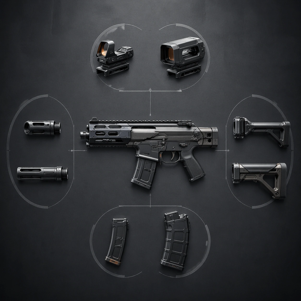
Scene:
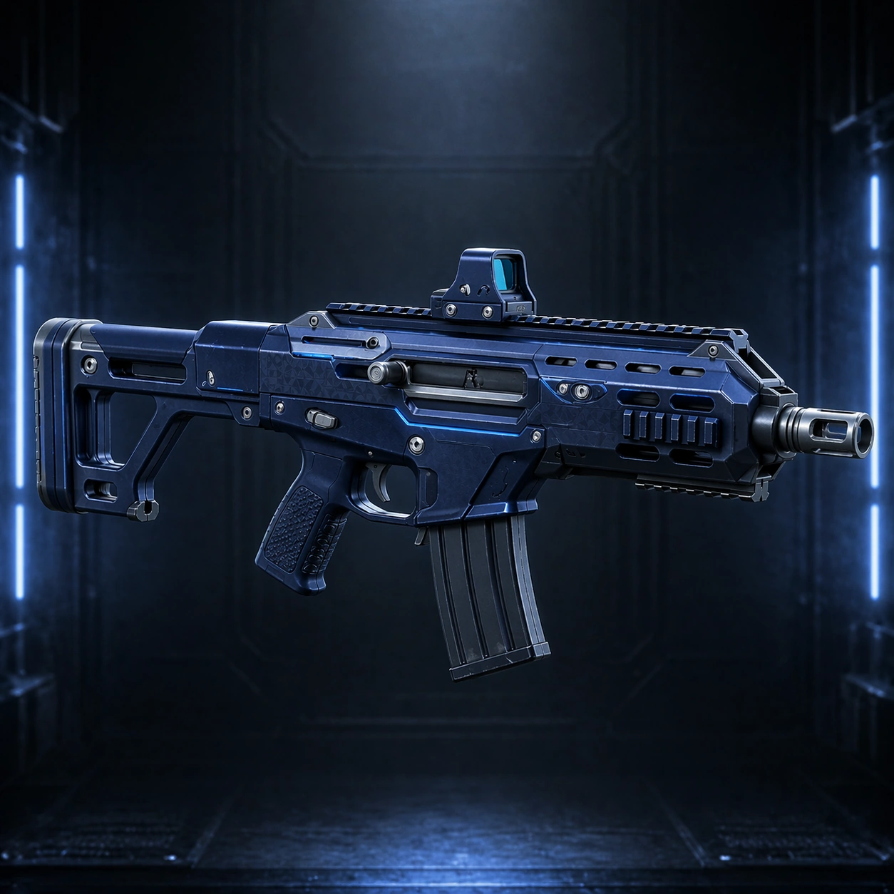
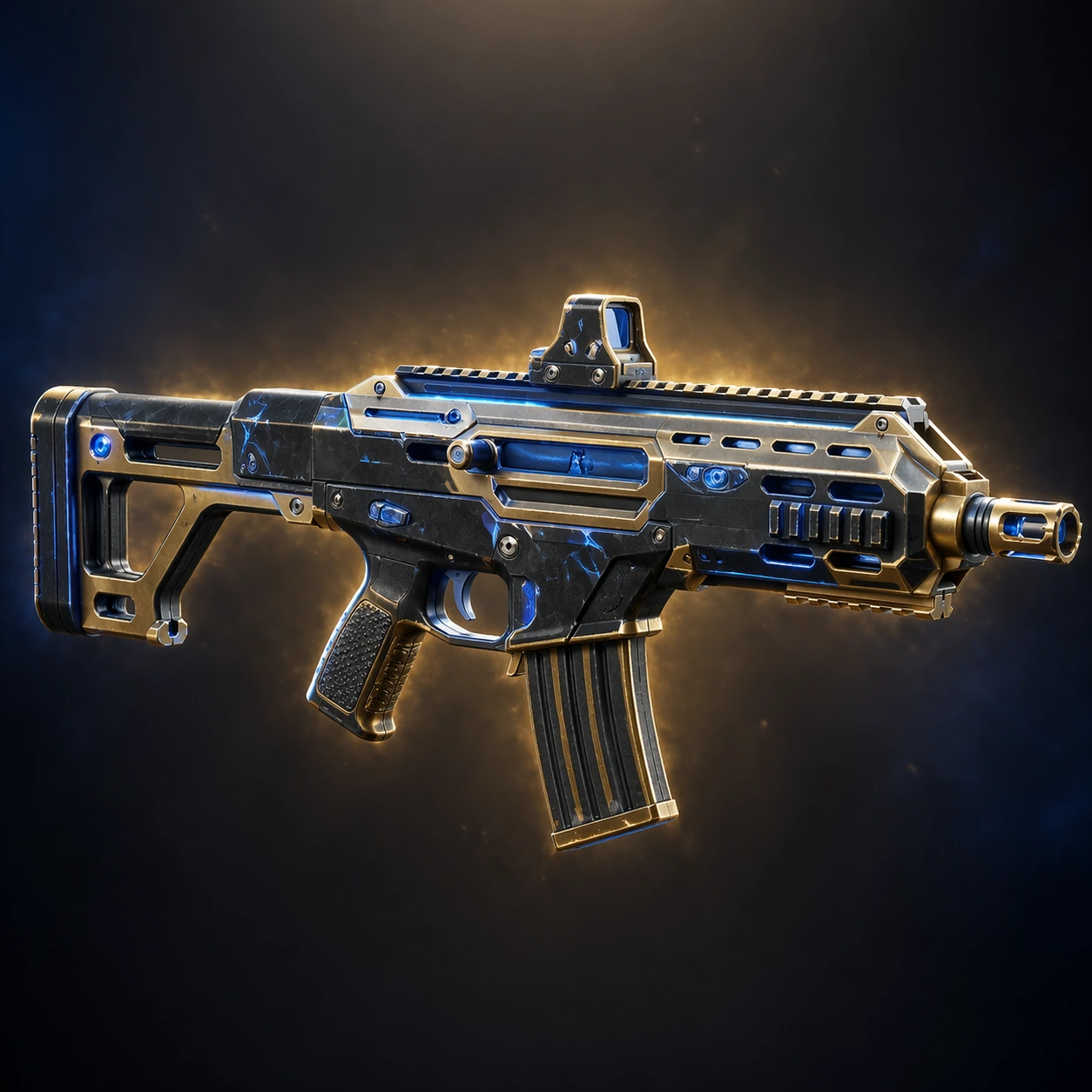
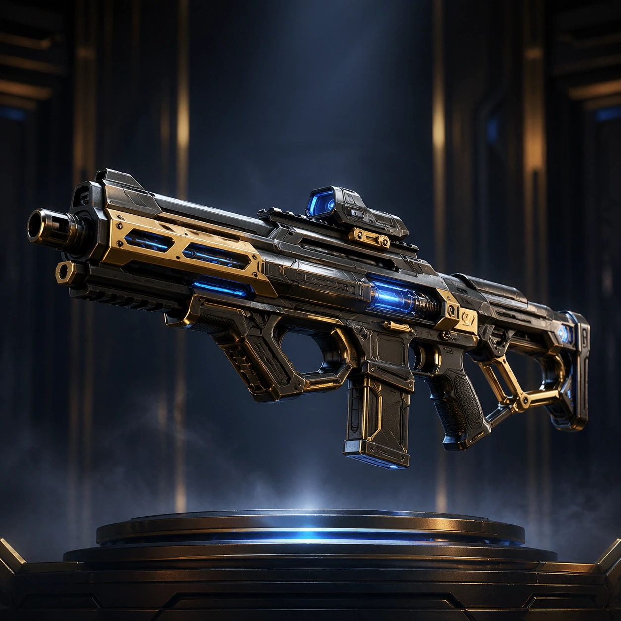
A square comparison layout on a muted industrial background with the base weapon centered and four attachment families arranged in disciplined radial clusters around it. Lighting is clean and analytical, like a polished UI marketing composite that still respects product photography principles.

Subject:
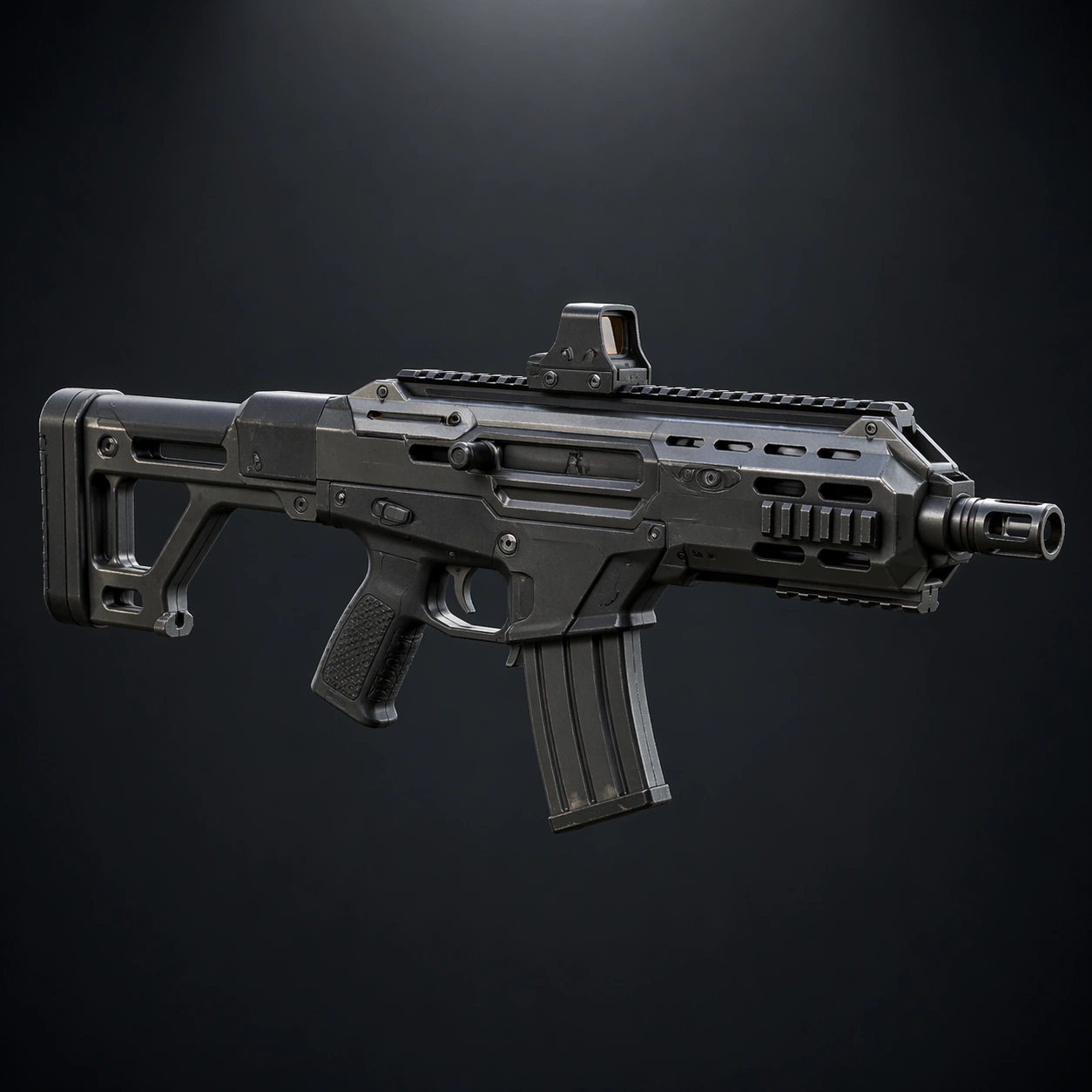
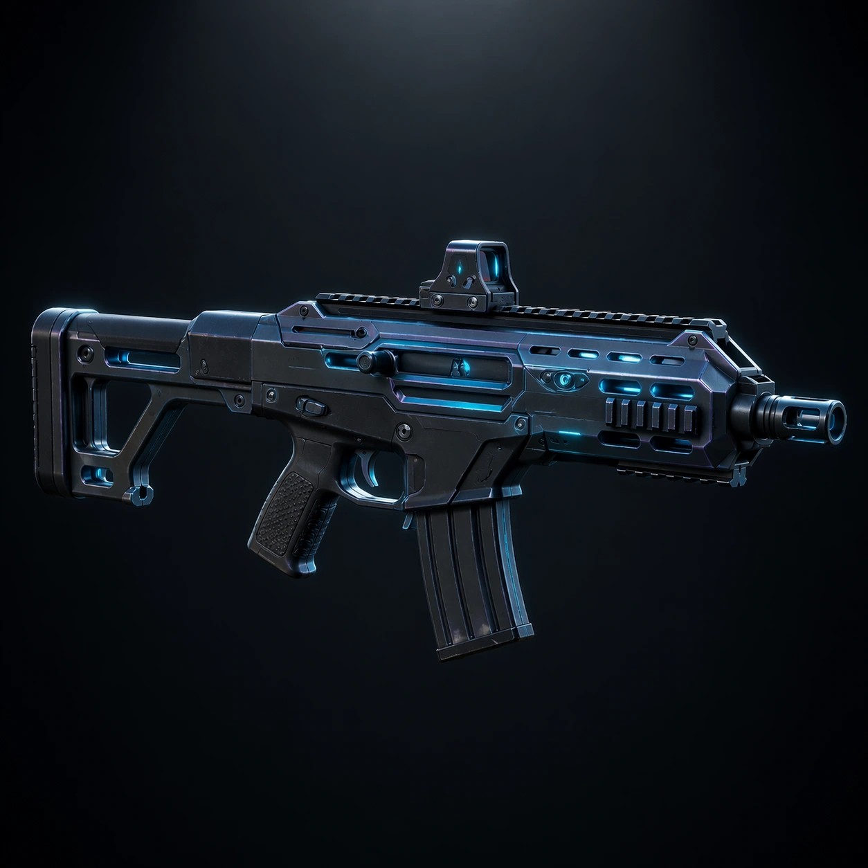
A fictional modular rifle platform accompanied by grouped attachment options: compact reflex optic versus enclosed sight hood, short compensator versus extended muzzle, folded skeletal stock versus reinforced brace, and slim magazine versus high-capacity magazine. The attachments should clearly belong to the same design family and feel ready for a shooter customization menu.

Important details:
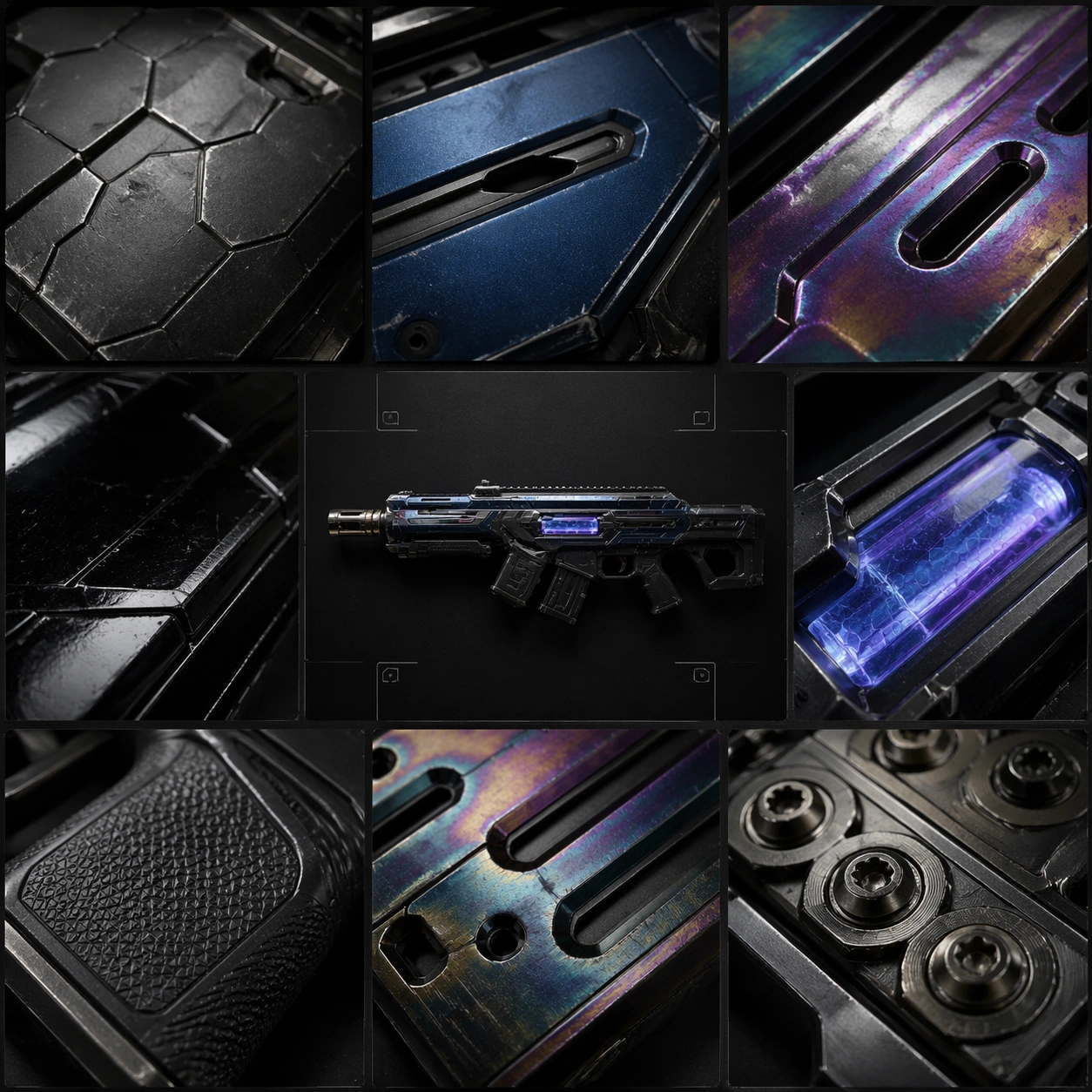
Make the comparison logic visually obvious through spacing, alignment, and tonal hierarchy rather than text. Each attachment group needs distinct silhouette differences and believable mounting interfaces. The central weapon should anchor the system, while the surrounding parts show customization breadth without turning the image into random clutter. Materials must stay consistent with a premium near-future armory aesthetic.

Use case:
Weapon Blueprint Rarity Ladder single study 9/9, summarizing modular customization options for armory and patch-note surfaces.

Constraints:
No readable text, no watermark, no logos, preserve exact 1:1 aspect ratio, no readable text, no cluttered sticker sheet feel, no hands, no battle background, no impossible connectors, no soft cartoon rendering, no broken geometry
How to use
- Copy the complete original prompt, including any parameters.
- Replace the subject, text and composition with your own requirements.
- Use a compatible external tool; check its current access conditions and review the result.
Before you start
- Check whether a reference image is required. A compatible model label does not mean this example was generated with that model.
- Keep names, figures and visible text accurate; results can vary between model versions.