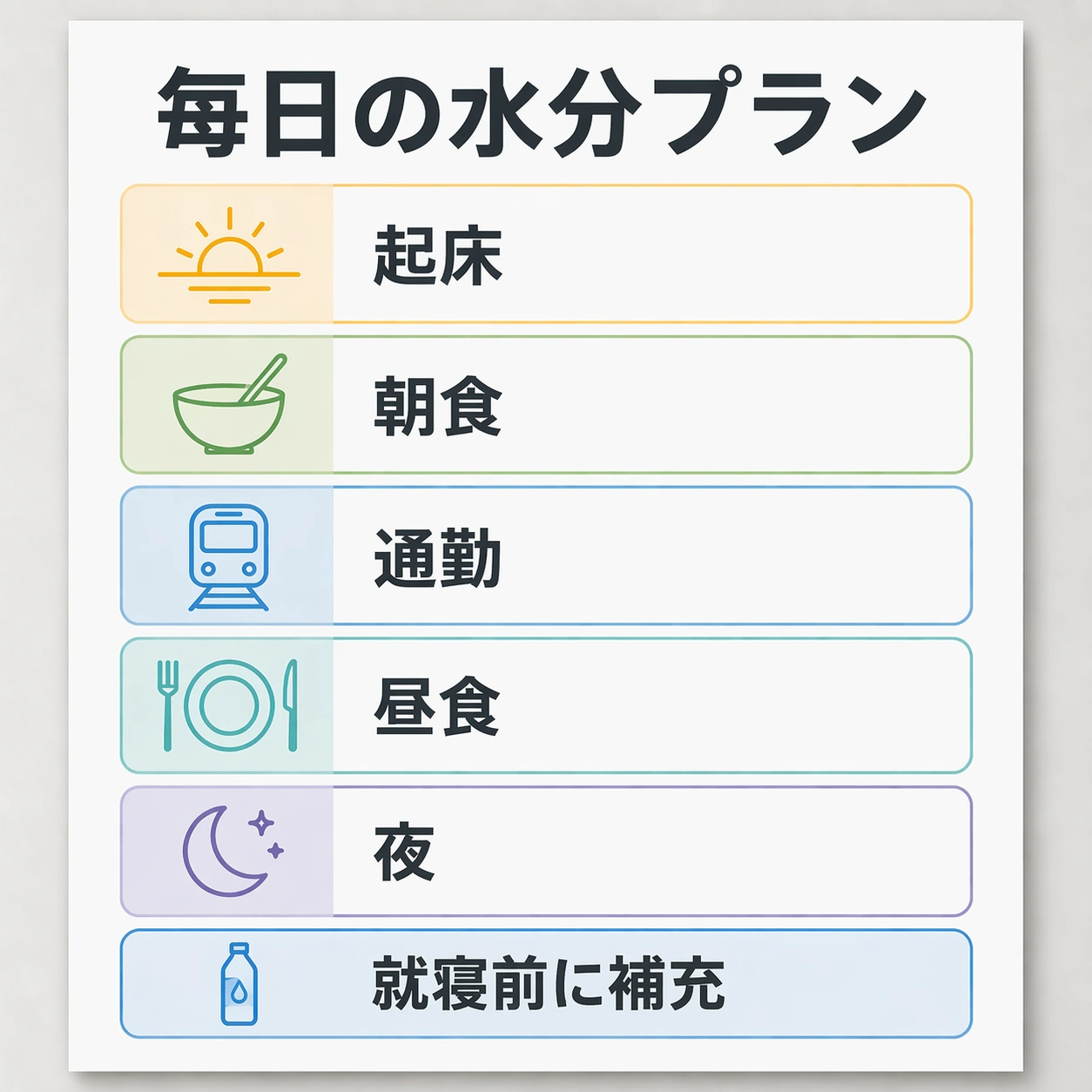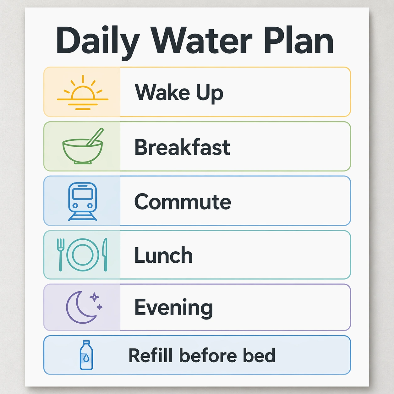
In Image Translation — Korean Localized Poster

In Image Translation — Korean Localized Poster

Original document

GPT Image 2 · en

Scene:
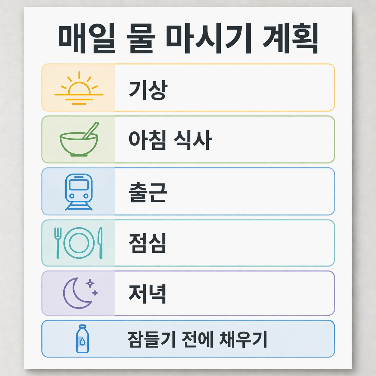
Use the reference image as the locked source poster. Maintain the same square, front-facing poster proof, neutral studio wall, bright even lighting, white card surfaces, graphite typography color, blue and green accent blocks, and warm yellow highlights. The finished result must feel like a Korean language export from the same design system.

Subject:
Replace only the English text with Korean. The exact readable Korean text must be: headline 매일 물 마시기 계획; card labels 기상, 아침 식사, 출근, 점심, 저녁; footer 잠들기 전에 채우기. Keep every phrase inside the same original text zone: the headline at the top, five schedule labels in the middle cards, and the footer in the bottom strip. Characters should be crisp Hangul, visually centered, and typeset with a clean sans serif rhythm.

Important details:
The challenge is to preserve typography and layout while the language changes length and density. Do not change the poster's card order, icon locations, container sizes, margin grid, background color, or visual hierarchy. The Korean text can use natural spacing, but it must keep the same baseline feeling and not collide with icons. Make the result inspectable as a before-and-after localization artifact.

Use case:
In-Image Translation series study 3/8, translating the source poster into Korean while preserving text boxes and composition.

Constraints:
No readable text except the specified Korean strings, no watermark, no logos, preserve exact 1:1 aspect ratio, no English leftovers, no garbled Hangul, no duplicate labels, no altered icons, no redesigned layout.

How to use

  1. Copy the complete original prompt, including any parameters.
  2. Replace the subject, text and composition with your own requirements.
  3. Use a compatible external tool; check its current access conditions and review the result.

Before you start

  • Check whether a reference image is required. A compatible model label does not mean this example was generated with that model.
  • Keep names, figures and visible text accurate; results can vary between model versions.
More like this

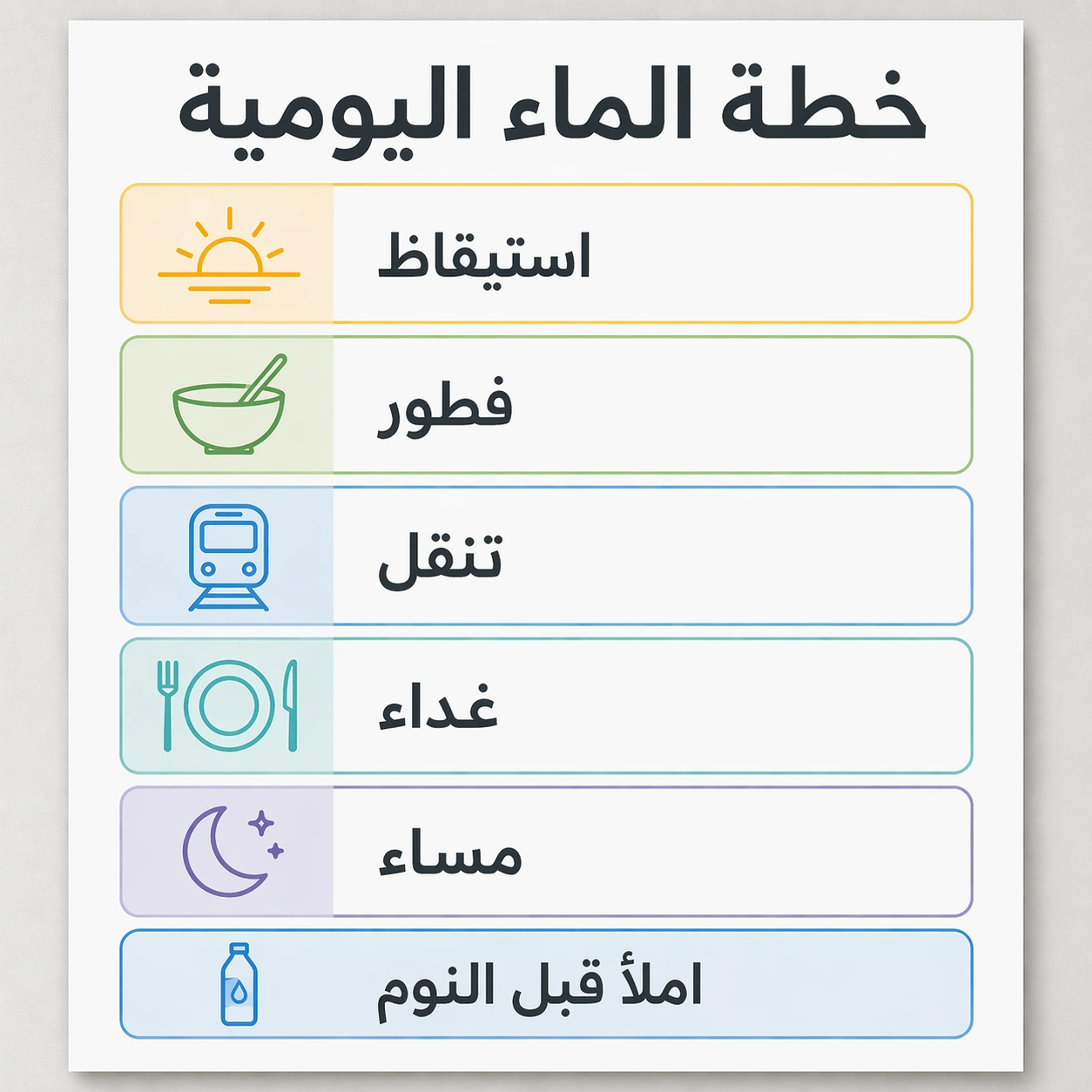
In Image Translation — Arabic Localized Poster
GPT Image 2en

Scene: Use the reference image as the locked source poster, but localize it for Arabic while keeping the square gallery crop and professional design proof quality. Preserve the same card grid, same soft gray wall, same white poster surface, same icon style, same blue, green, yell

In Image Translation — Japanese Localized Poster
GPT Image 2en

Scene: Use the reference image as the locked source poster. Keep the same square crop, same straight-on wall presentation, same color palette, same modular grid, same line icons, same card sizes, and same footer position. The image should look like the same design file after a pr

In Image Translation — English Source Poster
GPT Image 2en

Scene: A square product-design infographic poster, straight-on like a finished localization proof on a light gray studio wall. Use a calm modern palette of white, graphite, fresh blue, soft green, and warm yellow. The lighting is even and bright so every text block is legible. Th

In Image Translation — Transit Safety Panel
GPT Image 2en

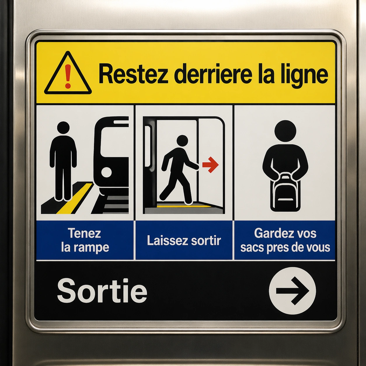
Scene: A square crop of a transit safety panel inside a clean metro carriage, photographed straight-on with stainless steel edges and soft overhead light. The panel is a finished public-information graphic with four pictogram boxes, a headline band, and a lower instruction strip.

In Image Translation — Ingredient Label Sheet
GPT Image 2en

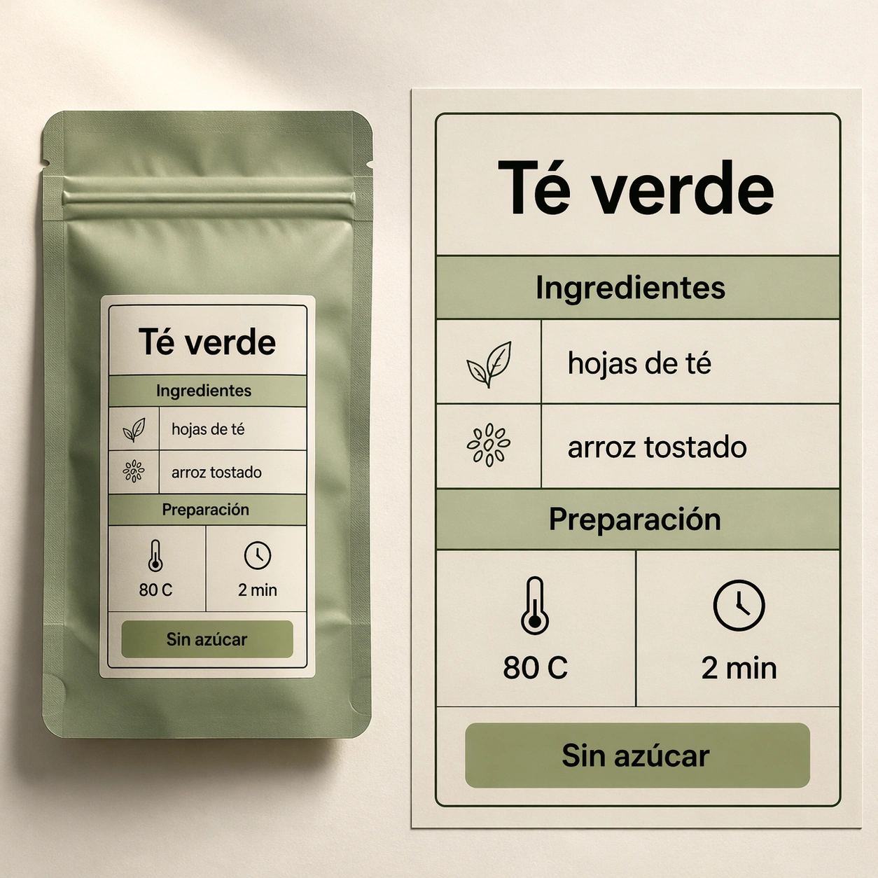
Scene: A square studio photograph style image of a premium tea pouch lying flat beside a magnified label proof sheet. The background is warm off-white paper, lit from the upper left with soft shadows. The design language is commercial packaging: clean black text, sage green block

In Image Translation — App Onboarding Board
GPT Image 2en

Scene: A square product mockup showing four mobile app onboarding screens laid out on a white design board. The board is viewed straight-on with subtle paper grain, soft shadows under each phone frame, and a restrained digital palette of black, white, teal, coral, and pale lavend