PROMPTS · CREATIVE EXPLORATION

Prompt Gallery

Explore real prompts and their generated examples. Find inspiration for your next creative mission and copy the complete prompt for free.

Examples
10,974
Models
17
Sources
1277
10,974 prompt examples · page 23 of 229
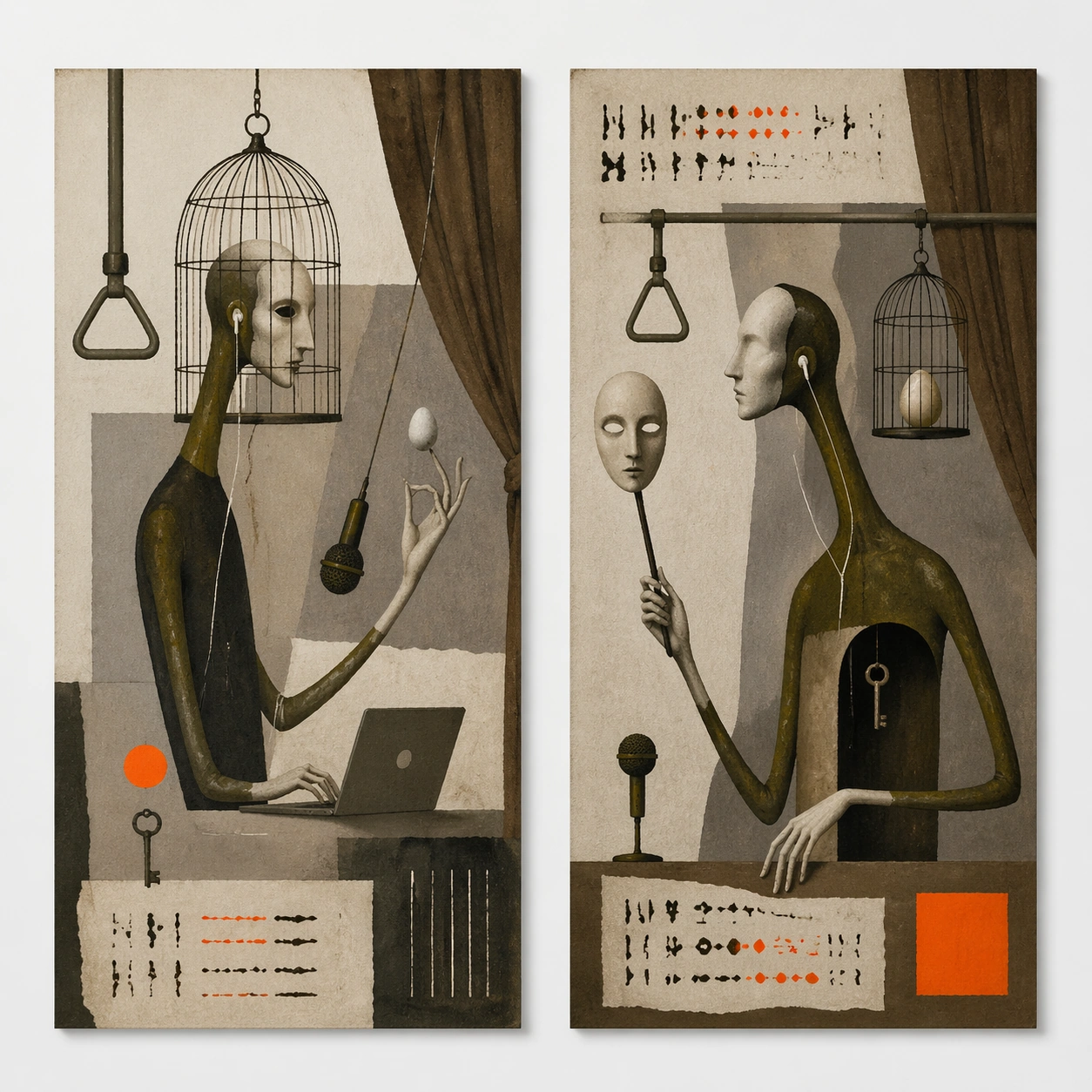
Example generated from “Polish Poster Surrealist — Twin Poster Diptych”
GPT Image 2en

Scene: A square white-wall installation showing two companion posters hung side by side with equal spacing, photographed frontally so the pair reads as a designed conversation rather than two unrelated sheets. The poster should express dry surreal theatre-poster logic using one impossible symbol, large mute fields, and an intellectual deadpan mood, using ash gray, olive, umber, bone, and a single acid orange or neon pink accent and a tactile surface appropriate to the medium. Subject: Compose a matched diptych: two posters sharing one style system while splitting the narrative across paired motifs, mirrored masses, or complementary color emphasis. Use elongated limbs, bird cages, eggs, microphones, masks, curtains, keys, and impossible body-object hybrids as the main visual ingredients, and organize them with quiet hand-drawn title blocks used as texture and spacing devices rather than readable type. For the contemporary-subject axis, thread in remote-work objects, earbuds, and subway handles fused into a deadpan surreal theatre metaphor. The poster must feel like an original design object rather than a reproduction of any known work. Important details: Both halves should feel distinct yet inseparable. Preserve one coherent visual language, but let each sheet carry its own focal symbol and rhythm without readable wording. Preserve symbolic compression, painterly paper tooth, sparse composition, and one decisive accent color. Keep every letterform abstract and non-readable, as if it were a typographic texture rather than language. Make the style unmistakable through composition, palette, surface behavior, and symbolic compression. no crowded collage, no glamour sheen, no literal plot illustration, no cheerful advertising tone. Use case: Polish Surrealist single study 6/9, testing system flexibility across a paired set. Constraints: No readable text, no watermark, no logos, preserve exact 1:1 aspect ratio, no copyrighted characters, no real brand marks, no QR codes, no interface chrome, no accidental gibberish lettering.
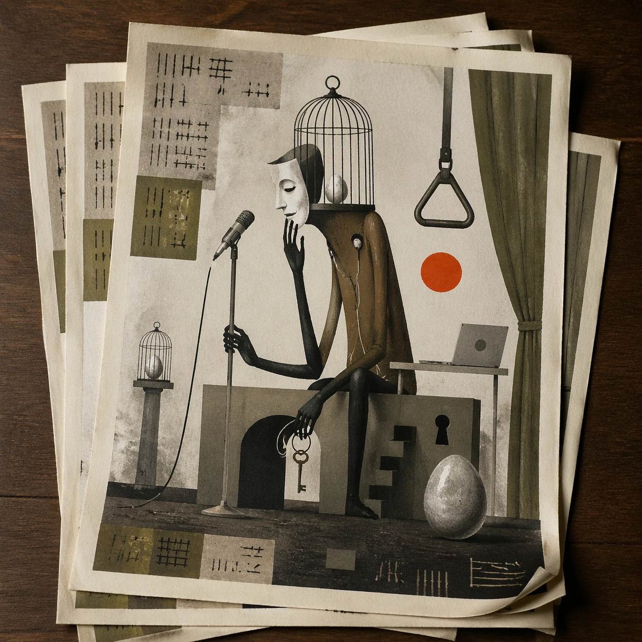
Example generated from “Polish Poster Surrealist — Stacked Print Bundle”
GPT Image 2en

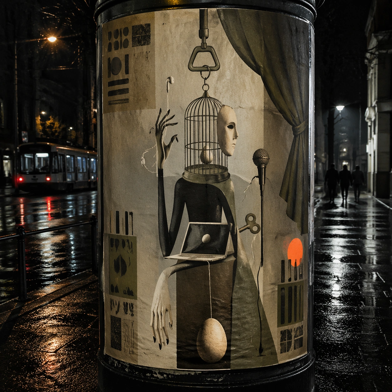
Scene: A square tabletop shot of several poster prints stacked and slightly fanned, with curled corners, offset edges, and soft directional light revealing paper thickness and ink behavior. The poster should express dry surreal theatre-poster logic using one impossible symbol, large mute fields, and an intellectual deadpan mood, using ash gray, olive, umber, bone, and a single acid orange or neon pink accent and a tactile surface appropriate to the medium. Subject: Design the top poster to dominate while nearby duplicate sheets echo the same composition, creating a tactile print-run scene rather than a single isolated sheet. Use elongated limbs, bird cages, eggs, microphones, masks, curtains, keys, and impossible body-object hybrids as the main visual ingredients, and organize them with quiet hand-drawn title blocks used as texture and spacing devices rather than readable type. For the contemporary-subject axis, thread in remote-work objects, earbuds, and subway handles fused into a deadpan surreal theatre metaphor. The poster must feel like an original design object rather than a reproduction of any known work. Important details: Use the stack to emphasize production character: edge shadows, repeated motifs peeking from beneath, and subtle misalignment should enrich the material reading without changing the core design. Preserve symbolic compression, painterly paper tooth, sparse composition, and one decisive accent color. Keep every letterform abstract and non-readable, as if it were a typographic texture rather than language. Make the style unmistakable through composition, palette, surface behavior, and symbolic compression. no crowded collage, no glamour sheen, no literal plot illustration, no cheerful advertising tone. Use case: Polish Surrealist single study 7/9, testing print-run tactility and repeat presence. Constraints: No readable text, no watermark, no logos, preserve exact 1:1 aspect ratio, no copyrighted characters, no real brand marks, no QR codes, no interface chrome, no accidental gibberish lettering.
Example generated from “Polish Poster Surrealist — Kiosk Night Glow”
GPT Image 2en

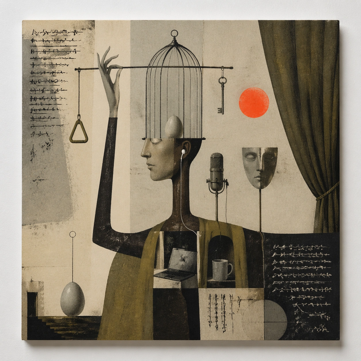
Scene: A square nighttime city view with the poster wrapping part of a cylindrical kiosk, wet pavement reflecting nearby light, and the composition holding together under moody urban illumination. The poster should express dry surreal theatre-poster logic using one impossible symbol, large mute fields, and an intellectual deadpan mood, using ash gray, olive, umber, bone, and a single acid orange or neon pink accent and a tactile surface appropriate to the medium. Subject: Reframe the design for a dramatic street-placement context, where the poster has to project style and mood through reflection, curvature, and surrounding darkness. Use elongated limbs, bird cages, eggs, microphones, masks, curtains, keys, and impossible body-object hybrids as the main visual ingredients, and organize them with quiet hand-drawn title blocks used as texture and spacing devices rather than readable type. For the contemporary-subject axis, thread in remote-work objects, earbuds, and subway handles fused into a deadpan surreal theatre metaphor. The poster must feel like an original design object rather than a reproduction of any known work. Important details: The design should remain instantly recognizable despite the cylindrical wrap. Preserve major blocks, symbolic shapes, and abstract title forms so the style still feels authoritative at night. Preserve symbolic compression, painterly paper tooth, sparse composition, and one decisive accent color. Keep every letterform abstract and non-readable, as if it were a typographic texture rather than language. Make the style unmistakable through composition, palette, surface behavior, and symbolic compression. no crowded collage, no glamour sheen, no literal plot illustration, no cheerful advertising tone. Use case: Polish Surrealist single study 8/9, testing atmospheric display under rain and glow. Constraints: No readable text, no watermark, no logos, preserve exact 1:1 aspect ratio, no copyrighted characters, no real brand marks, no QR codes, no interface chrome, no accidental gibberish lettering.
Example generated from “Polish Poster Surrealist — Contemporary Remix”
GPT Image 2en

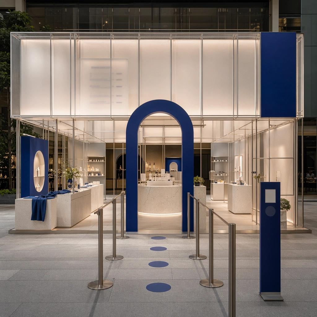
Scene: A square front-facing poster presentation on a clean neutral wall, lit like a premium print test, with crisp edges and a polished but still tactile finish appropriate to the style. The poster should express dry surreal theatre-poster logic using one impossible symbol, large mute fields, and an intellectual deadpan mood, using ash gray, olive, umber, bone, and a single acid orange or neon pink accent and a tactile surface appropriate to the medium. Subject: Apply the historical poster language to a contemporary urban subject so the old visual grammar proves it can carry present-day themes without losing authenticity or formal discipline. Use elongated limbs, bird cages, eggs, microphones, masks, curtains, keys, and impossible body-object hybrids as the main visual ingredients, and organize them with quiet hand-drawn title blocks used as texture and spacing devices rather than readable type. For the contemporary-subject axis, thread in remote-work objects, earbuds, and subway handles fused into a deadpan surreal theatre metaphor. The poster must feel like an original design object rather than a reproduction of any known work. Important details: This is not parody. The contemporary subject should feel genuinely absorbed into the style through palette, composition, symbolic compression, and non-readable lettering treatment. Preserve symbolic compression, painterly paper tooth, sparse composition, and one decisive accent color. Keep every letterform abstract and non-readable, as if it were a typographic texture rather than language. Make the style unmistakable through composition, palette, surface behavior, and symbolic compression. no crowded collage, no glamour sheen, no literal plot illustration, no cheerful advertising tone. Use case: Polish Surrealist single study 9/9, testing historical grammar on a present-day subject. Constraints: No readable text, no watermark, no logos, preserve exact 1:1 aspect ratio, no copyrighted characters, no real brand marks, no QR codes, no interface chrome, no accidental gibberish lettering.
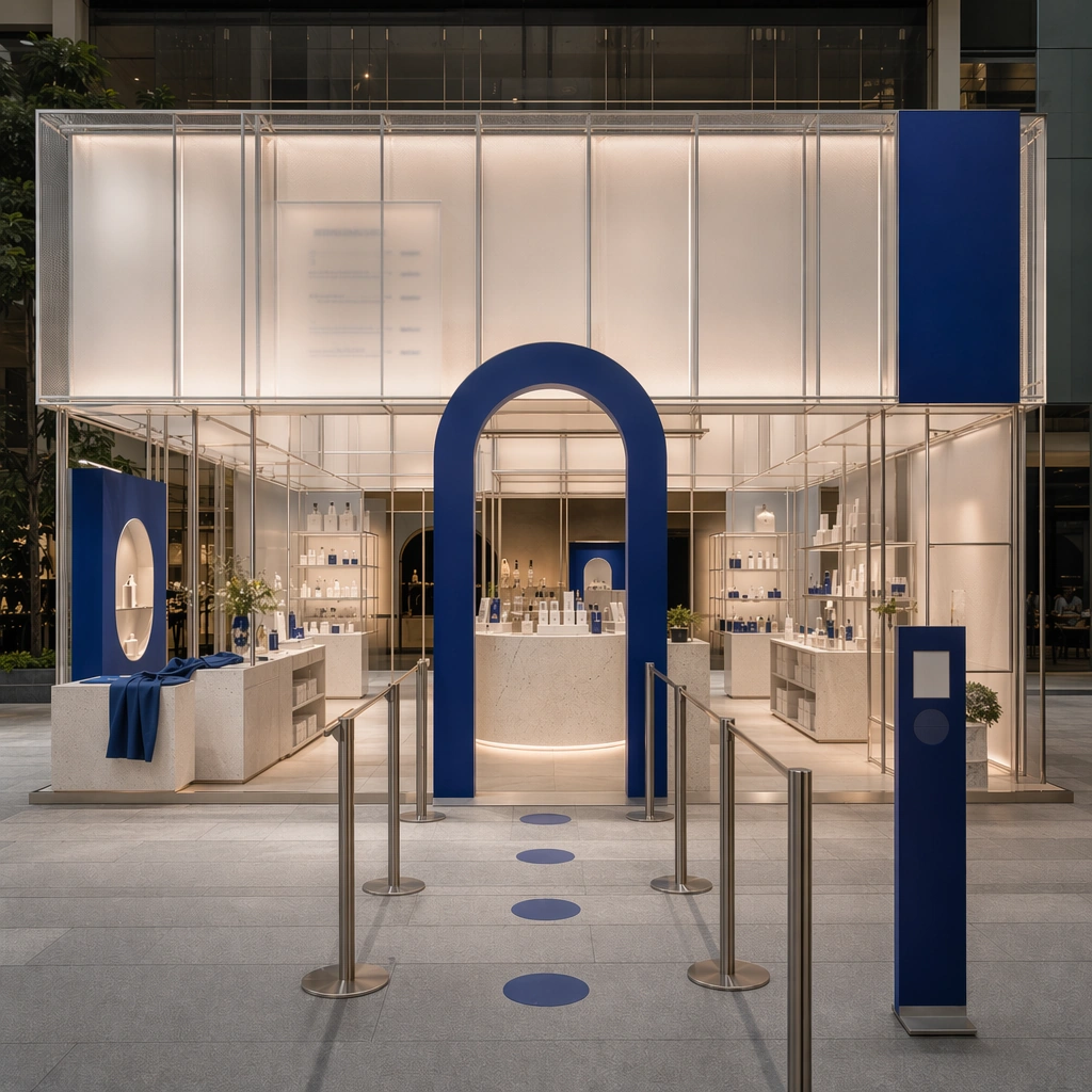
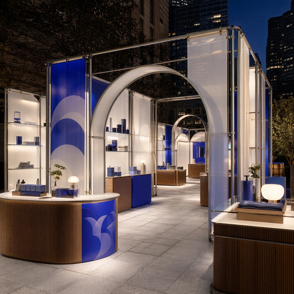
Example generated from “Pop Up Shop And Event Installation Kit — Streetfront Anchor”
GPT Image 2en

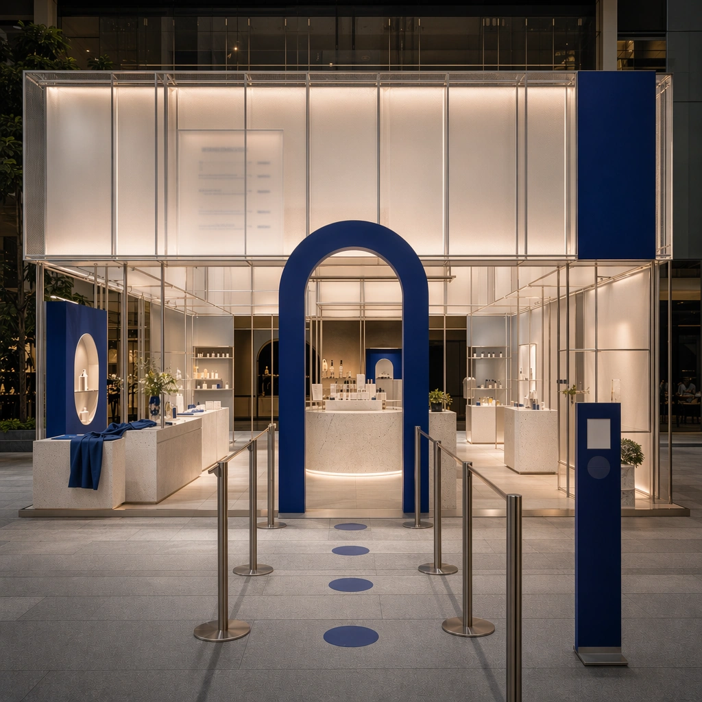
Scene: Create a square architectural reference still for Pop-up Shop and Event Installation Kit. Use a square streetfront hero still showing the full pop-up envelope and entry queue logic and treat the frame like a premium interior or architecture editorial photograph with disciplined perspective, readable depth from foreground to background, and enough negative space for the spatial hierarchy to breathe. Light the scene so photo moments, modular display, and high-recall activation design feel immediate, using soft neutral base with one strong accent color, translucent whites, brushed metal, and controlled event lighting as the governing tonal range. The composition must read as a high-end commercial image that could sit inside brand activations, launch events, campaign recaps, and experiential pitch decks. Subject: Show a modular pop-up and event installation built from tubular frames, translucent panels, bold but refined color blocks, sculpted counters, photo-op arches, and a circulation path designed for sharing and recall. Center the activation’s main recognizability, photo-op shape, and circulation invitation. This is the canonical reference image for the package, so the major proportions, material transitions, fixture families, and circulation logic must feel highly specific and internally coherent rather than generic luxury styling. Let the viewer understand how the space is organized within a single glance, with foreground anchors, a clear middle zone, and a resolved background termination. Important details: Lock the tubular frame language, translucent panel system, accent-color blocking, modular counters, and camera-friendly circulation. Surfaces should feel tactile and believable: stone veining must stay plausible, metals should have disciplined reflectance, fabrics should show natural weight, and concealed lighting should shape the volume instead of flattening it. Use abstract signage, menu, label, or caption zones only as unreadable graphic hints. The image should feel practical for downstream design reviews and polished enough for public-facing campaign use. Use case: Pop-up Shop and Event Installation Kit series study 1/9, establishing the canonical pop-up identity for the package. Constraints: No readable text, no watermark, no logos, preserve exact 1:1 aspect ratio, no crowds, no branded slogans, no cheap balloon decor, no stage truss overload, no festival chaos, no city ads stealing focus.

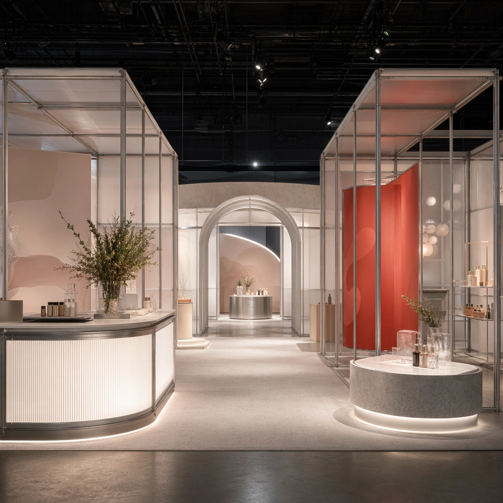
Example generated from “Pop Up Shop And Event Installation Kit — Hero Photo Zone”
GPT Image 2en

Scene: Create a square reference-dependent architecture still for Pop-up Shop and Event Installation Kit. Use a composition centered on the main photo-op zone and adjacent product staging while keeping the same lens discipline, editorial polish, and material believability established by the reference image. The lighting can shift to support the intended mood, but the space must still feel like the same authored project with a stable viewpoint logic, convincing depth separation, and clean commercial-photography finish. Keep soft neutral base with one strong accent color, translucent whites, brushed metal, and controlled event lighting as the governing tonal range even when the emphasis changes. Subject: Show a modular pop-up and event installation built from tubular frames, translucent panels, bold but refined color blocks, sculpted counters, photo-op arches, and a circulation path designed for sharing and recall. Focus on the exact same pop-up from the reference image, now emphasizing shareable framing and event drama. Preserve exact architectural identity, plan logic, material palette, fixture family, and circulation cues from the reference image while changing only the intended emphasis described here. The viewer should immediately recognize the same project, not a loose cousin, with matching silhouette logic, aligned detailing, and consistent brand atmosphere. Important details: Preserve the tubular frame language, translucent panel system, accent-color blocking, modular counters, and camera-friendly circulation. Any abstract wayfinding, menu, wall-label, or packaging zones must stay unreadable and subordinate to the spatial image. Joinery, edges, reflections, and lighting should remain realistic enough for an operator or design team to treat the image as a credible reference. The variation should feel deliberate and commercially useful, proving that one locked spatial language can flex across multiple campaign or editorial surfaces. Use case: Pop-up Shop and Event Installation Kit series study 2/9, extending the social-photo magnet while preserving the same activation identity. Constraints: No readable text, no watermark, no logos, preserve exact 1:1 aspect ratio, preserve exact architectural identity from the reference image, no crowds, no branded slogans, no cheap balloon decor, no stage truss overload, no festival chaos, no people posing.

Example generated from “Pop Up Shop And Event Installation Kit — Retail Counter Module”
GPT Image 2en

Scene: Create a square reference-dependent architecture still for Pop-up Shop and Event Installation Kit. Use a view focused on the modular counter and shelving system within the pop-up while keeping the same lens discipline, editorial polish, and material believability established by the reference image. The lighting can shift to support the intended mood, but the space must still feel like the same authored project with a stable viewpoint logic, convincing depth separation, and clean commercial-photography finish. Keep soft neutral base with one strong accent color, translucent whites, brushed metal, and controlled event lighting as the governing tonal range even when the emphasis changes. Subject: Show a modular pop-up and event installation built from tubular frames, translucent panels, bold but refined color blocks, sculpted counters, photo-op arches, and a circulation path designed for sharing and recall. Focus on the exact same pop-up from the reference image, now emphasizing transaction surfaces and product handling zones. Preserve exact architectural identity, plan logic, material palette, fixture family, and circulation cues from the reference image while changing only the intended emphasis described here. The viewer should immediately recognize the same project, not a loose cousin, with matching silhouette logic, aligned detailing, and consistent brand atmosphere. Important details: Preserve the tubular frame language, translucent panel system, accent-color blocking, modular counters, and camera-friendly circulation. Any abstract wayfinding, menu, wall-label, or packaging zones must stay unreadable and subordinate to the spatial image. Joinery, edges, reflections, and lighting should remain realistic enough for an operator or design team to treat the image as a credible reference. The variation should feel deliberate and commercially useful, proving that one locked spatial language can flex across multiple campaign or editorial surfaces. Use case: Pop-up Shop and Event Installation Kit series study 3/9, extending sell-through functionality within the same event language. Constraints: No readable text, no watermark, no logos, preserve exact 1:1 aspect ratio, preserve exact architectural identity from the reference image, no crowds, no branded slogans, no cheap balloon decor, no stage truss overload, no festival chaos, no payment terminal UI.

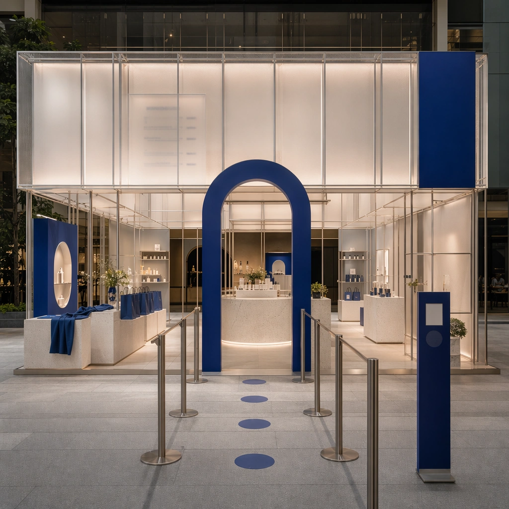
Example generated from “Pop Up Shop And Event Installation Kit — Exit Gift Sequence”
GPT Image 2en

Scene: Create a square reference-dependent architecture still for Pop-up Shop and Event Installation Kit. Use a final sequence near the exit with tote forms, shelving, and closing visual rhythm while keeping the same lens discipline, editorial polish, and material believability established by the reference image. The lighting can shift to support the intended mood, but the space must still feel like the same authored project with a stable viewpoint logic, convincing depth separation, and clean commercial-photography finish. Keep soft neutral base with one strong accent color, translucent whites, brushed metal, and controlled event lighting as the governing tonal range even when the emphasis changes. Subject: Show a modular pop-up and event installation built from tubular frames, translucent panels, bold but refined color blocks, sculpted counters, photo-op arches, and a circulation path designed for sharing and recall. Focus on the exact same pop-up from the reference image, now emphasizing memory objects and a clean departure experience. Preserve exact architectural identity, plan logic, material palette, fixture family, and circulation cues from the reference image while changing only the intended emphasis described here. The viewer should immediately recognize the same project, not a loose cousin, with matching silhouette logic, aligned detailing, and consistent brand atmosphere. Important details: Preserve the tubular frame language, translucent panel system, accent-color blocking, modular counters, and camera-friendly circulation. Any abstract wayfinding, menu, wall-label, or packaging zones must stay unreadable and subordinate to the spatial image. Joinery, edges, reflections, and lighting should remain realistic enough for an operator or design team to treat the image as a credible reference. The variation should feel deliberate and commercially useful, proving that one locked spatial language can flex across multiple campaign or editorial surfaces. Use case: Pop-up Shop and Event Installation Kit series study 4/9, extending the closing activation beat inside the same system. Constraints: No readable text, no watermark, no logos, preserve exact 1:1 aspect ratio, preserve exact architectural identity from the reference image, no crowds, no branded slogans, no cheap balloon decor, no stage truss overload, no festival chaos, no readable tote text.

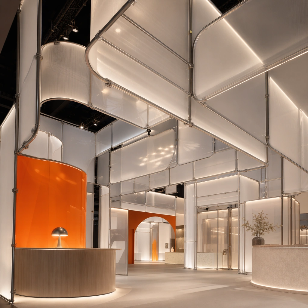
Example generated from “Pop Up Shop And Event Installation Kit — Ceiling Banner Cluster”
GPT Image 2en

Scene: Create a square standalone support study for Pop-up Shop and Event Installation Kit. Use an upward-looking composition of suspended panels and lighting bands and frame it like a premium commercial still or design-editorial crop with clear focal hierarchy, disciplined perspective, and enough breathing room for the materials and objects to read at both thumbnail and full size. Keep soft neutral base with one strong accent color, translucent whites, brushed metal, and controlled event lighting as the tonal guide so the image still belongs to the same theme family, and light the scene in a controlled way that emphasizes texture, edge quality, and authored atmosphere over spectacle. Subject: Show a modular pop-up and event installation built from tubular frames, translucent panels, bold but refined color blocks, sculpted counters, photo-op arches, and a circulation path designed for sharing and recall. In this support study, focus on event atmosphere, vertical layering, and camera drama. The image should work independently, yet it must still feel like it belongs to the same broader world of Pop-up Kit. Make the space, props, and detailing useful for real campaign, editorial, or design-review contexts rather than moodboard abstraction. Important details: Carry forward the broader language of the tubular frame language, translucent panel system, accent-color blocking, modular counters, and camera-friendly circulation, but let this image prove a new support surface or secondary deliverable. Material realism is essential: wood grain, metal sheen, glass edges, textiles, and stone should feel physically plausible and carefully art directed. Any graphic panels, labels, menus, packaging, or captions must stay abstract and unreadable. The overall result should feel reusable for brand activations, launch events, campaign recaps, and experiential pitch decks, with enough structure that a creative or operations team could build on it. Use case: Pop-up Shop and Event Installation Kit single study 6/9, exploring support still for activation overhead systems. Constraints: No readable text, no watermark, no logos, preserve exact 1:1 aspect ratio, no crowds, no branded slogans, no cheap balloon decor, no stage truss overload, no festival chaos, no hanging text banners.

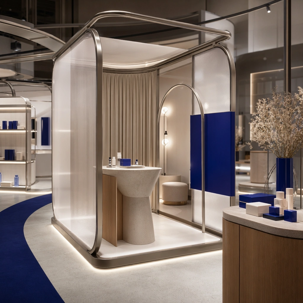
Example generated from “Pop Up Shop And Event Installation Kit — Fitting Pod Module”
GPT Image 2en

Scene: Create a square standalone support study for Pop-up Shop and Event Installation Kit. Use a compact fitting pod or private demo module integrated into the installation and frame it like a premium commercial still or design-editorial crop with clear focal hierarchy, disciplined perspective, and enough breathing room for the materials and objects to read at both thumbnail and full size. Keep soft neutral base with one strong accent color, translucent whites, brushed metal, and controlled event lighting as the tonal guide so the image still belongs to the same theme family, and light the scene in a controlled way that emphasizes texture, edge quality, and authored atmosphere over spectacle. Subject: Show a modular pop-up and event installation built from tubular frames, translucent panels, bold but refined color blocks, sculpted counters, photo-op arches, and a circulation path designed for sharing and recall. In this support study, focus on privacy, modular construction, and brand continuity. The image should work independently, yet it must still feel like it belongs to the same broader world of Pop-up Kit. Make the space, props, and detailing useful for real campaign, editorial, or design-review contexts rather than moodboard abstraction. Important details: Carry forward the broader language of the tubular frame language, translucent panel system, accent-color blocking, modular counters, and camera-friendly circulation, but let this image prove a new support surface or secondary deliverable. Material realism is essential: wood grain, metal sheen, glass edges, textiles, and stone should feel physically plausible and carefully art directed. Any graphic panels, labels, menus, packaging, or captions must stay abstract and unreadable. The overall result should feel reusable for brand activations, launch events, campaign recaps, and experiential pitch decks, with enough structure that a creative or operations team could build on it. Use case: Pop-up Shop and Event Installation Kit single study 7/9, exploring support image for experiential trial zones. Constraints: No readable text, no watermark, no logos, preserve exact 1:1 aspect ratio, no crowds, no branded slogans, no cheap balloon decor, no stage truss overload, no festival chaos, no readable instructions.

Example generated from “Pop Up Shop And Event Installation Kit — Night Event Activation”
GPT Image 2en

Scene: Create a square standalone support study for Pop-up Shop and Event Installation Kit. Use a dusk-to-night still of the activation glowing under event lighting and frame it like a premium commercial still or design-editorial crop with clear focal hierarchy, disciplined perspective, and enough breathing room for the materials and objects to read at both thumbnail and full size. Keep soft neutral base with one strong accent color, translucent whites, brushed metal, and controlled event lighting as the tonal guide so the image still belongs to the same theme family, and light the scene in a controlled way that emphasizes texture, edge quality, and authored atmosphere over spectacle. Subject: Show a modular pop-up and event installation built from tubular frames, translucent panels, bold but refined color blocks, sculpted counters, photo-op arches, and a circulation path designed for sharing and recall. In this support study, focus on temporary-event energy, translucent glow, and city-context recall. The image should work independently, yet it must still feel like it belongs to the same broader world of Pop-up Kit. Make the space, props, and detailing useful for real campaign, editorial, or design-review contexts rather than moodboard abstraction. Important details: Carry forward the broader language of the tubular frame language, translucent panel system, accent-color blocking, modular counters, and camera-friendly circulation, but let this image prove a new support surface or secondary deliverable. Material realism is essential: wood grain, metal sheen, glass edges, textiles, and stone should feel physically plausible and carefully art directed. Any graphic panels, labels, menus, packaging, or captions must stay abstract and unreadable. The overall result should feel reusable for brand activations, launch events, campaign recaps, and experiential pitch decks, with enough structure that a creative or operations team could build on it. Use case: Pop-up Shop and Event Installation Kit single study 8/9, exploring support imagery for press recaps and launch nights. Constraints: No readable text, no watermark, no logos, preserve exact 1:1 aspect ratio, no crowds, no branded slogans, no cheap balloon decor, no stage truss overload, no festival chaos, no crowding or security barricades.

Example generated from “Pop Up Shop And Event Installation Kit — Crate to Display Transition”
GPT Image 2en

Scene: Create a square standalone support study for Pop-up Shop and Event Installation Kit. Use a backstage-inspired still showing shipping-crate logic transformed into polished display furniture and frame it like a premium commercial still or design-editorial crop with clear focal hierarchy, disciplined perspective, and enough breathing room for the materials and objects to read at both thumbnail and full size. Keep soft neutral base with one strong accent color, translucent whites, brushed metal, and controlled event lighting as the tonal guide so the image still belongs to the same theme family, and light the scene in a controlled way that emphasizes texture, edge quality, and authored atmosphere over spectacle. Subject: Show a modular pop-up and event installation built from tubular frames, translucent panels, bold but refined color blocks, sculpted counters, photo-op arches, and a circulation path designed for sharing and recall. In this support study, focus on modularity, build efficiency, and clever event-system thinking. The image should work independently, yet it must still feel like it belongs to the same broader world of Pop-up Kit. Make the space, props, and detailing useful for real campaign, editorial, or design-review contexts rather than moodboard abstraction. Important details: Carry forward the broader language of the tubular frame language, translucent panel system, accent-color blocking, modular counters, and camera-friendly circulation, but let this image prove a new support surface or secondary deliverable. Material realism is essential: wood grain, metal sheen, glass edges, textiles, and stone should feel physically plausible and carefully art directed. Any graphic panels, labels, menus, packaging, or captions must stay abstract and unreadable. The overall result should feel reusable for brand activations, launch events, campaign recaps, and experiential pitch decks, with enough structure that a creative or operations team could build on it. Use case: Pop-up Shop and Event Installation Kit single study 9/9, exploring support image for production-minded activation design. Constraints: No readable text, no watermark, no logos, preserve exact 1:1 aspect ratio, no crowds, no branded slogans, no cheap balloon decor, no stage truss overload, no festival chaos, no shipping logos.

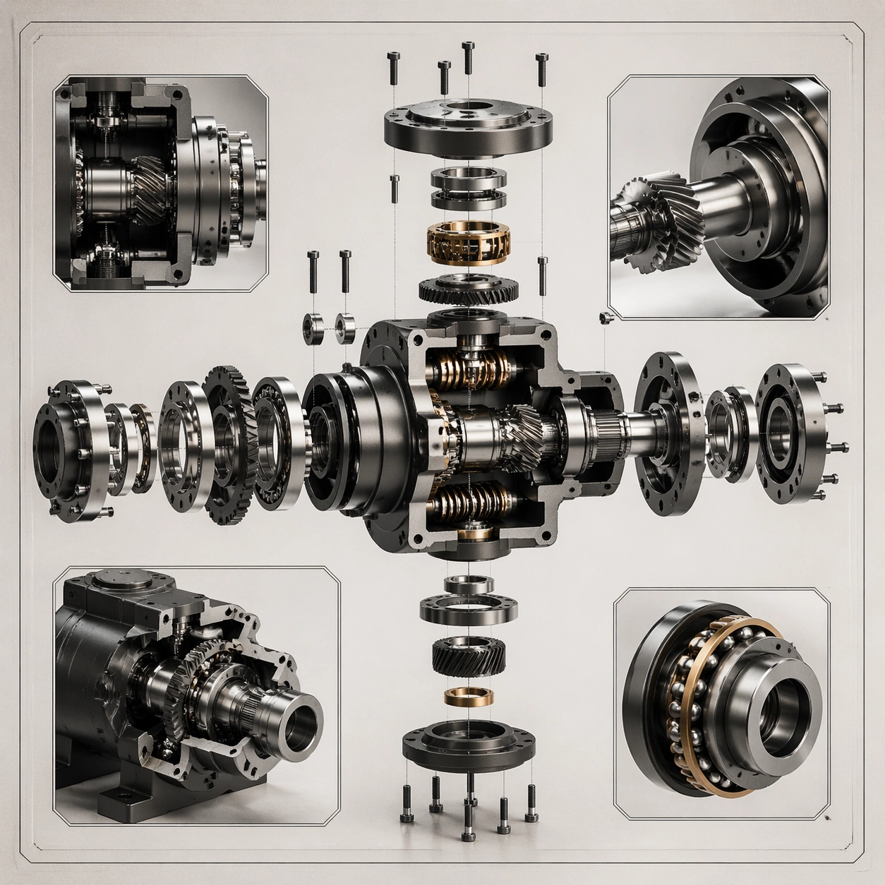
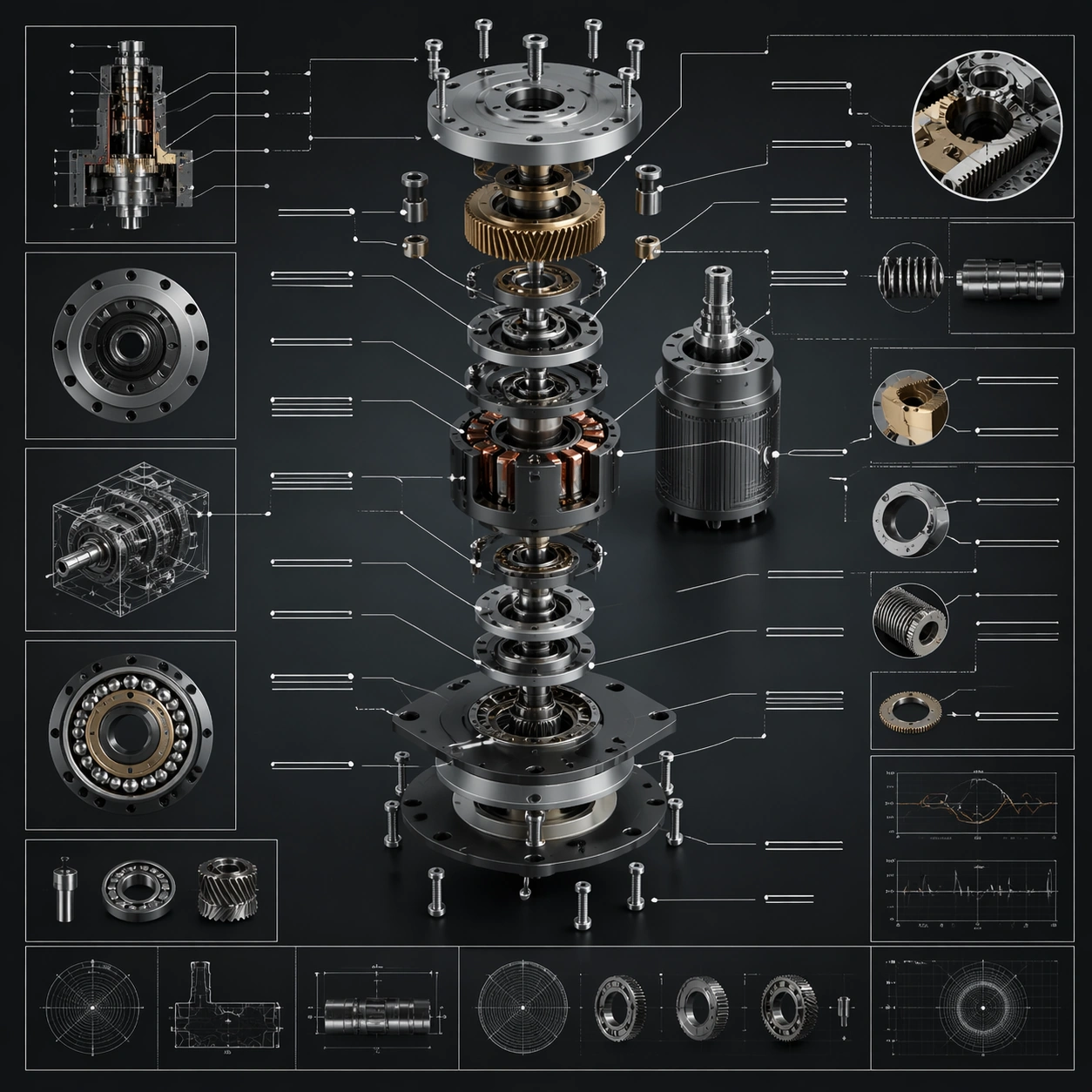
Example generated from “Precision Mechanical Exploded View — Cutaway Panel”
GPT Image 2en

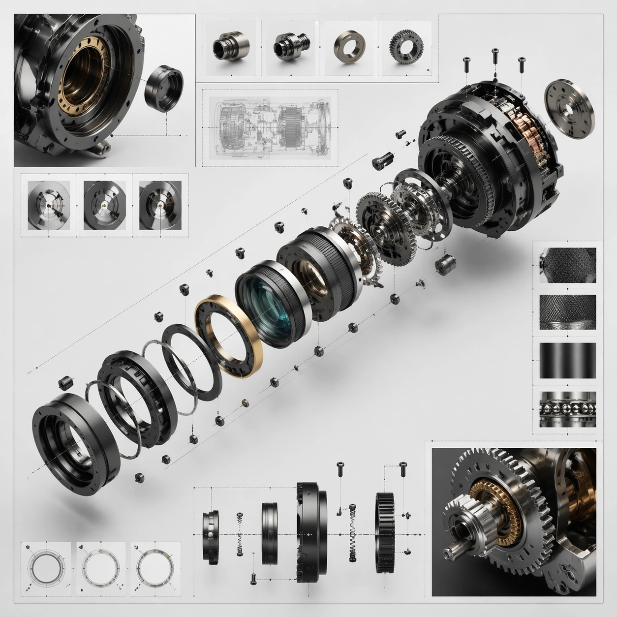
Scene: A square plate or board viewed straight-on, with crisp organization, disciplined spacing, and premium print clarity. Build the frame around a cutaway or sectional treatment that reveals interior logic without sacrificing readability. Keep the lighting, camera distance, and spatial organization tuned for a high-signal research image rather than a casual snapshot. The image belongs to the Precision Mechanical Exploded View theme and should feel immediately legible as a prompt atlas theme for precision mechanical exploded view, testing multi-image-reference, physics-materials, technical-diagram, commercial-mockup with gpt image 2.. Subject: Center the study on a cutaway or sectional treatment that reveals interior logic without sacrificing readability. Translate the theme into a concrete visual statement instead of an abstract mood board: the viewer should understand what kind of image this is, what is being tested, and why the composition is difficult. Use the slug idea of precision mechanical exploded view as a literal guide for subject matter, materials, and staging. If helpful, borrow the broad visual cues suggested by exploded view, but keep the result original and specific to this study. Important details: The image should communicate logic through grouping, hierarchy, callouts, insets, and believable professional layout discipline rather than decorative noise. Preserve a disciplined square composition, clear focal hierarchy, and enough secondary information to make the image feel complete rather than underspecified. The image should look polished, novel, and exhibition-ready, with topic-specific credibility coming from the way surfaces, structure, and visual language reinforce Precision Mechanical Exploded View. Avoid generic filler elements that do not serve the main concept. Use case: Precision Mechanical Exploded View single study 2/8, testing multi-image-reference, physics-materials, technical-diagram, commercial-mockup through the cutaway panel variation. Constraints: No readable text, no watermark, no logos, preserve exact 1:1 aspect ratio, no readable labels, no messy arrows, no random infographic decoration, no fake UI chrome unless the topic calls for it, no broken alignment, no meaningless clutter.

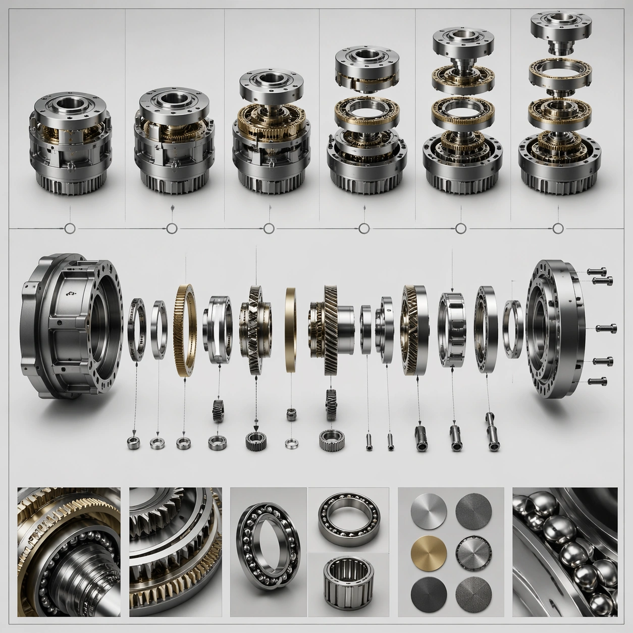
Example generated from “Precision Mechanical Exploded View — Process Sequence”
GPT Image 2en

Scene: A square plate or board viewed straight-on, with crisp organization, disciplined spacing, and premium print clarity. Build the frame around a sequence of stages or states arranged in a disciplined progression. Keep the lighting, camera distance, and spatial organization tuned for a high-signal research image rather than a casual snapshot. The image belongs to the Precision Mechanical Exploded View theme and should feel immediately legible as a prompt atlas theme for precision mechanical exploded view, testing multi-image-reference, physics-materials, technical-diagram, commercial-mockup with gpt image 2.. Subject: Center the study on a sequence of stages or states arranged in a disciplined progression. Translate the theme into a concrete visual statement instead of an abstract mood board: the viewer should understand what kind of image this is, what is being tested, and why the composition is difficult. Use the slug idea of precision mechanical exploded view as a literal guide for subject matter, materials, and staging. If helpful, borrow the broad visual cues suggested by exploded view, but keep the result original and specific to this study. Important details: The image should communicate logic through grouping, hierarchy, callouts, insets, and believable professional layout discipline rather than decorative noise. Preserve a disciplined square composition, clear focal hierarchy, and enough secondary information to make the image feel complete rather than underspecified. The image should look polished, novel, and exhibition-ready, with topic-specific credibility coming from the way surfaces, structure, and visual language reinforce Precision Mechanical Exploded View. Avoid generic filler elements that do not serve the main concept. Use case: Precision Mechanical Exploded View single study 3/8, testing multi-image-reference, physics-materials, technical-diagram, commercial-mockup through the process sequence variation. Constraints: No readable text, no watermark, no logos, preserve exact 1:1 aspect ratio, no readable labels, no messy arrows, no random infographic decoration, no fake UI chrome unless the topic calls for it, no broken alignment, no meaningless clutter.

Example generated from “Precision Mechanical Exploded View — Annotation Cluster”
GPT Image 2en

Scene: A square plate or board viewed straight-on, with crisp organization, disciplined spacing, and premium print clarity. Build the frame around dense callouts and side insets that feel scholarly while staying unreadable. Keep the lighting, camera distance, and spatial organization tuned for a high-signal research image rather than a casual snapshot. The image belongs to the Precision Mechanical Exploded View theme and should feel immediately legible as a prompt atlas theme for precision mechanical exploded view, testing multi-image-reference, physics-materials, technical-diagram, commercial-mockup with gpt image 2.. Subject: Center the study on dense callouts and side insets that feel scholarly while staying unreadable. Translate the theme into a concrete visual statement instead of an abstract mood board: the viewer should understand what kind of image this is, what is being tested, and why the composition is difficult. Use the slug idea of precision mechanical exploded view as a literal guide for subject matter, materials, and staging. If helpful, borrow the broad visual cues suggested by exploded view, but keep the result original and specific to this study. Important details: The image should communicate logic through grouping, hierarchy, callouts, insets, and believable professional layout discipline rather than decorative noise. Preserve a disciplined square composition, clear focal hierarchy, and enough secondary information to make the image feel complete rather than underspecified. The image should look polished, novel, and exhibition-ready, with topic-specific credibility coming from the way surfaces, structure, and visual language reinforce Precision Mechanical Exploded View. Avoid generic filler elements that do not serve the main concept. Use case: Precision Mechanical Exploded View single study 4/8, testing multi-image-reference, physics-materials, technical-diagram, commercial-mockup through the annotation cluster variation. Constraints: No readable text, no watermark, no logos, preserve exact 1:1 aspect ratio, no readable labels, no messy arrows, no random infographic decoration, no fake UI chrome unless the topic calls for it, no broken alignment, no meaningless clutter.

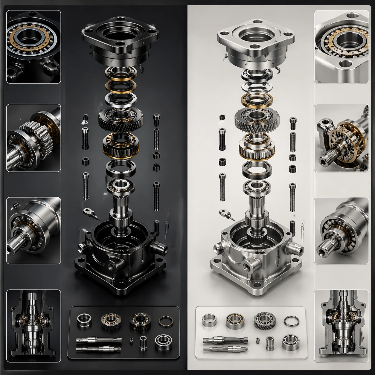
Example generated from “Precision Mechanical Exploded View — Comparison Board”
GPT Image 2en

Scene: A square plate or board viewed straight-on, with crisp organization, disciplined spacing, and premium print clarity. Build the frame around a side-by-side comparison structure with strong contrast and equal visual weight. Keep the lighting, camera distance, and spatial organization tuned for a high-signal research image rather than a casual snapshot. The image belongs to the Precision Mechanical Exploded View theme and should feel immediately legible as a prompt atlas theme for precision mechanical exploded view, testing multi-image-reference, physics-materials, technical-diagram, commercial-mockup with gpt image 2.. Subject: Center the study on a side-by-side comparison structure with strong contrast and equal visual weight. Translate the theme into a concrete visual statement instead of an abstract mood board: the viewer should understand what kind of image this is, what is being tested, and why the composition is difficult. Use the slug idea of precision mechanical exploded view as a literal guide for subject matter, materials, and staging. If helpful, borrow the broad visual cues suggested by exploded view, but keep the result original and specific to this study. Important details: The image should communicate logic through grouping, hierarchy, callouts, insets, and believable professional layout discipline rather than decorative noise. Preserve a disciplined square composition, clear focal hierarchy, and enough secondary information to make the image feel complete rather than underspecified. The image should look polished, novel, and exhibition-ready, with topic-specific credibility coming from the way surfaces, structure, and visual language reinforce Precision Mechanical Exploded View. Avoid generic filler elements that do not serve the main concept. Use case: Precision Mechanical Exploded View single study 5/8, testing multi-image-reference, physics-materials, technical-diagram, commercial-mockup through the comparison board variation. Constraints: No readable text, no watermark, no logos, preserve exact 1:1 aspect ratio, no readable labels, no messy arrows, no random infographic decoration, no fake UI chrome unless the topic calls for it, no broken alignment, no meaningless clutter.

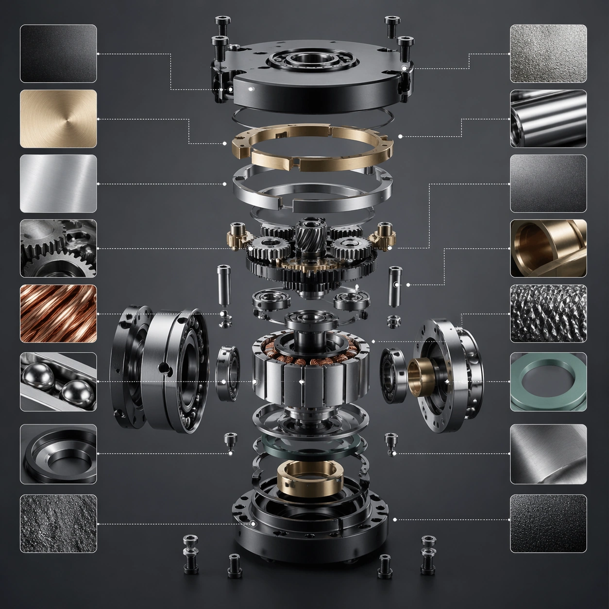
Example generated from “Precision Mechanical Exploded View — 材质标注”
GPT Image 2en

Scene: A square plate or board viewed straight-on, with crisp organization, disciplined spacing, and premium print clarity. Build the frame around specific texture or material evidence presented with controlled explanatory framing. Keep the lighting, camera distance, and spatial organization tuned for a high-signal research image rather than a casual snapshot. The image belongs to the Precision Mechanical Exploded View theme and should feel immediately legible as a prompt atlas theme for precision mechanical exploded view, testing multi-image-reference, physics-materials, technical-diagram, commercial-mockup with gpt image 2.. Subject: Center the study on specific texture or material evidence presented with controlled explanatory framing. Translate the theme into a concrete visual statement instead of an abstract mood board: the viewer should understand what kind of image this is, what is being tested, and why the composition is difficult. Use the slug idea of precision mechanical exploded view as a literal guide for subject matter, materials, and staging. If helpful, borrow the broad visual cues suggested by exploded view, but keep the result original and specific to this study. Important details: The image should communicate logic through grouping, hierarchy, callouts, insets, and believable professional layout discipline rather than decorative noise. Preserve a disciplined square composition, clear focal hierarchy, and enough secondary information to make the image feel complete rather than underspecified. The image should look polished, novel, and exhibition-ready, with topic-specific credibility coming from the way surfaces, structure, and visual language reinforce Precision Mechanical Exploded View. Avoid generic filler elements that do not serve the main concept. Use case: Precision Mechanical Exploded View single study 6/8, testing multi-image-reference, physics-materials, technical-diagram, commercial-mockup through the 材质标注 variation. Constraints: No readable text, no watermark, no logos, preserve exact 1:1 aspect ratio, no readable labels, no messy arrows, no random infographic decoration, no fake UI chrome unless the topic calls for it, no broken alignment, no meaningless clutter.

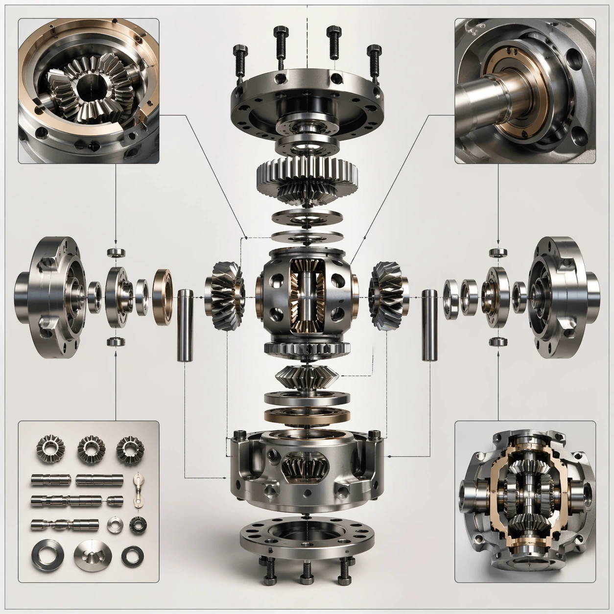
Example generated from “Precision Mechanical Exploded View — Exploded System”
GPT Image 2en

Scene: A square plate or board viewed straight-on, with crisp organization, disciplined spacing, and premium print clarity. Build the frame around components separated clearly enough to reveal construction and dependency. Keep the lighting, camera distance, and spatial organization tuned for a high-signal research image rather than a casual snapshot. The image belongs to the Precision Mechanical Exploded View theme and should feel immediately legible as a prompt atlas theme for precision mechanical exploded view, testing multi-image-reference, physics-materials, technical-diagram, commercial-mockup with gpt image 2.. Subject: Center the study on components separated clearly enough to reveal construction and dependency. Translate the theme into a concrete visual statement instead of an abstract mood board: the viewer should understand what kind of image this is, what is being tested, and why the composition is difficult. Use the slug idea of precision mechanical exploded view as a literal guide for subject matter, materials, and staging. If helpful, borrow the broad visual cues suggested by exploded view, but keep the result original and specific to this study. Important details: The image should communicate logic through grouping, hierarchy, callouts, insets, and believable professional layout discipline rather than decorative noise. Preserve a disciplined square composition, clear focal hierarchy, and enough secondary information to make the image feel complete rather than underspecified. The image should look polished, novel, and exhibition-ready, with topic-specific credibility coming from the way surfaces, structure, and visual language reinforce Precision Mechanical Exploded View. Avoid generic filler elements that do not serve the main concept. Use case: Precision Mechanical Exploded View single study 7/8, testing multi-image-reference, physics-materials, technical-diagram, commercial-mockup through the exploded system variation. Constraints: No readable text, no watermark, no logos, preserve exact 1:1 aspect ratio, no readable labels, no messy arrows, no random infographic decoration, no fake UI chrome unless the topic calls for it, no broken alignment, no meaningless clutter.

Example generated from “Precision Mechanical Exploded View — Final Plate”
GPT Image 2en

Scene: A square plate or board viewed straight-on, with crisp organization, disciplined spacing, and premium print clarity. Build the frame around a polished final technical plate that feels ready for a research deck or exhibition wall. Keep the lighting, camera distance, and spatial organization tuned for a high-signal research image rather than a casual snapshot. The image belongs to the Precision Mechanical Exploded View theme and should feel immediately legible as a prompt atlas theme for precision mechanical exploded view, testing multi-image-reference, physics-materials, technical-diagram, commercial-mockup with gpt image 2.. Subject: Center the study on a polished final technical plate that feels ready for a research deck or exhibition wall. Translate the theme into a concrete visual statement instead of an abstract mood board: the viewer should understand what kind of image this is, what is being tested, and why the composition is difficult. Use the slug idea of precision mechanical exploded view as a literal guide for subject matter, materials, and staging. If helpful, borrow the broad visual cues suggested by exploded view, but keep the result original and specific to this study. Important details: The image should communicate logic through grouping, hierarchy, callouts, insets, and believable professional layout discipline rather than decorative noise. Preserve a disciplined square composition, clear focal hierarchy, and enough secondary information to make the image feel complete rather than underspecified. The image should look polished, novel, and exhibition-ready, with topic-specific credibility coming from the way surfaces, structure, and visual language reinforce Precision Mechanical Exploded View. Avoid generic filler elements that do not serve the main concept. Use case: Precision Mechanical Exploded View single study 8/8, testing multi-image-reference, physics-materials, technical-diagram, commercial-mockup through the final plate variation. Constraints: No readable text, no watermark, no logos, preserve exact 1:1 aspect ratio, no readable labels, no messy arrows, no random infographic decoration, no fake UI chrome unless the topic calls for it, no broken alignment, no meaningless clutter.

Example generated from “Premium Appliance Lifestyle Launch Set — Countertop Hero”
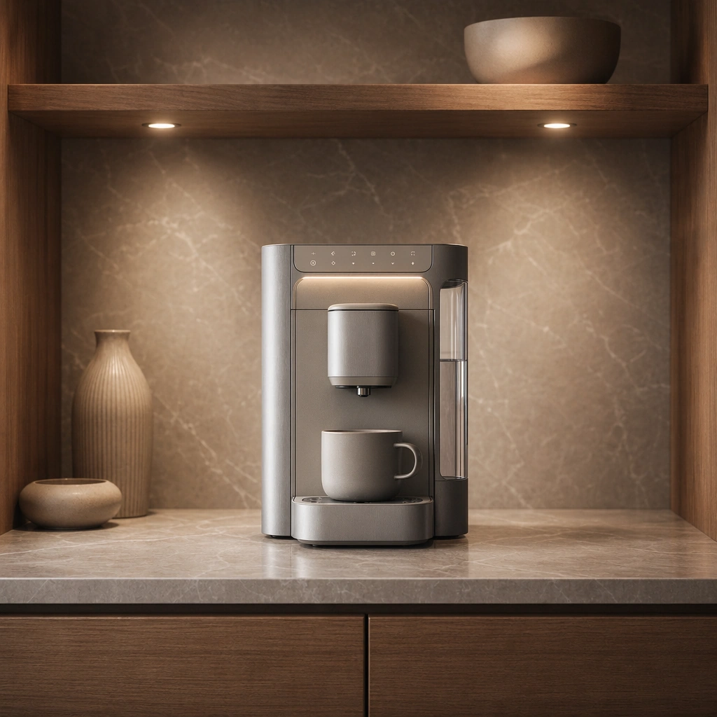
GPT Image 2en

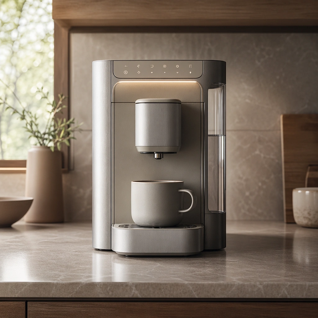
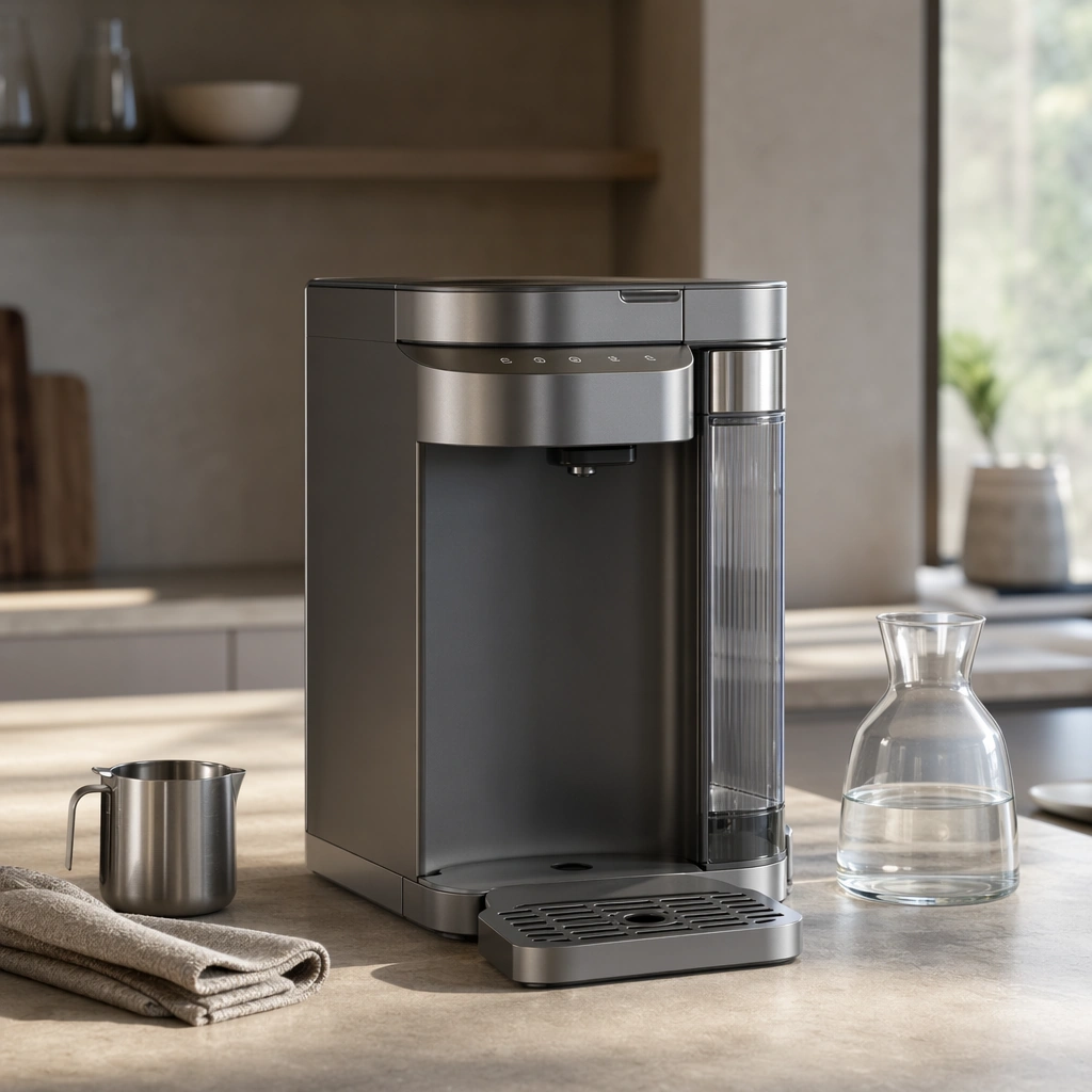
Scene: A square premium kitchen-counter scene with morning window light, soft shadows, and a calm warm-neutral palette. Compose the frame as a square key visual with disciplined camera placement, premium lighting control, and believable real-world scale. The tonal range should feel polished and intentional, with enough atmosphere to create depth without obscuring form. Keep contrast calibrated for launch, catalog, or research presentation use rather than casual snapshot aesthetics. Subject: Center an original premium countertop coffee system with a brushed metal body, matte ceramic touch surfaces, precise spout, compact water reservoir, and subtle warm status lighting. Make the subject feel original, production-aware, and clearly grounded in Premium Appliance Lifestyle Launch Set. For this series image, preserve exact core subject identity, proportions, base geometry, and material language from the reference image whenever continuity matters. The focal hierarchy should be immediate: primary form first, then material behavior, then supporting environmental cues that clarify use context and difficulty. Important details: Show the full appliance clearly on a refined counter with believable adjacent materials and restrained styling. The result should feel launch-ready and genuinely desirable. Preserve exact appliance silhouette, control placement, finish palette, and countertop footprint across the series. Domestic context should feel real, calm, and aspirational without becoming generic lifestyle advertising. Use believable materials, engineering logic, and professional composition discipline. Reflections, shadows, edge breaks, texture scale, interface density, and small physical joints must all support realism. Avoid filler props, vague mood-board clutter, or any element that weakens the sense of a purpose-built industrial or automotive image. Use case: Appliance Launch series study 1/9 for Premium Appliance Lifestyle Launch Set, built as image 01-reference-anchor. Constraints: No readable text, no watermark, no logos, preserve exact 1:1 aspect ratio, no brand logos, no readable labels, no visible trademarks, no messy kitchen clutter, no food-brand packaging, no exaggerated steam.

Example generated from “Premium Appliance Lifestyle Launch Set — Use Moment”
GPT Image 2en

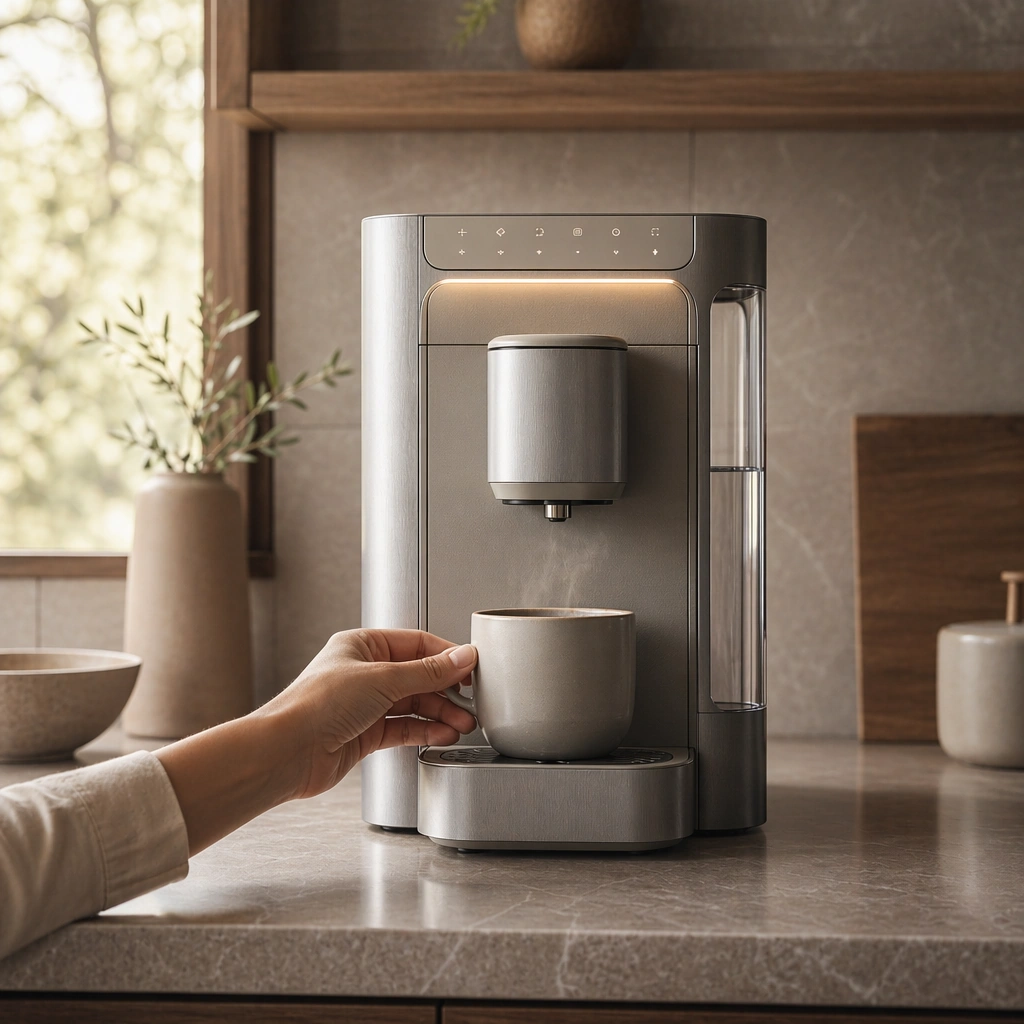
Scene: A square domestic close scene with warm daylight, subtle steam, soft ceramic surfaces, and restrained hand presence. Compose the frame as a square key visual with disciplined camera placement, premium lighting control, and believable real-world scale. The tonal range should feel polished and intentional, with enough atmosphere to create depth without obscuring form. Keep contrast calibrated for launch, catalog, or research presentation use rather than casual snapshot aesthetics. Subject: Center an original premium countertop coffee system with a brushed metal body, matte ceramic touch surfaces, precise spout, compact water reservoir, and subtle warm status lighting. Make the subject feel original, production-aware, and clearly grounded in Premium Appliance Lifestyle Launch Set. For this series image, preserve exact core subject identity, proportions, base geometry, and material language from the reference image whenever continuity matters. The focal hierarchy should be immediate: primary form first, then material behavior, then supporting environmental cues that clarify use context and difficulty. Important details: Keep the exact appliance identity while emphasizing tactility, ritual, and calm usability. The scene should feel intimate and premium rather than over-staged. Preserve exact appliance silhouette, control placement, finish palette, and countertop footprint across the series. Domestic context should feel real, calm, and aspirational without becoming generic lifestyle advertising. Use believable materials, engineering logic, and professional composition discipline. Reflections, shadows, edge breaks, texture scale, interface density, and small physical joints must all support realism. Avoid filler props, vague mood-board clutter, or any element that weakens the sense of a purpose-built industrial or automotive image. Use case: Appliance Launch series study 2/9 for Premium Appliance Lifestyle Launch Set, built as image 02-context-shift. Constraints: No readable text, no watermark, no logos, preserve exact 1:1 aspect ratio, no brand logos, no readable labels, no visible trademarks, no messy kitchen clutter, no food-brand packaging, no exaggerated steam.

Example generated from “Premium Appliance Lifestyle Launch Set — Evening Ambience”
GPT Image 2en

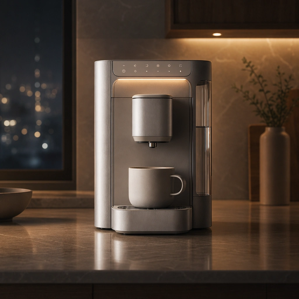
Scene: A square evening kitchen scene with warm task lights, quiet reflections, and low-contrast domestic atmosphere. Compose the frame as a square key visual with disciplined camera placement, premium lighting control, and believable real-world scale. The tonal range should feel polished and intentional, with enough atmosphere to create depth without obscuring form. Keep contrast calibrated for launch, catalog, or research presentation use rather than casual snapshot aesthetics. Subject: Center an original premium countertop coffee system with a brushed metal body, matte ceramic touch surfaces, precise spout, compact water reservoir, and subtle warm status lighting. Make the subject feel original, production-aware, and clearly grounded in Premium Appliance Lifestyle Launch Set. For this series image, preserve exact core subject identity, proportions, base geometry, and material language from the reference image whenever continuity matters. The focal hierarchy should be immediate: primary form first, then material behavior, then supporting environmental cues that clarify use context and difficulty. Important details: Highlight metal finish, soft indicator glow, and home atmosphere while keeping the product crisp and identically recognizable. The appeal should come from ownership mood, not decoration overload. Preserve exact appliance silhouette, control placement, finish palette, and countertop footprint across the series. Domestic context should feel real, calm, and aspirational without becoming generic lifestyle advertising. Use believable materials, engineering logic, and professional composition discipline. Reflections, shadows, edge breaks, texture scale, interface density, and small physical joints must all support realism. Avoid filler props, vague mood-board clutter, or any element that weakens the sense of a purpose-built industrial or automotive image. Use case: Appliance Launch series study 3/9 for Premium Appliance Lifestyle Launch Set, built as image 03-surface-study. Constraints: No readable text, no watermark, no logos, preserve exact 1:1 aspect ratio, no brand logos, no readable labels, no visible trademarks, no messy kitchen clutter, no food-brand packaging, no exaggerated steam.

Example generated from “Premium Appliance Lifestyle Launch Set — Retail Display Corner”
GPT Image 2en

Scene: A square boutique-appliance display corner with clean shelving, focused spotlights, premium stone and wood surfaces, and precise negative space. Compose the frame as a square key visual with disciplined camera placement, premium lighting control, and believable real-world scale. The tonal range should feel polished and intentional, with enough atmosphere to create depth without obscuring form. Keep contrast calibrated for launch, catalog, or research presentation use rather than casual snapshot aesthetics. Subject: Center an original premium countertop coffee system with a brushed metal body, matte ceramic touch surfaces, precise spout, compact water reservoir, and subtle warm status lighting. Make the subject feel original, production-aware, and clearly grounded in Premium Appliance Lifestyle Launch Set. For this series image, preserve exact core subject identity, proportions, base geometry, and material language from the reference image whenever continuity matters. The focal hierarchy should be immediate: primary form first, then material behavior, then supporting environmental cues that clarify use context and difficulty. Important details: Keep the same appliance exact while turning the scene into sellable retail communication. The image should balance domestic familiarity with aspirational presentation polish. Preserve exact appliance silhouette, control placement, finish palette, and countertop footprint across the series. Domestic context should feel real, calm, and aspirational without becoming generic lifestyle advertising. Use believable materials, engineering logic, and professional composition discipline. Reflections, shadows, edge breaks, texture scale, interface density, and small physical joints must all support realism. Avoid filler props, vague mood-board clutter, or any element that weakens the sense of a purpose-built industrial or automotive image. Use case: Appliance Launch series study 4/9 for Premium Appliance Lifestyle Launch Set, built as image 04-presentation-master. Constraints: No readable text, no watermark, no logos, preserve exact 1:1 aspect ratio, no brand logos, no readable labels, no visible trademarks, no messy kitchen clutter, no food-brand packaging, no exaggerated steam.

Example generated from “Premium Appliance Lifestyle Launch Set — Appliance Family Lineup”
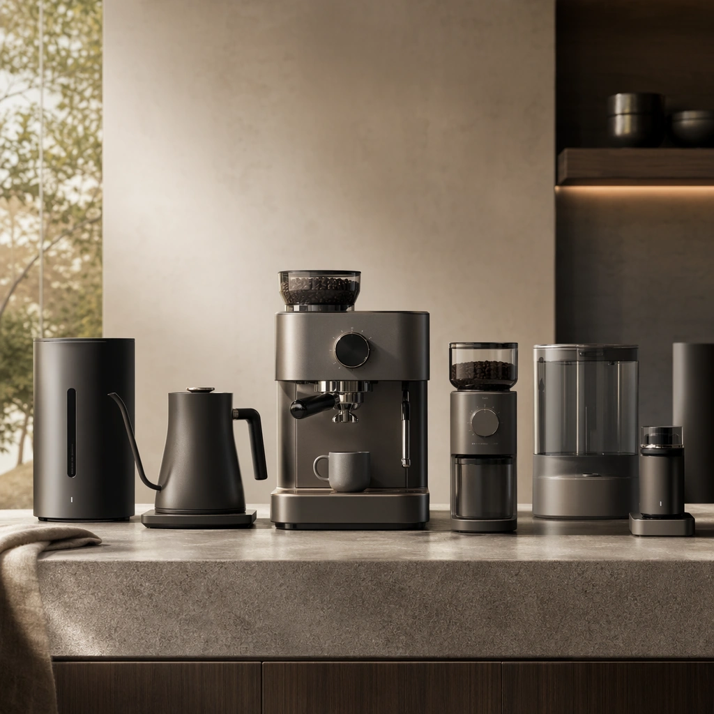
GPT Image 2en

Scene: A square clean studio lineup with a warm neutral background, disciplined spacing, and even premium lighting across multiple products. Compose the frame as a square key visual with disciplined camera placement, premium lighting control, and believable real-world scale. The tonal range should feel polished and intentional, with enough atmosphere to create depth without obscuring form. Keep contrast calibrated for launch, catalog, or research presentation use rather than casual snapshot aesthetics. Subject: Center an original appliance family including a coffee system, kettle, grinder, purifier, and related domestic devices. Make the subject feel original, production-aware, and clearly grounded in Premium Appliance Lifestyle Launch Set. Treat this as an independent study that must feel complete and coherent without relying on any external reference image. The focal hierarchy should be immediate: primary form first, then material behavior, then supporting environmental cues that clarify use context and difficulty. Important details: Focus on coherent brandless design language, premium proportion control, and quiet domestic sophistication. The lineup should feel platform-driven and intentional. The visual language should still feel native to Premium Appliance Lifestyle Launch Set, using disciplined industrial or campaign composition instead of generic stock photography. Use believable materials, engineering logic, and professional composition discipline. Reflections, shadows, edge breaks, texture scale, interface density, and small physical joints must all support realism. Avoid filler props, vague mood-board clutter, or any element that weakens the sense of a purpose-built industrial or automotive image. Use case: Appliance Launch single study 6/9 for Premium Appliance Lifestyle Launch Set, built as image support-two. Constraints: No readable text, no watermark, no logos, preserve exact 1:1 aspect ratio, no logos, no readable labels, no food-brand packaging, no influencer clutter, no unrealistic steam, no decorative overload.

Example generated from “Premium Appliance Lifestyle Launch Set — Kitchen Style Board”
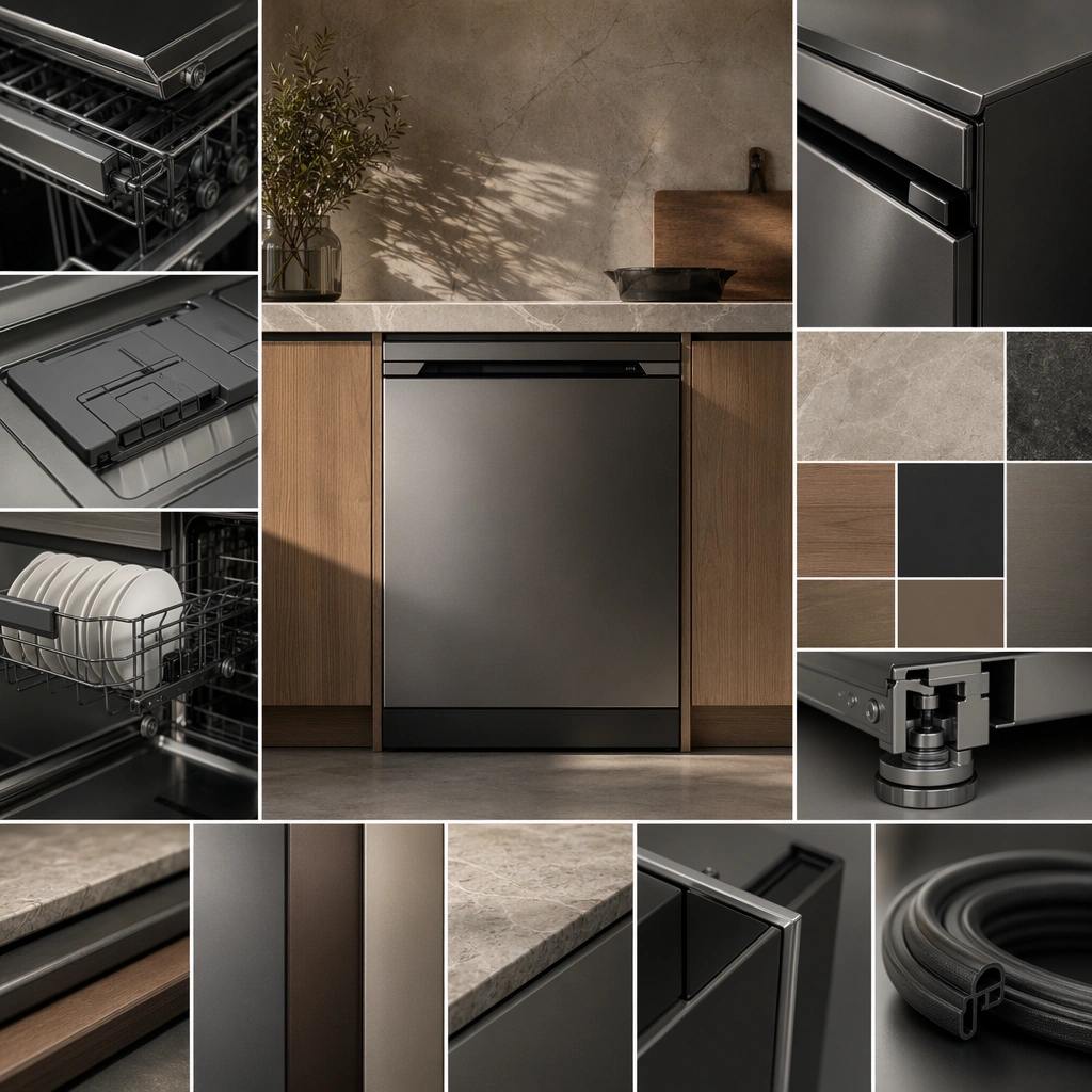
GPT Image 2en

Scene: A square design board with interior materials, cropped appliance views, warm daylight, and organized domestic samples. Compose the frame as a square key visual with disciplined camera placement, premium lighting control, and believable real-world scale. The tonal range should feel polished and intentional, with enough atmosphere to create depth without obscuring form. Keep contrast calibrated for launch, catalog, or research presentation use rather than casual snapshot aesthetics. Subject: Center an original appliance and complementary kitchen finishes arranged into a persuasive domestic concept sheet. Make the subject feel original, production-aware, and clearly grounded in Premium Appliance Lifestyle Launch Set. Treat this as an independent study that must feel complete and coherent without relying on any external reference image. The focal hierarchy should be immediate: primary form first, then material behavior, then supporting environmental cues that clarify use context and difficulty. Important details: Keep the board premium and non-readable, avoiding generic catalog tropes. It should feel like a serious home-product direction study. The visual language should still feel native to Premium Appliance Lifestyle Launch Set, using disciplined industrial or campaign composition instead of generic stock photography. Use believable materials, engineering logic, and professional composition discipline. Reflections, shadows, edge breaks, texture scale, interface density, and small physical joints must all support realism. Avoid filler props, vague mood-board clutter, or any element that weakens the sense of a purpose-built industrial or automotive image. Use case: Appliance Launch single study 7/9 for Premium Appliance Lifestyle Launch Set, built as image support-three. Constraints: No readable text, no watermark, no logos, preserve exact 1:1 aspect ratio, no logos, no readable labels, no food-brand packaging, no influencer clutter, no unrealistic steam, no decorative overload.

Example generated from “Premium Appliance Lifestyle Launch Set — Unboxing Mockup”
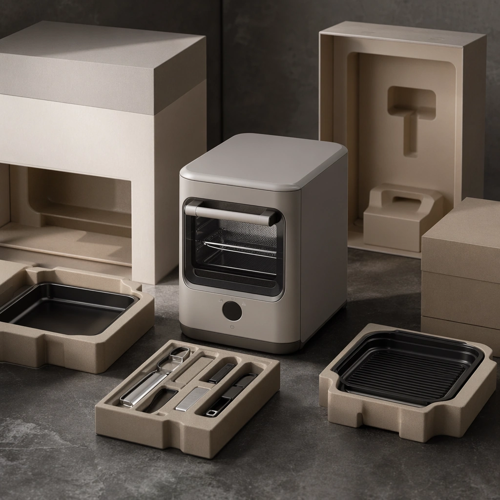
GPT Image 2en

Scene: A square tabletop scene with premium packaging volumes, molded inserts, soft retail lighting, and careful shadow control. Compose the frame as a square key visual with disciplined camera placement, premium lighting control, and believable real-world scale. The tonal range should feel polished and intentional, with enough atmosphere to create depth without obscuring form. Keep contrast calibrated for launch, catalog, or research presentation use rather than casual snapshot aesthetics. Subject: Center an original appliance partially unboxed with accessories, packaging supports, and a refined premium presentation rhythm. Make the subject feel original, production-aware, and clearly grounded in Premium Appliance Lifestyle Launch Set. Treat this as an independent study that must feel complete and coherent without relying on any external reference image. The focal hierarchy should be immediate: primary form first, then material behavior, then supporting environmental cues that clarify use context and difficulty. Important details: Make the packaging abstract and logo-free but believable as a retail artifact. The scene should emphasize care, protection, and product quality. The visual language should still feel native to Premium Appliance Lifestyle Launch Set, using disciplined industrial or campaign composition instead of generic stock photography. Use believable materials, engineering logic, and professional composition discipline. Reflections, shadows, edge breaks, texture scale, interface density, and small physical joints must all support realism. Avoid filler props, vague mood-board clutter, or any element that weakens the sense of a purpose-built industrial or automotive image. Use case: Appliance Launch single study 8/9 for Premium Appliance Lifestyle Launch Set, built as image support-four. Constraints: No readable text, no watermark, no logos, preserve exact 1:1 aspect ratio, no logos, no readable labels, no food-brand packaging, no influencer clutter, no unrealistic steam, no decorative overload.

Example generated from “Premium Appliance Lifestyle Launch Set — Domestic Ownership Scene”
GPT Image 2en

Scene: A square domestic counter scene with soft daylight, minimal props, tidy spatial rhythm, and a sense of quiet order after use. Compose the frame as a square key visual with disciplined camera placement, premium lighting control, and believable real-world scale. The tonal range should feel polished and intentional, with enough atmosphere to create depth without obscuring form. Keep contrast calibrated for launch, catalog, or research presentation use rather than casual snapshot aesthetics. Subject: Center an original appliance with a few realistic accessories arranged in a clean post-use domestic composition. Make the subject feel original, production-aware, and clearly grounded in Premium Appliance Lifestyle Launch Set. Treat this as an independent study that must feel complete and coherent without relying on any external reference image. The focal hierarchy should be immediate: primary form first, then material behavior, then supporting environmental cues that clarify use context and difficulty. Important details: Sell ownership satisfaction and domestic order rather than stylized clutter. The image should feel lived-in but premium, calm, and product-centered. The visual language should still feel native to Premium Appliance Lifestyle Launch Set, using disciplined industrial or campaign composition instead of generic stock photography. Use believable materials, engineering logic, and professional composition discipline. Reflections, shadows, edge breaks, texture scale, interface density, and small physical joints must all support realism. Avoid filler props, vague mood-board clutter, or any element that weakens the sense of a purpose-built industrial or automotive image. Use case: Appliance Launch single study 9/9 for Premium Appliance Lifestyle Launch Set, built as image support-five. Constraints: No readable text, no watermark, no logos, preserve exact 1:1 aspect ratio, no logos, no readable labels, no food-brand packaging, no influencer clutter, no unrealistic steam, no decorative overload.

Example generated from “Premium Product Landing Page — Titanium Headphone Hero”
GPT Image 2en

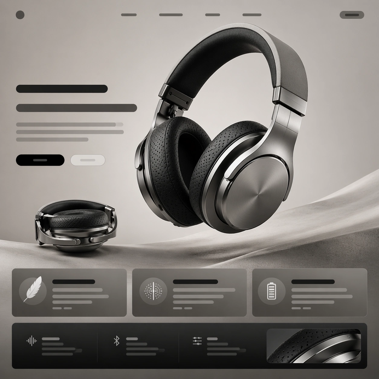
Scene: A square premium landing-page still for a flagship over-ear headphone, composed like the first viewport of a hardware launch website. The page is shown front-on with crisp vertical rhythm, a pale graphite background fading into warm stone gray, and a controlled studio-light glow that makes the page feel expensive rather than flashy. The upper half should read like a hero section, while the lower half suggests supporting modules and CTA blocks. Keep the lighting bright enough to reveal materials, with subtle reflections and disciplined shadows. Subject: Center a titanium over-ear headphone with a floating three-quarter view, slightly larger than life, showing the brushed metal yoke, perforated ear cushions, fine seam lines, and a soft matte headband interior. Around the product, build an elegant landing-page hierarchy using abstract headline bars, short paragraph blocks, pill-shaped CTA zones, and two or three clean value cards that imply features like comfort, acoustic isolation, and battery life without containing readable words. Add one smaller secondary render of the headphone folded flat to suggest portability. Important details: The image must feel like a real premium product launch page, not a random UI mockup. Product photography is the hero; typography zones, spacing, and module cadence support it. Preserve believable industrial design proportions, distinct titanium texture, soft black fabric, and restrained monochrome accents. Use generous margins, precise alignment, and a convincing rhythm from hero to feature modules to specification snippets. Use case: Premium Product Landing Page single study 1/9, testing a premium headphone hero frame with strong product-first web hierarchy. Constraints: No readable text, no watermark, no logos, preserve exact 1:1 aspect ratio, no browser chrome, no cluttered ecommerce thumbnails, no human model, no exploded parts, no neon gamer styling, no distorted headphone anatomy.

Example generated from “Premium Product Landing Page — Transparent Speaker Story”
GPT Image 2en

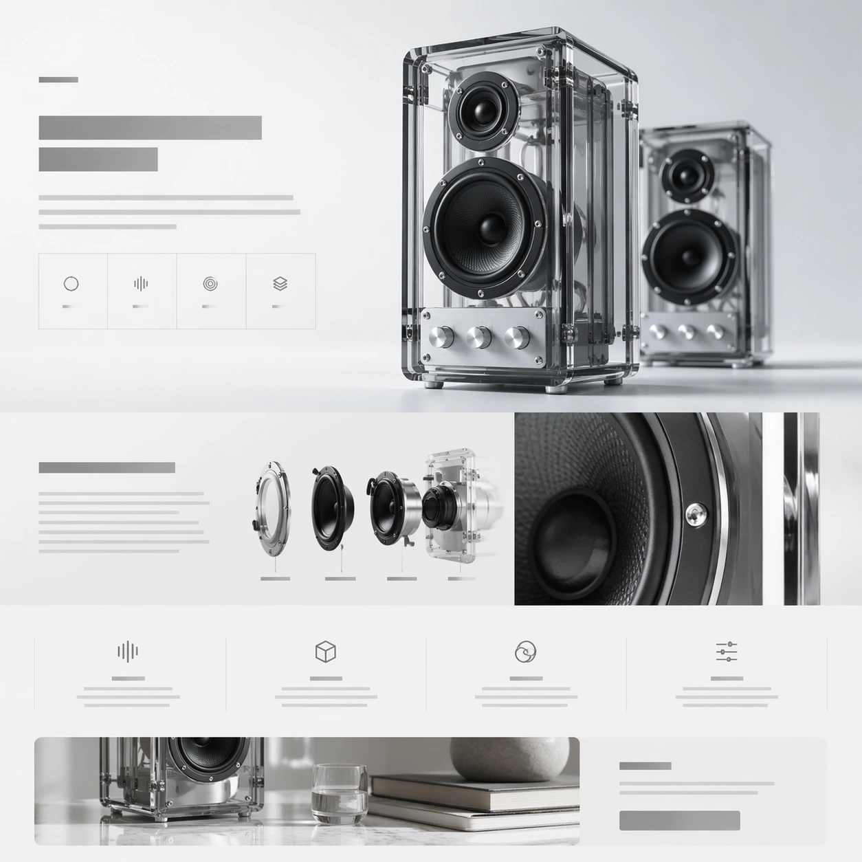
Scene: A square web-launch still for a transparent desktop speaker system, presented as a polished premium landing page. The layout feels airy and editorial, with an off-white background that grades into faint ice gray, minimal grid lines, and a calm daylight tone. The composition should suggest stacked website sections inside one frame: a hero band at the top, a storytelling middle section, and compact feature tiles below. Everything is aligned, spacious, and highly intentional. Subject: Feature a pair of transparent acrylic speakers with visible internal drivers, aluminum knobs, and smoked glass edges. One speaker stands upright as the main hero object; the second sits slightly behind it for depth. Construct the surrounding landing-page layout from abstract headline blocks, specification ribbons, icon-like markers, and modular content cards that imply acoustic tuning, transparent construction, and room presence. Include one close-up crop of the circular driver housing and one narrow band that suggests a lifestyle scene without showing a full room. Important details: This should feel like a launch page for a design-forward audio brand. Transparency, edge highlights, screws, driver cones, and acrylic thickness must be rendered credibly. The page hierarchy should have a strong beat: hero, material story, internal detail, feature row, CTA. Keep the system elegant and premium rather than playful. Use negative space, thin dividers, and quiet contrast to make the composition readable at a glance. Use case: Premium Product Landing Page single study 2/9, testing transparent hardware presentation and story-module rhythm in one premium web frame. Constraints: No readable text, no watermark, no logos, preserve exact 1:1 aspect ratio, no browser chrome, no crowded furniture scene, no random equalizer graphics, no exaggerated RGB lighting, no warped acrylic geometry, no cheap retail packaging.

Example generated from “Premium Product Landing Page — Modular Camera Showcase”
GPT Image 2en

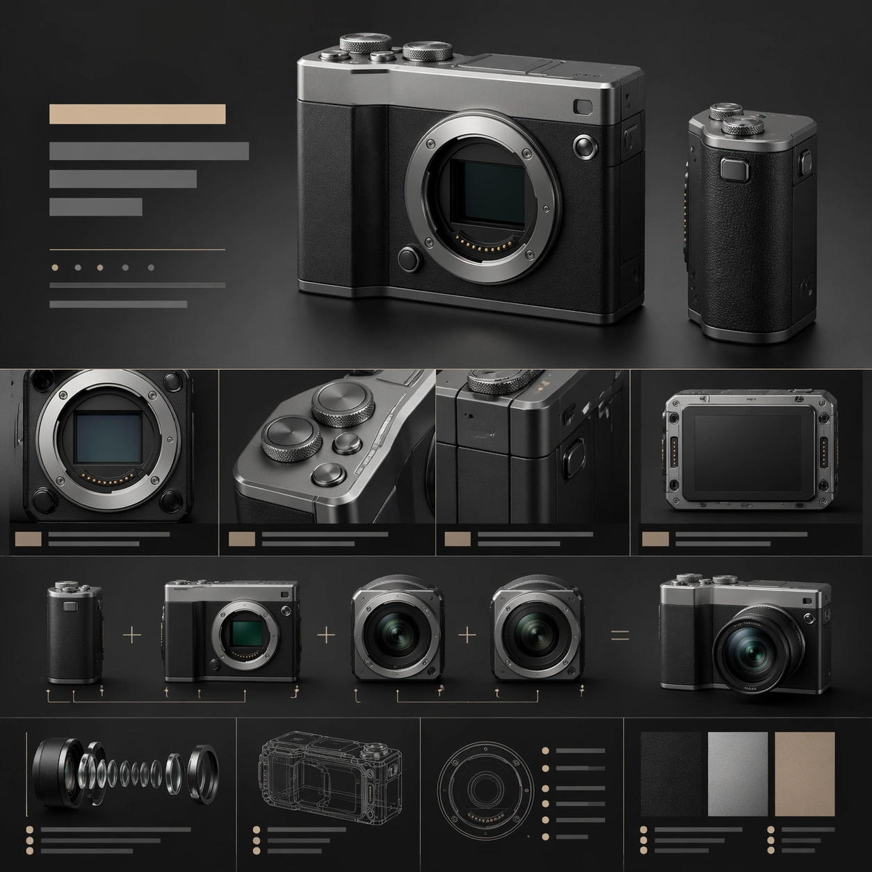
Scene: A square premium web still for a modular compact camera system, laid out like a high-end product landing page with crisp art direction. The palette combines matte charcoal, silver aluminum, and muted sandstone highlights, with lighting that feels like a blend of studio catalog photography and editorial design. The frame should contain a dominant hero section above a sequence of tightly designed feature areas and specification blocks, all arranged in a precise vertical cadence. Subject: Show a compact modular camera body with interchangeable lens modules and an attachable grip, rendered with believable machined edges, knurled dials, textured buttons, and a soft shadow beneath the main hero object. Surround it with abstract headline bars, feature panels, small diagram-like callout zones, and cropped detail windows revealing the lens mount, tactile controls, and modular seams. One supporting module can show two lens units aligned side by side to imply system versatility, but the central product body remains the main focal point. Important details: The page must communicate that the product is a premium camera ecosystem. Emphasize industrial precision, material fidelity, and clean hierarchy from hero render to feature explanation to specs. The composition should feel design-agency polished: sharp alignment, elegant spacing, and convincing relationships between large product renders and smaller supporting modules. Use restrained contrast and avoid noisy interface clutter. Use case: Premium Product Landing Page single study 3/9, testing camera-system storytelling with product photography, module hierarchy, and diagram-like feature framing. Constraints: No readable text, no watermark, no logos, preserve exact 1:1 aspect ratio, no browser chrome, no photographer model, no oversized lens flare, no chaotic accessory pile, no fake retro film nostalgia, no distorted camera proportions.

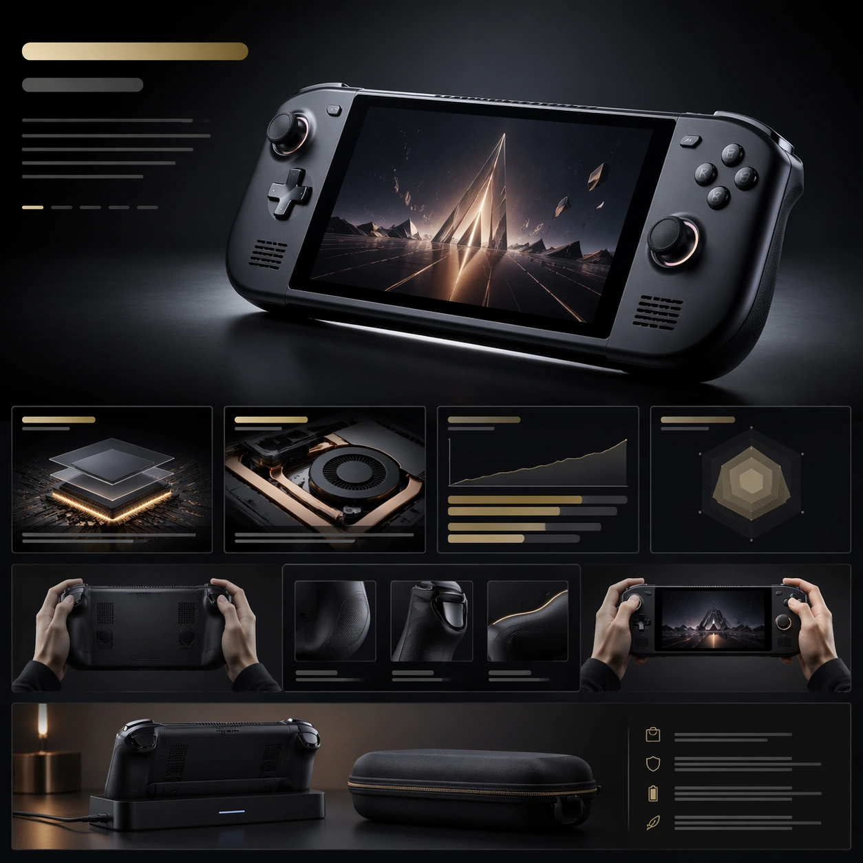
Example generated from “Premium Product Landing Page — Handheld Console Launch”
GPT Image 2en

Scene: A square launch-page still for a premium handheld gaming console, framed like a polished web campaign rather than a store listing. The page uses a deep charcoal-to-graphite background with controlled pools of light, clean module spacing, and a dramatic but disciplined contrast structure. The composition should read as a hero banner at the top flowing into performance, ergonomics, and portability sections below, all within one coherent square crop. Subject: Place a premium handheld console in the center, angled slightly to reveal its screen, analog sticks, shoulder curve, vents, and finely machined frame. The screen may show non-readable geometric game imagery, but the device body should remain the main subject. Around it, design a believable landing-page system with abstract headline bars, performance cards, small benchmark-style panels, ergonomic callout zones, and one lower strip showing the console docked beside a slim case or charging cradle. Keep every supporting element subordinate to the hero hardware render. Important details: The image should feel like a proposal for a luxury consumer-electronics launch page. Industrial design must be credible: balanced proportions, tactile buttons, realistic screen glass, subtle venting, and premium surface finishes. The web layout needs a strong hierarchy from hero to feature tiles to compact spec grid, using generous spacing, crisp edge alignment, and a visually persuasive cadence. Avoid generic gamer chaos; keep it premium, mature, and art directed. Use case: Premium Product Landing Page single study 4/9, testing premium gaming-device presentation with strong hero hardware and supporting feature modules. Constraints: No readable text, no watermark, no logos, preserve exact 1:1 aspect ratio, no browser chrome, no chaotic esports graphics, no anime characters on screen, no RGB overload, no toy-like proportions, no messy accessory pile, no distorted controls.

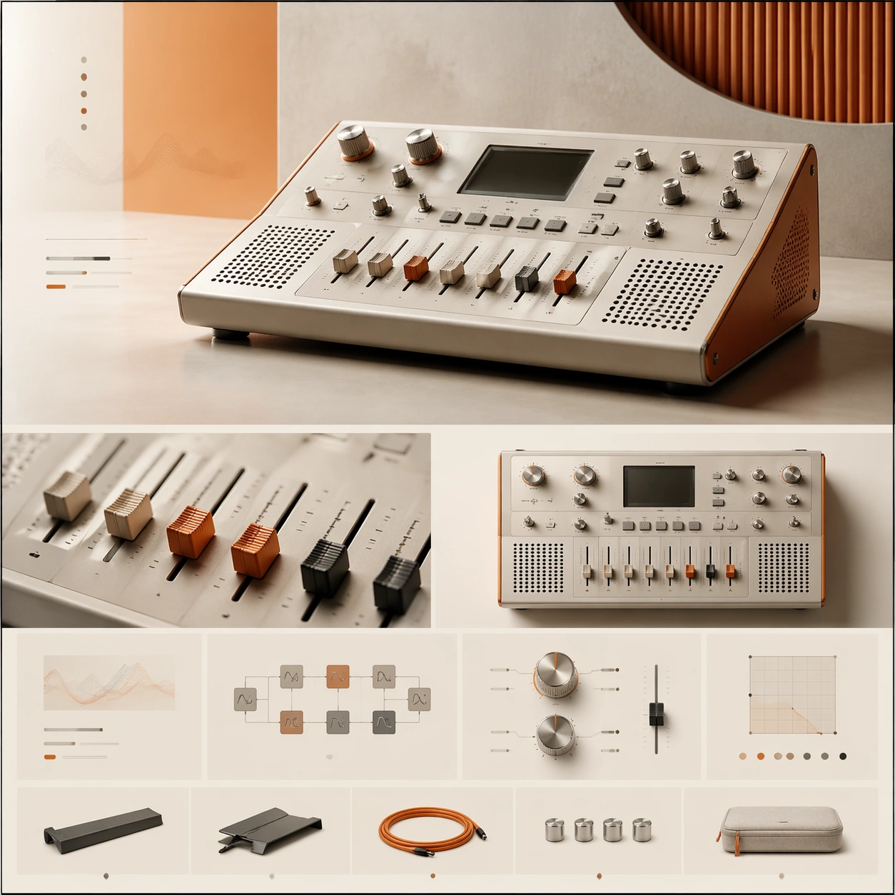
Example generated from “Premium Product Landing Page — Desktop Synth Arrangement”
GPT Image 2en

Scene: A square premium landing-page still for a boutique desktop synthesizer, composed like a sophisticated music-technology website. The visual tone is warm industrial: bone white, muted orange, brushed aluminum, and soft black accents, with diffuse studio lighting and a neat modular grid. The page should feel like an art-directed launch page with a hero zone up top and a sequence of feature sections below, all contained in a balanced square frame. Subject: Present a compact desktop synthesizer with clean knobs, sliders, a small non-readable display area, speaker perforations, and a carefully machined chassis. The main hero render sits slightly off-center to create motion, while surrounding layout elements suggest feature stories, signal-path modules, tactile control explanations, and a slim accessory strip. Add one cropped macro panel showing the fader caps and one secondary angle of the synth from above, but keep the dominant focus on the central hardware object and the premium page hierarchy built around it. Important details: This must look like a creative-tech launch page for a serious design-led brand. The hardware needs authentic industrial design cues: measured proportions, believable materials, crisp edges, and tactile knobs that feel manufacturable. The landing-page composition should rely on elegant spacing, modular alignment, and a clear flow from hero to feature storytelling to condensed specification grid. Aim for premium calm, not retro clutter or maximalist music-poster energy. Use case: Premium Product Landing Page single study 5/9, testing a boutique synthesizer launch page with tactile product detail and refined module rhythm. Constraints: No readable text, no watermark, no logos, preserve exact 1:1 aspect ratio, no browser chrome, no crowded studio desk, no musician portrait, no excessive cables, no vintage grime, no chaotic patch-bay spaghetti, no malformed knobs or keys.

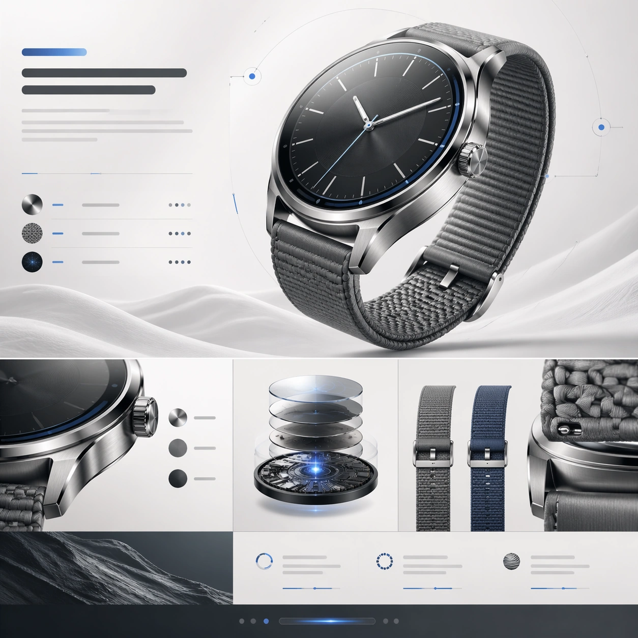
Example generated from “Premium Product Landing Page — Smartwatch Material Cutaway”
GPT Image 2en

Scene: A square premium landing-page still for a luxury smartwatch, designed as an immaculate product website section stack. The palette uses silver steel, off-white, soft graphite, and a restrained cool-blue highlight. Lighting is bright, clean, and luxurious, with a catalog-photography feel that transitions into elegant webpage blocks and module separators. The top half should read like a hero section, while the lower half transitions into material story, internal engineering, and strap-system segments. Subject: Show a brushed-steel smartwatch with a sculpted case, subtle crown, precision chamfers, and a premium woven strap. The main watch render floats in front of delicate abstract page elements. Around it, build landing-page modules from abstract headline bars, slim comparison rows, circular callout markers, and one cutaway-style detail panel hinting at layered materials or sensor architecture. Include a secondary strap color variation and a close crop of the case edge to emphasize finish quality, but preserve the watch face and body as the dominant focus. Important details: The composition should sell luxury engineering and refinement. Case thickness, lugs, strap attachment, glass curvature, and brushed metal finish must feel believable. The page hierarchy needs to communicate hero, material story, engineering depth, and CTA in a single frame without becoming cluttered. Use premium spacing, gentle contrast, and polished alignment. The design language should feel closer to a launch keynote website than a generic watch-store page. Use case: Premium Product Landing Page single study 6/9, testing luxury wearable presentation with material storytelling and cutaway-inspired page modules. Constraints: No readable text, no watermark, no logos, preserve exact 1:1 aspect ratio, no browser chrome, no wrist on human skin, no fake app screenshots, no oversized fitness icons, no jewelry clutter, no distorted watch anatomy, no cheap sport-watch styling.

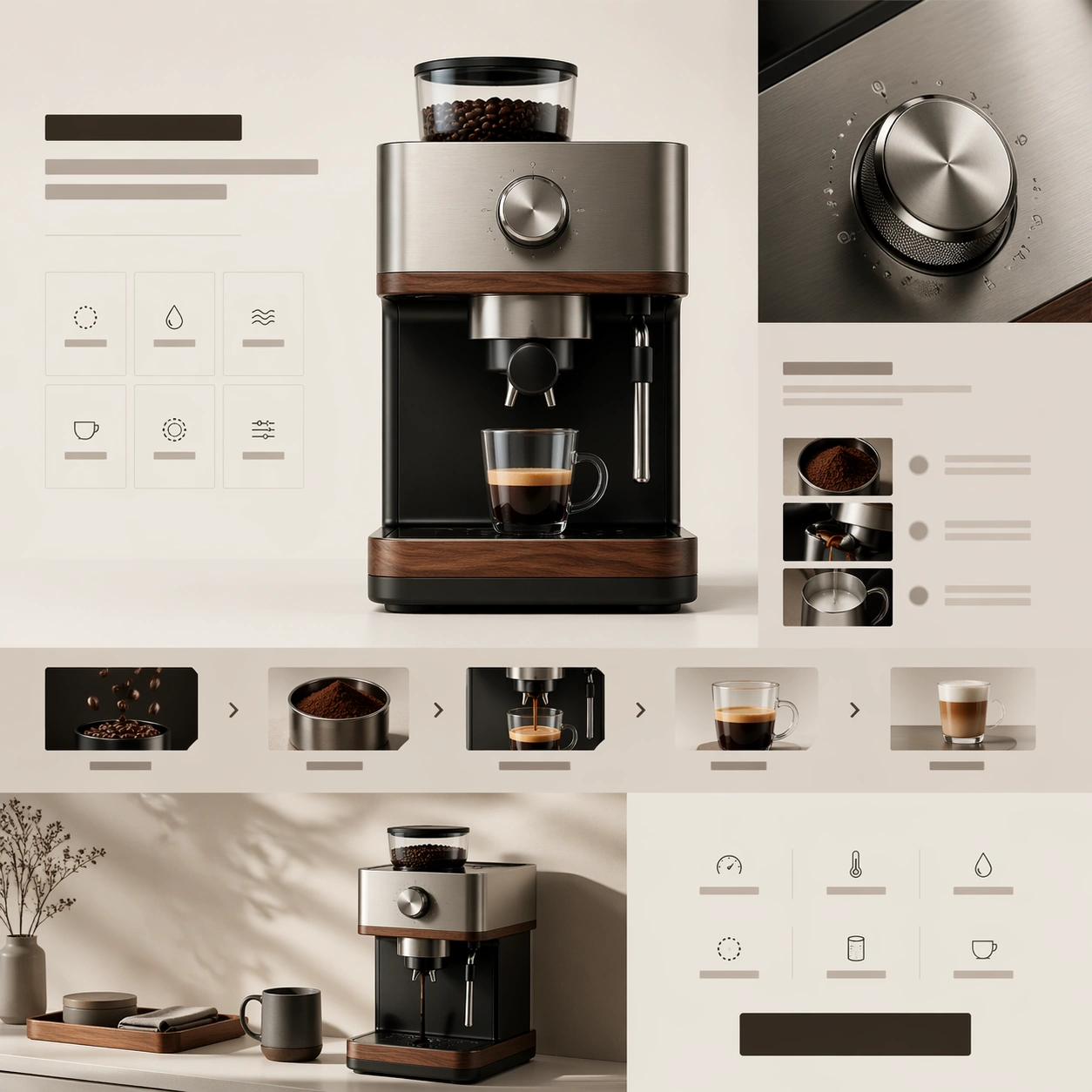
Example generated from “Premium Product Landing Page — Precision Coffee Launch”
GPT Image 2en

Scene: A square premium web-launch still for a precision coffee device, staged like the hero and feature stack of a design-led appliance landing page. The palette combines soft cream, matte black, brushed stainless steel, and warm walnut. Lighting feels like bright editorial product photography, while the page structure uses calm white space, thin dividing rules, and a refined sequence of content bands arranged within one square frame. Subject: Center a premium countertop coffee machine with an integrated grinder, precise spout, tactile control dial, and a clean geometric body. The hero render should feel substantial and beautifully manufactured. Around it, build a landing-page composition from abstract headline bars, ingredient-free feature cards, brewing-process strips, and compact spec rows. Include one close-up of the metal dial and one lower module showing the machine beside a matching cup and a neat tray, but keep the product itself dominant. The layout should imply craftsmanship, precision extraction, and everyday ritual. Important details: This should look like a serious premium appliance launch, not a kitchen catalog collage. Material fidelity matters: brushed metal, walnut trim, subtle seams, and precision-fitted panels should all feel real. The webpage hierarchy should move clearly from hero to ritual story to control detail to specs and CTA. Use premium restraint, careful spacing, and believable industrial design to maintain the illusion of a real brand presentation. Use case: Premium Product Landing Page single study 7/9, testing a luxury coffee-device launch page with ritual storytelling and premium appliance detail. Constraints: No readable text, no watermark, no logos, preserve exact 1:1 aspect ratio, no browser chrome, no messy cafe background, no overflowing coffee splash, no barista portrait, no fake packaging copy, no oversized beans, no distorted machine geometry.

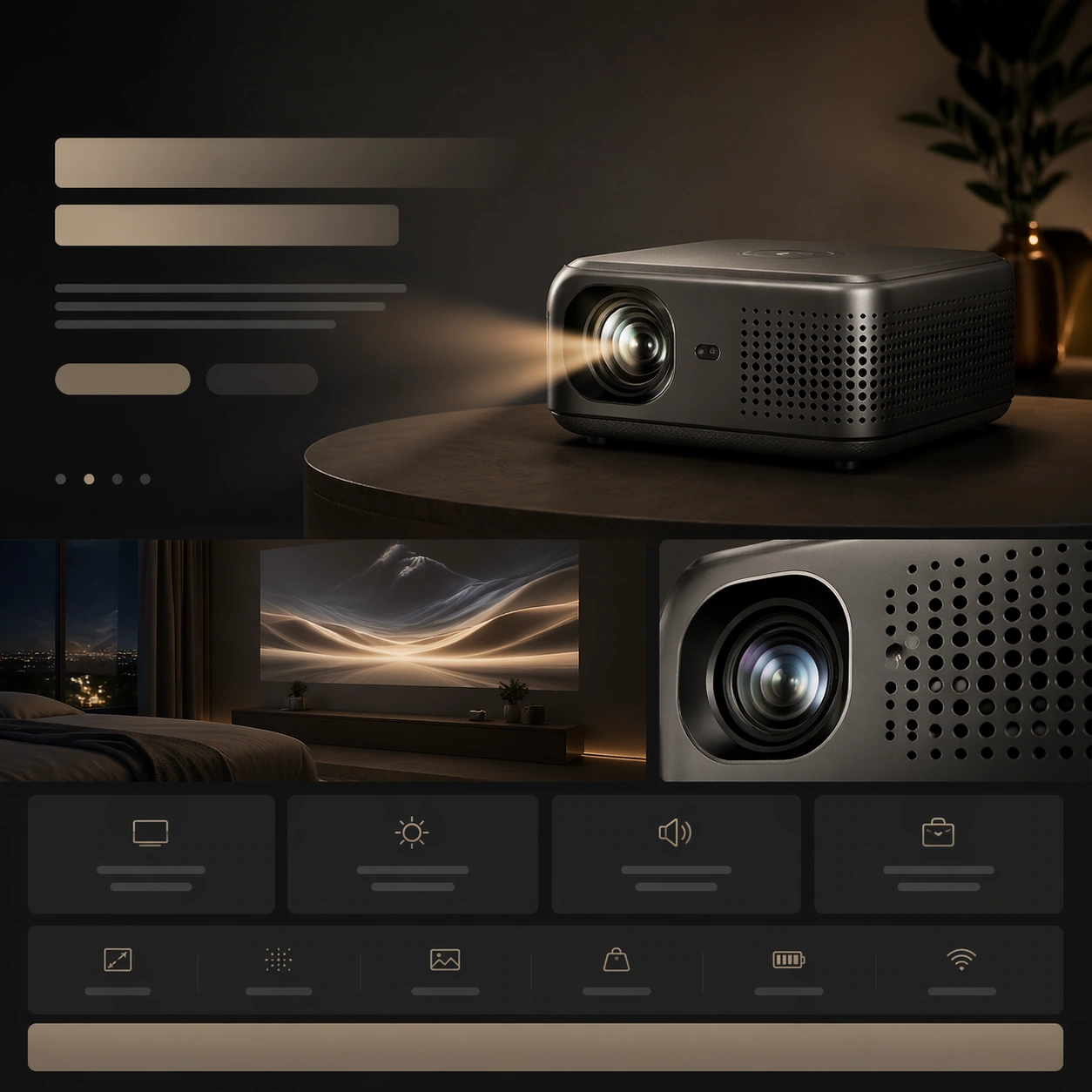
Example generated from “Premium Product Landing Page — Portable Projector Night Scene”
GPT Image 2en

Scene: A square premium landing-page still for a portable projector, designed as a cinematic product website frame. The page should blend low-light atmosphere with clean web hierarchy: a dark slate background, soft warm projection glow, and crisp layout bands that imply hero, use-case story, and compact specifications. The composition remains front-on and square, but it should feel immersive and brand-polished rather than flat. Subject: Place a small premium projector on a low surface, angled so its lens, perforated vents, and sculpted housing are clearly visible. A subtle beam of light can suggest projection without overpowering the page. Build the surrounding landing-page system from abstract headline bars, lifestyle-image placeholders, benefit cards, and spec strips. Include one supporting module showing a minimal night-room scene with a projected abstract image on a wall, plus one close crop of the lens assembly or vent pattern. The projector remains the central hardware hero, with the layout reinforcing portability and cinematic experience. Important details: The challenge is balancing ambience and clarity. The projector should feel beautifully manufactured, with real materials, vent geometry, and lens detail, while the webpage still reads cleanly. The layout needs clear section rhythm from hero to use-case story to technical detail to CTA. Keep the visual language premium and restrained, avoiding gadget-store clutter or exaggerated sci-fi glow. The page must feel like something a refined consumer-tech brand would present to investors or clients. Use case: Premium Product Landing Page single study 8/9, testing a portable projector launch page with atmospheric lifestyle context and disciplined module hierarchy. Constraints: No readable text, no watermark, no logos, preserve exact 1:1 aspect ratio, no browser chrome, no crowded living room, no movie characters on the wall, no laser-beam exaggeration, no toy projector styling, no chaotic app UI overlays, no distorted lens housing.

Example generated from “Premium Product Landing Page — Mesh Router Spec Grid”
GPT Image 2en

Scene: A square premium landing-page still for a mesh-router system, arranged like a high-end networking product website. The page uses a restrained palette of matte white, soft gray, pale blue, and graphite, with a bright minimal background and precise grid discipline. The composition should imply a hero section at the top, then a network-coverage story, then a performance-and-specification row below, all integrated into one square frame with elegant whitespace. Subject: Feature a set of sculptural mesh-router units with rounded edges, vent detailing, and a refined industrial form, arranged as a hero trio with one main unit forward and two supporting nodes behind it. Surround them with a landing-page layout built from abstract headline blocks, network-diagram panels, signal-zone cards, and a precise specification grid made of clean rectangular modules without readable words. Add one simplified top-down coverage visualization using glowing nodes and lines, and one close crop revealing vent texture and material finish. The hardware objects should remain the primary focal point. Important details: This should feel like premium infrastructure branding, not commodity electronics marketing. The routers must look believable, sculpted, and desirable, with careful seams, venting, and premium matte material treatment. The webpage layout should communicate trust, coverage, and system elegance through hierarchy, spacing, and well-controlled module rhythm. Keep the image minimal, confident, and visually intelligent, with no unnecessary clutter or generic smart-home clichés. Use case: Premium Product Landing Page single study 9/9, testing a mesh-network launch page with product grouping, coverage storytelling, and a clean premium spec grid. Constraints: No readable text, no watermark, no logos, preserve exact 1:1 aspect ratio, no browser chrome, no server-rack environment, no cartoon wifi icons, no smart-home family photo, no excessive blue glow, no cheap plastic feel, no distorted router geometry.

Example generated from “Prestige Tv Key Art Remix — Penthouse Lineup”
GPT Image 2en

Scene: A square premium-streaming key art composition staged inside a glass-walled penthouse above a winter city skyline at blue hour. The frame is cool, polished, and austere, with silver reflections, pale marble, smoked glass, and a disciplined balance of shadow and controlled highlights. The camera is frontal and slightly elevated so the whole group reads like an official campaign image rather than a candid scene. Subject: Create a fictional prestige-drama ensemble of six people arranged in a strict power pyramid. At the center sits an older matriarch in an ivory suit on a low modern chair, perfectly still and clearly dominant. Behind her stands the chosen heir in a dark charcoal suit, tense but composed. To one side, a sharp younger daughter leans against the window with a guarded stare; opposite her, an outsider son-in-law stands half a step back, uncertain but ambitious. Slightly behind them, a discreet fixer and a silent bodyguard complete the composition. Their expressions must suggest inheritance battles, private grievances, and long family memory without melodrama. Important details: This is the reference image for the series, so face identities, hair silhouettes, wardrobe palette, and precise spacing between figures must be memorable and reusable. The visual language must feel like an awards-season streamer campaign: clean negative space, expensive tailoring, subtle environmental storytelling, and unmistakable role hierarchy. Preserve believable anatomy, consistent eye lines, and enough empty space around the ensemble for future crop logic. Use case: Prestige TV Key Art Remix series study 1/9, establishing the core cast hierarchy for a fictional streaming dynasty drama. Constraints: No readable text, no watermark, no logos, preserve exact 1:1 aspect ratio, no comedy energy, no crowded props, no extra background people, no exaggerated action poses, no cheap soap-opera styling.

Example generated from “Prestige Tv Key Art Remix — Awards Portrait”
GPT Image 2en

Scene: Use the reference ensemble key art as the source of identity, wardrobe, and hierarchy. Create a square awards-season portrait adaptation set in a muted cream photo studio with soft architectural shadows, brushed metal panels, and controlled spotlight falloff. The mood is formal, expensive, and magazine-grade, as if the platform commissioned a prestige press image derived from the same series campaign. Subject: Show the same six characters from the reference with preserved faces, hairstyles, clothing language, and relationship structure. The matriarch remains the visual center, now standing instead of sitting, while the heir is placed close enough to imply succession but still clearly subordinate. The daughter and outsider son-in-law form opposing diagonals that create tension across the frame. The fixer and bodyguard stay slightly recessed, still readable but not competing for dominance. Use small shifts in shoulder angle, eye direction, and hand placement to intensify status and distrust without changing who each person is. Important details: Preserve exact identity continuity from image 01. This variant tests whether a campaign can tighten the crop and simplify the background while keeping the same power map. Maintain luxury tailoring, restrained color palette, and premium retouching discipline. The image should still read instantly as the same fictional series, not a new cast or unrelated editorial portrait. Avoid clutter; the hierarchy must come from spacing, posture, gaze, and tonal contrast. Use case: Prestige TV Key Art Remix series study 2/9, adapting the same fictional ensemble into a formal awards-campaign portrait. Constraints: No readable text, no watermark, no logos, preserve exact 1:1 aspect ratio, no cast reshuffle, no extra jewelry spectacle, no broad smiles, no busy set dressing, no fashion-editorial exaggeration that breaks the prestige-drama tone.

Example generated from “Prestige Tv Key Art Remix — Resort Fracture”
GPT Image 2en

Scene: Use the reference ensemble key art as the identity source. Create a square prestige-series campaign variant on a luxury seaside resort terrace at noon, with bleached stone, pale water, and a deceptively serene brightness. The frame should feel sunlit but emotionally cold, with crisp shadows and enough architectural depth to imply wealth, surveillance, and private agendas beneath a vacation surface. Subject: Show the same six characters from image 01 with preserved faces, clothing signatures, and role order, but redistribute them across a terrace composition that suggests temporary alliance and fracture. The matriarch occupies the central shaded seat near a stone table; the heir stands nearest to her, visibly protective but constrained. The daughter watches from a bright edge near the pool; the outsider son-in-law is separated by a table corner and a visible gap, hinting at exclusion. The fixer and bodyguard remain in supporting positions, one near a doorway, one near a reflective glass panel. Every pose should feel controlled, minimal, and loaded with subtext. Important details: The core task is to preserve campaign recognizability while changing environment and temperature. The same family must remain instantly identifiable from image 01, and their power geometry must still read clearly even in a wider, sunnier setting. Keep wardrobe in the same luxury neutral palette, maintain serious expressions, and use resort props sparingly so the image never becomes travel advertising. The visual message is privilege under pressure. Use case: Prestige TV Key Art Remix series study 3/9, translating the same fictional ensemble into a luxury-resort fracture variant. Constraints: No readable text, no watermark, no logos, preserve exact 1:1 aspect ratio, no tropical postcard cheer, no swimwear, no extra hotel guests, no slapstick body language, no dramatic wind effects that break identity continuity.

Example generated from “Prestige Tv Key Art Remix — Night Window Truce”
GPT Image 2en

Scene: Use the reference ensemble key art as the campaign identity source. Create a square night variant inside the same penthouse world, now lit by rain-streaked windows, distant city bokeh, and a narrow pool of tungsten light across dark flooring. The atmosphere is tense and intimate, with most of the frame held in deep shadow so faces and posture carry the drama. Subject: Show the same six characters from image 01 with preserved identities, tailoring, and rank order, arranged around the window line as if a temporary truce is being negotiated. The matriarch remains dominant near the center, still the brightest face. The heir stands close but slightly behind, ready to step in. The daughter and outsider son-in-law occupy opposite sides of the frame, creating a visual split through opposing gazes. The fixer hovers between camps, while the bodyguard is almost absorbed into shadow yet still structurally important. Keep gestures minimal: a hand on a chair back, a chin tilt, a slight lean toward or away from the others. Important details: This image tests whether the same prestige ensemble can survive a darker, moodier campaign treatment without losing clarity. Preserve the recognizable faces, hairstyle outlines, and wardrobe tones from image 01. Use reflections and rain only as atmosphere, never as distraction. The power dynamics must remain legible in silhouette, spacing, and light hierarchy. The result should feel like a premium streaming finale poster cropped to a square social key art format. Use case: Prestige TV Key Art Remix series study 4/9, turning the same fictional dynasty cast into a darker night-truce campaign variant. Constraints: No readable text, no watermark, no logos, preserve exact 1:1 aspect ratio, no action-scene chaos, no lightning theatrics, no extra weapons, no horror styling, no obscure faces hidden beyond recognition.
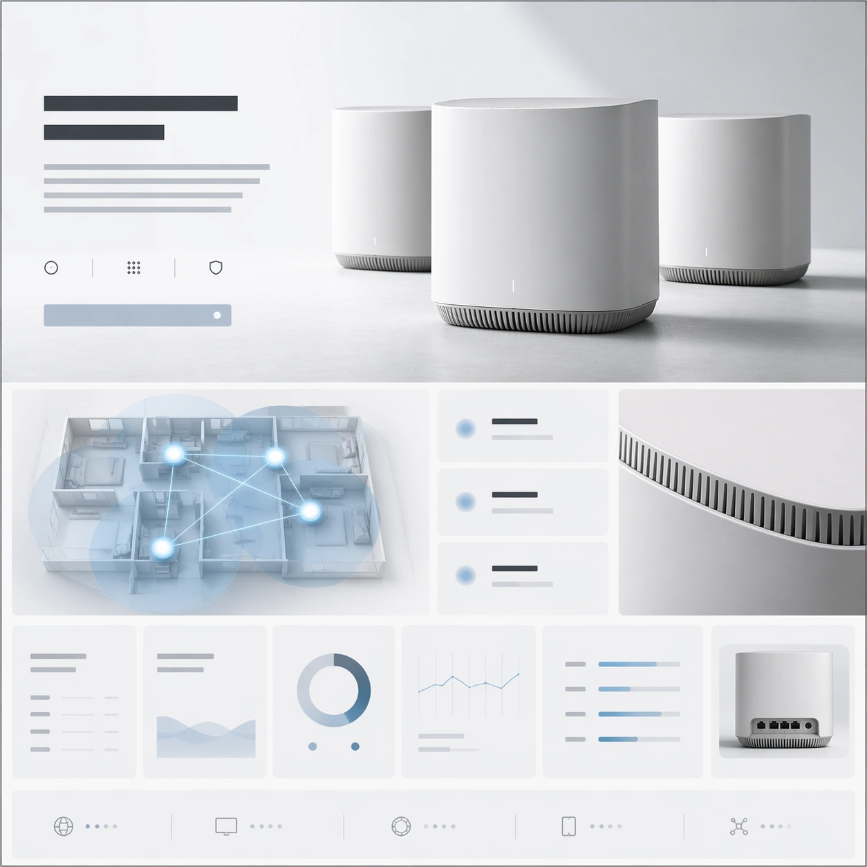
Example generated from “Prestige Tv Key Art Remix — Council of Heirs”
GPT Image 2en

Scene: A square prestige-streaming key art image set in a monumental ancestral council chamber with polished stone floors, candlelike side lighting, and towering carved walls that imply dynastic history without turning into fantasy spectacle. The palette is restrained: black, deep oxblood, parchment ivory, and muted brass. The frame should feel ceremonial, cold, and platform-ready, with a polished photographic finish rather than a painted tableau. Subject: Create a fictional ensemble of five heirs competing for control of an old empire. A stern eldest daughter sits in the central chair as the implied lead. Around her stand four rivals: a military brother in severe uniform, a scholar-sister holding a sealed document, a charming reformist cousin half turned away, and an elderly advisor whose presence is quiet but destabilizing. Arrange them so hierarchy is instantly readable: the lead is central and calm, the others orbit with distinct amounts of threat, resentment, and opportunism. Their faces and costumes should feel specific and believable, not generic fantasy cosplay. Important details: The key challenge is prestige-TV ensemble grammar applied to a historical power struggle. Use spacing, gaze direction, and subtle prop logic to show alliances and succession pressure. Keep the environment luxurious but understated so the cast remains the focus. This should feel like official campaign art for a serious serialized drama, not an adventure poster. Facial realism, wardrobe finish, and negative space discipline are critical. Use case: Prestige TV Key Art Remix single study 5/9, testing a dynastic council ensemble in premium streaming campaign language. Constraints: No readable text, no watermark, no logos, preserve exact 1:1 aspect ratio, no swords drawn, no fantasy creature elements, no cluttered throne-room excess, no camp theatricality, no chaotic crowd scene.
Example generated from “Prestige Tv Key Art Remix — Orbital Diplomats”
GPT Image 2en

Scene: A square premium-series key art composition inside a circular orbital negotiation chamber overlooking Earth. Use dim cobalt light, brushed titanium, soft screen glow without readable interface text, and a large observation window that gives the frame depth and status. The image must feel like campaign photography for a cerebral sci-fi drama, not an action blockbuster. Subject: Create a fictional ensemble of six diplomats and security figures during a fragile interplanetary treaty. At the center stands a composed female envoy in a sharply tailored pale suit, clearly the protagonist. To her left is an aging admiral whose medals and rigid stance imply old power; to her right is a young rival ambassador with concealed ambition. Behind them stand a translator with augmented eyes, a corporate observer in immaculate dark clothing, and a bodyguard whose stillness adds pressure. Their arrangement should communicate protocol, suspicion, and strategic dependency. Every face should be distinct and believable, with subtle differences in age, nationality cues, and professional role. Important details: The visual problem is ensemble diplomacy, not spectacle. Use spacing, eye lines, and glass reflections to suggest political tension. Keep the sci-fi design expensive but spare, with no crowded control room clutter. The campaign grammar must remain prestige-streaming: clear lead, supporting hierarchy, quiet menace, and a unified polished finish suitable for platform thumbnails, banners, and awards-season ads. Use case: Prestige TV Key Art Remix single study 6/9, testing orbital diplomacy as a premium ensemble key art system. Constraints: No readable text, no watermark, no logos, preserve exact 1:1 aspect ratio, no battle damage, no laser action, no generic spaceship cockpit clutter, no comic-book exaggeration, no extra background crew.

Example generated from “Prestige Tv Key Art Remix — Monastery Conspirators”
GPT Image 2en

Scene: A square prestige-series key art image inside a mountain monastery archive lit by cold dawn light from high windows and a few warm practical lamps. Stone columns, paper screens, and tiered shelves create a disciplined architectural frame. The mood is contemplative but dangerous, with heavy silence and a premium photographic finish that suggests serious serialized drama rather than mystical fantasy. Subject: Create a fictional ensemble of five conspirators embedded inside a religious institution. The lead is a young abbess in layered charcoal robes, centered and poised, holding neither weapon nor scripture but commanding the scene through stillness. Around her stand a war-scarred monk, an aristocratic donor in understated silk, a novice archivist with divided loyalty, and a severe investigator from the capital. Arrange them so the abbess is clearly the emotional center while the others form a network of suspicion and dependency. Their faces must feel lived-in, subtle, and complex, avoiding caricature. Important details: This study depends on relationship geometry more than overt plot props. Use posture, depth, and gaze to imply secret factions inside a closed institution. Maintain a restrained palette and sparse set dressing so the image reads like premium key art. The environment should feel real and expensive, not stagey. Keep clothing textures, age differences, and personal histories legible at thumbnail scale. Use case: Prestige TV Key Art Remix single study 7/9, exploring monastery intrigue through prestige ensemble campaign language. Constraints: No readable text, no watermark, no logos, preserve exact 1:1 aspect ratio, no glowing magic effects, no chanting crowd, no overt battle scene, no camp villain expressions, no fantasy-world excess.

Example generated from “Prestige Tv Key Art Remix — Desert Empire Board”
GPT Image 2en

Scene: A square streaming-series key art setup inside a desert-capital strategy room with sand-colored concrete, shaded lattice windows, and late-afternoon amber light cutting clean geometric shapes across the floor. The atmosphere should feel expensive, modern, and politically loaded. The space is minimal enough to keep focus on the cast, but rich enough to imply money, extraction, and statecraft. Subject: Create a fictional ensemble of six people controlling an energy empire. The lead is a young executive woman in a cream tailored suit standing at the head of a low table. Around her are an older patriarch in a wheelchair, a military liaison in dark uniform, a younger half-brother in relaxed luxury attire, a legal strategist with a tablet held dark and unreadable, and a desert field operator in dust-marked formalwear. Their arrangement should clearly suggest succession anxiety, public image management, and regional power. The lead must dominate the frame through posture and light, while every supporting character carries a distinct threat or dependency. Important details: Treat this as official platform key art for a modern geopolitical family drama. Use spacing and body language to communicate ownership, rivalry, and strategic containment. Keep surfaces tactile and believable, with high-end wardrobe styling and restrained props. The composition must avoid generic corporate-photo symmetry; instead it should feel intentionally dramatic, with a real sense of private history between people. Use case: Prestige TV Key Art Remix single study 8/9, testing a desert-capital power board as a premium ensemble campaign image. Constraints: No readable text, no watermark, no logos, preserve exact 1:1 aspect ratio, no war-zone chaos, no oil-rig spectacle, no extra attendants, no broad grin advertising tone, no cheap action-thriller clichés.

Example generated from “Prestige Tv Key Art Remix — Coastal Mystery Cast”
GPT Image 2en

Scene: A square prestige-streaming key art image on the terrace of a decaying coastal estate at overcast dusk. Sea mist, weathered stone, slate-blue water, and dim interior lamps create a restrained gothic atmosphere without turning supernatural. The composition should feel expensive and carefully art-directed, like a premium ensemble mystery limited series intended for platform homepages and awards-season press kits. Subject: Create a fictional ensemble of five suspects linked by an old disappearance. At the center stands a composed middle-aged woman in a dark tailored coat, clearly the lead and emotional anchor. Around her are a younger brother with exhausted wealth, a local detective in plain dark wool, an elegant outsider bride with unreadable motives, and a housekeeper who has seen everything but reveals nothing. Arrange them so the lead is central while the others create asymmetrical tension through distance, half-turns, and withheld eye contact. Every face should feel specific, weathered, and capable of carrying a long-form mystery drama. Important details: The success condition is campaign-grade suspicion, not horror. Use architectural lines, sea horizon, and subtle depth separation to make the relationships legible. Keep costumes grounded, tasteful, and regionally believable. The image must look like a serious ensemble key art poster without relying on text or obvious crime-scene props. Preserve strong thumbnail readability and a refined prestige-series finish. Use case: Prestige TV Key Art Remix single study 9/9, testing a coastal mystery ensemble in premium key art form. Constraints: No readable text, no watermark, no logos, preserve exact 1:1 aspect ratio, no ghost effects, no jump-scare horror cues, no police tape, no melodramatic storm action, no cluttered prop table.
Example generated from “Product Comparison Benefit Board — Reference Anchor”
GPT Image 2en

Scene: Create a square reference image for Product Comparison Benefit Board. Build a reference anchor establishing the core system with a premium, production-ready finish. Use a polished modular board or campaign surface with clean spacing, premium game-UI finish, and clear focal hierarchy. The composition should feel intentional, clean, and reusable for gallery, research, campaign, or internal handoff contexts. Lighting must support readability first, with the main forms clearly separated from the background and enough breathing room for the system to stay legible at both hero scale and thumbnail scale. Subject: Center a coherent original game-art system built for premium production and marketing surfaces. For this image, focus on reference anchor. Keep the same system logic stable across screenshots, cards, banners, and overview boards. This image is the canonical anchor that later series images must follow. The viewer should immediately understand what role this surface plays inside a cohesive game-production asset pack. Important details: Lock framing, icon grammar, palette blocking, and surface hierarchy so the kit feels production-ready and consistent. Preserve the core silhouette, framing language, and material logic from the reference image while each variation changes function. Keep materials believable, edge hierarchy disciplined, and the visual language consistent with Compare Board. Use abstract interface blocks or diagram accents when helpful, but avoid any readable language. The final result should feel like a deliberate production asset rather than a random illustration. Use case: Product Comparison Benefit Board series study 1/9, designed as reference anchor within a cohesive asset pack. Constraints: No readable text, no watermark, no logos, preserve exact 1:1 aspect ratio, no unrelated objects, no broken visual hierarchy, no malformed anatomy or broken perspective, no random decorative clutter.

Example generated from “Product Comparison Benefit Board — Variant One”
GPT Image 2en

Scene: Create a square dependent image for Product Comparison Benefit Board. Build a first controlled variation in the same system with a premium, production-ready finish. Use a polished modular board or campaign surface with clean spacing, premium game-UI finish, and clear focal hierarchy. The composition should feel intentional, clean, and reusable for gallery, research, campaign, or internal handoff contexts. Lighting must support readability first, with the main forms clearly separated from the background and enough breathing room for the system to stay legible at both hero scale and thumbnail scale. Subject: Center a coherent original game-art system built for premium production and marketing surfaces. For this image, focus on the intended support surface. Keep the same system logic stable across screenshots, cards, banners, and overview boards. Preserve exact identity or system logic from the reference image while changing only the intended variation axis. The viewer should immediately understand what role this surface plays inside a cohesive game-production asset pack. Important details: Lock framing, icon grammar, palette blocking, and surface hierarchy so the kit feels production-ready and consistent. Preserve the core silhouette, framing language, and material logic from the reference image while each variation changes function. Keep materials believable, edge hierarchy disciplined, and the visual language consistent with Compare Board. Use abstract interface blocks or diagram accents when helpful, but avoid any readable language. The final result should feel like a deliberate production asset rather than a random illustration. Use case: Product Comparison Benefit Board series study 2/9, designed as variant one within a cohesive asset pack. Constraints: No readable text, no watermark, no logos, preserve exact 1:1 aspect ratio, no unrelated objects, no broken visual hierarchy, no malformed anatomy or broken perspective, no random decorative clutter.

Example generated from “Product Comparison Benefit Board — Variant Two”
GPT Image 2en

Scene: Create a square dependent image for Product Comparison Benefit Board. Build a second controlled variation in the same system with a premium, production-ready finish. Use a polished modular board or campaign surface with clean spacing, premium game-UI finish, and clear focal hierarchy. The composition should feel intentional, clean, and reusable for gallery, research, campaign, or internal handoff contexts. Lighting must support readability first, with the main forms clearly separated from the background and enough breathing room for the system to stay legible at both hero scale and thumbnail scale. Subject: Center a coherent original game-art system built for premium production and marketing surfaces. For this image, focus on the intended support surface. Keep the same system logic stable across screenshots, cards, banners, and overview boards. Preserve exact identity or system logic from the reference image while changing only the intended variation axis. The viewer should immediately understand what role this surface plays inside a cohesive game-production asset pack. Important details: Lock framing, icon grammar, palette blocking, and surface hierarchy so the kit feels production-ready and consistent. Preserve the core silhouette, framing language, and material logic from the reference image while each variation changes function. Keep materials believable, edge hierarchy disciplined, and the visual language consistent with Compare Board. Use abstract interface blocks or diagram accents when helpful, but avoid any readable language. The final result should feel like a deliberate production asset rather than a random illustration. Use case: Product Comparison Benefit Board series study 3/9, designed as variant two within a cohesive asset pack. Constraints: No readable text, no watermark, no logos, preserve exact 1:1 aspect ratio, no unrelated objects, no broken visual hierarchy, no malformed anatomy or broken perspective, no random decorative clutter.