PROMPTS · CREATIVE EXPLORATION

Prompt Gallery

Explore real prompts and their generated examples. Find inspiration for your next creative mission and copy the complete prompt for free.

Examples
10,974
Models
17
Sources
1277
10,974 prompt examples · page 49 of 229
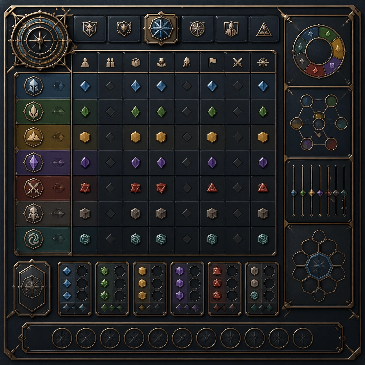
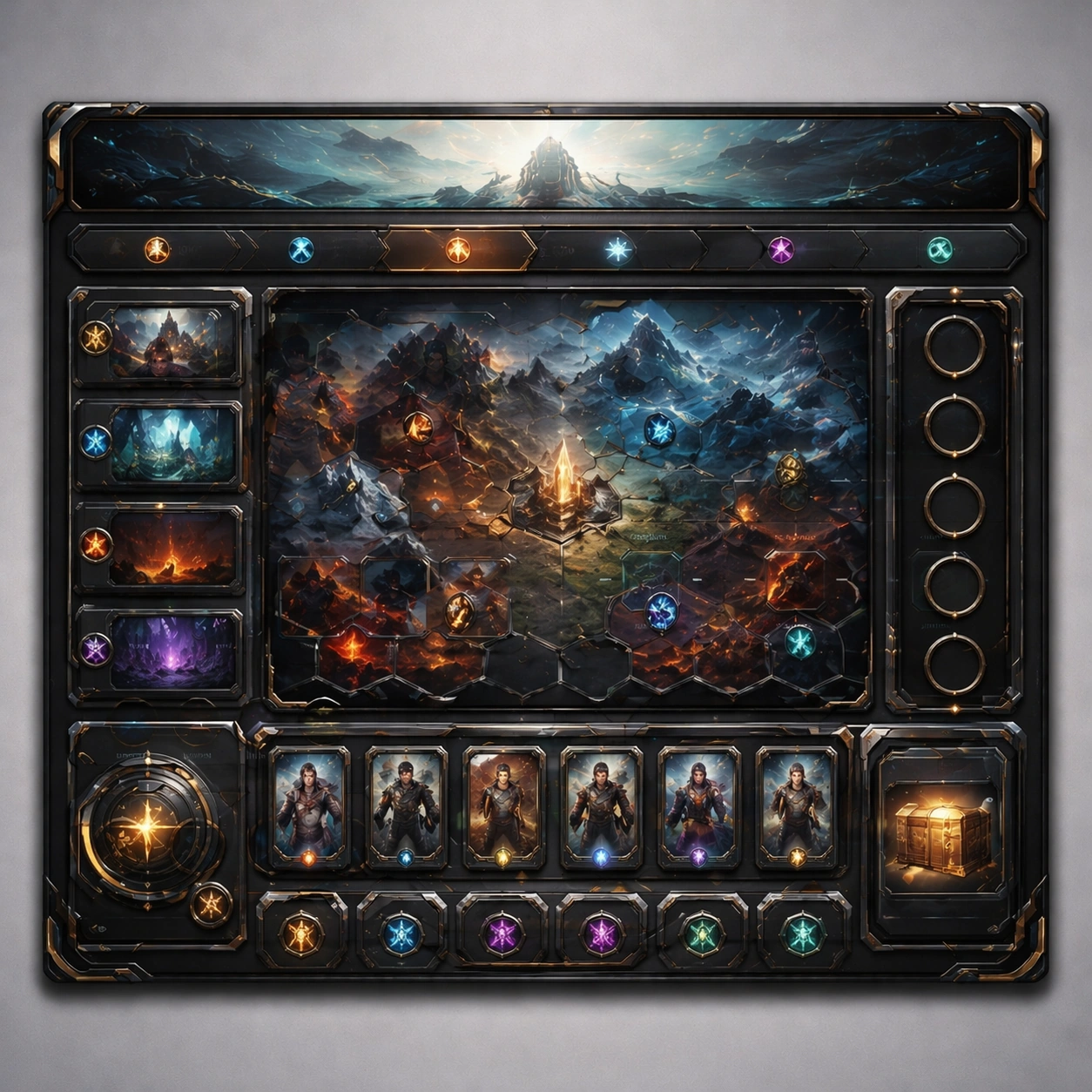
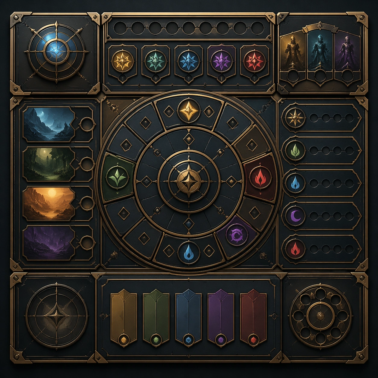
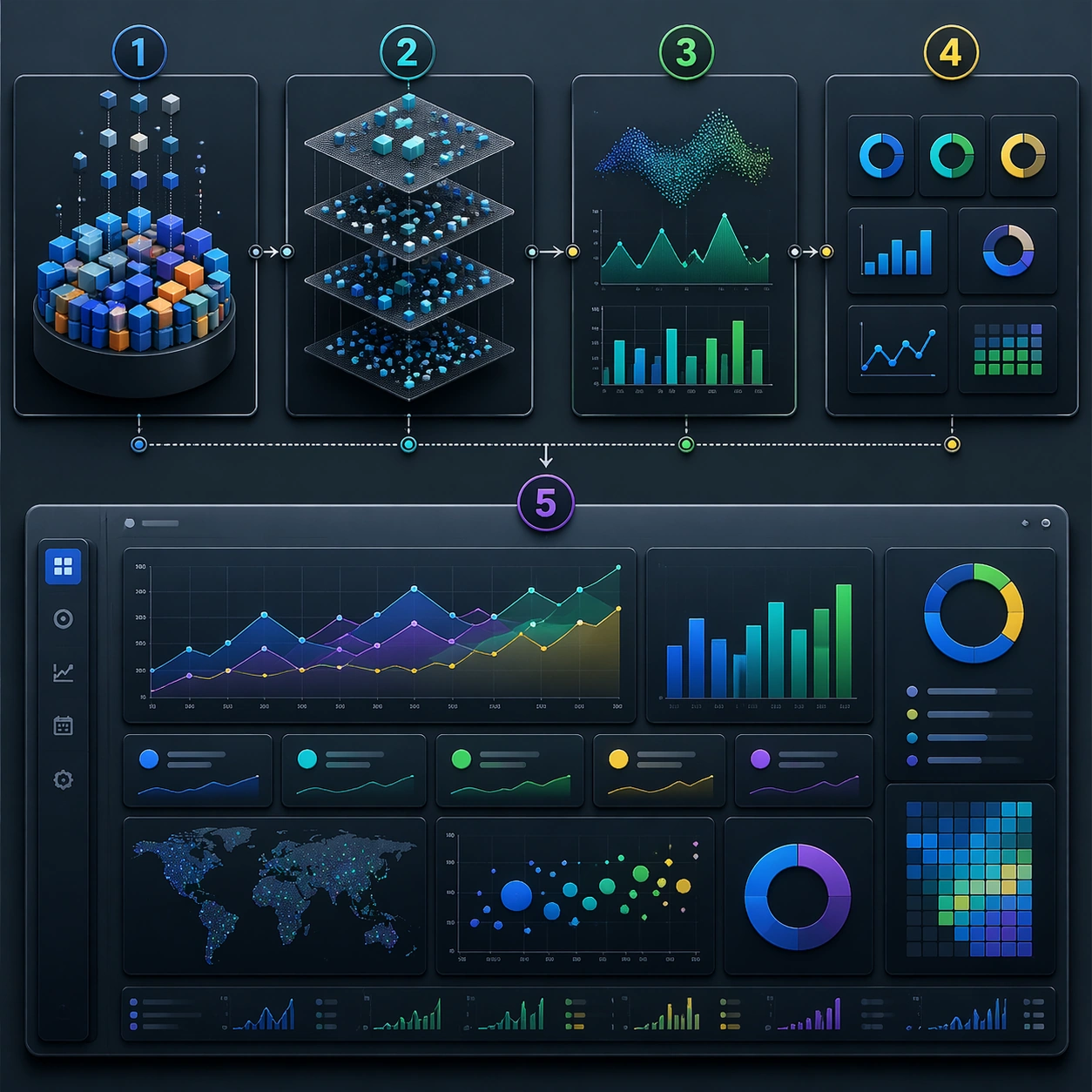
Example generated from “Dashboard Data Visualization — Cutaway Panel”
GPT Image 2en

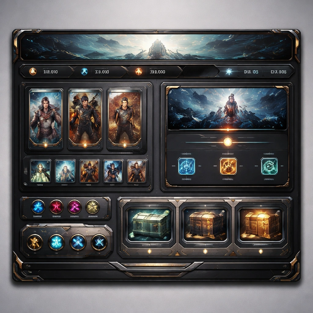
Scene: A square plate or board viewed straight-on, with crisp organization, disciplined spacing, and premium print clarity. Build the frame around a cutaway or sectional treatment that reveals interior logic without sacrificing readability. Keep the lighting, camera distance, and spatial organization tuned for a high-signal research image rather than a casual snapshot. The image belongs to the Dashboard Data Visualization theme and should feel immediately legible as a prompt atlas theme for dashboard data visualization, testing structured-layout, technical-diagram, reasoning-composition with gpt image 2.. Subject: Center the study on a cutaway or sectional treatment that reveals interior logic without sacrificing readability. Translate the theme into a concrete visual statement instead of an abstract mood board: the viewer should understand what kind of image this is, what is being tested, and why the composition is difficult. Use the slug idea of dashboard data visualization as a literal guide for subject matter, materials, and staging. If helpful, borrow the broad visual cues suggested by CO2, UI, but keep the result original and specific to this study. Important details: The image should communicate logic through grouping, hierarchy, callouts, insets, and believable professional layout discipline rather than decorative noise. Preserve a disciplined square composition, clear focal hierarchy, and enough secondary information to make the image feel complete rather than underspecified. The image should look polished, novel, and exhibition-ready, with topic-specific credibility coming from the way surfaces, structure, and visual language reinforce Dashboard Data Visualization. Avoid generic filler elements that do not serve the main concept. Use case: Dashboard Data Visualization single study 2/8, testing structured-layout, technical-diagram, reasoning-composition through the cutaway panel variation. Constraints: No readable text, no watermark, no logos, preserve exact 1:1 aspect ratio, no readable labels, no messy arrows, no random infographic decoration, no fake UI chrome unless the topic calls for it, no broken alignment, no meaningless clutter.
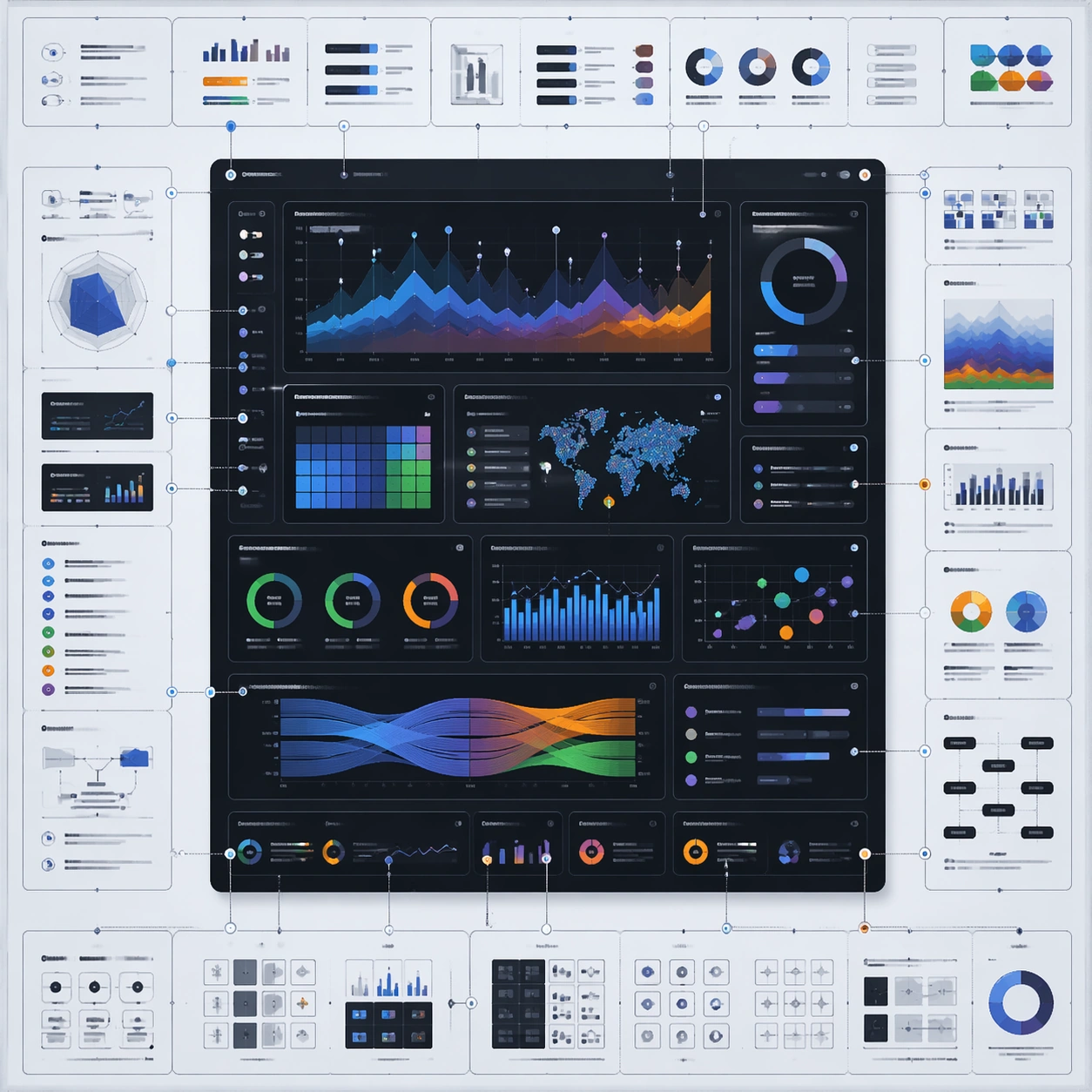
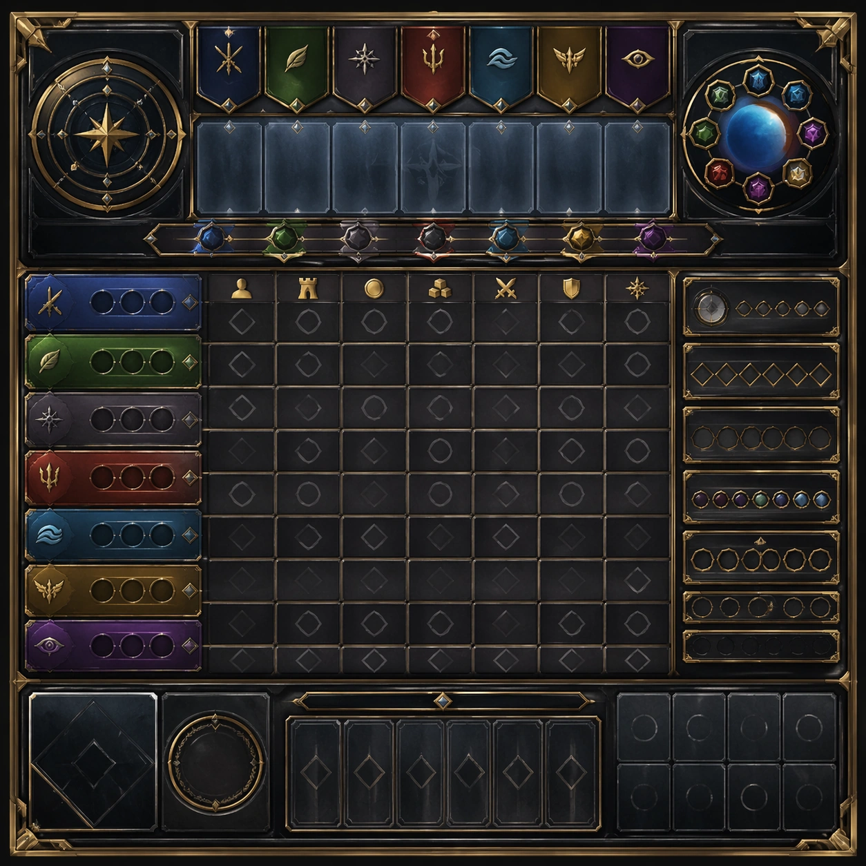
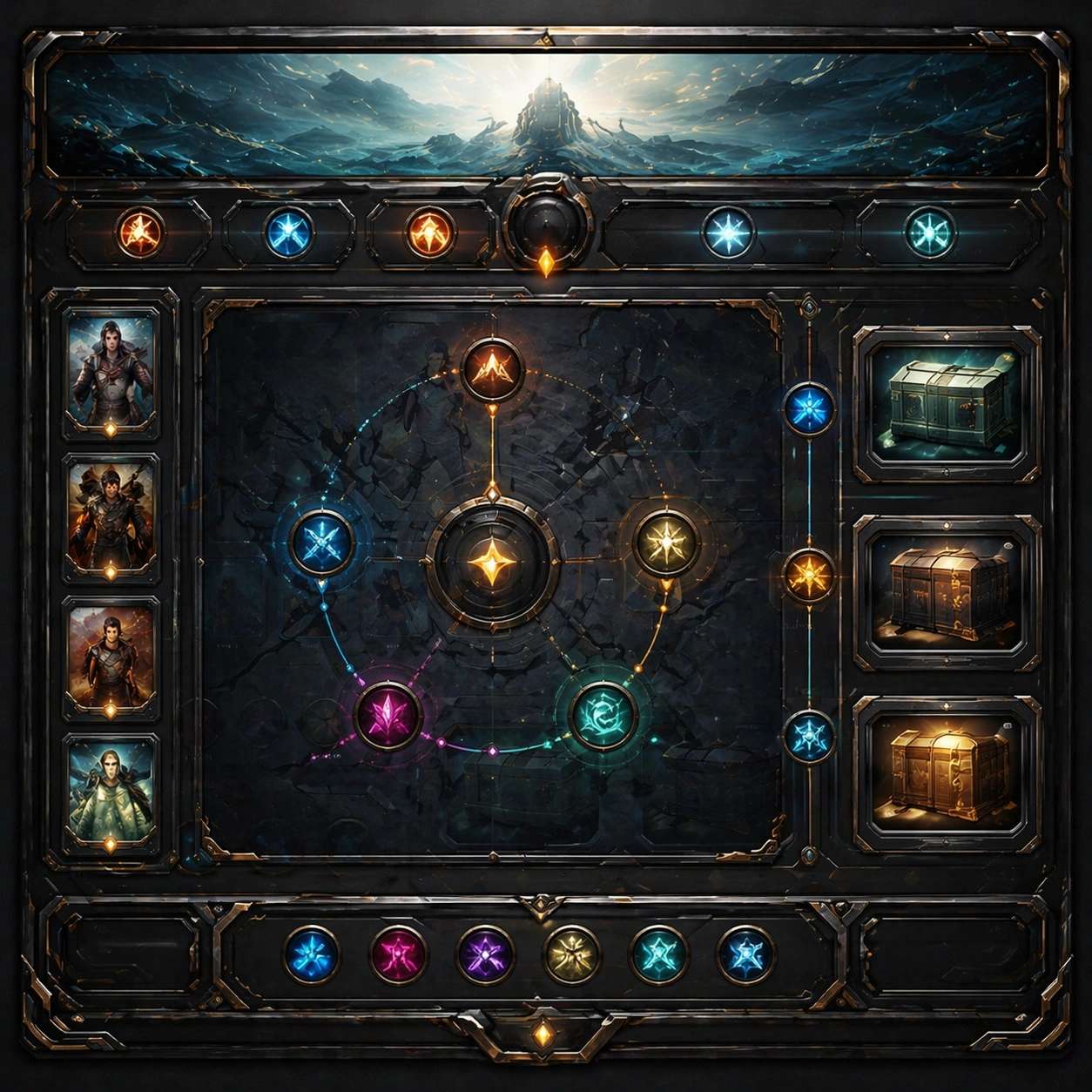
Example generated from “Dashboard Data Visualization — Process Sequence”
GPT Image 2en

Scene: A square plate or board viewed straight-on, with crisp organization, disciplined spacing, and premium print clarity. Build the frame around a sequence of stages or states arranged in a disciplined progression. Keep the lighting, camera distance, and spatial organization tuned for a high-signal research image rather than a casual snapshot. The image belongs to the Dashboard Data Visualization theme and should feel immediately legible as a prompt atlas theme for dashboard data visualization, testing structured-layout, technical-diagram, reasoning-composition with gpt image 2.. Subject: Center the study on a sequence of stages or states arranged in a disciplined progression. Translate the theme into a concrete visual statement instead of an abstract mood board: the viewer should understand what kind of image this is, what is being tested, and why the composition is difficult. Use the slug idea of dashboard data visualization as a literal guide for subject matter, materials, and staging. If helpful, borrow the broad visual cues suggested by CO2, UI, but keep the result original and specific to this study. Important details: The image should communicate logic through grouping, hierarchy, callouts, insets, and believable professional layout discipline rather than decorative noise. Preserve a disciplined square composition, clear focal hierarchy, and enough secondary information to make the image feel complete rather than underspecified. The image should look polished, novel, and exhibition-ready, with topic-specific credibility coming from the way surfaces, structure, and visual language reinforce Dashboard Data Visualization. Avoid generic filler elements that do not serve the main concept. Use case: Dashboard Data Visualization single study 3/8, testing structured-layout, technical-diagram, reasoning-composition through the process sequence variation. Constraints: No readable text, no watermark, no logos, preserve exact 1:1 aspect ratio, no readable labels, no messy arrows, no random infographic decoration, no fake UI chrome unless the topic calls for it, no broken alignment, no meaningless clutter.
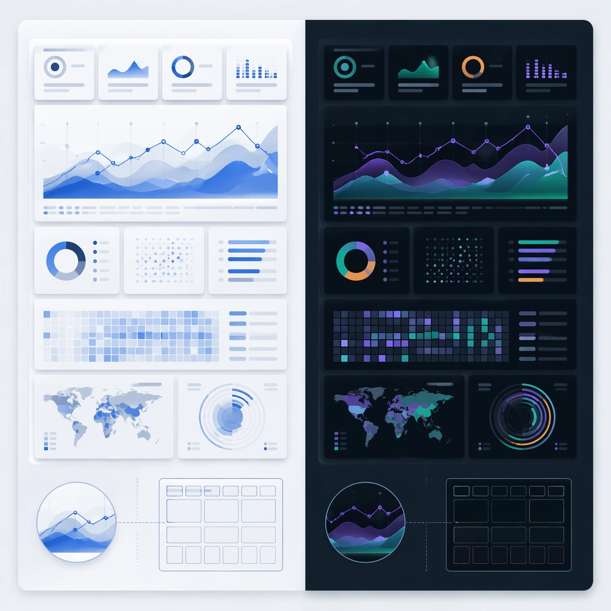
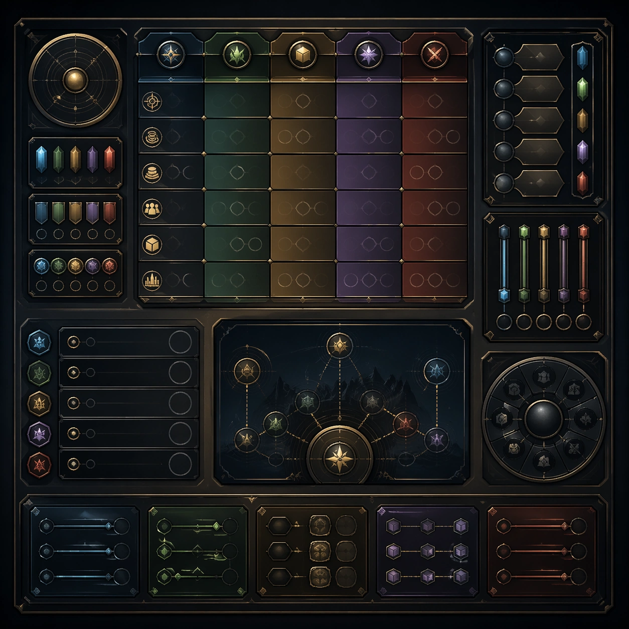
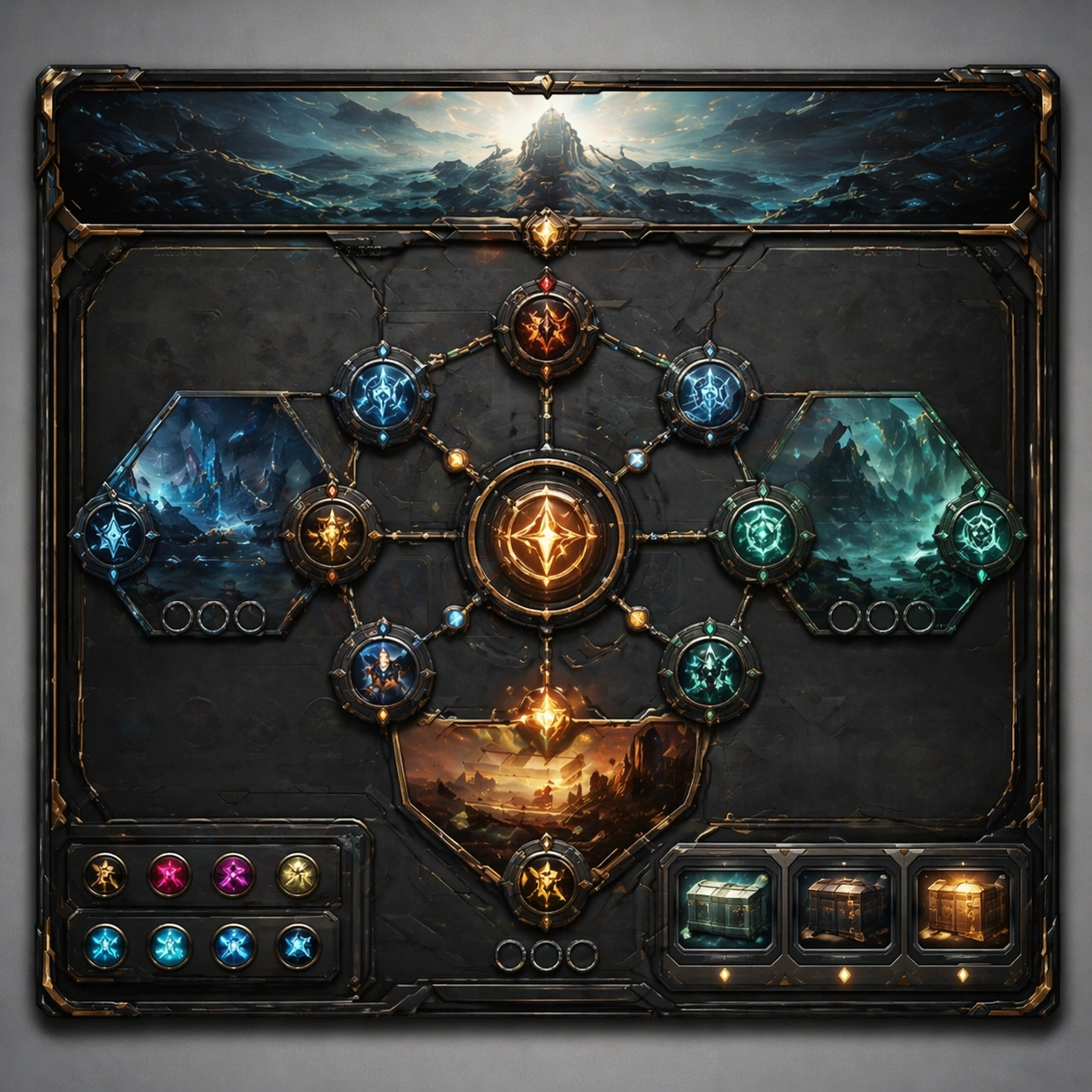
Example generated from “Dashboard Data Visualization — Annotation Cluster”
GPT Image 2en

Scene: A square plate or board viewed straight-on, with crisp organization, disciplined spacing, and premium print clarity. Build the frame around dense callouts and side insets that feel scholarly while staying unreadable. Keep the lighting, camera distance, and spatial organization tuned for a high-signal research image rather than a casual snapshot. The image belongs to the Dashboard Data Visualization theme and should feel immediately legible as a prompt atlas theme for dashboard data visualization, testing structured-layout, technical-diagram, reasoning-composition with gpt image 2.. Subject: Center the study on dense callouts and side insets that feel scholarly while staying unreadable. Translate the theme into a concrete visual statement instead of an abstract mood board: the viewer should understand what kind of image this is, what is being tested, and why the composition is difficult. Use the slug idea of dashboard data visualization as a literal guide for subject matter, materials, and staging. If helpful, borrow the broad visual cues suggested by CO2, UI, but keep the result original and specific to this study. Important details: The image should communicate logic through grouping, hierarchy, callouts, insets, and believable professional layout discipline rather than decorative noise. Preserve a disciplined square composition, clear focal hierarchy, and enough secondary information to make the image feel complete rather than underspecified. The image should look polished, novel, and exhibition-ready, with topic-specific credibility coming from the way surfaces, structure, and visual language reinforce Dashboard Data Visualization. Avoid generic filler elements that do not serve the main concept. Use case: Dashboard Data Visualization single study 4/8, testing structured-layout, technical-diagram, reasoning-composition through the annotation cluster variation. Constraints: No readable text, no watermark, no logos, preserve exact 1:1 aspect ratio, no readable labels, no messy arrows, no random infographic decoration, no fake UI chrome unless the topic calls for it, no broken alignment, no meaningless clutter.
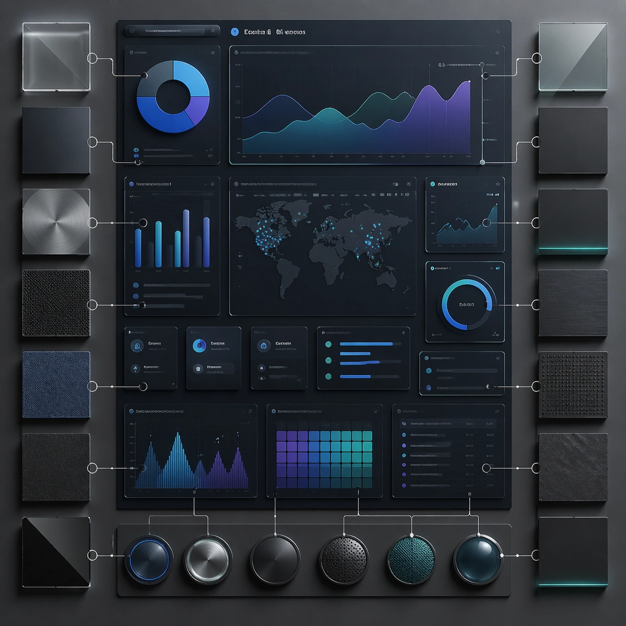
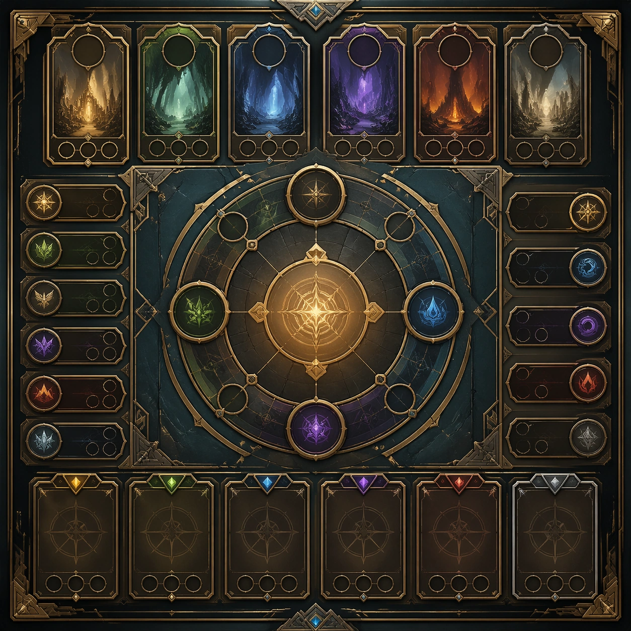
Example generated from “Dashboard Data Visualization — Comparison Board”
GPT Image 2en

Scene: A square plate or board viewed straight-on, with crisp organization, disciplined spacing, and premium print clarity. Build the frame around a side-by-side comparison structure with strong contrast and equal visual weight. Keep the lighting, camera distance, and spatial organization tuned for a high-signal research image rather than a casual snapshot. The image belongs to the Dashboard Data Visualization theme and should feel immediately legible as a prompt atlas theme for dashboard data visualization, testing structured-layout, technical-diagram, reasoning-composition with gpt image 2.. Subject: Center the study on a side-by-side comparison structure with strong contrast and equal visual weight. Translate the theme into a concrete visual statement instead of an abstract mood board: the viewer should understand what kind of image this is, what is being tested, and why the composition is difficult. Use the slug idea of dashboard data visualization as a literal guide for subject matter, materials, and staging. If helpful, borrow the broad visual cues suggested by CO2, UI, but keep the result original and specific to this study. Important details: The image should communicate logic through grouping, hierarchy, callouts, insets, and believable professional layout discipline rather than decorative noise. Preserve a disciplined square composition, clear focal hierarchy, and enough secondary information to make the image feel complete rather than underspecified. The image should look polished, novel, and exhibition-ready, with topic-specific credibility coming from the way surfaces, structure, and visual language reinforce Dashboard Data Visualization. Avoid generic filler elements that do not serve the main concept. Use case: Dashboard Data Visualization single study 5/8, testing structured-layout, technical-diagram, reasoning-composition through the comparison board variation. Constraints: No readable text, no watermark, no logos, preserve exact 1:1 aspect ratio, no readable labels, no messy arrows, no random infographic decoration, no fake UI chrome unless the topic calls for it, no broken alignment, no meaningless clutter.
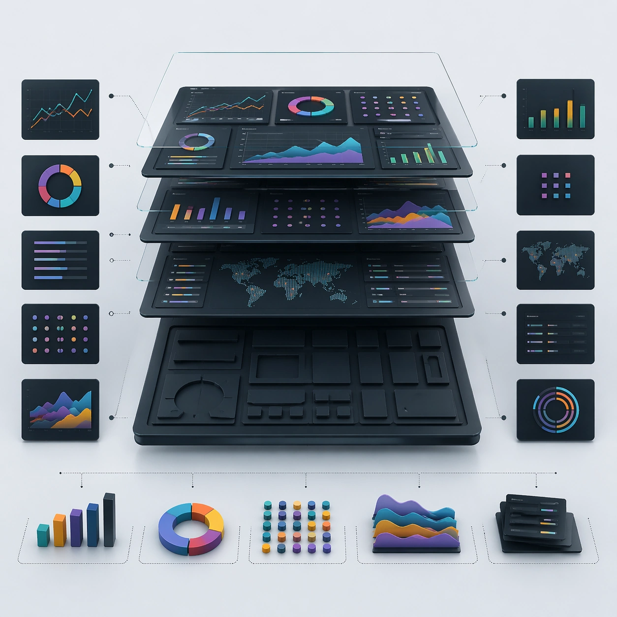
Example generated from “Dashboard Data Visualization — 材质标注”
GPT Image 2en

Scene: A square plate or board viewed straight-on, with crisp organization, disciplined spacing, and premium print clarity. Build the frame around specific texture or material evidence presented with controlled explanatory framing. Keep the lighting, camera distance, and spatial organization tuned for a high-signal research image rather than a casual snapshot. The image belongs to the Dashboard Data Visualization theme and should feel immediately legible as a prompt atlas theme for dashboard data visualization, testing structured-layout, technical-diagram, reasoning-composition with gpt image 2.. Subject: Center the study on specific texture or material evidence presented with controlled explanatory framing. Translate the theme into a concrete visual statement instead of an abstract mood board: the viewer should understand what kind of image this is, what is being tested, and why the composition is difficult. Use the slug idea of dashboard data visualization as a literal guide for subject matter, materials, and staging. If helpful, borrow the broad visual cues suggested by CO2, UI, but keep the result original and specific to this study. Important details: The image should communicate logic through grouping, hierarchy, callouts, insets, and believable professional layout discipline rather than decorative noise. Preserve a disciplined square composition, clear focal hierarchy, and enough secondary information to make the image feel complete rather than underspecified. The image should look polished, novel, and exhibition-ready, with topic-specific credibility coming from the way surfaces, structure, and visual language reinforce Dashboard Data Visualization. Avoid generic filler elements that do not serve the main concept. Use case: Dashboard Data Visualization single study 6/8, testing structured-layout, technical-diagram, reasoning-composition through the 材质标注 variation. Constraints: No readable text, no watermark, no logos, preserve exact 1:1 aspect ratio, no readable labels, no messy arrows, no random infographic decoration, no fake UI chrome unless the topic calls for it, no broken alignment, no meaningless clutter.
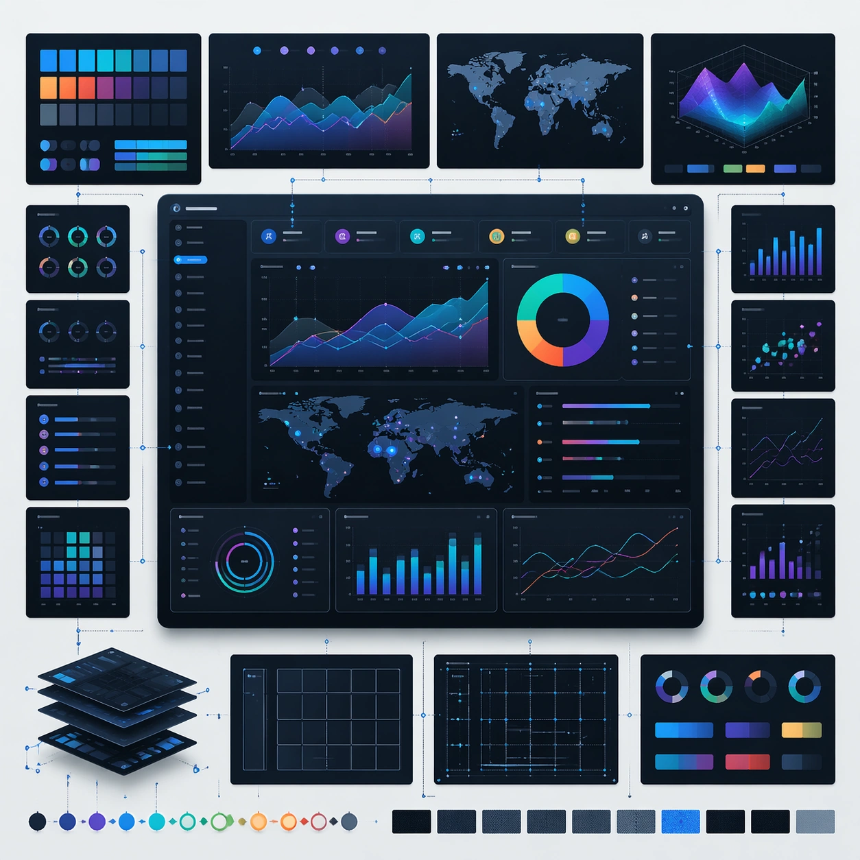
Example generated from “Dashboard Data Visualization — Exploded System”
GPT Image 2en

Scene: A square plate or board viewed straight-on, with crisp organization, disciplined spacing, and premium print clarity. Build the frame around components separated clearly enough to reveal construction and dependency. Keep the lighting, camera distance, and spatial organization tuned for a high-signal research image rather than a casual snapshot. The image belongs to the Dashboard Data Visualization theme and should feel immediately legible as a prompt atlas theme for dashboard data visualization, testing structured-layout, technical-diagram, reasoning-composition with gpt image 2.. Subject: Center the study on components separated clearly enough to reveal construction and dependency. Translate the theme into a concrete visual statement instead of an abstract mood board: the viewer should understand what kind of image this is, what is being tested, and why the composition is difficult. Use the slug idea of dashboard data visualization as a literal guide for subject matter, materials, and staging. If helpful, borrow the broad visual cues suggested by CO2, UI, but keep the result original and specific to this study. Important details: The image should communicate logic through grouping, hierarchy, callouts, insets, and believable professional layout discipline rather than decorative noise. Preserve a disciplined square composition, clear focal hierarchy, and enough secondary information to make the image feel complete rather than underspecified. The image should look polished, novel, and exhibition-ready, with topic-specific credibility coming from the way surfaces, structure, and visual language reinforce Dashboard Data Visualization. Avoid generic filler elements that do not serve the main concept. Use case: Dashboard Data Visualization single study 7/8, testing structured-layout, technical-diagram, reasoning-composition through the exploded system variation. Constraints: No readable text, no watermark, no logos, preserve exact 1:1 aspect ratio, no readable labels, no messy arrows, no random infographic decoration, no fake UI chrome unless the topic calls for it, no broken alignment, no meaningless clutter.
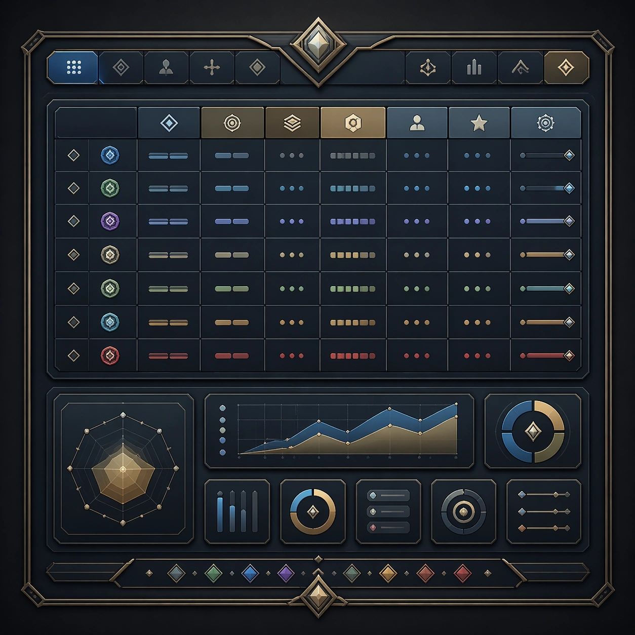
Example generated from “Dashboard Data Visualization — Final Plate”
GPT Image 2en

Scene: A square plate or board viewed straight-on, with crisp organization, disciplined spacing, and premium print clarity. Build the frame around a polished final technical plate that feels ready for a research deck or exhibition wall. Keep the lighting, camera distance, and spatial organization tuned for a high-signal research image rather than a casual snapshot. The image belongs to the Dashboard Data Visualization theme and should feel immediately legible as a prompt atlas theme for dashboard data visualization, testing structured-layout, technical-diagram, reasoning-composition with gpt image 2.. Subject: Center the study on a polished final technical plate that feels ready for a research deck or exhibition wall. Translate the theme into a concrete visual statement instead of an abstract mood board: the viewer should understand what kind of image this is, what is being tested, and why the composition is difficult. Use the slug idea of dashboard data visualization as a literal guide for subject matter, materials, and staging. If helpful, borrow the broad visual cues suggested by CO2, UI, but keep the result original and specific to this study. Important details: The image should communicate logic through grouping, hierarchy, callouts, insets, and believable professional layout discipline rather than decorative noise. Preserve a disciplined square composition, clear focal hierarchy, and enough secondary information to make the image feel complete rather than underspecified. The image should look polished, novel, and exhibition-ready, with topic-specific credibility coming from the way surfaces, structure, and visual language reinforce Dashboard Data Visualization. Avoid generic filler elements that do not serve the main concept. Use case: Dashboard Data Visualization single study 8/8, testing structured-layout, technical-diagram, reasoning-composition through the final plate variation. Constraints: No readable text, no watermark, no logos, preserve exact 1:1 aspect ratio, no readable labels, no messy arrows, no random infographic decoration, no fake UI chrome unless the topic calls for it, no broken alignment, no meaningless clutter.
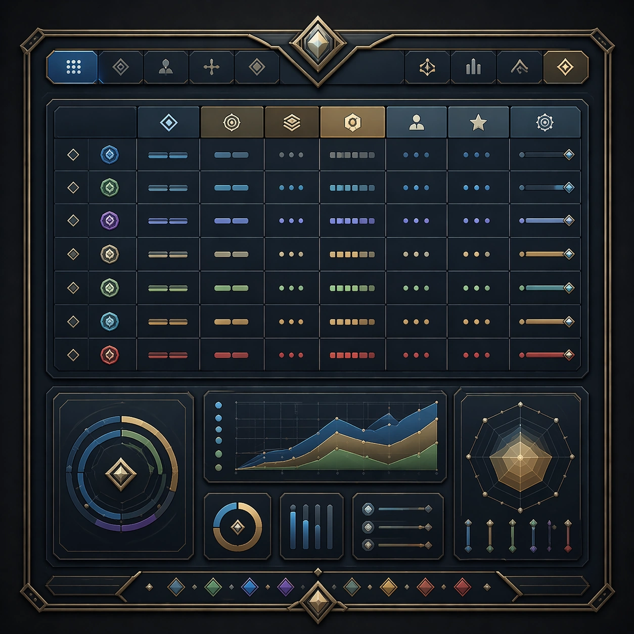
Example generated from “Data Table And Admin Clarity System — Reference Anchor”
GPT Image 2en

Scene: Create a square reference image for Data Table and Admin Clarity System. Build a reference anchor establishing the core system with a premium, production-ready finish. Use a polished modular board or campaign surface with clean spacing, premium game-UI finish, and clear focal hierarchy. The composition should feel intentional, clean, and reusable for gallery, research, campaign, or internal handoff contexts. Lighting must support readability first, with the main forms clearly separated from the background and enough breathing room for the system to stay legible at both hero scale and thumbnail scale. Subject: Center a coherent original game-art system built for premium production and marketing surfaces. For this image, focus on reference anchor. Keep the same system logic stable across screenshots, cards, banners, and overview boards. This image is the canonical anchor that later series images must follow. The viewer should immediately understand what role this surface plays inside a cohesive game-production asset pack. Important details: Lock framing, icon grammar, palette blocking, and surface hierarchy so the kit feels production-ready and consistent. Preserve the core silhouette, framing language, and material logic from the reference image while each variation changes function. Keep materials believable, edge hierarchy disciplined, and the visual language consistent with Admin Clarity. Use abstract interface blocks or diagram accents when helpful, but avoid any readable language. The final result should feel like a deliberate production asset rather than a random illustration. Use case: Data Table and Admin Clarity System series study 1/9, designed as reference anchor within a cohesive asset pack. Constraints: No readable text, no watermark, no logos, preserve exact 1:1 aspect ratio, no unrelated objects, no broken visual hierarchy, no malformed anatomy or broken perspective, no random decorative clutter.
Example generated from “Data Table And Admin Clarity System — Variant One”
GPT Image 2en

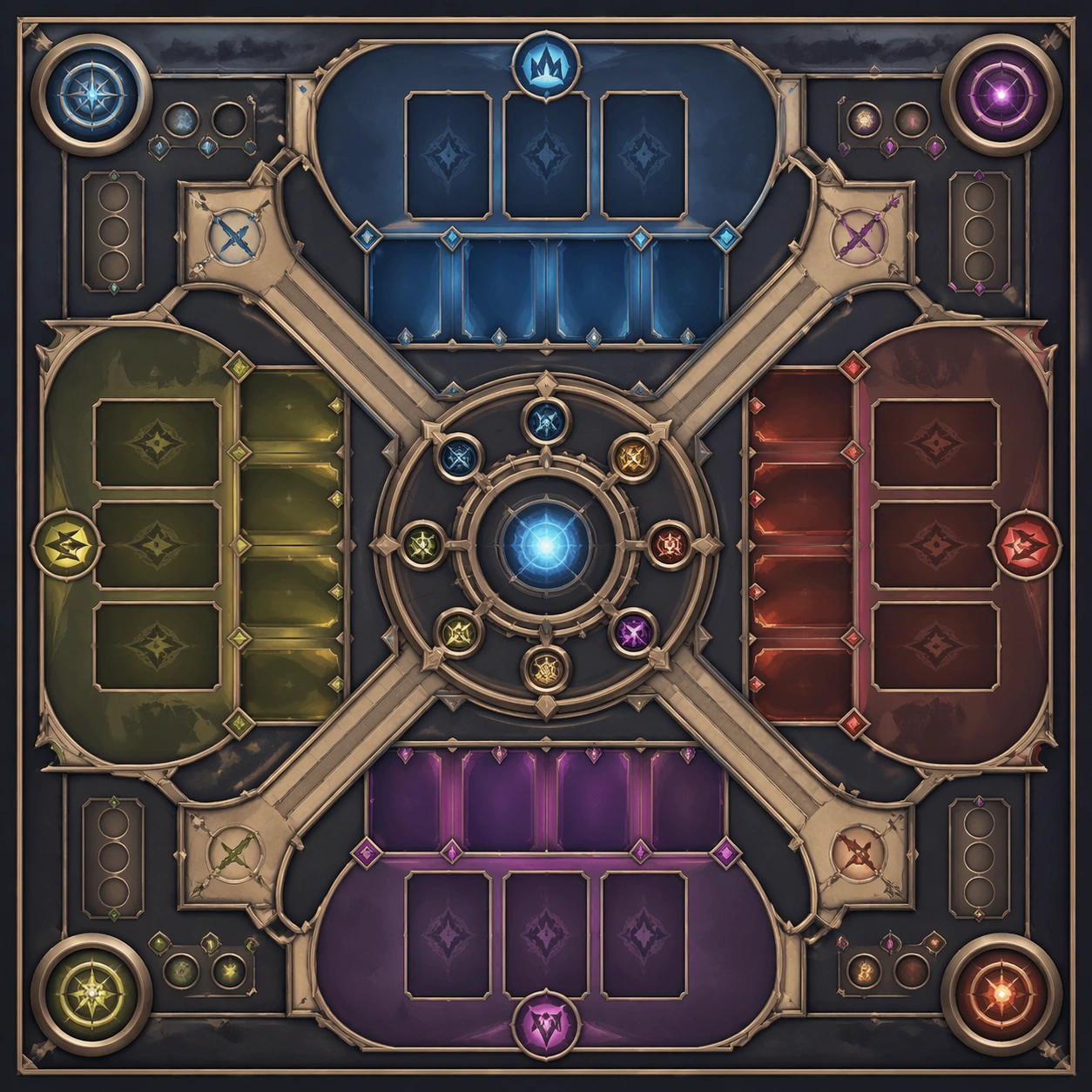
Scene: Create a square dependent image for Data Table and Admin Clarity System. Build a first controlled variation in the same system with a premium, production-ready finish. Use a polished modular board or campaign surface with clean spacing, premium game-UI finish, and clear focal hierarchy. The composition should feel intentional, clean, and reusable for gallery, research, campaign, or internal handoff contexts. Lighting must support readability first, with the main forms clearly separated from the background and enough breathing room for the system to stay legible at both hero scale and thumbnail scale. Subject: Center a coherent original game-art system built for premium production and marketing surfaces. For this image, focus on the intended support surface. Keep the same system logic stable across screenshots, cards, banners, and overview boards. Preserve exact identity or system logic from the reference image while changing only the intended variation axis. The viewer should immediately understand what role this surface plays inside a cohesive game-production asset pack. Important details: Lock framing, icon grammar, palette blocking, and surface hierarchy so the kit feels production-ready and consistent. Preserve the core silhouette, framing language, and material logic from the reference image while each variation changes function. Keep materials believable, edge hierarchy disciplined, and the visual language consistent with Admin Clarity. Use abstract interface blocks or diagram accents when helpful, but avoid any readable language. The final result should feel like a deliberate production asset rather than a random illustration. Use case: Data Table and Admin Clarity System series study 2/9, designed as variant one within a cohesive asset pack. Constraints: No readable text, no watermark, no logos, preserve exact 1:1 aspect ratio, no unrelated objects, no broken visual hierarchy, no malformed anatomy or broken perspective, no random decorative clutter.
Example generated from “Data Table And Admin Clarity System — Variant Two”
GPT Image 2en

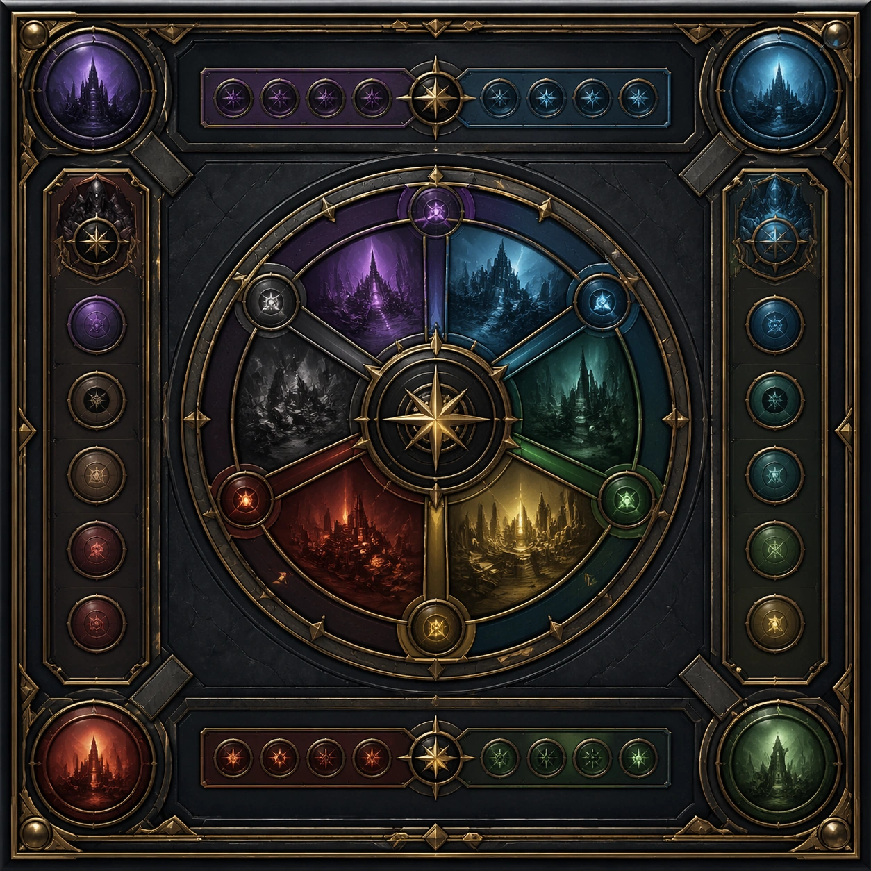
Scene: Create a square dependent image for Data Table and Admin Clarity System. Build a second controlled variation in the same system with a premium, production-ready finish. Use a polished modular board or campaign surface with clean spacing, premium game-UI finish, and clear focal hierarchy. The composition should feel intentional, clean, and reusable for gallery, research, campaign, or internal handoff contexts. Lighting must support readability first, with the main forms clearly separated from the background and enough breathing room for the system to stay legible at both hero scale and thumbnail scale. Subject: Center a coherent original game-art system built for premium production and marketing surfaces. For this image, focus on the intended support surface. Keep the same system logic stable across screenshots, cards, banners, and overview boards. Preserve exact identity or system logic from the reference image while changing only the intended variation axis. The viewer should immediately understand what role this surface plays inside a cohesive game-production asset pack. Important details: Lock framing, icon grammar, palette blocking, and surface hierarchy so the kit feels production-ready and consistent. Preserve the core silhouette, framing language, and material logic from the reference image while each variation changes function. Keep materials believable, edge hierarchy disciplined, and the visual language consistent with Admin Clarity. Use abstract interface blocks or diagram accents when helpful, but avoid any readable language. The final result should feel like a deliberate production asset rather than a random illustration. Use case: Data Table and Admin Clarity System series study 3/9, designed as variant two within a cohesive asset pack. Constraints: No readable text, no watermark, no logos, preserve exact 1:1 aspect ratio, no unrelated objects, no broken visual hierarchy, no malformed anatomy or broken perspective, no random decorative clutter.
Example generated from “Data Table And Admin Clarity System — Variant Three”
GPT Image 2en

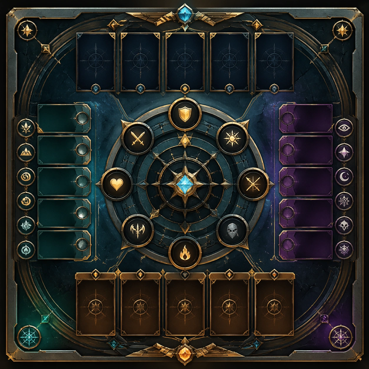
Scene: Create a square dependent image for Data Table and Admin Clarity System. Build a third controlled variation in the same system with a premium, production-ready finish. Use a polished modular board or campaign surface with clean spacing, premium game-UI finish, and clear focal hierarchy. The composition should feel intentional, clean, and reusable for gallery, research, campaign, or internal handoff contexts. Lighting must support readability first, with the main forms clearly separated from the background and enough breathing room for the system to stay legible at both hero scale and thumbnail scale. Subject: Center a coherent original game-art system built for premium production and marketing surfaces. For this image, focus on the intended support surface. Keep the same system logic stable across screenshots, cards, banners, and overview boards. Preserve exact identity or system logic from the reference image while changing only the intended variation axis. The viewer should immediately understand what role this surface plays inside a cohesive game-production asset pack. Important details: Lock framing, icon grammar, palette blocking, and surface hierarchy so the kit feels production-ready and consistent. Preserve the core silhouette, framing language, and material logic from the reference image while each variation changes function. Keep materials believable, edge hierarchy disciplined, and the visual language consistent with Admin Clarity. Use abstract interface blocks or diagram accents when helpful, but avoid any readable language. The final result should feel like a deliberate production asset rather than a random illustration. Use case: Data Table and Admin Clarity System series study 4/9, designed as variant three within a cohesive asset pack. Constraints: No readable text, no watermark, no logos, preserve exact 1:1 aspect ratio, no unrelated objects, no broken visual hierarchy, no malformed anatomy or broken perspective, no random decorative clutter.
Example generated from “Data Table And Admin Clarity System — Support One”
GPT Image 2en

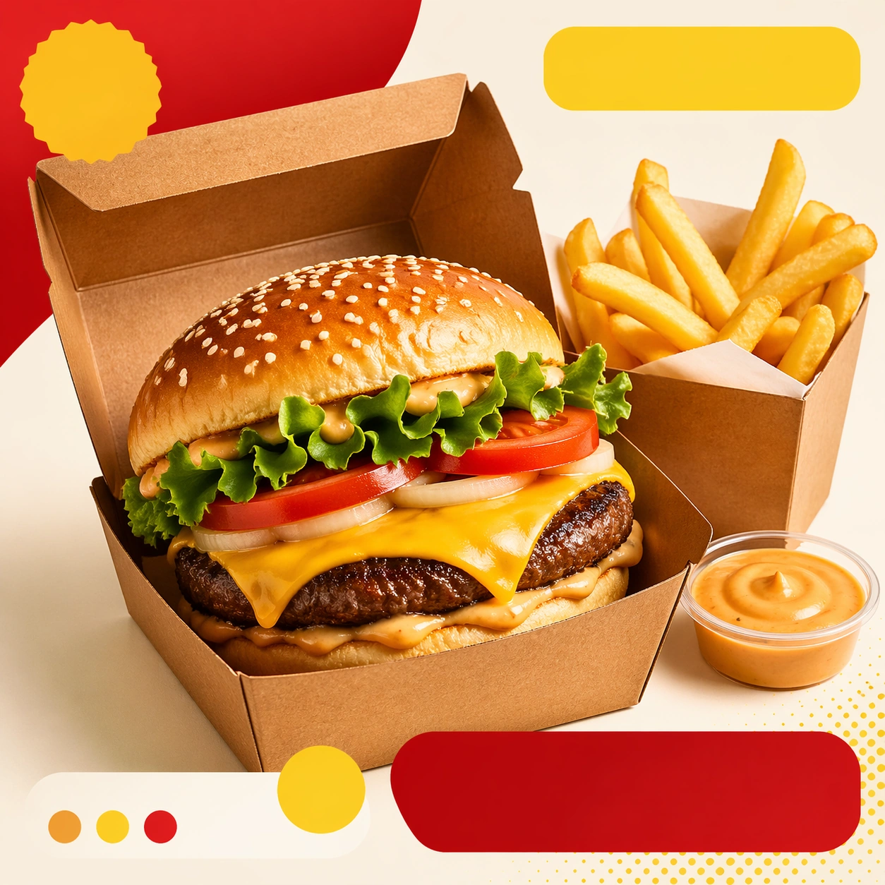
Scene: Create a square standalone support image for Data Table and Admin Clarity System. Build a support-surface study with a clear focal hierarchy and a finished professional surface. Use a polished modular board or campaign surface with clean spacing, premium game-UI finish, and clear focal hierarchy. The frame should feel self-contained and polished, with enough structure to explain the system even without the reference series, yet still obviously belonging to the same theme and production world. Subject: Show a coherent original game-art system built for premium production and marketing surfaces in a way that emphasizes the intended support surface. Keep the same system logic stable across screenshots, cards, banners, and overview boards. Even though this image is independent, the viewer should still recognize the same universe, same commercial logic, and same production intent as the core package. Important details: Lock framing, icon grammar, palette blocking, and surface hierarchy so the kit feels production-ready and consistent. Preserve the broader theme language through color, framing, material choices, and modular composition. Use clean panel rhythm, premium asset presentation, and believable detail density. The image should work equally well as a gallery study, research reference, and mock production deliverable. Use case: Data Table and Admin Clarity System single study 5/9, exploring support one as a support surface. Constraints: No readable text, no watermark, no logos, preserve exact 1:1 aspect ratio, no unrelated objects, no broken visual hierarchy, no visual noise that obscures the main surface, no accidental brand resemblance.

Example generated from “Data Table And Admin Clarity System — Support Two”
GPT Image 2en

Scene: Create a square standalone support image for Data Table and Admin Clarity System. Build a second support-surface study with a clear focal hierarchy and a finished professional surface. Use a polished modular board or campaign surface with clean spacing, premium game-UI finish, and clear focal hierarchy. The frame should feel self-contained and polished, with enough structure to explain the system even without the reference series, yet still obviously belonging to the same theme and production world. Subject: Show a coherent original game-art system built for premium production and marketing surfaces in a way that emphasizes the intended support surface. Keep the same system logic stable across screenshots, cards, banners, and overview boards. Even though this image is independent, the viewer should still recognize the same universe, same commercial logic, and same production intent as the core package. Important details: Lock framing, icon grammar, palette blocking, and surface hierarchy so the kit feels production-ready and consistent. Preserve the broader theme language through color, framing, material choices, and modular composition. Use clean panel rhythm, premium asset presentation, and believable detail density. The image should work equally well as a gallery study, research reference, and mock production deliverable. Use case: Data Table and Admin Clarity System single study 6/9, exploring support two as a support surface. Constraints: No readable text, no watermark, no logos, preserve exact 1:1 aspect ratio, no unrelated objects, no broken visual hierarchy, no visual noise that obscures the main surface, no accidental brand resemblance.

Example generated from “Data Table And Admin Clarity System — Support Three”
GPT Image 2en

Scene: Create a square standalone support image for Data Table and Admin Clarity System. Build a third support-surface study with a clear focal hierarchy and a finished professional surface. Use a polished modular board or campaign surface with clean spacing, premium game-UI finish, and clear focal hierarchy. The frame should feel self-contained and polished, with enough structure to explain the system even without the reference series, yet still obviously belonging to the same theme and production world. Subject: Show a coherent original game-art system built for premium production and marketing surfaces in a way that emphasizes the intended support surface. Keep the same system logic stable across screenshots, cards, banners, and overview boards. Even though this image is independent, the viewer should still recognize the same universe, same commercial logic, and same production intent as the core package. Important details: Lock framing, icon grammar, palette blocking, and surface hierarchy so the kit feels production-ready and consistent. Preserve the broader theme language through color, framing, material choices, and modular composition. Use clean panel rhythm, premium asset presentation, and believable detail density. The image should work equally well as a gallery study, research reference, and mock production deliverable. Use case: Data Table and Admin Clarity System single study 7/9, exploring support three as a support surface. Constraints: No readable text, no watermark, no logos, preserve exact 1:1 aspect ratio, no unrelated objects, no broken visual hierarchy, no visual noise that obscures the main surface, no accidental brand resemblance.

Example generated from “Data Table And Admin Clarity System — Support Four”
GPT Image 2en

Scene: Create a square standalone support image for Data Table and Admin Clarity System. Build a fourth support-surface study with a clear focal hierarchy and a finished professional surface. Use a polished modular board or campaign surface with clean spacing, premium game-UI finish, and clear focal hierarchy. The frame should feel self-contained and polished, with enough structure to explain the system even without the reference series, yet still obviously belonging to the same theme and production world. Subject: Show a coherent original game-art system built for premium production and marketing surfaces in a way that emphasizes the intended support surface. Keep the same system logic stable across screenshots, cards, banners, and overview boards. Even though this image is independent, the viewer should still recognize the same universe, same commercial logic, and same production intent as the core package. Important details: Lock framing, icon grammar, palette blocking, and surface hierarchy so the kit feels production-ready and consistent. Preserve the broader theme language through color, framing, material choices, and modular composition. Use clean panel rhythm, premium asset presentation, and believable detail density. The image should work equally well as a gallery study, research reference, and mock production deliverable. Use case: Data Table and Admin Clarity System single study 8/9, exploring support four as a support surface. Constraints: No readable text, no watermark, no logos, preserve exact 1:1 aspect ratio, no unrelated objects, no broken visual hierarchy, no visual noise that obscures the main surface, no accidental brand resemblance.

Example generated from “Data Table And Admin Clarity System — Support Five”
GPT Image 2en

Scene: Create a square standalone support image for Data Table and Admin Clarity System. Build a fifth support-surface study with a clear focal hierarchy and a finished professional surface. Use a polished modular board or campaign surface with clean spacing, premium game-UI finish, and clear focal hierarchy. The frame should feel self-contained and polished, with enough structure to explain the system even without the reference series, yet still obviously belonging to the same theme and production world. Subject: Show a coherent original game-art system built for premium production and marketing surfaces in a way that emphasizes the intended support surface. Keep the same system logic stable across screenshots, cards, banners, and overview boards. Even though this image is independent, the viewer should still recognize the same universe, same commercial logic, and same production intent as the core package. Important details: Lock framing, icon grammar, palette blocking, and surface hierarchy so the kit feels production-ready and consistent. Preserve the broader theme language through color, framing, material choices, and modular composition. Use clean panel rhythm, premium asset presentation, and believable detail density. The image should work equally well as a gallery study, research reference, and mock production deliverable. Use case: Data Table and Admin Clarity System single study 9/9, exploring support five as a support surface. Constraints: No readable text, no watermark, no logos, preserve exact 1:1 aspect ratio, no unrelated objects, no broken visual hierarchy, no visual noise that obscures the main surface, no accidental brand resemblance.

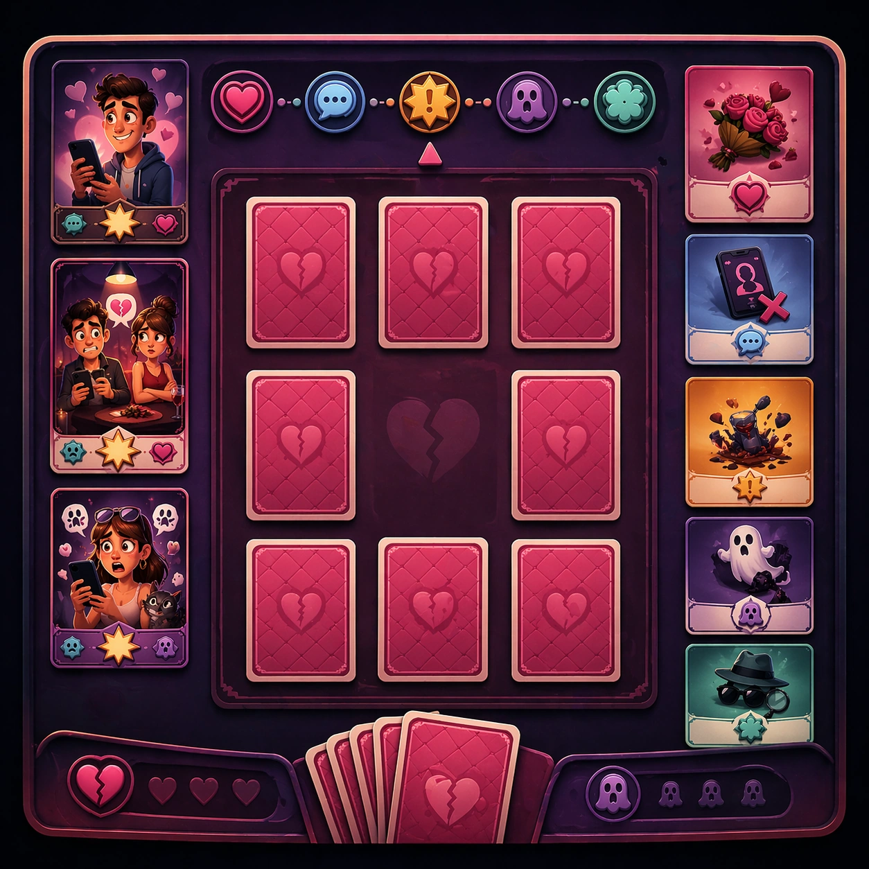
Example generated from “Dating App Disaster Comedy Cards — Reference Anchor”
GPT Image 2en

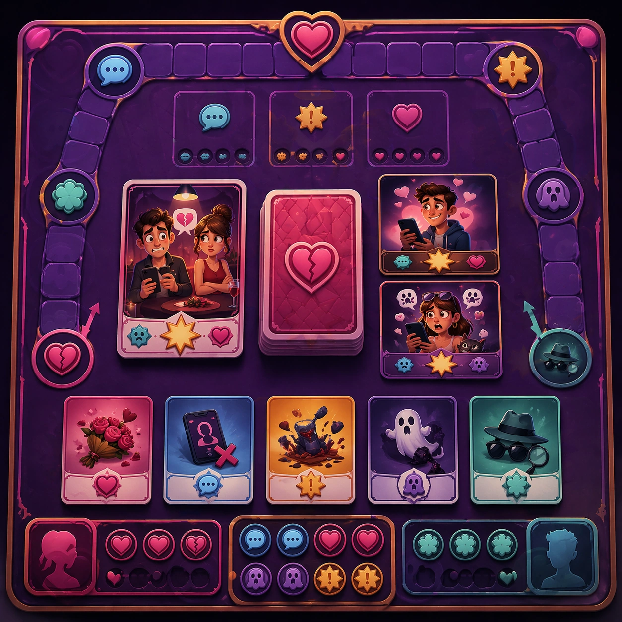
Scene: Create a square reference image for Dating App Disaster Comedy Cards. Build a reference anchor establishing the core system with a premium, production-ready finish. Use a polished modular board or campaign surface with clean spacing, premium game-UI finish, and clear focal hierarchy. The composition should feel intentional, clean, and reusable for gallery, research, campaign, or internal handoff contexts. Lighting must support readability first, with the main forms clearly separated from the background and enough breathing room for the system to stay legible at both hero scale and thumbnail scale. Subject: Center a coherent original game-art system built for premium production and marketing surfaces. For this image, focus on reference anchor. Keep the same system logic stable across screenshots, cards, banners, and overview boards. This image is the canonical anchor that later series images must follow. The viewer should immediately understand what role this surface plays inside a cohesive game-production asset pack. Important details: Lock framing, icon grammar, palette blocking, and surface hierarchy so the kit feels production-ready and consistent. Preserve the core silhouette, framing language, and material logic from the reference image while each variation changes function. Keep materials believable, edge hierarchy disciplined, and the visual language consistent with Dating Comedy. Use abstract interface blocks or diagram accents when helpful, but avoid any readable language. The final result should feel like a deliberate production asset rather than a random illustration. Use case: Dating App Disaster Comedy Cards series study 1/9, designed as reference anchor within a cohesive asset pack. Constraints: No readable text, no watermark, no logos, preserve exact 1:1 aspect ratio, no unrelated objects, no broken visual hierarchy, no malformed anatomy or broken perspective, no random decorative clutter.
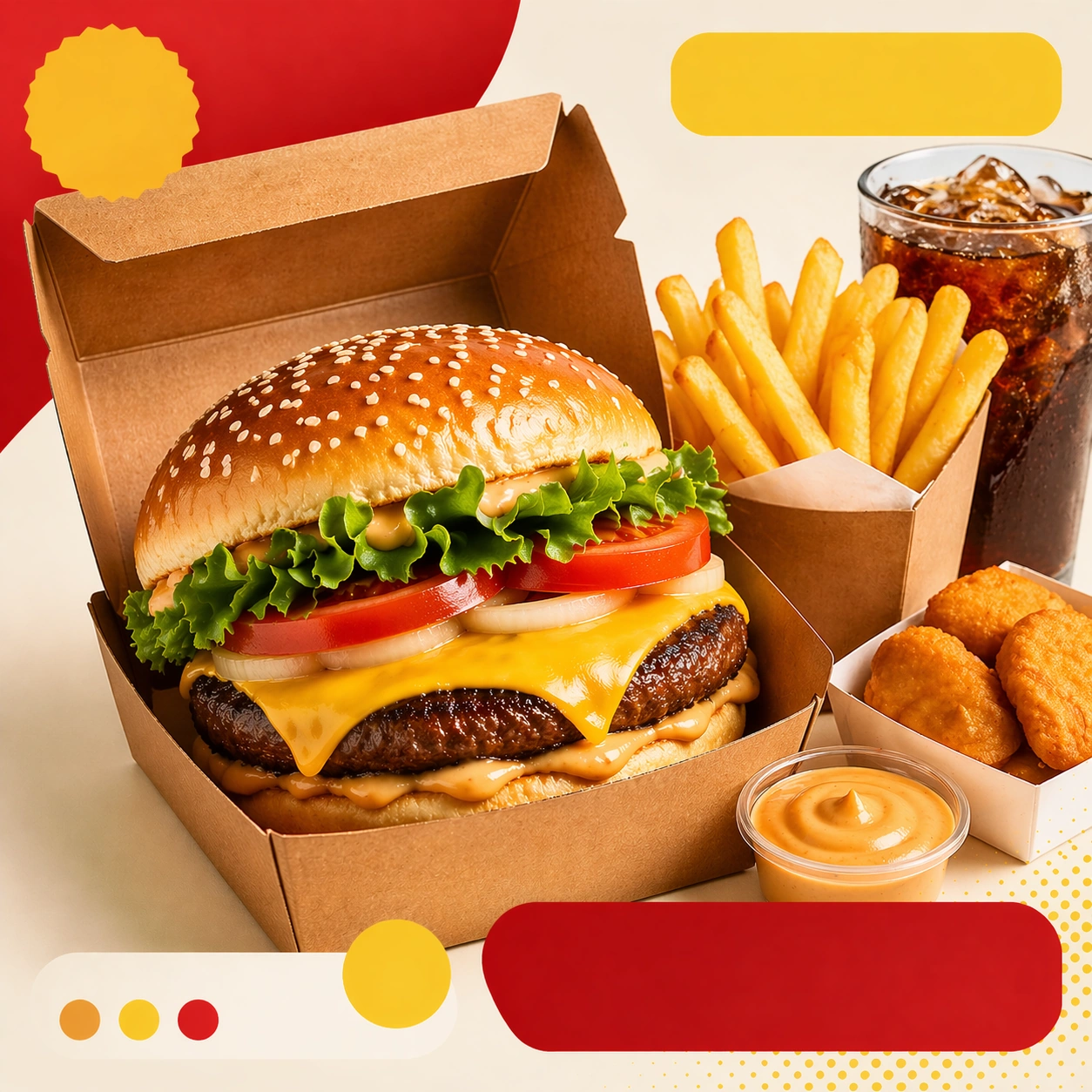
Example generated from “Dating App Disaster Comedy Cards — Variant One”
GPT Image 2en

Scene: Create a square dependent image for Dating App Disaster Comedy Cards. Build a first controlled variation in the same system with a premium, production-ready finish. Use a polished modular board or campaign surface with clean spacing, premium game-UI finish, and clear focal hierarchy. The composition should feel intentional, clean, and reusable for gallery, research, campaign, or internal handoff contexts. Lighting must support readability first, with the main forms clearly separated from the background and enough breathing room for the system to stay legible at both hero scale and thumbnail scale. Subject: Center a coherent original game-art system built for premium production and marketing surfaces. For this image, focus on the intended support surface. Keep the same system logic stable across screenshots, cards, banners, and overview boards. Preserve exact identity or system logic from the reference image while changing only the intended variation axis. The viewer should immediately understand what role this surface plays inside a cohesive game-production asset pack. Important details: Lock framing, icon grammar, palette blocking, and surface hierarchy so the kit feels production-ready and consistent. Preserve the core silhouette, framing language, and material logic from the reference image while each variation changes function. Keep materials believable, edge hierarchy disciplined, and the visual language consistent with Dating Comedy. Use abstract interface blocks or diagram accents when helpful, but avoid any readable language. The final result should feel like a deliberate production asset rather than a random illustration. Use case: Dating App Disaster Comedy Cards series study 2/9, designed as variant one within a cohesive asset pack. Constraints: No readable text, no watermark, no logos, preserve exact 1:1 aspect ratio, no unrelated objects, no broken visual hierarchy, no malformed anatomy or broken perspective, no random decorative clutter.
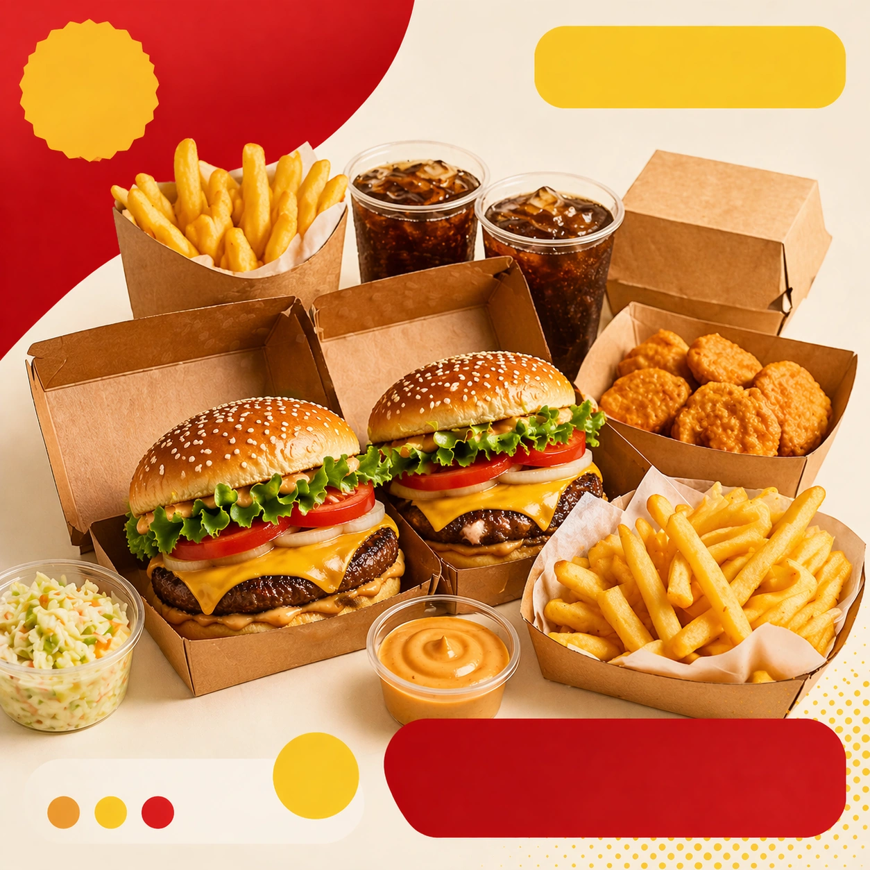
Example generated from “Dating App Disaster Comedy Cards — Variant Two”
GPT Image 2en

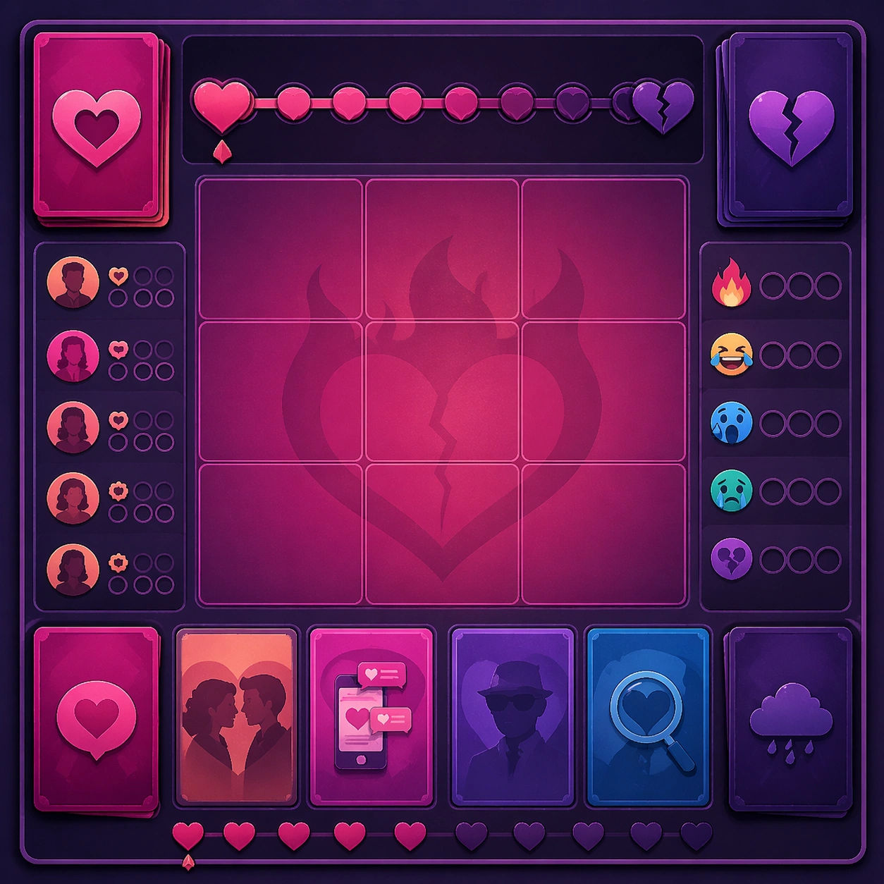
Scene: Create a square dependent image for Dating App Disaster Comedy Cards. Build a second controlled variation in the same system with a premium, production-ready finish. Use a polished modular board or campaign surface with clean spacing, premium game-UI finish, and clear focal hierarchy. The composition should feel intentional, clean, and reusable for gallery, research, campaign, or internal handoff contexts. Lighting must support readability first, with the main forms clearly separated from the background and enough breathing room for the system to stay legible at both hero scale and thumbnail scale. Subject: Center a coherent original game-art system built for premium production and marketing surfaces. For this image, focus on the intended support surface. Keep the same system logic stable across screenshots, cards, banners, and overview boards. Preserve exact identity or system logic from the reference image while changing only the intended variation axis. The viewer should immediately understand what role this surface plays inside a cohesive game-production asset pack. Important details: Lock framing, icon grammar, palette blocking, and surface hierarchy so the kit feels production-ready and consistent. Preserve the core silhouette, framing language, and material logic from the reference image while each variation changes function. Keep materials believable, edge hierarchy disciplined, and the visual language consistent with Dating Comedy. Use abstract interface blocks or diagram accents when helpful, but avoid any readable language. The final result should feel like a deliberate production asset rather than a random illustration. Use case: Dating App Disaster Comedy Cards series study 3/9, designed as variant two within a cohesive asset pack. Constraints: No readable text, no watermark, no logos, preserve exact 1:1 aspect ratio, no unrelated objects, no broken visual hierarchy, no malformed anatomy or broken perspective, no random decorative clutter.
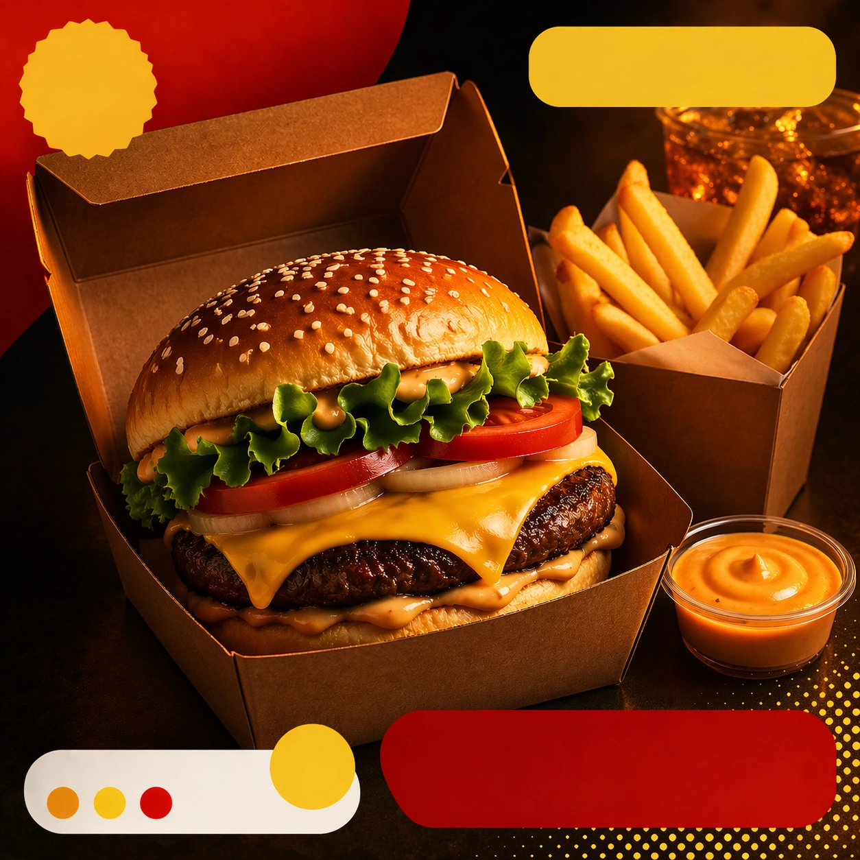
Example generated from “Dating App Disaster Comedy Cards — Variant Three”
GPT Image 2en

Scene: Create a square dependent image for Dating App Disaster Comedy Cards. Build a third controlled variation in the same system with a premium, production-ready finish. Use a polished modular board or campaign surface with clean spacing, premium game-UI finish, and clear focal hierarchy. The composition should feel intentional, clean, and reusable for gallery, research, campaign, or internal handoff contexts. Lighting must support readability first, with the main forms clearly separated from the background and enough breathing room for the system to stay legible at both hero scale and thumbnail scale. Subject: Center a coherent original game-art system built for premium production and marketing surfaces. For this image, focus on the intended support surface. Keep the same system logic stable across screenshots, cards, banners, and overview boards. Preserve exact identity or system logic from the reference image while changing only the intended variation axis. The viewer should immediately understand what role this surface plays inside a cohesive game-production asset pack. Important details: Lock framing, icon grammar, palette blocking, and surface hierarchy so the kit feels production-ready and consistent. Preserve the core silhouette, framing language, and material logic from the reference image while each variation changes function. Keep materials believable, edge hierarchy disciplined, and the visual language consistent with Dating Comedy. Use abstract interface blocks or diagram accents when helpful, but avoid any readable language. The final result should feel like a deliberate production asset rather than a random illustration. Use case: Dating App Disaster Comedy Cards series study 4/9, designed as variant three within a cohesive asset pack. Constraints: No readable text, no watermark, no logos, preserve exact 1:1 aspect ratio, no unrelated objects, no broken visual hierarchy, no malformed anatomy or broken perspective, no random decorative clutter.
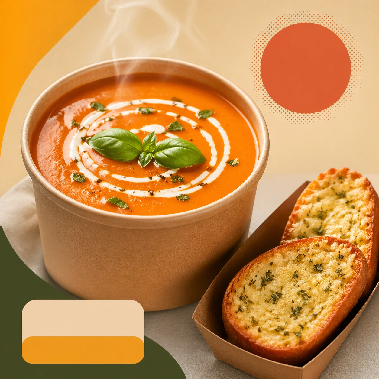
Example generated from “Dating App Disaster Comedy Cards — Support One”
GPT Image 2en

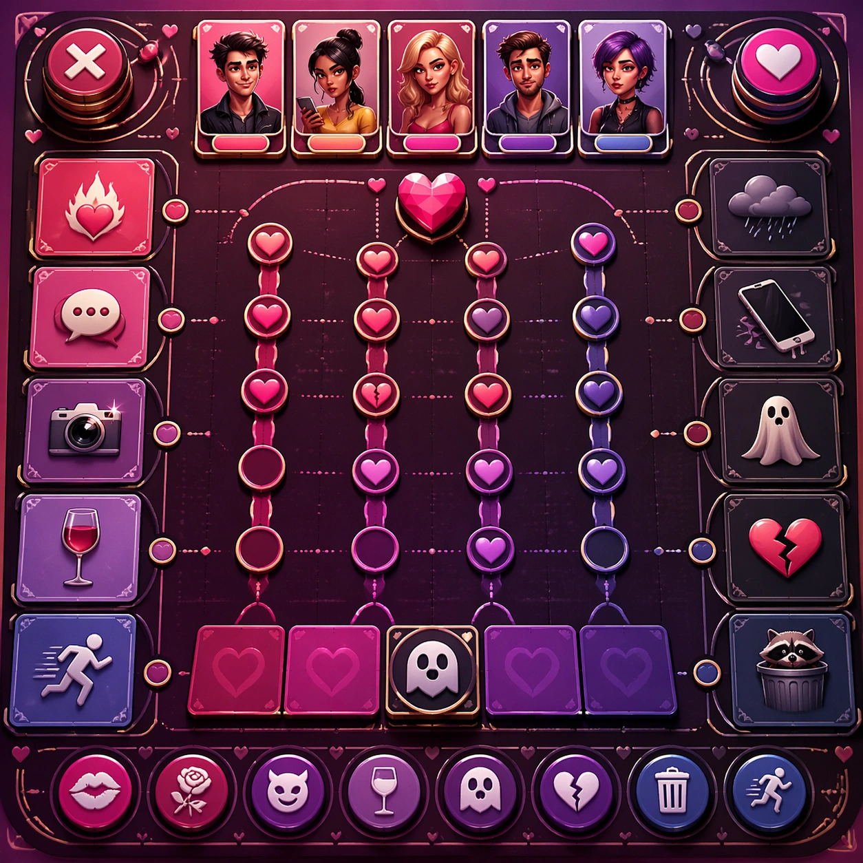
Scene: Create a square standalone support image for Dating App Disaster Comedy Cards. Build a support-surface study with a clear focal hierarchy and a finished professional surface. Use a polished modular board or campaign surface with clean spacing, premium game-UI finish, and clear focal hierarchy. The frame should feel self-contained and polished, with enough structure to explain the system even without the reference series, yet still obviously belonging to the same theme and production world. Subject: Show a coherent original game-art system built for premium production and marketing surfaces in a way that emphasizes the intended support surface. Keep the same system logic stable across screenshots, cards, banners, and overview boards. Even though this image is independent, the viewer should still recognize the same universe, same commercial logic, and same production intent as the core package. Important details: Lock framing, icon grammar, palette blocking, and surface hierarchy so the kit feels production-ready and consistent. Preserve the broader theme language through color, framing, material choices, and modular composition. Use clean panel rhythm, premium asset presentation, and believable detail density. The image should work equally well as a gallery study, research reference, and mock production deliverable. Use case: Dating App Disaster Comedy Cards single study 5/9, exploring support one as a support surface. Constraints: No readable text, no watermark, no logos, preserve exact 1:1 aspect ratio, no unrelated objects, no broken visual hierarchy, no visual noise that obscures the main surface, no accidental brand resemblance.
Example generated from “Dating App Disaster Comedy Cards — Support Two”
GPT Image 2en

Scene: Create a square standalone support image for Dating App Disaster Comedy Cards. Build a second support-surface study with a clear focal hierarchy and a finished professional surface. Use a polished modular board or campaign surface with clean spacing, premium game-UI finish, and clear focal hierarchy. The frame should feel self-contained and polished, with enough structure to explain the system even without the reference series, yet still obviously belonging to the same theme and production world. Subject: Show a coherent original game-art system built for premium production and marketing surfaces in a way that emphasizes the intended support surface. Keep the same system logic stable across screenshots, cards, banners, and overview boards. Even though this image is independent, the viewer should still recognize the same universe, same commercial logic, and same production intent as the core package. Important details: Lock framing, icon grammar, palette blocking, and surface hierarchy so the kit feels production-ready and consistent. Preserve the broader theme language through color, framing, material choices, and modular composition. Use clean panel rhythm, premium asset presentation, and believable detail density. The image should work equally well as a gallery study, research reference, and mock production deliverable. Use case: Dating App Disaster Comedy Cards single study 6/9, exploring support two as a support surface. Constraints: No readable text, no watermark, no logos, preserve exact 1:1 aspect ratio, no unrelated objects, no broken visual hierarchy, no visual noise that obscures the main surface, no accidental brand resemblance.

Example generated from “Dating App Disaster Comedy Cards — Support Three”
GPT Image 2en

Scene: Create a square standalone support image for Dating App Disaster Comedy Cards. Build a third support-surface study with a clear focal hierarchy and a finished professional surface. Use a polished modular board or campaign surface with clean spacing, premium game-UI finish, and clear focal hierarchy. The frame should feel self-contained and polished, with enough structure to explain the system even without the reference series, yet still obviously belonging to the same theme and production world. Subject: Show a coherent original game-art system built for premium production and marketing surfaces in a way that emphasizes the intended support surface. Keep the same system logic stable across screenshots, cards, banners, and overview boards. Even though this image is independent, the viewer should still recognize the same universe, same commercial logic, and same production intent as the core package. Important details: Lock framing, icon grammar, palette blocking, and surface hierarchy so the kit feels production-ready and consistent. Preserve the broader theme language through color, framing, material choices, and modular composition. Use clean panel rhythm, premium asset presentation, and believable detail density. The image should work equally well as a gallery study, research reference, and mock production deliverable. Use case: Dating App Disaster Comedy Cards single study 7/9, exploring support three as a support surface. Constraints: No readable text, no watermark, no logos, preserve exact 1:1 aspect ratio, no unrelated objects, no broken visual hierarchy, no visual noise that obscures the main surface, no accidental brand resemblance.

Example generated from “Dating App Disaster Comedy Cards — Support Four”
GPT Image 2en

Scene: Create a square standalone support image for Dating App Disaster Comedy Cards. Build a fourth support-surface study with a clear focal hierarchy and a finished professional surface. Use a polished modular board or campaign surface with clean spacing, premium game-UI finish, and clear focal hierarchy. The frame should feel self-contained and polished, with enough structure to explain the system even without the reference series, yet still obviously belonging to the same theme and production world. Subject: Show a coherent original game-art system built for premium production and marketing surfaces in a way that emphasizes the intended support surface. Keep the same system logic stable across screenshots, cards, banners, and overview boards. Even though this image is independent, the viewer should still recognize the same universe, same commercial logic, and same production intent as the core package. Important details: Lock framing, icon grammar, palette blocking, and surface hierarchy so the kit feels production-ready and consistent. Preserve the broader theme language through color, framing, material choices, and modular composition. Use clean panel rhythm, premium asset presentation, and believable detail density. The image should work equally well as a gallery study, research reference, and mock production deliverable. Use case: Dating App Disaster Comedy Cards single study 8/9, exploring support four as a support surface. Constraints: No readable text, no watermark, no logos, preserve exact 1:1 aspect ratio, no unrelated objects, no broken visual hierarchy, no visual noise that obscures the main surface, no accidental brand resemblance.

Example generated from “Dating App Disaster Comedy Cards — Support Five”
GPT Image 2en

Scene: Create a square standalone support image for Dating App Disaster Comedy Cards. Build a fifth support-surface study with a clear focal hierarchy and a finished professional surface. Use a polished modular board or campaign surface with clean spacing, premium game-UI finish, and clear focal hierarchy. The frame should feel self-contained and polished, with enough structure to explain the system even without the reference series, yet still obviously belonging to the same theme and production world. Subject: Show a coherent original game-art system built for premium production and marketing surfaces in a way that emphasizes the intended support surface. Keep the same system logic stable across screenshots, cards, banners, and overview boards. Even though this image is independent, the viewer should still recognize the same universe, same commercial logic, and same production intent as the core package. Important details: Lock framing, icon grammar, palette blocking, and surface hierarchy so the kit feels production-ready and consistent. Preserve the broader theme language through color, framing, material choices, and modular composition. Use clean panel rhythm, premium asset presentation, and believable detail density. The image should work equally well as a gallery study, research reference, and mock production deliverable. Use case: Dating App Disaster Comedy Cards single study 9/9, exploring support five as a support surface. Constraints: No readable text, no watermark, no logos, preserve exact 1:1 aspect ratio, no unrelated objects, no broken visual hierarchy, no visual noise that obscures the main surface, no accidental brand resemblance.

Example generated from “Deadpan Caption Image Format — Reference Anchor”
GPT Image 2en

Scene: Create a square reference image for Deadpan Caption Image Format. Build a reference anchor establishing the core system with a premium, production-ready finish. Use a polished modular board or campaign surface with clean spacing, premium game-UI finish, and clear focal hierarchy. The composition should feel intentional, clean, and reusable for gallery, research, campaign, or internal handoff contexts. Lighting must support readability first, with the main forms clearly separated from the background and enough breathing room for the system to stay legible at both hero scale and thumbnail scale. Subject: Center a coherent original game-art system built for premium production and marketing surfaces. For this image, focus on reference anchor. Keep the same system logic stable across screenshots, cards, banners, and overview boards. This image is the canonical anchor that later series images must follow. The viewer should immediately understand what role this surface plays inside a cohesive game-production asset pack. Important details: Lock framing, icon grammar, palette blocking, and surface hierarchy so the kit feels production-ready and consistent. Preserve the core silhouette, framing language, and material logic from the reference image while each variation changes function. Keep materials believable, edge hierarchy disciplined, and the visual language consistent with Deadpan Format. Use abstract interface blocks or diagram accents when helpful, but avoid any readable language. The final result should feel like a deliberate production asset rather than a random illustration. Use case: Deadpan Caption Image Format series study 1/9, designed as reference anchor within a cohesive asset pack. Constraints: No readable text, no watermark, no logos, preserve exact 1:1 aspect ratio, no unrelated objects, no broken visual hierarchy, no malformed anatomy or broken perspective, no random decorative clutter.

Example generated from “Deadpan Caption Image Format — Variant One”
GPT Image 2en

Scene: Create a square dependent image for Deadpan Caption Image Format. Build a first controlled variation in the same system with a premium, production-ready finish. Use a polished modular board or campaign surface with clean spacing, premium game-UI finish, and clear focal hierarchy. The composition should feel intentional, clean, and reusable for gallery, research, campaign, or internal handoff contexts. Lighting must support readability first, with the main forms clearly separated from the background and enough breathing room for the system to stay legible at both hero scale and thumbnail scale. Subject: Center a coherent original game-art system built for premium production and marketing surfaces. For this image, focus on the intended support surface. Keep the same system logic stable across screenshots, cards, banners, and overview boards. Preserve exact identity or system logic from the reference image while changing only the intended variation axis. The viewer should immediately understand what role this surface plays inside a cohesive game-production asset pack. Important details: Lock framing, icon grammar, palette blocking, and surface hierarchy so the kit feels production-ready and consistent. Preserve the core silhouette, framing language, and material logic from the reference image while each variation changes function. Keep materials believable, edge hierarchy disciplined, and the visual language consistent with Deadpan Format. Use abstract interface blocks or diagram accents when helpful, but avoid any readable language. The final result should feel like a deliberate production asset rather than a random illustration. Use case: Deadpan Caption Image Format series study 2/9, designed as variant one within a cohesive asset pack. Constraints: No readable text, no watermark, no logos, preserve exact 1:1 aspect ratio, no unrelated objects, no broken visual hierarchy, no malformed anatomy or broken perspective, no random decorative clutter.

Example generated from “Deadpan Caption Image Format — Variant Two”
GPT Image 2en

Scene: Create a square dependent image for Deadpan Caption Image Format. Build a second controlled variation in the same system with a premium, production-ready finish. Use a polished modular board or campaign surface with clean spacing, premium game-UI finish, and clear focal hierarchy. The composition should feel intentional, clean, and reusable for gallery, research, campaign, or internal handoff contexts. Lighting must support readability first, with the main forms clearly separated from the background and enough breathing room for the system to stay legible at both hero scale and thumbnail scale. Subject: Center a coherent original game-art system built for premium production and marketing surfaces. For this image, focus on the intended support surface. Keep the same system logic stable across screenshots, cards, banners, and overview boards. Preserve exact identity or system logic from the reference image while changing only the intended variation axis. The viewer should immediately understand what role this surface plays inside a cohesive game-production asset pack. Important details: Lock framing, icon grammar, palette blocking, and surface hierarchy so the kit feels production-ready and consistent. Preserve the core silhouette, framing language, and material logic from the reference image while each variation changes function. Keep materials believable, edge hierarchy disciplined, and the visual language consistent with Deadpan Format. Use abstract interface blocks or diagram accents when helpful, but avoid any readable language. The final result should feel like a deliberate production asset rather than a random illustration. Use case: Deadpan Caption Image Format series study 3/9, designed as variant two within a cohesive asset pack. Constraints: No readable text, no watermark, no logos, preserve exact 1:1 aspect ratio, no unrelated objects, no broken visual hierarchy, no malformed anatomy or broken perspective, no random decorative clutter.

Example generated from “Deadpan Caption Image Format — Variant Three”
GPT Image 2en

Scene: Create a square dependent image for Deadpan Caption Image Format. Build a third controlled variation in the same system with a premium, production-ready finish. Use a polished modular board or campaign surface with clean spacing, premium game-UI finish, and clear focal hierarchy. The composition should feel intentional, clean, and reusable for gallery, research, campaign, or internal handoff contexts. Lighting must support readability first, with the main forms clearly separated from the background and enough breathing room for the system to stay legible at both hero scale and thumbnail scale. Subject: Center a coherent original game-art system built for premium production and marketing surfaces. For this image, focus on the intended support surface. Keep the same system logic stable across screenshots, cards, banners, and overview boards. Preserve exact identity or system logic from the reference image while changing only the intended variation axis. The viewer should immediately understand what role this surface plays inside a cohesive game-production asset pack. Important details: Lock framing, icon grammar, palette blocking, and surface hierarchy so the kit feels production-ready and consistent. Preserve the core silhouette, framing language, and material logic from the reference image while each variation changes function. Keep materials believable, edge hierarchy disciplined, and the visual language consistent with Deadpan Format. Use abstract interface blocks or diagram accents when helpful, but avoid any readable language. The final result should feel like a deliberate production asset rather than a random illustration. Use case: Deadpan Caption Image Format series study 4/9, designed as variant three within a cohesive asset pack. Constraints: No readable text, no watermark, no logos, preserve exact 1:1 aspect ratio, no unrelated objects, no broken visual hierarchy, no malformed anatomy or broken perspective, no random decorative clutter.

Example generated from “Deadpan Caption Image Format — Support One”
GPT Image 2en

Scene: Create a square standalone support image for Deadpan Caption Image Format. Build a support-surface study with a clear focal hierarchy and a finished professional surface. Use a polished modular board or campaign surface with clean spacing, premium game-UI finish, and clear focal hierarchy. The frame should feel self-contained and polished, with enough structure to explain the system even without the reference series, yet still obviously belonging to the same theme and production world. Subject: Show a coherent original game-art system built for premium production and marketing surfaces in a way that emphasizes the intended support surface. Keep the same system logic stable across screenshots, cards, banners, and overview boards. Even though this image is independent, the viewer should still recognize the same universe, same commercial logic, and same production intent as the core package. Important details: Lock framing, icon grammar, palette blocking, and surface hierarchy so the kit feels production-ready and consistent. Preserve the broader theme language through color, framing, material choices, and modular composition. Use clean panel rhythm, premium asset presentation, and believable detail density. The image should work equally well as a gallery study, research reference, and mock production deliverable. Use case: Deadpan Caption Image Format single study 5/9, exploring support one as a support surface. Constraints: No readable text, no watermark, no logos, preserve exact 1:1 aspect ratio, no unrelated objects, no broken visual hierarchy, no visual noise that obscures the main surface, no accidental brand resemblance.

Example generated from “Deadpan Caption Image Format — Support Two”
GPT Image 2en

Scene: Create a square standalone support image for Deadpan Caption Image Format. Build a second support-surface study with a clear focal hierarchy and a finished professional surface. Use a polished modular board or campaign surface with clean spacing, premium game-UI finish, and clear focal hierarchy. The frame should feel self-contained and polished, with enough structure to explain the system even without the reference series, yet still obviously belonging to the same theme and production world. Subject: Show a coherent original game-art system built for premium production and marketing surfaces in a way that emphasizes the intended support surface. Keep the same system logic stable across screenshots, cards, banners, and overview boards. Even though this image is independent, the viewer should still recognize the same universe, same commercial logic, and same production intent as the core package. Important details: Lock framing, icon grammar, palette blocking, and surface hierarchy so the kit feels production-ready and consistent. Preserve the broader theme language through color, framing, material choices, and modular composition. Use clean panel rhythm, premium asset presentation, and believable detail density. The image should work equally well as a gallery study, research reference, and mock production deliverable. Use case: Deadpan Caption Image Format single study 6/9, exploring support two as a support surface. Constraints: No readable text, no watermark, no logos, preserve exact 1:1 aspect ratio, no unrelated objects, no broken visual hierarchy, no visual noise that obscures the main surface, no accidental brand resemblance.

Example generated from “Deadpan Caption Image Format — Support Three”
GPT Image 2en

Scene: Create a square standalone support image for Deadpan Caption Image Format. Build a third support-surface study with a clear focal hierarchy and a finished professional surface. Use a polished modular board or campaign surface with clean spacing, premium game-UI finish, and clear focal hierarchy. The frame should feel self-contained and polished, with enough structure to explain the system even without the reference series, yet still obviously belonging to the same theme and production world. Subject: Show a coherent original game-art system built for premium production and marketing surfaces in a way that emphasizes the intended support surface. Keep the same system logic stable across screenshots, cards, banners, and overview boards. Even though this image is independent, the viewer should still recognize the same universe, same commercial logic, and same production intent as the core package. Important details: Lock framing, icon grammar, palette blocking, and surface hierarchy so the kit feels production-ready and consistent. Preserve the broader theme language through color, framing, material choices, and modular composition. Use clean panel rhythm, premium asset presentation, and believable detail density. The image should work equally well as a gallery study, research reference, and mock production deliverable. Use case: Deadpan Caption Image Format single study 7/9, exploring support three as a support surface. Constraints: No readable text, no watermark, no logos, preserve exact 1:1 aspect ratio, no unrelated objects, no broken visual hierarchy, no visual noise that obscures the main surface, no accidental brand resemblance.

Example generated from “Deadpan Caption Image Format — Support Four”
GPT Image 2en

Scene: Create a square standalone support image for Deadpan Caption Image Format. Build a fourth support-surface study with a clear focal hierarchy and a finished professional surface. Use a polished modular board or campaign surface with clean spacing, premium game-UI finish, and clear focal hierarchy. The frame should feel self-contained and polished, with enough structure to explain the system even without the reference series, yet still obviously belonging to the same theme and production world. Subject: Show a coherent original game-art system built for premium production and marketing surfaces in a way that emphasizes the intended support surface. Keep the same system logic stable across screenshots, cards, banners, and overview boards. Even though this image is independent, the viewer should still recognize the same universe, same commercial logic, and same production intent as the core package. Important details: Lock framing, icon grammar, palette blocking, and surface hierarchy so the kit feels production-ready and consistent. Preserve the broader theme language through color, framing, material choices, and modular composition. Use clean panel rhythm, premium asset presentation, and believable detail density. The image should work equally well as a gallery study, research reference, and mock production deliverable. Use case: Deadpan Caption Image Format single study 8/9, exploring support four as a support surface. Constraints: No readable text, no watermark, no logos, preserve exact 1:1 aspect ratio, no unrelated objects, no broken visual hierarchy, no visual noise that obscures the main surface, no accidental brand resemblance.

Example generated from “Deadpan Caption Image Format — Support Five”
GPT Image 2en

Scene: Create a square standalone support image for Deadpan Caption Image Format. Build a fifth support-surface study with a clear focal hierarchy and a finished professional surface. Use a polished modular board or campaign surface with clean spacing, premium game-UI finish, and clear focal hierarchy. The frame should feel self-contained and polished, with enough structure to explain the system even without the reference series, yet still obviously belonging to the same theme and production world. Subject: Show a coherent original game-art system built for premium production and marketing surfaces in a way that emphasizes the intended support surface. Keep the same system logic stable across screenshots, cards, banners, and overview boards. Even though this image is independent, the viewer should still recognize the same universe, same commercial logic, and same production intent as the core package. Important details: Lock framing, icon grammar, palette blocking, and surface hierarchy so the kit feels production-ready and consistent. Preserve the broader theme language through color, framing, material choices, and modular composition. Use clean panel rhythm, premium asset presentation, and believable detail density. The image should work equally well as a gallery study, research reference, and mock production deliverable. Use case: Deadpan Caption Image Format single study 9/9, exploring support five as a support surface. Constraints: No readable text, no watermark, no logos, preserve exact 1:1 aspect ratio, no unrelated objects, no broken visual hierarchy, no visual noise that obscures the main surface, no accidental brand resemblance.

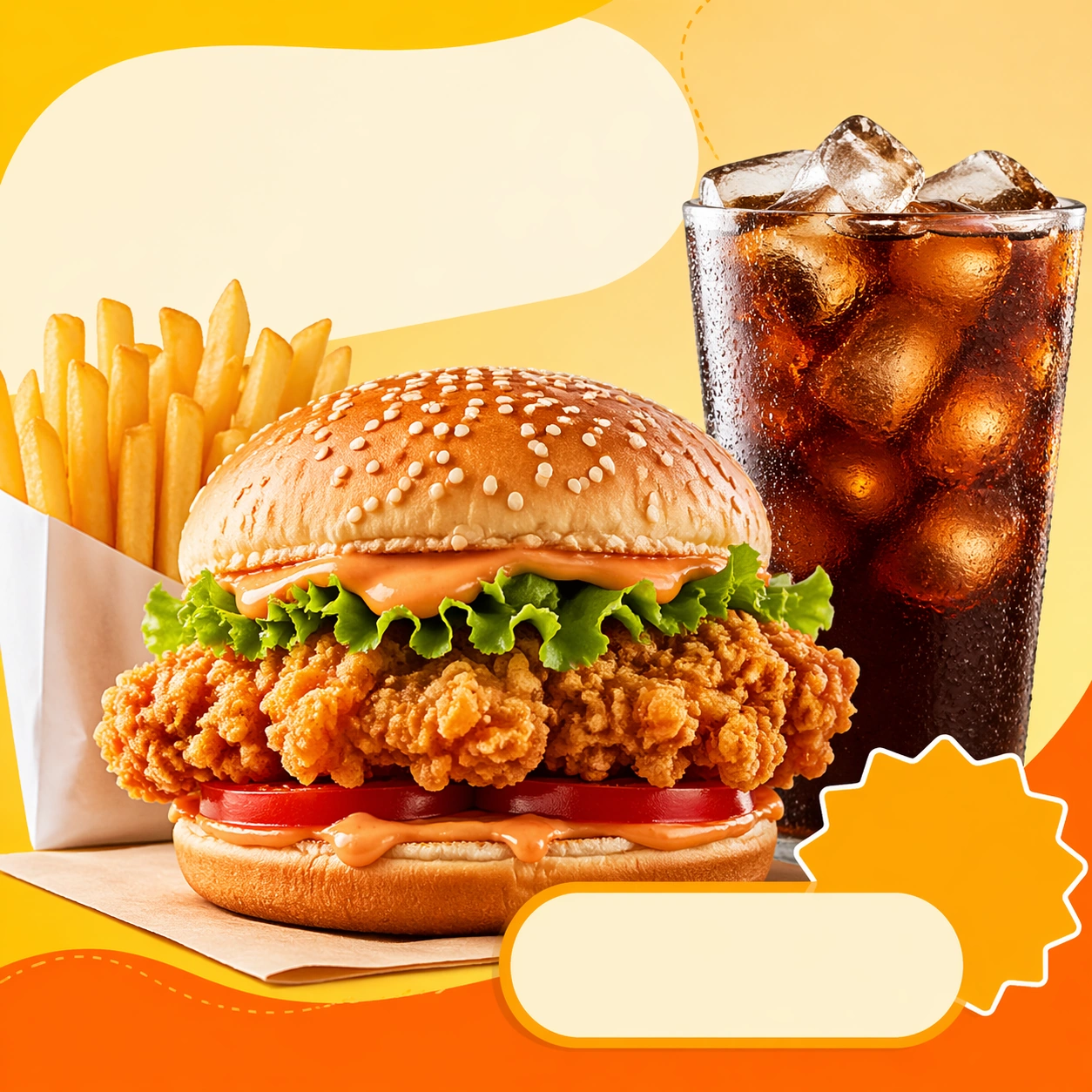
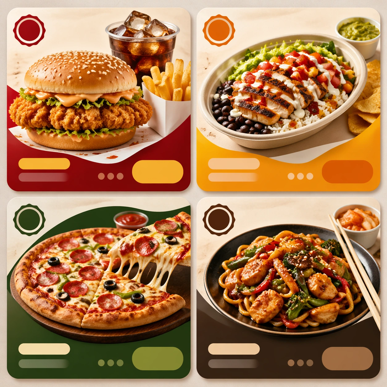
Example generated from “Delivery First Food Commerce Tiles — App Tile Anchor”
GPT Image 2en

Scene: Compose a square food-commerce image optimized for instant readability in app tiles, promo cards, or delivery grids. The image should emphasize appetizing clarity, strong hierarchy, and modular layout zones while staying photorealistic and commercially grounded. Packaging, dish crop, and badge-like design shapes can appear, but all text must remain unreadable. Use a bright, clean square card composition with one hero meal in delivery packaging, a secondary side item, and structured placeholder zones around the food. Subject: The food should look craveable at thumbnail scale, with clear portion logic, supporting side items when relevant, and delivery-aware presentation that prioritizes speed, legibility, and conversion. Show a craveable meal combo arranged so the hero item dominates, the side clarifies the offer, and the overall tile reads instantly at small size. Important details: This theme is about commerce reasoning. Preserve sharp hero food silhouettes, obvious combo structure, and clean tile-safe framing so the assets can survive small screens. Abstract text areas, CTA-like shapes, and offer badges are allowed only as non-legible design modules. Keep everything polished, modern, and immediately useful for ordering surfaces. This image establishes the reference system for the series, including camera height, tabletop discipline, prop family, and color control that later images must inherit. This image must define the tile system for the series: generous margin, bold silhouette separation, clean packaging edges, and unreadable but designed commerce shapes. Use case: Delivery Tiles series study 1/9, built for Prompt Atlas coverage of a food and beverage commercial visual system. Constraints: No readable text, no watermark, no logos, preserve exact 1:1 aspect ratio, no readable text, no logos, no app UI chrome, no fake prices, no delivery-bag chaos, no greasy blur, no clutter that hurts thumbnail legibility, no readable labels, no checkout UI, no courier person.

Example generated from “Delivery First Food Commerce Tiles — Combo Upsize Tile”
GPT Image 2en

Scene: Compose a square food-commerce image optimized for instant readability in app tiles, promo cards, or delivery grids. The image should emphasize appetizing clarity, strong hierarchy, and modular layout zones while staying photorealistic and commercially grounded. Packaging, dish crop, and badge-like design shapes can appear, but all text must remain unreadable. Preserve the same card geometry and high-key commerce lighting, but add one extra side or beverage cue to imply a bigger offer. Subject: The food should look craveable at thumbnail scale, with clear portion logic, supporting side items when relevant, and delivery-aware presentation that prioritizes speed, legibility, and conversion. Feature a main dish with one clearly visible add-on and organized packaging so the tile communicates a more substantial combo without crowding the frame. Important details: This theme is about commerce reasoning. Preserve sharp hero food silhouettes, obvious combo structure, and clean tile-safe framing so the assets can survive small screens. Abstract text areas, CTA-like shapes, and offer badges are allowed only as non-legible design modules. Keep everything polished, modern, and immediately useful for ordering surfaces. Preserve the exact camera height, lens feel, prop family, tabletop scale, palette discipline, and brand logic established by 01-app-tile-anchor. The anchor hierarchy must remain intact: hero food first, support item second, abstract badges third. Keep everything crisp enough for mobile browsing. Use case: Delivery Tiles series study 2/9, built for Prompt Atlas coverage of a food and beverage commercial visual system. Constraints: No readable text, no watermark, no logos, preserve exact 1:1 aspect ratio, no readable text, no logos, no app UI chrome, no fake prices, no delivery-bag chaos, no greasy blur, no clutter that hurts thumbnail legibility, no readable promo text, no huge feast pile, no delivery driver props.

Example generated from “Delivery First Food Commerce Tiles — Family Bundle Tile”
GPT Image 2en

Scene: Compose a square food-commerce image optimized for instant readability in app tiles, promo cards, or delivery grids. The image should emphasize appetizing clarity, strong hierarchy, and modular layout zones while staying photorealistic and commercially grounded. Packaging, dish crop, and badge-like design shapes can appear, but all text must remain unreadable. Maintain the same commerce card framing and color logic, but widen the perceived meal scope through multiple containers and one shared centerpiece. Subject: The food should look craveable at thumbnail scale, with clear portion logic, supporting side items when relevant, and delivery-aware presentation that prioritizes speed, legibility, and conversion. Show a family-style bundle with clear portion grouping, visible packaging lids or open containers, and an easy-to-understand food hierarchy. Important details: This theme is about commerce reasoning. Preserve sharp hero food silhouettes, obvious combo structure, and clean tile-safe framing so the assets can survive small screens. Abstract text areas, CTA-like shapes, and offer badges are allowed only as non-legible design modules. Keep everything polished, modern, and immediately useful for ordering surfaces. Preserve the exact camera height, lens feel, prop family, tabletop scale, palette discipline, and brand logic established by 01-app-tile-anchor. The image should still read quickly at thumbnail scale despite the bundle size. Separate containers cleanly, avoid clutter, and keep the food vivid and legible. Use case: Delivery Tiles series study 3/9, built for Prompt Atlas coverage of a food and beverage commercial visual system. Constraints: No readable text, no watermark, no logos, preserve exact 1:1 aspect ratio, no readable text, no logos, no app UI chrome, no fake prices, no delivery-bag chaos, no greasy blur, no clutter that hurts thumbnail legibility, no banquet chaos, no readable family-meal text, no disposable utensil scatter.

Example generated from “Delivery First Food Commerce Tiles — Late Night Snack Tile”
GPT Image 2en

Scene: Compose a square food-commerce image optimized for instant readability in app tiles, promo cards, or delivery grids. The image should emphasize appetizing clarity, strong hierarchy, and modular layout zones while staying photorealistic and commercially grounded. Packaging, dish crop, and badge-like design shapes can appear, but all text must remain unreadable. Retain the exact card structure but shift the mood to low-key evening light, richer shadows, and warmer highlights that suggest night ordering. Subject: The food should look craveable at thumbnail scale, with clear portion logic, supporting side items when relevant, and delivery-aware presentation that prioritizes speed, legibility, and conversion. Center a compact indulgent snack or noodle meal in packaging, with one glowing accent like a drink or dipping sauce to support the nighttime story. Important details: This theme is about commerce reasoning. Preserve sharp hero food silhouettes, obvious combo structure, and clean tile-safe framing so the assets can survive small screens. Abstract text areas, CTA-like shapes, and offer badges are allowed only as non-legible design modules. Keep everything polished, modern, and immediately useful for ordering surfaces. Preserve the exact camera height, lens feel, prop family, tabletop scale, palette discipline, and brand logic established by 01-app-tile-anchor. The series anchor should remain visible through layout, placeholder shapes, crop discipline, and appetite-first styling even as the mood turns more nocturnal. Use case: Delivery Tiles series study 4/9, built for Prompt Atlas coverage of a food and beverage commercial visual system. Constraints: No readable text, no watermark, no logos, preserve exact 1:1 aspect ratio, no readable text, no logos, no app UI chrome, no fake prices, no delivery-bag chaos, no greasy blur, no clutter that hurts thumbnail legibility, no party scene, no readable midnight offer text, no greasy mess.

Example generated from “Delivery First Food Commerce Tiles — Soup and Side Tile”
GPT Image 2en

Scene: Compose a square food-commerce image optimized for instant readability in app tiles, promo cards, or delivery grids. The image should emphasize appetizing clarity, strong hierarchy, and modular layout zones while staying photorealistic and commercially grounded. Packaging, dish crop, and badge-like design shapes can appear, but all text must remain unreadable. Compose a square commerce card around one soup bowl or container, one side item, and a clean support surface with soft light. Subject: The food should look craveable at thumbnail scale, with clear portion logic, supporting side items when relevant, and delivery-aware presentation that prioritizes speed, legibility, and conversion. Keep the liquid surface, toppings, and side-item relationship clear so the image communicates warmth, comfort, and completeness. Important details: This theme is about commerce reasoning. Preserve sharp hero food silhouettes, obvious combo structure, and clean tile-safe framing so the assets can survive small screens. Abstract text areas, CTA-like shapes, and offer badges are allowed only as non-legible design modules. Keep everything polished, modern, and immediately useful for ordering surfaces. This image should feel fully self-contained while still belonging to the same broader topic and commercial world. Steam, container rims, and side textures must feel real, while the layout remains modular and card-safe for delivery platforms. Use case: Delivery Tiles single study 6/9, built for Prompt Atlas coverage of a food and beverage commercial visual system. Constraints: No readable text, no watermark, no logos, preserve exact 1:1 aspect ratio, no readable text, no logos, no app UI chrome, no fake prices, no delivery-bag chaos, no greasy blur, no clutter that hurts thumbnail legibility, no spill chaos, no spoonful action, no readable labels.

Example generated from “Delivery First Food Commerce Tiles — Dessert Add-On Tile”
GPT Image 2en

Scene: Compose a square food-commerce image optimized for instant readability in app tiles, promo cards, or delivery grids. The image should emphasize appetizing clarity, strong hierarchy, and modular layout zones while staying photorealistic and commercially grounded. Packaging, dish crop, and badge-like design shapes can appear, but all text must remain unreadable. Use a clean square tile composition with one premium dessert in a takeaway cup or box, isolated enough to read instantly. Subject: The food should look craveable at thumbnail scale, with clear portion logic, supporting side items when relevant, and delivery-aware presentation that prioritizes speed, legibility, and conversion. Let the dessert, packaging, and topping hierarchy communicate indulgence without overloading the card. Important details: This theme is about commerce reasoning. Preserve sharp hero food silhouettes, obvious combo structure, and clean tile-safe framing so the assets can survive small screens. Abstract text areas, CTA-like shapes, and offer badges are allowed only as non-legible design modules. Keep everything polished, modern, and immediately useful for ordering surfaces. This image should feel fully self-contained while still belonging to the same broader topic and commercial world. Small-screen clarity is essential: topping contrast, container edge, and abstract badge-like shapes should all reinforce a quick add-on decision. Use case: Delivery Tiles single study 7/9, built for Prompt Atlas coverage of a food and beverage commercial visual system. Constraints: No readable text, no watermark, no logos, preserve exact 1:1 aspect ratio, no readable text, no logos, no app UI chrome, no fake prices, no delivery-bag chaos, no greasy blur, no clutter that hurts thumbnail legibility, no giant sundae tower, no confetti, no readable add-on text.

Example generated from “Delivery First Food Commerce Tiles — Beverage Upsell Tile”
GPT Image 2en

Scene: Compose a square food-commerce image optimized for instant readability in app tiles, promo cards, or delivery grids. The image should emphasize appetizing clarity, strong hierarchy, and modular layout zones while staying photorealistic and commercially grounded. Packaging, dish crop, and badge-like design shapes can appear, but all text must remain unreadable. Frame one chilled or hot drink beside a food item in a bright modular card layout with room for abstract promotion shapes. Subject: The food should look craveable at thumbnail scale, with clear portion logic, supporting side items when relevant, and delivery-aware presentation that prioritizes speed, legibility, and conversion. The drink must read immediately through glass or cup silhouette, liquid color, and condensation or steam. Important details: This theme is about commerce reasoning. Preserve sharp hero food silhouettes, obvious combo structure, and clean tile-safe framing so the assets can survive small screens. Abstract text areas, CTA-like shapes, and offer badges are allowed only as non-legible design modules. Keep everything polished, modern, and immediately useful for ordering surfaces. This image should feel fully self-contained while still belonging to the same broader topic and commercial world. Keep the packaging premium and clean, with enough context to show pairing value while preserving a simple tile-safe structure. Use case: Delivery Tiles single study 8/9, built for Prompt Atlas coverage of a food and beverage commercial visual system. Constraints: No readable text, no watermark, no logos, preserve exact 1:1 aspect ratio, no readable text, no logos, no app UI chrome, no fake prices, no delivery-bag chaos, no greasy blur, no clutter that hurts thumbnail legibility, no readable cup copy, no barista portrait, no app screenshot overlay.

Example generated from “Delivery First Food Commerce Tiles — Multi Tile Comparison Board”
GPT Image 2en

Scene: Compose a square food-commerce image optimized for instant readability in app tiles, promo cards, or delivery grids. The image should emphasize appetizing clarity, strong hierarchy, and modular layout zones while staying photorealistic and commercially grounded. Packaging, dish crop, and badge-like design shapes can appear, but all text must remain unreadable. Compose a square board containing three or four mini tile modules arranged in a structured grid on a neutral surface. Subject: The food should look craveable at thumbnail scale, with clear portion logic, supporting side items when relevant, and delivery-aware presentation that prioritizes speed, legibility, and conversion. Each module should show a distinct meal category while preserving one unified delivery visual language across the board. Important details: This theme is about commerce reasoning. Preserve sharp hero food silhouettes, obvious combo structure, and clean tile-safe framing so the assets can survive small screens. Abstract text areas, CTA-like shapes, and offer badges are allowed only as non-legible design modules. Keep everything polished, modern, and immediately useful for ordering surfaces. This image should feel fully self-contained while still belonging to the same broader topic and commercial world. The board tests hierarchy and system thinking: repeated card shapes, abstract text zones, and appetizing category differentiation must all remain clear. Use case: Delivery Tiles single study 9/9, built for Prompt Atlas coverage of a food and beverage commercial visual system. Constraints: No readable text, no watermark, no logos, preserve exact 1:1 aspect ratio, no readable text, no logos, no app UI chrome, no fake prices, no delivery-bag chaos, no greasy blur, no clutter that hurts thumbnail legibility, no readable menus, no phone frame, no dashboard analytics overlay.

Example generated from “Desert Dusk Monolith — Reference Anchor”
GPT Image 2en

Scene: Create a square cinematic still for Desert Dusk Monolith. Use production-grade photoreal lighting, disciplined lens behavior, and a composition that feels like a finished key frame from an original film rather than a casual snapshot. A severe desert dune field stretches to the horizon at sunset, where the last light turns the crests copper and rose, the far sky cools toward violet, and one dark monolith stands with absolute stillness above the wind-shaped sand. Keep the camera in a disciplined anchor position so the full lighting event and the main spatial structure are immediately legible from edge to edge. Subject: Build a coherent original scene whose emotional center comes from atmosphere, light physics, and spatial clarity. Avoid relying on celebrity likeness, franchise iconography, or stylized illustration shortcuts. The monolith, long shadow, dune ridges, and the empty horizon line should dominate, with no unnecessary props, because the image depends on scale tension between one silent object and an immense landscape. This frame should lock the canonical arrangement, scale relationship, and emotional tone that the later dependent images inherit. Important details: Preserve a believable physical world with strong depth layering, careful color separation, and premium image discipline. Keep the geometry minimal but not sterile, using precise shadow direction, tactile sand micro-relief, clean sky gradient, and disciplined negative space so the frame feels monumental rather than decorative. Use this image to establish the authoritative direction of light, atmospheric density, and structural silhouette for the package. Use case: Desert Monolith series study 1/9. Constraints: No readable text, no watermark, no logos, preserve exact 1:1 aspect ratio, no ruins, no spaceships, no readable markings on the monolith, no crowds, no surreal floating objects.

Example generated from “Desert Dusk Monolith — Closer Frame”
GPT Image 2en

Scene: Create a square cinematic still for Desert Dusk Monolith. Use production-grade photoreal lighting, disciplined lens behavior, and a composition that feels like a finished key frame from an original film rather than a casual snapshot. A severe desert dune field stretches to the horizon at sunset, where the last light turns the crests copper and rose, the far sky cools toward violet, and one dark monolith stands with absolute stillness above the wind-shaped sand. Move the camera closer or lower so the viewer feels more embedded inside the atmosphere while the same light direction and environment remain intact. Subject: Build a coherent original scene whose emotional center comes from atmosphere, light physics, and spatial clarity. Avoid relying on celebrity likeness, franchise iconography, or stylized illustration shortcuts. The monolith, long shadow, dune ridges, and the empty horizon line should dominate, with no unnecessary props, because the image depends on scale tension between one silent object and an immense landscape. Preserve the same world logic from the reference and let one human-scale or material-scale element become more prominent without stealing focus from the atmosphere. Important details: Preserve a believable physical world with strong depth layering, careful color separation, and premium image discipline. Keep the geometry minimal but not sterile, using precise shadow direction, tactile sand micro-relief, clean sky gradient, and disciplined negative space so the frame feels monumental rather than decorative. Keep the palette family, structural read, and light behavior from image 01 while increasing immediacy and tactile presence. Use case: Desert Monolith series study 2/9. Constraints: No readable text, no watermark, no logos, preserve exact 1:1 aspect ratio, no ruins, no spaceships, no readable markings on the monolith, no crowds, no surreal floating objects.

Example generated from “Desert Dusk Monolith — Spatial Counterpoint”
GPT Image 2en

Scene: Create a square cinematic still for Desert Dusk Monolith. Use production-grade photoreal lighting, disciplined lens behavior, and a composition that feels like a finished key frame from an original film rather than a casual snapshot. A severe desert dune field stretches to the horizon at sunset, where the last light turns the crests copper and rose, the far sky cools toward violet, and one dark monolith stands with absolute stillness above the wind-shaped sand. Shift to an oblique or lateral point of view that reveals different depth layers while staying inside the same place and the same atmospheric event. Subject: Build a coherent original scene whose emotional center comes from atmosphere, light physics, and spatial clarity. Avoid relying on celebrity likeness, franchise iconography, or stylized illustration shortcuts. The monolith, long shadow, dune ridges, and the empty horizon line should dominate, with no unnecessary props, because the image depends on scale tension between one silent object and an immense landscape. Hold the reference structure, but use the new angle to show secondary planes, foreground interruption, or a changed distance relationship. Important details: Preserve a believable physical world with strong depth layering, careful color separation, and premium image discipline. Keep the geometry minimal but not sterile, using precise shadow direction, tactile sand micro-relief, clean sky gradient, and disciplined negative space so the frame feels monumental rather than decorative. The success condition is continuity with the reference plus a richer sense of depth, not a new location or a new lighting system. Use case: Desert Monolith series study 3/9. Constraints: No readable text, no watermark, no logos, preserve exact 1:1 aspect ratio, no ruins, no spaceships, no readable markings on the monolith, no crowds, no surreal floating objects.

Example generated from “Desert Dusk Monolith — Climax Frame”
GPT Image 2en

Scene: Create a square cinematic still for Desert Dusk Monolith. Use production-grade photoreal lighting, disciplined lens behavior, and a composition that feels like a finished key frame from an original film rather than a casual snapshot. A severe desert dune field stretches to the horizon at sunset, where the last light turns the crests copper and rose, the far sky cools toward violet, and one dark monolith stands with absolute stillness above the wind-shaped sand. Push the composition toward the emotional peak of the same setup, with the most dramatic balance of brightness, shadow, or atmospheric density inside the established world. Subject: Build a coherent original scene whose emotional center comes from atmosphere, light physics, and spatial clarity. Avoid relying on celebrity likeness, franchise iconography, or stylized illustration shortcuts. The monolith, long shadow, dune ridges, and the empty horizon line should dominate, with no unnecessary props, because the image depends on scale tension between one silent object and an immense landscape. Everything should still read as the same location and same event, but framed for maximum narrative force and visual closure. Important details: Preserve a believable physical world with strong depth layering, careful color separation, and premium image discipline. Keep the geometry minimal but not sterile, using precise shadow direction, tactile sand micro-relief, clean sky gradient, and disciplined negative space so the frame feels monumental rather than decorative. Make it feel like the strongest hero frame of the sequence without breaking continuity or introducing a new design language. Use case: Desert Monolith series study 4/9. Constraints: No readable text, no watermark, no logos, preserve exact 1:1 aspect ratio, no ruins, no spaceships, no readable markings on the monolith, no crowds, no surreal floating objects.

Example generated from “Desert Dusk Monolith — Surface Study”
GPT Image 2en

Scene: Create a square cinematic still for Desert Dusk Monolith. Use production-grade photoreal lighting, disciplined lens behavior, and a composition that feels like a finished key frame from an original film rather than a casual snapshot. A severe desert dune field stretches to the horizon at sunset, where the last light turns the crests copper and rose, the far sky cools toward violet, and one dark monolith stands with absolute stillness above the wind-shaped sand. Build an independent square study around the way atmosphere interacts with surfaces, keeping enough environmental context for the image to feel finished rather than cropped at random. Subject: Build a coherent original scene whose emotional center comes from atmosphere, light physics, and spatial clarity. Avoid relying on celebrity likeness, franchise iconography, or stylized illustration shortcuts. The monolith, long shadow, dune ridges, and the empty horizon line should dominate, with no unnecessary props, because the image depends on scale tension between one silent object and an immense landscape. Let textures, reflections, residue, moisture, dust, or particulate response become primary, while the broader setting remains clearly implied. Important details: Preserve a believable physical world with strong depth layering, careful color separation, and premium image discipline. Keep the geometry minimal but not sterile, using precise shadow direction, tactile sand micro-relief, clean sky gradient, and disciplined negative space so the frame feels monumental rather than decorative. The key is material credibility under dramatic light, with micro-contrast and controlled mood supporting the theme. Use case: Desert Monolith single study 5/9. Constraints: No readable text, no watermark, no logos, preserve exact 1:1 aspect ratio, no ruins, no spaceships, no readable markings on the monolith, no crowds, no surreal floating objects.

Example generated from “Desert Dusk Monolith — Silhouette Study”
GPT Image 2en

Scene: Create a square cinematic still for Desert Dusk Monolith. Use production-grade photoreal lighting, disciplined lens behavior, and a composition that feels like a finished key frame from an original film rather than a casual snapshot. A severe desert dune field stretches to the horizon at sunset, where the last light turns the crests copper and rose, the far sky cools toward violet, and one dark monolith stands with absolute stillness above the wind-shaped sand. Compose an independent frame where one human, animal, or object silhouette negotiates with the atmospheric light event in a clean, readable way. Subject: Build a coherent original scene whose emotional center comes from atmosphere, light physics, and spatial clarity. Avoid relying on celebrity likeness, franchise iconography, or stylized illustration shortcuts. The monolith, long shadow, dune ridges, and the empty horizon line should dominate, with no unnecessary props, because the image depends on scale tension between one silent object and an immense landscape. The silhouette should supply scale and emotional orientation, but the environment still needs to carry most of the storytelling weight. Important details: Preserve a believable physical world with strong depth layering, careful color separation, and premium image discipline. Keep the geometry minimal but not sterile, using precise shadow direction, tactile sand micro-relief, clean sky gradient, and disciplined negative space so the frame feels monumental rather than decorative. Keep the silhouette simple and believable, avoiding poster-like graphic flattening while preserving strong contrast. Use case: Desert Monolith single study 6/9. Constraints: No readable text, no watermark, no logos, preserve exact 1:1 aspect ratio, no ruins, no spaceships, no readable markings on the monolith, no crowds, no surreal floating objects.