App Launch Marketing Page Kit — Social Launch Adaptations

App Launch Marketing Page Kit — Social Launch Adaptations

原始文档

GPT Image 2 · en

Scene:
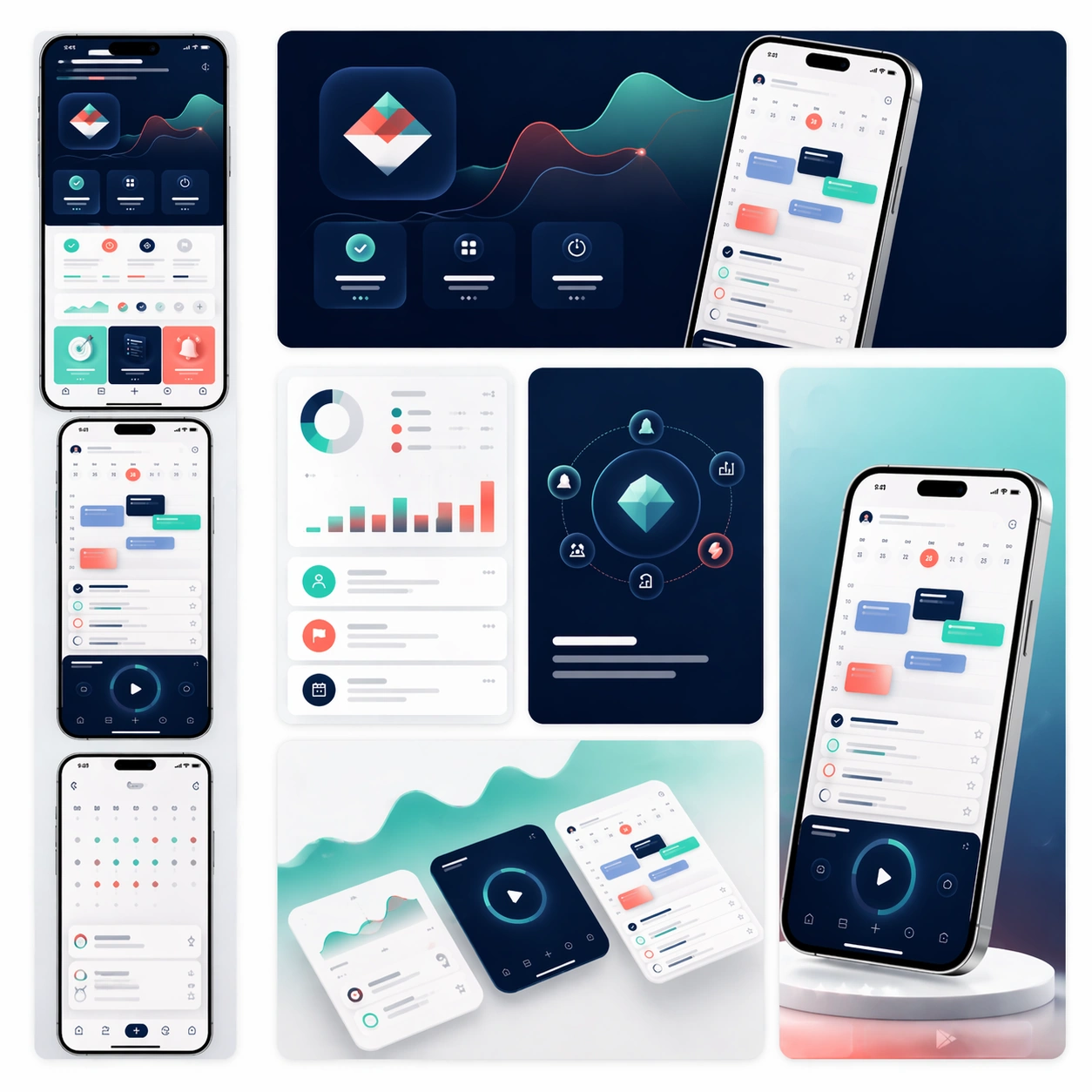
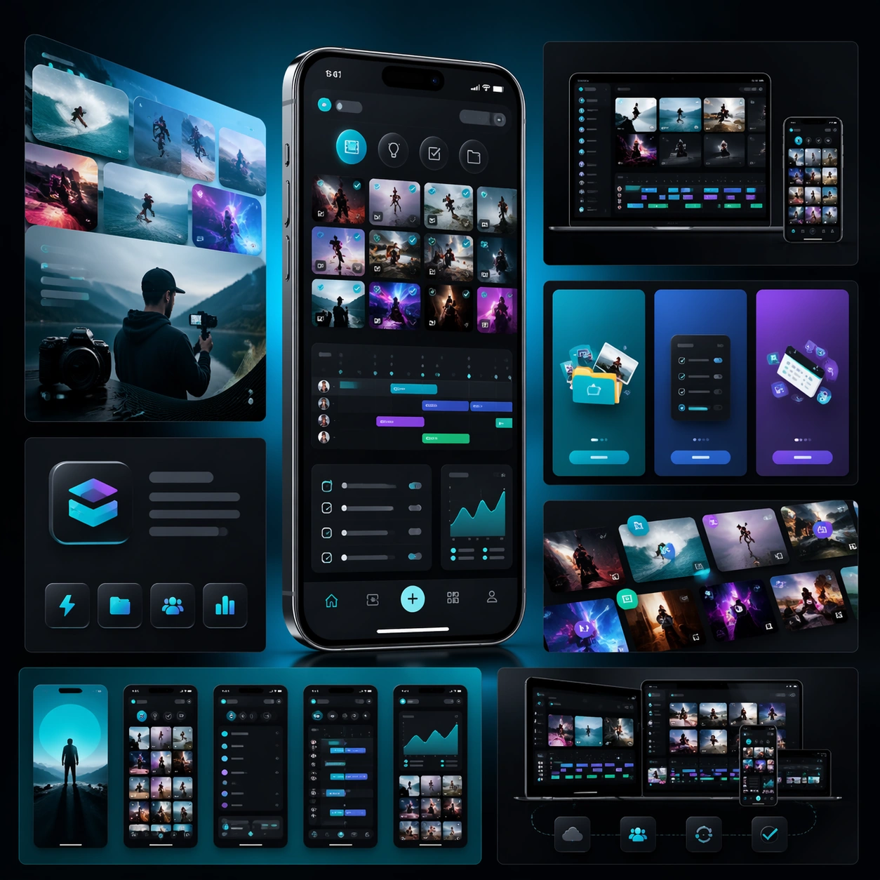
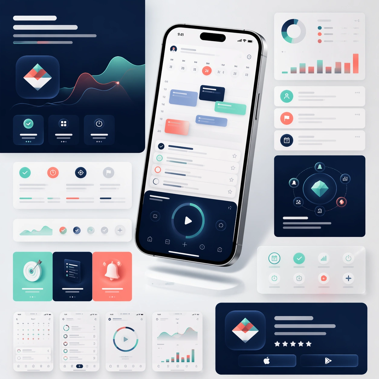
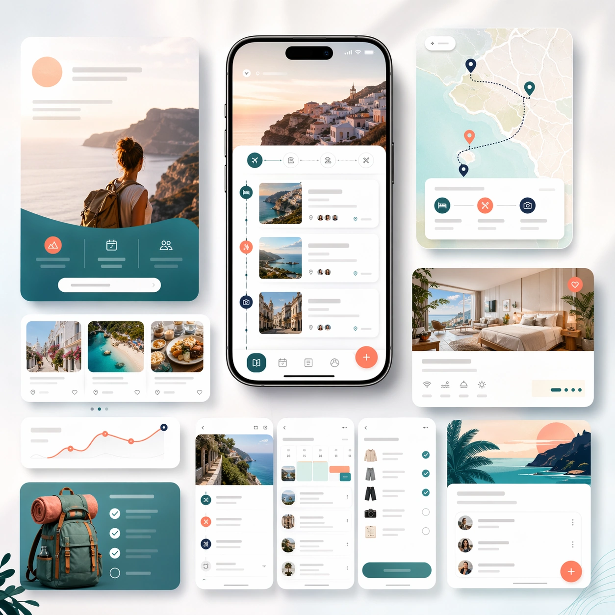
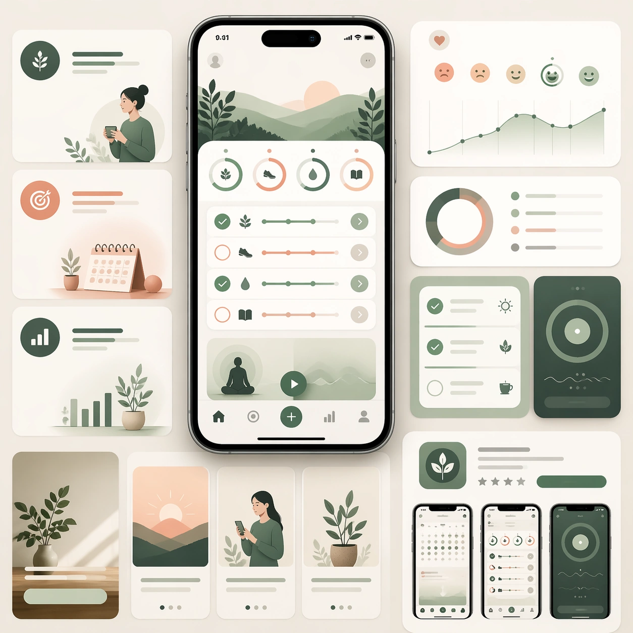
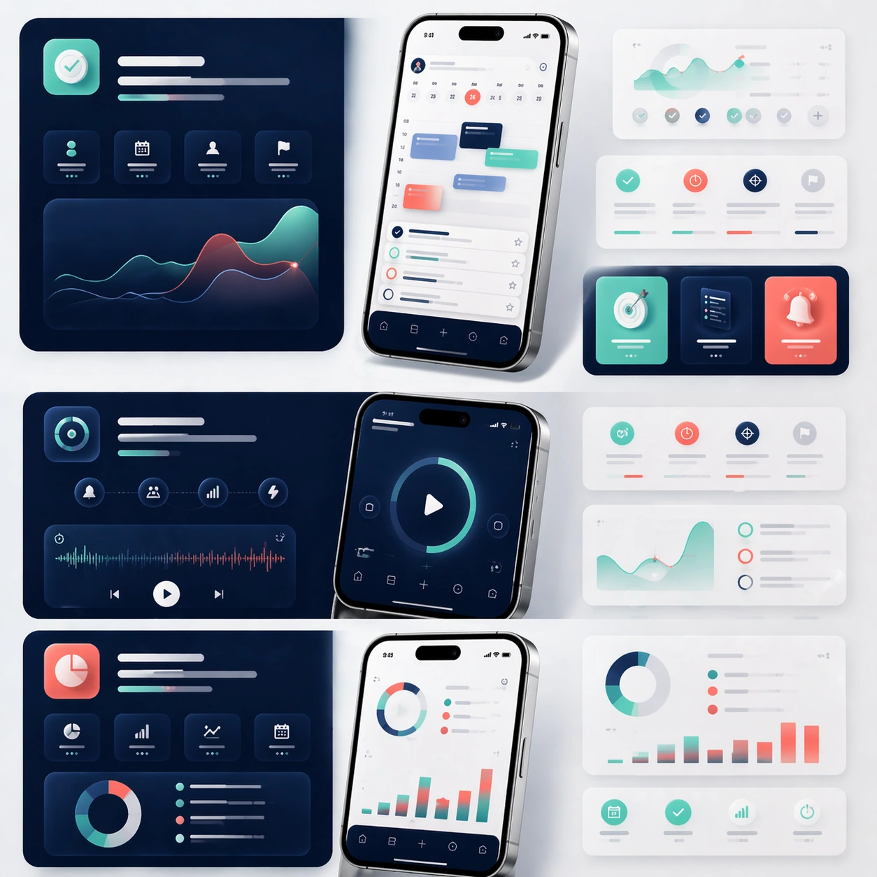
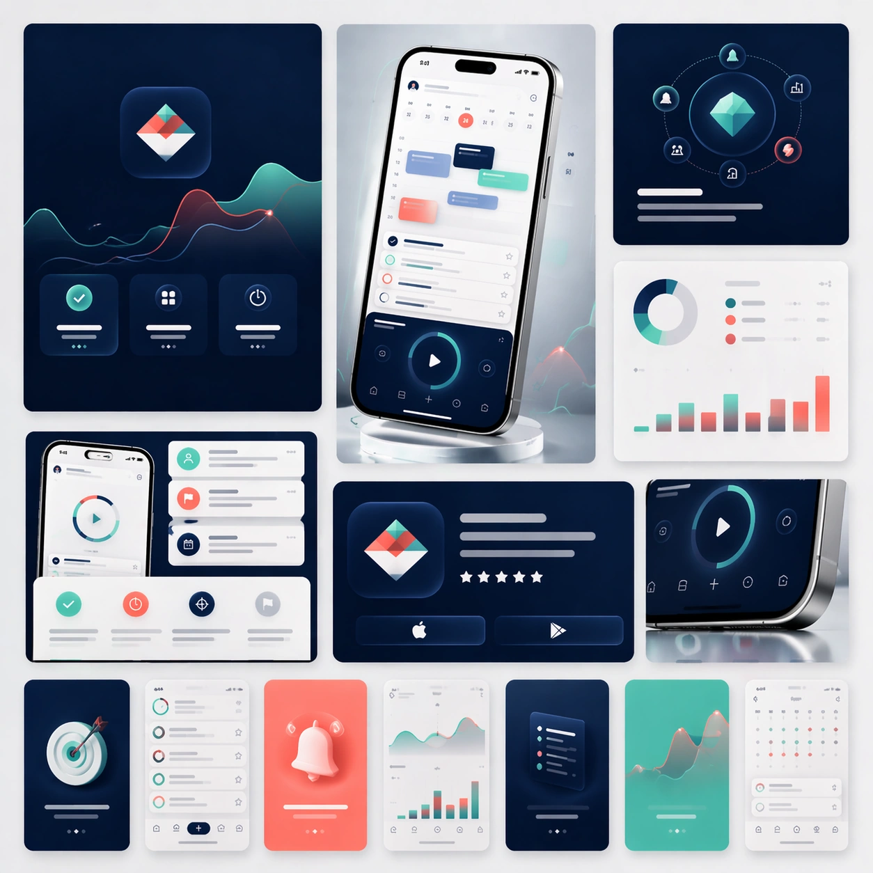
A square campaign board composed of several social-ready launch crops arranged within one master presentation. Instead of a single landing-page layout, show a family of polished ad-like frames, vertical teaser cards, square promo panels, and one compact hero device crop, all presented on a softly lit studio backdrop with subtle gradients and restrained reflections. The view should stay front-facing and editorial.

Subject:
Preserve exact app identity from the reference model: the same phone proportions, the same UI card system, the same palette, the same icon rhythm, and the same polished product mood. Translate that identity into a coordinated social launch kit with short teaser-style compositions, bold image-led framing, and a few screenshot-driven detail panels. The set should feel ready for announcement day across feed placements and paid social, but still look unmistakably related to the original marketing-page system. Use device fragments, cropped screens, and modular graphic blocks to imply campaign flexibility without losing brand coherence.

Important details:
Consistency is the priority. Keep the screen hierarchy stable, preserve material realism, and maintain premium spacing even as the crops become more dynamic. Each sub-frame should feel simple enough to read quickly yet rich enough to support a real product launch. No readable text is allowed, so structure, contrast, and device imagery must carry the message. The result should suggest a disciplined launch toolkit rather than generic social templates.

Use case:
App Launch Marketing Page Kit series study 4/4, converting the reference launch identity into coordinated social launch adaptations.

Constraints:
No readable text, no watermark, no logos, preserve exact 1:1 aspect ratio, preserve the same app identity from the reference, no chaotic sticker overlays, no unrelated lifestyle photography, no drastic color drift, no distorted device silhouettes.

使用方法

  1. 复制完整原始提示词,并保留其中的参数。
  2. 按需求替换主体、文字和构图要求。
  3. 在兼容的外部工具中使用,核对当前使用条件并检查结果。

开始前需了解

  • 先确认是否需要参考图。标注兼容模型,不代表该示例由这个模型生成。
  • 核对名称、数字与画面文字;不同模型版本的结果可能不同。

相似案例

App Launch Marketing Page Kit — App Store Promo Matrix
GPT Image 2en

Scene: A square commerce-style presentation board that feels like an App Store asset family arranged on one clean tabletop. Compose the image as a grid of screenshot cards, promotional tiles, cropped hero devices, and a few soft background gradients that give the board a premium

App Launch Marketing Page Kit — Creator Tool Launch Board
GPT Image 2en

Scene: A square campaign board for a mobile creator workflow app, with a more energetic but still disciplined launch aesthetic. Present one hero phone, several cropped interface panels, and layered media-like shapes on a dark charcoal-to-electric-teal gradient field. The lighting

App Launch Marketing Page Kit — Reference Launch Hero
GPT Image 2en

Scene: A square product-marketing board for a newly launched mobile productivity app, composed like a polished campaign key visual rather than a simple mockup sheet. Show one hero smartphone floating slightly above a bright studio surface, surrounded by cropped landing-page modul

App Launch Marketing Page Kit — Travel Planner Launch Board
GPT Image 2en

Scene: A square launch campaign board for a travel-planning app, balancing premium editorial atmosphere with clear commerce structure. Use a bright but refined palette of cloud white, ocean teal, sunset coral, and soft navy. Present one elegant hero phone, a few itinerary screen

App Launch Marketing Page Kit — Wellness Habit Launch Board
GPT Image 2en

Scene: A square product-launch board for a wellness and habit-building app, with a serene but still commercial visual language. Use a palette of warm cream, eucalyptus green, dusty peach, and muted graphite. Compose one central smartphone render, a few softly layered dashboard cr

App Launch Marketing Page Kit — Feature Story Sections
GPT Image 2en

Scene: A square editorial board showing the middle sections of a sophisticated app launch page, laid out as a modular story flow with multiple device crops, feature cards, and atmospheric color fields. The camera remains mostly straight-on, as if viewing a refined design presenta