원본 문서
GPT Image 2 · en
Scene:
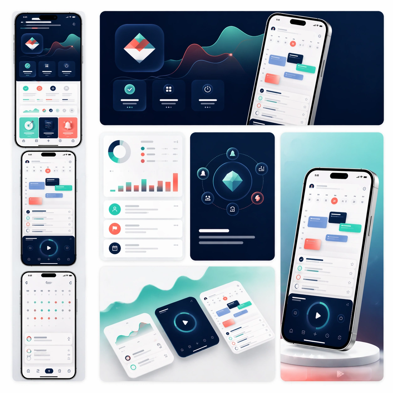
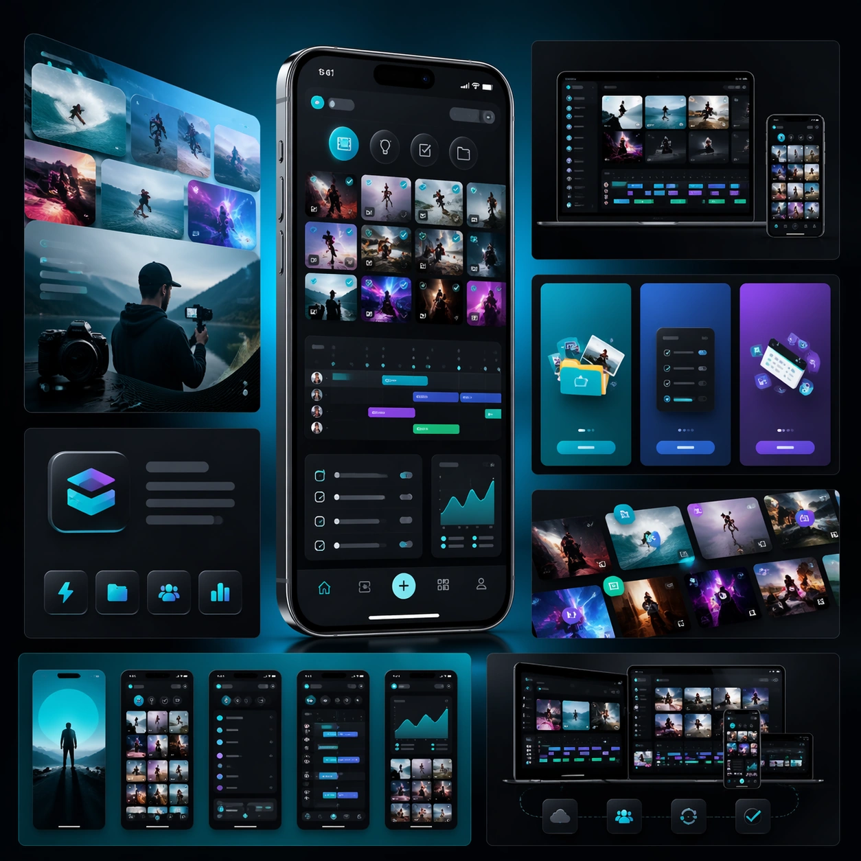
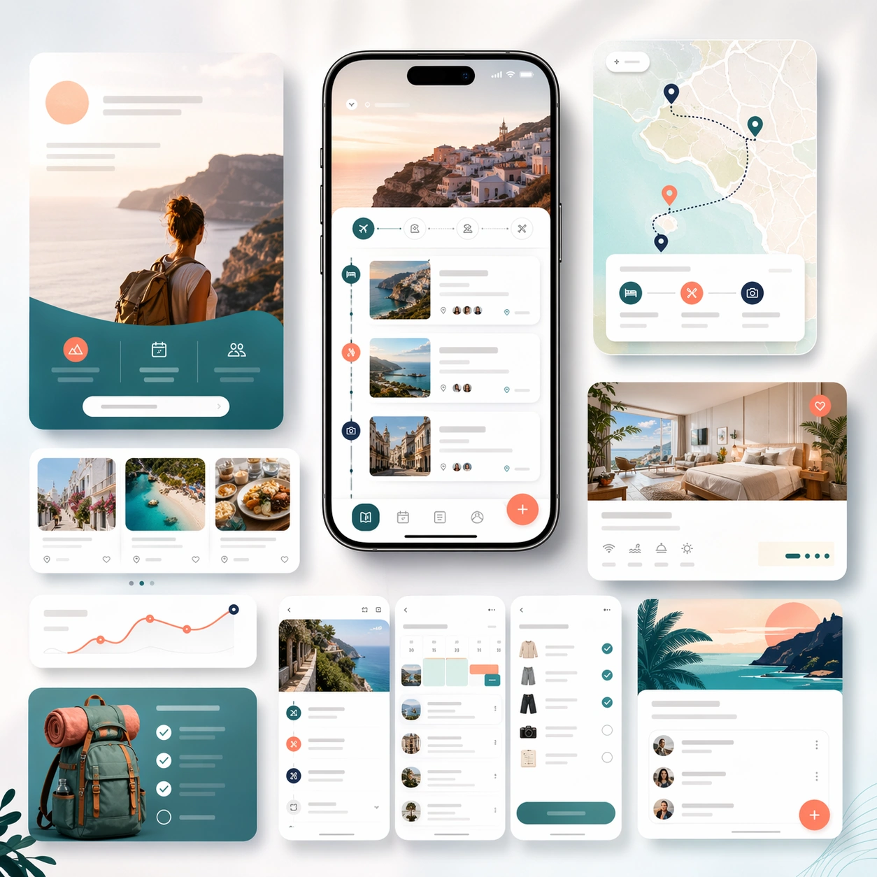
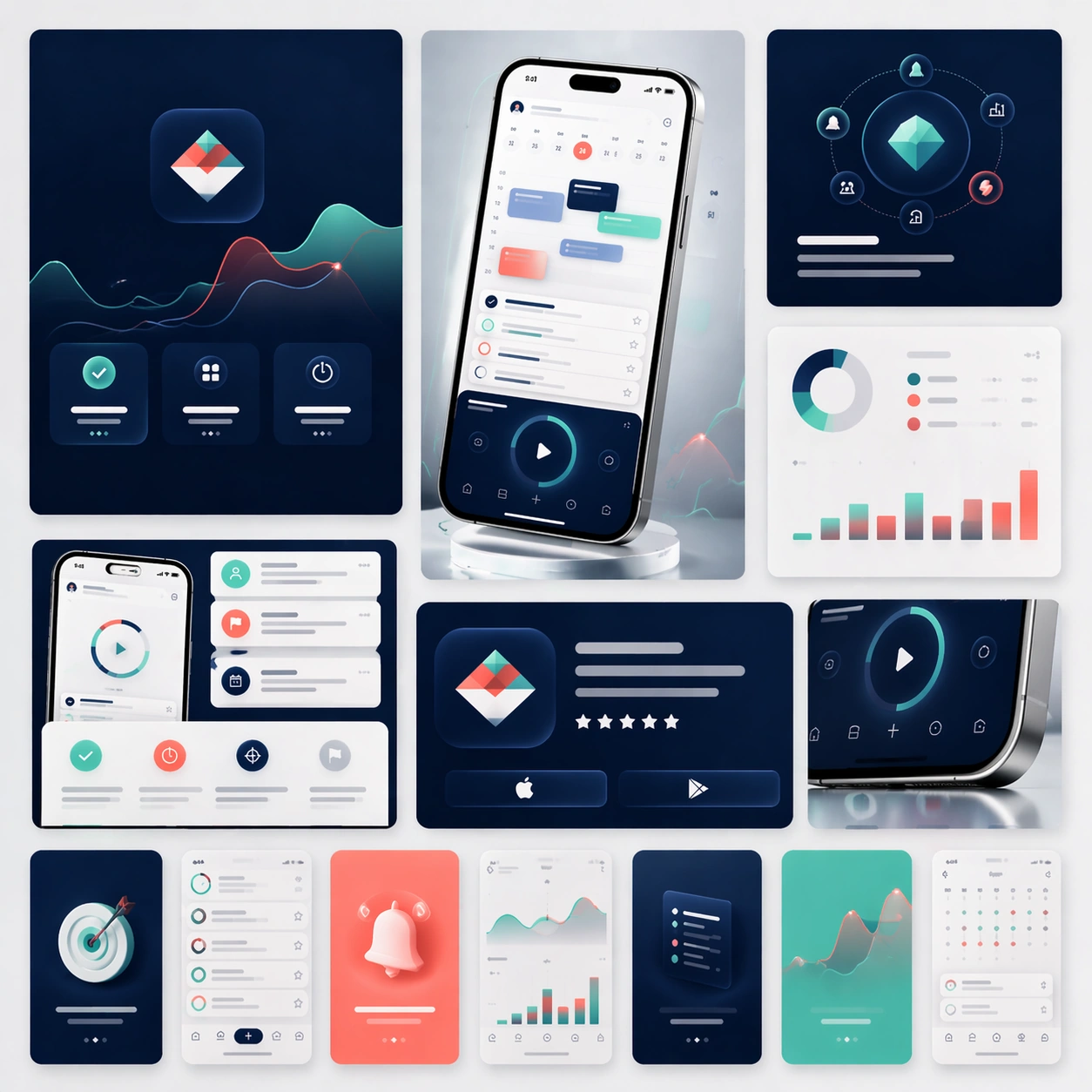
A square campaign board composed of several social-ready launch crops arranged within one master presentation. Instead of a single landing-page layout, show a family of polished ad-like frames, vertical teaser cards, square promo panels, and one compact hero device crop, all presented on a softly lit studio backdrop with subtle gradients and restrained reflections. The view should stay front-facing and editorial.

Subject:
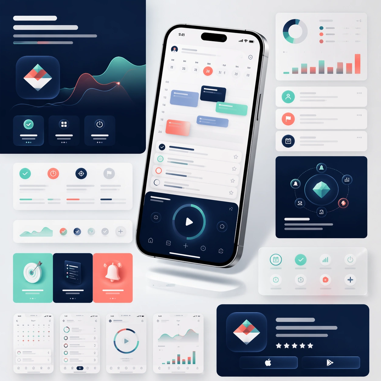
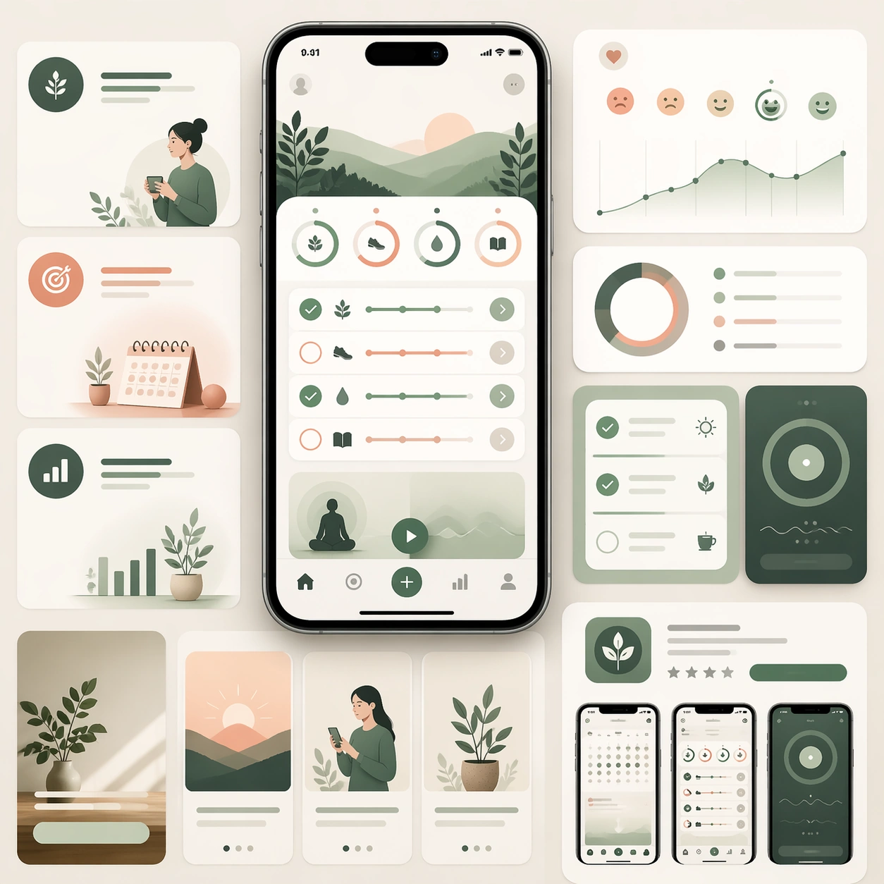
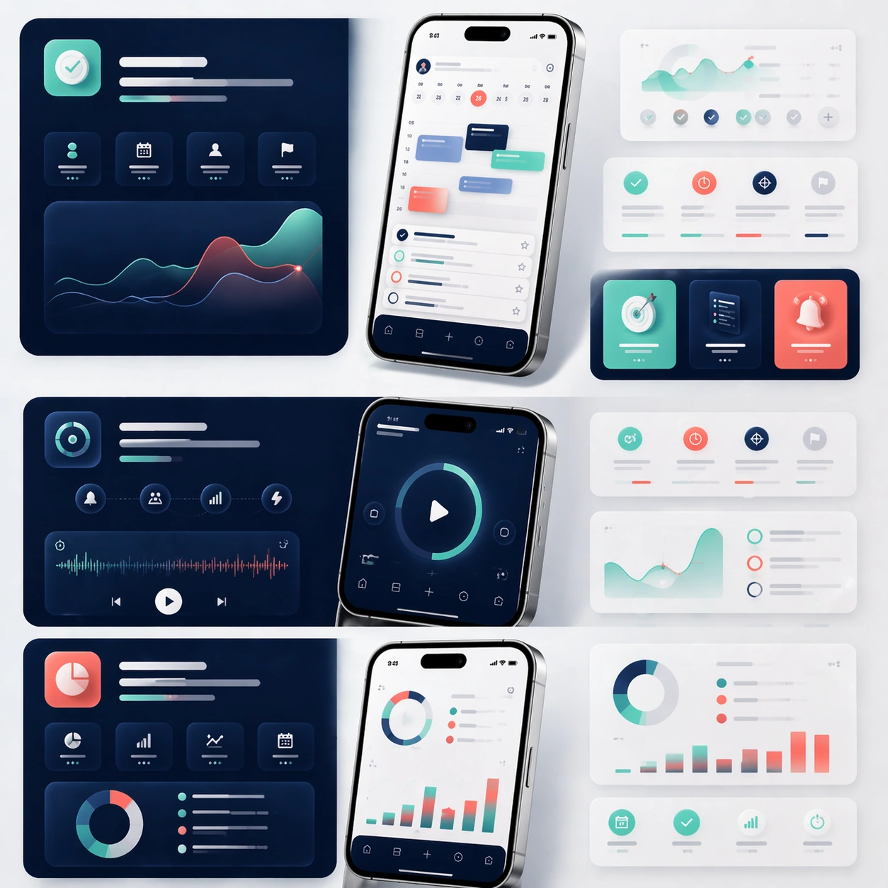
Preserve exact app identity from the reference model: the same phone proportions, the same UI card system, the same palette, the same icon rhythm, and the same polished product mood. Translate that identity into a coordinated social launch kit with short teaser-style compositions, bold image-led framing, and a few screenshot-driven detail panels. The set should feel ready for announcement day across feed placements and paid social, but still look unmistakably related to the original marketing-page system. Use device fragments, cropped screens, and modular graphic blocks to imply campaign flexibility without losing brand coherence.

Important details:
Consistency is the priority. Keep the screen hierarchy stable, preserve material realism, and maintain premium spacing even as the crops become more dynamic. Each sub-frame should feel simple enough to read quickly yet rich enough to support a real product launch. No readable text is allowed, so structure, contrast, and device imagery must carry the message. The result should suggest a disciplined launch toolkit rather than generic social templates.

Use case:
App Launch Marketing Page Kit series study 4/4, converting the reference launch identity into coordinated social launch adaptations.

Constraints:
No readable text, no watermark, no logos, preserve exact 1:1 aspect ratio, preserve the same app identity from the reference, no chaotic sticker overlays, no unrelated lifestyle photography, no drastic color drift, no distorted device silhouettes.
사용 방법
- 매개변수를 포함한 전체 원본 프롬프트를 복사하세요.
- 주제, 문구, 구도를 자신의 요구에 맞게 바꾸세요.
- 호환되는 외부 도구에서 사용하고 이용 조건과 결과를 확인하세요.
시작 전 확인
- 참조 이미지가 필요한지 확인하세요. 호환 표시는 해당 모델로 이 예시를 생성했다는 뜻이 아닙니다.
- 이름, 수치, 이미지 속 문구를 확인하세요. 모델 버전에 따라 결과가 다를 수 있습니다.