Esempi verificati

Galleria di prompt

Prompt reali abbinati alle immagini prodotte. Osserva il risultato e copia il prompt completo.

Coppie
5,541
Modelli
6
Fonti
10
5541 coppie prompt–immagine verificate · pagina 42 di 116
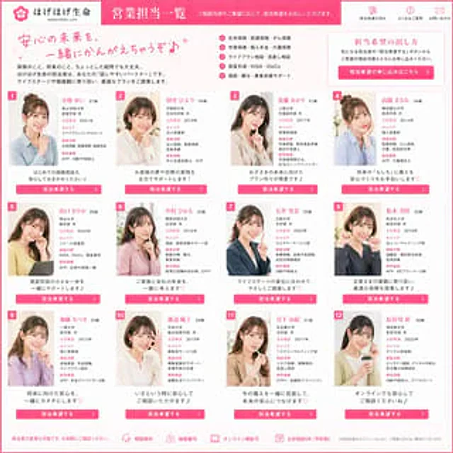
Example generated from “Japanese Insurance Staff Directory Mockup”
GPT Image 2en
Japanese Insurance Staff Directory Mockup

{ "type": "Japanese insurance company employee directory webpage presentation", "brand": { "company_name": "Hogehoge Life", "romanized_name": "HOGEHOGE LIFE", "theme": "The combination of bright pink and white presents a friendly, trustworthy, and gentle corporate design style." }, "page": { "title": "Sales Representatives Overview", "subtitle": "You can submit an application to serve based on the content of the consultation or your personal wishes.", "format": "Full-page website screenshot, square composition, dense card grid layout." }, "layout": { "header": { "left": "Company logo and name with flower icon", "center": "Large pink headline banner", "right": { "count": 3, "labels": [ "Simple application process", "Frequently Asked Questions", "Contact Us" ] } }, "intro": { "headline": "Let's create a safe and secure future together♪", "body": "No questions are too small when it comes to insurance or future planning. Hogehoge, your life's guardian, is your 'easy-to-communicate partner.' We will tailor the best solutions to your life stage and values.", "features": { "count": 6, "items": [ "Life insurance, medical insurance, and cancer insurance", "Education insurance, personal pension, and long-term care insurance", "Life planning consultation & policy review", "Asset Allocation • NISA • iDeCo", "Support for inheritance, gifts, and business succession", "Use simple and easy-to-understand language to provide detailed guidance" ] }, "cta_box": { "title": "How to apply for a position", "body": "Please click the \"Apply for Role\" button below your preferred role and fill in your inquiry to make an appointment.", "button": "Click here to apply for a position." } }, "staff_grid": { "count": 12, "numbered_cards": true, "columns": 4, "rows": 3, "card_style": "White cards with rounded corners, thin gray borders, and pink accents; each card has a colored number tag in the upper left corner.", "shared_elements": [ "A half-body photo of a smiling Japanese female consultant, her face blurred.", "Name and Age", "Japanese Language Position and Personal Profile", "Multiple pink category labels", "A short and friendly slogan at the bottom", "A bright pink CTA button, labeled \"Application Assistant\"." ], "cards": [ { "number": 1, "name": "Yui Kobayashi", "age": "27 years old", "photo": "A light blue shirt, chin resting on hand, against a soft interior background.", "catchphrase": "Even if it's your first insurance consultation, please feel free to entrust it to me♪" }, { "number": 2, "name": "Hiyori Tanaka", "age": "29 years old", "photo": "Beige shirt, shoulder-length hair, deep in thought.", "catchphrase": "We fully support you in achieving your dreams and goals!" }, { "number": 3, "name": "Akari Sato", "age": "31 years old", "photo": "Beige coat, fingers lightly touching lips, long straight hair", "catchphrase": "Specializes in creating plans for your child's future♪" }, { "number": 4, "name": "Manami Takahashi", "age": "34 years old", "photo": "Blue and white striped shirt, hair up, hand supporting cheek", "catchphrase": "Helping you prepare for the \"what ifs\" of the future with peace of mind ♡" }, { "number": 5, "name": "Yamaguchi Sayaka", "age": "28 years old", "photo": "Wearing a yellow cardigan, she sat by the window, a gentle smile on her face.", "catchphrase": "Take a small step into asset allocation with us♪" }, { "number": 6, "name": "Hikaru Nakamura", "age": "32 years old", "photo": "Pink shirt, bob haircut, gentle posture", "catchphrase": "Let's envision the future of our family and company together ♡" }, { "number": 7, "name": "Rina Ishii", "age": "25 years old", "photo": "Dark blue suit, braided or tied-up hair, confident pose", "catchphrase": "We offer personalized advice based on changes in your life stage." }, { "number": 8, "name": "Masaki Matsumoto", "age": "30 years old", "photo": "Dark shirt, one hand lightly touching his face, casual office photo.", "catchphrase": "We offer the best insurance solutions tailored to the needs of our corporate clients." }, { "number": 9, "name": "Satsuki Kato", "age": "33 years old", "photo": "Light purple top, hand supporting chin, bright background", "catchphrase": "Let's make peace of mind for the future a reality together ♡" }, { "number": 10, "name": "Yuka Watanabe", "age": "29 years old", "photo": "White shirt, short bob haircut, a simple and clean portrait.", "catchphrase": "Feel free to consult us anytime you need us♪" }, { "number": 11, "name": "Yuki Miyashita", "age": "31 years old", "photo": "Beige coat, hands close to face, warm indoor light", "catchphrase": "A comprehensive review based on existing safeguards, ensuring peace of mind for the future." }, { "number": 12, "name": "Aya Hasegawa", "age": "26 years old", "photo": "Wearing a pale yellow top, holding a smartphone, and smiling naturally.", "catchphrase": "Please rest assured that you can receive consultations online as well.♪" } ] }, "footer": { "count": 5, "items": [ "We support changing the person in charge; please feel free to contact us at any time.", "Free consultation", "Strict confidentiality", "Online consultation is supported.", "Consultations are available on weekends (appointment required)." ], "note": "*Depending on the schedules of the staff members, we may not be able to fulfill your reservation requests." } }, "style": { "visual_tone": "The cute and sophisticated style of Japanese corporate advertising conveys both trustworthiness and vitality.", "color_palette": { "primary": "Hot Pink", "secondary": "Soft pink", "background": "very light pink and white", "text": "Dark gray with pink highlight" }, "typography": "A clean, sans-serif Japanese font paired with a handwritten-style pink title.", "rendering": "High-resolution web UI demo, featuring stylish cards embedded with real portrait photographs, clear Japanese text, symmetrical spacing, and a professional e-commerce style landing page." } }
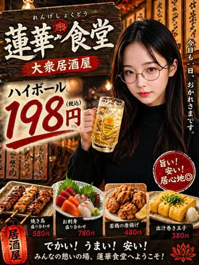
Example generated from “Japanese Izakaya Highball Poster”
GPT Image 2zh
Japanese Izakaya Highball Poster

A photorealistic Japanese izakaya (Japanese pub) promotional poster presents a warm and cinematic nighttime atmosphere, with a design style similar to a street-side restaurant flyer. The composition is vertical and layered. On the right is a young Japanese woman with long, straight, dark brown to black hair, wearing a fitted black ribbed turtleneck sweater. She appears half-body in the shot, holding a large, chilled glass filled with gold Highballs in her right hand, with ice cubes clearly visible. Her relaxed and friendly posture, looking at the camera, creates a soft nightlife atmosphere. The background is a narrow, traditional izakaya exterior or alleyway scene, filled with warm orange lantern light and shallow depth of field, with wooden menu signs bearing handwritten Japanese calligraphy, exuding a nostalgic, lively atmosphere after work. In the upper left corner, a dark, distressed wooden sign dominates the image, bearing the Chinese characters "莲華食堂" (Renka Shokudou) in striking white strokes. Above it is the smaller hiragana "れんげしょくどう" (Renge Shokudou), and below is a red banner that reads "大众居酒屋" (Taipei Izakaya). In the lower left center, a large cream-colored paper or drawing board displays discounted drinks in oversized calligraphic font: "ハイボール" (Highball) above, and a large red "198円" (198 yen) below, with a small black "(税込)" (tax included) next to the price, the numbers rendered in a vibrant brushstroke style. At the far right edge, vertical white Japanese text reads "今日も一日、おつかれさまです。" (Today is also one day, I'm here.). Above a female torso in the lower right corner, a red circular stamp-like badge bears the handwritten white text arranged diagonally and vertically: "旨い!安い!居心地◎" (Aim! Peace! Honesty◎). At the bottom foreground, four menu items are displayed side-by-side on rustic ceramic plates: 1) Two skewers of grilled chicken with charred marks, labeled "焼き鳥盛り合わせ" (grilled chicken skewers), priced at ¥580; 2) A sashimi platter containing tuna, salmon, white fish, shiso leaves, and wasabi, labeled "お刺身盛り合わせ" (sashimi platter), priced at ¥780; 3) A plate of Japanese fried chicken nuggets with lemon wedges, labeled "若鶏の唐扬げ" (fried chicken nuggets), priced at ¥480; 4) Sliced ​​dashi tamagoyaki (Japanese rolled omelet) topped with scallions and grated radish, labeled "出汁巻き驩子" (dashi rolled omelet), priced at ¥380. In the lower left corner, a glowing red paper lantern graphic is added, with the words "Izakaya" (Japanese pub) in black vertical text. In the dark strip at the bottom center, add the striking white bold text "Dekai! Umai! Anai!", below which is the smaller white text "Minna no Kii no Ba, Renka Shokudo e yokoso!". A decorative red lotus-shaped badge is added near the top sign, and another identical badge is added to the lower right corner. The design employs rich amber highlights, strong contrast, glossy food shapes, realistic skin and drink textures, commercial poster-level sophistication, and a nostalgic Showa-era izakaya advertising aesthetic.

Example generated from “Japanese Jungle Theme Park Parody Poster”
GPT Image 2zh
Japanese Jungle Theme Park Parody Poster

This is an incredibly detailed Japanese-style parody theme park advertisement poster. Using a vertical format, the design blends dramatic summer tourism advertising with luxury attraction promotion. The background is a tropical jungle with a clear blue sky above, dotted with scattered clouds. A blazing sun hangs in the upper right corner, and palm leaves droop from the top edge. A large 3D stone-textured Japanese title is placed at the top of the poster.{argument name="headline text" default="Jankiria Okinawa"} Below is a line of small white Japanese text: "— やんばるの自然に包まれた、超本格ジャングル・テーマパーク—". In the center of the image is a modern smartphone, upright and slightly tilted, occupying the visual focus. The screen displays a beige ticket lottery waiting screen, with a jungle silhouette at the top, and the prominent bold Japanese text "整理票抽选" (ticket lottery results are being processed) in the middle, accompanied by a circular loading icon. At the bottom, smaller text reads "结果発表まで30分" (Results have been posted 30 minutes ago) and "※この屏を闭じずにお待ちください" (Please wait for this screen to close). The phone's status bar shows the time as 10:00. To the left rear of the phone is a Tyrannosaurus Rex bursting out of the jungle vegetation, its mouth wide open, a realistic and menacing image. To the right is an ornately decorated golden entrance gate, intricately carved, with a sign above reading "Premium Pass Entrance," leading to a VIP passageway carpeted in red. The foreground and midground show long queues of tourists stretching into the distance, dressed in casual summer attire, wearing hats, carrying towels and backpacks, and holding parasols, fans, and water bottles, conveying their weariness in the sweltering heat. The faces of several figures closer to the frame are blurred. On the far left stands a large, weathered stone monument with the striking red Japanese inscription "Waiting Time 180 Minutes." In the bottom left corner are three stacked, rustic-style wooden items: the top sign has a blue parking icon and the text "Parking lot 2,000 yen"; the middle sign has a smartphone icon and the text "App must down road!"; and the bottom sign has a dinosaur silhouette and the text "You're the chosen one." Along the edge in the bottom right corner is a very prominent vertical white calligraphy-style Japanese text: "Wait, you're the chosen one." Contains 3 near the lower right corner A small round icon is marked with a brief Japanese slogan: "The person who chooses the lottery is the one who is the best, the fear is the dragon will be the one who will be the best." "きる前に、梦はstartまる" and "プレミアムなNearly道も、ご意しました", the icons respectively imply dinosaurs, mobile phone battery and VIP. aisle. A black disclaimer bar was added to the center of the bottom with small white Japanese text reading: "このポスターは空空のパロディ広报です". The overall style pursues hyper-realism, cinematic feel, high contrast, and satire, and is as exquisite as a high-end commercial poster. The core humor lies in the exaggerated hype of the theme park, the oppressive heat, and the absurd queuing-style adventure.

Example generated from “Japanese Koinobori Fashion Magazine Cover”
GPT Image 2en
Japanese Koinobori Fashion Magazine Cover

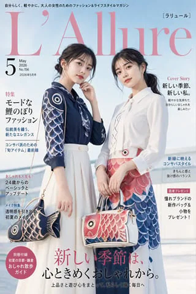
A sophisticated Japanese fashion magazine cover, photographed in a bright and clear outdoor setting, with a pale blue sky and soft-focus modern railings in the background, in a vertical composition. The top masthead features a large, elegant, soft pink serif font, "L'Allure," with smaller Japanese text above and a Japanese subtitle in brackets in the upper right corner. The upper left corner displays the issue information as a large black "5," flanked and below by smaller text indicating May 2026, issue number 156, and the May 2026 issue itself. The cover showcases two adult East Asian women standing side-by-side from mid-thigh up, striking a pose befitting a luxurious editorial cover. Their faces are deliberately obscured by smooth, rectangular blurs. The soft, natural, and highly embellished lighting creates a sophisticated high-fashion magazine aesthetic. The woman on the left wears a navy blue blouse with sleeves featuring a dramatic fish-scale design in navy blue, white, and silver, tucked into a long, flowing, off-white skirt with a wide waist. She carries a fish-shaped handbag: a navy blue and cream-colored koi-inspired bag with round eye details, fish scale patterns, a fish tail silhouette, gold hardware, and a delicate dangling chain. Her hair, a deep brown to black, is loosely tied in a low bun, with a few strands softly framing her face. Her posture is elegant, her body slightly leaning forward, one hand near her chin. The woman on the right wears a crisp white blouse with a soft bow tie or vertical ruffles/placket details, paired with a striking koi-inspired skirt or dress in coral pink and deep blue, featuring layered fish scale patterns and a round eye-shaped embellishment at the waist. She carries a structured handbag: a rectangular white bag with coral pink koi face detailing, blue accents, gold hardware, a top handle, and a shoulder strap. Her dark hair is tied in a low ponytail. She stands slightly to the left, her hands relaxed, exuding a composed, editorial air. The fashion concept revolves around carp streamers and carp motifs, transforming the traditional Japanese imagery of carp streamers into sophisticated contemporary womenswear. The color palette features soft sky blue, blush pink, navy blue, white, cream, and coral red. Fabrics appear smooth, elegant, and light, adorned with printed or embroidered fish-scale patterns. The overall atmosphere is elegant, feminine, seasonal, and high-end, balancing tradition and modern fashion. A multi-line Japanese cover title is included, employing realistic editorial typography. The left side contains four text blocks: a red and black themed section on melancholic carp streamer fashion; a blue subheading on balancing traditional aesthetics with fresh elegance; a black text block on basic and updated styles for 20-year-old women; and a blue beauty section on transparent makeup looks for early summer. The right side contains three text blocks: a red "Cover Story" title below a larger black Japanese main title; a blue text block about a conservative style shining in fresh greenery; and a pink-framed reader giveaway notification below black Japanese text about new bags and accessories from luxury brands. Near the bottom left corner is a circular pink badge with white and cream Japanese text announcing a special walking guide supplement. At the bottom center, spanning most of the width, is a large, dramatic Japanese main title in pink and black serif and calligraphy style. This is designed as the cover of a realistic high-end women's fashion magazine, the magazine's name being {argument name="magazine name" default="L’Allure"} The theme is{argument name="fashion theme" default="Carp streamer-inspired spring fashion"} Publication period is{argument name="issue month" default="May 2026"} The text remains primarily in Japanese, with a large pink serif font used for the masthead. The design is simple, appealing, and luxurious.

Example generated from “Japanese Kunoichi Character Prompt”
GPT Image 2en
Japanese Kunoichi Character Prompt

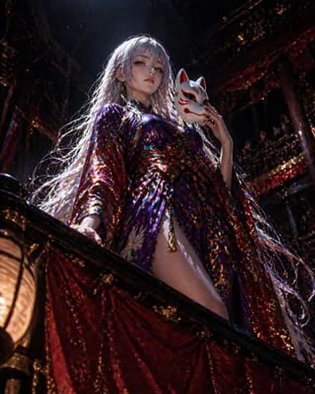
KUNOICHI CRISIS{argument name="character name" default="Kunoichi Yulia"} Disguised as{argument name="role" default="Touring performers"} Viewer's perspective

Example generated from “Japanese Law & Tax Services LP Hero”
GPT Image 2en
Japanese Law & Tax Services LP Hero

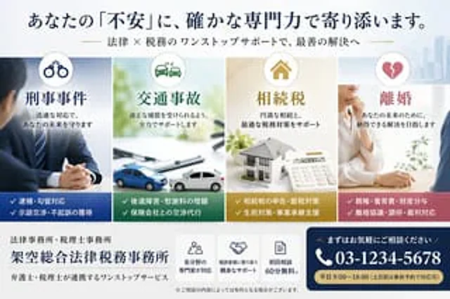
Create a sophisticated Japanese landing page banner for a fictional general law and tax firm. The style should be clean, professional, and convey a high level of trust. Use soft daylight lighting on a white background with subtle outlines of modern city architecture on the right. Employ a wide, horizontal header layout. At the very top, place a striking navy blue Japanese title.{argument name="headline text" default="Your anxieties will be addressed by our solid professional capabilities."} Below, a smaller Japanese subtitle with gold accents is placed.{argument name="subheadline text" default="One-stop legal and tax support to help you achieve the best solutions."} Below the title, four vertical service cards of equal width are arranged horizontally. Card 1 is for criminal defense, with a circular handcuff icon at the top, a cool blue color scheme, and the main title "Criminal Cases." The accompanying text reads "Protecting Your Future with a Swift Response." The accompanying image shows a professional man in a suit sitting at a desk with his hands folded. The bottom dark blue area lists two key points marked with checkmarks: "Arrest/Detention Response" and "Negotiation/Negotiation for Non-Prosecution." Card 2 is for traffic accidents, with a circular car crash icon at the top, a green color scheme, and the title "Traffic Accidents." The accompanying text reads "Fully Supporting You in Obtaining Reasonable Compensation." The accompanying image shows a bright desktop scene with documents showing two mini-cars colliding. The bottom dark green area lists two key points: "Post-Traumatic Stress/Increased Compensation" and "Handling Negotiations with Insurance Companies." Card 3 is about inheritance tax, featuring a circular house icon at the top, a warm gold tone, and the title "Inheritance Tax." The accompanying text reads "Supporting a successful inheritance and optimal tax strategies." The image shows a desktop scene with a house model, documents, and a calculator. The bottom mustard gold area lists two key points: "Inheritance Tax Filing & Tax Saving Strategies" and "Living Policy & Business Succession Support." Card 4 is about divorce, featuring a broken heart icon at the top, a rose pink tone, and the title "Divorce." The accompanying text reads "For your future, aiming to achieve a satisfactory solution." The image shows a soft, professional consultation scene, with a woman in a white shirt speaking across the table while resting her chin on her hand. The bottom gray-pink area lists two key points: "Parental Rights & Child Support & Property Division" and "Divorce Agreements & Mediation & Court Appeals." At the bottom, the left side includes the firm's logo, with a small line of text "Law Firm & Tax Firm" and a large letter of the firm's name.{argument name="firm name" default="Fence-based comprehensive legal and tax firm"} Below this is a smaller line of text: "One-stop service for lawyers and tax advisors working together." In the center below, there are three compact white function boxes with navy blue line icons and brief Japanese descriptions: Box 1 displays a crowd icon with the text "Experts in various fields respond"; Box 2 displays a handshake icon with the text "Friendly support close to the client"; Box 3 displays a document icon with the text "First consultation 60 minutes free." Below this is a small disclaimer: "※Fees may apply depending on the consultation content." In the lower right corner, a prominent navy blue rounded-corner Call to Action (CTA) panel is created. It includes the small text "Please feel free to contact us," and a large white phone number with a telephone icon.{argument name="phone number" default="03-1234-5678"} And a gold capsule-shaped strip at the bottom with the text "{argument name="business hours" default="Weekdays 9:00-18:00 (Reservations can be made in advance for weekends and public holidays)"} The main title uses elegant Japanese-style font with clear spacing, balanced margins, and subtle shadows, reflecting a high-end legal professional brand image.

Example generated from “Japanese Legal Presentation Cover Slide”
GPT Image 2zh
Japanese Legal Presentation Cover Slide

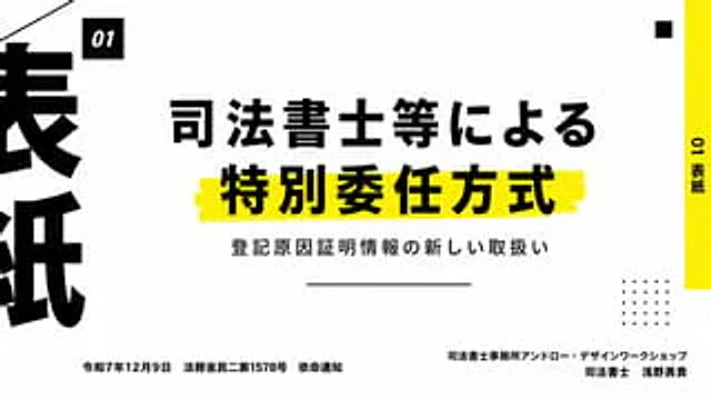
Create a clean, modern Japanese presentation cover slide with a minimalist editing style and a 16:9 landscape aspect ratio. Use a very light gray background with bold black typography and a vibrant yellow decorative strip. The layout employs an asymmetrical design with high contrast and ample white space. Place a small black square near the top left corner containing the white italic bold sans-serif text "01". In the center, place two lines of heavy black Japanese headings: the first line "法師等による" (Judicial Scribe, etc.), and the second line "特特委任方法" (Special Appointment Method). The second line has a larger font and is placed above a rough, hand-drawn yellow highlight. Below the headings, add a smaller black Japanese subheading: "注册因证证信息の新しい取扱い" (New Registration Reason Proof Information). Below the subheading, place a centered thin horizontal line. On the far right edge, add a tall, vertical yellow sidebar with the black vertical text "01表紙" (Form Paper). Near the top right corner, place a small black square as a decorative element. In the lower right quadrant, place a 5x5 dot matrix decoration consisting of 25 small black dots. At the far left edge, crop an oversized black Japanese character, making it only partially visible to create a strong graphic border effect. In the lower left corner, place a line of small black Japanese text: “Ministry of Justice Civil 2 No. 1578, December 9, Reiwa 7”. In the lower right corner, right-align two lines of small black Japanese text: the first line “Judicial Scribe Office Ann Road Design Work Shop”, the second line “Judicial Scribe Asano Yuki”. Add a thin diagonal line cutting in from the upper left corner as additional graphic decoration. Overall feel: High-end business presentation, legal seminar title slides, Swiss-style grid layout, bold Japanese typography, clear and print-quality.

Example generated from “Japanese Legal Services LP Banner”
GPT Image 2en
Japanese Legal Services LP Banner

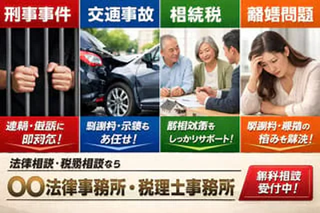
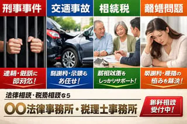
A landing page banner in the style of Japanese list ads, designed specifically for fictional law and tax firms, presents a striking web ad effect. It features four equally wide vertical panels at the top and a strong call-to-action area at the bottom. The top row contains four service panels, each with a colored title bar, realistic images, and a colored description bar at the bottom. Panel 1 is red, labeled "Criminal Case" at the top, showing a close-up of a pair of hands gripping dark prison bars against a black background; the red description bar at the bottom reads "Arrest/Prosecution Immediately Available!" in bold white Japanese. Panel 2 is blue, labeled "Traffic Accident" at the top, showing a realistic rear-end collision scene of two damaged dark cars on a city street under sunlight; the blue description bar at the bottom reads "Compensation and Discussion Also Available!" in bold white Japanese. Panel 3 is green, with the title "Tax Consultation" at the top. It shows an elderly couple sitting at a table consulting with a professional in a suit, with documents and a small house model visible on the table. The bottom green caption reads in bold white Japanese, "Support for Tax Consultation!" Panel 4 is orange, with the title "Divorce Issues" at the top. It shows a melancholy-looking woman sitting indoors, resting her chin on her hand. The bottom orange caption reads in bold white Japanese, "Resolve Compensation and Divorce Issues!" The four panels should be flush at the edges and separated by clean white lines. Each panel should be the same width, using highly saturated primary colors and a glossy advertising design style. Below the four panels, create a cream or light beige background footer area. On the left, place a small black Japanese subtitle: "Legal Consultation and Tax Consultation." The name of the main agency, in bold Japanese font with a metallic gold gradient and a slight bevel effect, is placed directly below and centered:{argument name="office name" default="XX Law Firm / Tax Accountant Office"} Add a thin black horizontal dividing line above and below the agency name. Place a large, glossy red rounded rectangle button in the lower right corner with a bright gradient effect and white bold Japanese text: "{argument name="button text" default="Free consultations available!"} The overall style should reflect the visual effect of a Japanese legal and tax services LP listing advertisement: corporate, urgency, trustworthy, commercial, photo-based, clean grid layout, eye-catching typography, high contrast, and realistic brochure-level composite effect.

Example generated from “Japanese Legal Services LP Banner”
GPT Image 2en
Japanese Legal Services LP Banner

A Japanese listing-ad style landing page hero banner for a fictional law office and tax accountant office, designed like a bold web advertisement with four equal vertical panels across the top and a strong call-to-action area across the bottom. The top row contains exactly 4 service panels, each with a colored header bar, a photo-realistic stock-photo image, and a colored caption bar at the bottom. Panel 1 is red and labeled 「刑事事件」 at the top, showing a close-up of two hands gripping dark prison bars against a black background; the bottom red caption reads 「逮捕・訴訟に即対応!」 in large bold white Japanese text. Panel 2 is blue and labeled 「交通事故」 at the top, showing a realistic rear-end car crash with two damaged dark-colored sedans on a city street in daylight; the bottom blue caption reads 「慰謝料・示談もお任せ!」 in large bold white Japanese text. Panel 3 is green and labeled 「相続税」 at the top, showing an elderly couple seated at a table consulting with a suited professional, with papers and a small house model visible; the bottom green caption reads 「税相続対策をしっかりサポート!」 in large bold white Japanese text. Panel 4 is orange and labeled 「離婚問題」 at the top, showing a distressed woman sitting indoors with her head resting on one hand; the bottom orange caption reads 「慰謝料・親権の悩みを解決!」 in large bold white Japanese text. Make the four panels touch edge-to-edge with clean white dividers, each panel occupying the same width, and use highly saturated primary colors with glossy ad-design styling. Beneath the four panels, create a cream or light beige background footer area. On the left side, place a smaller black subheadline in Japanese: 「法律相談・税務相談なら」. Centered below it, place the large main office name in metallic gold gradient bold Japanese lettering with a slight bevel effect: 「{argument name="office name" default="〇〇法律事務所・税理士事務所"}」. Add thin black horizontal divider lines above and below the main office name. On the lower right, place a large glossy red rounded rectangular button with a bright gradient and white bold Japanese text reading 「{argument name="button text" default="無料相談受付中!"}」. The overall style should feel like a Japanese legal and tax services LP main visual from a listing ad: corporate, urgent, trustworthy, commercial, photo-based, clean grid layout, bold typography, high contrast, and realistic brochure-quality compositing.

Example generated from “Japanese Manufacturing Challenges Infographic”
GPT Image 2zh
Japanese Manufacturing Challenges Infographic

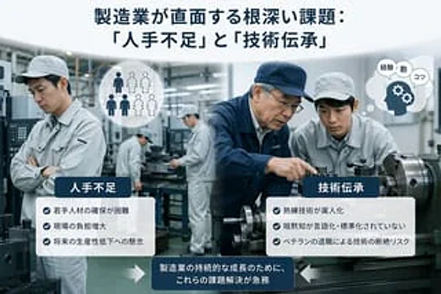
This is a simple, corporate infographic illustration used in a Japanese business article about the challenges of manufacturing. The background is a realistic, modern factory with metalworking machinery, rendered in cool gray-blue tones. The composition is divided into two thematic sections against a blurred industrial workshop background. At the top center, a striking, deep navy blue Japanese title is placed:{argument name="headline text" default="Deep-rooted challenges facing the manufacturing industry: "Labor shortage" and "Technology transfer""} In the left foreground, a factory worker in a light gray uniform and hat, arms crossed and looking worried, is shown; nearby, a circular white icon displays the silhouettes of six people, three solid dark figures and three dashed outlines, symbolizing a labor shortage. In the right foreground, two factory workers are shown beside a large lathe: a senior employee in a navy blue work jacket and hat, instructing and demonstrating machine operation, and a younger employee in a light gray uniform and hat, observing intently. Near them, a white speech bubble icon contains a navy blue head silhouette, accompanied by two gear symbols and three small Japanese speech bubbles with the characters “経験”, “勘”, and “コツ”. In the central background, two additional slightly out-of-focus workers operating machines are included, bringing the total number of workers visible in the factory scene to five. Two rounded white information panels with dark navy blue title labels are overlaid. The left panel, titled "Manpower Shortage," contains three key points marked with blue circular checkmarks: "Difficulty in securing young talent," "Increased burden on the field," and "Concern over future low productivity." The right panel, titled "Technical Inheritance," contains three key points marked with blue circular checkmarks: "Proficiency in skills is being handed over to individuals," "Silent knowledge is not being verbally or standardized," and "The loss of skills due to retirement from work." At the bottom center, a dark navy blue rounded rectangle containing white Japanese text is placed.{argument name="callout text" default="Addressing these challenges is an urgent necessity for the sustainable growth of the manufacturing industry."} Add two large white arrows pointing to the bottom label box, one from the left and one from the right. The overall style mimics professional consulting firm presentations or business magazine inserts: photorealistic workers and machinery, subtle depth of field, high definition, balanced layout, soft lighting, clear typography, and professional Japanese manufacturing infographic aesthetics.

Example generated from “Japanese Mecha Girl Figure Ad Poster”
GPT Image 2zh
Japanese Mecha Girl Figure Ad Poster

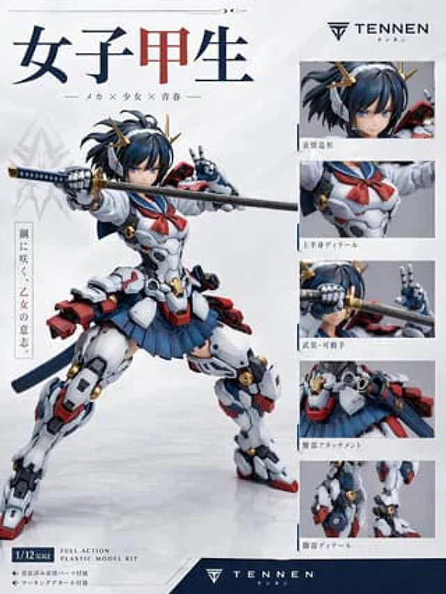
Against a clean white studio backdrop, create a high-end Japanese-style plastic model kit product poster with a subtle gray gradient and glossy ground reflections. The main subject is a highly detailed anime mecha high school girl figure, positioned on the left side of the image in a dynamic pose, legs wide open in a battle stance. One mechanical hand holds a katana across the frame, while the other hand makes a peace sign near her face. The character's face is blurred, and she has a messy, dark navy blue bob with a few tufts of hair on the side, adorned with a gold, horn-shaped mechanical hair accessory. Her outfit blends Japanese sailor uniform with hard-surface sci-fi armor: a white armored torso with mechanical panel lines, a red sailor collar, a pleated navy blue skirt, heavy white thigh and calf armor, red and blue accents, gold circular joint details, a dark blue belt or hem fabric, and red mechanical backpack-style attachments at the hips and lower back. The katana features a dark blade and a blue and gold hilt. Render the figure to resemble a professionally photographed collector's item or plastic model kit, with clear material definitions, realistic injection-molded plastic surfaces, a subtle satin sheen, and commercial product photography lighting. Design the page as a figure advertisement/specification, with one large main visual and five smaller detail panels stacked vertically on the right. The five right-side panels must showcase: 1) a close-up of the head and hair accessories, 2) upper body details with a sailor's collar and chest armor, 3) close-ups of the weapons and articulated hands (sword close to the face), 4) waist accessories and skirt/hip armor details, and 5) leg details showing the joints and armor structure. Add thin blue dividing trim around the right-side panel area. Place a striking bold serif-style Japanese title "女子甲生" (Women's Kousei) in the upper left corner, with the central character in dark red and the rest in dark navy blue. Below this, add a smaller Japanese subtitle: "— Meka × Shoujo × Seishun—". Place a simple logo and brand name in the upper right corner.{argument name="brand name" default="TENNEN"} Below this is a small Japanese text tag. A vertical Japanese slogan block is added to the left of the main visual, reading "Sparkling steel, the will of a maiden." The phrase in the middle is in red. Below the five detail panels on the right are Japanese descriptions: "Expression Design," "Upper Body Design," "Armed/Movable Hands," "Waist Attack," and "Leg Design." A framed proportion label is included in the lower left corner.{argument name="scale label" default="1/12 SCALE"} Add the English product text "FULL ACTION PLASTIC MODEL KIT" nearby. Below this, add two lines of Japanese text: "◆ 塗装済み髪パーツ付属" and "◆ マーキングデカール付属". At the bottom, add a dark navy blue footer, centered with the brand logo and "".{argument name="footer brand" default="TENNEN"} Below this is a small Japanese text tag. It employs sophisticated modern model brand aesthetics, Japanese mecha anime collectible packaging design, minimalist white space, clear typography, balanced editorial layout, and realistic studio rendering of the original, non-existent figure. Color scheme: white, navy blue, dark blue, red, gray, black, and metallic gold. Aspect ratio 3:4.

Example generated from “Japanese Model Swimsuit Fashion Shot”
GPT Image 2zh
Japanese Model Swimsuit Fashion Shot

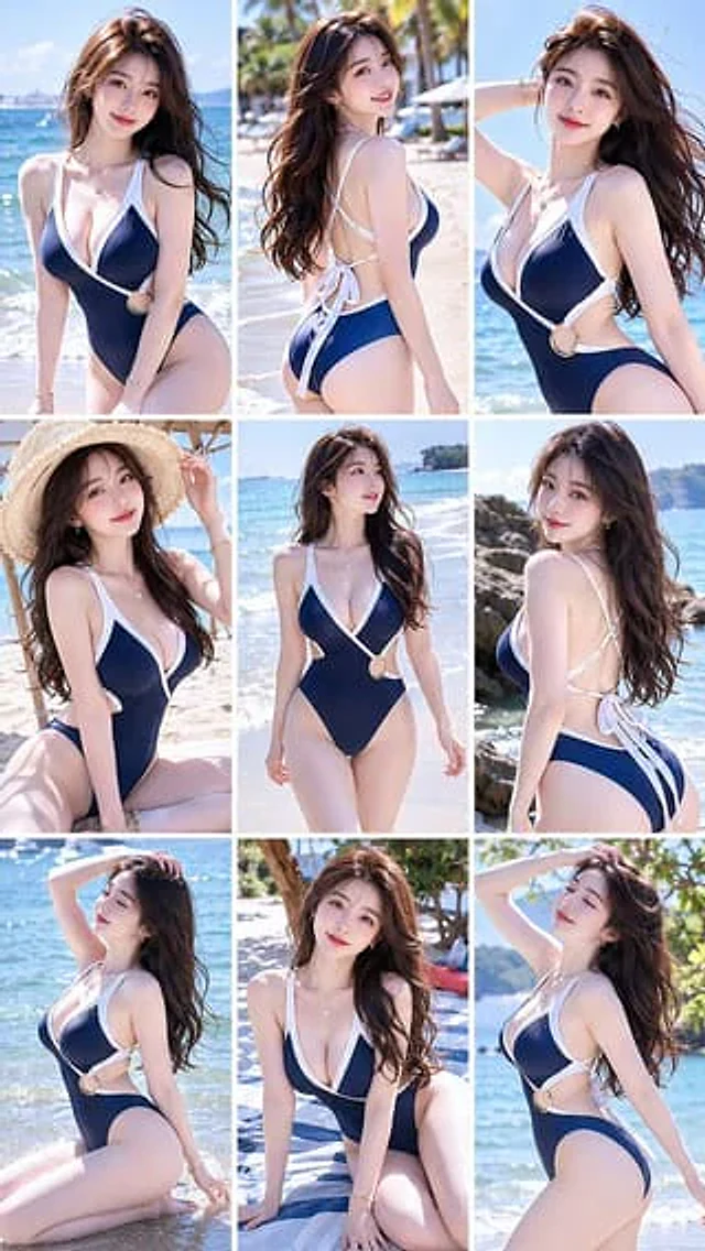
现代时尚的高级连体泳装,剪裁优雅。一位青春阳光的{argument name="年龄" default="20岁左右"}日本美女模特,皮肤白皙,长发微卷,身材丰腴且比例优雅匀称,散发着阳光自信的气质。海滩度假风格,柔和的自然光,侧身漫步的姿态,突显柔和的女性线条轮廓。照片级真,时尚杂志大片风格,不同的姿势角度,保持面部一致性,九宫格展示

Example generated from “Japanese Movie Teaser Collage”
GPT Image 2en
Japanese Movie Teaser Collage

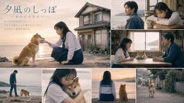
{ "type": "Japanese movie trailer visual collage", "typography": { "title": "{argument name=\"movie title\" default=\"Tail of the Evening Calm\"}", "subtitle": "—To you from that day—", "tagline": "{argument name=\"tagline text\" default=\"What's lost can never be recovered. Yet, by connecting with someone on an emotional level, people can look forward again.\"}" }, "characters": { "girl": "Young Japanese woman, dark hair, wearing a sailor-style school uniform.", "man": "Middle-aged Japanese man with stubble, wearing a dark blue shirt.", "animal": "{argument name=\"dog breed\" default=\"Shiba Inu\"}" }, "aesthetics": { "setting": "{argument name=\"setting\" default=\"Seaside town at sunset\"}", "style": "{argument name=\"color grading\" default=\"Nostalgic movie feel\"}" }, "layout": { "panel_count": 8, "sections": [ { "position": "Larger image on the left", "description": "A girl pets a dog; an old house; text superimposed." }, { "position": "Top right corner", "description": "A man's profile as he gazes at the sea." }, { "position": "Top right corner", "description": "The girl rested on the table." }, { "position": "Middle right", "description": "The girl and the man sat at the table, with a dog between them, and the ocean visible through the window." }, { "position": "bottom left corner", "description": "A man walks his dog on the beach." }, { "position": "bottom left corner", "description": "Close-up of a girl hugging a dog" }, { "position": "bottom right corner", "description": "The girl and dog are facing away from the camera, looking towards the sunset." }, { "position": "bottom right corner", "description": "A dog walking on a country street" } ] } }

Example generated from “Japanese Mystery Website Mockup”
GPT Image 2en
Japanese Mystery Website Mockup

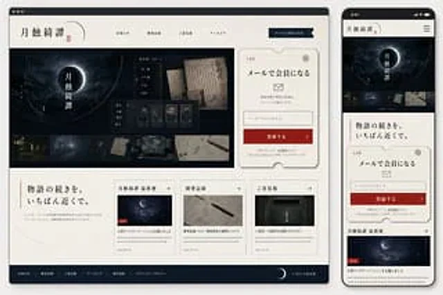
Goal: Create a polished website mockup for a Japanese mystery game or story archive titled {argument name="site title" default="月蝕綺譚"}, shown as a responsive design preview with one desktop browser window on the left and one smartphone screen on the right. Canvas: Wide 16:9 presentation image on a light gray background. Place a large desktop browser mockup occupying about 75% of the width on the left, and a tall smartphone mockup occupying about 22% of the width on the right. Use realistic device frames with soft shadows. Visual style: Elegant Japanese literary horror, quiet mystery, archival documents, moonlit darkness. Palette of ivory paper, black ink, deep navy-black, muted gray, and one strong vermilion red accent. Use serif Japanese typography, thin ruled lines, ticket-like borders, subtle paper texture, old manuscript imagery, and faint crescent-orbit line graphics. The overall mood should feel like a premium official website for a narrative game. Desktop layout: Show a browser window with a dark top bar and three small window dots. Inside the page, use an ivory header with the site title {argument name="site title" default="月蝕綺譚"} on the left, a small red seal mark, and exactly 5 horizontal navigation items: 「お知らせ」, 「開発記録」, 「ご意見箱」, 「アーカイブ」, and a dark navy button labeled 「メールで会員になる」. The hero section below is a wide dark moon-eclipse visual with the vertical title 「月蝕綺譚」 centered over a glowing crescent/eclipse. Overlay a translucent archive UI card with old Japanese documents and exactly 5 small collectible/document cards along the bottom of that overlay. Along the very bottom of the hero image, include exactly 5 horizontal thumbnail strips showing: a night street, a blueprint-like room, a dark folder or object, old handwritten papers, and a desk/workspace map. Desktop right signup card: To the right of the hero, place a large cream ticket-shaped membership card with clipped semicircle notches and a thin decorative border. It includes the small label 「入会札」, a stamp emblem, headline 「メールで会員になる」, an envelope icon, short explanatory text, one email input field with placeholder 「メールアドレスを入力」, and a red CTA button labeled 「登録する」 with a right arrow. Include tiny privacy-policy text beneath. Desktop lower content: Under the hero, make a two-column-feeling section. On the left, a large Japanese tagline {argument name="tagline text" default="物語の続きを、いちばん近くで。"} with a thin vertical red line and a small descriptive paragraph. On the right, place exactly 3 article cards in a row. The 3 cards are: 1) 「月蝕綺譚 最新便」 with a moon image, a small red NEW label, title 「大型アップデート『○○』を公開しました」, date 2024.05.20; 2) 「開発記録」 with a notebook and pen image, title 「開発記録 #12:環境音の調整について」, date 2024.05.18; 3) 「ご意見箱」 with a dark mailbox image, title 「ご意見・ご感想をお聞かせください」, date 2024.05.16. Each card has a thin border, a small arrow in the header, and gray placeholder summary lines. Desktop footer: Add a dark navy footer spanning the bottom with exactly 6 footer links: 「お知らせ」, 「開発記録」, 「ご意見箱」, 「アーカイブ」, 「利用規約」, 「プライバシーポリシー」. Include a crescent moon icon and copyright 「© 2024 月蝕綺譚」 on the right. Mobile layout: On the right smartphone, show the same site adapted to mobile. Status bar time reads 9:41. Header contains the title 「月蝕綺譚」 and a hamburger menu icon. Below it, show a compact dark hero with the eclipse and vertical title, then exactly 5 small horizontal thumbnails. Continue with the tagline 「物語の続きを、いちばん近くで。」, then the same ticket-shaped email signup card, then the first news card 「月蝕綺譚 最新便」 with moon image and red NEW label. The mobile view should be vertically scrollable-looking but contained within the phone screen. Constraints: Keep all visible interface text in Japanese as specified. Use clean, high-fidelity UI mockup rendering, crisp typography, subtle shadows, and no extra logos or watermarks. The design should look like a finished web/app mock generated for implementation planning.

Example generated from “Japanese Negative Film Aesthetic”
GPT Image 2en
Japanese Negative Film Aesthetic

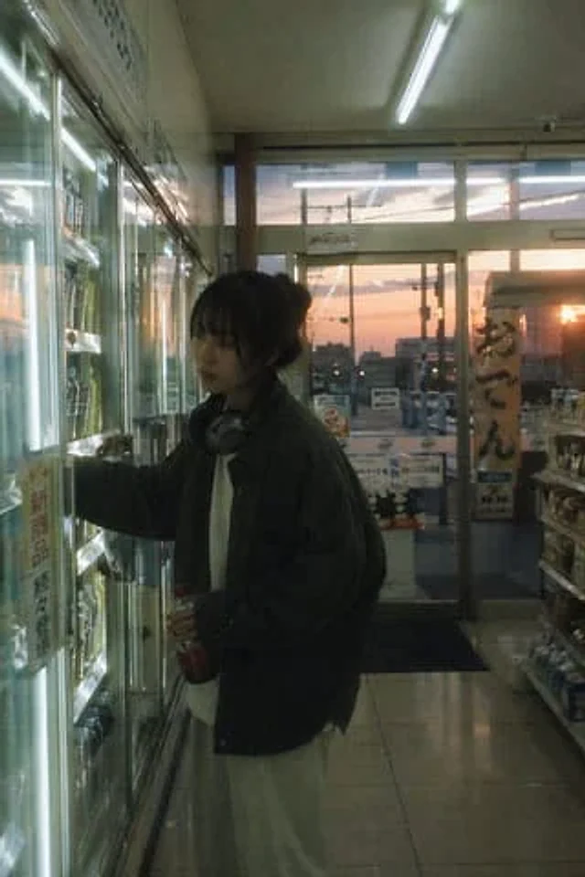
{argument name="aesthetic" default="Japanese negative film look"} aesthetics,{argument name="setting" default="Convenience store scene at dusk"} The interplay of cool indoor light and warm outdoor light creates a slight overexposure of highlights, resulting in low contrast, low-saturation colors, and a subtle grainy texture.{argument name="subject" default="The character stands in front of the freezer and casually grabs a drink."} Leaning slightly forward, relaxed posture, gentle and unfocused expression, the reflection in the glass door, the imperfect composition, the quiet and ordinary atmosphere, a nostalgic everyday life -- 2:3

Example generated from “Japanese News Broadcast Mockup”
GPT Image 2en
Japanese News Broadcast Mockup

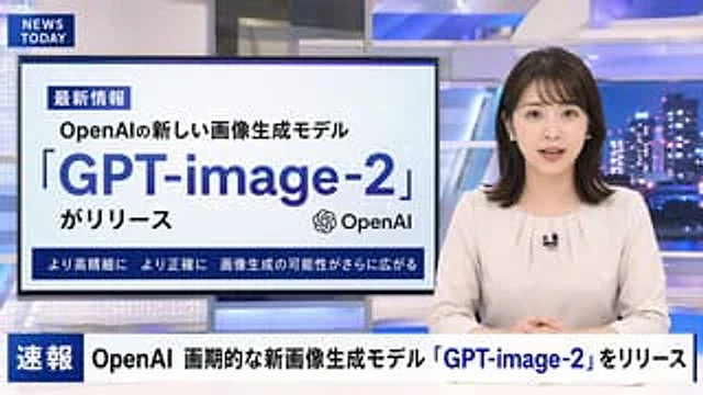
{ "type": "Television news broadcasting layout", "anchor": { "appearance": "{argument name=\"anchor appearance\" default=\"A young Japanese female news anchor with shoulder-length dark hair.\"}", "attire": "Light beige shirt, wearing a small lapel microphone", "pose": "Sit at the table, hands clasped together, facing forward." }, "studio_environment": "A modern news studio with blue illuminated panels and a nighttime city skyline as a backdrop.", "graphics": { "top_left_bug": { "style": "Dark blue rectangle", "text": "{argument name=\"channel logo\" default=\"NEWS TODAY\"}" }, "presentation_monitor": { "location": "The left side behind the anchor", "badge": "Latest Information", "subtitle": "{argument name=\"subheadline\" default=\"OpenAI's new image generation model\"}", "title": "{argument name=\"main headline\" default=\"「GPT-image-2」\"}", "suffix": "がリリース", "icon": "OpenAI logo", "bottom_bar": "Higher resolution, greater accuracy – the possibilities for image generation are expanding even further." }, "lower_thirds_ticker": { "badge": "breaking news", "headline": "{argument name=\"ticker text\" default=\"OpenAI releases groundbreaking new image generation model "GPT-image-2"\"}" } } }

Example generated from “Japanese News Broadcast Mockup”
GPT Image 2en
Japanese News Broadcast Mockup

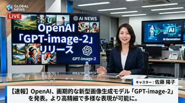
A hyper-realistic television news broadcast scene, with one person in the frame.{argument name="anchor appearance" default="Japanese female news anchor wearing a dark blue suit jacket with a white top"} She sat at the glass table in a modern news studio. Smiling, she looked directly at the camera, her hands resting beside a tablet, documents, and a clear water bottle. To her left, a large monitor displayed…{argument name="screen main text" default="OpenAI 「GPT-image-2」リリース"} The text reads "AI," next to an AI logo and eight smaller, diverse AI-generated image collages. In the top left corner is a channel logo that reads "...".{argument name="news channel name" default="GLOBAL NEWS"} The text is accompanied by a red "LIVE" logo. The background shows a busy office with computers and a wall screen displaying "AI Generation." At the bottom of the screen is a standard news graphic showing the anchor's name.{argument name="anchor name" default="Anchor: Yoko Sato"} "And a breaking news headline"{argument name="main headline text" default="[Breaking News] OpenAI announces groundbreaking new image generation model "GPT-image-2," enabling higher resolution and more diverse image expression."} (Displayed in bold Japanese text).

Example generated from “Japanese News Broadcast Mockup”
GPT Image 2en
Japanese News Broadcast Mockup

A photorealistic television news broadcast scene featuring a {argument name="anchor appearance" default="young Japanese female with shoulder-length dark hair wearing a light beige blouse"} and a small black lapel microphone, sitting at a news desk and speaking directly to the camera. The studio background is modern with blue and white lighting and a blurred nighttime city skyline on the right. In the top left corner, there is a dark blue graphic with the white text "{argument name="channel logo text" default="NEWS TODAY"}". To the anchor's left is a large presentation monitor displaying a news graphic with a white background and light blue network nodes. The monitor features a dark blue "最新情報" tag, the text "{argument name="subheadline" default="OpenAIの新しい画像生成モデル"}", a large prominent headline "{argument name="main headline" default="「GPT-image-2」"}", the text "がリリース", an OpenAI logo, and a dark blue bottom banner reading "より高精細に より正確に 画像生成の可能性がさらに広がる". Across the bottom of the entire screen is a news ticker lower third with a dark blue "速報" box and the scrolling text "{argument name="ticker text" default="OpenAI 画期的な新画像生成モデル「GPT-image-2」をリリース"}".

Example generated from “Japanese Onsen Ryokan Portrait”
GPT Image 2en
Japanese Onsen Ryokan Portrait

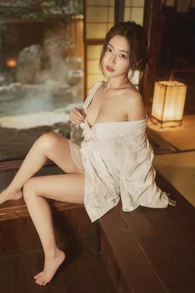
35mm film photography, warm vintage Japanese onsen ryokan aesthetic, soft ambient wooden lantern lighting mixed with gentle natural window light, subtle film grain, gentle color shift, high atmosphere editorial style, intimate medium shot, early 20s beautiful Chinese female idol with ultra-realistic delicate refined Chinese features, seductive almond-shaped fox eyes with natural double eyelids, high nose bridge, small sharp V-shaped jawline, flawless porcelain skin with warm ivory undertone, visible subtle skin texture and micro pores, soft natural makeup with dewy glow, subtle rosy flush on cheeks, natural soft pink lips slightly parted, long dark brown hair tied in a loose low bun with some messy strands falling around face and neck, wearing a loose white yukata (traditional Japanese bathrobe) deliberately slipped off one shoulder and loosely tied at the waist, the fabric slightly open revealing smooth skin and subtle cleavage, barefoot, seductive relaxed sitting pose on the edge of a traditional wooden engawa veranda at a vintage onsen ryokan, body slightly turned toward the camera, one leg bent with foot resting on the wooden floor, the other leg gently dangling, one hand lightly holding the yukata collar, the other hand resting on the wooden floor behind her for support, softly arched back to gently accentuate curves, intensely seductive yet gentle and inviting gaze straight at the viewer with soft doe eyes full of quiet temptation and warmth, warm wooden interior with paper sliding doors and distant steaming hot spring in soft focus, gentle rim lighting highlighting skin and fabric texture, authentic vintage film color grading with warm tones, extremely sharp yet soft skin rendering, natural hair strands, realistic fabric wrinkles and drape on the yukata, no plastic skin, no digital over-sharpening, no airbrushing, no blemishes, no moles, no oily skin, no watermark, no text, authentic 35mm film Japanese onsen ryokan atmosphere

Example generated from “Japanese Onsen Town in Four Seasons”
GPT Image 2en
Japanese Onsen Town in Four Seasons

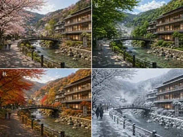
{ "type": "Four Seasons Comparison Landscape Collage", "subject": "The four seasons of the streets and rivers in the same Japanese mountain hot spring town", "setting": { "location": "Traditional Japanese riverside hot spring town", "features": [ "The shallow river is so clear that the rocks at the bottom are visible.", "Small arched pedestrian bridge spanning the river", "The riverside walkway is paved with stone slabs and has black wooden railings.", "On the right is a multi-story wooden Japanese-style inn, radiating warm interior light.", "The background is a forested mountain range.", "The village buildings extend into the valley." ] }, "layout": { "format": "2x2 grid collage", "sections": [ { "title": "spring", "position": "Top left", "count": 1, "labels": [ "spring" ] }, { "title": "summer", "position": "Top right", "count": 1, "labels": [ "summer" ] }, { "title": "autumn", "position": "Bottom left", "count": 1, "labels": [ "autumn" ] }, { "title": "winter", "position": "Bottom right", "count": 1, "labels": [ "winter" ] } ], "consistency": "The camera angles and compositions of all four panels are completely identical." }, "seasonal_variants": { "count": 4, "items": [ { "season": "spring", "trees": "The pale pink cherry blossoms arch up on the left", "ground": "The dry stone path is dappled with the light and shadow of spring.", "atmosphere": "Fresh, soft, and gentle sunlight" }, { "season": "summer", "trees": "The lush, vibrant green foliage creates a cool, shady environment.", "ground": "The stone path where sunlight and shadow intertwine", "atmosphere": "On a bright and sunny summer day, the vegetation is lush." }, { "season": "autumn", "trees": "The vibrant red, orange, and gold maple leaves", "ground": "The trail was bathed in warm amber light.", "atmosphere": "Vibrant autumn colors on the hillside" }, { "season": "winter", "trees": "Bare branches, trees, bridges, rooftops, and railings were covered with a thick layer of snow.", "ground": "Snow-covered riverside path", "atmosphere": "It was a cloudy day with lots of snow, snowflakes drifting down, accompanied by a cold mist." } ] }, "human_elements": { "count": 4, "description": "On the left side of each panel, there are a few pedestrians on the riverside path, their proportions natural, serving as a backdrop to the scenery." }, "signage": { "count": 1, "description": "Near the hotel on the right bank of the river, there is a vertical stone monument with Japanese kanji characters." }, "style": { "look": "Highly detailed realistic travel photography", "lighting": "Natural seasonal lighting, cinematic feel, realistic reflections in the water.", "composition": "Expansive scenic views, walkways and bridges forming guiding lines, and a balance between architecture and nature.", "quality": "Extremely high detail, clear textures, realistic water surfaces, vegetation, wood, stone, and snow." }, "prompt": "Create a 2x2 realistic comparison image to demonstrate{argument name=\"location\" default=\"A traditional Japanese mountain hot spring town\"} The scene maintains the same perspective throughout all four seasons. At the center of the scene is a clear, rocky river with a small arched pedestrian bridge. To the left is a stone-paved riverside path with black railings, and to the right is a large wooden Japanese-style inn with warm light streaming from its windows. In the distance, forested mountains and scattered town buildings are added. The upper left panel is labeled \"Spring,\" showcasing cherry blossoms in full bloom; the upper right panel is labeled \"Summer,\" displaying lush summer greenery; the lower left panel is labeled \"Autumn,\" showcasing vibrant red and orange autumn leaves; and the lower right panel is labeled \"Winter,\" showcasing snow-covered trees, bridges, rooftops, and falling snowflakes. A few pedestrians are added to the path on the left side of each panel. The season's Chinese characters are added in white in the upper left corner of each panel. The design emphasizes realistic seasonal changes while maintaining complete consistency in architecture, framing, and perspective across all four panels." }

Example generated from “Japanese Potato Chip Advertisement”
GPT Image 2en
Japanese Potato Chip Advertisement

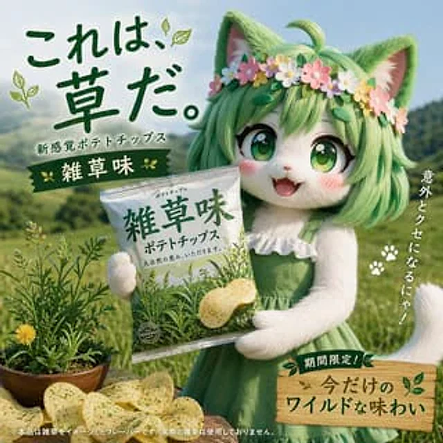
A Japanese potato chip commercial features a character promoting a bag of potato chips. The flavor of the chips is {argument name="flavor" default="weedy smell"}

Example generated from “Japanese Realist Romance Movie Poster”
GPT Image 2en
Japanese Realist Romance Movie Poster

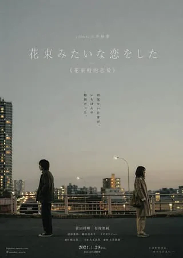
This Japanese-style realistic romance movie poster, inspired by the film *A Bouquet of Love*, depicts a young Japanese couple in their twenties standing in an everyday urban scene (street or intersection), maintaining a subtle yet realistic distance. There is no physical contact, as if capturing the moment of estrangement in their relationship. The atmosphere is quiet and restrained, conveying unspoken emotions and a sense of the passage of time. The composition follows the film's main visual style, with the figures positioned at the bottom or to one side, leaving ample white space to emphasize the space and atmosphere. The lighting is natural (overcast or at dusk), with low-saturation gray-blue, beige, and warm gray tones, possessing a realistic photographic quality. The image has a delicate film grain and a subtle sense of everyday life, not deliberately pursuing beauty or excessive decoration, like a frame from a real film. A small amount of natural flowers can be added to the edges or foreground as a metaphor (restrained, not excessive, not decorative). The title "I Made a Beautiful Bouquet" is added in the white space using Mingti font, with a simple and sparse layout; below, "We Made a Beautiful Bouquet" is added in a smaller font. Overall Requirements: Authentic Japanese movie poster quality, artistic, restrained, and with a sense of everyday life. Emphasize character relationships rather than romantic symbols, avoiding saccharine romance, excessive floral displays, trendy aesthetics, crowded compositions, and an "exquisite but empty" AI feel. Negative keywords: AI feel, overly beautified, floral displays, romantic filters, excessive lighting effects, high saturation, neon lights, intimate embraces, posed shots, close-up portrait compositions, trendy style, illustration-like feel, 3D rendering, cluttered elements. A minimalist Japanese art movie poster style, inspired by the film *Love Letter*, featuring a winter snow scene, close-ups of a young woman's face, her face close to or partially buried in the snow, with fine snowflakes falling naturally. The composition should be a restrained profile close-up or a slightly tilted face, with the figure occupying a large proportion of the frame but not overly sharp, with slightly softened or slightly out-of-focus edges. The expression is one of calm after grief, with tears in the eyes or tear stains, emotions restrained and controlled, as if one has just cried and is slowly returning to silence. The eyes do not look directly at the camera, conveying a sense of memory and emptiness. The lighting is natural diffused winter light or soft, overcast light, with cool white, light gray, and pale blue tones, low saturation, low contrast, no strong shadows, and no dramatic lighting effects. Snow and air form a clean background. The image texture is between realistic photography and film, with fine grain, a slight haze, and slightly washed out or slightly overexposed, like an old photograph or movie still faded by time. The skin is not overly detailed, with no smoothing, sharpening, or retouching. The composition is asymmetrical, with the face partially cropped, a minimalist background, and appropriate white space. A minimalist title, "Love Letter" or "ラヴレター," is added to the white space using a light Ming or light serif font, with wide letter spacing, sparse typography, and a light gray color; "Love Letter" is added below in a very small font. Overall Requirements: A realistic Japanese art film poster aesthetic—quiet, subtle, and restrained, like a memory covered in snow. Avoid studio-style designs, trendy aesthetics, overly refined filters, special lighting effects, high contrast and saturation, a sharp, digital look, dramatic emotions, and being "beautiful but empty." Negative keywords: AI-like appearance, skin smoothing, sharpening, HDR, high contrast, high saturation, dreamlike lighting effects, lens flare, filter-like feel, studio style, trendy face, posed shots, staring directly at the camera, exaggerated emotions, 3D rendering, illustration style, complex backgrounds.

Example generated from “Japanese Restaurant Promotional Menu Poster”
GPT Image 2zh
Japanese Restaurant Promotional Menu Poster

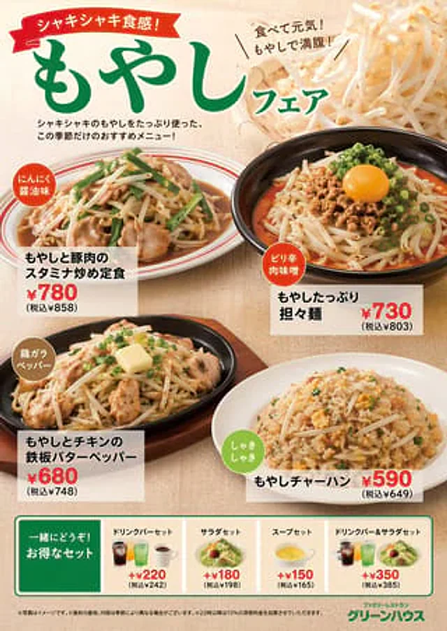
{ "type": "Restaurant promotional menu poster", "theme": "{argument name=\"main ingredient\" default=\"bean sprouts\"} Theme Exhibition", "header": { "ribbon_text": "{argument name=\"catchphrase\" default=\"Crisp and refreshing texture!\"}", "main_title": "{argument name=\"fair title\" default=\"Bean sprout themed exhibition\"}", "sub_text": "Eat your way to energy! Bean sprouts will fill you up and satisfy your hunger!", "description": "Featuring a generous selection of crisp bean sprouts, we present this season's limited-edition recommended menu!", "background_image": "Bamboo basket filled with fresh bean sprouts" }, "main_dishes": [ { "image": "Stir-fried pork, bean sprouts, and chives on a white plate with red stripes", "badge": "Garlic soy sauce flavor", "name": "{argument name=\"dish 1 name\" default=\"Bean sprout and pork stir-fried vegetable set meal\"}", "price": "¥780 (¥858 including tax)" }, { "image": "The dan dan noodles, served in a black bowl, are topped with minced meat, bean sprouts, chopped green onions, and a raw egg yolk.", "badge": "Spicy Meat Miso", "name": "Bean sprout-filled Dan Dan noodles", "price": "¥730 (¥803 including tax)" }, { "image": "Sizzling chicken and bean sprouts on a hot plate, topped with melted butter.", "badge": "Chicken Bone Pepper Flavor", "name": "Chicken and bean sprouts sizzling with butter and pepper", "price": "¥680 (¥748 including tax)" }, { "image": "Bean sprout fried rice served on a white plate", "badge": "Crisp texture", "name": "Bean sprout fried rice", "price": "¥590 (¥649 including tax)" } ], "bottom_section": { "title": "Enjoy even better value when combined! Great value套餐 (set meals)", "set_options_count": 4, "options": [ { "name": "Beverage Bar Set Meals", "image": "Three Selected Beverages", "price": "+¥220" }, { "name": "Salad Set Meal", "image": "Small green salad", "price": "+¥180" }, { "name": "Soup Set Meal", "image": "Yellow soup in a white glass", "price": "+¥150" }, { "name": "Drinks & Salad Set Meals", "image": "Drinks and salads", "price": "+¥350" } ] }, "footer": { "fine_print": "※Images are for reference only. ※The origin and contents of ingredients may vary depending on the season. ※A 10% late-night service charge will be added after 10 PM.", "restaurant_logo": "Family restaurant{argument name=\"restaurant name\" default=\"Green House\"}" } }

Example generated from “Japanese Rice Advertisement Banner”
GPT Image 2en
Japanese Rice Advertisement Banner

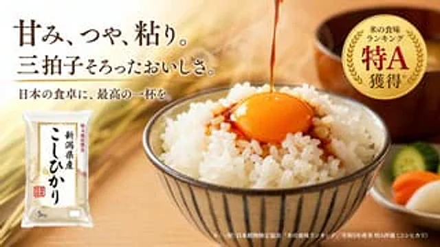
A high-quality Japanese food advertisement banner. The background features a warm, softly blurred wooden table, adorned with golden rice ears. On the right side of the image {argument name="main dish" default="A bowl of steaming white rice topped with a raw egg yolk and drizzled with soy sauce."} Served in a striped ceramic bowl. To the right is a small white dish neatly arranged with three slices of pickled vegetables (a green cucumber, an orange carrot, and a white radish), next to which is a blurred wooden miso soup bowl. In the upper left corner, a striking and elegant Japanese title reads…{argument name="headline text" default="Sweetness, gloss, and stickiness. A delicious combination of all three."} A smaller subtitle is provided below.{argument name="subheadline text" default="Bring the perfect cup of coffee to your Japanese dinner table."} The bottom left corner shows a 5kg plastic bag of rice, with the label stating {argument name="product name" default="Koshihikari rice from Niigata Prefecture"} In the upper right corner is a circular gold foil medal with text displayed.{argument name="badge text" default="Rice receives Special A rating in taste ranking."} Small explanatory text is printed along the bottom right edge. The overall lighting is warm, inviting, and professional, highlighting the glistening texture of the rice and eggs.

Example generated from “Japanese Roller Coaster Sales Banner”
GPT Image 2zh
Japanese Roller Coaster Sales Banner

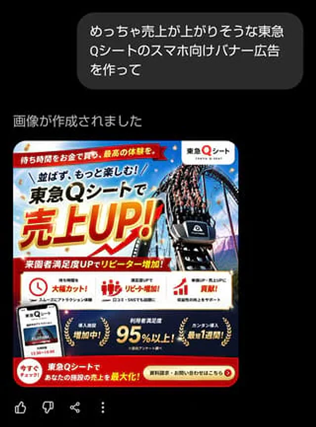
{"type":"Japanese Smartphone Banner Ads","style":"High-conversion commercial promotional banners, glossy and aggressive sales design, compact Japanese advertising layout, vibrant amusement park marketing visuals, sophisticated corporate event graphics","format":{"aspect_ratio":"Square","intended_use":"Smartphone web banners or social media ads"},"brand":{"name":"Tokyu Q Sheet","romanization":"TOKYU"} Q-SEAT","logo_position":"Inside the white circular badge in the upper right corner"},"subject":{"main_visual":"A dramatic roller coaster plunges down a steep track from the front, filled with excited passengers, shot from a low angle to show speed and impact","vehicle_label":"FUJIYAMA","background":"Bright blue sky and light clouds, amusement park atmosphere, with hints of mountain scenery, gold confetti falling in the composition"},"color_palette":{"primary":["red","gold","white","dark blue","black"],"mood":"urging, celebratory, high-end, energetic"},"layout":{"sections":[{"title":"Top Ribbon","position":"Upper left corner spanning the upper area","count":1,"label"] ls":["The time to wait is the best time to buy the best gold. "]​​},{"title":"Main title area","position":"Top left to center","count":3,"labels":["和ばず、もっと楽しむ!" ,"Tokyu Qシートで","売上UP!"]},{"title":"Red subtitle ribbon in the middle","position":"Below the main title","count":1,"lab els":["Add more rewards to visitors who are satisfied!"]},{"title":"Advantage Card","position":"Lower middle strip on white background","count":3,"labels":["Greater time to wait!","Add more rewards to visitors who are satisfied!","Contribute to price and sales increases!"]},{"title":"Dark blue achievement strip at the bottom","position":"CTA"] The lower part of the top area","count":3,"labels":["Importing facilities is increasing!","User satisfaction is over 95%!","Content import will take at least 1 week!"]},{"title":"Call to Action Area","position":"Red strip at the bottom","count":2,"labels":["Now Check!","Data Request・Question Combination"]}],"additional_elements_count":5,"additional_elements":["Smartphone mockup in the lower left corner, showing the service interface","Clock icon in the first advantage card","Crowd icon in the second advantage card","Bar arrow icon in the third advantage card","Golden laurel wreath decoration around the three achievement information"],"typograp hy":{"language":"Japanese","headline_style":"Extra-bold sans-serif font with oversized kanji and katakana","headline_effect":"Golden gradient fill with bold red outline, white halo, and subtle shadows (for "Sales UP!"),"support_text_style":"Bold Japanese sans-serif font in black, red, and white"},"composition":"Creates a compact Japanese amusement park sales banner with a roller coaster image occupying the right half and a huge sales headline occupying the left half. Uses diagonal energy lines, overlapping ribbons, a strong sense of hierarchy, and the urgency of retail advertising. The top right corner contains a white circular logo, a red ribbon headline at the very top, an oversized promotional headline in the center, a white three-column advantage bar, a dark blue achievement bar, and a red CTA at the bottom." strip. Gold confetti and high-end highlights are added throughout. ","text":{"top_ribbon":"The time is waiting for the gold to be bought, and the highest level is the body. ","headline_line_1":"和ばず、もっと楽しむ!","headline_line_2":"{argument name="service name" default="Tokyu Q Seat"}で","headline_line_3":"{argument name="main sales phrase" default="Increased sales!"} ","subheadline":"The number of visitors to the park is increasing!","benefit_1":"The time spent is greatly improved!","be nefit_1_sub":"スムーズにアトラクション体験","benefit_2":"満zuduUPでリピーターincrease!","benefi t_2_sub":"口コミ・SNSでもTOPICSに","benefit_3":"単価UP・売上UPにcontribution!","benefit_3_sub ":"Profitability is rising","achievement_1":"Introduction of facilities is increasing!","achievement_2":"Users are satisfied{argument name="satisfaction figure" default="Over 95%!"} ","achievement_2_note":"※自社アンケート片べ","achievement_3":"The shortest time for importing カンタン is 1 week!","bottom_left":"Now it's すぐチェック!","bottom_center":"{argument name="bottom message" default="Maximize your facility's revenue with Tokyu Q Seat!"} ","cta":"{argument name="call to action" default="For information requests and inquiries, please click here."} "}}

Example generated from “Japanese Roman Typeface Specimen Poster”
GPT Image 2zh
Japanese Roman Typeface Specimen Poster

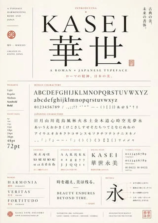
Create a sophisticated retro-modern style font sample poster to showcase a font called{argument name="typeface name" default="KASEI"} This fictional font aims to achieve an elegant fusion of Roman typeface and Japanese typography. It employs a vertical composition, uses warm ivory textured paper, and features thin gray dividing lines, black lettering, and soft vermilion accents to emphasize the text and seals. At the center of the composition is a large serif Latin wordmark.{argument name="typeface name" default="KASEI"} Below the title are two oversized Japanese kanji characters, “華世”, in a matching high-contrast classical style. Above the title is a smaller title, “INTRODUCING,” adorned with a tiny decorative diamond. To the right of the title area is a vertical Japanese slogan: “经典の美、未来の书体.” (Classical beauty, future calligraphy). Below the main kanji is the subtitle “A ROMAN × JAPANESE TYPEFACE,” and below that is a line of vermilion Japanese text: “ロмаの精神、日本の美.” "(The spirit of Rome, the beauty of Japan)". On the far left, create a narrow sidebar containing stacked English text "A TYPEFACE HARMONIZING ROME AND JAPAN", a small circular badge, Japanese text "制作—MMXXIV" and "CREATED IN KYOTO, JAPAN". The lower two-thirds are structured as a rigorous font sample table with clearly labeled areas. The left sidebar contains two sections: "WEIGHTS" with five items—Light, Regular, Medium, Semibold, Bold; and "POINT SIZES" with nine items—8pt, 10pt, 12pt, 14pt, 18pt, 24pt, 36pt, 48pt, 72pt. The main area contains a section titled "ROMAN CHARACTERS" displaying four lines of samples: uppercase letters A to Z, lowercase letters a to z, and the number 0. Up to number 9, and a line of punctuation/symbols, including forward slashes, commas, semicolons, exclamation marks, question marks, apostrophes, quotation marks, long dashes, parentheses, square brackets, curly braces, ampersands, at symbols, dollar signs, asterisks, swords, and double swords. Below that is a section titled "JAPANESE CHARACTERS," containing 4 lines: 19 kanji “日月山川花鸟风林火水土金木道心时空光梦永”, 23 hiragana “あいうえおかきくけこさしすせそたちつてとなにぬねの”, 21 The first line contains the katakana characters “アイウエオカキクケコサシスセソンタチツテトナニヌネノ”, and a line of symbols including Japanese punctuation, angle brackets, tildes, separators, parentheses, angle brackets, double angle brackets, black-cornered brackets, postal symbols, reference symbols, and reduplicated characters. On the next line, add four compact sample panels: “LIGATURES” with 10 items—Æ, AE, AJ, Œ, KA, KE, KI, KO, KU and “st ct fi fl ft fb”; and “STYLISTIC ALTERNATES” with 12 items—A, A, A, R, R, K, K, a, a, g, g, y, y, J, J, Q, Q, t, t. — The samples are arranged in a neat grid; “SPACING STUDY” displays the word “KASEI” with wide letter spacing, above the kanji “华世永美”; and “NUMERAL STYLES” contains four lines—uniform numerals 0123456789, old-style numerals 0123456789, and small capital letter combinations “H 0123” and “H 0123”. Tiny red Japanese descriptions are added below some sample boxes. At the bottom, three function panels are created. The left panel is titled “WORDS” and contains three entries: “HARMONIA” with red Japanese and English annotations “调和HARMONY”, “VERITAS” with “真実TRUTH”, and “FORTITUDO” with “勇気COURAGE”. The center panel contains a large Japanese quote: “時を越え、美は残る”. "(Beyond Time, Beauty Endures)," the English statement above reads "BEAUTY ENDURES BEYOND TIME," along with a small red signature "— KASEI." The right panel, titled "DETAILS," displays a large Chinese character "永" (yong, meaning eternal), against a background of subtle circular patterns and auxiliary lines, plus four right-aligned Japanese annotations connected by thin dotted lines. Finally, the footer contains four sections: a small badge with "KASEI TYPE FOUNDRY" and "WWW.KASEIFOUNDRY.JP"; a centered language support description "SUPPORTING 200+ LANGUAGES" and "LATIN / GREEK / CYRILLIC / JAPANESE / SYMBOLS"; the right-hand statement "DESIGNED WITH RESPECT CRAFTED FOR THE FUTURE"; and a label bearing the name "华世" (Huashi). A square vermilion seal. The overall style should present the texture of a high-end Japanese typeface foundry sample sheet, balancing the precision of the Swiss grid in the editing style, the classic book layout, the subtle Japanese brand sense, the generous margins, the restrained luxury, and the elegance of a museum poster.

Example generated from “Japanese RPG Status Screen”
GPT Image 2zh
Japanese RPG Status Screen

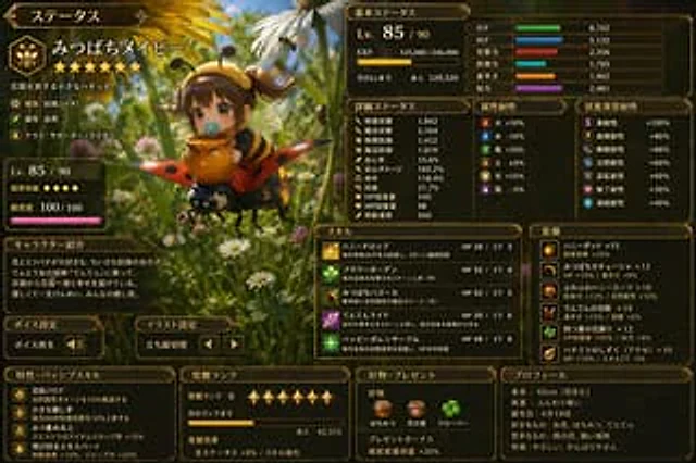
この画像からゲームのステータス画面を作ってください。情報量多め。言語は日本語。

Example generated from “Japanese SaaS Ad Banner at Night”
GPT Image 2en
Japanese SaaS Ad Banner at Night

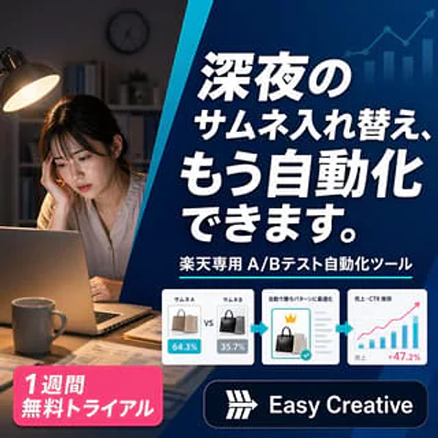
A sophisticated square Japanese-style digital banner ad for an AI e-commerce optimization tool. The image is divided into two main visual areas by a striking blue diagonal line extending from the top center to the lower left. The left third showcases a realistic nighttime home office scene: a tired young woman sits at a desk, her face blurred, resting her chin on her hand as she gazes at an open laptop. A warm desk lamp illuminates her and the desktop, a mug sits in the foreground, and scattered documents, bookshelves, and a clock on the wall are softly blurred against the dark background, creating an atmosphere of working late into the night. The right two-thirds features a dark blue gradient promotional panel with subtle financial growth graphics in the background: near the upper right corner is an upward line chart with an arrow and four light blue transparent bar charts. The panel is filled with a striking, oversized white Japanese title with a strong shadow, arranged in four rows:{argument name="headline text" default="You can now automate changing thumbnails late at night."} Add a white subheading below.{argument name="subheadline text" default="Rakuten-specific A/B testing automation tool"} The chart is accompanied by a thin cyan underline. Below it is a horizontal flow bar containing three white, rounded-corner cards connected by two cyan arrows pointing to the right. Card 1 shows two side-by-side thumbnails of handbags, labeled "Samune A" and "Samune B," with blue and gray percentage badges in the middle ("64.3%" and "35.7%" respectively), and marked "VS." Card 2 shows a thumbnail of a selected black handbag, with a small gold crown icon above it, a gray checkmark on the right, a cyan checkmark badge, and a small Japanese title indicating automatic optimization above. Card 3 shows a simple analytical chart with axes, including several blue bars, a pink upward trend line, and Japanese labels about sales and CTR trends, with a pink result number "+47.2%" in the lower right corner. Add a bright pink, rounded-corner promotional badge to the bottom left corner, with two lines of eye-catching white Japanese text:{argument name="offer text" default="1-week free trial"} Add a dark navy blue rounded logo bar in the bottom right corner, containing a simple white geometric logo and a bold white sans-serif brand name.{argument name="brand name" default="Easy Creative"} It adopts a clean and modern SaaS advertising aesthetic, featuring high contrast, clear typography, glossy UI cards, subtle shadows, and a professional conversion-oriented layout, all in a 1:1 aspect ratio.

Example generated from “Japanese SaaS Before-After Banner”
GPT Image 2en
Japanese SaaS Before-After Banner

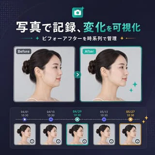
{ "type": "SaaS Feature Update Banner Info", "style": "The design features a clean and modern Japanese tech marketing style, a sophisticated UI, a deep navy blue gradient background, subtle dotted halftone textures in the upper left and lower right corners, soft curved accents, and striking neon cyan highlights, resulting in a refined and high-quality product launch visual effect.", "canvas": { "aspect_ratio": "1:1" }, "headline": { "icon": "The app icon is a rounded square with a white camera symbol, a cyan gradient background, and small glitter decorations.", "title": "{argument name=\"headline text\" default=\"Photographs record and visualize changes\"}", "subtitle": "{argument name=\"subtitle text\" default=\"Comparison of management before and after by timeline\"}", "language": "Chinese", "title_style": "Large, bold sans-serif font; the first phrase is white, and the second phrase is bright cyan.", "subtitle_style": "Medium-sized bold white sans-serif font, with cyan and gold glitter separators on both sides." }, "layout": { "sections": [ { "title": "Comparison Cards", "position": "center", "count": 2, "labels": [ "Before", "after" ] }, { "title": "Timeline entries", "position": "bottom", "count": 5, "labels": [ "04/01 10:30", "04/15 10:30", "04/29 10:30", "05/13 10:30", "05/27 10:30" ] } ], "centerpiece": "The side-by-side before-and-after portrait cards are connected by a circular cyan arrow button.", "bottom_panel": "The rounded rectangle timeline module contains five thumbnails with dates, connected by a dashed horizontal progress bar." }, "comparison": { "subject": "The same adult woman, profile view from the left, with dark brown hair tied in a neat low bun, fair skin, wearing a spaghetti strap top, studio lighting, and a light gray background.", "privacy": "The facial areas in the large card and all five thumbnails are covered with vertical rectangular blur blocks.", "before_card": { "label": "Before", "frame": "Rounded rectangle with light gray border and soft shadow", "image": "Neutral clinical style portrait" }, "after_card": { "label": "after", "frame": "Rounded rectangle with a light cyan border and soft shadow", "image": "Similar portraits, with subtle improvements to the jawline/neck contour, suggesting visible changes.", "decorations": "Then there are two cyan flashing stars in the bottom right corner of the card." }, "connector": "The small, round, cyan button in the center of the card has a white right-pointing arrow." }, "timeline": { "panel_style": "Dark, semi-transparent, rounded container with an internal glow effect.", "line": "White horizontal dashed line", "entries": [ { "date": "04/01", "time": "10:30", "state": "Small blue circular node above the thumbnail", "thumbnail": "A thumbnail of a woman's profile, with a blurred area and a miniature camera icon button in the lower right corner.", "frame": "Light gray rounded corner border" }, { "date": "04/15", "time": "10:30", "state": "Small blue circular node above the thumbnail", "thumbnail": "A thumbnail of a woman's profile, with a blurred area and a miniature camera icon button in the lower right corner.", "frame": "Light gray rounded corner border" }, { "date": "04/29", "time": "10:30", "state": "Currently selected, with a bluish-white ring node.", "thumbnail": "A thumbnail of a woman's profile, with a blurred area and a miniature camera icon button in the lower right corner.", "frame": "Bright cyan rounded corner border" }, { "date": "05/13", "time": "10:30", "state": "Small blue circular node above the thumbnail", "thumbnail": "A thumbnail of a woman's profile, with a blurred area and a miniature camera icon button in the lower right corner.", "frame": "Light gray rounded corner border" }, { "date": "05/27", "time": "10:30", "state": "Highlighted milestone with gold and white ring nodes", "thumbnail": "A thumbnail of a woman's profile, with a blurred area and a miniature camera icon button in the lower right corner.", "frame": "Gold rounded corner border" } ], "extra_decorations": "There are two small golden flashing stars on the far right edge of the timeline panel." }, "color_palette": { "background": "Deep navy blue to indigo gradient", "primary": "bright cyan", "secondary": "White", "accent": "gold", "support": "Soft gray and blue-purple" }, "rendering": "The clean vector graphics combined with UI design, embedded with realistic portrait photography, balanced spacing, and centered composition deliver the quality of a startup landing page banner." }

Example generated from “Japanese SaaS Feature Banner”
GPT Image 2en
Japanese SaaS Feature Banner

{ "type": "SaaS feature update promotional banner", "style": "A clean and modern Japanese tech marketing style, high-quality infographics, soft gradient backgrounds, and exquisite UI mockups—simple yet trustworthy.", "canvas": { "aspect_ratio": "1:1", "background": "A white background with flowing pale purple and light purple abstract wave shapes in the corners, a subtle halftone texture, and delicate shimmering accents." }, "branding": { "top_logo": { "icon": "Rounded square app icon, with a stylized white L on a purple gradient background.", "text": "L Member Card" }, "headline": "{argument name=\"headline text\" default=\"Start a new experience in medical record management\"}", "subheadline": "{argument name=\"subheadline text\" default=\"Customer records linked to LINE members\"}", "headline_style": "Large, bold, dark purple Japanese sans-serif font", "subheadline_style": "Medium-sized bold Japanese sans-serif font with cyan and dark navy blue accents, flanked by small star icons and thin dividing lines." }, "layout": { "centerpiece": "A large, vertically centered smartphone front model, positioned slightly below the title.", "sections": [ { "title": "Left side function", "position": "Left side of the phone", "count": 2, "labels": [ "Medical records", "client" ], "items": [ { "shape": "White circular badge with soft shadow", "icon": "Purple clipboard line icon", "label": "Medical records", "accent": "The purple dotted line connecting the phone" }, { "shape": "White circular badge with soft shadow", "icon": "Cyan silhouette icon", "label": "client", "accent": "The cyan dotted line connecting the phone" } ] }, { "title": "right-side functions", "position": "right side of the phone", "count": 2, "labels": [ "photo", "Automatically generated" ], "items": [ { "shape": "White circular badge with soft shadow", "icon": "Cyan camera icon", "label": "photo", "accent": "The cyan dotted line connecting the phone" }, { "shape": "White circular badge with soft shadow", "icon": "Orange clock icon with a glitter effect", "label": "Automatically generated", "accent": "The orange dashed line pointing to the phone" } ] } ], "decorations_count": 6 }, "app_screen": { "screen_title": "Medical Record List", "status_bar": { "time": "9:41", "battery": true, "signal": true }, "top_icons_count": 2, "top_icons": [ "search", "menu" ], "tabs": { "count": 4, "labels": [ "all", "Store visit record", "collect", "Following" ], "active": "all" }, "customer_cards": { "count": 4, "items": [ { "name": "{argument name=\"customer name 1\" default=\"Hanako Yamada\"}", "member_id": "L12345678", "last_visit": "May 12, 2024", "tag": "Repeat customers", "avatar": "Blurry female head" }, { "name": "Shota Sato", "member_id": "L123456789", "last_visit": "May 8, 2024", "tag": "Following", "avatar": "Blurry male head" }, { "name": "Misaki Suzuki", "member_id": "L34567890", "last_visit": "April 28, 2024", "tag": "New users", "avatar": "Blurry female head" }, { "name": "Kenichi Takahashi", "member_id": "L45678901", "last_visit": "April 20, 2024", "tag": "dormant users", "avatar": "Blurry male head" } ] }, "ui_style": "Rounded white list cards on a light gray background, purple application title bar, subtle shadows, Japanese sans-serif typography." }, "color_palette": { "primary": "#5B5CEB to #6C63FF", "secondary": "#22C7B8", "accent": "#F4B23A", "text_dark": "#2B2E5B", "white": "#FFFFFF" }, "rendering": "Clear vector-style marketing graphics with realistic smartphone bezels, balanced and centered composition, showcasing premium SaaS launch banner aesthetics." }

Example generated from “Japanese SaaS Form Builder Banner”
GPT Image 2en
Japanese SaaS Form Builder Banner

{ "type": "SaaS Feature Update Banner Info", "style": "The visuals for Japanese tech marketing are clean and modern, featuring soft gradient abstract backgrounds, advanced UI, minimalist flat illustrations, rounded cards, subtle shadows, and clear typography.", "language": "Chinese", "canvas": { "aspect_ratio": "1:1", "background": "A white background is accented with soft purple gradient ripples, delicate dotted halftone decorations, and subtle geometric shimmering effects in the corners." }, "headline": { "main": "{argument name=\"headline text\" default=\"Free customization\"}", "sub": "{argument name=\"subheadline text\" default=\"Six input formats allow for flexible form item design.\"}", "main_style": "Extra-large, bold Japanese-style sans-serif font with a gradient fill from dark blue to violet.", "sub_style": "Medium-bold Japanese sans-serif font, cyan and dark navy blue text, with small decorative flashing icons and thin dividing lines on both sides." }, "layout": { "composition": "Double-column product function banner", "sections": [ { "title": "Input type list", "position": "left", "count": 6, "labels": [ "Text input", "Radio button (single selection)", "Checkboxes (multiple selections)", "Paragraph text", "Date/Time", "Image upload" ], "container": "Six rounded white capsule cards are stacked vertically with soft shadows.", "icon_style": "Large, minimalist, colorful icon inside a light-colored circular badge", "colors": [ "purple", "teal", "teal", "purple", "teal", "orange" ] }, { "title": "Form Builder UI", "position": "right", "count": 6, "labels": [ "Name", "gender", "Services of interest", "Needs/Problems", "Expected arrival date", "Reference image (optional)" ], "container": "Large, rounded white application window with a purple-blue title bar", "header_text": "{argument name=\"panel title\" default=\"Create form items\"}", "field_types": [ "Single-line text input", "radio buttons", "checkbox group", "Multiline text area", "Date and Time Picker", "Image upload drag-and-drop area" ] } ], "connector": "The light blue dotted bracket-style guide lines visually connect the left-side function list with the right-side form builder panel." }, "ui_details": { "badges_count": 3, "badges": [ "Required", "Required", "Required" ], "sample_values": { "name_placeholder": "Example: Hanako Yamada", "radio_options": [ "male", "female", "other" ], "checkbox_options": [ "Haircut", "hair dye", "Nursing", "other" ], "textarea_placeholder": "Please fill in the blank freely.", "date_value": "2024/05/12", "time_value": "14:00", "upload_hint": "Click to select image" }, "window_controls": "Minimalist polka dots and drag handles, clean form rows with thin light gray borders" }, "color_palette": { "primary": "Violet Supreme Blue Gradient", "secondary": "blue", "accent": "orange color", "surface": "White", "text": "Navy blue and gray" }, "quality": "High-resolution, sophisticated startup marketing graphics with balanced spacing; elegant SaaS promotional banners for announcing customizable form input types." }

Example generated from “Japanese SaaS Trigger Automation Banner”
GPT Image 2en
Japanese SaaS Trigger Automation Banner

{ "type": "SaaS Feature Update Banner Info", "style": "Clean and modern Japanese technology marketing graphics, high-quality corporate infographics, soft gradients, rounded corner UI cards, subtle shadows, and minimalist vector illustrations.", "format": "Square social media banner", "aspect_ratio": "1:1", "brand": { "logo_text": "L Member Card", "logo_icon": "Rounded square app icon with a white L-shaped design on a blue-purple gradient background." }, "background": { "base": "A gradient from very light white to pale mint green", "decorations": { "count": 6, "items": [ "A large, semi-transparent arc that swept across the upper left corner", "A large, semi-transparent arc that swept across the bottom right corner", "Small dotted halftone clusters at the upper left edge", "Small dotted halftone clusters on the lower right edge", "Soft ambient light behind the main card", "A faint cyan gradient diffused in the corner" ] } }, "layout": { "sections": [ { "title": "header", "position": "top center", "count": 3, "labels": [ "L Member Card", "Automatic creation via trigger settings", "Generate archives based on in-store events" ] }, { "title": "left trigger cards", "position": "left center", "count": 3, "labels": [ "Appointment completed", "Sign in", "Create a transaction" ] }, { "title": "right output card", "position": "right center", "count": 1, "labels": [ "Create a file" ] } ], "flow": "The three stacked trigger cards on the left are connected by a cyan bracket-shaped line, pointing to a large personal profile record card on the right." }, "text": { "headline": "{argument name=\"headline text\" default=\"Automatic creation via trigger settings\"}", "subheadline": "{argument name=\"subheadline text\" default=\"Generate archives based on in-store events\"}" }, "left_panel": { "cards": [ { "label": "Appointment completed", "icon": "Calendar with checkmark", "icon_color": "teal", "card_style": "White rounded rectangle with soft gray shading" }, { "label": "Sign in", "icon": "Map pins", "icon_color": "teal", "card_style": "White rounded rectangle with soft gray shading" }, { "label": "Create a transaction", "icon": "Document outline", "icon_color": "teal", "card_style": "White rounded rectangle with soft gray shading" } ] }, "connector": { "color": "teal", "shape": "Connect the three cards on the left to the vertical bracket line of the arrow on the right.", "stroke": "Medium thickness rounded corner lines" }, "right_panel": { "title": "{argument name=\"feature label\" default=\"Create a file\"}", "container": "Large rounded rectangular card with a blue-purple gradient title and a white body", "top_badge": "The circular badge floating above the card displays an ID/profile document icon with a cyan checkmark.", "body_elements": { "count": 6, "items": [ "Circular avatar placeholder for a woman with dark blue hair", "Two lines of horizontal gray text to the right of the profile picture", "Three lines of information with cyan icons", "The first line has a cyan NEW tag.", "Light gray placeholder lines for recording details", "The thin blue outline around the main card" ] }, "row_icons": [ "tag", "phone", "heart" ] }, "accent_graphics": { "count": 4, "items": [ "The blue flash next to the subtitle on the left", "The golden glitter next to the right of the subtitle", "The two small white dots around the main right card are flashing.", "Small blue dot at the end of the connector" ] }, "color_palette": { "primary": "Deep blue-purple", "secondary": "blue", "accent": "gold", "background": "White and light mint green" }, "generation_notes": "Uses clear Japanese fonts, bold, large headings, balanced white space, refined SaaS product announcement aesthetics, vector UI mockup style, without photorealism or complex textures." }

Example generated from “Japanese Self-Help Book Cover Mockup”
GPT Image 2en
Japanese Self-Help Book Cover Mockup

A realistic 3D paperback mockup stands at a slight tilt against a pure off-white background, showcasing the cover and spine. The cover features a minimalist and serene illustration depicting a white archway leading to a bright, soft sunrise over a calm sea. A woman in a flowing white dress stands at the archway, gazing at the horizon. On either side of the archway are elegant vertical Japanese characters in Mincho font, containing the following text:{argument name="main title" default="Once I stopped enduring it, my life started to move forward."} There is smaller horizontal text in the upper left corner.{argument name="subtitle" default="7 Steps to Reclaiming Your Life"} The bottom third of the book is wrapped in a light pink dust jacket. The dust jacket features a prominent horizontal advertising slogan.{argument name="obi catchphrase" default="You no longer have to live your life based on other people's expectations."} The small print above, separated by dotted lines, mentions work, interpersonal relationships, love, and anxieties about the future. On the right side of the waistband is a white circular badge with a small crown icon and the text {argument name="sales badge text" default="Total sales surpass 200,000!"} The bottom of the book jacket features four small rectangles containing keywords related to self-esteem, time management, mental organization, and an ideal future, followed by the text "Everything will change!" The spine is white and displays the main title, subtitle, author's name placeholder, and publisher placeholder.

Example generated from “Japanese Shoe Laundry Bag Ad”
GPT Image 2en
Japanese Shoe Laundry Bag Ad

{ "type": "Japanese-style e-commerce product advertisements", "product": { "category": "Footwear laundry mesh bags", "name": "{argument name=\"product name\" default=\"shoe laundry net\"}", "hero": { "bag": { "shape": "Round flap zip laundry bag with top mesh panel and ribbed fabric sides", "main colors": [ "Light blue mesh", "Medium gray ribbed body", "Light blue zipper trim" ], "position": "Located at the right front of the light-colored wooden tabletop", "state": "The front zipper opens to reveal the contents." }, "contents": { "count": 2, "item": "White low-top sneakers", "arrangement": "A neat pair of shoes are placed side by side inside the bag, with the toes facing forward." }, "background": { "setting": "Bright and clean laundry room", "main object": "The front-loading washing machine is visible on the right side.", "effects": [ "A huge arc of water spray is visible behind the product.", "Bubbles are floating in the picture" ], "lighting": "High-key commercial photography lighting, featuring glossy highlights and sharp shadows." } } }, "layout": { "style": "A compact, Japanese-style e-commerce banner design, suitable for main images in online marketplaces.", "sections": [ { "title": "Main title area", "position": "Top left corner", "count": 3, "labels": [ "Simply put it in the washing machine!", "Do not damage the shoe surface", "Wash thoroughly!" ] }, { "title": "Product Name Section", "position": "Left-aligned below the title", "count": 1, "labels": [ "shoe laundry net" ] }, { "title": "Function icons", "position": "Left vertical column", "count": 3, "labels": [ "Simply put it in the washing machine.", "To prevent deformation, wash gently.", "Thoroughly remove dirt and odors" ] }, { "title": "Award badge", "position": "Top right corner", "count": 1, "labels": [ "Rakuten rankings", "No.1", "shoe laundry net", "※Ranked #1 on the daily chart (Updated March 14, 2024)" ] }, { "title": "Use of scene illustrations", "position": "bottom left corner", "count": 1, "labels": [ "Open the laundry bag with both hands to put in or show the shoes inside." ] }, { "title": "Color variations", "position": "Centered at the bottom", "count": 4, "labels": [ "grey", "yellow", "blue", "Light gray" ] }, { "title": "Color quantity labeling", "position": "bottom right corner", "count": 1, "labels": [ "Optional", "4", "Colors" ] } ], "color variants": [ { "label": "grey", "bag color": "Gray body with light blue mesh" }, { "label": "yellow", "bag color": "Yellow main body with light-colored trim" }, { "label": "blue", "bag color": "Bright blue main body with light-colored trim" }, { "label": "Light gray", "bag color": "Light gray body with light-colored trim" } ] }, "typography": { "language": "Japanese", "headline treatment": "Extra-large bold sans-serif font, black and bright blue emphasis, dynamic line wrapping.", "accent colors": [ "Royal Blue", "yellow", "White", "Red and gold badge decoration", "Green and orange function icons" ] }, "composition notes": "Create a sophisticated, market-relevant Japanese-style sales image. Place the product in the center right, a large headline highlighting key benefits on the left, a ranking badge in the upper right corner, and four color option thumbnails at the bottom. Emphasize cleaning, protection, and washing power. Use glossy water splash effects and bubbles to suggest the washing machine's performance. Maintain an overall high-end, trustworthy, and click-through-prone appearance.", "customization": { "headline emphasis color": "{argument name=\"accent color\" default=\"blue\"}", "bag main color": "{argument name=\"main bag color\" default=\"gray with light blue mesh\"}", "background appliance": "{argument name=\"background appliance\" default=\"front-loading washing machine\"}" } }
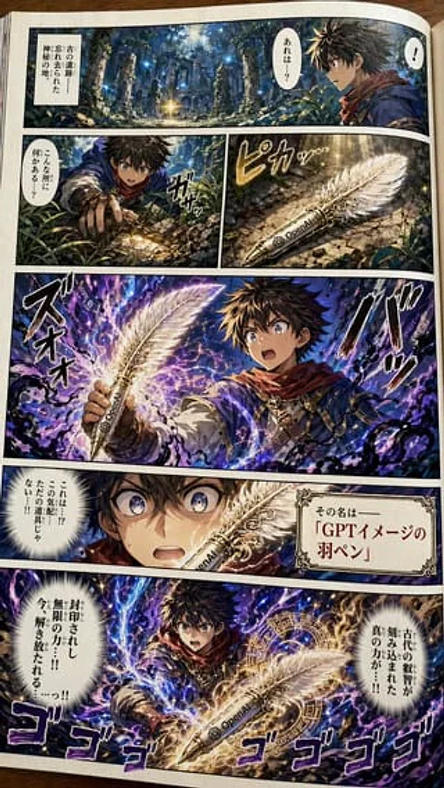
Example generated from “Japanese Shonen Manga Page”
GPT Image 2en
Japanese Shonen Manga Page

Make one{argument name="manga type" default="Colorful Japanese shonen adventure manga"} Sample pages. The pages should vividly depict our protagonist discovering a {argument name="item" default="Magic Quill"} The name of this quill pen is {argument name="item name" default="Quill of GPT Image"} The visuals should be dramatic. This magical quill contains sealed, powerful energy. Additional notes: Aspect ratio: 1440x2560 (portrait). The pen should bear the OpenAI logo. The language in the comic should be Japanese. Please carefully conceive the story to ensure it has excellent paneling. The pages should be presented as photographs of physical comic book pages, not digital pages.

Example generated from “Japanese Supermarket Promotional Flyer”
GPT Image 2en
Japanese Supermarket Promotional Flyer

{ "type": "Japanese supermarket promotional flyers", "header": { "store_name": "{argument name=\"store name\" default=\"ハピネス マーケット\"}", "store_directory": "List of 12 store addresses and phone numbers grouped by region" }, "style": "High-density, brightly colored, eye-catching red and yellow price tags, realistic food photography, and traditional Japanese retail aesthetics.", "layout": { "sections": [ { "title": "Tuesday Special Price", "position": "Top left", "count": 3, "labels": [ "Inari Sushi Combo", "Chikuwa", "tomato" ] }, { "title": "Wednesday Special Price", "position": "Upper-middle", "promotion": "{argument name=\"point multiplier\" default=\"5 times\"}", "count": 6, "labels": [ "soy sauce bottle", "Japanese-style assorted sweet buns", "Udon noodles", "Pork slices", "Tuna sashimi slices", "pudding" ] }, { "title": "Thursday and Friday special offers", "position": "Top right", "count": 5, "labels": [ "coffee bags", "broccoli", "White radish", "Pork slices", "Large pan-fried dumplings" ] }, { "title": "Mid-row discount", "position": "Center horizontally", "count": 7, "labels": [ "Apple 10% off", "lettuce", "yogurt", "Sushi Platter", "Multi-pack yogurt", "Frozen food 10% off", "Rice 10% off" ] }, { "title": "Unified low-price promotion", "position": "Bottom left", "price": "{argument name=\"low uniform price\" default=\"98\"}", "count": 6, "labels": [ "Mixed Fruits", "Yogurt and dairy products", "Natto and tofu", "ice cream", "fried chicken", "salmon slices" ] }, { "title": "Unified high-price promotion", "position": "Middle to lower", "price": "{argument name=\"high uniform price\" default=\"500\"}", "count": 4, "labels": [ "Pork belly slices", "Mandarin oranges and grapes", "Seafood Medley", "Grilled eel" ] }, { "title": "Right sidebar promotions", "position": "Bottom right", "count": 3, "labels": [ "Member Recharge Day", "Points Card Activity", "Fried cooked food" ] } ] }, "footer": { "sale_period": "{argument name=\"sale period\" default=\"4/14 (Fire) ▶ 17 (Metal)\"}", "disclaimers": "Standard small print description and auxiliary logo" } }
Example generated from “Japanese Supermarket Sale Flyer”
GPT Image 2zh
Japanese Supermarket Sale Flyer

『賑やかで魅力的なスーパーマーケットの折り込みチラシの画像。上部には「特売」の大きな文字と今週の日付。カラフルな商品写真(野菜・果物・牛肉・鮮魚)、赤枠の価格タグ、「超目玉商品」「家計応援」のキャッチ...』

Example generated from “Japanese Supermarket Sale Flyer”
GPT Image 2en
Japanese Supermarket Sale Flyer

{ "type": "Japanese supermarket flyers and posters", "style": "Busy, brightly colored, high-impact retail advertising; densely collaged layouts; striking red and yellow promotional graphics; glossy product photography; bold white outlines; star-shaped price tags; Japanese discount store aesthetics.", "format": "Vertical single-page flyer", "language": "Japanese", "headline": { "main": "Special Offer", "top_left_callouts": [ "Financial support!", "Amazing deal!", "Daily specials!" ], "top_right": { "label": "This week's special sale", "date_start": "May 24 (Saturday)", "date_end": "May 30 (Friday)", "sub": "7-Day Super Value Deal!" } }, "layout": { "sections": [ { "title": "Fresh Vegetables and Meat Section", "position": "upper half", "count": 3, "labels": [ "tomato", "cucumber", "Black Wagyu beef slices" ] }, { "title": "Fruit and Seafood Section", "position": "Central", "count": 5, "labels": [ "banana", "Sun Fuji Apple", "tuna", "raw silver salmon", "Home and Daily Necessities Section" ] }, { "title": "Home and Grocery Section", "position": "Mid-lower part", "count": 5, "labels": [ "tissue", "Detergent", "mayonnaise", "toilet paper", "beer" ] }, { "title": "Bottom Information Bar", "position": "bottom", "count": 4, "labels": [ "Store Logo Area", "LINE registration QR code area", "Parking Information Area", "Points Card Information Area" ] } ], "centerpiece": "The main sale title is displayed in a huge central top, against an explosive yellow background." }, "products": [ { "name": "tomato", "origin": "Kumamoto Prefecture", "note": "A perfect match for salad!", "package": "1 bag", "price_main": "198 yen", "price_tax": "213 yen including tax", "image": "A close-up of a basket of red tomatoes" }, { "name": "cucumber", "origin": "Gunma Prefecture", "note": "Tender and juicy!", "package": "1 bag (3 pieces)", "price_main": "138 yen", "price_tax": "149 yen including tax", "image": "Three glossy cucumbers in the basket" }, { "name": "Black Wagyu beef slices", "note": "Super popular item! Limited quantity! Buy now while supplies last!", "package": "(Thawed) Per 100 grams", "price_main": "880 yen", "price_tax": "950 yen including tax", "image": "Wagyu beef slices garnished with parsley on a black tray" }, { "name": "banana", "origin": "Philippine", "package": "1 string", "price_main": "128 yen", "price_tax": "138 yen including tax", "image": "A bunch of yellow bananas" }, { "name": "Sun Fuji Apple", "origin": "Aomori Prefecture", "note": "The fruit is also great value!", "package": "1", "price_main": "158 yen", "price_tax": "171 yen including tax", "image": "Four red apples" }, { "name": "tuna", "origin": "Pacific", "note": "Extremely fresh!", "package": "For sashimi use - thaw per 100 grams", "price_main": "698 yen", "price_tax": "¥753 including tax", "image": "Thick slices of magenta tuna sashimi on a dark plate" }, { "name": "raw silver salmon", "origin": "Chilean", "package": "Cultivation/Thawing per 100 grams", "price_main": "198 yen", "price_tax": "213 yen including tax", "image": "Orange salmon slices with lemon slices" }, { "name": "Koshimitsu Rice", "origin": "Niigata Prefecture", "note": "A must-have for every meal!", "package": "5 kg", "price_main": "2,480 yen", "price_tax": "2,678 yen including tax", "image": "A bag of rice" }, { "name": "rapeseed oil", "brand": "Nissin", "package": "1000 grams", "price_main": "298 yen", "price_tax": "322 yen including tax", "image": "plastic bottled cooking oil" }, { "name": "Cup noodles", "brand": "Nissin", "package": "1", "price_main": "128 yen", "price_tax": "138 yen including tax", "image": "Cup noodle container" }, { "name": "The taste of a high-class Japanese restaurant", "variant": "Reduce salt", "package": "750 grams", "price_main": "198 yen", "price_tax": "213 yen including tax", "image": "rectangular miso box" }, { "name": "tissue", "brand": "Elleair", "package": "5 boxes", "price_main": "298 yen", "price_tax": "327 yen including tax", "image": "Stacked tissue boxes" }, { "name": "Antibacterial EX", "brand": "Attack", "package": "880 grams", "price_main": "298 yen", "price_tax": "327 yen including tax", "image": "Blue laundry detergent refill" }, { "name": "mayonnaise", "brand": "Kewpie", "package": "450 grams", "price_main": "248 yen", "price_tax": "268 yen including tax", "image": "Upright squeeze mayonnaise jar with red grid pattern" }, { "name": "Flower Packaging", "brand": "Scottie", "package": "12 volumes", "price_main": "498 yen", "price_tax": "547 yen including tax", "image": "Multi-roll toilet paper" }, { "name": "Super Dry", "brand": "Asahi", "package": "350 ml x 6 bottles", "price_main": "998 yen", "price_tax": "1,098 yen including tax", "image": "Silver and red six-pack beer cans" } ], "footer": { "left_store_name": "{argument name=\"store name\" default=\"Supermarket OOOO Mart\"}", "promo_text": [ "Get special offers via LINE!", "Click here to add a friend!", "Complete parking lot", "It's safe and convenient to drive here!", "Points card membership is now open for recruitment!", "The displayed price is the price of the product.", "※Prices including tax are for reference only" ], "extra_elements": [ "QR code", "Small blue car illustration", "Membership card illustration" ] }, "people": { "count": 1, "description": "There is a small family illustration in the bottom left promotional panel, with simplified and blurred faces." }, "color_palette": { "dominant": [ "Bright red", "Sunshine Yellow", "White", "green", "blue" ], "accent": "Orange promotional burst graphic" }, "generation_notes": "Create a compact Japanese supermarket sale flyer featuring 16 carefully selected items, all accompanied by photographic silhouettes, eye-catching Japanese text, red star-shaped price tags, and a cluttered yet legible newspaper insert layout. Emphasize the large central sale headline, while also including food and household goods, with particular attention to highlighting discounts on mayonnaise and detergents at the bottom." }

Example generated from “Japanese Supermarket Spring Flyer”
GPT Image 2en
Japanese Supermarket Spring Flyer

{ "type": "Japanese supermarket promotional flyers", "theme": "Spring festival, cherry blossom pattern, vibrant red and yellow tones", "header": { "store_name": "{argument name=\"store name\" default=\"Supermarket\"}", "main_title": "{argument name=\"main headline\" default=\"Weekend Grand Thanksgiving\"}", "date": "{argument name=\"sale date\" default=\"Limited time offer: April 19th (Sunday)\"}", "badges": [ "5x points on points card", "Spring Flavor Slogan" ] }, "layout": { "structure": "A grid containing 12 product panels (3 rows and 4 columns) and a vertical sidebar on the right.", "product_panels": { "count": 12, "items": [ "Spring cabbage, red price tag 158", "Bamboo shoots, red price tag 198", "Strawberry, red price tag 598", "Sakura Mochi, red price tag 398", "Live clams, red price tag 298", "Sea bream sashimi, red price tag 580", "Beef shoulder, red price tag 1280", "Spring roll ingredients, red price tag 780", "New onion, red price tag 128", "Rapeseed flowers, red price tag 198", "Pork belly slices, red price tag 228", "Cherry blossom steamed buns, red price tag 168" ] }, "sidebar": { "position": "right side", "section_count": 4, "sections": [ "Store address, phone number, and business hours", "A list of green bullet points showcases store features.", "Small local map with parking information", "Green employee recruitment banner" ] }, "footer": "A full-width red banner with white promotional text and terms and conditions." } }
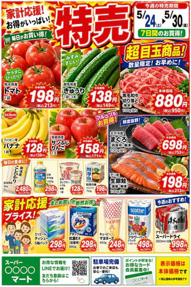
Example generated from “Japanese Swimsuit Magazine Grid”
GPT Image 2zh
Japanese Swimsuit Magazine Grid

{argument name="服装" default="泳装"}时尚杂志广告页面,{argument name="地域" default="日本"}成熟模特, S型曲线。变换姿势和风格,九宫格展示,保持人物面部一致性

Example generated from “Japanese Tabloid Magazine Cover”
GPT Image 2en
Japanese Tabloid Magazine Cover

{ "type": "Japanese tabloid magazine cover", "magazine_header": { "title": "{argument name=\"magazine name\" default=\"Weekly LUMINA\"}", "issue_date": "April 25th issue", "price": "¥450" }, "main_photo": { "subject": "{argument name=\"subject description\" default=\"A young Japanese woman turned around in surprise; she was wearing a white top and a denim jacket.\"}", "setting": "Nighttime streets with bokeh lighting", "style": "Paparazzi flash photography style" }, "layout": { "headlines": [ { "position": "Banner in the upper left corner", "text": "{argument name=\"top banner text\" default=\"Exclusive scoop!!\"}", "color": "White text on a red background" }, { "position": "Left vertical", "text": "{argument name=\"main headline left\" default=\"Sightings reported late at night!\"}", "color": "Yellow text with black outline" }, { "position": "right vertical", "text": "{argument name=\"main headline right\" default=\"Finally revealed!?\"}", "color": "Red text with white outline" }, { "position": "Bottom center stack 1", "text": "Capture the moment of impact!", "color": "Yellow text on a black background" }, { "position": "2 stacked at the bottom center", "text": "Those involved recount the truth", "color": "White text on a red background" }, { "position": "3 stacked at the bottom center", "text": "Unveiling the secrets behind the taboo!", "color": "Yellow text on a black background" }, { "position": "Width of the lower left corner", "text": "Exclusive insider report", "color": "White text on a red background" } ], "inset_photos": { "count": 3, "details": [ { "position": "Top right corner", "description": "The woman lowered her head and covered her head.", "label": "Top-secret photos acquired!!" }, { "position": "bottom left corner", "description": "A woman is talking to a man wearing glasses.", "label": "Intimate relationship exposed!?" }, { "position": "bottom right corner", "description": "A man and a woman photographed from the side.", "label": "I got it after our relationship was exposed!" } ] }, "footer": { "elements": [ "barcode", "188", "963469 195449" ] } } }
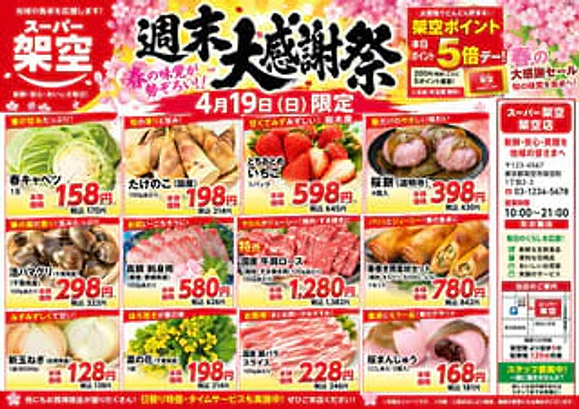
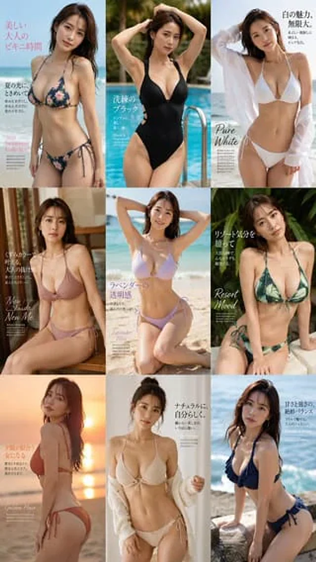
Example generated from “Japanese TCG Strategy Infographic”
GPT Image 2en
Japanese TCG Strategy Infographic

Goal: Create a polished vertical Japanese trading-card-game strategy infographic explaining the pros and cons of adding a specific card to a deck. Canvas: Portrait 2:3 layout, dark navy-black fantasy UI background with thin gold ornamental borders, beveled panels, subtle glow, and a premium card-game analysis aesthetic. Use gold title typography and white Japanese body text. Main title area: At top right, place a large ornate gold headline reading {argument name="headline text" default="道化の一座 ハット"}. Beneath it, add the subtitle {argument name="subtitle text" default="デッキに加えた際のメリット・デメリット"}. Under the subtitle, place a dark framed explanation box containing 3 short Japanese lines describing that the card can search/deploy Pendulum monsters, also enables non-theme monsters, supports interruption-resistant subroutes, and improves combo stability. Card display: At top left, show exactly 1 realistic Yu-Gi-Oh-style monster card mockup, named {argument name="card name" default="道化の一座 ハット"}. The card should have an orange monster-card frame, star icons, a small LIGHT attribute icon, dense Japanese effect text, ATK/DEF line, and fantasy artwork of a jester-like rogue in blue clothing holding a staff amid swirling golden magic. Do not use official logos or exact copyrighted card layout details; make it a close fictional TCG-style homage. Middle comparison section: Add a centered gold label tab reading “Trigger resilience comparison”. Create exactly 2 horizontal comparison rows under it, each split into a left original-deck behavior column, a middle after-adoption result column, and a right small change-image column. Row 1 is draw-type trigger: blue icon, left box has a large blue circle meaning good resilience; arrow points right to a red X meaning resilience becomes worse; right mini diagram shows a blue person icon leading to a card/box and a prohibition symbol, implying the combo stops at the draw stage. Row 2 is interruption-type trigger: red/orange icon, left box has a large red X meaning poor resilience; arrow points right to a blue circle meaning resilience improves; right mini diagram shows a red person icon leading to a card/box and a blue shield check, implying interruption is avoided and deployment continues. Lower benefits and drawbacks: Create exactly 6 rectangular cards in two columns, 3 benefits on the left and 3 drawbacks on the right. Left column header: “メリット” in a blue panel. Right column header: “デメリット” in a red panel. Benefit card 1 uses a shield icon and says it becomes stronger against interruption-type triggers. Benefit card 2 uses a branching route icon and says the number of deployment subroutes increases. Benefit card 3 uses a checkmark icon and says combo stability improves. Drawback card 1 uses stacked card icons and says it becomes weaker against draw-type triggers. Drawback card 2 uses a weight/bag icon and says deck burden becomes larger. Drawback card 3 uses a warning triangle icon and says unnecessary cards may need to be adopted. Each of the 6 cards must include a bold colored heading plus two smaller Japanese explanatory lines. Bottom summary: Add a wide dark framed box with a small gold tab header reading “まとめ”. Inside, write a concise Japanese summary explaining the trade-off: resistance to interruption and flexible deployment improve, but weakness to draw-type triggers and deck-building constraints increase. End with a larger gold call-to-action line reading {argument name="closing line" default="環境や構築方針に応じて、採用を検討しよう!"}. Style constraints: Use crisp vector-like UI panels mixed with realistic card art, high contrast, clean alignment, thin gold borders, blue for positive elements, red for negative elements, arrows between comparison boxes, no watermark, no extra sections, and keep all text legible as an infographic.

Example generated from “Japanese Train Comic Ad”
GPT Image 2ja
Japanese Train Comic Ad

電車の広告にある、コミック広告を作って。キャラの名前は「{argument name="キャラクター名" default="名前"}」。コミックのタイトル名は「{argument name="タイトル" default="お任せ"}」、キャッチフレーズは「お任せ」。(彼/彼女)は「{argument name="物語の概要" default="キャラの性格、世界観、物語の概要を簡潔に説明"}」です。

Example generated from “Japanese Train Schoolgirl Phone Recording”
GPT Image 2en
Japanese Train Schoolgirl Phone Recording

Create a photorealistic vertical smartphone candid photo inside a busy Japanese commuter train, shot from standing passenger height with a wide-angle phone lens. The main subject is {argument name="character description" default="a Japanese high school girl with long straight black hair"} standing in the aisle, wearing a classic navy-and-white sailor school uniform: short-sleeve white cropped sailor blouse with navy collar and double white stripes, navy neckerchief, navy pleated skirt, white crew socks, and brown loafers. Her face is intentionally hidden by a centered soft-edged square pixel blur/mosaic censor block. She raises her left arm to hold one gray triangular overhead train strap and looks downward while holding a dark smartphone in her right hand. On her shoulder is {argument name="bag description" default="a navy rectangular school shoulder bag"} decorated with exactly 5 visible dangling character charms: a pink bunny plush, a small red mushroom-like mascot, a blonde anime girl doll, a black-haired anime boy doll, and a pink-and-blue pastel plush on the far right. Surround her with other commuters in white shirts and school uniforms, some standing and some seated, with their faces blurred; include train windows showing an urban city view outside, metal poles, fluorescent ceiling lights, Japanese ad posters above the windows, and many gray triangular hanging straps receding into the background. Add a realistic phone video recording overlay: white corner frame brackets, a red dot and “REC” at the top center, timer text {argument name="recording time" default="03:12"}, small phone status icons at the top corners, and a small sparkle icon near the bottom right. Lighting should be natural daylight mixed with train interior fluorescent light, highly realistic, slightly compressed social-media photo quality, candid documentary mood, no glamour posing, no watermark.

Example generated from “Japanese Travel App Poster”
GPT Image 2en
Japanese Travel App Poster

Goal: Create a vibrant Japanese travel-app advertising poster for {argument name="brand name" default="NEWT"}, combining editorial travel photography, clean app UI mockups, and bold Japanese typography to promote the feeling that the next trip is already beginning. Canvas: Square 1:1 promotional graphic, bright white and mint-green background, high-key summer lighting, energetic composition, polished commercial ad quality. Layout: A large diagonal Japanese headline dominates the top-left and upper center. The main traveler stands large in the center foreground, smiling and looking up to the right while holding a smartphone showing the green brand screen. A second traveler appears behind her on the left inside an airport scene. Layer multiple travel photo cutouts around the lower half and right side, with floating app interface cards over them. Place a large green rounded brand block on the upper-right. Text content: Use exactly 5 main text groups: 1) huge headline text {argument name="headline text" default="次の旅が、もう始まってる。"} in vivid green, with the first line filled and the second line outlined; 2) small upper-right Japanese copy {argument name="subheadline text" default="航空券も、ホテルも、アプリひとつで軽やかに。"}; 3) English tagline “TRAVEL FEELS NEW.” near the top-right; 4) left-side vertical category list with exactly 5 items: “AIRPORT”, “HOTEL”, “CITY”, “BEACH”, “FOOD”; 5) brand block text with a white animal-like logo, the word “NEWT”, and the small Japanese call-to-action “NEWTで旅をみる” with a circular arrow icon. Subject details: Main subject is a cheerful young East Asian woman traveler, mid-20s, short dark bob hair moving naturally, gold hoop earrings, green ribbed top, loose translucent mint-and-white striped overshirt, cream high-waisted pants, woven straw shoulder bag with a small green charm, pulling a dark green rolling suitcase. She holds a phone with a green screen, white brand logo, and “NEWT” text. Secondary subject is a smiling young East Asian woman in an orange cardigan at an airport, holding a drink, with a departures board behind her. Travel image collage: Include exactly 5 travel photo cutouts: 1) bright airport terminal with departures board behind the secondary woman, 2) luxury hotel room with ocean view, 3) close-up seafood dish with shrimp and greens near the suitcase, 4) turquoise beach and ocean with swimmers on the right, 5) colorful resort city street with palm trees along the bottom-right. App UI cards: Include exactly 2 floating white app interface cards with rounded corners and soft shadows. Card 1 is a booking search card at mid-right with tabs for flight, hotel, and package; large destination text “ソウル”, small text “SEOUL, KOREA”, rows showing round trip, dates “6月20日(金) - 6月23日(月)”, passengers “大人1名、エコノミー”, and a green button labeled “検索する”. Card 2 is a hotel recommendation card lower-right with a pool thumbnail, small heart icon, hotel name “NEWT SEOUL 明洞”, rating “4.8”, and five yellow stars. Visual style: Premium Japanese startup travel campaign, fresh mint green brand color, crisp cutout collage, clean sans-serif typography, dynamic diagonal composition, airy negative space, glossy magazine-ad finish, realistic photography mixed with minimal vector UI. Add a dotted flight path with a location pin near the top-right. Constraints: Use no extra logos or watermarks beyond the specified brand. Keep all Japanese text legible and accurately placed. Maintain the strong green-and-white identity, optimistic summer travel mood, and layered depth.

Example generated from “Japanese TV Idol Show Screenshot”
GPT Image 2en
Japanese TV Idol Show Screenshot

In a brightly lit Japanese television variety show setting, two young female idols stand side-by-side behind a small white podium, framed in a mid-range shot from the waist up. Both wear matching light gray school uniform-style blazers with silver buttons, white shirts, and gray striped silk bow ties. Coordinating name tags are pinned to their left breasts, and delicate lace details are visible at their waists. The woman on the left has dark brown to black side-braided hair cascading over her right shoulder, her hands clasped in front of her chest, and her body slightly leaning to the right. The woman on the right has long, dark, wavy hair cascading over her shoulders, her hands resting lightly on the top of the podium. Their faces are obscured by soft, rectangular blurring. The background is a richly colored and densely packed television studio design: on the left is a tall, shimmering pink panel covered with repeating white icons, including hearts, triangles, snowflake-shaped flowers, and tree silhouettes, edged with opulent gold trim; in the center is a vibrant red-orange vertical panel with partial white lettering behind the presenter; on the right is a yellow wall decorated with metallic geometric patterns, and a large, arched brown mosaic archway inlaid with small reflective squares. There are three visible screen text areas: the upper left corner displays the Japanese program logo, shown as {argument name="show logo text" default="Let's meet at Hinatazaka"} It features a playful blue and white badge design; the upper right corner displays a Japanese title banner, shown in two lines.{argument name="headline text" default="Conquer the Praise-Seeking Squad! 'Praise-Praise Strikeout'"} The text is in bold white with a blue outline; the bottom left corner features a black sign with a red border, containing Japanese text and a large fraction.{argument name="score value" default="9 pt"} The nameplate on the left displays the name of one member in Japanese.{argument name="left name tag" default="Takase Mana"} The nameplate on the right displays the name of one member in Japanese.{argument name="right name tag" default="Nao Kosaka"} It is rendered as a clear broadcast screenshot, showcasing vivid studio lighting, saturated colors, realistic fabric textures, authentic Japanese television graphics, and exquisite entertainment program quality.

Example generated from “Japanese Ultra Plan Promo Storyboard”
GPT Image 2en
Japanese Ultra Plan Promo Storyboard

{ "type": "Japanese promotion storyboard", "brand": "Topview", "product": { "name": "Ultra Plan", "badge": "Newly released", "theme": "A premium AI creative suite with a landing page style for image and video generation." }, "language": "Japanese", "canvas": { "aspect_ratio": "16:9", "background": "The overall page is light gray, containing four white demo projects with rounded corners, arranged in a 2x2 grid." }, "layout": { "sections": [ { "title": "Panel 1", "position": "Top left", "count": 1, "composition": "The main visual card features rounded corners, a soft pink-white gradient background with subtle petal shimmer, a large anime girl illustration on the right, a title and function list on the left, and a film/video preview overlay near the bottom right corner." }, { "title": "Panel 2", "position": "Top right", "count": 1, "composition": "Compact feature overview card, with a centered title at the top and three equally wide feature cards side-by-side below." }, { "title": "Panel 3", "position": "Bottom left", "count": 1, "composition": "Wide banner card options, title in the top left corner, background with a faded anime girl illustration, and three function cards aligned at the bottom." }, { "title": "Panel 4", "position": "Bottom right", "count": 1, "composition": "The structured product summary card features a top heading, four function cards arranged side-by-side in the middle, and a bottom section with a three-column purple gradient revenue column." } ] }, "subject": { "character": { "type": "Ethereal anime girl", "role": "Creative generation of product visual themes", "hair": "Extremely long, flowing light golden wavy hair", "outfit": "A gorgeous pastel fantasy dress featuring lace, floral details, semi-sheer layers, and jewel-like accessories.", "palette": "Blush pink, cream, lavender purple, soft gold", "face": "All four panels are covered by rectangular beige privacy blotting blocks." }, "decor_elements": { "count": 5, "items": [ "Floating cherry blossom petals", "flash", "Hand-drawn storyboard sketches", "Film frame with video thumbnails", "Soft watercolor glow" ] } }, "text": { "logo_text": "Topview", "main_headlines": { "count": 4, "items": [ "{argument name=\"headline text\" default=\"Ultra Plan\"}", "New Ultra Plan", "Get closer to finding the perfect tool in the shortest time possible.", "Create more freely with Ultra Plan." ] }, "feature_names": { "count": 3, "items": [ "GPT-Image 2 (beta)", "Seedance 2.0", "Storyboard → Video" ] }, "feature_descriptions": { "count": 7, "items": [ "High-quality images, generating more freely", "720p / $0.1/second, low cost and high efficiency", "From storyboards to smooth video production", "High-quality images, generating more freely", "Low-cost, high-efficiency video generation", "From storyboards to smooth video production", "To create the ideal work in the shortest possible time." ] }, "bottom_benefits": { "count": 3, "items": [ "Low cost, high quality 720p / $0.1/second", "Production speed increased, forming in the shortest time", "Precise quality control to achieve the vision in your mind" ] } }, "cards": { "feature_card_count": 10, "types": [ { "name": "GPT-Image 2 (beta)", "count": 4, "visual": "Cards adorned with pink accents showcase 2x2 or collage-style anime art thumbnails." }, { "name": "Seedance 2.0", "count": 3, "visual": "Purple accent card featuring a large, touching comic book cover and a pink round play button" }, { "name": "Storyboard → Video", "count": 3, "visual": "White cards show the transition from storyboard sketches to film previews." } ] }, "style": { "design": "High-end Japanese-style SaaS advertising sample/storyboard demonstration project", "typography": "Ultra Plan uses an elegant serif font and a clean sans-serif font for auxiliary text.", "ui": "Rounded corner cards, thin light gray borders, soft shadows, and neat spacing", "colors": "White, blush pink, lavender purple, purple gradient, and gold badge accents.", "rendering": "Exquisite marketing visuals, accurate Japanese text layout, clear application card design, delicate anime illustrations, and high-end modern presentation effects." } }

Example generated from “Japanese Vacuum Design Sketch Board”
GPT Image 2en
Japanese Vacuum Design Sketch Board

{ "type": "Industrial Design Showcase Project", "style": "Handmade product concept sketches, rendered with markers and colored pencils on white paper, showcasing a clean, Japanese-style product design aesthetic, with light gray lines paired with soft purple and warm beige shadows.", "subject": { "product": "Minimalist Cordless Handheld Vacuum Cleaner", "headline": "{argument name=\"headline text\" default=\"Lightweight and agile, yet powerfully vacuums.\"}", "subheadline": "Minimalist and easy-to-use cordless handheld vacuum cleaner", "features": [ "Lightweight body, flexible operation", "Strong suction power", "Easy-to-clean dust cup", "Design integrated into home space" ], "color": "{argument name=\"product color\" default=\"Pearl White and Smoked Transparent Gray\"}", "materials": "Matte plastic body, translucent dust cup, metal aluminum tube" }, "layout": { "orientation": "Landscape display page", "sections": [ { "title": "Main product view", "position": "Center and top right corner", "count": 3, "labels": [ "Three-quarters view of the entire vacuum cleaner", "Center perspective view above the main unit", "Top right side perspective view of the main unit" ] }, { "title": "Functional label", "position": "Around the main view", "count": 7, "labels": [ "Easy-grip handle shape, minimalist operating area", "One-click dust cup removal, washable.", "Lightweight aluminum tubing, high rigidity, and easy to handle.", "High-performance filter effectively captures fine dust.", "Simple button layout, power/mode switch, battery level display", "The self-propelled nozzle is flexible and can clean every nook and cranny.", "Multiple accessories to meet different usage needs" ] }, { "title": "Use case sketch", "position": "Left and right illustrations", "count": 5, "labels": [ "The vacuum cleaner stands in the corner of the living room, next to a potted plant and a sofa.", "Close-up of the handheld handle", "Crack cleaner head for cleaning sofa crevices", "Vacuum cleaner body can be stored along a wall or in a narrow space.", "Crack cleaner head for cleaning cabinet bottoms or edges" ] }, { "title": "Accessories and fittings", "position": "Lower middle to right", "count": 2, "labels": [ "Crack suction head", "Brush head" ] }, { "title": "Exploded view of components", "position": "Middle right", "count": 1, "labels": [ "Vertical disassembly diagram of filter and dust cup" ] }, { "title": "Color variations", "position": "bottom left corner", "count": 3, "labels": [ "Light silver", "warm gray", "Matte Black" ] } ], "text_language": "Japanese", "composition": "The center of the page features a large, full-length diagonal vacuum cleaner, accompanied by perspective renderings and small illustrations of usage scenarios. Ample white space and handwritten annotations with guide lines complete the design." }, "rendering": { "line_quality": "Relaxed yet precise industrial sketch lines", "shading": "Soft marker gradients and pencil cross lines", "paper": "Slightly textured white sketch paper", "mood": "High-end, approachable, combining student-concept projects with professional product proposal style" } }