原始文档
GPT Image 2 · en
Scene:
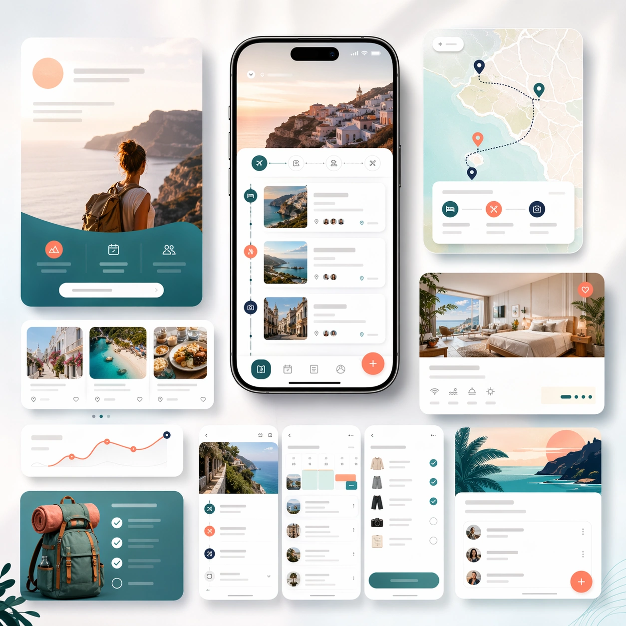
A square launch campaign board for a travel-planning app, balancing premium editorial atmosphere with clear commerce structure. Use a bright but refined palette of cloud white, ocean teal, sunset coral, and soft navy. Present one elegant hero phone, a few itinerary screen crops, map-like cards, and layered landing-page modules arranged on a softly lit backdrop with subtle motion in the composition.

Subject:
Design a believable app marketing page kit for trip planning, itinerary building, and travel organization. The device interface should show route cards, lodging summaries, day-by-day schedule blocks, map-inspired markers, and packing or booking checklist elements. Around it, build supporting marketing modules that imply discovery, trip coordination, and store-promo extensions. The result should feel aspirational without becoming generic vacation advertising. It must still read first as a polished app launch system, with realistic screen design and deliberate conversion hierarchy. Any copy areas should remain abstract and unreadable.

Important details:
Keep the visual mood airy and inviting while preserving structured layout discipline. Device realism, spacing, and module hierarchy should remain credible. Avoid postcard clichés and keep the marketing story centered on how the app organizes travel planning. The board should feel suitable for a formal landing page, an app-store screenshot campaign, and a paid acquisition creative family.

Use case:
App Launch Marketing Page Kit single study 4/5, testing an aspirational travel-planning launch direction.

Constraints:
No readable text, no watermark, no logos, preserve exact 1:1 aspect ratio, no airplane-stock-photo montage, no brand badges, no cluttered maps, no fake passport props, no distorted phones, no noisy tropical clichés.
使用方法
- 复制完整原始提示词,并保留其中的参数。
- 按需求替换主体、文字和构图要求。
- 在兼容的外部工具中使用,核对当前使用条件并检查结果。
开始前需了解
- 先确认是否需要参考图。标注兼容模型,不代表该示例由这个模型生成。
- 核对名称、数字与画面文字;不同模型版本的结果可能不同。