PROMPTS · CREATIVE EXPLORATION

Prompt Gallery

Explore real prompts and their generated examples. Find inspiration for your next creative mission and copy the complete prompt for free.

Examples
10,974
Models
17
Sources
1277
10,974 prompt examples · page 2 of 229
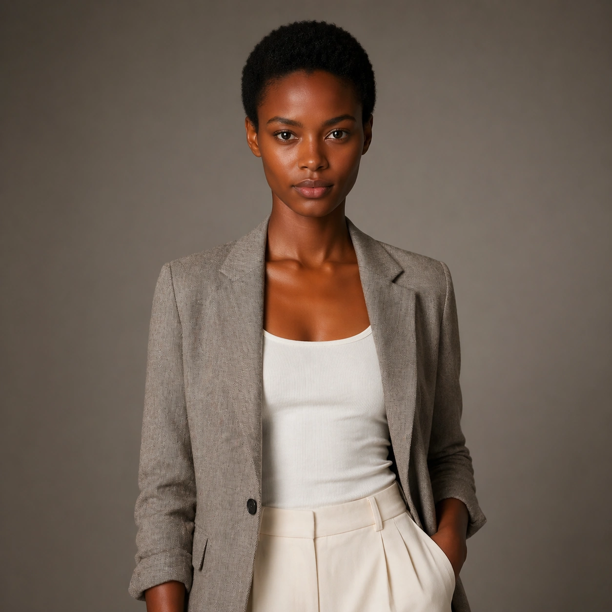
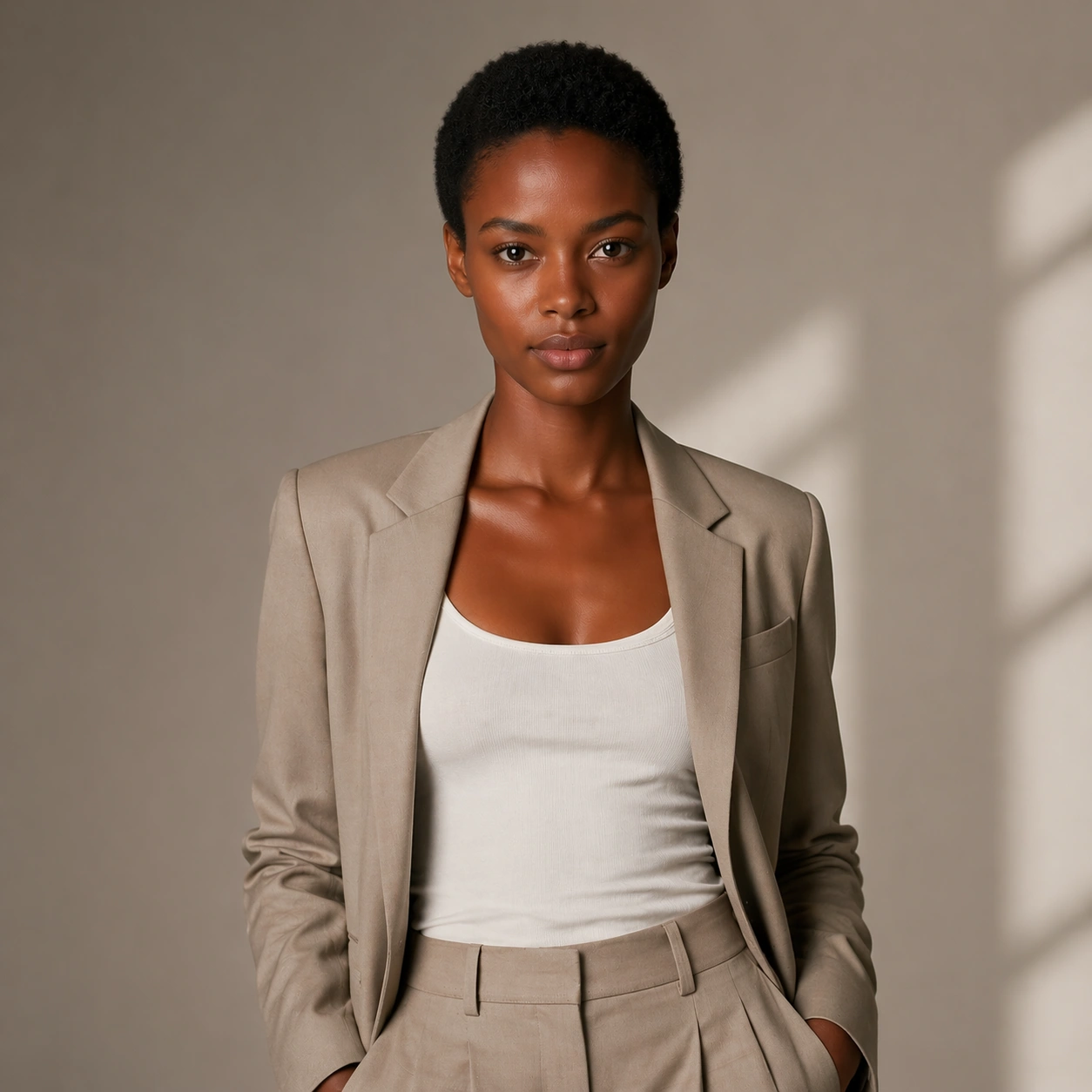
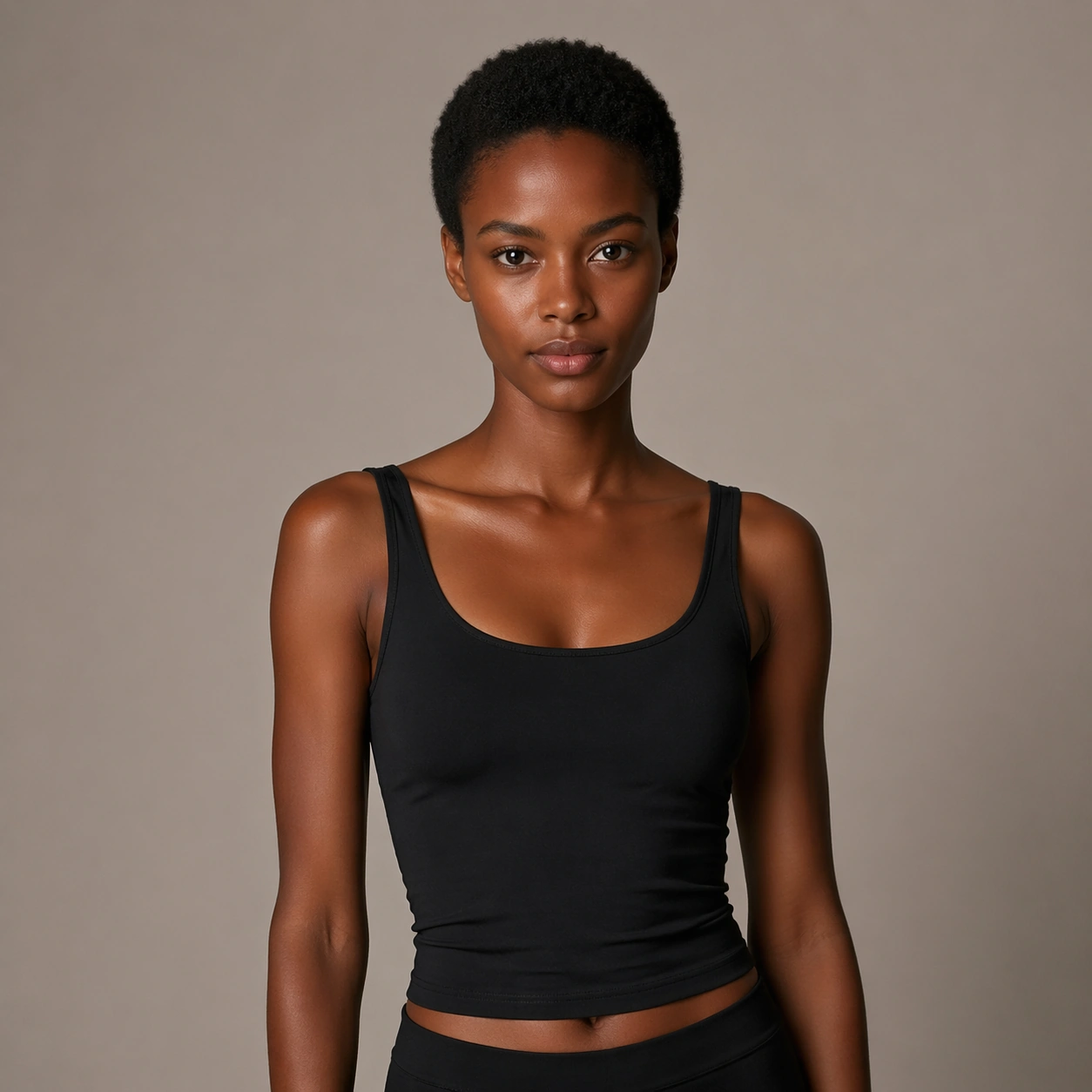
Example generated from “Same Model Wardrobe Tryon Campaign — Reference Natural Base”
GPT Image 2en

Scene: Create a square 1:1 portrait image for Same-Model Wardrobe Try-On Campaign. Use a clean approval-style studio portrait with neutral light, simple wardrobe, and enough facial visibility to lock identity perfectly. The frame should feel like a finished professional deliverable rather than a casual snapshot, with clear lens discipline, believable light falloff, and a palette that directly supports Keep the same model stable while swapping through campaign-ready wardrobe directions that feel like a real fashion fitting or virtual try-on studio.. Keep enough surrounding space and compositional control for gallery, research, campaign, or approval-board reuse while staying photoreal and human-scaled. Subject: Center one campaign model with deep brown skin, short natural hair, balanced tall proportions, and a calm direct gaze. Establish the exact same face, hair base, skin tone family, and body proportions that every transformation image must preserve. Use the example direction from the brief as grounding context: Keep the same model stable while swapping through campaign-ready wardrobe directions that feel like a real fashion fitting or virtual try-on studio.. Wardrobe, lighting, environment, and pose may shift to serve this variation, but the viewer must immediately understand that the same reference identity is still in front of the camera. Important details: This backlog line is difficult because Keep the same model stable while swapping through campaign-ready wardrobe directions that feel like a real fashion fitting or virtual try-on studio.. Preserve skin tone family, bone structure, eye spacing, nose shape, mouth shape, hairline logic, shoulder width, and overall body read across the entire series. preserve exact face / hair base / body proportions from the reference model. This baseline must read like the trustworthy approval frame before switching anything. Avoid the common failure described in the brief: ordinary image models often lose likeness once styling, lighting, or layout changes enter the frame. Success should feel like the result should feel professionally usable, coherent, and clearly built around one stable human identity. Use case: Same-Model Wardrobe Try-On Campaign series study 1/9, the natural baseline look. Constraints: No readable text, no watermark, no logos, preserve exact 1:1 aspect ratio, preserve exact face / hair base / body proportions from the reference model, no heavy styling, no logo wardrobe, no beauty filter, no extra subjects.
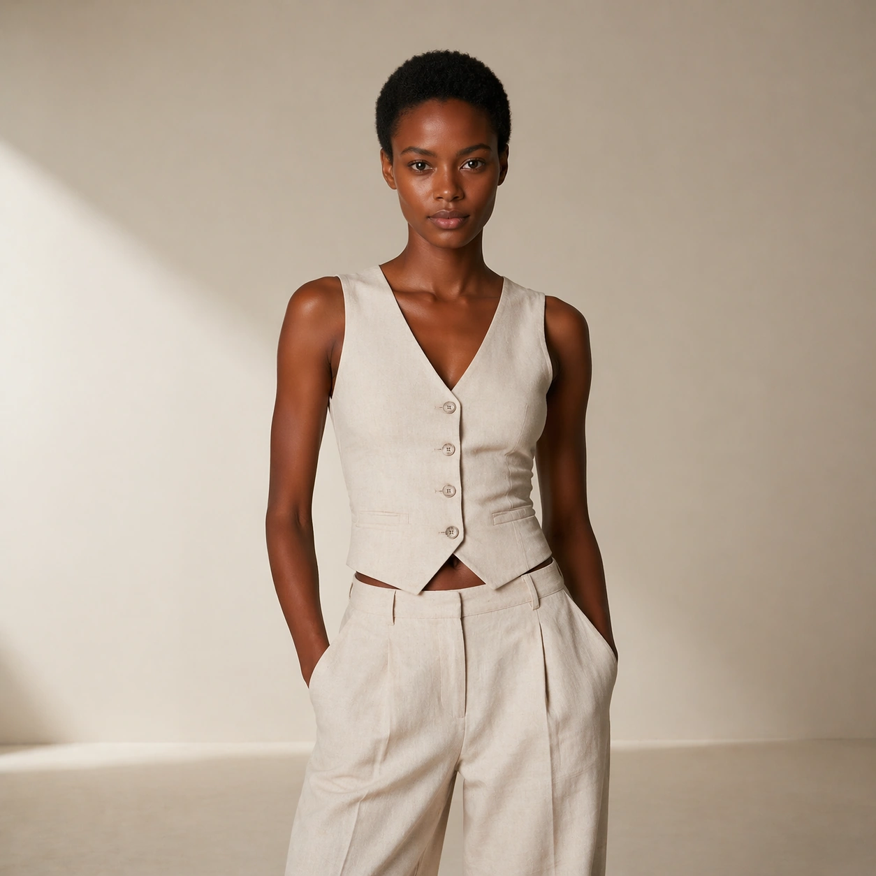
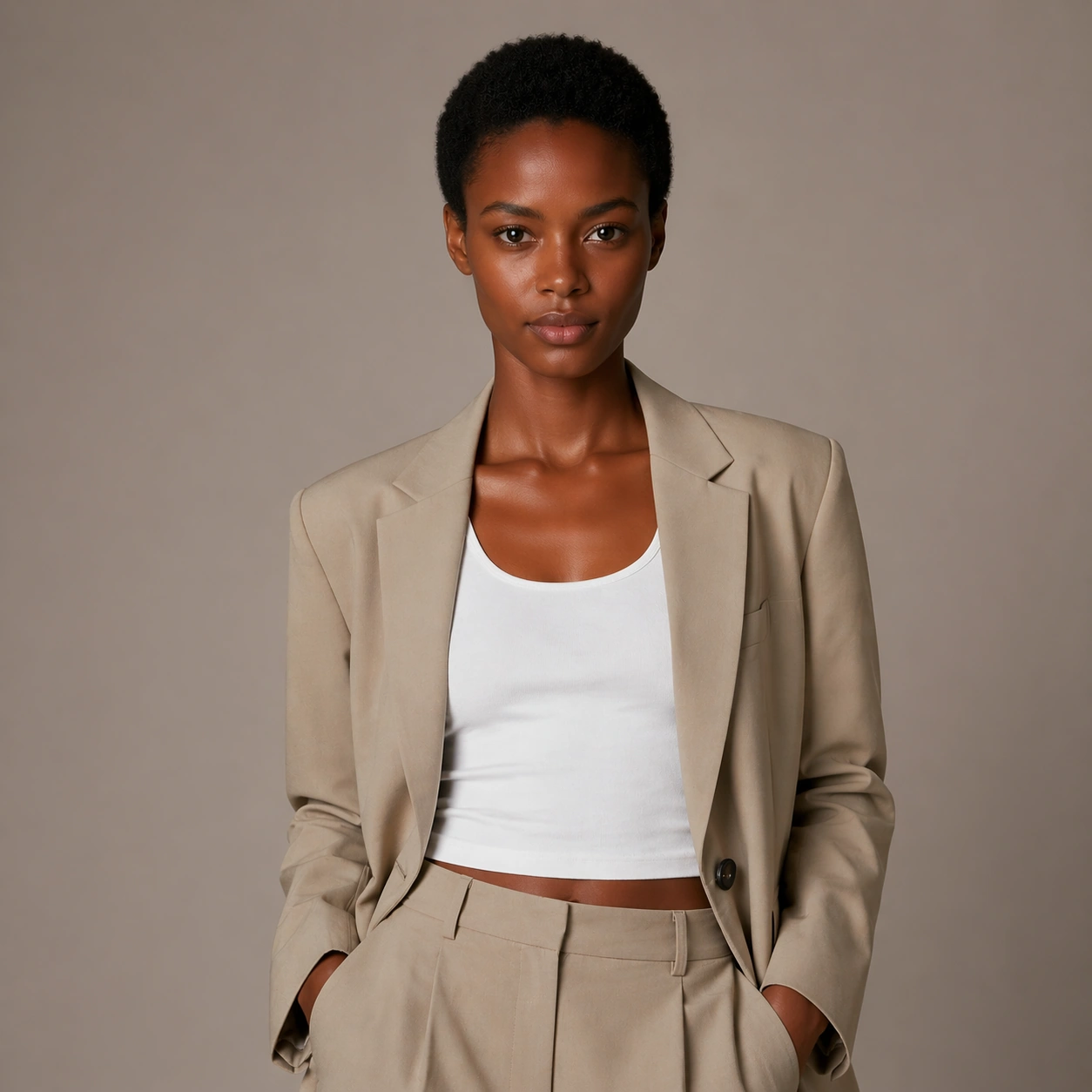
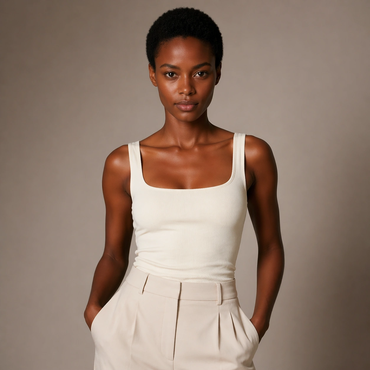
Example generated from “Same Model Wardrobe Tryon Campaign — Look Switch One”
GPT Image 2en

Scene: Create a square 1:1 portrait image for Same-Model Wardrobe Try-On Campaign. Use a premium portrait frame with one clear change direction and enough negative space to judge styling cleanly. The frame should feel like a finished professional deliverable rather than a casual snapshot, with clear lens discipline, believable light falloff, and a palette that directly supports Keep the same model stable while swapping through campaign-ready wardrobe directions that feel like a real fashion fitting or virtual try-on studio.. Keep enough surrounding space and compositional control for gallery, research, campaign, or approval-board reuse while staying photoreal and human-scaled. Subject: Center one campaign model with deep brown skin, short natural hair, balanced tall proportions, and a calm direct gaze. Keep the exact same person from the reference while executing the first major change requested by the topic, whether hair, makeup, wardrobe, grooming, or professional read. Use the example direction from the brief as grounding context: Keep the same model stable while swapping through campaign-ready wardrobe directions that feel like a real fashion fitting or virtual try-on studio.. Wardrobe, lighting, environment, and pose may shift to serve this variation, but the viewer must immediately understand that the same reference identity is still in front of the camera. Important details: This backlog line is difficult because Keep the same model stable while swapping through campaign-ready wardrobe directions that feel like a real fashion fitting or virtual try-on studio.. Preserve skin tone family, bone structure, eye spacing, nose shape, mouth shape, hairline logic, shoulder width, and overall body read across the entire series. preserve exact face / hair base / body proportions from the reference model. The switch must be obvious, but the identity must remain stronger than the styling change. Avoid the common failure described in the brief: ordinary image models often lose likeness once styling, lighting, or layout changes enter the frame. Success should feel like the result should feel professionally usable, coherent, and clearly built around one stable human identity. Use case: Same-Model Wardrobe Try-On Campaign series study 2/9, the first controlled transformation. Constraints: No readable text, no watermark, no logos, preserve exact 1:1 aspect ratio, preserve exact face / hair base / body proportions from the reference model, no face redraw, no changed age unless explicitly asked, no costume-party exaggeration, no new body shape.

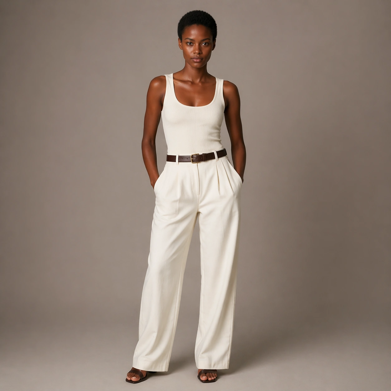
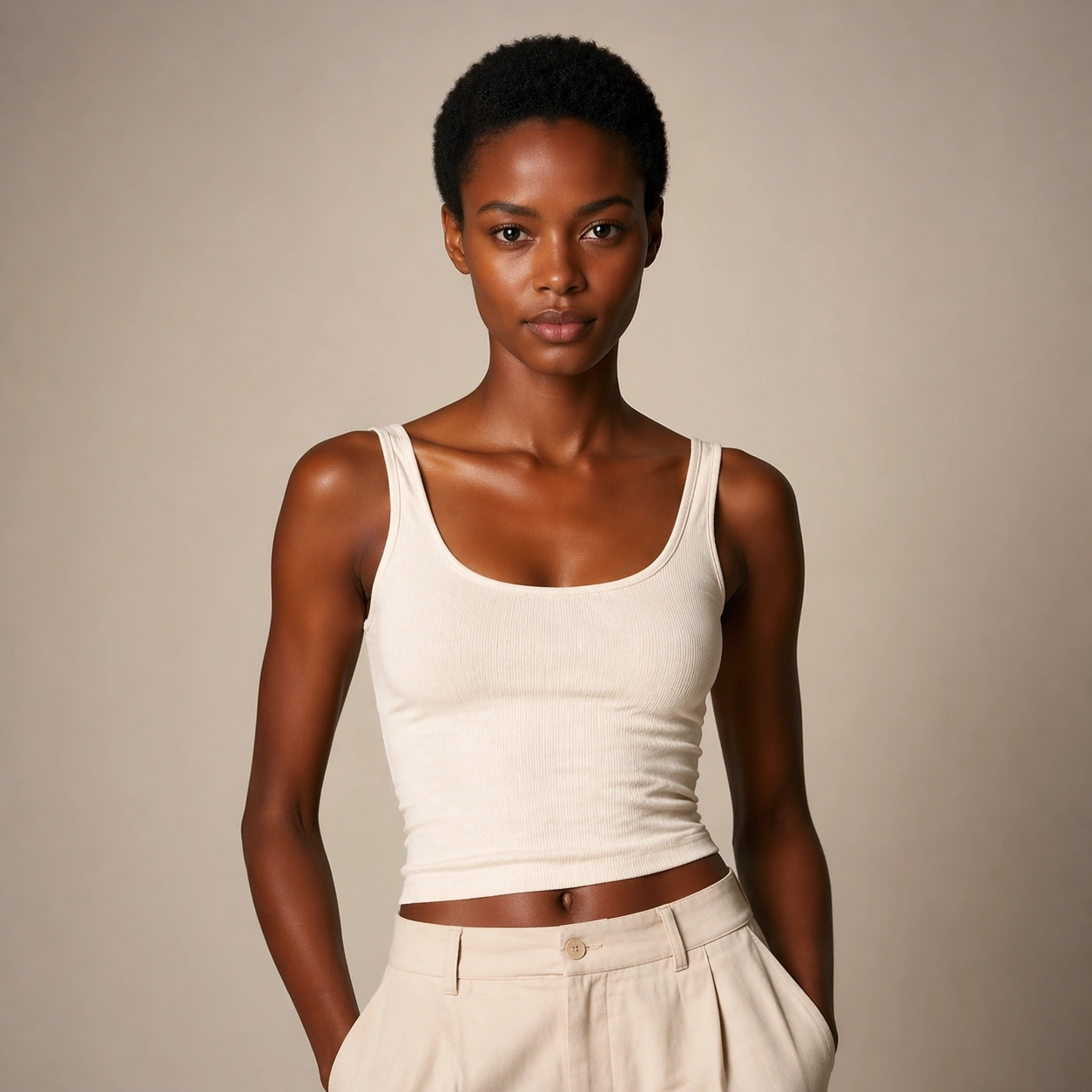
Example generated from “Same Model Wardrobe Tryon Campaign — Look Switch Two”
GPT Image 2en

Scene: Create a square 1:1 portrait image for Same-Model Wardrobe Try-On Campaign. Use a square commercial portrait proof with similar camera logic and controlled light. The frame should feel like a finished professional deliverable rather than a casual snapshot, with clear lens discipline, believable light falloff, and a palette that directly supports Keep the same model stable while swapping through campaign-ready wardrobe directions that feel like a real fashion fitting or virtual try-on studio.. Keep enough surrounding space and compositional control for gallery, research, campaign, or approval-board reuse while staying photoreal and human-scaled. Subject: Center one campaign model with deep brown skin, short natural hair, balanced tall proportions, and a calm direct gaze. Preserve the same face and body while moving to a second transformation state that still feels plausible for the same person. Use the example direction from the brief as grounding context: Keep the same model stable while swapping through campaign-ready wardrobe directions that feel like a real fashion fitting or virtual try-on studio.. Wardrobe, lighting, environment, and pose may shift to serve this variation, but the viewer must immediately understand that the same reference identity is still in front of the camera. Important details: This backlog line is difficult because Keep the same model stable while swapping through campaign-ready wardrobe directions that feel like a real fashion fitting or virtual try-on studio.. Preserve skin tone family, bone structure, eye spacing, nose shape, mouth shape, hairline logic, shoulder width, and overall body read across the entire series. preserve exact face / hair base / body proportions from the reference model. Hairline logic, eye spacing, lip shape, and shoulder width must remain exact. Avoid the common failure described in the brief: ordinary image models often lose likeness once styling, lighting, or layout changes enter the frame. Success should feel like the result should feel professionally usable, coherent, and clearly built around one stable human identity. Use case: Same-Model Wardrobe Try-On Campaign series study 3/9, the second controlled transformation. Constraints: No readable text, no watermark, no logos, preserve exact 1:1 aspect ratio, preserve exact face / hair base / body proportions from the reference model, no hairstyle that changes skull shape, no enlarged eyes, no body morphing, no logo props.

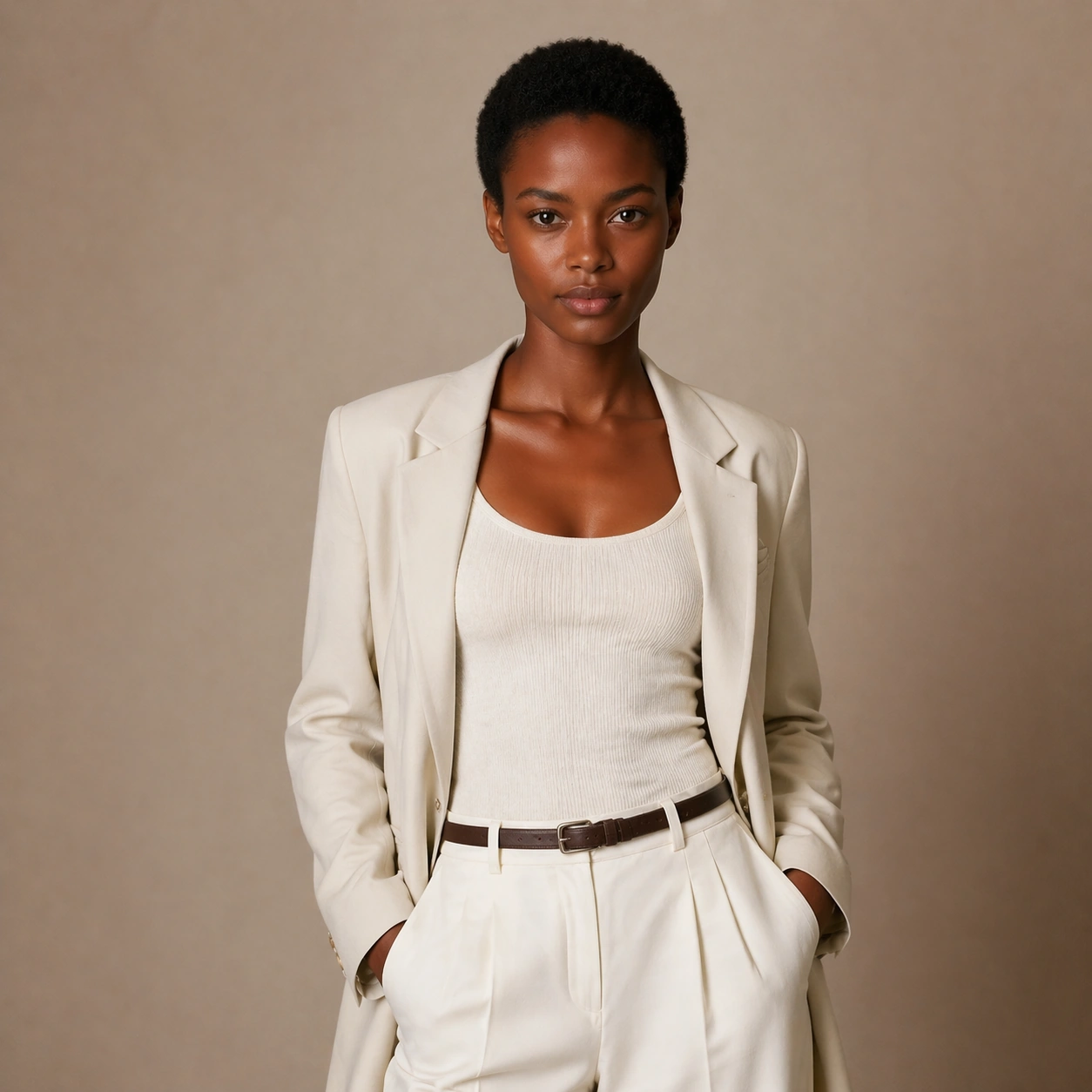
Example generated from “Same Model Wardrobe Tryon Campaign — Look Switch Three”
GPT Image 2en

Scene: Create a square 1:1 portrait image for Same-Model Wardrobe Try-On Campaign. Use a slightly bolder campaign-like frame with disciplined crop and clean light falloff. The frame should feel like a finished professional deliverable rather than a casual snapshot, with clear lens discipline, believable light falloff, and a palette that directly supports Keep the same model stable while swapping through campaign-ready wardrobe directions that feel like a real fashion fitting or virtual try-on studio.. Keep enough surrounding space and compositional control for gallery, research, campaign, or approval-board reuse while staying photoreal and human-scaled. Subject: Center one campaign model with deep brown skin, short natural hair, balanced tall proportions, and a calm direct gaze. Apply a third styling direction while holding the same reference identity with no drift in age, ethnicity, or face structure. Use the example direction from the brief as grounding context: Keep the same model stable while swapping through campaign-ready wardrobe directions that feel like a real fashion fitting or virtual try-on studio.. Wardrobe, lighting, environment, and pose may shift to serve this variation, but the viewer must immediately understand that the same reference identity is still in front of the camera. Important details: This backlog line is difficult because Keep the same model stable while swapping through campaign-ready wardrobe directions that feel like a real fashion fitting or virtual try-on studio.. Preserve skin tone family, bone structure, eye spacing, nose shape, mouth shape, hairline logic, shoulder width, and overall body read across the entire series. preserve exact face / hair base / body proportions from the reference model. The image should prove range under control rather than spectacle for spectacle alone. Avoid the common failure described in the brief: ordinary image models often lose likeness once styling, lighting, or layout changes enter the frame. Success should feel like the result should feel professionally usable, coherent, and clearly built around one stable human identity. Use case: Same-Model Wardrobe Try-On Campaign series study 4/9, the third controlled transformation. Constraints: No readable text, no watermark, no logos, preserve exact 1:1 aspect ratio, preserve exact face / hair base / body proportions from the reference model, no gimmick costume, no false lashes that change eye shape, no surreal hair physics, no second person.

Example generated from “Same Model Wardrobe Tryon Campaign — Look Switch Four”
GPT Image 2en

Scene: Create a square 1:1 portrait image for Same-Model Wardrobe Try-On Campaign. Use a close or mid-shot portrait that privileges detail and approval clarity over background storytelling. The frame should feel like a finished professional deliverable rather than a casual snapshot, with clear lens discipline, believable light falloff, and a palette that directly supports Keep the same model stable while swapping through campaign-ready wardrobe directions that feel like a real fashion fitting or virtual try-on studio.. Keep enough surrounding space and compositional control for gallery, research, campaign, or approval-board reuse while staying photoreal and human-scaled. Subject: Center one campaign model with deep brown skin, short natural hair, balanced tall proportions, and a calm direct gaze. Keep the same exact subject while introducing another visible shift in style language, finish, or mood tied directly to the topic brief. Use the example direction from the brief as grounding context: Keep the same model stable while swapping through campaign-ready wardrobe directions that feel like a real fashion fitting or virtual try-on studio.. Wardrobe, lighting, environment, and pose may shift to serve this variation, but the viewer must immediately understand that the same reference identity is still in front of the camera. Important details: This backlog line is difficult because Keep the same model stable while swapping through campaign-ready wardrobe directions that feel like a real fashion fitting or virtual try-on studio.. Preserve skin tone family, bone structure, eye spacing, nose shape, mouth shape, hairline logic, shoulder width, and overall body read across the entire series. preserve exact face / hair base / body proportions from the reference model. Micro-details may change, but likeness, skin tone family, and body read cannot. Avoid the common failure described in the brief: ordinary image models often lose likeness once styling, lighting, or layout changes enter the frame. Success should feel like the result should feel professionally usable, coherent, and clearly built around one stable human identity. Use case: Same-Model Wardrobe Try-On Campaign series study 5/9, the fourth controlled transformation. Constraints: No readable text, no watermark, no logos, preserve exact 1:1 aspect ratio, preserve exact face / hair base / body proportions from the reference model, no retouch blur, no facial asymmetry drift, no extra accessories noise, no unreadable product text.

Example generated from “Same Model Wardrobe Tryon Campaign — Look Switch Five”
GPT Image 2en

Scene: Create a square 1:1 portrait image for Same-Model Wardrobe Try-On Campaign. Use a square portrait with polished commercial finish and enough room to see styling structure clearly. The frame should feel like a finished professional deliverable rather than a casual snapshot, with clear lens discipline, believable light falloff, and a palette that directly supports Keep the same model stable while swapping through campaign-ready wardrobe directions that feel like a real fashion fitting or virtual try-on studio.. Keep enough surrounding space and compositional control for gallery, research, campaign, or approval-board reuse while staying photoreal and human-scaled. Subject: Center one campaign model with deep brown skin, short natural hair, balanced tall proportions, and a calm direct gaze. Push to a fifth variation while preserving exact face / hair base / body proportions from the reference model. This should still feel like one person being art-directed, not re-generated from scratch. Use the example direction from the brief as grounding context: Keep the same model stable while swapping through campaign-ready wardrobe directions that feel like a real fashion fitting or virtual try-on studio.. Wardrobe, lighting, environment, and pose may shift to serve this variation, but the viewer must immediately understand that the same reference identity is still in front of the camera. Important details: This backlog line is difficult because Keep the same model stable while swapping through campaign-ready wardrobe directions that feel like a real fashion fitting or virtual try-on studio.. Preserve skin tone family, bone structure, eye spacing, nose shape, mouth shape, hairline logic, shoulder width, and overall body read across the entire series. preserve exact face / hair base / body proportions from the reference model. Keep continuity stronger than novelty. Avoid the common failure described in the brief: ordinary image models often lose likeness once styling, lighting, or layout changes enter the frame. Success should feel like the result should feel professionally usable, coherent, and clearly built around one stable human identity. Use case: Same-Model Wardrobe Try-On Campaign series study 6/9, the fifth controlled transformation. Constraints: No readable text, no watermark, no logos, preserve exact 1:1 aspect ratio, preserve exact face / hair base / body proportions from the reference model, no gender drift unless explicitly relevant, no unrelated props, no costume confusion, no body-scale jump.

Example generated from “Same Model Wardrobe Tryon Campaign — Look Switch Six”
GPT Image 2en

Scene: Create a square 1:1 portrait image for Same-Model Wardrobe Try-On Campaign. Use a final single-look variation with confident but restrained campaign polish. The frame should feel like a finished professional deliverable rather than a casual snapshot, with clear lens discipline, believable light falloff, and a palette that directly supports Keep the same model stable while swapping through campaign-ready wardrobe directions that feel like a real fashion fitting or virtual try-on studio.. Keep enough surrounding space and compositional control for gallery, research, campaign, or approval-board reuse while staying photoreal and human-scaled. Subject: Center one campaign model with deep brown skin, short natural hair, balanced tall proportions, and a calm direct gaze. Use the same person again in a sixth styling state, making sure recognition is instant before the viewer notices what changed. Use the example direction from the brief as grounding context: Keep the same model stable while swapping through campaign-ready wardrobe directions that feel like a real fashion fitting or virtual try-on studio.. Wardrobe, lighting, environment, and pose may shift to serve this variation, but the viewer must immediately understand that the same reference identity is still in front of the camera. Important details: This backlog line is difficult because Keep the same model stable while swapping through campaign-ready wardrobe directions that feel like a real fashion fitting or virtual try-on studio.. Preserve skin tone family, bone structure, eye spacing, nose shape, mouth shape, hairline logic, shoulder width, and overall body read across the entire series. preserve exact face / hair base / body proportions from the reference model. The transformation should feel deliberate, premium, and usable in a real salon, beauty, fashion, or casting workflow. Avoid the common failure described in the brief: ordinary image models often lose likeness once styling, lighting, or layout changes enter the frame. Success should feel like the result should feel professionally usable, coherent, and clearly built around one stable human identity. Use case: Same-Model Wardrobe Try-On Campaign series study 7/9, the sixth controlled transformation. Constraints: No readable text, no watermark, no logos, preserve exact 1:1 aspect ratio, preserve exact face / hair base / body proportions from the reference model, no hidden face, no perspective warp, no dramatic environment change, no AI-gloss artifacts.
Example generated from “Same Model Wardrobe Tryon Campaign — Detail Proof Board”
GPT Image 2en

Scene: Create a square 1:1 portrait image for Same-Model Wardrobe Try-On Campaign. Use a square composition that can include multiple tight crops or one richer close-up, but still reads as one coherent portrait asset. The frame should feel like a finished professional deliverable rather than a casual snapshot, with clear lens discipline, believable light falloff, and a palette that directly supports Keep the same model stable while swapping through campaign-ready wardrobe directions that feel like a real fashion fitting or virtual try-on studio.. Keep enough surrounding space and compositional control for gallery, research, campaign, or approval-board reuse while staying photoreal and human-scaled. Subject: Center one campaign model with deep brown skin, short natural hair, balanced tall proportions, and a calm direct gaze. Stay locked to the same identity while emphasizing the evidence of the switch: hair texture, makeup finish, beard line, garment detail, or aging cues depending on the topic. Use the example direction from the brief as grounding context: Keep the same model stable while swapping through campaign-ready wardrobe directions that feel like a real fashion fitting or virtual try-on studio.. Wardrobe, lighting, environment, and pose may shift to serve this variation, but the viewer must immediately understand that the same reference identity is still in front of the camera. Important details: This backlog line is difficult because Keep the same model stable while swapping through campaign-ready wardrobe directions that feel like a real fashion fitting or virtual try-on studio.. Preserve skin tone family, bone structure, eye spacing, nose shape, mouth shape, hairline logic, shoulder width, and overall body read across the entire series. preserve exact face / hair base / body proportions from the reference model. This frame should support professional review and decision making without readable text. Avoid the common failure described in the brief: ordinary image models often lose likeness once styling, lighting, or layout changes enter the frame. Success should feel like the result should feel professionally usable, coherent, and clearly built around one stable human identity. Use case: Same-Model Wardrobe Try-On Campaign series study 8/9, a detail-proof or comparison board. Constraints: No readable text, no watermark, no logos, preserve exact 1:1 aspect ratio, preserve exact face / hair base / body proportions from the reference model, no readable labels, no broken panel alignment, no detached close-up fragments, no face drift.

Example generated from “Same Model Wardrobe Tryon Campaign — Campaign Finale”
GPT Image 2en

Scene: Create a square 1:1 portrait image for Same-Model Wardrobe Try-On Campaign. Use a square commercial finish with strong portrait presence, premium negative space, and final-asset confidence. The frame should feel like a finished professional deliverable rather than a casual snapshot, with clear lens discipline, believable light falloff, and a palette that directly supports Keep the same model stable while swapping through campaign-ready wardrobe directions that feel like a real fashion fitting or virtual try-on studio.. Keep enough surrounding space and compositional control for gallery, research, campaign, or approval-board reuse while staying photoreal and human-scaled. Subject: Center one campaign model with deep brown skin, short natural hair, balanced tall proportions, and a calm direct gaze. Resolve the same identity into a final hero image that proves the transformation line can ship as a real campaign, promo board, or salon approval visual. Use the example direction from the brief as grounding context: Keep the same model stable while swapping through campaign-ready wardrobe directions that feel like a real fashion fitting or virtual try-on studio.. Wardrobe, lighting, environment, and pose may shift to serve this variation, but the viewer must immediately understand that the same reference identity is still in front of the camera. Important details: This backlog line is difficult because Keep the same model stable while swapping through campaign-ready wardrobe directions that feel like a real fashion fitting or virtual try-on studio.. Preserve skin tone family, bone structure, eye spacing, nose shape, mouth shape, hairline logic, shoulder width, and overall body read across the entire series. preserve exact face / hair base / body proportions from the reference model. The final degree of polish cannot erase the exact same-person read established in image 01. Avoid the common failure described in the brief: ordinary image models often lose likeness once styling, lighting, or layout changes enter the frame. Success should feel like the result should feel professionally usable, coherent, and clearly built around one stable human identity. Use case: Same-Model Wardrobe Try-On Campaign series study 9/9, a polished campaign finale. Constraints: No readable text, no watermark, no logos, preserve exact 1:1 aspect ratio, preserve exact face / hair base / body proportions from the reference model, no readable copy, no logos, no poster clutter, no identity reset.

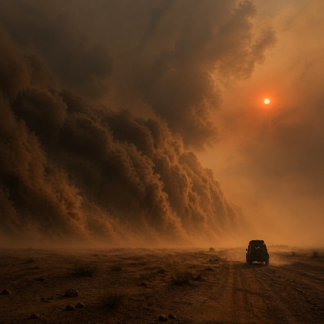
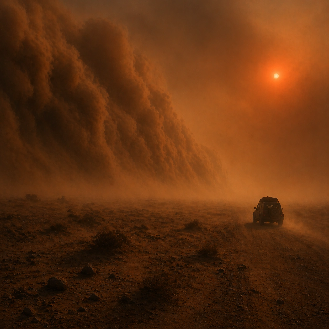
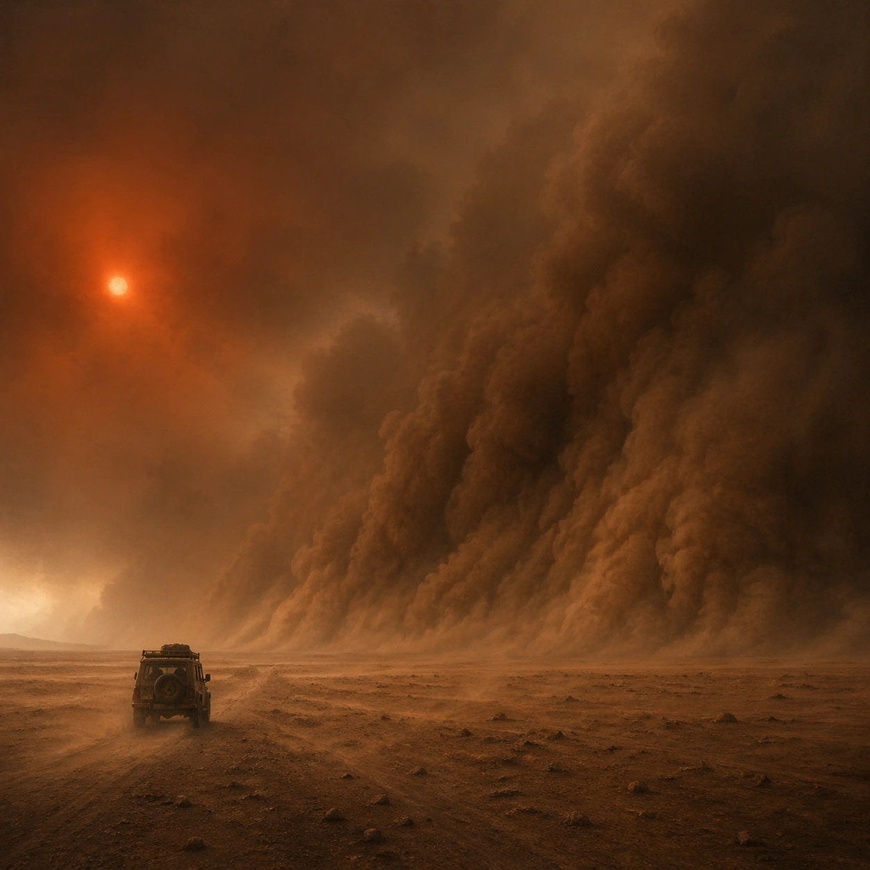
Example generated from “Sandstorm Apocalypse Sun — Reference Anchor”
GPT Image 2en

Scene: Create a square cinematic still for Sandstorm Apocalypse Sun. Use production-grade photoreal lighting, disciplined lens behavior, and a composition that feels like a finished key frame from an original film rather than a casual snapshot. A colossal wall of sand advances across an open plain under a dim blood-red sun, with the air turning ochre and gray, horizon contrast collapsing, and the ground scoured by wind-driven dust. Keep the camera in a disciplined anchor position so the full lighting event and the main spatial structure are immediately legible from edge to edge. Subject: Build a coherent original scene whose emotional center comes from atmosphere, light physics, and spatial clarity. Avoid relying on celebrity likeness, franchise iconography, or stylized illustration shortcuts. One jeep or utility vehicle in silhouette should provide a simple scale cue, while the real subject remains the storm front, the compressed sky, and the sense of irreversible movement across the land. This frame should lock the canonical arrangement, scale relationship, and emotional tone that the later dependent images inherit. Important details: Preserve a believable physical world with strong depth layering, careful color separation, and premium image discipline. Make the airborne dust granular and directional, with partial visibility, layered turbulence, and a sun disc that feels filtered by dense particulate atmosphere rather than pasted in as a graphic symbol. Use this image to establish the authoritative direction of light, atmospheric density, and structural silhouette for the package. Use case: Sandstorm Sun series study 1/9. Constraints: No readable text, no watermark, no logos, preserve exact 1:1 aspect ratio, no city ruins, no readable license plates, no zombies, no science-fiction armor, no clean air clarity.
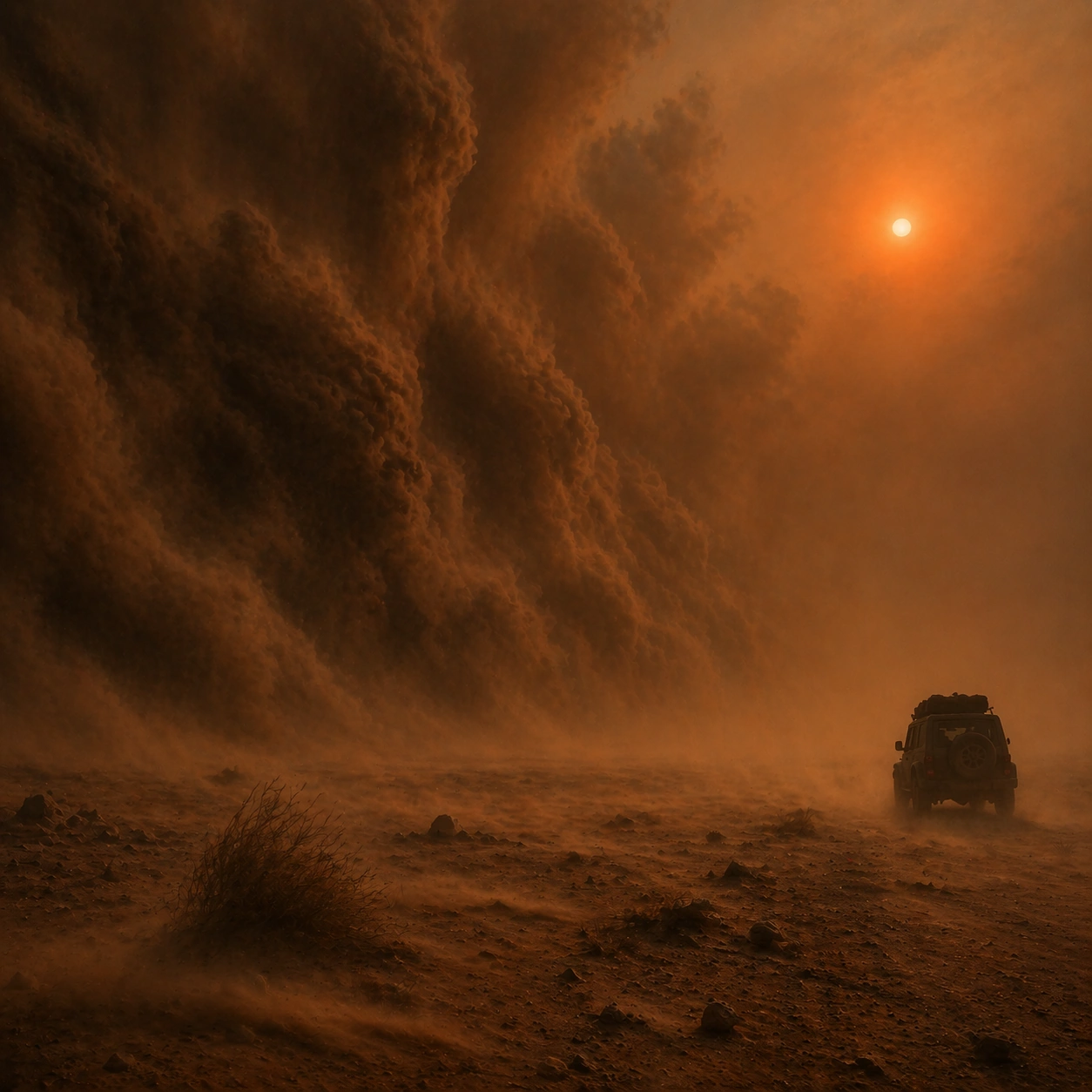
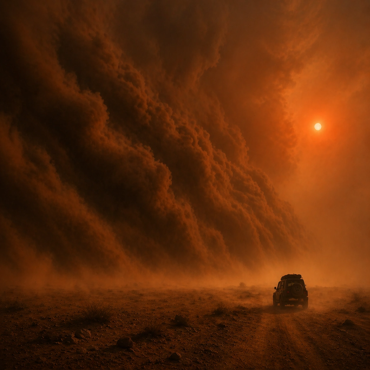
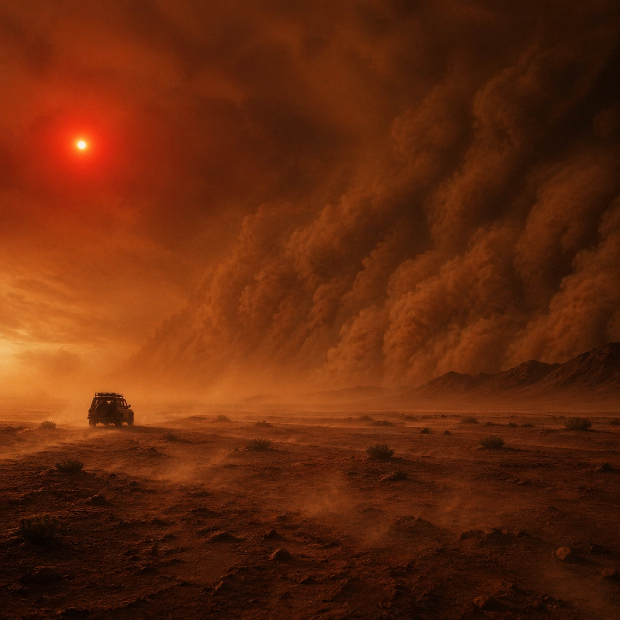
Example generated from “Sandstorm Apocalypse Sun — Closer Frame”
GPT Image 2en

Scene: Create a square cinematic still for Sandstorm Apocalypse Sun. Use production-grade photoreal lighting, disciplined lens behavior, and a composition that feels like a finished key frame from an original film rather than a casual snapshot. A colossal wall of sand advances across an open plain under a dim blood-red sun, with the air turning ochre and gray, horizon contrast collapsing, and the ground scoured by wind-driven dust. Move the camera closer or lower so the viewer feels more embedded inside the atmosphere while the same light direction and environment remain intact. Subject: Build a coherent original scene whose emotional center comes from atmosphere, light physics, and spatial clarity. Avoid relying on celebrity likeness, franchise iconography, or stylized illustration shortcuts. One jeep or utility vehicle in silhouette should provide a simple scale cue, while the real subject remains the storm front, the compressed sky, and the sense of irreversible movement across the land. Preserve the same world logic from the reference and let one human-scale or material-scale element become more prominent without stealing focus from the atmosphere. Important details: Preserve a believable physical world with strong depth layering, careful color separation, and premium image discipline. Make the airborne dust granular and directional, with partial visibility, layered turbulence, and a sun disc that feels filtered by dense particulate atmosphere rather than pasted in as a graphic symbol. Keep the palette family, structural read, and light behavior from image 01 while increasing immediacy and tactile presence. Use case: Sandstorm Sun series study 2/9. Constraints: No readable text, no watermark, no logos, preserve exact 1:1 aspect ratio, no city ruins, no readable license plates, no zombies, no science-fiction armor, no clean air clarity.
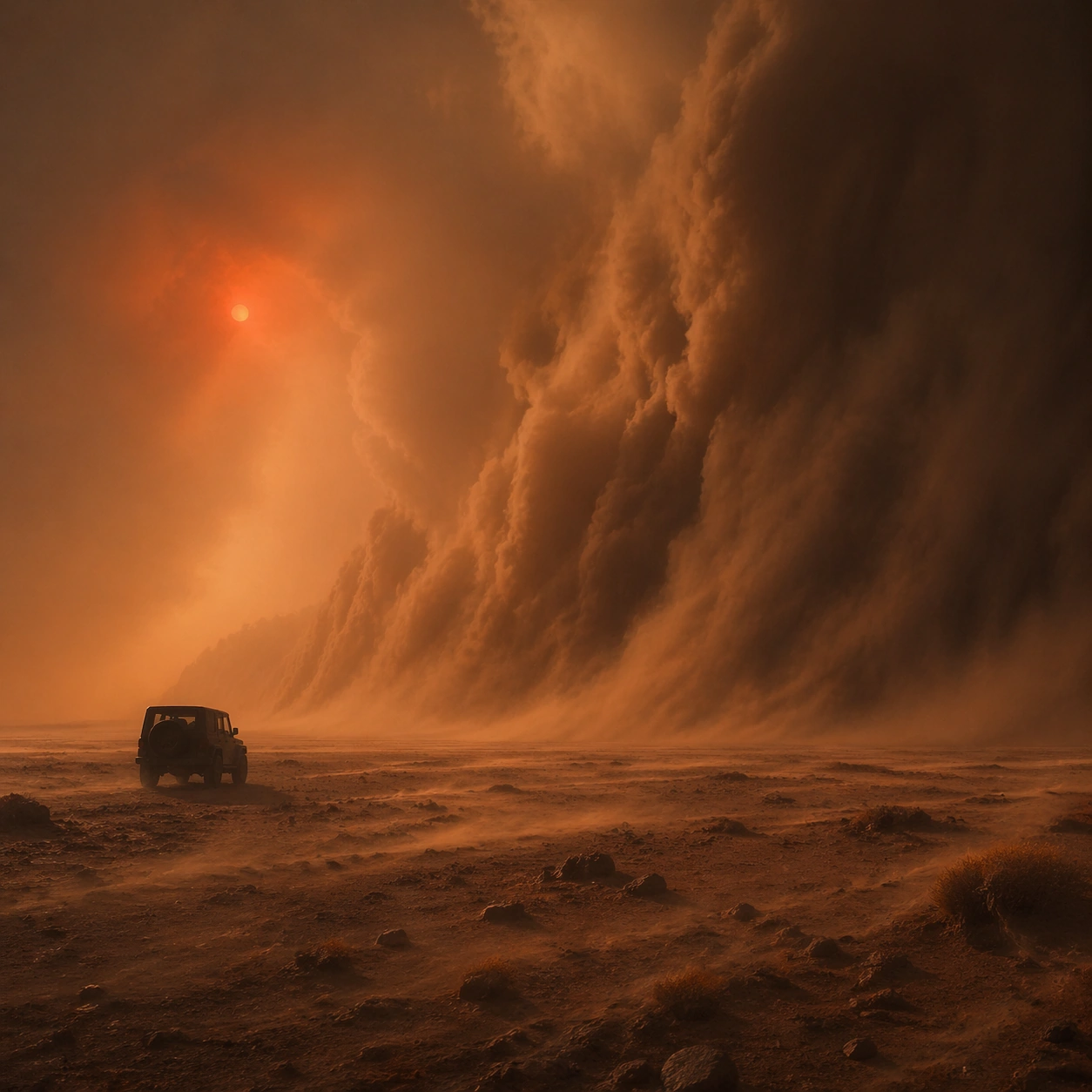
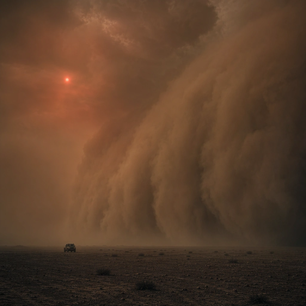
Example generated from “Sandstorm Apocalypse Sun — Spatial Counterpoint”
GPT Image 2en

Scene: Create a square cinematic still for Sandstorm Apocalypse Sun. Use production-grade photoreal lighting, disciplined lens behavior, and a composition that feels like a finished key frame from an original film rather than a casual snapshot. A colossal wall of sand advances across an open plain under a dim blood-red sun, with the air turning ochre and gray, horizon contrast collapsing, and the ground scoured by wind-driven dust. Shift to an oblique or lateral point of view that reveals different depth layers while staying inside the same place and the same atmospheric event. Subject: Build a coherent original scene whose emotional center comes from atmosphere, light physics, and spatial clarity. Avoid relying on celebrity likeness, franchise iconography, or stylized illustration shortcuts. One jeep or utility vehicle in silhouette should provide a simple scale cue, while the real subject remains the storm front, the compressed sky, and the sense of irreversible movement across the land. Hold the reference structure, but use the new angle to show secondary planes, foreground interruption, or a changed distance relationship. Important details: Preserve a believable physical world with strong depth layering, careful color separation, and premium image discipline. Make the airborne dust granular and directional, with partial visibility, layered turbulence, and a sun disc that feels filtered by dense particulate atmosphere rather than pasted in as a graphic symbol. The success condition is continuity with the reference plus a richer sense of depth, not a new location or a new lighting system. Use case: Sandstorm Sun series study 3/9. Constraints: No readable text, no watermark, no logos, preserve exact 1:1 aspect ratio, no city ruins, no readable license plates, no zombies, no science-fiction armor, no clean air clarity.

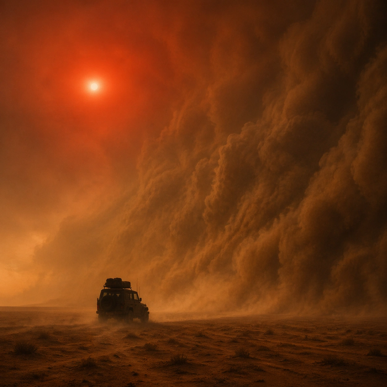
Example generated from “Sandstorm Apocalypse Sun — Climax Frame”
GPT Image 2en

Scene: Create a square cinematic still for Sandstorm Apocalypse Sun. Use production-grade photoreal lighting, disciplined lens behavior, and a composition that feels like a finished key frame from an original film rather than a casual snapshot. A colossal wall of sand advances across an open plain under a dim blood-red sun, with the air turning ochre and gray, horizon contrast collapsing, and the ground scoured by wind-driven dust. Push the composition toward the emotional peak of the same setup, with the most dramatic balance of brightness, shadow, or atmospheric density inside the established world. Subject: Build a coherent original scene whose emotional center comes from atmosphere, light physics, and spatial clarity. Avoid relying on celebrity likeness, franchise iconography, or stylized illustration shortcuts. One jeep or utility vehicle in silhouette should provide a simple scale cue, while the real subject remains the storm front, the compressed sky, and the sense of irreversible movement across the land. Everything should still read as the same location and same event, but framed for maximum narrative force and visual closure. Important details: Preserve a believable physical world with strong depth layering, careful color separation, and premium image discipline. Make the airborne dust granular and directional, with partial visibility, layered turbulence, and a sun disc that feels filtered by dense particulate atmosphere rather than pasted in as a graphic symbol. Make it feel like the strongest hero frame of the sequence without breaking continuity or introducing a new design language. Use case: Sandstorm Sun series study 4/9. Constraints: No readable text, no watermark, no logos, preserve exact 1:1 aspect ratio, no city ruins, no readable license plates, no zombies, no science-fiction armor, no clean air clarity.

Example generated from “Sandstorm Apocalypse Sun — Surface Study”
GPT Image 2en

Scene: Create a square cinematic still for Sandstorm Apocalypse Sun. Use production-grade photoreal lighting, disciplined lens behavior, and a composition that feels like a finished key frame from an original film rather than a casual snapshot. A colossal wall of sand advances across an open plain under a dim blood-red sun, with the air turning ochre and gray, horizon contrast collapsing, and the ground scoured by wind-driven dust. Build an independent square study around the way atmosphere interacts with surfaces, keeping enough environmental context for the image to feel finished rather than cropped at random. Subject: Build a coherent original scene whose emotional center comes from atmosphere, light physics, and spatial clarity. Avoid relying on celebrity likeness, franchise iconography, or stylized illustration shortcuts. One jeep or utility vehicle in silhouette should provide a simple scale cue, while the real subject remains the storm front, the compressed sky, and the sense of irreversible movement across the land. Let textures, reflections, residue, moisture, dust, or particulate response become primary, while the broader setting remains clearly implied. Important details: Preserve a believable physical world with strong depth layering, careful color separation, and premium image discipline. Make the airborne dust granular and directional, with partial visibility, layered turbulence, and a sun disc that feels filtered by dense particulate atmosphere rather than pasted in as a graphic symbol. The key is material credibility under dramatic light, with micro-contrast and controlled mood supporting the theme. Use case: Sandstorm Sun single study 5/9. Constraints: No readable text, no watermark, no logos, preserve exact 1:1 aspect ratio, no city ruins, no readable license plates, no zombies, no science-fiction armor, no clean air clarity.

Example generated from “Sandstorm Apocalypse Sun — Silhouette Study”
GPT Image 2en

Scene: Create a square cinematic still for Sandstorm Apocalypse Sun. Use production-grade photoreal lighting, disciplined lens behavior, and a composition that feels like a finished key frame from an original film rather than a casual snapshot. A colossal wall of sand advances across an open plain under a dim blood-red sun, with the air turning ochre and gray, horizon contrast collapsing, and the ground scoured by wind-driven dust. Compose an independent frame where one human, animal, or object silhouette negotiates with the atmospheric light event in a clean, readable way. Subject: Build a coherent original scene whose emotional center comes from atmosphere, light physics, and spatial clarity. Avoid relying on celebrity likeness, franchise iconography, or stylized illustration shortcuts. One jeep or utility vehicle in silhouette should provide a simple scale cue, while the real subject remains the storm front, the compressed sky, and the sense of irreversible movement across the land. The silhouette should supply scale and emotional orientation, but the environment still needs to carry most of the storytelling weight. Important details: Preserve a believable physical world with strong depth layering, careful color separation, and premium image discipline. Make the airborne dust granular and directional, with partial visibility, layered turbulence, and a sun disc that feels filtered by dense particulate atmosphere rather than pasted in as a graphic symbol. Keep the silhouette simple and believable, avoiding poster-like graphic flattening while preserving strong contrast. Use case: Sandstorm Sun single study 6/9. Constraints: No readable text, no watermark, no logos, preserve exact 1:1 aspect ratio, no city ruins, no readable license plates, no zombies, no science-fiction armor, no clean air clarity.

Example generated from “Sandstorm Apocalypse Sun — Transition Study”
GPT Image 2en

Scene: Create a square cinematic still for Sandstorm Apocalypse Sun. Use production-grade photoreal lighting, disciplined lens behavior, and a composition that feels like a finished key frame from an original film rather than a casual snapshot. A colossal wall of sand advances across an open plain under a dim blood-red sun, with the air turning ochre and gray, horizon contrast collapsing, and the ground scoured by wind-driven dust. Treat this as an adjacent moment before or after the main event, preserving the same topic language while letting the atmosphere shift slightly in intensity or position. Subject: Build a coherent original scene whose emotional center comes from atmosphere, light physics, and spatial clarity. Avoid relying on celebrity likeness, franchise iconography, or stylized illustration shortcuts. One jeep or utility vehicle in silhouette should provide a simple scale cue, while the real subject remains the storm front, the compressed sky, and the sense of irreversible movement across the land. Show the environment in transition, with clear evidence of recent motion, changing weather, or fading light, but without turning it into action spectacle. Important details: Preserve a believable physical world with strong depth layering, careful color separation, and premium image discipline. Make the airborne dust granular and directional, with partial visibility, layered turbulence, and a sun disc that feels filtered by dense particulate atmosphere rather than pasted in as a graphic symbol. Subtle temporal storytelling matters here more than maximal drama, so let traces, gradients, and environmental residue do the work. Use case: Sandstorm Sun single study 7/9. Constraints: No readable text, no watermark, no logos, preserve exact 1:1 aspect ratio, no city ruins, no readable license plates, no zombies, no science-fiction armor, no clean air clarity.

Example generated from “Sandstorm Apocalypse Sun — Wide Study”
GPT Image 2en

Scene: Create a square cinematic still for Sandstorm Apocalypse Sun. Use production-grade photoreal lighting, disciplined lens behavior, and a composition that feels like a finished key frame from an original film rather than a casual snapshot. A colossal wall of sand advances across an open plain under a dim blood-red sun, with the air turning ochre and gray, horizon contrast collapsing, and the ground scoured by wind-driven dust. Pull back enough to explain the broader geography or architectural envelope while keeping the square crop intentional and balanced. Subject: Build a coherent original scene whose emotional center comes from atmosphere, light physics, and spatial clarity. Avoid relying on celebrity likeness, franchise iconography, or stylized illustration shortcuts. One jeep or utility vehicle in silhouette should provide a simple scale cue, while the real subject remains the storm front, the compressed sky, and the sense of irreversible movement across the land. The wider frame should reveal how the main light or weather phenomenon organizes the surrounding world and not just the immediate subject. Important details: Preserve a believable physical world with strong depth layering, careful color separation, and premium image discipline. Make the airborne dust granular and directional, with partial visibility, layered turbulence, and a sun disc that feels filtered by dense particulate atmosphere rather than pasted in as a graphic symbol. Make scale legible through spacing, horizon control, and foreground-to-background separation rather than through extra props. Use case: Sandstorm Sun single study 8/9. Constraints: No readable text, no watermark, no logos, preserve exact 1:1 aspect ratio, no city ruins, no readable license plates, no zombies, no science-fiction armor, no clean air clarity.

Example generated from “Sandstorm Apocalypse Sun — Afterglow Study”
GPT Image 2en

Scene: Create a square cinematic still for Sandstorm Apocalypse Sun. Use production-grade photoreal lighting, disciplined lens behavior, and a composition that feels like a finished key frame from an original film rather than a casual snapshot. A colossal wall of sand advances across an open plain under a dim blood-red sun, with the air turning ochre and gray, horizon contrast collapsing, and the ground scoured by wind-driven dust. End on a quieter independent image that holds the residue of the topic atmosphere after its loudest moment has passed, while still feeling complete and exhibition-ready. Subject: Build a coherent original scene whose emotional center comes from atmosphere, light physics, and spatial clarity. Avoid relying on celebrity likeness, franchise iconography, or stylized illustration shortcuts. One jeep or utility vehicle in silhouette should provide a simple scale cue, while the real subject remains the storm front, the compressed sky, and the sense of irreversible movement across the land. The frame should suggest memory, aftermath, or lingering presence through environment first and only secondarily through any figure or object. Important details: Preserve a believable physical world with strong depth layering, careful color separation, and premium image discipline. Make the airborne dust granular and directional, with partial visibility, layered turbulence, and a sun disc that feels filtered by dense particulate atmosphere rather than pasted in as a graphic symbol. Favor restraint, believable light decay, and subtle narrative closure over spectacle or decorative excess. Use case: Sandstorm Sun single study 9/9. Constraints: No readable text, no watermark, no logos, preserve exact 1:1 aspect ratio, no city ruins, no readable license plates, no zombies, no science-fiction armor, no clean air clarity.

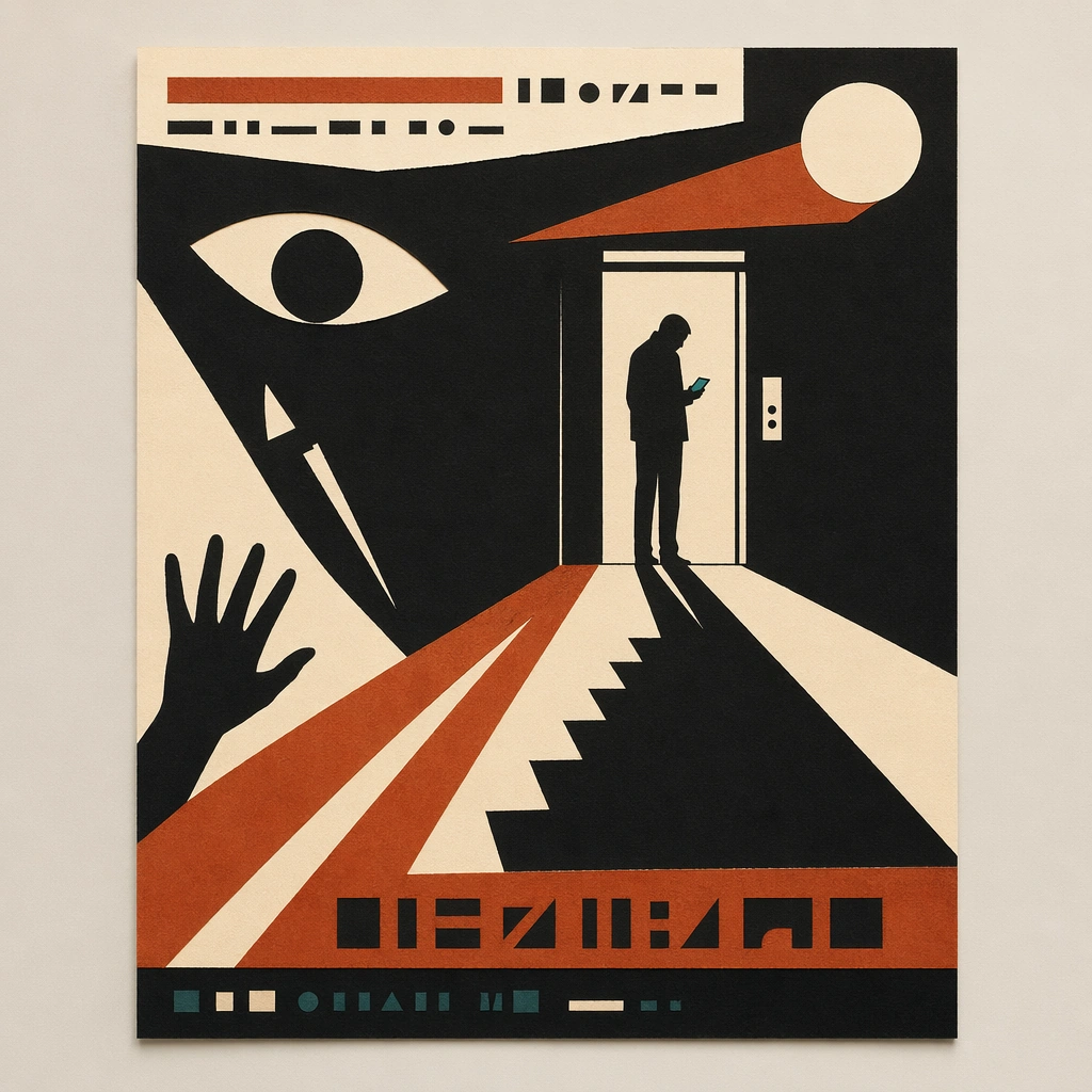
Example generated from “Saul Bass Minimalist Cut — Canonical One-Sheet”
GPT Image 2en

Scene: A square straight-on studio view of a pristine poster mounted on a matte wall with even museum lighting, crisp corners, and enough breathing room around the sheet for the full composition to read as an intentional object. The poster should express mid-century minimalist paper-cut poster language driven by torn shapes, narrative negative space, and three-color restraint, using matte black, rust orange, cream, and a very limited dark teal accent and a tactile surface appropriate to the medium. Subject: Build the flagship poster statement for this style, with the strongest hierarchy, the clearest subject silhouette, and the most disciplined balance between image field, pseudo-typography, and empty space. Use single silhouettes, staircases, hands, knives, eyes, circles, doorways, and dramatic shadows as the main visual ingredients, and organize them with simple cut-paper title bars and glyph fragments kept abstract and unreadable. For the contemporary-subject axis, thread in ride-share lanes, phone glare, and elevator doors converted into severe paper-cut suspense. The poster must feel like an original design object rather than a reproduction of any known work. Important details: Treat this as the cleanest thesis image in the set: the paper should look fresh, the inks or paint should feel deliberate, and every formal rule of the style should be easy to study at a glance. Preserve deliberate imbalance, clean cut contours, visible paper fibers, and story told through absence as much as presence. Keep every letterform abstract and non-readable, as if it were a typographic texture rather than language. Make the style unmistakable through composition, palette, surface behavior, and symbolic compression. no glossy gradients, no tiny fiddly detail, no photoreal rendering, no ornamental clutter. Use case: Paper-Cut Film single study 1/9, establishing the cleanest museum-grade poster reading. Constraints: No readable text, no watermark, no logos, preserve exact 1:1 aspect ratio, no copyrighted characters, no real brand marks, no QR codes, no interface chrome, no accidental gibberish lettering.

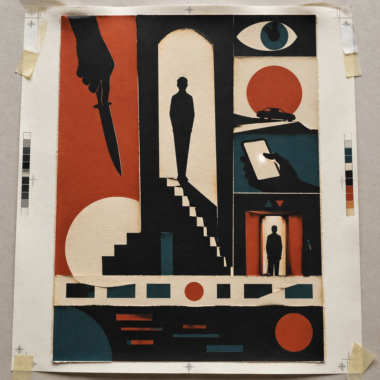
Example generated from “Saul Bass Minimalist Cut — Print Proof Flatlay”
GPT Image 2en

Scene: A square overhead tabletop photograph of a fresh poster proof on neutral worktable paper, lit by cool daylight, with crop marks, tape tabs, and slight paper bow visible around the sheet. The poster should express mid-century minimalist paper-cut poster language driven by torn shapes, narrative negative space, and three-color restraint, using matte black, rust orange, cream, and a very limited dark teal accent and a tactile surface appropriate to the medium. Subject: Design the poster as a print-shop proof, preserving the same poster language while allowing production clues such as edge trims, registration targets, and process marks to frame the composition. Use single silhouettes, staircases, hands, knives, eyes, circles, doorways, and dramatic shadows as the main visual ingredients, and organize them with simple cut-paper title bars and glyph fragments kept abstract and unreadable. For the contemporary-subject axis, thread in ride-share lanes, phone glare, and elevator doors converted into severe paper-cut suspense. The poster must feel like an original design object rather than a reproduction of any known work. Important details: The image must still read as a finished poster concept, but it should carry believable print-process evidence and material tactility instead of gallery-wall perfection. Preserve deliberate imbalance, clean cut contours, visible paper fibers, and story told through absence as much as presence. Keep every letterform abstract and non-readable, as if it were a typographic texture rather than language. Make the style unmistakable through composition, palette, surface behavior, and symbolic compression. no glossy gradients, no tiny fiddly detail, no photoreal rendering, no ornamental clutter. Use case: Paper-Cut Film single study 2/9, testing production realism and process evidence. Constraints: No readable text, no watermark, no logos, preserve exact 1:1 aspect ratio, no copyrighted characters, no real brand marks, no QR codes, no interface chrome, no accidental gibberish lettering.

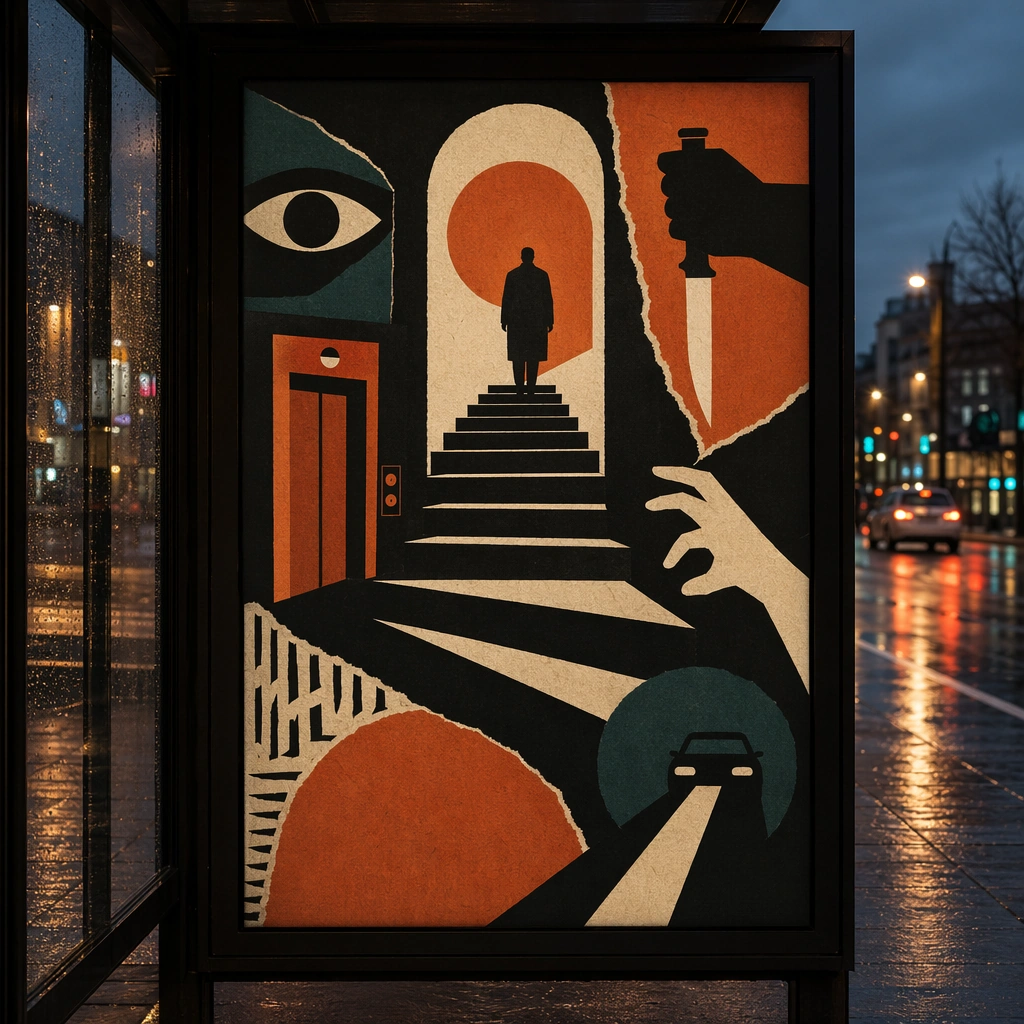
Example generated from “Saul Bass Minimalist Cut — Transit Lightbox”
GPT Image 2en

Scene: A square dusk street photograph of a backlit transit poster glowing inside glass, with faint rain reflections, soft city blur in the distance, and the poster remaining fully legible as a composition. The poster should express mid-century minimalist paper-cut poster language driven by torn shapes, narrative negative space, and three-color restraint, using matte black, rust orange, cream, and a very limited dark teal accent and a tactile surface appropriate to the medium. Subject: Adapt the poster into a public-facing lightbox version that still honors the original style grammar while feeling bold enough to stop a passerby from several meters away. Use single silhouettes, staircases, hands, knives, eyes, circles, doorways, and dramatic shadows as the main visual ingredients, and organize them with simple cut-paper title bars and glyph fragments kept abstract and unreadable. For the contemporary-subject axis, thread in ride-share lanes, phone glare, and elevator doors converted into severe paper-cut suspense. The poster must feel like an original design object rather than a reproduction of any known work. Important details: Let the style survive the illumination test: color blocking, silhouette contrast, and abstract lettering should stay controlled under bright internal light and reflective glass. Preserve deliberate imbalance, clean cut contours, visible paper fibers, and story told through absence as much as presence. Keep every letterform abstract and non-readable, as if it were a typographic texture rather than language. Make the style unmistakable through composition, palette, surface behavior, and symbolic compression. no glossy gradients, no tiny fiddly detail, no photoreal rendering, no ornamental clutter. Use case: Paper-Cut Film single study 3/9, testing distance readability in public display. Constraints: No readable text, no watermark, no logos, preserve exact 1:1 aspect ratio, no copyrighted characters, no real brand marks, no QR codes, no interface chrome, no accidental gibberish lettering.

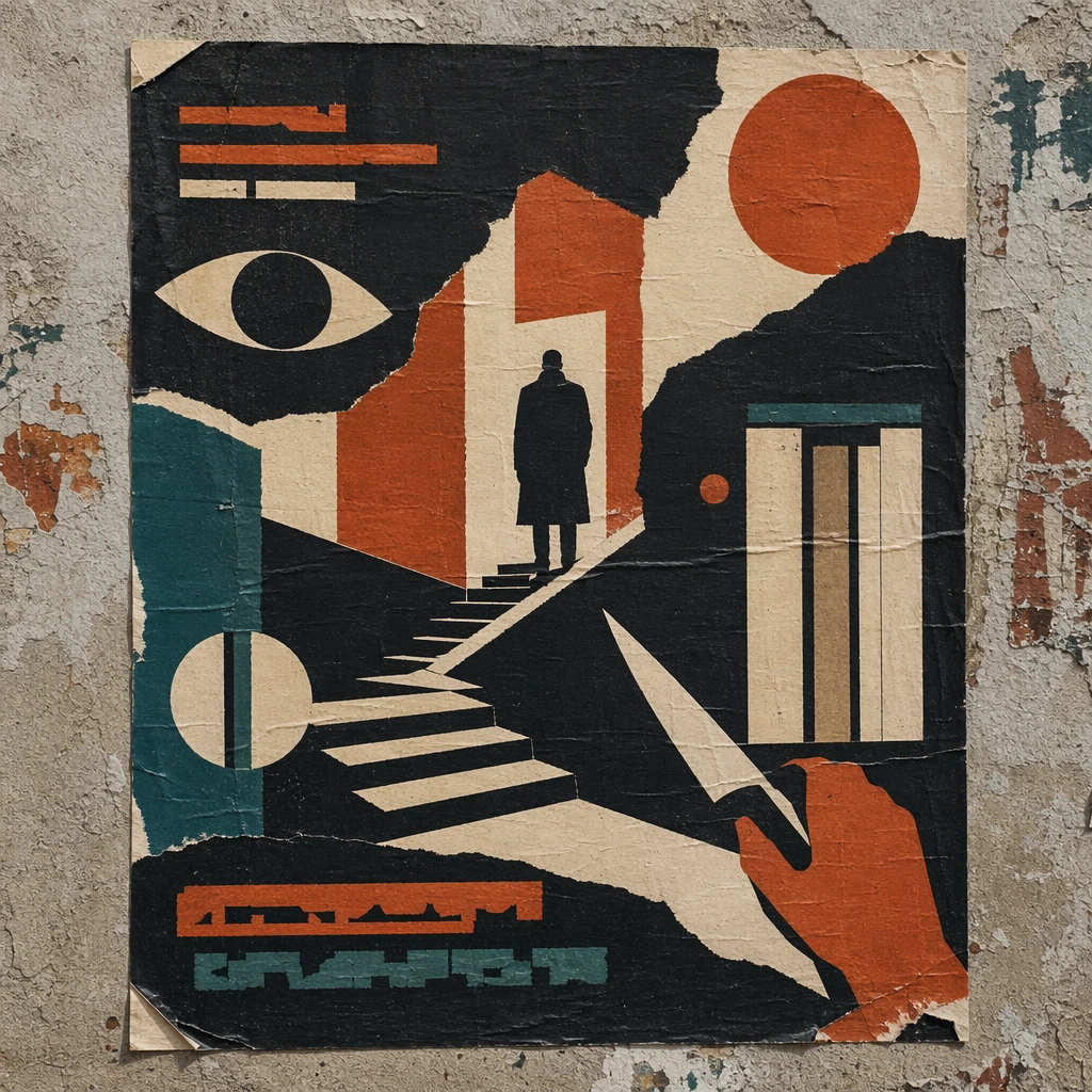
Example generated from “Saul Bass Minimalist Cut — Wheatpaste Wall Layer”
GPT Image 2en

Scene: A square urban wall study with the poster pasted onto rough plaster among torn edges and older paper remnants, photographed in soft overcast light so texture, glue bubbles, and surface scars stay visible. The poster should express mid-century minimalist paper-cut poster language driven by torn shapes, narrative negative space, and three-color restraint, using matte black, rust orange, cream, and a very limited dark teal accent and a tactile surface appropriate to the medium. Subject: Create a version that feels made for the street, with the poster carrying enough formal force to survive abrasion, layering, and imperfect placement without losing its visual identity. Use single silhouettes, staircases, hands, knives, eyes, circles, doorways, and dramatic shadows as the main visual ingredients, and organize them with simple cut-paper title bars and glyph fragments kept abstract and unreadable. For the contemporary-subject axis, thread in ride-share lanes, phone glare, and elevator doors converted into severe paper-cut suspense. The poster must feel like an original design object rather than a reproduction of any known work. Important details: Keep the main design intact but let the environment add grit: lifted corners, tiny tears, wrinkled paper, and older color fragments around the perimeter should amplify the style rather than dilute it. Preserve deliberate imbalance, clean cut contours, visible paper fibers, and story told through absence as much as presence. Keep every letterform abstract and non-readable, as if it were a typographic texture rather than language. Make the style unmistakable through composition, palette, surface behavior, and symbolic compression. no glossy gradients, no tiny fiddly detail, no photoreal rendering, no ornamental clutter. Use case: Paper-Cut Film single study 4/9, testing street-life durability and layered context. Constraints: No readable text, no watermark, no logos, preserve exact 1:1 aspect ratio, no copyrighted characters, no real brand marks, no QR codes, no interface chrome, no accidental gibberish lettering.

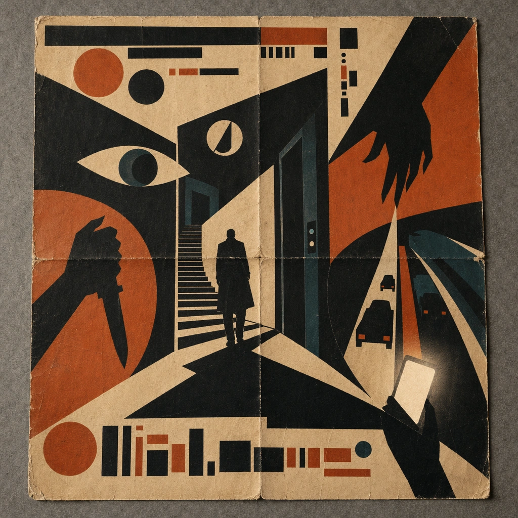
Example generated from “Saul Bass Minimalist Cut — Folded Archive Copy”
GPT Image 2en

Scene: A square conservation-table view of a vintage poster laid on gray felt under raking light, with visible fold lines, softened corners, and subtle aging that still preserves the integrity of the image. The poster should express mid-century minimalist paper-cut poster language driven by torn shapes, narrative negative space, and three-color restraint, using matte black, rust orange, cream, and a very limited dark teal accent and a tactile surface appropriate to the medium. Subject: Present the poster as an archive copy that has been stored, unfolded, and carefully documented, letting age and handling reveal how the design holds up across time. Use single silhouettes, staircases, hands, knives, eyes, circles, doorways, and dramatic shadows as the main visual ingredients, and organize them with simple cut-paper title bars and glyph fragments kept abstract and unreadable. For the contemporary-subject axis, thread in ride-share lanes, phone glare, and elevator doors converted into severe paper-cut suspense. The poster must feel like an original design object rather than a reproduction of any known work. Important details: Aging must stay believable rather than theatrical: slight yellowing, fold memory, edge wear, and pigment variation should support the historical or crafted feeling of the style. Preserve deliberate imbalance, clean cut contours, visible paper fibers, and story told through absence as much as presence. Keep every letterform abstract and non-readable, as if it were a typographic texture rather than language. Make the style unmistakable through composition, palette, surface behavior, and symbolic compression. no glossy gradients, no tiny fiddly detail, no photoreal rendering, no ornamental clutter. Use case: Paper-Cut Film single study 5/9, testing archival endurance and age character. Constraints: No readable text, no watermark, no logos, preserve exact 1:1 aspect ratio, no copyrighted characters, no real brand marks, no QR codes, no interface chrome, no accidental gibberish lettering.

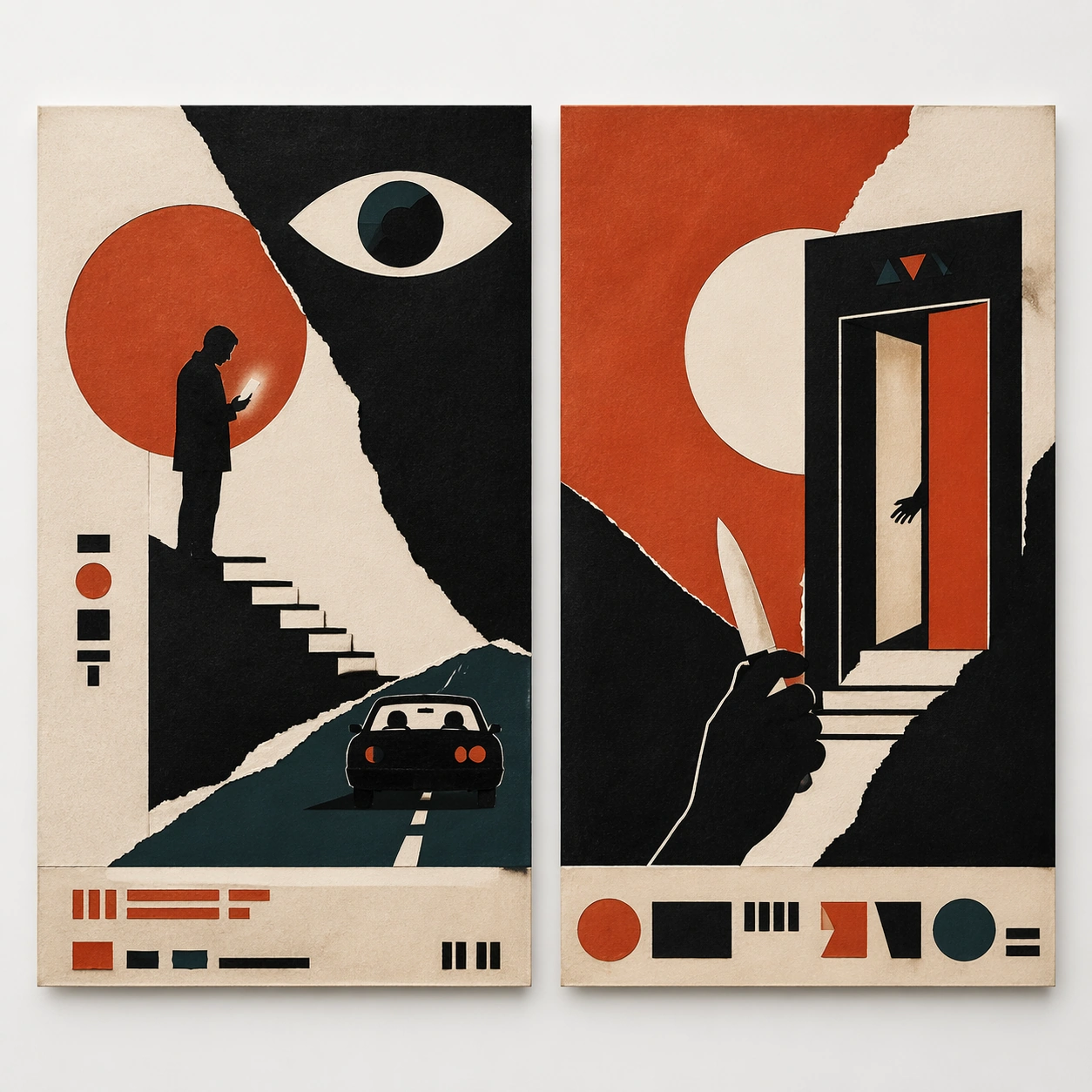
Example generated from “Saul Bass Minimalist Cut — Twin Poster Diptych”
GPT Image 2en

Scene: A square white-wall installation showing two companion posters hung side by side with equal spacing, photographed frontally so the pair reads as a designed conversation rather than two unrelated sheets. The poster should express mid-century minimalist paper-cut poster language driven by torn shapes, narrative negative space, and three-color restraint, using matte black, rust orange, cream, and a very limited dark teal accent and a tactile surface appropriate to the medium. Subject: Compose a matched diptych: two posters sharing one style system while splitting the narrative across paired motifs, mirrored masses, or complementary color emphasis. Use single silhouettes, staircases, hands, knives, eyes, circles, doorways, and dramatic shadows as the main visual ingredients, and organize them with simple cut-paper title bars and glyph fragments kept abstract and unreadable. For the contemporary-subject axis, thread in ride-share lanes, phone glare, and elevator doors converted into severe paper-cut suspense. The poster must feel like an original design object rather than a reproduction of any known work. Important details: Both halves should feel distinct yet inseparable. Preserve one coherent visual language, but let each sheet carry its own focal symbol and rhythm without readable wording. Preserve deliberate imbalance, clean cut contours, visible paper fibers, and story told through absence as much as presence. Keep every letterform abstract and non-readable, as if it were a typographic texture rather than language. Make the style unmistakable through composition, palette, surface behavior, and symbolic compression. no glossy gradients, no tiny fiddly detail, no photoreal rendering, no ornamental clutter. Use case: Paper-Cut Film single study 6/9, testing system flexibility across a paired set. Constraints: No readable text, no watermark, no logos, preserve exact 1:1 aspect ratio, no copyrighted characters, no real brand marks, no QR codes, no interface chrome, no accidental gibberish lettering.

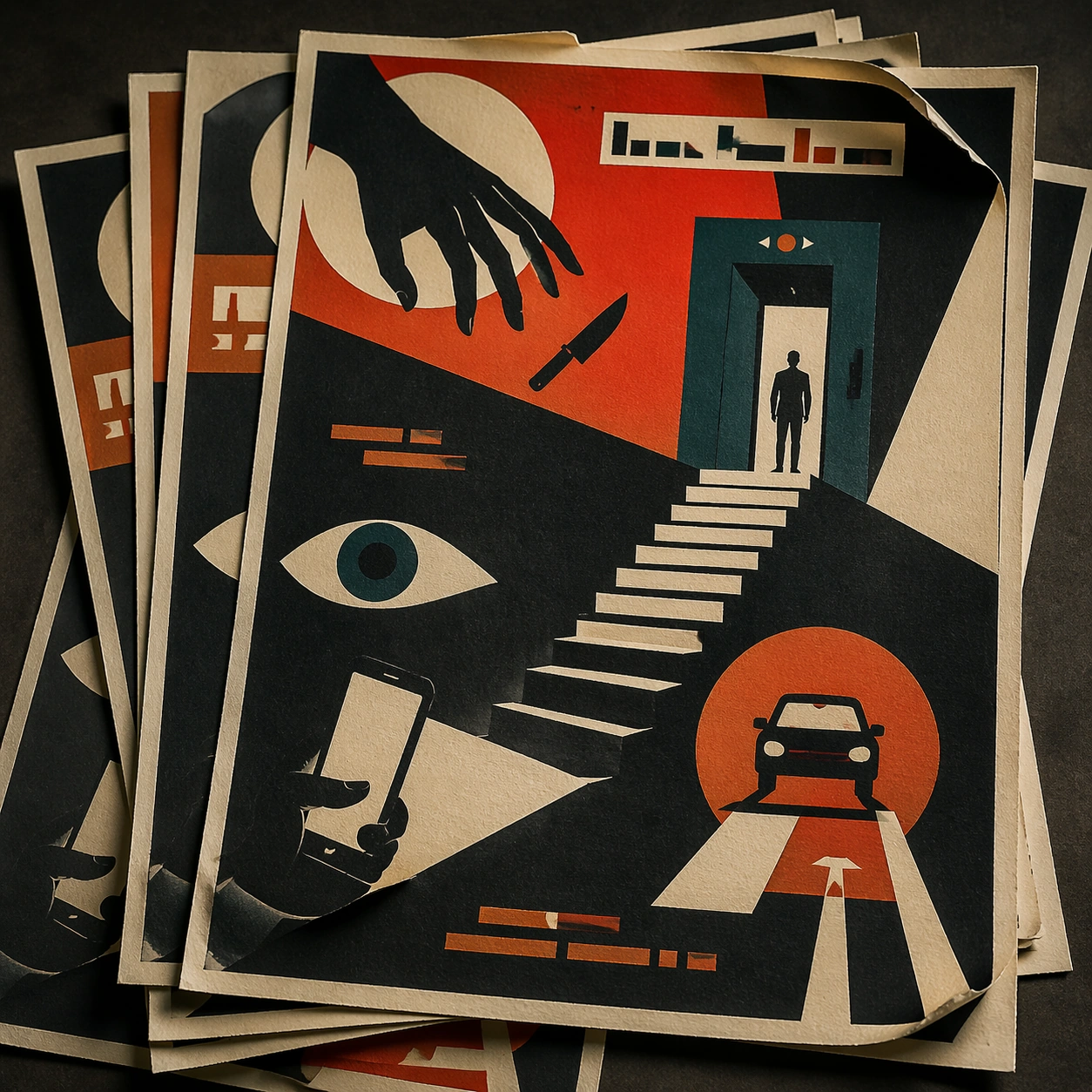
Example generated from “Saul Bass Minimalist Cut — Stacked Print Bundle”
GPT Image 2en

Scene: A square tabletop shot of several poster prints stacked and slightly fanned, with curled corners, offset edges, and soft directional light revealing paper thickness and ink behavior. The poster should express mid-century minimalist paper-cut poster language driven by torn shapes, narrative negative space, and three-color restraint, using matte black, rust orange, cream, and a very limited dark teal accent and a tactile surface appropriate to the medium. Subject: Design the top poster to dominate while nearby duplicate sheets echo the same composition, creating a tactile print-run scene rather than a single isolated sheet. Use single silhouettes, staircases, hands, knives, eyes, circles, doorways, and dramatic shadows as the main visual ingredients, and organize them with simple cut-paper title bars and glyph fragments kept abstract and unreadable. For the contemporary-subject axis, thread in ride-share lanes, phone glare, and elevator doors converted into severe paper-cut suspense. The poster must feel like an original design object rather than a reproduction of any known work. Important details: Use the stack to emphasize production character: edge shadows, repeated motifs peeking from beneath, and subtle misalignment should enrich the material reading without changing the core design. Preserve deliberate imbalance, clean cut contours, visible paper fibers, and story told through absence as much as presence. Keep every letterform abstract and non-readable, as if it were a typographic texture rather than language. Make the style unmistakable through composition, palette, surface behavior, and symbolic compression. no glossy gradients, no tiny fiddly detail, no photoreal rendering, no ornamental clutter. Use case: Paper-Cut Film single study 7/9, testing print-run tactility and repeat presence. Constraints: No readable text, no watermark, no logos, preserve exact 1:1 aspect ratio, no copyrighted characters, no real brand marks, no QR codes, no interface chrome, no accidental gibberish lettering.

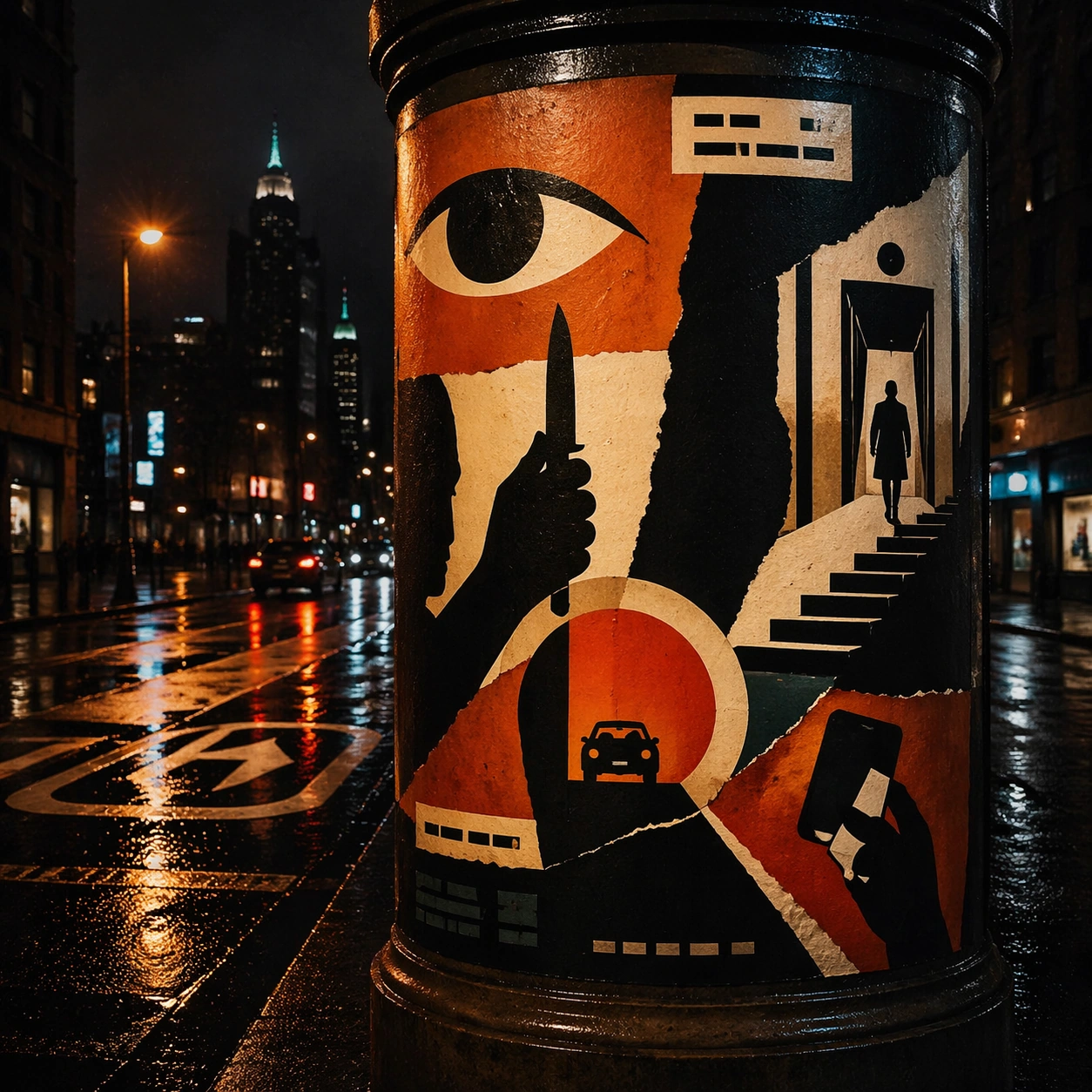
Example generated from “Saul Bass Minimalist Cut — Kiosk Night Glow”
GPT Image 2en

Scene: A square nighttime city view with the poster wrapping part of a cylindrical kiosk, wet pavement reflecting nearby light, and the composition holding together under moody urban illumination. The poster should express mid-century minimalist paper-cut poster language driven by torn shapes, narrative negative space, and three-color restraint, using matte black, rust orange, cream, and a very limited dark teal accent and a tactile surface appropriate to the medium. Subject: Reframe the design for a dramatic street-placement context, where the poster has to project style and mood through reflection, curvature, and surrounding darkness. Use single silhouettes, staircases, hands, knives, eyes, circles, doorways, and dramatic shadows as the main visual ingredients, and organize them with simple cut-paper title bars and glyph fragments kept abstract and unreadable. For the contemporary-subject axis, thread in ride-share lanes, phone glare, and elevator doors converted into severe paper-cut suspense. The poster must feel like an original design object rather than a reproduction of any known work. Important details: The design should remain instantly recognizable despite the cylindrical wrap. Preserve major blocks, symbolic shapes, and abstract title forms so the style still feels authoritative at night. Preserve deliberate imbalance, clean cut contours, visible paper fibers, and story told through absence as much as presence. Keep every letterform abstract and non-readable, as if it were a typographic texture rather than language. Make the style unmistakable through composition, palette, surface behavior, and symbolic compression. no glossy gradients, no tiny fiddly detail, no photoreal rendering, no ornamental clutter. Use case: Paper-Cut Film single study 8/9, testing atmospheric display under rain and glow. Constraints: No readable text, no watermark, no logos, preserve exact 1:1 aspect ratio, no copyrighted characters, no real brand marks, no QR codes, no interface chrome, no accidental gibberish lettering.

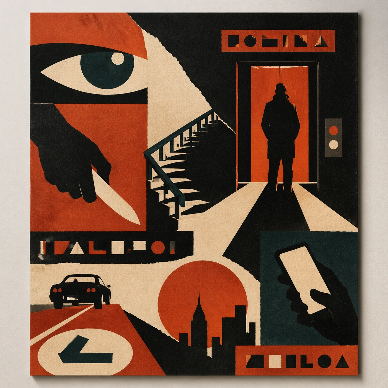
Example generated from “Saul Bass Minimalist Cut — Contemporary Remix”
GPT Image 2en

Scene: A square front-facing poster presentation on a clean neutral wall, lit like a premium print test, with crisp edges and a polished but still tactile finish appropriate to the style. The poster should express mid-century minimalist paper-cut poster language driven by torn shapes, narrative negative space, and three-color restraint, using matte black, rust orange, cream, and a very limited dark teal accent and a tactile surface appropriate to the medium. Subject: Apply the historical poster language to a contemporary urban subject so the old visual grammar proves it can carry present-day themes without losing authenticity or formal discipline. Use single silhouettes, staircases, hands, knives, eyes, circles, doorways, and dramatic shadows as the main visual ingredients, and organize them with simple cut-paper title bars and glyph fragments kept abstract and unreadable. For the contemporary-subject axis, thread in ride-share lanes, phone glare, and elevator doors converted into severe paper-cut suspense. The poster must feel like an original design object rather than a reproduction of any known work. Important details: This is not parody. The contemporary subject should feel genuinely absorbed into the style through palette, composition, symbolic compression, and non-readable lettering treatment. Preserve deliberate imbalance, clean cut contours, visible paper fibers, and story told through absence as much as presence. Keep every letterform abstract and non-readable, as if it were a typographic texture rather than language. Make the style unmistakable through composition, palette, surface behavior, and symbolic compression. no glossy gradients, no tiny fiddly detail, no photoreal rendering, no ornamental clutter. Use case: Paper-Cut Film single study 9/9, testing historical grammar on a present-day subject. Constraints: No readable text, no watermark, no logos, preserve exact 1:1 aspect ratio, no copyrighted characters, no real brand marks, no QR codes, no interface chrome, no accidental gibberish lettering.

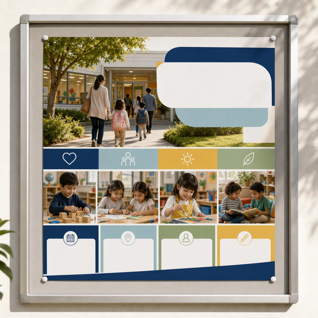
Example generated from “School Open Day And Enrollment Kit — Reference Open Day Poster”
GPT Image 2en

Scene: Create a square straight-on poster mockup displayed on a clean campus notice board, with soft daylight and believable print texture. The poster should combine welcoming campus photography, blank headline bands, and modular information zones in a way that feels immediately usable for a real preschool or primary-school open day campaign. Keep the square frame balanced, calm, and production-ready so the asset can serve gallery review, research comparison, and real educational delivery at the same time. Subject: Feature a warm campus scene with children and caregivers arriving, greenery, bright classrooms visible through windows, and a clear admissions-oriented hierarchy built from panels, icons, and photo blocks. The overall impression should be inclusive, aspirational, and operationally credible. The subject matter should feel intentionally selected for a coherent curriculum family rather than like a random decorative assortment. Important details: The asset must balance polished marketing appeal with genuine school trust. Use restrained color coding, obvious whitespace for future copy, and realistic institutional photography rather than generic lifestyle gloss. Preserve the same campus color system, photography tone, panel hierarchy, family-friendly admissions mood, and blank information-band rhythm from the reference asset. Use variation only in the teaching content, supporting props, and scene-specific mood while preserving the core visual system exactly. Use case: School Open Day and Enrollment Kit series study 1/4, reference open day poster. Constraints: No readable text, no watermark, no logos, preserve exact 1:1 aspect ratio, no readable school names, no logos, no celebrity faces, no unrealistic campus luxury, no crowded chaos, no distorted architecture.

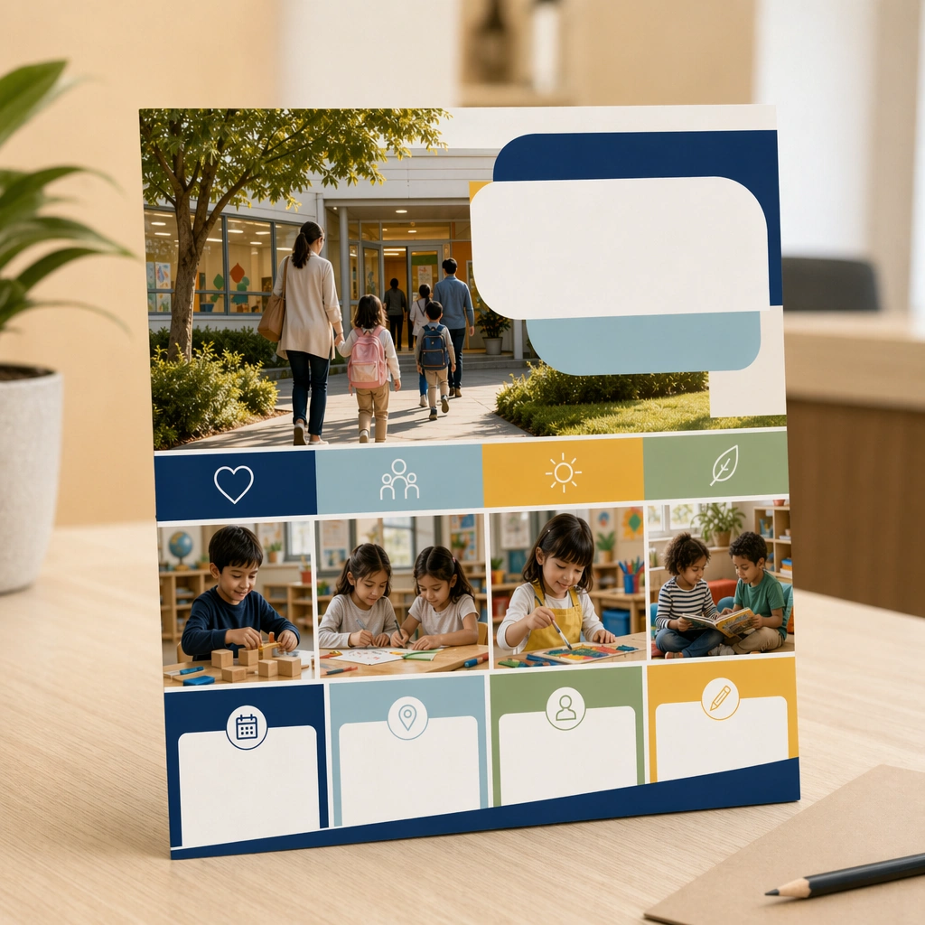
Example generated from “School Open Day And Enrollment Kit — Prospectus Cover”
GPT Image 2en

Scene: Keep the same square brand presentation, campus photography tone, and print realism established by the reference poster, but shift the asset into a prospectus-cover mockup resting on a reception desk. The composition should feel like the next approved deliverable in one admissions toolkit. Keep the square frame balanced, calm, and production-ready so the asset can serve gallery review, research comparison, and real educational delivery at the same time. Subject: Show a neatly printed brochure cover with one strong campus image, blank title bars, simple icon clusters, and edge details that feel premium but practical. The school environment and warm welcome cues should remain central, even though the asset is now a handheld printed piece. The subject matter should feel intentionally selected for a coherent curriculum family rather than like a random decorative assortment. Important details: Preserve the reference system exactly: the same color family, admissions mood, photo treatment, and modular panel rhythm. Variation should come from scale and deliverable format, not from a new visual language. Preserve the same campus color system, photography tone, panel hierarchy, family-friendly admissions mood, and blank information-band rhythm from the reference asset. Use variation only in the teaching content, supporting props, and scene-specific mood while preserving the core visual system exactly. Use case: School Open Day and Enrollment Kit series study 2/4, prospectus cover. Constraints: No readable text, no watermark, no logos, preserve exact 1:1 aspect ratio, no readable school names, no logos, no celebrity faces, no unrealistic campus luxury, no crowded chaos, no distorted architecture.

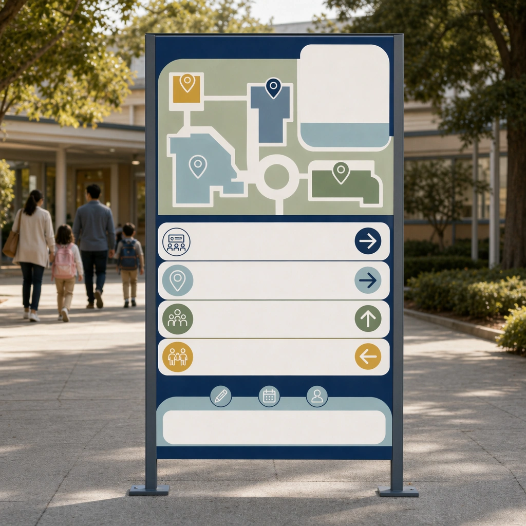
Example generated from “School Open Day And Enrollment Kit — Campus Wayfinding Board”
GPT Image 2en

Scene: Render the same square branded presentation in a campus courtyard with one freestanding directional board photographed straight-on in soft daylight. The image should look like a real event-day guidance asset designed to help visiting families navigate the school smoothly. Keep the square frame balanced, calm, and production-ready so the asset can serve gallery review, research comparison, and real educational delivery at the same time. Subject: Use campus map shapes, directional arrows, icon markers, and blank information strips to suggest open-classroom tours, registration points, and family waiting areas without any readable names. The signage should feel friendly, legible, and institutionally credible. The subject matter should feel intentionally selected for a coherent curriculum family rather than like a random decorative assortment. Important details: Maintain the reference system in photography tone, color palette, and panel logic. The board should prove the enrollment identity can extend beyond posters into real operational surfaces for an open day. Preserve the same campus color system, photography tone, panel hierarchy, family-friendly admissions mood, and blank information-band rhythm from the reference asset. Use variation only in the teaching content, supporting props, and scene-specific mood while preserving the core visual system exactly. Use case: School Open Day and Enrollment Kit series study 3/4, campus wayfinding board. Constraints: No readable text, no watermark, no logos, preserve exact 1:1 aspect ratio, no readable school names, no logos, no celebrity faces, no unrealistic campus luxury, no crowded chaos, no distorted architecture.

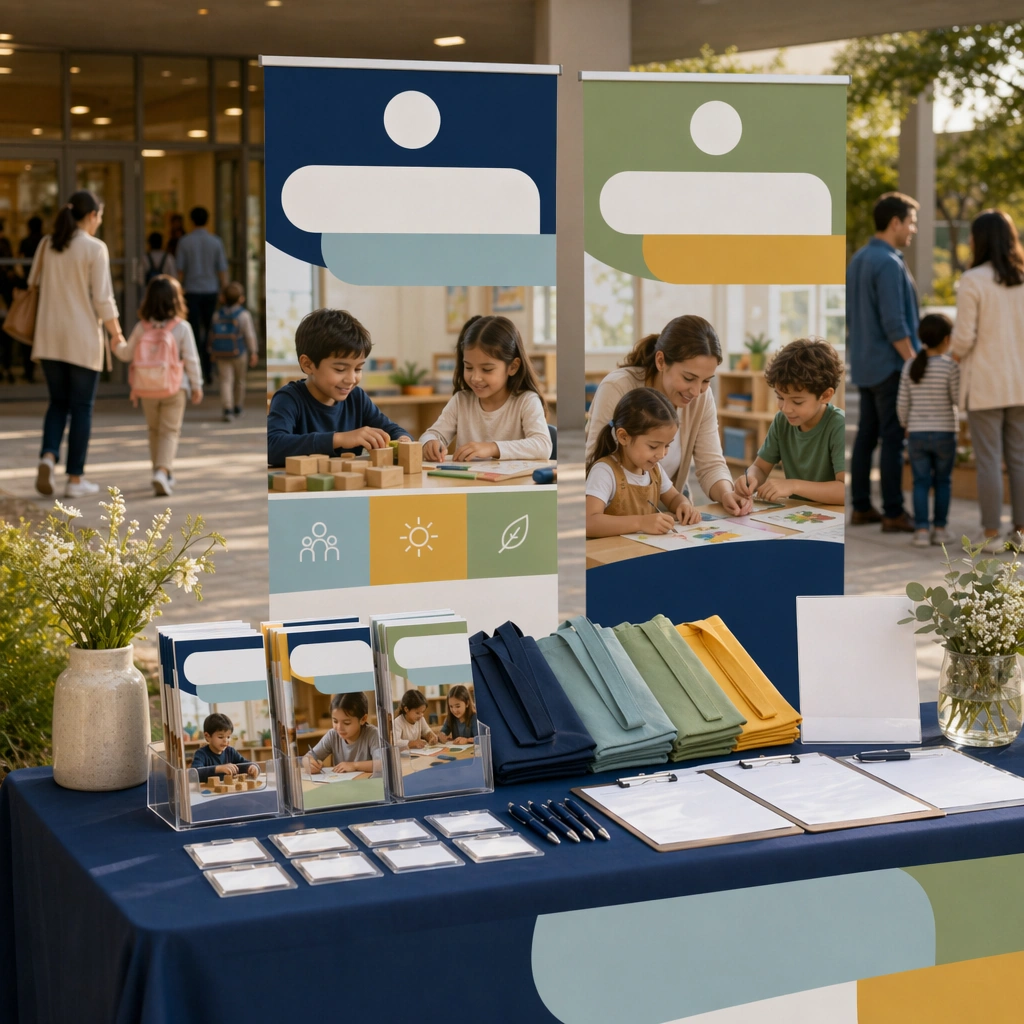
Example generated from “School Open Day And Enrollment Kit — Admissions Booth Hero”
GPT Image 2en

Scene: Return to the same square campaign style and campus-brand atmosphere, now centered on an admissions booth or welcome desk photographed from a slightly frontal angle under natural daylight. The scene should feel live enough for a real event and clean enough for use in a school marketing deck. Keep the square frame balanced, calm, and production-ready so the asset can serve gallery review, research comparison, and real educational delivery at the same time. Subject: Show a tidy welcome station with brochures, tote bags, blank badges, floral accents, and one or two photorealistic campus-brand panels behind it. The environment should suggest organized hospitality, family trust, and educational warmth rather than commercial hard-selling. The subject matter should feel intentionally selected for a coherent curriculum family rather than like a random decorative assortment. Important details: Preserve the same admissions identity system from the reference poster, especially the color family, photo treatment, and blank information panels. The result should feel like a complete enrollment-kit world, not four unrelated marketing assets. Preserve the same campus color system, photography tone, panel hierarchy, family-friendly admissions mood, and blank information-band rhythm from the reference asset. Use variation only in the teaching content, supporting props, and scene-specific mood while preserving the core visual system exactly. Use case: School Open Day and Enrollment Kit series study 4/4, admissions booth hero. Constraints: No readable text, no watermark, no logos, preserve exact 1:1 aspect ratio, no readable school names, no logos, no celebrity faces, no unrealistic campus luxury, no crowded chaos, no distorted architecture.

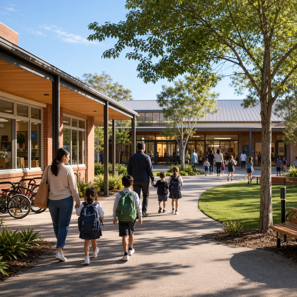
Example generated from “School Open Day And Enrollment Kit — Campus Hero Photo”
GPT Image 2en

Scene: Create a square photoreal campus hero shot during soft morning light, with neat grounds, inviting architecture, and believable family-scale activity. The image should feel premium but grounded, like a real school photography commission rather than a stock lifestyle cliche. Keep the square frame balanced, calm, and production-ready so the asset can serve gallery review, research comparison, and real educational delivery at the same time. Subject: Feature a welcoming exterior with children and caregivers moving through the space naturally, clear sightlines to classrooms and greenery, and subtle institutional details that support trust. The moment should feel bright, safe, and full of educational possibility. The subject arrangement should feel complete and self-contained, able to stand alone as a real supporting deliverable inside the same education business line. Important details: Favor real architectural texture and humane scale. The scene should read as a credible school environment first and a marketing asset second, proving admissions photography can feel both aspirational and honest. Keep the visual hierarchy modular, commercially believable, and clearly tied to a real educational use case rather than a generic mood board. Use case: School Open Day and Enrollment Kit single study 1/5, campus hero photo. Constraints: No readable text, no watermark, no logos, preserve exact 1:1 aspect ratio, no readable school names, no logos, no luxury-hotel exaggeration, no chaotic crowds, no celebrity faces, no fake brand signage.

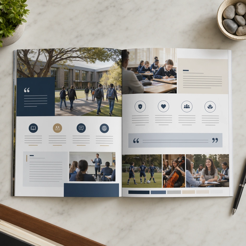
Example generated from “School Open Day And Enrollment Kit — Brochure Spread”
GPT Image 2en

Scene: Show a square top-down mockup of an open admissions brochure on a reception desk, lit cleanly with subtle shadows and believable coated-paper texture. The spread should feel publication-ready and suitable for a real school communications team. Keep the square frame balanced, calm, and production-ready so the asset can serve gallery review, research comparison, and real educational delivery at the same time. Subject: Use campus photos, icon-led info blocks, blank pull-quote bands, and carefully paced panels that communicate program breadth, safety, and community without readable copy. The brochure should feel spacious, modern, and parent-trust oriented. The subject arrangement should feel complete and self-contained, able to stand alone as a real supporting deliverable inside the same education business line. Important details: Keep the layout modular and restrained, avoiding generic corporate brochure stiffness. The balance between imagery and empty copy zones should signal serious admissions intent and design maturity. Keep the visual hierarchy modular, commercially believable, and clearly tied to a real educational use case rather than a generic mood board. Use case: School Open Day and Enrollment Kit single study 2/5, brochure spread. Constraints: No readable text, no watermark, no logos, preserve exact 1:1 aspect ratio, no readable school names, no logos, no luxury-hotel exaggeration, no chaotic crowds, no celebrity faces, no fake brand signage.

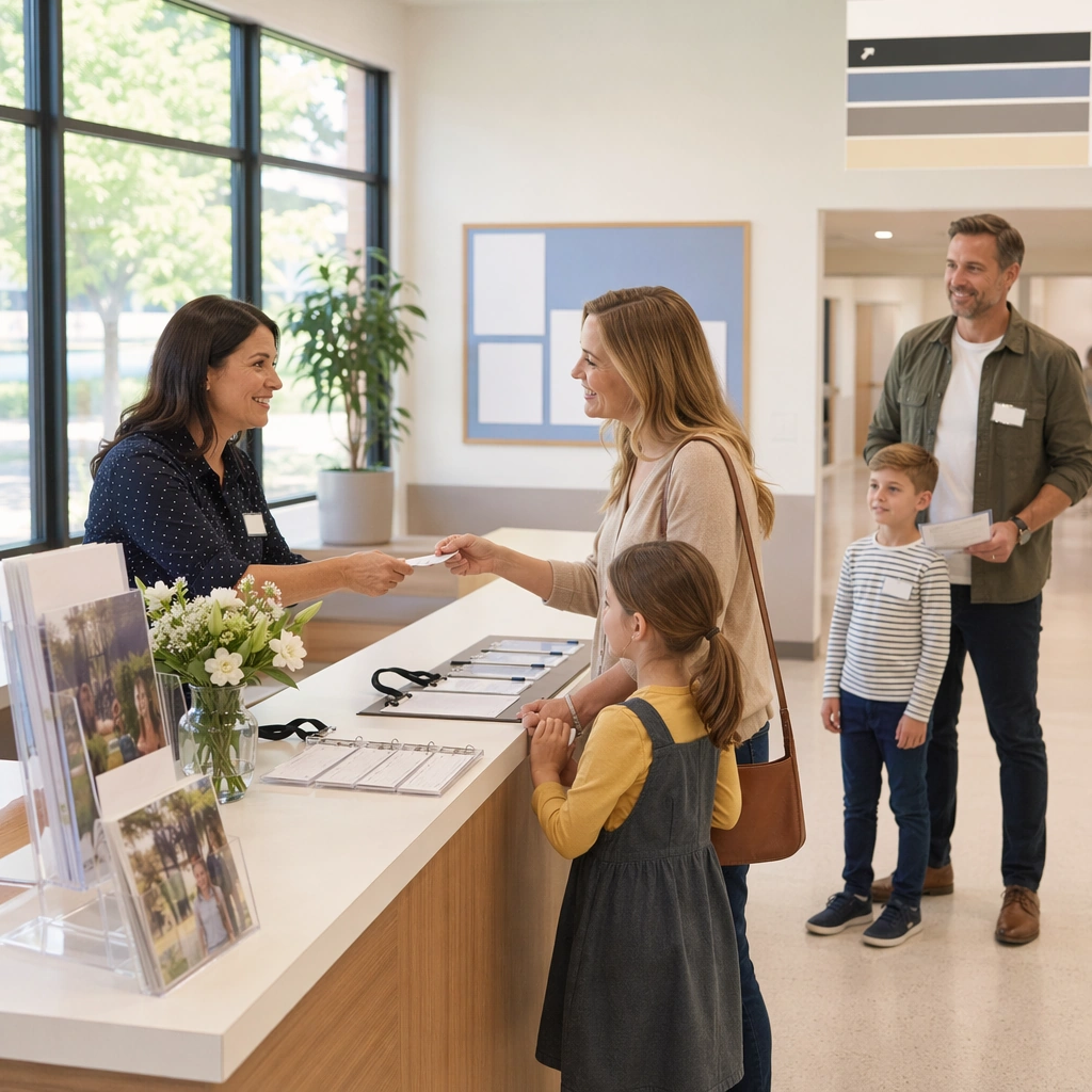
Example generated from “School Open Day And Enrollment Kit — Family Tour Check-In”
GPT Image 2en

Scene: Render a square front-desk scene at a school open day, with bright natural light, clear circulation, and a tidy welcome atmosphere. The image should feel documentary-photoreal yet art-directed enough for marketing use. Keep the square frame balanced, calm, and production-ready so the asset can serve gallery review, research comparison, and real educational delivery at the same time. Subject: Show a reception desk with blank badges, brochures, small floral details, and staff-like figures greeting families in a warm but orderly way. The visual story should emphasize calm organization and emotional reassurance. The subject arrangement should feel complete and self-contained, able to stand alone as a real supporting deliverable inside the same education business line. Important details: Avoid event-chaos energy. The admissions moment should feel human, specific, and trustworthy, proving that enrollment marketing can be centered on experience rather than abstract claims. Keep the visual hierarchy modular, commercially believable, and clearly tied to a real educational use case rather than a generic mood board. Use case: School Open Day and Enrollment Kit single study 3/5, family tour check-in. Constraints: No readable text, no watermark, no logos, preserve exact 1:1 aspect ratio, no readable school names, no logos, no luxury-hotel exaggeration, no chaotic crowds, no celebrity faces, no fake brand signage.

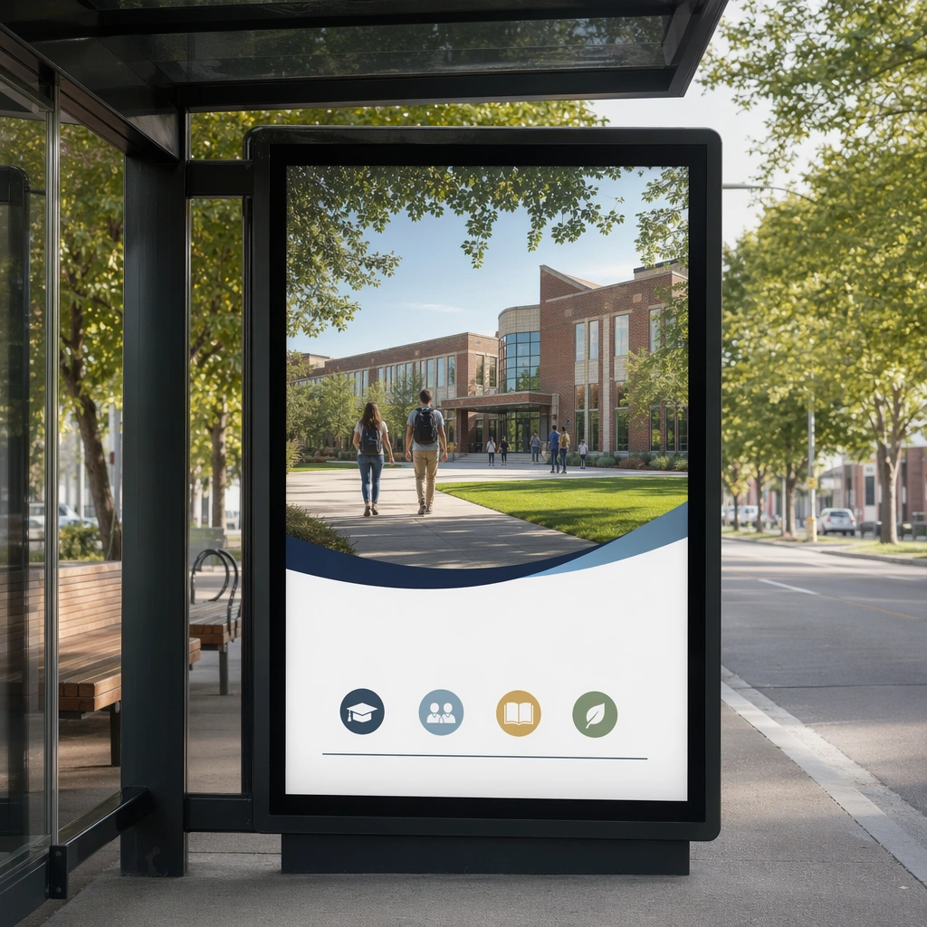
Example generated from “School Open Day And Enrollment Kit — Bus Stop Banner”
GPT Image 2en

Scene: Create a square environmental mockup of a bus-stop lightbox featuring a school campaign visual, photographed at eye level in clean daytime conditions. The surroundings should remain minimal so the media surface and campus image stay dominant. Keep the square frame balanced, calm, and production-ready so the asset can serve gallery review, research comparison, and real educational delivery at the same time. Subject: Use one strong campus photo, blank headline space, a simple icon row, and a calm admissions hierarchy adapted for quick public viewing. The banner must feel professional, civic, and realistic for a school located in a neighborhood. The subject arrangement should feel complete and self-contained, able to stand alone as a real supporting deliverable inside the same education business line. Important details: Keep the composition concise and credible. The outdoor placement should expand the enrollment system into public communication without turning into a loud consumer-ad cliche. Keep the visual hierarchy modular, commercially believable, and clearly tied to a real educational use case rather than a generic mood board. Use case: School Open Day and Enrollment Kit single study 4/5, bus stop banner. Constraints: No readable text, no watermark, no logos, preserve exact 1:1 aspect ratio, no readable school names, no logos, no luxury-hotel exaggeration, no chaotic crowds, no celebrity faces, no fake brand signage.

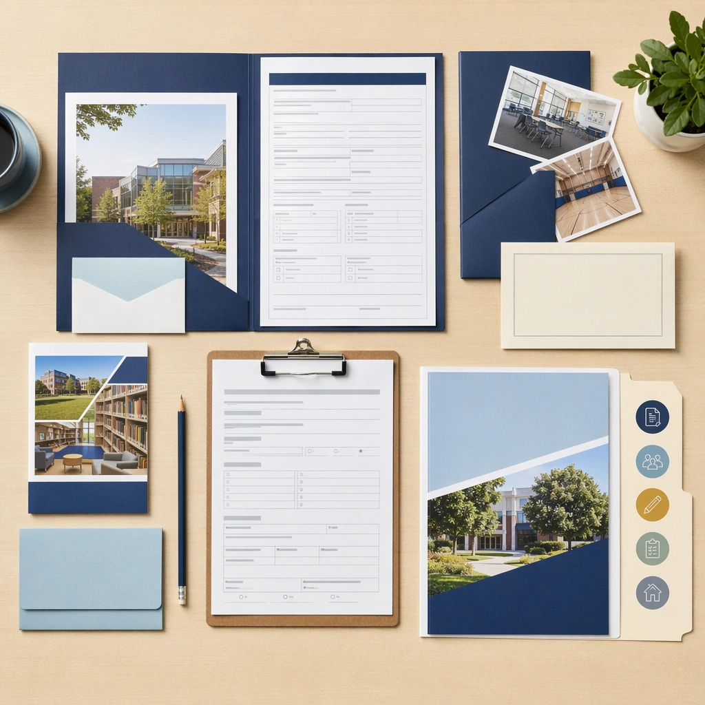
Example generated from “School Open Day And Enrollment Kit — Enrollment Folder Flatlay”
GPT Image 2en

Scene: Show a square top-down admissions packet flatlay on a clean desk with folders, forms, prospectus pieces, and a welcome card arranged with exacting order. Use cool-neutral daylight and a restrained prop set so the image feels administrative but still warm. Keep the square frame balanced, calm, and production-ready so the asset can serve gallery review, research comparison, and real educational delivery at the same time. Subject: Feature blank form fields, clipboards, brochures, campus photos, and a few tactile items like a pencil and folder tab, all styled into one coherent packet. The materials should suggest preparedness and professionalism without becoming bureaucratic or cold. The subject arrangement should feel complete and self-contained, able to stand alone as a real supporting deliverable inside the same education business line. Important details: The flatlay should communicate process clarity and family readiness. It should feel like a real school deliverable that parents would receive, not a generic office-stationery arrangement. Keep the visual hierarchy modular, commercially believable, and clearly tied to a real educational use case rather than a generic mood board. Use case: School Open Day and Enrollment Kit single study 5/5, enrollment folder flatlay. Constraints: No readable text, no watermark, no logos, preserve exact 1:1 aspect ratio, no readable school names, no logos, no luxury-hotel exaggeration, no chaotic crowds, no celebrity faces, no fake brand signage.

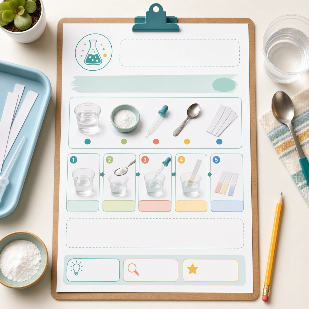
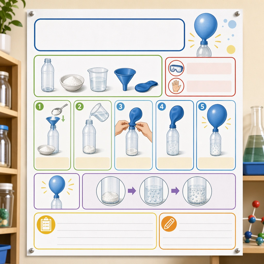
Example generated from “Science Kids Experiment Poster System — Reference Experiment Poster”
GPT Image 2en

Scene: Create a square straight-on poster mockup pinned on a classroom science wall, lit with bright but soft daylight. The poster should feel like a real educational deliverable, with crisp print texture, clean margins, and enough context from nearby shelves and jars to suggest a science corner without competing for attention. Keep the square frame balanced, calm, and production-ready so the asset can serve gallery review, research comparison, and real educational delivery at the same time. Subject: Design the poster around one simple classroom experiment shown through picture-led setup, step panels, safety icons, material trays, and outcome illustrations. Use a clear visual progression with generous blank title and note areas so the poster feels genuinely teachable and easy to localize later. The subject matter should feel intentionally selected for a coherent curriculum family rather than like a random decorative assortment. Important details: The system should feel safe, lively, and methodical at once: rounded modules, playful but not silly color coding, obvious sequence logic, and illustration cues that children can follow with minimal adult translation. It must read as a scalable poster template for many experiments. Preserve the same poster grid, step-panel proportions, icon weight, blank instruction bars, and safety-callout rhythm from the reference poster. Use variation only in the teaching content, supporting props, and scene-specific mood while preserving the core visual system exactly. Use case: Science Kids Experiment Poster System series study 1/4, reference experiment poster. Constraints: No readable text, no watermark, no logos, preserve exact 1:1 aspect ratio, no readable copy, no chemical formulas, no logos, no dangerous realism, no lab-brand signage, no chaotic clutter.

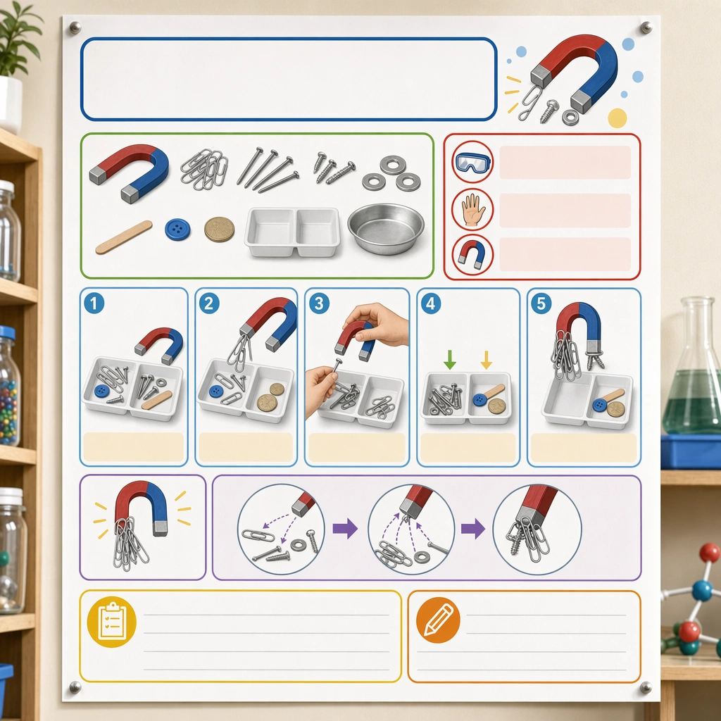
Example generated from “Science Kids Experiment Poster System — Magnet Exploration Board”
GPT Image 2en

Scene: Render the same square straight-on poster on the classroom wall, with the same soft daylight, print realism, and supporting science-corner props held in the background. The image should read as another approved poster in the same school-ready series. Keep the square frame balanced, calm, and production-ready so the asset can serve gallery review, research comparison, and real educational delivery at the same time. Subject: Build the experiment around horseshoe magnets, metal and non-metal test objects, sorting trays, and attraction paths shown through friendly diagrams and step panels. Make the poster instantly understandable through imagery and sequence rather than text, while staying visually rich enough to feel like a real published classroom asset. The subject matter should feel intentionally selected for a coherent curriculum family rather than like a random decorative assortment. Important details: Every structural rule from the reference poster must remain intact, especially the module grid, safety cue placement, blank headline zones, and pictogram weight. Variation should come from object behavior and discovery energy, not from a new graphic system. Preserve the same poster grid, step-panel proportions, icon weight, blank instruction bars, and safety-callout rhythm from the reference poster. Use variation only in the teaching content, supporting props, and scene-specific mood while preserving the core visual system exactly. Use case: Science Kids Experiment Poster System series study 3/4, magnet exploration board. Constraints: No readable text, no watermark, no logos, preserve exact 1:1 aspect ratio, no readable copy, no chemical formulas, no logos, no dangerous realism, no lab-brand signage, no chaotic clutter.

Example generated from “Science Kids Experiment Poster System — Seed Growth Board”
GPT Image 2en

Scene: Return to the exact same square poster mockup composition and classroom wall context established by the reference poster. It should feel like a calm observational companion piece in the same STEM poster line, ready for both classroom display and curriculum packaging. Keep the square frame balanced, calm, and production-ready so the asset can serve gallery review, research comparison, and real educational delivery at the same time. Subject: Focus on a seed-in-jar or cotton-pad growth experiment with materials, daily observation steps, root and sprout stages, and comparison icons organized into the familiar poster grid. Use blank note panels and timeline-like visual slots without any actual writing. The subject matter should feel intentionally selected for a coherent curriculum family rather than like a random decorative assortment. Important details: Keep the poster architecture locked to the reference image while shifting the experiment mood toward slow observation and care. The result should prove that the template can handle high-energy reaction experiments and gentle life-science studies equally well. Preserve the same poster grid, step-panel proportions, icon weight, blank instruction bars, and safety-callout rhythm from the reference poster. Use variation only in the teaching content, supporting props, and scene-specific mood while preserving the core visual system exactly. Use case: Science Kids Experiment Poster System series study 4/4, seed growth board. Constraints: No readable text, no watermark, no logos, preserve exact 1:1 aspect ratio, no readable copy, no chemical formulas, no logos, no dangerous realism, no lab-brand signage, no chaotic clutter.

Example generated from “Science Kids Experiment Poster System — Science Corner Wall”
GPT Image 2en

Scene: Show a square classroom science corner photographed straight-on with bright natural light, tidy shelving, and a central display wall. The scene should feel realistic for a primary classroom but still polished enough for a prospectus or teaching-resource catalog. Keep the square frame balanced, calm, and production-ready so the asset can serve gallery review, research comparison, and real educational delivery at the same time. Subject: Combine one or two experiment posters with jars, magnifiers, trays, and natural specimens arranged in a coherent educational vignette. The wall should communicate curiosity and order through image-led labels, blank tabs, and strong visual grouping rather than through written content. The subject arrangement should feel complete and self-contained, able to stand alone as a real supporting deliverable inside the same education business line. Important details: Emphasize classroom credibility and accessibility. The display should feel achievable, safe, and scalable, proving that the poster language can extend into an entire science-learning environment. Keep the visual hierarchy modular, commercially believable, and clearly tied to a real educational use case rather than a generic mood board. Use case: Science Kids Experiment Poster System single study 1/5, science corner wall. Constraints: No readable text, no watermark, no logos, preserve exact 1:1 aspect ratio, no readable text, no brand logos, no unsafe flames, no dangerous chemicals, no crowded lab realism, no cluttered props.

Example generated from “Science Kids Experiment Poster System — Safety Supply Flatlay”
GPT Image 2en

Scene: Create a square overhead flatlay on a neutral lab-classroom surface with trays, goggles, droppers, jars, spoons, towels, and colorful experiment tools carefully spaced under clean studio light. The image should feel like a trustworthy school-supply bundle, not a messy science-table snapshot. Keep the square frame balanced, calm, and production-ready so the asset can serve gallery review, research comparison, and real educational delivery at the same time. Subject: Make each tool child-safe and easy to understand visually, with grouped components suggesting different experiment types and blank color-coded markers standing in for labels. The arrangement should imply readiness, organization, and repeat classroom use. The subject arrangement should feel complete and self-contained, able to stand alone as a real supporting deliverable inside the same education business line. Important details: Keep the hierarchy clear and catalog-ready. Surfaces should be clean, materials tactile, and the entire kit should feel more like an education product than a generic craft assortment. Keep the visual hierarchy modular, commercially believable, and clearly tied to a real educational use case rather than a generic mood board. Use case: Science Kids Experiment Poster System single study 2/5, safety supply flatlay. Constraints: No readable text, no watermark, no logos, preserve exact 1:1 aspect ratio, no readable text, no brand logos, no unsafe flames, no dangerous chemicals, no crowded lab realism, no cluttered props.

Example generated from “Science Kids Experiment Poster System — Step Card Standees”
GPT Image 2en

Scene: Render a square tabletop scene with several upright step cards on a science table, shallow depth of field, and crisp side lighting that highlights coated card stock. The setup should feel like a product launch image for a classroom experiment accessory line. Keep the square frame balanced, calm, and production-ready so the asset can serve gallery review, research comparison, and real educational delivery at the same time. Subject: Each standee uses pictorial step cues, material icons, safety reminders, and blank heading bars, arranged so children could follow an experiment sequence visually from left to right. Add a few beakers and trays in the background, but keep the standees dominant. The subject arrangement should feel complete and self-contained, able to stand alone as a real supporting deliverable inside the same education business line. Important details: The cards should look durable, teacher-friendly, and easy to localize later. Their proportions, icon style, and color coding should suggest a broader poster system, even though this is an independent support asset. Keep the visual hierarchy modular, commercially believable, and clearly tied to a real educational use case rather than a generic mood board. Use case: Science Kids Experiment Poster System single study 3/5, step card standees. Constraints: No readable text, no watermark, no logos, preserve exact 1:1 aspect ratio, no readable text, no brand logos, no unsafe flames, no dangerous chemicals, no crowded lab realism, no cluttered props.

Example generated from “Science Kids Experiment Poster System — Tabletop Demo Setup”
GPT Image 2en

Scene: Show a square classroom demo table from a slightly elevated angle, with trays, jars, pipettes, and one small experiment setup arranged under bright educational lighting. The image should feel like a practical hero visual for a school science program campaign. Keep the square frame balanced, calm, and production-ready so the asset can serve gallery review, research comparison, and real educational delivery at the same time. Subject: Use a single clear experiment station with orderly materials, picture cues, and a blank checklist card, making the setup feel both exciting and well-managed. The table should look ready for children to gather around, but still safe and intentional. The subject arrangement should feel complete and self-contained, able to stand alone as a real supporting deliverable inside the same education business line. Important details: Avoid theatrical laboratory drama. The asset should center on clarity, trust, and child-scale discovery, proving that everyday science can be marketed visually without slipping into generic stock imagery. Keep the visual hierarchy modular, commercially believable, and clearly tied to a real educational use case rather than a generic mood board. Use case: Science Kids Experiment Poster System single study 4/5, tabletop demo setup. Constraints: No readable text, no watermark, no logos, preserve exact 1:1 aspect ratio, no readable text, no brand logos, no unsafe flames, no dangerous chemicals, no crowded lab realism, no cluttered props.

Example generated from “Science Kids Experiment Poster System — Family Take-Home Sheet”
GPT Image 2en

Scene: Create a square editorial mockup of a family take-home sheet clipped to a board with a few experiment supplies and a pencil nearby. The composition should look like a polished parent-resource cover image from a school or after-school science program. Keep the square frame balanced, calm, and production-ready so the asset can serve gallery review, research comparison, and real educational delivery at the same time. Subject: The sheet should show a home-safe experiment sequence through pictures, material clusters, and simple progress blocks, with large blank regions where instructions could later be typeset. Everything should feel friendly enough for families and structured enough for formal programs. The subject arrangement should feel complete and self-contained, able to stand alone as a real supporting deliverable inside the same education business line. Important details: Use calm colors, clear modular spacing, and obvious visual hierarchy. The image should prove that the science poster system can stretch beyond classroom walls into home-learning communication. Keep the visual hierarchy modular, commercially believable, and clearly tied to a real educational use case rather than a generic mood board. Use case: Science Kids Experiment Poster System single study 5/5, family take-home sheet. Constraints: No readable text, no watermark, no logos, preserve exact 1:1 aspect ratio, no readable text, no brand logos, no unsafe flames, no dangerous chemicals, no crowded lab realism, no cluttered props.

Example generated from “Scientific Paper Figure — Cutaway Panel”
GPT Image 2en

Scene: A square plate or board viewed straight-on, with crisp organization, disciplined spacing, and premium print clarity. Build the frame around a cutaway or sectional treatment that reveals interior logic without sacrificing readability. Keep the lighting, camera distance, and spatial organization tuned for a high-signal research image rather than a casual snapshot. The image belongs to the Scientific Paper Figure theme and should feel immediately legible as a prompt atlas theme for scientific paper figure, testing physics-materials, commercial-mockup with gpt image 2.. Subject: Center the study on a cutaway or sectional treatment that reveals interior logic without sacrificing readability. Translate the theme into a concrete visual statement instead of an abstract mood board: the viewer should understand what kind of image this is, what is being tested, and why the composition is difficult. Use the slug idea of scientific paper figure as a literal guide for subject matter, materials, and staging. If helpful, borrow the broad visual cues suggested by Nature, Science, but keep the result original and specific to this study. Important details: The image should communicate logic through grouping, hierarchy, callouts, insets, and believable professional layout discipline rather than decorative noise. Preserve a disciplined square composition, clear focal hierarchy, and enough secondary information to make the image feel complete rather than underspecified. The image should look polished, novel, and exhibition-ready, with topic-specific credibility coming from the way surfaces, structure, and visual language reinforce Scientific Paper Figure. Avoid generic filler elements that do not serve the main concept. Use case: Scientific Paper Figure single study 2/8, testing physics-materials, commercial-mockup through the cutaway panel variation. Constraints: No readable text, no watermark, no logos, preserve exact 1:1 aspect ratio, no readable labels, no messy arrows, no random infographic decoration, no fake UI chrome unless the topic calls for it, no broken alignment, no meaningless clutter.

Example generated from “Scientific Paper Figure — Process Sequence”
GPT Image 2en

Scene: A square plate or board viewed straight-on, with crisp organization, disciplined spacing, and premium print clarity. Build the frame around a sequence of stages or states arranged in a disciplined progression. Keep the lighting, camera distance, and spatial organization tuned for a high-signal research image rather than a casual snapshot. The image belongs to the Scientific Paper Figure theme and should feel immediately legible as a prompt atlas theme for scientific paper figure, testing physics-materials, commercial-mockup with gpt image 2.. Subject: Center the study on a sequence of stages or states arranged in a disciplined progression. Translate the theme into a concrete visual statement instead of an abstract mood board: the viewer should understand what kind of image this is, what is being tested, and why the composition is difficult. Use the slug idea of scientific paper figure as a literal guide for subject matter, materials, and staging. If helpful, borrow the broad visual cues suggested by Nature, Science, but keep the result original and specific to this study. Important details: The image should communicate logic through grouping, hierarchy, callouts, insets, and believable professional layout discipline rather than decorative noise. Preserve a disciplined square composition, clear focal hierarchy, and enough secondary information to make the image feel complete rather than underspecified. The image should look polished, novel, and exhibition-ready, with topic-specific credibility coming from the way surfaces, structure, and visual language reinforce Scientific Paper Figure. Avoid generic filler elements that do not serve the main concept. Use case: Scientific Paper Figure single study 3/8, testing physics-materials, commercial-mockup through the process sequence variation. Constraints: No readable text, no watermark, no logos, preserve exact 1:1 aspect ratio, no readable labels, no messy arrows, no random infographic decoration, no fake UI chrome unless the topic calls for it, no broken alignment, no meaningless clutter.

Example generated from “Scientific Paper Figure — Annotation Cluster”
GPT Image 2en

Scene: A square plate or board viewed straight-on, with crisp organization, disciplined spacing, and premium print clarity. Build the frame around dense callouts and side insets that feel scholarly while staying unreadable. Keep the lighting, camera distance, and spatial organization tuned for a high-signal research image rather than a casual snapshot. The image belongs to the Scientific Paper Figure theme and should feel immediately legible as a prompt atlas theme for scientific paper figure, testing physics-materials, commercial-mockup with gpt image 2.. Subject: Center the study on dense callouts and side insets that feel scholarly while staying unreadable. Translate the theme into a concrete visual statement instead of an abstract mood board: the viewer should understand what kind of image this is, what is being tested, and why the composition is difficult. Use the slug idea of scientific paper figure as a literal guide for subject matter, materials, and staging. If helpful, borrow the broad visual cues suggested by Nature, Science, but keep the result original and specific to this study. Important details: The image should communicate logic through grouping, hierarchy, callouts, insets, and believable professional layout discipline rather than decorative noise. Preserve a disciplined square composition, clear focal hierarchy, and enough secondary information to make the image feel complete rather than underspecified. The image should look polished, novel, and exhibition-ready, with topic-specific credibility coming from the way surfaces, structure, and visual language reinforce Scientific Paper Figure. Avoid generic filler elements that do not serve the main concept. Use case: Scientific Paper Figure single study 4/8, testing physics-materials, commercial-mockup through the annotation cluster variation. Constraints: No readable text, no watermark, no logos, preserve exact 1:1 aspect ratio, no readable labels, no messy arrows, no random infographic decoration, no fake UI chrome unless the topic calls for it, no broken alignment, no meaningless clutter.

Example generated from “Scientific Paper Figure — Comparison Board”
GPT Image 2en

Scene: A square plate or board viewed straight-on, with crisp organization, disciplined spacing, and premium print clarity. Build the frame around a side-by-side comparison structure with strong contrast and equal visual weight. Keep the lighting, camera distance, and spatial organization tuned for a high-signal research image rather than a casual snapshot. The image belongs to the Scientific Paper Figure theme and should feel immediately legible as a prompt atlas theme for scientific paper figure, testing physics-materials, commercial-mockup with gpt image 2.. Subject: Center the study on a side-by-side comparison structure with strong contrast and equal visual weight. Translate the theme into a concrete visual statement instead of an abstract mood board: the viewer should understand what kind of image this is, what is being tested, and why the composition is difficult. Use the slug idea of scientific paper figure as a literal guide for subject matter, materials, and staging. If helpful, borrow the broad visual cues suggested by Nature, Science, but keep the result original and specific to this study. Important details: The image should communicate logic through grouping, hierarchy, callouts, insets, and believable professional layout discipline rather than decorative noise. Preserve a disciplined square composition, clear focal hierarchy, and enough secondary information to make the image feel complete rather than underspecified. The image should look polished, novel, and exhibition-ready, with topic-specific credibility coming from the way surfaces, structure, and visual language reinforce Scientific Paper Figure. Avoid generic filler elements that do not serve the main concept. Use case: Scientific Paper Figure single study 5/8, testing physics-materials, commercial-mockup through the comparison board variation. Constraints: No readable text, no watermark, no logos, preserve exact 1:1 aspect ratio, no readable labels, no messy arrows, no random infographic decoration, no fake UI chrome unless the topic calls for it, no broken alignment, no meaningless clutter.