PROMPTS · EXPLORATION CRÉATIVE

Galerie de prompts

Explorez des prompts réels et leurs exemples générés. Trouvez l’inspiration pour votre prochaine mission créative et copiez le texte intégral gratuitement.

Exemples
10,974
Modèles
17
Sources
1277
10 974 exemples de prompts · page 72 sur 229
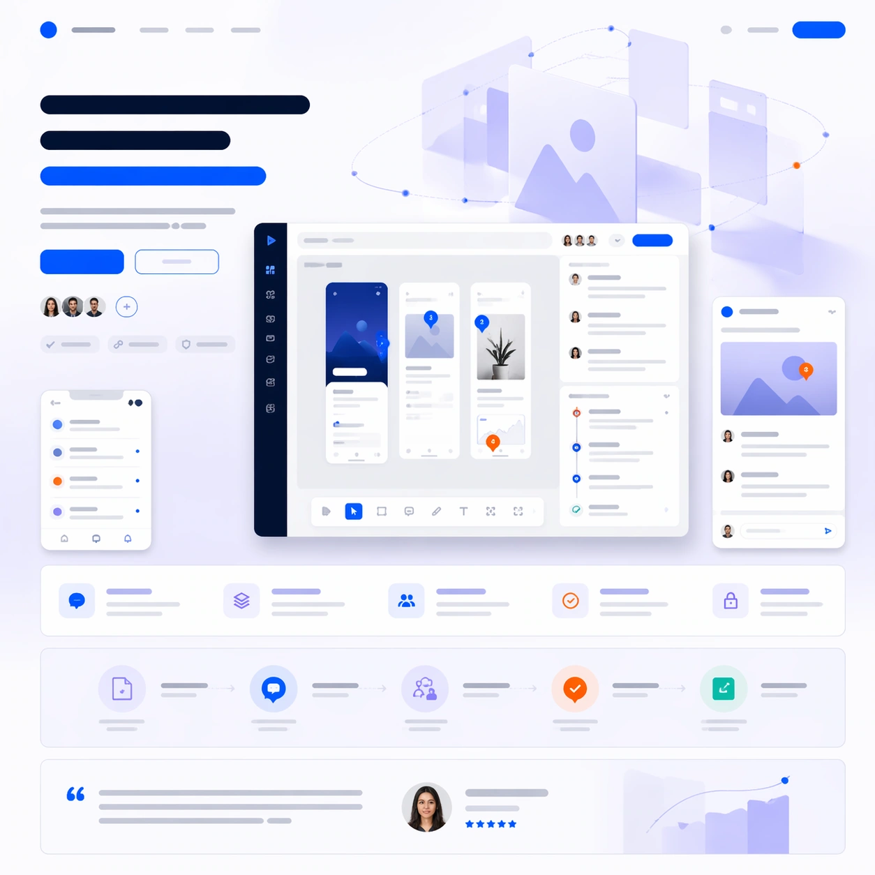
Example generated from “App Launch Hero System — Design Review Canvas”
GPT Image 2en

Scene: A square software launch-page still with cool white, lavender gray, cobalt, and signal orange accents, composed like a premium design-tool website first screen with supporting sections below. Use a clean studio background, floating panels, and carefully spaced interface layers so the frame feels modern and collaborative rather than sterile. The layout should clearly separate hero, features, workflow proof, and final CTA. Subject: Place a wide desktop screenshot for a design review platform at the center, showing an artboard canvas, threaded comment pins, side inspector cards, and a compact approval timeline. Add two smaller supporting crops: one mobile notification view and one zoomed review detail card. Around these, compose a launch-page hierarchy with abstract headline bars, a CTA pair, a row of feature blocks, a process diagram strip, and a testimonial band. Behind the screenshots, add a soft geometric hero illustration of translucent rectangles orbiting around a central canvas plane. Important details: This should look like a real software launch page where product proof and marketing rhythm reinforce each other. Keep the UI credible for a collaborative design-review tool, with consistent panel language and precise spacing. The page must communicate workflow clearly through layout, not through readable words. Treat all text zones as elegant placeholder bars, badge pills, and icon shapes. Avoid collage chaos: each screen, module, and supporting element needs a deliberate place in the vertical story from hero statement to proof to conversion. Use case: App Launch Hero System single study 4/9, testing whether a collaborative design-tool launch page can integrate dense interface proof with clean brand storytelling. Constraints: No readable text, no watermark, no logos, preserve exact 1:1 aspect ratio, no browser chrome, no generic dribbble-shot clutter, no unrealistic 3D laptops, no overlapping UI chaos, no fake brand marks, no broken perspective on panels.
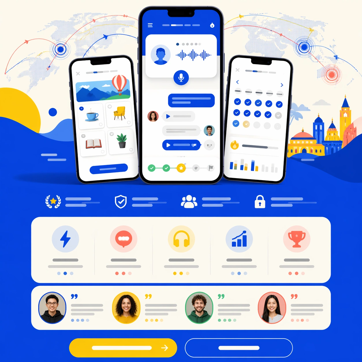
Example generated from “App Launch Hero System — Language Sprint Mobile”
GPT Image 2en

Scene: A square mobile-first app launch-page still with bright cobalt, cream, lemon, and coral accents, styled like a confident consumer-product website with strong onboarding energy. The composition should feel lively but controlled, with a centered phone hero, playful modular cards below, and a subtle illustrated backdrop that suggests momentum and travel. Keep the layout polished enough to feel like a real launch asset from a mature language-learning company. Subject: Show a tall phone mockup for a language-learning sprint app at the center, with screens implying short lesson cards, pronunciation waves, conversation bubbles, and progress ladders. Flank it with two smaller device crops showing a vocabulary challenge and a weekly streak calendar. Build a launch-page frame around the devices using an abstract headline zone, CTA buttons, small trust badges, a benefits grid, and a testimonial row with circular portraits. Add a hero motif of colorful map arcs and speech-sound rings drifting behind the phone stack. Important details: The image must sell a full launch page, not just a pretty app UI. Maintain a believable story flow from aspirational hero to feature proof to social proof to conversion. Use strong spacing and consistent mobile UI language across every screen. All copy must remain unreadable, appearing only as bars, dots, and stylized blocks. Avoid toy-like clutter; the page should feel globally marketable, premium, and modular enough to be repurposed into app-store visuals or social campaign crops. Use case: App Launch Hero System single study 5/9, testing whether a consumer language app can combine cheerful brand motion, mobile proof, and launch-page structure in one image. Constraints: No readable text, no watermark, no logos, preserve exact 1:1 aspect ratio, no browser chrome, no national flags dominating the frame, no cartoon owl mascot, no overloaded sticker clutter, no fake app-store text, no bent phone geometry.

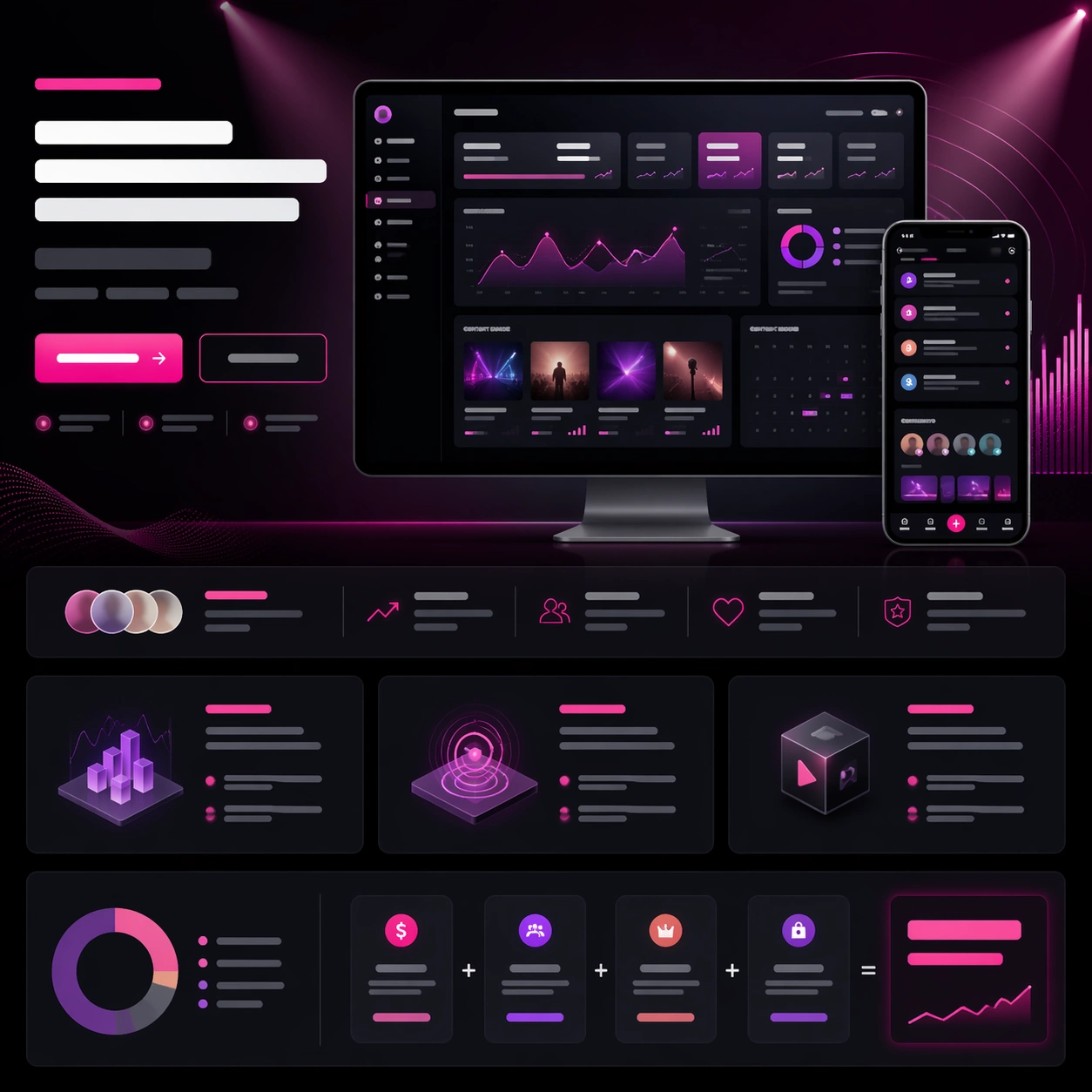
Example generated from “App Launch Hero System — Creator Analytics Portal”
GPT Image 2en

Scene: A square creator-tool launch-page still with charcoal, plum, silver, and electric pink highlights, arranged as a polished web hero with lower storytelling bands. The tone should feel ambitious and media-savvy, with glowing chart accents, thumbnail-like content tiles, and a cinematic gradient field behind the main dashboard. Keep the structure crisp enough to read instantly as a real launch website for creators. Subject: Center a desktop screenshot for a creator analytics portal, showing unreadable yet believable audience graphs, revenue cards, content performance tiles, and a campaign calendar. Add a smaller phone companion screen showing notifications and community highlights. Around the screenshots, build a strong launch-page hierarchy with abstract headline bars, two CTA buttons, a social-proof strip, three feature modules, and a monetization breakdown band. Use a subtle hero illustration of floating spotlight beams and signal waves to frame the product without overpowering it. Important details: The page must feel like product marketing with a real business objective, not a random dashboard collage. The product screenshots should carry the proof while the surrounding modules establish aspiration, trust, and action. Keep the layout disciplined and premium, with consistent card language, balanced empty space, and clear vertical rhythm. All text-like elements must remain unreadable placeholder forms only. The result should suggest a launch system that could extend into ads, keynote slides, and storefront images. Use case: App Launch Hero System single study 6/9, testing whether a creator-economy analytics page can blend dense product proof, visual energy, and believable conversion structure. Constraints: No readable text, no watermark, no logos, preserve exact 1:1 aspect ratio, no browser chrome, no social-media brand icons, no influencer portraits dominating the frame, no cluttered thumbnail wall, no fake readable chart labels, no distorted monitor angles.

Example generated from “App Launch Hero System — Clinic Wellness Companion”
GPT Image 2en

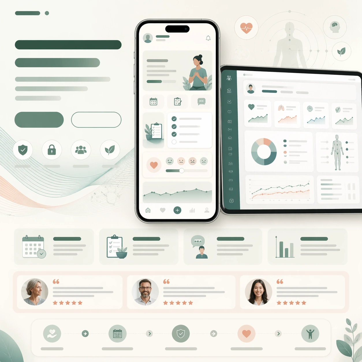
Scene: A square health-tech launch-page still with warm white, sage, sea-glass, and muted coral tones, designed like a trusted care-platform website. The layout should be soft and reassuring but still commercial and precise, with a centered phone hero, supporting information cards, and a clear CTA area. Use subtle gradients and rounded modules so the page feels humane rather than sterile. Subject: Show a phone-centered launch page for a clinic wellness companion app, with a main screen implying appointment prep, recovery checklist cards, and calm symptom journaling. Add a secondary tablet or desktop crop with clinician-side summaries and progress charts. Compose the page around these screenshots using abstract headline blocks, a CTA pair, feature cards, a patient-story testimonial row, and a gentle care pathway strip. Behind the devices, add a translucent wave motif resembling breathing curves and soft medical diagrams without any readable notation. Important details: The image should look like a real health-product launch page built to earn trust. Product screenshots must be believable and calm, while the surrounding layout clearly expresses reassurance, capability, and next-step action. Keep the UI simple, medically credible, and uncluttered. All copy zones stay unreadable, appearing as bars, card stubs, and icon patterns only. The finished still should feel adaptable for a homepage hero, app-store feature graphic, and waiting-room presentation without losing coherence. Use case: App Launch Hero System single study 7/9, testing whether a health-tech launch page can combine empathy, clinical clarity, and strong signup structure in one frame. Constraints: No readable text, no watermark, no logos, preserve exact 1:1 aspect ratio, no hospital photo backgrounds, no red emergency drama, no browser chrome, no fake prescription text, no unrealistic anatomy diagrams, no distorted device bezels.

Example generated from “App Launch Hero System — Trip Planner Orbit”
GPT Image 2en

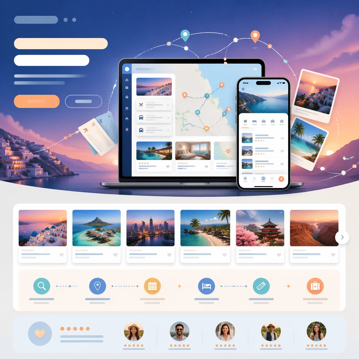
Scene: A square travel-app launch-page still with twilight blue, sand, aqua, and sunset orange accents, composed like a premium consumer travel website. The frame should feel aspirational and lightweight, with layered cards, route arcs, and one atmospheric gradient behind the central device cluster. Structure the composition so the hero feels dreamy while the lower modules still read as concrete product proof and booking conversion. Subject: Center a laptop and phone pairing for a trip-planning app, with screenshots implying itinerary cards, map pins, hotel blocks, and transit timing. Surround the devices with a clean launch-page hierarchy: abstract headline bars, two CTA buttons, a row of destination cards, a planning workflow strip, and a trust module made of ratings-like dots and traveler avatars. Add a subtle hero illustration of orbital route lines, paper tickets, and horizon gradients weaving behind the product screens. Important details: The page must convincingly integrate app proof with travel aspiration. Keep the screenshots believable and modular, never cluttered. The abstract hero art should amplify the sense of movement without turning the frame into a poster unrelated to product UI. Use disciplined spacing and obvious vertical sections so the still could plausibly be sliced into homepage hero, app-store visual, or social banner assets. All text-like content remains unreadable placeholder forms only, with no literal words or map labels. Use case: App Launch Hero System single study 8/9, testing whether a travel-planning launch page can balance dreamy hero mood, structured UI proof, and clear booking CTA hierarchy. Constraints: No readable text, no watermark, no logos, preserve exact 1:1 aspect ratio, no browser chrome, no airplane stock photo dominating the frame, no passport stamps with letters, no cluttered map labels, no luggage brand marks, no distorted screen reflections.

Example generated from “App Launch Hero System — Developer API Command Center”
GPT Image 2en

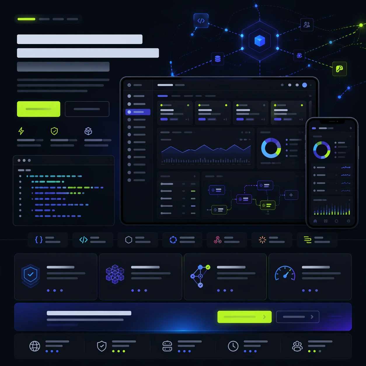
Scene: A square developer-tool launch-page still with charcoal, indigo, ice blue, and vivid lime accents, styled like a serious API platform homepage. The page should feel technical and premium, with a clear hero zone, product screenshot cluster, lower feature modules, and a final CTA strip. Use crisp light on dark surfaces and a restrained code-like glow so the frame feels modern without becoming hacker cliché. Subject: Center a desktop screenshot for a developer API command center showing endpoint cards, usage graphs, environment tabs, and workflow automation tiles, all rendered as unreadable but plausible interface content. Pair it with a smaller terminal-like side panel and one mobile status view. Around the screens, compose a realistic launch-page hierarchy using abstract headline bars, button shapes, integration badges, a feature grid, and a trust strip with infrastructure-style icons. Add a subtle hero illustration of connected nodes and packet paths floating behind the product, echoing platform orchestration. Important details: The page must look like a real software launch asset for developers and platform teams. The UI should feel coherent, useful, and organized; the marketing wrapper should make clear what the product promises without any readable text. Keep the balance between code-adjacent seriousness and polished commercial design. Use generous margins, exact alignment, and structured module rhythm so the still could be repurposed into keynote slides or storefront assets. Every textual region remains unreadable placeholder geometry only. Use case: App Launch Hero System single study 9/9, testing whether a technical API-platform launch page can combine dense product proof, abstract orchestration hero art, and clean conversion hierarchy. Constraints: No readable text, no watermark, no logos, preserve exact 1:1 aspect ratio, no browser chrome, no green-on-black hacker trope overload, no actual source code blocks with words, no cloud vendor branding, no distorted monitor frames, no extra floating windows without layout purpose.

Example generated from “App Launch Marketing Page Kit — Reference Launch Hero”
GPT Image 2en

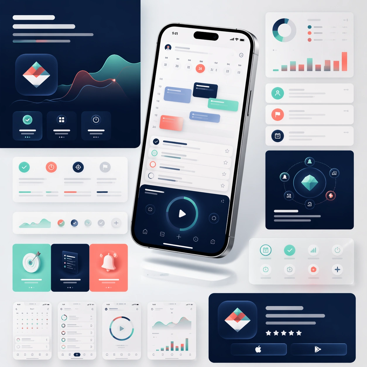
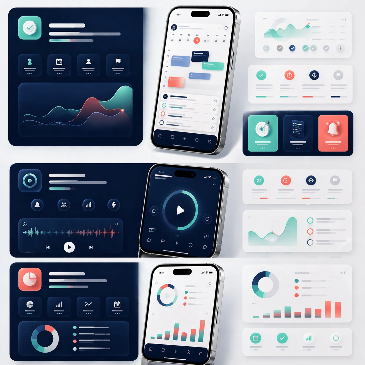
Scene: A square product-marketing board for a newly launched mobile productivity app, composed like a polished campaign key visual rather than a simple mockup sheet. Show one hero smartphone floating slightly above a bright studio surface, surrounded by cropped landing-page modules, soft gradient color fields, subtle shadow planes, and a few glassy interface fragments. The camera is straight-on with a mild top-down bias so the design reads like a premium marketing page assembled into a single square showcase. Keep the lighting crisp, commercial, and believable, with a calm palette of deep navy, cool mint, soft coral, and brushed silver. Subject: Establish the reference identity for the full series. The hero phone should display a coherent app interface with a dashboard, calendar blocks, tidy task cards, focus timer elements, and small chart accents. Around the phone, place abstract feature callout modules, screenshot strips, and App Store style promotional tiles using the same design language. The app should feel real, consumer-friendly, and launch-ready, but any text must remain unreadable placeholder bars and glyph-like marks. Show enough of the interface system that later images can clearly preserve the same screen hierarchy, icon style, corner radius, hardware proportions, and visual tone. Important details: The composition must feel like a full marketing-page toolkit collapsed into one elegant board. Keep device reflections subtle, bezels thin, shadows soft, and spacing deliberate. Use structured layout logic, realistic glass and metal materials, and disciplined UI rhythm rather than chaotic floating widgets. The image should communicate premium launch readiness, clear feature storytelling, and store-extension potential without relying on readable copy. Use case: App Launch Marketing Page Kit series study 1/4, establishing the core identity reference for all launch extensions. Constraints: No readable text, no watermark, no logos, preserve exact 1:1 aspect ratio, no fake brand names, no extra hands, no duplicate phones with mismatched UI, no warped device frames, no cluttered background props.

Example generated from “App Launch Marketing Page Kit — Feature Story Sections”
GPT Image 2en

Scene: A square editorial board showing the middle sections of a sophisticated app launch page, laid out as a modular story flow with multiple device crops, feature cards, and atmospheric color fields. The camera remains mostly straight-on, as if viewing a refined design presentation board pinned flat under soft studio lighting. Use the same premium navy, mint, coral, and silver palette from the reference, with generous negative space and clean section breaks. Subject: Preserve the exact product identity from the reference model: the same app interface hierarchy, the same icon language, the same rounded card system, and the same phone hardware proportions. Instead of one hero moment, focus on three feature narratives: planning, focus, and progress review. Show one larger phone crop for each feature, supported by smaller floating UI fragments, ambient device reflections, and soft diagrammatic layout blocks. The modules should imply how a real landing page would guide a user through benefits step by step, while every screen still clearly belongs to the same app family established in the reference. Important details: Preserve exact screen structure, color tokens, device materials, and visual temperament from the reference image. Emphasize feature storytelling rather than generic app collage. Keep the board scanable, premium, and commercially credible, with believable depth, clean spacing, and consistent interaction components. Text areas should read as elegant placeholder bands only. The viewer should immediately understand this as a formal product page system, not a random set of UI screenshots. Use case: App Launch Marketing Page Kit series study 2/4, extending the reference identity into a structured feature-story layout. Constraints: No readable text, no watermark, no logos, preserve exact 1:1 aspect ratio, preserve the same app identity from the reference, no unrelated color palette shifts, no broken UI perspective, no cluttered sticker aesthetics, no cheap neon effects.

Example generated from “App Launch Marketing Page Kit — App Store Promo Matrix”
GPT Image 2en

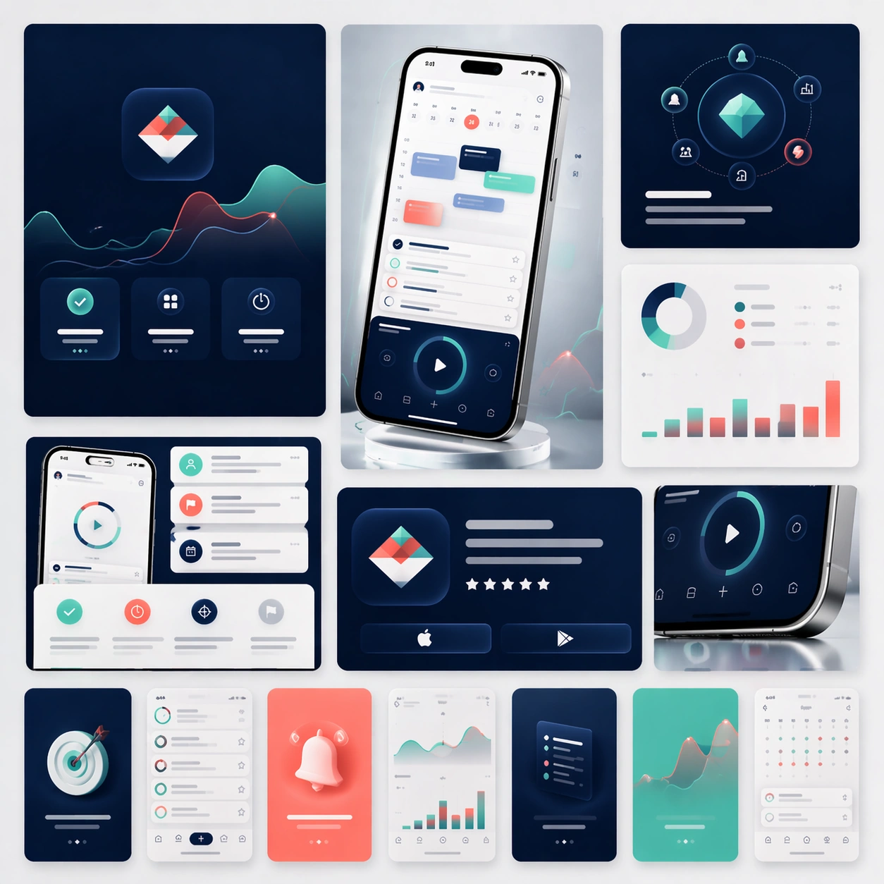
Scene: A square commerce-style presentation board that feels like an App Store asset family arranged on one clean tabletop. Compose the image as a grid of screenshot cards, promotional tiles, cropped hero devices, and a few soft background gradients that give the board a premium launch-day energy. Lighting should be bright and precise, like a studio product shoot mixed with a high-end design review board. Subject: Preserve exact face-value identity from the reference app system: the same interface hierarchy, dashboard widgets, navigation patterns, color tokens, hardware frame shape, and overall product temperament. Reformat that same app into store-ready deliverables: a vertical screenshot strip, a landscape promotional banner crop, a close-up card showing progress analytics, a card highlighting calm task planning, and one concise hero tile built around the same device render. Everything should feel like one official launch package prepared for marketplace submission and paid acquisition. The assets should suggest conversion-oriented clarity, not noisy experimentation. Important details: Maintain consistent spacing, reflective device realism, clean shadows, and disciplined module hierarchy. Let the visuals imply copy zones and selling points through shape and layout only, since no readable text is allowed. The board must look scalable across storefront and ad placements, with every component clearly related to the same app reference. Aim for professional platform polish, modularity, and real product-market credibility. Use case: App Launch Marketing Page Kit series study 3/4, adapting the core product identity into a store-ready promotional matrix. Constraints: No readable text, no watermark, no logos, preserve exact 1:1 aspect ratio, preserve the same app identity from the reference, no mismatched screenshot styles, no crowded coupon graphics, no fake app-store badges, no extra devices unrelated to the system.

Example generated from “App Launch Marketing Page Kit — Social Launch Adaptations”
GPT Image 2en

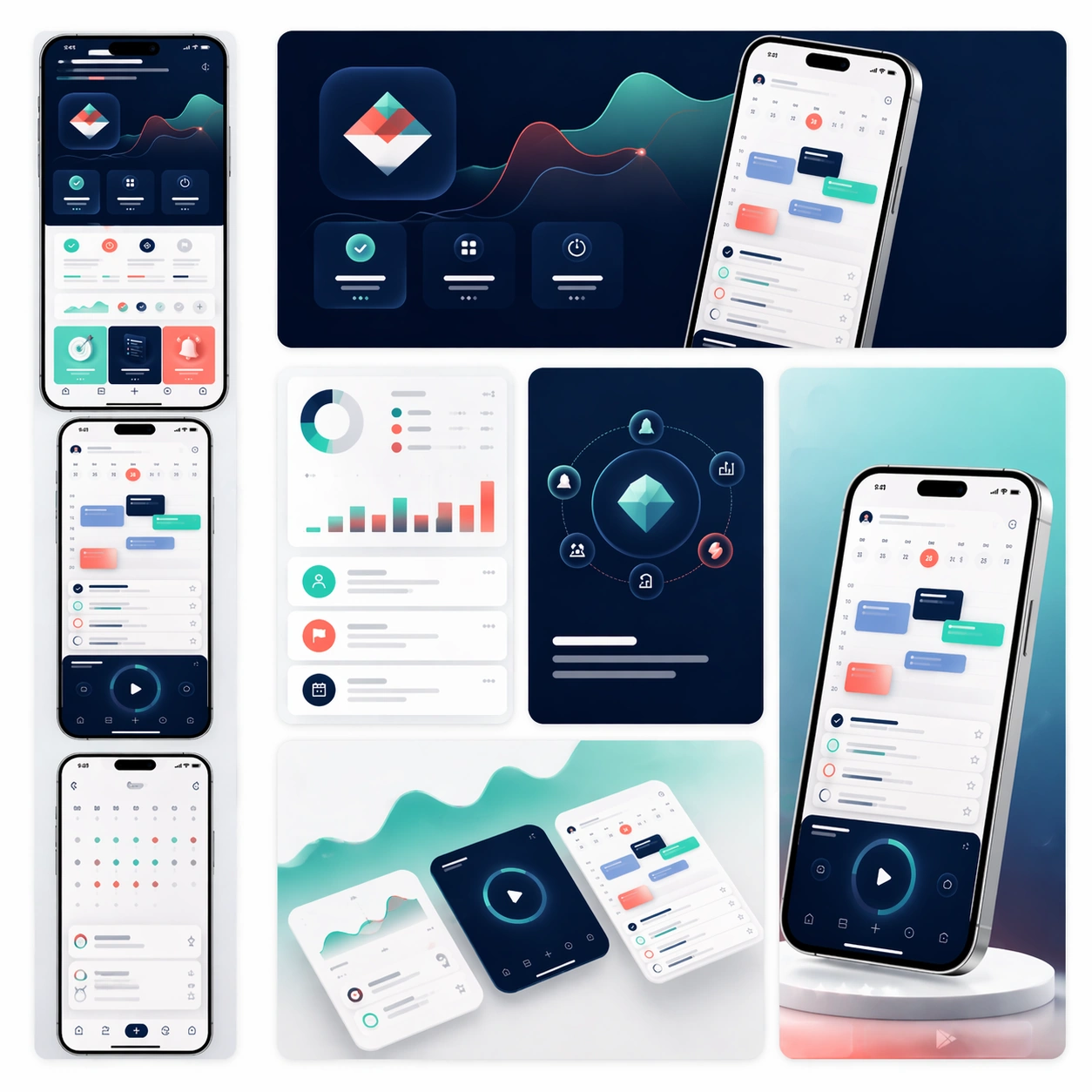
Scene: A square campaign board composed of several social-ready launch crops arranged within one master presentation. Instead of a single landing-page layout, show a family of polished ad-like frames, vertical teaser cards, square promo panels, and one compact hero device crop, all presented on a softly lit studio backdrop with subtle gradients and restrained reflections. The view should stay front-facing and editorial. Subject: Preserve exact app identity from the reference model: the same phone proportions, the same UI card system, the same palette, the same icon rhythm, and the same polished product mood. Translate that identity into a coordinated social launch kit with short teaser-style compositions, bold image-led framing, and a few screenshot-driven detail panels. The set should feel ready for announcement day across feed placements and paid social, but still look unmistakably related to the original marketing-page system. Use device fragments, cropped screens, and modular graphic blocks to imply campaign flexibility without losing brand coherence. Important details: Consistency is the priority. Keep the screen hierarchy stable, preserve material realism, and maintain premium spacing even as the crops become more dynamic. Each sub-frame should feel simple enough to read quickly yet rich enough to support a real product launch. No readable text is allowed, so structure, contrast, and device imagery must carry the message. The result should suggest a disciplined launch toolkit rather than generic social templates. Use case: App Launch Marketing Page Kit series study 4/4, converting the reference launch identity into coordinated social launch adaptations. Constraints: No readable text, no watermark, no logos, preserve exact 1:1 aspect ratio, preserve the same app identity from the reference, no chaotic sticker overlays, no unrelated lifestyle photography, no drastic color drift, no distorted device silhouettes.
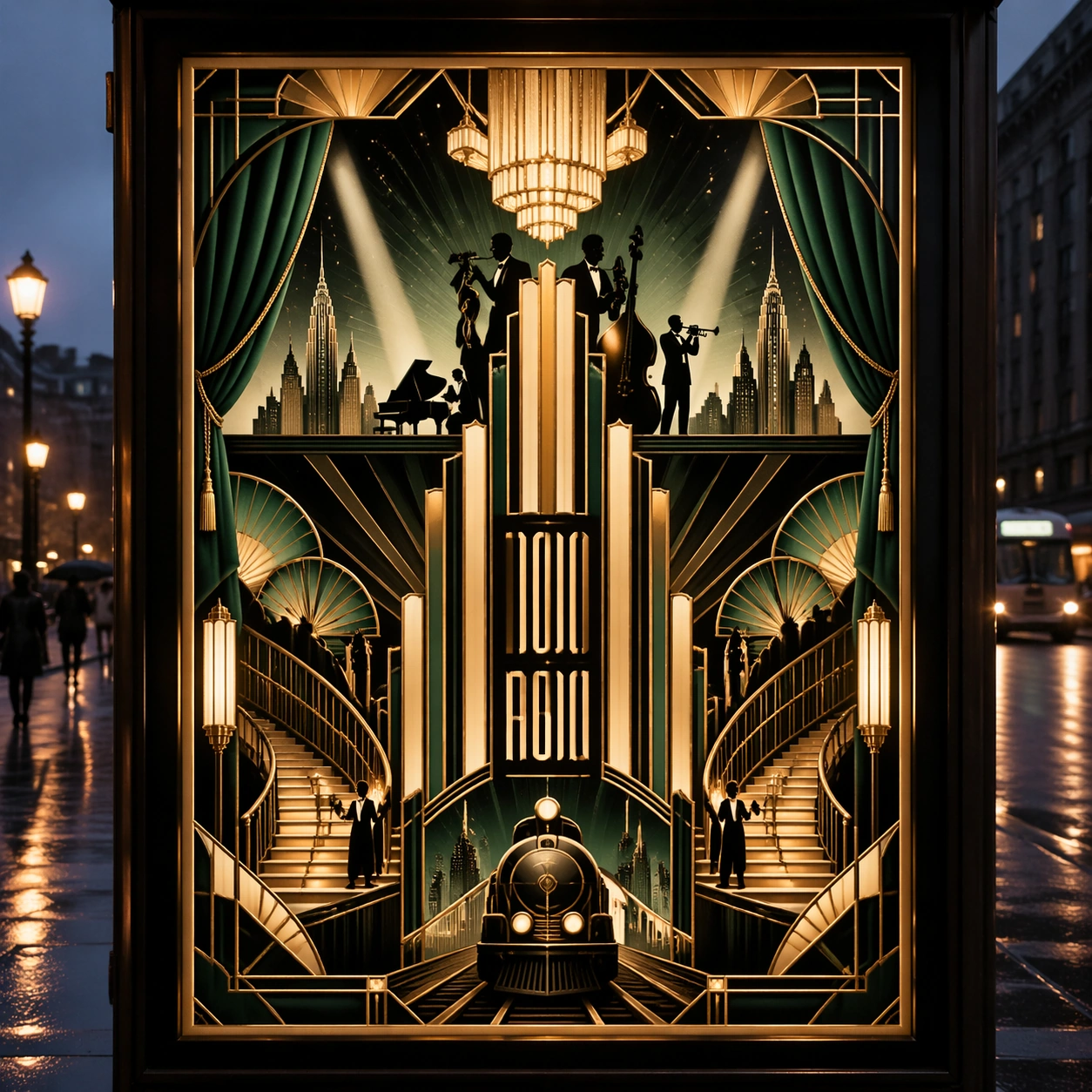
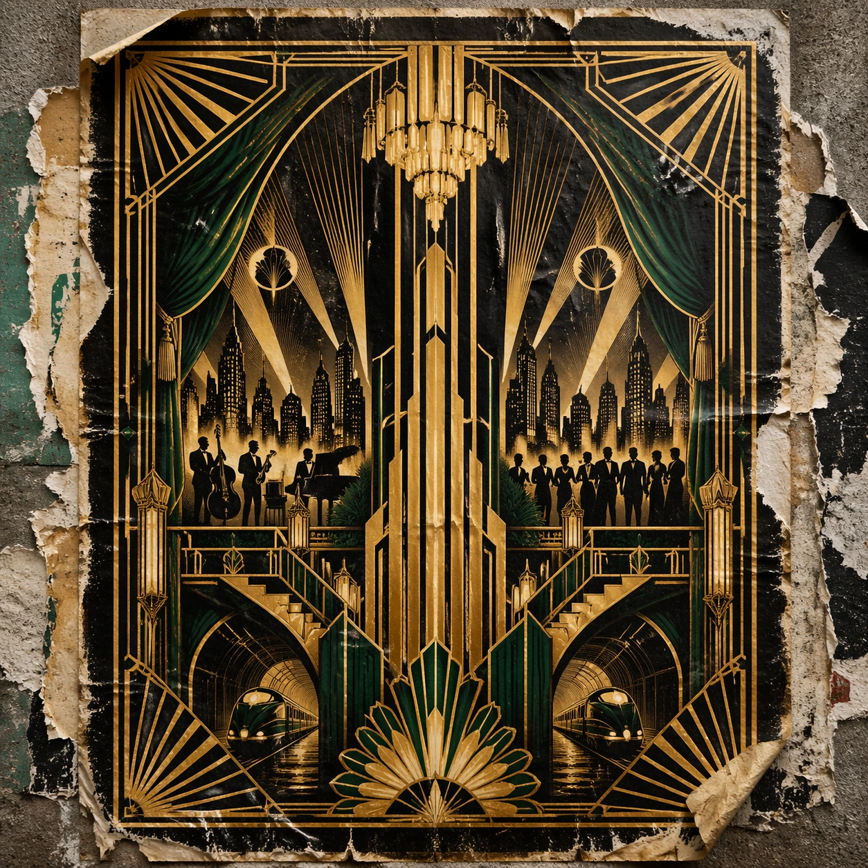
Example generated from “App Launch Marketing Page Kit — Creator Tool Launch Board”
GPT Image 2en

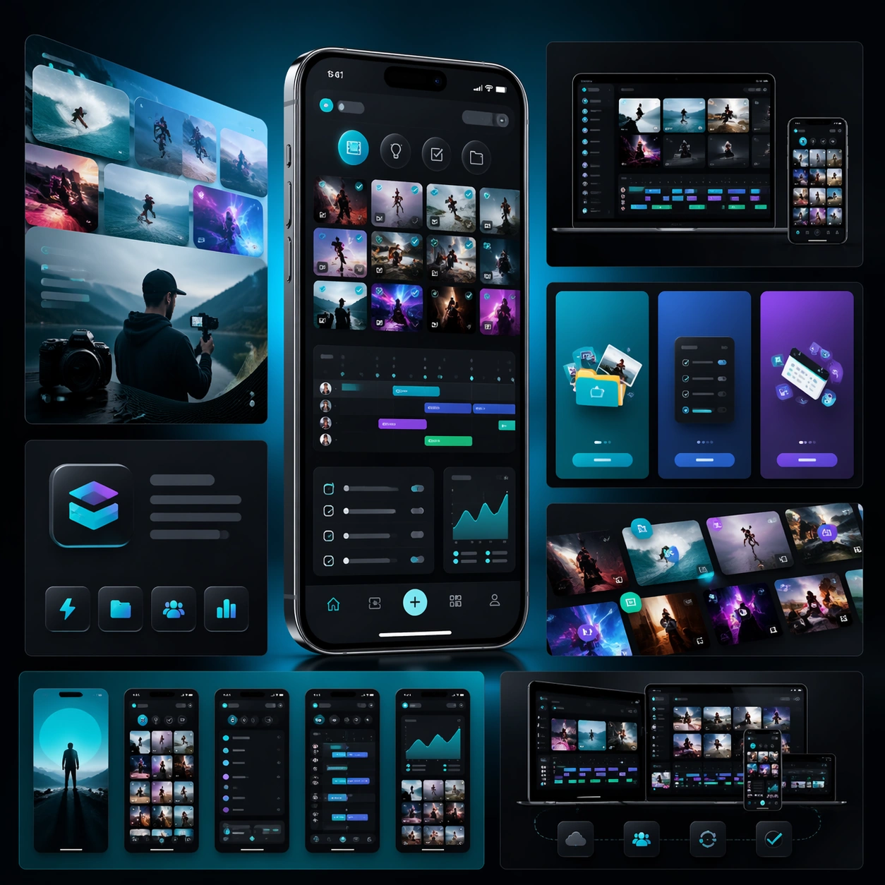
Scene: A square campaign board for a mobile creator workflow app, with a more energetic but still disciplined launch aesthetic. Present one hero phone, several cropped interface panels, and layered media-like shapes on a dark charcoal-to-electric-teal gradient field. The lighting should feel glossy and commercial, with crisp reflections on glass and metal but no excessive glow. Subject: Build a launch-page kit for an app that helps creators organize clips, ideas, publishing steps, and asset libraries. The hero phone should display a visually rich interface with thumbnail grids, scheduling lanes, checklist modules, and compact analytics cards. Surround it with landing-page fragments that suggest onboarding, cross-device workflow, and store-promo assets. The structure should feel like a complete app marketing system prepared for launch week, not just a single hero shot. Use strong composition, believable device rendering, and abstract copy zones that imply promotional messaging without any readable typography. Important details: Keep the interface coherent and attractive, but prioritize scanability over noise. Show visual energy through image framing, rhythm, and contrast rather than through random effects. The board should feel like a real product campaign for creators: polished, modern, ambitious, and clear enough to extend into store screenshots, social crops, and a landing page. Maintain structured modules, consistent spacing, and premium material rendering throughout. Use case: App Launch Marketing Page Kit single study 2/5, testing an energetic creator-tool launch direction. Constraints: No readable text, no watermark, no logos, preserve exact 1:1 aspect ratio, no chaotic collage clutter, no fake brand marks, no distorted screen perspective, no excessive lens flares, no messy color overload.

Example generated from “App Launch Marketing Page Kit — Budget Planner Launch Board”
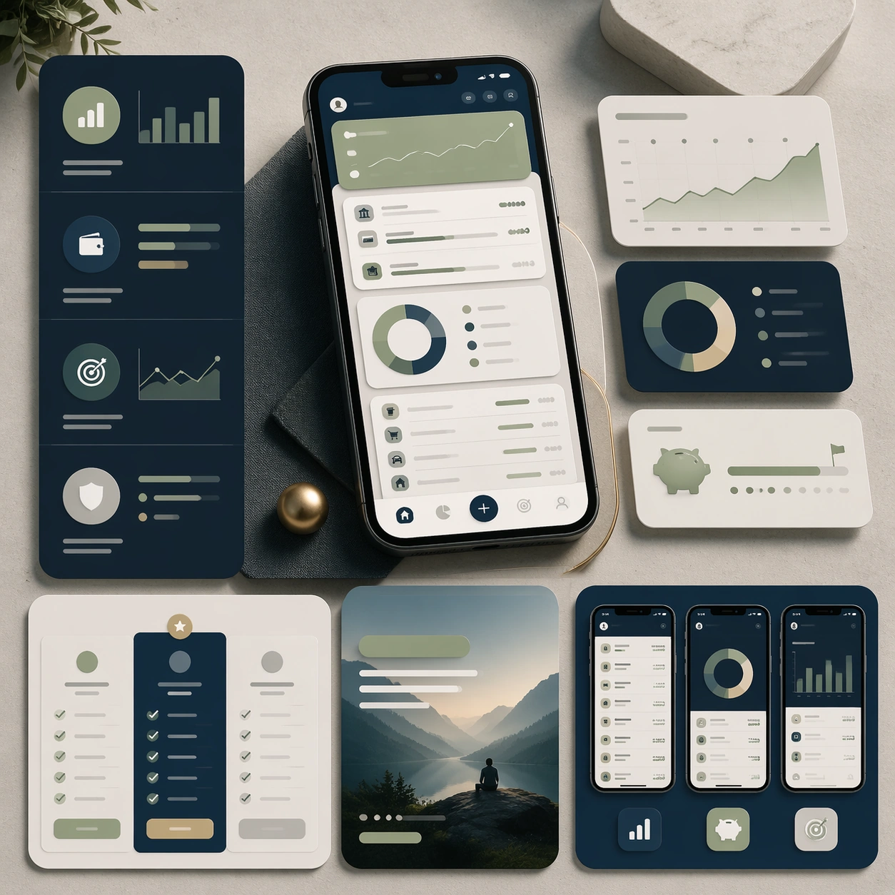
GPT Image 2en

Scene: A square marketing presentation for a personal budgeting and planning app, set on a clean stone-like surface with restrained studio lighting. Use a palette of midnight blue, pale sage, warm gray, and subtle brass highlights. Compose one central device render, a few floating analytics panels, and several structured marketing-page modules arranged with editorial precision and generous negative space. Subject: Create a trustworthy app launch board for a finance-planning tool aimed at everyday users. The interface should show account summary cards, budget bars, category rings, savings goals, and a calm transaction overview, all rendered as believable mobile UI rather than speculative sci-fi graphics. Around the device, build supporting sections that imply feature explanation, plan comparison, and store-ready promotional crops. The entire board should look prepared for a serious launch campaign that needs both warmth and credibility. All communication should happen through shape, hierarchy, and image language because text must remain unreadable. Important details: Emphasize clarity, discipline, and realistic product polish. Keep charts simple and elegant, maintain coherent spacing, and avoid anything that feels like a banking dashboard parody. The composition should project trust, premium utility, and conversion readiness while still feeling modern enough for consumer app marketing. Make it clear that the work extends beyond a single mockup into a full page-and-store asset system. Use case: App Launch Marketing Page Kit single study 3/5, testing a finance-planning launch direction. Constraints: No readable text, no watermark, no logos, preserve exact 1:1 aspect ratio, no cryptocurrency clichés, no exaggerated holograms, no crowded spreadsheet chaos, no impossible reflections, no mismatched chart styles.

Example generated from “App Launch Marketing Page Kit — Travel Planner Launch Board”
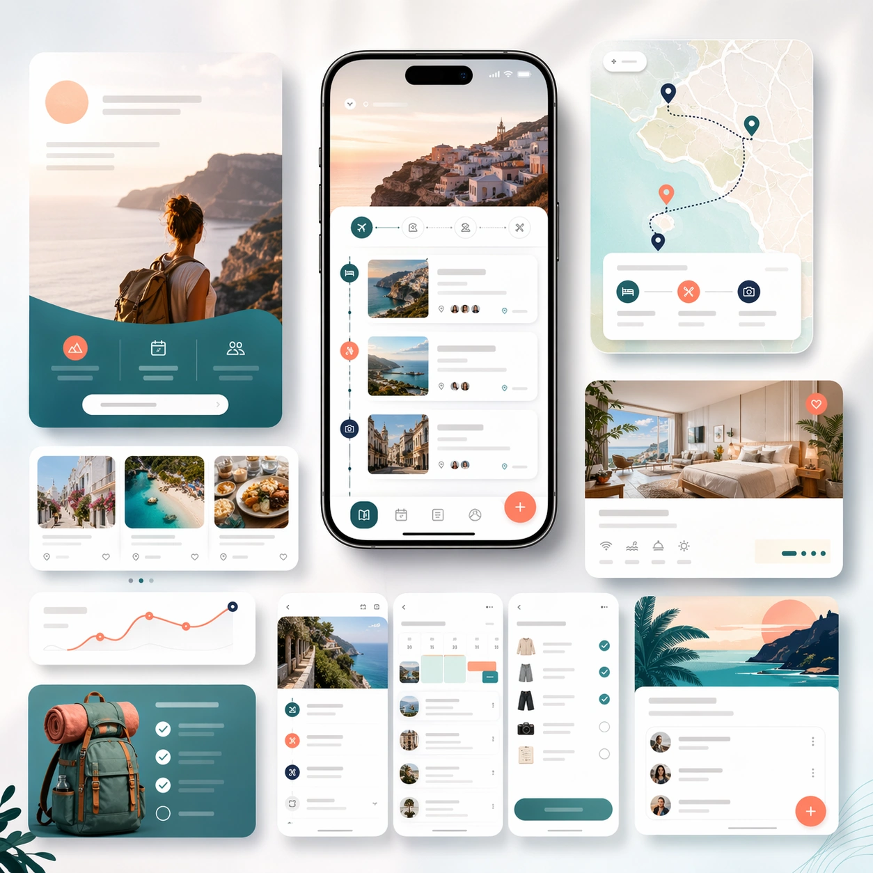
GPT Image 2en

Scene: A square launch campaign board for a travel-planning app, balancing premium editorial atmosphere with clear commerce structure. Use a bright but refined palette of cloud white, ocean teal, sunset coral, and soft navy. Present one elegant hero phone, a few itinerary screen crops, map-like cards, and layered landing-page modules arranged on a softly lit backdrop with subtle motion in the composition. Subject: Design a believable app marketing page kit for trip planning, itinerary building, and travel organization. The device interface should show route cards, lodging summaries, day-by-day schedule blocks, map-inspired markers, and packing or booking checklist elements. Around it, build supporting marketing modules that imply discovery, trip coordination, and store-promo extensions. The result should feel aspirational without becoming generic vacation advertising. It must still read first as a polished app launch system, with realistic screen design and deliberate conversion hierarchy. Any copy areas should remain abstract and unreadable. Important details: Keep the visual mood airy and inviting while preserving structured layout discipline. Device realism, spacing, and module hierarchy should remain credible. Avoid postcard clichés and keep the marketing story centered on how the app organizes travel planning. The board should feel suitable for a formal landing page, an app-store screenshot campaign, and a paid acquisition creative family. Use case: App Launch Marketing Page Kit single study 4/5, testing an aspirational travel-planning launch direction. Constraints: No readable text, no watermark, no logos, preserve exact 1:1 aspect ratio, no airplane-stock-photo montage, no brand badges, no cluttered maps, no fake passport props, no distorted phones, no noisy tropical clichés.

Example generated from “App Launch Marketing Page Kit — Wellness Habit Launch Board”
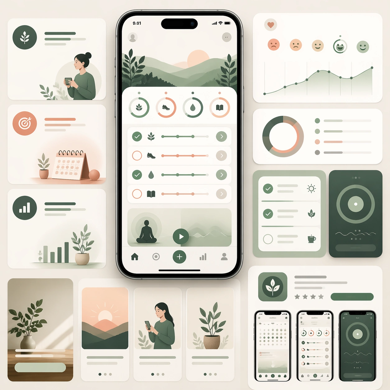
GPT Image 2en

Scene: A square product-launch board for a wellness and habit-building app, with a serene but still commercial visual language. Use a palette of warm cream, eucalyptus green, dusty peach, and muted graphite. Compose one central smartphone render, a few softly layered dashboard crops, and several landing-page modules arranged like a premium product presentation under diffused studio light. Subject: Create a believable app launch kit focused on daily habits, routines, mood check-ins, and gentle progress tracking. The mobile interface should show habit rings, calm checklist cards, breathing or reflection modules, and simple trend graphs. Around the phone, include supporting sections that suggest onboarding, benefit storytelling, and store-ready promotional cards. The whole composition should feel trustworthy, contemporary, and conversion-aware without becoming medical or sterile. It should communicate that this is a complete launch system for a consumer wellness app rather than a single isolated mockup. Important details: Keep the hierarchy calm, the device materials realistic, and the interface language consistent. Let soft color, spacing, and rounded forms communicate reassurance while the overall board still reads as a disciplined marketing page. Avoid generic spa imagery; the emphasis should remain on product clarity, believable app UX, and polished campaign presentation that can extend to landing pages and app-store assets. Use case: App Launch Marketing Page Kit single study 5/5, testing a wellness and habit-building launch direction. Constraints: No readable text, no watermark, no logos, preserve exact 1:1 aspect ratio, no medical claims, no yoga-stock-photo collage, no cluttered health graphs, no distorted hardware, no childish sticker treatment, no unrealistic glass effects.

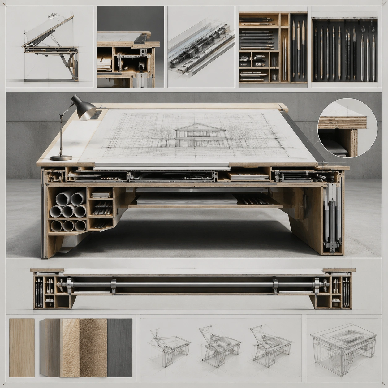
Example generated from “Architectural Drawing Board — Overview Plate”
GPT Image 2en

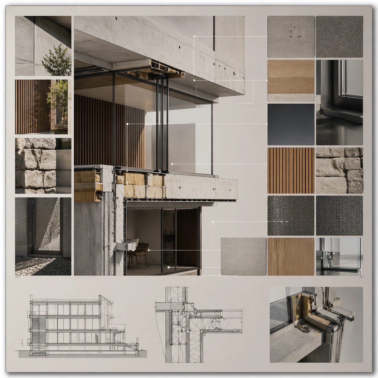
Scene: A square plate or board viewed straight-on, with crisp organization, disciplined spacing, and premium print clarity. Build the frame around a complete overview that establishes the system, subject boundaries, and visual hierarchy. Keep the lighting, camera distance, and spatial organization tuned for a high-signal research image rather than a casual snapshot. The image belongs to the Architectural Drawing Board theme and should feel immediately legible as a prompt atlas theme for architectural drawing board, testing photorealism, physics-materials, technical-diagram, world-knowledge with gpt image 2.. Subject: Center the study on a complete overview that establishes the system, subject boundaries, and visual hierarchy. Translate the theme into a concrete visual statement instead of an abstract mood board: the viewer should understand what kind of image this is, what is being tested, and why the composition is difficult. Use the slug idea of architectural drawing board as a literal guide for subject matter, materials, and staging. Important details: The image should communicate logic through grouping, hierarchy, callouts, insets, and believable professional layout discipline rather than decorative noise. Preserve a disciplined square composition, clear focal hierarchy, and enough secondary information to make the image feel complete rather than underspecified. The image should look polished, novel, and exhibition-ready, with topic-specific credibility coming from the way surfaces, structure, and visual language reinforce Architectural Drawing Board. Avoid generic filler elements that do not serve the main concept. Use case: Architectural Drawing Board single study 1/8, testing photorealism, physics-materials, technical-diagram, world-knowledge through the overview plate variation. Constraints: No readable text, no watermark, no logos, preserve exact 1:1 aspect ratio, no readable labels, no messy arrows, no random infographic decoration, no fake UI chrome unless the topic calls for it, no broken alignment, no meaningless clutter.

Example generated from “Architectural Drawing Board — Cutaway Panel”
GPT Image 2en

Scene: A square plate or board viewed straight-on, with crisp organization, disciplined spacing, and premium print clarity. Build the frame around a cutaway or sectional treatment that reveals interior logic without sacrificing readability. Keep the lighting, camera distance, and spatial organization tuned for a high-signal research image rather than a casual snapshot. The image belongs to the Architectural Drawing Board theme and should feel immediately legible as a prompt atlas theme for architectural drawing board, testing photorealism, physics-materials, technical-diagram, world-knowledge with gpt image 2.. Subject: Center the study on a cutaway or sectional treatment that reveals interior logic without sacrificing readability. Translate the theme into a concrete visual statement instead of an abstract mood board: the viewer should understand what kind of image this is, what is being tested, and why the composition is difficult. Use the slug idea of architectural drawing board as a literal guide for subject matter, materials, and staging. Important details: The image should communicate logic through grouping, hierarchy, callouts, insets, and believable professional layout discipline rather than decorative noise. Preserve a disciplined square composition, clear focal hierarchy, and enough secondary information to make the image feel complete rather than underspecified. The image should look polished, novel, and exhibition-ready, with topic-specific credibility coming from the way surfaces, structure, and visual language reinforce Architectural Drawing Board. Avoid generic filler elements that do not serve the main concept. Use case: Architectural Drawing Board single study 2/8, testing photorealism, physics-materials, technical-diagram, world-knowledge through the cutaway panel variation. Constraints: No readable text, no watermark, no logos, preserve exact 1:1 aspect ratio, no readable labels, no messy arrows, no random infographic decoration, no fake UI chrome unless the topic calls for it, no broken alignment, no meaningless clutter.

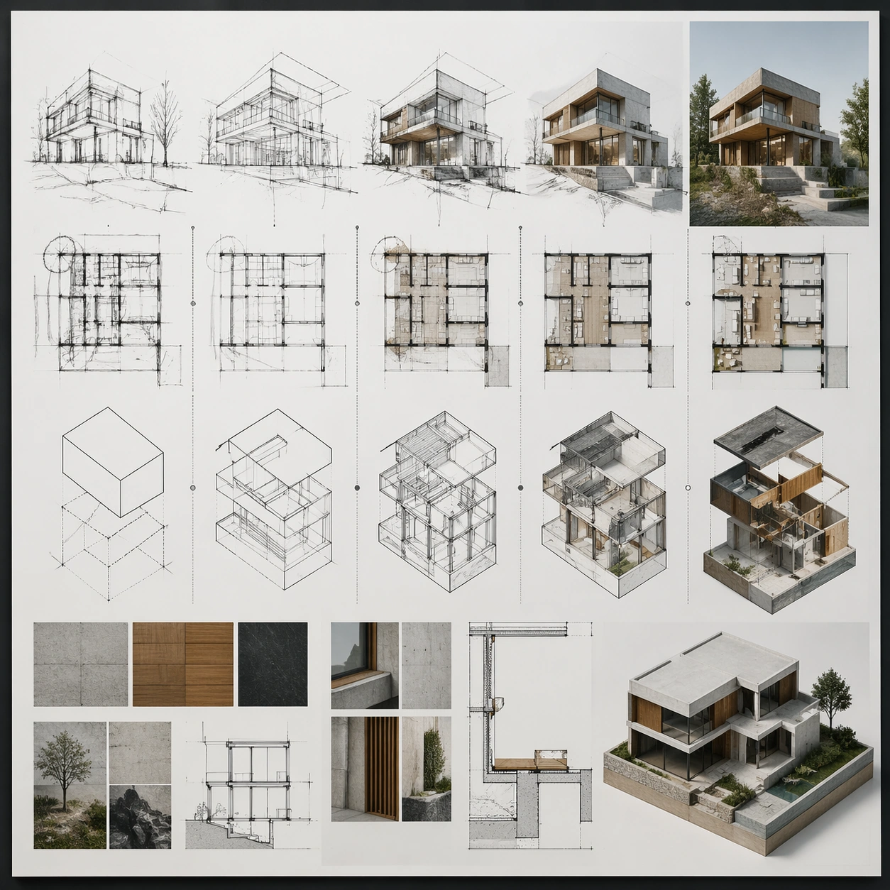
Example generated from “Architectural Drawing Board — Process Sequence”
GPT Image 2en

Scene: A square plate or board viewed straight-on, with crisp organization, disciplined spacing, and premium print clarity. Build the frame around a sequence of stages or states arranged in a disciplined progression. Keep the lighting, camera distance, and spatial organization tuned for a high-signal research image rather than a casual snapshot. The image belongs to the Architectural Drawing Board theme and should feel immediately legible as a prompt atlas theme for architectural drawing board, testing photorealism, physics-materials, technical-diagram, world-knowledge with gpt image 2.. Subject: Center the study on a sequence of stages or states arranged in a disciplined progression. Translate the theme into a concrete visual statement instead of an abstract mood board: the viewer should understand what kind of image this is, what is being tested, and why the composition is difficult. Use the slug idea of architectural drawing board as a literal guide for subject matter, materials, and staging. Important details: The image should communicate logic through grouping, hierarchy, callouts, insets, and believable professional layout discipline rather than decorative noise. Preserve a disciplined square composition, clear focal hierarchy, and enough secondary information to make the image feel complete rather than underspecified. The image should look polished, novel, and exhibition-ready, with topic-specific credibility coming from the way surfaces, structure, and visual language reinforce Architectural Drawing Board. Avoid generic filler elements that do not serve the main concept. Use case: Architectural Drawing Board single study 3/8, testing photorealism, physics-materials, technical-diagram, world-knowledge through the process sequence variation. Constraints: No readable text, no watermark, no logos, preserve exact 1:1 aspect ratio, no readable labels, no messy arrows, no random infographic decoration, no fake UI chrome unless the topic calls for it, no broken alignment, no meaningless clutter.

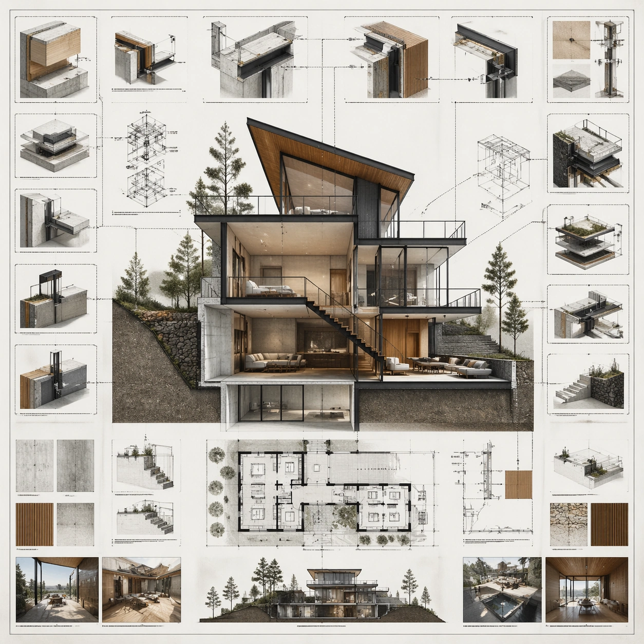
Example generated from “Architectural Drawing Board — Annotation Cluster”
GPT Image 2en

Scene: A square plate or board viewed straight-on, with crisp organization, disciplined spacing, and premium print clarity. Build the frame around dense callouts and side insets that feel scholarly while staying unreadable. Keep the lighting, camera distance, and spatial organization tuned for a high-signal research image rather than a casual snapshot. The image belongs to the Architectural Drawing Board theme and should feel immediately legible as a prompt atlas theme for architectural drawing board, testing photorealism, physics-materials, technical-diagram, world-knowledge with gpt image 2.. Subject: Center the study on dense callouts and side insets that feel scholarly while staying unreadable. Translate the theme into a concrete visual statement instead of an abstract mood board: the viewer should understand what kind of image this is, what is being tested, and why the composition is difficult. Use the slug idea of architectural drawing board as a literal guide for subject matter, materials, and staging. Important details: The image should communicate logic through grouping, hierarchy, callouts, insets, and believable professional layout discipline rather than decorative noise. Preserve a disciplined square composition, clear focal hierarchy, and enough secondary information to make the image feel complete rather than underspecified. The image should look polished, novel, and exhibition-ready, with topic-specific credibility coming from the way surfaces, structure, and visual language reinforce Architectural Drawing Board. Avoid generic filler elements that do not serve the main concept. Use case: Architectural Drawing Board single study 4/8, testing photorealism, physics-materials, technical-diagram, world-knowledge through the annotation cluster variation. Constraints: No readable text, no watermark, no logos, preserve exact 1:1 aspect ratio, no readable labels, no messy arrows, no random infographic decoration, no fake UI chrome unless the topic calls for it, no broken alignment, no meaningless clutter.

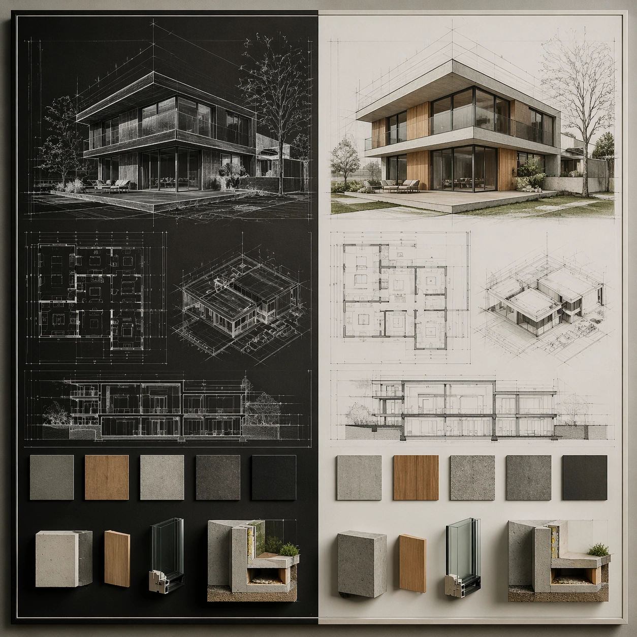
Example generated from “Architectural Drawing Board — Comparison Board”
GPT Image 2en

Scene: A square plate or board viewed straight-on, with crisp organization, disciplined spacing, and premium print clarity. Build the frame around a side-by-side comparison structure with strong contrast and equal visual weight. Keep the lighting, camera distance, and spatial organization tuned for a high-signal research image rather than a casual snapshot. The image belongs to the Architectural Drawing Board theme and should feel immediately legible as a prompt atlas theme for architectural drawing board, testing photorealism, physics-materials, technical-diagram, world-knowledge with gpt image 2.. Subject: Center the study on a side-by-side comparison structure with strong contrast and equal visual weight. Translate the theme into a concrete visual statement instead of an abstract mood board: the viewer should understand what kind of image this is, what is being tested, and why the composition is difficult. Use the slug idea of architectural drawing board as a literal guide for subject matter, materials, and staging. Important details: The image should communicate logic through grouping, hierarchy, callouts, insets, and believable professional layout discipline rather than decorative noise. Preserve a disciplined square composition, clear focal hierarchy, and enough secondary information to make the image feel complete rather than underspecified. The image should look polished, novel, and exhibition-ready, with topic-specific credibility coming from the way surfaces, structure, and visual language reinforce Architectural Drawing Board. Avoid generic filler elements that do not serve the main concept. Use case: Architectural Drawing Board single study 5/8, testing photorealism, physics-materials, technical-diagram, world-knowledge through the comparison board variation. Constraints: No readable text, no watermark, no logos, preserve exact 1:1 aspect ratio, no readable labels, no messy arrows, no random infographic decoration, no fake UI chrome unless the topic calls for it, no broken alignment, no meaningless clutter.

Example generated from “Architectural Drawing Board — 材质标注”
GPT Image 2en

Scene: A square plate or board viewed straight-on, with crisp organization, disciplined spacing, and premium print clarity. Build the frame around specific texture or material evidence presented with controlled explanatory framing. Keep the lighting, camera distance, and spatial organization tuned for a high-signal research image rather than a casual snapshot. The image belongs to the Architectural Drawing Board theme and should feel immediately legible as a prompt atlas theme for architectural drawing board, testing photorealism, physics-materials, technical-diagram, world-knowledge with gpt image 2.. Subject: Center the study on specific texture or material evidence presented with controlled explanatory framing. Translate the theme into a concrete visual statement instead of an abstract mood board: the viewer should understand what kind of image this is, what is being tested, and why the composition is difficult. Use the slug idea of architectural drawing board as a literal guide for subject matter, materials, and staging. Important details: The image should communicate logic through grouping, hierarchy, callouts, insets, and believable professional layout discipline rather than decorative noise. Preserve a disciplined square composition, clear focal hierarchy, and enough secondary information to make the image feel complete rather than underspecified. The image should look polished, novel, and exhibition-ready, with topic-specific credibility coming from the way surfaces, structure, and visual language reinforce Architectural Drawing Board. Avoid generic filler elements that do not serve the main concept. Use case: Architectural Drawing Board single study 6/8, testing photorealism, physics-materials, technical-diagram, world-knowledge through the 材质标注 variation. Constraints: No readable text, no watermark, no logos, preserve exact 1:1 aspect ratio, no readable labels, no messy arrows, no random infographic decoration, no fake UI chrome unless the topic calls for it, no broken alignment, no meaningless clutter.

Example generated from “Architectural Drawing Board — Exploded System”
GPT Image 2en

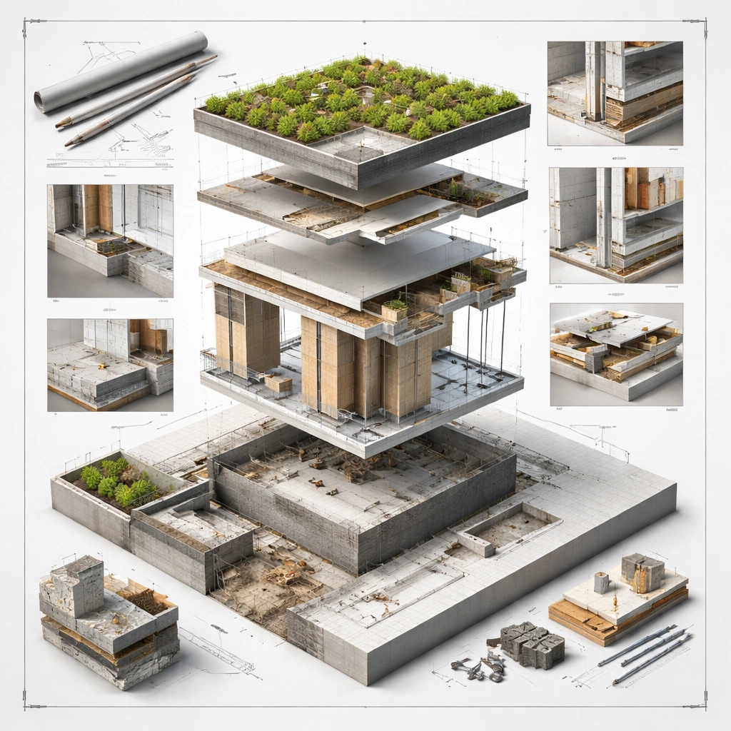
Scene: A square plate or board viewed straight-on, with crisp organization, disciplined spacing, and premium print clarity. Build the frame around components separated clearly enough to reveal construction and dependency. Keep the lighting, camera distance, and spatial organization tuned for a high-signal research image rather than a casual snapshot. The image belongs to the Architectural Drawing Board theme and should feel immediately legible as a prompt atlas theme for architectural drawing board, testing photorealism, physics-materials, technical-diagram, world-knowledge with gpt image 2.. Subject: Center the study on components separated clearly enough to reveal construction and dependency. Translate the theme into a concrete visual statement instead of an abstract mood board: the viewer should understand what kind of image this is, what is being tested, and why the composition is difficult. Use the slug idea of architectural drawing board as a literal guide for subject matter, materials, and staging. Important details: The image should communicate logic through grouping, hierarchy, callouts, insets, and believable professional layout discipline rather than decorative noise. Preserve a disciplined square composition, clear focal hierarchy, and enough secondary information to make the image feel complete rather than underspecified. The image should look polished, novel, and exhibition-ready, with topic-specific credibility coming from the way surfaces, structure, and visual language reinforce Architectural Drawing Board. Avoid generic filler elements that do not serve the main concept. Use case: Architectural Drawing Board single study 7/8, testing photorealism, physics-materials, technical-diagram, world-knowledge through the exploded system variation. Constraints: No readable text, no watermark, no logos, preserve exact 1:1 aspect ratio, no readable labels, no messy arrows, no random infographic decoration, no fake UI chrome unless the topic calls for it, no broken alignment, no meaningless clutter.

Example generated from “Architectural Drawing Board — Final Plate”
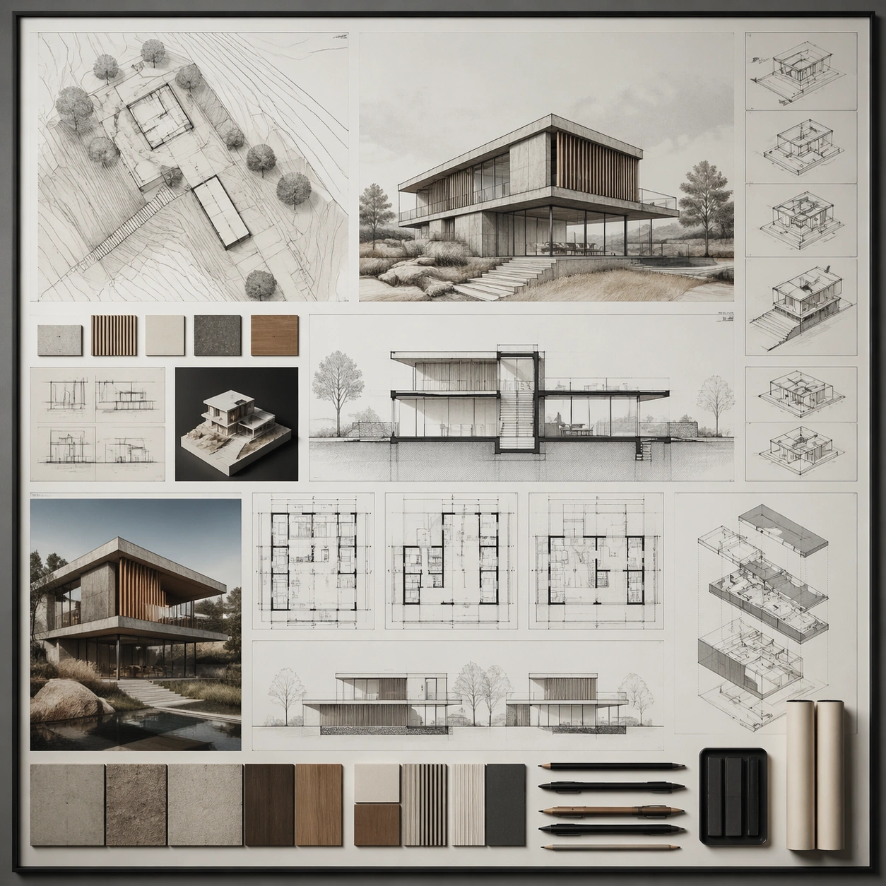
GPT Image 2en

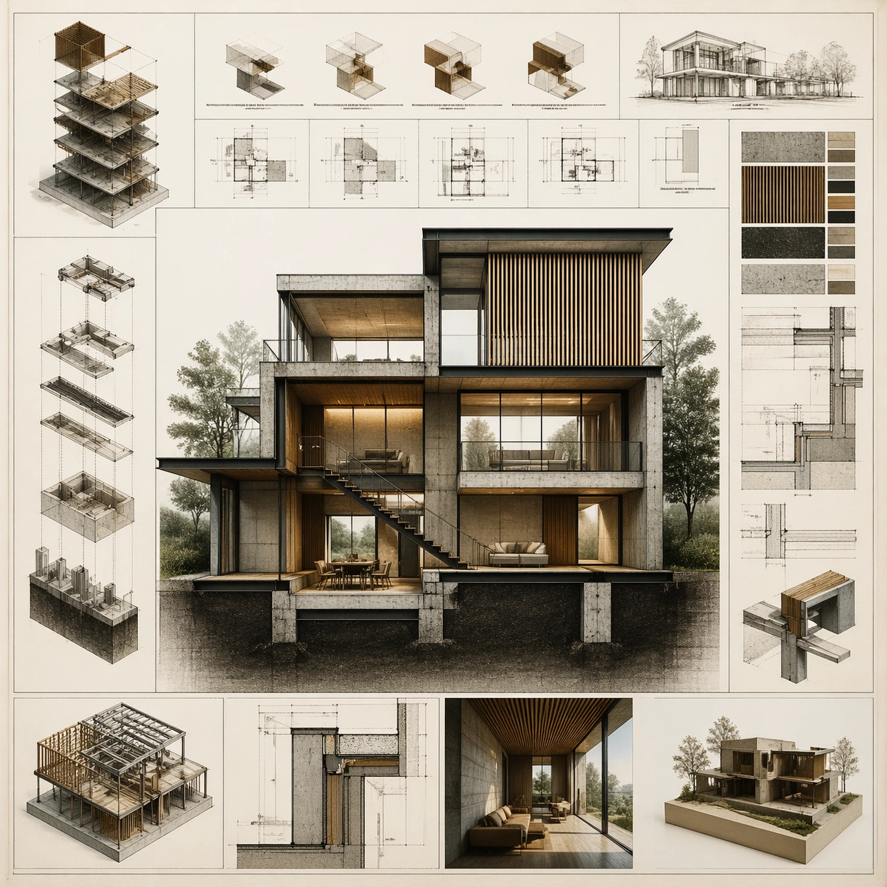
Scene: A square plate or board viewed straight-on, with crisp organization, disciplined spacing, and premium print clarity. Build the frame around a polished final technical plate that feels ready for a research deck or exhibition wall. Keep the lighting, camera distance, and spatial organization tuned for a high-signal research image rather than a casual snapshot. The image belongs to the Architectural Drawing Board theme and should feel immediately legible as a prompt atlas theme for architectural drawing board, testing photorealism, physics-materials, technical-diagram, world-knowledge with gpt image 2.. Subject: Center the study on a polished final technical plate that feels ready for a research deck or exhibition wall. Translate the theme into a concrete visual statement instead of an abstract mood board: the viewer should understand what kind of image this is, what is being tested, and why the composition is difficult. Use the slug idea of architectural drawing board as a literal guide for subject matter, materials, and staging. Important details: The image should communicate logic through grouping, hierarchy, callouts, insets, and believable professional layout discipline rather than decorative noise. Preserve a disciplined square composition, clear focal hierarchy, and enough secondary information to make the image feel complete rather than underspecified. The image should look polished, novel, and exhibition-ready, with topic-specific credibility coming from the way surfaces, structure, and visual language reinforce Architectural Drawing Board. Avoid generic filler elements that do not serve the main concept. Use case: Architectural Drawing Board single study 8/8, testing photorealism, physics-materials, technical-diagram, world-knowledge through the final plate variation. Constraints: No readable text, no watermark, no logos, preserve exact 1:1 aspect ratio, no readable labels, no messy arrows, no random infographic decoration, no fake UI chrome unless the topic calls for it, no broken alignment, no meaningless clutter.

Example generated from “Architectural Facade Identity System — Street Corner Anchor”
GPT Image 2en

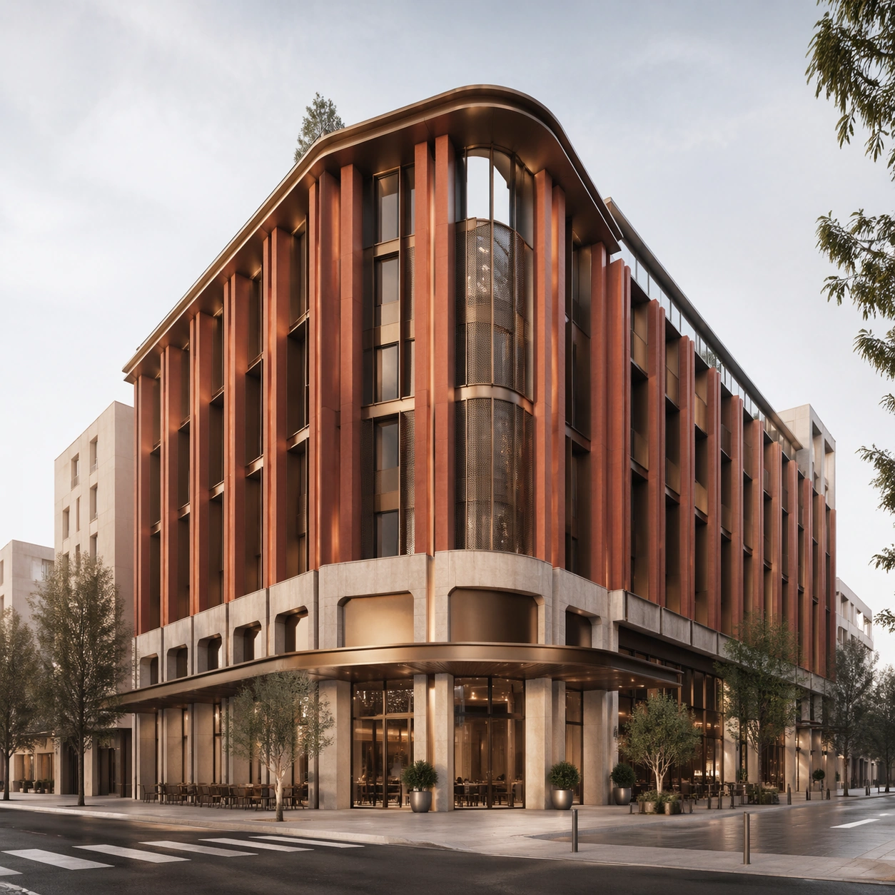
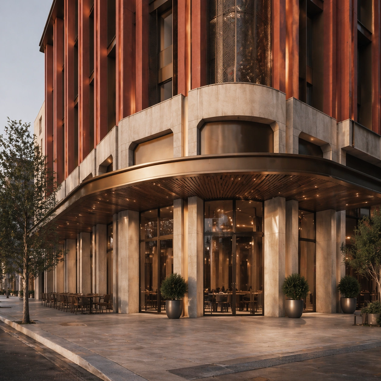
Scene: Create a square architectural reference still for Architectural Facade Identity System. Use a square daylight hero view from the primary street corner showing the full massing and lower levels and treat the frame like a premium interior or architecture editorial photograph with disciplined perspective, readable depth from foreground to background, and enough negative space for the spatial hierarchy to breathe. Light the scene so material silhouette, facade rhythm, and urban recognition feel immediate, using earthy terracotta, bronze brown, pale stone, smoked glass, and soft sky gray as the governing tonal range. The composition must read as a high-end commercial image that could sit inside architecture competitions, developer decks, city-brand editorials, and facade-design presentations. Subject: Show an architectural facade system with terracotta fins, bronze mesh, deep window reveals, sculpted canopies, and a civic-commercial identity that feels recognizable from multiple distances. Center the building’s primary facade identity, material rhythm, and public presence. This is the canonical reference image for the package, so the major proportions, material transitions, fixture families, and circulation logic must feel highly specific and internally coherent rather than generic luxury styling. Let the viewer understand how the space is organized within a single glance, with foreground anchors, a clear middle zone, and a resolved background termination. Important details: Lock the fin spacing, bronze mesh logic, canopy silhouette, reveal depth, and urban recognizability of the building. Surfaces should feel tactile and believable: stone veining must stay plausible, metals should have disciplined reflectance, fabrics should show natural weight, and concealed lighting should shape the volume instead of flattening it. Use abstract signage, menu, label, or caption zones only as unreadable graphic hints. The image should feel practical for downstream design reviews and polished enough for public-facing campaign use. Use case: Architectural Facade Identity System series study 1/9, establishing the canonical facade identity for the package. Constraints: No readable text, no watermark, no logos, preserve exact 1:1 aspect ratio, no giant logos, no construction cranes, no crowds, no random neighboring ads, no impossible geometry, no traffic jam dominating.

Example generated from “Architectural Facade Identity System — Entry Canopy Focus”
GPT Image 2en

Scene: Create a square reference-dependent architecture still for Architectural Facade Identity System. Use a closer angle on the entry canopy and lower facade layers while keeping the same lens discipline, editorial polish, and material believability established by the reference image. The lighting can shift to support the intended mood, but the space must still feel like the same authored project with a stable viewpoint logic, convincing depth separation, and clean commercial-photography finish. Keep earthy terracotta, bronze brown, pale stone, smoked glass, and soft sky gray as the governing tonal range even when the emphasis changes. Subject: Show an architectural facade system with terracotta fins, bronze mesh, deep window reveals, sculpted canopies, and a civic-commercial identity that feels recognizable from multiple distances. Focus on the exact same building from the reference image, now emphasizing ground-level tactility, canopy depth, and threshold drama. Preserve exact architectural identity, plan logic, material palette, fixture family, and circulation cues from the reference image while changing only the intended emphasis described here. The viewer should immediately recognize the same project, not a loose cousin, with matching silhouette logic, aligned detailing, and consistent brand atmosphere. Important details: Preserve the fin spacing, bronze mesh logic, canopy silhouette, reveal depth, and urban recognizability of the building. Any abstract wayfinding, menu, wall-label, or packaging zones must stay unreadable and subordinate to the spatial image. Joinery, edges, reflections, and lighting should remain realistic enough for an operator or design team to treat the image as a credible reference. The variation should feel deliberate and commercially useful, proving that one locked spatial language can flex across multiple campaign or editorial surfaces. Use case: Architectural Facade Identity System series study 2/9, extending arrival-scale detail while preserving the same building identity. Constraints: No readable text, no watermark, no logos, preserve exact 1:1 aspect ratio, preserve exact architectural identity from the reference image, no giant logos, no construction cranes, no crowds, no random neighboring ads, no impossible geometry, no readable address numbers.

Example generated from “Architectural Facade Identity System — Upper Facade Crop”
GPT Image 2en

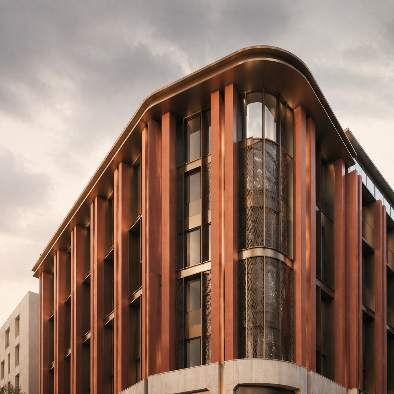
Scene: Create a square reference-dependent architecture still for Architectural Facade Identity System. Use a telephoto crop on the upper facade bays and fin rhythm against the sky while keeping the same lens discipline, editorial polish, and material believability established by the reference image. The lighting can shift to support the intended mood, but the space must still feel like the same authored project with a stable viewpoint logic, convincing depth separation, and clean commercial-photography finish. Keep earthy terracotta, bronze brown, pale stone, smoked glass, and soft sky gray as the governing tonal range even when the emphasis changes. Subject: Show an architectural facade system with terracotta fins, bronze mesh, deep window reveals, sculpted canopies, and a civic-commercial identity that feels recognizable from multiple distances. Focus on the exact same building from the reference image, now emphasizing repetition, shadow depth, and the skyline silhouette. Preserve exact architectural identity, plan logic, material palette, fixture family, and circulation cues from the reference image while changing only the intended emphasis described here. The viewer should immediately recognize the same project, not a loose cousin, with matching silhouette logic, aligned detailing, and consistent brand atmosphere. Important details: Preserve the fin spacing, bronze mesh logic, canopy silhouette, reveal depth, and urban recognizability of the building. Any abstract wayfinding, menu, wall-label, or packaging zones must stay unreadable and subordinate to the spatial image. Joinery, edges, reflections, and lighting should remain realistic enough for an operator or design team to treat the image as a credible reference. The variation should feel deliberate and commercially useful, proving that one locked spatial language can flex across multiple campaign or editorial surfaces. Use case: Architectural Facade Identity System series study 3/9, extending mid-to-upper facade discipline within the same identity. Constraints: No readable text, no watermark, no logos, preserve exact 1:1 aspect ratio, preserve exact architectural identity from the reference image, no giant logos, no construction cranes, no crowds, no random neighboring ads, no impossible geometry, no birds obscuring the facade.

Example generated from “Architectural Facade Identity System — Courtyard Rear Elevation”
GPT Image 2en

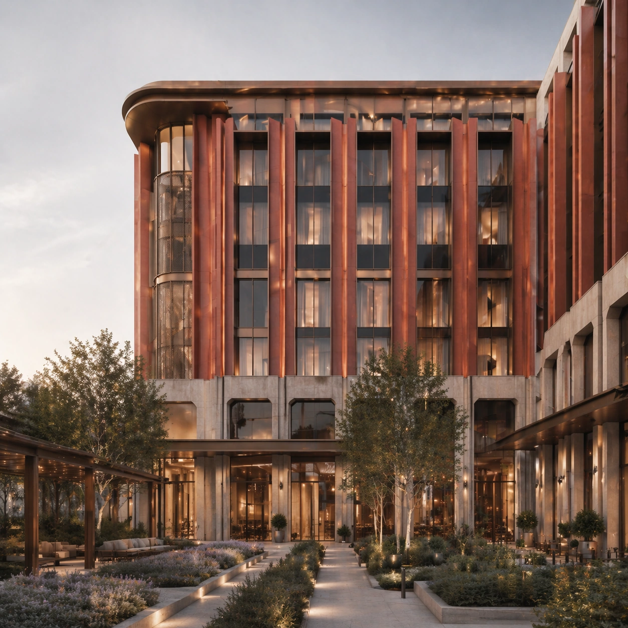
Scene: Create a square reference-dependent architecture still for Architectural Facade Identity System. Use a composed rear or courtyard elevation view that still belongs clearly to the same project while keeping the same lens discipline, editorial polish, and material believability established by the reference image. The lighting can shift to support the intended mood, but the space must still feel like the same authored project with a stable viewpoint logic, convincing depth separation, and clean commercial-photography finish. Keep earthy terracotta, bronze brown, pale stone, smoked glass, and soft sky gray as the governing tonal range even when the emphasis changes. Subject: Show an architectural facade system with terracotta fins, bronze mesh, deep window reveals, sculpted canopies, and a civic-commercial identity that feels recognizable from multiple distances. Focus on the exact same building from the reference image, now emphasizing secondary facade language and landscaped adjacency. Preserve exact architectural identity, plan logic, material palette, fixture family, and circulation cues from the reference image while changing only the intended emphasis described here. The viewer should immediately recognize the same project, not a loose cousin, with matching silhouette logic, aligned detailing, and consistent brand atmosphere. Important details: Preserve the fin spacing, bronze mesh logic, canopy silhouette, reveal depth, and urban recognizability of the building. Any abstract wayfinding, menu, wall-label, or packaging zones must stay unreadable and subordinate to the spatial image. Joinery, edges, reflections, and lighting should remain realistic enough for an operator or design team to treat the image as a credible reference. The variation should feel deliberate and commercially useful, proving that one locked spatial language can flex across multiple campaign or editorial surfaces. Use case: Architectural Facade Identity System series study 4/9, extending back-of-house dignity within the same facade system. Constraints: No readable text, no watermark, no logos, preserve exact 1:1 aspect ratio, preserve exact architectural identity from the reference image, no giant logos, no construction cranes, no crowds, no random neighboring ads, no impossible geometry, no service clutter.

Example generated from “Architectural Facade Identity System — Dusk Plaza Silhouette”
GPT Image 2en

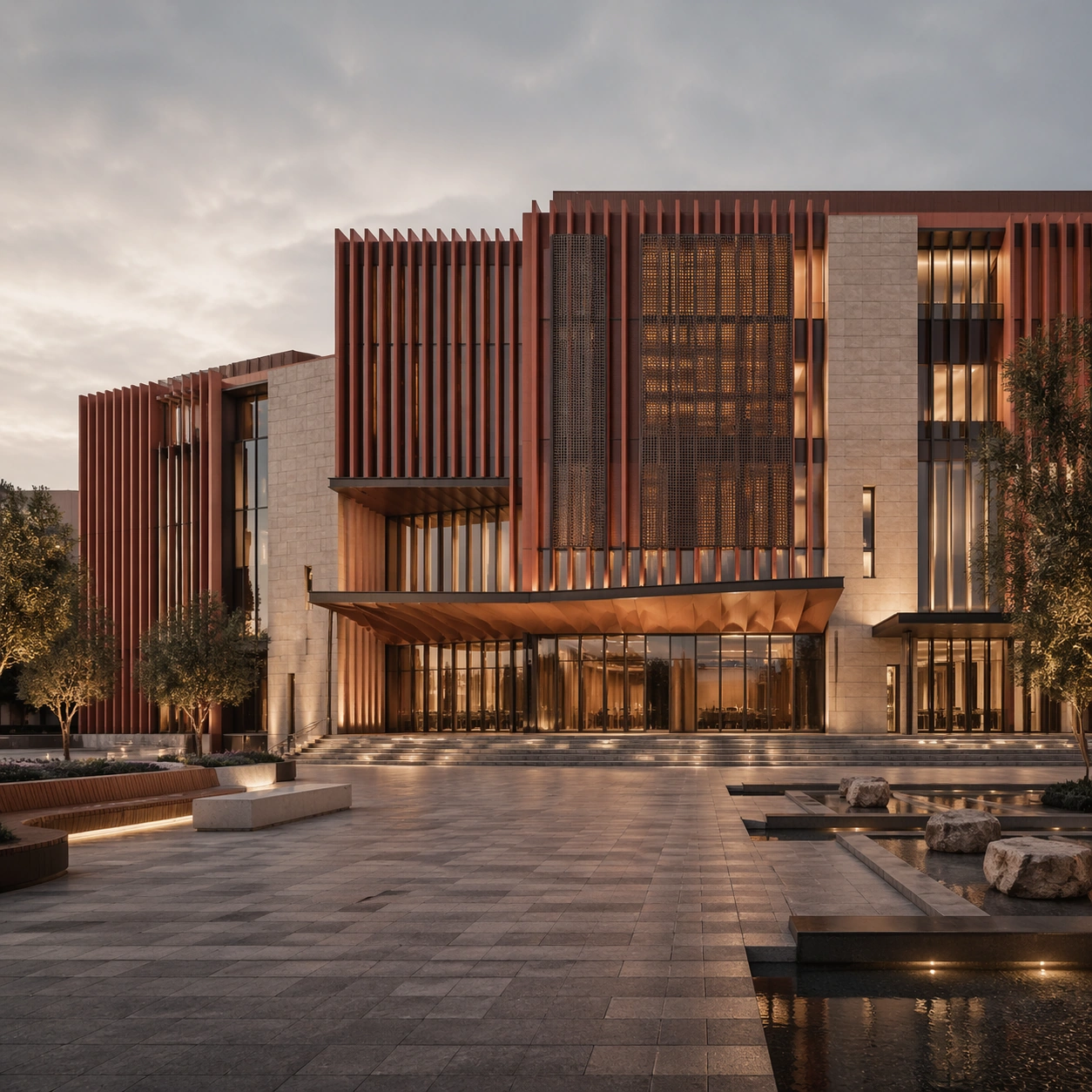
Scene: Create a square standalone support study for Architectural Facade Identity System. Use a plaza-wide dusk still emphasizing the building silhouette and public forecourt and frame it like a premium commercial still or design-editorial crop with clear focal hierarchy, disciplined perspective, and enough breathing room for the materials and objects to read at both thumbnail and full size. Keep earthy terracotta, bronze brown, pale stone, smoked glass, and soft sky gray as the tonal guide so the image still belongs to the same theme family, and light the scene in a controlled way that emphasizes texture, edge quality, and authored atmosphere over spectacle. Subject: Show an architectural facade system with terracotta fins, bronze mesh, deep window reveals, sculpted canopies, and a civic-commercial identity that feels recognizable from multiple distances. In this support study, focus on urban recognizability, warm interior glow, and massing clarity. The image should work independently, yet it must still feel like it belongs to the same broader world of Facade Identity. Make the space, props, and detailing useful for real campaign, editorial, or design-review contexts rather than moodboard abstraction. Important details: Carry forward the broader language of the fin spacing, bronze mesh logic, canopy silhouette, reveal depth, and urban recognizability of the building, but let this image prove a new support surface or secondary deliverable. Material realism is essential: wood grain, metal sheen, glass edges, textiles, and stone should feel physically plausible and carefully art directed. Any graphic panels, labels, menus, packaging, or captions must stay abstract and unreadable. The overall result should feel reusable for architecture competitions, developer decks, city-brand editorials, and facade-design presentations, with enough structure that a creative or operations team could build on it. Use case: Architectural Facade Identity System single study 6/9, exploring support imagery for city-facing brand narratives. Constraints: No readable text, no watermark, no logos, preserve exact 1:1 aspect ratio, no giant logos, no construction cranes, no crowds, no random neighboring ads, no impossible geometry, no event tents.

Example generated from “Architectural Facade Identity System — Address Wall Study”
GPT Image 2en

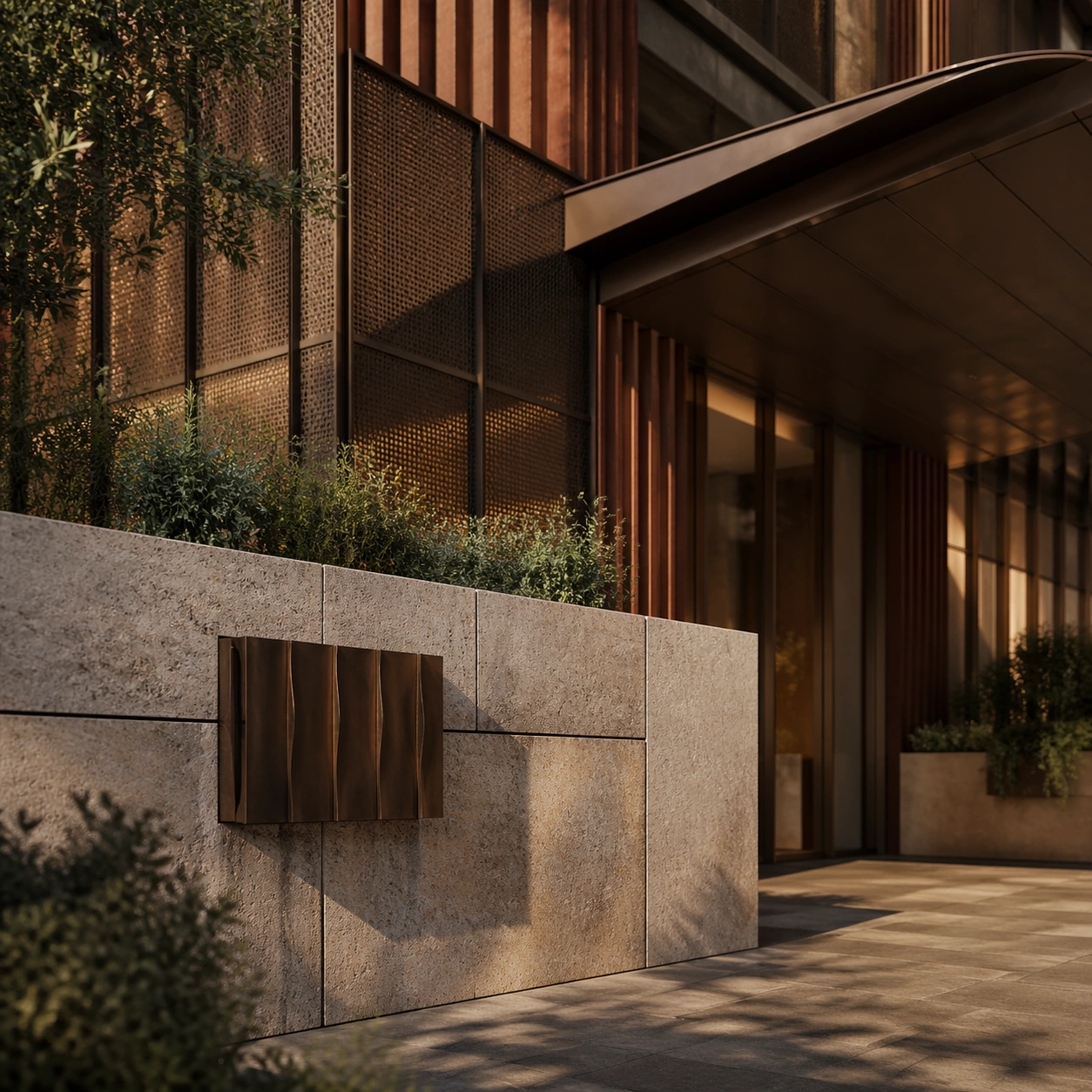
Scene: Create a square standalone support study for Architectural Facade Identity System. Use a close threshold still of a stone address wall, planter edge, and canopy shadow and frame it like a premium commercial still or design-editorial crop with clear focal hierarchy, disciplined perspective, and enough breathing room for the materials and objects to read at both thumbnail and full size. Keep earthy terracotta, bronze brown, pale stone, smoked glass, and soft sky gray as the tonal guide so the image still belongs to the same theme family, and light the scene in a controlled way that emphasizes texture, edge quality, and authored atmosphere over spectacle. Subject: Show an architectural facade system with terracotta fins, bronze mesh, deep window reveals, sculpted canopies, and a civic-commercial identity that feels recognizable from multiple distances. In this support study, focus on arrival tactility without readable signage and with premium detailing. The image should work independently, yet it must still feel like it belongs to the same broader world of Facade Identity. Make the space, props, and detailing useful for real campaign, editorial, or design-review contexts rather than moodboard abstraction. Important details: Carry forward the broader language of the fin spacing, bronze mesh logic, canopy silhouette, reveal depth, and urban recognizability of the building, but let this image prove a new support surface or secondary deliverable. Material realism is essential: wood grain, metal sheen, glass edges, textiles, and stone should feel physically plausible and carefully art directed. Any graphic panels, labels, menus, packaging, or captions must stay abstract and unreadable. The overall result should feel reusable for architecture competitions, developer decks, city-brand editorials, and facade-design presentations, with enough structure that a creative or operations team could build on it. Use case: Architectural Facade Identity System single study 7/9, exploring support still for ground-floor identity moments. Constraints: No readable text, no watermark, no logos, preserve exact 1:1 aspect ratio, no giant logos, no construction cranes, no crowds, no random neighboring ads, no impossible geometry, no readable letters or numbers.

Example generated from “Architectural Facade Identity System — Rainwashed Detail Elevation”
GPT Image 2en

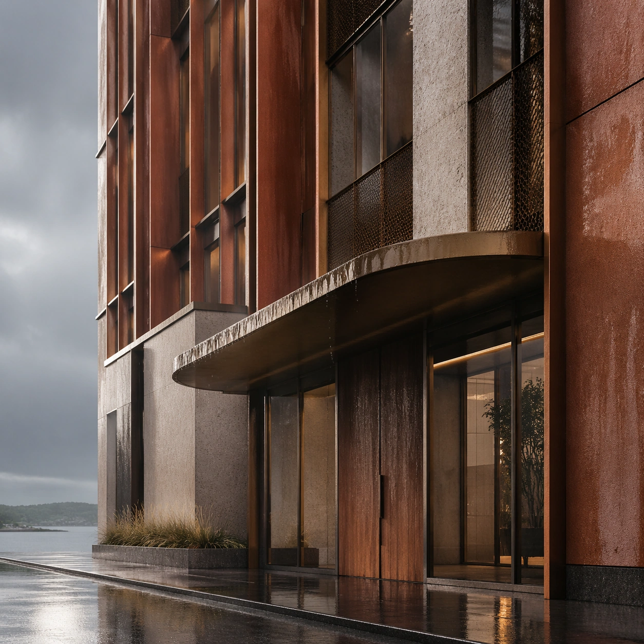
Scene: Create a square standalone support study for Architectural Facade Identity System. Use a wet-weather close facade study with stone, mesh, and glazing under soft rain light and frame it like a premium commercial still or design-editorial crop with clear focal hierarchy, disciplined perspective, and enough breathing room for the materials and objects to read at both thumbnail and full size. Keep earthy terracotta, bronze brown, pale stone, smoked glass, and soft sky gray as the tonal guide so the image still belongs to the same theme family, and light the scene in a controlled way that emphasizes texture, edge quality, and authored atmosphere over spectacle. Subject: Show an architectural facade system with terracotta fins, bronze mesh, deep window reveals, sculpted canopies, and a civic-commercial identity that feels recognizable from multiple distances. In this support study, focus on surface aging, water runoff, and atmospheric realism. The image should work independently, yet it must still feel like it belongs to the same broader world of Facade Identity. Make the space, props, and detailing useful for real campaign, editorial, or design-review contexts rather than moodboard abstraction. Important details: Carry forward the broader language of the fin spacing, bronze mesh logic, canopy silhouette, reveal depth, and urban recognizability of the building, but let this image prove a new support surface or secondary deliverable. Material realism is essential: wood grain, metal sheen, glass edges, textiles, and stone should feel physically plausible and carefully art directed. Any graphic panels, labels, menus, packaging, or captions must stay abstract and unreadable. The overall result should feel reusable for architecture competitions, developer decks, city-brand editorials, and facade-design presentations, with enough structure that a creative or operations team could build on it. Use case: Architectural Facade Identity System single study 8/9, exploring support image for all-weather facade storytelling. Constraints: No readable text, no watermark, no logos, preserve exact 1:1 aspect ratio, no giant logos, no construction cranes, no crowds, no random neighboring ads, no impossible geometry, no umbrellas or pedestrians.

Example generated from “Architectural Facade Identity System — Rooftop Crown View”
GPT Image 2en

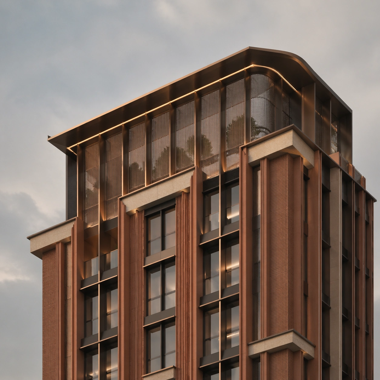
Scene: Create a square standalone support study for Architectural Facade Identity System. Use a telephoto view of the building crown and upper facade against a calm sky and frame it like a premium commercial still or design-editorial crop with clear focal hierarchy, disciplined perspective, and enough breathing room for the materials and objects to read at both thumbnail and full size. Keep earthy terracotta, bronze brown, pale stone, smoked glass, and soft sky gray as the tonal guide so the image still belongs to the same theme family, and light the scene in a controlled way that emphasizes texture, edge quality, and authored atmosphere over spectacle. Subject: Show an architectural facade system with terracotta fins, bronze mesh, deep window reveals, sculpted canopies, and a civic-commercial identity that feels recognizable from multiple distances. In this support study, focus on top termination, lighting restraint, and skyline composure. The image should work independently, yet it must still feel like it belongs to the same broader world of Facade Identity. Make the space, props, and detailing useful for real campaign, editorial, or design-review contexts rather than moodboard abstraction. Important details: Carry forward the broader language of the fin spacing, bronze mesh logic, canopy silhouette, reveal depth, and urban recognizability of the building, but let this image prove a new support surface or secondary deliverable. Material realism is essential: wood grain, metal sheen, glass edges, textiles, and stone should feel physically plausible and carefully art directed. Any graphic panels, labels, menus, packaging, or captions must stay abstract and unreadable. The overall result should feel reusable for architecture competitions, developer decks, city-brand editorials, and facade-design presentations, with enough structure that a creative or operations team could build on it. Use case: Architectural Facade Identity System single study 9/9, exploring support still for skyline-recognition presentations. Constraints: No readable text, no watermark, no logos, preserve exact 1:1 aspect ratio, no giant logos, no construction cranes, no crowds, no random neighboring ads, no impossible geometry, no helicopter viewpoint distortion.

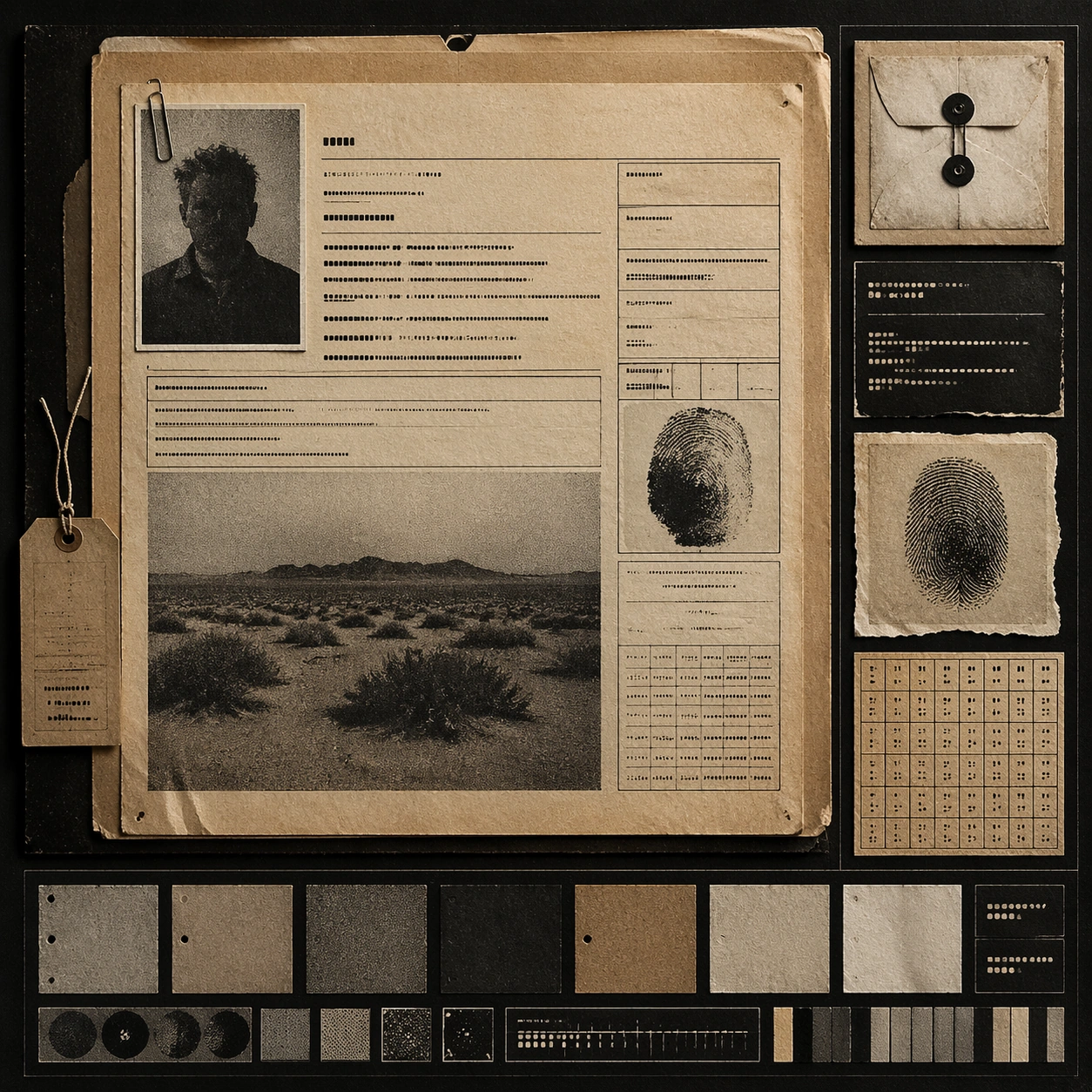
Example generated from “Archive Aesthetic File — Variant Grid”
GPT Image 2en

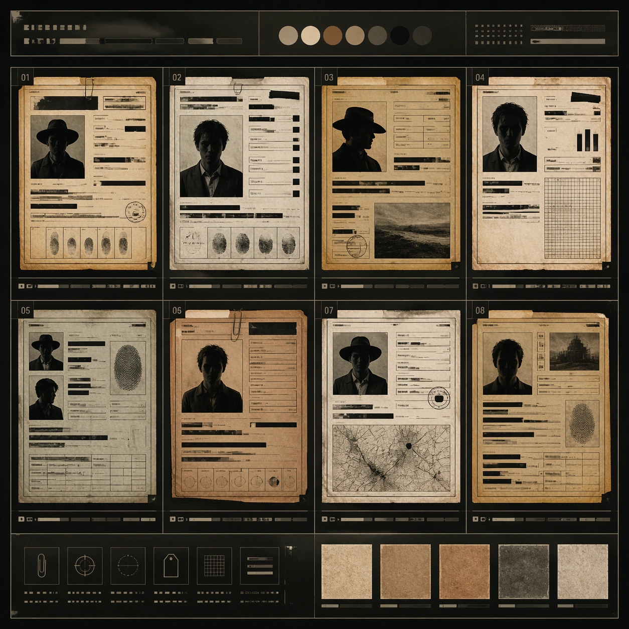
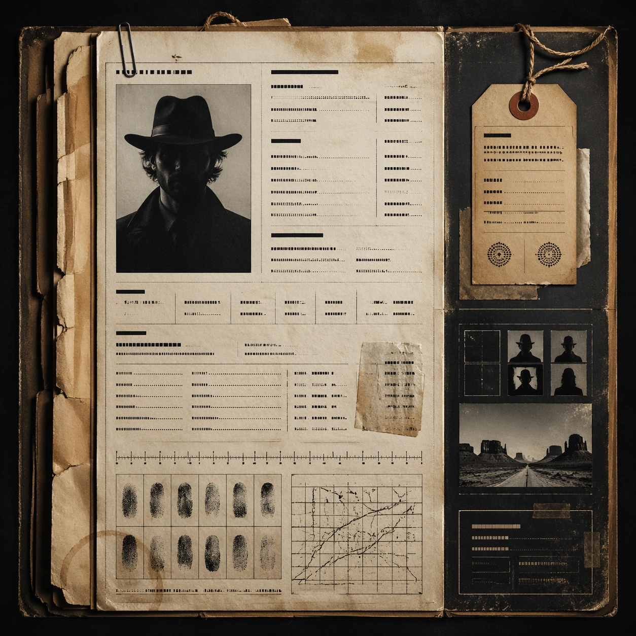
Scene: A square editorial or interface layout study with exact margins, confident grid structure, and premium print or screen presentation. Build the frame around multiple aligned variations sharing one disciplined layout system. Keep the lighting, camera distance, and spatial organization tuned for a high-signal research image rather than a casual snapshot. The image belongs to the Archive Aesthetic File theme and should feel immediately legible as a prompt atlas theme for archive aesthetic file, testing text-rendering, structured-layout with gpt image 2.. Subject: Center the study on multiple aligned variations sharing one disciplined layout system. Translate the theme into a concrete visual statement instead of an abstract mood board: the viewer should understand what kind of image this is, what is being tested, and why the composition is difficult. Use the slug idea of archive aesthetic file as a literal guide for subject matter, materials, and staging. If helpful, borrow the broad visual cues suggested by Old West Wanted, FBI, but keep the result original and specific to this study. Important details: Typography fields must stay unreadable, but hierarchy, rhythm, and page architecture should feel convincing enough for design review. Preserve a disciplined square composition, clear focal hierarchy, and enough secondary information to make the image feel complete rather than underspecified. The image should look polished, novel, and exhibition-ready, with topic-specific credibility coming from the way surfaces, structure, and visual language reinforce Archive Aesthetic File. Avoid generic filler elements that do not serve the main concept. Use case: Archive Aesthetic File single study 2/8, testing text-rendering, structured-layout through the variant grid variation. Constraints: No readable text, no watermark, no logos, preserve exact 1:1 aspect ratio, no readable text, no logo lockups from real brands, no broken grid, no arbitrary poster clutter, no malformed columns, no accidental lorem ipsum.

Example generated from “Archive Aesthetic File — Desk Review”
GPT Image 2en

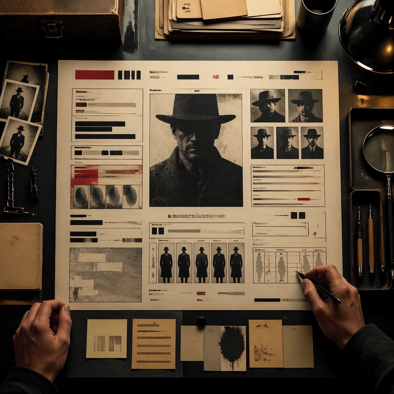
Scene: A square editorial or interface layout study with exact margins, confident grid structure, and premium print or screen presentation. Build the frame around a presentation context that shows the layout as a reviewed design object. Keep the lighting, camera distance, and spatial organization tuned for a high-signal research image rather than a casual snapshot. The image belongs to the Archive Aesthetic File theme and should feel immediately legible as a prompt atlas theme for archive aesthetic file, testing text-rendering, structured-layout with gpt image 2.. Subject: Center the study on a presentation context that shows the layout as a reviewed design object. Translate the theme into a concrete visual statement instead of an abstract mood board: the viewer should understand what kind of image this is, what is being tested, and why the composition is difficult. Use the slug idea of archive aesthetic file as a literal guide for subject matter, materials, and staging. If helpful, borrow the broad visual cues suggested by Old West Wanted, FBI, but keep the result original and specific to this study. Important details: Typography fields must stay unreadable, but hierarchy, rhythm, and page architecture should feel convincing enough for design review. Preserve a disciplined square composition, clear focal hierarchy, and enough secondary information to make the image feel complete rather than underspecified. The image should look polished, novel, and exhibition-ready, with topic-specific credibility coming from the way surfaces, structure, and visual language reinforce Archive Aesthetic File. Avoid generic filler elements that do not serve the main concept. Use case: Archive Aesthetic File single study 3/8, testing text-rendering, structured-layout through the desk review variation. Constraints: No readable text, no watermark, no logos, preserve exact 1:1 aspect ratio, no readable text, no logo lockups from real brands, no broken grid, no arbitrary poster clutter, no malformed columns, no accidental lorem ipsum.

Example generated from “Archive Aesthetic File — Material Closeup”
GPT Image 2en

Scene: A square editorial or interface layout study with exact margins, confident grid structure, and premium print or screen presentation. Build the frame around print grain, paper, or screen detail without losing overall composition. Keep the lighting, camera distance, and spatial organization tuned for a high-signal research image rather than a casual snapshot. The image belongs to the Archive Aesthetic File theme and should feel immediately legible as a prompt atlas theme for archive aesthetic file, testing text-rendering, structured-layout with gpt image 2.. Subject: Center the study on print grain, paper, or screen detail without losing overall composition. Translate the theme into a concrete visual statement instead of an abstract mood board: the viewer should understand what kind of image this is, what is being tested, and why the composition is difficult. Use the slug idea of archive aesthetic file as a literal guide for subject matter, materials, and staging. If helpful, borrow the broad visual cues suggested by Old West Wanted, FBI, but keep the result original and specific to this study. Important details: Typography fields must stay unreadable, but hierarchy, rhythm, and page architecture should feel convincing enough for design review. Preserve a disciplined square composition, clear focal hierarchy, and enough secondary information to make the image feel complete rather than underspecified. The image should look polished, novel, and exhibition-ready, with topic-specific credibility coming from the way surfaces, structure, and visual language reinforce Archive Aesthetic File. Avoid generic filler elements that do not serve the main concept. Use case: Archive Aesthetic File single study 4/8, testing text-rendering, structured-layout through the material closeup variation. Constraints: No readable text, no watermark, no logos, preserve exact 1:1 aspect ratio, no readable text, no logo lockups from real brands, no broken grid, no arbitrary poster clutter, no malformed columns, no accidental lorem ipsum.

Example generated from “Archive Aesthetic File — Archive Sheet”
GPT Image 2en

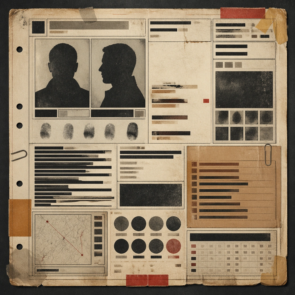
Scene: A square editorial or interface layout study with exact margins, confident grid structure, and premium print or screen presentation. Build the frame around a flat archival or proof-like sheet with modular content blocks. Keep the lighting, camera distance, and spatial organization tuned for a high-signal research image rather than a casual snapshot. The image belongs to the Archive Aesthetic File theme and should feel immediately legible as a prompt atlas theme for archive aesthetic file, testing text-rendering, structured-layout with gpt image 2.. Subject: Center the study on a flat archival or proof-like sheet with modular content blocks. Translate the theme into a concrete visual statement instead of an abstract mood board: the viewer should understand what kind of image this is, what is being tested, and why the composition is difficult. Use the slug idea of archive aesthetic file as a literal guide for subject matter, materials, and staging. If helpful, borrow the broad visual cues suggested by Old West Wanted, FBI, but keep the result original and specific to this study. Important details: Typography fields must stay unreadable, but hierarchy, rhythm, and page architecture should feel convincing enough for design review. Preserve a disciplined square composition, clear focal hierarchy, and enough secondary information to make the image feel complete rather than underspecified. The image should look polished, novel, and exhibition-ready, with topic-specific credibility coming from the way surfaces, structure, and visual language reinforce Archive Aesthetic File. Avoid generic filler elements that do not serve the main concept. Use case: Archive Aesthetic File single study 5/8, testing text-rendering, structured-layout through the archive sheet variation. Constraints: No readable text, no watermark, no logos, preserve exact 1:1 aspect ratio, no readable text, no logo lockups from real brands, no broken grid, no arbitrary poster clutter, no malformed columns, no accidental lorem ipsum.

Example generated from “Archive Aesthetic File — 陈列展示”
GPT Image 2en

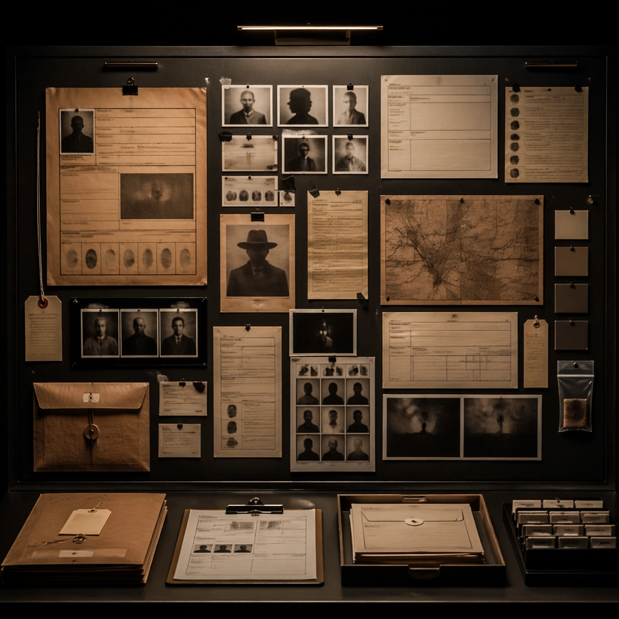
Scene: A square editorial or interface layout study with exact margins, confident grid structure, and premium print or screen presentation. Build the frame around a polished display context that still preserves layout logic. Keep the lighting, camera distance, and spatial organization tuned for a high-signal research image rather than a casual snapshot. The image belongs to the Archive Aesthetic File theme and should feel immediately legible as a prompt atlas theme for archive aesthetic file, testing text-rendering, structured-layout with gpt image 2.. Subject: Center the study on a polished display context that still preserves layout logic. Translate the theme into a concrete visual statement instead of an abstract mood board: the viewer should understand what kind of image this is, what is being tested, and why the composition is difficult. Use the slug idea of archive aesthetic file as a literal guide for subject matter, materials, and staging. If helpful, borrow the broad visual cues suggested by Old West Wanted, FBI, but keep the result original and specific to this study. Important details: Typography fields must stay unreadable, but hierarchy, rhythm, and page architecture should feel convincing enough for design review. Preserve a disciplined square composition, clear focal hierarchy, and enough secondary information to make the image feel complete rather than underspecified. The image should look polished, novel, and exhibition-ready, with topic-specific credibility coming from the way surfaces, structure, and visual language reinforce Archive Aesthetic File. Avoid generic filler elements that do not serve the main concept. Use case: Archive Aesthetic File single study 6/8, testing text-rendering, structured-layout through the 陈列展示 variation. Constraints: No readable text, no watermark, no logos, preserve exact 1:1 aspect ratio, no readable text, no logo lockups from real brands, no broken grid, no arbitrary poster clutter, no malformed columns, no accidental lorem ipsum.

Example generated from “Archive Aesthetic File — System Board”
GPT Image 2en

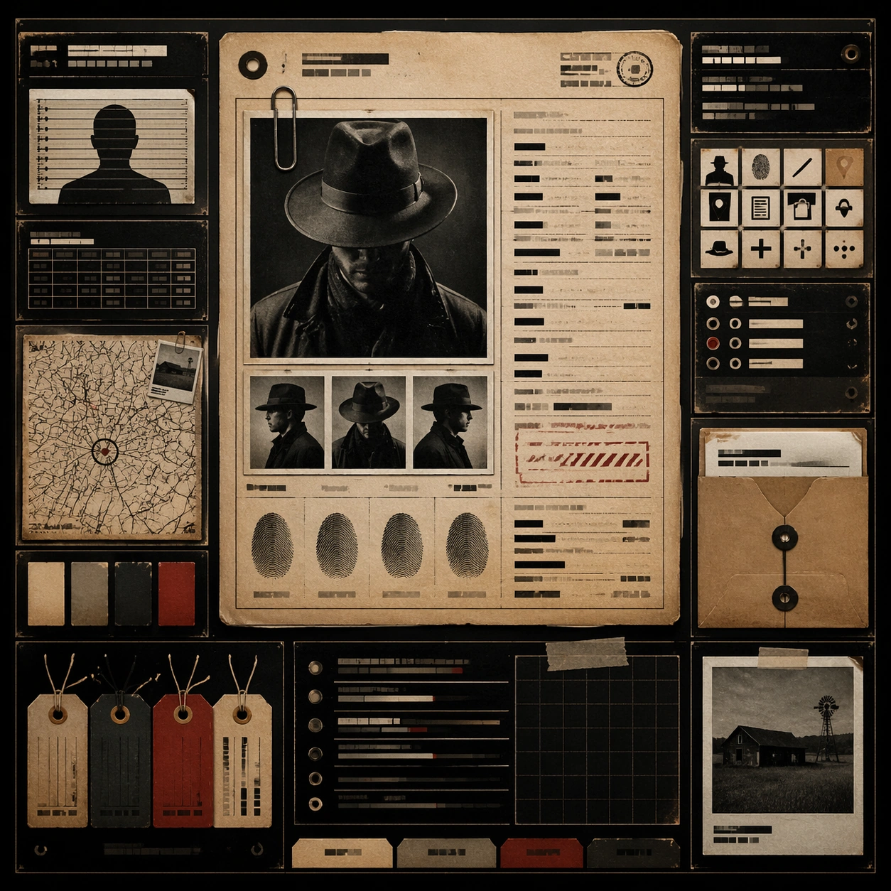
Scene: A square editorial or interface layout study with exact margins, confident grid structure, and premium print or screen presentation. Build the frame around a family of elements organized into a coherent visual language. Keep the lighting, camera distance, and spatial organization tuned for a high-signal research image rather than a casual snapshot. The image belongs to the Archive Aesthetic File theme and should feel immediately legible as a prompt atlas theme for archive aesthetic file, testing text-rendering, structured-layout with gpt image 2.. Subject: Center the study on a family of elements organized into a coherent visual language. Translate the theme into a concrete visual statement instead of an abstract mood board: the viewer should understand what kind of image this is, what is being tested, and why the composition is difficult. Use the slug idea of archive aesthetic file as a literal guide for subject matter, materials, and staging. If helpful, borrow the broad visual cues suggested by Old West Wanted, FBI, but keep the result original and specific to this study. Important details: Typography fields must stay unreadable, but hierarchy, rhythm, and page architecture should feel convincing enough for design review. Preserve a disciplined square composition, clear focal hierarchy, and enough secondary information to make the image feel complete rather than underspecified. The image should look polished, novel, and exhibition-ready, with topic-specific credibility coming from the way surfaces, structure, and visual language reinforce Archive Aesthetic File. Avoid generic filler elements that do not serve the main concept. Use case: Archive Aesthetic File single study 7/8, testing text-rendering, structured-layout through the system board variation. Constraints: No readable text, no watermark, no logos, preserve exact 1:1 aspect ratio, no readable text, no logo lockups from real brands, no broken grid, no arbitrary poster clutter, no malformed columns, no accidental lorem ipsum.

Example generated from “Archive Aesthetic File — Signature Layout”
GPT Image 2en

Scene: A square editorial or interface layout study with exact margins, confident grid structure, and premium print or screen presentation. Build the frame around the most distilled expression of the topic’s layout identity. Keep the lighting, camera distance, and spatial organization tuned for a high-signal research image rather than a casual snapshot. The image belongs to the Archive Aesthetic File theme and should feel immediately legible as a prompt atlas theme for archive aesthetic file, testing text-rendering, structured-layout with gpt image 2.. Subject: Center the study on the most distilled expression of the topic’s layout identity. Translate the theme into a concrete visual statement instead of an abstract mood board: the viewer should understand what kind of image this is, what is being tested, and why the composition is difficult. Use the slug idea of archive aesthetic file as a literal guide for subject matter, materials, and staging. If helpful, borrow the broad visual cues suggested by Old West Wanted, FBI, but keep the result original and specific to this study. Important details: Typography fields must stay unreadable, but hierarchy, rhythm, and page architecture should feel convincing enough for design review. Preserve a disciplined square composition, clear focal hierarchy, and enough secondary information to make the image feel complete rather than underspecified. The image should look polished, novel, and exhibition-ready, with topic-specific credibility coming from the way surfaces, structure, and visual language reinforce Archive Aesthetic File. Avoid generic filler elements that do not serve the main concept. Use case: Archive Aesthetic File single study 8/8, testing text-rendering, structured-layout through the signature layout variation. Constraints: No readable text, no watermark, no logos, preserve exact 1:1 aspect ratio, no readable text, no logo lockups from real brands, no broken grid, no arbitrary poster clutter, no malformed columns, no accidental lorem ipsum.

Example generated from “Art Deco Gatsby Theatre — Print Proof Flatlay”
GPT Image 2en

Scene: A square overhead tabletop photograph of a fresh poster proof on neutral worktable paper, lit by cool daylight, with crop marks, tape tabs, and slight paper bow visible around the sheet. The poster should express luxury theatre-era deco symmetry with stepped arches, fan motifs, sunbursts, and jewel-like border framing, using metallic gold, deep black, emerald green, ivory, and restrained champagne highlights and a tactile surface appropriate to the medium. Subject: Design the poster as a print-shop proof, preserving the same poster language while allowing production clues such as edge trims, registration targets, and process marks to frame the composition. Use velvet curtains, skyline silhouettes, chandeliers, mirrored staircases, stage spotlights, and fan-shaped rays as the main visual ingredients, and organize them with tall condensed deco glyph blocks kept ornamental and non-readable. For the contemporary-subject axis, thread in a nocturnal rooftop jazz gala and sleek city train arrival absorbed into deco glamour. The poster must feel like an original design object rather than a reproduction of any known work. Important details: The image must still read as a finished poster concept, but it should carry believable print-process evidence and material tactility instead of gallery-wall perfection. Preserve mirror symmetry, thin metallic linework, precise ornament pacing, and elegant vertical emphasis. Keep every letterform abstract and non-readable, as if it were a typographic texture rather than language. Make the style unmistakable through composition, palette, surface behavior, and symbolic compression. no cheap glitter, no modern interface chrome, no casual streetwear, no cartoon softness. Use case: Art Deco Theatre single study 2/9, testing production realism and process evidence. Constraints: No readable text, no watermark, no logos, preserve exact 1:1 aspect ratio, no copyrighted characters, no real brand marks, no QR codes, no interface chrome, no accidental gibberish lettering.

Example generated from “Art Deco Gatsby Theatre — Transit Lightbox”
GPT Image 2en

Scene: A square dusk street photograph of a backlit transit poster glowing inside glass, with faint rain reflections, soft city blur in the distance, and the poster remaining fully legible as a composition. The poster should express luxury theatre-era deco symmetry with stepped arches, fan motifs, sunbursts, and jewel-like border framing, using metallic gold, deep black, emerald green, ivory, and restrained champagne highlights and a tactile surface appropriate to the medium. Subject: Adapt the poster into a public-facing lightbox version that still honors the original style grammar while feeling bold enough to stop a passerby from several meters away. Use velvet curtains, skyline silhouettes, chandeliers, mirrored staircases, stage spotlights, and fan-shaped rays as the main visual ingredients, and organize them with tall condensed deco glyph blocks kept ornamental and non-readable. For the contemporary-subject axis, thread in a nocturnal rooftop jazz gala and sleek city train arrival absorbed into deco glamour. The poster must feel like an original design object rather than a reproduction of any known work. Important details: Let the style survive the illumination test: color blocking, silhouette contrast, and abstract lettering should stay controlled under bright internal light and reflective glass. Preserve mirror symmetry, thin metallic linework, precise ornament pacing, and elegant vertical emphasis. Keep every letterform abstract and non-readable, as if it were a typographic texture rather than language. Make the style unmistakable through composition, palette, surface behavior, and symbolic compression. no cheap glitter, no modern interface chrome, no casual streetwear, no cartoon softness. Use case: Art Deco Theatre single study 3/9, testing distance readability in public display. Constraints: No readable text, no watermark, no logos, preserve exact 1:1 aspect ratio, no copyrighted characters, no real brand marks, no QR codes, no interface chrome, no accidental gibberish lettering.

Example generated from “Art Deco Gatsby Theatre — Wheatpaste Wall Layer”
GPT Image 2en

Scene: A square urban wall study with the poster pasted onto rough plaster among torn edges and older paper remnants, photographed in soft overcast light so texture, glue bubbles, and surface scars stay visible. The poster should express luxury theatre-era deco symmetry with stepped arches, fan motifs, sunbursts, and jewel-like border framing, using metallic gold, deep black, emerald green, ivory, and restrained champagne highlights and a tactile surface appropriate to the medium. Subject: Create a version that feels made for the street, with the poster carrying enough formal force to survive abrasion, layering, and imperfect placement without losing its visual identity. Use velvet curtains, skyline silhouettes, chandeliers, mirrored staircases, stage spotlights, and fan-shaped rays as the main visual ingredients, and organize them with tall condensed deco glyph blocks kept ornamental and non-readable. For the contemporary-subject axis, thread in a nocturnal rooftop jazz gala and sleek city train arrival absorbed into deco glamour. The poster must feel like an original design object rather than a reproduction of any known work. Important details: Keep the main design intact but let the environment add grit: lifted corners, tiny tears, wrinkled paper, and older color fragments around the perimeter should amplify the style rather than dilute it. Preserve mirror symmetry, thin metallic linework, precise ornament pacing, and elegant vertical emphasis. Keep every letterform abstract and non-readable, as if it were a typographic texture rather than language. Make the style unmistakable through composition, palette, surface behavior, and symbolic compression. no cheap glitter, no modern interface chrome, no casual streetwear, no cartoon softness. Use case: Art Deco Theatre single study 4/9, testing street-life durability and layered context. Constraints: No readable text, no watermark, no logos, preserve exact 1:1 aspect ratio, no copyrighted characters, no real brand marks, no QR codes, no interface chrome, no accidental gibberish lettering.

Example generated from “Art Deco Gatsby Theatre — Folded Archive Copy”
GPT Image 2en

Scene: A square conservation-table view of a vintage poster laid on gray felt under raking light, with visible fold lines, softened corners, and subtle aging that still preserves the integrity of the image. The poster should express luxury theatre-era deco symmetry with stepped arches, fan motifs, sunbursts, and jewel-like border framing, using metallic gold, deep black, emerald green, ivory, and restrained champagne highlights and a tactile surface appropriate to the medium. Subject: Present the poster as an archive copy that has been stored, unfolded, and carefully documented, letting age and handling reveal how the design holds up across time. Use velvet curtains, skyline silhouettes, chandeliers, mirrored staircases, stage spotlights, and fan-shaped rays as the main visual ingredients, and organize them with tall condensed deco glyph blocks kept ornamental and non-readable. For the contemporary-subject axis, thread in a nocturnal rooftop jazz gala and sleek city train arrival absorbed into deco glamour. The poster must feel like an original design object rather than a reproduction of any known work. Important details: Aging must stay believable rather than theatrical: slight yellowing, fold memory, edge wear, and pigment variation should support the historical or crafted feeling of the style. Preserve mirror symmetry, thin metallic linework, precise ornament pacing, and elegant vertical emphasis. Keep every letterform abstract and non-readable, as if it were a typographic texture rather than language. Make the style unmistakable through composition, palette, surface behavior, and symbolic compression. no cheap glitter, no modern interface chrome, no casual streetwear, no cartoon softness. Use case: Art Deco Theatre single study 5/9, testing archival endurance and age character. Constraints: No readable text, no watermark, no logos, preserve exact 1:1 aspect ratio, no copyrighted characters, no real brand marks, no QR codes, no interface chrome, no accidental gibberish lettering.

Example generated from “Art Deco Gatsby Theatre — Twin Poster Diptych”
GPT Image 2en

Scene: A square white-wall installation showing two companion posters hung side by side with equal spacing, photographed frontally so the pair reads as a designed conversation rather than two unrelated sheets. The poster should express luxury theatre-era deco symmetry with stepped arches, fan motifs, sunbursts, and jewel-like border framing, using metallic gold, deep black, emerald green, ivory, and restrained champagne highlights and a tactile surface appropriate to the medium. Subject: Compose a matched diptych: two posters sharing one style system while splitting the narrative across paired motifs, mirrored masses, or complementary color emphasis. Use velvet curtains, skyline silhouettes, chandeliers, mirrored staircases, stage spotlights, and fan-shaped rays as the main visual ingredients, and organize them with tall condensed deco glyph blocks kept ornamental and non-readable. For the contemporary-subject axis, thread in a nocturnal rooftop jazz gala and sleek city train arrival absorbed into deco glamour. The poster must feel like an original design object rather than a reproduction of any known work. Important details: Both halves should feel distinct yet inseparable. Preserve one coherent visual language, but let each sheet carry its own focal symbol and rhythm without readable wording. Preserve mirror symmetry, thin metallic linework, precise ornament pacing, and elegant vertical emphasis. Keep every letterform abstract and non-readable, as if it were a typographic texture rather than language. Make the style unmistakable through composition, palette, surface behavior, and symbolic compression. no cheap glitter, no modern interface chrome, no casual streetwear, no cartoon softness. Use case: Art Deco Theatre single study 6/9, testing system flexibility across a paired set. Constraints: No readable text, no watermark, no logos, preserve exact 1:1 aspect ratio, no copyrighted characters, no real brand marks, no QR codes, no interface chrome, no accidental gibberish lettering.

Example generated from “Art Deco Gatsby Theatre — Stacked Print Bundle”
GPT Image 2en

Scene: A square tabletop shot of several poster prints stacked and slightly fanned, with curled corners, offset edges, and soft directional light revealing paper thickness and ink behavior. The poster should express luxury theatre-era deco symmetry with stepped arches, fan motifs, sunbursts, and jewel-like border framing, using metallic gold, deep black, emerald green, ivory, and restrained champagne highlights and a tactile surface appropriate to the medium. Subject: Design the top poster to dominate while nearby duplicate sheets echo the same composition, creating a tactile print-run scene rather than a single isolated sheet. Use velvet curtains, skyline silhouettes, chandeliers, mirrored staircases, stage spotlights, and fan-shaped rays as the main visual ingredients, and organize them with tall condensed deco glyph blocks kept ornamental and non-readable. For the contemporary-subject axis, thread in a nocturnal rooftop jazz gala and sleek city train arrival absorbed into deco glamour. The poster must feel like an original design object rather than a reproduction of any known work. Important details: Use the stack to emphasize production character: edge shadows, repeated motifs peeking from beneath, and subtle misalignment should enrich the material reading without changing the core design. Preserve mirror symmetry, thin metallic linework, precise ornament pacing, and elegant vertical emphasis. Keep every letterform abstract and non-readable, as if it were a typographic texture rather than language. Make the style unmistakable through composition, palette, surface behavior, and symbolic compression. no cheap glitter, no modern interface chrome, no casual streetwear, no cartoon softness. Use case: Art Deco Theatre single study 7/9, testing print-run tactility and repeat presence. Constraints: No readable text, no watermark, no logos, preserve exact 1:1 aspect ratio, no copyrighted characters, no real brand marks, no QR codes, no interface chrome, no accidental gibberish lettering.

Example generated from “Art Deco Gatsby Theatre — Kiosk Night Glow”
GPT Image 2en

Scene: A square nighttime city view with the poster wrapping part of a cylindrical kiosk, wet pavement reflecting nearby light, and the composition holding together under moody urban illumination. The poster should express luxury theatre-era deco symmetry with stepped arches, fan motifs, sunbursts, and jewel-like border framing, using metallic gold, deep black, emerald green, ivory, and restrained champagne highlights and a tactile surface appropriate to the medium. Subject: Reframe the design for a dramatic street-placement context, where the poster has to project style and mood through reflection, curvature, and surrounding darkness. Use velvet curtains, skyline silhouettes, chandeliers, mirrored staircases, stage spotlights, and fan-shaped rays as the main visual ingredients, and organize them with tall condensed deco glyph blocks kept ornamental and non-readable. For the contemporary-subject axis, thread in a nocturnal rooftop jazz gala and sleek city train arrival absorbed into deco glamour. The poster must feel like an original design object rather than a reproduction of any known work. Important details: The design should remain instantly recognizable despite the cylindrical wrap. Preserve major blocks, symbolic shapes, and abstract title forms so the style still feels authoritative at night. Preserve mirror symmetry, thin metallic linework, precise ornament pacing, and elegant vertical emphasis. Keep every letterform abstract and non-readable, as if it were a typographic texture rather than language. Make the style unmistakable through composition, palette, surface behavior, and symbolic compression. no cheap glitter, no modern interface chrome, no casual streetwear, no cartoon softness. Use case: Art Deco Theatre single study 8/9, testing atmospheric display under rain and glow. Constraints: No readable text, no watermark, no logos, preserve exact 1:1 aspect ratio, no copyrighted characters, no real brand marks, no QR codes, no interface chrome, no accidental gibberish lettering.

Example generated from “Art Deco Gatsby Theatre — Contemporary Remix”
GPT Image 2en

Scene: A square front-facing poster presentation on a clean neutral wall, lit like a premium print test, with crisp edges and a polished but still tactile finish appropriate to the style. The poster should express luxury theatre-era deco symmetry with stepped arches, fan motifs, sunbursts, and jewel-like border framing, using metallic gold, deep black, emerald green, ivory, and restrained champagne highlights and a tactile surface appropriate to the medium. Subject: Apply the historical poster language to a contemporary urban subject so the old visual grammar proves it can carry present-day themes without losing authenticity or formal discipline. Use velvet curtains, skyline silhouettes, chandeliers, mirrored staircases, stage spotlights, and fan-shaped rays as the main visual ingredients, and organize them with tall condensed deco glyph blocks kept ornamental and non-readable. For the contemporary-subject axis, thread in a nocturnal rooftop jazz gala and sleek city train arrival absorbed into deco glamour. The poster must feel like an original design object rather than a reproduction of any known work. Important details: This is not parody. The contemporary subject should feel genuinely absorbed into the style through palette, composition, symbolic compression, and non-readable lettering treatment. Preserve mirror symmetry, thin metallic linework, precise ornament pacing, and elegant vertical emphasis. Keep every letterform abstract and non-readable, as if it were a typographic texture rather than language. Make the style unmistakable through composition, palette, surface behavior, and symbolic compression. no cheap glitter, no modern interface chrome, no casual streetwear, no cartoon softness. Use case: Art Deco Theatre single study 9/9, testing historical grammar on a present-day subject. Constraints: No readable text, no watermark, no logos, preserve exact 1:1 aspect ratio, no copyrighted characters, no real brand marks, no QR codes, no interface chrome, no accidental gibberish lettering.

Example generated from “Art Nouveau Poster — Commercial Study”
GPT Image 2en

Scene: A square 1:1 composition designed as a premium Art Nouveau Poster study. Present the subject with a premium, campaign-ready finish, while keeping the image elegant and intentional rather than salesy. Use lighting, color, and spatial staging that make the core idea legible in one glance while still rewarding close inspection. The frame should feel display-ready rather than like a rough concept sheet, with balanced brightness, deliberate negative space, and clear separation of foreground, midground, and background layers. Subject: Interpret Art Nouveau Poster through 新艺术运动 · 19 世纪末. Draw from this visual direction: Alphonse Mucha 风 · 飘发女子 + 星形光环 + 百合藤蔓 + 书法 typography · 广告海报(香槟 / 火车 / 烟草). Focus on a polished commercial-facing treatment with clean hierarchy and high instruction following. Build a primary focal subject, secondary support forms, and a coherent environmental envelope so the scene feels complete and specific. Treat this as an independent study with no continuity requirement beyond the shared theme language. Important details: Carry forward the theme's distinguishing value: 装饰艺术巅峰 · 石版印刷工艺黄金年代 · 现代品牌高级感挪用. Reflect the tested capabilities through visible decisions related to text-rendering, structured-layout, style-transfer, commercial-mockup. 更强图中文字渲染与版式跟随;复杂结构化视觉和多面板构图能力. Aim for these acceptance cues: 一眼能看出这是高难度炫技主题,不像普通模板图; 核心创意和画面结构无需解释即可成立. Keep the image controlled, elegant, and intentionally composed, with no accidental filler elements. Use case: Art Nouveau Poster single study 2/8, testing the theme in a commercial-facing treatment. Constraints: No readable text, no watermark, no logos, preserve exact 1:1 aspect ratio, no muddy focal point, no duplicate main subject, no collage seams, no broken margin geometry, no accidental extra text blocks.

Example generated from “Art Nouveau Poster — Technical Study”
GPT Image 2en

Scene: A square 1:1 composition designed as a premium Art Nouveau Poster study. Make the scene more analytic and information-rich, with stricter organization, cleaner separation of elements, and explicit structural readability. Use lighting, color, and spatial staging that make the core idea legible in one glance while still rewarding close inspection. The frame should feel display-ready rather than like a rough concept sheet, with balanced brightness, deliberate negative space, and clear separation of foreground, midground, and background layers. Subject: Interpret Art Nouveau Poster through 新艺术运动 · 19 世纪末. Draw from this visual direction: Alphonse Mucha 风 · 飘发女子 + 星形光环 + 百合藤蔓 + 书法 typography · 广告海报(香槟 / 火车 / 烟草). Focus on a structured interpretation emphasizing process visibility, precision, or internal logic. Build a primary focal subject, secondary support forms, and a coherent environmental envelope so the scene feels complete and specific. Treat this as an independent study with no continuity requirement beyond the shared theme language. Important details: Carry forward the theme's distinguishing value: 装饰艺术巅峰 · 石版印刷工艺黄金年代 · 现代品牌高级感挪用. Reflect the tested capabilities through visible decisions related to text-rendering, structured-layout, style-transfer, commercial-mockup. 更强图中文字渲染与版式跟随;复杂结构化视觉和多面板构图能力. Aim for these acceptance cues: 一眼能看出这是高难度炫技主题,不像普通模板图; 核心创意和画面结构无需解释即可成立. Keep the image controlled, elegant, and intentionally composed, with no accidental filler elements. Use case: Art Nouveau Poster single study 3/8, testing whether the topic holds up under a technical visual treatment. Constraints: No readable text, no watermark, no logos, preserve exact 1:1 aspect ratio, no muddy focal point, no duplicate main subject, no collage seams, no broken margin geometry, no accidental extra text blocks.

Example generated from “Art Nouveau Poster — Experimental Study”
GPT Image 2en

Scene: A square 1:1 composition designed as a premium Art Nouveau Poster study. Push the composition toward a bold visual experiment that still feels coherent, with stronger contrast and memorable thematic exaggeration. Use lighting, color, and spatial staging that make the core idea legible in one glance while still rewarding close inspection. The frame should feel display-ready rather than like a rough concept sheet, with balanced brightness, deliberate negative space, and clear separation of foreground, midground, and background layers. Subject: Interpret Art Nouveau Poster through 新艺术运动 · 19 世纪末. Draw from this visual direction: Alphonse Mucha 风 · 飘发女子 + 星形光环 + 百合藤蔓 + 书法 typography · 广告海报(香槟 / 火车 / 烟草). Focus on an adventurous interpretation that highlights frontier creativity while remaining disciplined and legible. Build a primary focal subject, secondary support forms, and a coherent environmental envelope so the scene feels complete and specific. Treat this as an independent study with no continuity requirement beyond the shared theme language. Important details: Carry forward the theme's distinguishing value: 装饰艺术巅峰 · 石版印刷工艺黄金年代 · 现代品牌高级感挪用. Reflect the tested capabilities through visible decisions related to text-rendering, structured-layout, style-transfer, commercial-mockup. 更强图中文字渲染与版式跟随;复杂结构化视觉和多面板构图能力. Aim for these acceptance cues: 一眼能看出这是高难度炫技主题,不像普通模板图; 核心创意和画面结构无需解释即可成立. Keep the image controlled, elegant, and intentionally composed, with no accidental filler elements. Use case: Art Nouveau Poster single study 4/8, showing the most adventurous single-image treatment under the same theme. Constraints: No readable text, no watermark, no logos, preserve exact 1:1 aspect ratio, no muddy focal point, no duplicate main subject, no collage seams, no broken margin geometry, no accidental extra text blocks.