프롬프트 · 창작 탐험

프롬프트 갤러리

실제 프롬프트와 생성 예시를 탐색하세요. 다음 창작 임무를 위한 영감을 찾고 전체 프롬프트를 무료로 복사하세요.

예시
10,974
모델
17
출처
1277
10,974 개의 프롬프트 예시 · 페이지 3 / 229
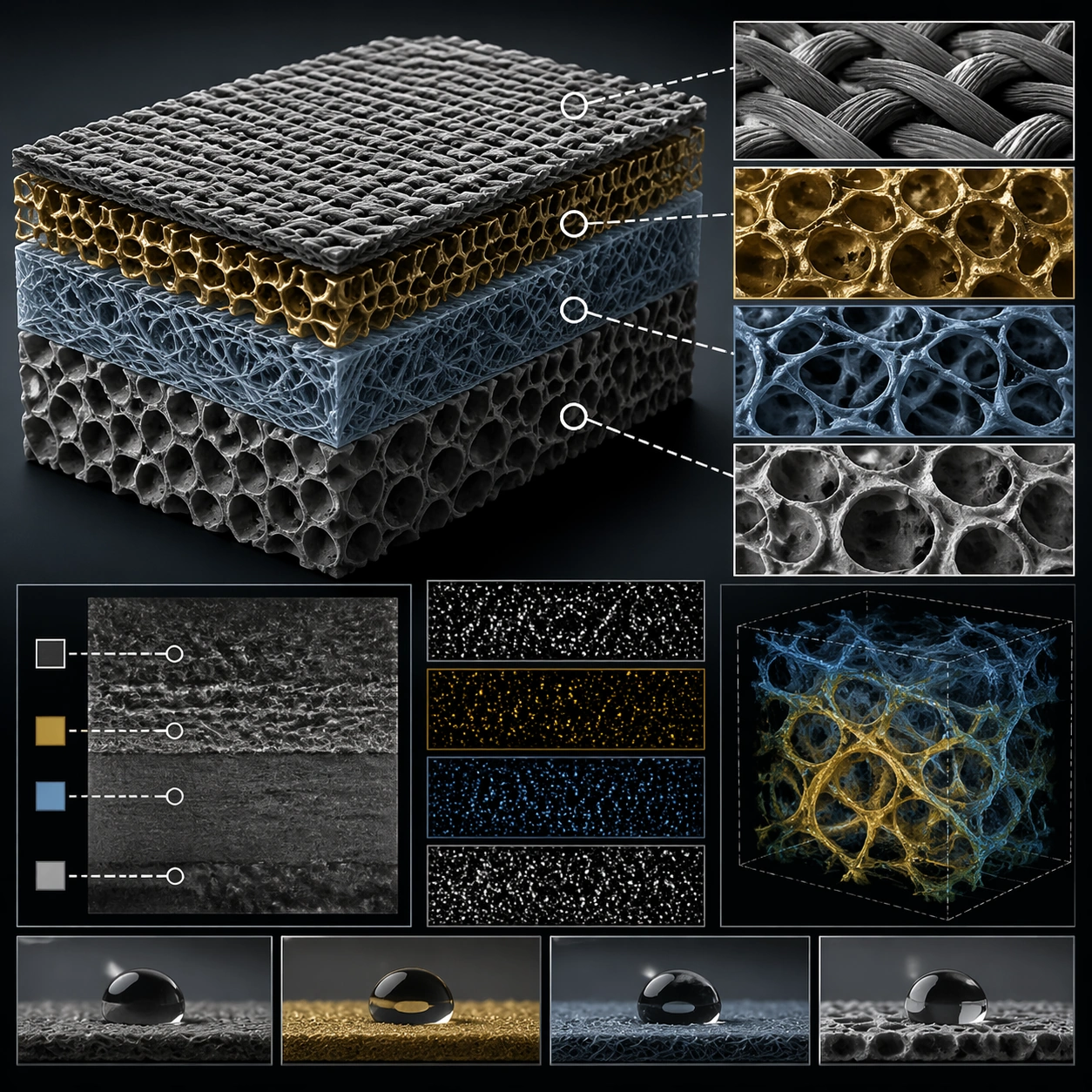
Example generated from “Scientific Paper Figure — 材质标注”
GPT Image 2en

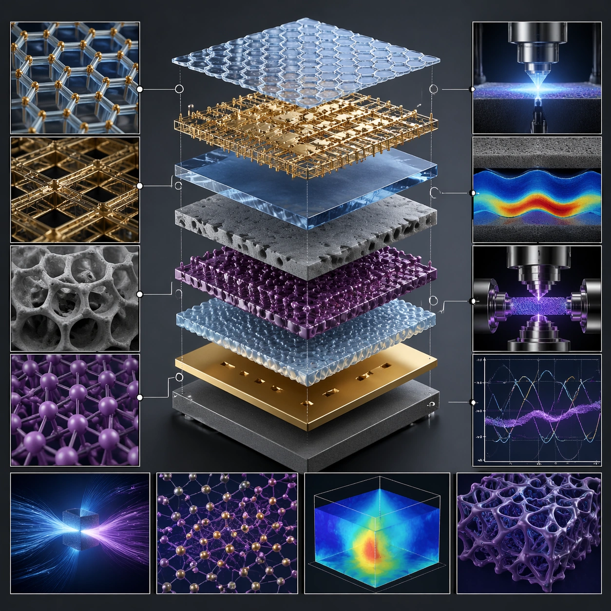
Scene: A square plate or board viewed straight-on, with crisp organization, disciplined spacing, and premium print clarity. Build the frame around specific texture or material evidence presented with controlled explanatory framing. Keep the lighting, camera distance, and spatial organization tuned for a high-signal research image rather than a casual snapshot. The image belongs to the Scientific Paper Figure theme and should feel immediately legible as a prompt atlas theme for scientific paper figure, testing physics-materials, commercial-mockup with gpt image 2.. Subject: Center the study on specific texture or material evidence presented with controlled explanatory framing. Translate the theme into a concrete visual statement instead of an abstract mood board: the viewer should understand what kind of image this is, what is being tested, and why the composition is difficult. Use the slug idea of scientific paper figure as a literal guide for subject matter, materials, and staging. If helpful, borrow the broad visual cues suggested by Nature, Science, but keep the result original and specific to this study. Important details: The image should communicate logic through grouping, hierarchy, callouts, insets, and believable professional layout discipline rather than decorative noise. Preserve a disciplined square composition, clear focal hierarchy, and enough secondary information to make the image feel complete rather than underspecified. The image should look polished, novel, and exhibition-ready, with topic-specific credibility coming from the way surfaces, structure, and visual language reinforce Scientific Paper Figure. Avoid generic filler elements that do not serve the main concept. Use case: Scientific Paper Figure single study 6/8, testing physics-materials, commercial-mockup through the 材质标注 variation. Constraints: No readable text, no watermark, no logos, preserve exact 1:1 aspect ratio, no readable labels, no messy arrows, no random infographic decoration, no fake UI chrome unless the topic calls for it, no broken alignment, no meaningless clutter.
Example generated from “Scientific Paper Figure — Exploded System”
GPT Image 2en

Scene: A square plate or board viewed straight-on, with crisp organization, disciplined spacing, and premium print clarity. Build the frame around components separated clearly enough to reveal construction and dependency. Keep the lighting, camera distance, and spatial organization tuned for a high-signal research image rather than a casual snapshot. The image belongs to the Scientific Paper Figure theme and should feel immediately legible as a prompt atlas theme for scientific paper figure, testing physics-materials, commercial-mockup with gpt image 2.. Subject: Center the study on components separated clearly enough to reveal construction and dependency. Translate the theme into a concrete visual statement instead of an abstract mood board: the viewer should understand what kind of image this is, what is being tested, and why the composition is difficult. Use the slug idea of scientific paper figure as a literal guide for subject matter, materials, and staging. If helpful, borrow the broad visual cues suggested by Nature, Science, but keep the result original and specific to this study. Important details: The image should communicate logic through grouping, hierarchy, callouts, insets, and believable professional layout discipline rather than decorative noise. Preserve a disciplined square composition, clear focal hierarchy, and enough secondary information to make the image feel complete rather than underspecified. The image should look polished, novel, and exhibition-ready, with topic-specific credibility coming from the way surfaces, structure, and visual language reinforce Scientific Paper Figure. Avoid generic filler elements that do not serve the main concept. Use case: Scientific Paper Figure single study 7/8, testing physics-materials, commercial-mockup through the exploded system variation. Constraints: No readable text, no watermark, no logos, preserve exact 1:1 aspect ratio, no readable labels, no messy arrows, no random infographic decoration, no fake UI chrome unless the topic calls for it, no broken alignment, no meaningless clutter.

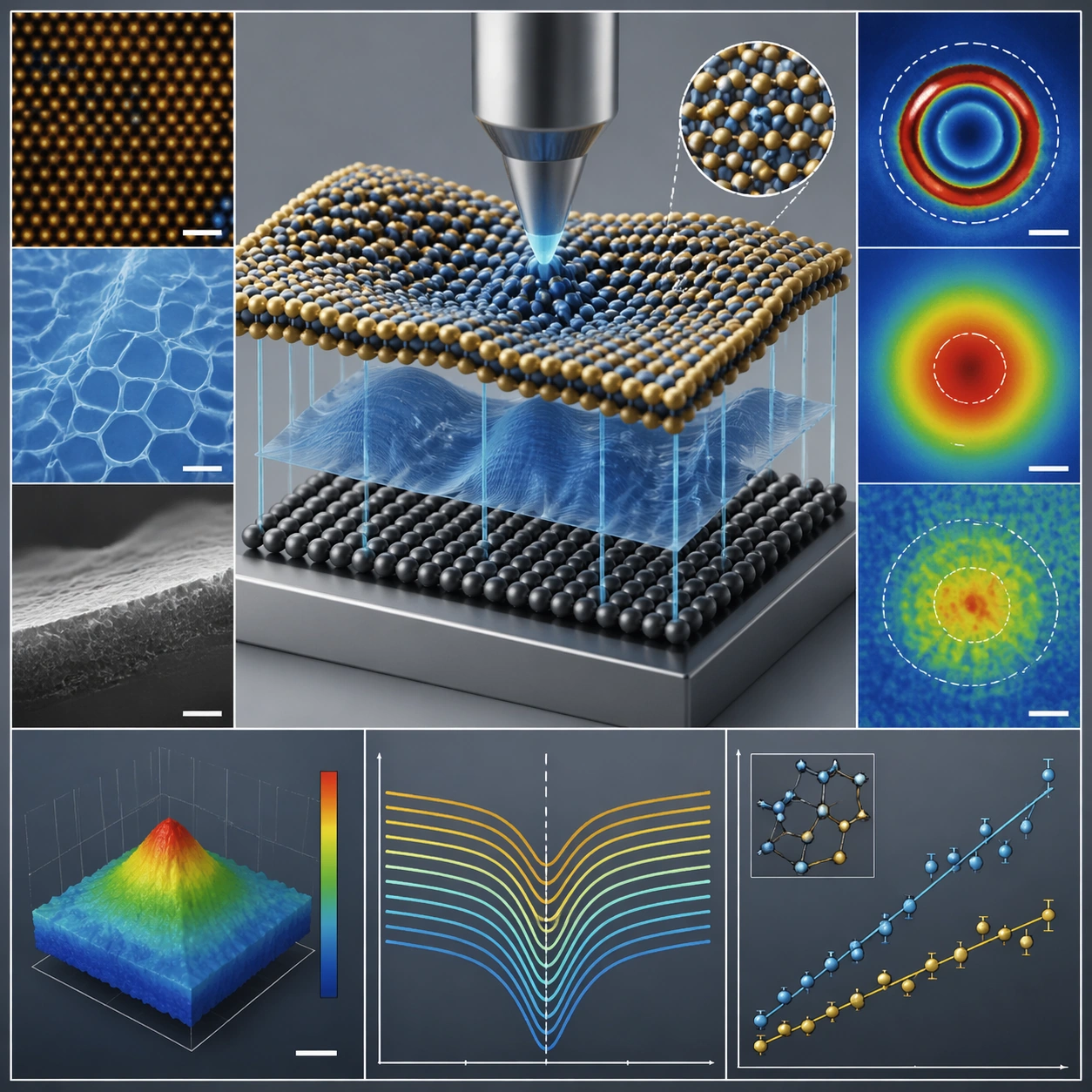
Example generated from “Scientific Paper Figure — Final Plate”
GPT Image 2en

Scene: A square plate or board viewed straight-on, with crisp organization, disciplined spacing, and premium print clarity. Build the frame around a polished final technical plate that feels ready for a research deck or exhibition wall. Keep the lighting, camera distance, and spatial organization tuned for a high-signal research image rather than a casual snapshot. The image belongs to the Scientific Paper Figure theme and should feel immediately legible as a prompt atlas theme for scientific paper figure, testing physics-materials, commercial-mockup with gpt image 2.. Subject: Center the study on a polished final technical plate that feels ready for a research deck or exhibition wall. Translate the theme into a concrete visual statement instead of an abstract mood board: the viewer should understand what kind of image this is, what is being tested, and why the composition is difficult. Use the slug idea of scientific paper figure as a literal guide for subject matter, materials, and staging. If helpful, borrow the broad visual cues suggested by Nature, Science, but keep the result original and specific to this study. Important details: The image should communicate logic through grouping, hierarchy, callouts, insets, and believable professional layout discipline rather than decorative noise. Preserve a disciplined square composition, clear focal hierarchy, and enough secondary information to make the image feel complete rather than underspecified. The image should look polished, novel, and exhibition-ready, with topic-specific credibility coming from the way surfaces, structure, and visual language reinforce Scientific Paper Figure. Avoid generic filler elements that do not serve the main concept. Use case: Scientific Paper Figure single study 8/8, testing physics-materials, commercial-mockup through the final plate variation. Constraints: No readable text, no watermark, no logos, preserve exact 1:1 aspect ratio, no readable labels, no messy arrows, no random infographic decoration, no fake UI chrome unless the topic calls for it, no broken alignment, no meaningless clutter.

Example generated from “Season Kv Battle Pass Kit — Reference Season Hero KV”
GPT Image 2en

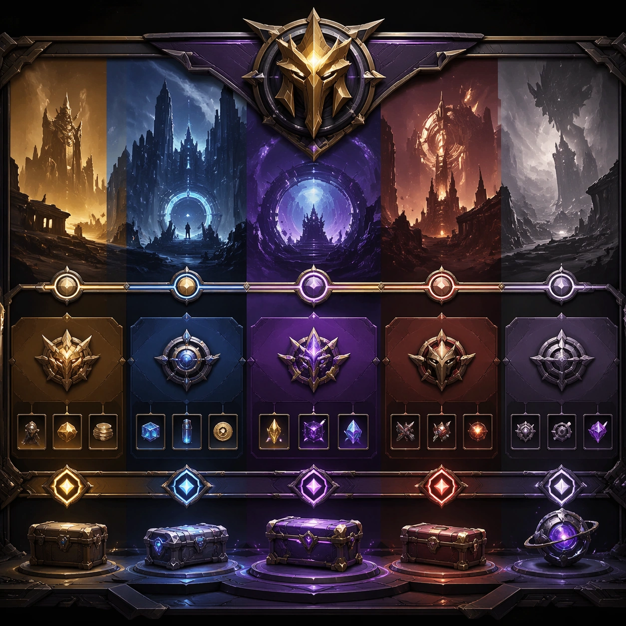
Scene: A square premium key-art frame built for a reference-dependent production series. Stage a flagship season key visual centered on one featured hero and a strong event theme with controlled lighting, clear silhouette separation, and a camera setup that feels deliberate enough for campaign reuse. The composition should carry strong focal hierarchy, believable depth, and polished surface behavior while still staying stable enough to support downstream dependent variations. Subject: Center the image on a flagship season key visual centered on one featured hero and a strong event theme. The result should feel like a concrete, shippable asset for Season KV Battle Pass Kit, not a generic fantasy render. Build the subject with layered materials, stable anatomy or engineering logic, and enough specificity that later images can inherit the same underlying identity. This image is the root reference that defines continuity for the rest of the series. The viewer should immediately understand what is being preserved across the sequence and what is changing in this particular beat. Important details: establish the seasonal palette, prop motifs, background atmosphere, and hero silhouette that all follow-up assets must inherit. Make continuity explicit through repeatable shape language, proportion control, and a coherent palette system. Changes in pose, angle, mood, rarity, weather, or layout should still feel downstream of one stable source. Avoid clutter that would confuse reference use. Any interface-like blocks or graphic surfaces must remain abstract and unreadable. Keep the image polished, original, and suitable for both gallery display and production review. Use case: Season KV Battle Pass Kit series study 1/4, focused on reference season hero kv. Constraints: No readable text, no watermark, no logos, preserve exact 1:1 aspect ratio, no title text, no brand logos, no broken continuity, no off-model redesign, no accidental franchise resemblance.

Example generated from “Season Kv Battle Pass Kit — Battle Pass Cover”
GPT Image 2en

Scene: A square premium key-art frame built for a reference-dependent production series. Stage the same season translated into a battle pass cover with disciplined product hierarchy with controlled lighting, clear silhouette separation, and a camera setup that feels deliberate enough for campaign reuse. The composition should carry strong focal hierarchy, believable depth, and polished surface behavior while still staying stable enough to support downstream dependent variations. Subject: Center the image on the same season translated into a battle pass cover with disciplined product hierarchy. The result should feel like a concrete, shippable asset for Season KV Battle Pass Kit, not a generic fantasy render. Build the subject with layered materials, stable anatomy or engineering logic, and enough specificity that later images can inherit the same underlying identity. Preserve the same season theme, hero identity, color script, and event icon language from the reference key visual from the reference image while changing only what this variation needs. The viewer should immediately understand what is being preserved across the sequence and what is changing in this particular beat. Important details: preserve the same hero and event language while tightening the composition for a cover surface. Make continuity explicit through repeatable shape language, proportion control, and a coherent palette system. Changes in pose, angle, mood, rarity, weather, or layout should still feel downstream of one stable source. Avoid clutter that would confuse reference use. Any interface-like blocks or graphic surfaces must remain abstract and unreadable. Keep the image polished, original, and suitable for both gallery display and production review. Use case: Season KV Battle Pass Kit series study 2/4, focused on battle pass cover. Constraints: No readable text, no watermark, no logos, preserve exact 1:1 aspect ratio, no readable tier text, no currency numbers, no broken continuity, no off-model redesign, no accidental franchise resemblance.

Example generated from “Season Kv Battle Pass Kit — Reward Track Header”
GPT Image 2en

Scene: A square premium key-art frame built for a reference-dependent production series. Stage the same season visual system adapted into a reward-track header with wider horizontal logic inside a square crop with controlled lighting, clear silhouette separation, and a camera setup that feels deliberate enough for campaign reuse. The composition should carry strong focal hierarchy, believable depth, and polished surface behavior while still staying stable enough to support downstream dependent variations. Subject: Center the image on the same season visual system adapted into a reward-track header with wider horizontal logic inside a square crop. The result should feel like a concrete, shippable asset for Season KV Battle Pass Kit, not a generic fantasy render. Build the subject with layered materials, stable anatomy or engineering logic, and enough specificity that later images can inherit the same underlying identity. Preserve the same season theme, hero identity, color script, and event icon language from the reference key visual from the reference image while changing only what this variation needs. The viewer should immediately understand what is being preserved across the sequence and what is changing in this particular beat. Important details: keep the graphic family consistent while emphasizing progression and premium rewards. Make continuity explicit through repeatable shape language, proportion control, and a coherent palette system. Changes in pose, angle, mood, rarity, weather, or layout should still feel downstream of one stable source. Avoid clutter that would confuse reference use. Any interface-like blocks or graphic surfaces must remain abstract and unreadable. Keep the image polished, original, and suitable for both gallery display and production review. Use case: Season KV Battle Pass Kit series study 3/4, focused on reward track header. Constraints: No readable text, no watermark, no logos, preserve exact 1:1 aspect ratio, no labels, no arrows, no broken continuity, no off-model redesign, no accidental franchise resemblance.

Example generated from “Season Kv Battle Pass Kit — Store Takeover Crop”
GPT Image 2en

Scene: A square premium key-art frame built for a reference-dependent production series. Stage the same season repackaged as a high-impact store takeover crop for live-ops placement with controlled lighting, clear silhouette separation, and a camera setup that feels deliberate enough for campaign reuse. The composition should carry strong focal hierarchy, believable depth, and polished surface behavior while still staying stable enough to support downstream dependent variations. Subject: Center the image on the same season repackaged as a high-impact store takeover crop for live-ops placement. The result should feel like a concrete, shippable asset for Season KV Battle Pass Kit, not a generic fantasy render. Build the subject with layered materials, stable anatomy or engineering logic, and enough specificity that later images can inherit the same underlying identity. Preserve the same season theme, hero identity, color script, and event icon language from the reference key visual from the reference image while changing only what this variation needs. The viewer should immediately understand what is being preserved across the sequence and what is changing in this particular beat. Important details: conversion energy should rise while the same seasonal identity remains obvious. Make continuity explicit through repeatable shape language, proportion control, and a coherent palette system. Changes in pose, angle, mood, rarity, weather, or layout should still feel downstream of one stable source. Avoid clutter that would confuse reference use. Any interface-like blocks or graphic surfaces must remain abstract and unreadable. Keep the image polished, original, and suitable for both gallery display and production review. Use case: Season KV Battle Pass Kit series study 4/4, focused on store takeover crop. Constraints: No readable text, no watermark, no logos, preserve exact 1:1 aspect ratio, no sale text, no logos, no broken continuity, no off-model redesign, no accidental franchise resemblance.

Example generated from “Season Kv Battle Pass Kit — Season Launch Poster”
GPT Image 2en

Scene: A square production-ready image designed for a game-art review wall and a commercial gallery at the same time. Frame a launch-poster composition that sells the season as a must-enter event with disciplined lighting, clean edge separation, and enough surrounding context to prove how the asset would behave in a real product surface. The camera, crop, and tonal balance should feel intentional rather than generic, with high readability at first glance and convincing material response under closer inspection. Subject: Center the study on a launch-poster composition that sells the season as a must-enter event. Translate the topic into a concrete, shippable visual statement instead of a loose mood board. Build layered object relationships, believable surface finish, and strong silhouette grouping so the image reads immediately as part of Season KV Battle Pass Kit. The subject should feel made for a live game pipeline: useful in store, UI, campaign, or art-review contexts, with visual hierarchy strong enough to survive aggressive cropping. Important details: the same thematic system should feel cinematic and campaign-worthy without relying on copy. Keep every supporting element subordinate to the main read, and make category separation obvious through form, color zoning, depth, and material logic rather than words. Where panels, cards, badges, or interface blocks appear, they must look professionally structured but remain unreadable. The visual language should feel premium, original, and coherent across this package, with no filler clutter and no accidental resemblance to a specific shipped game IP. Use case: Season KV Battle Pass Kit single study 1/5, focused on season launch poster. Constraints: No readable text, no watermark, no logos, preserve exact 1:1 aspect ratio, no slogans, no logos, no broken hierarchy, no generic stock-photo staging, no accidental UI gibberish.

Example generated from “Season Kv Battle Pass Kit — Premium Reward Card”
GPT Image 2en

Scene: A square production-ready image designed for a game-art review wall and a commercial gallery at the same time. Frame a premium reward card surface built from the season’s hero and motif language with disciplined lighting, clean edge separation, and enough surrounding context to prove how the asset would behave in a real product surface. The camera, crop, and tonal balance should feel intentional rather than generic, with high readability at first glance and convincing material response under closer inspection. Subject: Center the study on a premium reward card surface built from the season’s hero and motif language. Translate the topic into a concrete, shippable visual statement instead of a loose mood board. Build layered object relationships, believable surface finish, and strong silhouette grouping so the image reads immediately as part of Season KV Battle Pass Kit. The subject should feel made for a live game pipeline: useful in store, UI, campaign, or art-review contexts, with visual hierarchy strong enough to survive aggressive cropping. Important details: the reward should feel aspirational and perfectly on-brand for the season. Keep every supporting element subordinate to the main read, and make category separation obvious through form, color zoning, depth, and material logic rather than words. Where panels, cards, badges, or interface blocks appear, they must look professionally structured but remain unreadable. The visual language should feel premium, original, and coherent across this package, with no filler clutter and no accidental resemblance to a specific shipped game IP. Use case: Season KV Battle Pass Kit single study 2/5, focused on premium reward card. Constraints: No readable text, no watermark, no logos, preserve exact 1:1 aspect ratio, no tier numbers, no text labels, no broken hierarchy, no generic stock-photo staging, no accidental UI gibberish.

Example generated from “Season Kv Battle Pass Kit — Seasonal Store Tile”
GPT Image 2en

Scene: A square production-ready image designed for a game-art review wall and a commercial gallery at the same time. Frame a conversion-focused store tile for a featured seasonal bundle or offer with disciplined lighting, clean edge separation, and enough surrounding context to prove how the asset would behave in a real product surface. The camera, crop, and tonal balance should feel intentional rather than generic, with high readability at first glance and convincing material response under closer inspection. Subject: Center the study on a conversion-focused store tile for a featured seasonal bundle or offer. Translate the topic into a concrete, shippable visual statement instead of a loose mood board. Build layered object relationships, believable surface finish, and strong silhouette grouping so the image reads immediately as part of Season KV Battle Pass Kit. The subject should feel made for a live game pipeline: useful in store, UI, campaign, or art-review contexts, with visual hierarchy strong enough to survive aggressive cropping. Important details: make it feel expensive and coherent with the same seasonal art direction. Keep every supporting element subordinate to the main read, and make category separation obvious through form, color zoning, depth, and material logic rather than words. Where panels, cards, badges, or interface blocks appear, they must look professionally structured but remain unreadable. The visual language should feel premium, original, and coherent across this package, with no filler clutter and no accidental resemblance to a specific shipped game IP. Use case: Season KV Battle Pass Kit single study 3/5, focused on seasonal store tile. Constraints: No readable text, no watermark, no logos, preserve exact 1:1 aspect ratio, no prices, no coupons, no broken hierarchy, no generic stock-photo staging, no accidental UI gibberish.

Example generated from “Season Kv Battle Pass Kit — Social Announcement Crop”
GPT Image 2en

Scene: A square production-ready image designed for a game-art review wall and a commercial gallery at the same time. Frame a social-ready square crop announcing the season through key art fragments and atmosphere with disciplined lighting, clean edge separation, and enough surrounding context to prove how the asset would behave in a real product surface. The camera, crop, and tonal balance should feel intentional rather than generic, with high readability at first glance and convincing material response under closer inspection. Subject: Center the study on a social-ready square crop announcing the season through key art fragments and atmosphere. Translate the topic into a concrete, shippable visual statement instead of a loose mood board. Build layered object relationships, believable surface finish, and strong silhouette grouping so the image reads immediately as part of Season KV Battle Pass Kit. The subject should feel made for a live game pipeline: useful in store, UI, campaign, or art-review contexts, with visual hierarchy strong enough to survive aggressive cropping. Important details: the crop should stay instantly legible even after mobile compression. Keep every supporting element subordinate to the main read, and make category separation obvious through form, color zoning, depth, and material logic rather than words. Where panels, cards, badges, or interface blocks appear, they must look professionally structured but remain unreadable. The visual language should feel premium, original, and coherent across this package, with no filler clutter and no accidental resemblance to a specific shipped game IP. Use case: Season KV Battle Pass Kit single study 4/5, focused on social announcement crop. Constraints: No readable text, no watermark, no logos, preserve exact 1:1 aspect ratio, no hashtags, no text, no broken hierarchy, no generic stock-photo staging, no accidental UI gibberish.

Example generated from “Season Kv Battle Pass Kit — Season Roadmap Board”
GPT Image 2en

Scene: A square production-ready image designed for a game-art review wall and a commercial gallery at the same time. Frame a roadmap-like board composed from the season’s shapes, rewards, and chapter rhythm with disciplined lighting, clean edge separation, and enough surrounding context to prove how the asset would behave in a real product surface. The camera, crop, and tonal balance should feel intentional rather than generic, with high readability at first glance and convincing material response under closer inspection. Subject: Center the study on a roadmap-like board composed from the season’s shapes, rewards, and chapter rhythm. Translate the topic into a concrete, shippable visual statement instead of a loose mood board. Build layered object relationships, believable surface finish, and strong silhouette grouping so the image reads immediately as part of Season KV Battle Pass Kit. The subject should feel made for a live game pipeline: useful in store, UI, campaign, or art-review contexts, with visual hierarchy strong enough to survive aggressive cropping. Important details: it should imply ongoing beats and value without any readable roadmap copy. Keep every supporting element subordinate to the main read, and make category separation obvious through form, color zoning, depth, and material logic rather than words. Where panels, cards, badges, or interface blocks appear, they must look professionally structured but remain unreadable. The visual language should feel premium, original, and coherent across this package, with no filler clutter and no accidental resemblance to a specific shipped game IP. Use case: Season KV Battle Pass Kit single study 5/5, focused on season roadmap board. Constraints: No readable text, no watermark, no logos, preserve exact 1:1 aspect ratio, no calendar text, no labels, no broken hierarchy, no generic stock-photo staging, no accidental UI gibberish.

Example generated from “Seasonal Drink Launch Poster Set — Launch Anchor”
GPT Image 2en

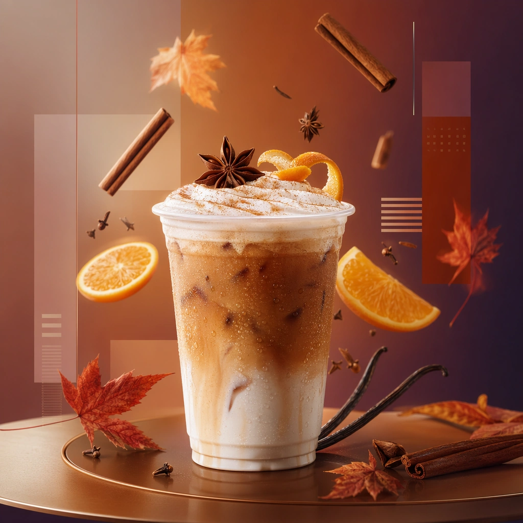
Scene: Compose a square seasonal drink campaign image that can function as a poster, counter card, or launch visual. The frame should combine a hero beverage with strong art direction, abstract text-safe zones, and seasonal cues expressed through ingredients, color shifts, atmosphere, and material accents rather than readable copy. Use a polished studio campaign setup with one hero cup centered against a color field and atmospheric gradient, leaving clear negative space for abstract layout zones. Subject: The beverage must remain physically believable and delicious, with clear cup or bottle silhouette, realistic liquid behavior, and ingredients that support a limited-time seasonal story. Feature a premium seasonal beverage with realistic ice, foam, garnish, or swirl, supported by floating or arranged ingredients that define the seasonal story. Important details: This theme lives at the intersection of product photography and campaign layout. Preserve strong focal hierarchy, poster-safe negative space, and refined color systems that suggest seasonality without relying on legible words. Abstract lettering forms or blocks are allowed only as unreadable design elements. The drink must still look like something a real brand could launch tomorrow. This image establishes the reference system for the series, including camera height, tabletop discipline, prop family, and color control that later images must inherit. This anchor image must lock the poster system for the series: disciplined central hero, ingredient choreography, abstract unreadable type zones, and commercial clarity. Use case: Seasonal Drinks series study 1/9, built for Prompt Atlas coverage of a food and beverage commercial visual system. Constraints: No readable text, no watermark, no logos, preserve exact 1:1 aspect ratio, no readable text, no logos, no fake holiday slogans, no amusement-park color overload, no unreadable clutter, no cheap stock-poster look, no readable launch copy, no holiday mascot, no generic fireworks.

Example generated from “Seasonal Drink Launch Poster Set — Citrus Splash Poster”
GPT Image 2en

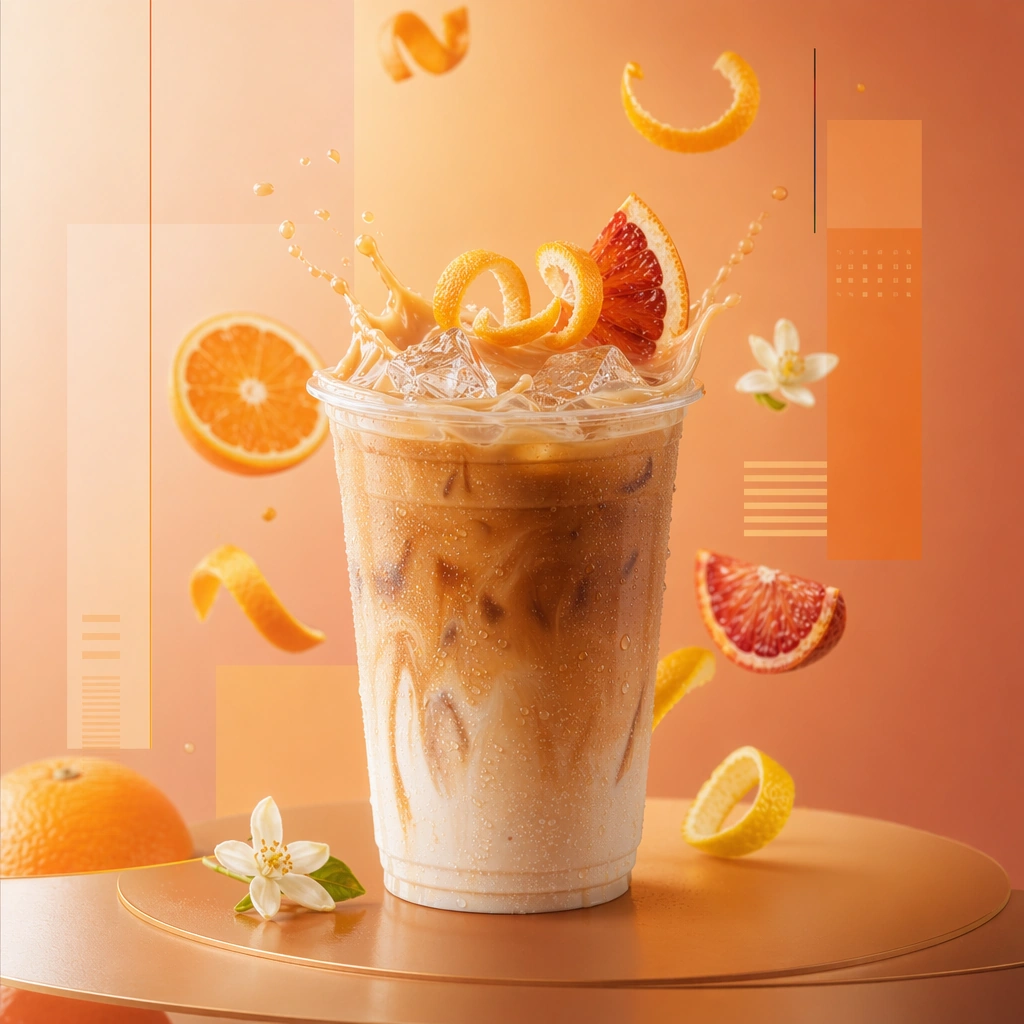
Scene: Compose a square seasonal drink campaign image that can function as a poster, counter card, or launch visual. The frame should combine a hero beverage with strong art direction, abstract text-safe zones, and seasonal cues expressed through ingredients, color shifts, atmosphere, and material accents rather than readable copy. Preserve the same poster framing and negative-space structure, but brighten the palette with citrus tones, crisp highlights, and restrained liquid motion. Subject: The beverage must remain physically believable and delicious, with clear cup or bottle silhouette, realistic liquid behavior, and ingredients that support a limited-time seasonal story. Show a citrus-forward beverage with fruit slices, peel texture, and a controlled splash or pour that feels premium rather than chaotic. Important details: This theme lives at the intersection of product photography and campaign layout. Preserve strong focal hierarchy, poster-safe negative space, and refined color systems that suggest seasonality without relying on legible words. Abstract lettering forms or blocks are allowed only as unreadable design elements. The drink must still look like something a real brand could launch tomorrow. Preserve the exact camera height, lens feel, prop family, tabletop scale, palette discipline, and brand logic established by 01-launch-anchor. The reference system must remain visible through vessel scale, abstract layout blocks, and overall campaign discipline while the flavor story changes. Use case: Seasonal Drinks series study 2/9, built for Prompt Atlas coverage of a food and beverage commercial visual system. Constraints: No readable text, no watermark, no logos, preserve exact 1:1 aspect ratio, no readable text, no logos, no fake holiday slogans, no amusement-park color overload, no unreadable clutter, no cheap stock-poster look, no juice-ad cliché overload, no readable flavor names, no beach vacation backdrop.

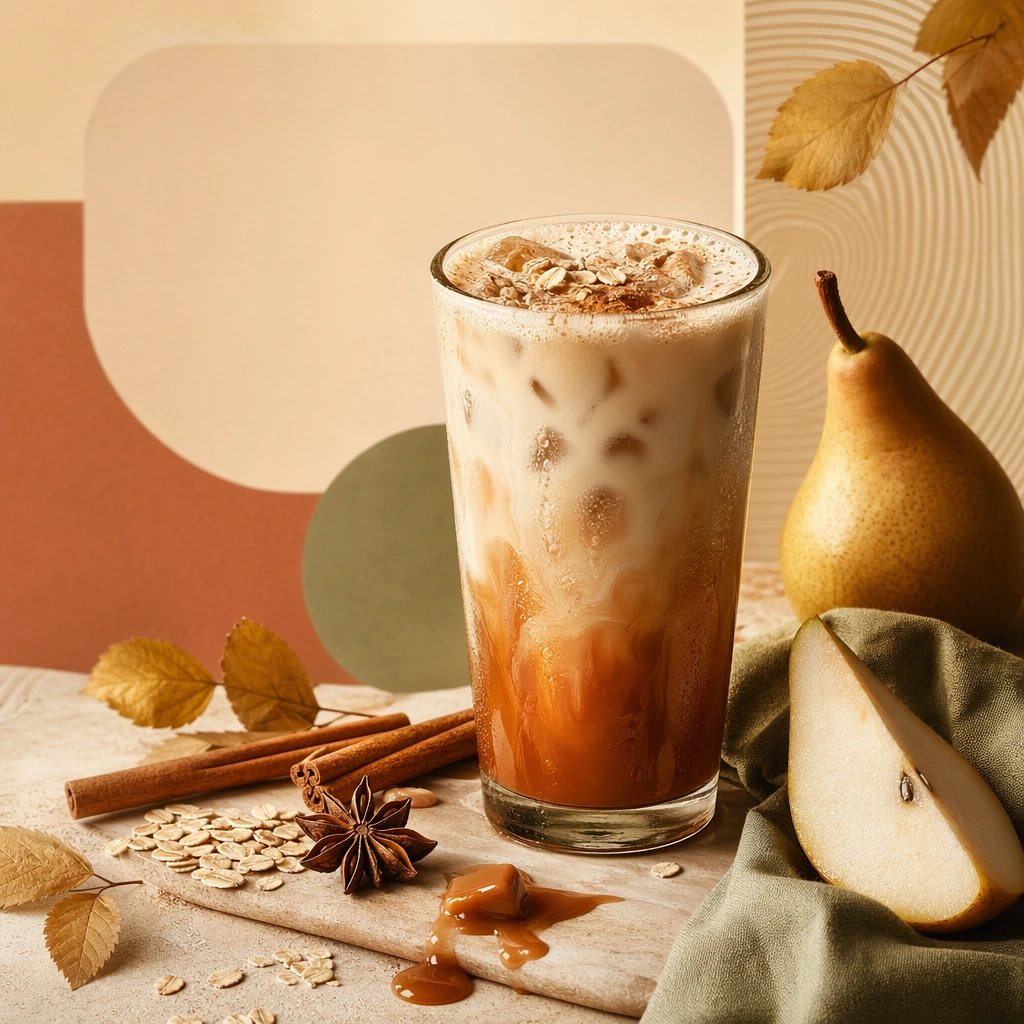
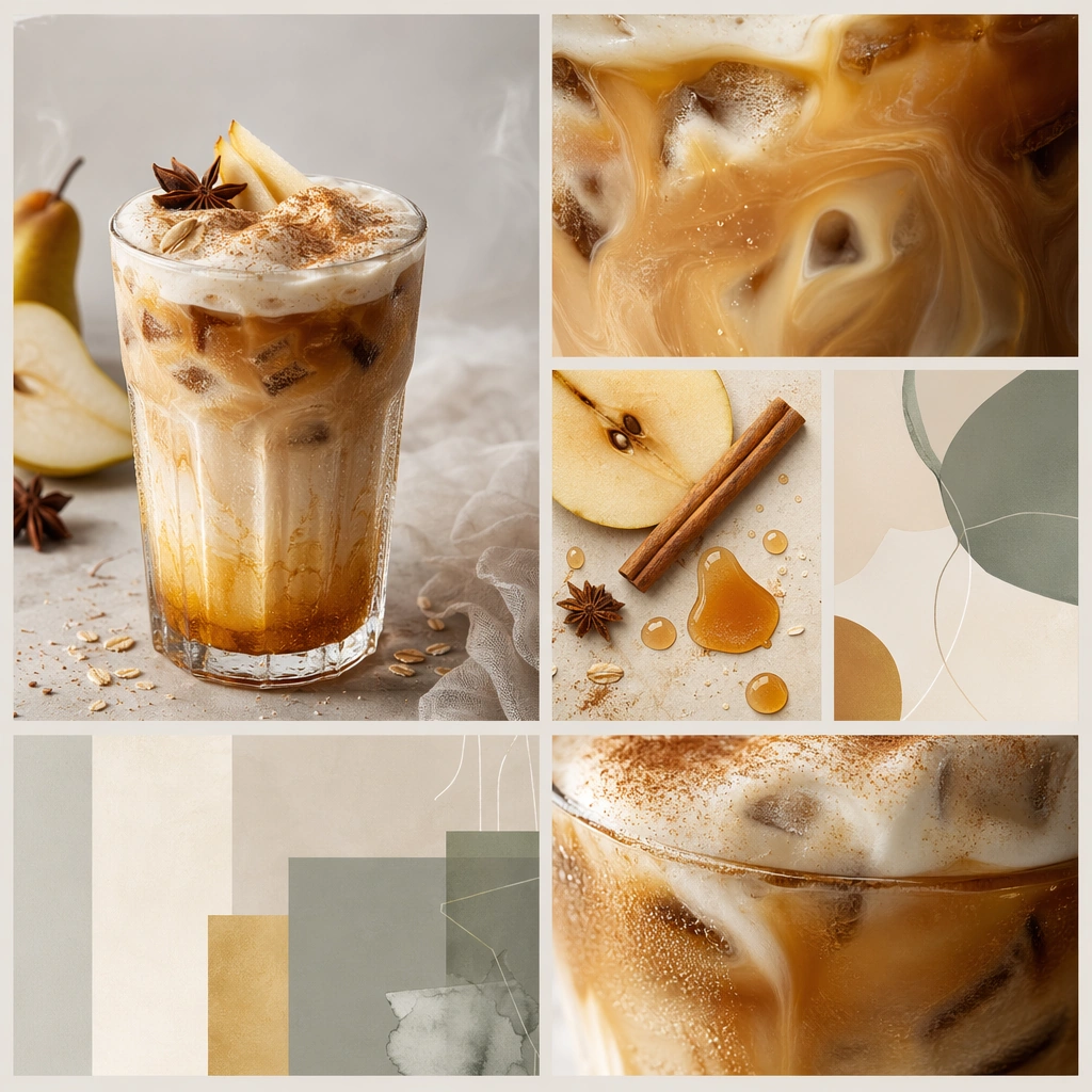
Example generated from “Seasonal Drink Launch Poster Set — Spice Cream Poster”
GPT Image 2en

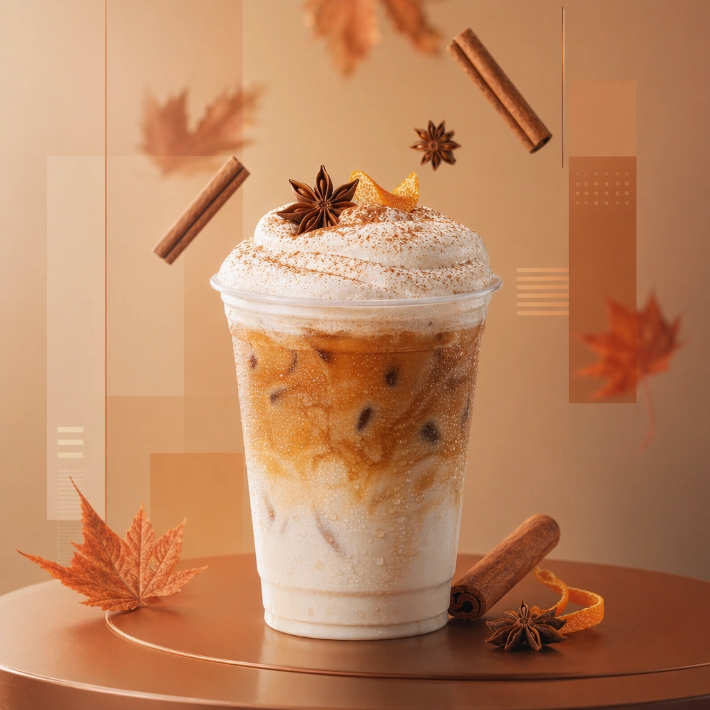
Scene: Compose a square seasonal drink campaign image that can function as a poster, counter card, or launch visual. The frame should combine a hero beverage with strong art direction, abstract text-safe zones, and seasonal cues expressed through ingredients, color shifts, atmosphere, and material accents rather than readable copy. Keep the same square poster structure, but shift the palette toward warm cream, cinnamon, amber, or toasted spice tones with soft seasonal atmosphere. Subject: The beverage must remain physically believable and delicious, with clear cup or bottle silhouette, realistic liquid behavior, and ingredients that support a limited-time seasonal story. Present a creamy seasonal beverage with foam, spice dusting, and one or two ingredient elements that communicate warmth and indulgence. Important details: This theme lives at the intersection of product photography and campaign layout. Preserve strong focal hierarchy, poster-safe negative space, and refined color systems that suggest seasonality without relying on legible words. Abstract lettering forms or blocks are allowed only as unreadable design elements. The drink must still look like something a real brand could launch tomorrow. Preserve the exact camera height, lens feel, prop family, tabletop scale, palette discipline, and brand logic established by 01-launch-anchor. Preserve the anchor layout grammar and commercial polish while making spice granules, foam structure, and cup material feel physically convincing. Use case: Seasonal Drinks series study 3/9, built for Prompt Atlas coverage of a food and beverage commercial visual system. Constraints: No readable text, no watermark, no logos, preserve exact 1:1 aspect ratio, no readable text, no logos, no fake holiday slogans, no amusement-park color overload, no unreadable clutter, no cheap stock-poster look, no holiday ornaments, no readable winter slogans, no cartoon marshmallow overload.

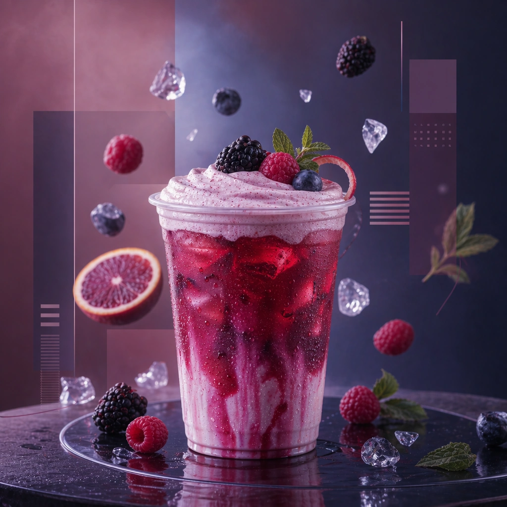
Example generated from “Seasonal Drink Launch Poster Set — Iced Berry Dusk Poster”
GPT Image 2en

Scene: Compose a square seasonal drink campaign image that can function as a poster, counter card, or launch visual. The frame should combine a hero beverage with strong art direction, abstract text-safe zones, and seasonal cues expressed through ingredients, color shifts, atmosphere, and material accents rather than readable copy. Retain the exact campaign composition and layout-safe space, but move into berry tones, dusk gradients, and reflective chilled surfaces. Subject: The beverage must remain physically believable and delicious, with clear cup or bottle silhouette, realistic liquid behavior, and ingredients that support a limited-time seasonal story. Show an iced berry beverage with glass clarity, fruit accent, and a mood that feels like a seasonal evening launch moment. Important details: This theme lives at the intersection of product photography and campaign layout. Preserve strong focal hierarchy, poster-safe negative space, and refined color systems that suggest seasonality without relying on legible words. Abstract lettering forms or blocks are allowed only as unreadable design elements. The drink must still look like something a real brand could launch tomorrow. Preserve the exact camera height, lens feel, prop family, tabletop scale, palette discipline, and brand logic established by 01-launch-anchor. The poster should still read as part of the same campaign family through vessel scale, ingredient orbit logic, and abstract layout blocks even as the palette cools. Use case: Seasonal Drinks series study 4/9, built for Prompt Atlas coverage of a food and beverage commercial visual system. Constraints: No readable text, no watermark, no logos, preserve exact 1:1 aspect ratio, no readable text, no logos, no fake holiday slogans, no amusement-park color overload, no unreadable clutter, no cheap stock-poster look, no neon nightclub vibe, no readable berry callouts, no candy-shop styling.

Example generated from “Seasonal Drink Launch Poster Set — Ingredient Orbit Board”
GPT Image 2en

Scene: Compose a square seasonal drink campaign image that can function as a poster, counter card, or launch visual. The frame should combine a hero beverage with strong art direction, abstract text-safe zones, and seasonal cues expressed through ingredients, color shifts, atmosphere, and material accents rather than readable copy. Compose a square board-like layout on a clean color field with one drink and several ingredient elements arranged in a balanced orbit. Subject: The beverage must remain physically believable and delicious, with clear cup or bottle silhouette, realistic liquid behavior, and ingredients that support a limited-time seasonal story. Keep the beverage central while ingredients provide visual storytelling and poster-safe structure. Important details: This theme lives at the intersection of product photography and campaign layout. Preserve strong focal hierarchy, poster-safe negative space, and refined color systems that suggest seasonality without relying on legible words. Abstract lettering forms or blocks are allowed only as unreadable design elements. The drink must still look like something a real brand could launch tomorrow. This image should feel fully self-contained while still belonging to the same broader topic and commercial world. Spacing, shadow softness, and ingredient realism should feel carefully art directed, with enough room for abstract text-like shapes that remain unreadable. Use case: Seasonal Drinks single study 5/9, built for Prompt Atlas coverage of a food and beverage commercial visual system. Constraints: No readable text, no watermark, no logos, preserve exact 1:1 aspect ratio, no readable text, no logos, no fake holiday slogans, no amusement-park color overload, no unreadable clutter, no cheap stock-poster look, no recipe diagram copy, no scientific labels, no chaotic floating objects.

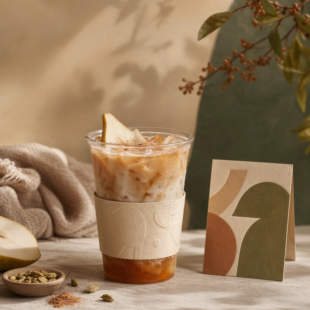
Example generated from “Seasonal Drink Launch Poster Set — Cup Sleeve Counter Card”
GPT Image 2en

Scene: Compose a square seasonal drink campaign image that can function as a poster, counter card, or launch visual. The frame should combine a hero beverage with strong art direction, abstract text-safe zones, and seasonal cues expressed through ingredients, color shifts, atmosphere, and material accents rather than readable copy. Use a square counter setup with one drink, one sleeve or wrap, and one small standing card under soft retail light. Subject: The beverage must remain physically believable and delicious, with clear cup or bottle silhouette, realistic liquid behavior, and ingredients that support a limited-time seasonal story. Show how the seasonal campaign translates from hero beverage into tactile point-of-sale materials without readable words. Important details: This theme lives at the intersection of product photography and campaign layout. Preserve strong focal hierarchy, poster-safe negative space, and refined color systems that suggest seasonality without relying on legible words. Abstract lettering forms or blocks are allowed only as unreadable design elements. The drink must still look like something a real brand could launch tomorrow. This image should feel fully self-contained while still belonging to the same broader topic and commercial world. Paper stock, cup texture, and material alignment need to feel intentional and commercially credible. The drink should remain the clear focal point. Use case: Seasonal Drinks single study 6/9, built for Prompt Atlas coverage of a food and beverage commercial visual system. Constraints: No readable text, no watermark, no logos, preserve exact 1:1 aspect ratio, no readable text, no logos, no fake holiday slogans, no amusement-park color overload, no unreadable clutter, no cheap stock-poster look, no readable POS copy, no barcode sticker, no cashier hardware.

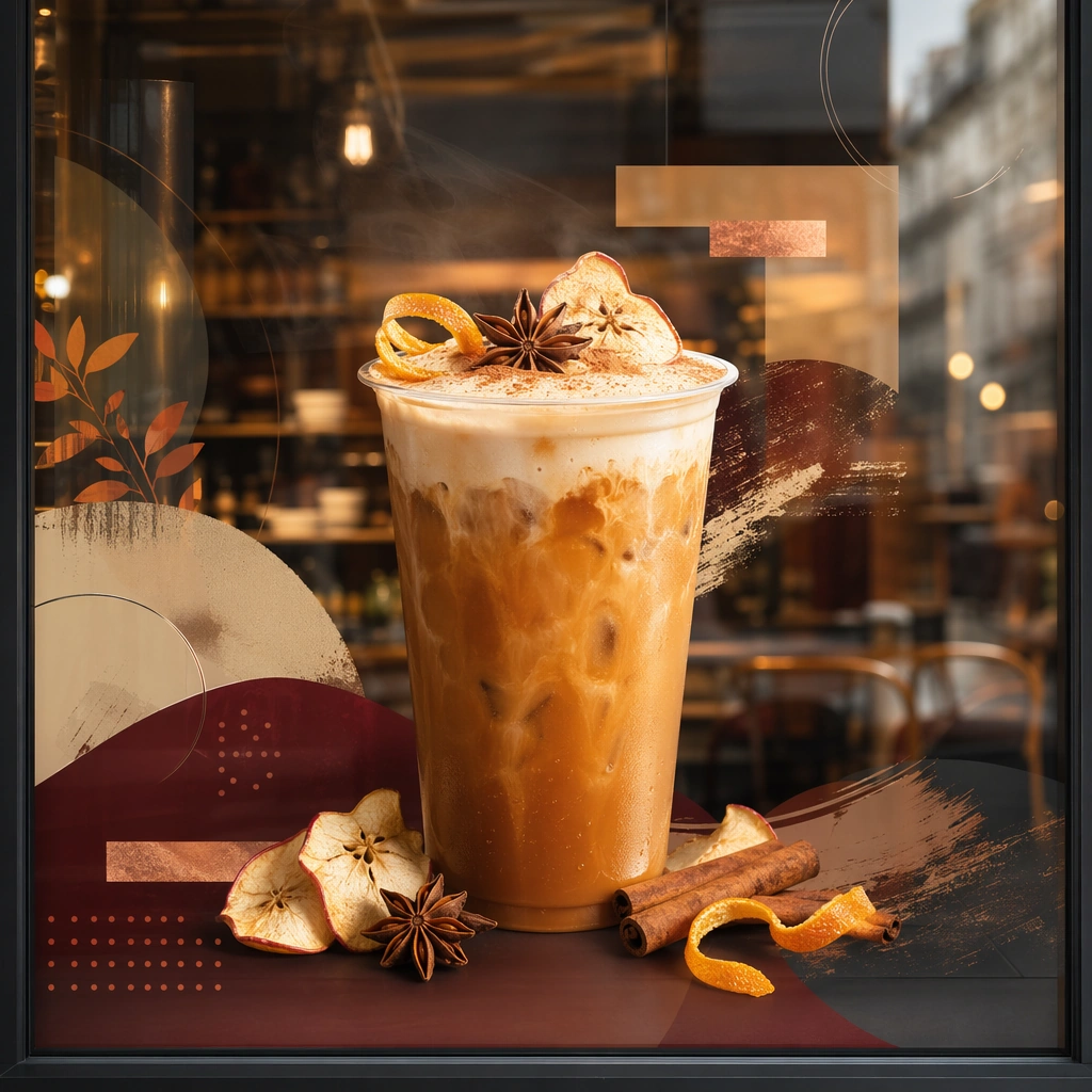
Example generated from “Seasonal Drink Launch Poster Set — Window Cling Mockup”
GPT Image 2en

Scene: Compose a square seasonal drink campaign image that can function as a poster, counter card, or launch visual. The frame should combine a hero beverage with strong art direction, abstract text-safe zones, and seasonal cues expressed through ingredients, color shifts, atmosphere, and material accents rather than readable copy. Frame a square crop of a shop window with one beverage visual, abstract shape overlays, and interior blur behind the glass. Subject: The beverage must remain physically believable and delicious, with clear cup or bottle silhouette, realistic liquid behavior, and ingredients that support a limited-time seasonal story. The beverage should appear as a large storefront hero supported by non-legible campaign graphics and seasonal ingredient cues. Important details: This theme lives at the intersection of product photography and campaign layout. Preserve strong focal hierarchy, poster-safe negative space, and refined color systems that suggest seasonality without relying on legible words. Abstract lettering forms or blocks are allowed only as unreadable design elements. The drink must still look like something a real brand could launch tomorrow. This image should feel fully self-contained while still belonging to the same broader topic and commercial world. Glass reflection, opacity layers, and storefront depth should feel real, with the applied graphic still reading cleanly and commercially. Use case: Seasonal Drinks single study 7/9, built for Prompt Atlas coverage of a food and beverage commercial visual system. Constraints: No readable text, no watermark, no logos, preserve exact 1:1 aspect ratio, no readable text, no logos, no fake holiday slogans, no amusement-park color overload, no unreadable clutter, no cheap stock-poster look, no readable store hours, no street brand names, no busy pedestrian crowd.

Example generated from “Seasonal Drink Launch Poster Set — Chilled Bottle Burst”
GPT Image 2en

Scene: Compose a square seasonal drink campaign image that can function as a poster, counter card, or launch visual. The frame should combine a hero beverage with strong art direction, abstract text-safe zones, and seasonal cues expressed through ingredients, color shifts, atmosphere, and material accents rather than readable copy. Use a square studio setup with one chilled bottle or can emerging from a cold atmosphere, supported by seasonal ingredient fragments. Subject: The beverage must remain physically believable and delicious, with clear cup or bottle silhouette, realistic liquid behavior, and ingredients that support a limited-time seasonal story. Let the container and liquid state do the storytelling through frost, droplets, and believable package geometry without readable labeling. Important details: This theme lives at the intersection of product photography and campaign layout. Preserve strong focal hierarchy, poster-safe negative space, and refined color systems that suggest seasonality without relying on legible words. Abstract lettering forms or blocks are allowed only as unreadable design elements. The drink must still look like something a real brand could launch tomorrow. This image should feel fully self-contained while still belonging to the same broader topic and commercial world. Condensation, packaging material, and ingredient placement must look premium and crisp enough for launch advertising. Use case: Seasonal Drinks single study 8/9, built for Prompt Atlas coverage of a food and beverage commercial visual system. Constraints: No readable text, no watermark, no logos, preserve exact 1:1 aspect ratio, no readable text, no logos, no fake holiday slogans, no amusement-park color overload, no unreadable clutter, no cheap stock-poster look, no readable label copy, no exploding glass danger, no sports-drink cliché.

Example generated from “Seasonal Drink Launch Poster Set — Carousel Crop Tiles”
GPT Image 2en

Scene: Compose a square seasonal drink campaign image that can function as a poster, counter card, or launch visual. The frame should combine a hero beverage with strong art direction, abstract text-safe zones, and seasonal cues expressed through ingredients, color shifts, atmosphere, and material accents rather than readable copy. Arrange several square or near-square crop modules on one board-like composition, each showing a different framing of the same seasonal drink world. Subject: The beverage must remain physically believable and delicious, with clear cup or bottle silhouette, realistic liquid behavior, and ingredients that support a limited-time seasonal story. Use one campaign beverage identity expressed through close crop, ingredient detail, and abstract layout blocks across multiple social-friendly panels. Important details: This theme lives at the intersection of product photography and campaign layout. Preserve strong focal hierarchy, poster-safe negative space, and refined color systems that suggest seasonality without relying on legible words. Abstract lettering forms or blocks are allowed only as unreadable design elements. The drink must still look like something a real brand could launch tomorrow. This image should feel fully self-contained while still belonging to the same broader topic and commercial world. System consistency is the goal: repeated palette, controlled spacing, and clear crop logic should make the board feel production-ready. Use case: Seasonal Drinks single study 9/9, built for Prompt Atlas coverage of a food and beverage commercial visual system. Constraints: No readable text, no watermark, no logos, preserve exact 1:1 aspect ratio, no readable text, no logos, no fake holiday slogans, no amusement-park color overload, no unreadable clutter, no cheap stock-poster look, no readable hashtags, no phone UI frame, no random sticker clutter.
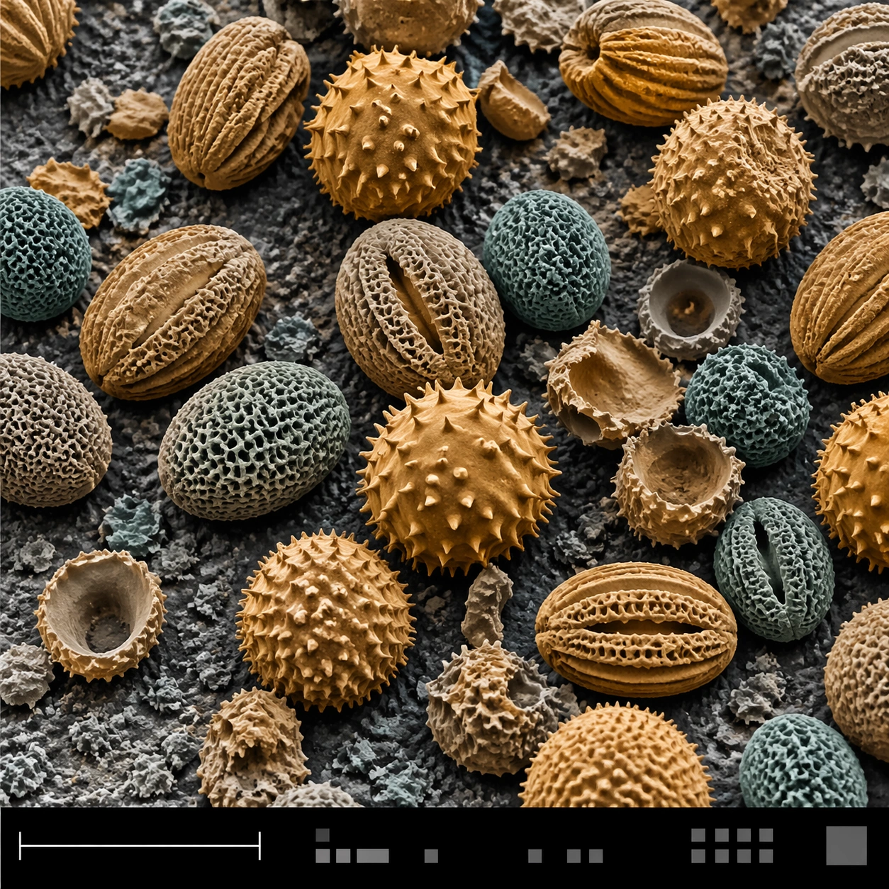
Example generated from “Sem Microscopy — Pollen Grain Field”
GPT Image 2en

Scene: A square false-color SEM microscopy plate with muted amber and teal tinting over an otherwise electron-microscope tonal base. The sample field is viewed from a slightly elevated angle, with a shallow topographic shadow and a clean black bottom information strip. A lower-left scale bar area and small calibration blocks are present as visual structures only, with no readable characters. Subject: A dense field of pollen grains resting on a rough carbon tape surface. The grains vary in shape: round spiny spheres, oval grooved capsules, and a few collapsed shells. Each pollen grain has species-like microarchitecture, including pores, spikes, ridges, perforations, and powdery residue. Some grains overlap or sit in tiny depressions, casting delicate SEM-like shadows. Important details: Make the image scientific and plausible, not decorative. False color should be restrained post-processing: warm grains, cool shadows, neutral substrate, and preserved grayscale relief. Keep the instrument layout structured with a bottom strip, scale bar geometry, and micro UI marks that remain unreadable. Surface detail must be crisp at multiple scales: grain silhouette, pore pattern, spines, dust, and substrate granularity. Avoid turning pollen into fruit, beads, or planets. Use case: SEM Microscopy single study 2/8, testing false-color pollen surface rendering with structured scientific plate layout. Constraints: No readable text, no watermark, no logos, preserve exact 1:1 aspect ratio, no bright candy colors, no macro photo bokeh, no plant petals, no floating grains, no cartoon spikes, no labels, no decorative border, no biological gore.

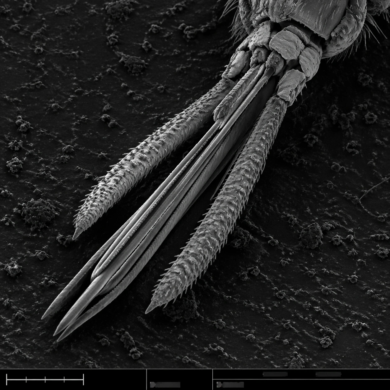
Example generated from “Sem Microscopy — Mosquito Mouthparts”
GPT Image 2en

Scene: A square grayscale SEM plate with dramatic but scientifically restrained topographic contrast. The specimen is centered diagonally across the frame, magnified enough to show segmented anatomy and fine bristles. A thin bottom instrument strip includes a lower-left scale bar, tiny tick marks, and unreadable machine-interface marks, all integrated into the plate without becoming graphic design decoration. Subject: Mosquito mouthparts seen under scanning electron microscopy: a bundled proboscis with needle-like stylets, segmented sheath structure, small palps, hooked micro bristles, textured cuticle, and tiny sensory hairs along the surface. The mouthparts should feel dry, metallic-gray, and insect-scale, with sharp ridges and natural asymmetry. The surrounding background is dark, grainy sample mount material. Important details: This must read as real SEM scientific imaging, not a horror illustration. Keep anatomy plausible: segmented insect cuticle, tapering proboscis, bristles attached to surfaces, shallow shadowing, and brittle microtexture. The field should avoid blood, skin, or bite context. Maintain the structured layout: main specimen area, subtle border discipline, bottom information strip, and scale bar geometry with no readable labels. Use grayscale only, with fine noise and high local contrast. Use case: SEM Microscopy single study 3/8, testing insect mouthpart realism and controlled scientific composition. Constraints: No readable text, no watermark, no logos, preserve exact 1:1 aspect ratio, no gore, no human skin, no monster design, no bright colors, no cartoon fangs, no oversized eyes, no annotations, no exaggerated horror lighting.

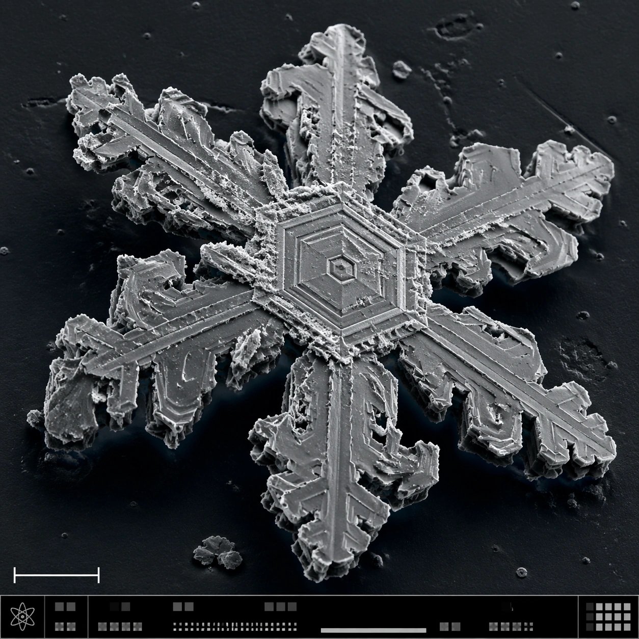
Example generated from “Sem Microscopy — Snowflake Hex Crystal”
GPT Image 2en

Scene: A square SEM-style microscopy plate of a frozen crystalline specimen, rendered in crisp grayscale with a faint cool blue false-color wash only in the deepest shadows. The image is composed like a scientific journal figure: central specimen, dark vacuum-like background, lower-left scale bar form, and a bottom instrument-information strip made of small unreadable marks and calibration blocks. Subject: A single snowflake-like hexagonal ice crystal fragment under high magnification. The structure shows six-fold symmetry, terraced plates, branching dendrites, stepped fracture lines, tiny pits, sublimation scars, and sharp crystalline edges. Some branches are broken, revealing layered thickness and granular frost residue. The crystal sits on a dark sample mount with sparse ice debris. Important details: The specimen must look physically crystalline, not like a decorative paper snowflake. Preserve hexagonal geometry while adding SEM realism: edge shadows, etched terraces, brittle fractures, rough sublimated surfaces, and nonuniform thickness. Keep the palette almost monochrome, with scientific false-color restraint. The layout should communicate instrument capture through the scale bar and bottom strip without legible text. Avoid magical glow or macro camera reflections. Use case: SEM Microscopy single study 4/8, testing snow crystal geometry and SEM-style structured scientific layout. Constraints: No readable text, no watermark, no logos, preserve exact 1:1 aspect ratio, no fantasy glow, no holiday ornament style, no glass jewelry look, no liquid droplets, no readable labels, no colorful background, no symmetrical clip-art perfection.

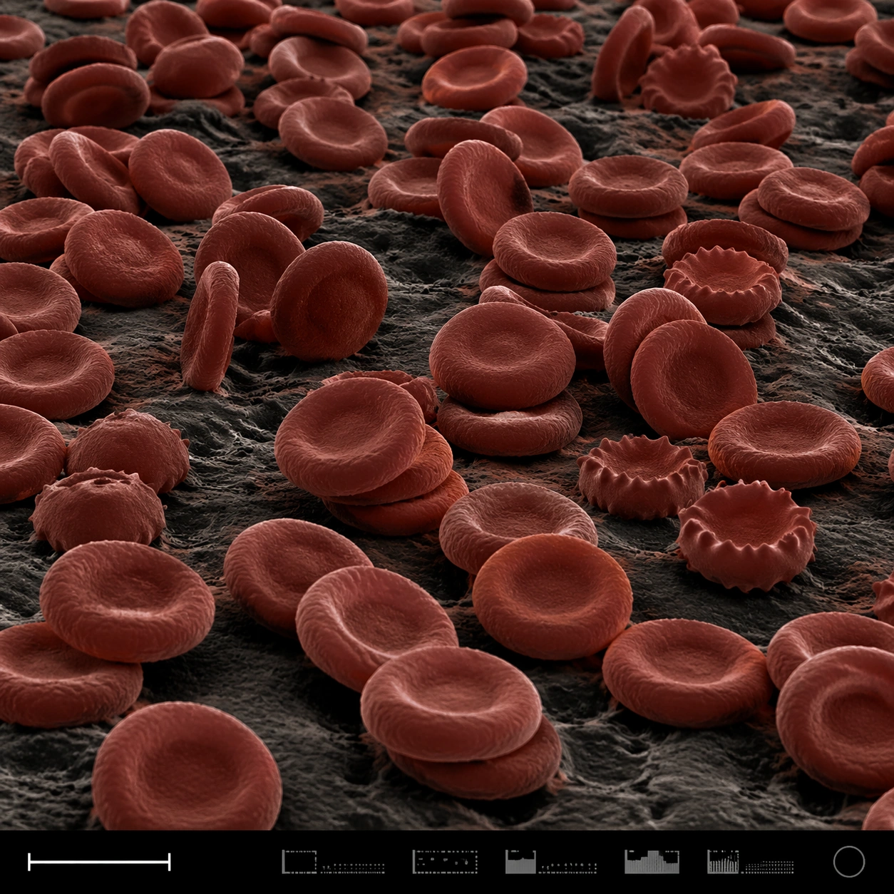
Example generated from “Sem Microscopy — Red Blood Cell Terrain”
GPT Image 2en

Scene: A square false-color SEM microscopy plate with dark charcoal shadows and muted red-brown post-colorization. The view is low and oblique, like a terrain of cells across a sample surface. A disciplined bottom instrument strip anchors the image, including a small lower-left scale bar shape and compact non-readable machine marks. Subject: A field of red blood cells rendered as biconcave discs under scanning electron microscopy. Some cells are stacked, some tilt on edge, some show slight crenation, and others press into shallow clusters. The cell surfaces have subtle membrane texture and soft rounded rims, with dark gaps between discs. The scene feels anatomical and scientific but visually abstract, like a cellular landscape. Important details: The cells must be plausible RBC forms, not coins, candies, or abstract bubbles. Use SEM-like shading and restrained false color: iron-red cell surfaces, dark creases, neutral substrate, and high microcontrast. Preserve structured scientific layout with clear specimen field, scale bar geometry, and an instrument-information strip without readable text. Avoid medical gore or liquid blood. Show depth and density through occlusion, shadows, and cell rim thickness. Use case: SEM Microscopy single study 5/8, testing false-color red blood cell realism and plate layout clarity. Constraints: No readable text, no watermark, no logos, preserve exact 1:1 aspect ratio, no gore, no wet blood, no cartoon cells, no bright candy colors, no microscope eyepiece circle, no labels, no hospital UI, no fantasy organisms.

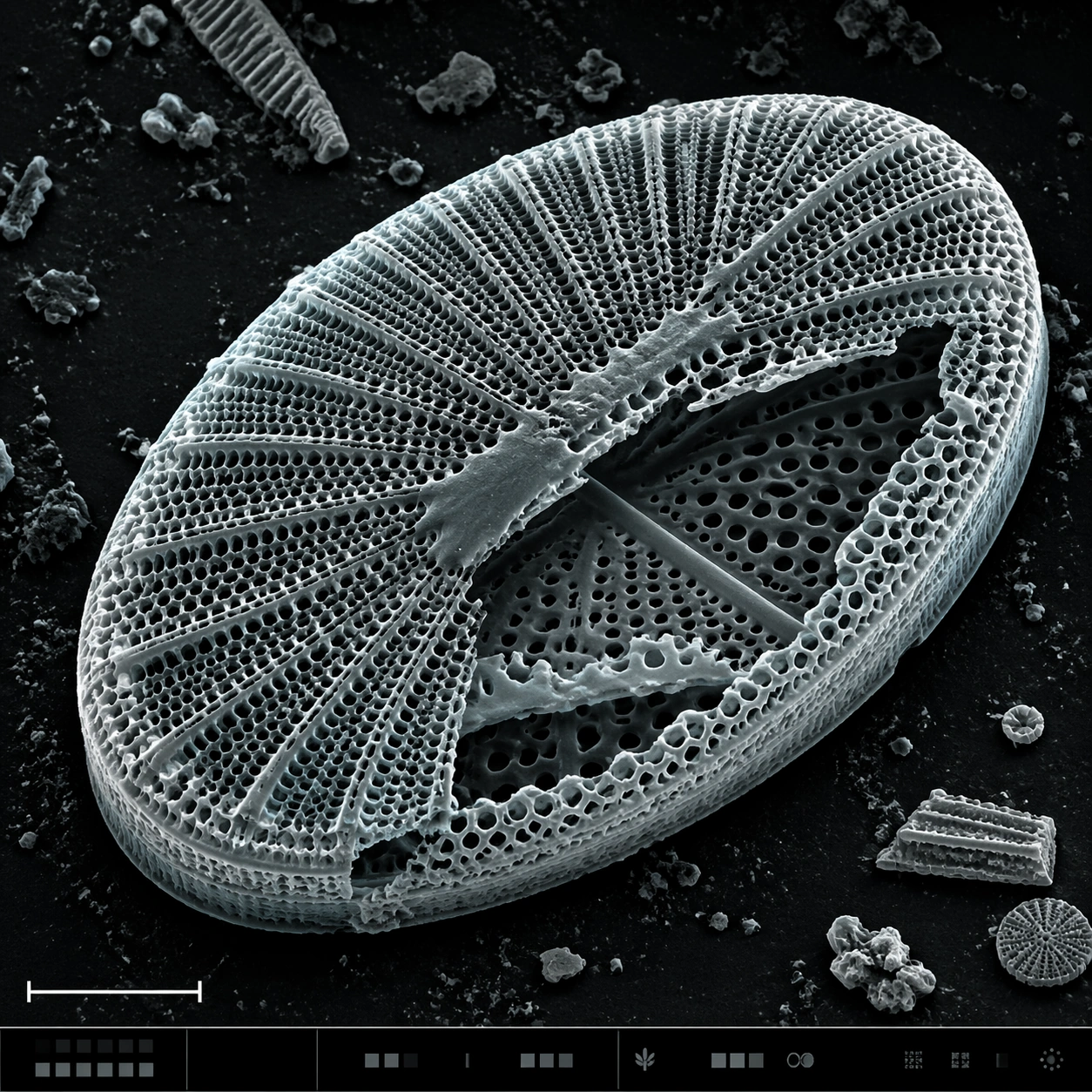
Example generated from “Sem Microscopy — Diatom Glass Lattice”
GPT Image 2en

Scene: A square SEM microscopy plate with luminous grayscale relief and a very subtle cyan-gray false-color tint applied to highlights. The specimen is centered, rotated slightly off-axis, and surrounded by dark sample-mount negative space. A lower-left scale bar shape and a bottom instrument strip with tiny unreadable interface marks provide scientific structure. Subject: A diatom frustule, like a microscopic glass shell, showing an intricate porous lattice. The oval shell has radial ribs, honeycomb perforations, raised rim, fractured window edges, and layered silica thickness. One side is partly broken to reveal inner chambers and secondary perforation patterns. Fine dust specks and small shell fragments rest nearby, emphasizing scale. Important details: The image must balance beauty with SEM credibility. The diatom should not become jewelry, architecture, or a mandala; it should remain a biological silica shell with natural asymmetry, brittle edges, and uneven pores. Preserve detailed microtexture across the lattice: rim ridges, tiny holes, broken panels, granular substrate, and topographic shadows. The bottom information strip should support the plate layout but contain no readable text or numbers. Use case: SEM Microscopy single study 6/8, testing porous biological lattice rendering with scientific realism. Constraints: No readable text, no watermark, no logos, preserve exact 1:1 aspect ratio, no decorative mandala, no stained glass colors, no perfect vector geometry, no underwater scene, no labels, no glowing fantasy shell, no smooth plastic surface.

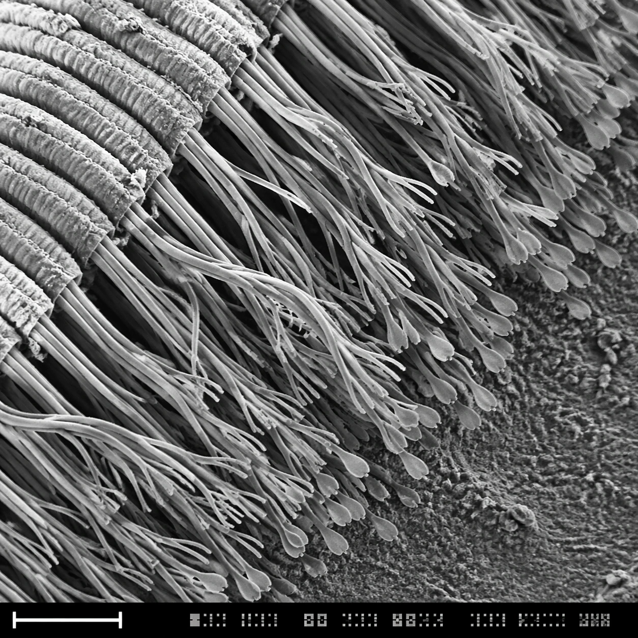
Example generated from “Sem Microscopy — Gecko Toe Setae”
GPT Image 2en

Scene: A square grayscale SEM-style scientific plate, high magnification, with the specimen sweeping diagonally from upper left to lower right. The image uses crisp relief shadows, granular substrate texture, and a bottom instrument strip containing a lower-left scale bar form plus compact unreadable calibration marks. The composition should feel like a real laboratory capture selected for a museum science display. Subject: The underside of a gecko toe pad at microscopic scale. Dense rows of setae split into many finer spatula-like tips, forming a forest of dry adhesive hairs. Some bundles bend together, some separate into branching tips, and the base ridges of the toe pad are visible as layered folds. Dust specks and tiny broken hairs provide scale and natural imperfection. Important details: The main challenge is microstructure hierarchy: toe pad ridge, seta bundle, branching hair, flattened spatula tip. Preserve this nested structure clearly. Use SEM grayscale contrast, not macro fur photography. The hairs should be dry, sharp, and slightly translucent-gray in electron-imaging style, with realistic occlusion and depth. The scale bar and bottom instrument strip must be present as non-readable visual layout elements, never as legible typography. Use case: SEM Microscopy single study 7/8, testing hierarchical microtexture and scientific SEM realism for gecko adhesion structures. Constraints: No readable text, no watermark, no logos, preserve exact 1:1 aspect ratio, no cute animal context, no visible whole gecko, no soft fur look, no colored illustration, no oversized labels, no wet slime, no fantasy tendrils, no random hair clumps.

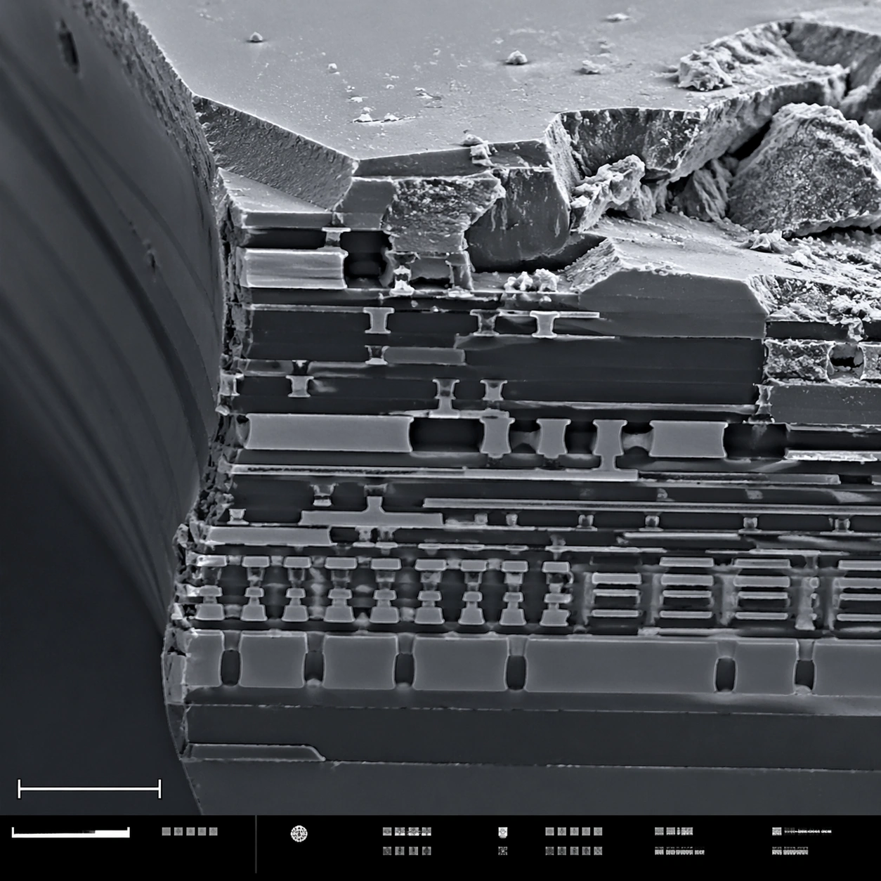
Example generated from “Sem Microscopy — Microchip Fracture”
GPT Image 2en

Scene: A square scanning electron microscope plate of a fractured microchip cross-section, rendered in sharp monochrome with a slight graphite-blue tint in the shadows. The specimen occupies the main field like a miniature canyon of engineered layers. A lower-left scale bar shape and a bottom instrument-information strip with small unreadable marks make the layout feel like an SEM capture screen. Subject: A broken silicon microchip edge at high magnification. Visible features include stacked metal interconnect layers, etched trenches, dielectric strata, jagged fracture planes, tiny vias, rectangular circuit terraces, and granular debris on the cleaved surface. Some layers are smooth and engineered; others are rough and torn, showing contrast between manufactured precision and brittle breakage. Important details: Keep the image scientifically plausible and technical. Do not show a normal circuit board or macro electronics; this is a microscopic cross-section. Emphasize SEM relief: crisp edges, grainy fracture texture, deep shadowed trenches, and thin layer boundaries. The structured layout should have a clean main field, scale bar geometry, and bottom strip without readable typography. The image should feel suitable for a failure-analysis report while remaining visually striking. Use case: SEM Microscopy single study 8/8, testing technical material SEM realism and structured plate composition. Constraints: No readable text, no watermark, no logos, preserve exact 1:1 aspect ratio, no brand marks, no normal macro circuit board, no glowing neon traces, no floating labels, no colorful cyberpunk style, no schematic overlay, no perfect 3D render look.

Example generated from “Short Video Cover Pack — Reference Host”
GPT Image 2en

Scene: A square short-video thumbnail master template for a tech-business creator channel. The composition should be loud enough to read at phone size but still clean and system-driven: a close face crop on the left two-thirds, a bold rectangular hook zone on the right, and a narrow top category strip. Background uses a dark navy gradient with lime and white accent blocks, like a modern YouTube Shorts or Bilibili cover system. Subject: A confident East Asian female host in her early thirties with a sharp bob haircut, charcoal blazer, and small in-ear mic leans slightly toward camera with one raised eyebrow and a half-smile. She should feel like a recognizable recurring creator rather than a generic stock portrait. Behind her are abstract shapes suggesting dashboards, charts, and studio light reflections, but kept blurred and secondary. The cover must establish one host identity, one lighting setup, and one template structure that later series images can preserve. Important details: Design for thumbnail legibility first: oversized face, simple background, one bright accent color, and a clean empty block where hook text would normally sit, but rendered as non-readable bars and geometric placeholders only. Keep the host's face, hair, blazer, and lighting highly stable because follow-up covers will depend on this image as the identity reference. The whole frame should feel like a premium recurring channel pack, not a random poster. Use case: Short Video Cover Pack series study 1/9, establishing the recurring host identity and reusable cover template for a creator channel. Constraints: No readable text, no watermark, no logos, preserve exact 1:1 aspect ratio, no cluttered background, no extra people, no tiny unreadable details everywhere, no poster-like empty dead space.

Example generated from “Short Video Cover Pack — AI Breakthrough Alert”
GPT Image 2en

Scene: Using the referenced host identity and the same thumbnail template, create a square short-video cover for an urgent AI breakthrough story. Preserve the close face crop on the left, the empty hook block on the right, and the narrow category strip at the top. Background should remain dark navy and white, but introduce a bright electric-cyan neural diagram glow behind the host to signal AI without making the frame messy. Subject: The same recurring female host from the reference image appears with matching haircut, blazer, skin tone, lighting direction, and camera angle. Her expression shifts to alert concentration, with one hand slightly raised near the chin as if reacting to breaking news. On the right side, abstract non-readable headline bars sit above a simple chip icon and a glowing circuit motif. The design must look like a second episode in the same channel system, not a different brand. Important details: Identity consistency is mandatory: same host face, same overall crop, same channel styling, same clean geometry. The only major changes should be the cyan accent, the AI iconography, and a stronger sense of urgency in the expression. Keep the design optimized for mobile-size scanning with clear contrast and minimal clutter. All text areas must remain unreadable placeholder shapes, never actual words. Use case: Short Video Cover Pack series study 2/9, using the reference host to test AI-news category variation within one stable thumbnail system. Constraints: No readable text, no watermark, no logos, preserve exact 1:1 aspect ratio, no different host identity, no extra panel collage, no overcomplicated tech background, no soft low-contrast thumbnail.
Example generated from “Short Video Cover Pack — Market Shock Explainer”
GPT Image 2en

Scene: Using the referenced host identity and the same square thumbnail layout, create a market-volatility explainer cover. Keep the host face crop on the left, the blank hook zone on the right, and the thin top strip, but shift the accent palette to warning orange and crisp white against the same dark navy base. Add a single falling-chart diagonal and one coin or candlestick symbol as simplified background cues. Subject: The same recurring female host from the reference image must remain clearly identical in face, hairstyle, wardrobe, and framing. Her expression is sharper and more analytical, with lips slightly parted as if saying something surprising. The right-side hook zone uses stacked non-readable bars and a downward arrow motif. The overall thumbnail should feel like another episode from the same account, tuned for financial urgency and high click-through recognition. Important details: Preserve identity consistency and channel-system discipline above all else. The host cannot drift into a different person or a different lighting setup. Keep background elements large and simple enough to read when reduced to a tiny thumbnail. Use orange sparingly so the face remains dominant. The empty text zone must look intentional and bold even without any readable lettering. Use case: Short Video Cover Pack series study 3/9, testing a finance-news variation while preserving the same creator-channel visual system. Constraints: No readable text, no watermark, no logos, preserve exact 1:1 aspect ratio, no extra hosts, no dense stock-market clutter, no low-energy expression, no deviation from the reference face and crop.

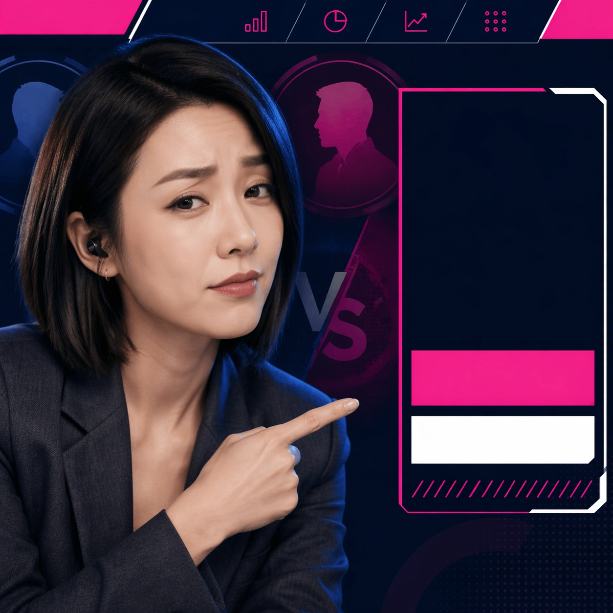
Example generated from “Short Video Cover Pack — Founder Debate Spotlight”
GPT Image 2en

Scene: Using the referenced host identity and the same thumbnail system, create a founder-debate spotlight cover. Preserve the left-heavy host crop, the right-side hook block, and the narrow top category strip. Keep the dark navy base, but switch the accent to vivid magenta and white with one split-circle or versus shape faintly behind the placeholder headline zone. Subject: The same recurring female host from the reference image appears unchanged in identity, hair, face, blazer, and lighting. She now points slightly toward the right-side hook area with a more skeptical expression, as if framing a debate between two public figures. The background should include only simplified silhouette medallions or abstract profile shapes, not full extra faces. The cover must read immediately as part of the same creator channel while signaling a debate or opinion segment. Important details: Identity preservation and template consistency are the main tasks. Keep the same overall camera distance and layout rhythm so all four covers look like one system when viewed side by side. The magenta accent should be decisive but limited. Use bold unreadable line blocks for the hook zone and clean graphic separators for a premium short-video feel. Do not let the supporting graphics compete with the host's face. Use case: Short Video Cover Pack series study 4/9, testing opinion-segment variation while maintaining one host-led cover system. Constraints: No readable text, no watermark, no logos, preserve exact 1:1 aspect ratio, no extra realistic portrait collage, no different host styling, no overcrowded debate graphics, no muddy low-contrast layout.

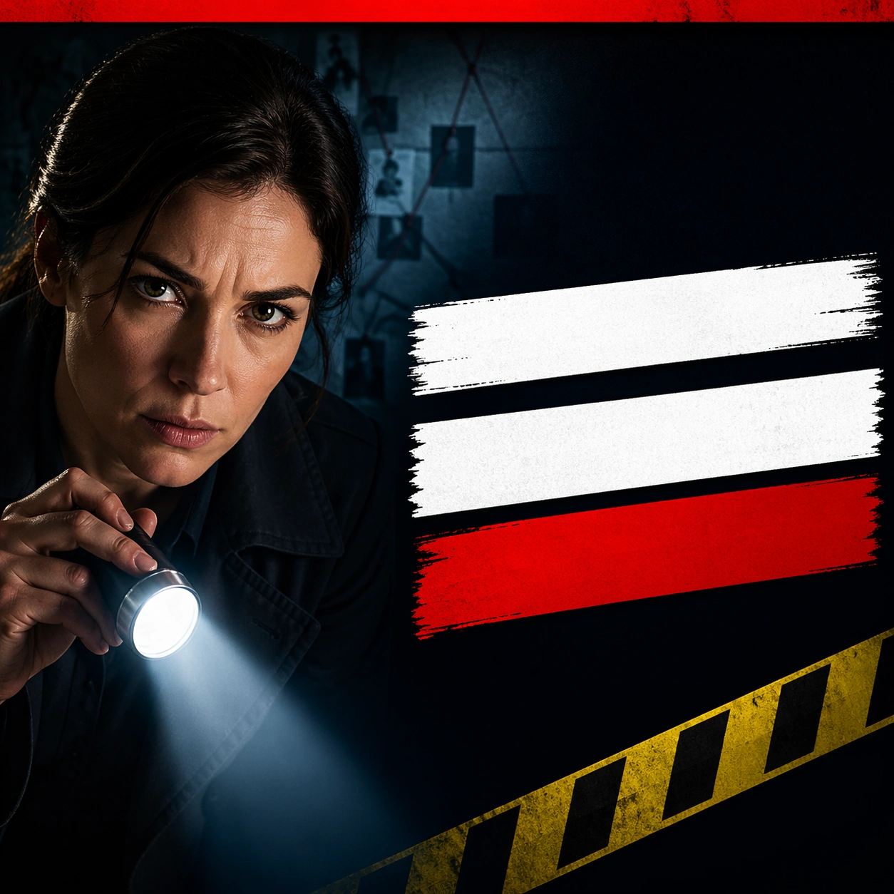
Example generated from “Short Video Cover Pack — True Crime Nightcase”
GPT Image 2en

Scene: A square short-video thumbnail for a true-crime channel, designed for maximum mobile-size readability. The composition uses a dark blue-black background, one flashlight beam, one close human face on the left, and a stark empty hook zone on the right. A narrow red top strip signals the category. The overall layout should feel clean, urgent, and highly clickable without becoming a messy poster. Subject: An investigative female host in a dark coat leans into frame holding a flashlight upward, her expression tense but controlled. Behind her, a crime-scene wall and evidence board appear only as large abstract shapes, not detailed clutter. The right side contains bold non-readable headline bars and one simple caution-tape diagonal. The frame must read instantly at thumbnail scale. Important details: Keep the face large, the lighting dramatic, and the design extremely simple. Use red only as a category accent so the face remains the focal point. The hook zone should feel intentional and strong even with no real words. This is a channel cover system, not a cinematic key art poster. Use case: Short Video Cover Pack single study 5/9, focused on true-crime thumbnail clarity and bold hook-zone placement. Constraints: No readable text, no watermark, no logos, preserve exact 1:1 aspect ratio, no cluttered evidence collage, no multiple faces competing, no muddy darkness, no tiny props everywhere.

Example generated from “Short Video Cover Pack — Space Facts Burst”
GPT Image 2en

Scene: A square science-facts thumbnail built for instant small-size recognition. The composition uses a bright astronaut helmet or presenter face on the left, a large glowing planet behind, and a clean hook zone on the right made of thick non-readable bars. Background is deep space purple-black with cyan highlights, but the overall layout stays simple and graphic. Subject: A youthful science presenter in a silver space jacket points upward with excitement while a stylized Saturn-like planet and orbit ring fill the upper background. A simple star map grid and one rocket icon appear as large clean forms only. The presenter expression should be energetic and friendly. The thumbnail must feel like a repeatable educational channel cover, not a movie poster. Important details: Prioritize silhouette, contrast, and category signal. Keep the face or helmet large, the planet unmistakable, and the text area bold yet unreadable. Use a strong color split between the presenter and background so the image survives heavy downscaling. Avoid too many stars or tiny science props. Use case: Short Video Cover Pack single study 6/9, focused on science-channel readability and bright category coding. Constraints: No readable text, no watermark, no logos, preserve exact 1:1 aspect ratio, no cluttered galaxy wallpaper, no multiple competing planets, no tiny labels, no low-contrast composition.

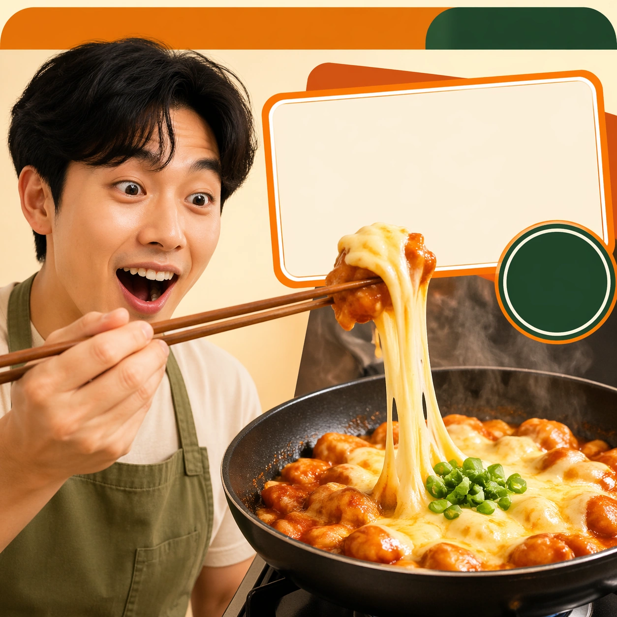
Example generated from “Short Video Cover Pack — Kitchen Hack Sizzle”
GPT Image 2en

Scene: A square cooking-hack thumbnail for mobile feeds, using a split composition: sizzling pan close-up on the right and expressive chef face on the left. The background is warm cream with orange and green accents, plus a clear top category bar and a bold empty hook block overlapping the pan edge. The overall look should be bright, simple, and instantly edible. Subject: A charismatic home-cook creator in an apron reacts with delight while lifting chopsticks above a pan where steam and one dramatic cheese or sauce pull creates a single irresistible food cue. The ingredients should stay large and recognizable: one pan, one bright garnish, one utensil. The right-side hook area uses non-readable blocks and one badge-like circle to imply the platform template. Important details: Thumbnail logic comes first. Keep the cook's face large and expressive, keep the food cue singular and obvious, and avoid restaurant-menu clutter. Use strong warm contrast so the frame survives downscaling. This should look like a repeatable short-video cover system for kitchen hacks rather than a plated-food advertisement. Use case: Short Video Cover Pack single study 7/9, focused on split-screen cooking-cover logic with face-plus-food clarity. Constraints: No readable text, no watermark, no logos, preserve exact 1:1 aspect ratio, no crowded ingredient spread, no multiple dishes, no greasy mess, no fine-print labels or recipe cards.
Example generated from “Short Video Cover Pack — Book Summary Minimal”
GPT Image 2en

Scene: A square minimalist book-summary thumbnail built around calm editorial order. The composition uses a presenter portrait on the left, a single oversized book object in the center-right, and a pale neutral background with one colored spine stripe for category coding. A strong empty hook block sits in the upper right, and the whole design should feel clean, smart, and highly reusable. Subject: A thoughtful male presenter in a simple knit sweater holds a closed book near the chest while looking directly at camera with a clear, calm expression. Behind him, one oversized floating book shape and a few paper tabs create the category signal. The image should feel more disciplined and intellectual than the other thumbnails, with clean edges and restrained color. Important details: This cover tests whether a low-energy, knowledge-first thumbnail can still click. Keep the face large, the book cue unmistakable, and the layout extremely simple. Use beige, dark teal, and one accent mustard stripe. The hook zone must remain bold but unreadable. Avoid cluttered library backgrounds or stacks of many books. Use case: Short Video Cover Pack single study 8/9, focused on minimalist knowledge-channel cover logic and calm intellectual branding. Constraints: No readable text, no watermark, no logos, preserve exact 1:1 aspect ratio, no crowded bookshelf, no multiple presenters, no noisy sticky notes everywhere, no weak low-contrast face crop.

Example generated from “Short Video Cover Pack — Match Recap Flash”
GPT Image 2en

Scene: A square sports-recap thumbnail optimized for instant feed impact. The composition uses a dynamic athlete cutout on the right, a presenter or commentator face on the left, and a bold central slash separating the two. Background is deep stadium blue with one hot yellow accent and a wide top strip for category coding. The empty hook zone should sit across the upper center as thick non-readable bars. Subject: A commentator host reacts with open-mouth excitement while a football or basketball player in motion occupies the opposite side, frozen at the decisive highlight moment. Use only one athlete and one host so the frame remains clean. Add one scoreboard-like block and one heat-trail graphic as simple visual cues. The thumbnail should feel like a repeatable sports recap system for a short-video account. Important details: Clarity beats realism. Keep expressions big, silhouettes bold, and the central slash graphic simple. Make sure the athlete and host stay readable at tiny scale. Use color contrast aggressively but avoid cluttered stadium detail. The empty hook block must feel loud and clickable without any actual words. Use case: Short Video Cover Pack single study 9/9, focused on sports-recap thumbnail energy and two-subject layout discipline. Constraints: No readable text, no watermark, no logos, preserve exact 1:1 aspect ratio, no full team crowd, no messy scoreboard clutter, no multiple athletes, no muddy motion blur covering faces.

Example generated from “Silhouette Universe — Doorway Threshold”
GPT Image 2en

Scene: A square gallery poster on a clean white canvas, using generous negative space around one centered arched doorway silhouette. The lighting is even and graphic, with the white exterior field kept plain so the door reads as a strong symbolic object. The composition should be calm at the edges and richly layered only inside the doorway. Subject: A pure black silhouette of an arched wooden door and frame, but the doorway interior is not solid. Inside the arched contour is a compressed otherworldly landscape: dark forest trunks at the base, glowing moss, a path leading inward, distant mountains, birds crossing the upper opening, a star field, and a visible galaxy band folding into the arch. The door shape must remain unmistakable as a black threshold. Important details: The door acts as a container for a universe, not as a literal open doorway in a room. All forest, stars, mountains, birds, and galaxy details must be pressed inside the arched outline and must not escape onto the white canvas. Keep the outer silhouette edge crisp, heavy, and black. The interior may use deep greens, indigo, silver stars, and subtle luminous depth while the exterior remains blank white. Use case: Silhouette Universe independent study 2/3, demonstrating the door outline within a tower, door, and skull silhouette-narrative matrix. Constraints: No readable text, no watermark, no logos, preserve exact 1:1 aspect ratio, no broken silhouette edges, no white halo, no extra people outside the outline.

Example generated from “Silhouette Universe — Skull Memento”
GPT Image 2en

Scene: A square memento mori poster on aged beige parchment with subtly worn corners, faint paper grain, and restrained sepia atmosphere. A side-profile skull silhouette sits centered and large, clear enough to read from across a room. The outside field stays sparse, antique, and quiet, letting the skull shape carry the composition. Subject: A pure black profile silhouette of a human skull, but the skull is not a solid filled icon. Inside the head contour is a full Victorian funeral scene: a dark casket on a small road, a line of mourners in period clothing, bare trees, crows, a distant cemetery with tilted headstones, a low fog layer, and a pale evening sky visible through tiny interior openings. The eye socket and jaw area should help organize the narrative layers while preserving the skull profile. Important details: The skull is a container for the final chapter of life. All funeral elements must remain inside the skull outline, with no casket, crow, mourner, branch, or grave crossing the silhouette edge. The contour must stay sharp, continuous, and black against the parchment. Interior detail should read as a miniature staged narrative, using charcoal, sepia, and muted gray values for a solemn Victorian mood. Use case: Silhouette Universe independent study 3/3, completing the tower, door, and skull trio with the skull outline as a narrative container. Constraints: No readable text, no watermark, no logos, preserve exact 1:1 aspect ratio, no broken silhouette edges, no white halo, no extra people outside the outline.

Example generated from “Single Point Perspective Clinical Corridor — Sealed Hallway”
GPT Image 2en

Scene: A square frame organized around a ruthless one-point perspective, with the vanishing point pinned dead center and every wall seam, ceiling light, floor tile, and doorway converging toward it. The palette should lean cold white, muted red, steel gray, and hospital green, with a monumental sense of emptiness and institutional order. Build a sealed research corridor with identical doors, recessed ceiling strips, and a waxed floor that reflects the central light path like a ruler. Subject: Place one small human figure or one important object along the central axis so the architecture dominates the scale relationship. The corridor or interior must feel long, controlled, and mildly oppressive, as if the camera is witnessing a space designed by precision rather than comfort. A lone technician in a pale gown stands at the vanishing point carrying a metal case, dwarfed by the long passage behind and in front of them. Important details: The essential grammar is exact perspective discipline, polished surfaces, measured repetition, and low emotional temperature. Preserve straight lines, clean threshold spacing, and a believable practical-lighting logic. The image should feel clinical, deliberate, and spatially hypnotic rather than decorative or chaotic. Use tiny red safety accents at door handles and floor markers, but keep the overall sensation controlled and austere. Use case: Single-Point Perspective Clinical Corridor single study 1/9. Constraints: No readable text, no watermark, no logos, preserve exact 1:1 aspect ratio, no fisheye distortion, no crooked horizon, no cluttered props, no graffiti, no colorful signage, no broken anatomy, no low-detail background, no accidental text fragments.

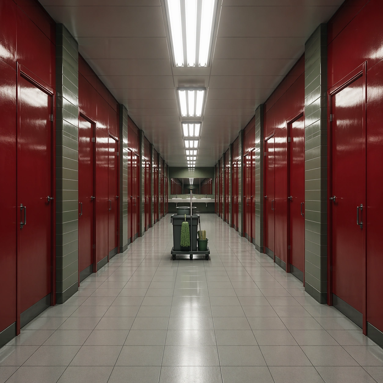
Example generated from “Single Point Perspective Clinical Corridor — Red Restroom Threshold”
GPT Image 2en

Scene: A square frame organized around a ruthless one-point perspective, with the vanishing point pinned dead center and every wall seam, ceiling light, floor tile, and doorway converging toward it. The palette should lean cold white, muted red, steel gray, and hospital green, with a monumental sense of emptiness and institutional order. Use a glossy red restroom antechamber with repeating stall doors, fluorescent strips, and pale floor tiles driving the eye into a central sink mirror. Subject: Place one small human figure or one important object along the central axis so the architecture dominates the scale relationship. The corridor or interior must feel long, controlled, and mildly oppressive, as if the camera is witnessing a space designed by precision rather than comfort. A janitor cart is parked exactly in the middle of the room, turning an ordinary service space into a formal perspective exercise. Important details: The essential grammar is exact perspective discipline, polished surfaces, measured repetition, and low emotional temperature. Preserve straight lines, clean threshold spacing, and a believable practical-lighting logic. The image should feel clinical, deliberate, and spatially hypnotic rather than decorative or chaotic. Let the red surfaces feel lacquered and severe, with no text labels and no casual mess breaking the geometry. Use case: Single-Point Perspective Clinical Corridor single study 2/9. Constraints: No readable text, no watermark, no logos, preserve exact 1:1 aspect ratio, no fisheye distortion, no crooked horizon, no cluttered props, no graffiti, no colorful signage, no broken anatomy, no low-detail background, no accidental text fragments.

Example generated from “Single Point Perspective Clinical Corridor — Archive Tunnel”
GPT Image 2en

Scene: A square frame organized around a ruthless one-point perspective, with the vanishing point pinned dead center and every wall seam, ceiling light, floor tile, and doorway converging toward it. The palette should lean cold white, muted red, steel gray, and hospital green, with a monumental sense of emptiness and institutional order. Construct an archive tunnel lined with equal metal shelves and rolling ladders, each repeating into the distance under cool white strip lighting. Subject: Place one small human figure or one important object along the central axis so the architecture dominates the scale relationship. The corridor or interior must feel long, controlled, and mildly oppressive, as if the camera is witnessing a space designed by precision rather than comfort. A single empty chair faces the vanishing point at the center, implying recent human presence without filling the space with action. Important details: The essential grammar is exact perspective discipline, polished surfaces, measured repetition, and low emotional temperature. Preserve straight lines, clean threshold spacing, and a believable practical-lighting logic. The image should feel clinical, deliberate, and spatially hypnotic rather than decorative or chaotic. The room should feel heavy with order and storage logic, with labels omitted so only the geometry and serial repetition remain. Use case: Single-Point Perspective Clinical Corridor single study 3/9. Constraints: No readable text, no watermark, no logos, preserve exact 1:1 aspect ratio, no fisheye distortion, no crooked horizon, no cluttered props, no graffiti, no colorful signage, no broken anatomy, no low-detail background, no accidental text fragments.

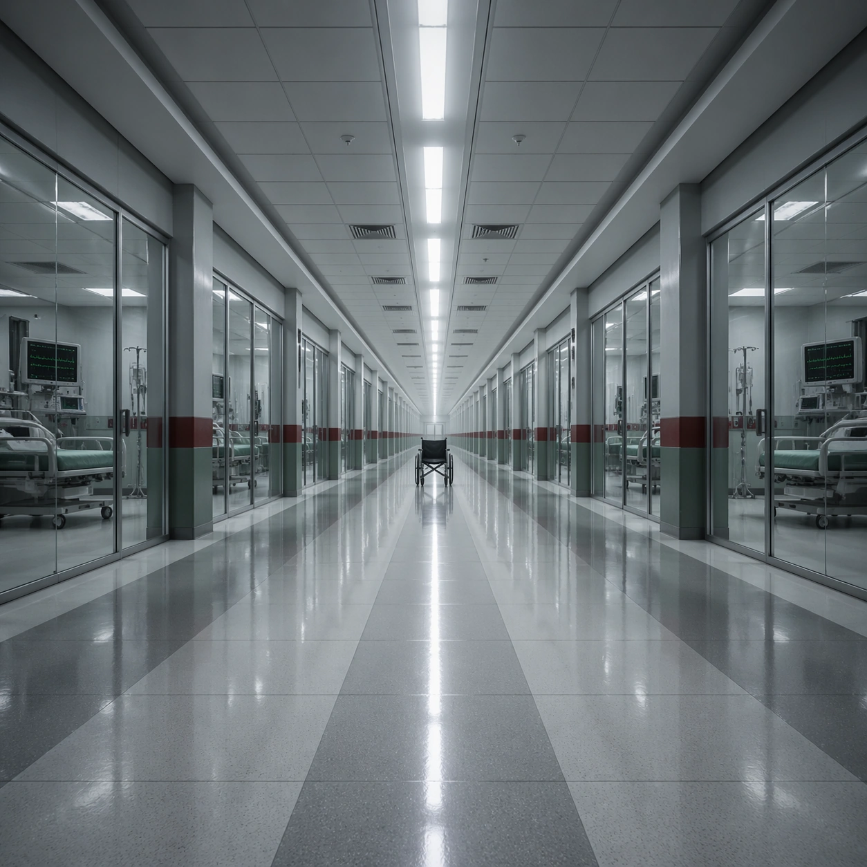
Example generated from “Single Point Perspective Clinical Corridor — Observation Wing”
GPT Image 2en

Scene: A square frame organized around a ruthless one-point perspective, with the vanishing point pinned dead center and every wall seam, ceiling light, floor tile, and doorway converging toward it. The palette should lean cold white, muted red, steel gray, and hospital green, with a monumental sense of emptiness and institutional order. Show a hospital observation wing with glass partitions, evenly spaced monitoring bays, and a polished floor carrying a bright linear reflection to the center. Subject: Place one small human figure or one important object along the central axis so the architecture dominates the scale relationship. The corridor or interior must feel long, controlled, and mildly oppressive, as if the camera is witnessing a space designed by precision rather than comfort. A patient wheelchair sits unattended at the exact midpoint, framed by sterile doorways and ceiling panels. Important details: The essential grammar is exact perspective discipline, polished surfaces, measured repetition, and low emotional temperature. Preserve straight lines, clean threshold spacing, and a believable practical-lighting logic. The image should feel clinical, deliberate, and spatially hypnotic rather than decorative or chaotic. Keep the glass faintly reflective and the room unnervingly quiet, emphasizing depth, repetition, and the absence of disorder. Use case: Single-Point Perspective Clinical Corridor single study 4/9. Constraints: No readable text, no watermark, no logos, preserve exact 1:1 aspect ratio, no fisheye distortion, no crooked horizon, no cluttered props, no graffiti, no colorful signage, no broken anatomy, no low-detail background, no accidental text fragments.

Example generated from “Single Point Perspective Clinical Corridor — Dormitory Aisle”
GPT Image 2en

Scene: A square frame organized around a ruthless one-point perspective, with the vanishing point pinned dead center and every wall seam, ceiling light, floor tile, and doorway converging toward it. The palette should lean cold white, muted red, steel gray, and hospital green, with a monumental sense of emptiness and institutional order. Design a long boarding-house dormitory aisle with identical bed alcoves, overhead pipes, and alternating red blanket folds repeating toward the center. Subject: Place one small human figure or one important object along the central axis so the architecture dominates the scale relationship. The corridor or interior must feel long, controlled, and mildly oppressive, as if the camera is witnessing a space designed by precision rather than comfort. A child in slippers stands far away at the vanishing point holding a toy ball, making the scale feel uncanny and formal. Important details: The essential grammar is exact perspective discipline, polished surfaces, measured repetition, and low emotional temperature. Preserve straight lines, clean threshold spacing, and a believable practical-lighting logic. The image should feel clinical, deliberate, and spatially hypnotic rather than decorative or chaotic. The bedding, lockers, and floor pattern must obey the perspective grid with absolute obedience, avoiding sentimental clutter. Use case: Single-Point Perspective Clinical Corridor single study 5/9. Constraints: No readable text, no watermark, no logos, preserve exact 1:1 aspect ratio, no fisheye distortion, no crooked horizon, no cluttered props, no graffiti, no colorful signage, no broken anatomy, no low-detail background, no accidental text fragments.

Example generated from “Single Point Perspective Clinical Corridor — Conference Passage”
GPT Image 2en

Scene: A square frame organized around a ruthless one-point perspective, with the vanishing point pinned dead center and every wall seam, ceiling light, floor tile, and doorway converging toward it. The palette should lean cold white, muted red, steel gray, and hospital green, with a monumental sense of emptiness and institutional order. Build a carpeted corporate passage linking meeting rooms, with linear wall sconces, wood veneer panels, and narrow red carpeting aimed directly at the center. Subject: Place one small human figure or one important object along the central axis so the architecture dominates the scale relationship. The corridor or interior must feel long, controlled, and mildly oppressive, as if the camera is witnessing a space designed by precision rather than comfort. A single rolling briefcase stands on the axis under a ceiling vent, as if its owner just vanished beyond the frame. Important details: The essential grammar is exact perspective discipline, polished surfaces, measured repetition, and low emotional temperature. Preserve straight lines, clean threshold spacing, and a believable practical-lighting logic. The image should feel clinical, deliberate, and spatially hypnotic rather than decorative or chaotic. Hold the palette to beige, smoke gray, and disciplined oxblood so the corridor feels expensive but emotionally sterile. Use case: Single-Point Perspective Clinical Corridor single study 6/9. Constraints: No readable text, no watermark, no logos, preserve exact 1:1 aspect ratio, no fisheye distortion, no crooked horizon, no cluttered props, no graffiti, no colorful signage, no broken anatomy, no low-detail background, no accidental text fragments.

Example generated from “Single Point Perspective Clinical Corridor — Service Kitchen Run”
GPT Image 2en

Scene: A square frame organized around a ruthless one-point perspective, with the vanishing point pinned dead center and every wall seam, ceiling light, floor tile, and doorway converging toward it. The palette should lean cold white, muted red, steel gray, and hospital green, with a monumental sense of emptiness and institutional order. Set the image in a back-of-house kitchen run with stainless counters mirrored left and right, white tile joints, and bright ceiling panels pulling to a central prep station. Subject: Place one small human figure or one important object along the central axis so the architecture dominates the scale relationship. The corridor or interior must feel long, controlled, and mildly oppressive, as if the camera is witnessing a space designed by precision rather than comfort. A single covered cloche waits at the vanishing point, introducing ritual and suspense into an otherwise practical service corridor. Important details: The essential grammar is exact perspective discipline, polished surfaces, measured repetition, and low emotional temperature. Preserve straight lines, clean threshold spacing, and a believable practical-lighting logic. The image should feel clinical, deliberate, and spatially hypnotic rather than decorative or chaotic. Everything should feel spotless, metallic, and acoustically hard, with geometry overpowering culinary warmth. Use case: Single-Point Perspective Clinical Corridor single study 7/9. Constraints: No readable text, no watermark, no logos, preserve exact 1:1 aspect ratio, no fisheye distortion, no crooked horizon, no cluttered props, no graffiti, no colorful signage, no broken anatomy, no low-detail background, no accidental text fragments.
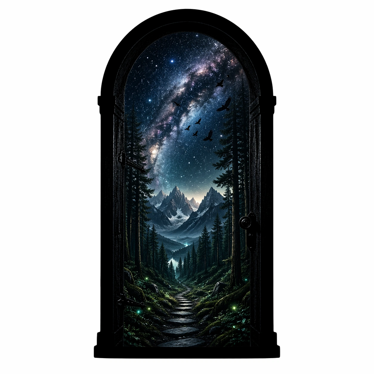
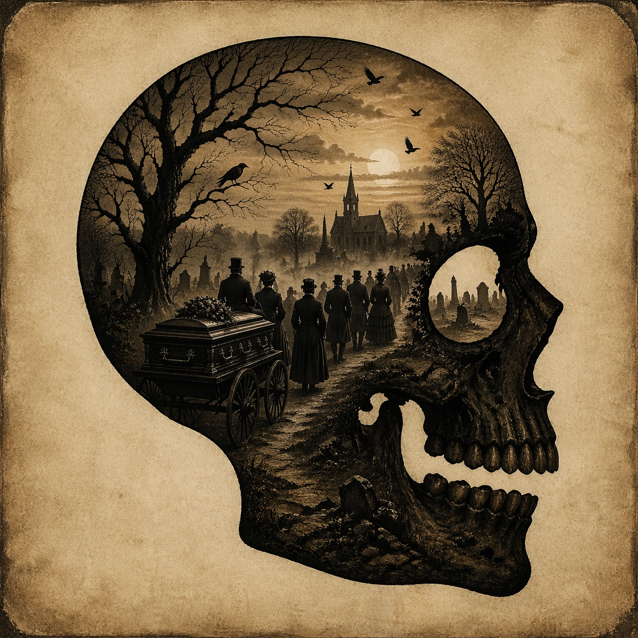
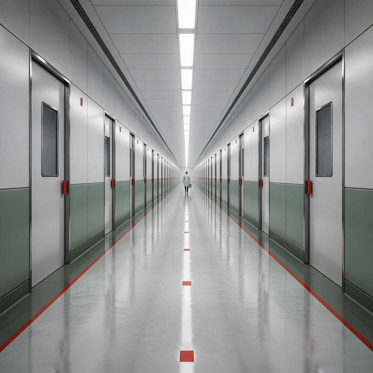
Example generated from “Single Point Perspective Clinical Corridor — Ice Blue Lab”
GPT Image 2en

Scene: A square frame organized around a ruthless one-point perspective, with the vanishing point pinned dead center and every wall seam, ceiling light, floor tile, and doorway converging toward it. The palette should lean cold white, muted red, steel gray, and hospital green, with a monumental sense of emptiness and institutional order. Create an ice-blue laboratory chamber with floor drains, cable trays, and illuminated wall niches all converging toward a central sealed hatch. Subject: Place one small human figure or one important object along the central axis so the architecture dominates the scale relationship. The corridor or interior must feel long, controlled, and mildly oppressive, as if the camera is witnessing a space designed by precision rather than comfort. A scientist in a simple protective suit stands in front of the hatch with hands behind their back, reduced to a small silhouette by the architecture. Important details: The essential grammar is exact perspective discipline, polished surfaces, measured repetition, and low emotional temperature. Preserve straight lines, clean threshold spacing, and a believable practical-lighting logic. The image should feel clinical, deliberate, and spatially hypnotic rather than decorative or chaotic. Favor frozen color temperature, crisp edges, and a sense of monitored stillness rather than futuristic spectacle. Use case: Single-Point Perspective Clinical Corridor single study 8/9. Constraints: No readable text, no watermark, no logos, preserve exact 1:1 aspect ratio, no fisheye distortion, no crooked horizon, no cluttered props, no graffiti, no colorful signage, no broken anatomy, no low-detail background, no accidental text fragments.

Example generated from “Single Point Perspective Clinical Corridor — Gold Door Threshold”
GPT Image 2en

Scene: A square frame organized around a ruthless one-point perspective, with the vanishing point pinned dead center and every wall seam, ceiling light, floor tile, and doorway converging toward it. The palette should lean cold white, muted red, steel gray, and hospital green, with a monumental sense of emptiness and institutional order. Finish in a grand interior threshold where matte cream walls, geometric floor stone, and a distant gold door align perfectly with the center point. Subject: Place one small human figure or one important object along the central axis so the architecture dominates the scale relationship. The corridor or interior must feel long, controlled, and mildly oppressive, as if the camera is witnessing a space designed by precision rather than comfort. A room attendant stands before the door holding two keys on a tray, making the ritual of access feel larger than life. Important details: The essential grammar is exact perspective discipline, polished surfaces, measured repetition, and low emotional temperature. Preserve straight lines, clean threshold spacing, and a believable practical-lighting logic. The image should feel clinical, deliberate, and spatially hypnotic rather than decorative or chaotic. Use restraint so the gold reads ceremonial rather than gaudy, and keep the perspective lines strict enough to generate visual pressure. Use case: Single-Point Perspective Clinical Corridor single study 9/9. Constraints: No readable text, no watermark, no logos, preserve exact 1:1 aspect ratio, no fisheye distortion, no crooked horizon, no cluttered props, no graffiti, no colorful signage, no broken anatomy, no low-detail background, no accidental text fragments.