PROMPTS · CREATIVE EXPLORATION

Prompt Gallery

Explore real prompts and their generated examples. Find inspiration for your next creative mission and copy the complete prompt for free.

Examples
10,974
Models
17
Sources
1277
10,974 prompt examples · page 47 of 229
Example generated from “Latte Art Atlas — Macro Study”
GPT Image 2en

Scene: A square photographic image with intentional lens choice, coherent light, and a subject that feels observed rather than merely decorated. Build the frame around closer observation that reveals fine structure and optical behavior. Keep the lighting, camera distance, and spatial organization tuned for a high-signal research image rather than a casual snapshot. The image belongs to the Latte Art Atlas theme and should feel immediately legible as a prompt atlas theme for latte art atlas, testing structured-layout, photorealism, style-transfer, commercial-mockup with gpt image 2.. Subject: Center the study on closer observation that reveals fine structure and optical behavior. Translate the theme into a concrete visual statement instead of an abstract mood board: the viewer should understand what kind of image this is, what is being tested, and why the composition is difficult. Use the slug idea of latte art atlas as a literal guide for subject matter, materials, and staging. Important details: The realism should come from timing, optics, and material response: atmosphere, contrast, depth, motion, and tiny physical cues all need to agree. Preserve a disciplined square composition, clear focal hierarchy, and enough secondary information to make the image feel complete rather than underspecified. The image should look polished, novel, and exhibition-ready, with topic-specific credibility coming from the way surfaces, structure, and visual language reinforce Latte Art Atlas. Avoid generic filler elements that do not serve the main concept. Use case: Latte Art Atlas single study 2/8, testing structured-layout, photorealism, style-transfer, commercial-mockup through the macro study variation. Constraints: No readable text, no watermark, no logos, preserve exact 1:1 aspect ratio, no watermark, no cheap HDR excess, no unreadable signage, no fake stock-photo posing, no compositing seams, no arbitrary lens flare.


Example generated from “Latte Art Atlas — Side Light Study”
GPT Image 2en

Scene: A square photographic image with intentional lens choice, coherent light, and a subject that feels observed rather than merely decorated. Build the frame around a directional-light treatment that increases form and drama. Keep the lighting, camera distance, and spatial organization tuned for a high-signal research image rather than a casual snapshot. The image belongs to the Latte Art Atlas theme and should feel immediately legible as a prompt atlas theme for latte art atlas, testing structured-layout, photorealism, style-transfer, commercial-mockup with gpt image 2.. Subject: Center the study on a directional-light treatment that increases form and drama. Translate the theme into a concrete visual statement instead of an abstract mood board: the viewer should understand what kind of image this is, what is being tested, and why the composition is difficult. Use the slug idea of latte art atlas as a literal guide for subject matter, materials, and staging. Important details: The realism should come from timing, optics, and material response: atmosphere, contrast, depth, motion, and tiny physical cues all need to agree. Preserve a disciplined square composition, clear focal hierarchy, and enough secondary information to make the image feel complete rather than underspecified. The image should look polished, novel, and exhibition-ready, with topic-specific credibility coming from the way surfaces, structure, and visual language reinforce Latte Art Atlas. Avoid generic filler elements that do not serve the main concept. Use case: Latte Art Atlas single study 3/8, testing structured-layout, photorealism, style-transfer, commercial-mockup through the side light study variation. Constraints: No readable text, no watermark, no logos, preserve exact 1:1 aspect ratio, no watermark, no cheap HDR excess, no unreadable signage, no fake stock-photo posing, no compositing seams, no arbitrary lens flare.

Example generated from “Latte Art Atlas — Motion Moment”
GPT Image 2en

Scene: A square photographic image with intentional lens choice, coherent light, and a subject that feels observed rather than merely decorated. Build the frame around a time-sensitive or kinetic phenomenon captured at the right instant. Keep the lighting, camera distance, and spatial organization tuned for a high-signal research image rather than a casual snapshot. The image belongs to the Latte Art Atlas theme and should feel immediately legible as a prompt atlas theme for latte art atlas, testing structured-layout, photorealism, style-transfer, commercial-mockup with gpt image 2.. Subject: Center the study on a time-sensitive or kinetic phenomenon captured at the right instant. Translate the theme into a concrete visual statement instead of an abstract mood board: the viewer should understand what kind of image this is, what is being tested, and why the composition is difficult. Use the slug idea of latte art atlas as a literal guide for subject matter, materials, and staging. Important details: The realism should come from timing, optics, and material response: atmosphere, contrast, depth, motion, and tiny physical cues all need to agree. Preserve a disciplined square composition, clear focal hierarchy, and enough secondary information to make the image feel complete rather than underspecified. The image should look polished, novel, and exhibition-ready, with topic-specific credibility coming from the way surfaces, structure, and visual language reinforce Latte Art Atlas. Avoid generic filler elements that do not serve the main concept. Use case: Latte Art Atlas single study 4/8, testing structured-layout, photorealism, style-transfer, commercial-mockup through the motion moment variation. Constraints: No readable text, no watermark, no logos, preserve exact 1:1 aspect ratio, no watermark, no cheap HDR excess, no unreadable signage, no fake stock-photo posing, no compositing seams, no arbitrary lens flare.

Example generated from “Latte Art Atlas — Low-Light Atlas”
GPT Image 2en

Scene: A square photographic image with intentional lens choice, coherent light, and a subject that feels observed rather than merely decorated. Build the frame around a dusk, night, or low-light frame with disciplined exposure. Keep the lighting, camera distance, and spatial organization tuned for a high-signal research image rather than a casual snapshot. The image belongs to the Latte Art Atlas theme and should feel immediately legible as a prompt atlas theme for latte art atlas, testing structured-layout, photorealism, style-transfer, commercial-mockup with gpt image 2.. Subject: Center the study on a dusk, night, or low-light frame with disciplined exposure. Translate the theme into a concrete visual statement instead of an abstract mood board: the viewer should understand what kind of image this is, what is being tested, and why the composition is difficult. Use the slug idea of latte art atlas as a literal guide for subject matter, materials, and staging. Important details: The realism should come from timing, optics, and material response: atmosphere, contrast, depth, motion, and tiny physical cues all need to agree. Preserve a disciplined square composition, clear focal hierarchy, and enough secondary information to make the image feel complete rather than underspecified. The image should look polished, novel, and exhibition-ready, with topic-specific credibility coming from the way surfaces, structure, and visual language reinforce Latte Art Atlas. Avoid generic filler elements that do not serve the main concept. Use case: Latte Art Atlas single study 5/8, testing structured-layout, photorealism, style-transfer, commercial-mockup through the low-light atlas variation. Constraints: No readable text, no watermark, no logos, preserve exact 1:1 aspect ratio, no watermark, no cheap HDR excess, no unreadable signage, no fake stock-photo posing, no compositing seams, no arbitrary lens flare.

Example generated from “Latte Art Atlas — Specimen Table”
GPT Image 2en

Scene: A square photographic image with intentional lens choice, coherent light, and a subject that feels observed rather than merely decorated. Build the frame around a carefully arranged or comparative frame that still feels photographic. Keep the lighting, camera distance, and spatial organization tuned for a high-signal research image rather than a casual snapshot. The image belongs to the Latte Art Atlas theme and should feel immediately legible as a prompt atlas theme for latte art atlas, testing structured-layout, photorealism, style-transfer, commercial-mockup with gpt image 2.. Subject: Center the study on a carefully arranged or comparative frame that still feels photographic. Translate the theme into a concrete visual statement instead of an abstract mood board: the viewer should understand what kind of image this is, what is being tested, and why the composition is difficult. Use the slug idea of latte art atlas as a literal guide for subject matter, materials, and staging. Important details: The realism should come from timing, optics, and material response: atmosphere, contrast, depth, motion, and tiny physical cues all need to agree. Preserve a disciplined square composition, clear focal hierarchy, and enough secondary information to make the image feel complete rather than underspecified. The image should look polished, novel, and exhibition-ready, with topic-specific credibility coming from the way surfaces, structure, and visual language reinforce Latte Art Atlas. Avoid generic filler elements that do not serve the main concept. Use case: Latte Art Atlas single study 6/8, testing structured-layout, photorealism, style-transfer, commercial-mockup through the specimen table variation. Constraints: No readable text, no watermark, no logos, preserve exact 1:1 aspect ratio, no watermark, no cheap HDR excess, no unreadable signage, no fake stock-photo posing, no compositing seams, no arbitrary lens flare.

Example generated from “Latte Art Atlas — Atmospheric View”
GPT Image 2en

Scene: A square photographic image with intentional lens choice, coherent light, and a subject that feels observed rather than merely decorated. Build the frame around weather, haze, or volumetric light used to deepen realism. Keep the lighting, camera distance, and spatial organization tuned for a high-signal research image rather than a casual snapshot. The image belongs to the Latte Art Atlas theme and should feel immediately legible as a prompt atlas theme for latte art atlas, testing structured-layout, photorealism, style-transfer, commercial-mockup with gpt image 2.. Subject: Center the study on weather, haze, or volumetric light used to deepen realism. Translate the theme into a concrete visual statement instead of an abstract mood board: the viewer should understand what kind of image this is, what is being tested, and why the composition is difficult. Use the slug idea of latte art atlas as a literal guide for subject matter, materials, and staging. Important details: The realism should come from timing, optics, and material response: atmosphere, contrast, depth, motion, and tiny physical cues all need to agree. Preserve a disciplined square composition, clear focal hierarchy, and enough secondary information to make the image feel complete rather than underspecified. The image should look polished, novel, and exhibition-ready, with topic-specific credibility coming from the way surfaces, structure, and visual language reinforce Latte Art Atlas. Avoid generic filler elements that do not serve the main concept. Use case: Latte Art Atlas single study 7/8, testing structured-layout, photorealism, style-transfer, commercial-mockup through the atmospheric view variation. Constraints: No readable text, no watermark, no logos, preserve exact 1:1 aspect ratio, no watermark, no cheap HDR excess, no unreadable signage, no fake stock-photo posing, no compositing seams, no arbitrary lens flare.

Example generated from “Latte Art Atlas — Signature Frame”
GPT Image 2en

Scene: A square photographic image with intentional lens choice, coherent light, and a subject that feels observed rather than merely decorated. Build the frame around the most memorable final image for the topic. Keep the lighting, camera distance, and spatial organization tuned for a high-signal research image rather than a casual snapshot. The image belongs to the Latte Art Atlas theme and should feel immediately legible as a prompt atlas theme for latte art atlas, testing structured-layout, photorealism, style-transfer, commercial-mockup with gpt image 2.. Subject: Center the study on the most memorable final image for the topic. Translate the theme into a concrete visual statement instead of an abstract mood board: the viewer should understand what kind of image this is, what is being tested, and why the composition is difficult. Use the slug idea of latte art atlas as a literal guide for subject matter, materials, and staging. Important details: The realism should come from timing, optics, and material response: atmosphere, contrast, depth, motion, and tiny physical cues all need to agree. Preserve a disciplined square composition, clear focal hierarchy, and enough secondary information to make the image feel complete rather than underspecified. The image should look polished, novel, and exhibition-ready, with topic-specific credibility coming from the way surfaces, structure, and visual language reinforce Latte Art Atlas. Avoid generic filler elements that do not serve the main concept. Use case: Latte Art Atlas single study 8/8, testing structured-layout, photorealism, style-transfer, commercial-mockup through the signature frame variation. Constraints: No readable text, no watermark, no logos, preserve exact 1:1 aspect ratio, no watermark, no cheap HDR excess, no unreadable signage, no fake stock-photo posing, no compositing seams, no arbitrary lens flare.

Example generated from “Launch Countdown Social Kit — Reference Anchor”
GPT Image 2en

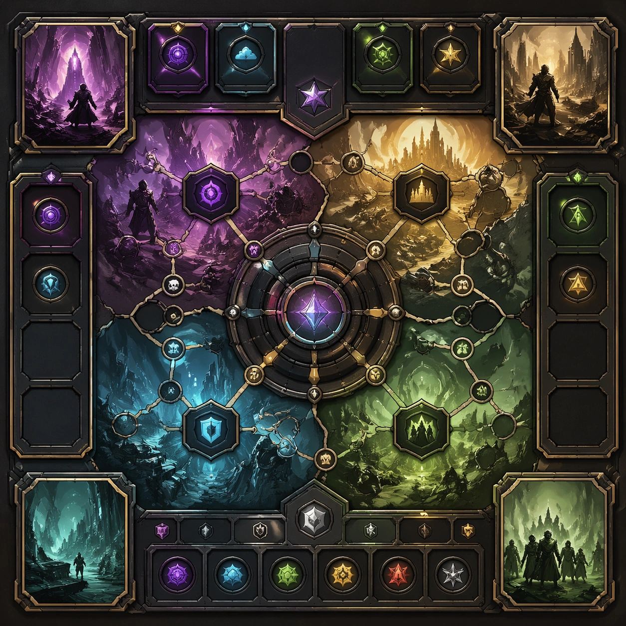
Scene: Create a square reference image for Launch Countdown Social Kit. Build a reference anchor establishing the core system with a premium, production-ready finish. Use a polished modular board or campaign surface with clean spacing, premium game-UI finish, and clear focal hierarchy. The composition should feel intentional, clean, and reusable for gallery, research, campaign, or internal handoff contexts. Lighting must support readability first, with the main forms clearly separated from the background and enough breathing room for the system to stay legible at both hero scale and thumbnail scale. Subject: Center a coherent original game-art system built for premium production and marketing surfaces. For this image, focus on reference anchor. Keep the same system logic stable across screenshots, cards, banners, and overview boards. This image is the canonical anchor that later series images must follow. The viewer should immediately understand what role this surface plays inside a cohesive game-production asset pack. Important details: Lock framing, icon grammar, palette blocking, and surface hierarchy so the kit feels production-ready and consistent. Preserve the core silhouette, framing language, and material logic from the reference image while each variation changes function. Keep materials believable, edge hierarchy disciplined, and the visual language consistent with Countdown Kit. Use abstract interface blocks or diagram accents when helpful, but avoid any readable language. The final result should feel like a deliberate production asset rather than a random illustration. Use case: Launch Countdown Social Kit series study 1/9, designed as reference anchor within a cohesive asset pack. Constraints: No readable text, no watermark, no logos, preserve exact 1:1 aspect ratio, no unrelated objects, no broken visual hierarchy, no malformed anatomy or broken perspective, no random decorative clutter.

Example generated from “Launch Countdown Social Kit — Variant One”
GPT Image 2en

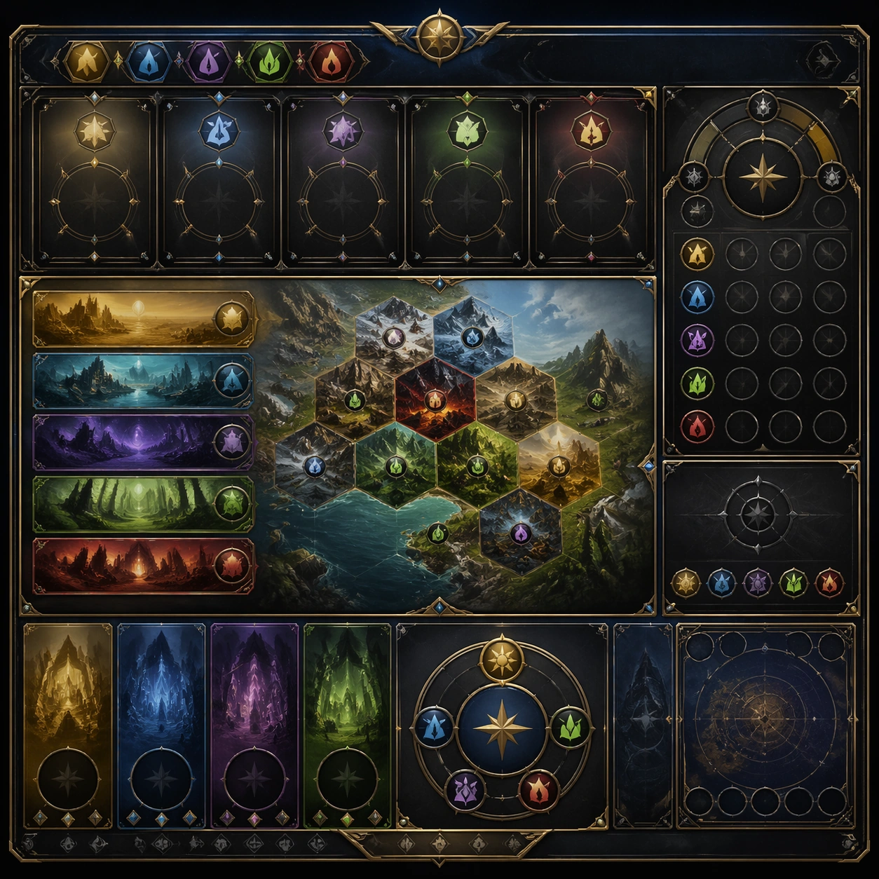
Scene: Create a square dependent image for Launch Countdown Social Kit. Build a first controlled variation in the same system with a premium, production-ready finish. Use a polished modular board or campaign surface with clean spacing, premium game-UI finish, and clear focal hierarchy. The composition should feel intentional, clean, and reusable for gallery, research, campaign, or internal handoff contexts. Lighting must support readability first, with the main forms clearly separated from the background and enough breathing room for the system to stay legible at both hero scale and thumbnail scale. Subject: Center a coherent original game-art system built for premium production and marketing surfaces. For this image, focus on the intended support surface. Keep the same system logic stable across screenshots, cards, banners, and overview boards. Preserve exact identity or system logic from the reference image while changing only the intended variation axis. The viewer should immediately understand what role this surface plays inside a cohesive game-production asset pack. Important details: Lock framing, icon grammar, palette blocking, and surface hierarchy so the kit feels production-ready and consistent. Preserve the core silhouette, framing language, and material logic from the reference image while each variation changes function. Keep materials believable, edge hierarchy disciplined, and the visual language consistent with Countdown Kit. Use abstract interface blocks or diagram accents when helpful, but avoid any readable language. The final result should feel like a deliberate production asset rather than a random illustration. Use case: Launch Countdown Social Kit series study 2/9, designed as variant one within a cohesive asset pack. Constraints: No readable text, no watermark, no logos, preserve exact 1:1 aspect ratio, no unrelated objects, no broken visual hierarchy, no malformed anatomy or broken perspective, no random decorative clutter.

Example generated from “Launch Countdown Social Kit — Variant Two”
GPT Image 2en

Scene: Create a square dependent image for Launch Countdown Social Kit. Build a second controlled variation in the same system with a premium, production-ready finish. Use a polished modular board or campaign surface with clean spacing, premium game-UI finish, and clear focal hierarchy. The composition should feel intentional, clean, and reusable for gallery, research, campaign, or internal handoff contexts. Lighting must support readability first, with the main forms clearly separated from the background and enough breathing room for the system to stay legible at both hero scale and thumbnail scale. Subject: Center a coherent original game-art system built for premium production and marketing surfaces. For this image, focus on the intended support surface. Keep the same system logic stable across screenshots, cards, banners, and overview boards. Preserve exact identity or system logic from the reference image while changing only the intended variation axis. The viewer should immediately understand what role this surface plays inside a cohesive game-production asset pack. Important details: Lock framing, icon grammar, palette blocking, and surface hierarchy so the kit feels production-ready and consistent. Preserve the core silhouette, framing language, and material logic from the reference image while each variation changes function. Keep materials believable, edge hierarchy disciplined, and the visual language consistent with Countdown Kit. Use abstract interface blocks or diagram accents when helpful, but avoid any readable language. The final result should feel like a deliberate production asset rather than a random illustration. Use case: Launch Countdown Social Kit series study 3/9, designed as variant two within a cohesive asset pack. Constraints: No readable text, no watermark, no logos, preserve exact 1:1 aspect ratio, no unrelated objects, no broken visual hierarchy, no malformed anatomy or broken perspective, no random decorative clutter.

Example generated from “Launch Countdown Social Kit — Variant Three”
GPT Image 2en

Scene: Create a square dependent image for Launch Countdown Social Kit. Build a third controlled variation in the same system with a premium, production-ready finish. Use a polished modular board or campaign surface with clean spacing, premium game-UI finish, and clear focal hierarchy. The composition should feel intentional, clean, and reusable for gallery, research, campaign, or internal handoff contexts. Lighting must support readability first, with the main forms clearly separated from the background and enough breathing room for the system to stay legible at both hero scale and thumbnail scale. Subject: Center a coherent original game-art system built for premium production and marketing surfaces. For this image, focus on the intended support surface. Keep the same system logic stable across screenshots, cards, banners, and overview boards. Preserve exact identity or system logic from the reference image while changing only the intended variation axis. The viewer should immediately understand what role this surface plays inside a cohesive game-production asset pack. Important details: Lock framing, icon grammar, palette blocking, and surface hierarchy so the kit feels production-ready and consistent. Preserve the core silhouette, framing language, and material logic from the reference image while each variation changes function. Keep materials believable, edge hierarchy disciplined, and the visual language consistent with Countdown Kit. Use abstract interface blocks or diagram accents when helpful, but avoid any readable language. The final result should feel like a deliberate production asset rather than a random illustration. Use case: Launch Countdown Social Kit series study 4/9, designed as variant three within a cohesive asset pack. Constraints: No readable text, no watermark, no logos, preserve exact 1:1 aspect ratio, no unrelated objects, no broken visual hierarchy, no malformed anatomy or broken perspective, no random decorative clutter.

Example generated from “Launch Countdown Social Kit — Support One”
GPT Image 2en

Scene: Create a square standalone support image for Launch Countdown Social Kit. Build a support-surface study with a clear focal hierarchy and a finished professional surface. Use a polished modular board or campaign surface with clean spacing, premium game-UI finish, and clear focal hierarchy. The frame should feel self-contained and polished, with enough structure to explain the system even without the reference series, yet still obviously belonging to the same theme and production world. Subject: Show a coherent original game-art system built for premium production and marketing surfaces in a way that emphasizes the intended support surface. Keep the same system logic stable across screenshots, cards, banners, and overview boards. Even though this image is independent, the viewer should still recognize the same universe, same commercial logic, and same production intent as the core package. Important details: Lock framing, icon grammar, palette blocking, and surface hierarchy so the kit feels production-ready and consistent. Preserve the broader theme language through color, framing, material choices, and modular composition. Use clean panel rhythm, premium asset presentation, and believable detail density. The image should work equally well as a gallery study, research reference, and mock production deliverable. Use case: Launch Countdown Social Kit single study 5/9, exploring support one as a support surface. Constraints: No readable text, no watermark, no logos, preserve exact 1:1 aspect ratio, no unrelated objects, no broken visual hierarchy, no visual noise that obscures the main surface, no accidental brand resemblance.

Example generated from “Launch Countdown Social Kit — Support Two”
GPT Image 2en

Scene: Create a square standalone support image for Launch Countdown Social Kit. Build a second support-surface study with a clear focal hierarchy and a finished professional surface. Use a polished modular board or campaign surface with clean spacing, premium game-UI finish, and clear focal hierarchy. The frame should feel self-contained and polished, with enough structure to explain the system even without the reference series, yet still obviously belonging to the same theme and production world. Subject: Show a coherent original game-art system built for premium production and marketing surfaces in a way that emphasizes the intended support surface. Keep the same system logic stable across screenshots, cards, banners, and overview boards. Even though this image is independent, the viewer should still recognize the same universe, same commercial logic, and same production intent as the core package. Important details: Lock framing, icon grammar, palette blocking, and surface hierarchy so the kit feels production-ready and consistent. Preserve the broader theme language through color, framing, material choices, and modular composition. Use clean panel rhythm, premium asset presentation, and believable detail density. The image should work equally well as a gallery study, research reference, and mock production deliverable. Use case: Launch Countdown Social Kit single study 6/9, exploring support two as a support surface. Constraints: No readable text, no watermark, no logos, preserve exact 1:1 aspect ratio, no unrelated objects, no broken visual hierarchy, no visual noise that obscures the main surface, no accidental brand resemblance.

Example generated from “Launch Countdown Social Kit — Support Three”
GPT Image 2en

Scene: Create a square standalone support image for Launch Countdown Social Kit. Build a third support-surface study with a clear focal hierarchy and a finished professional surface. Use a polished modular board or campaign surface with clean spacing, premium game-UI finish, and clear focal hierarchy. The frame should feel self-contained and polished, with enough structure to explain the system even without the reference series, yet still obviously belonging to the same theme and production world. Subject: Show a coherent original game-art system built for premium production and marketing surfaces in a way that emphasizes the intended support surface. Keep the same system logic stable across screenshots, cards, banners, and overview boards. Even though this image is independent, the viewer should still recognize the same universe, same commercial logic, and same production intent as the core package. Important details: Lock framing, icon grammar, palette blocking, and surface hierarchy so the kit feels production-ready and consistent. Preserve the broader theme language through color, framing, material choices, and modular composition. Use clean panel rhythm, premium asset presentation, and believable detail density. The image should work equally well as a gallery study, research reference, and mock production deliverable. Use case: Launch Countdown Social Kit single study 7/9, exploring support three as a support surface. Constraints: No readable text, no watermark, no logos, preserve exact 1:1 aspect ratio, no unrelated objects, no broken visual hierarchy, no visual noise that obscures the main surface, no accidental brand resemblance.

Example generated from “Launch Countdown Social Kit — Support Four”
GPT Image 2en

Scene: Create a square standalone support image for Launch Countdown Social Kit. Build a fourth support-surface study with a clear focal hierarchy and a finished professional surface. Use a polished modular board or campaign surface with clean spacing, premium game-UI finish, and clear focal hierarchy. The frame should feel self-contained and polished, with enough structure to explain the system even without the reference series, yet still obviously belonging to the same theme and production world. Subject: Show a coherent original game-art system built for premium production and marketing surfaces in a way that emphasizes the intended support surface. Keep the same system logic stable across screenshots, cards, banners, and overview boards. Even though this image is independent, the viewer should still recognize the same universe, same commercial logic, and same production intent as the core package. Important details: Lock framing, icon grammar, palette blocking, and surface hierarchy so the kit feels production-ready and consistent. Preserve the broader theme language through color, framing, material choices, and modular composition. Use clean panel rhythm, premium asset presentation, and believable detail density. The image should work equally well as a gallery study, research reference, and mock production deliverable. Use case: Launch Countdown Social Kit single study 8/9, exploring support four as a support surface. Constraints: No readable text, no watermark, no logos, preserve exact 1:1 aspect ratio, no unrelated objects, no broken visual hierarchy, no visual noise that obscures the main surface, no accidental brand resemblance.

Example generated from “Launch Countdown Social Kit — Support Five”
GPT Image 2en

Scene: Create a square standalone support image for Launch Countdown Social Kit. Build a fifth support-surface study with a clear focal hierarchy and a finished professional surface. Use a polished modular board or campaign surface with clean spacing, premium game-UI finish, and clear focal hierarchy. The frame should feel self-contained and polished, with enough structure to explain the system even without the reference series, yet still obviously belonging to the same theme and production world. Subject: Show a coherent original game-art system built for premium production and marketing surfaces in a way that emphasizes the intended support surface. Keep the same system logic stable across screenshots, cards, banners, and overview boards. Even though this image is independent, the viewer should still recognize the same universe, same commercial logic, and same production intent as the core package. Important details: Lock framing, icon grammar, palette blocking, and surface hierarchy so the kit feels production-ready and consistent. Preserve the broader theme language through color, framing, material choices, and modular composition. Use clean panel rhythm, premium asset presentation, and believable detail density. The image should work equally well as a gallery study, research reference, and mock production deliverable. Use case: Launch Countdown Social Kit single study 9/9, exploring support five as a support surface. Constraints: No readable text, no watermark, no logos, preserve exact 1:1 aspect ratio, no unrelated objects, no broken visual hierarchy, no visual noise that obscures the main surface, no accidental brand resemblance.

Example generated from “Launch Recap Comic Carousel — Reference Anchor”
GPT Image 2en

Scene: Create a square reference image for Launch Recap Comic Carousel. Build a reference anchor establishing the core system with a premium, production-ready finish. Use a polished modular board or campaign surface with clean spacing, premium game-UI finish, and clear focal hierarchy. The composition should feel intentional, clean, and reusable for gallery, research, campaign, or internal handoff contexts. Lighting must support readability first, with the main forms clearly separated from the background and enough breathing room for the system to stay legible at both hero scale and thumbnail scale. Subject: Center a coherent original game-art system built for premium production and marketing surfaces. For this image, focus on reference anchor. Keep the same system logic stable across screenshots, cards, banners, and overview boards. This image is the canonical anchor that later series images must follow. The viewer should immediately understand what role this surface plays inside a cohesive game-production asset pack. Important details: Lock framing, icon grammar, palette blocking, and surface hierarchy so the kit feels production-ready and consistent. Preserve the core silhouette, framing language, and material logic from the reference image while each variation changes function. Keep materials believable, edge hierarchy disciplined, and the visual language consistent with Recap Carousel. Use abstract interface blocks or diagram accents when helpful, but avoid any readable language. The final result should feel like a deliberate production asset rather than a random illustration. Use case: Launch Recap Comic Carousel series study 1/9, designed as reference anchor within a cohesive asset pack. Constraints: No readable text, no watermark, no logos, preserve exact 1:1 aspect ratio, no unrelated objects, no broken visual hierarchy, no malformed anatomy or broken perspective, no random decorative clutter.

Example generated from “Launch Recap Comic Carousel — Variant One”
GPT Image 2en

Scene: Create a square dependent image for Launch Recap Comic Carousel. Build a first controlled variation in the same system with a premium, production-ready finish. Use a polished modular board or campaign surface with clean spacing, premium game-UI finish, and clear focal hierarchy. The composition should feel intentional, clean, and reusable for gallery, research, campaign, or internal handoff contexts. Lighting must support readability first, with the main forms clearly separated from the background and enough breathing room for the system to stay legible at both hero scale and thumbnail scale. Subject: Center a coherent original game-art system built for premium production and marketing surfaces. For this image, focus on the intended support surface. Keep the same system logic stable across screenshots, cards, banners, and overview boards. Preserve exact identity or system logic from the reference image while changing only the intended variation axis. The viewer should immediately understand what role this surface plays inside a cohesive game-production asset pack. Important details: Lock framing, icon grammar, palette blocking, and surface hierarchy so the kit feels production-ready and consistent. Preserve the core silhouette, framing language, and material logic from the reference image while each variation changes function. Keep materials believable, edge hierarchy disciplined, and the visual language consistent with Recap Carousel. Use abstract interface blocks or diagram accents when helpful, but avoid any readable language. The final result should feel like a deliberate production asset rather than a random illustration. Use case: Launch Recap Comic Carousel series study 2/9, designed as variant one within a cohesive asset pack. Constraints: No readable text, no watermark, no logos, preserve exact 1:1 aspect ratio, no unrelated objects, no broken visual hierarchy, no malformed anatomy or broken perspective, no random decorative clutter.

Example generated from “Launch Recap Comic Carousel — Variant Two”
GPT Image 2en

Scene: Create a square dependent image for Launch Recap Comic Carousel. Build a second controlled variation in the same system with a premium, production-ready finish. Use a polished modular board or campaign surface with clean spacing, premium game-UI finish, and clear focal hierarchy. The composition should feel intentional, clean, and reusable for gallery, research, campaign, or internal handoff contexts. Lighting must support readability first, with the main forms clearly separated from the background and enough breathing room for the system to stay legible at both hero scale and thumbnail scale. Subject: Center a coherent original game-art system built for premium production and marketing surfaces. For this image, focus on the intended support surface. Keep the same system logic stable across screenshots, cards, banners, and overview boards. Preserve exact identity or system logic from the reference image while changing only the intended variation axis. The viewer should immediately understand what role this surface plays inside a cohesive game-production asset pack. Important details: Lock framing, icon grammar, palette blocking, and surface hierarchy so the kit feels production-ready and consistent. Preserve the core silhouette, framing language, and material logic from the reference image while each variation changes function. Keep materials believable, edge hierarchy disciplined, and the visual language consistent with Recap Carousel. Use abstract interface blocks or diagram accents when helpful, but avoid any readable language. The final result should feel like a deliberate production asset rather than a random illustration. Use case: Launch Recap Comic Carousel series study 3/9, designed as variant two within a cohesive asset pack. Constraints: No readable text, no watermark, no logos, preserve exact 1:1 aspect ratio, no unrelated objects, no broken visual hierarchy, no malformed anatomy or broken perspective, no random decorative clutter.

Example generated from “Launch Recap Comic Carousel — Variant Three”
GPT Image 2en

Scene: Create a square dependent image for Launch Recap Comic Carousel. Build a third controlled variation in the same system with a premium, production-ready finish. Use a polished modular board or campaign surface with clean spacing, premium game-UI finish, and clear focal hierarchy. The composition should feel intentional, clean, and reusable for gallery, research, campaign, or internal handoff contexts. Lighting must support readability first, with the main forms clearly separated from the background and enough breathing room for the system to stay legible at both hero scale and thumbnail scale. Subject: Center a coherent original game-art system built for premium production and marketing surfaces. For this image, focus on the intended support surface. Keep the same system logic stable across screenshots, cards, banners, and overview boards. Preserve exact identity or system logic from the reference image while changing only the intended variation axis. The viewer should immediately understand what role this surface plays inside a cohesive game-production asset pack. Important details: Lock framing, icon grammar, palette blocking, and surface hierarchy so the kit feels production-ready and consistent. Preserve the core silhouette, framing language, and material logic from the reference image while each variation changes function. Keep materials believable, edge hierarchy disciplined, and the visual language consistent with Recap Carousel. Use abstract interface blocks or diagram accents when helpful, but avoid any readable language. The final result should feel like a deliberate production asset rather than a random illustration. Use case: Launch Recap Comic Carousel series study 4/9, designed as variant three within a cohesive asset pack. Constraints: No readable text, no watermark, no logos, preserve exact 1:1 aspect ratio, no unrelated objects, no broken visual hierarchy, no malformed anatomy or broken perspective, no random decorative clutter.

Example generated from “Launch Recap Comic Carousel — Support One”
GPT Image 2en

Scene: Create a square standalone support image for Launch Recap Comic Carousel. Build a support-surface study with a clear focal hierarchy and a finished professional surface. Use a polished modular board or campaign surface with clean spacing, premium game-UI finish, and clear focal hierarchy. The frame should feel self-contained and polished, with enough structure to explain the system even without the reference series, yet still obviously belonging to the same theme and production world. Subject: Show a coherent original game-art system built for premium production and marketing surfaces in a way that emphasizes the intended support surface. Keep the same system logic stable across screenshots, cards, banners, and overview boards. Even though this image is independent, the viewer should still recognize the same universe, same commercial logic, and same production intent as the core package. Important details: Lock framing, icon grammar, palette blocking, and surface hierarchy so the kit feels production-ready and consistent. Preserve the broader theme language through color, framing, material choices, and modular composition. Use clean panel rhythm, premium asset presentation, and believable detail density. The image should work equally well as a gallery study, research reference, and mock production deliverable. Use case: Launch Recap Comic Carousel single study 5/9, exploring support one as a support surface. Constraints: No readable text, no watermark, no logos, preserve exact 1:1 aspect ratio, no unrelated objects, no broken visual hierarchy, no visual noise that obscures the main surface, no accidental brand resemblance.

Example generated from “Launch Recap Comic Carousel — Support Two”
GPT Image 2en

Scene: Create a square standalone support image for Launch Recap Comic Carousel. Build a second support-surface study with a clear focal hierarchy and a finished professional surface. Use a polished modular board or campaign surface with clean spacing, premium game-UI finish, and clear focal hierarchy. The frame should feel self-contained and polished, with enough structure to explain the system even without the reference series, yet still obviously belonging to the same theme and production world. Subject: Show a coherent original game-art system built for premium production and marketing surfaces in a way that emphasizes the intended support surface. Keep the same system logic stable across screenshots, cards, banners, and overview boards. Even though this image is independent, the viewer should still recognize the same universe, same commercial logic, and same production intent as the core package. Important details: Lock framing, icon grammar, palette blocking, and surface hierarchy so the kit feels production-ready and consistent. Preserve the broader theme language through color, framing, material choices, and modular composition. Use clean panel rhythm, premium asset presentation, and believable detail density. The image should work equally well as a gallery study, research reference, and mock production deliverable. Use case: Launch Recap Comic Carousel single study 6/9, exploring support two as a support surface. Constraints: No readable text, no watermark, no logos, preserve exact 1:1 aspect ratio, no unrelated objects, no broken visual hierarchy, no visual noise that obscures the main surface, no accidental brand resemblance.

Example generated from “Launch Recap Comic Carousel — Support Three”
GPT Image 2en

Scene: Create a square standalone support image for Launch Recap Comic Carousel. Build a third support-surface study with a clear focal hierarchy and a finished professional surface. Use a polished modular board or campaign surface with clean spacing, premium game-UI finish, and clear focal hierarchy. The frame should feel self-contained and polished, with enough structure to explain the system even without the reference series, yet still obviously belonging to the same theme and production world. Subject: Show a coherent original game-art system built for premium production and marketing surfaces in a way that emphasizes the intended support surface. Keep the same system logic stable across screenshots, cards, banners, and overview boards. Even though this image is independent, the viewer should still recognize the same universe, same commercial logic, and same production intent as the core package. Important details: Lock framing, icon grammar, palette blocking, and surface hierarchy so the kit feels production-ready and consistent. Preserve the broader theme language through color, framing, material choices, and modular composition. Use clean panel rhythm, premium asset presentation, and believable detail density. The image should work equally well as a gallery study, research reference, and mock production deliverable. Use case: Launch Recap Comic Carousel single study 7/9, exploring support three as a support surface. Constraints: No readable text, no watermark, no logos, preserve exact 1:1 aspect ratio, no unrelated objects, no broken visual hierarchy, no visual noise that obscures the main surface, no accidental brand resemblance.

Example generated from “Launch Recap Comic Carousel — Support Four”
GPT Image 2en

Scene: Create a square standalone support image for Launch Recap Comic Carousel. Build a fourth support-surface study with a clear focal hierarchy and a finished professional surface. Use a polished modular board or campaign surface with clean spacing, premium game-UI finish, and clear focal hierarchy. The frame should feel self-contained and polished, with enough structure to explain the system even without the reference series, yet still obviously belonging to the same theme and production world. Subject: Show a coherent original game-art system built for premium production and marketing surfaces in a way that emphasizes the intended support surface. Keep the same system logic stable across screenshots, cards, banners, and overview boards. Even though this image is independent, the viewer should still recognize the same universe, same commercial logic, and same production intent as the core package. Important details: Lock framing, icon grammar, palette blocking, and surface hierarchy so the kit feels production-ready and consistent. Preserve the broader theme language through color, framing, material choices, and modular composition. Use clean panel rhythm, premium asset presentation, and believable detail density. The image should work equally well as a gallery study, research reference, and mock production deliverable. Use case: Launch Recap Comic Carousel single study 8/9, exploring support four as a support surface. Constraints: No readable text, no watermark, no logos, preserve exact 1:1 aspect ratio, no unrelated objects, no broken visual hierarchy, no visual noise that obscures the main surface, no accidental brand resemblance.

Example generated from “Launch Recap Comic Carousel — Support Five”
GPT Image 2en

Scene: Create a square standalone support image for Launch Recap Comic Carousel. Build a fifth support-surface study with a clear focal hierarchy and a finished professional surface. Use a polished modular board or campaign surface with clean spacing, premium game-UI finish, and clear focal hierarchy. The frame should feel self-contained and polished, with enough structure to explain the system even without the reference series, yet still obviously belonging to the same theme and production world. Subject: Show a coherent original game-art system built for premium production and marketing surfaces in a way that emphasizes the intended support surface. Keep the same system logic stable across screenshots, cards, banners, and overview boards. Even though this image is independent, the viewer should still recognize the same universe, same commercial logic, and same production intent as the core package. Important details: Lock framing, icon grammar, palette blocking, and surface hierarchy so the kit feels production-ready and consistent. Preserve the broader theme language through color, framing, material choices, and modular composition. Use clean panel rhythm, premium asset presentation, and believable detail density. The image should work equally well as a gallery study, research reference, and mock production deliverable. Use case: Launch Recap Comic Carousel single study 9/9, exploring support five as a support surface. Constraints: No readable text, no watermark, no logos, preserve exact 1:1 aspect ratio, no unrelated objects, no broken visual hierarchy, no visual noise that obscures the main surface, no accidental brand resemblance.

Example generated from “League Season Launch Visual Kit — Reference League Launch”
GPT Image 2en

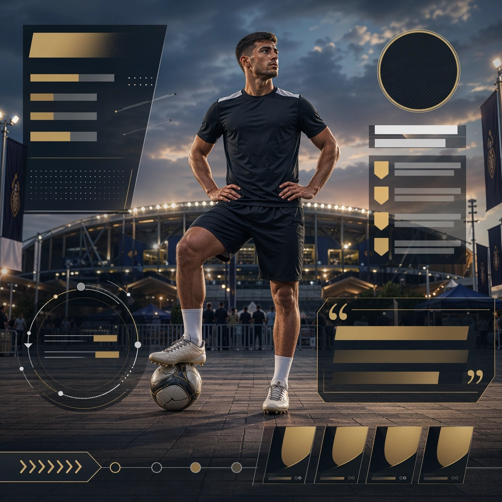
Scene: Create a square season launch hero visual for League Launch, using a fictional major-tournament launch world with arena haze, graphite and silver materials, and prestige-oriented lighting. The frame should feel commercial, polished, and immediately useful for a real client deliverable rather than a one-off art experiment. Keep the composition readable at thumbnail scale while still rewarding a closer look with layered depth, clean negative space, and strong directional light. Build the image so it clearly supports sports communication, with enough modular structure to imply information architecture without relying on literal words. Subject: Center the image on a cast of original athletes organized into a clear hero hierarchy with one lead figure and supporting contenders, arranged as hero athlete plus supporting cast. Treat the subject as original and brandless, with believable apparel construction, realistic body proportions, and strong emotional legibility. Surround the subject with supporting environmental cues that reinforce the category but never overpower the main figure. All secondary objects, props, and background elements should strengthen the same professional sports or fitness context. Important details: This first image must establish the full reference system for later derivatives: neutral league-like geometry, non-readable schedule blocks, and event-scale campaign framing. The emotional tone should read as official anticipation. Make the visual language reusable, disciplined, and commercially credible, with clean edges, coherent light behavior, and obvious hierarchy. Abstract panels, diagram bands, or stat-like modules are welcome, but they must remain non-readable and subordinate to the main visual message. The result should feel original, specific, and ready to anchor a larger package. Use case: League Launch series study 1/9, the reference image for the package. Constraints: No readable text, no watermark, no logos, preserve exact 1:1 aspect ratio, no brand marks, no copied famous team or product identity, no generic stock-photo stiffness, no cluttered background noise, no celebrity likenesses.
Example generated from “League Season Launch Visual Kit — Division Schedule Board”
GPT Image 2en

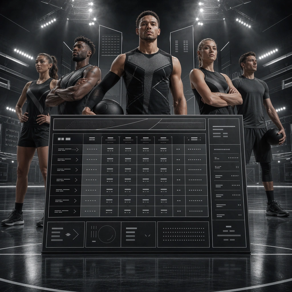
Scene: Build a square division schedule board derived from the reference image for League Launch. Preserve the exact world established by the reference image, including the same palette family, lighting direction, environmental logic, and surface finish. The new frame should feel like a deliberate extension of one campaign system, not a separate concept. Shift the hierarchy to suit this use case, but keep the overall composition commercial, polished, and ready for real rollout. Subject: Use the same original subject identity and anchor cues introduced by the reference image, now organized as cast reduced behind calendar structure. Keep faces, hair logic, body proportions, apparel or product construction, and major supporting forms consistent with the reference. Allow only the layout emphasis, pose, crop, and contextual energy to change so the result clearly belongs to the same package. Important details: Continuity is the main challenge. Preserve the exact reference language for color, materials, framing rhythm, and overall brandless campaign grammar while steering the tone toward organized readiness. Keep any stat blocks, schedule modules, arrows, badges, or callout panels non-readable. The derivative should prove that the same art direction can handle a different communication task without losing identity or utility. Make it credible for production use, with clean edges, intentional spacing, and no random decorative elements. Use case: League Launch series study 2/9, a derivative surface linked to 01-reference-league-launch. Constraints: No readable text, no watermark, no logos, preserve exact 1:1 aspect ratio, no new subject identity, no brand marks, no palette drift, no unrelated props, no collage chaos, no copied public-figure styling.

Example generated from “League Season Launch Visual Kit — Star Cast Poster”
GPT Image 2en

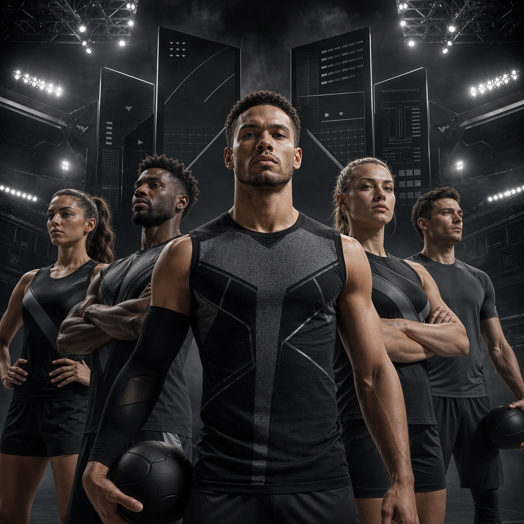
Scene: Build a square star cast hero poster derived from the reference image for League Launch. Preserve the exact world established by the reference image, including the same palette family, lighting direction, environmental logic, and surface finish. The new frame should feel like a deliberate extension of one campaign system, not a separate concept. Shift the hierarchy to suit this use case, but keep the overall composition commercial, polished, and ready for real rollout. Subject: Use the same original subject identity and anchor cues introduced by the reference image, now organized as same cast pushed closer. Keep faces, hair logic, body proportions, apparel or product construction, and major supporting forms consistent with the reference. Allow only the layout emphasis, pose, crop, and contextual energy to change so the result clearly belongs to the same package. Important details: Continuity is the main challenge. Preserve the exact reference language for color, materials, framing rhythm, and overall brandless campaign grammar while steering the tone toward portrait-led prestige. Keep any stat blocks, schedule modules, arrows, badges, or callout panels non-readable. The derivative should prove that the same art direction can handle a different communication task without losing identity or utility. Make it credible for production use, with clean edges, intentional spacing, and no random decorative elements. Use case: League Launch series study 3/9, a derivative surface linked to 01-reference-league-launch. Constraints: No readable text, no watermark, no logos, preserve exact 1:1 aspect ratio, no new subject identity, no brand marks, no palette drift, no unrelated props, no collage chaos, no copied public-figure styling.

Example generated from “League Season Launch Visual Kit — Trophy Countdown Variant”
GPT Image 2en

Scene: Build a square trophy countdown variant derived from the reference image for League Launch. Preserve the exact world established by the reference image, including the same palette family, lighting direction, environmental logic, and surface finish. The new frame should feel like a deliberate extension of one campaign system, not a separate concept. Shift the hierarchy to suit this use case, but keep the overall composition commercial, polished, and ready for real rollout. Subject: Use the same original subject identity and anchor cues introduced by the reference image, now organized as lead athlete facing distant prize silhouette. Keep faces, hair logic, body proportions, apparel or product construction, and major supporting forms consistent with the reference. Allow only the layout emphasis, pose, crop, and contextual energy to change so the result clearly belongs to the same package. Important details: Continuity is the main challenge. Preserve the exact reference language for color, materials, framing rhythm, and overall brandless campaign grammar while steering the tone toward forward-looking suspense. Keep any stat blocks, schedule modules, arrows, badges, or callout panels non-readable. The derivative should prove that the same art direction can handle a different communication task without losing identity or utility. Make it credible for production use, with clean edges, intentional spacing, and no random decorative elements. Use case: League Launch series study 4/9, a derivative surface linked to 01-reference-league-launch. Constraints: No readable text, no watermark, no logos, preserve exact 1:1 aspect ratio, no new subject identity, no brand marks, no palette drift, no unrelated props, no collage chaos, no copied public-figure styling.

Example generated from “League Season Launch Visual Kit — Host City Banner Board”
GPT Image 2en

Scene: Create a square host city support board for League Launch, using season-opening sports marketing with schedule-ready layout logic, neutral league prestige, and event-scale atmosphere. The composition should read as a practical, production-ready sports or fitness surface with a clear hierarchy, premium lighting, and obvious commercial intent. Keep the environment specific enough to feel real, but leave enough control in the layout for non-readable information modules, campaign blocks, or visualized metrics. Aim for a finish that works for a brand, club, app, academy, or event operator. Subject: Build the image around athlete near stadium plaza. The subject should be original, believable, and free of any real-brand or celebrity cues. Use realistic apparel, safe body mechanics when movement is visible, and environmental props that support the category without clutter. The subject must stay visually dominant so the design still works as a communication asset rather than a pure scene study. Important details: The mood should read as civic event polish. Treat layout, light, and supporting graphic structure as part of one polished delivery surface. Any schedule blocks, metric panels, quote zones, badges, or path diagrams must stay abstract and non-readable. Prioritize usefulness, clarity, and category truth over spectacle. The image should feel distinct from the series package while still belonging naturally to the same topic and business use case. Use case: League Launch single study 6/9, an independent rollout surface for the topic. Constraints: No readable text, no watermark, no logos, preserve exact 1:1 aspect ratio, no brand marks, no public-figure resemblance, no generic stock layout, no cluttered UI imitation, no accidental copyrighted insignia.

Example generated from “League Season Launch Visual Kit — Bracket Energy Card”
GPT Image 2en

Scene: Create a square bracket energy teaser for League Launch, using season-opening sports marketing with schedule-ready layout logic, neutral league prestige, and event-scale atmosphere. The composition should read as a practical, production-ready sports or fitness surface with a clear hierarchy, premium lighting, and obvious commercial intent. Keep the environment specific enough to feel real, but leave enough control in the layout for non-readable information modules, campaign blocks, or visualized metrics. Aim for a finish that works for a brand, club, app, academy, or event operator. Subject: Build the image around mirrored contender pair. The subject should be original, believable, and free of any real-brand or celebrity cues. Use realistic apparel, safe body mechanics when movement is visible, and environmental props that support the category without clutter. The subject must stay visually dominant so the design still works as a communication asset rather than a pure scene study. Important details: The mood should read as structural tension. Treat layout, light, and supporting graphic structure as part of one polished delivery surface. Any schedule blocks, metric panels, quote zones, badges, or path diagrams must stay abstract and non-readable. Prioritize usefulness, clarity, and category truth over spectacle. The image should feel distinct from the series package while still belonging naturally to the same topic and business use case. Use case: League Launch single study 7/9, an independent rollout surface for the topic. Constraints: No readable text, no watermark, no logos, preserve exact 1:1 aspect ratio, no brand marks, no public-figure resemblance, no generic stock layout, no cluttered UI imitation, no accidental copyrighted insignia.

Example generated from “League Season Launch Visual Kit — Broadcast Toolkit Cover”
GPT Image 2en

Scene: Create a square broadcast toolkit cover for League Launch, using season-opening sports marketing with schedule-ready layout logic, neutral league prestige, and event-scale atmosphere. The composition should read as a practical, production-ready sports or fitness surface with a clear hierarchy, premium lighting, and obvious commercial intent. Keep the environment specific enough to feel real, but leave enough control in the layout for non-readable information modules, campaign blocks, or visualized metrics. Aim for a finish that works for a brand, club, app, academy, or event operator. Subject: Build the image around single athlete with utility framing. The subject should be original, believable, and free of any real-brand or celebrity cues. Use realistic apparel, safe body mechanics when movement is visible, and environmental props that support the category without clutter. The subject must stay visually dominant so the design still works as a communication asset rather than a pure scene study. Important details: The mood should read as operational clarity. Treat layout, light, and supporting graphic structure as part of one polished delivery surface. Any schedule blocks, metric panels, quote zones, badges, or path diagrams must stay abstract and non-readable. Prioritize usefulness, clarity, and category truth over spectacle. The image should feel distinct from the series package while still belonging naturally to the same topic and business use case. Use case: League Launch single study 8/9, an independent rollout surface for the topic. Constraints: No readable text, no watermark, no logos, preserve exact 1:1 aspect ratio, no brand marks, no public-figure resemblance, no generic stock layout, no cluttered UI imitation, no accidental copyrighted insignia.

Example generated from “League Season Launch Visual Kit — Ticketing Mood Board”
GPT Image 2en

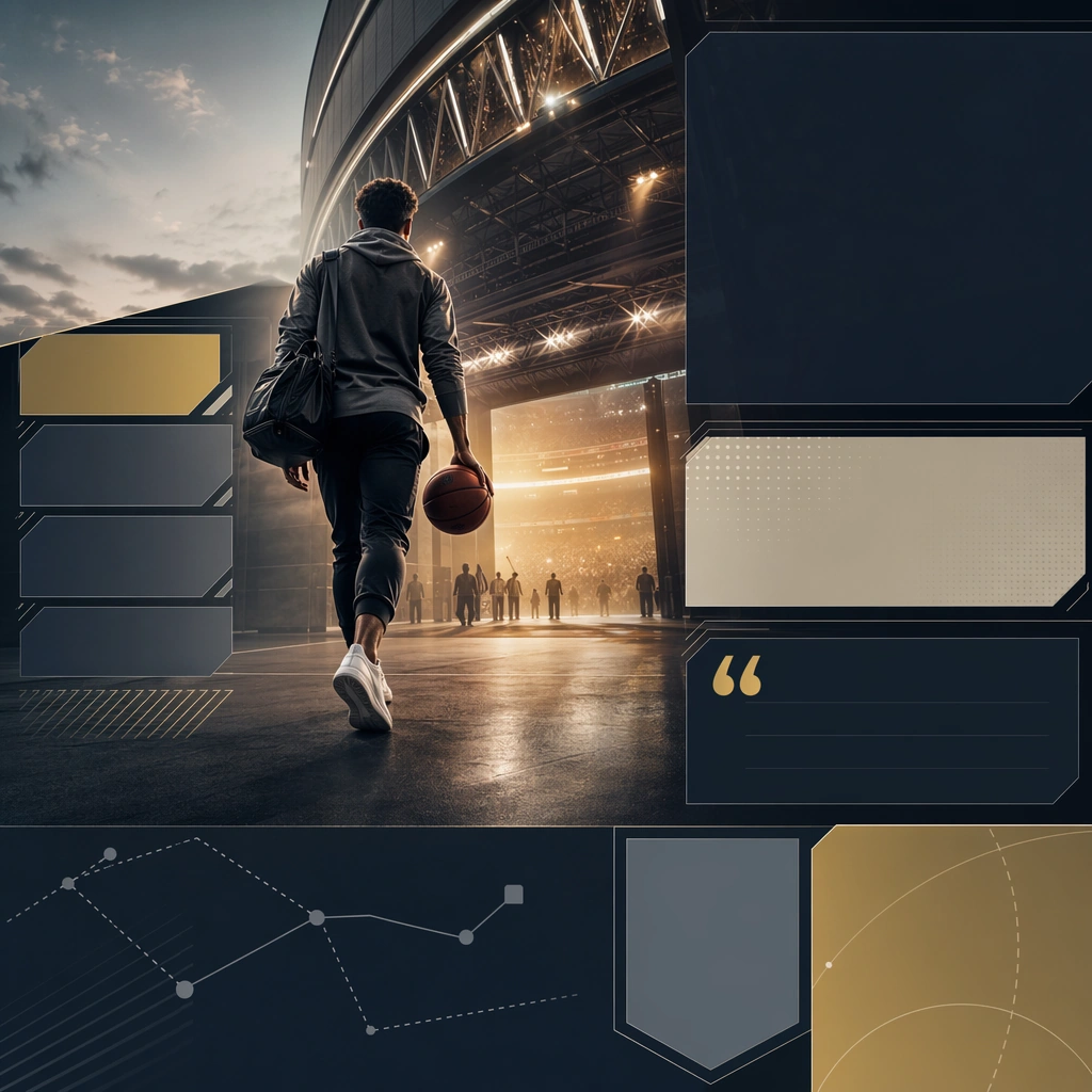
Scene: Create a square ticketing mood board for League Launch, using season-opening sports marketing with schedule-ready layout logic, neutral league prestige, and event-scale atmosphere. The composition should read as a practical, production-ready sports or fitness surface with a clear hierarchy, premium lighting, and obvious commercial intent. Keep the environment specific enough to feel real, but leave enough control in the layout for non-readable information modules, campaign blocks, or visualized metrics. Aim for a finish that works for a brand, club, app, academy, or event operator. Subject: Build the image around fan or athlete moving toward venue threshold. The subject should be original, believable, and free of any real-brand or celebrity cues. Use realistic apparel, safe body mechanics when movement is visible, and environmental props that support the category without clutter. The subject must stay visually dominant so the design still works as a communication asset rather than a pure scene study. Important details: The mood should read as entry anticipation. Treat layout, light, and supporting graphic structure as part of one polished delivery surface. Any schedule blocks, metric panels, quote zones, badges, or path diagrams must stay abstract and non-readable. Prioritize usefulness, clarity, and category truth over spectacle. The image should feel distinct from the series package while still belonging naturally to the same topic and business use case. Use case: League Launch single study 9/9, an independent rollout surface for the topic. Constraints: No readable text, no watermark, no logos, preserve exact 1:1 aspect ratio, no brand marks, no public-figure resemblance, no generic stock layout, no cluttered UI imitation, no accidental copyrighted insignia.

Example generated from “Learning App Onboarding And Lesson Ui — Reference Onboarding Stack”
GPT Image 2en

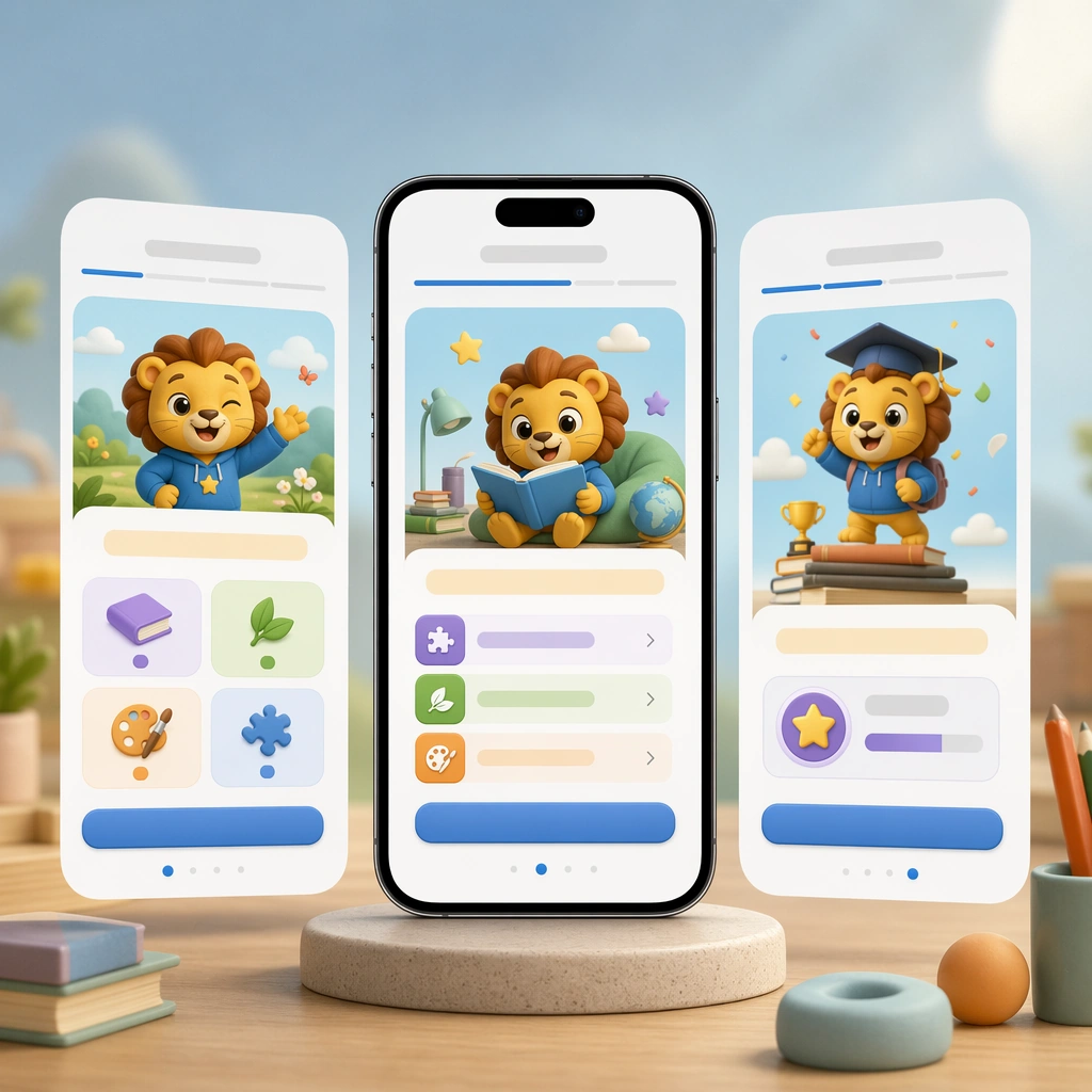
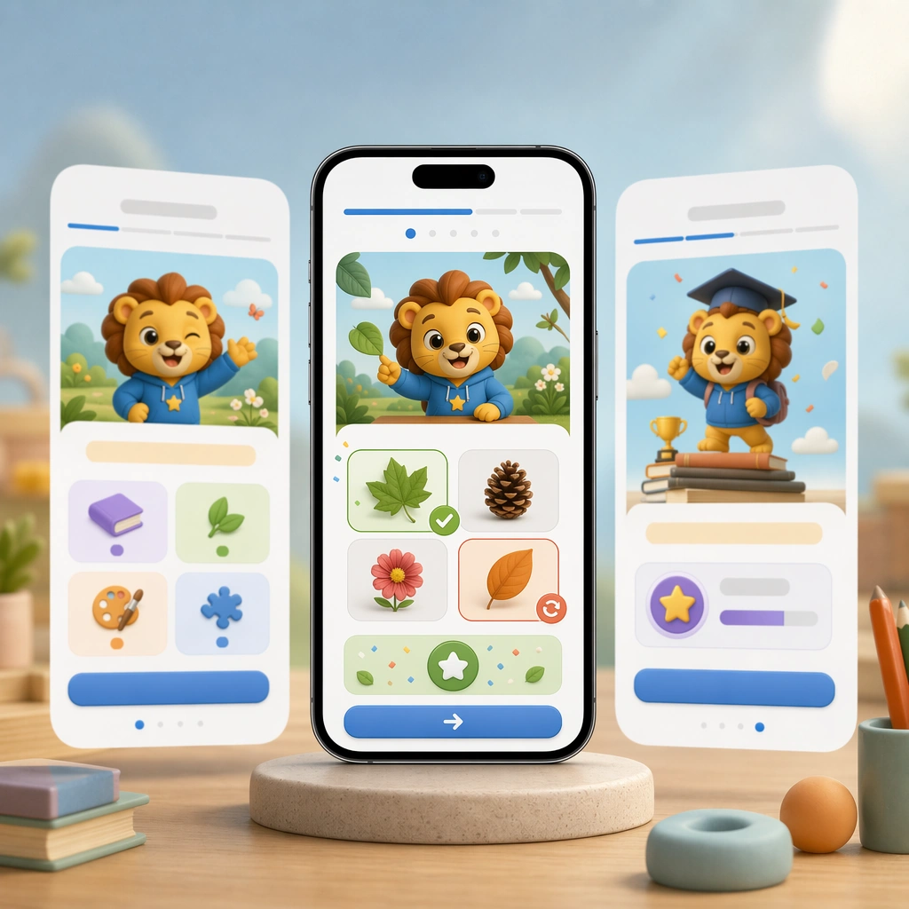
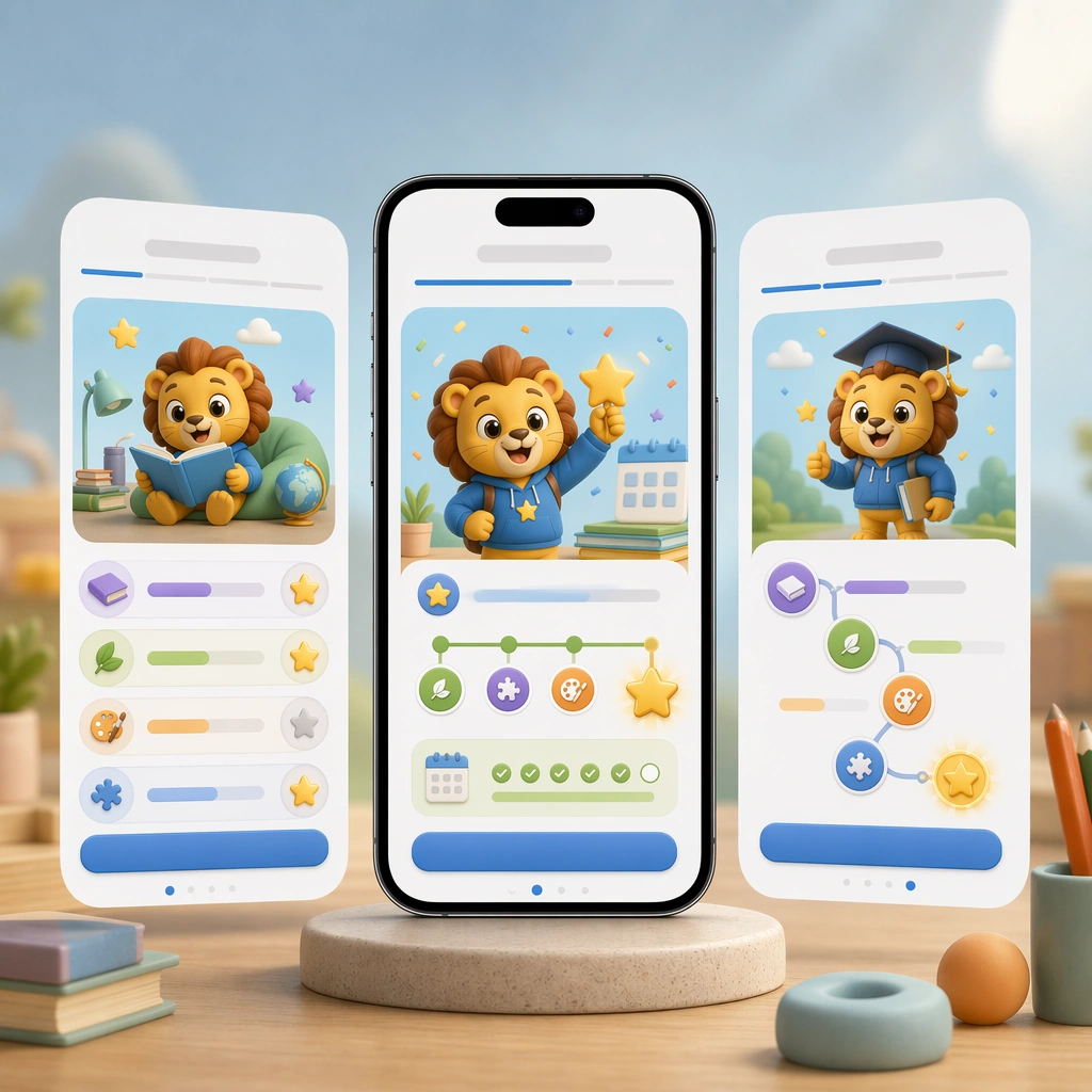
Scene: Create a square product-shot composition featuring a smartphone and two floating companion screens on a soft atmospheric backdrop, with polished device reflections and bright friendly lighting. The image should feel like a premium mobile-app campaign visual for parents, teachers, and product teams reviewing the initial onboarding flow. Keep the square frame balanced, calm, and production-ready so the asset can serve gallery review, research comparison, and real educational delivery at the same time. Subject: Show an onboarding sequence with a cheerful mascot, illustrated skill categories, large tappable cards, progress dots, and empty headline bars. The UI must be unmistakably made for children but disciplined enough for a real shipping product, balancing delight with clarity and accessible spacing. The subject matter should feel intentionally selected for a coherent curriculum family rather than like a random decorative assortment. Important details: Lock a repeatable visual system: rounded modules, confident hierarchy, soft but not sugary palette, supportive iconography, and precise mobile spacing. The screens should imply pedagogy, encouragement, and frictionless first use without relying on any readable interface text. Preserve the same mobile device framing, card radius, mascot style, color system, icon weight, and spacing rhythm from the reference screen set. Use variation only in the teaching content, supporting props, and scene-specific mood while preserving the core visual system exactly. Use case: Learning App Onboarding and Lesson UI series study 1/4, reference onboarding stack. Constraints: No readable text, no watermark, no logos, preserve exact 1:1 aspect ratio, no readable UI copy, no app-store branding, no logos, no generic gaming clutter, no impossible device anatomy, no notification spam.

Example generated from “Learning App Onboarding And Lesson Ui — Placement Lesson Screen”
GPT Image 2en

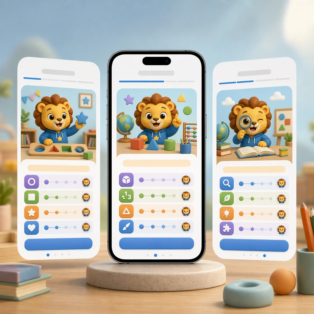
Scene: Keep the same square device-shot composition, camera angle, and product-lighting polish from the reference onboarding image. The arrangement should feel like the next approved asset in the same marketing and product-design family, with identical device scale, spacing logic, and color confidence. Keep the square frame balanced, calm, and production-ready so the asset can serve gallery review, research comparison, and real educational delivery at the same time. Subject: Swap the flow into a lesson-start or placement moment using skill cards, difficulty ladders made of icons, avatar cues, and a large action button shape without any written label. The screen must feel motivating and easy to understand, with one clear path forward for a young learner. The subject matter should feel intentionally selected for a coherent curriculum family rather than like a random decorative assortment. Important details: Preserve the reference layout rules exactly: same card radius, mascot behavior, navigation rhythm, and color hierarchy. Let the educational state change, not the underlying system, so the product reads as one coherent app experience. Preserve the same mobile device framing, card radius, mascot style, color system, icon weight, and spacing rhythm from the reference screen set. Use variation only in the teaching content, supporting props, and scene-specific mood while preserving the core visual system exactly. Use case: Learning App Onboarding and Lesson UI series study 2/4, placement lesson screen. Constraints: No readable text, no watermark, no logos, preserve exact 1:1 aspect ratio, no readable UI copy, no app-store branding, no logos, no generic gaming clutter, no impossible device anatomy, no notification spam.

Example generated from “Learning App Onboarding And Lesson Ui — Practice Feedback Screen”
GPT Image 2en

Scene: Render the same square hero composition with a smartphone front and center, subtle layered depth, and studio-grade reflections that match the reference screen set. The image should look like a polished product-marketing tile focused on one feedback moment in the learning journey. Keep the square frame balanced, calm, and production-ready so the asset can serve gallery review, research comparison, and real educational delivery at the same time. Subject: Show a practice screen with picture choices, gesture-friendly controls, celebratory but controlled feedback icons, and a gentle correction state that still feels positive. Avoid text entirely and communicate meaning through color, motion cues, and a very obvious answer-feedback hierarchy. The subject matter should feel intentionally selected for a coherent curriculum family rather than like a random decorative assortment. Important details: Hold the reference system tightly: identical module shapes, mascot styling, palette anchors, and UI spacing. The scene should prove that the app can handle instruction and response with clarity, not just onboarding charm. Preserve the same mobile device framing, card radius, mascot style, color system, icon weight, and spacing rhythm from the reference screen set. Use variation only in the teaching content, supporting props, and scene-specific mood while preserving the core visual system exactly. Use case: Learning App Onboarding and Lesson UI series study 3/4, practice feedback screen. Constraints: No readable text, no watermark, no logos, preserve exact 1:1 aspect ratio, no readable UI copy, no app-store branding, no logos, no generic gaming clutter, no impossible device anatomy, no notification spam.

Example generated from “Learning App Onboarding And Lesson Ui — Streak Reward Screen”
GPT Image 2en

Scene: Return to the same square device-led composition and polished studio lighting from the reference screens, but shift the moment into a celebratory reward state. The image should still feel credible for a real education product, not an over-gamified entertainment app. Keep the square frame balanced, calm, and production-ready so the asset can serve gallery review, research comparison, and real educational delivery at the same time. Subject: Feature a progress path, earned badges, confetti kept under control, a smiling mascot, and a clean reward card that suggests continuity and habit-building. Use visual hierarchy so parents can sense trust and pedagogy even in a more emotional product moment. The subject matter should feel intentionally selected for a coherent curriculum family rather than like a random decorative assortment. Important details: Maintain the exact reference system: same device framing, card geometry, icon weight, and color logic. The change should come from emotional energy and completion cues, while the app remains obviously part of one carefully designed learning flow. Preserve the same mobile device framing, card radius, mascot style, color system, icon weight, and spacing rhythm from the reference screen set. Use variation only in the teaching content, supporting props, and scene-specific mood while preserving the core visual system exactly. Use case: Learning App Onboarding and Lesson UI series study 4/4, streak reward screen. Constraints: No readable text, no watermark, no logos, preserve exact 1:1 aspect ratio, no readable UI copy, no app-store branding, no logos, no generic gaming clutter, no impossible device anatomy, no notification spam.

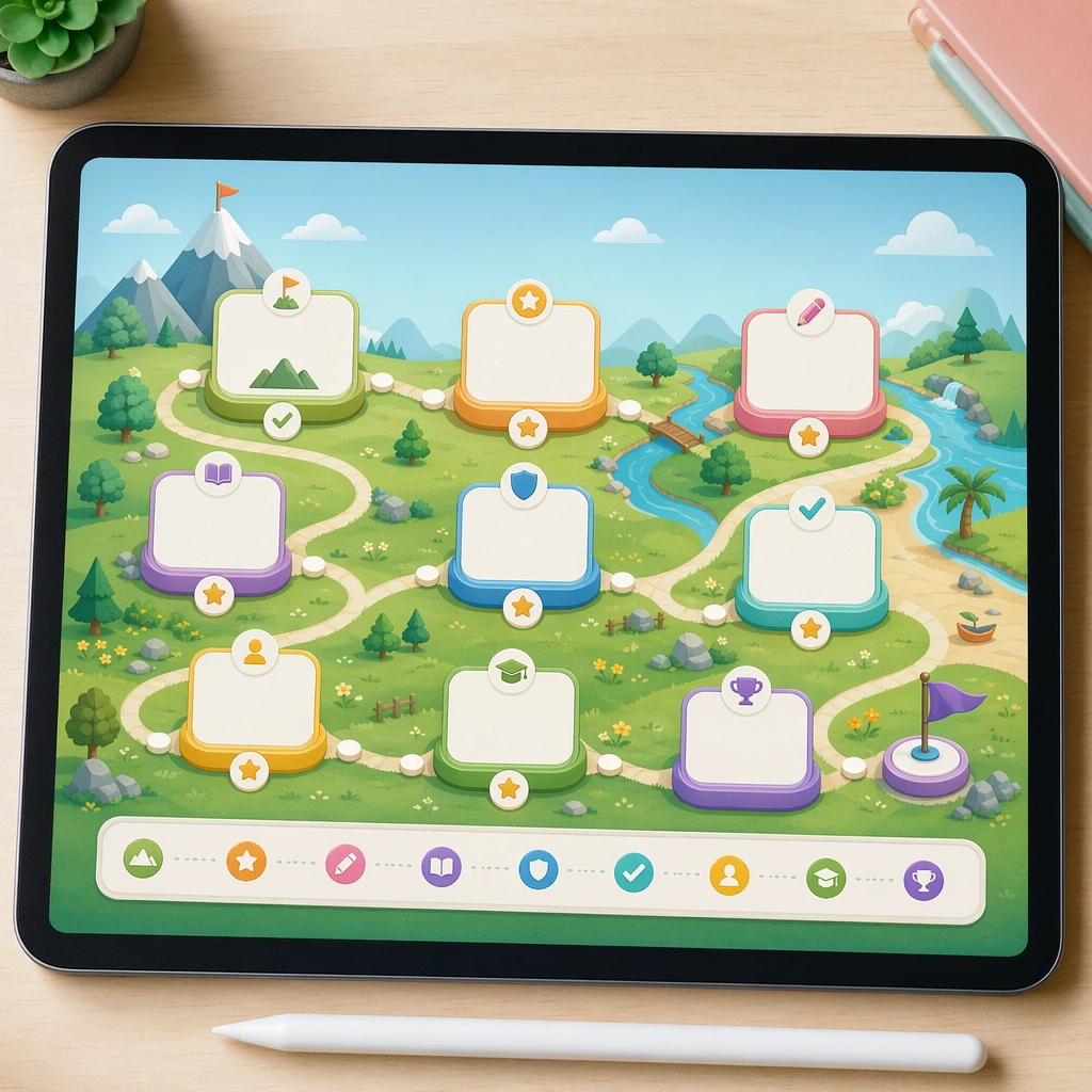
Example generated from “Learning App Onboarding And Lesson Ui — Course Map Board”
GPT Image 2en

Scene: Show a square overview board displayed on a tablet screen or lightweight poster, with a clear path-like composition and crisp educational lighting. The image should feel like a curriculum presentation asset that could live in product marketing, teacher training, or app design decks. Keep the square frame balanced, calm, and production-ready so the asset can serve gallery review, research comparison, and real educational delivery at the same time. Subject: Turn modules into islands, stepping stones, or gentle landmarks connected by a child-friendly path, with blank module cards and pictorial achievement markers. The layout should make progression obvious while remaining structured and plausible for a real education product. The subject arrangement should feel complete and self-contained, able to stand alone as a real supporting deliverable inside the same education business line. Important details: Keep the hierarchy extremely clear and the style modular. The asset should bridge pedagogy and delight, translating curriculum logic into a form children can emotionally understand. Keep the visual hierarchy modular, commercially believable, and clearly tied to a real educational use case rather than a generic mood board. Use case: Learning App Onboarding and Lesson UI single study 2/5, course map board. Constraints: No readable text, no watermark, no logos, preserve exact 1:1 aspect ratio, no readable UI copy, no logos, no generic game loot clutter, no brand watermarks, no impossible screen perspective, no app-store badges.

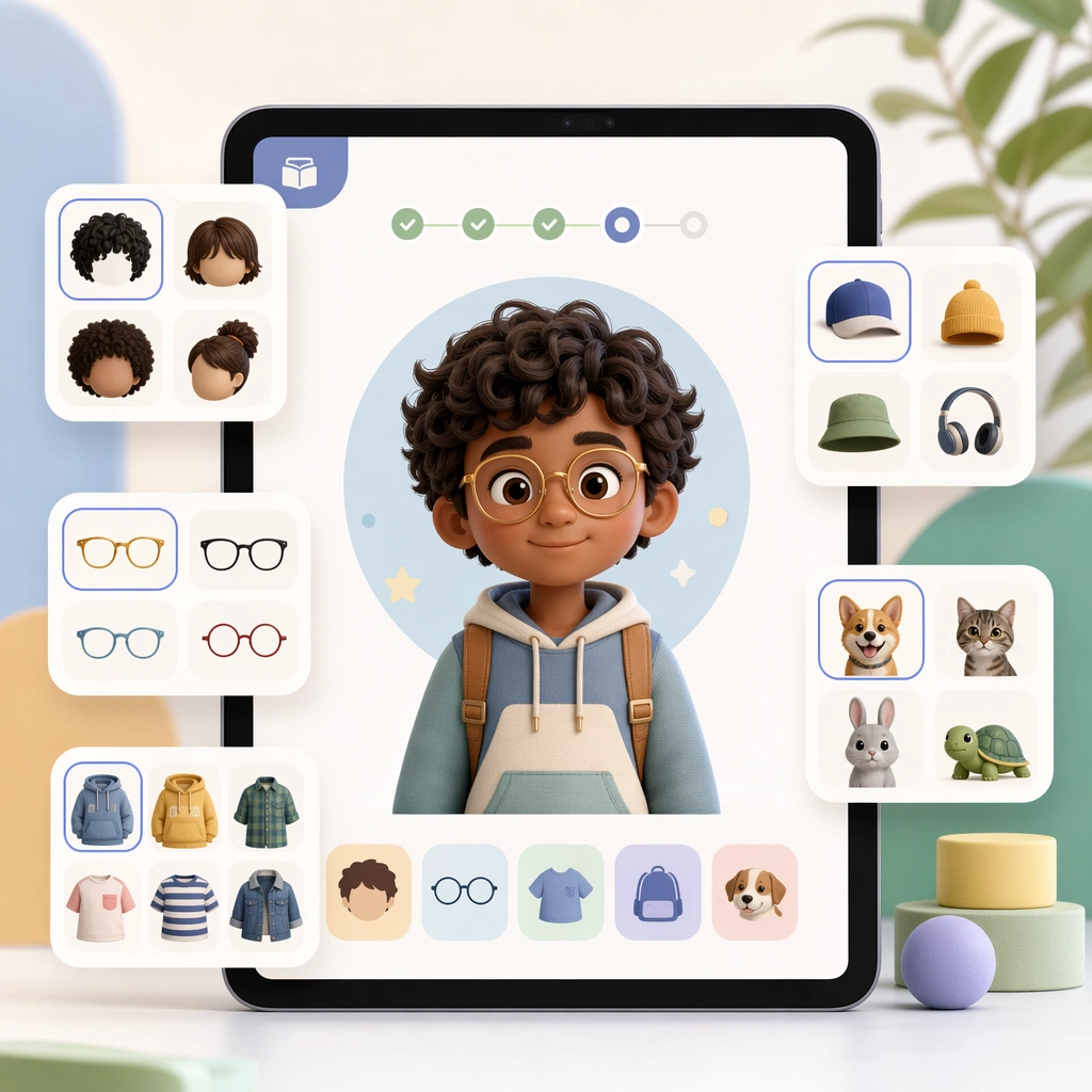
Example generated from “Learning App Onboarding And Lesson Ui — Avatar Customizer Panel”
GPT Image 2en

Scene: Render a square device-screen hero shot with a central character preview and side option cards floating on a soft studio background. The composition should look like a polished feature announcement tile for a new profile-customization capability. Keep the square frame balanced, calm, and production-ready so the asset can serve gallery review, research comparison, and real educational delivery at the same time. Subject: Show a friendly child avatar with selectable hair, glasses, outfits, and companion accessories indicated through pictorial swatches and taps. The interface must stay simple and emotionally safe, avoiding clutter while still feeling expressive and delightful. The subject arrangement should feel complete and self-contained, able to stand alone as a real supporting deliverable inside the same education business line. Important details: Use the same clean geometry and product polish expected of a real app. The image should communicate ownership and personalization without drifting into generic game UI excess. Keep the visual hierarchy modular, commercially believable, and clearly tied to a real educational use case rather than a generic mood board. Use case: Learning App Onboarding and Lesson UI single study 3/5, avatar customizer panel. Constraints: No readable text, no watermark, no logos, preserve exact 1:1 aspect ratio, no readable UI copy, no logos, no generic game loot clutter, no brand watermarks, no impossible screen perspective, no app-store badges.

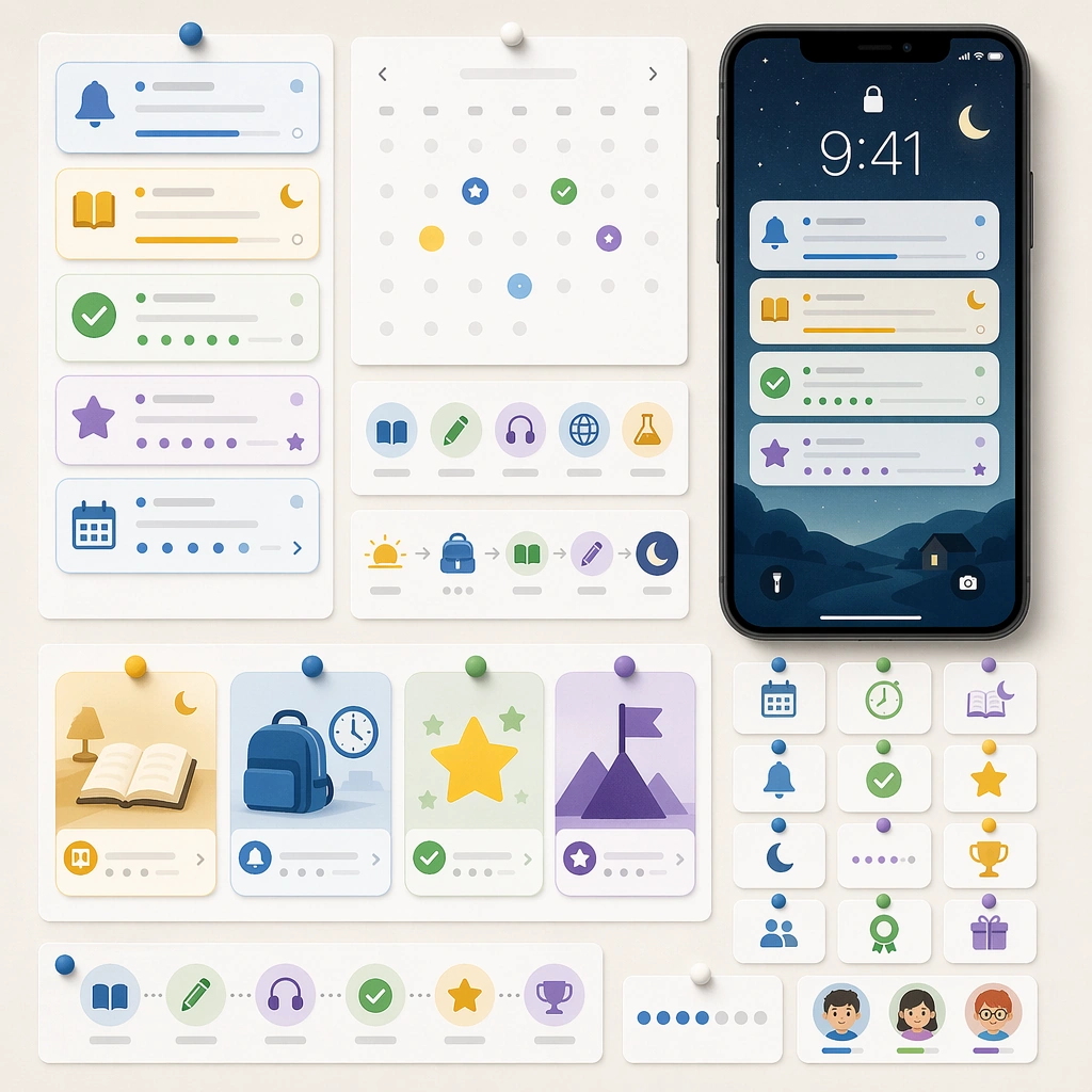
Example generated from “Learning App Onboarding And Lesson Ui — Reminder Notification Board”
GPT Image 2en

Scene: Create a square editorial board with mobile notification cards, calendar badges, routine icons, and a device lock-screen mockup pinned on a clean backdrop. The image should feel like a system design presentation for habit-forming educational touchpoints. Keep the square frame balanced, calm, and production-ready so the asset can serve gallery review, research comparison, and real educational delivery at the same time. Subject: Use simple cue cards for lesson reminders, bedtime reading prompts, reward moments, and streak encouragement, all expressed through pictograms, timing icons, and empty text bars. The pieces should feel modular enough to be reused across messaging and product surfaces. The subject arrangement should feel complete and self-contained, able to stand alone as a real supporting deliverable inside the same education business line. Important details: Keep the board crisp and production-aware rather than decorative. This asset should prove the app brand can extend into lifecycle communication while staying visually coherent and family-safe. Keep the visual hierarchy modular, commercially believable, and clearly tied to a real educational use case rather than a generic mood board. Use case: Learning App Onboarding and Lesson UI single study 4/5, reminder notification board. Constraints: No readable text, no watermark, no logos, preserve exact 1:1 aspect ratio, no readable UI copy, no logos, no generic game loot clutter, no brand watermarks, no impossible screen perspective, no app-store badges.

Example generated from “Learning App Onboarding And Lesson Ui — Tablet and Card Pack”
GPT Image 2en

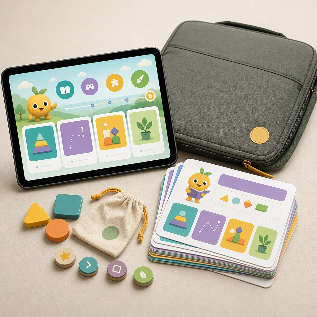
Scene: Show a square hybrid product mockup with a tablet, a stack of lesson cards, a carrying sleeve, and a few tactile tokens on a soft studio surface. The lighting should be bright, premium, and believable for an education startup or publisher launch visual. Keep the square frame balanced, calm, and production-ready so the asset can serve gallery review, research comparison, and real educational delivery at the same time. Subject: The tablet displays one clean lesson screen while the printed materials echo the same colors, mascot language, and module logic. Together they should suggest a blended learning kit that works across school, home, and travel contexts. The subject arrangement should feel complete and self-contained, able to stand alone as a real supporting deliverable inside the same education business line. Important details: Favor commercial clarity and product plausibility. The bundle should feel like a deliberate business offer, not a random prop collage, proving the interface system can expand into physical learning surfaces. Keep the visual hierarchy modular, commercially believable, and clearly tied to a real educational use case rather than a generic mood board. Use case: Learning App Onboarding and Lesson UI single study 5/5, tablet and card pack. Constraints: No readable text, no watermark, no logos, preserve exact 1:1 aspect ratio, no readable UI copy, no logos, no generic game loot clutter, no brand watermarks, no impossible screen perspective, no app-store badges.

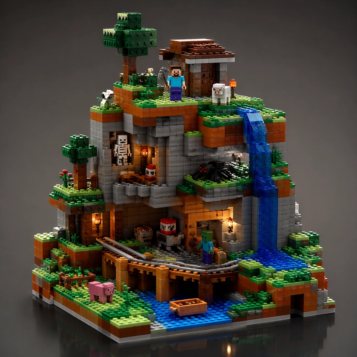
Example generated from “Lego Scene Rebuild — Hero Model”
GPT Image 2en

Scene: A square CGI or design-visualization frame with calibrated lighting, intentional composition, and premium material rendering. Build the frame around a flagship render that establishes form, stance, and material identity. Keep the lighting, camera distance, and spatial organization tuned for a high-signal research image rather than a casual snapshot. The image belongs to the Lego Scene Rebuild theme and should feel immediately legible as a prompt atlas theme for lego scene rebuild, testing physics-materials, style-transfer, commercial-mockup with gpt image 2.. Subject: Center the study on a flagship render that establishes form, stance, and material identity. Translate the theme into a concrete visual statement instead of an abstract mood board: the viewer should understand what kind of image this is, what is being tested, and why the composition is difficult. Use the slug idea of lego scene rebuild as a literal guide for subject matter, materials, and staging. If helpful, borrow the broad visual cues suggested by Minecraft, studio, but keep the result original and specific to this study. Important details: The model must feel engineered or art-directed rather than merely stylized: edges, seams, translucency, reflections, and scale cues should all hold up. Preserve a disciplined square composition, clear focal hierarchy, and enough secondary information to make the image feel complete rather than underspecified. The image should look polished, novel, and exhibition-ready, with topic-specific credibility coming from the way surfaces, structure, and visual language reinforce Lego Scene Rebuild. Avoid generic filler elements that do not serve the main concept. Use case: Lego Scene Rebuild single study 1/8, testing physics-materials, style-transfer, commercial-mockup through the hero model variation. Constraints: No readable text, no watermark, no logos, preserve exact 1:1 aspect ratio, no real brand logos, no low-poly shortcuts, no broken reflections, no muddy materials, no generic showroom clutter, no unreadable UI overlays.

Example generated from “Lego Scene Rebuild — Exploded Arrangement”
GPT Image 2en

Scene: A square CGI or design-visualization frame with calibrated lighting, intentional composition, and premium material rendering. Build the frame around components or accessories separated with clean studio logic. Keep the lighting, camera distance, and spatial organization tuned for a high-signal research image rather than a casual snapshot. The image belongs to the Lego Scene Rebuild theme and should feel immediately legible as a prompt atlas theme for lego scene rebuild, testing physics-materials, style-transfer, commercial-mockup with gpt image 2.. Subject: Center the study on components or accessories separated with clean studio logic. Translate the theme into a concrete visual statement instead of an abstract mood board: the viewer should understand what kind of image this is, what is being tested, and why the composition is difficult. Use the slug idea of lego scene rebuild as a literal guide for subject matter, materials, and staging. If helpful, borrow the broad visual cues suggested by Minecraft, studio, but keep the result original and specific to this study. Important details: The model must feel engineered or art-directed rather than merely stylized: edges, seams, translucency, reflections, and scale cues should all hold up. Preserve a disciplined square composition, clear focal hierarchy, and enough secondary information to make the image feel complete rather than underspecified. The image should look polished, novel, and exhibition-ready, with topic-specific credibility coming from the way surfaces, structure, and visual language reinforce Lego Scene Rebuild. Avoid generic filler elements that do not serve the main concept. Use case: Lego Scene Rebuild single study 2/8, testing physics-materials, style-transfer, commercial-mockup through the exploded arrangement variation. Constraints: No readable text, no watermark, no logos, preserve exact 1:1 aspect ratio, no real brand logos, no low-poly shortcuts, no broken reflections, no muddy materials, no generic showroom clutter, no unreadable UI overlays.

Example generated from “Lego Scene Rebuild — Material Pass”
GPT Image 2en

Scene: A square CGI or design-visualization frame with calibrated lighting, intentional composition, and premium material rendering. Build the frame around the same design idea pushed through surface richness and shader control. Keep the lighting, camera distance, and spatial organization tuned for a high-signal research image rather than a casual snapshot. The image belongs to the Lego Scene Rebuild theme and should feel immediately legible as a prompt atlas theme for lego scene rebuild, testing physics-materials, style-transfer, commercial-mockup with gpt image 2.. Subject: Center the study on the same design idea pushed through surface richness and shader control. Translate the theme into a concrete visual statement instead of an abstract mood board: the viewer should understand what kind of image this is, what is being tested, and why the composition is difficult. Use the slug idea of lego scene rebuild as a literal guide for subject matter, materials, and staging. If helpful, borrow the broad visual cues suggested by Minecraft, studio, but keep the result original and specific to this study. Important details: The model must feel engineered or art-directed rather than merely stylized: edges, seams, translucency, reflections, and scale cues should all hold up. Preserve a disciplined square composition, clear focal hierarchy, and enough secondary information to make the image feel complete rather than underspecified. The image should look polished, novel, and exhibition-ready, with topic-specific credibility coming from the way surfaces, structure, and visual language reinforce Lego Scene Rebuild. Avoid generic filler elements that do not serve the main concept. Use case: Lego Scene Rebuild single study 3/8, testing physics-materials, style-transfer, commercial-mockup through the material pass variation. Constraints: No readable text, no watermark, no logos, preserve exact 1:1 aspect ratio, no real brand logos, no low-poly shortcuts, no broken reflections, no muddy materials, no generic showroom clutter, no unreadable UI overlays.

Example generated from “Lego Scene Rebuild — Studio Turn”
GPT Image 2en

Scene: A square CGI or design-visualization frame with calibrated lighting, intentional composition, and premium material rendering. Build the frame around a presentation angle that reveals volume and silhouette clearly. Keep the lighting, camera distance, and spatial organization tuned for a high-signal research image rather than a casual snapshot. The image belongs to the Lego Scene Rebuild theme and should feel immediately legible as a prompt atlas theme for lego scene rebuild, testing physics-materials, style-transfer, commercial-mockup with gpt image 2.. Subject: Center the study on a presentation angle that reveals volume and silhouette clearly. Translate the theme into a concrete visual statement instead of an abstract mood board: the viewer should understand what kind of image this is, what is being tested, and why the composition is difficult. Use the slug idea of lego scene rebuild as a literal guide for subject matter, materials, and staging. If helpful, borrow the broad visual cues suggested by Minecraft, studio, but keep the result original and specific to this study. Important details: The model must feel engineered or art-directed rather than merely stylized: edges, seams, translucency, reflections, and scale cues should all hold up. Preserve a disciplined square composition, clear focal hierarchy, and enough secondary information to make the image feel complete rather than underspecified. The image should look polished, novel, and exhibition-ready, with topic-specific credibility coming from the way surfaces, structure, and visual language reinforce Lego Scene Rebuild. Avoid generic filler elements that do not serve the main concept. Use case: Lego Scene Rebuild single study 4/8, testing physics-materials, style-transfer, commercial-mockup through the studio turn variation. Constraints: No readable text, no watermark, no logos, preserve exact 1:1 aspect ratio, no real brand logos, no low-poly shortcuts, no broken reflections, no muddy materials, no generic showroom clutter, no unreadable UI overlays.

Example generated from “Lego Scene Rebuild — Scale Comparison”
GPT Image 2en

Scene: A square CGI or design-visualization frame with calibrated lighting, intentional composition, and premium material rendering. Build the frame around supporting context that clarifies proportion and use without becoming literal advertising. Keep the lighting, camera distance, and spatial organization tuned for a high-signal research image rather than a casual snapshot. The image belongs to the Lego Scene Rebuild theme and should feel immediately legible as a prompt atlas theme for lego scene rebuild, testing physics-materials, style-transfer, commercial-mockup with gpt image 2.. Subject: Center the study on supporting context that clarifies proportion and use without becoming literal advertising. Translate the theme into a concrete visual statement instead of an abstract mood board: the viewer should understand what kind of image this is, what is being tested, and why the composition is difficult. Use the slug idea of lego scene rebuild as a literal guide for subject matter, materials, and staging. If helpful, borrow the broad visual cues suggested by Minecraft, studio, but keep the result original and specific to this study. Important details: The model must feel engineered or art-directed rather than merely stylized: edges, seams, translucency, reflections, and scale cues should all hold up. Preserve a disciplined square composition, clear focal hierarchy, and enough secondary information to make the image feel complete rather than underspecified. The image should look polished, novel, and exhibition-ready, with topic-specific credibility coming from the way surfaces, structure, and visual language reinforce Lego Scene Rebuild. Avoid generic filler elements that do not serve the main concept. Use case: Lego Scene Rebuild single study 5/8, testing physics-materials, style-transfer, commercial-mockup through the scale comparison variation. Constraints: No readable text, no watermark, no logos, preserve exact 1:1 aspect ratio, no real brand logos, no low-poly shortcuts, no broken reflections, no muddy materials, no generic showroom clutter, no unreadable UI overlays.

Example generated from “Lego Scene Rebuild — Detail Closeup”
GPT Image 2en

Scene: A square CGI or design-visualization frame with calibrated lighting, intentional composition, and premium material rendering. Build the frame around macro rendering of joints, textures, or finish transitions. Keep the lighting, camera distance, and spatial organization tuned for a high-signal research image rather than a casual snapshot. The image belongs to the Lego Scene Rebuild theme and should feel immediately legible as a prompt atlas theme for lego scene rebuild, testing physics-materials, style-transfer, commercial-mockup with gpt image 2.. Subject: Center the study on macro rendering of joints, textures, or finish transitions. Translate the theme into a concrete visual statement instead of an abstract mood board: the viewer should understand what kind of image this is, what is being tested, and why the composition is difficult. Use the slug idea of lego scene rebuild as a literal guide for subject matter, materials, and staging. If helpful, borrow the broad visual cues suggested by Minecraft, studio, but keep the result original and specific to this study. Important details: The model must feel engineered or art-directed rather than merely stylized: edges, seams, translucency, reflections, and scale cues should all hold up. Preserve a disciplined square composition, clear focal hierarchy, and enough secondary information to make the image feel complete rather than underspecified. The image should look polished, novel, and exhibition-ready, with topic-specific credibility coming from the way surfaces, structure, and visual language reinforce Lego Scene Rebuild. Avoid generic filler elements that do not serve the main concept. Use case: Lego Scene Rebuild single study 6/8, testing physics-materials, style-transfer, commercial-mockup through the detail closeup variation. Constraints: No readable text, no watermark, no logos, preserve exact 1:1 aspect ratio, no real brand logos, no low-poly shortcuts, no broken reflections, no muddy materials, no generic showroom clutter, no unreadable UI overlays.

Example generated from “Lego Scene Rebuild — 环境展示”
GPT Image 2en

Scene: A square CGI or design-visualization frame with calibrated lighting, intentional composition, and premium material rendering. Build the frame around the design placed into a context that tests realism and narrative. Keep the lighting, camera distance, and spatial organization tuned for a high-signal research image rather than a casual snapshot. The image belongs to the Lego Scene Rebuild theme and should feel immediately legible as a prompt atlas theme for lego scene rebuild, testing physics-materials, style-transfer, commercial-mockup with gpt image 2.. Subject: Center the study on the design placed into a context that tests realism and narrative. Translate the theme into a concrete visual statement instead of an abstract mood board: the viewer should understand what kind of image this is, what is being tested, and why the composition is difficult. Use the slug idea of lego scene rebuild as a literal guide for subject matter, materials, and staging. If helpful, borrow the broad visual cues suggested by Minecraft, studio, but keep the result original and specific to this study. Important details: The model must feel engineered or art-directed rather than merely stylized: edges, seams, translucency, reflections, and scale cues should all hold up. Preserve a disciplined square composition, clear focal hierarchy, and enough secondary information to make the image feel complete rather than underspecified. The image should look polished, novel, and exhibition-ready, with topic-specific credibility coming from the way surfaces, structure, and visual language reinforce Lego Scene Rebuild. Avoid generic filler elements that do not serve the main concept. Use case: Lego Scene Rebuild single study 7/8, testing physics-materials, style-transfer, commercial-mockup through the 环境展示 variation. Constraints: No readable text, no watermark, no logos, preserve exact 1:1 aspect ratio, no real brand logos, no low-poly shortcuts, no broken reflections, no muddy materials, no generic showroom clutter, no unreadable UI overlays.