검증된 예시

프롬프트 갤러리

실제 프롬프트와 그 결과 이미지를 함께 확인하고, 전체 프롬프트를 복사해 시작점으로 활용하세요.

이미지 세트
5,541
모델
6
출처
10
5,541 개의 검증된 프롬프트–이미지 세트 · 페이지 93 / 116
Example generated from “AmirMušić #420”
Nano Bananaen
AmirMušić #420

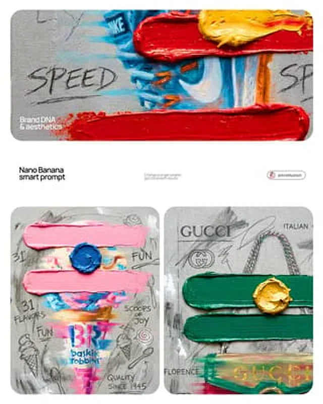
[BRAND NAME]. Goal: Generate a professional mixed-media oil painting on textured canvas where the color palette and graphics are dynamically adapted to the brand identity. 1. BRAND COLOR ADAPTATION - Analyze the visual identity of [BRAND NAME]. - Use the primary brand color for the two main horizontal impasto strokes. - Use a contrasting secondary brand color for the thick, raised central dollop of paint. - Replace the original red and yellow with this new adaptive color scheme. 2. PAINTED SUBJECT & MOTION - Object: A central, vertically oriented product related to [BRAND NAME], rendered as a cohesive OIL PAINTING directly on the canvas. - Technique: Apply a "motion blur" oil painting effect with visible horizontal brushstrokes to create a sense of dynamic movement. - Integration: The object must be part of the painted layer, sharing the same heavy-grain canvas texture as the background, not an overlay. - Branding: Paint the "[BRAND NAME]" logo using distressed, semi-transparent oil paint layers within the object's silhouette. 3. ADAPTIVE IMPASTO & TEXTURE - Primary Strokes: Two thick, physical, horizontal impasto oil paint strokes applied over the painted object in the brand's primary color. - Detail: One heavily textured, raised dollop of the brand's secondary color oil paint placed precisely on the center stroke. - Surface: Background is a raw, heavy-grain grey textured canvas with visible weave, charcoal smudges, and gesso dabs. 4. BRAND-CENTRIC GRAPHICS - Handwriting: Use charcoal and graphite to scribble keywords, slogans, and values associated with [BRAND NAME] across the canvas. - Symbols: Replace the original $ and doodles with hand-drawn, messy abstract icons representing [BRAND NAME]. - Execution: All text and symbols must look like they were scratched or drawn with graphite over the dried oil paint layers. 5. STYLE - Contemporary mixed-media pop-art. 8K macro photography focusing on the physical thickness of oil paint and the raw canvas grain.

Example generated from “AmirMušić #434”
Nano Bananaen
AmirMušić #434

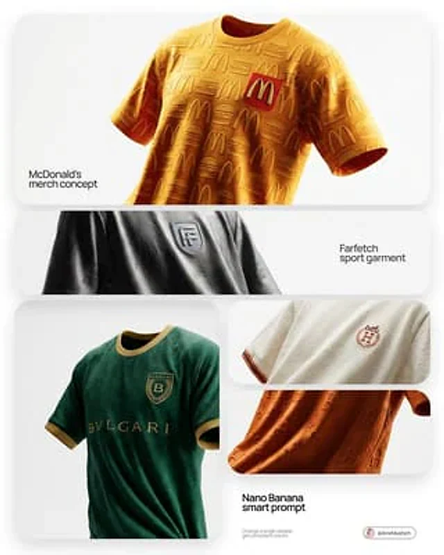
[BRAND NAME]. Act as a fashion photographer and creative director shooting a high-end editorial lookbook for a bespoke football jersey designed by this brand. THE SUBJECT & COMPOSITION (FLOATING & ANGLED): A single, premium custom football jersey is floating suspended in mid-air, centered in the frame. There is no hanger visible. Crucial Angle: The jersey is NOT presented flatly frontal. It is rotated slightly (approximately 15 degrees angled view) to show depth, form, and a dynamic profile. Despite floating, the fabric must show realistic weight, deep gravity-defying folds, creases, and natural wrinkles. It must feel like a real, heavy garment frozen in time, not a stiff 3D model. BRANDED DESIGN & AESTHETICS: The jersey's design is a sophisticated interpretation of [BRAND NAME]'s visual identity. Branding Placement: The official [BRAND NAME] logo is authentically applied as the main club crest on the chest (e.g., embroidered patch or high-quality heat transfer). MATERIALITY & TEXTURE (CRITICAL): The focus remains on luxurious, tactile textures. Fabric: A heavyweight, retro-inspired athletic cotton-blend or technical knit with a visible, coarse weave structure. ENVIRONMENT & BACKGROUND (WHITE STUDIO): The jersey floats within an abstract, infinite white photo studio cyclorama space. The background is completely seamless, pure, clean white, and minimalist, with absolutely zero distractions, placing total focus on the suspended garment. LIGHTING & PHOTOGRAPHY STYLE: Style: Hyper-realistic editorial fashion photography. Clean, high-key aesthetic. Lighting: sophisticated studio lighting. Soft, diffused light that sculpts the folds of the fabric and highlights the texture against the pure white background. Subtle soft shadows might be cast on the jersey itself to define its form in the white space.

Example generated from “AmirMušić #442”
Nano Bananaen
AmirMušić #442

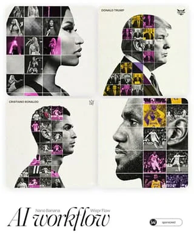
[PERSON NAME]. Act as a high-end sports graphic designer creating a conceptual tribute poster. The style is a complex "dual exposure photo-grid composite" with mixed-media textures. **CENTRAL STRUCTURE (THE VESSEL):** The central focus is a large-scale, high-contrast black and white portrait silhouette of [PERSON NAME]. This main portrait acts as the container. **THE GRID FILL & TEXTURES (MIXED MEDIA):** The interior of the silhouette is populated by a dense "photo mosaic grid" of action shots from the person's career. **CRITICAL TEXTURE INSTRUCTION:** Do not just paste flat photos. Apply artistic textures to various grid cells to create a tactile, collage feel. Use effects like: - **Halftone Dots:** Comic-book style raster patterns on some cells. - **Fabric/Embroidery:** Subtle thread or canvas textures suggesting a jersey or patch. - **Film Grain:** Heavy noise on specific high-contrast action shots. **COLOR STRATEGY:** The base is Monochrome B&W. Use selective color overlays (relevant to the team/flag) ONLY on specific grid cells to create a rhythm. **TYPOGRAPHY & BRANDING (STRICT MICRO-SCALING):** 1. **Top Left (The Name):** Write "[PERSON NAME]" strictly using the font **Inter Semibold**. - **Kerning:** Tight negative kerning (-4%). - **Size:** SMALL and discreet. It must occupy **MAXIMUM 20%** of the canvas width. Do NOT make it large or loud. 1. **Top Right (The Symbol):** Place the primary logo (Team/Brand/Flag). - **Size:** VERY SMALL. It must occupy **MAXIMUM 10%** of the canvas width. **COMPOSITION & BACKGROUND:** - **Background:** Off-white or light grey with a **visible high-quality paper or concrete texture**. It should not be flat digital white. - **Alignment:** Center the figure perfectly. Maintain wide negative space around the object.

Example generated from “AmirMušić #443”
Nano Bananaen
AmirMušić #443

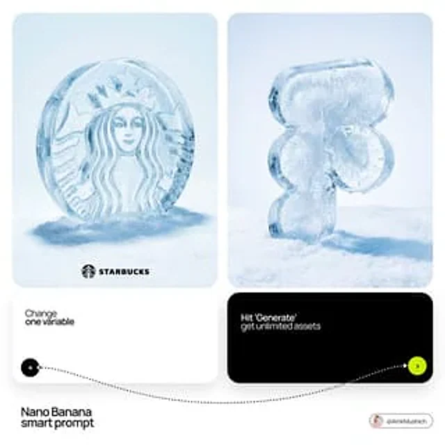
[BRAND NAME]: Enter the brand name here. Goal: Generate a hyper-realistic studio photograph where the stylized logo icon of [BRAND NAME] is a physical 3D ice sculpture lying directly on a snowy surface. Constraint: NO TEXT inside or immediately near the central ice icon. Only the bottom signature. Light, airy background. 1. THE CENTRAL ICE ARTIFACT - Main Subject: A large, 3D volumetric sculpture in the exact shape of the [BRAND NAME] logo icon. - Material: Crafted from high-purity crystalline ice with intricate internal textures, frost needles, and frozen air bubbles. - Details: The surface of the ice logo is covered with small, realistic water droplets and light condensation. - Perspective: The logo is positioned at a 3/4 angle, lying horizontally on the snow to show its depth and thickness. 2. ENVIRONMENT & LAYOUT - View: Eye-level macro perspective, 3/4 view. - Surface: The logo is resting on a field of crisp, detailed, white powdery snow. - Background: A flawless, uniform, very light pale blue and white gradient background (much lighter than the original). - Shadow: A soft, realistic shadow is cast on the snow directly beneath the ice icon to ground it. 3. BOTTOM BRAND SIGNATURE (CRITICAL) - Placement: A clean horizontal signature block centered at the bottom of the frame, far below the ice artifact. - Elements: A tiny, flat, minimalist black version of the [BRAND NAME] logo icon on the left. - Text: The word "[BRAND NAME]" in a clean, bold, black sans-serif typeface immediately to the right of the tiny logo. - Scale: The signature is very small and subtle compared to the main ice sculpture. 4. AESTHETIC - Premium product photography, cold and crisp atmosphere, hyper-realistic 8k resolution, cinematic lighting, ultra-detailed textures.

Example generated from “AmirMušić #455”
Nano Bananaen
AmirMušić #455

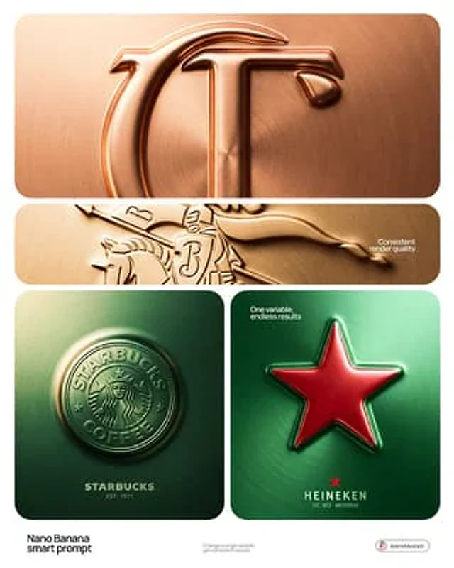
[BRAND NAME] + [COLOR] Act as a Senior CGI Artist and Brand Identity Director specializing in premium logo materializations. Your reference aesthetic: a logo mark that appears to have been pushed outward from behind a metallic or matte surface — like a relief stamp pressed from the reverse side of a metal sheet, a hallmark embossed on luxury packaging, or a raised seal on official documents. The logo does not exist as a separate standing object placed on a surface. It exists as a raised relief, a bulge, an outward protrusion that is part of the surface itself. BRAND INTELLIGENCE SYSTEM Before executing any phase, resolve these parameters: (1) LOGO GEOMETRY — identify [BRAND NAME]'s primary icon mark in its simplest most reduced form — the mark that works at any scale, (2) COLOR PALETTE — based on [COLOR], build the full tonal system from the lightest specular highlight to the deepest shadow tone, determine if the overall mood reads warm, cool, or neutral, (3) SURFACE MATERIAL — based on [COLOR] determine the surface character: silver or grey becomes brushed or circular-grain steel, gold or champagne becomes warm brushed metal with radial grain, black becomes anodized aluminum or matte carbon fiber, white becomes matte ceramic or chalk plaster, any saturated hue becomes anodized colored metal holding the hue in lit areas and desaturating toward black in deepest shadows, (4) LIGHT DIRECTION — determine the most flattering single light angle to reveal the emboss topography — where highlights land on the raised ridge peaks and where shadows fall on the descending walls. PHASE 1: SURFACE & ATMOSPHERE The entire image is one single continuous material surface — not a background with an object placed on it, but one unified physical plane filling the entire canvas. This surface is made of the SURFACE MATERIAL resolved above. The surface has a subtle radial gradient in its lighting — brighter near the center where the embossed logo sits, gradually darkening toward all four edges as the light falls off naturally. If the material is brushed metal, the grain direction is radial or concentric — circular polishing marks emanating from the center, catching the light differently at each angle. Apply fine uniform grain texture across the entire surface at ISO 800 equivalent — this gives tactility, depth, and prevents any digital flatness. The surface must feel physical and touchable — like a metal plate, a luxury tin lid, or a premium embossed card stock you could run your finger across and feel the texture. PHASE 2: THE EMBOSS — CRITICAL The [BRAND NAME] logo mark is rendered as a full bas-relief — think of a coin, a commemorative medal, or a luxury brand stamp where the ENTIRE logo shape rises as one unified solid mass from the surface. Not just the outline. Not just the stroke path. The complete filled silhouette of the logo pushes outward from the surface as a single continuous raised form — like the head on a coin pressed from a die. The interior of the logo is NOT hollow or open. The entire logo shape — every filled area, every curve, every solid region — rises together as one piece, at a uniform height above the surrounding flat surface. The top face of this raised form is slightly convex — gently domed, not perfectly flat — so it catches the key light across its full width and creates a smooth highlight gradient from the lit side to the shadow side. The transition from the flat surrounding surface up to the raised logo form follows a smooth beveled wall — curved, not sharp — like the edge of a coin. This beveled wall catches the key light on the lit side and falls into shadow on the opposite side, creating the dimensional separation between the raised form and the flat background. Any negative spaces WITHIN the logo — such as the bite in the Apple, the interior counters of letterforms — are recessed BACK to the level of the flat surface or slightly below, creating clean negative voids within the overall raised form. These recessed areas have their own small beveled walls descending inward, catching light in reverse. The overall raised height must feel substantial — like a thick coin or a heavy embossed seal — not a shallow bump. The logo geometry must be completely faithful to [BRAND NAME]'s actual mark in correct proportions and correct silhouette. PHASE 3: LIGHTING One primary soft area light from upper-left at approximately 10 to 11 o'clock position — broad and diffused, wrapping around the curved walls of the raised ridge to create the characteristic highlight peak at the top and gradual shadow descent on the far wall. Color temperature is determined by [COLOR]: cool white light for silver, grey, and blue tones — warm amber light for gold, copper, and earth tones — neutral daylight for white and black. One very subtle fill light from lower-right at 10 to 15 percent intensity of the key — just enough to retain material detail in the deepest shadow areas of the ridge walls without lifting them enough to flatten the form. No hard shadows anywhere on the surface. No spotlight pools. No rim light. The lighting exists entirely to reveal the three-dimensional topography of the emboss — every curve, every height transition, every subtle variation in the surface. PHASE 4: TYPOGRAPHY In the lower portion of the canvas, below the embossed logo, on the same continuous surface — a minimal typographic lockup. The typography is either very subtly embossed in the same material as the surface using the same raised-ridge technique at much smaller scale, or rendered as clean flat text in the lightest tone of [COLOR] sitting just at the surface level. Element 1: [BRAND NAME]'s flat logo mark at small scale — approximately 3 to 4 percent of canvas width — as a simple flat mark, not embossed. Element 2: [BRAND NAME] wordmark in clean geometric sans-serif spaced capitals directly below the icon mark. Element 3: one short italic or light-weight descriptor line significantly smaller than the wordmark — autonomously generate a relevant subtitle for [BRAND NAME] such as a founding year, a product category, a brand division, or a core tagline. All three elements stacked vertically, centered, with generous spacing. No decorative elements. No lines or rules. Pure typographic restraint. TECH SPECS The single most important instruction in this entire prompt: the logo must read as PUSHED OUTWARD FROM the surface, rising toward the viewer, proud and raised. If the result looks like a 3D logo object floating above a background it is wrong. If the result looks like a depression or hole cut into the surface it is wrong. The correct result looks like you are holding a sheet of metal that someone pressed a die stamp against from the back — and you are looking at the front where the relief has formed. Ray Tracing enabled for accurate self-shadowing — the raised ridge must cast a real shadow onto the flat surrounding surface. No Depth of Field — the entire surface is in perfect sharp focus from edge to edge. Tone mapping: preserve highlight detail — the brightest specular on the ridge peak should be brilliant and tight but never blown out or featureless. Film grain applied uniformly across the full final render. No chromatic aberration. No lens distortion. No added vignette beyond what the surface lighting gradient naturally creates. Anti-aliasing maximum — the ridge edges must be perfectly clean. Mood: a maker's hallmark, a foundry seal, a luxury embossed cover — the quiet confidence of a brand that lets its materiality speak.

Example generated from “AmirMušić #463”
Nano Bananaen
AmirMušić #463

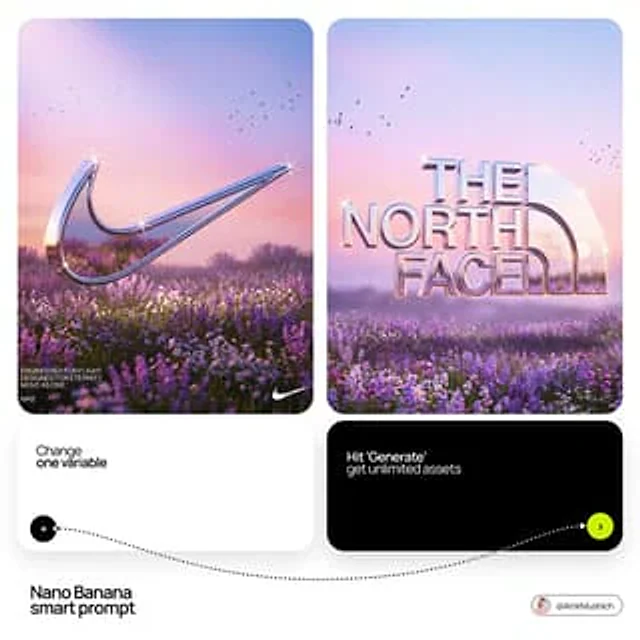
[BRAND NAME]. Act as a Senior 3D Product Visualization Artist and Cinematic Art Director specializing in luxury brand key visuals for high-end editorial and streetwear campaigns. PHASE 1: LOGO SUBJECT Autonomously identify the official, universally recognized logo/logotype of [BRAND NAME]. Reproduce it with maximum fidelity to the original silhouette, proportions, andgeometry — no stylistic distortion, no graffiti interpretation. The logo shape must be instantlyrecognizable as the real [BRAND NAME] mark. Extrude the logo into a solid 3D object with a depth of approximately 15–20% of its height. All surfaces — front face, side extrusion, and beveled edges — must be coated in a single unified material: Surface material: hyper-polished liquid chrome. Reflectance value 0.98 — near-perfect mirror finish. Apply full Ray-Traced environment reflections: the logo must visibly reflect the surrounding sky gradient, flower field, and light sources within its curved and flat surfaces. Bevel radius on all hard edges: moderate (enough to catch sharp specular highlights). Add Subsurface Scattering on the thinnest structural parts of the logo (fine lines, serifs, icon details) to create a subtle inner glow at the edges. Place 4–8 prismatic star-shaped lens-flare sparkles (4-point) at the highest specular peaks — corners, tips, and curved peaks of the logo geometry. The sparkles must feel organic, not uniformly distributed. Zero matte surfaces. Zero plastic look. The entire object must read as cast from liquid silver. PHASE 2: ENVIRONMENT & BACKGROUND Background: a wide cinematic landscape at the golden-lilac hour (just after sunset). A vast flower field fills the lower third — densely packed lavender and white wildflowers with realistic micro-texture and subtle wind motion-blur on the far clusters. Middle ground fades into soft purple-grey bokeh haze. Sky: gradient from warm blush rose (#E8A0BF) at the horizon through lilac (#C3A6D4) to cool powder blue (#A8C4D8) at the top. Add 3–5 loose silhouetted bird clusters (starlings, small and sharp) scattered across the upper left and right quadrants. Volumetric atmospheric haze sits on the horizon line. Autonomously shift the environment's color palette to reflect [BRAND NAME]'s iconic brand identity — introduce the brand's signature hue as a tonal wash in the sky gradient or as the dominant flower color in the field. Preserve the overall ethereal, editorial mood. The environment must feel like it was art-directed specifically for this brand — not generic. PHASE 3: COMPOSITION & LAYOUT Format: 1:1 square. The chrome logo is centered horizontally and placed at the vertical midpoint — monumental in scale, spanning 65–80% of frame width.Apply a subtle forced perspective tilt (2–4 degrees) for dynamic energy without distorting logo recognition. The bottom edge of the logo object grazes or slightly overlaps the top of the flower field, integrating the 3D object naturally into the environment. The logo casts a soft diffused shadow downward into the flowers. Lower-left corner: 2–3 lines of micro-copy in clean white sans-serif at minimal optical size. Autonomously generate a poetic 3-line brand statement relevant to [BRAND NAME]'s world, heritage, and aesthetic language. Bottom-left: "[BRAND NAME]" in small caps logotype label. Bottom-right: a secondary flat 2D chrome version of the same logo rendered small as a finishing mark. PHASE 4: LIGHTING Primary: large soft area light from upper-left simulating post-sunset overcast sky — fully diffused, no hard shadows, color temperature 5800K with a lilac tint overlay. Secondary: warm rim light (3200K) grazing the bottom and side edges of the logo from behind — creates a golden separation halo between the object and the field. Global Illumination enabled — the chrome logo must realistically bounce and absorb the landscape's ambient color. The flower field's purple tones should be faintly visible in the lower reflective surfaces of the logo. Volumetric god rays faintly visible through any negative space or cutouts within the logo geometry. TECH SPECS Render engine: Octane Render aesthetic. Ray Tracing: maximum bounces (16+). Depth of Field: f/11 equivalent — full logo sharp, far background in soft bokeh only. Tone mapping: lifted blacks, compressed highlights, filmic S-curve. Color grade: desaturated midtones, preserved pastels, cool shadow tones. Film grain: subtle (ISO 200 equivalent). Chromatic Aberration: 0.2–0.3px on peripheral logo edges only. Anti-aliasing: maximum. Strictly no AI-plastic normals. No smooth uniform shading. Microscopic surface imperfections on the chrome required for realism (micro-scratches, 0.5% roughness noise map). Mood reference: luxury brand retrospective editorial for Highsnobiety or AnOther Magazine.

Example generated from “AmirMušić #475”
Nano Bananaen
AmirMušić #475

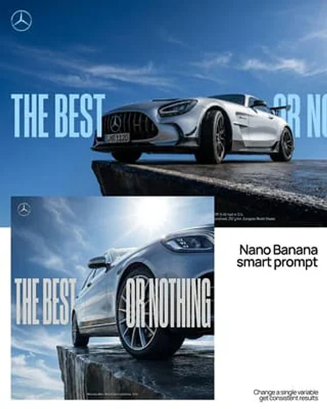
[BRAND NAME] | [SLOGAN]. Act as a Professional Editorial Art Director. PHASE 1: PHYSICS & GROUNDING (THE "STABILITY" RULE). - Analyze [BRAND NAME] category: * CATEGORY A (Active/Sports/Fashion): The subject (person) is in a high-intensity leap, detached from the ground, silhouette against the sky. * CATEGORY B (Automotive/Heavy Goods): The subject (vehicle) must be HEROICALLY GROUNDED. Place the car firmly on a solid surface (asphalt, concrete, or rock). * Perspective: Use an extreme low-angle (worm's-eye view). The car must look massive and dominant, anchored to the bottom of the frame, towering over the viewer. NO floating or flying for vehicles. PHASE 2: DYNAMIC PHOTOGRAPHY & LIGHTING. - Environment: A vast, clear blue sky with minimal soft clouds. - Lighting: Natural, direct sunlight. High-contrast shadows on the subject to emphasize form and texture. - Style: High-end 8k commercial photography. Sharp focus. PHASE 3: TYPOGRAPHY & LAYOUT (MATTE FINISH). - Layout: Use the text from "[SLOGAN]" as massive, ultra-condensed bold sans-serif characters. - Execution: Split "[SLOGAN]" into two parts: one on the far left, one on the far right. - Depth: A part of the subject (e.g., a bumper, a mirror, or a person's limb) must overlap the letters to create a 3D effect. PHASE 4: COLOR STRATEGY (MATTE & REALISTIC). - Graphic Color: NO NEON. Use a solid, matte brand color for the text (e.g., flat Navy for BMW, flat Red for Red Bull). The color must be opaque and non-glowing, resembling high-quality print ink. - Photo Color: Maintain authentic, rich photographic colors for the subject and the sky. The contrast comes from "Flat Graphic vs. Realistic Photo". PHASE 5: FINAL BRANDING. - Logo: Small minimalist [BRAND NAME] logo in the upper corner. - Metadata: Tiny secondary text in a clean sans-serif font at the bottom for a technical/editorial look.

Example generated from “AmirMušić #480”
Nano Bananaen
AmirMušić #480

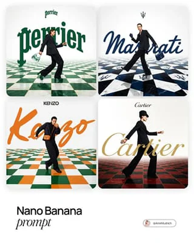
[BRAND NAME]. Act as a Fashion Photographer and Graphic Designer specializing in luxury brand campaign visuals with integrated typography and surreal spatial design. PHASE 1: SPATIAL CONCEPT Create a high-fashion editorial image where architecture and graphic design merge into a theatrical stage. The foundation is a bold geometric floor pattern that extends into forced perspective, creating infinite depth and visual drama. This is not a neutral backdrop – the floor is a protagonist that amplifies brand identity through pattern, color, and spatial illusion. PHASE 2: CHECKERBOARD ARCHITECTURE - Surface: Checkerboard/geometric tile pattern rendered in brand-relevant colors - Perspective: Aggressive forced perspective starting from bottom foreground and receding toward horizon (vanishing point at upper third of frame) - Pattern Logic: Autonomously determine pattern based on [BRAND NAME]: - Color Palette: Incorporate 2-3 signature colors of [BRAND NAME] into floor pattern while maintaining readability - Texture: Photorealistic rendering with subtle reflections and shadows for depth PHASE 3: MODEL & STYLING - Subject: One fashion model (gender-fluid casting) captured mid-motion – dynamic pose suggesting walking, running, or dancing - Outfit: Elevated monochrome look (black, white, or brand-neutral tone) to let floor pattern and typography dominate. Include 1-2 key accessories in [BRAND NAME]'s signature color as hero product focal points - Pose Energy: 70% movement, 30% control – fashion-forward but grounded (avoid floating/unnatural levitation) - Placement: Model positioned in lower-mid frame, interacting spatially with both floor perspective and typography layer - Camera Angle: Low-to-mid angle (waist-to-full body shot) to emphasize floor perspective drama PHASE 4: TYPOGRAPHY INTEGRATION - Brand Script: Oversized handwritten/script version of [BRAND NAME] rendered as flat graphic element behind or around the model - Scale: Typography should be 40-60% of frame width – bold and unmissable but not crushing the model - Color: Signature brand color (autonomously selected), solid fill with clean edges - Interaction: Typography appears to "sit" in the space – model may partially overlap letters, creating layering hierarchy - Logo Lockup: Clean, small brand logo centered in upper portion of frame (10-15% of width) in black or brand color - Treatment: Pure vector aesthetic – no gradients, no shadows, no dimensional effects. Flat color only. PHASE 5: COLOR ORCHESTRATION (AUTONOMOUS) Autonomously research and apply [BRAND NAME]'s iconic color system: - Primary: Identify 1-2 hero brand colors (e.g., Gucci → forest green + red, Tiffany → robin egg blue) - Application: Use primary colors in floor pattern AND typography for visual cohesion - Balance: 60% white/neutral space, 30% brand color saturation, 10% black for anchoring - Accent: Hero product (bag, shoes, accessory) should echo brand color for strategic eye-pull PHASE 6: LIGHTING & ATMOSPHERE - Lighting Setup: High-key fashion lighting with soft shadows – think editorial studio quality - Key Light: 45° front-left to sculpt model, creating gentle shadows on checkerboard - Fill: Ambient fill to prevent harsh contrast while maintaining drama - Floor Treatment: Subtle specular highlights on floor tiles for luxury sheen (not glossy/mirror-like) - Background: Pure white or subtle gradient to white at horizon line – maintains clean editorial feel PHASE 7: TECHNICAL EXECUTION - Mood: Playful luxury – sophisticated but not stiff, energetic but refined - Composition Rule: Dynamic diagonal lines (floor perspective) + vertical anchor (model) + horizontal balance (typography) - Depth Layers: Background (white) → Typography (mid-ground) → Model (foreground) → Floor pattern (spanning all depths) - Post-Production: Magazine-cover polish with color grading that enhances brand palette TECHNICAL SPECS: - Camera Simulation: Phase One XF IQ4 150MP, 80mm lens, f/5.6 for controlled depth - Aspect Ratio: 4:5 (Instagram editorial) or 3:4 (print campaign) - Resolution: 8K output, print-ready sharpness - Color Space: sRGB with vibrant saturation for digital, slight desaturation for luxury print feel - Style Reference: Gucci campaigns by Glen Luchford, Prada visuals, Highsnobiety x luxury collabs, Vogue Italia editorials - Rendering: Photorealistic model and floor, graphic-design-quality typography (hybrid aesthetic)

Example generated from “AmirMušić #486”
Nano Bananaen
AmirMušić #486

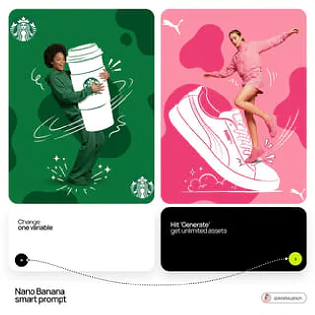
[BRAND NAME] + [HERO COLOR] Act as a Mixed-Media Campaign Art Director. Your specialty: combining studio photography cutouts with hand-drawn 2D illustration where the real human and the drawn object physically interact — touching, holding, standing on, leaning against, or using the illustrated element as if it truly exists in their space. PHASE 1: CANVAS & COLOR SYSTEM Format: 1:1 square canvas. Base: single flat saturated color [HERO COLOR]. No gradients. No texture. Pure chromatic field. Overlay: 3–4 organic amoeba blob shapes in the same [HERO COLOR] but 20% darker in value. Smooth edges, irregular silhouettes, scattered asymmetrically. Some bleeding off-frame. Hand-painted feel, clean execution. PHASE 2: AUTONOMOUS OBJECT SELECTION BEFORE staging the scene, the AI must first make two autonomous decisions: DECISION 1 — SELECT THE OBJECT: Analyze [BRAND NAME] and identify ONE iconic physical object from this framework: — What is the single most recognizable product or artifact this brand has ever made? — What object do fans of this brand collect, use daily, or photograph? — What prop has defined this brand's visual identity across decades? Do NOT choose animals. Do NOT choose logos. Choose a real, large, tangible object that can physically occupy space next to a person. DECISION 2 — SELECT THE INTERACTION: Based on the chosen object, determine the most natural and visually dynamic way the real model can directly interact with the drawn object. Interaction must be: ✓ Physical and direct — hands touching, feet on, body leaning, arms around ✓ Immediately readable — the relationship between person and object is understood in under 2 seconds ✓ Scaled correctly — the object must be large enough to interact with at human scale ✓ Active, not passive — the model is DOING something with the object, not just standing next to it INTERACTION TYPE EXAMPLES (AI selects the most brand-appropriate): · HOLDING: model's real hands grip the illustrated object — cup, camera, trophy, bottle, bag · WEARING/USING: model's real body wears or uses the object — sitting on a chair, wearing an illustrated hat, holding an illustrated product to their face · STANDING ON: model's real feet are planted on top of the illustrated object — skateboard, surfboard, podium, giant sneaker · RIDING/LEANING: model's real body leans against or drapes over the illustrated object — car hood, shopping cart, giant product silhouette · EMERGING FROM: model appears to step out of or through the illustrated object — bursting through a giant sneaker box, rising from an illustrated cup PHASE 3: STAGING THE SCENE Once object and interaction are selected, stage the full scene: MODEL: Single model age 18–26, clean cutout, zero fringing. Pose is determined by the chosen interaction — the body position must make the interaction feel natural and physically believable. Wardrobe: [BRAND NAME]'s most iconic apparel in [HERO COLOR] monochromatic palette. ILLUSTRATED OBJECT: Pure white (#FFFFFF) flat 2D illustration. Brush-pen marker line quality, 3–5px weight. Slightly imperfect organic edges — hand-drawn feel, not vector-perfect. NO shading. NO gradients. Flat white fill only. SCALE RULE — CRITICAL: The illustrated object must be LARGE. Minimum size: 40% of canvas height. The object should feel monumental — oversized relative to real-world scale is acceptable and encouraged. A coffee cup can be waist-height. A sneaker can be as tall as the model. Large scale = better readability = stronger visual impact. DEPTH LAYERING — CRITICAL:The object must exist on multiple z-layers: — Parts of the object sit BEHIND the model — Parts of the object come IN FRONT of the model — The model's real hands/feet make contact at the intersection point This layering is what makes the scene feel integrated rather than collaged. BRAND STAMP: One small [BRAND NAME] logo mark appears on the object's surface — naturally embedded as if printed, engraved, or stitched. Rendered in [HERO COLOR] darker variant. Subtle, not dominant. PHASE 4: SUPPORTING ILLUSTRATION SYSTEM All supporting elements: white, flat, brush-pen line style. Same visual language as the hero object. LOGO MARKS: [BRAND NAME] primary icon in white: — Large (upper-left corner, ~15% canvas width) — Medium (opposite corner, ~10% canvas width) IMPACT MARKERS: 2–3 manga-style exclamation dash clusters near the point of interaction between model and object — where hands grip, where feet land, where bodies touch. This emphasizes the physical connection. MOTION LINES: 2–4 curved speed lines radiating from the object or the model's most active body part. Taper at ends. Cross behind and in front of the model for depth. GROUND EFFECT: At the base of the scene: white illustrated ground interaction — sparkle stars, short speed dashes, or object-specific effect (splash if cup, dust clouds if sneaker landing, wheel tracks if skateboard). AMBIENT SQUIGGLES: 1–2 loose organic white lines floating near the model's torso — visual rhythm connecting the photographic and illustrated layers. PHASE 5: LIGHTING Studio strobe, high-key, even and clean. 5500K neutral. No dramatic shadows on model. Soft contact shadow at model's feet (opacity 15%). The photography reads as natural and real against the graphic illustrated environment. TECH SPECS Aesthetic: mixed media — real photograph integrated with hand-drawn 2D illustration. Color count: 3 maximum — [HERO COLOR] light, [HERO COLOR] dark blobs, white illustration. Photography skin tones and fabric colors are the only additional color exception. Illustration style: Y2K comic energy, Japanese streetwear magazine, brush marker. Composition: asymmetric and dynamic. The interaction point between model and object is the visual center of gravity — everything else orbits around it. No text. No wordmarks. Logo icon only. Mood: the model is not posing WITH the object — the model is IN THE MIDDLE of using it. Caught mid-action. Alive.

Example generated from “AmirMušić #508”
Nano Bananaen
AmirMušić #508

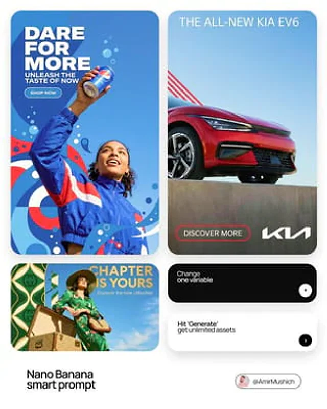
[BRAND NAME] | [HEADLINE] | [SUB-TEXT] | [CTA]. Act as a Senior Art Director. PHASE 1: INTEGRATED COMPOSITION & OVERLAP. - Layout: Seamless fusion of 2D graphics and 3D photography. - Overlap Logic: The subject and their primary "Product Prop" (e.g., a car, a device) must physically overlap the graphic panel to break the "wall" between design and photo. - Unity: Geometric shapes from the graphic side must bleed into the photographic sky area. PHASE 2: BRAND & CATEGORY SIMULATION. Autonomously analyze the [BRAND NAME] and its industry category: - INDUSTRY CONTEXT: * If Automotive: Include the vehicle and a person interacting with it. * If Tech: Include flagship devices/gadgets. * If Fashion/Lifestyle: Focus on editorial poses and premium accessories. - SHAPE SIMULATION: Match shapes to brand identity (e.g., Sharp/Speed for Auto, Minimalist/Grid for Tech). - COLOR SIMULATION: Use the brand's primary signature hue for both the graphic pattern and the subject's outfit/accents. PHASE 3: TYPOGRAPHY & CUSTOM CONTENT. - Headline: Display "[HEADLINE]" in a bold, modern Sans-Serif font. (If [HEADLINE] is empty, generate a high-energy slogan for [BRAND NAME]). - Sub-headline: Display "[SUB-TEXT]" below the headline. - Button: Create a minimalist pill-shaped CTA button with the text: "[CTA]". - Interaction: Text layers should have 3D depth, sitting partially behind the subject or product prop. PHASE 4: PHOTOGRAPHY & SUBJECT. - Perspective: Extreme low-angle (worm’s eye view) looking up. - Subject: A diverse persona reflecting the brand's audience. - Environment: Massive, clear blue sky as the backdrop. - Visual Link: Subject's styling must incorporate the Brand's primary color. PHASE 5: FINAL VISUAL STYLE. High-end commercial aesthetic. Crisp, saturated, professional fusion of flat vector art and realistic photography.

Example generated from “AmirMušić #586”
Nano Bananaen
AmirMušić #586

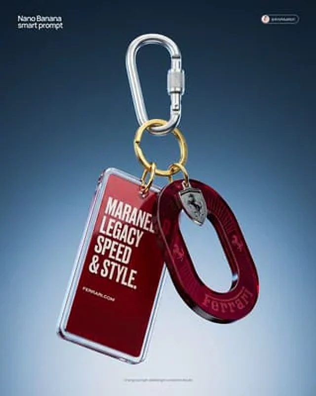
[BRAND NAME] Act as a High-End CGI Product Photographer and 3D Render Artist specializing in streetwear merch and limited-edition collectibles. PHASE 1: CONCEPT & OBJECT Create a photorealistic CGI product shot of a premium keychain set suspended in mid-air against a neutral gradient studio background. The keychain set consists of THREE elements connected to a single polished silver carabiner clip with a gold-plated split ring: ELEMENT 1 — ACRYLIC TAG: A rectangular acrylic charm (approx. 4:9 ratio, rounded corners, 3mm thick). Layered construction: clear gloss acrylic front panel over a [BRAND NAME]-colored background insert. The background insert carries bold, condensed all-caps typography — autonomously generate a short poetic or brand-relevant phrase (4–8 words) that matches [BRAND NAME]'s tone of voice, set in a heavy condensed grotesque typeface (Bebas Neue / Impact / custom bold). Include [BRAND NAME]'s URL or tagline in small print at the bottom of the insert. Micro-printed fine text fills the lower third as a design texture element. ELEMENT 2 — OVAL MEDALLION CHARM: A die-cut oval hoop/ring shape (donut silhouette, 40mm diameter) made from tinted translucent acrylic or resin. Autonomously determine the iconic brand color of [BRAND NAME] and apply it as the tint (deep saturated, jewel-tone translucency — e.g., gold, cobalt, emerald, crimson). The [BRAND NAME] wordmark is engraved or UV-printed in bold all-caps along the inner curve of the ring. Add 1–2 small iconographic symbols (logo mark, globe icon, cloud glyph) laser-engraved onto the face. Subtle radial sun-ray pattern embossed on the surface. ELEMENT 3 — HARDWARE: Silver anodized aluminum carabiner with knurled locking barrel. Gold-plated brass split ring (key ring loop) at the top. All metal surfaces show micro-scratches and machining marks — no perfect CGI plastic. Industrial precision aesthetic. PHASE 2: MATERIAL & TEXTURE Render all acrylic elements with full Ray Tracing and Subsurface Scattering — light must visibly pass through the tinted acrylic creating internal glow. Apply Fresnel reflection on acrylic edges. Surface imperfections: hairline scratches, micro-dust particles, smudge traces on the clear panel (subtle, editorial-level — not dirty). Metal: PBR metallic workflow — anisotropic specular highlights on the carabiner barrel, brushed finish on the ring. Typography on acrylic must appear screen-printed or UV spot-coated — slight ink texture, not floating. PHASE 3: COMPOSITION & STAGING Levitation shot: the entire keychain set hangs suspended from the top of frame, centered with a 10–15 degree rotation to the right (showing dimensionality). Nothing touches a surface — pure float. Camera angle: slightly below eye-level looking up at ~5 degrees, portrait orientation (4:5 ratio). Depth of Field: focus plane centered on the oval medallion, acrylic tag in sharp secondary focus, top hardware with micro bokeh blur. Aperture equivalent: f/4.0. Negative space: generous — object occupies 55% of frame. PHASE 4: LIGHTING Primary: large octabox soft key light, positioned top-right at 45 degrees — creates clean specular bloom on acrylic edges. Secondary: subtle rim light from bottom-left, cool temperature (5500K), separates the object from background. Background: seamless gradient cyclorama — dark steel blue (#1a2535) at top transitioning to pale silver-grey (#d0d8e0) at bottom. No hard shadows cast. Global Illumination active. Chromatic Aberration: micro-level, visible only on acrylic edges (adds realism, prevents CGI-plastic look). No lens flare. No neon. No HDR overblown highlights. TECH SPECS Render engine: Octane Render or Blender Cycles (path-traced) Resolution: 4096 x 5120px (4:5 portrait) Samples: 4096 minimum Color profile: Adobe RGB, D65 white point Post-processing: subtle film grain overlay (ISO 400 equivalent), +5 clarity, -10 highlights, neutral color grade Output mood: High-end streetwear lookbook / limited drop product page Style references: Kith accessories, Highsnobiety product editorial, Fragment Design merch photography NEGATIVE: No white studio infinity cove. No flat lay. No hand holding the product. No fake bokeh blur filters. No AI plastic sheen. No floating text outside the object.

Example generated from “AmirMušić #606”
Nano Bananaen
AmirMušić #606

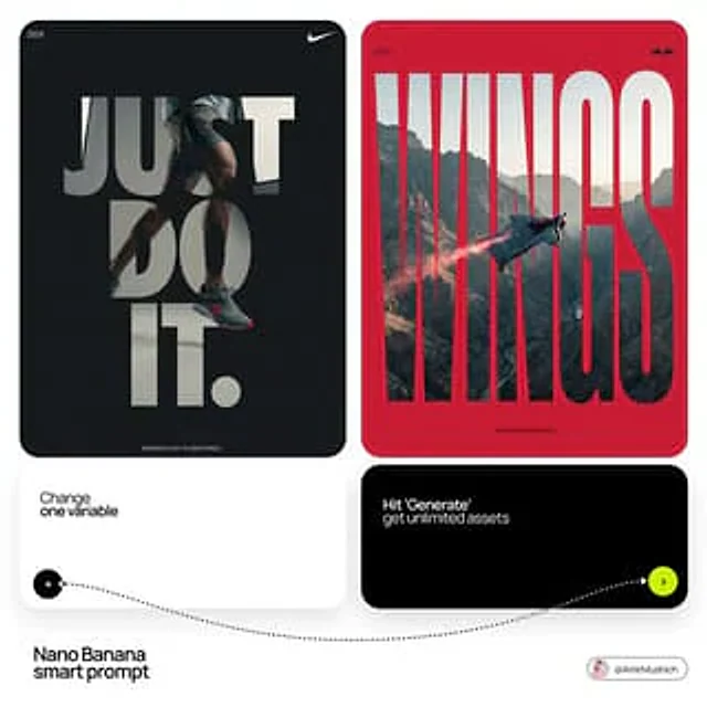
[BRAND NAME]. Act as a Senior Editorial Designer and Typographer. PHASE 1: TYPOGRAPHIC MASK (THE "WINDOW" EFFECT). - Core Element: Use the most iconic slogan or the name of [BRAND NAME] as a massive, ultra-bold, heavy sans-serif typographic mask. - Layout: The letters must be giant, filling the entire vertical frame from edge to edge with tight kerning. - Concept: The text acts as a "cut-out" window. The background is solid white, and the photographic subject is visible ONLY through the letterforms. PHASE 2: DYNAMIC SUBJECT LOGIC. - Subject Selection: - Detail: Ensure a high-contrast element (like a red shoe or a glowing headlight) is visible through one of the letters as a focal point. PHASE 3: SOPHISTICATED MUTED PALETTE. - Atmosphere: Use a "Refined Muted" color scheme. - Tones: Soft slate blues, charcoal greys, and creamy off-whites for the photography inside the mask. - Accent: Identify one sharp, saturated accent color belonging to [BRAND NAME] and apply it to a single key object visible through the text. PHASE 4: PHOTOGRAPHY & LIGHTING. - Lighting: Soft-box studio lighting. Diffused shadows and gentle highlights to create a cinematic, high-end editorial feel. - Finish: Clean, matte texture with zero visual noise. High-definition photographic quality. PHASE 5: MINIMALIST BRANDING. - Accents: Add a tiny minimalist logo and a small vertical tagline in a clean, microscopic sans-serif font near the corners. - Year: Include the year "2026" in a subtle, elegant font to mimic a limited-edition look.

Example generated from “AmirMušić #609”
Nano Bananaen
AmirMušić #609

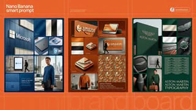
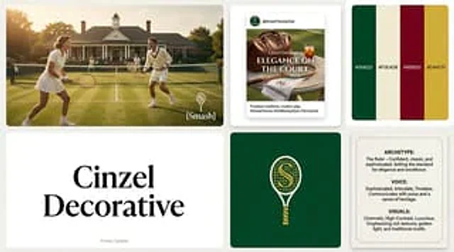
[BRAND NAME]. Act as a Senior AI Visual Strategist & Creative Director. Goal: Generate a grid-based brand identity showcase. PHASE 1: COMPOSITION & LAYOUT Set the scene on a deep, rich [BRAND PRIMARY COLOR] background. Implement an 8-module grid with rounded corners and thin separation lines. - Large Modules: Top Left and Bottom Right. - Small/Medium Modules: Fill the remaining space. PHASE 2: AUTONOMOUS BRAND LOGIC (THE CORE) [INSTRUCTIONS FOR IMAGEN]: Analyze the name "[BRAND NAME]". Determine the industry (e.g., Tech, Luxury, Eco, Automotive, Fashion). Do NOT default to sports/tennis unless the brand name explicitly requires it. Adapt all secondary elements (accessories, textures, model's activity) to match this industry. PHASE 3: MODULE CONTENT (DYNAMIC ADAPTATION) - MODULE 1 (Exterior): A flagship building façade. Use textured walls in [BRAND PRIMARY COLOR]. Feature a large [BRAND NAME] wordmark and a geometric abstract logo in a contrasting Cream/Beige. - MODULE 2 (Colors): A vertical swatch panel. Sequence: [BRAND PRIMARY COLOR], Cream, Deep Black, White. Satin finish. - MODULE 3 & 5 (Core Logo): Detailed close-ups of the brand's unique geometric icon. - MODULE 4 (Accessory): AUTONOMOUS CHOICE. If [BRAND NAME] is Tech, show a sleek device. If Luxury, show a watch or jewelry. If Eco, show sustainable packaging. Must be in brand colors. - MODULE 6 (Urban): A street-level mockup on a concrete wall. A person in an all-black outfit walks past a branded panel. - MODULE 7 (Editorial): A high-end lifestyle shot. - Model: Professional, editorial style. - Outfit: Premium sweatshirt in [BRAND PRIMARY COLOR] with brand logo. - Prop: AUTONOMOUS CHOICE based on industry. (e.g., a leather briefcase for Finance, a camera for Media, a designer bag for Retail). - MODULE 8 (Specs): Top half: A complex repeating pattern based on the brand logo. Bottom half: Four lines of text " [BRAND NAME] TYPOGRAPHY" in a clean, high-end sans-serif. PHASE 4: LIGHTING & TEXTURES - High-End Editorial Photography. No "AI-plastic" look. - Cinematic soft-box lighting with Rembrandt shadows. - Micro-details: fabric weave, skin pores, concrete grit, leaf veins. - Subsurface scattering on organic materials. PHASE 5: TECH SPECS 8K Resolution, Octane Render style, Ray Traced reflections, subtle film grain.

Example generated from “AmirMušić #610”
Nano Bananaen
AmirMušić #610

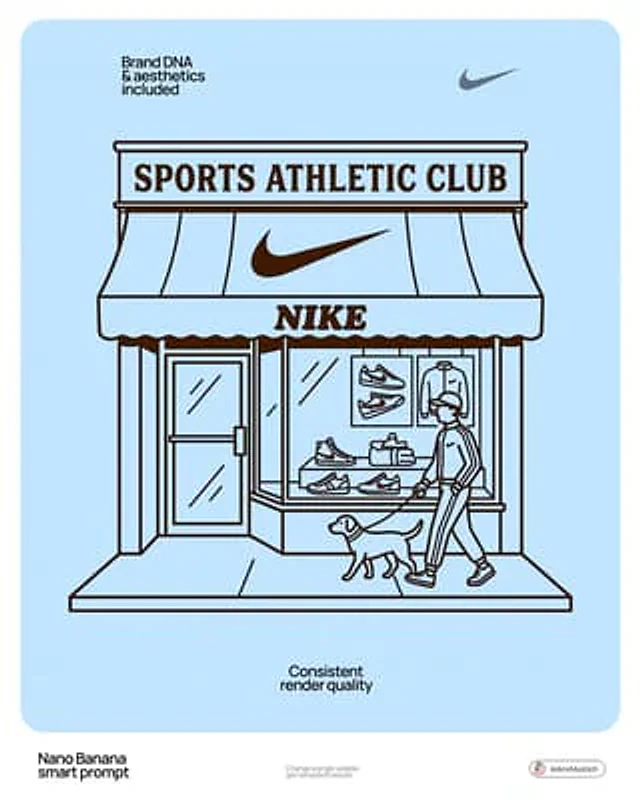
[BRAND NAME] | [SUBJECT_TOGGLE]. Act as a Lead Graphic Designer. PHASE 1: ARCHITECTURAL SETTING. Create a minimalist 2D vector illustration of a vintage-style storefront representing [BRAND NAME]. - Autonomously design the facade (Modernist, Industrial, or Classic) to match the brand's heritage. PHASE 2: SUBJECT LOGIC (TOGGLE SYSTEM). - If [SUBJECT_TOGGLE] is "OFF": Show only the empty storefront. - If [SUBJECT_TOGGLE] is "ON": Autonomously add 1-2 characters or a pet that fits the brand's lifestyle. PHASE 3: DYNAMIC TYPOGRAPHY (CORRECTED). - Header: Autonomously generate a high-status "Club" or "Community" title based on the nature of [BRAND NAME]. * Examples: For Starbucks — "Coffee Roasters Society"; for Nike — "Elite Runners Club"; for Apple — "Digital Creators Guild". - Branding: Place the [BRAND NAME] logo clearly on the storefront awning. - Contextual Info: Below the awning, add "EST. [REAL FOUNDING YEAR]" and "[REAL ORIGIN CITY]". PHASE 4: VISUAL STYLE. - Two-tone palette: [BRAND SIGNATURE COLOR] on a pure white background. - Style: 1950s-60s Retro Line Art. No gradients, no shadows. TECH SPECS: Flat 2D vector, 8k resolution, monochrome aesthetic, centered composition.

Example generated from “AmirMušić #614”
Nano Bananaen
AmirMušić #614

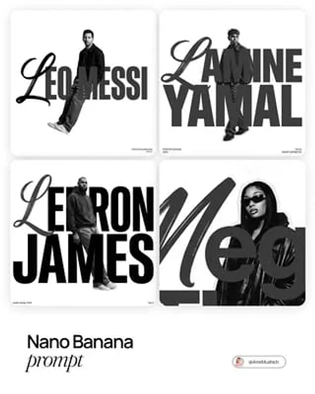
[PERSON NAME]. Act as a graphic designer creating a minimalist, avant-garde streetwear poster. COMPOSITION (THE FUSION): The image is a creative fusion of a massive typographic name and a monochrome portrait of [PERSON NAME]. The Subject: A high-contrast, black-and-white full-body or 3/4 cut-out photograph of [PERSON NAME]. The subject stands centrally, looking cool and detached. The Typography: The person's name is written horizontally across the entire width of the image. The text interacts with the body: the person stands through the letters, creating a "woven" depth effect (some limbs in front of text, some behind), or the portrait creates a silhouette mask for the text. TYPOGRAPHY STYLE (MIXED SCRIPTS): Mimic the specific "Street Editorial" font pairing: The First Letter: The initial letter of the name is rendered in a large, sweeping, expressive Calligraphic Script or Brush font (dynamic and loose). The Rest of the Name: The remaining letters are rendered in an Ultra-Heavy, Geometric Sans-Serif font (like Impact or Helvetica Black). Color: The text is solid Dark Grey or Black. AESTHETICS & ATMOSPHERE: Palette: Strictly Monochrome (Black, White, and Greyscale). Background: Pure, vast White Minimalist background. Extensive negative space. Vibe: Raw, "Zine" aesthetic, cut-and-paste collage feel, high-fashion streetwear poster. LAYOUT DETAILS: Add very small, microscopic functional text in the extreme corners (e.g., "poster design", "2025", "fig 01") to enhance the Swiss Design poster feel.

Example generated from “AmirMušić #634”
Nano Bananaen
AmirMušić #634

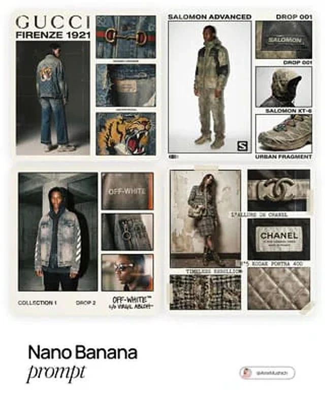
[BRAND NAME]. Act as a Creative Director and Brand Strategist. PHASE 1: CONCEPT & COMPOSITION. Create a multi-panel fashion lookbook collage (grid layout) on a clean off-white background. - Main Shot: A full-body editorial pose of a model wearing a signature [BRAND NAME] piece. - Detail Shots: 3-4 smaller rectangular frames showing macro crops of fabric, hardware, and stitching. - Autonomously determine the garment type based on the brand's current hype items. PHASE 2: VISUAL STYLE & TEXTURE. "High-End Lo-fi" aesthetic. Intense film grain, analog noise, and scanline artifacts. Heavy, premium clothing textures: faded vintage washes, distressed edges, and high-quality "cracked" screen prints. Muted, moody color palette with brand-specific accents. PHASE 3: DYNAMIC TYPOGRAPHY & LOGIC. Autonomously analyze the [BRAND NAME] heritage and core identity to generate unique typography. - Content: Instead of generic "Drop" labels, generate text based on the brand’s DNA: - Style: Match the font to the brand's era (e.g., brutalist sans-serif for modern labels, elegant serif for luxury house heritage). Integrate the [BRAND NAME] logo with a distressed, "Xerox-copied" texture. TECH SPECS: 35mm film look (Kodak Portra 400), f/5.6 for raw sharpness, high ISO grain. High-contrast editorial flash, deep shadows. Octane render quality with an analog scan soul.

Example generated from “AmirMušić #672”
Nano Bananaen
AmirMušić #672

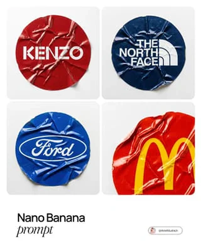
A sharp, top-down macro photograph of a single, heavily crumpled circular vinyl sticker featuring the official [BRAND NAME] logo. MATERIAL & TEXTURE (VINYL): The sticker is made of durable, slight-gloss vinyl material, not paper. It is severely crinkled with sharp, defined ridges and deep stress folds across its entire surface. Unlike soft paper creases, these vinyl wrinkles show plastic stress and catch the light with subtle specular highlights on the peaks of the folds. The edges are slightly curled from wear. COLOR PALETTE (BRAND DYNAMIC): The background color of the circular sticker itself is the dominant primary color associated with [BRAND NAME]'s official brand palette (e.g., if Ferrari, red; if John Deere, green). The logo is printed clearly in its standard contrasting color (e.g., white or black). LIGHTING (STUDIO BRIGHT): Bright, clean, high-key overhead white studio lighting. This intense lighting creates strong, clean highlights on the vinyl's crumpled ridges and defined, crisp shadows in the valleys, dramatically emphasizing the 3D topography of the damage. BACKGROUND & COMPOSITION: The camera is locked in a strict, perfectly parallel top-down flat lay view. The sticker is adhered flat onto a pure white plastic surface which has a subtle, fine granular texture (like bead-blasted plastic) to provide tactile contrast to the smooth vinyl. The entire sticker is in sharp focus.

Example generated from “AmirMušić #678”
Nano Bananaen
AmirMušić #678

[BRAND NAME] | [OBJECT] Act as a High-End Commercial Product Photographer and Creative Director shooting a luxury editorial campaign (Hypebeast / Highsnobiety /Wallpaper* level). PHASE 1: BRAND INTELLIGENCE The hero subject is a [OBJECT] branded for [BRAND NAME]. Autonomously determine [BRAND NAME]'s full visual identity: signature color palette, typographic DNA, logo mark geometry, material language, and cultural positioning. Apply this identity to the [OBJECT] with precision — do not invent a generic brand, decode the real visual codes. PHASE 2: OBJECT SURFACE & MATERIAL DNA Regardless of the shape of [OBJECT], apply this material system: Base tone: deep neutral — matte dark graphite, warm charcoal, or matte black. Fine-grain surface micro-texture visible under raking light — powder-coat, matte paper, or brushed material feel. Subtle gradient bloom: the base color dissolves in the lower portion of the object's surface into the brand's most iconic accent color — a soft luminous haze from within the material, not a printed graphic. Logo application: embossed, debossed, or metallic foil relief — catching specular light at edges only. Precise. Restrained. Typography: brand-accurate typeface, small tracking, positioned with editorial intentionality. PHASE 3: THE ACCENT BREAKOUT ELEMENT This is the signature design move — adapt it to the natural geometry of [OBJECT]: Identify the most logical "interruption zone" on [OBJECT] — a seam, edge, band, collar, rim, strap, or wrap point. At this zone, apply a narrow saturated accent element in the brand's most iconic hue — vivid, slightly matte. This element must visually "break out" of the object's boundary — extending, protruding, or wrapping beyond the expected edge, creating a deliberate 3D tension between the object and the detail.The accent element carries a micro-typographic brand detail — tagline, model name, or descriptor — small, precise, tracked. PHASE 4: STAGING & COMPOSITION Studio cyclorama. Surface tone: off-white to warm light gray. Background field: cool neutral mid-gray, darker in upper zone. [OBJECT] positioned at 3/4 angle — front face and one secondary surface simultaneously visible. Rule of thirds: object occupies right 60% of frame. Left field: generous negative space — intentional, not empty. Single hard-edged directional shadow cast to the right and slightly downward — crisp penumbra, no diffusion. PHASE 5: LIGHTING Single dominant key light: large softbox, camera-left, elevated at 40°. Specular highlight traces the top-left edge of [OBJECT] — revealing material grain. Shadow side: no fill. Darkness earns depth. Subtle ambient bounce from cyclorama floor — lifts shadow by 15%, no more. Accent element receives micro-specular glint along its dominant edge. Mood: Rembrandt chiaroscuro logic applied to product photography. No lens flare. No atmospheric effects. PHASE 6: TECH SPECS Lens: 85mm equivalent, f/4.5. Depth of field: object fully sharp, background softened. Chromatic aberration: subtle, at extreme frame edges only — optical realism signal. Film grain overlay: 15% opacity — anti-CGI-plastic treatment. Render: Octane / Ray Tracing quality —subsurface scattering where material demands it, global illumination, physically accurate shadow falloff. Aspect ratio: autonomously determine optimal ratio for this [OBJECT] format.

Example generated from “AmirMušić #686”
Nano Bananaen
AmirMušić #686

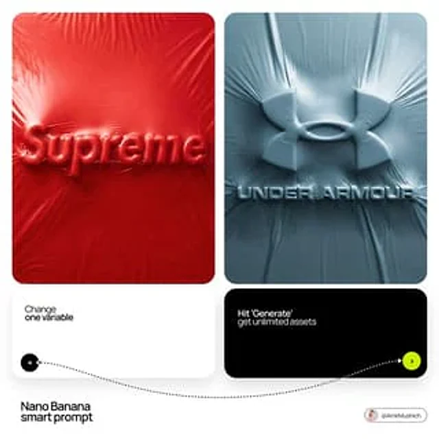
[BRAND NAME] + [COLOR] Act as a Senior CGI Artist specializing in shrink wrap simulation and 3D material rendering. Your task: render [BRAND NAME]'s complete logo — icon mark AND wordmark if the brand uses one — completely wrapped under a single layer of tight stretched plastic film or shrink wrap. The logo forms are visible only as raised shapes beneath the material, never exposed directly. BRAND INTELLIGENCE SYSTEM Before executing, resolve: (1) LOGO GEOMETRY — identify [BRAND NAME]'s complete visual identity mark — this includes both the icon symbol AND the wordmark/logotype if the brand uses them together. Render both elements as they appear in the brand's official lockup. If the brand uses only an icon with no wordmark, render the icon only. If the brand uses a wordmark without an icon, render the wordmark only. Preserve the correct spatial relationship between icon and text as it appears in the real logo, (2) COLOR SYSTEM — based on [COLOR], determine one single monochromatic tone that covers everything in the scene without exception — the wrapped object, the background surface, the film material — pure tonal unity with variation only through light and shadow, (3) FILM CHARACTER — based on [COLOR] determine the stretch film behavior: bright saturated colors become tight latex or glossy shrink wrap with visible tension lines, neutrals become matte stretch film like packaging plastic, darks become semi-transparent vacuum seal film, light colors become frosted cling wrap. PHASE 1: SCENE & SURFACE The entire scene is monochromatic — one single color [COLOR] covers every element without exception. The background is the same film material pooling and wrinkling loosely around the central wrapped object — a continuous surface of the same material with natural stress lines, crinkles, and soft folds radiating outward from where the film is pulled tightest over the logo forms. No floor line. No walls. No horizon. Just continuous film material in every direction filling the entire frame. PHASE 2: THE WRAPPED LOGO — CRITICAL [BRAND NAME]'s complete logo — resolved in the brand intelligence system — exists as solid three-dimensional inflated forms. Each element of the logo — every letter, every curve of the icon, every geometric element — is volumetrically inflated like a balloon, giving each component roundness and depth. The complete logo lockup sits on the background surface and is covered by a single continuous layer of stretch plastic film pulled tightly from above. The film conforms precisely to every raised logo element — stretching tightly over the peaks of each inflated letter and icon form, creating visible tension stress lines in the film where it is pulled most taut, and releasing into loose crinkled pools of excess material in the gaps between letters, in the negative spaces of the icon, and around the outer perimeter of the logo where the film relaxes back onto the background surface. The entire logo must remain fully legible through the film — every letter readable, the icon identifiable — but no surface of the actual logo is ever directly visible or exposed. Only the film surface exists. The physical behavior of the film must be accurate: tight stretch over high points, stress lines radiating from tension peaks, loose crinkle pools in valleys, the film slightly lifting off the surface in the spaces between raised elements creating small shadow gaps underneath. PHASE 3: LIGHTING Large soft area light from upper-left — diffused and broad. The lighting reveals the film's topography: raised logo elements catch more light on their peaks, valleys and gaps between forms fall into progressively deeper shadow, background crinkled film shows its own shadow landscape of stress lines and folds. For glossy or latex film [COLOR]: add subtle specular highlights running along the highest tension points of the film — a tight line of brighter light along the film's most stretched areas. For matte film [COLOR]: no specular, pure diffuse light only. Global illumination on — ambient light fills shadow areas enough to retain detail in the deepest folds without flattening the overall relief. TECH SPECS The entire image is one color — [COLOR] — applied to every surface with variation only through light and shadow. No other colors anywhere. No exposed logo surfaces. No additional text beyond what is part of [BRAND NAME]'s actual logo lockup. Film simulation must be physically accurate — real stretch film behavior, real tension dynamics, real crinkle patterns. No fabric look. No cloth drape. This is plastic film — it has different tension behavior than textile: tighter, more stressed, more geometric stress lines, less organic drape. Film grain: ISO 400 equivalent. Mood: a product sealed for shipping, a reveal imminent, the form known but not yet touched.

Example generated from “AmirMušić #694”
Nano Bananaen
AmirMušić #694

[PERSONE]. Act as a Senior Art Director. PHASE 1: PHOTOGRAPHIC COMPOSITION. - Layered Effect: Double exposure photographic collage. High-definition action shot in the foreground; massive monumental silhouette in the background. - Overlap: The subject must seamlessly integrate with the background graphics. PHASE 2: CONTEXTUAL VIBE SIMULATION. - Identity Analysis: Autonomously identify the core industry of [PERSONE] (Sport, Music, Cinema, or Business). - Pose & Props: PHASE 3: DYNAMIC COLOR & BRAND SIMULATION (VARIABLE COLORS). - Primary Color (Atmosphere): Identify the MOST ICONIC color associated with [PERSONE] or their team/brand. Use this for the background, halftone textures, and smoke. - Accent Color (Impact): Identify a secondary high-contrast VIBRANT hue (e.g., neon, gold, or electric white). Use this for the "Radial Burst" rays. - Visual Texture: Apply heavy film grain and halftone dots (screen printing effect) to the shadows of the high-res photos. PHASE 4: GRAPHIC ACCENTS. - Geometry: Bold radial rays bursting from the center. Fluid, wave-like organic shapes at the base. - Birds: Minimalist black bird silhouettes for scale and depth. PHASE 5: BRANDING & TEXT. - Tagline: Generate a powerful, one-word or two-word slogan tailored to [PERSONE]'s legacy. - Logo: Place a minimalist, industry-appropriate logo in the bottom corner. - Typography: Bold, high-impact Sans-Serif. TECHNICAL FINISH: - Quality: 8k resolution, authentic commercial photography style (NOT an illustration). - Lighting: Extreme studio rim-lighting (contour highlights) to separate the photographic subjects from the graphic layers.

Example generated from “AmirMušić #699”
Nano Bananaen
AmirMušić #699

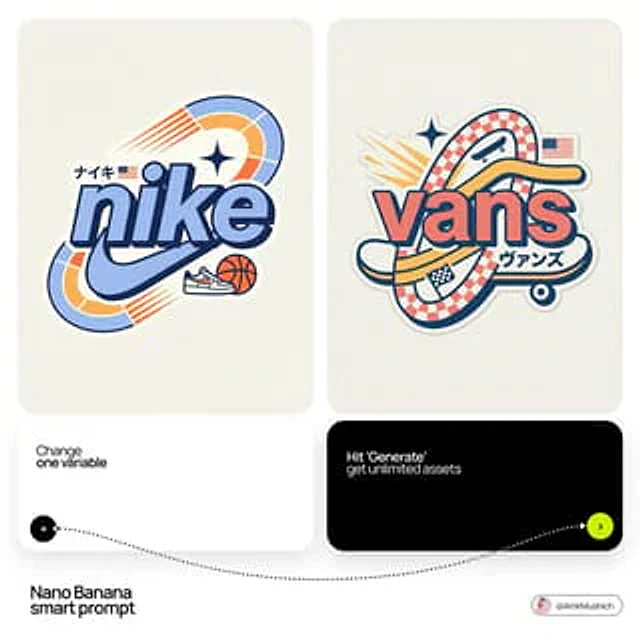
[BRAND NAME] Act as a Senior Vector Graphic Designer specializing in Y2K Japanese streetwear badge design. Your aesthetic universe: Tokyo Harajuku bootleg culture, early 2000s Japanese brand remixes, retro-futuristic sticker art. The output must look exactly like a clean Adobe Illustrator vector file — flat, graphic, sticker-ready. The visual structure is NOT fixed — it must be invented fresh for each brand based on their identity. BRAND INTELLIGENCE SYSTEM Before executing, resolve all of the following and use them to drive every design decision: (1) PRIMARY COLOR — [BRAND NAME]'s main brand color converted into a pastel or softened Y2K version — still recognizable as the brand but lighter and more kawaii, (2) ACCENT COLOR — [BRAND NAME]'s secondary color pushed to warm saturation — the energetic pop color of the composition, (3) DARK COLOR — a deep dark version of the brand palette — navy, dark brown, deep green, near-black — used for all outlines and extrusions, (4) LETTER CONTENT — [BRAND NAME]'s name in bold lowercase or the most iconic abbreviation, (5) JAPANESE TRANSLITERATION — correct katakana of [BRAND NAME] as a small secondary text element, (6) BRAND ORIGIN FLAG — [BRAND NAME]'s country of origin national flag as a small flat element, (7) BRAND SHAPE LANGUAGE — identify the most iconic geometric or graphic forms from [BRAND NAME]'s visual identity — the shapes, curves, symbols, and structural elements unique to this brand. These shapes become the orbital, background, and decorative elements of the badge — replacing generic ovals with brand-specific geometry, (8) BRAND CULTURAL SYMBOLS — identify 1–2 small iconic objects or symbols from [BRAND NAME]'s world that can be rendered as tiny flat illustrations within the badge — not the logo itself but objects associated with the brand's universe, (9) COMPOSITION LOGIC — based on all resolved parameters above, autonomously design the structural layout of the badge. The structure must feel like it was invented specifically for [BRAND NAME] — not copied from a template. Ask: what shapes from this brand's identity could orbit the letters? What geometry feels native to this brand? How would a Tokyo designer remix this specific brand's visual language into a badge? PHASE 1: CANVAS 1:1 square canvas. Background: flat off-white or warm light grey. Completely empty. No texture. No gradient. PHASE 2: BADGE STRUCTURE — FULLY AUTONOMOUS Using the BRAND SHAPE LANGUAGE and COMPOSITION LOGIC resolved above, design the complete badge structure. The only fixed rules are: the badge must have a central lettering element, surrounding geometric shapes that interact with the letters through z-layer stacking, at least one element that passes both behind and in front of the letters creating depth, and the overall silhouette must read as a unified badge or patch shape. Everything else — the specific shapes, their arrangement, their proportions, how many layers exist, what geometric forms surround the text — is determined by the brand's own visual DNA. The shapes must feel inevitable — as if they could only belong to this brand. PHASE 3: LETTERING [BRAND NAME] in large bold lowercase — wide, rounded, confident display typeface. Flat PRIMARY COLOR fill. Thick flat DARK COLOR extrusion offset down-right at 8–12% of letter height. Bold DARK COLOR outline. No gradients. No rendering. The letters are the anchor of the entire composition. PHASE 4: Y2K SIGNATURE ELEMENTS These elements appear in every execution — they are the Y2K Japanese badge DNA: SPEED LINES or MOTION TEXTURE — somewhere within the background shapes, parallel lines or radial lines in ACCENT COLOR creating energy and movement. 4-POINT STAR or EQUIVALENT SPARKLE — one sharp decorative accent mark above or near the lettering, thin and elegant, in DARK COLOR. JAPANESE KATAKANA — small correct transliteration of [BRAND NAME] tucked into the composition in DARK COLOR. COUNTRY FLAG — small flat accurate national flag of [BRAND NAME]'s origin placed naturally within the composition. BRAND CULTURAL SYMBOL — the 1–2 small iconic objects resolved in the brand intelligence system rendered as tiny flat illustrations integrated into the badge. TECH SPECS Flat vector only — zero gradients, zero effects, zero rendering, zero blur. Clean crisp edges throughout. Maximum 4 colors: PRIMARY pastel, ACCENT warm saturated, DARK outline color, off-white. The badge must feel like a collectible sticker or embroidered patch. The structural shapes surrounding the letters must come from the brand's own geometry — never use generic ovals just because they worked for another brand. Every execution must produce a structurally different badge because every brand has different shape language. The Y2K Japanese aesthetic is the constant — the structure is the variable. Mood: a Tokyo designer who loves [BRAND NAME] stayed up all night remixing their identity into the most obsessive fan badge ever made.

Example generated from “AmirMušić #701”
Nano Bananaen
AmirMušić #701

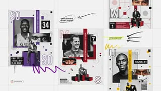
[PERSONE]. Act as a Senior Editorial Designer and Graphic Artist. Goal: Generate a complex, multi-layered Swiss-style collage poster for [PERSONE]. PHASE 1: SEMANTIC INTELLIGENCE (AUTONOMOUS) [INSTRUCTIONS]: Analyze "[PERSONE]". Determine their primary field (e.g., Elite Sports, Cyber-Engineering, Cinema, History). Select an "Iconic Accent Color" based on their identity (e.g., Racing Orange for a driver, Neon Cyan for a hacker, Crimson for a hero). Generate 3 key statistics or milestones (e.g., "7 TITLES", "98% ACCURACY") and a short professional title. PHASE 2: COMPOSITIONAL STRUCTURE (THE GRID) The image is a single vertical composition with overlapping geometric frames and segments: - MAIN SUBJECT (Top Left): A large, high-grain grayscale or color portrait of [PERSONE], smiling or looking confident. - DETAIL SHOT (Center Right): A zoomed-in, cropped rectangle showing only the eyes or a specific detail of [PERSONE]. - FULL BODY SHOT (Bottom Center): [PERSONE] sitting on a geometric box or podium in a relaxed but powerful pose. - BACKGROUND: Light gray with a heavy, tactile film grain/noise texture. PHASE 3: GRAPHIC ELEMENTS & TYPOGRAPHY - Initials: Large, outlined capital letters of the first and last name placed in opposite corners. - Vertical Ribbon: A solid color strip with the text "WORLD CHAMPIONSHIP LEADER" or a relevant title running vertically through the center. - Data Blocks: - A specific number (ID or rank) in a bold sans-serif block. - A "Statistics" block in the bottom-left corner with 3 lines of text (e.g., "TWO POLES / FOUR WINS / FIVE PODIUMS"). - Accents: Scatter orange and black squares, dotted circles, and small asterisks throughout the grid for visual complexity. PHASE 4: LIGHTING & TEXTURE - Texture: High-contrast, gritty, and grainy. The overall image should look like a printed high-end magazine or a vintage poster. - Lighting: Professional studio lighting on the subjects, but processed with a "risograph" or "halftone" feel. PHASE 5: TECH SPECS 8K Resolution. Swiss Modernism aesthetic. Flat vector shapes combined with hyper-realistic photography.

Example generated from “AmirMušić #717”
Nano Bananaen
AmirMušić #717

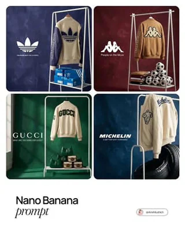
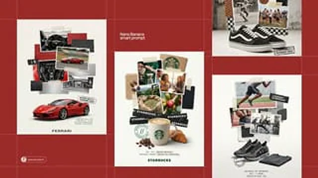
[BRAND NAME]. Act as a Creative Director and Still Life Photographer for a hypebeast fashion publication. THE TASK: Create a high-end "Showroom Still Life" photograph announcing a limited merchandise drop for [BRAND NAME]. PHASE 1: AUTONOMOUS CURATION (STRATEGY) Analyze [BRAND NAME]: Identify the industry and the core physical product (e.g., if "Spalding" -> Basketballs; if "McDonald's" -> Burger Boxes; if "Visa" -> Metal Cards). Determine the Palette: Background Color: A deep, rich, textured tone derived from the brand's secondary palette (e.g., Teal, Navy, Burgundy, Slate Grey). Merch Color: A contrasting warm or neutral tone (Camel, Orange, Cream) to pop against the background. Select the "Merch Item": Choose a high-quality apparel piece relevant to the brand's vibe (e.g., a Varsity Letterman Jacket, a Heavyweight Hoodie, a Canvas Tote, or a Wool Scarf). PHASE 2: SET DESIGN (THE RACK) The Prop: A simple, modern White Powder-Coated Metal Rack or Shelf unit. It stands cleanly in the frame. The Arrangement: Hanging Item: The chosen "Merch Item" (e.g., the Jacket) is draped casually over the rack or hanging on a hanger, showing off the texture (wool/felt). Stacked Items: On the shelves of the rack, stack multiple units of the brand's Core Product (e.g., a stack of basketballs, a pyramid of cans, a row of boxes). The Background: A Hand-Painted Canvas Backdrop in the chosen Deep Background Color. Visible texture/brushstrokes are essential for that "studio" look. PHASE 3: PHYSICAL BRANDING (TEXTURE) On the Merch: The hanging apparel must feature High-Quality Physical Branding. Use "Chenille Patches", "Embroidered Logos", or "Screen Print" running down the sleeve or on the back. It must look like a real, expensive garment. On the Products: Ensure the stacked core products have the correct [BRAND NAME] logo visible. PHASE 4: PHOTOGRAPHY & LIGHTING Lighting: Soft, directional window light from the side. Creates realistic, soft shadows on the rack and rich highlights on the textures. Lens: 50mm or 85mm. Sharp focus on the merch, slight fall-off in the background. PHASE 5: UI OVERLAY (THE "DROP" LAYOUT) Left Side Alignment: Large, clean White Logo of [BRAND NAME] floating in the negative space on the left. Under the logo, small white text with the brand's official slogan.

Example generated from “AmirMušić #722”
Nano Bananaen
AmirMušić #722

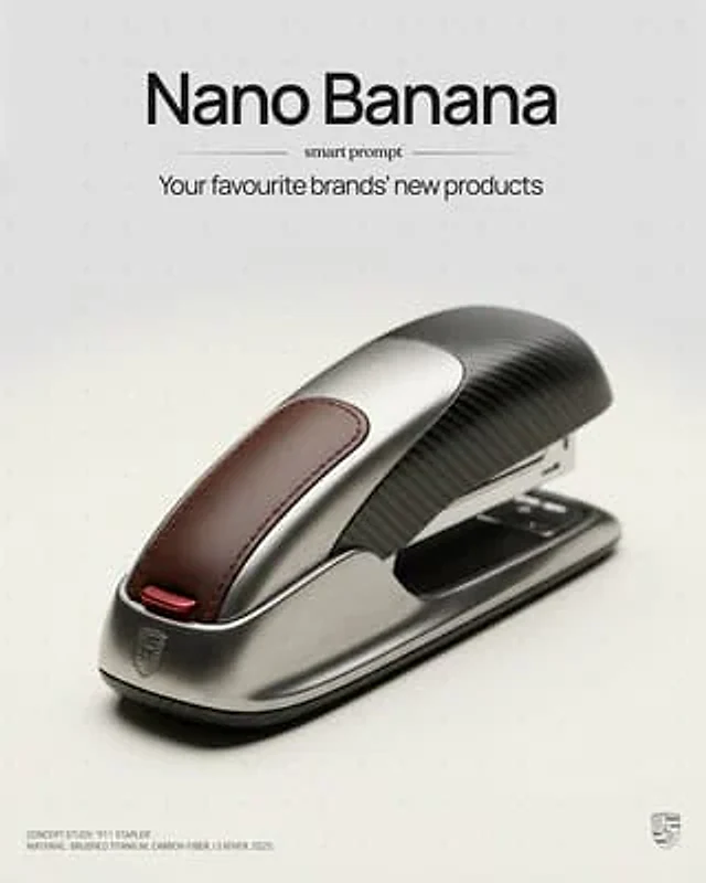
[BRAND NAME]: A high-end, glossy concept art magazine editorial photograph of a unique, unexpected functional object conceptualized and designed by the brand. **1. The Concept & Object (AI Invention):** Based on the design philosophy, heritage, and material vocabulary of the specified brand, the AI must invent a novel utility product (NOT standard clothing, shoes, or bags). Examples could be home goods, tech accessories, tools, or sporting equipment, reinterpretated through the brand's lens. The object should feel sculptural yet functional. **2. Materials & Details (Hyper-Premium):** The object is constructed from ultra-premium, highly tactile materials characteristic of the brand (e.g., patinated exotic leathers, brushed aerospace-grade titanium, sculpted matte ceramics, molded carbon fiber, or technical high-fashion textiles). Every detail is hyper-realistic: visible stitching, microscopic material grain, precision engravings, and complex texture contrasts. **3. Photography & Lighting (Cinematic Studio):** Shot on a medium format Phase One camera with a 100mm macro lens. Extremely shallow depth of field, with sharp focus on the hero details of the object and a creamy, smooth bokeh background. The lighting is sophisticated studio softbox lighting: gentle, enveloping fill light with precise rim lighting to accentuate contours and material textures. **4. Environment:** A seamless, impeccably clean studio cyclorama background in a pure, ultra-light pastel tone (e.g., desaturated mint, pale blush, or off-white), free of shadows. **5. Layout & UI Elements (Strict Placement):** - **Bottom Right Corner:** A small, understated, monochrome gray logo of the brand. - **Bottom Left Corner:** Small, minimalist monochrome gray text describing the invented product. The font style looks like Manrope Regular with very tight tracking (kerning) and balanced line spacing. Example format: "CONCEPT STUDY: [AI inserts invented product name]. MATERIAL: [AI inserts main materials]. SS25.

Example generated from “AmirMušić #748”
Nano Bananaen
AmirMušić #748

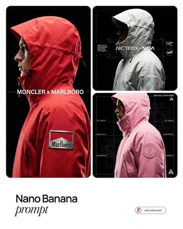
[BRAND NAME]. Act as a Creative Director for a technical outerwear brand and a High-End Product Photographer. THE TASK: Autonomously conceptualize and render a "Technical Outerwear Campaign Image" featuring a collaboration between the input brand ([BRAND NAME]) and a relevant performance fashion label. PHASE 1: PARTNER SELECTION & GEAR DESIGN (THE STRATEGIST) Analyze [BRAND NAME]: Is it Luxury, Sport, Industrial, or Lifestyle? Select the Apparel Partner: Luxury/Lifestyle -> The North Face, Moncler. Tech/Industrial -> Arc'teryx, Stone Island Shadow Project. Sport/Speed -> Nike ACG, Salomon. The Gear: Design a Heavy Technical Outerwear Piece (Parka, Shell Jacket, or Anorak) with a structured HOOD or HIGH COLLAR. Color: The garment must be the Signature Color of [BRAND NAME]. Material: Stiff, high-performance fabrics (Gore-Tex 3L, Ripstop) with matte finish. PHYSICAL BRANDING INTEGRATION (CRITICAL): You must integrate the [BRAND NAME] logo physically onto the garment in a way that looks expensive and high-tech. PHASE 2: PHOTOGRAPHY & LIGHTING (THE PROFILE) Framing: A tight Head-and-Shoulders Side Profile Shot. Model faces Left. Pose: Chin up, looking forward. Hood frames the face. Lighting (Chiaroscuro Tech): Key Light: Hard light hitting the face profile and the [BRAND NAME] LOGO on the jacket, creating sharp contrast. The Void: Background is Pure Void Black (#000000). Texture Priority: Maximize detail of fabric weave and the physical logo material. PHASE 3: UI & SCHEMATIC OVERLAY (BLUEPRINT AESTHETIC) Overlay a "Technical Blueprint" Interface (thin white lines): The Grid: Vertical hairline white lines cutting through the image. Left Sidebar: Vertical tech specs (e.g., "75D 133g/m2", "GORE-TEX 3L"). Center: Title "[PARTNER] x [BRAND NAME]". Right Side: The Partner Logo (e.g., The North Face logo) in white. PHASE 4: TECH SPECS 100mm Macro Lens, f/8, High Contrast, Unreal Engine 5 render quality, Commercial Techwear Look.

Example generated from “AmirMušić #753”
Nano Bananaen
AmirMušić #753

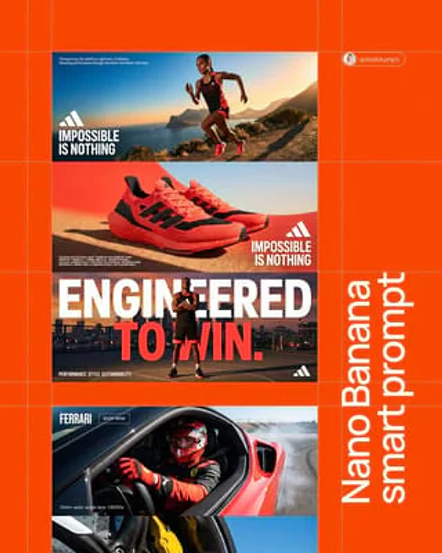
[BRAND NAME]. Act as a Senior AI Visual Strategist & Creative Director. Goal: Analyze the provided [BRAND NAME] and generate a high-end, three-panel vertical manifesto stack. Every element (color, slogan, technical text) must be a logical derivative of the brand's identity. PHASE 1: AUTONOMOUS BRAND ANALYSIS (INTERNAL SIMULATION) - Identify the core industry of "[BRAND NAME]". - Select a high-contrast primary color for the background (e.g., Electric Blue, Racing Red, or Titanium White). - Generate a powerful 3-word slogan and a 2-line brand philosophy description. - Generate a block of 5 technical specifications/keywords relevant to the brand's premium products. PHASE 2: COMPOSITIONAL STRUCTURE (THE VERTICAL STACK) Layout consists of three wide horizontal panels stacked vertically: TOP PANEL (Action & Identity): A dynamic wide-angle shot of a professional model using the brand's product. - Typography (Mid-Left): Place [BRAND NAME] logo and the 3-word slogan in bold white uppercase sans-serif. - Micro-Typography (Top-Left corner): Place the 2-line brand philosophy in a tiny, minimalist font. MIDDLE PANEL (The Hero Product & Density): A macro close-up focus on the product's high-fidelity details. - Typography (Mid-Right): Place [BRAND NAME] logo and the slogan here to create a diagonal visual flow from the top panel. - Technical Density (Bottom-Left corner): Add the 5 technical specifications in sharp, microscopic uppercase font to create a "technical blueprint" aesthetic and fill the negative space. BOTTOM PANEL (The Power Pose): A low-angle "hero shot" of the model. - Mega-Typography: Two massive, high-contrast slogans in white bold sans-serif overlaid across the center of the frame. - Corner Accents: A small brand icon in the bottom-right; a secondary micro-text in the bottom-left corner. PHASE 3: LIGHTING & TEXTURE STANDARDS - Lighting: Hard, direct "High-Noon" sunlight creating crisp, sharp-edged shadows and brilliant highlights (Chiaroscuro). - Textures: Extreme fidelity in skin pores, fabric weaves (tech-mesh, leather, carbon fiber), and precision-engineered materials. Zero "AI-plastic" look. PHASE 4: TECH SPECS 8K Resolution. Render: Octane/Redshift. Global Illumination. Ray Traced reflections. Cinematic photo grain.

Example generated from “AmirMušić #758”
Nano Bananaen
AmirMušić #758

[BRAND NAME] Act as a Senior Editorial Art Director and Campaign Photographer specializing in high-impact brand posters that combine action photography with bold graphic design. Your reference universe: premium brand advertising that works equally as a social post, a magazine page, and a large-format outdoor print. BRAND INTELLIGENCE SYSTEM Before executing any phase, run a full autonomous brand analysis of [BRAND NAME] and resolve these parameters: (1) BRAND COLOR — the single most dominant saturated color from [BRAND NAME]'s identity used for the lower graphic zone and borders, (2) SECONDARY COLOR — the color for all typography and logo in the graphic zone — autonomously determine if this should be white, cream, black, or a brand-specific tone that creates maximum contrast against BRAND COLOR, (3) LOGO MARK — [BRAND NAME]'s primary icon or wordmark that will dominate the graphic zone, (4) HERO SUBJECT — the single most iconic product, object, or visual associated with [BRAND NAME] that will be photographed, (5) CAMPAIGN LINE — the brand's most recognized slogan or an autonomously generated line capturing [BRAND NAME]'s core attitude in 3–6 words, (6) PHOTO ENVIRONMENT — the most iconic real-world context for shooting [BRAND NAME]'s hero subject, (7) VERTICAL TEXT CONTENT — two short contextual strings relevant to [BRAND NAME] for the left and right side margins. All parameters must be resolved before phase 1 begins. PHASE 1: CANVAS & FORMAT Vertical format, 4:5 ratio. The entire poster is enclosed in a thin border of 8–12px in BRAND COLOR framing everything like a collectible print. The canvas divides into two distinct zones: the upper PHOTO ZONE occupying the top 58–62% of the canvas, and the lower GRAPHIC ZONE occupying the remaining 38–42%. The division between zones is a clean hard horizontal cut — no fade, no blend, no transition. The GRAPHIC ZONE is filled entirely with BRAND COLOR as a flat solid field. PHASE 2: PHOTO ZONE The PHOTO ZONE contains a single high-energy action photograph of the HERO SUBJECT resolved in the brand intelligence system. Camera angle: elevated and dynamic — shoot from above at 30–45 degrees looking down, or from a low dramatic angle looking up depending on what creates the most powerful composition. Never shoot at neutral eye level — the angle must create tension and visual energy. The photograph fills the entire PHOTO ZONE edge to edge with no padding. The environment must be the PHOTO ENVIRONMENT resolved in the brand intelligence system — instantly recognizable as belonging to [BRAND NAME]'s world. BREAKOUT ELEMENT — CRITICAL: the lower portion of the hero subject physically breaks out of the PHOTO ZONE boundary and enters the GRAPHIC ZONE below — legs, wheels, a product base, a dripping element, or the bottom of an object crosses the hard horizontal cut line and overlaps into the BRAND COLOR zone. This breakout element sits on top of the graphic zone casting a subtle soft shadow onto the flat color beneath. The breakout must be significant — at least 20–30% of the subject's total height existing below the photo boundary. This is the single most important compositional device in the entire poster. PHASE 3: GRAPHIC ZONE The lower zone is a flat solid BRAND COLOR field. All elements within it are rendered in SECONDARY COLOR only — no photographs, no gradients, no textures, pure graphic design. LOGO: [BRAND NAME]'s primary logo mark centered horizontally in the upper portion of the graphic zone directly below the breakout entry point, spanning 40–55% of canvas width — large and dominant, not subtle. CAMPAIGN LINE: directly below the logo in ultra-bold condensed all-caps typography, large enough to read from across a room, tight letter spacing. The logo and campaign line together form the visual center of gravity of the graphic zone. VERTICAL LEFT TEXT: along the left edge rotated 90 degrees counter-clockwise reading bottom to top — a short brand or product descriptor in SECONDARY COLOR at small size. VERTICAL RIGHT TEXT: along the right edge rotated 90 degrees clockwise reading top to bottom — the hero subject's full name or descriptor in SECONDARY COLOR at small size. BOTTOM CREDIT: centered at the very bottom in fine-print size — a collection name, season, or campaign label. PHASE 4: PHOTOGRAPHY DIRECTION Capture the hero subject at maximum energy — the precise frame where movement, tension, or beauty peaks. For a person: mid-motion at full commitment to the action. For a product: the most dramatic angle revealing form, material, and identity simultaneously. For food: the moment of pour, cut, steam, or impact. For automotive: speed blur, drift, or heroic three-quarter angle. Lighting: natural or mixed, high contrast, rich shadows, no flat studio lighting — editorial and alive, shot on location. Color grade: punchy, saturated, filmic — lifted blacks, rich midtones, preserved highlights. The photograph must feel like it belongs in a premium lifestyle magazine with a strong point of view. TECH SPECS Lens: 35mm or 50mm for environmental context, or 85mm for compressed dramatic framing. Depth of field: subject sharp, background contextual at f/4 to f/8. Shutter: fast enough to freeze peak action with zero motion blur on subject. Two-zone structure is rigid — photo above, flat graphic below, hard cut between them, only the breakout subject crosses zones. Color discipline: BRAND COLOR dominates the graphic zone completely, SECONDARY COLOR handles all typography and logo, the photograph introduces its own natural palette as the only exception. Typography: condensed, bold, authoritative — no decorative fonts. Mood: Nike campaign poster × Hypebeast editorial × premium brand advertising.

Example generated from “AmirMušić #772”
Nano Bananaen
AmirMušić #772

[BRAND NAME] [PRODUCT TYPE] (Clothing / Food / Automotive / Tech). Goal: Generate a professional "scrapbook" style collage poster for [BRAND NAME] centered around a [PRODUCT TYPE]. 1. HERO PRODUCT (BOTTOM FOCUS) - Object: A high-definition, realistic 3D render of a [PRODUCT TYPE] by [BRAND NAME] at the bottom center. - Placement: Slightly angled to show depth, with soft realistic contact shadows on a plain off-white floor. 2. THE MULTI-LAYERED COLLAGE STACK - Photos: A vertical stack of overlapping photos with RAGGED, TORN paper edges rising above the product. - Content: Photos should show [PRODUCT TYPE] in use, lifestyle shots related to [BRAND NAME], and close-ups of specific details. - Materials: Physical swatches of textures related to [PRODUCT TYPE] (e.g., leather/fabric for clothing, metal/carbon for cars, organic ingredients for food). Include visible raw edges and stitching. - Fasteners: Use strips of semi-transparent masking tape and black duct tape with the "[BRAND NAME]" logo printed in white to "hold" the pieces together. 3. GRAPHIC OVERLAYS & STAMPS - Stamp: A black, distressed ink stamp or seal near the hero product with text: "AUTHENTIC QUALITY // SUSTAINABLE CHOICE". - Typography: Small, clean sans-serif and typewriter-style text blocks describing the heritage of [BRAND NAME] placed at the bottom. - Logo: The primary "[BRAND NAME]" logo centered at the very bottom in a minimalist font. 4. STYLE & ATMOSPHERE - Aesthetic: Industrial DIY, workshop moodboard, high-end editorial collage. - Lighting: Bright, studio high-key lighting with soft, multi-layered shadows between the paper scraps and textures. - Quality: 8K resolution, macro detail on paper grain, fabric fibers, and tape adhesive.

Example generated from “AmirMušić #782”
Nano Bananaen
AmirMušić #782

[BRAND NAME]. Act as a Creative Director and Fashion Photographer creating a high-end editorial lookbook image with a UI overlay layer. 1. THE SUBJECT (AVANT-GARDE STREETWEAR & NATURAL POSE): A fashion model stands centrally in a clean studio. Fashion Style: The outfit is a striking, conceptual "Modern Avant-Garde Streetwear" look that interprets the aesthetic and color palette of [BRAND NAME]. Think high-fashion meets street culture: experimental silhouettes, deconstructed layering, oversized proportions, unique material combinations, and bold details. It should feel innovative and editorial, but still grounded in streetwear, avoiding basic casual clothes. Pose: The model adopts a natural, relaxed, and effortless editorial pose (e.g., hands casually in pockets, a slight lean, looking off-camera or gently at the camera). Absolutely NO robotic, stiff, or "T-pose" stances. 2. THE UI OVERLAY (FROSTED GLASS RECTANGLE): Superimposed directly in front of the model's torso is a large, vertical Floating UI Element. Shape & Outline: A simple vertical rectangle with rounded corners, framed by a clean 2px solid White Stroke. Material (Glassmorphism): The interior of this rectangle is "Frosted Glass". The part of the model's outfit behind this glass must be heavily blurred (high Gaussian Blur), creating a translucent depth effect, while the rest of the model remains razor-sharp. 3. UI CONTENT (MINIMALIST & SMALL): Inside the frosted glass pane, place two elements in pure Monochrome White: Center: The official [BRAND NAME] logo, perfectly centered. Below Logo: Positioned significantly higher than the bottom edge, place two VERY SMALL, minimalist white navigation arrows (one pointing Left "<", one pointing Right ">"). They should be subtle and approximately 50% smaller than standard UI icons. 4. PHOTOGRAPHY STYLE & COMPOSITION (STRICT FRAMING): Style: High-End Editorial Fashion Photography. Real film grain, sophisticated soft studio lighting that emphasizes fabric textures. It must look like a real photograph, not a CGI render. Background: Infinite, pure White Studio Cyclorama. Framing (STRICT CONSTRAINT): The shot is a Wide Full-Body Photograph. The entire model (from top of head to bottom of feet) AND the entire UI overlay must be COMPLETELY CONTAINED within the image boundaries. There must be absolutely ZERO CROPPING of the subject or UI. There must be a very large, generous amount of empty negative space ("air") surrounding the subject on all four sides.

Example generated from “AmirMušić #793”
Nano Bananaen
AmirMušić #793

[BRAND NAME]. Act as a Senior AI Visual Strategist & Creative Director. Goal: Generate a high-motion triptych editorial where every visual element (color, text, props) is a direct semantic derivative of the brand name. PHASE 1: SEMANTIC BRAND ANALYSIS (AUTONOMOUS) [INSTRUCTIONS FOR IMAGEN]: Core Identity: Analyze "[BRAND NAME]". Define its industry, soul, and "vibe" (e.g., Kinetic, Organic, Brutalist, Ethereal). Color Psychology: Select a triadic palette based on brand associations: - BACKGROUND: The "Mood" color (e.g., Deep Forest for 'GAIA', Neon Amber for 'FUSE'). - ACCENTS/TYPOGRAPHY: The "Energy" color. Must have high contrast/readability against the background. - APPAREL: The "Statement" color. Completes the brand's visual signature. Copywriting: Generate 2-3 short, punchy slogans or keywords that resonate with the brand's mission to be used as background micro-text. PHASE 2: COMPOSITION (THE DYNAMIC TRIPTYCH) Layout: A single horizontal image split into three vertical editorial panels. - PANEL 1 (The Portrait): Extreme close-up. Bold [BRAND NAME] wordmark inside a geometric frame (circle or rectangle) overlapping the model's face or neck. - PANEL 2 (The Elevate): Medium shot. A model (gender determined by brand target audience) holds a primary brand-representative object above their head in a triumphant or symbolic gesture. - PANEL 3 (The Kinetic): Full-body shot. High-speed motion blur or an aggressive "power pose" interacting with the brand's core element. PHASE 3: GRAPHIC OVERLAYS & TEXTURES - Main Typography: Large, slanted (italic) heavy sans-serif in [ACCENT COLOR]. - Dynamic Ribbons: Vertical yellow or contrast tapes crossing the panels with repeating text: "[BRAND NAME] // [ASSOCIATED KEYWORD] // [BRAND NAME]". - Micro-Copy: Scattered small text in corners like "DESIGNED FOR [TARGET AUDIENCE]" or "EST. 2026 // GLOBAL IDENTITY". PHASE 4: LIGHTING & ESTHETIC STANDARDS - High-End Editorial (Vogue/Hypebeast style). - Global Illumination with crisp, sharp edges. - Realistic skin textures (pores, subtle sweat/shine) and high-fidelity fabric weaves. - No "AI-plastic" artifacts. PHASE 5: TECH SPECS 8K Resolution. Render: Octane. Subtle film grain. Ray-traced reflections on eyes and surfaces.

Example generated from “AmirMušić #837”
Nano Bananaen
AmirMušić #837

[BRAND NAME]: A high-end, glossy concept art magazine editorial photograph of a unique, unexpected functional object conceptualized and designed by the brand. **1. The Concept & Object (AI Invention):** Based on the design philosophy, heritage, and material vocabulary of the specified brand, the AI must invent a novel utility product (NOT standard clothing, shoes, or bags). Examples could be home goods, tech accessories, tools, or sporting equipment, reinterpretated through the brand's lens. The object should feel sculptural yet functional. **2. Materials & Details (Hyper-Premium):** The object is constructed from ultra-premium, highly tactile materials characteristic of the brand (e.g., patinated exotic leathers, brushed aerospace-grade titanium, sculpted matte ceramics, molded carbon fiber, or technical high-fashion textiles). Every detail is hyper-realistic: visible stitching, microscopic material grain, precision engravings, and complex texture contrasts. **3. Photography & Lighting (Cinematic Studio):** Shot on a medium format Phase One camera with a 100mm macro lens. Extremely shallow depth of field, with sharp focus on the hero details of the object and a creamy, smooth bokeh background. The lighting is sophisticated studio softbox lighting: gentle, enveloping fill light with precise rim lighting to accentuate contours and material textures. **4. Environment:** A seamless, impeccably clean studio cyclorama background in a pure, ultra-light pastel tone (e.g., desaturated mint, pale blush, or off-white), free of shadows. **5. Layout & UI Elements (Strict Placement):** - **Bottom Right Corner:** A small, understated, monochrome gray logo of the brand. - **Bottom Left Corner:** Small, minimalist monochrome gray text describing the invented product. The font style looks like Manrope Regular with very tight tracking (kerning) and balanced line spacing. Example format: "CONCEPT STUDY: [AI inserts invented product name]. MATERIAL: [AI inserts main materials]. SS25.

Example generated from “AmirMušić #839”
Nano Bananaen
AmirMušić #839

[PERSONE]. Act as a Creative Director and Master of Visual Metaphor. PHASE 1: DYNAMIC ARCHETYPE LOGIC. Autonomously analyze the core essence of [PERSONE] and assign them a "High-Status Sovereign" role: - If the character is a scientist/intellectual: Depict as a "Grand Archivist" in heavy velvet robes with celestial instruments. - If the character is a rebel/anti-hero: Depict as a "Wasteland Prophet" in deconstructed, layered streetwear and scavenged textures. - If the character is royalty/leader: Depict as a "Divine Monarch" in stiff, ornamental ceremonial attire. - Maintain the stoic, iconographic pose from the reference. PHASE 2: ART STYLE & INK (THE REFERENCE LOOK). Strictly follow the "Neo-Traditional Etching" style. - Bold black ink outlines, intricate cross-hatching, and stippling for shadows. - Color Palette: Deep Ochre, Faded Teal, Jet Black, and Bone White background. PHASE 3: DYNAMIC TYPOGRAPHY. - The massive Gothic/Blackletter halo behind the subject MUST explicitly spell out the name "[PERSONE]". - The font style should adapt to the archetype (e.g., sharp and aggressive for rebels, elegant and structured for scholars). TECH SPECS: 2D flat illustration, white background, ink-bleed effects, high contrast, sharp line-work.

Example generated from “AmirMušić #858”
Nano Bananaen
AmirMušić #858

[BRAND NAME]. Act as a Senior Editorial Designer and Typographer. PHASE 1: TYPOGRAPHIC MASK (THE "WINDOW" EFFECT). - Core Element: Use the most iconic slogan or the name of [BRAND NAME] as a massive, ultra-bold, heavy sans-serif typographic mask. - Layout: The letters must be giant, filling the entire vertical frame from edge to edge with tight kerning. - Concept: The text acts as a "cut-out" window. The background is solid white, and the photographic subject is visible ONLY through the letterforms. PHASE 2: DYNAMIC SUBJECT LOGIC. - Subject Selection: - Detail: Ensure a high-contrast element (like a red shoe or a glowing headlight) is visible through one of the letters as a focal point. PHASE 3: SOPHISTICATED MUTED PALETTE. - Atmosphere: Use a "Refined Muted" color scheme. - Tones: Soft slate blues, charcoal greys, and creamy off-whites for the photography inside the mask. - Accent: Identify one sharp, saturated accent color belonging to [BRAND NAME] and apply it to a single key object visible through the text. PHASE 4: PHOTOGRAPHY & LIGHTING. - Lighting: Soft-box studio lighting. Diffused shadows and gentle highlights to create a cinematic, high-end editorial feel. - Finish: Clean, matte texture with zero visual noise. High-definition photographic quality. PHASE 5: MINIMALIST BRANDING. - Accents: Add a tiny minimalist logo and a small vertical tagline in a clean, microscopic sans-serif font near the corners. - Year: Include the year "2026" in a subtle, elegant font to mimic a limited-edition look.

Example generated from “AmirMušić #878”
Nano Bananaen
AmirMušić #878

[BRAND NAME] ({INDUSTRY}). Act as a Lead Brand Designer creating a comprehensive "Brand Identity System" presentation (Bento-Grid Layout). **THE TASK:** Generate a single, high-resolution bento-grid board containing **6 distinct modules** that define the visual identity for [BRAND NAME]. --- **PHASE 1: VISUAL STRATEGY (AUTONOMOUS)** 1. **Analyze the Brand:** Determine the archetype and visual vibe. 2. **Define the Palette:** Select 4 distinct colors. 3. **Select Typography:** Choose ONE specific Google Font (Serif, Sans-Serif, or Display) relevant to the industry. **PHASE 2: THE LAYOUT (6-MODULE GRID)** The image must be a clean, gap-separated grid featuring these specific blocks: * **Block 1 (The Hero):** A high-end **Key Visual** photography showing the product/service in context. Cinematic lighting, photorealistic. Overlay the brand logo in white. * **Block 2 (Social Media):** A mockup of an **Instagram Post**. It features a bold headline using the brand font and a lifestyle image. * **Block 3 (The Palette & HEX):** A clean design block displaying **4 Vertical Color Swatches**. * *Crucial Detail:* Inside or below each color swatch, simulate distinct text looking like **HEX Codes** (e.g., "#1A2B3C"). * **Block 4 (Typography Spec):** A minimalist block dedicated to the **Brand Font**. * *CRITICAL CONSTRAINT:* Do NOT show the alphabet (Aa Bb Cc). * *The Content:* The block must display ONLY the **Name of the Font** (e.g., "Montserrat", "Lato", "Oswald") written in large, crisp characters using that specific font style. This acts as the visual specimen. * *Subtext:* Tiny text at the bottom reading "Primary Typeface". * **Block 5 (The Logo):** A solid background block featuring the **Final Logo** (clean, vector style, NO construction lines/grids). Minimalist and iconic. * **Block 6 (Brand DNA):** A text-heavy "Manifesto Card". It simulates a layout with three short paragraphs titled: * **ARCHETYPE:** (e.g., "The Innovator") * **VOICE:** (e.g., "Confident, Direct") * **VISUALS:** (e.g., "Cinematic, High-Contrast") **PHASE 3: AESTHETIC & FINISH** * **Style:** Behance Trend / Awwwards Winner. * **Quality:** 8k resolution, razor-sharp vector graphics mixed with high-end photography. * **Lighting:** Soft studio lighting across the whole grid to make it look like a cohesive presentation board.

Example generated from “AmirMušić #887”
Nano Bananaen
AmirMušić #887

[BRAND NAME] | [COLOR] Act as a 3D Motion Graphics Director and CGI Type Artist specializing in Japanese streetwear, Y2K motorsport aesthetics, and retro-tech hardware design. References: Kawasaki Racing livery, Yasuhiro Nightow title cards, Wipeout game UI, Peak Design × Japanese hardware collab. PHASE 0: BRAND LOGO INTELLIGENCE Retrieve the canonical logotype of [BRAND NAME] from training data. Identify its core typographic DNA — stroke weight, angle of italic lean, terminal style, any custom glyph cuts. If [BRAND NAME] uses a geometric or sans-serif wordmark — apply a 15 to 20° italic transformation while preserving all letterform proportions. If [BRAND NAME] already uses italic or script — preserve its native angle exactly. The goal is to translate the brand's typographic identity into a Japanese motorsport script register — aerodynamic, forward-leaning, built for speed. The letters must remain recognizable as [BRAND NAME]'s typeface, not replaced with a generic racing font. PHASE 1: PRIMARY TYPOGRAPHY SCULPTURE The wordmark of [BRAND NAME] is a fully 3D object — thick, physical, occupying real depth. Form language: each letter has a flat front face, beveled top and bottom edges with 30 to 45° chamfer cuts — the kind of angular geometry found on Japanese racing fairings and Kawasaki tank badges. Letters are slightly condensed and heavily italic — forward momentum is built into the geometry. The overall silhouette reads as one unified aerodynamic form — letters connect at their bases through a common ground plane, like a single cast aluminum piece. Material: high-gloss automotive lacquer in [COLOR] — the same paint system as a Japanese sports motorcycle tank. Surface properties: IOR 1.6, roughness 0.05, clear-coat depth visible. [COLOR] is pure and saturated in midtones, pushing toward near-white in specular peaks, pulling toward deep shadow in recessed zones and chamfer undersides. Reflections on the front face: subtle dark environment reflections — minimal and moody, just enough to show material depth. Top chamfer faces catch the primary light as bright highlight strips — the signature detail that defines 3D volume. PHASE 2: NEON WIRE OUTLINE SYSTEM A continuous neon tube traces the exact outer silhouette contour of the entire wordmark — every letter edge, every chamfer angle, every connecting point between letters. This is not a glow effect or a stroke — it is a physical glass neon tube, 4 to 6mm diameter, bent precisely to follow the letterform outline at a 3 to 5mm offset distance from the letter surface. Neon tube properties: glass tube body is semi-transparent — internal plasma glow visible through glass. Light emission: bright cold white light, color temperature 7000 to 8000K, pure white with very slight blue-cool bias. Emitted light creates a tight halo of illumination — 8 to 15mm radius soft glow on surrounding black void. The neon light bounces onto nearest letter surfaces — edges adjacent to the tube receive subtle cool white rim light. Tube construction: clean geometric bends at sharp corners, thin mounting wire clips at 3 to 4 points along its length — technically precise, like real neon sign hardware. PHASE 3: INTEGRATED TECHNICAL SCREEN A hardware screen panel is physically integrated with the wordmark — not a separate floating element, not placed at a distance. Integration logic — autonomously determine the most natural attachment point based on [BRAND NAME]'s logo geometry, choosing ONE of these integration modes: OVERLAP MODE — the screen panel is partially overlaid onto the rightmost or leftmost letter of the wordmark, as if mounted directly on the letter face. The letter surface shows through the screen's transparent zones. The screen edge cuts across the letter geometry deliberately — like a sticker or plate bolted onto the sculpture. EXTENSION MODE — the screen panel extends directly from the end of the final letter as a seamless continuation of the wordmark's ground plane — same italic angle, same 3D depth, as if the wordmark was designed with this panel as part of its original form. The transition from letter to screen feels like one continuous designed object. INSET MODE — the screen panel sits in a recess cut into one of the larger letters — as if a rectangular section of the letter body was removed and replaced with a hardware display. The letter geometry frames the screen on three sides. Screen physical construction: machined aluminum or brushed steel housing, same thickness as the letter sculpture — 8 to 12mm deep. The face is a slightly frosted acrylic panel backlit from within. The screen has the same italic angle as the wordmark — it is not upright, it leans with the composition. Screen contents rendered in precise small-scale detail: [BRAND NAME] in small clean technical sans-serif as primary label. An alphanumeric model code autonomously generated to feel authentic to [BRAND NAME]'s cultural language. 2 to 3 Japanese characters as secondary label. A horizontal LED progress bar — 4 to 6 rectangular segments, 1 to 2 lit in amber, others dark. A small ventilation grille or mesh pattern along one edge of the housing. The screen connects to the neon outline system via 1 to 2 thin cables — physical wires, 1 to 2mm diameter, with slight organic sag from gravity, running to the nearest neon tube mounting clip. PHASE 4: LIGHTING & ATMOSPHERE Background: pure absolute black (#000000 to #030303) — complete void, no ambient, no gradient, no surface. The composition is self-illuminated — only light sources are the neon tube emission, the screen's internal backlight, and a single narrow overhead spot. Overhead spot: focused directly above the wordmark center — illuminates top chamfer faces as bright highlight strips, falls off completely within 5 to 10cm of letterform edges, never reaches the background. Neon contribution: cool white rim light on adjacent letter edges, 8 to 15mm glow halo in surrounding void, reflected light on cables and screen housing. Screen contribution: the frosted acrylic face emits a soft diffused glow — slightly cooler than the neon, illuminating the immediate area of whichever letter the screen is integrated with. The amber LED segments create a warm micro-glow within the screen housing. No other light sources. No rim lights. No fill. Darkness is absolute outside self-illuminated zones. PHASE 5: COMPOSITION Aspect ratio: 1:1 square. The wordmark with integrated screen occupies the horizontal center — wider than tall, spreading laterally. The screen integration should feel like it was always part of the logo design — not an accessory bolted on, but a native component. Vertical position: slightly above center. The neon outline breaches the implied bounding box slightly at 1 to 2 points — confirming physical separation between neon tube and letter surface. Camera: slightly elevated 5 to 10° above center — reveals top chamfer faces and confirms 3D depth. Mild perspective. Depth of field: none — sharp across entire composition from screen detail to neon tube. PHASE 6: TECH SPECS Render: Octane Render or Redshift. Ray tracing: on — for accurate neon tube emission, screen backlight glow, glass refraction, cable shadows. Volumetric light: subtle around neon tube and screen face only — physically present glow without fogging the black void. Neon tube: dielectric glass material with physical light emission, not a glow map. Screen face: translucent acrylic with internal emissive backlight. Letter sculpture: automotive lacquer with full clear-coat depth. Anti-aliasing: maximum. Sampling: minimum 1024 samples. Film grain: none. Output feel: CGI title card or album cover — precision and atmosphere in equal measure. Darkness absolute. Neon and screen physically real.

Example generated from “Anissa #1012”
Nano Bananaen
Anissa #1012

unlimited nano banana pro, AI photo collage, vintage film look, black and white editorial, cinematic , analog photography aesthetic, collage, film grain texture, Ilford HP5 style, moody portrait lighting, street photography vibe, retro zine layout, AI photography workflow, prompt sharing, generative art prompts, editorial collage design

Example generated from “Anissa #1179”
Nano Bananaen
Anissa #1179

cinematic portrait of a young woman standing perfectly still as the city around her spirals in circular motion blur, streaks of headlights and neon lights orbiting her body like gravity pulling the world inward, dramatic teal and orange cinematic color grading, wind moving strands of hair, calm expression contrasting chaotic motion, shallow depth of field, shot on a 50mm lens, realistic skin texture, atmospheric night lighting, vertical composition

Example generated from “Anissa #1301”
Nano Bananaen
Anissa #1301

USE UPLOADED PHOTO AS REFERENCE. HOGWARTS-STYLE PHOTOSHOOT. THE GIRL IS POSING, IN A BLACK ROBE, THE UNDERSIDE OF THE ROBE IS RED, A WHITE COLLAR AND A TIED TIE OF GRYFFINDOR COLOR ARE VISIBLE. HER HAIR IS LOOSE, A DILAPIDATED, OLD BOOK IS PRESSED TO HER BODY IN HER HANDS. HE HOLDS A MAGIC WAND IN ONE HAND. A WHITE OWL SITS ON THE SHOULDER, THE BACKGROUND IS AN OLD STONE WALL, THE BACKGROUND IS SLAY. THEMATIC PHOTO SESSION. DETAILING, HIGH QUALITY. PORTRAIT.

Example generated from “Anissa #1327”
Nano Bananaen
Anissa #1327

Create a realistic portrait (100% identical face, no editing allowed). A hyper-realistic black-and-white portrait of a young beautiful woman with a calm, serious, and introspective expression, sitting casually on a stack of rustic wooden crates in a minimalist studio setting. She faces the camera directly with a relaxed yet confident posture, her legs slightly apart, one hand resting naturally between her knees and the other loosely stretched across her thigh, creating a powerful editorial fashion pose. She has straight, dark, shoulder-length hair with a natural center parting, slightly tousled, gently framing her face. Her facial features are delicate and symmetrical, with a naturally smooth skin texture, subtle shadows under her eyes, soft, slightly parted lips, and deep, expressive eyes staring directly into the lens, conveying a calm confidence and emotional depth. The lack of heavy makeup emphasizes the natural editorial aesthetic. Clothing & Style: She wears a fitted black blazer with structured shoulders over a simple white crew-neck T-shirt, paired with cropped black striped trousers. On her feet are modern, chunky white sneakers, paired with white calf-length socks with bold black horizontal stripes, adding a casual street-style contrast to the formal blazer. Minimal accessories, no visible jewelry. Her nails are painted black. Lighting & Ambiance: High-contrast cinematic lighting with strong, directional natural light coming in from the side, creating dramatic diagonal streaks of light and shadow on the plain studio walls and partly on her body. The lighting creates depth, texture, and a moody editorial atmosphere reminiscent of a high-end fashion magazine. Soft shadows preserve facial details while maintaining strong contrast. Camera & Composition: Medium-full-length shot, eye-level perspective, centered composition. Shot with a professional DSLR or medium format camera, using a prime lens (50mm–85mm). Shallow depth of field with sharp focus on the subject, subtle background blur. Sharp details, subtle texture of fabric, visible skin pores, realistic falloff. Style & Quality: Editorial fashion photography, minimalist, cinematic, monochrome aesthetic, Vogue-style portraiture, ultra-high resolution, sharp focus, film-like contrast, timeless and modern atmosphere.

Example generated from “Anissa #860”
Nano Bananaen
Anissa #860

ME AND MY LITTLE 3D CHIBI IN THE OFFICE Ultra-realistic cinematic portrait of an adult person, with the face fully visible, natural human skin texture with pores and subtle imperfections, and realistic hair strands. The real person is seated in a dental chair in a pink dental office, holding a small 3D miniature of themselves, delicately sitting with crossed legs in a relaxed pose on the palm of one hand. 4:3 horizontal ratio. Features dental office attire with a rose-colored coat and holding a dental mirror in hand. The real person looks at the miniature with clear surprise and slight amusement, raised eyebrows, a soft smile, and expressive eyes. The facial expression appears spontaneous and authentic. The miniature closely resembles the real person in facial structure, hairstyle, and clothing, but rendered in a soft, high-quality 3D chibi style. The miniature has a funny and exaggerated facial expression, lively eyes, and playful moving arms and legs. The stylization is clean and modern, not like a toy, doll, or artificial figure. Both characters wear matching outfits: medium distressed jeans, rose-colored coat with 3/4 bell sleeves finished with lace on cuffs and hems, embroidered with white lace and golden center details, and light white sneakers. Hair according to reference. Makeup: luminous and well-defined skin, light rosy blush, intense eyeshadow in neutral tones, black mascara on eyelashes, and matte pink lips. The scale difference between the realistic woman and the 3D chibi figure is obvious and visually amusing. The background is a realistic office scene with white cabinets containing painting and creative items, a white desk, and a plastic swivel chair, with slight blur and strong depth of field. Professional cinematic lighting with clear separation of objects, soft highlights on the skin, and subtle rim light around both figures. Ultra-detailed textures for the real person. Clean 3D textures with a realistic style for the miniature. Balanced between realism and humor. No surreal distortions.

Example generated from “Anissa #892”
Nano Bananaen
Anissa #892

Utilize exclusively and obligatorily the uploaded reference photos as the primary and authoritative source for the model’s face, facial structure, proportions, skin tone, real skin texture, and the exact natural characteristics of her hair. Do not idealize, beautify, alter, rejuvenate, slim the face, smooth the skin, or modify any real features. Do not remove or change freckles, pores, fine lines, or natural imperfections.The appearance must match the reference images exactly, with absolute fidelity. Create a hyper-realistic, ethereal macro Fine Art portrait photograph, captured with a Leica APO-Macro-Elmarit-R 100mm f/2.8, full-frame. An extreme close-up of a young woman’s face with pale skin, fully respecting the real physiognomy of the model as shown in the reference photos. Skin texture is ultra-detailed and completely natural, with clearly visible pores and no artificial smoothing. One crystal-clear, melancholic eye is in perfect critical focus, displaying natural micro-contrast characteristic of Leica optics. Long, natural eyelashes. Lips slightly parted, in a natural pale pink tone, with no excessive or artificial makeup. Delicate wildflowers in soft lilac and muted purple tones rest gently on the cheek and intertwine with loose, naturally imperfect hair strands, exactly following the real hair pattern seen in the reference images. Some flowers appear softly out of focus in the foreground, creating organic depth and layered composition. Soft, cool, diffused natural light, as on an overcast day. No harsh shadows, no artificial lighting. A serene, fragile, poetic, and subtly melancholic atmosphere. Macro photography with an extremely shallow depth of field, edges and background melting into a creamy, smooth bokeh. Absolute critical focus on the iris and the true skin texture. Desaturated color palette, cool pastel tones — soft gray, beige, and lilac. Fine Art aesthetic, authentic Leica optical fidelity, true photographic appearance. Ultra-high resolution 8K, with no AI-generated look.

Example generated from “ANKIT PATEL 🇮🇳 | AI #1424”
Nano Bananaen
ANKIT PATEL 🇮🇳 | AI #1424

When pop aesthetics meet confidence… this is the vibe 💗📺 Would you dare to pull off this look? 💭✨ Gemini Nano Banana 🍌 { "type": "image_generation_prompt", "style": "ultra_realistic_fashion_editorial", "composition": { "camera": "studio photograph", "lighting": "clean studio lighting", "focus": "sharp focus", "resolution": "high resolution", "aesthetic": "modern pop", "color_palette": "vibrant pastels", "mood": "cinematic" }, "background": { "type": "solid", "color": "pastel blue" }, "subject": { "gender": "female", "appearance": { "hair": "long straight dark hair", "makeup": "glossy makeup with soft pink blush highlighted cheekbones bold eye makeup" }, "attire": { "top": "fitted white sleeveless crop top", "bottom": "high waisted pink pleated mini skirt", "accessories": [ "gold hoop earrings", "layered gold chain necklace" ] }, "pose": { "position": "leaning forward", "interaction": "resting arms casually on a retro CRT television", "expression": "confident", "action": "blowing a translucent pink bubblegum bubble" } }, "props": { "television": { "type": "retro CRT TV", "screen_content": "mirrored image of the same woman posing against a pink background", "effect": "dual reality visual concept" } }, "style_tags": [ "photorealistic", "fashion editorial", "cinematic composition", "creative concept", "pastel aesthetic" ] }

Example generated from “ANKIT PATEL 🇮🇳 | AI #385”
Nano Bananaen
ANKIT PATEL 🇮🇳 | AI #385

{ "meta": { "image_quality": "High", "image_type": "Photo" }, "global_context": { "scene_description": "Close-up portrait of a young person's face covered with colorful paper stickers and glossy adhesive residue. Central focus on eyes, nose, lips; subject blowing a pink bubblegum bubble. Stickers vary in size, text, icons and layered overlap; hair strands frame face at edges. Skin shows freckles, pores, and sheen from adhesive or moisture.", "time_of_day": "Neutral/studio lighting", "weather_atmosphere": "Indoors/controlled", "lighting": { "source": "Artificial", "direction": "Frontal with slight top", "quality": "Soft", "color_temp": "Neutral" } }, "color_palette": { "dominant_hex_estimates": ["#E7B1B6", "#F6C0D0", "#C9A38C"], "accent_colors": ["Pink","Magenta"], "contrast_level": "Medium" }, "composition": { "camera_angle": "Eye-level", "framing": "Extreme close-up (face fills frame)", "depth_of_field": "Shallow (background indistinct)", "focal_point": "Eyes and central bubble" }, "objects": [ { "id": "obj_001", "label": "Face", "category": "Person (head)", "location": "Center", "prominence": "Foreground", "visual_attributes": { "color": "Light beige skin with pink undertones and freckles", "texture": "Smooth with visible pores, glossy adhesive patches", "material": "Skin", "state": "Sticker-covered, slightly wet/glossy", "dimensions_relative": "Large relative to frame" }, "micro_details": [ "Freckles concentrated on nose and cheeks", "Shiny adhesive residue streaks on forehead and cheeks", "Fine vellus hairs visible", "Pores visible on nose and cheeks" ], "pose_or_orientation": "Frontal", "text_content": null }, { "id": "obj_002", "label": "Eyes (pair)", "category": "Facial feature", "location": "Upper-center", "prominence": "Foreground", "visual_attributes": { "color": "Gray-green irises with dark limbal ring", "texture": "Wet/glossy cornea, visible eyelashes", "material": "Biological", "state": "Open, neutral expression", "dimensions_relative": "Medium" }, "micro_details": [ "Tiny specular highlights on each cornea", "Sparse lower lashes, fuller upper lashes", "Slight shadow under lower lids" ], "pose_or_orientation": "Facing camera", "text_content": null }, { "id": "obj_003", "label": "Pink bubble", "category": "Object (gum)", "location": "Lower-center", "prominence": "Foreground", "visual_attributes": { "color": "Pastel pink", "texture": "Smooth, slightly translucent", "material": "Gum", "state": "Inflated/intact", "dimensions_relative": "Large relative to mouth" }, "micro_details": [ "Two bright specular reflections on sphere", "Seamless edge against lips" ], "pose_or_orientation": "Centered over mouth", "text_content": null }, { "id": "obj_004", "label": "Stickers (assorted)", "category": "Adhesive stickers", "location": "Entire face and neck, concentrated forehead and cheeks", "prominence": "Foreground", "visual_attributes": { "color": "Multicolor: magenta, yellow, blue, white", "texture": "Paper/plastic with glossy varnish, torn edges", "material": "Paper/plastic adhesive", "state": "Layered, partially torn, some wrinkled", "dimensions_relative": "Varied small-to-medium" }, "micro_details": [ "Large 'POP ME' magenta sticker on forehead", "Partial torn sticker fragments near nasolabial fold", "Small rectangular stickers with tiny printed text", "Edges lifting, adhesive shine around perimeters" ], "pose_or_orientation": "Affixed flat or slightly peeled", "text_content": "Multiple small logos and words (e.g., 'POP ME')" }, { "id": "obj_005", "label": "Hair strands", "category": "Hair", "location": "Left and right edges framing face", "prominence": "Background/foreground overlap", "visual_attributes": { "color": "Light brown", "texture": "Fine, slightly wet", "material": "Hair", "state": "Loose strands", "dimensions_relative": "Thin relative to face" }, "micro_details": [ "Individual strands crossing forehead edges", "Slight adhesive sheen on some strands" ], "pose_or_orientation": "Hanging down" } ], "text_ocr": { "present": true, "content": [ { "text": "POP ME", "location": "Forehead", "font_style": "Bold/Decorative", "legibility": "Clear" } ] }, "semantic_relationships": [ "Stickers are affixed to Face", "Bubble covers mouth, partially obscuring lips", "Adhesive residue creates glossy highlights on skin", "Hair strands frame and partly overlay stickers" ] }

Example generated from “ANKIT PATEL 🇮🇳 | AI #504”
Nano Bananaen
ANKIT PATEL 🇮🇳 | AI #504

{ "project": "Nano Banana – Maximalist Editorial Americana Scene", "version": "2.4", "engine_optimization": "Nano Banana (maximalist cinematic photorealism, high detail density, controlled imperfection)", "render_intent": "cohesive western color harmony with refined fashion detail and narrative clarity", "frame": { "aspect_ratio": "3:4", "shot_type": "medium-full portrait", "camera_angle": "eye-level with subtle cinematic parallax", "composition": "subject foreground dominant, pointing gesture aligned parallel to the sign, car balancing the frame", "lens_simulation": "50mm full-frame prime", "camera_metadata": { "iso": 100, "shutter_speed": "1/320", "aperture": "f/1.8" }, "depth_of_field": "shallow, face and guiding hand crisp, background softly diffused" }, "subject": { "type": "young woman", "approximate_age": "early to mid 20s", "identity_consistency": "single subject, realistic anatomy, natural proportions", "appearance": { "hair": { "color": "deep brunette", "length": "long", "style": "loose, softly flowing, gently wind-swept" }, "face": { "beauty_level": "very beautiful, striking yet natural", "pose_detail": "face slightly tilted, enhancing elegance and approachability" }, "skin": { "tone": "light to medium", "details": [ "natural texture", "subtle freckles", "soft daylight glow" ] }, "eyes": { "color": "warm brown or hazel", "expression": "inviting, confident, gently persuasive" }, "makeup": "minimal, clean editorial finish" }, "expression": "calm confidence with a subtle, encouraging smile", "pose": "standing beside the car, torso slightly angled, arm extended horizontally, pointing parallel to the sign as if signaling ‘follow that way, follow me’" }, "wardrobe": { "top": "light pastel blue denim shirt with visible weave, pink and white embroidery in refined western motifs", "fit": "relaxed yet tailored", "bottom": "light brown pants, soft twill or suede-like texture, tailored with natural creases", "footwear": "warm tan suede cowboy boots, medium contrast, elegant western stitching, slightly worn for authenticity", "accessories": [ "silver necklace", "small silver heart-shaped pendant, delicate and understated, resting just below the collarbone" ], "fabric_behavior": "authentic material stiffness and drape, embroidered threads catching light, natural folds and tension" }, "vehicle": { "type": "classic Ford Mustang", "color": "lemon yellow", "finish": "glossy paint with realistic reflections and subtle surface imperfections", "positioning": "parked beside the subject at a slight diagonal, iconic profile visible" }, "environment": { "location": "open roadside or rural edge", "background_elements": [ "roadside sign with clearly legible text: 'My Way'", "open sky", "soft greenery or distant fields" ], "atmosphere": "freedom, direction, invitation, optimistic Americana mood" }, "lighting": { "type": "natural daylight", "source": "open sky sunlight", "time_of_day": "late afternoon", "quality": "soft, directional, cinematic", "effects": [ "gentle rim light on hair and shoulders", "subtle highlights on silver jewelry", "soft reflections on car paint" ], "shadow_behavior": "clean, soft-edged, physically accurate" }, "color_palette": { "dominant_colors": [ "lemon yellow", "pastel denim blue", "light brown", "warm tan", "soft pink and white embroidery", "natural skin tones", "silver accents" ], "grading_style": "warm cinematic editorial grading with filmic highlight roll-off" } }

Example generated from “ANKIT PATEL 🇮🇳 | AI #550”
Nano Bananaen
ANKIT PATEL 🇮🇳 | AI #550

Transform the original photo into a dramatic, photorealistic, ultra-detailed set of 4 styles characters are included , each a mid close up wide-angle shot with an extreme, dynamic camera angle complex, powerful pose in a consistent, expanded version of the original environment, with cinematic lighting, high contrast, crisp textures, and precise color grading.

Example generated from “ANKIT PATEL 🇮🇳 | AI #620”
Nano Bananaen
ANKIT PATEL 🇮🇳 | AI #620

[ { "id": "subject", "type": "person", "description": "Madelyn Cline with long blonde hair, looking at the camera.", "pose": "She is walking forward through the mirrored structure mid-step, one hand lightly brushing the metal framework while the other adjusts her hair as she glances toward the camera.", "clothing": { "dress": { "color": "deep violet", "material": "patent leather", "style": "strapless mini-dress" }, "legwear": { "color": "black", "type": "sheer pantyhose" }, "footwear": { "color": "Violet", "material": "patent leather", "style": "Louboutin So Kate with red sole" } } }, { "id": "environment", "type": "room", "description": "A geometrically designed mirrored room with a fractured, kaleidoscopic effect.", "elements": [ { "type": "mirrors", "description": "Multiple angled mirror panels reflecting the subject and the room structure." }, { "type": "structure", "description": "Black metal framework holding the mirror panels." } ], "lighting": "Bright, high-contrast light from LED strips within the structure, creating sharp highlights and reflections, high-quality, cinematic, Ultra-realistic photo and lighting, high quality photo, depth of field, no Ai or cgi look, 8k resolution." } ]

Example generated from “ANKIT PATEL 🇮🇳 | AI #811”
Nano Bananaen
ANKIT PATEL 🇮🇳 | AI #811

{ "project": { "title": "Hyper-Visual Burger Macro Series", "version": "2.0_Structured_High_Speed", "target_aesthetic": "High-end Commercial Advertising" }, "technical_foundation": { "camera_hardware": { "body": "Nikon D850", "lens": "105mm f/2.8 Micro-Nikkor", "settings": "High-speed shutter, deep depth of field, ISO 100" }, "global_image_specs": { "aspect_ratio": "2:3", "resolution": "8K Ultra-HD", "lighting_style": "Studio high-key with rim-light accents", "color_profile": "Vibrant, high-saturation golden browns, reds, and greens" } }, "scene_manifest": [ { "scene_id": "01_THE_SAUCE_CROWN", "composition": { "focus": "Macro interaction", "subject": "Juicy burger slice (beef patty cross-section with bun edge)", "action": "Vertical plunge into glossy burger sauce" }, "physics_elements": { "liquid": "Thick, creamy signature burger sauce", "splash_shape": "Symmetrical dynamic crown", "particles": "Suspended sauce droplets, sesame seeds, and salt flakes" }, "texture_details": [ "Seared beef fibers", "Juicy meat sheen", "Toasted bun crumb texture" ] }, { "scene_id": "02_THE_LAYER_SWING", "composition": { "focus": "Dynamic movement", "subject": "Burger slice in motion", "environment": "Open burger box context" }, "physics_elements": { "motion": "Angular swing trajectory", "particles": "Pepper flakes, salt crystals, and lettuce shreds", "background": "Soft-focus bright studio" }, "lighting": "Balanced shadow/highlight contrast for rich 3D depth" }, { "scene_id": "03_THE_HERO_STACK", "composition": { "focus": "Action-packed layout", "subject": "Upward ejecting burger slice", "branding": "Open branded burger box beneath" }, "lighting_effects": { "primary": "Radial spotlight burst behind subject", "secondary": "Fill light emphasizing juicy meat and bun texture" }, "particle_vfx": "Explosive trail of sauce droplets, crumbs, and sesame seeds" }, { "scene_id": "04_THE_JUICE_BURST", "composition": { "focus": "Extreme macro freeze-frame", "subject": "Burger slice juice release", "action": "Mid-air compression and release of meat juices" }, "environment_vfx": { "background": "Warm amber-to-cream high-contrast gradient", "atmosphere": "Fine mist of steam and seasoning particles", "shimmer": "Backlit glints on melted fat, sauce, and bun surface" } } ], "negative_parameters": [ "motion blur", "plastic or artificial food textures", "low-resolution noise", "muddy colors", "overexposed highlights", "unrealistic food physics" ] }
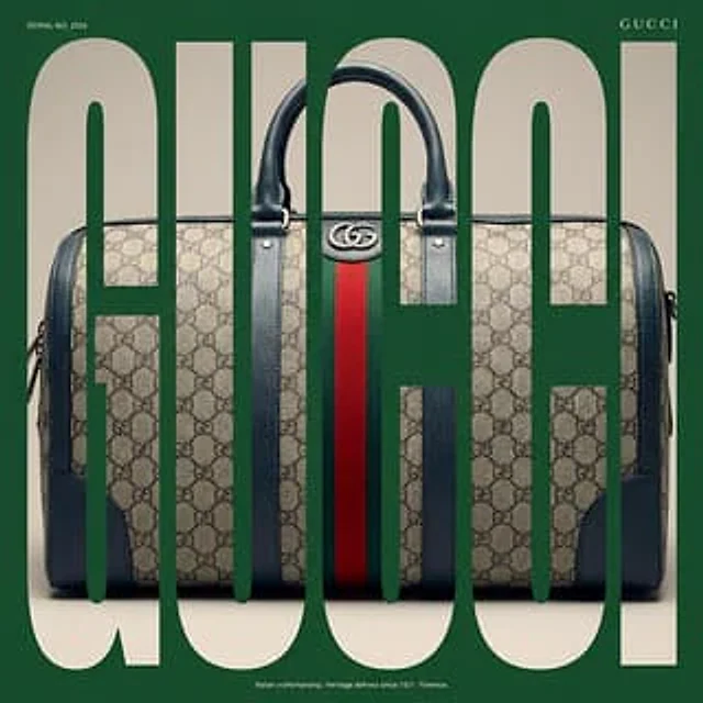
Example generated from “ANKIT PATEL 🇮🇳 | AI #975”
Nano Bananaen
ANKIT PATEL 🇮🇳 | AI #975

"scene_description": { "location": "Urban rooftop or high vantage point with a backdrop of towering glass skyscrapers and sleek modern architecture", "vibe": "Energetic, youthful, urban streetwear, dynamic and slightly distorted perspective", "lighting": "Bright daylight, harsh sunlight creating a sunburst/lens flare in the upper left, high contrast shadows on the sleek surfaces, vibrant colors", "camera_settings": "Ultra-wide angle or Fisheye lens (approx 8mm-12mm), extreme low angle (worm's-eye view), forced perspective, deep depth of field, sharp focus from shoe sole to skyline, close up full body shot of the woman" }, "primary_subjects": [ { "character": "Young woman with shoulder-length brown hair", "role": "Streetwear model / Urban explorer", "action": "Sitting casually on the corner of a modern minimalist ledge or platform, looking down at the camera with a confident, relaxed expression. One leg is extended forward towards the lens creating extreme foreshortening, maintaining the same pose as before", "details": "Bright red track jacket with white stripes on sleeves, Bright Red fitted leggings, massive white chunky platform sneakers with a distinct red tread pattern on the sole (shoe is the dominant foreground element)" } ], "environment_details": { "crowd": "None", "architecture": "Curved modern glass skyscrapers surrounding the subject, smooth light concrete or metallic ledge in the foreground instead of a red brick wall, clean modern textures", "fidelity": "High-resolution photography, realistic texture on the sneaker leather and modern materials, lens distortion effect on the buildings" } }